Theme 3: Graphics
This theme is concerned with all things connected to graphics. This includes the production of various types of graphs, adding text, lines, and points to graphs, and altering a range of additional graphical parameters. This theme also covers saving graphs to other programs and to disk in various graphical formats.
Topics In This Theme
Commands In This Theme:
Making Graphs
You can create various sorts of graphs with a few basic commands covered in this topic. You can transfer your graphs to other programs or save them to disk in a variety of graphical formats (for example, pdf, jpeg, tiff, and so on).
What’s In This Topic:
- Creating blank graph windows
- Managing open graph windows
- Types of graphics files
Types of Graphs
The R program can produce several types of graphs. The commands that produce these graphs are covered in this section. You can customize and embellish your graphs in many ways. Note that many of the parameters used by the various graphics commands are shared by several commands.
Command Name
barplotThis command creates bar charts. The bars can be drawn as vertical or horizontal.
Common Usage
barplot(height, width = 1, space = NULL,
        names.arg = NULL, legend.text = NULL, beside = FALSE,
        horiz = FALSE, density = NULL, angle = 45,
        col = NULL, border = par("fg")
        main = NULL, sub = NULL, xlab = NULL, ylab = NULL,
        xlim = NULL, ylim = NULL,
        cex.axis = par("cex.axis"), cex.names = par("cex.axis"),
        plot = TRUE, add = FALSE, args.legend = NULL, ...)
Related Commands
Command Parameters
| height | The data giving the heights of the bars. This can be a vector of numeric values or a matrix. |
| width = 1 | The widths of the bars. This can be specified as a vector of values or as a single number. If a single number is specified, there will be no effect unless xlim is also given. |
| space = NULL | The amount of space (as a fraction of the average bar width) left before each bar. You can specify a single number or one number per bar. If height is a matrix and beside = TRUE, space can be specified by two numbers, where the first is the space between bars in the same group, and the second is the space between the groups. If not given explicitly, it defaults to c(0,1) if height is a matrix and beside = TRUE, and to 0.2 otherwise. |
| names.arg = NULL | The names to be displayed beneath the bars (or groups of bars). If omitted, the names are taken from data specified in height. If the data are a matrix, the names are taken from the column names. If the data are a vector, the names are taken from the names attribute. |
| legend.text = NULL | A vector of text to use for a legend. If legend.text = TRUE, the names are constructed from the row names of the data. |
| beside = FALSE | By default, stacked bars are produced if the data are a matrix with multiple rows. Each column forms a stack. If beside = TRUE, the bars are shown in groups. |
| horiz = FALSE | If horiz = TRUE, the bars are drawn horizontally. In this case the bottom axis is still regarded as the x-axis and the vertical axis as the y-axis. |
| col = NULL | Colors to use for the bars. The default is a range of gray shades. |
| border | The border color for the bars. |
| density = NULL | The density of shading lines in lines per inch. The default is NULL, which suppresses lines. |
| angle = 45 | The angle of shading lines in degrees. This is measured as a counter-clockwise rotation. |
| main = NULL | A character string giving the main title for the plot. |
| sub = NULL | A character string giving the subtitle for the plot. |
| xlab = NULL | A character string giving the title for the x-axis. |
| ylab = NULL | A character string giving the title for the y-axis. |
| cex.axis = 1 | A numeric value that sets the expansion factor for the numeric axis labels. |
| cex.names = 1 | A numeric value that sets the expansion factor for the bar names. |
| plot = TRUE | If plot = FALSE, nothing is plotted. |
| add = FALSE | If add = TRUE, the bars are added to an existing plot. |
| args.legend = NULL | A list of arguments to be passed to the legend (see the legend command). |
Examples
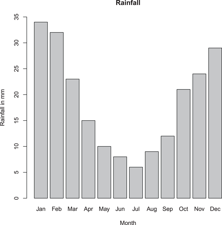
  ## Make values for basic barplot
> rain = c(34, 32, 23, 15, 10, 8, 6, 9, 12, 21, 24, 29) # Vector
> month = month.abb[1:12] # Make labels

  ## Now draw the plot (Figure 3-1)
  ## Increase y-axis limits and add titles
> barplot(rain, ylim = c(0, 35), names = month,
 main = "Rainfall", xlab = "Month", ylab = "Rainfall in mm")
Figure 3-1: A basic bar chart
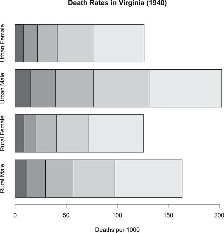
  ## More data, this time as a matrix
> data(VADeaths) # Data are in R datasets

  ## Draw stacked bar chart with horizontal bars (Figure 3-2)
  ## Note that xlab annotates bottom axis
  ## There is no legend automatically
> barplot(VADeaths, xlab = "Deaths per 1000", horiz = TRUE)

  ## Add main title afterwards
> title(main = "Death Rates in Virginia (1940)")
Figure 3-2: A stacked bar chart
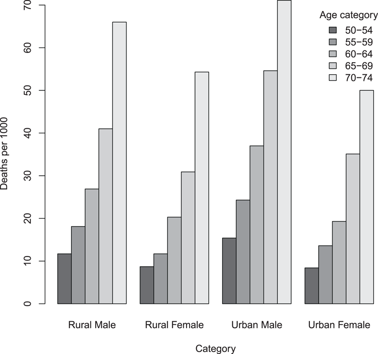
  ## Same data as previous - a Matrix
> data(VADeaths) # Data are in R datasets

  ## Draw bar chart with adjacent bars (Figure 3-3)
  ## Add a legend. Note parameters passed to legend command
> barplot(VADeaths, beside = TRUE, legend = TRUE,
 args.legend = list(bty = "n", title = "Age category"))

  ## Add titles afterwards
> title(ylab = "Deaths per 1000", xlab = "Category")
Figure 3-3: A bar chart with adjacent (grouped) bars and a legend
Command Name
biplotThis command produces biplots. Essentially, a biplot is two series of x, y coordinates. The data are plotted using separate axis scales and you have the option to add arrows to the second series. The main use for biplots is showing the result of multivariate analysis. The command will accept input in two different ways: as the result of a multivariate analysis or as two separate two-column matrix objects.
Common Usage
biplot(x, y, var.axes = TRUE, col, cex = rep(par("cex"), 2),
       xlabs = NULL, ylabs = NULL, expand = 1,
       xlim  = NULL, ylim  = NULL, arrow.len = 0.1,
       main = NULL, sub = NULL, xlab = NULL, ylab = NULL, ...)

biplot(x, choices = 1:2, scale = 1, pc.biplot = FALSE, ...)
Related Commands
Command Parameters
| x | The data that forms the first set of points. This can be a two-column matrix or the result of a multivariate analysis. If the object is the latter, x is taken from the results of the rows (samples). |
| y | The data that forms the second set of points. If x is given as the result of a multivariate analysis, y can be missing. In this case, the data will be taken from the results of the columns (variables). |
| var.axes = TRUE | By default, the second set of points has arrows pointing to them from the origin. |
| col | The colors for the points and arrows. |
| cex | The character expansion factor for the points. Two values can be given for the first and second set, respectively. |
| xlabs = NULL | A vector of character strings to use as the labels for the individual points for the first data set. The default uses the row names if set, or numbers if names are not set. |
| ylabs = NULL | A vector of character strings to use as the labels for the individual points for the second data set. The default uses the row names if set, or numbers if names are not set. |
| expand = 1 | An expansion factor to apply to the axes for the second set of points relative to the first. |
| xlim = NULL | A vector of two values giving the limits of the x-axis for the first data set. |
| ylim = NULL | A vector of two values giving the limits of the y-axis for the first data set. |
| arrow.len = 0.1 | The length of the arrow heads if var.axes = TRUE. Use arrow.len = 0 to suppress arrow heads. |
| main = NULLsub = NULLxlab = NULLylab = NULL... | Additional graphical parameters can be given. These include main and subtitles for the plot as well as titles for x- and y-axes. |
| choices = 1:2 | If the data are from a multivariate analysis and have a class attribute "prcomp" or "princomp", you can specify which axes to plot (two values are required). The default is to use 1:2, which relates to the first two axes. |
| scale = 1 | A scale factor (between 0 and 1). This affects the way the scales of the variables (columns) and observations (rows) are drawn relative to one another. |
| pc.plot = FALSE | If pc.plot = TRUE, the observations are scaled up by sqrt(n) and the variables scaled down by sqrt(n). |
Examples
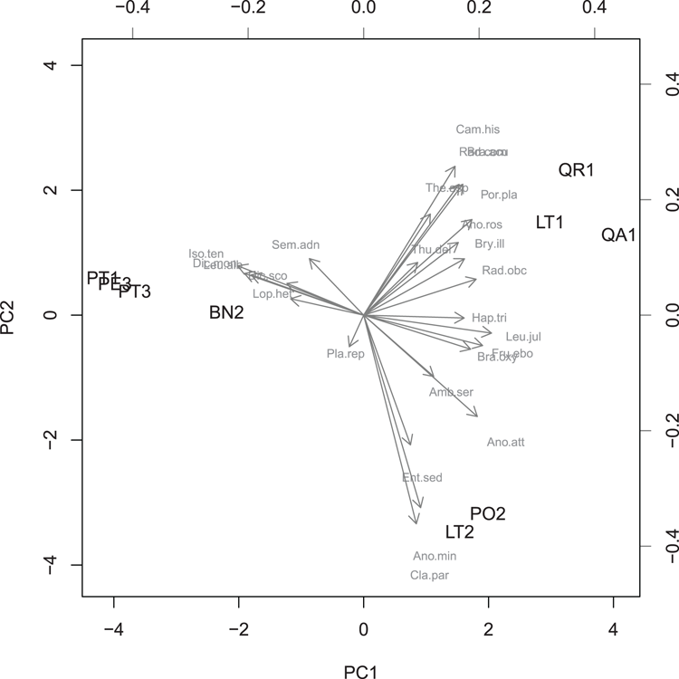
  ## Use Principal Components to make multivariate result
> moss.pca = prcomp(moss, scale = TRUE)

  ## View the result as a bi-plot (Figure 3-4)
  ## Note use of two colors and two cex (2nd set smaller)
> biplot(moss.pca, scale = 0, col = c("black", 'gray50'),
  cex = c(1, 0.7))
Figure 3-4: A biplot from a principal components analysis
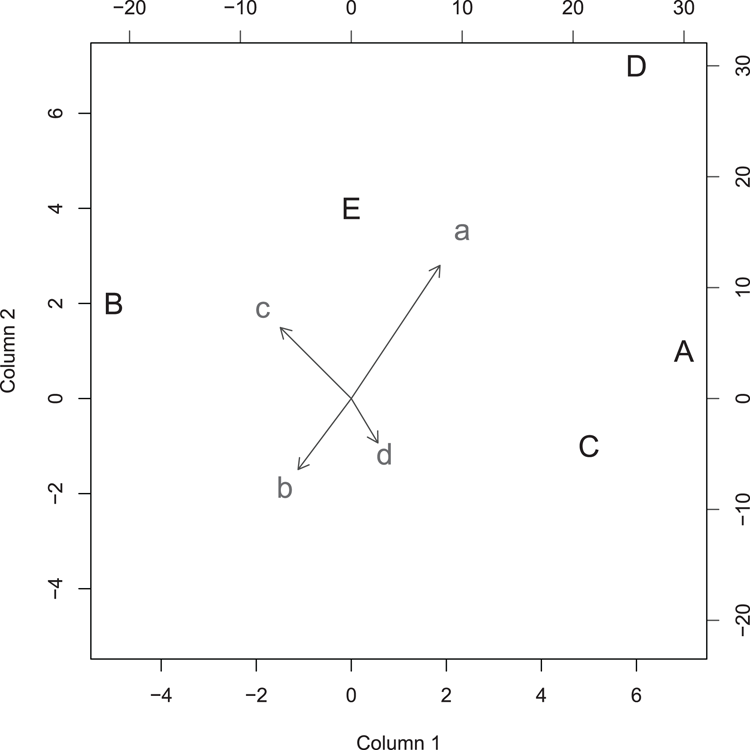
  ## Use data from two matrix objects
  ## Make data
> mat1 = matrix(c(7, -5, 5, 6, 0, 1, 2, -1, 7, 4), ncol = 2)
> rownames(mat1) = LETTERS[1:5] # Make row names (become plot labels)
> colnames(mat1) = c("Column 1", "Column 2") # Become axis titles

> mat2 = matrix(c(10, -6, -8, 3, 15, -8, 8, -5), ncol = 2)
> rownames(mat2) = letters[1:4] # Make rownames (become plot labels)

  ## Draw the biplot (Figure 3-5)
  ## make the arrows slightly smaller and all points larger
> biplot(mat1, mat2, expand = 0.5, col = c("black", "gray30"),
  cex = 1.5)
Figure 3-5: A biplot from two matrix objects
Command Name
boxplotThis command produces box-whisker plots. The command accepts data in several forms:
- As one or more vectors of values
- As an object containing multiple numeric variables (for example, data frame, matrix, or list)
- As a formula
The command takes your input data and calculates the values required to create the plot. These values are then passed to the bxp command for the actual plotting.
Common Usage
boxplot(formula, data = NULL, ..., subset, na.action = NULL)

boxplot(x, ..., range = 1.5, width = NULL, varwidth = FALSE,
       notch = FALSE, outline = TRUE, names, plot = TRUE,
       border = par("fg"), col = NULL,
       pars = list(boxwex = 0.8, staplewex = 0.5),
       horizontal = FALSE, add = FALSE, at = NULL)
Related Commands
Command Parameters
| formula | A formula of the form y ~ grp, where y is the response variable and grp is one or more predictor (grouping) variables. |
| data = NULL | A data frame (or list) from which the variables in the formula are to be found. |
| subset | A subset of the observations to be used in the plot. |
| na.action = NULL | What to do if the data contains NA items. The default is to ignore them. |
| x | If the input data are not specified as a formula, x specifies the data to be used. This can be one or more vectors (separate names using commas) or a data frame, matrix, or list. |
| range = 1.5 | Specifies how far the whiskers extend; this is range multiplied by the inter-quartile range. To make the whiskers extent to the max-min, use range = 0. See the outline parameter. |
| width = NULL | A vector of values giving the relative widths of the boxes. |
| varwidth = FALSE | If varwidth = TRUE, the boxes have widths proportional to the square root of the number of observations. |
| notch = FALSE | If notch = TRUE, a notch is drawn as an indicator of significant difference (an approximate 95% confidence indicator). |
| outline = TRUE | If outline = FALSE, outliers are not shown. By default, points that lie beyond the range of the whiskers are shown as outliers. |
| names | Group labels for the boxes. The labels are taken from the names attribute if available. |
| plot = TRUE | If plot = FALSE, the plot is not drawn and the boxplot statistics are given instead. These are in the form of a list. These statistics could be passed to the bxp command. |
| border | A vector of colors for the borders of the boxes. |
| col | The colors for the fill of the boxes. If a single value is given it is used for all boxes, otherwise the values are used sequentially and recycled as necessary. |
| pars = list() | A list of additional parameters to pass to the bxp command. The defaults specify boxwex and staplewex. |
| boxwex = 0.8 | A scale factor to apply to all boxes. |
| staplewex = 0.5 | The width of the staple line (the ends of the whiskers) compared to box width. |
| horizontal = FALSE | If TRUE, the boxes and whiskers are drawn horizontally. In this case the bottom axis is still regarded as the x-axis and the vertical axis as the y-axis. |
| add = FALSE | If add = TRUE, the boxplot is drawn into the existing plot window. |
| at = NULL | A vector of values specifying the locations where the boxes are to be drawn. The locations are relative to the number of boxes across the x-axis. |
| ... | Additional graphical parameters. |
Examples
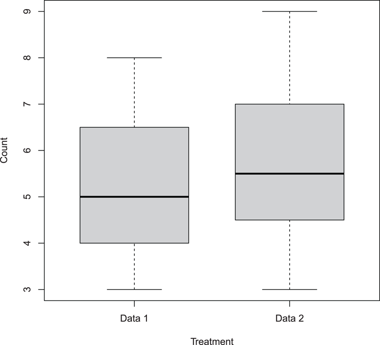
  ## Make data
> dat1 = c(4, 5, 6, 4, 3, 5, 7, 8)
> dat2 = c(8, 6, 5, 5, 4, 6, 3, 9)

  ## Draw box-plot (Figure 3-6)
  ## Names must be given explicitly when using separate vectors
  ## Boxes made thinner using boxwex
> boxplot(dat1, dat2, names = c("Data 1", "Data 2"),
 col = "gray80", boxwex = 0.7,
 xlab = "Treatment", ylab = "Count")
Figure 3-6: Basic box-whisker plot
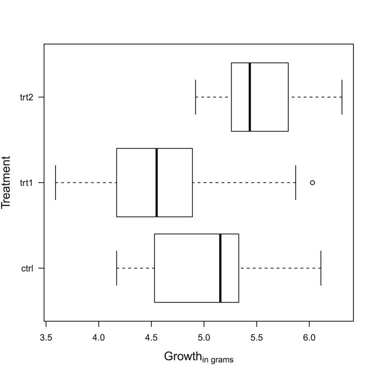
  ## Use data from datasets
> data(PlantGrowth) # Make sure data is ready
> names(PlantGrowth) # See what the columns are called
[1] "weight" "group"

  ## Make boxplot, (Figure 3-7)
  ## Use horizontal boxes, las = 1 rotates axis labels
  ## Use formula to specify data
  ## Boxes automatically labeled as data in data frame
  ## Note outlier (use range = 0 to extend whiskers)
> boxplot(weight ~ group, data = PlantGrowth, horizontal = TRUE,
  las = 1)

  ## Add titles, make them slightly larger than default
  ## Note xlab still refers to bottom axis
  ## note also expression used for subscript
> title(xlab = expression("Growth"["in grams"]),
  ylab = 'Treatment', cex.lab = 1.3)
Figure 3-7: A horizontal boxplot
Command Name
bxpThis command draws box-whisker plots. The data are usually taken from summary statistics produced by the boxplot command, but you could generate the values in another way.
Common Usage
bxp(z, notch = FALSE, width = NULL, varwidth = FALSE,
    outline = TRUE, notch.frac = 0.5,
    border = par("fg"), pars = NULL, frame.plot = axes,
    horizontal = FALSE, add = FALSE, at = NULL, show.names = NULL,
    ...)
Related Commands
Command Parameters
| z | A list that contains the elements used to create the plot. Usually this will be created by the boxplot command. |
| notch = FALSE | If notch = TRUE, a notch is drawn as an indicator of significant difference (an approximate 95% confidence indicator). |
| width = NULL | A vector of values giving the relative widths of the boxes. |
| varwidth = FALSE | If varwidth = TRUE, the boxes have widths proportional to the square root of the number of observations. |
| outline = TRUE | If outline = FALSE, outliers are not shown. By default, points that lie beyond the range of the whiskers are shown as outliers. |
| notch.frac = 0.5 | A value between 0 and 1 that determines what fraction of the box width the notch should use. |
| border | A vector of colors for the borders of the boxes. The color set is also used as the default for other colors: boxcol, medcol, whiskcol, staplecol, and outcol. |
| pars = NULL | Additional graphical parameters can be specified as a list. See the ... parameter. |
| frame.plot = axes | Specifies if a frame should be drawn around the plot. The default is effectively TRUE, unless axes = FALSE is specified. The frame can be suppressed using frame.plot = FALSE. |
| horizontal = FALSE | If TRUE, the boxes and whiskers are drawn horizontally. In this case the bottom axis is still regarded as the x-axis and the vertical axis as the y-axis. |
| add = FALSE | If add = TRUE, the boxplot is drawn into the existing plot window. |
| at = NULL | A vector of values specifying the locations where the boxes are to be drawn. The locations are relative to the number of boxes across the x-axis. |
| show.names = NULL | Set to TRUE or FALSE to override the defaults on whether an x-axis label is printed for each group. |
| ... | Additional graphical parameters can be specified. (See “Graphical Parameters.”) Any parameters set override those set via the pars parameter. |
Additional graphical parameters for the bxp command can be applied to various components of the plot. The parameters are generally based on the equivalents in the par command:
| boxwex | A scale factor applied to all boxes. The default = 0.8. |
| staplewex, outwex | A width expansion factor for the staple (end of whisker) and outlier line proportional to box width. The default = 0.5. |
| boxlty, boxlwd, boxcol, boxfill | Sets the box outline type, width, color, and fill color. |
| medlty, medlwd, medpch, medcex, medcol, medbg | Sets parameters for the median indicator: line type, width, character, expansion factor, color, and background. The default medpch = NA suppresses the character. To suppress the line, use medlty = "blank". |
| whisklty, whisklwd, whiskcol | Sets parameters for the whiskers: line type (the default is "dashed"), width, and color. |
| staplelty, staplelwd, staplecol | Sets parameters for the staple (the end of the whiskers): line type, width, and color. |
| outlty, outlwd, outpch, outcex, outcol, outbg | Sets parameters for the outliers: line type, width, character, expansion factor, color, and background. The default outlty = "blank" suppresses the lines. To suppress the points, use outpch = NA. |
Examples
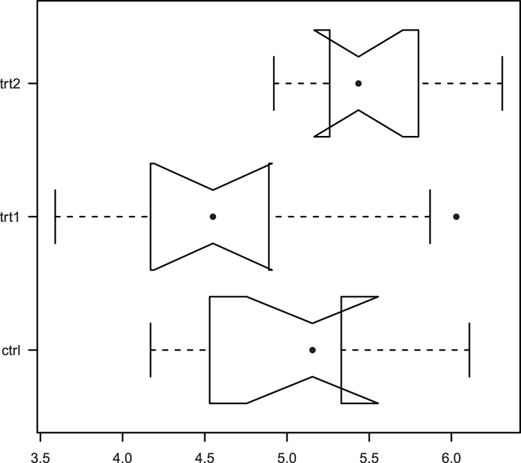
  ## Use data from datasets
> data(PlantGrowth) # Make sure data is ready

  ## Use boxplot to create statistics for plot but do not plot it
> bp = boxplot(weight ~ group, data = PlantGrowth, plot = FALSE)
> bp # See the results
$stats
      [,1] [,2]  [,3]
[1,] 4.170 3.59 4.920
[2,] 4.530 4.17 5.260
[3,] 5.155 4.55 5.435
[4,] 5.330 4.89 5.800
[5,] 6.110 5.87 6.310

$n
[1] 10 10 10

$conf
         [,1]     [,2]     [,3]
[1,] 4.755288 4.190259 5.165194
[2,] 5.554712 4.909741 5.704806

$out
[1] 6.03

$group
[1] 2

$names
[1] "ctrl" "trt1" "trt2"

  ## Use bxp to draw boxplot (Figure 3-8).
  ## Various parameters altered: horizontal plot, outlier symbol
  ## median line removed and replaced by symbol
  ## axis labels all horizontal, add notch (gives error for these data)
> bxp(bp, notch = TRUE, horiz = TRUE, outpch = 16,
  medlty = "blank", medpch = 16, las = 1)

Warning message:
In bxp(bp, notch = TRUE, horiz = TRUE, outpch = 16, medlty = "blank",  :
  some notches went outside hinges ('box'): maybe set notch=FALSE
Figure 3-8: A boxplot drawn and customized using the bxp command
Command Name
coplotThis command produces conditioning plots. The command requires that the input be in the form of a formula. The panels of the plot can be customized using the panel parameter, which is in the form of a function.
Common Usage
coplot(formula, data, given.values, panel = points, rows, columns,
       show.given = TRUE, col = par("fg"), pch = par("pch"),
       bar.bg = c(num = gray(0.8), fac = gray(0.95)),
       xlab = c(x.name, paste("Given :", a.name)),
       ylab = c(y.name, paste("Given :", b.name)),
       subscripts = FALSE,
       axlabels = function(f) abbreviate(levels(f)),
       number = 6, overlap = 0.5, xlim, ylim, ...)
Related Commands
Command Parameters
| formula | A formula of the general form y ~ x | a * b, where y and x are the variables to plot, and a and b are the conditioning variables. If there is only one conditioning variable, the formula will be y ~ x | a. |
| data | The name of the data frame containing the variables in the formula. |
| given.values | These values determine how the plot is arranged by specifying the order in which the conditioning plots are shown and applied. If there is one conditioning variable, there will be one set of values corresponding to the levels of the conditioning variable. |
| panel = points | A function that determines how the plot is produced. The default is points. Any custom function must include x and y parameters (see also the subscripts parameter). |
| rows | The number of rows for the main plot. |
| columns | The number of columns for the main plot. |
| show.given = TRUE | If FALSE, the levels of the conditioning variables are not shown. If two conditioning variables exist, two values must be given. |
| col | The colors for the points. |
| pch | The plotting symbols for the points. |
| bar.bg | A vector with two named components: "num" and "fac". These give the color of the shingle bars (see the following examples) for numeric and factor variables, respectively. |
| xlab | A character vector containing the names for the x-axis and the first conditioning variable. If a single value is given it is used for the x-axis, and the default is used for the conditioning variable. |
| ylab | A character vector containing the names for the y-axis and the second conditioning variable. If a single value is given it is used for the y-axis, and the default is used for the conditioning variable. |
| subscripts | If subscripts = TRUE, the custom function in panel can include a subscripts parameter. |
| axlabels | A function to create axis (tick) labels when x or y are factors. |
| number | An integer value to control the number of conditioning intervals if the conditioning variable is not a factor. If you have two conditioning variables you can specify two values. |
| overlap | A numeric value < 1, which determines the fraction of overlap of the conditioning variables. If you have two conditioning variables you can specify two values. If overlap < 0, there will be gaps between the data slices. |
| xlim | The extent of the x-axis; you must give the starting and ending values. |
| ylim | The extent of the y-axis; you must give the starting and ending values. |
| ... | Additional graphical parameters can be used within the panel function. |
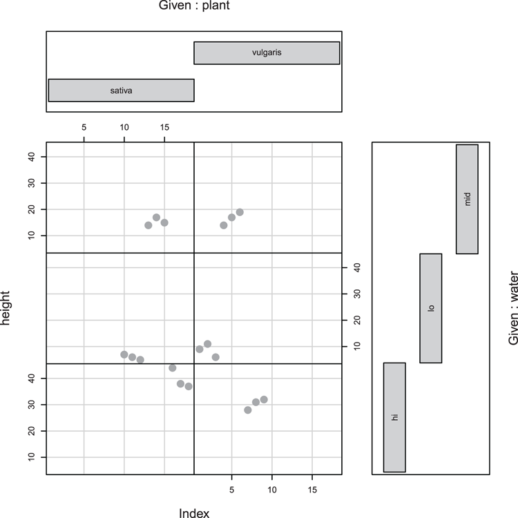
Examples
> Index = seq(length=nrow(pw)) # index of rows

  ## Draw plot (Figure 3-9)
  ## height is response data, Index plots individual values
  ## plant * water are conditioning variables
> coplot(height ~ Index | plant * water, data = pw,
 col = 'gray60', pch = 16, cex = 2, bar.bg = c(fac = "gray80"))
Figure 3-9: A coplot, a response variable, and two conditioning variables
Command Name
curveThis command draws a curve corresponding to a mathematical function. The command can create a new plot or add the curve to an existing plot window.
Command Name
densityThis command computes kernel density estimates. You can use it to visualize the distribution of a data sample as a graph, for example, plot(density(x)). You can also compare to a known distribution by overlaying the plot onto a histogram using the lines command.
Command Name
dotchartThis command produces Cleveland dot plots. These can be used as an alternative to bar charts and pie charts. You can also add a summary statistic to the plot.
Common Usage
dotchart(x, labels = NULL, groups = NULL, gdata = NULL,
         cex = par("cex"), pch = 21, gpch = 21, bg = par("bg"),
         color = par("fg"), gcolor = par("fg"), lcolor = "gray",
         xlim = range(x[is.finite(x)]),
         main = NULL, xlab = NULL, ylab = NULL, ...)
Related Commands
Command Parameters
| x | The data to plot, usually a vector or a matrix. If x is a matrix, the rows are taken as the data and the columns are taken as the groups. |
| labels = NULL | A vector of labels for the points. For a vector the names are used, for a matrix the rownames are used. |
| groups = NULL | A factor indicating the grouping of the data. |
| gdata = NULL | A data value for each group, such as the mean. |
| cex | A character expansion factor, values > 1 make text larger, values < 1 make it smaller. |
| pch = 21 | The plotting symbol to use for the data points. |
| gpch = 21 | The plotting symbol to use for the grouping summary. |
| bg | The background color for the plotting symbols. |
| color | The colors to use for data points and labels. |
| gcolor | The color to use for group labels and values. |
| lcolor = "gray" | The colors to use for the horizontal lines. |
| xlim | The x-axis scale, e.g., the limits of the horizontal axis. You must specify both start and end values. |
| main = NULL | An overall title for the plot. |
| xlab = NULL | A title for the x-axis. |
| ylab = NULL | A title for the y-axis. |
| ... | Additional graphical parameters. |
Examples
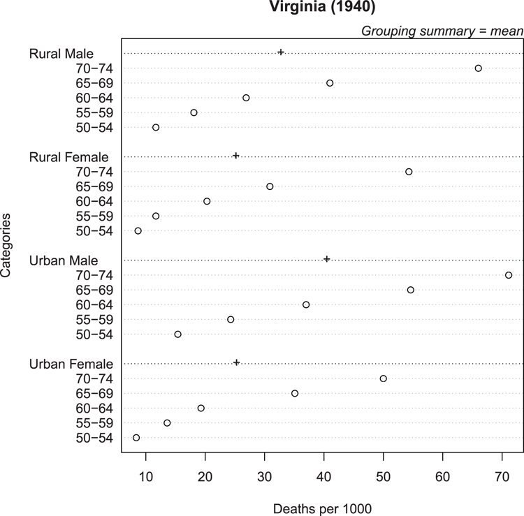
  ## Use data from datasets (VADeaths is a matrix)
> data(VADeaths) # make sure data ready

  ## Create dotchart (Figure 3-10), use colMeans to get summary mean
  ## Alter symbol for summary stat, add some titles
> dotchart(VADeaths, gdata = colMeans(VADeaths), gpch = "+",
 xlab = "Deaths per 1000", main = "Virginia (1940)")

  ## Add y-axis title and marginal text (top axis, on the right end)
> title(ylab = "Categories")
> mtext(text = "Grouping summary = mean", side = 3, adj = 1, font = 3)
Figure 3-10: Cleveland dot chart with group summary statistic
Command Name
histThis command creates histograms. The command computes the required values before plotting the histogram. These values can be saved as a named object, which holds a class attribute "histogram".
Common Usage
hist(x, breaks = "Sturges",
    freq = NULL, right = TRUE,
    density = NULL, angle = 45, col = NULL, border = NULL,
    main = paste("Histogram of" , xname),
    xlim = range(breaks), ylim = NULL,
    xlab = xname, ylab,
    axes = TRUE, plot = TRUE, labels = FALSE, ...)
Related Commands
Command Parameters
| x | A vector of values. |
| breaks = "Sturges" | Specifies the breakpoints between the histogram bars. Can be one of:
|
| freq = NULL | If freq = TRUE, the histogram axis represents frequency. If FALSE, density is used (so the total area sums to 1). If the breakpoints are equidistant, the value defaults to TRUE. |
| right = TRUE | By default, the histogram cells are right-closed (left open) intervals. |
| density = NULL | The density of shading lines in lines per inch. The default is NULL, which suppresses lines. |
| angle = 45 | The angle of shading lines in degrees. This is measured as a counter-clockwise rotation. |
| col = NULL | The color for the bars. The default, NULL, gives unfilled bars. |
| border = NULL | The border color for the bars. The default uses the standard foreground color. |
| main | A main title for the plot. To omit the title, use main = NULL. |
| xlim | The limits of the x-axis. You must specify both starting and ending values. |
| ylim | The limits of the y-axis. You must specify both starting and ending values. |
| xlab | A character vector giving a title for the x-axis. |
| ylab | A character vector giving a title for the y-axis. |
| axes = TRUE | If FALSE, the axes are not drawn. |
| plot = TRUE | If plot = FALSE, the values to create the histogram are computed but the plot is not drawn. |
| labels = FALSE | A vector of labels to place above the bars. For this to be successful you will need to know how many bars will be produced. |
| ... | Additional graphical parameters can be used. |
Examples
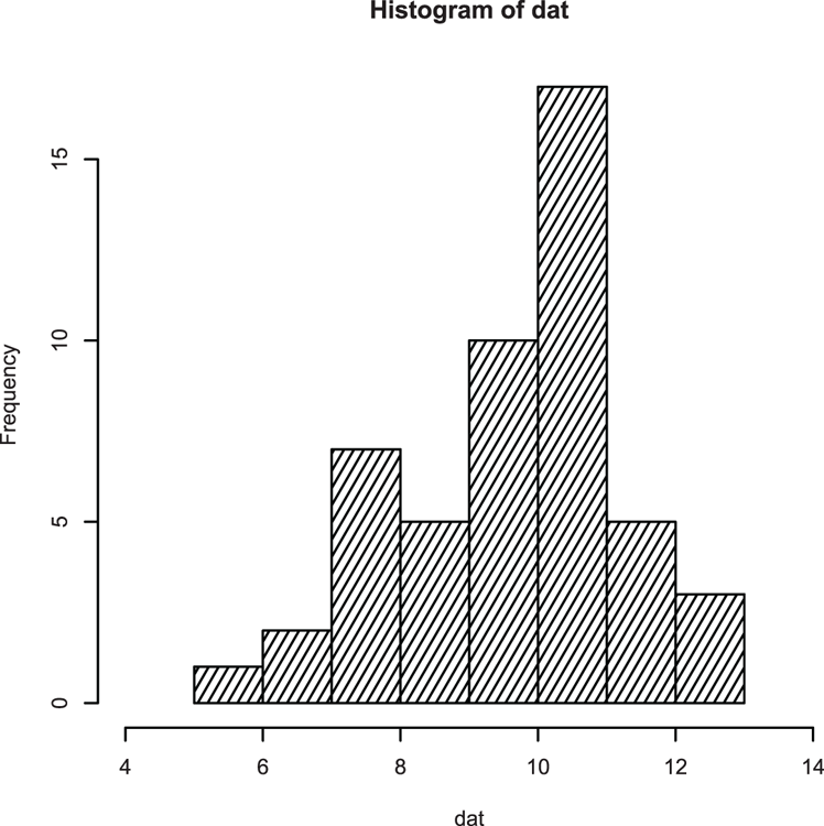
  ## Make some data
> set.seed(99) # Set random number generator
> dat = rnorm(50, mean = 10, sd = 1.5) # Values from normal distribution

  ## Draw histogram (Figure 3-11)
  ## Extend x-axis limits, add density fill lines
> hist(dat, xlim = c(4, 14), density = 15, angle = 60)
Figure 3-11: A histogram with shading lines
## View data used to draw histogram
> hist(dat, plot = FALSE)
$breaks
[1] 5 6 7 8 9 10 11 12 13
$counts
[1] 1 2 7 5 10 17 5 3
$intensities
[1] 0.02 0.04 0.14 0.10 0.20 0.34 0.10 0.06
$density
[1] 0.02 0.04 0.14 0.10 0.20 0.34 0.10 0.06
$mids
[1] 5.5 6.5 7.5 8.5 9.5 10.5 11.5 12.5
$xname
[1] "dat"
$equidist
[1] TRUE
attr(,"class")
[1] "histogram"
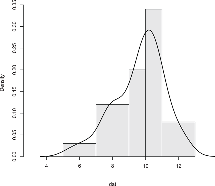
## Add density overlay and use unequal bars (Figure 3-12)
> hist(dat, breaks = c(5, 7, 9, 10, 11, 13), xlim = c(3, 13),
main = NULL, col = "gray90", axes = FALSE)
## Add axes
> axis(2) # The default y-axis
## Draw x-axis
> axis(1, pos = 0) # Use pos to move axis up to bottom of bars
## Add density line as overlay
> lines(density(dat), lwd = 2) # lwd makes line widerFigure 3-12: Histogram with unequal breakpoints and a density plot overlay
Command Name
interaction.plotThis command plots the mean or other summary statistic of a response variable for two-way combinations of factors. It can be seen as a quick graphical way to visualize potential factor interactions.
Common Usage
interaction.plot(x.factor, trace.factor, response, fun = mean,
                type = "l", legend = TRUE,
                trace.label = deparse(substitute(trace.factor)),
                fixed = FALSE,
                xlab = deparse(substitute(x.factor)),
                ylab = ylabel,
                ylim = range(cells, na.rm=TRUE),
                lty = nc:1, col = 1, pch = c(1:9, 0, letters),
                leg.bg = par("bg"), leg.bty = "n", ...)
Related Commands
Command Parameters
| x.factor | A factor whose levels will form the x-axis. |
| trace.factor | A factor whose levels will form the trace, e.g., the groupings of the plot. |
| response | A numeric variable giving the response variable to plot on the y-axis. |
| fun = mean | The summary function to apply to the response variable; the mean is the default. |
| type = "l" | The type of plot. The default is to use lines; other options are "p" for points and "b" for both lines and points. |
| legend = TRUE | If legend = TRUE, a legend is added. |
| trace.label | A title for the legend. |
| fixed = FALSE | By default, the trace factor is shown in the legend in the order of the level. If fixed = TRUE, the levels are shown in order of the summary function (at the right-hand end). |
| xlab | A title for the x-axis. |
| ylab | A title for the y-axis. |
| ylim | The limits of the y-axis. You must specify both starting and ending values. |
| lty = nc:1 | The line types for the trace variable. The defaults use a range of numeric values. |
| col = 1 | The colors for the plot. The default is black for everything. |
| pch | The plotting symbols to use if type = "p" or "b". The defaults use numbers 1–9 followed by lowercase letters if needed. |
| leg.bg | A color to use for the legend. This only works if leg.bty = "o". |
| leg.bty = "n" | By default, a box is not drawn around the legend. To draw one, use leg.bty = "o". |
| ... | Other graphical parameters can be specified. |
Examples
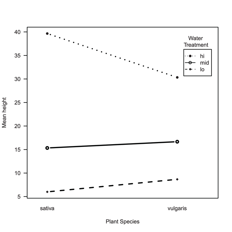
> names(pw) # A reminder of the variables
[1] "height" "plant"  "water"

  ## Draw the interaction plot (Figure 3-13)
> interaction.plot(pw$plant, pw$water, pw$height, fun = mean,
 xlab = "Plant Species", ylab = "Mean height",
 trace.label = "Water
Treatment",
 type = "b", pch = c(16, 18, 21),
 lwd = 2, leg.bty = "o", las = 1)
Figure 3-13: An interaction plot
Command Name
matplot
matpoints
matlines
The matplot command produces multiple series graphs. The command works by plotting the columns of one matrix against the columns of another matrix. The matpoints and matlines commands add points and lines to existing plots.
Common Usage
matplot(x, y, type = "p", lty = 1:5, lwd = 1, pch = NULL,
        col = 1:6, cex = NULL, bg = NA,
        xlab = NULL, ylab = NULL, xlim = NULL, ylim = NULL,
        ..., add = FALSE

matpoints(x, y, type = "p", lty = 1:5, lwd = 1, pch = NULL,
          col = 1:6, ...)

matlines (x, y, type = "l", lty = 1:5, lwd = 1, pch = NULL,
          col = 1:6, ...)
Related Commands
Command Parameters
| x, y | Matrix or vectors of numeric data to plot. The number of rows should match. If only one matrix or vector is given, it is taken as y with x being a simple index based on the number of rows in the given data. |
| type = "p" | The type of plot to create. The default is "p", producing points. Other options are "l" and "b", producing lines and both lines and points, respectively. Different types can be specified for each column of y. |
| lty = 1:5 | The line type to use for each column of y; defaults to values 1 to 5 and is recycled as necessary. |
| lwd = 1 | The line widths for each column of y. |
| pch = NULL | The plotting symbols to use for each column of y. The default uses numbers 1–9 and lowercase letters. |
| col = 1:6 | The colors to use for each column of y. Colors are recycled as necessary. |
| cex = NULL | The character expansion factor for each column of y. |
| bg = NA | The background colors to use for plotting symbols (if appropriate) for each column of y. |
| xlab = NULL | A title for the x-axis. |
| ylab = NULL | A title for the y-axis. |
| xlim = NULL | The limits of the x-axis. You must specify both starting and ending values. |
| ylim = NULL | The limits of the y-axis. You must specify both starting and ending values. |
| ... | Additional graphical parameters. |
| add = FALSE | If add = TRUE, the plot is added to the current plot window; otherwise, a new plot is created. |
Examples
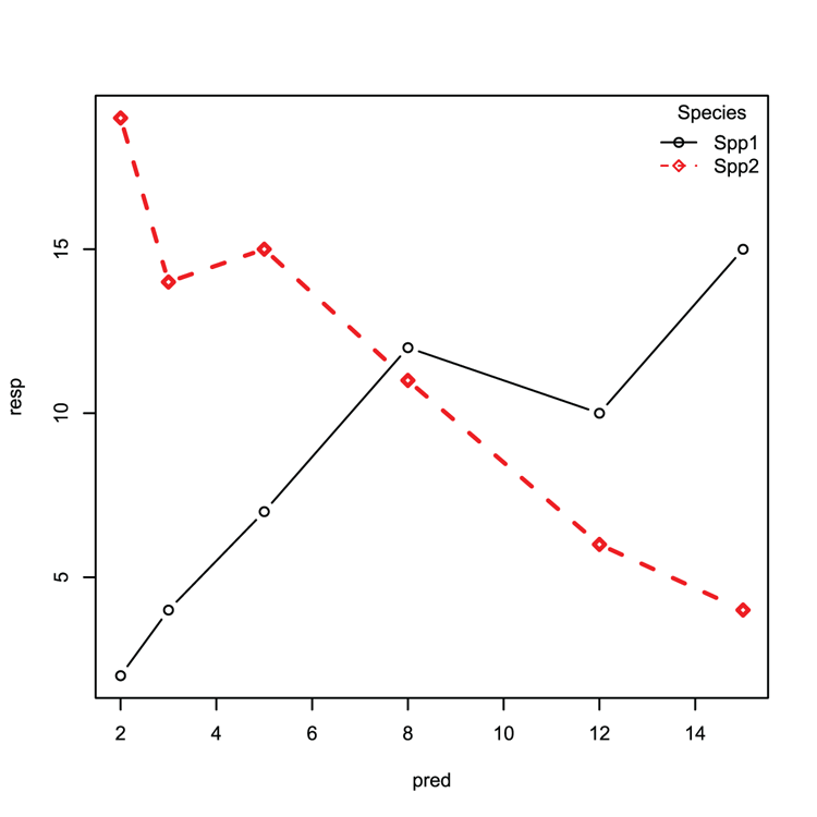
  ## Make some data (matrix for response and matrix for predictor)
> resp = matrix(c(2, 4, 7, 12, 10, 15, 19, 14, 15, 11, 6, 4), ncol = 2)
> pred = matrix(c(2, 3, 5, 8, 12, 15), ncol = 1)

  ## Create matrix plot as lines+points (Figure 3-14)
  ## Use custom symbols, line width, colors and styles
> matplot(pred, resp, type = 'b', pch = c(21,23), lwd = c(1, 2),
 col = 1:2, lty = 1:2)

  ## Add a legend, make sure parameters match original plot
  ## Check pch, lty and so on match
> legend("topright", legend = c("Spp1", "Spp2"), bty = "n", pch = c(21, 23),
 col = 1:2, lty = 1:2, title = "Species")
Figure 3-14: A matrix plot with legend
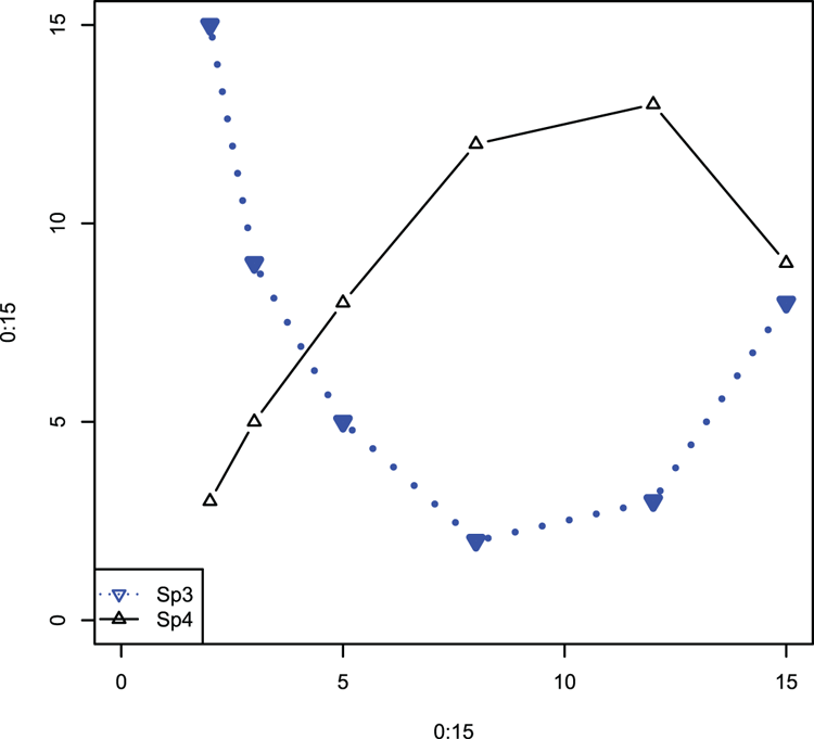
  ## Create some data (vectors)
> Sp3 = c(15, 9, 5, 2, 3, 8)
> Sp4 = c(3, 5, 8, 12, 13, 9)

  ## Make a blank plot (Figure 3-15)
> plot(0:15, 0:15, type = "n")

  ## matpoints can add to any plot and can also draw lines!
  ## Note that data can be a vector
  ## Specify plotting character, color and so on to help match in legend
> matpoints(pred, Sp3, type = "b", col = "blue", lwd = 3, lty = 3,
  pch = 25)

  # matlines can draw points!
> matlines(pred, Sp4, type = "b", col = "black", pch = 24)

  ## Add a legend
> legend("bottomleft", legend = c("Sp3", "Sp4"),
  col = c("blue", "black"), lty = c(3, 1), pch = 25:24)
Figure 3-15: The matpoints and matlines commands used to add data to an existing plot
Command Name
pairsThis command produces multiple scatter plots within one plot window; that is, it produces a matrix of scatter plots. The command can accept input in two forms:
- As a matrix or data frame with numeric columns
- As a formula
Common Usage
pairs(formula, data = NULL, ..., subset,
     na.action = stats::na.pass)

pairs(x, labels, panel = points, ...,
     lower.panel = panel, upper.panel = panel,
     diag.panel = NULL, text.panel = textPanel,
     label.pos = 0.5 + has.diag/3,
     cex.labels = NULL, font.labels = 1,
     row1attop = TRUE, gap = 1)
Related Commands
Command Parameters
| formula | A formula with no response variable, only predictors, of the form ~ x + y + z. |
| data = NULL | A data frame or list containing the variables given in the formula. |
| subset | A subset of observations to use. |
| na.action | A function defining what to do if NA items are in the data. The default is to pass missing values on to the panel functions, but na.action = na.omit will cause cases with missing values in any of the variables to be omitted entirely. |
| x | A data frame or matrix whose columns form the variables to be plotted. |
| labels | The names for the variables. |
| panel = points | A function(x, y, ...), used to plot the contents of the panels. |
| ... | Additional graphical parameters. |
| lower.panel = panel | A function(x, y, ...), used for plotting in the lower triangle of panels. |
| upper.panel = panel | A function(x, y, ...), used for plotting in the upper triangle of panels. |
| diag.panel = NULL | A function(x, ...), used to apply to the diagonal. |
| text.panel = textPanel | A function(x, y, labels, cex, font, ...), which is applied to the diagonals. |
| label.pos | The y position of the labels in the text panel. |
| cex.labels = NULL | An expansion factor for the labels in the text panel. |
| font.labels = 1 | The font style to use for the text panel. |
| row1attop = TRUE | If TRUE, the layout is matrix-like, with row 1 at the top. If FALSE, it is graph-like with row 1 at the bottom. |
| gap = 1 | Sets the distance between sub-plots in margin lines. |
Examples
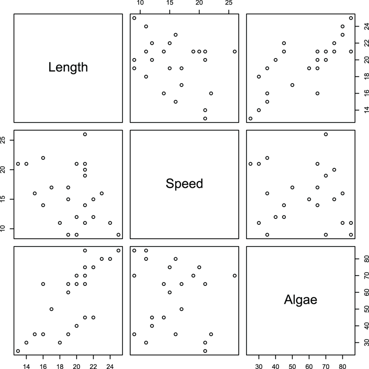
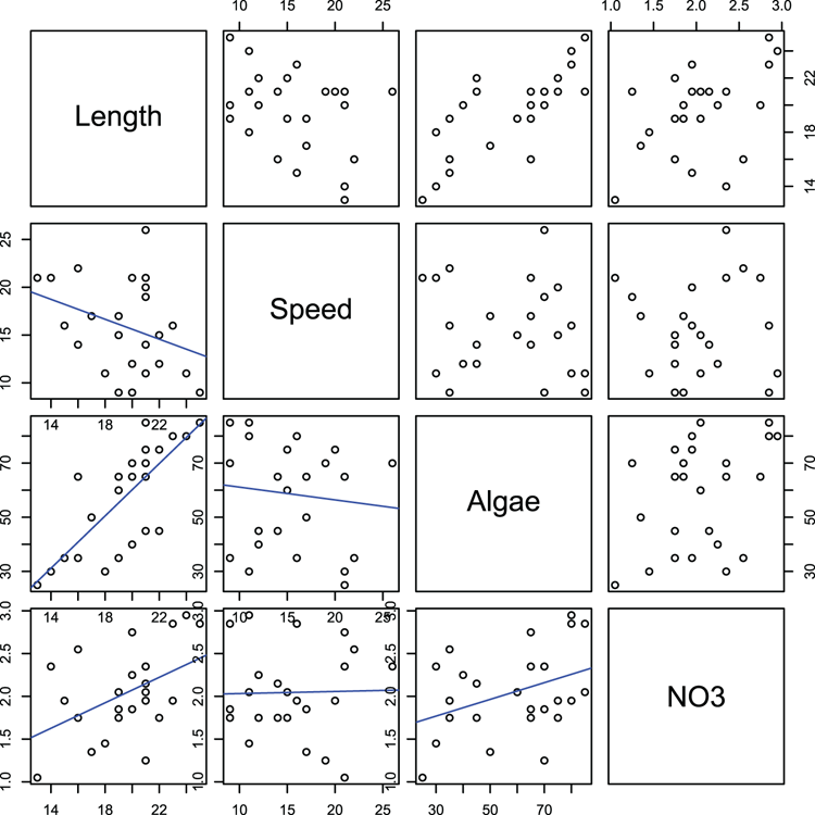
> names(mf) # as a reminder of variable names
[1] "Length" "Speed"  "Algae"  "NO3"    "BOD"    "site"

  ## Make pairs plot using some of the variables (Figure 3-16)
> pairs(~ Length + Speed + Algae, data = mf)
Figure 3-16: A default pairs plot using selected data
  ## Make a special function to display best-fit line
> panel.lm = function(x, y, ...) {  # Set-up function and define inputs
    par("new" = TRUE)               # do not wipe a new plot
    plot(x, y)                      # plot the x, y values
    abline(lm(y ~ x), col = "blue") # add a best-fit line in blue
    par("new" = FALSE) } # reset the new parameter and end the function

  ## Make pairs plot (Figure 3-17) and use new function
  ## to place scatter + best-fit in lower panels
> pairs(~Length + Speed + Algae + NO3, data=mf, lower.panel = panel.lm)
Figure 3-17: A pairs plot with a customized function for the lower panels
Command Name
pieThis command produces pie charts.
Common Usage
pie(x, labels = names(x), edges = 200, radius = 0.8,
   clockwise = FALSE, init.angle = if(clockwise) 90 else 0,
   density = NULL, angle = 45, col = NULL, border = NULL,
   lty = NULL, main = NULL, ...)
Related Commands
Command Parameters
| x | A vector of numeric values, these will form the pie slices and must be non-negative. |
| labels = names(x) | Labels for the pie slices. The default is to use the names attribute of x. |
| edges = 200 | A value that controls how smooth the circular outline of the pie is. The greater the value, the more segments of polygon are used, so the smoother the circle. |
| radius = 0.8 | The proportion of the plot area that the pie fills. Smaller size may be necessary to accommodate labels. |
| clockwise = FALSE | By default, the slices of pie are drawn counter-clockwise. |
| init.angle | A value specifying the starting angle in degrees. The default is 0 (3 o’clock) unless clockwise = TRUE, in which case it is 90 (12 o’clock). |
| density = NULL | The density of shading lines in lines per inch. The default is NULL, which suppresses lines. |
| angle = 45 | The angle of shading lines in degrees. This is measured as a counter-clockwise rotation. |
| col = NULL | Colors used for filling the slices. The default is a set of six pastel colors. |
| border = NULL | The border color for the slices. |
| lty = NULL | The line type for the slices. |
| main = NULL | An overall title for the plot. |
| ... | Additional graphical parameters can be supplied, but the only ones with an effect relate to labels and main title. |
Examples
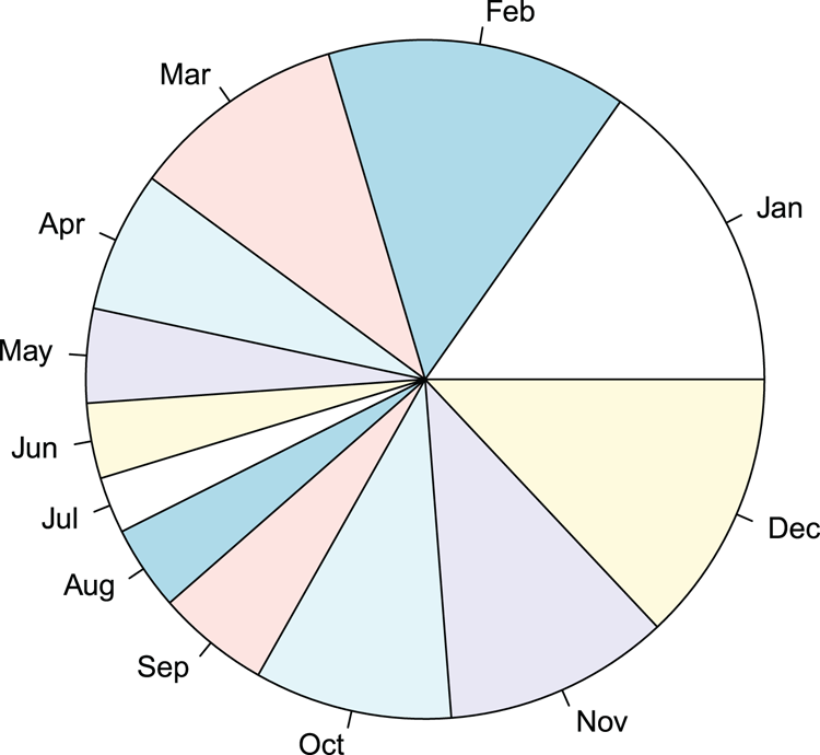
  ## Make data
> rain = c(34, 32, 23, 15, 10, 8, 6, 9, 12, 21, 24, 29) # A vector
> names(rain) = month.abb[1:12] # Make labels
> rain # View the data
Jan Feb Mar Apr May Jun Jul Aug Sep Oct Nov Dec
 34  32  23  15  10   8   6   9  12  21  24  29

  ## Make a pie chart using all default settings (Figure 3-18)
  ## Labels are shown for slices as names were set
> pie(rain)
Figure 3-18: A pie chart
Command Name
plotThis command is a generic function for plotting R objects. The basic form of the command produces scatter plots. However, many objects have a dedicated plotting routine and variants of the plot command will produce plots according to the class attribute of the object. You have three ways to specify the input to plot:
- As separate x and y coordinates
- As a formula
- As an object that has a plotting structure (that is, it has a dedicated plot command of its own)
Many graphical parameters can be specified and most are shared with other commands that produce a plot window. The par command gives access to all the graphical parameters.
Common Usage
plot(x, y, ...)Related Commands
Command Parameters
| x, y | The coordinates to plot. These can be separate x and y vectors or a formula. You can also specify an object, which holds a print structure. |
| frame.plot | If frame.plot = TRUE, the default, a box is drawn around the plot region. |
| type | The type of plot to produce.The general default is type = "p", which produces points. The main options are "p" for points, "l" for lines, "b" for both, and "n" for nothing. |
| mainsubxlabylab | Titles.Titles can be specified using a character string (or expression). You can produce titles for the overall plot and a subtitle, as well as for x- and y-axes. |
| log | Allows plotting of axes on a log scale. Use a character string as follows: "x" for the x-axis to be logarithmic, "y" for the y-axis, and "xy" or "yx" for both. |
| ... | Additional graphical parameters. |
Many graphical parameters can be used with the plot command. Additionally, the par command allows you to alter the current settings. Most of the parameters accessible via par can be used directly from the plotting command but some can only be set using the par command.
Examples
> names(mf) # As a reminder of the variables
[1] "Length" "Speed" "Algae" "NO3" "BOD" "site"
## A scatter plot in x, y style (Figure 3-19)
## Expression used in x-axis label to get superscript
## plotting symbol 21 can be colored in ("gray85") and larger
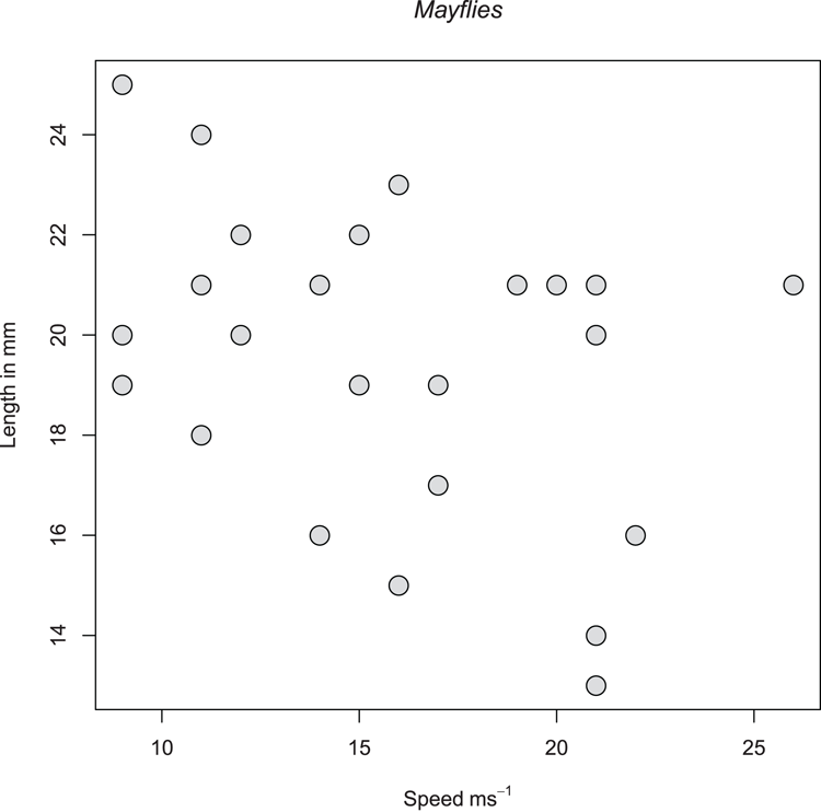
> plot(mf$Speed, mf$Length,
xlab = expression(Speed~ms^-1), ylab = "Length in mm",
pch = 21, bg = "gray85", cex = 2)
## Add a main title and alter the font to italic
> title(main = "Mayflies", font.main = 3)Figure 3-19: A scatter plot
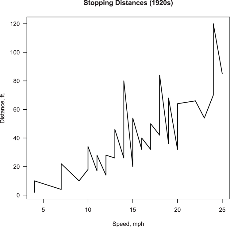
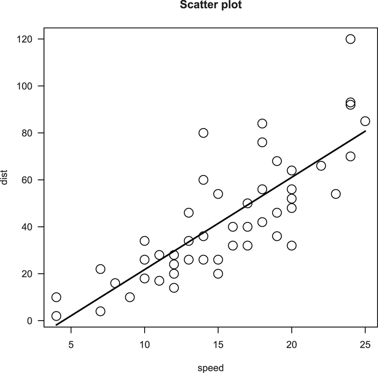
  ## Use cars data from R datasets
> data(cars) # make sure data are ready
> names(cars) # A reminder of the variables
[1] "speed" "dist"

  ## Make plot (Figure 3-20), use formula to specify data
  ## Use lines (type = "l") and widen them (lwd = 1.5)
  ## Add titles and ensure axis annotations are horizontal (las = 1)
> plot(dist ~ speed, data = cars, type = "l", lwd = 1.5,
 xlab = "Speed, mph", ylab = "Distance, ft.",
 main = "Stopping Distances (1920s)", las = 1)
Figure 3-20: A plot using lines rather than points
Command Name
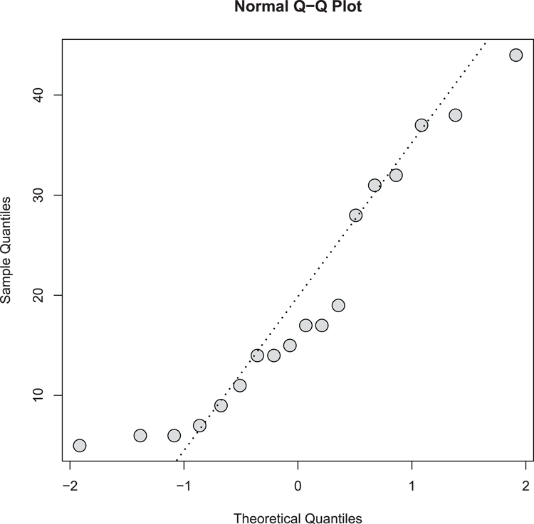
qqnormThis command draws quantile-quantile plots. The command takes a numeric sample and plots it against theoretical quantiles based on a normal distribution. In this way, you can visualize the normality of the data distribution.
Common Usage
qqnorm(y, ylim, main = "Normal Q-Q Plot",
       xlab = "Theoretical Quantiles", ylab = "Sample Quantiles",
       plot.it = TRUE, datax = FALSE, ...)
Related Commands
Command Parameters
| y | The data sample to plot, usually a vector. |
| ylim | The limits of the y-axis; you must specify both starting and ending values. |
| main | The main title for the plot. The title can be omitted using main = NULL. |
| xlabylab | Titles for x- and y-axes; the defaults place sensible titles. If you specify NULL, the title is not omitted; "x" and "y" are used for the x- and y-axis, respectively. To suppress an axis, use "", a pair of empty quotes. |
| plot.it = TRUE | If plot.it = FALSE, the data for the plot is computed but nothing is actually plotted. |
| datax = FALSE | By default, the sample quantiles are plotted on the y-axis. If datax = TRUE, the theoretical quantiles are plotted on the y-axis and the sample quantiles are plotted on the x-axis. |
| ... | Additional graphical parameters can be used. |
Examples
  ## Draw the QQ plot (Figure 3-21). Set plotting symbol, color & size.
> qqnorm(pw$height, cex = 2, pch = 21, bg = "gray85")

  ## Add a QQ line to help estimate normality
> qqline(pw$height, lwd = 2, lty = 3)
Figure 3-21: A normal quantile-quantile plot
Command Name
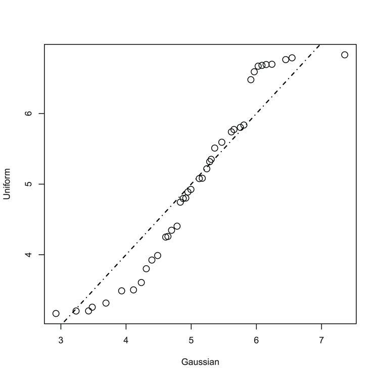
qqplotThis command produces a quantile-quantile plot of two variables.
Common Usage
qqplot(x, y, plot.it = TRUE, xlab = deparse(substitute(x)),
       ylab = deparse(substitute(y)), ...)
Related Commands
Command Parameters
| x, y | Numeric samples to plot. They do not need to be the same length because it is the quantiles that are plotted, not the original data. |
| plot.it = TRUE | If plot.it = FALSE, the data for the plot is computed but nothing is actually plotted. |
| xlabylab | Titles for x- and y-axes; the defaults place sensible titles. If you specify NULL, the title is not omitted; "sx" and "sy" are used for the x- and y-axis, respectively. To suppress an axis, use "", a pair of empty quotes. |
Examples
  ## Make some data
> set.seed(55) # Reset the random number generator

  ## Make random numbers from two distributions
> nd = rnorm(n = 50, mean = 5, sd = 1) # Normal (Gaussian) data
> ud = runif(n = 40, min = 3, max = 7) # Uniform distribution

  ## Make QQ plot to compare samples (Figure 3-22)
> qqplot(nd, ud, cex = 1.5, xlab = "Gaussian", ylab = "Uniform")

  ## If samples matched, the line would "fit"
> abline(0, 1, lwd = 1.5, lty = 4)
Figure 3-22: A QQ plot comparing Gaussian and Uniform distribution
Command Name
stemThis command creates stem-and-leaf plots. The command does not open a graphical window but produces a text-based representation of the data distribution in the console window.
Common Usage
stem(x, scale = 1, width = 80)Related Commands
Command Parameters
| x | A numeric vector. |
| scale = 1 | Sets the length of the plot; essentially creates more bins. You can specify values < 1. |
| width = 80 | Sets the width of the plot in the console window. Any truncated values are represented by +n, where n shows the number of missing values. |
Examples
  ## Make some data
> set.seed(55) # Set random number generator

  ## Make 50 values from a normal distribution
> nd = rnorm(n = 50, mean = 5, sd = 1)

  ## Stem-leaf plot using defaults
> stem(nd)

  The decimal point is at the |

  2 | 9
  3 | 24
  3 | 5579
  4 | 12334
  4 | 55667788999
  5 | 0012233334
  5 | 5667889
  6 | 0011224
  6 | 56
  7 | 4

  ## Make scale smaller
> stem(nd, scale = 0.5)

  The decimal point is at the |

  2 | 9
  3 | 245579
  4 | 1233455667788999
  5 | 00122333345667889
  6 | 001122456
  7 | 4
Saving Graphs
You can save your graphs to other programs in two ways: using copy and paste or by saving your graph to disk as a graphics file. You can save graphs in various formats; for example, JPEG, PNG, TIFF, BMP, and PDF.
Sometimes you want to create a graphics window ready to accept a plot. Creating a window leaves an old graph intact and readies a new graphics window for subsequent plots. You can also have several graphics windows open at the same time. R provides commands that allow you to manage the various graphics windows.
Command Name
bmp
jpeg
png
tiff
dev.new
These commands open a link to a file on disk and send graphical commands to it. The file remains open and any graphical commands are sent to the file until the command dev.off is used to close the file.
Common Usage
bmp(filename = "Rplot%03d.bmp",
   width = 480, height = 480, units = "px",
   pointsize = 12, bg = "white", res = NA)

jpeg(filename = "Rplot%03d.jpeg",
    width = 480, height = 480, units = "px",
    pointsize = 12, quality = 75, bg = "white", res = NA)

png(filename = "Rplot%03d.png",
   width = 480, height = 480, units = "px",
   pointsize = 12, bg = "white",  res = NA)

tiff(filename = "Rplot%03d.tiff",
    width = 480, height = 480, units = "px", pointsize = 12,
    compression = "none", bg = "white", res = NA)

dev.new(...)
Related Commands
Command Parameters
| filename | A filename to write the subsequent graphics file. This must be in quotes. The file will be written to the current working directory unless the path is written explicitly. |
| width = 480 | The width of the graphic. The default is 480 (pixels). |
| height = 480 | The height of the graphic. The default is 480 (pixels). |
| units = "px" | The units for height and width. The default is "px" (pixels). Other options are "in" (inches), "cm" (centimeters), and "mm" (millimeters). |
| pointsize = 12 | The default point-size of plotted text characters. It works out at 1/72 inch at res dpi. |
| quality = 75 | For jpeg this sets the quality of the image as a percentage. Essentially this controls the file size. Smaller values will be smaller files, but greater compression leads to poorer quality. |
| compression = "none" | For tiff this sets the type of compression to use. The default is "none". Other options are "rle", "lzw", "jpeg", and "zip". |
| bg | Sets the background color. The default setting is "white". |
| res = NA | The resolution for the final image in dpi. If you do not specify a value, the image will use 72 dpi but not have a dpi value recorded in the meta data. |
| ... | Any appropriate commands for the device. |
Examples
  ## Use cars data from R datasets
> names(cars) # A reminder of the variables
[1] "speed" "dist"

  ## Draw the plot to screen (not shown)
> plot(dist ~ speed, data = cars, main = "Scatter plot", cex=2, las = 1)
> abline(lm(dist ~ speed, data = cars), lty = 2, lwd = 2)
> text(5, 100, "Correlation = 0.8", pos = 4)

  ## Send to disk as PNG using res = 300
  ## Open the device driver
> png(file = "dpi300.png", height = 2100, width = 2100,
  res = 300, bg = "white")

  ## Use graphical commands
> plot(dist ~ speed, data = cars, main = "Scatter plot", cex=2, las = 1)
> abline(lm(dist ~ speed, data = cars), lty = 2, lwd = 2)
> text(5, 100, "Correlation = 0.8", pos = 4)

  ## Close the device and finish writing the file
> dev.off()

## Compare the screen plot to the disk file
Command Name
dev.copy
dev.print
These commands copy the current graphics device to a new device. The most useful purpose is to copy a graphic from the screen to a disk file (which you can also do via the GUI in Windows). The dev.copy command makes the new device the current one and leaves it open so further graphical commands can be issued (use dev.off to close the file). The dev.print command closes the device immediately.
Common Usage
dev.copy(device, ..., which = dev.next())

dev.print(device, ...)
Related Commands
Command Parameters
| device | A device to send the current plot to. This will usually be bmp, png, pdf, jpeg, or tiff. |
| ... | Parameters to pass to the device; e.g., filename, height, width, and res. |
| which = dev.next() | If a device is already open, it can be specified using which. You cannot specify both device and which parameters. |
Examples
  ## Use cars data from R datasets
> data(cars) # make sure data is ready

  ## Plot to screen (not shown)
> plot(dist ~ speed, data = cars, main = "Scatter plot",
  cex = 2, las = 1)

  ## Send graphic to a jpeg file and close device immediately
> dev.print(jpeg, height = 2100, width = 2100, res = 300,
  file = "A_test.jpg")
Command Name
dev.cur
dev.list
dev.next
dev.off
dev.prev
dev.set
These commands manage the graphics device(s). You can see what the current device is, list all active devices, turn off any or all devices (and so complete the writing of a graphics file to disk), and switch between graphics devices (on screen or disk). The commands and their tasks are as follows:
- dev.cur shows which is the current device.
- dev.list lists all open devices.
- dev.next makes the next device current.
- dev.off closes a device.
- dev.prev makes the previous device current.
- dev.set sets a specific device as current.
- graphics.off closes all devices.
Common Usage
dev.cur()
dev.list()
dev.next(which = dev.cur())
dev.off(which = dev.cur())
dev.prev(which = dev.cur())
dev.set(which = dev.next())
graphics.off()
Related Commands
Command Parameters
| which | The graphics device to use. Usually a simple integer value. The number 1 is always the “null device” and cannot be used. |
Examples
> graphics.off() # Turn off all graphics devices
> dev.cur() # What is current? Nothing!
null device
          1

  ## Open a new blank window
> windows(height = 7, width = 7, title = "My Graphics Window")
> dev.cur() # Device 2 is current (1 is always null)
windows
     2

  ## Open another window
> quartz(height = 7, width = 7, title = "My other Graphics Window")
> dev.list() # Show the list
windows windows
     2      3
> dev.cur() # Window 3 is current
windows
     3
> dev.prev() # set to previous window
windows
     2
Command Name
jpegOpens a link to a file on disk and sends graphical commands to a JPEG file.
Command Name
pdfOpens a link to a file on disk and sends graphical commands to a PDF file.
Common Usage
pdf(file = ifelse(onefile, "Rplots.pdf", "Rplot%03d.pdf"),
    width, height, onefile, family, title,
    paper, bg, fg, pointsize, pagecentre, colormodel)
Related Commands
Command Parameters
| file | A filename to write the subsequent graphics file. This must be in quotes. The file will be written to the current working directory unless the path is written explicitly. The default filename depends on the onefile setting. |
| width | The width of the plot in inches. The usual default is 7, but this can be altered. |
| height | The height of the plot in inches. The usual default is 7, but this can be altered. |
| onefile | If onefile = TRUE, multiple figures will be sent to a single PDF file. |
| family | The font family to use. The default is "Helvetica" (or "sans"). Other options are "AvantGarde", "Bookman", "Courier" (or "mono"), "Helvetica-Narrow", "NewCenturySchoolbook", "Palatino", and "Times" (or "serif"). These are standard Adobe PostScript fonts. |
| title | A title comment embedded in the file. The default is “R Graphics Output”. |
| paper = "special" | The target paper size. Basic options are "a4", "letter", "legal" (or "us"), and "executive". Also, "a4r" and "USr" can be used for landscape (rotated) orientation. The default, "special", takes the paper size from the height and width. |
| bg = "transparent" | The background color to use. The default is "transparent". |
| fg = "black" | The foreground color to use. The default is "black". |
| pointsize = 12 | The default point size to use. This is only approximate and defaults to 12. |
| pagecentre = TRUE | If paper is not "special", by default the graphic is centered on the page. |
| colormodel | A character string that specifies the color model to be used; the default is "rgb". Other options are "gray" and "cmyk". |
Examples
  ## Create a link to a file and start the PDF device driver
  ## Set the device to create greyscale
> pdf(file = "My_graphic.pdf", height = 7, width = 7,
  colormodel = "gray")

  ## Create a plot
plot(dist ~ speed, data = cars, main = "Scatter plot", cex = 2, las = 1)

  ## Close the device, which writes/finishes the file
dev.off()
Command Name
pngOpens a link to a file on disk and sends graphical commands to a PNG file.
Command Name
quartz
windows
X11
dev.new
These commands open a blank graphics window. Usually this will be on-screen but the quartz command can open a link to a file (which must be closed using dev.off). The different commands operate on different operating systems:
- For Macintosh, use quartz and X11
- For Windows, use windows and X11
- For Linux, use X11 (x11 is an alias)
The dev.new command opens a graphics device appropriate for the operating system.
Common Usage
quartz(title, width, height, pointsize, family,
       type, file = NULL, bg, canvas, dpi)

windows(width, height, pointsize, xpinch, ypinch, bg, canvas,
        gamma, title, family)

X11(width, height, pointsize, gamma, bg, canvas, title, type)

dev.new(...)
Related Commands
Command Parameters
| title | A character string that will appear in the title bar of the graphics window. |
| width | The width of the graphics window in inches. The default is 7. |
| height | The height of the graphics window in inches. The default is 7. |
| pointsize | The point size to use. The default is 12. |
| dpi | The resolution of the output. For on-screen graphics windows, this defaults to the resolution of the screen. For off-screen graphics, the default is 72. |
| xpinchypinch | The resolution of the output in the horizontal and vertical directions. |
| bg | The initial background color to use; defaults to "transparent". |
| canvas | The canvas color to use for on-screen windows. The default is "white". |
| type = "native" | The type of display to use. The default, "native", uses the screen. Other options are dependent on the OS and include "png", "jpeg", "tiff", "gif", "psd", and "pdf". |
| file = NULL | A target for the graphics device. Used when type is set to an off-screen device. Any filename must be in quotes and will go to the current working directory unless the path is specified explicitly. |
| family | The family name of the font series to be used. The default depends on the operating system. |
| ... | Parameters to pass to selected device. If left blank, the default screen device is used. |
Examples
  ## Start a new blank screen 5 inches in size (Windows OS)
> windows(height = 5, width = 5, title = "My graphics")

  ## Start a new window 4 inches is size (on any OS)
> dev.new(height = 4, width = 4, title = "My small graphic")

> graphics.off() # close all graphics
Command Name
tiffOpens a link to a file on disk and sends graphical commands to a TIFF file.
Command Name
windowsOpens a blank graphics window. The different commands operate on different operating systems.
Command Name
X11
x11
Opens a blank graphics window. The x11 command is an alias for X11.
Adding to Graphs
You can add various elements to graphs. You can add data, represented by points or lines. You can also add various sorts of lines to plots, such as lines of best-fit or curves representing mathematical functions. You can also add text to graphs, either in the main plot area or in the margins and along the axes. You can also add legends.
What’s In This Topic:
- As points
- As lines
- Straight lines
- Curved lines
- Mathematical functions
- To the plot window
- To the axes
- Marginal text
Adding Data
Once you have created a graph of some sort you can add data to it in various ways. You can add data as points or as lines. You can also use the lines command to make lines of best-fit.
Command Name
curveThis command plots a mathematical function, either as a new plot or to an existing one.
Command Name
linesThis command adds connected line segments to an existing plot. The data can be specified in two main ways:
- As x and y coordinates
- As an object that contains a valid plotting structure (that is, x and y coordinates)
You can think of the lines and points commands as equivalent; you can alter the parameters of either to produce the same result.
Common Usage
lines(x, y = NULL, type = "l", ...)Related Commands
Command Parameters
| x, y | Vectors of numeric values that describe the coordinates to plot. If x is an object with a valid plotting structure, y can be missing. This object could be a list with named x and y elements, a two-column matrix or data frame, or a time series object. |
| type = "l" | The type of line to produce. The default, "l", produces segments of line. Other options include:
|
| ... | Other graphical parameters can be used. Especially noteworthy are:
|
Examples
  ## Use cars data from R datasets
> data(cars) # make sure data are ready

  ## Draw scatter plot (Figure 3-23)
> plot(dist ~ speed, data = cars, main = "Scatter plot", cex=2, las = 1)

  ## Make a linear model of relationship
> cars.lm = lm(dist ~ speed, data = cars)

  ## Use fitted model values to add a line (x = speed, y = fitted)
> lines(cars$speed, fitted(cars.lm), lwd = 2)
Figure 3-23: A scatter plot with best-fit line added using lines command
Command Name
locatorThe locator command reads the position of the cursor when you click the mouse. The results are returned as x, y coordinates. A common use for the locator command is to allow the user to place a legend or text in a graphic window by clicking with the mouse.
Common Usage
locator(n = 512)Related Commands
Command Parameters
| n = 512 | The number of points to locate. The coordinates of mouse clicks will be recorded until the default number of clicks is reached (512) or the ESC key is pressed. |
Examples
> plot(0:10,0:10) # Make a simple plot

  ## Set one mouse-click and get the coordinates
> locator(1)
$x
[1] 3.357639

$y
[1] 8.821705

  ## Set two clicks and return coordinates
> locator(2)
$x
[1] 2.020833 6.829861

$y
[1] 7.736434 4.538760
Command Name
matlines
matpoints
These commands add data as lines or points to an existing plot (usually one created using matplot).
Command Name
pointsThis command adds points to an existing plot. The data can be specified in two main ways:
- As x and y coordinates
- As an object that contains a valid plotting structure (that is, x and y coordinates)
You can think of the points and lines commands as equivalent; you can alter the parameters of either to produce the same result.
Common Usage
points(x, y = NULL, type = "p", ...)Related Commands
Command Parameters
| x, y | Vectors of numeric values that describe the coordinates to plot. If x is an object with a valid plotting structure, y can be missing. This object could be a list with named x and y elements, a two-column matrix or data frame, or a time series object. |
| type = "p" | The type of line to produce. The default, "p", produces points. Other options include:
|
| ... | Other graphical parameters can be used. Especially noteworthy are:
|
Examples
  ## make a simple plot (Figure 3-24)
> plot(1:10, 1:10, cex = 2)

  ## Add points to the plot
> points(10:1, 1:10, pch = 23, bg = "gray80", cex = 2)

  ## Some data (as vectors)
> x = c(1, 4, 6, 3, 4, 7)
> y = c(3, 6, 4, 5, 9, 6)

  ## Add the vectors as points
> points(x, y, pch = 21, bg = "black", cex = 2)
Figure 3-24: Scatter plot with extra data added using the points command
Adding Lines
You can add various sorts of lines to existing plots. These include lines of best-fit (straight or curved), sections of straight line, arrows, and curves representing mathematical functions.
Command Name
ablineThis command can add one or more straight lines to a plot. Lines can be drawn horizontally, vertically, or with a specified slope and intercept. The command can accept input in two main ways:
- Values given explicitly
- Values taken from an object, which contains coefficients
Common Usage
abline(a = NULL, b = NULL, h = NULL, v = NULL, reg = NULL,
       coef = NULL, untf = FALSE, ...)
Related Commands
Command Parameters
| a = NULL | The intercept for the line as a numeric value. |
| b = NULL | The slope of the line as a numeric value. |
| h = NULL | The y value for a horizontal line. |
| v = NULL | The x value for a vertical line. |
| reg = NULL | An object that contains coefficients, such as the result of lm. |
| coef = NULL | A vector containing two values, the intercept and slope. |
| untf = FALSE | If untf = TRUE, and at least one axis was drawn log-transformed, the line is drawn corresponding to the original coordinates. If untf = FALSE, the line is drawn using the transformed coordinate system. Horizontal and vertical lines always use the original coordinate system. |
| ... | Additional graphics commands can be used. Of particular use are:
|
Examples
  ## Use cars data from R datasets
> data(cars) # make sure data is ready

  ## Make the basic scatter plot (Figure 3-25)
> plot(dist ~ speed, data = cars, cex = 2)

  ## Add horizontal lines using a sequence
> abline(h = seq(from = 20, to = 100, by = 20), lty = 3, col = "gray50")

  ## Add a vertical line at the mean speed
> abline(v = mean(cars$speed), lty = "dotted", col = "gray50")

  ## Do a regression
> cars.lm = lm(dist ~ speed, data = cars)

  ## Add line of best-fit using regression result
> abline(cars.lm, lwd = 2.5)

  ## View coefficients of regression (intercept, slope)
> coef(cars.lm)
(Intercept)       speed
 -17.579095    3.932409

  ## Add line approximating to intercept, slope
  ## by giving vector of two values
> abline(c(-20, 4), lwd = 2, lty = 2)

  ## add a line by specifying intercept and slope separately
> abline(0, 1)
Figure 3-25: Using the abline command to add to a plot

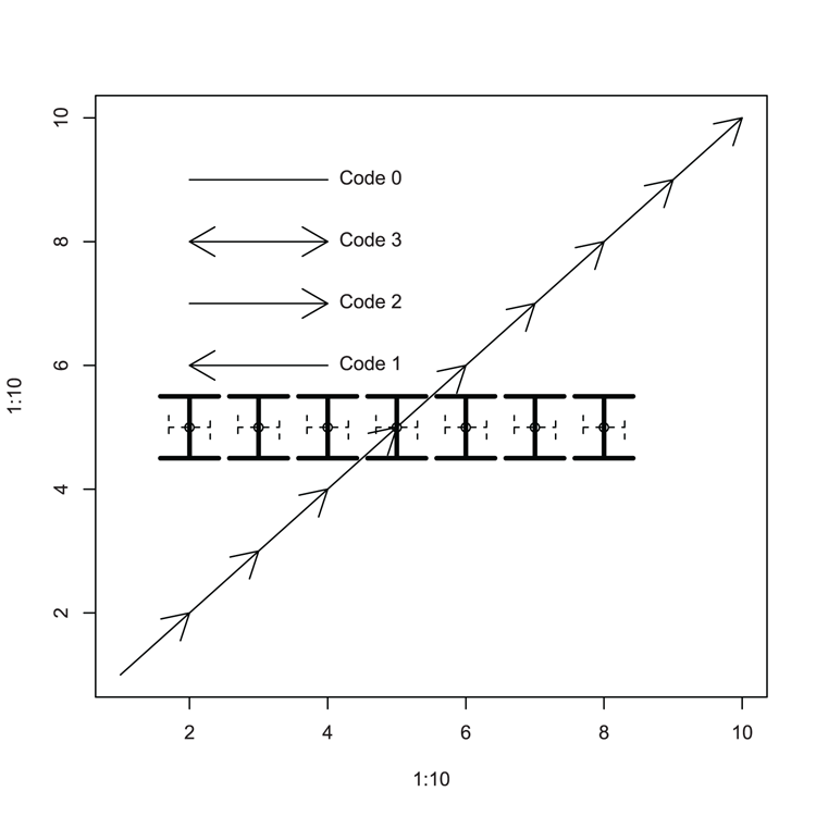
Command Name
arrowsThis command adds arrows to a plot by connecting pairs of coordinates.
Common Usage
arrows(x0, y0, x1 = x0, y1 = y0,
       length = 0.25, angle = 30, code = 2,
       col = par("fg"), lty = par("lty"), lwd = par("lwd"),
       ...)
Related Commands
Command Parameters
| x0, y0 | The coordinates for the starting point. |
| x1, y1 | The coordinates for the ending point. |
| length = 0.25 | The length of the arrow head, in inches. |
| angle = 30 | The angle of the arrow head to the shaft. |
| code = 2 | The style of arrow to draw. If code = 1, an arrow head is drawn at the starting end. If code = 2 (the default), an arrow head is drawn at the end. If code = 3, arrow heads are drawn at both ends. If code = 0, no heads are drawn. |
| col | The color for the arrow. |
| lty | The line type: 1= solid, 2 = dashed, 3 = dotted. |
| lwd | The line width. |
| ... | Additional graphical commands can be given. |
Examples
  ## Draw an empty plot (Figure 3-26)
> plot(1:10, 1:10, type = "n")

  ## Draw arrows to "join the dots", using defaults
> arrows(1:9, 1:9, 2:10, 2:10)

  ## Set some coordinates
> xc = 2:8
> yc = rep(5, 7)

  ## Use coordinates to add points
> points(xc, yc)

  ## Use arrows to add "error style" bars vertically
> arrows(xc, yc + 0.5, xc, yc - 0.5, code = 3, lwd = 3, angle = 90)

  ## Use arrows to add "error style" bars horizontally
> arrows(xc - 0.3, yc, xc + 0.3, yc, code = 3, length = 0.1,
  lty = 2, angle = 90)

  ## More arrows and annotation
> arrows(2,8, 4, 8, code = 3)
> arrows(2,7, 4, 7, code = 2)
> arrows(2,6, 4, 6, code = 1)
> arrows(2,9, 4, 9, code = 0)
> text(4, 9, "Code 0", pos = 4)
> text(4, 6, "Code 1", pos = 4)
> text(4, 7, "Code 2", pos = 4)
> text(4, 8, "Code 3", pos = 4)
Figure 3-26: Various arrows added to a plot
Command Name
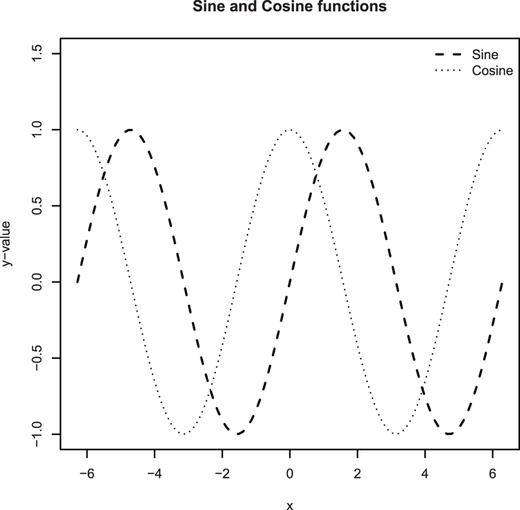
curve
plot
These commands draw curves representing mathematical functions. The plot command is very general and will plot those functions already built in to R. The curve command permits you to specify any function, which is then plotted.
Common Usage
curve(expr, from = NULL, to = NULL, n = 101, add = FALSE,
      type = "l", ylab = NULL, log = NULL, xlim = NULL, ...)

plot(x, y = 0, to = 1, from = y, xlim = NULL, ...)
Related Commands
Command Parameters
| expr | An expression of a function of x or the name of a function to plot. |
| x | A numeric R function. |
| from | The starting/lower value for x. |
| to | The ending/upper value for x. |
| n = 101 | The number of x values to evaluate. |
| add = FALSE | If add = TRUE, the curve plotted is added to an existing plot window. |
| type = "l" | The type of plot. The default, "l", plots lines. Other options include "p" for points and "b" for both lines and points. |
| ylab = NULL | A label for the y-axis. |
| y | An alias for from. This maintains compatibility with the plot command. |
| log = NULL | A character string stating which (if any) axes should be on a log scale. The options are "x", "y", and "xy". |
| xlim = NULL | The limits of the x-axis; two values must be given, the starting and ending values. |
| ... | Additional graphical parameters can be used. The most useful ones are likely to be:
|
Examples
  ## Plot a trig function (Figure 3-27)
  ## curve command would give same result
  ## Set x-axis to go from -2*pi to +2*pi and lengthen y-axis for legend
> plot(sin, from = -pi*2, to =  pi*2,
  lty = 2, lwd = 1.5, ylim = c(-1, 1.5), ylab = "y-value")

  ## Plot the cosine, use curve command and set add = TRUE to overlay
> curve(cos, from = -pi*2, to = pi*2, lty = 3, add = TRUE)

  ## Add a legend, be careful to styles from the plot
> legend("topright", legend = c("Sine", "Cosine"),
 lty = c(2, 3), lwd = c(1.5, 1), bty = "n")

  ## Give a main title
> title(main = "Sine and Cosine functions")
Figure 3-27: Plotting mathematical functions
Command Name
linesThis command adds connected line segments to an existing plot.
Command Name
loessThis command carries out local polynomial regression fitting. A common use for this is to produce a locally fitted model that can be added to a scatter plot as a trend line to help visualize the relationship.
Command Name
lowessThis command carries out scatter plot smoothing. The algorithm uses a locally weighted polynomial regression. A common use for this is to produce a locally fitted model that can be added to a scatter plot as a trend line to help visualize the relationship. The trend line is not a straight line, but weaves through the scatter of points; thus, lowess is often referred to as a scatter plot smoother.
Command Name
matlines
matpoints
These commands add data as lines or points to an existing plot (usually one created using matplot).
Command Name
qqlineThis command adds a line to a normal QQ plot, which passes through the first and third quartiles.
Common Usage
qqline(y, datax = FALSE, ...)Related Commands
Command Parameters
| y | The numerical sample from which the QQ plot was derived. |
| datax = FALSE | By default, the sample quantiles are plotted on the y-axis. If datax = TRUE, the theoretical quantiles are plotted on the y-axis and the sample quantiles are plotted on the x-axis. |
| ... | Additional graphical parameters may be used. The most useful ones are likely to be:
|
Examples
## make some data
> set.seed(22) # Set random number generator
## Random values from Gamma distribution
> dat = rgamma(50, shape = 3)
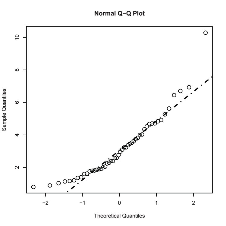
## Make a Normal QQ plot (Figure 3-28)
> qqnorm(dat, cex = 1.5)
## Add a line - not a good fit!
> qqline(dat, lty = "dotdash", lwd = 2)Figure 3-28: Adding a QQ-line to a normal QQ plot
Command Name
segmentsThis command adds line segments to a plot by connecting pairs of coordinates.
Common Usage
segments(x0, y0, x1 = x0, y1 = y0,
         col = par("fg"), lty = par("lty"), lwd = par("lwd"),
         ...)
Related Commands
Command Parameters
| x0, y0 | The coordinates for the starting point. |
| x1, y1 | The coordinates for the ending point. |
| col | The color for the lines. |
| lty | The line type: 1= solid, 2 = dashed, 3 = dotted. |
| lwd | The line width. |
| ... | Additional graphical commands can be given: |
Examples
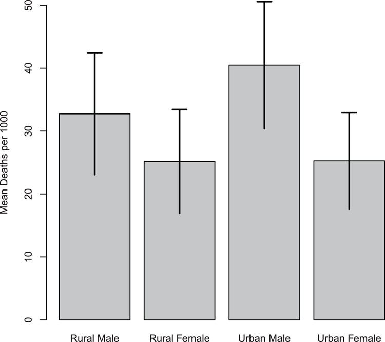
  ## Use VADeaths data from R datasets
> data(VADeaths) # make sure data is ready

  ## Calculate means for columns
> VADmean = colMeans(VADeaths)

  ## Calculate std. deviation
> VADsd = apply(VADeaths, MARGIN = 2, FUN = sd)

  ## Calculate std. error
> VADerr = VADsd / sqrt(5) # There are 5 rows

  ## Before plotting, set clipping to allow spill-over into margin
  ## as top-hat will reach top of plot area
> opt = par("xpd" = TRUE)

  ## Bar chart of means (Figure 3-29)
  ## Note setting of name for plot object
> bp = barplot(VADmean, ylim = c(0, 50), ylab = "Mean Deaths per 1000")

  ## Use segments to draw error bars (top to bottom)
> segments(bp, VADmean + VADerr, bp, VADmean - VADerr, lwd = 2)

  ## Add top hats (left to right)
> segments(bp - 0.1, VADmean + VADerr, bp + 0.1, VADmean + VADerr, lwd=2)

> par(opt) # Reset clipping back to previous setting
Figure 3-29: Using the segments command to add error bars
Command Name
splineThis command uses spline interpolation on a series of coordinate data. If you use this within a lines command, you can produce a smoothed curve.
Common Usage
spline(x, y = NULL, n = 3*length(x), method = "fmm",
      xmin = min(x), xmax = max(x), xout, ties = mean)
Related Commands
Command Parameters
| x, y = NULL | Vectors giving the coordinates of the points to be interpolated. Alternatively, x can be an object with a plotting structure, such as a list with x and y elements (in which case y can be missing). |
| n | If xout is unspecified, the interpolation takes place at n equally spaced points between xmin and xmax. |
| method = "fmm" | The method of interpolation. The default is "fmm"; other options are "natural", "periodic", and "monoH.FC". |
| xmin = min(x)xmax = max(x) | If xout is unspecified the interpolation takes place at n equally spaced points between xmin and xmax. |
| xout | A set of values explicitly stating where the interpolation should take place. |
| ties = mean | Determines how tied values are dealt with. The default is mean. Other functions can be used as long as they require a single value as an argument and return a single value. Alternatively, you can give the string "ordered". |
Examples
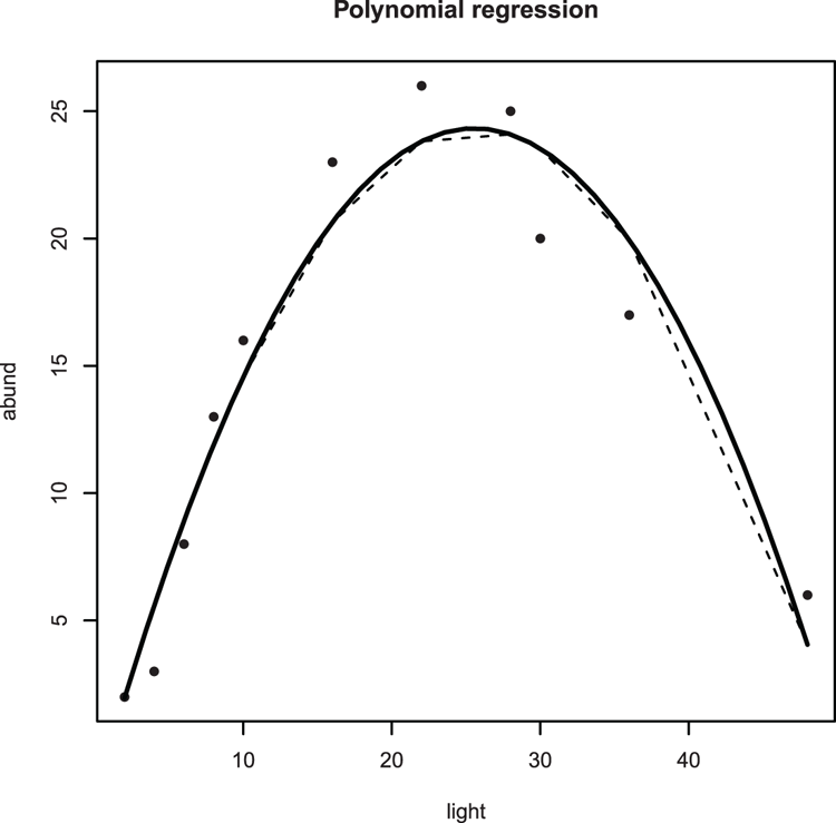
> names(bbel) # Check variable names
[1] "abund" "light"

  ## Plot scatter graph of relationship (Figure 3-30)
> plot(abund ~ light, data = bbel, pch = 16)

  ## Looks polynomial - add a title
> title(main = "Polynomial regression")

  ## Carry out polynomial regression
> bbel.lm = lm(abund ~ light + I(light^2), data = bbel)

  ## Add "best-fit" line (y-data from model fit)
> lines(bbel$light, fitted(bbel.lm), lty = 2)

  ## Regular lines look "clunky" so use spline to smooth curve
> lines(spline(bbel$light, fitted(bbel.lm)), lwd = 2)
Figure 3-30: Curved line (using spline) of best-fit for a polynomial regression
Adding Shapes
Various shapes can be added to plots. The commands that deal with these are rect, which adds rectangles, and polygon, which adds polygons. In addition, there is the box command, which adds a bounding box to a plot.
Command Name
boxThis command adds a box around the current plot in the given color and line style.
Common Usage
box(which = "plot", lty = "solid", ...)Related Commands
Command Parameters
| which = "plot" | Where the box is to be drawn. The default is "plot", which draws around the plot region (e.g., the extent of the axes and any bars/points). Other options are "inner", "outer", and "figure". Exactly where the box will appear depends on the margin settings. |
| lty = "solid" | The line type. The default is "solid". |
| ... | Additional graphical commands can be given. The most useful of these are:
|
Examples
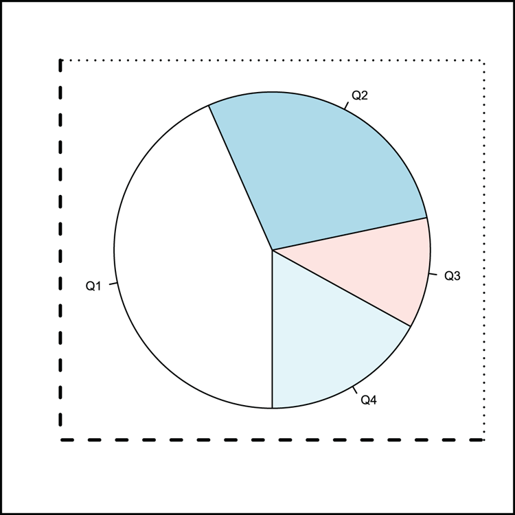
  ## Make some data
> dat = c(23, 15, 6, 9) # A vector
> names(dat) = c("Q1", "Q2", "Q3", "Q4") # Assign names

  ## Draw a pie chart (Figure 3-31)
> pie(dat, clockwise = TRUE, init.angle = 270, radius = 0.9)

  ## Add various boxes
> box(lty = 3, lwd = 1.5, bty = "7") # top and right of plot area
> box(lty = 2, lwd = 2.5, bty = "L") # bottom and left of plot area
> box(lwd = 3, which = "outer")      # around the outer margin
Figure 3-31: A pie chart with various plot boxes added using the box command
Command Name
polygonDraws shapes into the current plot window by connecting a series of coordinates.
Common Usage
polygon(x, y = NULL, density = NULL, angle = 45,
       border = NULL, col = NA, lty = par("lty"),
       ..., fillOddEven = FALSE)
Related Commands
Command Parameters
| x, y | Vectors containing the x and y coordinates to plot. If x contains a plotting structure (e.g., a list with x and y elements, or a two-column matrix or data frame), y can be missing. In any event the polygon is assumed to be closed and the last pair of coordinates are joined to the first. |
| density = NULL | The density of shading lines in lines per inch. The default is NULL, which suppresses lines. |
| angle = 45 | The angle of shading lines in degrees. This is measured as a counter-clockwise rotation. |
| border = NULL | The color to draw the border. The default uses the current par("fg") setting. Use border = NA to omit borders. |
| col = NA | The fill color for the polygon(s). If density is not NULL, the specified color is used for the density lines. |
| lty | The line type to use. |
| ... | Additional graphical parameters can be given, e.g., lwd. |
| fillOddEven = FALSE | Controls the way that self-intersecting polygons are colored/filled. |
Examples
  ## Make a plot without data to set a coordinate system (Figure 3-32)
> plot(0:10, 0:10, type = "n")

  ## Make data for shape coordinates and draw
  ## Use vector data
> tri1x = 0:2
> tri1y = c(0, 2, 0)

  ## Draw this shape
> polygon(tri1x, tri1y, lty = 2) # Dotted border

  ## Make more data, matrix
> tri2mat = matrix(c(4, 2, 6, 0, 4, 4), ncol = 2)

  ## Draw this shape with fill color and wide line
> polygon(tri2mat, col = "lightblue", lwd = 2)

  ## More data as a list
> xc = c(6, 8, 6, 10, 4, 5, 6, 9, 8, 10) # vector for x
> yc = c(0, 4, 6, 9, 10, 8, 9, 6, 4, 0) # vector for y
> polyl = list(x = xc, y = yc) # put data into a list

  ## Draw the shape using the list data
> polygon(polyl, col = "pink", border = NA) # Turn off border
> polygon(polyl$y, polyl$x, col = "gray90") # Switch co-ordinates
Figure 3-32: Using the polygon command to draw various shapes
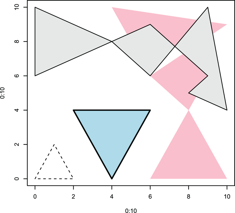
Command Name
rectThis command draws one or more rectangles into an existing plot window. Other plotting commands such as hist and barplot use the command.
Common Usage
rect(xleft, ybottom, xright, ytop, density = NULL, angle = 45,
    col = NA, border = NULL, lty = par("lty"), lwd = par("lwd"),
    ...)
Related Commands
Command Parameters
| xleftybottomxrightytop | The coordinates for the rectangle(s). A vector of left x positions. A vector of bottom y positions. A vector of right x positions. A vector of top y positions. You are essentially describing the coordinates for the bottom-left point and the top-right point of each rectangle you want to draw. |
| density = NULL | The density of shading lines in lines per inch. The default is NULL, which suppresses lines. |
| angle = 45 | The angle of shading lines in degrees. This is measured as a counter-clockwise rotation. |
| col = NA | The color to fill the rectangles with. The default NA, (also NULL) equates to no fill. |
| border = NULL | The color to draw the border. The default uses the current par("fg") setting. Use border = NA to omit borders. Use border = TRUE to set the color of the border to the same as the shading lines (if density is used). |
| lty | The line type. |
| lwd | The line width. |
| ... | Additional graphical parameters can be used. |
Examples
 ## Make some data
> dat = c(2, 3, 4, 4, 4, 5, 5, 5, 5, 5, 6, 6, 6, 6, 7)
> table(dat) # Look at the frequencies
dat
2 3 4 5 6 7
1 1 3 5 4 1

  ## Make your own histogram!
  ## Use hist to determine breakpoints on x-axis
> hist(dat, plot = FALSE)$breaks # computes breakpoints
[1] 2 3 4 5 6 7
> breaks = hist(dat, plot = FALSE)$breaks # make a variable for result

> hist(dat, plot = FALSE)$counts # computes frequencies
[1] 2 3 5 4 1
> counts = hist(dat, plot = FALSE)$counts # make a variable for result

  ## Make a blank plot as a coordinate system (basis for Figure 3-33)
  ## Leave out everything!
> plot(2:7, 0:5, type = "n", axes = FALSE, xlab = NA, ylab = NA)

  ## Add basic axes (adding to Figure 3-33)
> axis(2)          # the y-axis
> axis(1, pos = 0) # the x-axis, shift this up a bit
  ## Create a histogram using rectangles, one for each bar
> for (i in 1:length(counts)) {
  rect(breaks[i], 0, breaks[i+1], counts[i], col = "gray90") }

  ## Add titles (finishing Figure 3-33)
> title(xlab = "Breakpoints", ylab = "Counts")
Figure 3-33: A histogram created using rect command
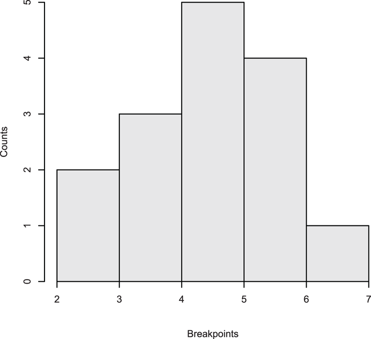
Adding Text
You can add text to graphs in several ways. You can create titles for plots and axes and you can place text in the plot area or in the margins. R also provides a means to create complicated expressions, for example, containing superscript, subscript, and mathematical symbols.
Command Name
expression
is.expression
as.expression
The expression command allows you to create text strings containing superscript and subscript elements. It also allows the use of math and other symbols. This allows you to create text labels for use as titles and text in graphics windows. An expression object holds a class attribute "expression"; the is.expression and as.expression commands allow you to test for and set this attribute.
Common Usage
expression(...)
is.expression(x)
as.expression(x)
Related Commands
Command Parameters
| ... | R objects, text, or symbols to create the expression. |
| x | An R object to test or coerce to an expression. |
The following are some of the expressions you can create; use help(plotmath) in R for a comprehensive list. You can also type demo(plotmath) for more details.
Text Elements
| ~ | A space. |
| * | A connector. |
| ^ | Superscript. Text following the caret is superscripted. |
| [] | Subscript. Text within the brackets is subscripted. |
| Newline character. |
Font Face
| plain() | The text in parentheses is plain text. |
| italic() | The text in parentheses is italic text. |
| bold() | The text in parentheses is bold text. |
| bolditalic() | The text in parentheses is bold and italic text. |
| underline() | The text in parentheses is underlined. |
Math Expressions
| x + y | Produces x + y. |
| x – y | Produces x – y. |
| x == y | Produces x = y. |
| x != y | Produces x y. |
| x %~~% y | Produces x ≈ y. |
| x %+-% y | Produces x ± y. |
| x %/% y | Produces x ÷ y. |
| bar(x) | Produces x with an overbar. |
| frac(x, y) | Produces a fraction with x over y. |
| x %up% y | Produces an up arrow, x ↑ y. |
| x %down%y | Produces a down arrow, x ↓ y. |
| x %->% y | Produces a right arrow, x → y. |
| x %<-% y | Produces a left arrow, x ← y. |
| sum(x, a, b) | Produces a sum (capital sigma) symbol, ∑, with optional sub and superscripts. |
| sqrt(x)sqrt(x, y) | Produces a square root symbol, √x, with optional root, y√x. |
| infinity | An infinity symbol, ∞. |
| alpha – omega | Greek letters in lowercase. |
| Alpha – Omega | Greek letters in uppercase. |
| 180*degree | Produces a degree symbol, 180˚. |
| x ~ y | A space, x y. |
Examples
  ## Make a blank plot to set a coordinate system (base for Figure 3-34)
> plot(1:10, 1:10, type = 'n')

  ## Set character expansion to a new level
> opt = par(cex = 1.5)

  ## Make some math expressions and draw them on the plot
> text(1, 1, expression(hat(x)))
> text(2, 1, expression(bar(x)))
> text(2, 2, expression(alpha==x))
> text(3, 3, expression(beta==y))
> text(4, 4, expression(frac(x, y)))
> text(5, 5, expression(sum(x)))
> text(6, 6, expression(sum(x^2)))
> text(7, 7, expression(bar(x) == sum(frac(x[i], n), i==1, n)))
> text(8, 8, expression(sqrt(x)))
> text(9, 9, expression(sqrt(x, 3)))

  ## Reset the character expansion to original
> par(opt)

  ## Make some text expressions and draw on the plot
> text(3, 7, expression(Speed ~ ms^-1), cex = 2)
> text(7, 2, expression(Count[per ~ mm]), cex = 2)
> text(4, 9, expression(Mixed^super*" and"[sub]*" script"), cex = 2)
Figure 3-34: Creating math and text using the expression command
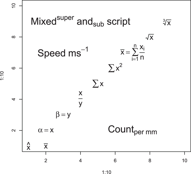
Command Name
legendThis command adds a legend to an existing plot window.
Command Name
mtextThis command adds text to the marginal area of a plot, that is, outside the coordinate system.
Common Usage
mtext(text, side = 3, line = 0, outer = FALSE, at = NA,
      adj = NA, padj = NA, cex = NA, col = NA, font = NA, ...)
Related Commands
Command Parameters
| text | The text to write. This can be a character string or an expression. |
| side = 3 | The side of the plot to use. The sides are 1 = bottom, 2 = left, 3 = top, 4 = right. The default is the top. |
| line = 0 | The line of the margin to use. The default is 0, which is adjacent to the outside of the plot area. Positive values move outward and negative values inward. |
| outer = FALSE | If outer = TRUE, the outer margin is used if available. |
| at = NA | How far along the side to place the text in relation to the axis scale. Text is centered on this point. |
| adj = NA | How far along the side to place the text as a proportion. The default is effectively 0.5, which places the text halfway along. If text is oriented parallel to the axis, adj = 0 will result in left or bottom placement. Text is centered. |
| padj = NA | Adjusts the text perpendicular to the reading direction. This permits “tweaking” of the placement. Positive values place text lower; negative values higher. |
| cex = NA | The character expansion. Values > 1 make text larger; values < 1 make text smaller. |
| col = NA | The color for the text. The default, NA, means use the current setting par("col"). |
| font = NA | The font to use. The default, NA, means use the current setting par("font"). Use font = 1 for regular text; 2 = bold, 3 = italic, 4 = bold+italic. |
| ... | Additional graphics parameters can be used. Of particular interest is las, which controls the text direction:
|
Examples
  ## Make a basic plot
> plot(1:10, 1:10)

  ## Add marginal text, see Figure 3-35 for results
> mtext('mtext(side = 1, line = -1, adj = 1)',
  side = 1, line = -1, adj = 1)

> mtext('mtext(side = 1, line = -1, adj = 0)',
  side = 1, line = -1, adj = 0)

> mtext('mtext(side = 2, line = -1, font = 3)',
  side = 2, line = -1, font = 3)

> mtext('mtext(side = 3, font = 2)', side = 3, font = 2)

> mtext('mtext(side = 3, line = 1, font = 2)',
  line = 1, side = 3, font = 2)

> mtext('mtext(side = 3, line = 2, font = 2, cex = 1.2)',
  cex = 1.2, line = 2, side = 3, font = 2)

> mtext('mtext(side = 3, line = -2, font = 4, cex = 0.8)',
  cex = 0.8, font = 4, line = -2)

> mtext('mtext(side = 4, line = 0)', side = 4, line = 0)
Figure 3-35: Marginal text placed using the mtext command
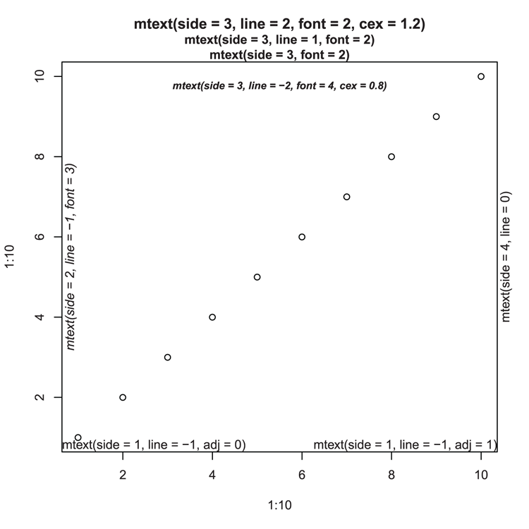
Command Name
textThis command adds text to a plot. It is a very general command and you can alter the text in many ways. Text can also be described as an expression.
Common Usage
text(x, y = NULL, labels = seq_along(x), adj = NULL,
    pos = NULL, offset = 0.5,
    cex = 1, col = NULL, font = NULL, ...)
Related Commands
Command Parameters
| x, y | The coordinates for positioning of the text. The coordinates can be separate x and y vectors, or y can be missing if x has a plotting structure (a list with x and y elements or a two-column matrix or data frame). You can also use locator(1) to place text with a click of the mouse. |
| labels | The text labels to place on the plot at the specified coordinates. Can be a character string or an expression. The default attempts to create a numeric index and plots values accordingly; this is not always successful, so it is best to specify labels explicitly! |
| adj = NULL | An adjustment to the placement coordinates (text is centered on the coordinates). You can specify one or two values (x, y). The default is effectively adj = c(0.5, 0.5), which makes no adjustment. A value of 1 adjusts left (or down). A value of 0 adjusts right (or up). Values > 1 or < 0 are also permitted. |
| pos = NULL | The positioning of the text relative to the coordinates. This overrides any adj parameter. The default, NULL, results in text centered on the point. Other options are:
|
| offset = 0.5 | When pos is specified, the offset parameter offsets the position of the text by a fraction of the character width. A value of 1 offsets away from the original coordinate, a value of 0 offsets toward the original coordinate. Values > 1 or < 0 are also permitted. |
| cex = 1 | A character expansion factor. Larger values increase size; smaller values decrease size. |
| col = NULL | The color to use for the labels. |
| font = NULL | The font to use. The default, NA, means use the current setting par("font"). Use font = 1 for regular text; 2 = bold, 3 = italic, 4 = bold+italic. |
| ... | Additional graphical parameters may be used. Of particular interest is srt, which sets the rotation of text in degrees. The rotation is counter-clockwise. |
Examples
  ## Make a basic plot with points
> plot(1:10, 1:10, pch = 3, cex = 1.5)

  ## Add text using various methods of alignment (see Figure 3-36)
> text(4, 4, 'Centered on point')

> text(3, 3, 'Under point (pos = 1)', pos = 1)

> text(5, 5, 'Left of point (pos = 2)', pos = 2)

> text(6, 6, 'Above point (pos = 3)', pos = 3)

> text(7, 7, 'Right of point (pos = 4)', pos = 4)

> text(8, 8, "Upside down! (pos = 4, offset = -0.5)",
  srt = 180, pos = 4, offset = -0.5)

> text(1,1, "Sideways (adj = c(-0.05, 0.5), pos = 4)",
  srt = 90, adj = c(-0.05,0.5))
Figure 3-36: Text positioning in the plot window
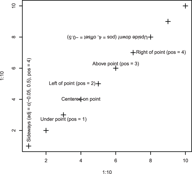
Command Name
titleThis command places titles on plots. It can add labels to the axes as well as an overall title and subtitle. The titles must be characters, but you can specify an expression, allowing subscripts, symbols, and so on. Most of the commands that produce graphs will accept the same parameters, but it is sometimes useful to specify titles separately.
Common Usage
title(main = NULL, sub = NULL, xlab = NULL, ylab = NULL,
      line = NA, outer = FALSE, ...)
Related Commands
Command Parameters
| main = NULL | The main title at the top of the plot window. |
| sub = NULL | A subtitle. |
| xlab = NULL | A title for the x-axis. |
| ylab = NULL | A title for the y-axis. |
| line = NULL | Allows for offsetting of titles (in marginal lines). A value of 0 places the title just outside the axis. Larger values move the title outward, and smaller values move the title inward. |
| outer = FALSE | If outer = TRUE, the title is added to the outer margin. |
| ... | Additional graphical parameters can be used. To differentiate between titles, add .main, .sub, or .lab to the parameter required. For example:
|
Examples
  ## Set wider margins for plots (save original settings in opt)
> opt = par("mar" = c(7, 5, 5, 3))

  ## Make a simple plot (Figure 3-37). Alter most of the settings!
  ## Include x-axis and y-axis titles here
> plot(1, col.axis = "darkgreen", cex.axis = 1.5, font.axis = 3,
 col.lab = "brown", cex.lab = 2, font.lab = 3,
 xlab = "X-axis", ylab = "Y-axis")

  ## Add main and sub-titles. Alter most of the settings!
> title(main = "Main title", font.main = 4, col.main = "blue",
 cex.main = 2, sub = "Sub-title", font.sub = 1,
 col.sub = "red", cex.sub = "0.75")

  ## Reset margin settings to previous
> par(opt)
Figure 3-37: Customizing titles
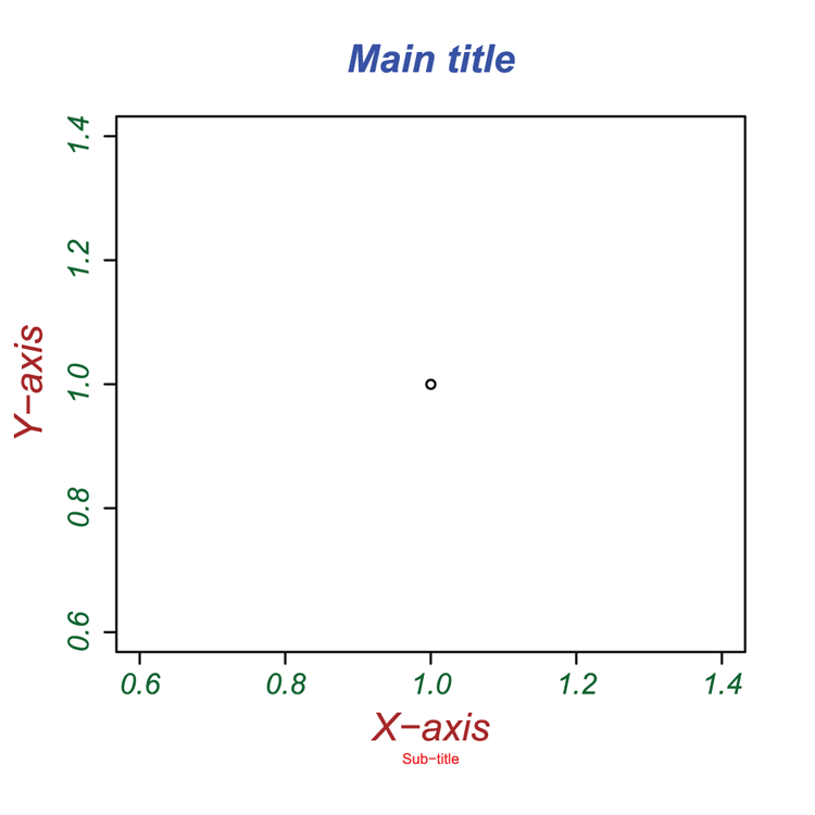
Adding Legends
Some plot types have a legend parameter (for example, barplot), which allows the placement of a legend. The legend command enables a legend to be created and placed on any plot. The placement of the legend can be achieved in three ways: by coordinate, by keyword, or interactively. See the following command parameters for details.
Command Name
legendCreates and adds a legend to an existing plot. You have many options and the parameter list is long!
Common Usage
legend(x, y = NULL, legend, fill = NULL, col = par("col"),
      border="black", lty, lwd, pch,
      angle = 45, density = NULL, bty = "o", bg = par("bg"),
      box.lwd = par("lwd"), box.lty = par("lty"), box.col = par("fg"),
      pt.bg = NA, cex = 1, pt.cex = cex, pt.lwd = lwd,
      xjust = 0, yjust = 1, x.intersp = 1, y.intersp = 1,
      adj = c(0, 0.5), text.width = NULL, text.col = par("col"),
      merge = do.lines && has.pch,
      ncol = 1, horiz = FALSE, title = NULL,
      inset = 0, title.col = text.col, title.adj = 0.5, seg.len = 2)
Related Commands
Command Parameters
| x, y = NULL | The coordinates where the legend should be placed. You can specify x and y coordinates explicitly or using a text string. The options are "bottomright", "bottom", "bottomleft", "left", "topleft", "top", "topright", "right", and "center". Abbreviations can be used. You can also place the legend interactively using locator(1) instead of x. The top-left corner of the legend will be placed where you click with the mouse. |
| legend | The text of the legend. Usually this will be a character or expression vector. |
| fill = NULL | The fill colors for boxes to appear beside the legend text. If density is given, fill gives the colors for the shading lines. The default, NULL, omits boxes. |
| col = par("col") | The colors to use for the lines and/or points that appear in the legend. The default uses the current setting in par("col"). |
| border = "black" | The color for the boxes of the legend. Only used if fill is not NULL. |
| lty | The line types used in the legend. Usually these will match those used in the plot. |
| lwd | The line widths used in the legend. Usually these will match those used in the plot. |
| pch | The plotting symbols used in the legend. Usually these will match those used in the plot. |
| density = NULL | The density of shading lines in lines per inch. The default is NULL, which suppresses lines. |
| angle = 45 | The angle of shading lines in degrees. This is measured as a counter-clockwise rotation. |
| bty = "o" | The type of box to place around the legend. The default, "o", produces a box. Use bty = "n" to omit the box. |
| bg = par("bg") | The background color to use for the legend box; only used if bty = "o". The default uses the current setting from par("bg"). |
| box.ltybox.lwdbox.col | Settings specific to the box around the legend (assuming bty = "o"); they set line type, line width, and color. |
| pt.bg | The background color for the points that appear in the legend (for open type symbols, pch = 21:25). This will usually match those from the original plot. |
| cex | The character expansion factor. This operates relative to the current setting in par("cex"). Specifying a value also sets the expansion for pt.cex and title.cex (which can also be set independently). |
| pt.cexpt.lwd | Settings for the points that appear in the legend. Sets their expansion factor and line width. |
| xjust = 0yjust = 1 | Adjust the justification of the legend relative to the placement coordinates: 0 = left (or bottom), 0.5 = centered, 1 = right (or top). |
| x.intersp = 1y.intersp = 1 | Sets the character interspaces for the horizontal or vertical line distances. Larger values allow you to “spread out” the legend over a greater area. |
| adj = c(0, 0.5) | Adjusts the text in the legend box. You can specify one or two values corresponding to the x- and y-axis directions. Increasing the defaults results in text being adjusted to the left (or down). Decreasing the defaults results in text being adjusted right (or up). |
| text.width = NULL | Sets the text width (and so the extent of the legend box), which is usually computed automatically. The value is not in characters; you can determine the value for your text using strwidth(text), where text is your character string or expression. |
| text.col = par("col") | The color of the text in the legend. The default uses the current setting from par("col"); usually this is "black". |
| merge = TRUE | If merge = FALSE, the points appear at the end of the lines in the legend, rather than in the middle. |
| ncol = 1 | The number of columns for the legend. The default is 1. |
| horiz = FALSE | If TRUE, the legend is set out horizontally instead of vertically. This has the same effect as increasing the number of columns, but note that you cannot have horiz = TRUE and ncol > 1. |
| title = NULL | A title for the legend, usually as a character string or expression. |
| inset = 0 | If the legend is placed using a keyword (rather than x, y coordinates), inset specifies the distance to the margin(s). The value is a fraction of the plot region. |
| title.col | The color to use for the title. |
| title.adj = 0.5 | Sets the horizontal adjustment for the title (as a proportion of the legend width). The default, 0.5, centers the title. Smaller values shift the title to the right. Larger values shift the title to the left. |
| seg.len = 2 | The length of the lines drawn in the legend. Larger values mean longer lines (the units are character widths). |
Examples
  ## Make an empty plot to create a coordinate system
> plot(0:10, 0:10, type = "n")

  ## Add some points/lines (see Figure 3-38 for final result)
> points(3:5, 4:6, type = "b", lwd=2, lty = 1, pch = 21, col = "black")
> points(2:4, 2:4, type = "b", lwd=2, lty = 2, pch = 24, col = "blue")
> points(5:7, 5:7, type = "b", lwd=2, lty = 3, pch = 25, col = "red")

  ## Make a list of names as labels for each set of lines/points
> mydata = c("Line1", "Line2", "Line3")

  ## Add a legend, take care to match up line/point parameters
> legend("topright", legend = mydata, lty = c(1, 2, 3), lwd = 2,
 col = c("black", "red", "blue"), pch = c(21, 24, 25))

  ## It is often easier to make named objects for colors
  ## and plot characters
> plcols = c("black", "red", "blue")
> plchr = c(21, 24, 25)

  ## Add more legends: note the various options
> legend("bottomleft", legend = mydata, lty = 1:3, col = plcols,
 pch = plchr, bty = "n", title = "Sample
Legend Title")

> legend("top", legend = mydata, lty = 1:3, col = plcols,
 pch = plchr, horiz = TRUE, inset = 0.01)

> legend(8.5, 1.5, legend = mydata, lty = 1:3, col = plcols,
 pch = plchr, bg = "gray90")

> legend("right", legend = mydata, lty = 1:3, col = plcols,
 pch = plchr, ncol = 2, inset = 0.01, title = "Two-column Layout")

  ## This time go for simple colored boxes
> legend(0, 8, legend = mydata, fill = plcols)
Figure 3-38: A variety of legends
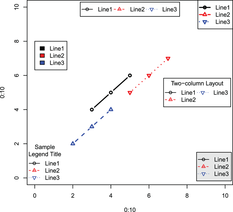
  ## Add a legend using the mouse to set the location
  ## This adds to the previous example
  ## Top left of legend appears where you click with the mouse
> legend(locator(1), legend = mydata, lty = 1:3, col = plcols)
Graphical Parameters
R provides a mechanism to view current graphical settings and alter them via the par command. The parameters are common to most of the commands that produce graphics. Most settings can be altered (temporarily) by the plotting commands, but a few can only be set via the par command.
In addition to the par command, a few other commands have relevance to graphical parameters; for example, the commands that deal with partitioning the plot window and the palette command for creating colors.
What’s In This Topic:
- Setting color palettes
- Color parameters
- Text parameters
- Plotting characters/symbols
- Splitting the window into parts
- Controlling split windows
Using the par Command
The par command is the management tool for most of the graphical parameters used in R.
Command Name
parThis command queries or sets the graphical parameters. Some of the parameters are read-only and cannot be set by the user. Many of the remaining parameters can be altered by the separate commands that draw plots, at least for the duration of the plotting. Some parameters can only be set via the par command.
To make it easy to return to previous settings, you can save the current parameters to a named object (a list) as the new settings are applied. See the following examples.
- “Altering Color”
- “Altering Axis Parameters”
- “Altering Text Parameters”
- “Altering Line (and Box) Parameters”
- “Altering Plot Margins”
- “Altering the Graph Window”
Common Usage
par(..., no.readonly = FALSE)Related Commands
Command Parameters
| ... | A list of parameters to be queried or set. Generally, the form is tag = value, where tag is a character string corresponding to the required parameter. If no tag is given, the values of all are reported. |
| no.readonly = FALSE | If TRUE, only the parameters that can be set by the user are shown. |
Examples
  ## List all parameters that you can change (result not shown here)
> par(no.readonly = TRUE)

  ## List some parameters
  ## Character expansion, color, background, plot margin size
> par(list("cex", "col", "bg", "mar"))

$cex
[1] 1

$col
[1] "black"

$bg
[1] "white"

$mar
[1] 5.1 4.1 4.1 2.1

  ## Alter the margin sizes
  ## Note that you make an object; the current setting is saved there
> opt = par("mar" = c(7, 4, 4, 2))

  ## Check the new setting
> par("mar")
[1] 7 4 4 2

  ## See how previous setting was saved
> opt
$mar
[1] 5.1 4.1 4.1 2.1

  ## Restore setting and check it
> par(opt)
> par("mar")
[1] 5.1 4.1 4.1 2.1
Altering Color
Color can be managed in several ways. Various commands deal with color palettes and creation of colors (for example, the RGB specification). Other color parameters are set via the par command.
Command Name
colors
colours
These commands display the built-in color names. The color names can be used wherever a color is required. Colors are often referred to by a simple integer value. This refers to the position of the color in the current palette.
Common Usage
colors()
colours()
Related Commands
Command Parameters
| () | No parameters are required. |
Examples
  ## Get colors and save result as an object
> cl = colors()

  ## How many colors are available?
> length(cl)
[1] 657

  ## Display the first 20 color names
  ## Color numbers do not correspond to their position in this list
  ## but to their position in the current palette
> cl[1:20]
[1] "white" "aliceblue" "antiquewhite" "antiquewhite1"
[5] "antiquewhite2" "antiquewhite3" "antiquewhite4" "aquamarine"
[9] "aquamarine1" "aquamarine2" "aquamarine3" "aquamarine4"
[13] "azure" "azure1" "azure2" "azure3"
[17] "azure4" "beige" "bisque" "bisque1"Command Name
col2rgb
hcl
hsv
rgb
rgb2hsv
These commands deal with the creation of colors and the translation of specification:
- col2rgb converts a named color to its RGB specification.
- hcl creates a color from hue, chroma, and luminance.
- hsv creates a color from hue, saturation, and value.
- rbg creates a color from red, green, and blue settings.
- rgb2hsv converts RGB values into HSV equivalents.
Common Usage
col2rgb(col, alpha = FALSE)

hcl(h = 0, c = 35, l = 85, alpha, fixup = TRUE)

hsv(h = 1, s = 1, v = 1, gamma = 1, alpha)

rgb(red, green, blue, alpha, names = NULL, maxColorValue = 1)

rgb2hsv(r, g = NULL, b = NULL, gamma = 1, maxColorValue = 255)
Related Commands
Command Parameters
| col | A named color. This can be a character string giving the name or a hexadecimal string "#rrggbb". You can also give a single integer value, which will return the appropriate value from the current palette. |
| alpha | The transparency value. Values are:
|
| h | A value for “hue.” Values are:
|
| c | A value for “chroma.” The upper limit for this depends on h, “hue” and l, “luminance.” |
| l | A value for “luminance,” generally between 0 and 100, but for any combination of h and c only a subset is possible. |
| fixup = TRUE | If this is TRUE, the resulting color is adjusted so that it is a real color. If fixup = FALSE, an “unreal” color will result in NA. |
| s, v | Numeric levels for “saturation” and “value.” These should be between 0 and 1. |
| gamma | A gamma correction component. |
| r, g, b | Integer values for red, green, and blue components of the color. The range of values should be 0 to maxColorValue. |
| names = NULL | A character vector giving names for the resulting color(s). |
| maxColorValue | Sets the maximum value for r, g, and b. Values 1 or 255 are most useful. |
Examples
  ## View current palette colors
> palette()
[1] "black" "red" "green3" "blue" "cyan" "magenta" "yellow" "gray"
  ## View current palette colors as RGB
> col2rgb(1:8)
      [,1] [,2] [,3] [,4] [,5] [,6] [,7] [,8]
red      0  255    0    0    0  255  255  190
green    0    0  205    0  255    0  255  190
blue     0    0    0  255  255  255    0  190
Command Name
palette
rainbow
heat.colors
terrain.colors
topo.colors
cm.colors
gray
grey
These commands create and manage color “sets.” The palette command manages the “set” of colors (the palette); you can see the current palette or create a customized range of colors as a palette.
The other commands create custom “sets” of colors that can be assigned to the palette (the commands gray and grey are the same). In plotting commands the parameter col = palette() will use the current color “set.” Specifying a color simply by an integer value takes the color from its position in the current palette. Using palette("default") returns to base settings and restores the default “set.”
Common Usage
palette(value)
rainbow(n, s = 1, v = 1, start = 0, end = max(1,n - 1)/n, gamma = 1, alpha = 1)
heat.colors(n, alpha = 1)
terrain.colors(n, alpha = 1)
topo.colors(n, alpha = 1)
cm.colors(n, alpha = 1)
gray(level)
grey(level)
Related Commands
Command Parameters
| value | The palette to set; you have several options:
|
| n | The number of colors to be in the palette. |
| s, v | The “saturation” and “value” to be used in the HSV color descriptions. |
| start = 0 | The starting value for “hue” in the rainbow (between 0 and 1). |
| end | The ending value for “hue” in the rainbow (between 0 and 1). |
| gamma | The gamma correction. |
| alpha | The transparency, between 0 and 1 (1 is opaque). |
| level | A vector of gray levels, between 0 and 1 (0 is black, 1 is white). |
Examples
  ## Set plot window into 6 (2 rows, 3 columns)
> opt = par(mfrow = c(2, 3))

  ## Produce color wheels as pie charts (final result in Figure 3-39)
> pie(rep(1,12), col = rainbow(12), radius = 0.95,
 main = "Rainbow Colors")
> box(which = "figure") # a box around the sub-window

> pie(rep(1,12), col = heat.colors(12), radius = 0.95,
 main = "Heat colors")
> box(which = "figure")

> pie(rep(1,12), col = terrain.colors(12), radius = 0.95,
 main = "Terrain Colors")
> box(which = "figure")

> pie(rep(1,12), col = topo.colors(12), radius = 0.95,
 main = "Topo Colors")
> box(which = "figure")

> pie(rep(1,12), col = cm.colors(12), radius = 0.95, main = "CM Colors")
> box(which = "figure")

> pie(rep(1,12), col = gray(seq(0, 1, len = 12)), radius = 0.95,
 main = "Gray Colors")
> box(which = "figure")

  ## Reset the plot window to previous setting
> par(opt)
Figure 3-39: Color wheels for standard palettes
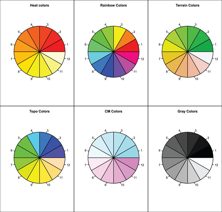
  ## Set new palette (6 rainbow colors)
> palette(rainbow(6))
> palette()
[1] "red"     "yellow"  "green"   "cyan"    "blue"    "magenta"

  ## Set palette to 6 topo colors
> palette(topo.colors(6))
> palette()
[1] "#4C00FF" "#00E5FF" "#00FF4D" "#E6FF00" "yellow"  "#FFE0B3"

  ## View palette colors as RGB
> col2rgb(1:length(palette()))
      [,1] [,2] [,3] [,4] [,5] [,6]
red     76    0    0  230  255  255
green    0  229  255  255  255  224
blue   255  255   77    0    0  179

  ## Reset palette to default
> palette("default")
> palette()
[1] "black" "red" "green3" "blue" "cyan" "magenta" "yellow" "gray"Command Name
parThis command queries or sets the various graphical parameters.
Common Usage
par(tag = value)

par(list(tag1 = value, tag2 = value, ...))
Related Commands
Command Parameters
| bg | Sets the background color for the plot. If set via par("bg"), "new" is also set to FALSE (see “Altering the Graph Window”). Note that some graphical commands have a bg parameter, which is different than the par setting. |
| col | The overall default plotting color, usually "black". Several variants control colors on plot elements:
|
| fg | The foreground color for plots. Controls axis color, for example. When set via par("fg"), the "col" parameter is also set to the same color. If you want different values, set "fg" first, then "col" (which you will have to do with a separate par command). |
Examples
  ## Check current setting of some parameters
> par(list("bg", "col", "fg"))
$bg
[1] "white"

$col
[1] "black"

$fg
[1] "black"

  ## You can make a list of parameters and set them anytime
  ## Use the list for custom settings or as a "default" for restore
> parcols = list(col = "black", fg = "black", bg = "white",
 col.main = "black", col.sub = "black",
 col.lab = "black", col.axis = "black")

## If you assign a name to the par command you can restore later
> opt = par(list(bg = "gray95", fg = "blue", col.main = "red",
 col.sub = "brown"))

  ## The list you made contains the settings that were current
  ## when you made it
> opt
$bg
[1] "white"

$fg
[1] "black"

$col.main
[1] "black"

$col.sub
[1] "black"

  ## Use your list to restore previous settings
> par(opt)

  ## Or you can use the earlier list
> par(parcols)
Altering Axis Parameters
Most axis parameters can be set directly as part of a plotting command, but some can only be altered via the par command. Several separate commands also exist relating to axes.
Command Name
axisThis command adds an axis to a current plot. It allows you to specify a completely customized axis.
Common Usage
axis(side, at = NULL, labels = TRUE, tick = TRUE, line = NA,
    pos = NA, outer = FALSE, font = NA, lty = "solid",
    lwd = 1, lwd.ticks = lwd, col = NULL, col.ticks = NULL,
    hadj = NA, padj = NA, ...)
Related Commands
Command Parameters
| side | An integer value giving the side for the axis: 1 = bottom, 2 = left, 3= top, 4 = right. |
| at = NULL | The points along the axis where the tick marks are to be placed. If NULL, the default, the tick marks are calculated automatically. Otherwise, you must specify values explicitly. |
| labels = TRUE | The labels to use for the tick marks. If TRUE, numerical labels are used. You can specify labels as a character string or an expression. |
| tick = TRUE | If FALSE, the axis line and tick marks are not drawn in. |
| line = NA | The margin line where the axis will be drawn. Effectively, the default = 0. Positive values move the axis outward, negative values inward. |
| pos = NA | The coordinate where the axis line is to be drawn. This will be a y-value for sides 1 and 3 and an x-value for sides 2 and 4. |
| outer = FALSE | If TRUE, the axis is drawn in the outer margin of the plot. |
| font = NA | The font for the text. The default is effectively par("font"). |
| lty = "solid" | The line type to use. The default is "solid". See “Altering Line (and Box) Parameters.” |
| lwd = 1lwd.ticks = lwd | The line width for the axis and tick marks. The tick marks default to the same as the lwd setting. |
| col = NULLcol.ticks = NULL | The colors for the axis line and tick marks. If col = NULL, the setting in par("fg") is used. If col.ticks = NULL, the setting is whatever col is set to. |
| hadj = NA | An adjustment value for all labels parallel to the reading direction. The default is effectively 0.5. Smaller values place labels to the right, larger values to the left. |
| padj = NA | An adjustment value for all labels perpendicular to the reading direction. The default is effectively 0. Positive values place labels lower, negative values higher. |
| ... | Additional graphical parameters can be used. For example: cex.axis, col.axis and font.axis |
Examples
  ## Make some data
> rain = c(34, 32, 23, 15, 10, 8, 6, 9, 12, 21, 24, 29) # Vector
> names(rain) = month.abb[1:12] # Make labels
> rain # View the data
Jan Feb Mar Apr May Jun Jul Aug Sep Oct Nov Dec
 34  32  23  15  10   8   6   9  12  21  24  29

  ## Because x-data are categorical a regular plot will show index
  ##  rather than categories we want, so
  ##  draw plot without axes (forms basis for Figure 3-40)
  ## Note that axis labels omitted using NA
> plot(rain, type = "b", lty = "dashed", lwd = 2.5, axes = FALSE,
 main = "Rainfall", xlab = NA, ylab = NA)

  ## Axis 2 (y-axis) is numeric so default is fine but
  ## use las to rotate annotation
> axis(side = 2, las = 1)

  ## New x-axis, at = axis ticks, specify number required
  ## Also give labels
> axis(side = 1, at = 1:length(rain), labels = names(rain))

  ## Add axis labels (final result is Figure 3-40)
> title(xlab = "Month", ylab = "Rainfall in mm")
Figure 3-40: Specifying a custom axis
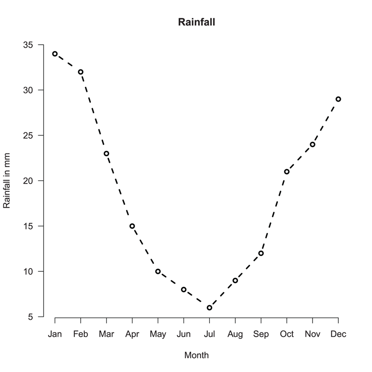
Command Name
axTicksThis command computes sensible (pretty) locations for tick marks. The locations are the same as calculated using the axis or pretty commands, but axTicks is able to deal with log coordinates.
Common Usage
axTicks(side, axp = NULL, usr = NULL, log = NULL)Related Commands
Command Parameters
| side | An integer value giving the side for the axis: 1 = bottom, 2 = left, 3= top, 4 = right. |
| axp = NULL | A numeric vector with three values. You supply the start, end, and number of ticks required. The default values are taken from par("xaxp") or par("yaxp") according to the value of side. |
| usr = NULL | A numeric vector with four values. You supply the limits of the coordinate system for x and y directions. The default takes values as in par("usr"). |
| log = NULL | A logical value indicating is log coordinates are active. The defaults take values from par("xlog") or par("ylog”). |
Examples
  ## Set x-axis to a log scale
> par(xlog = TRUE)

  ## Determine tick marks locations using 3 algorithms
> axTicks(side = 1, axp = c(1,1000, 2))
[1]    1    5   10   50  100  500 1000

> axTicks(side = 1, axp = c(1,1000, 1))
[1]    1   10  100 1000

> axTicks(side = 1, axp = c(1,1000, 3))
 [1]    1    2    5   10   20   50  100  200  500 1000

  ## Set x-axis back to regular scale
> par(xlog = FALSE)

  ## Make a plot with one axis log, the other not (not shown)
> plot(1:1000, 1:1000, log = "x")

  ## Look at tick mark locations
> axTicks(1)
[1]    1    5   10   50  100  500 1000
> axTicks(2)
[1]    0  200  400  600  800 1000
Command Name
boxThis command adds a bounding box around the plot.
Command Name
parThis command queries or sets the various graphical parameters.
Common Usage
par(tag = value)

par(list(tag1 = value, tag2 = value, ...))
Related Commands
Command Parameters
| adj | Adjusts how text strings are justified. See the text, mtext, and title commands. Generally, 0.5 means centered, 0 means left justified, and 1 means right justified. |
| bty | The type of box to draw around the plot region. The default is "O", producing a complete box. Other options are "L", "C", "U", "7", and "]". The resulting box resembles the character (which can be lowercase). Use bty = "n" (lowercase) for no box. |
| cex.axiscex.lab | The character expansion to use for axis annotation and axis labels, respectively. The values are relative to the current setting in par("cex"). See “Altering Text Parameters.” |
| col.axiscol.lab | The color to use for axis annotation and axis labels, respectively. |
| font.axisfont.lab | The font to use for axis annotation and axis labels, respectively. Generally, 1 = plain, 2 = bold, 3 = italic, 4 = bold+italic. |
| lab | This controls approximately how many tick marks and annotations will be used for the axes. You specify three values (x, y, len), which correspond to the two axes and the length of the labels (len is unused and provides compatibility with the S language). The default is c(5, 5, 7). |
| las | Controls how axis labels are oriented relative to the axes. Specify a numeric value as follows:
|
| tck = NA | Controls the length of the tick marks as a fraction of the smallest axis. The default is to use tcl = -0.5. Values >= 0.5 are interpreted as a fraction of the axis. Use tck = 1 to draw gridlines. Positive values place tick inside the axis, negative values outside. |
| tcl = -0.5 | Controls the length of the tick marks as a fraction of the height of a line of text. Using tcl = NA sets the value to –0.01 (the default for the S language). |
| xaxpyaxp | Controls the number of tick marks and their intervals. For a regular scale (not log), you supply three values: c(x, y, n). These correspond to the extremes of the axis and the required number of tick marks.If the axis is a log scale, the three values have a different meaning. Values for x and y correspond to the powers of 10 and n is a code 1, 2, or 3. It is hard to visualize the result and experimentation is encouraged! Generally, you get more tick marks as the code increases. You can also use negative values, which ignore the log values and give tick marks in the 0–10 range. |
| xaxsyaxs | Controls the style of interval calculation for tick marks:
|
| xaxtyaxt | Sets the axis type. Values of "s", "l", or "t" will produce a regular axis, and a value of "n" will omit the axis. All other values will give an error. |
| xlogylog | A logical value determining if a log scale is to be used for the axis in question; the default is FALSE. These parameters can only be set using par. |
Examples
  ## Set up plot window for 2 rows and 1 column
  ## par Figure 3-41
> par(mfrow = c(2, 1))

  ## Alter some axis parameters: las = annotation orientation,
  ## adj = justification, xaxs/yaxs = do not extend axis
  ## tcl = tick marks inside
> parax = par(las = 1, adj = 1, xaxs = "i", yaxs = "i", tcl = 0.5)

  ## Draw the plot (Figure 3-41, top)
> plot(0:10, 0:10, main = "Title")

  ## Reset values to previous
> par(parax)

  ## Draw plot again (Figure 3-41, bottom)
> plot(0:10, 0:10, main = "Title")

  ## Reset plot window to single plot
> par(mfrow = c(1, 1))
Figure 3-41: Customization of axis parameters
Command Name
prettyThis command calculates breakpoints for an axis. Essentially, the command creates equally spaced intervals spanning the range you specify.
Common Usage
pretty(x, n = 5, min.n = n %/% 3)Related Commands
Command Parameters
| x | A numeric vector or object that can be coerced into one. |
| n = 5 | The desired number of intervals. Generally, the result will be n or n+1 intervals. |
| min.n | The minimum number of intervals to calculate. |
Examples
  ## Calculate default axis intervals
> pretty(1:1000)
[1]    0  200  400  600  800 1000

  ## This gives same result
> pretty(100:1000)
[1]    0  200  400  600  800 1000

  ## If you specify min value it must be > n (default n = 5)
> pretty(1:1000, n = 10, min = 9)
 [1]    0  100  200  300  400  500  600  700  800  900 1000
Altering Text Parameters
The par command provides a mechanism to alter many default text parameters. Many of these parameters can also be used from within the various plotting commands.
Command Name
parThis command queries or sets the various graphical parameters.
Common Usage
par(tag = value)

par(list(tag1 = value, tag2 = value, ...))
Related Commands
Command Parameters
| adj | Adjusts how text strings are justified. See the text, mtext, and title commands. Generally, 0.5 means centered, 0 means left justified, and 1 means right justified. Note that the adj parameter in the text command will allow adjustment in x and y directions. |
| cexcex.axiscex.labcex.maincex.sub | The parameter cex sets the magnification factor for text. Note that some commands have cex as a parameter with different interpretation. The other parameters affect the expansion of text for axis, labels, and titles and operate relative to the setting of cex. |
| colcol.maincol.subcol.axiscol.lab | The col parameter sets the colors of the plot and text. The other parameters set colors for main and subtitles and axis annotations and labels. |
| crt | Controls the rotation of characters in degrees. This is generally not a helpful parameter and srt is more useful for rotating strings. |
| family | The name of the font family to use for drawing text. The default is "", which uses the defaults for the device. Other options include "serif", "sans", and "mono". |
| fontfont.mainfont.subfont.axisfont.lab | An integer value determines the style of text: 1 = plain (the default), 2 = bold, 3 = italic, 4 = bold+italic. The parameters set the font for plotting text, titles, axis annotation, and axis labels. |
| las | Controls how axis labels are oriented relative to the axes. Specify a numeric value as follows:
|
| lheight | Specifies the line height multiplier. The default is 1. Larger values create more space between lines of text. This parameter can only be set using par. |
| pch | The plotting symbols to use. Generally, an integer value between 0 and 25. Values 32–127 give ASCII characters; negative values (< –31) use Unicode characters (if available). Alternatively, a character can be given as a string. Useful symbols include:
|
| ps | Sets the point size of text (but not symbols). This parameter can only be set using par. |
| srt | Sets the string rotation in degrees. The setting only operates for the text command. Text is rotated in a counter-clockwise direction. |
Examples
  ## A blank plot to set up a coordinate system
  ## Final result will be Figure 3-42
> plot(0:10, 0:10, type = "n")

  ## Some regular text as a baseline
> text(2,10, "Regular text", pos = 4)

  ## Set text larger and use serif family
> par(list(cex = 2, family = "serif"))

  ## Add some text
> text(2,8, "Serif Family", pos = 4)

  ## Alter rotation and set sans serif family
> par(list(srt = 180, family = "sans"))

  ## Add some text note pos is opposite to previous
> text(2,6, "Sans Family", pos = 2)

  ## Alter rotation and set monospace family
> par(list(srt = 90, family = "mono"))

 ## Add some text
> text(8,6, "Monospace Family")

  ## Reset parameters
> par(list(cex = 1, srt = 0, family = ""))

  ## Create multi-line text
> text(2,4, "Multi-line
text with
default spacing", pos = 4)

  ## Alter line height
> par(lheight = 2)

## More multi-line text
> text(4, 2, "Multi-line
text with
custom spacing", pos = 4)

  ## Reset line height
> par(lheight = 1)
Figure 3-42: Altering text parameters
Altering Line (and Box) Parameters
Most graphical commands use lines of one sort or another. Various parameters can be set via the par command. Many of these can also be used directly by the plotting commands that utilize the settings.
Command Name
parThis command queries or sets the various graphical parameters.
Common Usage
par(tag = value)

par(list(tag1 = value, tag2 = value, ...))
Related Commands
Command Parameters
| bty | The type of box to draw around the plot region. The default is "O", producing a complete box. Other options are "L", "C", "U", "7", and "]". The resulting box resembles the character (which can be lowercase). Use bty = "n" (lowercase) for no box. |
| col | Sets colors for the plot. This generally includes any lines drawn. |
| lend | The style of the ends of lines. You can specify an integer or a character string as follows:
|
| ljoin | This controls how lines are joined. Specify an integer value or a character string as follows:
|
| lmitre | Sets the line mitre limit and so controls when mitered line joins are converted to beveled joins. The default is 10; you must set a value > 1. |
| lty | The line type. This can be an integer or a character string as follows:
|
| lwd | The line width; the default is 1. This is similar to an expansion factor and larger values result in thicker lines. |
Examples
  ## Set plot window to 2 rows and 2 columns
> par(mfrow = c(2, 2))

  ## Set box type and line type/width
> par(list(bty = "L", lty = 2, lwd = 1.5))

  ## Use bbel data from download as basis for plot
  ## (Figure 3-43, top left)
> plot(abund ~ light, data = bbel, type = "b")

  ## Alter parameters again
> par(list(bty = "7", lty = "dashed", lwd = 2))

  ## Redraw plot using new settings (Figure 3-43, top right)
> plot(abund ~ light, data = bbel, type = "b")

  ## Alter parameters again
> par(list(bty = "n", lty = 4, lwd = 2.5))

  ## Redraw (Figure 3-43, bottom left)
> plot(abund ~ light, data = bbel, type = "b")

  ## Alter settings again (these are the usual defaults)
> par(list(bty = "O", lty = 1, lwd = 1))

  ## Plot again (Figure 3-43, bottom right)
> plot(abund ~ light, data = bbel, type = "b")

  ## reset plot window
> par(mfrow = c(1, 1))
Figure 3-43: Altering line and box parameters
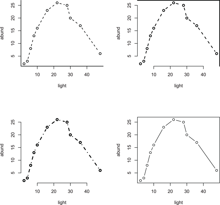
Altering Plot Margins
You have various ways to control the margins of your plots. These parameters can only be set via the par command.
Command Name
parThis command queries or sets the various graphical parameters.
Common Usage
par(tag = value)

par(list(tag1 = value, tag2 = value, ...))
Related Commands
Command Parameters
| mai | Sets the margins of the plot in inches. You must specify four values in the form c(bottom, left, top, right), giving the values for the corresponding margins. The defaults are device specific but are often approximately c(1.02, 0.82, 0.82, 0.42). This can only be set using par. |
| mar | Sets the margins of the plot in lines of text. You must specify four values in the form c(bottom, left, top, right), giving the values for the corresponding margins. The default values are c(5, 4, 4, 2) + 0.1. This can only be set using par. |
| mex | This sets an expansion factor for describing coordinates in the margin regions. Using values > 1 essentially increases all margins. This can only be set using par. |
| oma | Sets the outer margins of the plot in lines of text. You must specify four values in the form c(bottom, left, top, right), giving the values for the corresponding margins. The default values are all zero (no outer margin). This can only be set using par. |
| omd | Sets the region inside the outer margins as a fraction of the plot region (i.e., 0 to 1). You must specify four values, c(x1, x2, y1, y2), defining the region. The default is c(0, 1, 0, 1), which is essentially no outer margin! This can only be set using par. |
| omi | Sets the outer margins of the plot in inches. You must specify four values in the form c(bottom, left, top, right), giving the values for the corresponding margins. This can only be set using par. |
Examples
  ## Set margins (in #lines) for outer and regular margins
> par(oma = c(3, 2, 3, 2))
> par(mar = c(7, 6, 6, 4))

  ## Draw a plot, with axes but no bounding box (basis for Figure 3-44)
> plot(0:10, 0:10, xlab = "X-axis", ylab = "Y-axis", frame.plot = FALSE)

  ## Add main and sub-titles
> title(main = "Main Title", sub = "Sub Title")

  ## Add bounding boxes to various zones
> box(which = "outer")
> box(which = "figure")
> box(which = "plot")

  ## Add text to show margin areas
> mtext("Regular margin", side = 3, outer = FALSE)
> mtext("Outer Margin", side = 1:4, outer = TRUE)

  ## Reset margins to default settings
> par(oma = c(0, 0, 0, 0))
> par(mar = c(5, 4, 4, 2) + 0.1)
Figure 3-44: Setting and altering margins.
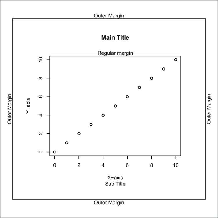
Altering the Graph Window
Various commands and graphical parameters alter the graph window in some way. The commands generally either set the dimensions of the plot region or split the plot window in some manner (allowing several graphs to be in one window).
Command Name
layout
layout.show
lcm
These commands help split the plot window into sections. The layout command does the split; the layout.show command allows you to visualize the split. The lcm command is a helper function that creates values in centimeters to help sizing of plot windows. Note that the layout method of splitting the window is incompatible with the methods, split.screen and par("mfrow").
Common Usage
layout(mat, widths = rep(1, ncol(mat)),
       heights = rep(1, nrow(mat)), respect = FALSE)

layout.show(n = 1)

lcm(x)
Related Commands
Command Parameters
| mat | A matrix that sets out the splits of the screen such that the matrix acts like a map, showing the screen numbers that will be filled for each plotting event (in numerical order). A zero represents an area that will not be plotted. |
| widths | A vector of widths for the plot sections. The values will mirror the columns in mat. Values can be specified as relative or as absolute values. To specify absolute value, use the lcm command to specify the dimension in centimeters. |
| heights | A vector of heights for the plot sections. The values will mirror the rows in mat. Values can be specified as relative or as absolute values. To specify absolute value, use the lcm command to specify the dimension in centimeters. |
| respect = FALSE | This parameter can be given in one of two ways:
|
| n = 1 | The number of figures to plot/show. |
| x | A dimension to be interpreted as centimeters. |
Examples
  ## Use cars data from R datasets
> data(cars) # make sure data is ready
  ## View the variable names
> names(cars)
[1] "speed" "dist"

  ## Work out break points for axes
> xbreak = pretty(cars$speed)
> ybreak = pretty(cars$dist)

  ## Make histogram data (i.e. not plotted)
> xhist = hist(cars$speed, breaks = xbreak, plot = FALSE)
> yhist = hist(cars$dist, breaks = ybreak, plot = FALSE)

  ## Set layout to make 4 areas: one for scatter, one blank,
  ## two for histograms
  ## Make the matrix "map" first
> lout = matrix(c(2, 0, 1, 3), nrow = 2, ncol = 2, byrow = TRUE)
> lout
     [,1] [,2]
[1,]    2    0
[2,]    1    3

  ## Now split the screen using the "map"
  ## The widths and heights are (rows, columns) and are relative
  ## Here we have two rows and two columns (see lout matrix) so
  ## Specify two widths and two heights
> figs = layout(lout, widths = c(3, 1), heights = c(1, 3),
 respect = TRUE)

  ## Show the layout on screen
> layout.show(figs)

  ## Set margins then draw scatter plot final result will be Figure 3-45
> opt.mar = par(mar = c(3, 3, 1, 1))
> plot(dist ~ speed, data = cars)

  ## Set margins and draw histogram for x-data
> par(mar = c(0, 3, 1, 1)) # Match left margin to first plot
> barplot(xhist$counts, space = 0, axes = FALSE)

  ## Set margins and draw histogram for y-data
> par(mar = c(3, 0, 1, 1)) # Match bottom margin to first plot
> barplot(yhist$counts, space = 0, horiz = TRUE, axes = FALSE)

  ## Reset margins
> par(opt.mar)

  ## Reset to single plot window
> layout(1)
Figure 3-45: Using the layout command to split the plot window
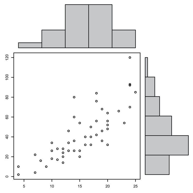
Command Name
parThis command queries or sets the various graphical parameters.
Common Usage
par(tag = value)

par(list(tag1 = value, tag2 = value, ...))
Related Commands
Command Parameters
| ann | If ann = FALSE, annotations are turned off and axis titles and overall titles are not drawn. |
| ask | If ask = TRUE, the user is asked for input before the figure is drawn. This can only be set using par. |
| bty | The type of box to draw around the plot region. The default is "O", producing a complete box. Other options are "L", "C", "U", "7", and "]". The resulting box resembles the character (which can be lowercase). Use bty = "n" (lowercase) for no box. |
| fig | The coordinates of the figure region within the overall plot area as proportions (that is, 0 to 1). You specify four values of the form c(x1, x2, y1, y2). This can only be set using par. The default is c(0, 1, 0, 1), that is, the whole region. This will create a new plot window when set unless new = TRUE is also set. |
| fin | Sets the figure region in inches as (width, height). This can only be set using par, and will create a new plot window when set. |
| mfrow | Splits the plot window into sections (rows and columns); you specify c(nr, nc). The subsequent plot window is filled row by row. This can only be set using par.You can skip a section by using plot.new(), and draw directly into a section using par("mfg"). |
| mfcol | Splits the plot window into sections (rows and columns); you specify c(nr, nc). The subsequent plot window is filled column by column. This can only be set using par.You can skip a section by using plot.new(), and draw directly into a section using par("mfg"). |
| mfg | This allows you to draw directly into a section of plot window that has been split using mfrow or mfcol. This can only be set using par.To set a section to plot in next, you specify c(row, column).You can also see which section is current (the last section to have a plot in it). The result shows four values; the first two represent the row, column of the plot section last used. The last two values show the number of rows, columns that are set. |
| mgp | The margin line (in mex units) for the axis title, axis labels, and axis line. You specify three values; the defaults are c(3, 1, 0). The first value affects the title and the others the axes. |
| new | This determines if the current plot is wiped when a new plotting instruction is issued. If par("new" = TRUE), the command assumes that the window is clean (new), thus adding to an existing plot. If par("new" = FALSE), the default, the next plotting command wipes the window. This can only be set using par. |
| pin | This determines the current plot dimensions (width, height) in inches. This can only be set using par. |
| plt | This determines the plot region as a fraction of the current figure region. You specify four values, c(x1, x2, y1, y2), which represent the coordinates. This can only be set using par. |
| pty | The type of plot region used. "s" sets a square region and "m" sets a maximal region. This can only be set using par. |
| usr | The extreme user coordinates of the plotting region. You specify four values: c(x1, x2, y1, y2). If a log scale is in use, the limits will be 10^usr. This can only be set using par. |
| xpd | Determines the clipping region. If FALSE, plotting is clipped to the plot region. If TRUE, plotting is clipped to the figure region (allowing you to overspill into the margins). If NA, plotting is clipped to the device region. |
Examples
  ## Splitting the plot window
  ## Make 2 rows, 2 columns, fill plots by column
> par(mfcol = c(2, 2))

  ## Turn off plot box
> par(bty = "n")

  ## First plot starts graphics window (Figure 3-46)
  ## Simple scatter plot, joined points (Figure 3-46, top left)
> plot(log(1:10), 1:10, cex = 1.5, type = "b")

  ## Which plot is current? Result shows row, column of last plot
  ## and row, columns of the split
> par("mfg")
[1] 1 1 2 2

  ## Set random number generator
> set.seed(11)

  ## A histogram of some random numbers (Figure 3-46, bottom left)
> hist(rnorm(n = 50, mean = 5, sd = 1), col = "gray90",
 main = "Normal distribution)

  ## Plot cosine function (Figure 3-46, top right)
> curve(cos, from = -2*pi, to = 2*pi, lwd = 2)

  ## Set some gray colors
> piecol = gray(c(0.55, 0.75, 0.9))
  ## Make some labels
> pielab = c("Cos", "Sin", "Tan")

  ## A pie chart (Figure 3-46, bottom right)
> pie(c(cos(45), sin(45), tan(45)), labels = pielab, col = piecol)

  ## Add text to margin, uses current plot
  ## still bottom right
> mtext("Trig functions", side = 1, line = 1, font = 2)

  ## Any command that draws a new plot will wipe window and
  ## start again top left

  ## Reset graphic to single window and restore boxes
> par(list(mfcol = c(1, 1), bty = "O"))
Figure 3-46: Splitting the plot window and altering window parameters
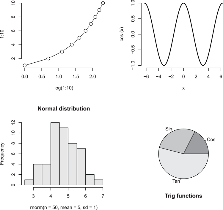
Command Name
plot.newThis command causes the current plot to be finished (if there is one) and advances to a new graphics frame. This is useful for skipping plot windows if the frame has been divided into sections.
Common Usage
plot.new()Related Commands
Command Parameters
| () | No parameters are required. |
Examples
  ## Split plot window into 2 rows, 2 columns, fill by row
> par(mfrow = c(2, 2))

  ## Turn boxes around plots off
> par(bty = "n")

  ## Set the random number generator
> set.seed(9)

  ## A histogram of some random numbers from Poisson distribution
  ## (Figure 3-47, top left)
hist(rpois(50, lambda = 4), col = "gray95",
 main = "Poisson Distribution")

  ## Skip a plot, and again
> plot.new() # Would have been top right
> plot.new() # Would have been bottom left

  ## A histogram of some random numbers from normal distribution
  ## (Figure 3-47, bottom right)
hist(rnorm(50, mean = 4, sd = 1), col = "gray90",
 main = "Normal Distribution")

  ## Set the next plot to go into row 2, column 1
> par('mfg' = c(2, 1))

  ## A histogram of some random numbers from Student’s t distribution
  ## (Figure 3-47, bottom left)
hist(rt(50, df = Inf), col = "gray90",
 main = "Student's-t Distribution")

  ## Reset plot window to single and turn box on
> par(list(bty = "O", mfrow = c(1, 1)))
Figure 3-47: Skipping a section of a split window
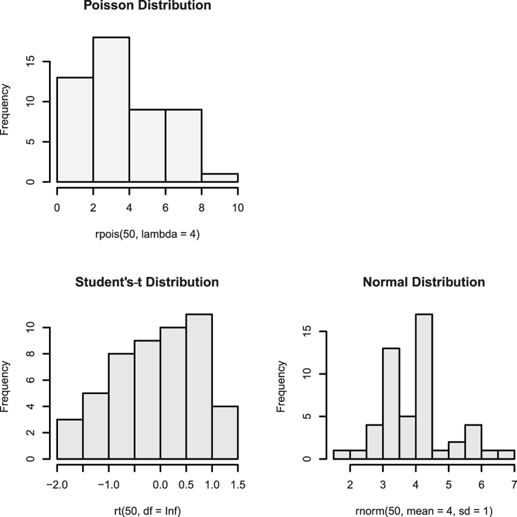
Command Name
screen
split.screen
erase.screen
close.screen
These commands provide a mechanism to split the plotting screen and manage those splits:
- screen—Selects the screen to use.
- split.screen—Splits the screen (you can also split a previously split section).
- erase.screen—Clears a screen by filling with background color.
- close.screen—Closes a split.
These commands are incompatible with other means of splitting plot windows, such as layout or par("mfrow").
Common Usage
split.screen(figs, screen, erase = TRUE)

screen(n = , new = TRUE)

erase.screen(n = )

close.screen(n, all.screens = FALSE)
Related Commands
Command Parameters
| figs | Describes how the plot region should be split. You can supply two values giving the number of rows and columns. You can also give a matrix with four columns. Each row represents a section of screen with values for the left, right, bottom, and top (in that order). The values are in NDC units, which are a proportion of the overall plot window, thus 0 to 1. |
| screen | A number giving the screen to split. The default is the current screen or the whole plot region if no previous splits exist. |
| erase = TRUE | If erase = FALSE, the selected screen is not cleared before the screen is split. |
| n | A screen number; close.screen will accept a vector of values.If n is omitted from screen, the current screen number is returned.If n is omitted from close.screen, a vector of values showing the screen numbers is returned. |
| new = TRUE | If new = FALSE, the screen is not cleared before setting as the current screen. If new = TRUE, the screen is cleared by filling with background color. If this is "transparent", nothing apparently happens! Use par("bg" = "white") to overcome this. |
| all.screens = FALSE | If TRUE, all screens are closed. |
Examples
  ## Use cars data from R datasets
> data(cars) # Make sure data is ready

  ## Check if screen is split
> close.screen()
[1] FALSE

  ## Split screen into 2 rows, 1 column
> split.screen(figs = c(2, 1))
[1] 1 2

  ## Prepare screen 1 (at the top)
> screen(1)

  ## A scatter plot (Figure 3-48, top)
> plot(dist ~ speed, data = cars, frame.plot = FALSE)

  ## Split bottom half (screen 2) into 1 row and 2 columns
> split.screen(figs = c(1, 2), screen = 2)
[1] 3 4

  ## Prepare screen 3 (bottom left)
> screen(3)

  ## A histogram (Figure 3-48, bottom left)
> hist(cars$dist, col = "gray90", main = "Distance")

  ## Prepare screen 4 (bottom right)
> screen(4)

  ## A histogram (Figure 3-48, bottom right)
> hist(cars$speed, col = "gray90", main = "Speed")

  ## Return to screen 1 (top) but do not erase drawing
> screen(1, new = FALSE)

  ## Add title. Generally it is safer to complete one figure
  ## before moving to another
> title(main = "Stopping Distance and Speed")
  ## A reminder of the splits (but not how!)
> close.screen()
[1] 1 2 3 4

  ## Close all splits, this does not wipe the plot
> close.screen(all.screens = TRUE)
Figure 3-48: Splitting the plot window
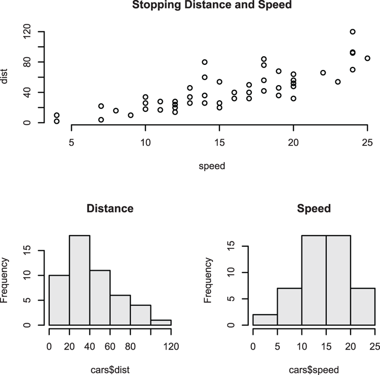
  ## Make a scatter plot and marginal histograms
  ## Set NDC coordinates for screens as Left, Right, Bottom, Top
  ## NDC are proportional to main window (0 to 1)
> scr1 = c(0, 0.75, 0, 0.75) # NDC coords for screen 1
> scr2 = c(0, 0.75, 0.75, 1) # screen 2
> scr3 = c(0.75, 1, 0, 0.75)
> scr4 = c(0.75, 1, 0.75, 1)

  ## Combine window coordinates in one matrix
> spl = rbind(scr1, scr2, scr3, scr4) # Make a matrix
> colnames(spl) = c("L", "R", "B", "T") # Add column names
> spl # See matrix "map"
        L    R    B    T
scr1 0.00 0.75 0.00 0.75
scr2 0.00 0.75 0.75 1.00
scr3 0.75 1.00 0.00 0.75
scr4 0.75 1.00 0.75 1.00

  ## Use cars data from R datasets
> data(cars) # Make sure data are ready

  ## View the variable names
> names(cars)
[1] "speed" "dist"

  ## Work out break points for axis
> xbreak = pretty(cars$speed)
> ybreak = pretty(cars$dist)

  ## Make histogram data
> xhist = hist(cars$speed, breaks = xbreak, plot = FALSE)
> yhist = hist(cars$dist, breaks = ybreak, plot = FALSE)

  ## Split the screen according to "map"
> split.screen(spl)
[1] 1 2 3 4

  ## Select (and erase) screen 1
> screen(1)

  ## Set margins
> par(mar = c(4, 4, 1, 1))

  ## Draw a scatter plot (Figure 3-49, bottom left)
> plot(dist ~ speed, data = cars, frame.plot = FALSE)

  ## Select and erase screen 2
> screen(2)

  ## Set margins, make sure left margin matches screen 1
> par(mar = c(0, 4, 1, 1))

  ## Draw the histogram data (Figure 3-49, top left)
> barplot(xhist$counts, space = 0, axes = FALSE)

  ## Select and erase screen 3
> screen(3)

  ## Set margins, make sure bottom margin matches screen 1
> par(mar = c(4, 0, 1 ,1))

  ## Draw histogram data (horizontally, Figure 3-49, bottom right)
> barplot(yhist$counts, space = 0, horiz = TRUE, axes = FALSE)

  ## Select screen 4
> screen(4)

  ## Set all margins to 0
> par(mar = c(0,0,0,0))

  ## A blank plot (Figure 3-49, top right)
> plot(1, type = "n", axes = FALSE)

 ## Add a text message
> text(1,1, "Scatter plot
and histograms
for x/y data")

 ## Remove all splits (window remains until next plot)
> close.screen(all.screens = TRUE)
Figure 3-49: Complex splits of the plot window