LEARN 8
Look for what’s not there.
—Harry Bosch
 WHAT IS “LEARN” AND WHY IS IT IMPORTANT?
Learn actions enable organizations to know what their prospects and their customers are experiencing and what they think about the organization’s processes, policies, products, and services in a continuous improvement loop. Learn also provides the insights and data to guide customer-related improvements and helps the organization to invest in the right tools and systems at the right time. It provides the key measurement of how well improvements are working and who should be held accountable. Just as the Understand step obtains a first pass of data to reveal friction, the Learn step makes this an ongoing endeavor by selecting and integrating different mechanisms and tracking continuously. Learn feeds decision-making and informs those who own the issues. It shows a business where friction exists, who is accountable to remove the friction, and how to track improvements.
The right combination of Learn mechanisms will achieve the following five results:
■ Produce continuous data on the customer experience and indicators of friction.
■ Yield insight across the whole of the business and all channels so that there are no blind spots.
■ Provide qualitative information that helps inform quantitative information (e.g., by asking customers open-ended questions like “Why?” or “Why not?”).
■ Limit the effort required by customers to provide information and therefore exploit the information that a business already has.
■ Make accountability clear across the business.
In any organization, responsibilities will change over time as staff members change roles and structures evolve. An effective Learn process enables the right leaders to be held to account despite these moves, adds, and changes. The governance processes for Learn need to be frequent enough that the business is in control but not too frequent so that reporting and meetings limit the capacity to improve.
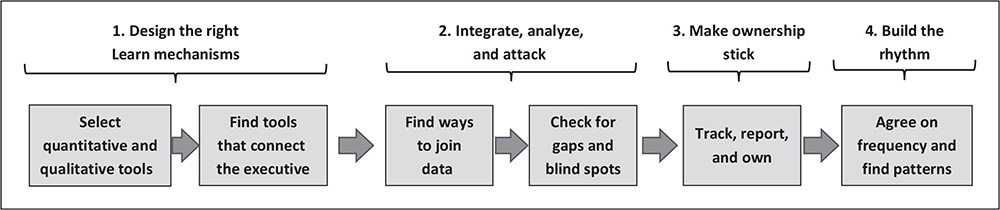
Learn requires these four actions:
■ Design the right mechanisms to keep track of customer needs and opportunities to improve.
■ Integrate Learn mechanisms and attack the issues.
■ Make ownership stick.
■ Build the Learn rhythm.
Each is discussed in more detail in the how-to section of this chapter. In effect, Learn builds on the ideas described in the Understand, and Assign and Prioritize chapters but moves from a one-off instance of analysis and allocating responsibility to continuous analysis, allocation, and action.
Why Is Learn Important?
Learn provides the data and insight needed to drive improvement and hold the right managers to account. Learn-related data and insights drive the initiatives that will deliver cost and revenue goals, thereby directing expenditure and maximizing the return on improvement investments. Learn helps to keep the organization accountable when factors change, and it connects the organization more closely to its customers. Without the data and insights from Learn, or with narrow or poor data, an organization is, in effect, flying blind.
Why Is Learn Hard?
It is not easy to Learn. First off, it’s hard to select the right data mechanisms, and then it’s even harder to integrate the data. For example, the reason customers experience clumsy and intrusive surveys is that these tools and data are often separated from information the organization already knows about them. The tools used to track contacts and contact history are often separate from those for surveys and feedback. Second, scorekeeping can become an end in itself, with the goal of getting feedback pushed aside. As a result, Learn processes can become more about measurement than improvement.
Another obstacle to success is getting busy executives to focus on these problems. A well-sponsored workshop to “assign and prioritize” might have obtained temporary attention by senior business leaders, but that is different from telling executives that reducing friction is a permanent responsibility and a goal that they will be measured on constantly. Learn’s goals require a much greater commitment by leadership than those of Assign and Prioritize.
GOOD STORIES
Airbnb’s Video Epiphany
From its early days, when Airbnb’s cofounders donned headsets as the original Customer Service agents, the company has tracked host and guest experience in order to learn the needs of both customer types. Over the years, Airbnb has improved its host and guest survey techniques. In order to make its Learn capabilities more impactful, Airbnb’s Community Support VOC programs lead, Desiree Madison-Biggs, expanded the technical solution to include video messaging. This process encourages customers to upload video messaging about their experiences, whether positive or terrible.1 This has compelled the Airbnb product and service owners to address negative issues raised and to fix them, thereby creating a virtuous closed loop. The company also forwards positive reviews and comments to frontline staff.
Another Learn response was the company’s ability to track what happened after guests declared, “I will never use Airbnb again.” These situations were analyzed in greater depth, and subsequent bookings from these customers were probed in more depth to find and apply broad improvements. The combination of surveys, video logs, and predictive analytics created “a treasure trove of improvement potential for our support organization” according to Madison-Biggs.
E.ON’s Customer Insights for Development
For many years Germany-based energy giant E.ON has been using a desktop tool for its agents called WOCAS (what our customers are saying) to augment its agent contact coding system, and it has revealed numerous insights not contained in the agent contact reporting. In Germany, E.ON’s customers receive only one bill per year for their energy usage, which produces the potential for dispute and defection to a competitor if the actual usage is lower than prepayments. Using feedback from the WOCAS tool and insights from predictive analytics (for example, examining family or lifestyle changes, including moving to another location), E.ON has been able to encourage its customers to implement automatic meter readers and to check their usage in their online portal. The changes included encouraging customers to call the company if they had questions. The company’s annual invoice also meant that, after it signed up new customers, E.ON didn’t hear from them. While that looked attractive (fewer initial contacts), it was also a churn risk. E.ON built a range of outbound contacts to check in with the new users, especially younger customers living in their first flat or home.
Using the insights gathered from frontline staff via the WOCAS tool, E.ON is able to analyze weekly (or more frequently) small trends in customer contact reason codes, passing concerns or needs to its development team. It then kicks into a top-issues management process to dig into root causes. According to E.ON’s head of Customer and Market Insights, Kristina Rodig, as a result of WOCAS’s insights and these integrated processes, E.ON has managed to reduce its CPX (contacts per subscriber) by 40% while enjoying churn rates that are less than half of their competitors’. Interestingly, E.ON’s older customers have embraced the company’s online and self-service tools much more than anticipated, again in response to using WOCAS’s insights.2
Vodafone’s Fine-Tuning
As part of its global strategy to improve customer experience and reduce unnecessary contacts, Vodafone has been using a Pareto report called Skyline that includes historical, recent, and target contact rates (CPX) by reason code, plus several KPIs measuring customer experience. Each market (country) reports the same reason codes using a standard taxonomy that mirrors the customer journey. Each reason code has a clear business owner in each country. The reason code owners decide on what target actions to take (e.g., Eliminate, Digitize) and are required to describe their progress toward those targets and to work with colleagues to produce improvements.
These Learn processes have helped Vodafone spot opportunities across the world and deal with dramatic change. Vodafone has been able to compare and contrast results very quickly across markets, sharing improvements or challenges, according to Vodafone’s global senior manager for Service and Digital Transformation, Kim Hiltz.3 These results have included creating an all-digital product as well as plans to accommodate new customer usage patterns when working from home. Vodafone was able to learn quickly and then use the data to fine-tune solutions. Consistency of measurement helped compare behaviors and issues across markets, which, in turn, helped leverage investments and learning globally.
Uber’s Focus on Apps, Ratings, and Defect Rates
Part of Uber’s innovative approach is that riders, drivers, food deliverers, and consumers use its app for bookings, changes, and self-service. The company has also built in ratings and feedback functions to measure all four parties. This measurement philosophy has helped create a culture of customer focus, with drivers often offering mints and bottles of water because they want to get high ratings. Uber cars are usually also far cleaner than a typical taxi. Further, passenger behavior is driven by a need to score well.
This feedback helps Uber improve its internal processes and systems. Uber has been able to reduce its defect rate by 90% over the last four years, according to Troy Stevens, Uber’s VP and global head of Community Operations. He stresses, “The best customer experience is one that doesn’t have to happen.”4 For its food delivery service, Uber has added a Missing Items feature on its app after analyzing why customers were reporting that their orders were incomplete. Uber then digitized the function to make “problem repair fast and simple.” For the rideshare service, Uber added a Cancel Ride option to the app that automatically dispatches another driver for the customer who sees that their original driver is not coming or is too far away. These and many other features have reduced friction for customers and for Uber.
The company also uses scores and app interactions to drive improvement in other departments. Stevens added, “Community Operations has become a really good partner with our tech team in order to create an operational metric for the tech-development groups. They provide the tech team with a flavor of what the customer experience feels like, or VOC real-world examples.” In this way, Uber is able to respond to customer needs very quickly.
Red Hat’s CX-360
Like most organizations, Red Hat had many sources of customer insights initiated and managed by different functions or departments. That was until, according to Megan Jones, Red Hat’s director of Customer Experience Programs, the company was prompted by a drive to “Be more customer-centric.” At that point, Red Hat collapsed these sources into an integrated 360° view across 16 touchpoints, spanning from the first interaction to renewal.5 By defining several of these touchpoints as “moments of truth” with the company’s Lifecycle marketing team, Red Hat added 13 surveys to 3 existing surveys and fashioned a visual dashboard and sentiment models, by which sales reps could quickly obtain a clear picture of customers’ pain points. Using clearly presented color-coded results in coxcomb reports (similar to pie charts but scaled more dynamically), together with NPS open-ended comments in word clouds, Red Hat’s CX 360° has enabled its product and sales teams to learn, at a glance, what matters to its customers, how the company is addressing their needs, and which emerging needs require attention across the company. This has also led to the popular Red Hat Learning Community, where resellers, integrators, and corporate customers of its PaaS tools share with each other.6
BAD STORIES
The bad stories for Learn illustrate common issues. Many organizations invest in apparent Learn mechanisms that don’t work, while others seem to expect customers to do all the work. Some companies fail to integrate the data and insights they have, producing isolated islands of information. Finally, other companies have become obsessed with measurement but don’t seem to act on it.
Flying Blind by Loading the Survey Dice
You know it’s going to be a bad experience when an airline introduces its survey with “This will take between 10 and 15 minutes of your time.” Yet, several airlines still do this. The rest of the survey process then continues to impose on customers in a variety of ways. The first questions ask the customer what the airline already knows:
■ “How did you book this flight?”
■ “How often do you travel?”
■ “Did you use the lounge?”
That is frustrating for customers, as they can tell the airline has been lazy. After all, the airline has already pulled certain data and passed it over to the research house to initiate the survey. They know the customer flew on a particular flight or they wouldn’t be asking! It’s not much more effort to extract other data the organization has about the customer and the booking, and yet one particular airline prefers to put the customer to work.
Their survey’s 15 pages of questions are all heavily structured around topics that the airline thinks it needs to know, like the food and beverage experience or the boarding procedure. Only one question, the last one, contains a free-format text box where the customer can provide feedback on what interests or bothers them. It’s as though the airline thinks it already knows what all the issues might be and isn’t really open to listening to other feedback. If the airline really wanted feedback, then why not ask only the open-ended questions?
This survey format is frustrating enough, but there is one more catch. This airline only conducts these surveys when their flights run on time. When flights are delayed, they give customers no opportunity to critique or give feedback. Talk about flying blind! When delays occur, airlines and the service experiences they provide are really put to the test, but this airline doesn’t want to know how it handles those critical situations. It wants to load the dice toward positive experiences. The executives of the organization may not be aware how much the airline is missing out on the feedback it really needs. It is going through the Learn motions but failing to listen properly, subjecting the customer to frustrating, unnecessary effort.
Ignoring a Golden Opportunity
A fast-growing SaaS provider conducted quarterly NPS surveys with its business customers and dutifully summarized the average scores for that time period, comparing them with the previous quarter. However, even though the organization knew that a nettlesome percentage of its customers scored 0, 1, or 2 (deep detractors), they rarely reached out to those customers to ask the salient questions “Why?” and “What can we do to fix the situation?” Instead, they patted themselves on the back for minuscule improvements in overall NPS while shirking the opportunity to learn from customers who gave them low scores.
A major bank also underreached with its NPS strategy. They got survey responses from 4% of their customers, but supervisors and team leaders had to follow up with the deep detractors. When the contact center manager was asked why they only surveyed 4%, management responded that the frontline leadership “wouldn’t be able to cope” with finding more detractors. In other words, it was better not to know than have to do something about it—a sad “head in the sand” approach to Learn.
Fees for No Service Lead to Industry Shame
The financial advice industry in Australia has been besieged with scandals dating back to the 1990s. Most newsworthy were rogue financial advisors who pocketed hefty fees by recommending products that didn’t suit their customers. These and other scandals led to increased regulation. One wave of legislation, the Future of Financial Advice (FOFA), tried to make sure that advisors were correctly engaged by their clients and working in their clients’ best interest. When that also failed to fix the issues, the government called for a banking and wealth-management public inquiry, a Royal Commission, which exposed further rogue behavior.
The biggest scandal in the inquiry uncovered major wealth-management businesses that had charged thousands of clients for advice when none had been given. In some cases, companies were continuing to charge customers who had died. The “fees-for-no-service” scandal caused the downfall of the CEOs and chairmen of some of these companies. This public horror occurred because these organizations had failed to learn from these situations. Some were aware that they were charging money for nothing but kept doing it. Other companies failed to have the measurement and controls in place. This was a good example of an industry that had refused to learn.
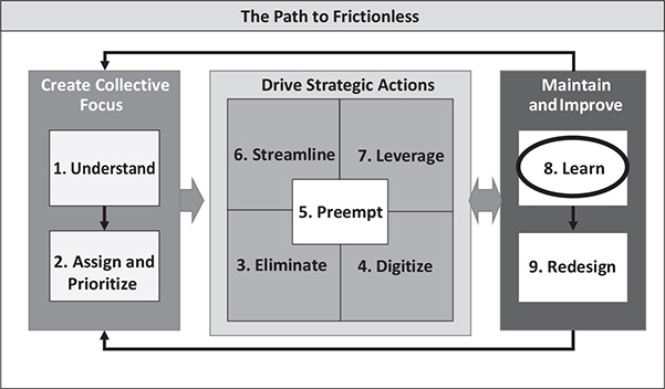
HOW TO LEARN
Learn requires four actions, as shown in figure 8.1.
Design the Right Learn Mechanisms
There are myriad Learn mechanisms that collect different types of VOC, some providing rich quantitative data and others yielding more qualitative data with different insights. These Learn mechanisms are divided into three groups that (1) quantify friction; (2) collect rich stories and suggestions that may provide commentary on products and processes or enable a drill-down on particular issues; and (3) enable the connection of executives, management, and staff with customers.
FIGURE 8.1. The Learn Approach
Group 1: Quantify Friction
The mechanisms in table 8.1 can be used to track the quantity of friction continuously, with analytics as the most refined and complete way to do this. As noted in the Understand chapter, cruder mechanisms, such as QA sampling or agent contact coding, can also be used, but they are harder to verify or smaller in sample size.
Group 2: Rich Qualitative Insights
The mechanisms in table 8.2 include traditional customer research and focus groups, both covered earlier. The following mechanisms are alternatives to that form of research; they have more data points and at a fraction of the cost.
Group 3: Connection of Executives, Management, and Staff with Customers
The mechanisms in table 8.3 are used to keep executives and management in touch with customers by immersing them into customers’ experiences. For Renovators, where management may have become separated from customers, these tools can become the necessary “shock and awe” to reconnect them to customers’ reality.
Organizations need to use mechanisms from each of the three groups to detect and reduce friction. The mechanisms that span the most interactions (e.g., data-mining all contacts) provide the best breadth of analysis. However, the qualitative techniques are better for deep-diving into specific issues and bringing a direct customer voice to the table. The connection mechanisms are more useful for keeping executives and management engaged about what really affects customers.
Unfortunately, customer surveys have become the dominant form of customer feedback measurement. Surveys have a place and a purpose, but many are used in biased or loaded ways, and others are used to keep score rather than to obtain real feedback and insights. You can tell it is scorekeeping if a survey includes measurements and ratings on scales from 0 to 10 or from 1 to 5 but don’t allow free-format feedback. If organizations want feedback, they need only to ask an open question like “Please tell us what you think.” The old U.S. truckers’ decal, “How’s my driving?,” is a good example of this. It won’t keep score, but it will provide feedback that is often very frank, specific, and actionable.
TABLE 8.1. Mechanisms That Quantify Friction
Mechanism | How It Works | How It Is Used |
Speech and text analytics of all customer contacts | Analyzes sales and service calls, emails, chats, and messages using a consistent analytics framework to report what is driving contact (see chapter 1, “Understand”) | ■ Keeping a constant watch on what drives contact ■ Quantifying the volumes and costs of customer contact reasons ■ Measuring improvements |
CPX ( X= the driver of contacts such orders shipped) overall and by reason | Measures the rate of contacts and whether a company is getting harder or easier to deal with (see chapter 1, “Understand”) | ■ Measuring “customer effort” ■ Yielding deeper analysis, including analysis of which reasons are most frustrating ■ Tracking results of process or other changes ■ Scorekeeping |
CES—evaluating how much effort it takes a customer to achieve a goal during every interaction with a company | Can be based on customer survey or imputed as a composite of contact rates, durations, and other factors that show how much effort is being imposed on the customer | ■ Revealing areas of potential improvement ■ Leading process breakdowns to be actionable by product and process ■ Placing the managers and executives “in the shoes of the customer” |
Repeat contact analysis | Uses analytics to show how often customers are having to make contact about the same or related issues, either within or across channels (see the “Understand” and “Preempt” chapters, especially the resolution-tracking topic in “Understand”) | ■ Highlighting processes that are not working well and that need improvement (e.g., through training, knowledge, how-to guides) ■ Building performance management programs from frontline staff up through site leaders and different enterprises including BPOs |
Volume and effort analysis of key processes, such as repair visits, faults, or repairs | Identifies key processes that reflect failures and problems and highlight their volumes and workload | ■ Understanding faulty products and processes ■ Ensuring that changes are moving the needles in the right directions |
TABLE 8.2. Richer Qualitative Insights
Mechanism | How It Works | How It Is Used |
Frontline inquiry | Asks staff, “What are our customers saying?” (WOCAS) and “How often are they saying it?” | ■ Identifying new needs or problems ■ Enabling drill-down by researching when these issues occur |
Social media monitoring | Obtains feedback from social media sites on your products and services. Some companies offer scraping services to aggregate this for you. | ■ Analyzing feedback that your products and services are receiving in the public domain ■ Providing early indicators ■ Intervening, where allowed, to address concerns |
Customer exit process | Visits with or interviews former customers to figure out what went wrong. (This sounds easy, but many former customers won’t be willing to share much!) | ■ Understanding issues and problems or customer offers that were serious enough to tip customers over the edge ■ Applying these lessons to similarly situated customers who might churn as well |
Customer observation | Watches how your customers use your products and services in their own environments. Merge observations with those in usability environments, if necessary. | ■ Understanding the customer perspective and frame of reference ■ Grounding designers and product owners in customer reality |
Mystery shopping | Samples your products and customers’ experiences in a structured manner, either by engaging specialists or using your own staff | ■ Demonstrating what customers actually experience and providing rich feedback and frequent monitoring ■ Showing managers how much friction their products or services are causing |
“Staple yourself to an order” or happy/ unhappy path analysis | Follows an order or other long and complex procedure through all processes. Happy path has no friction; unhappy path analysis flags what can go wrong. | ■ Demonstrating the large number of steps and possible roadblocks ■ Quantifying failures |
Customer journey mapping | Shows all aspects of the end-to-end journey of customers, from marketing, onboarding, and usage through renewal, continuation, or account closing | ■ Bringing all departments together to get traction on action and change ■ Revealing even more friction (e.g., delays or lack of updates; see chapter 5, “Preempt”) |
Customer feedback surveys | Asks, at the simplest level, How did we do?” and then uses analytics to mine responses. Many companies use this as score- keeping instead with complex multiquestion surveys. | ■ Enriching data if requests are simple and/or use a free format (open fields) |
Null search analysis | Mines every time when customers ask for something that has no “hit” on websites or in requests of sales teams | ■ Indicating future product or service needs |
Customer panels or communities | Uses a group of customers in constant contact to review products or services (e.g., website self-service look and feel) | ■ Prompting ongoing two-way communications and, as close as possible, unvarnished feedback and recommendations |
Customer feedback surveys | Asks, at the simplest level, How did we do?” and then uses analytics to mine responses. Many companies use this as score-keeping instead with complex multiquestion surveys. | ■ Enriching data if requests are simple and/or use a free format (open fields) |
Null search analysis | Mines every time when customers ask for something that has no “hit” on websites or in requests of sales teams | ■ Indicating future product or service needs |
Customer panels or communities | Uses a group of customers in constant contact to review products or services (e.g., website self-service look and feel) | ■ Prompting ongoing two-way communications and, as close as possible, unvarnished feedback and recommendations |
Much of the investment in surveys could be more profitably directed toward analyzing the data that organizations already have or could easily collect. It’s unfortunate that many businesses are spending a great deal of their money and customer effort administering surveys and analyzing them when they could invest in mining the insights available from the thousands of customer interactions they have already had. All that most organizations need is a central repository of customer contact data and the ability to tap into that repository with key words, customer profiles, or personas.
Integrate, Analyze, and Attack
Most organizations already have some of these mechanisms from which to learn, so it is essential to integrate them and to spot obvious gaps. Here’s a method for analyzing and assessing your ability to learn:
■ Document all of the mechanisms used for customer voices and feedback today in your business (see the three groups previously mentioned).
■ Record how frequently each voice is collected, the approximate volume collected, who initiates the contact, and which channels are used.
■ Record uses of these data, including their frequency, the receivers, and the ways they are presented to potential users (e.g., push alerts, portals, attachments, PowerPoint reports, etc.).
■ Document stories of how these customer voices have been used across the organization and how they have changed the organization. This can also take the form of an impact score. You may find these stories are limited. If this becomes a massive exercise, that is good news, as it suggests change is occurring.
■ Share those reports and stories broadly and widely within the organization as well as with prospective customers, investors, and other stakeholders.
TABLE 8.3. Connection Mechanisms
Mechanism | How It Works | How It Is Used |
Management monitoring or “back to the floor” | Requires executives to spend one day a month, or a week at a time, working as or with frontline staff in retail shops or handling calls or chats | ■ Grounding executives in the issues that customers and frontline staff face |
New-hires start in service and vice versa | Schedules every person who joins the organization to spend time in customer service, and all service staff work in other areas such as in the fulfillment center, in billing or credit (e.g., in a utility), or in ride-alongs with field technicians | ■ Creating broader awareness of how departments need to collaborate ■ Establishing useful links between and among departments |
Customer days [where everyone talks to customers] | Mobilizes the entire organization to talk to a customer on a given day or week (very useful for Renovators) | ■ Forcing connections with customers across the business to gather hundreds of stories ■ Finding crisp ways to collect insights as customers are experiencing them |
“Worst call” playlist | Sets up sessions for executives, either together or on their own, to listen to 10 calls a month that represent complaints or bad experiences | ■ Helping all departments understand the issues they cause |
Customer stories | Obtains and widely publishes stories of success and failure (e.g., Trek and Nordstrom) | ■ Educating staff to address/ reduce friction ■ Showing “what good looks like” ■ Creating a culture of help and support ■ Granting permission for frontline staff to take initiative and “do the right thing” for customers |
This documentation will provide an overview of what exists and how it is used. It will be important to examine (1) frequency, where data exists but is episodic; (2) scope, where some channels or products aren’t covered; (3) quality, where there is limited insight from the data; and (4) action, where data seem to be useful but no one does anything with it. Symptoms of the latter include negative feedback of different types or poor scores that produce no outcome.
Links in the Chain
The best mechanisms complement one another. For example, contact analytics provides constant data, monitoring, and quantification based on all the contacts that are occurring. Ideally, in central data lakes, it also links to research and feedback on particular issues. For example, complaints and frontline feedback should be classified in such a way that they can also be connected with contact reasons. When organizations can start to link these mechanisms, they are in a better position to quantify the benefits of investment and track the impact of actions. This means using common causes and classifications across customer complaints; repeat contacts; social media commentary; and the plethora of phone calls, email messages, chats, and other channels. For example, it helps that certain calls, emails, chats, and posts all relate to the problem of “Product X doesn’t work.”
Once all of these mechanisms and voices are properly linked, organizations can start to turn off some of the redundant mechanisms. It’s far better to have 3 to 5 Learn mechanisms used in an integrated way than 10 mechanisms used ineffectively and in a way that delivers no action.
Mind the Gap
There are key questions to check if your Learn mechanisms are complete. Any of them can be an indicator that you may have gaps to close.
■ Do you have data to track the reasons customers need to contact you, which reports continuously and shows you new and emerging trends?
■ Is the information telling you about what customers think of your products, services, and processes so that you can refine them?
■ Does it take a long time to get detailed information on customers’ perspectives or to find root causes of issues?
■ Is the data you are getting driving improvement and change?
■ Are some products and services outside the scope of the information you are receiving?
■ Are you surprised by negative feedback, such as complaints that weren’t represented earlier?
■ Do you appear to be getting different and contradictory feedback from different mechanisms?
Because there are now so many contact channels, it is critical to get a broad view across all of them and to understand their interplay and where gaps exist in Learn mechanisms. For example, call rates (CPX) may be dropping, but an organization needs to know if those contacts have shifted to other channels like web chat, email, or messaging. The Digitize and selfservice channels also need to report their effectiveness in order to answer these three key questions:
■ Are customers completing more transactions, or are they getting stuck or navigating excessively?
■ Are all of the possible elements of friction and dissatisfaction being captured?
■ How are these data changing?
Make Ownership Stick
The Assign and Prioritize chapter introduced the idea that issues and problems need to have unique owners across the organization. Some organizations have developed sophisticated mechanisms to maintain ownership. At Amazon, the customer service team developed a complex Pareto reporting mechanism nicknamed Skyline that engaged owners with their assigned customer contact reasons weekly and held them to account. The Skyline report provided a succinct visualization of customer contact reasons and their trends and goals (see figure 1.5 for a simplified version) relative to business growth because everything was normalized in terms of CPX or contacts per order. This reporting format has since been used by organizations all over the world.
This type of reporting becomes more useful when there is consistency across divisions, markets, and countries rather than allowing each one to have its own taxonomy. This consistency allows benchmarking and the exchange of solutions. It works better still when there is a standardized framework for creating actions, assigning owners, and agreeing upon targets. The larger the organization, the more that standard mechanisms like this can help create visibility and accountability across the business.
Accountability works best when the organization puts the following practices into place:
■ The CEO or most senior sponsor holds their executive team to account. If executives are assigned a category to own, they are forced to understand the reasons and trends, especially if they have to explain these trends to the CEO each month. Ignorance looks bad if the CEO is asking questions, so senior sponsorship and interest forces owners to get involved.
■ Costs are reversed to each owner so that they bear the financial impact that they caused. This includes not just the cost of the staff handling contacts but all of the costs related to fixing the problems (e.g., refunds, repairs, truck rolls, and product returns, as described in the Understand chapter).
■ The metrics are front and center in the organization’s goals and targets. Ownership means executives have related targets. Many organizations have made satisfaction, NPS, or CES goals that are collective and individual. Using contact rates or CPX can create collective targets that are easier to measure and understand and have clear accountabilities. For example, the head of finance might be held accountable for contacts like “Where’s my refund?” while the head of field operations might own “Where’s my repair technician?”
■ The organization has enough data and analysis capability to get “under the hood” of the trends and changes. Owners of different categories will get very frustrated if deeper dives don’t help them explain trends for which they are accountable.
This same style of Skyline reporting can be applied to many other VOC data types, including complaints, customer satisfaction, NPS, and CES. Linking contact categories to these other VOC measures makes them easier to break down (e.g., NPS and churn by reason).
Build the Learn Rhythm
In dynamic, changing businesses like Innovators or Renovators, the leadership team usually meets once or twice each week to review these customer contact reports, while a more stable organization might need to meet only monthly. The Skyline report referenced earlier has some key features that help to establish the right rhythm by capturing and picturing the following for each reason:
■ Microtrends over four- to six-week periods
■ Comparisons to “this time last year” and to seasonal peaks
■ Recent variations, highs, and lows
■ Tracking against targets and goals
This type of reporting makes it easier for C-level executives to review progress and direct resources to accelerate changes or new investments.
Findings Patterns
The essence of the Learn strategy is to find patterns quickly and then to figure out how to apply them to remove friction. That might sound easy, but Learn requires the capacity and capability to sort through many data sources and mechanisms and to pull out the relevant stories. Four techniques help find these patterns:
■ Create common linkages among data types by using the same classification scheme or taxonomy. For example, calls, chats, messages, emails, repeat contacts, complaints, and customer feedback can all be coded the same way, with the same reasons. As a result, analyzing and reporting reasons such as “Why is my bill so high?” can include the following:
❍ The volume and rate of contacts in each channel and across channels
❍ The number and rate of repeat contacts
❍ Customer satisfaction scores, NPS, and CES
❍ The amount of customer effort
❍ The workload to handle the reason
❍ Downstream costs to resolve the reason
❍ The volume of related complaints
❍ Other feedback received
All of this together provides a complete picture of the impacts of this reason.
■ Teach the analytics tools what patterns to find. These machines are much more useful once shown language patterns, including variations in accents or expressions. As explained in the Understand chapter, product vendors may claim that tools can find all the patterns, but the tools will find them faster when shown where to look.
■ Track the success rates of the analytics to find matches and then recalibrate the machine if its correlation rates start to fall. For example, more work is needed if the “match rate” falls from 80% of contacts to below 75%. AI and machine learning tools can be trained to help but may not recognize new issues and problems and will probably catch a smaller percentage of contacts over time.
■ Data-mine verbatim comments to find new trends and themes.
That reinforces the power of asking for verbatims.
Another pattern that can add insight is a customer’s PTC (propensity to contact), which can also refer to a growing body of research about a customer’s propensity to complain. A customer’s tenure with the organization, the number of products or services they have, and where they live each provides a different opportunity to learn.
■ The customer’s tenure reveals important patterns. Typically, first-time customers contact the company three to five times more than customers who have become used to the operations, products, or services. Answers to a high, early PTC are usually found “upstream” in sales and marketing processes. For example, the sales team may not have set expectations clearly or educated new customers properly about what will happen in the first few weeks after they start to use a service or product. Geographic patterns can be layered over these contacts to show issues in logistics by site or to flag certain stores that sell too aggressively or without enough personalization.
■ The number of products or services a customer uses changes their PTC. If products are similar to each other, using more of them will produce a lower contact rate. However, if the products are different or keep changing, the contact rates will increase. Reporting by customer, and by each customer’s different products and services, will start to reveal the patterns and suggest which products and services the company needs to address.
■ Where customers live and where they grew up also affects their contact rates. Academic research into PTC reveals that customers in (or from) Japan tend to make far fewer contacts for the same reason than those in (or from) China or other Asian countries. In contrast, customers from Italy or Boston tend to contact a lot more for the same reason than those in (or from) northern European countries or the U.S. Northwest. Understanding these patterns is important if companies are to make sense of different geographic contact rates.
There are patterns everywhere. You just have to know where to look and how to learn from them.
Looking outside the Lines
Perhaps the hardest patterns to look for are gaps or missing pieces, but these patterns can be quite insightful. Frictionless Organizations research what customers do not say that they would like them to say and what customers do not do that they want them to do. For example, organizations might research similar customer groups and determine that some of them are not purchasing the same amount or types of products or services as are others. This can lead to new insights about the “non-contacting” groups. For example, it can show that some groups have had shared experiences that make them less loyal and more likely to leave. These behavioral gaps can be early warning indicators of customer churn.
Another missing pattern are customers who are not complaining but who are looking to go elsewhere—called the silent sufferers. There are two ways to identify these types of customers. The first is to talk to a cross-section of customers regularly to check that issues aren’t being buried or hidden. This might include monitoring external forums like social media. The second way is to reach out to customers affected by an issue that others have made contact about but they haven’t. It’s hard to look for “what’s not there,” but it can provide critical insights ahead of losing the customers.
HINTS AND TIPS
There are several techniques that can make Learn more effective.
Get Data for Multiple Purposes, or Two for the Price of One
Some data-collection techniques can be used to obtain multiple insights rather than being treated in isolation. For example, some well-structured customer surveys probe for two or three key insights by doing the following: (1) including a satisfaction, CES, or NPS question, (2) asking how many attempts were required to resolve the issue (a repeat-contacts question), and (3) prompting open-ended feedback. The trick is to consider how investments in measurement can be minimized by combining multiple measurement types without burdening the customer with too many questions.
This idea in practice. A utility changed its quality assessments in a way that would provide multiple insights. The revised assessments were used to evaluate repeat work, confirm or track contact reasons and outcomes (“Was the problem resolved?”), and serve their original purpose of assessing process adherence and compliance. This gave the utility a monthly litmus test of key overall metrics, like repeat contact rates based on analysis by a trusted group of quality assessors.
Go Beyond Averages
Averages or aggregates are used extensively in all organizations, especially in customer support operations, and yet they hide myriad detail to the point that they can be misleading. A high NPS, for example, may still include a significant percentage of deep detractors who are damaging the brand. A contact center that answers 80% of calls in an average of 30 seconds may have hundreds of calls that wait for 10 minutes or more during certain periods of the day. As noted earlier, an overall customer churn figure of, say, 2% per month, looks very different when you break it down by reason, where the range could be from 0.3% (“We don’t have to worry.”) to over 12% per month (“All hands on deck!”). Therefore, it is useful to examine the entire range of data that make up the averages to see where the opportunities are and where not to have to spend precious time.
This idea in practice. A wealth-management business moved away from managing their customer contact centers’ daily activities with a single “grade of service” figure. Instead, they published a “heat map” that showed the service level delivered by the contact center in each 15-minute interval throughout the day. Poor intervals were shown in red, good outcomes in green, and slightly below target in orange. This view showed that there were problems to be fixed during certain parts of the day and made it easier to spot recurring issues, such as a poor start and end to each day. This view led the operation to revise its staff rostering to address the visible problems.
Take Incremental Approaches
Case studies in other chapters have described data analytics that were successful for organizations such as Airbnb and Cable One. For organizations that haven’t used these mechanisms, these tools can represent complex new capabilities and expensive investments; these organization can start by using manual mechanisms. A well-structured sampling exercise where contacts help frontline staff select from a list of 25 to 50 reasons will start to build an initial view of the opportunities. These data can then be used to “teach the machine” to obtain faster and deeper outcomes, thereby building credibility.
This idea in practice. An insurance business embarked on a five-week diagnostic exercise to assess the customer experience and identify demand-reduction opportunities across customer calls, email messages, and chats. They sampled 1,000 contacts, selected from a typical month, in proportion to the channels that customers used. This sample was more than enough to identify Eliminate, Digitize, and Preempt opportunities. It also created the first view of repeat contacts and was used to build the case for further investment in analytics and reporting.
Up the Involvement
Some CEOs who have wanted to get everyone focused on customer issues have sought ways to involve as many people as possible. Ironically, size and success can cause greater separation from the customer, and the bigger an organization becomes, the more removed many of its departments get from their customers. When that happens, organizations need mechanisms that involve everyone in order to reground them in customer issues. In Innovators and start-ups, often everyone has to “muck in” and help customers; for example, answering customer inquiries, shipping products, finding bugs in code, and reaching out to disgruntled customers. As we noted at the outset, becoming frictionless is a “whole of company” challenge.
This idea in practice. One telecommunication head insisted that his executive team spend one day a month in a customer-facing area such as in a retail store, in a contact center, or on the social media response team. The team didn’t embrace the idea at first. However, after each immersion day, team members came back energized and overflowing with stories and ideas. “Did you know we do X?” and “I can fix Y!” became familiar comments at each executive meeting.
Create an Integrated Data Set and Repository
The data and the skills necessary for Learn actions usually reside in different departments. Marketing and products may own data sets like CLV, customer research, and customer win/loss data; IT may have the skills and knowledge in big-data analytics; and operations may have the data sets on customer contacts. Co-locating these functions and joining the data allows these departments to feed off of each other and to get insights across multiple data sets. The Learn processes are more effective when VOC, customer testimonials and stories, and customer experience data reside in a central data repository (now called data lakes) that departments across the organization can access and leverage.
This idea in practice. Trek Bikes uses an inventory of customer stories at its annual Trek World conference and in its training programs. The stories have become a core and anticipated aspect of Trek World, prompting dealers to want to share more stories about how their employees and mechanics have delighted Trek customers and created a frictionless experience.
Look for Mismatches
Mismatches and contradictions in data will reveal gaps and areas needing more research. For example, NPS, CES, or satisfaction scores may indicate that an organization has happy customers, but its revenues are falling. Perhaps the surveys are biased, unhappy customers are electing not to engage in various feedback processes (the silent suffers), or customers simply no longer need the products and services. These and other possible root causes merit the same attack squads introduced in chapter 3, “Eliminate.”
This idea in practice. One organization noticed rising contact rates while complaint rates were stable or falling. What this showed was that the frontline staff were reluctant to identify and raise complaints. In effect, these customer complaints were hidden from senior management and only emerged later with external complaint bodies and a rising customer attrition rate. Looking at the different growth rates of contacts and complaints gave early warning of a larger hidden problem.
SUMMARY
The objective of Learn is to enable continuous monitoring and improvement to reduce friction for both the customer and the organization. There is great potential in using interactions across channels as a source of continuous learning, especially when those interactions include obvious pain points such as complaints and repeat contacts. Customer interactions contain copious real-time insights if they can be mined correctly. The process can yield an intimidating amount of data and require deep analysis, so it is better to start with samples or trial forms of analytics. It is important to include all channels so that a complete picture of customer interactions can be built and linked to revenue and all customer-related costs. While other mechanisms, like surveys, can be useful, they impose more effort on the customer and may not provide a complete or continuous picture.
An important aspect of Learn is to keep the right owners and departments engaged in these issues with clear and consistent sponsorship and aligned measurement. While stories and anecdotes can provide telling insights, it is more effective when executives get to experience customer issues regularly. Reporting that makes CPX, trends, and costs transparent and visual is also very helpful. Analytics and visualization are now so sophisticated that all organizations need to have effective Learn mechanisms in place. Finally, determining what customers are not saying or doing, which may require reaching out to silent sufferers, is both insightful and beneficial.