
20. Strategies for Using Excel
In this final chapter, we return to the main theme of this book, methods of retrieving data from relational databases. In the previous few chapters, we’ve taken a detour from data retrieval to the related topics of updating data, maintaining tables, and designing databases. We now want to focus again on the task of retrieving and displaying data. More specifically, we’ll compare the capabilities of SQL to other reporting tools available to the end user and discuss strategies for employing the most appropriate tool for the job at hand.
In the broad business and corporate world, Microsoft Excel is the most widely available and pervasive reporting tool for the end user. One would be hard-pressed to find a business analyst who doesn’t use or interact with Excel in some manner. In this chapter, we’ll focus on Excel and examine how it can be used to extend the capabilities of SQL to further explore and manipulate data and present it in formats that aren’t easily accomplished with SQL.
Crosstab Layouts Revisited
Back in Chapter 10, we looked at using the PIVOT operator to create output in a crosstab format. In that chapter, we presented the following data in this Sales Summary table:

Using the PIVOT operator, we then created output in this crosstab format:
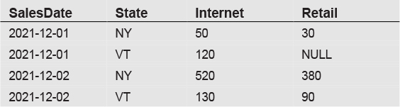
The key feature of this crosstab layout is the appearance of channel values in individual columns. Although data is grouped by SalesDate, State, and Channel, we see only combinations of SalesDate and State in the individual rows. We moved the two channel values to their own columns, Internet and Retail.
This is all fine and good, except that there was an inherent difficulty in using SQL to produce output in this crosstab format. As seen in Chapter 10, the SQL statement that produced the above output was:
SELECT * FROM
(SELECT SalesDate, State, Channel, SalesAmount FROM SalesSummary) AS mainquery
PIVOT (SUM(SalesAmount) FOR Channel IN ([Internet], [Retail])) AS pivotquery
ORDER BY SalesDate
Notice that in this SQL statement we needed to specify the Channel column values, Internet and Retail, in the statement. In other words, we were required to know in advance all the possible values for the channels and put them in our statement so that columns could be created for them. As a practical matter, this is a cumbersome solution. In this simple example, with only two channel values, it doesn’t seem terribly difficult. But in the real world, we might easily run into situations for which we might have dozens of potential values for columns, and we wouldn’t know in advance what those values are.
For this reason, the PIVOT keyword is seldom used in practice. A much simpler and more powerful solution is to rely on reporting software to automatically generate reports in a crosstab format. The vast majority of reporting tools provide some sort of crosstab functionality. In Microsoft Excel, this is accomplished with pivot tables. Other reporting tools offer similar capabilities. For example, Microsoft Reporting Services provides a Matrix Report that allows the user to lay out data in a crosstab format.
Interestingly, the report layout in reporting tools such as Reporting Services is independent of the underlying SQL query used to retrieve data. For example, in Reporting Services, you can start with a simple SQL query without a GROUP BY clause and place that query in either a Table Report or a Matrix Report. If placed in a Table Report, the output will be a simple list of data. If placed in a Matrix Report, the data can be organized into rows and columns, and then the report will automatically perform all required grouping and generate any needed columns.
External Data and Power Query
Our focus now turns to pivot tables and charts in Microsoft Excel, as this software is widely available, user friendly, and produces results similar to Reporting Services and other specialized reporting tools.
However, before delving into those topics, we need to digress for a moment into some of the specifics on how to connect to data in Excel. With its ubiquitous presence in the business world, most query and reporting tools provide a mechanism for exporting data from their tools directly into Excel. When working with SQL query tools, you generally need only to use an Export to Excel option to move data into Excel.
There are also a variety of options when working within Excel to import data from external sources. We’ll focus on obtaining data from relational databases, but we will also mention in passing that Excel can also import data from text files and connect directly to OLAP databases. Text files are generally imported directly into an Excel workbook via a wizard that lets the user specify the layout of the text file, what type of delimiters are used, the properties of each column, and so on. Excel also provides the ability to connect directly to OLAP databases, sometimes referred to as cubes. When connecting to an OLAP cube, Excel uses its pivot table interface to view data in the cube.
To obtain data from relational databases, the likely scenario is to connect to the database server and then import data into Excel. This is generally initiated via a command under the Get Data label on the Data tab of the Ribbon. Under the Get Data label are options such as:
![]() From SQL Server Database
From SQL Server Database
![]() From Microsoft Access Database
From Microsoft Access Database
![]() From ODBC
From ODBC
In this tutorial on connecting to external data, we’re going to focus on the From SQL Server Database option. The From ODBC option would be be used to connect to non-Microsoft databases such as MySQL or Oracle.
When selecting the From SQL Server Database option, it will first ask for the server you wish to connect to and your login credentials. After providing that information, a Navigator pane will pop up which asks for the specific tables on that server you would like to import. For purposes of this example, we’ll select the Customers and Orders tables, last seen together in Chapter 13. After doing so, a Queries & Connections pane will become visible that lists the Customers and Orders tables as queries. This is shown in Figure 20.1.
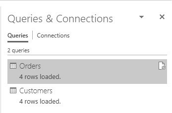
Figure 20.1 Queries and Connections
To proceed, we’ll double-click on the Customers query. This will cause a Power Query Editor window to open, as shown in Figure 20.2.
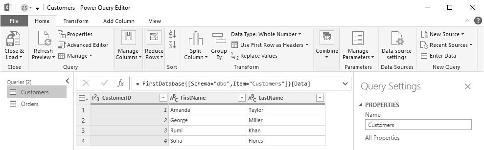
Figure 20.2 Power Query Editor
We now see the data in the Customers table. Our objective now is to combine the Customers and Orders tables together as a single query, joining the two tables on CustomerID. To accomplish that, we’ll select the Merge Queries as New command under the Combine label in the Power Query Editor, and follow the prompts to select the data in both tables. The Merge window appears as in Figure 20.3.
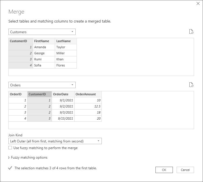
Figure 20.3 Merge Window
Notice that we highlighted the CustomerID column in the Customers table and CustomerID column in the Orders table. This indicates how the two tables are to be joined. We selected the Left Outer Join option so it will select all rows from the Customers table and any matching rows from the Orders table After clicking OK, the merged data now appears in the Power Query window as shown in Figure 20.4.

Figure 20.4 Power Query Editor after Merge
We then need to scroll to the right to expand the Orders table to make sure all columns are selected. The final step is to select the Close and Load command in the Power Query Editor. This will load the data to an Excel worksheet, as shown in Figure 20.5.

Figure 20.5 Excel Table with Merged Data
We have now accomplished our goal of importing all data from two tables from SQL Server into a single table in an Excel worksheet. The join of the two tables was done by using the merge capabilities of the Microsoft Power Query Tool Editor. Now that all the data is one a single worksheet in Excel, we can proceed with the logical next step, which is to create a Pivot Table from this table.
Excel Pivot Tables
Excel includes many features that overlap what can be done with SQL. For example, within Excel you can sort and filter data, and apply a myriad of transformations with numerous functions. Data can also be grouped and subtotaled. But one feature of Excel that’s difficult to replicate with SQL is the pivot table. Excel provides the ability to select any range of data on a worksheet and convert that data into a pivot table.
At a basic level, a pivot table is the equivalent of the crosstab format that we’ve already seen. However, a key benefit of the pivot table is that it’s completely interactive and dynamic. Rather than viewing a static crosstab report, you can easily modify the pivot table by rearranging data elements into its four data areas: rows, columns, values, and filters.
To better understand the capabilities of pivot tables, let’s illustrate with an example. We’ll start with a set of data that already resides in an Excel worksheet. We’ll assume that the data was moved to the worksheet by either first utilizing a SQL statement that joined data in tables describing customers, products, and sales and then importing that data into Excel, or else by utilizing the Power Query tool described above to merge and import the data into Excel. The data for our example is seen in Figure 20.6.
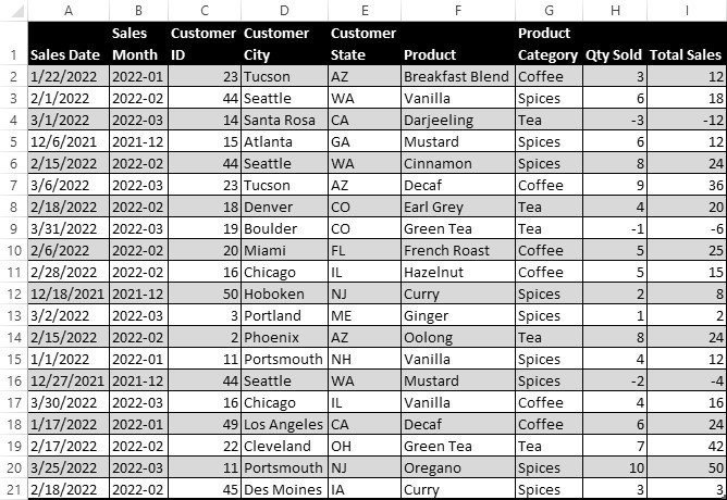
Figure 20.6 Underlying data for a pivot table
In this data set, rows with negative quantities and sales represent returns. There is one row per order or return. The first step is to insert this data into a pivot table. This is accomplished by selecting any cell in this table of data, then the PivotTable command under the Insert tab of the Ribbon. Accepting the default values on the Create PivotTable pane, Excel will create a pivot table as shown in Figure 20.7.
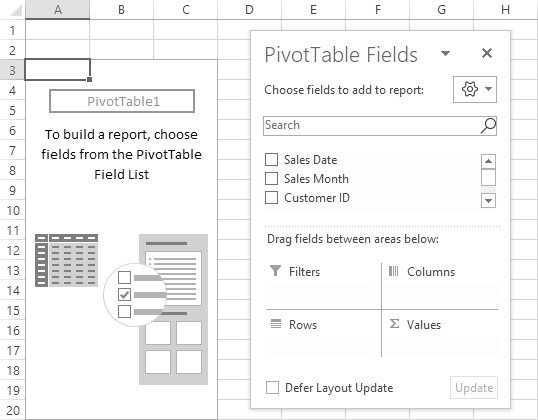
Figure 20.7 An empty pivot table with a PivotTable Fields list
At this point, we see an empty pivot table and a PivotTable Fields list showing the available fields that can be moved into the pivot table. The easiest way to move data to the pivot table is to drag fields from the list to one of the four areas of the pivot table on the Fields list: Filters, Rows, Columns, or Values. Let’s begin by moving Customer State to the Filters area, Sales Month to the Rows area, Product Category to the Columns area, and Total Sales to the Values area. The results are shown in Figure 20.8.
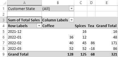
Figure 20.8 A pivot table with fields in all four areas
Let’s examine what has happened to our data. Pivot tables sum all the detailed data to which the pivot table is connected. The pivot table displays as many rows and columns as are necessary to display that data. The data is displayed in a crosstab format, with fields in the Rows or Columns areas, and quantitative values summed up in the Values area. The Filter area can be used to apply a filter to all the data. In this example, we’ve placed Customer State in the Filters area but haven’t yet applied any filters on the state.
When fields are moved to any of the four areas, the pivot table is instantly updated with appropriate values corresponding to the new layout. It’s a highly interactive device that lets you manipulate data at will.
Unlike with SQL statements, you never need to specify a grouping in pivot tables. Excel assumes that you want grouping of any fields placed in the Rows or Columns area. In this example, the pivot table has grouped all data by Sales Month and Product Category. We see, therefore, that there was a total of 86 dollars of Tea sales in the month of February 2022. Grand Total rows and columns have been automatically added, although those Grand Totals can just as easily be removed.
If we want to group data or modify the presentation in a slightly different manner, that is easily accomplished. In this next iteration, we’ll move the Sales Month to the Columns area, move the Product Category to the Rows, add Product to the Rows area, and adjust the Customer State filter to select only data from Arizona (AZ), California (CA), and Maine (ME). The resulting data is shown in Figure 20.9.
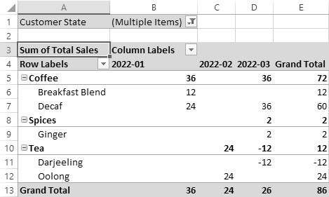
Figure 20.9 Rearranged pivot table with a filter applied
Notice that we now see a hierarchy of fields in the rows area. Within each product category, we see the various products that belong to that category. Sales Month values are now broken down into separate columns. Because we applied a filter by state, we now see a Grand Total of only 86 dollars in sales rather than the previous 321.
In addition to allowing summation of values, the pivot table allows other options, such as count and average. However, understand that only summable quantitative values can be placed in the Values area of the pivot table. In this sense, pivot tables are a close cousin of the star schema dimensional design discussed in Chapter 19. Whereas dimensional data can be placed in the Rows, Columns, or Filters areas, summable quantities belong in the Values area. The Values area of the pivot table is analogous to data in a Fact table of a star schema design.
In addition to allowing you to move fields between the areas of the pivot table, Excel also provides a few interesting report layout options. There are three basic layout options for pivot tables:
![]() Compact Form
Compact Form
![]() Outline Form
Outline Form
![]() Tabular Form
Tabular Form
When a pivot table is selected, these options appear under the Design tab of the Ribbon. The pivot tables of Figures 20.8 and 20.9 are in Compact Form. After switching the layout of Figure 20.9 to Tabular Form, the pivot table appears as in Figure 20.10.
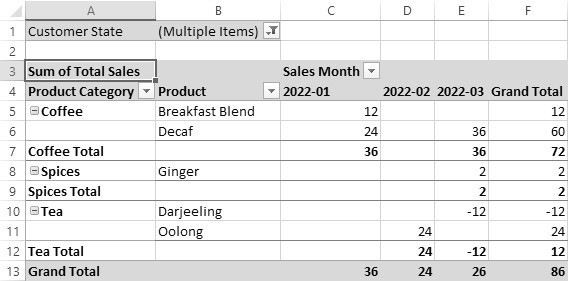
Figure 20.10 Pivot table in Tabular Form
In the Tabular Form, we now see Product Category and Product in separate columns, with labels for each field in the header area. This format clearly lists all field names in the display. Further, the subtotals for each Product Category now appears on separate rows below the Product Category.
As an additional adjustment, let’s now turn off subtotals and grand totals. The data now appears much more compactly, as in Figure 20.11.
Figure 20.11 Pivot table without subtotals or grand totals
It’s important to realize that we have thus far presented the Product Category and Product columns in a hierarchical structure, with both columns in the rows area. If we simply reverse the order of the Product Category and Product in the rows area, with the Product listed first, the data has a different effect, as shown in Figure 20.12. To enhance the effect, we also removed the filter on individual states. Additionally, we selected the Repeat All Items Label command, found under the Report Layout icon in the Design tab.

Figure 20.12 Pivot table with an inverted hierarchy
In this presentation, the Product Category appears as merely an attribute of the Product, telling us what the category for that product. Note that, since we enabled the Repeat All Items command, the label Vanilla appears twice in the last two rows, for both the coffee and the spice.
There are many other useful features of pivot tables, but one last benefit we’ll demonstrate is the ability to drill down from the summarized values in the pivot table back to the original data. This is referred to as a drillthrough. In this example, we’ll return to Figure 20.8 and double-click the cell with the value of 48, shown as the Grand Total of sales for January 2022. When we do this, a new worksheet appears that looks like Figure 20.13.

Figure 20.13 Drillthrough results Python’s download Web page is the place where you can get the latest Python releases CIT_FIG_CAP
This table of data shows the detailed data used to calculate the value of 48 in the pivot table. There are three rows shown, representing the three rows for that month we previously saw in Figure 20.6. If we sum the values in the Total Sales column, we can verify that Total Sales in January 2022 were indeed 48.
Excel Pivot Charts
The use of pivot tables is somewhat familiar territory for SQL analysts in the sense that we’re still dealing with a normal array of character, date and numeric data. Excel pivot tables are unique in that they permit to view this data in a dynamic and interactive manner, but when all is said and done, we’re still viewing data in a format that employs rows and columns. However, we now want to turn our attention to the equally noteworthy capabilities of Excel pivot charts, a tool that allows us to view data in a purely visual way.
Excel pivot charts are, in fact, closely related to pivot tables. After a pivot table is created, it can be quickly transformed into a pivot chart. Alternatively, one can create a pivot chart from a table of data in an Excel worksheet without having to create the pivot table first. When this is done, a pivot table is automatically created along with the pivot chart. However, whereas pivot tables are tied to the rows and columns of a worksheet, pivot charts reside as a free-floating visual pane above the worksheet that can be moved around at will.
To illustrate the process, let’s start with a new set of data that we will use to create a pivot chart, shown in Figure 20.14.

Figure 20.14 Underlying data for a pivot chart
This is a presentation of sales data, summarized by month, state, and channel. There are 18 combinations of data, consisting of 3 months (April through June of 2022), 2 states (New York and Vermont), and 3 channels (internet, phone, and retail). For example, the first row indicates that there was a total of $4800 in sales on the internet to customers in New York in April. Although this data is summarized, we can just as easily build our pivot chart from the underlying data, which might consist of thousands of rows. We’ve only summarized the data for purposes of being able to easily view the values.
As was done with pivot tables, the first step is to select any cell in the table of data, then the PivotChart command, found under the Insert tab of the Ribbon. After accepting the default values on the Create PivotChart pane, a pivot chart will appear as shown in Figure 20.15.

Figure 20.15 An empty pivot chart with a PivotChart Fields list
At this point, we see an empty pivot table, an empty pivot chart, and a PivotChart Fields list showing the available fields that can be moved into the pivot chart. The PivotChart Fields list is almost identical to the previously seen PivotTable Fields list, except that instead of containing areas for Filters, Columns, Rows, and Values, we now see areas for Filters, Legend (Series), Axis (Categories), and Values. The Legend area corresponds to the pivot table Columns, and the Axis corresponds to Rows. As before, we can easily drag fields from the list to one of the four areas of the pivot chart on the Fields list.
Let’s begin by moving Sales Month to the Categories area, and Sales Amount to the Values area. The results are shown in Figure 20.16.

Figure 20.16 Pivot chart with one field in the Categories area
Excel has created a column chart for us. More specifically, it created a clustered column chart. This is the default chart type. The vertical axis has been automatically populated with labels to indicate the value of each column. Since we have only one field in the Categories area, we see only one column per category. Notably, unlike pivot tables, pivot charts require a field in the Values area. If nothing were in the Values area, the pivot chart would be completely blank. Also observe that simultaneous with modifying the display of the pivot chart, the changes we made also simultaneously update the corresponding pivot table, as shown in Figure 20.17.

Figure 20.17 Corresponding pivot table
Let’s now add the Channel field to the Series area and see how the pivot chart changes. This is shown in Figure 20.18.

Figure 20.18 Pivot chart with fields in the Categories and Series areas
With fields in both the Categories and Series areas, this is a more typical chart. The sales of each month is now broken down by channel. Labels for the channels in the series are listed to the right of the data. In the corresponding pivot table, Sales Month is in the Rows area and Channels is in the Columns. Just as rows are somewhat primary in importance relative to columns in pivot tables, categories are primary to series in pivot charts. In terms of what this chart relates to the analyst, we see a breakdown of how each channel contributed to sales in each month. If our interest was more to learn of how each channel grew in sales over time, we merely need to select the Switch Row/Column command under the Design tab of the Ribbon. The results appear as in Figure 20.19.

Figure 20.19 Pivot chart after a Switch Row/Column command
We now see Channel in the Categories and Sales Month in the Series. This allows us to more easily discern how sales has grown within each channel over time.
Now that we’ve briefly seen what can be done with the various areas of a pivot chart, let’s turn our attention to some of the available chart types. To see all the possibilities, one merely needs to select the Change Chart Type command, found under the Design tab of the Ribbon. This will bring up a selection pane with over 40 chart variants that be created with pivot charts. Some of the major categories include:
![]() Column charts
Column charts
![]() Bar charts
Bar charts
![]() Line charts
Line charts
![]() Pie charts
Pie charts
![]() Area charts
Area charts
Within each category are subvariants. For example, under the column chart category, one finds:
![]() Clustered column charts
Clustered column charts
![]() Stacked column charts
Stacked column charts
![]() 100% stacked column charts
100% stacked column charts
![]() 3-D clustered column charts
3-D clustered column charts
![]() 3-D stacked column charts
3-D stacked column charts
![]() 3-D 100% stacked column charts
3-D 100% stacked column charts
![]() 3-D column charts
3-D column charts
It is considerably beyond the scope of this book to delve into the nuances of each available chart type and its appropriate use. This is a topic best left for the numerous books that cover visualization theory and techniques in detail. However, to whet your appetite for what charts can accomplish, we’ll provide two more examples of chart types.
Within the realm of column charts, we’ve previously seen the clustered column chart type. Two other particularly useful variants are the stacked column and 100% stacked column types. Figure 20.20 shows the stacked column equivalent of what had been seen in Figure 20.18.

Figure 20.20 A stacked column pivot chart
Comparing this chart to Figure 20.18, the three separate columns for each channel have now been combined into one column that stacks the three channel elements on top of another. Notice also that the vertical scale has changed to accommodate the larger values required by combining the three channels together. In contrast to the clustered chart, the stacked chart emphasizes the combined volume of each month. We can clearly see the rise in sales from April to June, a fact that was not obvious in Figure 20.18. However, the clustered chart does a better job of emphasizing the individual contributions of each channel to monthly sales.
The third main variant of the column chart, the 100% stacked chart is shown in Figure 20.21

Figure 20.21 A 100% stacked column pivot chart
In this version of the stacked chart, units are expressed as percentages. The total value of each month has the same height and a value of 100%. The virtue of this chart type is that it indicates the relative contributions of each of the channels to the month’s sales. For example, when looking at Figure 20.20, one can’t easily tell much about the relative contributions of Internet sales to each month. In contrast, Figure 20.21 clearly shows the relative importance of Internet sales increased from May to June. That said, we return to the original presentation of a clustered column chart in Figure 20.18 and observe that it provides more succinct information. By separating out each element in the series into its own column, one can readily compare the values of each individual element.
Excel Standard Charts
In addition to the capabilities of pivot charts to visually summarize data, Excel also provides several important chart types that can be created solely via traditional Excel charts, sometimes referred to as standard charts. These charts display the type of detailed data that cannot be summarized via pivot tables or pivot charts without losing important information. In this brief survey of the topic, we’ll focus on two particularly useful standard chart types, scatter charts and histograms.
Scatter charts provide a way to visually understand relationships in data. Figure 20.22 has data that represents ten different advertising campaigns. Each row indicates the amount of advertising dollars spent on a campaign and the resulting sales. Figure 20.23 shows the results when a scatter chart is created from this set of data.

Figure 20.22 Advertising and sales data

Figure 20.23 Scatter chart
As seen, the scatter chart provides a visual representation of the specific data points along two axes, advertising and sales. The relationship between these two variables can be seen as a positive one, where sales tends to rise as advertising increases. To make the relationship more obvious, we added a linear trend line to the chart, as well as axis and chart titles. These elements are all found under the Add Chart Element label in the Chart Design tab of the Ribbon.
In Chapter 9, we showed how to create a rudimentary frequency distribution by grouping data and displaying the number of occurrences of each data point, sorted from low to high. We now want to take that concept a step further by showing how Excel can create a chart type called a histogram. A histogram is a frequency distribution where the data is grouped into small bins of equal size. For example, when viewing grades from 1 to 100, one might want to see view bin sizes of 10, breaking down the individual grades into the categories 1 to 10, 11 to 20, and so on. In Figure 20.24, we show a histogram chart that has been created from an Excel table of 100 numbers, where each number has a value between 1 and 100.

Figure 20.24 Histogram with 5 bins
This histogram shows the frequencies of the numbers, as they fall into 5 different bins. The selection of 5 bins was done automatically. Each bin covers a range of 16 values. For example, the first bin goes from 5 to 21, the second from 21 to 37, and so on. The vertical axis indicates the frequency of occurrences for each bin. For example, we can see that there are approximately 4 numbers that fall in the 5 to 21 bin.
Now that the histogram has been created, we can tweak it to improve its usefulness. To do this, we simply right-click on the bottom horizontal axis and select the Format Axis command. On the pane that pops up, we’ll change the number of bins from Automatic to 20. We’ll also modify the chart title. The result is shown in Figure 20.25.

Figure 20.25 Histogram with 20 bins
We can now see enough detail to have a better feel for the shape of frequency distribution. It’s clear that the bin with the greatest frequency centers between 80.2 to 84.9, and contains 16 of the 100 numbers in the data set.
Looking Ahead
This chapter examined a few ways in which Excel can be used to supplement our data analysis and summarize data in a manner that is difficult to present strictly through SQL statements. Pivot tables in Excel use the basic concept of the crosstab report and extend it to provide additional flexibility and functionality, allowing for a fully interactive experience. Pivot charts are a close cousin of pivot tables and provide numerous ways to visually represent data. There are also occasional uses for standard charts in Excel. By being aware of reporting and analytical tools such as is found in Excel, SQL developers can focus their talents on retrieving data and let the reporting tool or end user handle more complex display issues.
If you haven’t already done so, you may want to take a look at Appendixes A, B, and C for some tips on how to get started with Microsoft SQL Server, MySQL, or Oracle. These appendices provide instructions on how to install the free versions of these databases and also provide some basic information on how to use the software to execute SQL commands.
At the beginning of this book, we mentioned that SQL involves both logic and language. The language component is fairly obvious. In each chapter, we stressed the keywords introduced and the meaning behind those words. But now that you’ve completed the book, you will hopefully better appreciate that the true power of SQL lies in the logic that it encompasses.
It is pure logic that allows you to take a bunch of values arranged in columns and rows and transform them into something approaching meaningful information. The challenge in using SQL is in determining how to apply logic to real-world data. This is where the theoretical and practical meet. By using functions, aggregation, joins, subqueries, views, and the like, the practitioner must grapple with the reality of raw data and learn how to manipulate it with a few appropriate twists of logic.
But logic isn’t the end of the matter. The language of SQL plays an equally important role. In a sense, the beauty of SQL lies in the fact that its language is quite sparse. It’s neither verbose nor overly cryptic. Each keyword has a distinct purpose and specifies a particular bit of logic and nothing more. We wouldn’t go as far as to say that SQL has poetic qualities, but within the realm of computer languages, the language does carry a certain aesthetic appeal.