CHAPTER 6
BASIC PHOTO WORKFLOW IN LIGHTROOM OR ACR
WHEN WORKING WITH PHOTOGRAPHS, post-processing is half the procedure. I know there is a school of thought that says you should get it all in-camera. I stand across that aisle. I am not a purist. I believe in using whatever tools are available to create the best possible image.
To a certain degree, “get it all in-camera” is not a bad philosophy. This might be true for journalism, but what does “all in-camera” really mean? When you are shooting in RAW, you have made a digital negative. It still requires processing. In a traditional darkroom, decisions are made that affect the final appearance of a photograph; this is the same with the digital darkroom (e.g., your post-processing software).
I have an alternative mantra: Get it all on the sensor and then bring out what you need in post-processing. Why limit yourself to capture, the first part of the process? The second part is where you really get to put your personal fingerprint, your signature, on the image. You will learn that there are ways of capturing images that lend themselves really well to your style of post-processing. Most of the small cameras we fly lack the dynamic range and sharpness of their ground-based siblings. Generally, there is more distortion because we are shooting wide angle, and noise can quickly become a problem with the tiny sensors.
There are two programs I mainly use to process my aerial images, and we will examine the best ways to apply their tools to aerial imaging. We are going to look at Adobe Photoshop Lightroom and Adobe Photoshop. These applications have been my trusted friends for a long time. I have been using Photoshop since 1993, when it first came out on the PC as version 2.5. I have used Lightroom since it was in beta, and I’ve had the privilege of being an Adobe Alpha tester on both applications.
It’s impossible to cover Photoshop and Lightroom in depth without writing a 1000-page book. I have made a career by creating many in-depth resources on these programs at PhotoshopCAFE.com.
The point I’m making is that these Adobe tools have been a part of my workflow since I started working with imaging, before digital cameras were any good. In some ways, the quality of the earlier aerial images took me back to those early postproduction days of film scans. This helped me because those images took a lot of massaging. There was a good image in there somewhere, but you had to be heavy-handed to coax it out—but not too heavy-handed, because the images were flimsy and would fall apart quickly. What was needed was an iron fist in a velvet glove. Nothing proved this more than working with the DJI Vision and Vision+ cameras. I was able to evolve this processing with the Phantom 3 and 4 cameras and the Inspire 1, X3, and X5 cameras. I’m now going to share what I have learned over the past 20+ years, but filtered into the context of the workflow I have developed over the past three years.
Every time I post an aerial image online, I get questions about how I process my images. I hope to answer all these questions and more in the following pages. You can find me on both Facebook and Instagram, where I post daily aerial images, as PhotoshopCAFE. Disclaimer: I haven’t perfected my workflow. I’m still experimenting and learning and growing, so this is what I am doing currently. Some of these techniques will evolve and some won’t. I encourage you to learn from my efforts, but then use that as a jumping-off point to develop your own unique style and workflow. I know I will! I’m not ready to bake my clay just yet.
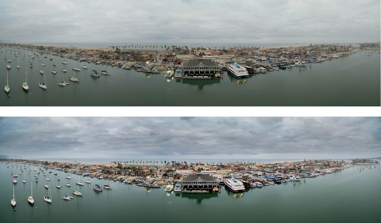
6.1 Before and after postproduction
MEDIA DOWNLOADING AND TIPS
BEFORE YOU CAN DO ANYTHING, you need to get your photos off your aircraft and onto your computer. This means that you need to come up with a system. There are three main things to take into account.
- 1. How will you get the files off your cards?
- 2. Where are you going to put them?
- 3. How are you going to find them when you need them later?
Dumping Your Data
The first question is easily answered. There are three methods available to remove the files from your memory card. The first is to transfer the files wirelessly through your app. The second option is to connect your camera through a cable, such as USB. The third and recommended way is to transfer the files directly off the card using a card reader. This is the fastest way to “dump” your data, and it doesn’t require you to use up your drone batteries while you are doing it.
Most aerial cameras use microSD cards. These tiny cards can be placed into an SD adapter and treated like an SD card. Many devices, such as the MacBook Pro, come with SD card slots that you can plug the card into directly. At this time, the maximum read time on the MacBook Pro, 480 Mbit/s, exceeds the fastest cards, so this is a good solution.
If you are shooting on multiple cards, then investing in a good card reader is a great idea. I use the Lexar UR2, which supports UHS2 and can transfer from three microSD cards simultaneously. Always use Class 10 or faster cards. I talk about cards in chapter 2.
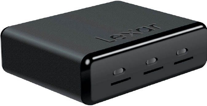
6.2 MicroSD card reader
Where Are You Putting It?
The second part of the equation is where you are putting the images. You are transferring your images to a hard drive. This could be a spinning platter or an SSD (solid-state drive). It could be an internal or external drive. All of this really depends on your workflow. Personally, I move my photos and videos onto an external hard drive. I shoot a lot of footage and need flexible storage, so I use an array of external drives. I am a big fan of using external RAID drives because of their size and redundancy. I also look for speed, so a Thunderbolt connection is great. USB 3 is OK, but it’s half the speed of Thunderbolt. Avoid USB 2—it’s a lot slower. USB 3.1 is the same speed as Thunderbolt. Thunderbolt 2 is twice as fast, and on it will go. Get the fastest drive that fits your budget. For photos, this doesn’t matter as much as it does for video.
Where Is It?
This is where digital asset management comes into play. There are many management systems you can use. The important thing is to be consistent. Whatever management system you use, make sure you stick to it so that you don’t accidentally delete important files. Have a system for cataloging your downloaded files. You can sort the main folders and subfolders by camera, by date, by location, or some other way.
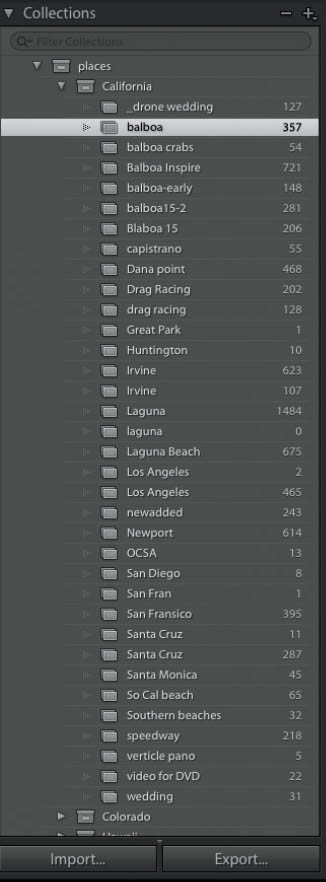
Personally, I sort by camera and location. I have a main folder, called Drone. Under that, it’s sorted by different cameras: GoPro, P2, P3, P4, Inspire, and X5. I then sort by location: country, state, city, and finally, specific location. If I shoot the same location multiple times, I create a numbered folder for each shoot; this prevents me from accidentally overwriting other files with the same name. This is where I dump all the files when I come home from a shoot.
The second and most important part of organization is metadata. File-based management has its limitations, but metadata is far more powerful because of how quickly it makes finding files; it also leads to better version control. I use Lightroom to catalog all my footage and images. I have a catalog for all my aerial photos and videos. I then create collections and subcollections. These collections are based on locations. I also add keywords to the photos as I import them. Keywords and collections make it really easy to find images later on for processing. A lot of the information, such as dates, times, and GPS coordinates, can be useful and are written into the files.
You can also use smart collections in Lightroom to automatically create collections for things like HDR images and your processed images. For example, I made a smart collection that automatically includes all TIFF and PSD files for this book. All the images I have processed in Lightroom and Photoshop appear in this collection, which saves me the time of digging around trying to find things.
ASSET MANAGEMENT IN LIGHTROOM
I don’t want to spend too much time on asset management, but it’s worth looking at some quick basics. Lightroom is a great program that lends itself well to aerial imaging. It’s a good place to bring all your photos and videos together so you can manage and locate them later. For more features and a larger workflow, I have a 15-minute Lightroom crash-course video here: http://photoshopcafe.com/Learn-Lightroom.
6.3
Catalog
The catalog is where you save all your photo information. Lightroom doesn’t actually store your photos. It knows where they are and creates a reference to them. It keeps a little text file for each image in its database (known as an XMP). Lightroom is just a database that lets you change settings. This text file contains the EXIF information that the camera writes, such as shutter speed, time of capture, and so on. It also stores the metadata that you add, such as keywords, and it contains the Develop settings—the things you change in Lightroom, such as the brightness, contrast, gradients, etc. When you look at a photo in Lightroom, what you are seeing is the program reading the text information and displaying the photograph accordingly. You change this information by moving sliders.
The database is called the catalog. You can have multiple catalogs in Lightroom, but you can open only one at a time. I created a catalog where I keep all my aerial photos.
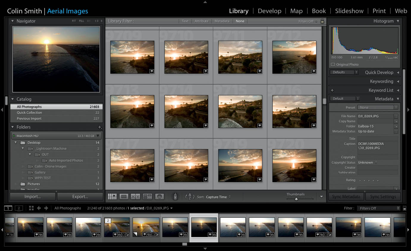
When you want to view all the photos in your catalog, make sure to click All Photographs at the top of the Catalog panel in the Library module. If you don’t choose All Photographs, you won’t see all your photos and you may think some are missing. This is our home base (Figure 6.3).
Scroll down a little bit and you will see the Folders panel. This shows the actual location of the physical images on your computer’s hard drive or external drives. If you want to change the location of photos, don’t change them on the drive, because Lightroom won’t know where you’ve moved them. If you drag the images from within the Folders panel, you can relocate them and they will also change physical location on the drive. To summarize, move the indexed files inside Lightroom, not on the drives themselves (Figure 6.4).

6.4 Folders view is where the actual photographs live
Collections
There are many times when you don’t want to look at all your photos. Maybe you want to look at photos from a particular shoot or from a specific location. This is what collections are. Collections are sets of photographs from the entire library. It’s a great idea to make collections, because you can quickly group photos together. When you click a collection, only the photos in that collection will show (Figure 6.5).
To make a collection, click the little + button on the collection and type in a name. If you have photos selected while creating the collection, you will have the option to include these photos in the new collection. If you don’t have any selected or choose not to add selected photos, you will have a blank collection (Figure 6.6).
Photos can easily be added to collections by dragging them into a collection from Grid view or from their folders. You can add a single image or multiple images.
6.5

6.6
When you add images to collections, they do not move from their original location; you are just grouping them together in Lightroom.
TIP You can drag a folder from the Folders panel into the Collections panel and a new collection will be created with the photos from the folder.
Keywords
Keywords will help you find your photos. You add keywords through the Keywording panel on the right side of the Library module (Figure 6.7).
Finding Images in Lightroom
All this fancy metadata doesn’t mean much if we don’t have a way to use it later.
Keywords and other metadata can be searched by using the filter bar in Lightroom. Choose View > Show Filter Bar, or press the / key (Figure 6.8).
Choose a criterion from across the top: Text, Attribute, Metadata, or None (to turn off filtering). If you want to search the entire library, select All Photographs from the Library panel or select a collection to restrict searching to the photos in the collection.
ATTRIBUTE
A useful option on the filter bar is Attribute. I use this all the time to quickly display all the video files. There are a number of different ways you can filter attributes (Figure 6.9).

6.7 The Keywording panel

6.8

6.9
At the far right of the Attribute panel in Figure 6.10 are three buttons labeled Kind. Click the last one, which is a little filmstrip icon. Now all the photos will be hidden and all that remain are the video files—that’s a huge time-saver!

6.10
Basic Edits in Lightroom
Lightroom is a great place to start making adjustments to your images. The adjustments in Lightroom and Adobe Camera Raw (ACR) are identical. This means you can start in Lightroom and if you choose to open a photo in Photoshop as a Smart Object, you have direct access to your Lightroom adjustments from within ACR. This also means that the following tutorials will work in either Lightroom or ACR. Also, ACR and Lightroom aren’t restricted to the RAW format. They also work with the JPEG, TIFF, and PNG formats. RAW is the preferred format to shoot because there is more information and dynamic range in a RAW file.
A QUICK NOTE ON LIGHTROOM AND CAMERA RAW COMPATIBILITY
If you are on Adobe Creative Cloud, then the latest versions of Lightroom and ACR have exactly the same feature set. If you have an earlier version of ACR, you can still open the file from any version of Lightroom, but only the features in that version of ACR will be re-editable.
- Lightroom 4 was fully compatible with Photoshop CS6.
- Lightroom 5 was fully compatible with early Photoshop CC.
- Lightroom 6 was fully compatible with Photoshop CC 2015.
- Lightroom CC is always up to date with the latest version of Photoshop CC.
![]()
BASIC LIGHTROOM WORKFLOW
I’M NOW GOING TO WALK YOU THROUGH the basic sequence and steps to editing your photos in Lightroom. Most of the time, these are the steps that I apply to every photograph.
Note that ACR in Photoshop works exactly the same way, with the same settings. You can open a RAW file into Photoshop or Bridge. In Photoshop CC only, you can also access ACR as a filter.
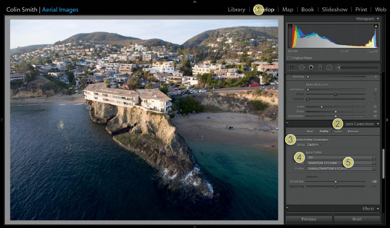
Fix the Lens
The first thing we need to do is remove the distortion from the lens. GoPro cameras usually have more distortion than many of the others, but all wide-angle cameras have some distortion. Lightroom has built-in profiles for most of the cameras you’ll be using. If it doesn’t, try something similar and see how it looks (Figures 6.11A—6.11C).
- 1. Switch to the Develop module at the top of Lightroom. (I have collapsed the left panel by clicking the arrow in the margin to provide more working space.)
- 2. In the right column, scroll down to the Lens Corrections panel.
- 3. Click on Profile. Choose Enable Profile Corrections.
- 4. Choose the make of the camera. In this case, it’s DJI. Many other manufacturers are supported, including GoPro.
- 5. Choose the model of the camera. Once you do this, the profile will be applied and you should see a reduction in lens distortion (the fisheye effect) and vignetting (darkening of the edges). Under Model, you may not see your exact model, so try using something close. Currently, the Phantom 3 FC300X seems to work well for all Phantom 3 and Phantom 4 cameras.

6.11A The original image as shot
6.11B The lens profile applied

6.11C Before and after image taken with the Phantom 2. No adjustments other than lens profile.

Crop and Straighten
The next step is to straighten the image. Sometimes your gimbal isn’t correctly leveled, or perhaps the wind blew it off a little. If this is the case, the best place to straighten is the Crop & Straighten panel (Figure 6.12).
- 1. Click the Crop icon at the top left of the Develop module.
- 2. Click the Level icon in Angle.
- 3. Drag the tool along the horizon line. This straightens the horizon.
You can also manually drag the corners to change the rotation of the image.
This is also the place that you can crop the photograph to remove distractions or to change the composition if you so choose.

6.12 Straightening the horizon
Color Correction
Because the color of ambient light changes based on the time of day and on whether it’s sunny or overcast, we often need to correct the overall color of the photo. Sometimes the color can be spot on, but we might want to warm it up a little or adjust it creatively.
Here is how to correct the color in a photograph (Figure 6.13).
- 1. Under the Basic panel in the Develop module, click the Eyedropper tool.
- 2. Move it over an area that should normally display as a neutral gray or white. Usually gray works best because often the white is blown out. You will see a grid that identifies the exact color under the eyedropper.
- 3. Click the gray to apply the color correction. If you don’t like it, try clicking a different area.

6.13 Applying the color correction
6.14 The result of the color correction
COLOR CORRECTION TIP Near the end of the day, such as at sunset, try looking for a gray area that is in shade. This often produces the most natural results.
You can also slide the Temp slider to make a manual color correction.
Tonal Corrections
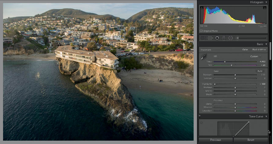
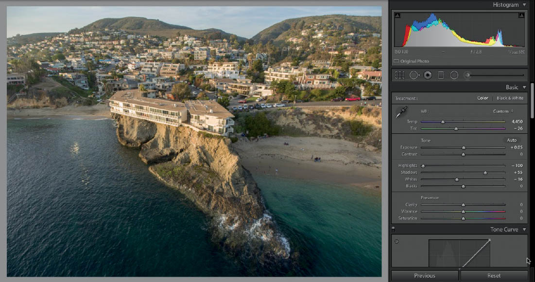
We are now going to move on to the tonal corrections. This is where many people begin their editing. To see what they are missing by not starting with a corrected image, look at the before and after images as they look thus far.
Tonal corrections are achieved by adjusting the brightness of the image. The brightness can be broken into three main areas: shadows, midtones, and highlights. These tonal corrections can be made to make the photograph look natural, or they can be pushed to extremes for image enhancement and exaggeration. Feel free to choose the style that you prefer. All of this is going to happen in the Basic panel in Lightroom (or ACR).
HIGHLIGHTS
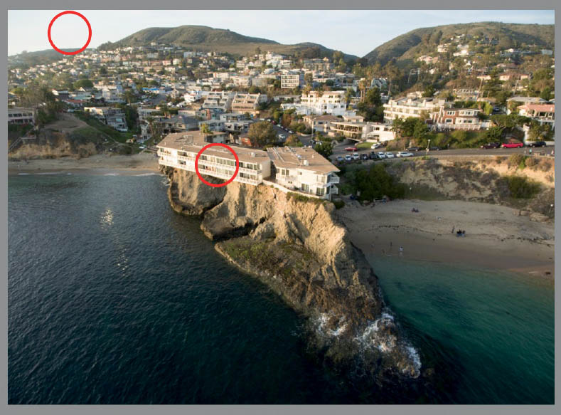
If you look at the photograph we are working with (Figure 6.14), you will notice that the highlights are blown out. The sky is bright, it’s hard to make out much color, and the building is lacking detail in its brighter areas, such as the balconies.
We recover highlight details by moving the Highlights slider. Slide it to the left to recover highlight details. There is rarely a reason to move it to the right. In this case, we had to move it all the way left to recover the highlight information we desire. It’s very common to be a bit heavy-handed with this, since highlight detail gets lost easily in digital photography (Figure 6.15).
Note that when something is overexposed and completely blown out, moving the Highlights slider will only turn the white areas gray and will not recover details, because they don’t exist on the sensor. Be watchful of this, as gray, milky whites are not attractive.
SHADOWS
The Shadows slider enables us to recover detail in the very dark areas of a photograph. Be careful not to overdo this, as you can easily end up with a faux HDR look. Not all photos will need shadow recovery. Move the slider to the right to open up the shadows and reveal details (Figure 6.16).
6.15

6.16
Adjusting the Shadows and Highlights sliders will reveal more of the dynamic range that was captured but hidden in the RAW file (or, to a lesser extent, in the JPEG file). Use of these sliders will reduce the contrast of the photo and make it look a little washed out. That’s OK. Don’t worry about contrast yet; we will get to it soon. Also keep an eye out for noise. If you open up shadow areas too much, you will see speckled noise appear in your photograph. While a little bit is acceptable, too much will ruin the image.
EXPOSURE
The Exposure slider adjusts the overall brightness of an image. Even though it affects the entire image, it’s where you can tune your midtones (the grays). Sometimes I begin with the Exposure slider if the image overall is too dark or too bright. Whether I begin with Exposure or wait until after Shadows and Highlights, I always check it at this stage of the adjustment. It’s a balancing act. To adjust exposure, move the Exposure slider to the left to darken or to the right to brighten. In this case, I barely moved the Exposure slider, because not much adjustment was required (Figure 6.17).

6.17
At this point we are looking at setting the contrast of the image. What is contrast? High contrast is having clean, bright whites and deep blacks in the shadows—more of a punchy image. Low contrast is akin to looking out a dirty window. The picture can look faded.
You could move the Contrast slider to the right to add more contrast, or to the left to reduce it and increase dynamic range. I rarely move the Contrast slider because I prefer separate control of the highlights and shadows. By using the Blacks and Whites sliders, I can choose high contrast in the shadows but low contrast in the highlights.
There are two ways to use the Whites slider. If there are highlights or areas of white that have turned milky or gray, moving the Whites slider slightly to the right can clean these up and produce clean, crisp highlights. This is its main use. A secondary use is in a situation in which we need to recover more highlights than the Highlights slider was able to; moving the Whites slider slightly to the left will bring out more detail. Since there are very few pure whites in this image, this works well (Figure 6.18).
6.18
The Blacks slider is where you push the darkest shadows, without detail, into pure black. This gives the most contrast punch. An image without true blacks can look washed out and lacking body. Move the Blacks slider to the left to darken the shadows (Figure 6.19).
When an area of shadow is solid black with no details, or when highlights are solid white with no details, it’s called clipping. Usually the goal is to show as much detail as possible, (while keeping it tasteful). You usually want to set the Blacks and Whites sliders to add contrast but avoid clipping your image. Here is a tip to help you do that: Hold down the Alt key (Option key on Mac) and move the Blacks or Whites slider. The image will initially appear blank white. As you move the slider, areas of the image will start to appear. These are the areas that will be clipped if you apply the slider. Use this technique to quickly identify when clipping will begin to help you choose how far to move the sliders (Figure 6.20).

6.19

6.20
This little trick also works with the Exposure, Shadows, and Highlights sliders. Figure 6.21 shows an image that is adjusted right to the clipping point using the basic adjustments. It produces a very natural result, which is preferable to some people. In our example, we have slightly exaggerated the details, which is something I personally like with the small cameras on the Phantoms and GoPros. With the Inspire Pro (X5), I go for a more natural result because the sensor detail is better. How far you move these sliders is entirely up to you, of course, and we all have different preferences (Figure 6.21).

6.21 A natural, non-stylized adjustment. You can see that there is less movement on the Shadows and Highlights sliders.
Enhancements
You’ll find additional adjustments in a section called Presence at the bottom of the Basic panel. These adjustments allow a little creative boost.
CLARITY
This is not sharpen, but does produce an effect that makes the image look sharper. This slider boosts midtone contrast. It makes the subtle differences between light and dark midtones more pronounced, making more details visible in the photograph. Move it to the right to bring out more details in things like rocks and sky. Move it to the left to make things look softer. I avoid moving the slider to the left except in extreme circumstances, such as to reduce visible banding (Figure 6.22).
VIBRANCE AND SATURATION
The Saturation and Vibrance sliders increase or reduce the amount of color. The difference is that Vibrance looks for areas with a low amount of color and boosts those more than areas that already have a lot of color. This allows you to add color without clipping the existing color in the image. A little vibrance in skies, water, and sunsets can go a long way (Figure 6.23).

6.22

6.23
LOCAL CORRECTIONS
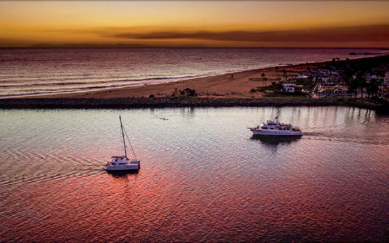
SO FAR WE HAVE EXAMINED GLOBAL ADJUSTMENTS, or adjustments that affect the entire image. But sometimes an image looks great, but there is one part that is too bright or too dark and you can’t fix it without messing up the rest of the photo. This is where local corrections come in handy. The one that you will use the most is the Gradient tool. The Gradient tool is most useful for skies. Because the sky is usually your light source, it’s often brighter than the rest of the image. The Gradient tool is a great way to darken the sky to allow color, clouds, and sunsets to show without over-darkening the rest of the photo.
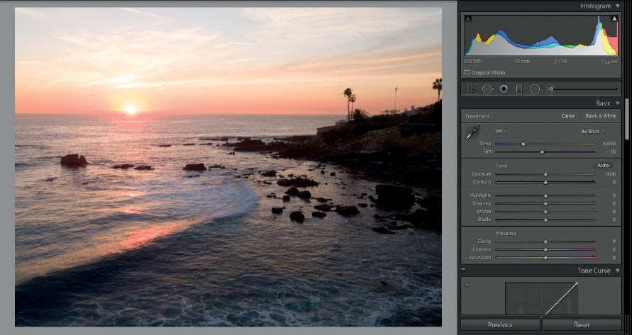
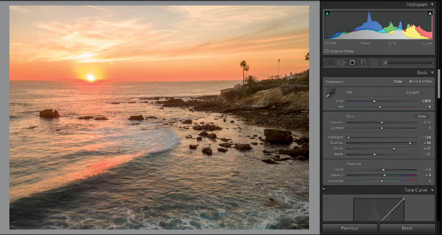
Figure 6.24 shows the original image. Figure 6.25 shows the same image after applying the workflow shown up to this point in the chapter. It looks pretty good, and we have recovered a lot of detail. Let’s make the sky a little darker, though, and reveal even more of that powerful sunset.
- 1. Choose the Gradient tool in the Adjustments toolbox.
- 2. Drag it vertically across the image where you want to adjust the photo. Everything on one side of the gradient will be adjusted. The other side won’t change. The three lines in the middle are where the new adjustments will blend.
- 3. Drag the black dot to relocate the gradient at any time.
- 4. Drag one of the horizontal lines to make the gradient wider or narrower, or even to rotate it.
- 5. Double-click the word Effect to reset all the settings.
Now, make adjustments to the sliders in the gradient. They are the same as the sliders in the Basic panel, with the exception of Vibrance. Notice that the adjustments apply only to the region you defined with the gradient. You can always move the gradient or change its transition at any time, even after you have applied the sliders (Figures 6.26—6.27).
6.24 The original image
6.25

6.26

6.27
Adjustment Brush
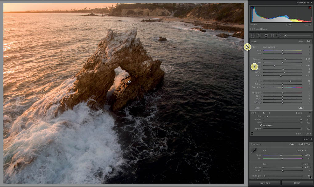
The most powerful tool for local adjustments is the Adjustment Brush. This tool allows you to brush on the adjustments wherever you like. You can apply the basic adjustments to any portion of the photo. Here is a good way to use it.
Make your global adjustments to the image in Figure 6.28. We want to add some details to the rock but not to the rest of the image (Figures 6.28–6.29).

6.28

6.29
- 1. Click the Adjustment Brush to make it active.
- 2. Adjust the Size, Feather (softness), Flow (painting opacity), and Density (overall opacity) settings.
- 3. Turn on Auto Mask if you want to detect edges and paint inside the lines; otherwise, turn it off.
- 4. Press the O key for the mask overlay, and paint over the object you want to adjust. When you are done, press O again to hide the overlay (Figure 6.30).
- 5. Double-click the word Effect to zero out the adjustments.
- 6. The result is shown in Figure 6.31.
- 7. Make your desired adjustments to the masked area.

6.30
6.31
Dehaze
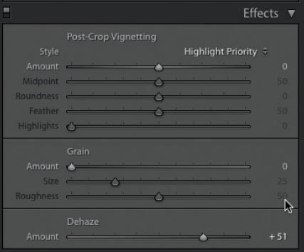
Sometimes you will get a lot of atmospheric haze in a photo from fog, pollution, or a number of other causes. There is a slider in Lightroom specifically for this—it’s called Dehaze, and it was, ironically, unveiled in smoggy Los Angeles at Adobe Max. You might not use it very often, but it’s good to know it’s there when you need it.
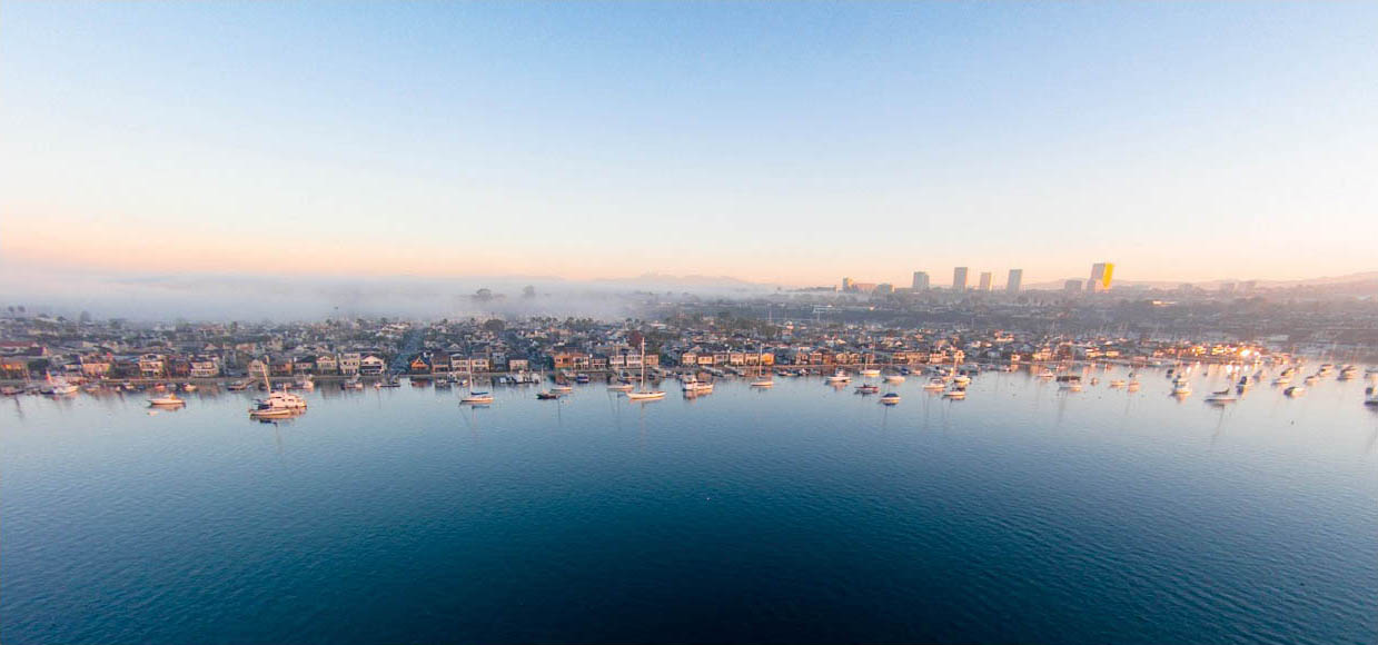
Figure 6.32 shows a photo of some really great fog coming in. The problem is that a lot of the details are, um, hazy.
Go to the Effects panel in the Develop module. Dehaze is at the bottom (it’s also in local adjustments such as Gradient). Slide it to the right to cut through the haze. Move it to the left to add haze (Figure 6.33).
Now you can see the dramatic result for this little but powerful slide (Figure 6.34).

6.32
6.33
6.34
FIXING THE BAD STUFF
A couple of bad things can happen to a photograph. When posting images on social media, they may be too small for these deformities to be noticeable. But if you are going to print any of your photos, then you definitely need to know how to resolve these issues.
Noise
You could think of noise as film grain; the difference is that some people find film grain pleasing because it’s a natural by-product of the way we used to make images. Noise is just bad, and it’s not an attractive type of grain. Noise is a by-product of the sensor working hard and trying to capture details. There are three main causes of noise:
- Shooting in a low-light situation. Noise will especially manifest in the shadows.
- Shooting with the ISO turned up high. Many quadcopter cameras will show noise at any ISO higher than 100. Try taking a few test shots to find out at what ISO the noise becomes unacceptable on your camera, and then avoid going above that number. When the ISO is turned up, it boosts the sensitivity of the sensor, which produces noise.
- The sensor getting hot. If you are shooting a lot of video without any cool-down time in between shots, you might start to see noise.
Figure 6.35 displays noise. It’s not always easy to see the noise until you zoom in close.
6.35 This image displays noise
In Figure 6.36 you can clearly see the noise. It’s widely recommended to view images at 100% for noise reduction and sharpening. There are two types of noise: color noise and luminosity noise. Color noise is when the grain on the images contains colors that don’t belong. This is the easiest type of noise to reduce, and usually a very small amount of color noise reduction will do the trick.
In the Detail panel, look for Noise Reduction. Slide the Color slider to the right until the grain color looks even and the colored speckles are gone (Figure 6.37).

6.36

6.37
The second type of noise is luminosity noise. This is the grain structure that appears—the tiny dots everywhere. I chose this particular image because it’s easy to see the side effects of noise reduction in the tire tracks in the sand. Move the Luminance slider to the right until the noise is reduced or gone. Play around with the Detail and Contrast sliders to restore as much detail to the image as you can. It’s really a compromise between the level of acceptable noise and the loss of fine detail in your photo. In this case, I got quite heavy at 100%, maybe too heavy, but I wanted you to clearly see the difference (Figure 6.38).

6.38
Zoom back out and you can see the effect the noise reduction had on the entire image. Figure 6.39 should look pretty decent for a social media post or online viewing, but for print, you may want to reduce the Luminance slider a little bit. Don’t forget that we haven’t applied any sharpening yet, and that will bring back some detail; sharpening is covered at the end of this chapter (Figure 6.39).

6.39
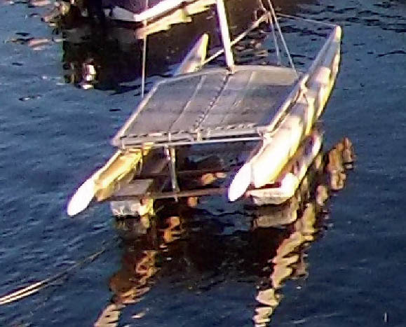
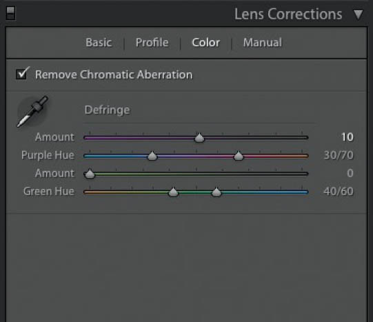
Chromatic Aberration
Chromatic Aberration, otherwise known as color fringing, is a result of the different colors of light at different wavelengths hitting the lens and sensor. An easier way of explaining it is to look at a photograph at 200% magnification. Figure 6.40 displays color fringing as a purple halo around the white bows of the catamaran.
In the Lens Corrections panel, click the Color tab to reveal the Defringe tools. Select the Remove Chromatic Aberration checkbox, and adjust the Amount slider to reduce or remove this problem (Figures 6.41–6.42).
6.40
6.41

6.42
FINISHING TECHNIQUES
THESE TECHNIQUES aren’t going to be used on every photo that you process, but I think you will find them very useful when you do need them.
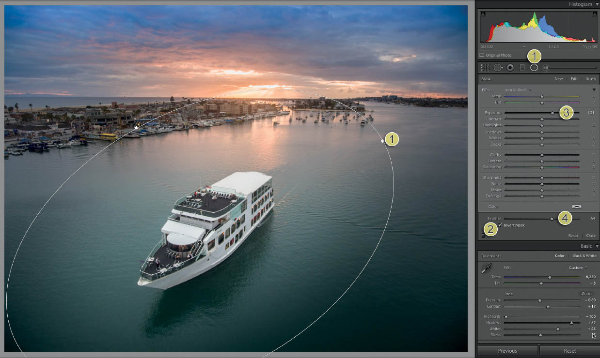
Radial
The Radial adjustment is immensely useful when it comes to focusing the viewer’s eye on a portion of a photo. This works a lot like the Gradient tool, but it works as an oval or circular shape that can be any size, angle, or location. Adjustments can be applied to the inside or outside of the elliptical selection.
In Figure 6.43, the surroundings look great, but the subject—the boat—is a bit dull. We want to lighten up this area without the rest of the image being affected, like shining a spotlight on it (Figure 6.44).

6.43
- 1. Apply a Radial adjustment.
- 2. Select Invert Mask so that the inside of the radial is affected.
- 3. Lighten up the exposure.
- 4. Adjust the feather so it’s nice and soft.
Figure 6.45 shows the result.
6.44

6.45
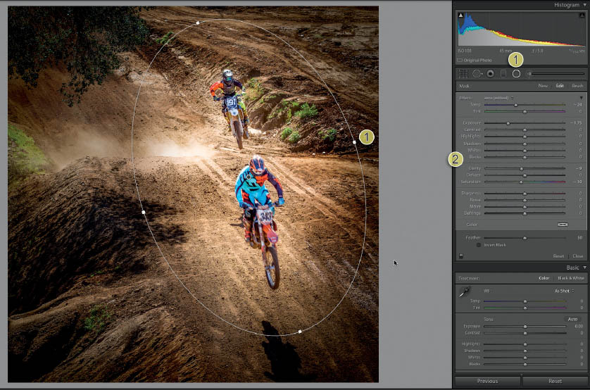
Let’s look at another example. In Figure 6.46 our subject is bright enough, but there is a lot going on around the edges.
- 1. Apply the Radial adjustment. Deselect Invert Mask (Figure 6.47).
- 2. Turn down the exposure, and slightly reduce saturation (Figure 6.47).
In Figure 6.48, you can see a totally different result for the same tool. This tool can be used often, and people won’t even notice if you use it in a subtle way.

6.46
6.47

6.48
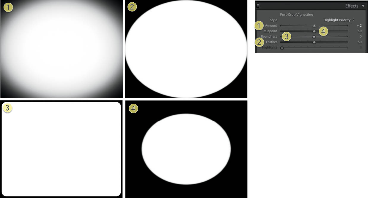
Vignette
One of the quickest ways to add a professional touch to a photo and draw the eye into the image is the use of a vignette. I’m sure you have seen them many times. What was once considered a flaw of the lens is now a popular effect. A rounded lens receives more light in the center than around the edges, which causes a darkening effect. There is a Vignette filter in Lightroom, but we aren’t using it for this creative vignette. Instead, we are using the one in the Effects panel in the Develop module.

6.49 An image without a vignette
Whereas a regular vignette is applied to the original shape of a photo and can be cropped out, a post-crop vignette will fill the image, even after we crop it or change its shape.
Let’s take a look at the components of a vignette (Figure 6.50). The actual vignette you use will generally be much subtler, but in these examples, the settings are turned all the way up so you can clearly see what each setting does.
- Amount: To the left is darker; to the right is brighter. In this case, it’s all the way to black.
- Feather: Softens and blends the edges. Here, it is all the way down and shows a hard edge.
- Roundness: From a rounded rectangle shape all the way to a circle.
- Midpoint: The size, from just in the corners to most of the image.
6.50
Here are some real-world settings and application of the vignette. You will notice I use these on a number of images in the book. After we apply the effect, notice how it draws you into the photo and adds an almost subliminal border to the image.
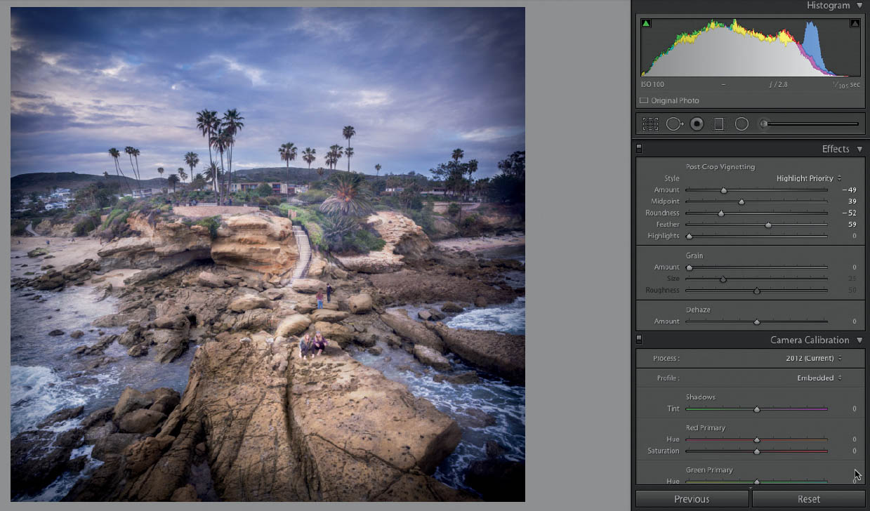
6.51 The different settings of a post-crop vignette
Creative Use of Dehaze
I mentioned the Dehaze adjustment already. Now I want to share a couple of useful creative applications of this effect. These aren’t effects you will use often, but they are nice to have tucked away in case you need them. We can use them in conjunction with the Gradient tool to add or decrease atmosphere.
Add the Gradient tool and zero it out.
Add just a little bit of Dehaze, and see how it gives the sky and clouds a boost.
We can also produce the opposite effect by reducing Dehaze, which will create some fog in the image.
In this example, we added a gradient and reduced the Dehaze slider.
6.52 Edited image without Dehaze
6.53 Dehaze can add punch to the clouds and sky

6.54 The image before Dehaze is reduced
6.55 The image after Dehaze is reduced on the gradient. It looks like the fog has rolled in.
SHARPEN
LET’S WRAP UP THIS CHAPTER by talking about sharpening. All lenses create a slight amount of blur, so a little bit of sharpening is needed. Lightroom automatically applies a small amount of sharpening to every image as it’s processed. Quite often, you might want to add more sharpening yourself.
The important thing is to leave sharpening until the very end. I often save unsharpened or minimally sharpened versions of an image so the last step (known as finishing sharpening) is dependent on how the photograph will be used. If you are going to print the image, it will require more sharpening than if you are going to post it on Facebook or Instagram.
The reason for this is resolution. The larger the image, the more sharpening you need. It also depends on how close the viewer will be to the image. If you are looking at the photo really close, you won’t want too much sharpening, or people will see the halos around the details in your photo. However, if they are standing back a bit, looking at an image hanging on a wall, a bit more sharpening is desirable because it makes the photo look more crisp.
If you are going to print or output the image from Lightroom, then add some sharpening. However, if you are going to continue working on it in Photoshop, wait and add sharpening after the work is all done.
Sharpening Workflow
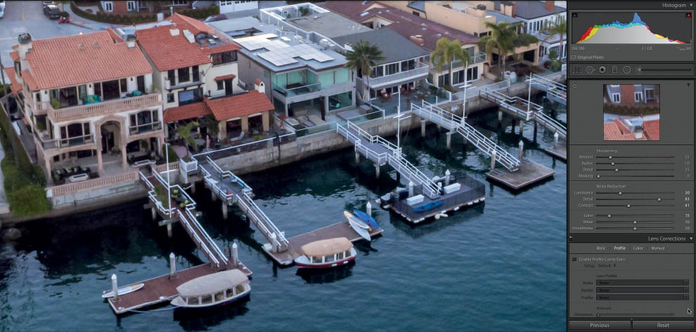
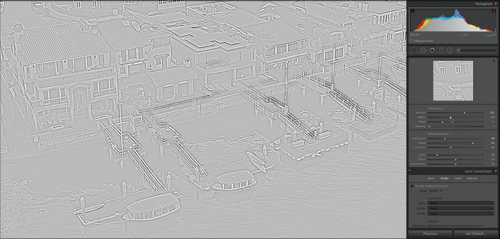
Whenever you’re doing any sharpening, make sure you’re viewing the photograph at 100% view so you can see the details.
The Amount slider determines how much sharpening is applied. Start with this slider; otherwise, nothing else will do anything (Figure 6.57).
Hold down Alt/Option to get a preview as you slide the Radius slider. Adjusting the radius will determine how bold the sharpening applied to the edges will be. Sharpening is achieved by adding contrast around the areas of detail. Too much and you will start to see halos around the edges. Figure 6.59 shows a small radius.
With a larger radius, as in Figure 6.60, you can see what the Radius slider does to achieve sharpening.
Adjusting the Detail slider will bring out textures and lower contrast details. Holding down Alt/Option provides a preview of the detail areas that are being sharpened. Be careful—too much detail and a moiré pattern will start to appear on the image (Figure 6.61).
6.56 This image shows the photo zoomed in to 100%, with default sharpening applied

6.57 If you hold down the Alt/Option key while sliding the Amount slider, you will see a black and white overlay so that you can clearly see the results of the sharpening

6.58

6.59
6.60

6.61
Finally, the Masking slider will help you keep the sharpening effect while reducing noise or moiré that may have been introduced. Hold down Alt/Option as you move the slider to see where the sharpening will be applied (white areas) and where it will be masked or hidden (black areas). A zero amount will result in no masking and the preview will be solid white. An amount of 100 will result in no sharpening to the image at all and a solid black preview. To prevent the introduction of noise, find the amount where the edges and areas of important detail are being sharpened while larger areas without detail are being masked (Figure 6.62).
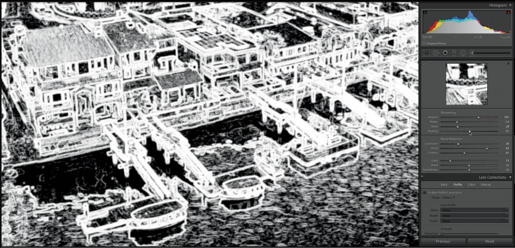
6.62
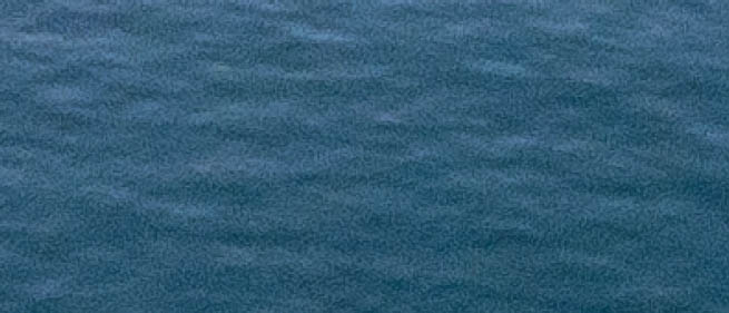
6.63 A closeup of an area with a lot of noise added in sharpening

6.64 Masking eliminates a lot of this noise
In Figure 6.65 you can see an area of the photo at 100% with sharpening applied. Be sure to examine different parts of the photo to make sure the sharpening is pleasing throughout the image.
Figure 6.66 shows the full image with no sharpening applied.
Figure 6.67 shows the entire image after sharpening. It might be difficult to notice at full size. You want the sharpening to make the image crisp, but you don’t want it to look like it was obviously manipulated.

6.65

6.66

6.67
CONCLUSION
IN THIS CHAPTER, you learned a lot of basic image adjustments that will make up the bulk of your postproduction work in Lightroom or ACR. In the past, I would have suggested ways of doing a lot of these tasks using Photoshop’s adjustments and filters. In today’s world, all this basic processing is best handled in a modern tool such as Lightroom or ACR. It’s much faster, it’s completely nondestructive, and it produces better results than adjustments and filters. Remember that ACR and Lightroom aren’t limited to RAW files; they are also your best bet for working with JPEG and TIFF files.
There are a number of tasks that only Photoshop can do or that Photoshop can do better than Lightroom. We are going to examine those in the next chapter. We aren’t done with Lightroom yet, either. Advanced tasks, such as HDR and panoramas, will be covered in the next chapter.