
CHAPTER 2
LAYERS
This chapter alone could have been a book by itself because there’s so much we could cover here. In fact, my great friend Matt Kloskowski did exactly that and wrote a book dedicated to layers a few years back.
Everything in Photoshop involves layers, so it stands to reason that understanding them is crucial. Of course, there is always more to learn, and that’s what I find incredibly exciting about Photoshop; but here my goal is to make sure that you have an understanding of layers, and you can go further from there.
When we make selections, we make them on a layer. We then use the selections to alter the contents of that layer or maybe even copy what’s within the selection onto a new layer, and so it goes on.
When I first started out in Photoshop, I was heavily into compositing, which is where one creates pictures by combining other images, or parts thereof. I used to work on these for hours at a time, and they would easily end up with 60, 70, or even more layers.
Being organized with your layers is probably the best tip I can give you because it will save you lots time and frustration down the line.
If you’re a seasoned Photoshop user who already understands layers, then feel free to skip past this bit and dive into chapter 3 and beyond.
Right, let’s get going . . .
LAYER BASICS
In his book Layers: The Complete Guide to Photoshop’s Most Powerful Feature, published back in 2008, Matt gave the best explanation I’ve seen to describe layers. He described them as being equivalent to clear sheets of acetate. Let me explain . . .
Imagine you have a very special photograph—you’d never in a million years think of drawing directly on it with a Sharpie, and then later on trying to erase what you’d done, would you? Well, that’s exactly what you would be doing if you didn’t use layers in Photoshop, and instead made adjustments, applied brush strokes, and made other edits to the original image.
If you were going to draw over the photograph, you’d probably create a copy first and keep the original out of harm’s way, but you could also place a sheet of clear acetate on top of the photograph and use the Sharpie to draw on that. Make sense?
This is exactly how to think of layers in Photoshop.
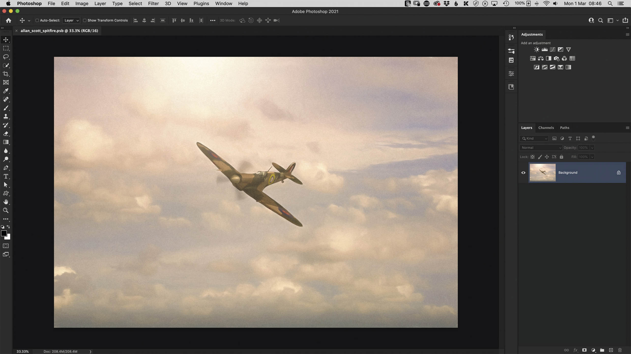
FIGURE 2.1
In Figure 2.1, I have an image open in Photoshop, and this is shown as the Background layer in the Layers panel (Figure 2.2). Continuing on with the real-life example, this is the equivalent of our original photograph.
The padlock icon on this Background layer means that it is locked, and this prevents us from doing something to it we might regret, such as drawing on it, deleting it, and so on.

FIGURE 2.2
If you wanted to unlock this Background layer to work directly on it, you’d just need to click once on the padlock icon. Once unlocked, the Background layer is renamed Layer 0, and you can then make the layer visible or not visible by clicking on the eye icon.
CREATING A NEW LAYER
If we wanted to draw, paint, or whatever else on top of this picture, we would, like I explained before, put a clear sheet of acetate on top. In Photoshop, the equivalent would be to add a new blank layer, and we can do this in one of the following ways:
- Click on the New Layer icon at the bottom of the Layers panel. This adds a new layer above the original image in the layer stack and names it Layer 1 (Figure 2.3).
- To rename this layer, simply double-click on its name to highlight it, and then type in a new name.
- Go to Layer > New > Layer. Doing this will bring up the New Layer dialog box where you can name the layer and click OK (Figure 2.4). There are additional items here, but I’ll cover those in a little while.
- Use the following keyboard shortcut, which you’ll see next to the New Layer menu items: Shift + Command (Mac)/Ctrl (PC) + N.
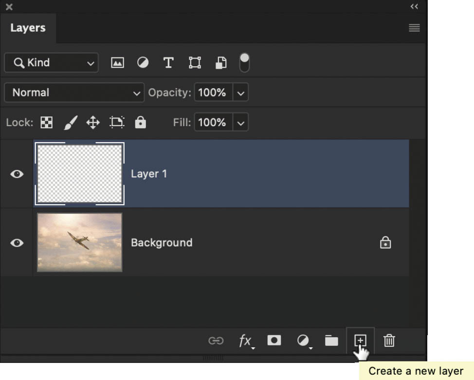
FIGURE 2.3

FIGURE 2.4
When we add a new layer like this, there is no change to our image. This is because the new layer, like the acetate, is completely transparent and, in this case, contains no pixels. The transparency is represented by the small gray-and-white squares. You can see this more clearly when you unlock the Background layer and then click on the eye icon to turn off its visibility (Figure 2.5).

FIGURE 2.5
REPOSITIONING LAYER CONTENTS
In Figure 2.6, I have opened a new document in Photoshop, and above the white background layer, I have added a new layer containing a blue circle. We’ll work through this example together, so go ahead and open the Photoshop document titled circles.psd from your downloaded files. Or you can create a simple document of your own with a white background layer and another layer with a blue circle.
With the Move Tool (V) (found in the toolbar), click directly on the blue circle and drag it around. If you can’t move it around, make sure that the layer containing the blue circle is highlighted in the Layers panel, meaning that it’s active (Figure 2.7).
In the options bar, you could also tick the Auto-Select checkbox (making sure Layer is selected in the drop-down menu next to it) (Figure 2.8). Now when you click on the document, whatever your cursor is on top of is what will be highlighted in the Layers panel, and thus will be active.
Let’s say you want this circle to be positioned in the center of the document. To do this, start by going to Select > All to have Photoshop put a selection around the entire outline of the document. This is visible by what we call marching ants (more of this in chapter 3).
In the options bar at the top of the screen (with the Move Tool still the active tool from the toolbar) there are options to align the contents of the layer (Figure 2.9). Use these to align the blue circle horizontally centered and vertically centered.

FIGURE 2.6

FIGURE 2.7
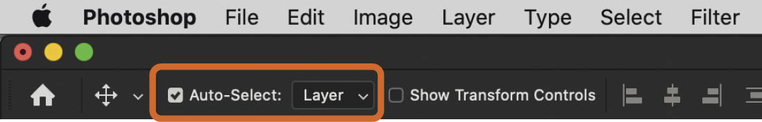
FIGURE 2.8

FIGURE 2.9

Download all the files you need to follow along step-by-step at: http://rockynook.com/PLSW
COPYING THE CONTENTS OF A LAYER
Now let’s add another circle. First, we’ll make a copy of the blue circle layer, which we can do a number of different ways. Make sure the blue circle layer is active, then use one of the following methods:
- Go to Layer > New > Layer via Copy.
- Use the keyboard shortcut Command (Mac)/Ctrl (PC) + J.
- Click on the panel menu (three horizontal lines) in the top-right corner of the Layers Panel and choose the Duplicate Layer command (Figure 2.10).

FIGURE 2.10
NOTEThere are a few more options available when using this method, including copying the contents of the layer into another document you have open in Photoshop.
Now use the following steps:
- 1.Double-click on the name of this duplicated blue circle layer and name it white circle.
- 2.Hold down the Command (Mac)/Ctrl (PC) key and click on the thumbnail of the duplicated layer—now named white circle—in the Layers panel. This loads the circle as a selection, and we can see this because there are marching ants around its perimeter (Figure 2.11).
- 3.Go to Edit > Fill and choose White from the Contents drop-down menu, then click OK.
- 4.Go to Select > Deselect. We now have a white circle, but we are unable to see the blue circle, apart from maybe a very thin outline. This is because the white circle is above (on top of) the blue circle in the Layers panel and is the same size (Figure 2.12).

FIGURE 2.11
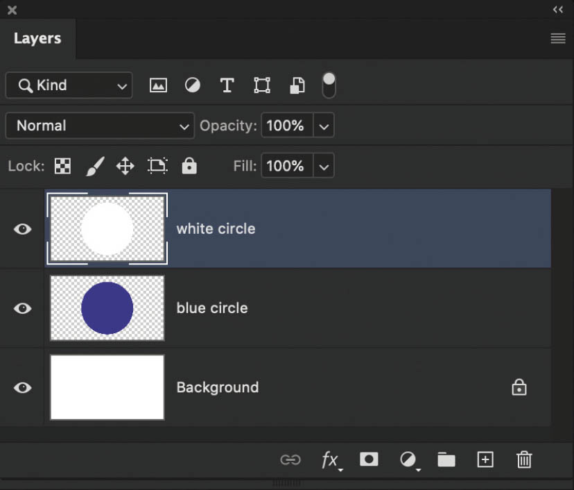
FIGURE 2.12
- 5.Using the Move Tool (V), we can drag and reposition the contents of either the blue circle layer or the white circle layer so that we can see them both (Figure 2.13).
- 6.To make the contents easier to see, unlock the Background and then press Delete to remove it completely. Now we see the contents of each layer, but where there is nothing (no pixels), we see the gray-and-white squares, meaning those areas of the layer are transparent (just like the clear acetate sheets) (Figure 2.14).

FIGURE 2.13

FIGURE 2.14
- 7.Click on the white circle layer in the Layers panel and realign it to the center of the document so that it is back on top of the blue circle.
- 8.Go to Edit > Transform > Scale (Figure 2.15). Hold down the Shift + Option (Mac)/Alt (PC) and click-and-drag a corner transform handle inward to make the white circle smaller (Figure 2.16). Press Enter/Return.
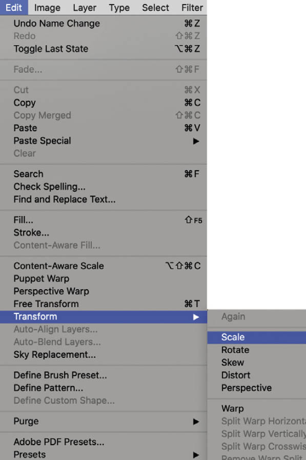
FIGURE 2.15

FIGURE 2.16
Repeat this process, duplicating the white circle, to create a smaller red circle layer on top (Figures 2.17 and 2.18).

FIGURE 2.17

FIGURE 2.18
LAYER GROUPS
Now that we have our red, white, and blue circles, what if we want to reposition them all on the canvas, but still keep them together in exactly the same design layout with one on top of the other? That’s easy using layer groups.
In the Layers panel, click on the uppermost layer, the red circle layer, so that it is highlighted and active. Then hold down the Shift key and click on the bottom (blue circle) layer. All of the layers are now highlighted (Figure 2.19). Of course, you don’t have to highlight all of the layers, just highlight those that you want to keep together.

FIGURE 2.19
There are several ways to now put these layers into a single group:
- Go to Layer > New > Group from Layers (Figure 2.20). Name this new group and click OK.
- Or, with all of the layers you want to include in the group highlighted in the Layers panel, hold down the Command (Mac)/Ctrl (PC) key and press G.

FIGURE 2.20
- Alternatively, again with all the layers you want included in the group highlighted in the Layers panel, go to the panel menu in the top-right corner of the Layers panel and choose New Group from Layers (Figure 2.21).
- Finally, you could also simply click on the Create a new group icon (it looks like a file folder) at the very bottom of the Layers panel.

FIGURE 2.21
Once you’ve used one of these options to create a new layer group, you will see it appear in the Layers panel, named Group 1. With this group highlighted so that it is active, you can use the Move Tool (V) to move all of the contents at the same time.
CHANGING THE ORDER OF LAYERS
Now let’s make some changes to the order of the layers in the Layers panel.
- 1.In the Layers panel, add two new layers. Fill one with black by going to Edit > Fill, and choosing Black from the Contents menu, and clicking OK. Fill the other layer with white. Rename these layers accordingly in the Layers panel (Figure 2.22).
- 2.Click on the uppermost layer (in my example, the layer filled with white) and drag it downward in the layer stack. When you see a blue line appear, release your mouse to drop the layer in the location of the blue line (Figure 2.23).
- 3.The black layer is now at the top of the layer stack, which means we can no longer see the contents of the white layer or that of the group in the main Photoshop workspace (Figure 2.24).

FIGURE 2.22

FIGURE 2.23

FIGURE 2.24
![]() TIPYou can move a layer or group to a new spot in the layer stack by holding down the Command (Mac)/Ctrl (PC) key and pressing the right square bracket key to move it upward, or the left square bracket key to move it downward.
TIPYou can move a layer or group to a new spot in the layer stack by holding down the Command (Mac)/Ctrl (PC) key and pressing the right square bracket key to move it upward, or the left square bracket key to move it downward.
OPACITY
At the top of the Layers panel, we have the Opacity control. This slider controls the visibility of the active (highlighted) layer or group.
If we reduce the opacity (Figure 2.25), we can start to see through the active layer or group. Reducing opacity to 0% means that the contents of the layer are no longer visible.
In this example, I have reduced the opacity of the black layer to 50%, meaning that only 50% of that layer is visible. The result is that the document in the center of the Photoshop workspace looks gray, as the black layer reveals 50% of the white layer below (Figure 2.26).

FIGURE 2.25

FIGURE 2.26
If we turn off the visibility of the white layer so that its contents are hidden, we see through to the group of circles, but again, they are covered by 50% visibility of the black layer above, which explains why we don’t see them in their full vibrant colors (Figure 2.27).
If we reduce the opacity of the black layer to 0%, now we can see the full-color circles (Figure 2.28).
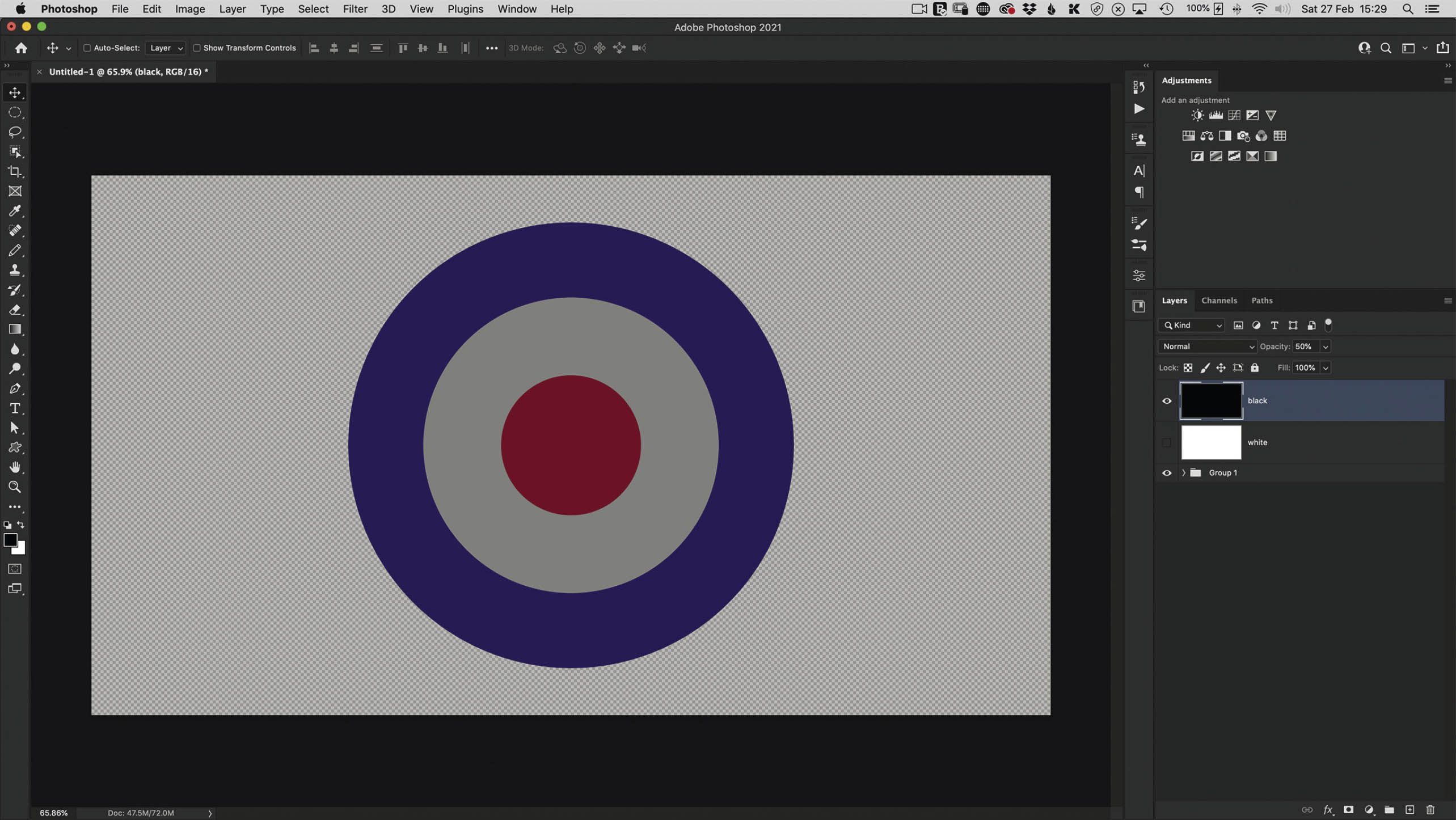
FIGURE 2.27

FIGURE 2.28
MERGING LAYERS
Although it’s something we try to avoid doing too often, we can merge layers. We would avoid doing this because it takes the contents of any highlighted layers and merges them together to create one single layer.
Let’s try this with an example.
- 1.Delete the black and the white layers from the layers panel.
- 2.Right click on the Group name in the Layers panel and choose Ungroup Layers (Figure 2.29).
- 3.Highlight all of the layers in the layer stack and merge them together. You can do this by using one of the following methods:
- Go to Layer > Merge Layers (Figure 2.30).
- Go to the panel menu in the top-right corner of the Layers panel and choose Merge Layers (Figure 2.31).
- Use the keyboard shortcut Command (Mac)/Ctrl (PC) + E.

FIGURE 2.29

FIGURE 2.30

FIGURE 2.31
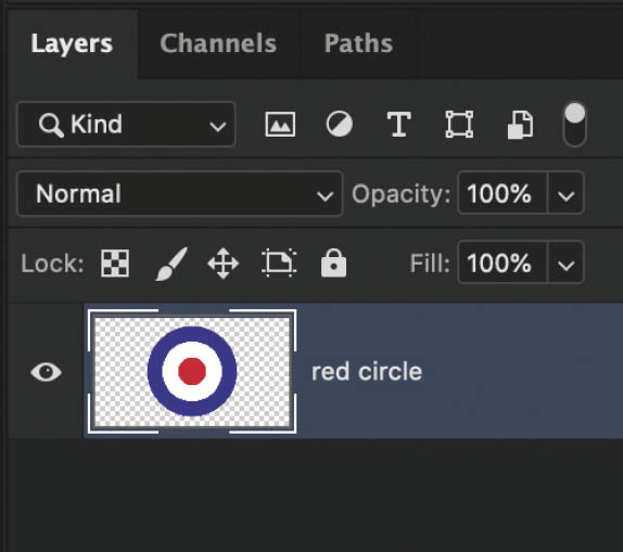
FIGURE 2.32
When you merge layers, the single merged layer is named after that which was at the top. So, in the Layers panel, we now have just one layer called red circle (Figure 2.32).
Now when we use the Move Tool, the three circles move together because they are all on the same layer.
LAYERS PANEL OPTIONS
If you go to the panel menu in the top-right corner of the Layers panel, you will see a menu item called Panel Options (Figure 2.33).
In the Layers Panel Options dialog box, we can do things like change the size of the layer thumbnail, and also choose whether the thumbnail contents include the transparent area or only what is on the layer (Figure 2.34).
For example, if we choose Layer Bounds and click OK, notice now how in the Layers panel the three circles layer thumbnail is trimmed to show only the contents of the layer (Figure 2.35).
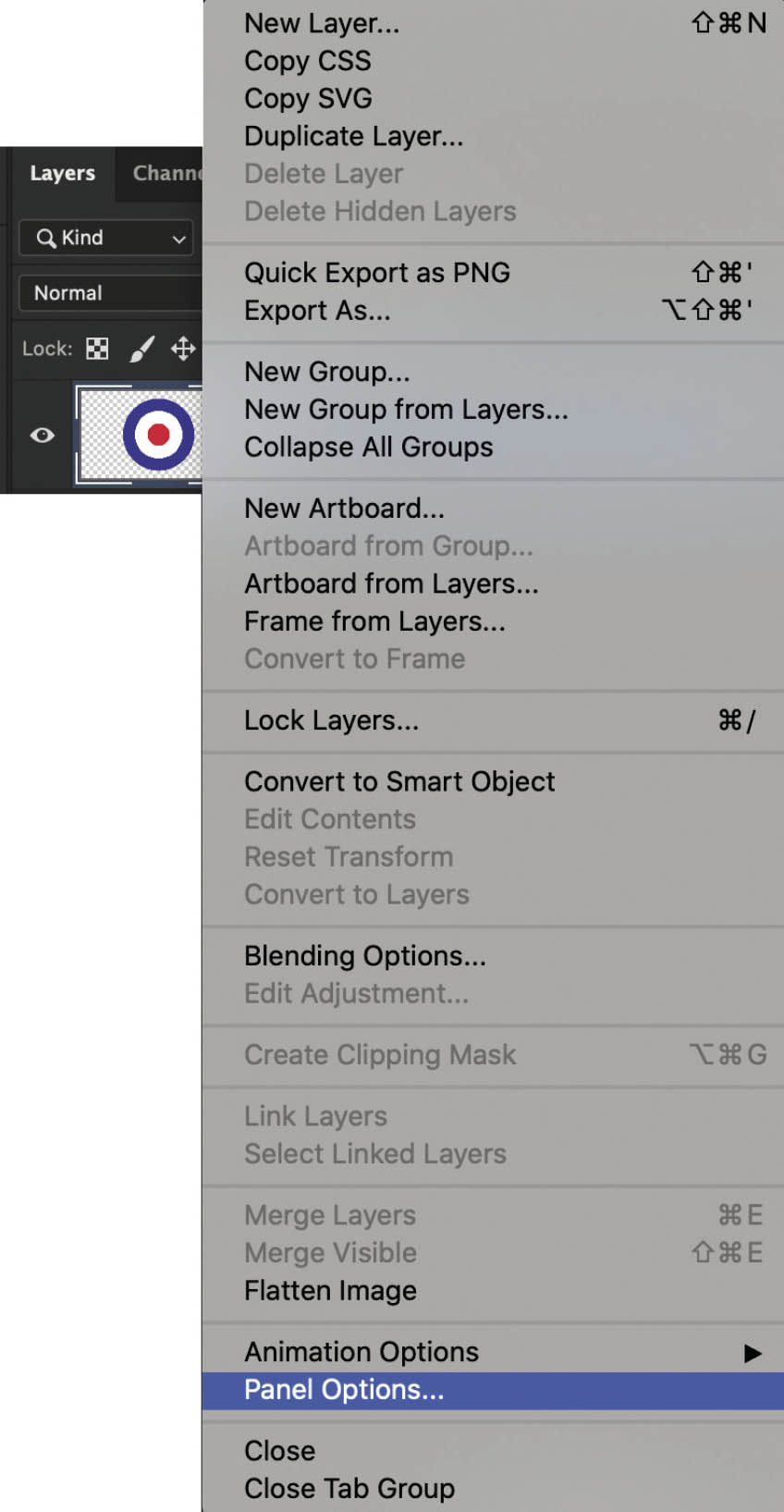
FIGURE 2.33
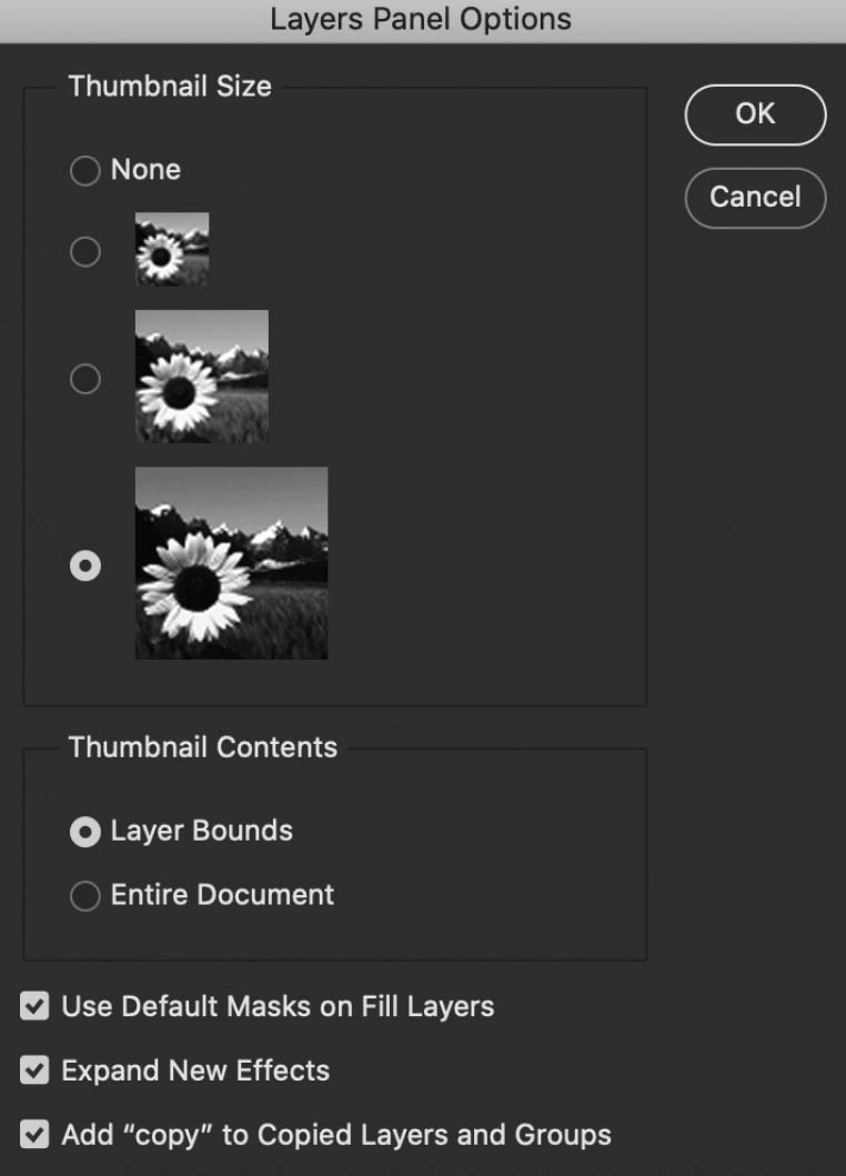
FIGURE 2.34

FIGURE 2.35
DISPLAYING SPECIFIC LAYERS
In the Layers panel, we can also choose to display specific layers (Figure 2.36).
This is particularly useful if you have a document with lots of layers. Scrolling to find which one you want can be tricky, so the ability to choose to see layers by their contents or by layer type is a big help.

FIGURE 2.36
BLEND MODES
In my book The Photoshop Toolbox I dedicated a large portion of the content to blend modes. There is so much creativity at your fingertips when it comes using blend modes. There are many places in Photoshop where you’ll see blend modes available, but the main place you’ll use them is within the Layers panel (Figure 2.37).

FIGURE 2.37
In the simplest terms, blend modes control how layers react with one another, causing them to darken, lighten, reveal certain parts, and so on. Because of the nature and purpose of blend modes, they will only become available to you in the Layers panel when you have more than one layer present.
By default, the blend mode for layers is set to Normal, but you can change it by choosing another option from the menu or, when using the Move Tool, by holding down the Shift key and using the + and – keys to scroll through each one.
The great thing about blend modes is that as you scroll over each one, you will see in real time how it affects the layers to which it is being applied.
LAYER MASKS
Layer masks are BRILLIANT! I use them with every single image I work on. Layer masks allow you to show or hide the contents of a layer or group. The only thing you need to remember is that white reveals the contents of the layer and black hides the contents of a layer (we’ll refer to this a lot more when we go through the selections in this book).
This is a really basic example of what I mean, but let’s take a look at this photograph of my car that I have open in Photoshop (Figure 2.38)

FIGURE 2.38
I’ll now add a Hue/Saturation adjustment layer (Figure 2.39), check the box for Colorize in the Properties panel, and change the Hue slider to 220, which turns the whole image blue (Figure 2.40).
In the Layers panel, you can see that there is a new layer (Figure 2.41). This is the Hue/Saturation adjustment layer I just added. To the side of it is a white rectangle, which is the layer mask. Because it is white, we can see the contents of the Hue/Saturation adjustment on the image.

FIGURE 2.39
If I click once on this layer mask and then go to Image > Adjustment > Invert, the layer mask changes from white to black, and we can no longer see the effect of the Hue/Saturation adjustment.
However, if I now grab a simple round brush and with a white foreground color start painting over the car, we will start to see the effect of the Hue/Saturation adjustment where I paint (Figure 2.42).

FIGURE 2.40

FIGURE 2.41

FIGURE 2.42
So, white reveals the contents of the layer (whatever that content is); black hides the contents of the layer, or indeed, group.
You can add a layer mask by using the Add layer mask icon at the bottom of the Layers panel or by going to Layer > Layer Mask.

FIGURE 2.43
At the very bottom of the Layers panel are a number of icons (Figure 2.43).
Amongst them are options we’ve used already (Create a new layer, Create a new group, and Add layer mask), and we also have access to layer effects (such as Drop Shadows) and the option to Create new fill or adjustment layers. We’ll cover more on this later on when we’re going through selections.
FILL
Whereas Opacity controls the visibility of anything and everything on a layer, Fill affects only the opacity of the contents of a layer.
Let me explain. In Figure 2.44, I’ve added a new layer containing text.

FIGURE 2.44
In the Layers panel, with the text layer highlighted, I’ll click on the fx (Add a new layer style) icon, choose Bevel and Emboss (Figure 2.45), and click OK.
Now look what happens to the text when I lower the Fill of the text layer to 0% (Figure 2.46)—the contents of the layer (the text) has disappeared, but the layer style is still visible (Figure 2.47).
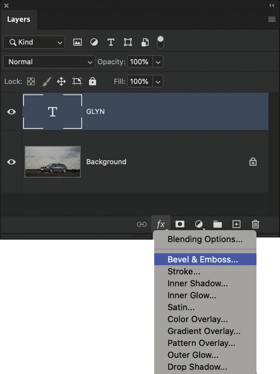
FIGURE 2.45

FIGURE 2.46

FIGURE 2.47
CLIPPING MASKS
Clipping masks allow us to restrict the contents of the upper layer onto areas of a layer below.
Let’s look at another quick example. Here, I have two layers in Photoshop, one with a blue circle and one with a red circle (Figure 2.48).

FIGURE 2.48
If I add a Hue/Saturation adjustment layer to the top of the layer stack and then drag the Hue slider left and right in the Properties panel (Figure 2.49), it affects both the red and blue circles (Figure 2.50).
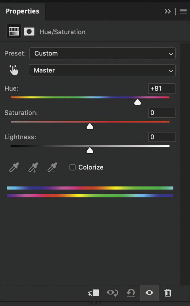
FIGURE 2.49

FIGURE 2.50
If I click on the clipping mask icon at the bottom of the Properties panel (Figure 2.51), the Hue/Saturation adjustment is restricted to affect only the layer directly below it, which is the red circle. Notice in Figure 2.52 that the blue circle is unaffected by the adjustment.

FIGURE 2.51

FIGURE 2.52
Here’s another example of one of the many uses of a clipping mask. Back with the two circles, I’ve added another layer—a photograph of a dog—to the top of the Layers panel, and used the Move Tool to position it over the red circle (Figure 2.53).

FIGURE 2.53
With this new layer active in the layer stack, I’ll add a clipping mask by going to Layer > Create Clipping Mask.
Doing this means that the dog layer is only visible on the visible parts of the layer below, which in this case is the red circle (Figure 2.54).
I can then use the Move Tool to reposition the dog picture within the circle.

FIGURE 2.54
TITLE BAR
The last thing I want to mention here is the title bar that you’ll see near the top-left corner of the interface when you have an image or document open in Photoshop (Figure 2.55).
The title bar includes information such as the document or image filename, the size at which it is being displayed (in %), the embedded color space, and the bit depth (Figure 2.56).
However, you may also see some extra symbols such as an asterisk (*) or a pound sign (#). If you see an asterisk (*), it means that the color space of the image you have open is different from the default color workspace you have set in Photoshop (Figure 2.57).

FIGURE 2.55

FIGURE 2.56
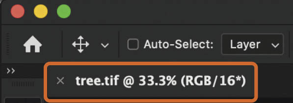
FIGURE 2.57
For example, if the default color workspace of Photoshop is set to Adobe RGB and an image with an embedded color space of CMYK is opened, you will see an asterisk. However, if the default color workspace of Photoshop is set to Adobe RGB and an image with an embedded color space of Adobe RGB is opened, there will be no asterisk.
If you see a pound sign (#), it means the image open in Photoshop has no color space assigned to it. Photoshop is not color managing the image, so what you see on the screen may not accurately reflect what the image actually looks like. You should go to Edit > Assign Profile to assign the correct profile to the image.
Anyway, like I said, I could literally write a book just on layers (as Matt and others have done), but what I’ve covered in this chapter will certainly get you up to speed and ensure you understand what is on the following pages so that you get the most out of them.
Okay, now it’s time we move on to selections . . .