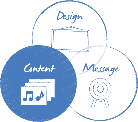
It might seem like a simple question, but it’s very easy to get the wrong end of the stick. Content to many people is the information you place onto a PowerPoint slide (normally in bullet point form!) to get your message across.
But it actually goes deeper than that.
This means that, dependent on your audience, there are likely to be large chunks of content cluttering up your slide that the audience either doesn’t need to know—or, more likely, is already completely au fait with and doesn’t need you to remind them of.
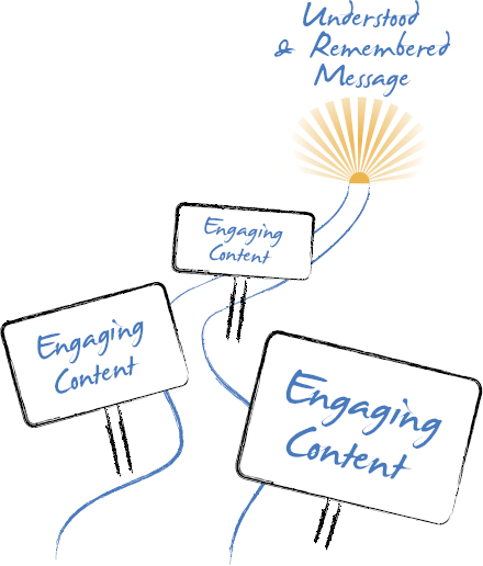
It’s useful to see content as the logical building blocks of your presentation. If you don’t share salient content in a structured way, you’ll never get to your goal of a completely understood, engaging and remembered message. As such, it’s also a great way of building empathy and rapport with your audience by ensuring that the content you use addresses their questions, concerns and needs. Content that engages them and takes them on a personal journey is a lot more valuable and compelling than sharing fact after fact about your business and how impressive it’s growth has been.
The Curse of the Credentials Presentation
Ask a business-to-business (B2B) salesperson to name their most used sales tool and they are likely to pat their laptop proudly and utter the words, “Our creds PowerPoint deck.”
For the record, this tends to send shivers down my spine. This infamous and usually monstrous file is often a living example of all that is bad about corporate presentations. Let the record also state that this is not the fault of anyone in particular; the original deck is likely to be the lovechild of the product team, the marketing team and, at a push, the sales team. Each will have gone into this with the very best intentions:
The Product team wanted to ensure that all the latest specifications for the product were present, from the running speed to the size of the processor—and much more.
Marketing wanted to ensure that the deck was on brand, that it introduced the company in such a way that no one could sue for misrepresentation, and that the competition couldn’t learn too much about them should the deck fall into their hands.
And Sales wanted to ensure the deck made them stand out from the competition. So they added cool animations, some humor, and extra text, allowing any new sales rep to grab hold of the presentation and hit the ground running.
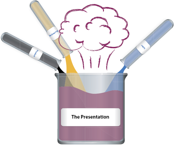
Not a recipe for success—and, what’s more, that’s just the start of it. You see, those who use the deck at the “coalface” (i.e., the sales team) have likely made further embellishments over time. They will have created a few extra slides to help explain some of the more complex or esoteric parts of their proposition; they may have swapped out the template for a cool new one they downloaded from the internet or saw used at last year’s company conference; and, heaven forbid (but almost guaranteed), they’ll have added their own images and clipart—including holiday snaps of them on the beach by way of introduction.
All of these are major crimes and have a hugely detrimental effect on the overall quality of the presentation. But perhaps more than that, they add more and more valueless content to an already busy presentation. It’s valueless because the vast majority of this content—both the original and the recently added—will have little or nothing to do with the audience’s needs. It’s more of the same “me, me, me” content that makes creds PowerPoint decks the epitome of presentation information overload.
So What Content Do I Choose?
The problem with presentation content is normally a nice one to have: There’s simply too much of the stuff!
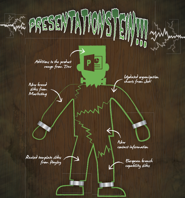
It’s very rare that we come across a situation where the presenter is struggling to source sufficient content, despite this being one of their biggest fears at the start of the process. As they embark on the process of creating a presentation, they normally use the Frankenstein approach as a first option. That is, they pull together all manner of facts, visuals, and odds and ends, and then try to arrange them in such a way that begets some semblance of order and process.
And although it seems a natural place to start, it’s often the reason for complete failure later on in the presentation process, for a few simple reasons:
The content is rarely pulled together to support the objectives (Must-Intend-Like) and overarching message. You simply end up with a patchwork quilt of relatively useful content, but there’s rarely a cohesive message across the entire story.
You’re likely to be sharing information that the audience is already completely in control of. This runs the risk of being boring or, even worse, coming across as condescending to the most important people in the room— your audience.
This lack of content focus makes it very difficult to agree on what you should and shouldn’t leave out—and how it all links together. Typically, most people opt for “the safe approach” and leave it all in—just in case.
This issue affects the vast majority of presenters, but as a rule, the groups that suffer most are those from an academic or scientific background, product managers, or what we fondly call the OSMCs.*
Ultimately, the compelling content should not be judged on volume. It’s value lies in how much it supports and contributes to the one thing you are looking for the audience to remember—your message.
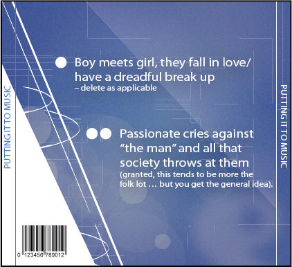
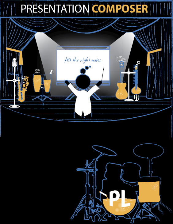
Putting It to Music
Strange though it may sound, we often reference music when looking at content. Beautiful music works in a magical way by adjusting tempo, sometimes being dramatic, sometimes being subtle and gentle. For there to be a real (and ideally, emotional) connection with an audience, a presentation needs to follow much the same way.
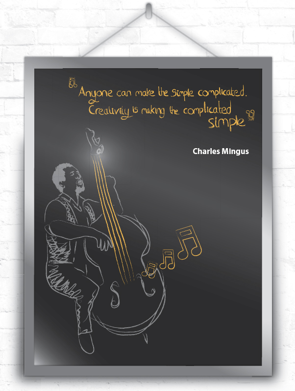
I love this quote so much that I have a huge poster in my office so as to constantly remind me of the importance of simplicity in terms of content. I’ve also lost count of the number of times I’ve sent pictures of it to customers as a gentle (but not so subtle!) reminder to cut back on the content and only leave in the good stuff.
I’m a huge music fan but am one of those frustrating sorts who like a bit of everything— jazz, rock, funk, even a little folk now and then. Each genre brings with it different tempos, different attitudes, and, I can assure you having been to a fair few gigs, very different audiences (the piercings per person ratio goes off the scale at folk events).
Yet despite all these differences, there are also a vast number of similarities. They all have the same chords and musical notes to work with as their foundation and typically their heartfelt lyrics cover many of the same topics:
Um . . . that tends to be it.
No matter what the genre, one of the other key similarities among the top-notch composers out there is their understanding of the art of the song. Great musicians know all the notes and chords, of course, yet they choose to use them sparingly and to maximum effect. It’s easy to spot those who might possess all the required technical prowess on their chosen instrument but has little musicianship; they’re the ones who try and cram as many notes and fancy chords into every bar of music.
I personally don’t have a musical bone in my body. However, I have sufficient knowledge to know that you don’t play a sad song in a major key or a happy song in a minor key. But it’s more than that—it’s about knowing which notes to play (and not to play) to help you get your message across.
Great melodic, emotional, and resonating music relies as much on the notes that you don’t play as the notes that make it into your song. The pauses, the rhythm, the soul of music comes from the composer’s ability to carefully choose which notes add to their message and which ones don’t.
All of the above applies equally to presentation content. As presentation “composers,” we face the same challenges and choices. We need to use only the most relevant and powerful content, use it at the right times, and with the right aims in mind (which, yep, are all about supporting the message, but you knew that).
Everything should be made as simple as possible, but not simpler.
Quote attributed to Albert Einstein
Content represents one of the biggest challenges the business presenter faces: It’s a scarily fragile balance to maintain.
On one side, if you encumber your presentation with too much content it will become immobile. It’s as if the presentation becomes overweight and flabby; it runs short of breath and slowly grinds to a halt.
On the other side, if your presentation is too light on content, your entire message is fundamentally built on sand. It’s flaky, it’s fragile, and it leaves your message wide open to audience skepticism.
It all comes down to the art of editing (or, more likely, self-editing in presentations). It’s an art form rarely given the credit it deserves. For example, the editor’s impact is too often overlooked in film and TV. (Can you name anyone who’s won an Oscar for editing? Nope, me neither.)
Film editors are often seen as nothing more than a technical support act to the director, screenwriters, and actors. Yet it is their sense of what should stay in the picture and what should be left as a remnant on the cutting room floor that can make all the difference. As with presentations, editing is all about maintaining the fragile balance between sufficient content and clutter. Film editor Walter Murch describes the role perfectly: “A cross between a short-order cook and a brain surgeon” (Source: National Public Radio).
Editing is tricky . . . very tricky. So how can you ensure that you’ve got the balance right? By far the easiest first step is to ask yourself one simple question:
Make no bones about it—the primary purpose of content within your presentation is to support your message. Verbose flabby presentations tend to be full of content that is, at best, simply superfluous—and at worst, full of “noise” meant to mask the presenter’s lack of clarity or knowledge. You’ll recall from your school days that it was always easier to pad an essay on a topic that you didn’t know a huge amount about than to create a succinct and focused essay on something you did understand. Presentations tend to fall into the same trap.
So how do you cut to the chase and build a presentation on those prime cuts of content? The good news is that you are not the only person tasked with deciding what key information to share. Scholars, scientists, and speechwriters all struggle with the question of what to leave in and what to dispose of. Our answer borrows heavily from a theoretical approach known as Occam’s razor, which provides a simple guide to getting to the core of an issue.
From a scientific standpoint, this means that delving into hugely detailed possibilities and flights of fancy will, more often than not, lead you down some dead ends. On the other hand, sticking with the basic information available to you will typically lead you to the correct conclusion.
And so it goes with presentation content. Keep it as simple, clear, and uncluttered as possible to get to your intended conclusion. Not only will unnecessary material hinder your audience’s engagement with the topic in hand, it could also send you down some blind alleys.
Stephen Hawking, a chap who knows a fair bit about communicating very complex matters in an engaging way, mentions Occam’s razor in his masterpiece, A Brief History of Time:
“We could still imagine that there is a set of laws that determines events completely for some supernatural being, who could observe the present state of the universe without disturbing it. However, such models of the universe are not of much interest to us mortals. It seems better to employ the principle known as Occam’s razor and cut out all the features of the theory that cannot be observed.”
This approach supports the Presentation Lab mantra of “simplicity is not stupidity.” That is, by working with the most important and relevant elements of your content, you are able to deliver a quick and engaging explanation to support your message. Each type of audience profile, from the factual to the visionary, needs this content foundation upon which to build their own opinions. If this foundation becomes overcomplicated or fragile due to tenuous links or too much hypothesizing, you and your message could be in trouble.
The Presentation Lab Razor—Preparation
With an eye firmly on the theory (and skepticism!) of Occam’s razor, we’ve developed different approaches for ridding your presentation of content clutter, either when creating one from scratch or enhancing/developing an existing deck.
Both scenarios require that we observe some basic content editing rules, courtesy of our old friend The Eight Cognitive Communication Principles—three of which really come into play.
Once the coffee has reached sipping temperature, return to your content and start applying the following recognized psychological considerations:
Compatibility
Compatibility is about ensuring that all the presentation elements work as if they belong together, be that from a content perspective or in terms of visual branding. As soon as you leave an incompatible bit of content in your presentation, it will stick out like the proverbial sore thumb, distracting your audience and generally serving no purpose.
Relevance
Closely aligned to Compatibility is Relevance. Best described as “not being able to see the forest for the trees,” relevance focuses on the human brain’s extraordinary automatic problem-solving capabilities.
If there’s too little content in place, your audience will look to fill in the gaps through assumptions. This brings with it the inevitable risk of them reaching the incorrect conclusions and threatening your message’s power and impact. Equally, provide too much content and your audience will jump straight into filtering mode, which carries equals risks of them grabbing hold of the wrong end of the stick.
The answer to the conundrum is obvious: Only use content that is completely relevant and supports your key message.
Discriminability
Finally, we have Discriminability. This is a fancy way of describing the most basic of presentation rules. Big blocks of information on a slide do very little to help your audience engage with you and your message.
Bombarding your audience with content, no matter how relevant and supportive, does little more than overload them with information and ultimately lose their attention. The audience needs your assistance to Discriminate the information you’re feeding them and digest it in the right order and at the right time.
The Presentation Lab Razor—Define & Declutter
With the basics in place, you are now in a position to start working your way through the process of defining and decluttering your content so only the strongest and most relevant survives.
Option 1 A Sparkling Brand New Presentation
The first and easiest approach is to start your presentation from scratch. By going through the process of understanding your audience, fine-tuning your message, and creating a bespoke storyflow document, you’re well on your way.
The storyflow document does a wonderful job at signposting what content should and shouldn’t be included in your final presentation. By creating the story up front, you will have self-edited much of the superfluous information out of the structure, knowing that any unnecessary diversions will only impede your message’s effectiveness.
Option 2 Optimizing an Existing Presentation
Although it would be wonderful to think that you’ll develop all presentations from scratch, the reality is most are either carbon copies of earlier pitches/speeches or an untidy smorgasbord of different slides and ideas from an array of sources. Although I’d implore you to start from a blank piece of paper (à la the full Presentation Optimization process), I also recognize that real life occasionally gets in the way—and you may need to pull together a presentation in a very limited time. So here goes.
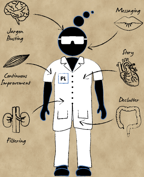
Stage 1 Messaging
Simply because you are working from an existing deck (or collection of decks) does not get you off the hook when it comes to reaffirming your message. By taking the time to either establish or reengage with the message, you are giving yourself the very best chance of keeping the best content and ditching the excess.
Consider your new audience and their Factual/Emotional/Visionary heat map profile. What will they be taking away from your message that you might not have previously considered? What are their Musts, Intends, and Likes?
Stage 2 Story
Again, you may believe that the story is already in place when using an existing presentation. However, taking time to review and tweak it accordingly will give you the confidence to deliver a more succinct presentation.
Think about how the story will resonate with the different audience profiles (Factual, Emotional, and Visionary) and ensure that you have these elements straight in your own mind. Once these aims are compiled, you are able to move to the next phase—applying the correct content to help support your story.
Stage 3 Filtering
This is the relatively simple process of identifying which elements of your plentiful content will assist your audience in understanding and moving through each of the chapters of your story. Again, a good understanding of your audience’s profile will help here. How much Factual content to do you need to bring to the table versus Emotional or Visionary?
Filter out the information that doesn’t serve this purpose. For example, demonstrating that you’ve worked really hard and know a lot about your subject might make you feel better, but it’s unlikely to have a huge impact on the final decision made by an external procurement team. Leave in the content that matters to them; you can use everything else in the hard copy handout later.
Stage 4 Jargon Busting
Jargon is a peculiar phenomenon. It can seem to appear out of the ether and settle into presentations without business presenters ever really noticing. It’s only after a few less-than-stellar presentation performances that presenters review their decks and realize that their slides, their notes and their script are full of TLAs (three-letter acronyms, to you and me).
Business jargon has now reached epidemic proportions. People no longer find it a sign of subject matter expertise or greater intelligence; they find it tiresome. There is also the very real risk that your audience could feel intimidated by their inability to decipher your TLA and jargon-heavy presentation. They disengage with you and your message more quickly and remind you of a crucial presentation rule: as the presenter, it is incumbent on you to keep the audience comfortable and engaged with the content. If they can’t keep up, the fault lies with the way you’ve positioned the material—not with their inability to grasp it.
If you fear that you are have “gone native” and can no longer distinguish between jargon and normal speech (it happens to us all), call on a friend outside of your industry or business to sense check things. You may be surprised at how much jargon has worked it’s way into your vocabulary!
So much technical gobbledygook is spewed out in various forms that the United Kingdom now has a central body called the Plain English Campaign to identify culprits and reward plain-speaking direct communicators.
Some people think that flowery language and complicated writing is a sign of intellectual strength. They are wrong. Some of our greatest communicators were—and are—passionate believers in the simplicity of the written word. As Winston Churchill described a particularly tortured piece of officialese: “This is the sort of English up with which I will not put.”
Baroness Thatcher, former Prime Minister, in a letter to the Plain English Campaign
The good news is that by ridding your presentation of jargon and gobbledygook, you kill two birds with one stone: You declutter the content, and you further increase the chances of your audience understanding what you’re talking about.
Stage 5 Declutter
By this stage, you should be in a very comfortable position. All the content you have left provides value and is ordered in a way that supports your key message. You’ve stripped out all the unnecessary “corporate twaddle” that can slowly kill the audience’s engagement and thus your key message.
But there’s still more you can do.
At this stage, it’s all about the fine-tuning of your content. You should be looking to remove the superfluous words (ditching adjectives and verbs is relatively easy if you’re delivering the presentation “live”) and conveying the information in tables and data as visuals or charts.
Stage 6 Continuous Improvement
Short term—Go to Stage 4 and repeat before every meeting.
Longer term—Go to Stage 1 and repeat at least once every 6 months.
Fundamentally, getting content right is about keeping it relevant, structured, and as simple as possible; it’s no more complex than that. With this in mind, we need to turn our attentions to the process of bringing the message and content to life through Valuable Visuals.
It would seem that there are certain rules and regulations that have become almost acceptable to disobey.
For instance, the motorway speed limit is 70 mph in the United Kingdom. Yet for the life of me, I can’t remember the last time I saw anyone drive at less than 80 mph on a clear carriageway— despite the fact that all drivers are fully aware that the speed limit is there to protect them and their passengers in case of an accident.
Another example would be the age at which young adults partake of their first alcoholic beverage. Of course, the law states one thing, but society on the whole accepts that it will happen earlier. And as long as all involved are safe, no one gets into trouble. The law exists to protect our young people’s health and wellbeing—yet many people happily turn a blind eye.
Most pertinently to the Presentation Lab, businesspeople know that creating text heavy slides is simply not the way to do things. It breaks the most basic rules of presentations that they fully recognize and understand. They’ll happily acknowledge that too much text kills any opportunity to engage their audience and makes them less likely to meet their objectives. They’re well aware doing so reinforces the generally held belief that all business presentations, well, suck.
Yet they still do it . . . time and time again.
It’s really quite remarkable behavior from otherwise rational and professional business people, especially when they know that they are the root cause of the issue.
So as we move on to creating the visual tools to support your presentation message and share your content, it’s time to make a few assumptions.
That you, the learned reader of this book, already know that too much text and distracting wacky animations on a slide is bad and that powerful visuals are good.
That you know how to add visuals to your slideware of choice, whether it’s PowerPoint, Keynote, or whichever flavor-of-the-month tool is being hawked around business circles at the time of reading.
That you are not equipped with a limitless budget to purchase high resolution images from picture libraries. Equally, you’re not blessed with an intimate knowledge of Photoshop, Illustrator, or other image manipulation software.
With this in mind, let’s focus on the impact Valuable Visuals can have on your presentation and how to ensure that you present the best option each and every time.
The Power of Visuals
I feel like I should start with an apology. Kicking off a section regarding visuals with the somewhat trite “a picture paints a thousand words” could be viewed by many as a bit of a cop-out. It’s as obvious as the multitude of other rules that business presenters choose to ignore, yet when you dig a little deeper, this hackneyed phrase simply and clearly summarizes the importance of presentation visuals.
It is no exaggeration to say that the stakes rise to new heights when considering how to visualize and support your presentation message. Get your visuals right, and you’re well on the way to getting your audience hooked. Get them wrong, and you could confuse or disengage them irreparably.
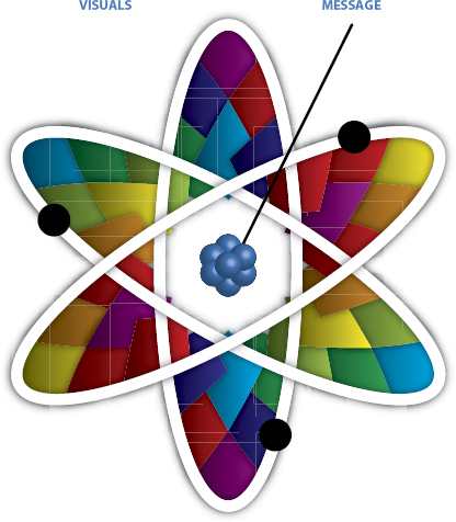
The Power of Visuals + Message
Well-chosen images not only help demonstrate a point but also lock it into your audience’s psyche. The visual is often the key to them remembering and being able to share/act on your message; it acts as the synapse to recall.
This vital link between visuals and your message is an essential part of the Presentation Lab process. The whole is so much greater than the sum of the parts.
So there would seem to be no end to the power of the visual as an element of your presentation formula. The logic behind this power is pretty obvious:
We think visually.
We remember visually.
We engage visually way more often than we do with other senses.
Indeed, this is one of the reasons many people close their eyes when listening or thinking intently. It’s all about shutting off our predominant sense of sight.
“My style of songwriting is influenced by cinema. I’m a frustrated filmmaker. A fan once said to me, ‘Girl, you make me see pictures in my head!’ and I took that as a great compliment. That’s exactly my intention.”
Joni Mitchell, Singer, Activist
For this simple reason, images in a presentation contain incredible power and as a result, need to be treated with the utmost respect. Take a moment to think about the emotions stirred by the important or powerful images in your own life. Some of these emotions are likely to come from incredibly personal images—they could be screensaver pictures of your children growing up, a old printed photograph from your wedding day album, or a polaroid of the home you grew up in. The strength of feeling you get from recalling and viewing these personal artifacts is incredibly powerful—it gets you deep inside.
But emotionally powerful images are not just reserved for emotional stimuli from your personal experiences; they can also come from your own sense of self and position within society. Take the example of a fading pop star who was so moved by the powerful imagery featured in a 1984 TV news report of the famine in Ethiopia that he started a movement that fundamentally changed the way people view charity and the world at large.
The TV pictures of Ethiopian children dying in biblical numbers sparked something in Sir Bob Geldof, then a comfortably well off but relatively unremarkable lead singer in a rock and roll band.
The passion and energy these images prompted in Sir Bob compelled him to take a series of actions—from organizing a charity single to setting up an iconic transatlantic pop concert in 1985, a time when transatlantic travel was tricky! Live Aid alone raised more than $280 million (USD) and was viewed by an estimated 400 million people across 60 countries.
The immense power of images can prompt people to do amazing things, follow particular flights of fancy, or just start to think differently. As such, it is incumbent on us as presenters to use the right type of imagery and visuals to guide our audience through the story in support of our message.
“The scenes were absolutely riveting. This from the get-go did not look like television—it looked like Spartacus, something vast . . . And it was grey . . . these grey raphes moving in this grey moonscape.
And the camera was pitching us . . . it was like a Cyclops, just there . . .
It would not let you off the hook.”
Bob Geldof
Using visual themes is a wonderful and powerful way to get your audience on the same page. Using images effectively can spark ideas, emotion and enthusiasm within your audience. But it is imperative that you choose the right ones. Using shocking or provocative images might grab attention and become a talking point (often for the wrong reasons), but can ultimately create a barrier between your audience and your message. (More on that shortly.)
In short, proceed with caution.
The Super Powers of Visual Subtext
If simple visuals are a powerful way of engaging your audience and sharing your message, things go to a whole new level once you understand the importance and impact of working with a visual subtext.
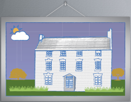
What do we mean by visual subtext? It’s probably best to demonstrate how this works by way of a simple example—like the following picture of a house:
The general subtext here is likely to be relatively far-reaching to those within your audience. It’s a nice looking house surrounded by perfect blue skies and beautiful trees. But your audience’s immediate response is likely to be less about the facts and more about the emotions it evokes.
It might cause some to think about their own home and the warmth and safety they feel when they are there. Others might be considering their aspirations, perhaps planning on moving or working toward owning a house of this size. It could also prompt them to imagine fun family days in the sun, perhaps playing with the kids in the garden or barbecuing with friends.
The list of emotions and feelings generated by one simple photo could go on and on. There is a risk that the presenter doesn’t have complete control over the emotions the image stirs, but after some consideration, you get a sense of what impact this picture is likely to have on your audience. However, much more important than control at this stage is the simple fact that the audience will have emotionally engaged with the image. Rather than force-feeding them information, you have encouraged them to use the picture to start building a story all of their own.
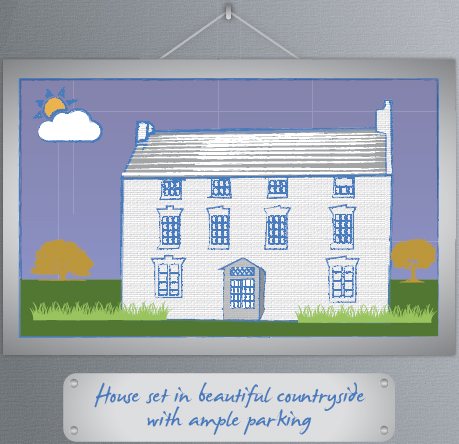
As we start to add more context to the house, the opportunity for the audience to emotionally engage with the image slowly dissipates. One simple (and fairly obvious!) message suddenly drags us away from the wide-focus emotional engagement with the image and starts to take us down a particular route.
As we build more and more context (for which you can read “content”), the less we are able to reference our initial emotional response to the picture.
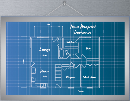
By the time we get to this version of the image, we’re more focused on the material structure and house’s layout rather than its original emotional qualities as a home. Although these contextual features may be useful to an audience made up of realtors, the emotional response that accompanied our initial response has long since disappeared into the ether.
As soon as you start adding more copy around an image, you cut down the opportunity for people to create and engage with their own subtext.
So what?
Well, we cannot dismiss the importance of letting the subtext breathe.
Unhindered subtext sparks strong emotions which deliver that Holy Grail for presenters—a stickier and longer-lasting message.
Managing an audience that is enjoying its own personal trip down memory lane is important. You want to emotionally stimulate people, but you need to ensure that they stay on track and engaged with your message. The trick here is to accompany your powerful visuals with other stimuli to guide the audience through the process, from the few carefully chosen words you decide to add to the slide or by the content you share vocally or by structuring and sequencing your story.
By using these techniques in conjunction with emotionally powerful images, you will be able to ensure that the audience follows you rather than you having to try to round them up every 5 minutes.
“I’m a visual thinker, not a language-based thinker. My brain is like Google Images.”
Temple Grandin, Professor at Colorado State University, bestselling author, autistic activist, one of the 100 Most Influential People in Time 100 List and all round good egg.
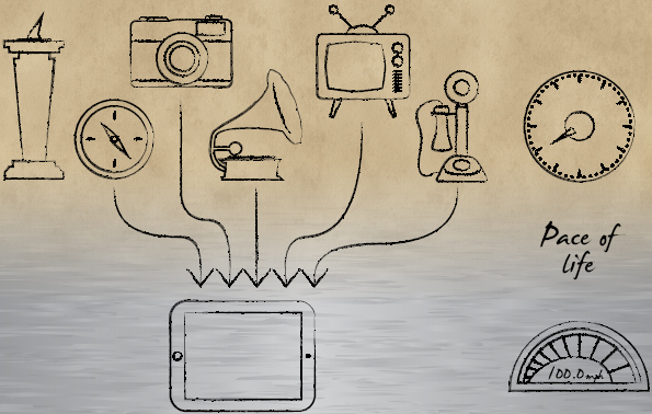
Your audience is made up of people just like you and me. Over time, we’ve been spoiled (in the nicest possible way) by the incredibly fast change of technology. The old way of doing things has moved on and gotten, well, better.
Where once we had to actually attend a concert to see our favorite artists perform, we can now simply watch last night’s gig on YouTube (albeit on a very shaky mobile phone shot video with a very loud and irritating audience member singing out of tune).
Where once we had to wait for the news to air on TV or radio, we now jump onto our smartphones or tablets and view live footage wherever we are.
Where once we used to leaf through physical newspapers, we can directly interact with their online descendants, “pinching out” images and running video on a whim.
An interesting recurring theme through the multitude of technological advances that have affected us directly as human beings is the enduring presence of all things visual. As a race, humans are now producing a mind-blowing level of data every day. In fact, at the time of writing, Scandinavian research center Sintef estimates that 90 percent of all the data ever produced by the human race was generated in the last two years. Yet despite this, Web usage is still dominated by visual content. Simply perform a Web search through Google or Bing, and you’ll see that they present their search results as a list of Web pages, images, and video. They understand we have become more and more keyed into the power and immediacy of the visual to ensure you keep coming back for more.
A Word of Warning (1)
Despite (or perhaps because of) our growing reliance on images, we also risk cheapening them. In the not too distant past, sourcing and using an image was part of the challenge of pulling together a presentation. It could entail a frustrating few hours carefully considering the best way to visualize your message. But by the time you had hunted it down and either purchased the rights or created the visual yourself, it was with a confidence that the time invested had resulted in the very best image for the job.
Sadly, it is all too easy today to make snap decisions on images thanks to the vast array available to you via search engines like Google and Bing, as well as popular image libraries like Shutterstock and iStockphoto. With a few clicks of a mouse, you’re given access to some of the largest image collections in the world with the option to search on size and resolution. It’s doubtlessly quick and simple to use, but there is a very real danger inherent in the ease of this process. For one thing, presentation designers can fall into the trap of using images without really considering whether they’re the best choice (is there another image that provides a stronger, more enduring message to your audience?). For another, it can prompt them to opt for a visual cliché (much more on the curse of the cliché on page 142).
One way of enforcing sufficient thought before using an image is to attach a value to it. It is interesting to see the behavioral change in our customers when they are footing the bill for an image. Quite understandably, they ponder the value and impact of the image for a notably longer time than if it had been free of charge.
Technology has granted us access to a vast array of great quality images, many of which can be used as valuable visuals within a presentation. The trick is using the time afforded by quick, easy access to images to ensure you take time to properly ponder the options and choose the right one. It’s no more complex than that.
A Word of Warning (2)
Be under no illusion—the democratization of content through search engines like Google and Bing doesn’t mean that you can download and use the images you find on the Web without considering who owns the rights to them.
Each of the pictures thrown up on an “images,” Flickr, or on an individual website search belong to someone. The good news is that some of these kind folks allow you to use these images for your own work, completely free of charge (or for a nominal fee). The bad news is that some strictly forbid it and will pursue you through the highest courts to protect their intellectual property. The really bad news is that this might be the case even if there is not an explicit warning telling you that the image is subject to copyright restrictions.
Of course, the use of pictorial images is one thing. The ante only increases when you start using companies’ logos and branding. Businesses (quite rightly) protect their brands with real fervor, so tread with extreme caution every time you consider adding a logo to your presentation.
Copying and pasting images from the Web is a dangerous game to play. Not only is it a legal minefield that could carry significant financial and reputational penalties, but it also has the potential to short cut the review and consideration process. The worst case scenario is that you end up with a presentation visual that not only lands you in legal hot water but also fails to deliver your message in the most compelling or engaging way. No one wins.
For these reasons, my advice is to steer clear of the temptations of Google and Bing and treat the visual element of your presentation as an investment. Image library sites like Shutterstock, iStockphoto, and Fotolia now offer millions of images in a range of different resolutions and formats at extremely competitive costs. With these sites now competing for the everyday presenter’s business, the average price per image has reduced to the point where there simply is no excuse for being cheap and (potentially) stealing images from Google and Bing.
So, consider yourself warned.
Use Stock Libraries Only When Fully Prepared
Let’s face facts: We presentation writers and designers have never had it so good. The Web brings with it a multitude of amazing tools, delivering new presentation technologies such has Prezi and SlideShare to our desks at little or no cost. Sites such as Shutterstock and iStockphoto grant us access to millions and millions of low-cost, high-quality images.
The Web has given business presenters, no matter how small their budget, access to stock photo libraries that were previously limited to big creative agencies’ large wallets. Although businesses were ultimately paying for these through their hefty agency retainers, there was a real sense that the standard business presenter was not part of the inner circle and as such would have to put up with the clichéd clipart and tired images supplied in their PowerPoint image library. As a result, a generation of presentations featured dated cartoons of ducks hitting a CRT computer monitor with a mallet or cheesy handshake illustrations. Gaining access to millions of professionally shot, high-resolution images couldn’t come quickly enough.
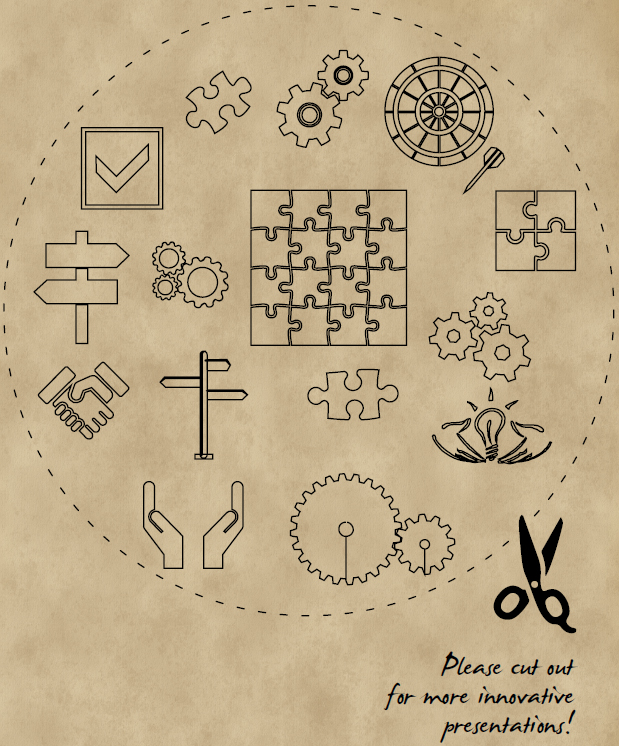
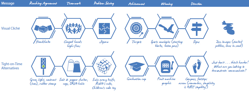
Nowadays, we face a different problem: Rather than being limited to a small pool of free clichéd images to use in our presentations, we have millions of iterations of the same clichés.
For example, try typing “handshake” into iStockphoto. It will provide you with more than 20,000 image options to review, buy, and download. Some of these will be beautifully shot—real works of art in their own rights—and some of them will be up-to-date but essentially the same clichéd version of their PowerPoint image library predecessor. Importantly, the blame for the issue doesn’t lie with the good people of iStockphoto or their community photographers; it lies firmly at the doorstep of the presentation designer. Although the image options we have available to us have grown exponentially, the time we invest in really developing truly engaging visual ideas and analogies has remained static at best.
The good news is that there are always a wide array of alternatives available to you; they just require some investment in time to consider (plus maybe the opportunity to bounce them off colleagues to sense check them if you think you’re over thinking things!).
For those short on time or short on colleagues, here are some alternatives to the clichéd images that are oh-so-easy to slip into:
Online stock libraries are extraordinarily helpful resources for today’s business presenter—but they should the final port-of-call when pulling together your presentation. Leaping in too early can only increase your chances of jigsaw-piece-inspired-visual-clichédom.
Knowing what you want to say and how you want to say must be the foundations upon which you source and use imagery within your presentation. Great images do not make a great presentation if they are merely beautiful versions of tired clichés or are being used to decorate a slide rather than prompt a response or reaction from your audience.
Provocative Presentations
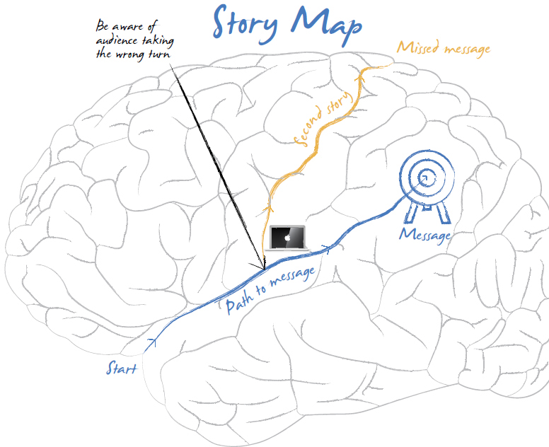
It’s very easy to make the mental leap from wanting to engage your audience with an strong, emotionally charged visual to using images that are simply there to shock. Although the use of provocative images will grab your audience’s attention, there is a very high probability of sparking a “second story” from which there is no way back. It might also polarize and upset sections of your audience (reference audience profile heat map chapter) before you’ve had a chance to properly engage them.
There is an interesting distinction when it comes to the appropriate use of provocative visuals or props: It would seem to depend on the size and scale of your presentation. Let me explain.
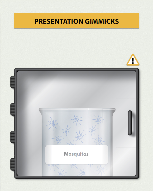
Bill Gates, once of Microsoft and now famed for his philanthropy, delivered an impassioned presentation at a TED event way back in 2009. It would not be unfair to describe Bill’s reputation as a public speaker as being a little downbeat. In his previous life as founder of Microsoft, he had presented himself as the epitome of the nervous techie (with generally awful PowerPoint slides to boot).
What made Bill’s TED presentation so noteworthy wasn’t the fact that he didn’t use a bullet point–strewn PowerPoint deck or that his impassioned delivery regarding the continuing (but treatable) scourge of malaria across the planet demonstrated real oratory skills. Nope—the presentation was talked, tweeted, and rewatched online more than 1 million times primarily due to one provocative act: He released (malaria-free) mosquitos into the auditorium with the words, “there’s no reason only poor people should have the experience.”
It was something of a masterclass in how to fully exploit an opportunity, because it not only demonstrated great showmanship (à la Steve Jobs), but, more important, it exhibited the impact a provocative act could have on audience engagement and understanding.
Now back to reality . . .
Bill Gates can get away with this sort of thing because he’s . . . well, he’s Bill Gates speaking at a large TED event.
Superstar chef, TV icon, and champion for better food in schools Jamie Oliver can get away with pouring barrow loads of sugar onto the floor because he’s . . . well, he’s Jamie Oliver and he’s speaking at a large TED event.
As a business presenter, it would at best be brave and in reality, rather foolish, to follow these examples too closely. Walking into a conventional boardroom to pitch an idea and then exposing your audience to something as provocative as a jar of mosquitos or a barrow load of sugar will simply not work. In a similar fashion, I’ve seen incredibly provocative images used at conferences (photography taken from war zones and famine struck countries) that resonated with everyone in the large auditorium but would simply be too harsh and direct for a smaller audience. The intimacy you quickly build when presenting to a small audience can become uncomfortable equally speedily.
The use of valuable visuals makes it possible to grab and then sustain your audience’s attention. The trick is to turn the dial up or down depending on the audience profile and the type of presentation you are delivering.
A Word about Infographics
Definition:An infographic is a visualization of data or ideas that tries to convey complex information to an audience in a manner that can be quickly consumed and easily understood.
Mark Smiciklas
The Power of Infographics: Using Pictures to Communicate and Connect with Your Audiences
Over the past few years, infographics have started to pop up in the most unlikely of places. From magazines to posters to animated films on YouTube, it’s not uncommon to be greeted with some form of infographic covering a dazzling array of topics.
Thankfully, I’m all in favor of infographics becoming more of our everyday life. They make navigating the London Tube network simple, make setting up new technology at home an absolute breeze, and aid my understanding of local election results (normally employed by an overexcited presenter on an elaborate TV set). The clever and often very beautiful graphic design, simple thinking, and logical content structure makes our lives easier and more attractive to the eye day in, day out.
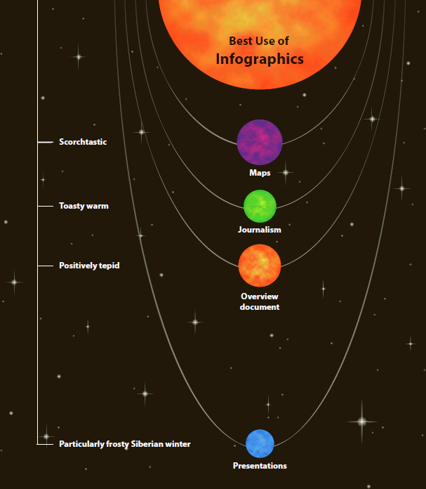
Where I do struggle with the use of infographics, however, is in presentations. As the use of this design approach has increased in popularity and profile, they have started to find their way into presentation decks on an alarmingly frequent basis. It may be a short-lived fad among those presenters who feel they need to project a “finger on the pulse” image, but the reality is that it compromises both the presentation and the infographic.
The reason for this is simple: By their very nature, good infographics tell their audience pretty much the whole story. Because they operate independently of a presenter, they need to share way more content than is healthy for a visual slide.
This is not to say that infographics are not aesthetically pleasing; they usually are. It’s just that their structure, format, and copious amounts of content leaves no opportunity for a meaningful engagement with the audience.
With the Presentation Lab’s aim of delivering a long-term sticky message to your audience, this lack of audience engagement puts the infographic approach at the back of the queue when it comes choosing valuable presentation visuals.
Based on the information shared thus far, it would very easy to assume that, as long as you are armed with the courage to think beyond the standard form of bullet points and clip art, creating presentation visuals is relatively straightforward. The casual reader may mistakenly assume that simply ditching the image clichés and taking time out to ponder the best use of visuals as part of a presentation will put him or her well on the way to creating presentation visuals that inspire, engage, and communicate clearly to audiences.
But the reality for many presentations is somewhat different.
Many presentations, both internal and external, are easily bogged down in a deluge of data and silos of statistics. These typically manifest themselves in hyper detailed content accompanied with busy and complex slide decks. The real tell tale sign for a presentation of this ilk is when the presenter utters the immortal words, “You won’t be able to see this at the back of the room so let me explain it to you.” There are few things more likely to kill an audience’s engagement dead in its tracks than these 20 words.
The good news is that it doesn’t need to be like this. Data-heavy content, and ergo, the accompanying visuals, follow pretty much the same Presentation Optimization rules as other formats:
1. You need a strong message around which to build your story.
2. This message needs to be supported with relevant content.
3. This content needs to be visualized in a way that connects with your audience.
Delivering Data as a Story
No matter how much data you may be wading through in the preparation phase, your presentation still very much needs to deliver a structured story. And this story must move your audience to do something with the information you’ve shared—make a decision, change a viewpoint, or consider alternatives. Frankly, merely throwing unstructured data at them will do you or your message no favors.
The most important responsibility you have as a presenter is to guide your audience through the story, pointing them in the right direction for them to understand, and, ideally, embrace and act upon your message.
Today’s presentation grandmasters know how to build data into their message. Rather than becoming an obstacle that they need to negotiate or seeing it as ‘the boring part,’ they let the data form the backbone of the story.
Consider the Following:
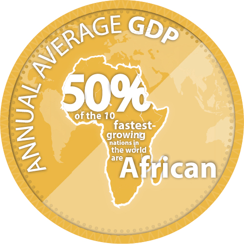
Gross domestic product (GDP) across African nations is growing at unprecedented levels. According to the World Bank, the countries with the highest growth levels in 2012 were as follows:
World’s 10 fastest-growing economies
Percentage of annual average GDP growth 2012 %
SOURCE: WORLD BANK
1. Sierra Leone
18.2
2. Mongolia
12.3
3. Niger
11.2
4. Panama
10
5. Ivory Coast
9.8
6. Burkina Faso
9
7. Papua New Guinea
9
8. Ethiopia
8.5
9. Lao PDR
8.3
10. Uzbekistan
8.2
Although impressive, these statistics are still a little too dry for regular consumption. Presenting this information at a conference, an internal strategy meeting, or school education event might prompt a few nodding heads and the odd thoughtful stroke of a beard . . . but little else.
But by putting this information into context with your audience’s frame of reference, the data suddenly takes on a whole new dimension.
It’s still based on factually sound data and can still stand up to scrutiny—but you can now apply it in a way that will resonate with your audience. You have the basis of a story that can support your presentation message. What does this information mean to your audience, their livelihoods and their families? What are the opportunities? What are the threats?
All these questions (and their answers) can now start to form the story backbone of your presentation and help you deliver a message that will stick with your audience going forward.
Supporting Data Content
Just because you have the data doesn’t mean you have to share it all with your audience. As highlighted in both the Message and Content sections of this book, simplicity is not stupidity. Cut out the noise, and your audience will hear your message a lot more clearly.
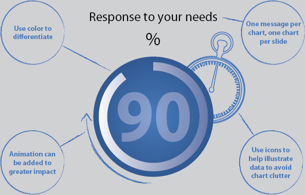
Charts in particular have an unnerving ability to collect clutter—unnecessary gridlines, distracting backgrounds, overlapping elements, way too much information, and so on. Give your chart the opportunity to breathe and allow your audience to engage with the information that makes the difference to the story.
However, your quest for simplicity and clarity should not come at the expense of honesty or transparency. You’ll need to have the confidence to stand by your data when someone questions it. You’ll also want to be able to sleep at night, so massaging the visualization of data is a dangerous game to play.
Playing with the way you display data is not only misleading, but it could leave you in very hot water. Tread carefully.
Getting Your Data Noticed
Your audience deserves the same standard of clarity around the data you present as the rest of your presentation content. A well-crafted presentation that encompasses all the elements of Presentation Optimization is destined to struggle (and perhaps even fail) if you deliver key factual/data elements in a cluttered and uncompelling manner.
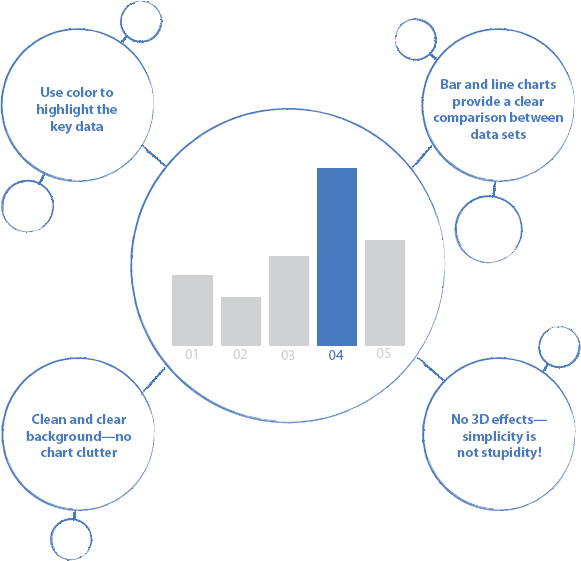
To ensure data doesn’t become your presentation Achilles heel, you need to visualize data in ways that your audience will quickly understand and with which they’re able to engage. Conventional charts are an obvious avenue to explore, and can be very powerful visual tools when developed carefully.
However, in line with our mantra of constantly pushing the boundaries in the Presentation Lab, consider some other options.
Data can be a little daunting to many presenters, myself included. It tends to come in complex, dense tables and spreadsheets and can initially make it a challenge to see the forest for the trees. By far the easiest way to get over this initial panic is to recognize one simple thing: Data is content in the same way that text on a slide is content.
As such, just as you work hard to trim back the clutter of too many words on a slide, so should you take the same approach with data and statistics.
In summary, the best way to visually enhance data-heavy slides is to follow that most important of all presentation teachings:
The buzz you get from identifying the right visual to help share your message with your identified audience is mighty satisfying. It brings with it a confidence that will put you in good stead as you prepare to deliver your presentation. All is good with the world.
Your task is to now take this visual concept and convert it into a powerful and useful presentation tool. Despite the plethora of presentation software available, chances are that your first port of call will be PowerPoint or Keynote.
Storyboarding is the process of committing your story, content, and visuals to paper before making the final transition over to PowerPoint, Prezi, or whichever slideware takes your fancy. The simple act of drawing the slides out allows you to continue the all important process of building your presentation with your audience at the core of your thinking.
Manually completing the slide by hand will also prompt you to consider how much content clutter you are adding to your presentation. If you start to suffer from writer’s cramp or are forced to write small to squeeze it all in, chances are that you’ve got too much information on the slide!
At Eyeful Presentations, we use a simple storyboard format to prompt a step away from PowerPoint and get all parties involved thinking visually. All the boring technical information regarding animations, screen ratios, and hyperlinks is set to one side, allowing the important job of visualizing the content to be the focus of our attention.
They can stir powerful emotions, which can elevate your presentation from the ordinary to the stuff of legend. There’s no getting away from it: 99.9 percent of presentations, no matter what their format, deliver greater results when supported by strong visuals that engage with your audience.
By the same token, using the wrong image—clichéd, inconsistent, or simply for shock value—can scupper your presentation before you’re even out of the starting blocks.
Now is the time to embrace the power and value visuals bring to your presentation. I promise—your audiences will be forever grateful.


“We could still imagine that there is a set of laws that determines events completely for some supernatural being, who could observe the present state of the universe without disturbing it. However, such models of the universe are not of much interest to us mortals. It seems better to employ the principle known as Occam’s razor and cut out all the features of the theory that cannot be observed.”


 Compatibility
 Relevance
 Discriminability