

The concept of The Presentation Lab is not one I’ve casually thrown together to create a snappy title for a book. Akin to developing a new drug, creating a presentation demands meticulous planning and preparation along with some serious brainpower. There must be sufficient controls in place to guard against things getting out of hand.
The two core elements of your presentation development process are:
If you can master these concepts, both you and your presentation will be in good shape going forward. If you rush or try to short cut this section, it will be at your peril.
The good news is that once these elements are firmly in place, we can really go to town in terms of finessing the content, polishing the visuals, and preparing to actually deliver the presentation to your audience. But we’re getting ahead of ourselves. Let’s focus on that all important element of your presentation formula: the audience.

The more you think about it, the more obvious it is.
Every presentation represents an investment the audience is making in you. It accounts for the obvious stuff like time and attention, but it also includes something a little more entrancing: their willingness to connect with you and your story.
Yet despite the audience’s investment, we all too often see presenters who have scant regard for their audiences. They simply “roll up” and deliver the same precanned, half-baked presentation that not only fails to interest the audience but also, thanks to the presenter’s tone and approach, bores them, too.
A presentation is an incredible opportunity to really connect with each individual member of the audience. It is often the net result of a huge amount of hard work to get to the point of presenting (reference “The Presentation Paradox” on page 19). Presenters have spent hours, days, weeks, sometimes even months planning, jostling, and positioning to get in front of the right audience. Yet, despite this, people seem happy to throw away this hard work when they are given this incredible opportunity.
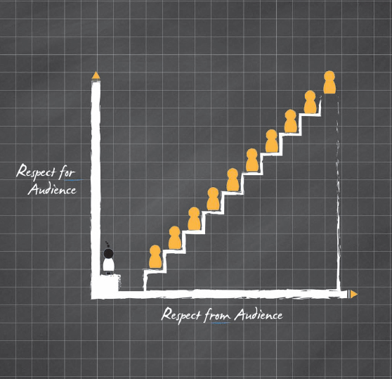
Treat your audience with the utmost respect. They are opening themselves and their minds up to your message. They probably don’t need to be there, and chances are, they have a whole bunch of other interesting and pressing stuff to be doing. Yet they chose to invest their time, energy, and attention in you.
Even if you have a “captive audience” (internal presentations are a classic example of this—legions of employees sitting in a darkened room wishing they were somewhere else), don’t make the mistake of thinking that they have to be there. True; you can force them to be there in body. But the real investment is in their attention, their willingness to engage in spirit, and ultimately embrace your message.

Once you understand the value and importance of your audience, you can then move on to the tricky business of understanding them and how they tick. Tricky, yes, but vital in ensuring you deliver true presentation success.
Get this mix right, and the presenter and the presentation fly. Suddenly, it’s simple and a joy to be involved in. However, should you get the tone of your presentation wrong, the bond between presenter and audience vanishes into thin air, causing things to go awry very quickly. An audience can turn on you or, even worse, switch off completely, bringing any seasoned presenter to their knees.
So why is this engagement with an audience so fraught with danger and anxiety? It primarily comes down to the inconvenient truth that they tend to consist of people.
And as anyone who has ever been in a relationship, raised children, been a child themselves, or generally “existed” will acknowledge, people are complex beasts. Take a moment to think about your family or groups of friends and colleagues. By their very nature, they will consist of a complex mass of opinions, backgrounds, ages, motives, and beliefs. Presentation audiences are exactly the same.
Yet despite this smorgasbord of personality influences, it is incumbent on us as presenters to connect with our audience members quickly and effectively each and every time we sit down with them. It’s nothing short of a mind-blowing undertaking.
This leaves your Average Joe business presenter with an interesting dilemma. Do they try and untangle the complex web of personalities for each and every presentation, analyzing and fine tuning their content, visuals, and style to address the needs of this carefully profiled audience? Or, do they create a presentation that takes a sufficiently broad-brush approach to the whole subject on the assumption that by not shocking or upsetting anyone, they’ve at least “got away with it”?

One assumes that presenters have gathered sufficient knowledge of the audience members before stepping in front of them. And this is possible in a perfect, well-planned, and carefully project managed world. However, it is rarely the case in reality. The other is nothing short of a cop-out: Make the presentation content generic enough to ensure no one is offended or feels left out. This is like making an action movie but cutting out the exciting bits to ensure it gets a PG rating. In short, it’s a terrible idea.
In the end, the best approach sits somewhere in the middle: Cultivate a presentation that acknowledges the different personality types that comprise an audience, one that possesses sufficient content and flexibility to address their specific needs while also being universal enough to be used time and time again. This is going to be more valuable—both to you as the presenter and, more important, to your audience. The value here is not just about ensuring that you get your message across clearly and powerfully; it’s also about demonstrating the most rare of things in many business presentations: respect for the audience (see page 56).
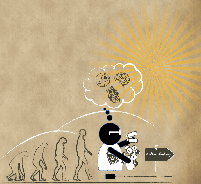
At this point, it’s awfully tempting to get into a lot of very clever science and psychology, calling upon Jung, Freud, and the like to explain how people interact, think, and operate. I could spend the next 20 pages waxing lyrical about the left brain and right brain, mulling over the importance of rationale versus instinct and, frankly, confusing and boring most readers. The Presentation Lab is about equipping you with practical skills and not bombarding you with quite interesting, but not entirely useful, theory.
Instead, I’d like us to focus on a simple but powerful way of splitting your audience into groups based on personality types instead of job function.
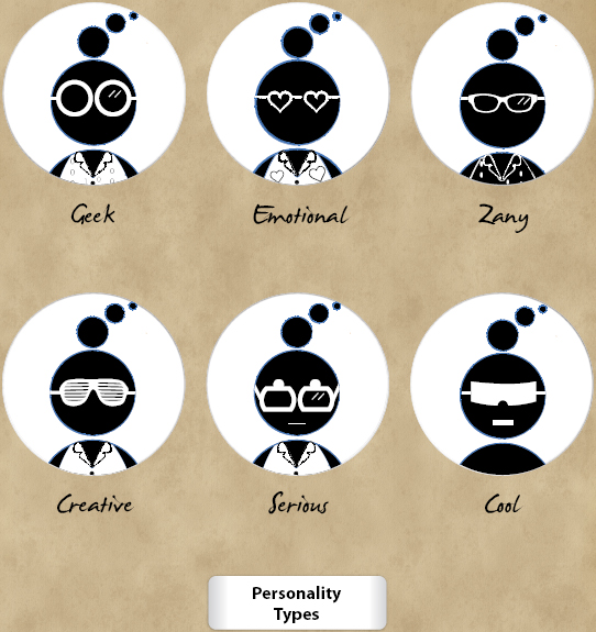
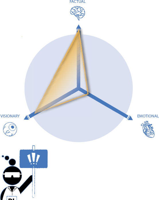
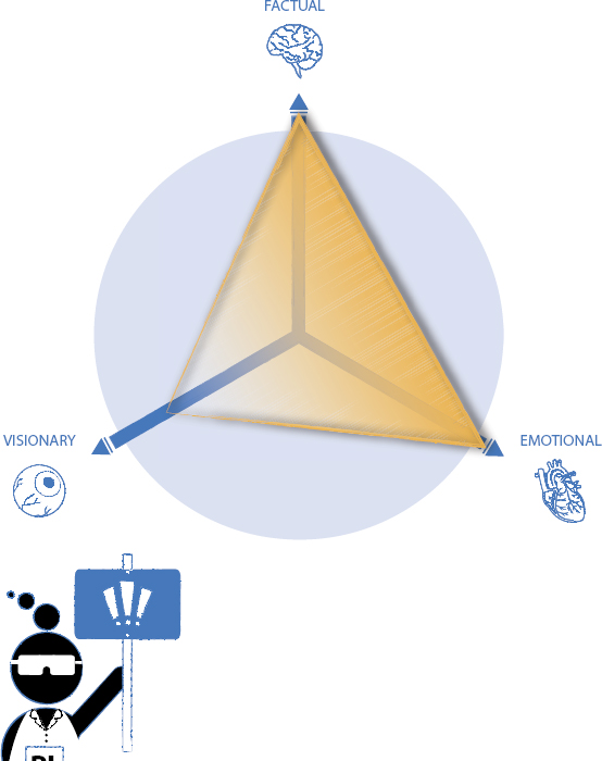
At a very basic level, most business audiences can be split into three groups:
 Factual
 Emotional
 Visionary
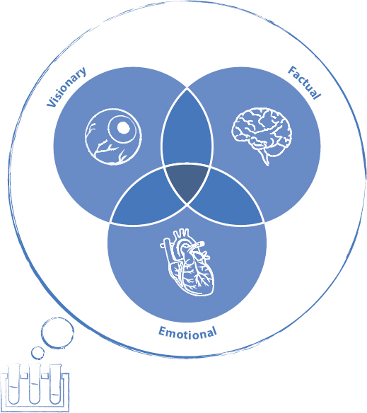
Identifying these personality types helps determine how they interact with one another (and you as the presenter) in different situations. I have worked with a vast array of business presenters and audiences over the years and seen how the formula changes from one presentation type to another. Awareness of these shifting group dynamics has allowed us to develop a “heat map” visual when preparing for different presentation audiences. As you would expect, the heat map shifts in line with a number of variables, from the type of presentation you’re delivering through to the sector you may be working in.
| Presentation Purpose: | Credentials Presentation |
| Presentation Type: | Persuasive |
| Sector: | Environmental Solution |
A large proportion of the projects we work on at Eyeful Presentations fall into the “credentials presentation” space. These are business-to-business (B2B) presentations that we typically develop for field-based teams to use as part of their face-to-face sales process.
As such, the audiences that they engage with can vary wildly, from the very Factual for our pharma and medical customers to more emotive for business services. We’ll occasionally work with a start-up or extremely entrepreneurial business that is breaking new ground and needs a credentials presentation to allow them to position themselves as thought leaders or market makers.
We did a recent project for a local company who had developed a unique way of recycling previously “toxic” materials such as diapers and other sanitary materials. They were using some very clever science to turn them into plastic goods such as park benches and (ironically) recycling bins. It was a tremendously exciting project to be involved in. Not only was the company looking to address an ongoing problem (diapers in landfill sites), but it was also finding new ways of using the output.
It would have seemingly been easy to put the company’s solution firmly in the warm and fuzzy box due to the impact of their unique process. But the reality was very different—and determined directly by their audience. They were initially presenting to a group of “green ambassadors,” procurement, and CEOs from hospitals and local authorities across the United Kingdom. Although there’s no doubt that these people had some level of interest in the great green story surrounding the process, their real focus was much more cut and dry:
- How could this save them ever-increasing waste disposal costs?
- How would this help them address the public outcry at the amount of waste being dumped in local landfill sites?
- How could they use this service to further their own profile and standing among their peers (and thus attract additional funding from central government)?
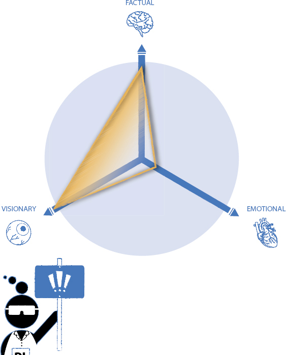
As such, the “audience heat map” we developed differed from what you may have initially thought. It was far less emotionally charged than we had anticipated—the Factual and Visionary elements came through very strongly as the business case and future opportunities were discussed:
| Presentation Purpose: | Internal Change |
| Presentation Type: | Informative |
| Sector: | Global Software |
We also worked on project for an international software provider. Following a number of credentials presentation projects, this organization approached us to work on a sensitive project. After acquiring a smaller competitor, management was looking to lose just under 15 percent of the workforce as they consolidated the two companies.
The company shared many of the internal characteristics of businesses in this sector—it was full of smart, well paid, and frankly, opinionated individuals. As such, sharing news around any sort of restructure was fraught with danger—most obviously an immediate impact on morale, but also the potential for public relations (PR) headaches as the news was leaked to the industry.
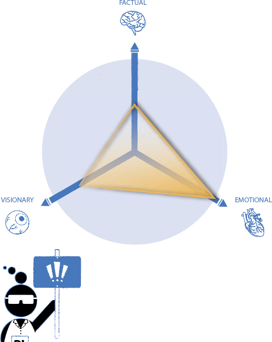
Again, we looked beyond the obvious when reviewing the audience profile. Although it was primarily comprised of Factual individuals (working in software can do that to you), the presentation’s nature would certainly elicit an emotional response. We also needed to address the “big picture” to paint a positive and ultimately upbeat picture for those employees remaining.
The “audience heat map” changed to reflect the nature of the message plus the volatility of the people in the room. In turn, this allowed us to develop the tone of voice for the presentation accordingly: As shown in the diagram opposite, to demonstrate the logical reasoning behind the decision while addressing the inevitable emotional impact it would have on the audience.
| Presentation Purpose: | Investor Relations |
| Presentation Type: | Informative |
| Sector: | Private Equity |
Before we started working with Private Equity companies, I’ll gladly confess to not really understanding how they worked. The first few presentations we worked on were little more than “lipstick on a pig”—type projects, where there seemed to be more focus on making charts look pretty than supporting a sustained message. But after a while, we started to understand more about the audience we were developing slides for—and ultimately determined how to improve the approach.
Our customer’s goal was for its investors to learn more about what made each of their fund companies tick. To achieve this, they’d get the various CEOs to stand up and share their story—from the eureka moment through to painting a picture of what the future holds. On paper, it looked like a great way to show the big picture and add color to something that had the potential to be a presentation dominated by charts and data. The problem was that some of the CEOs took this as an opportunity to share their life stories, ultimately delivering an Emotional style of presentation. This led to an unfortunate mismatch between the presentation and audience.
The audience at an investor forum is made up of very clever people. I mean really clever; they can review an earnings before interest, taxes, depreciation, and amoritzation (EBITDA) forecast chart and draw a well thought out and considered conclusion at 50 paces. It’s really quite remarkable.
And in addition to being very smart, they’re also extremely busy. They’re constantly checking their mobile devices—not as a slight to the presenter, but because they truly do need to be ‘on it’ the entire time. They simply don’t have time to get Emotional as each of the presentations is delivered. For them, it’s all about the facts.
The diagram should give you a pretty good picture of the people sitting in the auditorium. They are here to understand the short-term business case behind decisions while getting a long-term understanding of opportunities for each of the companies.
With this in mind, we toned down the presentation’s Emotional content and focused on the Factual (obviously). We also coached the CEO presenters to engage with the Visionary part of the audience psyche. This was the exciting part and, more important, humanized the presentation without being too emotional. It quickly became a Unique Selling Point for this event and our customer.
| Presentation Purpose: | Persuasive |
| Presentation Type: | Bid |
| Sector: | IT Services |
The high stakes surrounding bid presentations can take the nervous presenter dangerously off-track very quickly. Many will ditch the concept of ‘playing to the audience’ and use this presentation as an excuse to simply regurgitate the same structure and content that’s in the original tender document.
It’s an easy trap to fall into. And it’s one that could potentially cost you that high profile and profitable contract.
One of our longest-standing customers is a U.S.-based information technology (IT) company responsible for delivering mission-critical services into the financial services sector. It is a massively successful organization, something we can attribute to a variety of factors: continued dominance among competitors, the quality of its services (failure is simply unthinkable), and the staff’s “can-do” attitude.
This IT company was asked to bid on a project for which it would be providing some very complex services to run the back room processing for a high-profile global bank. The sales staff had run the gauntlet of numerous meetings, audits, and bid submissions over the previous 24 months—all of which culminated in a crunch time presentation.
We spent the early stage of the development process carefully reviewing the named audience members, their responsibilities, and our customer’s existing relationship with them. The more the project team discussed the audience, the more obvious it became that the bid’s success centered on trust. Our customer could technically deliver the solution without breaking into too much of a sweat; the same went for their two nearest competitors. They could distinguish themselves from the competition by demonstrating that the bank could trust them to deliver on the project scope—and that they would be easier to work with.
It was time to engage and play to the audience’s Emotional facets, while aligning these to the factual box-ticking elements required to connect with the professionals in the room. It’s important to note that this focus on the Emotional and Factual audience drivers does not exclude the Visionary element; the audience wanted to know that there was an element of future-proofing in place. However, previous meetings, audits, and documents had addressed much of this.
The presentation we created for this “must-win” bid successfully demonstrated trust and a shared vision for how the project should be run. This, in conjunction with keen pricing, an enviable reputation, and some great account management, contributed to our customer winning one of the largest orders in their long history.
Drawing Conclusions
Understanding the different forces in play within audiences makes life a lot simpler and more efficient when creating presentations. It also makes the “presentation scientist” aware of the pitfalls inherent in assuming that stereotypes of different job functions or presentation type are a guide upon which you can base your approach.
So what does this mean to us as presentation creators and deliverers? Pretty much everything: You dismiss your audience and its profile at your peril. Showing up and delivering the same tone of presentation to a range of different audiences is a recipe for disaster. It’s the equivalent of booking the same entertainment for a bachelor party and the subsequent wedding reception. These are clearly two different audiences who require two different types of engagement. When you assume that one size fits all, you run the risk of either disappointing—or, in the case of the bachelor/wedding party, upsetting—more than a few members of your audience.
This audience profile needs to be paramount in your mind when creating your presentation. The people to whom you’re presenting should form the basis of some very basic questions:
![]() Message
Message
- What is your message, and how do you anticipate the audience will react to it?
- What is a realistic expectation of them following the presentation?
- What do you want them to do as a result of hearing your message?
![]() Content
Content
- What kind of tone and language will resonate with them?
- What do they already know?
- What don’t they know that you might have to provide some background on?
 Delivery
- What are the right presentation tools for the job?
- How can you use visuals to connect with them?
Different audiences demand (and deserve!) different approaches. Because these varied approaches share the same basic presentation building blocks—message, content, and design—you need to apply them in line with your audience. An Emotional audience won’t benefit from too much data, a Visionary audience requires “big-picture” statements, and the Factual will need more detail than most.
Get the mix right and you have a strong and robust foundation in place to build upon. Make too many assumptions or fall into the trap of believing stereotypes, and you run the risk of losing your audience before you’ve even started.
So armed with an understanding of your audience profile, how do you take this and evolve it into a structure that meets their demands? It’s time to introduce the Audience Pathway . . .

Al of this understanding and empathizing with your audience is all very nice, of course. But to what end? What’s our intended result, and just how are we going to get them there?
No matter what mix of audience types you’re facing—be they predominantly Emotional, Factual, or Visionary—they all need to take a journey from the initial faltering steps through to wholehearted action. Your job as the presenter is to guide them through this journey as quickly and painlessly as possible.
Your audience needs to take a pathway made up of four distinct phases, shown in the graphic below:
Audience Pathway
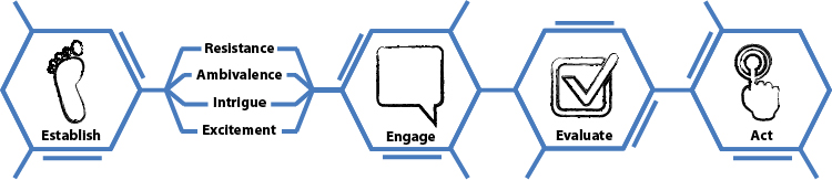
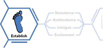
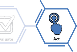
Of all four stages, Establish perhaps comes with the highest stakes. You can see on the diagram above that there are a few things coming between this and the next step of Engage. This phase is where the skeptics, the cynics, and the downright disruptive will raise their heads and ruthlessly disrupt the presentation. They might express this through body language (crossed arms accompanied with a dramatic sigh are never a good sign) or by asking loaded questions that demonstrate to the rest of the audience that they don’t want to be there. Although visions of strangling the members of the audience involved might seem cathartic, it is better to recognize their resistance as part of the process. You need to establish the reason they are in the room and use this to frame the engagement going forward.
This takes a very negative view of the Establish phase, however. It’s somewhat of a worst case scenario. More often than not, this phase is a positive one and more about managing the audience’s interest, intrigue, and excitement. Again, recognizing that this is merely the start of the process allows you to plan your presentation structure carefully to ensure your audience’s good intentions are duly respected.
The aim at this stage is a simple one: keep them on your side, get them all on the same page, and proceed as quickly as you can to the Engage stage.
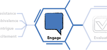
The Engage stage is where all the magic happens. It’s where your compelling content, coupled with your valuable visuals, work seamlessly to support the message that resonates loud and clear with your audience. It’s the phase where your emotional audience members fall in (or out of) love with you and your message. It’s where the factual ones start to take on board the content you’re sharing, and it’s where the visionaries in the room see the cogs start turning as the bigger picture slowly starts to come into focus.
Engaging your audience is a wonderful experience. Professional speakers will talk misty eyed about the second they knew they had the audience in the palm of their hands—that special moment when the entire room was on the same page. It’s very easy for us mere mortals who don’t make their living presenting to enraptured crowds to think that this ‘magical moment’ is out of our reach. The cynics might say that taking inspiration from great orators like Steve Jobs, Dr. Martin Luther King, or Winston Churchill is fine—but the reality is different. For them, getting through the presentation unscathed, with reputation intact and the audience still awake is a win.
Make no mistake: Business presentations provide as much opportunity to create magic moments as the big-ticket speeches by Steve, Dr. King, and Winston. The reason we drag out and cite these examples so regularly is that they are great exponents of audience engagement, not because of the oratory skills, grandeur of the venue, or the eye-popping visuals that were on display. (In fact, rumor has it that Churchill was rubbish at PowerPoint.)
If you boil it all down, engaging your audience is remarkably, almost embarrassingly, simple; It’s just a matter of taking time to get the basics right. It’s very much the same as engaging and building a relationship with someone new. You put yourself in the other person’s shoes, show interest in the things that are bugging that person, and demonstrate that you understand—and that you might ultimately be able to help the person. It really is as simple as the old “What’s in it for me?” (WIIFM) sales 101 training most business professionals have undergone. We all know it, but rarely follow it through.
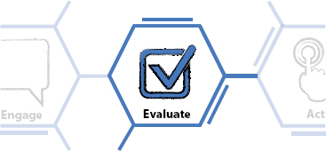
This leads rather nicely on to the Evaluate phase. This principally involves you spelling out the impact your proposition will have and then allowing your audience to chew it over before forming their own opinion. Depending on your audience’s profile, this might entail them processing hard return on investment (ROI) facts that demonstrate the logical reason for proceeding with the plan. It might mean allowing them the time to mull over your carefully constructed benefit statements (“what this means to you”). Either way, you need to ensure that you give your audience time to process your message. This investment in evaluation will prompt questions which ultimately will give you a further springboard to demonstrate your understanding and passion for the project. Done correctly, it’s a win-win for both you and the audience.
As mentioned previously, it’s all too easy to think of the Audience Pathway as a single linear process. Odds are, you’ll need to provide some clarification or discuss particularly complex issues in more detail. In these instances, you may find you need to take the audience through the Engage–Evaluate process a number of times. This is when it’s invaluable to equip yourself with a flexible presentation tool (or ideally tools); they allow you to build to the crescendo of the Act phase.
Sometimes taking a few small bites at the cherry is the best way to get to your goal. There is no need to rush things!
Remarkably, the most common absence from the business presentations I am asked to “Healthcheck” is a clear Call to Action. It’s a most peculiar trait that seems to affect presentations from companies large and small and from all over the world. People seem to either forget (unlikely) or feel uncomfortable asking their audience to take some sort of action at the conclusion of their presentation.
This is incredibly confusing, of course—because the ultimate purpose of presenting is to prompt an action or a change from your audience. It might come in the form of them spending money with you, approving a new approach or simply thinking differently. But the action doesn’t really matter if you don’t ask the question and prompt the audience to respond!
The trick in any successful and joined up presentation is to make the Call to Action as natural as possible by working with the audience profile rather than against it. Going for a hard close to a room full of Emotional people will do nothing to aid your cause, and being too high level and fluffy with a Factual audience will do you no favors either.
It makes no sense to go to the trouble of developing a presentation around a specific Audience Pathway without including a Call to Action. Not only does it waste your time, but it wastes your audience’s, too—which is even worse. Without it, you fail to demonstrate that all-important respect for your audience. (And if you’re questioning this advice at this point, might I respectfully suggest you read Section C again. It really is that important!)
Navigating Your Way along the Pathway
Understanding the steps along the pathway is important, but it’s primarily a matter of common sense. The real power comes from knowing how to apply each of these stages to the different audience profiles, from the use of emotive language through to the application of visuals, data, and different Calls to Action.
The following diagram provides a high-level view of how to engage different audience profiles at each of the Audience Pathway steps.
As always, remember that these are not mutually exclusive. You’re still able to drive the engagement stage of the presentation with a predominantly emotional audience by using charts (just don’t overdo it!). In much the same way, building rapport with an audience is a valuable thing to do with all manner of different groups. You just may find that it’s more efficient to cut to the chase to demonstrate knowledge when speaking to a predominantly Factual audience.
Ultimately this diagram is designed to offer a rule of thumb for structuring your presentation to meet the predominant audience profile.
Audience Pathway
Presentation tone of voice
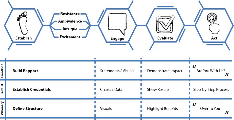
Audiences with a strong Emotional scale want to feel that they are on a journey with you, hence, the Act phase being an inclusive “Are you with us?” Such an informal approach at the conclusion of the presentation would raise eyebrows and concerns among a predominantly factual audience—they will expect you to demonstrate a tried and test process that will deliver the results you had previously demonstrated. An audience with a bias toward Visionary will want to be guided toward the Act phase but don’t make the mistake of pushing too hard—they want to get there at their own pace so a non pushy “Over to you” is preferable to a highly structured Call To Action.
Different strokes for different folks.
As this entire section has highlighted, getting a strong grasp of your audience’s profile and interest is the first and most important step toward building a powerful presentation. It is the base matter upon which the remaining elements that comprise the full Presentation Lab formula sit. If you fail to invest sufficient time and energy in getting this right, the entire presentation is on shaky ground from the get-go.
With that in mind, let’s now move on to the other elements that work together to create a truly powerful presentation. The next step: working to deliver your message with real clarity and power.

Every presentation ultimately needs to have a purpose. I considered calling this chapter “Setting Objectives” but shied away from it for the obvious reason: It makes it sound really boring.
And perhaps this is the reason that people typically launch into presentations with little or no thought as to their reason for being. It’s remarkable how seldom business people bother to even set objectives before creating their presentation.
The truth is that you must intimately understand why you’re presenting in order to ensure your message is robust enough. It is critical, because it is the framework upon which you build the content and visuals of your presentation.
The good news is that we don’t subscribe to the drawn out process of creating totally SMART (specific, measurable, attainable, relevant and time-bound) objectives for most presentations. Like you, we’re keen to get started on building the presentation. But we do need to make sure we lay the right foundations before diving in.
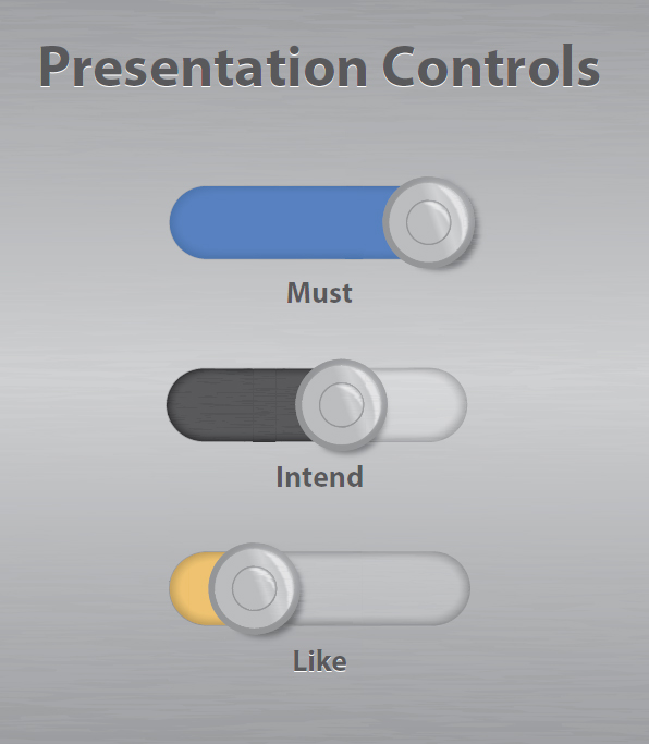
We use a much simpler brainstorming process called Must-Intend-Like to get a firm grip on the objectives for any presentation. The great news is that you can use this approach for all manner of things—from setting the objectives for important phone calls to agreeing where the next family holiday will be. It’s powerful stuff.
Step 1
Using whatever method feels most natural to you (whiteboard, mindmap, Word document, back of an envelope, etc.), think through and jot down a few key considerations for the upcoming presentation:
- Who will be there?
- How long do you have with them?
- How long has this been on your schedule?
- Is it a recent development, or has this been planned for some time?
- Why are they seeing you?
- What do you believe they are looking to achieve from the presentation?
Don’t worry; you’re not looking to write War and Peace here. You just need enough to get your thoughts straight, and start thinking about the possibilities the presentation holds.
Step 2
Next, you’ll create a separate list; but this time, it is all about you:
- What are the fundamental reasons you are presenting?
- Is it to make a sale?
- Share an idea you want your audience to support?
- Report on progress?
- Why are you personally presenting?
- Your knowledge and experience?
- Your position or profile within the business?
- What history do you have with the audience?
- Do they know you and/or your company?
- Is there a level of trust already established?
- Is this a follow up presentation to a previous engagement (presentation, proposal, networking event)?
Step 3
Using the information you now have, take a final page and split it into three columns entitled Must, Intend, and Like. Revisit the observations you’ve already noted and start making some judgment calls on the upcoming presentation.

 Must
Must
These are the minimum results you are looking to achieve from the presentation.
For example, you might set the minimum bar for a sales presentation at something akin to “give a good impression and ensure that our reputation as a worthy partner goes unblemished.” For an internal presentation, it might be something like “ensure that all parties understand the progress we have made over the last quarter and the impact it will have on the business going forward.”
Always refer back to your previous notes. If you believe the audience is merely there to “kick tires” and is not serious about proceeding with a purchase in the short term, factor this in to your “Must.”
Importantly, don’t set the bar too low. The objectives you set here will form the basis of your presentation story, so going for too easy an option will do nothing more than limit your overall effectiveness.
 Intend
These are the results you are expecting to achieve based on a well-run presentation with sufficient time and the right audience in place. In a sales scenario, it might be “to build sufficient trust with the prospect to the point that they ask us to return and demo our solution;” or, for an internal audience, “request further information so that the board can present our progress to investors on the next call.”
Again, be realistic. If your initial thoughts indicate that the audience is conservative, or that your time with them is shorter than you would have ideally liked, factor that in when setting objectives.
 Like
Like
This is when you get the opportunity to be a little more optimistic and set yourself some stretch targets. Working out your “Like” can be quite a personal thing and may not be commercially driven, but it can be a huge motivator and driver when pulling together the content of your presentation.
Sales examples might be “at their request, move immediately to the demo stage.” An internal meeting option might be, “that the CEO asks you to spend some time one-to-one sharing your vision for the project.”
Setting strong and realistic objectives is absolutely essential to having a strong presentation message; the two are symbiotic. The Must-Intend-Like process ensures that you set yourself realistic targets and that, as you build your presentation, you don’t forget the reason(s) you’re doing it.
With these in mind, we’ll move on to message creation.
I’m all for simplicity in messaging. There’s plenty of opportunity and space in your presentation’s content to show your audience how clever you are if you so wish. But simplicity should always rule in messaging.
However, simple doesn’t mean “dumbed down”; far from it. Keeping things simple while retaining meaning is actually quite tricky. And in these days of powerful presentation slideware, a gazillion technology channels, and limited time, it’s easy to make things more complex than is good, or even necessary, for you or your audience.
Getting to simple takes time and a vast amount of consideration; it’s the equivalent of asking an artist to create a picture using only three paints and four strokes of the paintbrush. Before even picking up the canvas, the considerate artist would take time to plan, evaluate, and test themselves and their theory fully. The same applies when creating a new presentation: Your message’s clarity and simplicity needs to be the result of intense thought, debate, and review. Only once you have this in the bag can you commit yourself to creating the presentation. And although it’s a huge task for any presenter, it’s one to which they rarely give due consideration.
Your message needs to be simple enough for people to not only understand it quickly and fully but also to be able to share it with others without faltering.
In addition to the Must-Intend-Like process, a useful test for me when working with customers is to ponder if my young daughter would understand it. The project might be to launch a new bit of clever technology that comes with all manner of whizzy elements and reference the latest and greatest new information technology (IT) trends; but the message needs to make sense to an eight-year-old. Otherwise, it won’t work.
If we can boil the message down to a simple, “it saves the company money and keeps customers happy because it’s quicker and doesn’t break down,” we’re onto a winner. If the message is a little more complex (and in IT, they usually are), “it addresses the growing redundancy issue of the mainframe ecosystem whilst embracing big data,” I know my daughter would quickly turn around and return to the important task of organizing her plastic monster collection.
Yes, it’s blindingly obvious. But members of the corporate world have a funny way of taking the straightforward and making it complex so that it sounds a little more grown up. They might do so based on the assumption that complex things sound more impressive, and they can charge more for them.
Or it might just be that people have forgotten about the basics. Either way, spending time to boil the material down to its simplest points is a surefire way to ensure that your audience leaves with your intended message, versus some smorgasbord of assumptions and guesswork.


How often have you sat through a presentation and then, when a colleague asked what it was all about afterward, struggled to explain it properly? Holding your hands up and dramatically declaring, “I have absolutely no idea!” might amuse others, but in reality, it reflects a huge waste of your time—and the presentation’s massive failure to deliver.
Work that through to its logical conclusion: It means that pretty much everyone who sat through that presentation had the opportunity to take on board your message and share it with their colleagues, friends, lovers, and family pets. But because they either didn’t understand or remember it, that opportunity has been lost. Great presentation messages have the propensity to sprout feet and travel through conversations, social media, gossip, and formal communications. Poor presentation messages never make it out the door.
So How Do You Ensure That Your Audience Remembers Your Message?
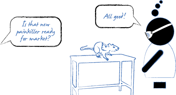
Many of my learned peers have written extensively about giving audiences that “special moment” in a presentation that they will remember long after the final slide has been shown. Well documented examples of these “gob-smacking,” widely talked about moments include when Steve Jobs produced the new MacBook Air out of a standard office envelope, or when his counterpart Bill Gates opened up a jar of mosquitos within the auditorium at a TED talk.
Now, I love showmanship as much as the next man. But I fear that sometimes, people are missing the point when talking about these “special moments,” specifically, that it’s not the act that’s noteworthy but the message behind it.

If all you can remember about Steve Jobs’ MacBook Air presentation is that he pulled a neat trick on stage using a laptop computer and an envelope but you didn’t grasp the message he was really trying to communicate, then the presentation was ultimately a failure.*
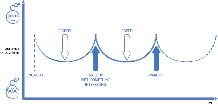
Believe it or not, it’s relatively simple to create a standout moment in a presentation. It could be an arresting image on a slide, use of a prop or an exercise that involves audience members. (I’ve forgotten how many times I’ve seen a bottle of Coke and a tube of Mentos used as a tortured metaphor for a range of business topics.) It doesn’t really matter what the moment is unless it helps deliver your message loud and clear. But if it doesn’t support your message, it’s at best redundant showmanship—and at worst a distraction that ultimately damages your presentation.
Using tricks and novelties to grab your audiences’ attention is hokey. If your message is suitably powerful, you can step away from the Coke/Mentos floorshow and start to really communicate with your audience.
*I’m aware that calling Steve Jobs’ messianic position as a brilliant presenter into question is verging on the sacrilegious. But what the heck; we’re here to challenge the norm—because the norm is not working for most presentations.
Focus on the Message First—Not the Delivery
In the end, your underlying message is what needs to live on after the presentation. If you struggle to answer a colleague’s innocent “What was the presentation about?’ question, the lack of clarity, focus, and simplicity around the message is likely to blame. You’ve got some work to do.
When we take customers through our Presentation Optimization process, we work damned hard at developing, clarifying, and testing key messages. It’s important to put the time in here. After all, you want your message to continue making an impact well after you finish presenting your carefully delivered speech or beautifully designed slides.
To ensure that the messages are focused, clear, and engaging, we limit them to an absolute maximum of three points (while always striving to one killer message). We use the following questions as our litmus test:
- If I called a member of your audience two weeks after your presentation, what do you think they would remember about your presentation?
- What would you want them to remember about your presentation?
- Do the two currently match?
If the response from the audience member is positive but along the lines of “I remember your beautifully designed slides,” we’ve failed. If, however, they respond by saying, “Oh yes, you’re the guys that can make an impact on X, Y and Z,” we’ve delivered a presentation with a message that has truly sprouted feet and started to spread.
Focused Messages Take Time
In many ways, a thorough understanding of audience and message seem to have been the biggest victims from today’s manic and technological business world.
When the clock is ticking and you’re up against a deadline, it’s all too easy to make assumptions about audience stereotypes (“They’re from finance so we need lots of charts”) and message (selling product features over business benefits). Communication 24/7 via e-mail, phone, text, and Skype means that everyone is able to (and normally does) offer an opinion on everything—from presentation content and aesthetics, to which technology to employ. Presentation development by committee is fast becoming the norm—and is something technology providers are, unsuspectingly, aiding in by building collaboration functionality into their software.
Unfortunately, the net result is confused noise rather than clear messaging focused on a well-defined audience profile. You, your audience, and your presentation all deserve better than that.

Having a powerful message to share is great, but it’s merely the starting point of a more involved process.
Your carefully constructed and considered message needs to evolve into the basis of a story. As discussed earlier, a thoroughly developed story has the power to make your message “sticky,” without having to rely on wow moments to keep your audience engaged. By introducing a structure, story, or narrative arc, you can give your message the opportunity to grow legs, travel, and get shared time and time again.
We use a process called storyflow development to achieve this for our customers. The concept of the storyflow took some time to come into fruition within Eyeful. Our presentation consultant team spent many years working with customers to identify their key messages.
Once confirmed, we’d dive straight into figuring out which content helped them deliver this to their audience. However, this led to a few headaches. Some customers freaked out when we started to hack away at their beloved content armed with little more than a whiteboard/flipchart full of workshop generated hieroglyphics and a confident air about ourselves. In particular, it proved difficult for our contacts to share the new Presentation Optimization–created message with their peers and superiors at this very early stage.
Yes, they could describe the new pared down message, but there was some confusion letting them know precisely how we were going to actually share it. And, “Well, you’ll just have to wait and see,” didn’t seem to cut it.
How to Build Your Storyflow Document
The easiest way to describe the storyflow document is that it’s the chapter headings of your presentation story; it highlights the structural elements, the high-level messages and the story’s logical flow.
It will also highlight that points you use to jump off into more detailed sections (we’ll cover the power of interactive presentations later on; as demonstrated in the graphic below, these need to be carefully planned from the very start) and also provide some rudimentary pointers in terms of script.
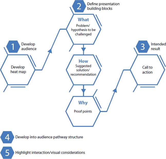
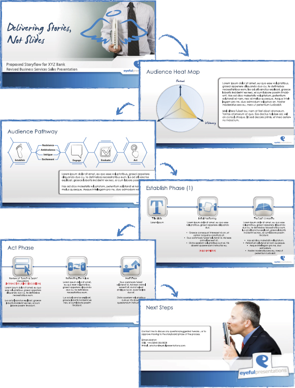
Nothing about the storyflow document is cast in stone; there should always be debate and challenge to the approach. The example opposite is a case in point. Our customer was a large retail bank who required a new approach to their sales messaging. Following a fruitful but occasionally tense workshop, we put forward a plan that to some of the more Factual personalities in the room was going to be contentious. The purpose of the storyflow was to ensure that all parties were able to view the proposed approach without the distraction or complication of detail. Once we had approval on the overarching message and structure of the story, we were able to move on to the detail as a group jointly happy with the presentation approach.
The storyflow allowed for an additional benefit: We were able to use it to keep us on the straight and narrow further down the road of presentation development. Despite the fact that we build presentations for a living—for companies of all different sizes and shapes—we’re still human. And we need to ensure that the tail is not wagging the dog in terms of content and visuals. It’s all too easy to get over excited when you start pulling together relevant and powerful content and developing the accompanying visuals. The storyflow document helps address that.
The good news for those of you who are desperate to begin developing your content and visuals is that once you’ve completed the storyflow document, we’re ready to launch into the next phase of presentation development: finessing and developing your raw materials.