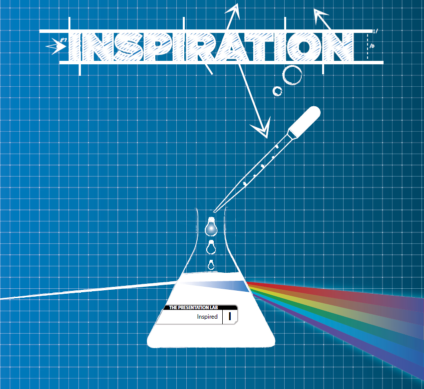
No matter how many books you read, training events you sign up for (and hopefully, attend), or YouTube tutorials you watch, the simple fact is that there is nothing that makes a presentation work better than that flash of inspiration.
Without inspiration, you’re merely playing around the edges, applying lipstick to a pig, or rearranging the deckchairs on the Titanic.
The good news is the inspiration for your next presentation is everywhere. Look around you and you’ll see hundreds, nay, thousands, of things that can act as the catalyst for a brilliant presentation.
Someone might make an off-the-cuff remark that gives you that all-important spark. You might read an article over someone’s shoulder on the train into work that gets the creative juices flowing. It could be something as completely non business related as a TV show, a family photograph, or a joke or a song on the radio.
It doesn’t matter where the inspiration for your presentation comes from; what’s important is to know what to do with it once you get it.
The good news is that inspiration counts for a huge proportion of what makes for a good presentation. In my opinion—which is based on working with hundreds of companies on thousands of vitally important presentations—once you have the inspiration element in place, you’re about 85 percent of the way there.
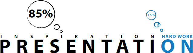
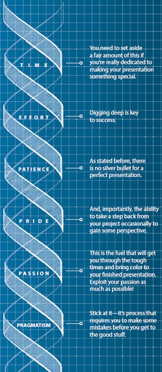
The perhaps not-so-good news is that the remaining 15 percent is pretty damned hard work. I mean really hard. But it’s also this last 15 percent that makes all the difference. It turns your idea from an average, run-of-the-mill, or even painful presentation (the ones we experience day in and day out) into something remarkable—an optimized presentation.
Just 15 percent makes all the difference—yet it doesn’t rely on any expertise in PowerPoint, Keynote, or the plethora of other fancy presentation software packages.
Nor does it rely on you being the most effervescent speaker known to man. And the 15 percent doesn’t require an armful of college, university, or marketing degrees.
Every business presenter out there can apply this magical 15 percent. You have the ingredients in place already, and if you don’t, you can source them easily enough by juggling your schedule and reprioritizing a few things:
By applying the ideas and processes in this book, you’ll move along the Presentation Optimization scale, culminating in a presentation that engages audiences in the most powerful way possible—prompting them to make changes and view things differently.
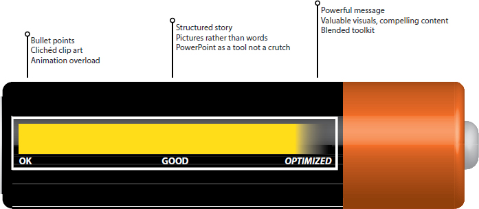
Equipping yourself with a truly optimized presentation—that you can deliver in a host different ways—changes the game completely.
Audience engagement goes up a notch or three, your ability to influence and drive change increases, and all the hard work you put into getting to the presentation stage pays off.
There is a vast amount of writing on presentations and their links to the innermost workings of the human brain. This is an opportunity for the aspiring presentation experts to get themselves embroiled in the complicated and occasionally confusing world of science.
For those with a yearning to “geek up,” there are some well-trodden paths to follow:
Professor Emeritus of Psychology Albert Mehrabian is perhaps the most commonly quoted expert in this area (see side panel). This expert on the relative importance of verbal and nonverbal messages does a good job in filling the “well, it’s obvious when you think about it” void.
German psychologist Hermann Ebbinghaus works well here (see side panel). His theories on human memory provide a great deal of insight into how quickly people will forget most of what you have to say.
As you may have picked up from my tone, I’m more than a little skeptical of much of the science that is thrown out to people looking to improve their presentations. This suspicion might sound a little peculiar coming from someone who chose to call their book The Presentation Lab, but there is good reason for it (honest). When we understand and apply it sympathetically, science can be an incredibly useful set of tools to have at our disposal. However, when we follow it slavishly, all common sense tends to leave the room—and you’re left with an uninspiring and often meandering presentation and story.
I’ve seen some truly awful presentations developed for companies that tick all the boxes of scientific thinking. I guess it’s one of the reasons that computers have never been able to create true art, such as poetry or music; we can never replace the human element in these things. The same goes for presentations.
A computer may be able to beat you at chess (and, in my case, frequently does), but it’ll never be able to create a story that engages and resonates with an audience like a human can, no matter how flawed that human may be. Skepticism aside, I have found an amalgam of different scientific studies helpful in being able to apply labels to some things that we have seen work in the field with customers over the past nine years or so—Presentation Optimization.
The most relevant and easily applied of these many scientific insights was a comprehensive study by American psychologist, neuroscientist, author, and educator Stephen M. Kosslyn titled “Eight Cognitive Communication Principles” (catchy title, eh?). Because the study was initially designed to understand and analyze the flaws of PowerPoint and other presentation software, it provided a very nifty way of applying some science to three of the key stages of the Presentation Optimization methodology:
We’ll revisit this study later on in the book.
What’s the real purpose of applying science in presentations? Caveat Emptor
I’ve pondered this question numerous times and always reached the same couple of conclusions, all of which I’ve explained in detail below.
No need to learn through trial and error
There is a strong case to be made that all presentations should strongly follow psychology’s guiding principles. After all, presentation science is merely the process of logging what happens naturally when we absorb information through a presenter and their visual tools. Surely, using these insights means we get it right more times than we get it wrong?
Does the application of science make it more likely that your next presentation will meet your objectives—specifically, in terms of making sure your audience understands your message and is moved sufficiently to take action? If so, get going—you’re onto a winner. But in my experience, this is extremely unlikely. It’s the equivalent of learning to ride a bike by reading a book about riding a bike. No matter how sufficiently you’ve researched, you’ll end up falling off a few times before you get the knack—and the only way to figure that out is by getting on the bike. In other words, science is no replacement for getting out there.
Perhaps more important, presentations are about connecting with people. For all the rules, insight, and recommendations that science can bring, they can’t guarantee that electric pulse that occurs between a presenter and their audience when a great presentation just connects everyone in the room. It’s akin to when great writers, film directors, or musicians strive to create something that elicits that “spark”; rarely do they find it in the pages of a psychology book.
Justification
There’s no doubt that it’s easier to sell a new concept into a business if you’re able to demonstrate its worth—particularly by referencing impartial but compelling evidence. This is where the science comes in for keen presentation thinkers and evangelists.
There’s no getting away from it—some of the actions I’d like you to take after reading this book are a little, um, uncomfortable. Acting on concepts like corporate storytelling or Blended Presenting to your CEO are pretty nerve-wracking scenarios to consider. After all, they’re probably more than comfortable with your current slide deck (heck, they’re probably the ones who created it back in the day!). They’re likely to perceive this new-fangled approach to presenting as being a little too fancy for them and their company.
But if you can add some science to the mix, you’re able to quickly and (relatively) simply share the insights of very clever people who have a large number of letters after each of their names. Your CEO will be suitably impressed that you’d demonstrated the superhero levels of tenacity and enthusiasm to work through the long (and typically boring) theses you reference—and allow you to carry on as planned.
In conclusion
Whatever the reason for referencing the science that supports presentations, never make the mistake of believing that ticking all the psychology boxes will allow you to create and share something that will stick with your audience and inspire them into action. And that’s the purpose of presenting in the first place.

Clear, engaging, and ultimately successful business communication is vital. Without it, the cogs that drive business get gummed up and slowly but surely grind to a halt.
I witnessed it in my own business (oh, the irony) when the stresses of demanding customers, changing goalposts, and ever-tighter deadlines made working at Eyeful less than fun for a while.
The first casualty was communication—and in retrospect, the signs were there for all to see. People began resorting to e-mail more and more. This inevitably led to people misconstruing one another’s e-mails more frequently, which resulted in some tense conversations. The consequence was that, in a frighteningly short period of time, key people were not really communicating or engaging with each other at all. It was horrible.
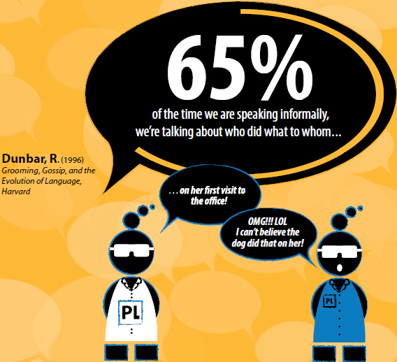
With so many people now dotted across the world, we had no alternative but to schedule a conference call. It is not my preferred method of communication, but necessity compelled us to do so.
I started by thanking people for joining the call and then recalled the vision I had for the business when I started it back in 2004: to build a company that would deliver the best possible presentation services to its customers through a mix of great people, smart thinking, and the need to ensure that each and every member of the team feels valued, respected, and engaged with the business.
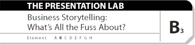
I told a few short stories of how we convinced long-standing team members to join us in the first place—Sally over a cheap pizza in London, Liz through a series of increasingly bizarre interviews, and even having my dog pee on poor Vicki when she first visited the office. I spoke of the excitement we all felt when moving to our company headquarters, “Eyeful Towers,” the peculiar novelty of our own dedicated server, and the buzz we all felt when winning each new customer.
I underlined that these everyday things defined “Eyefulocity” and made our company a special place to work. Our customers frequently commented that they felt this in the way we supported them and each other on projects. We were living the dream.
I then shared more recent and slightly less uplifting stories—when a team member was reduced to tears as a result of receiving an angry e-mail from a colleague; when a team felt demotivated by unrealistic deadlines; and the awful feeling of fear I had one morning when arriving at the office and sensing that we were slowly morphing into another “normal” company.

Stories that, frankly, I’d chosen to pull at my employees’ heartstrings and make the audience feel the pain and disappointment I was feeling. It is easy to overlook the importance of authenticity in the stories I chose to share; they were stories that everyone could relate to immediately. The raw sense of disappointment expressed through the stories allowed the audience to reflect on how the changing behaviors described had affected the business’s culture and their colleagues’ and friends’ happiness. With authenticity and emotion comes real power.
Without a solitary PowerPoint slide, the presentation touched everyone on that call and set the more positive agenda going forward. People still refer to the “Eyefulocity presentation” today as a crucial point in our business’s development—one that, appropriately, relied totally on authentic storytelling.
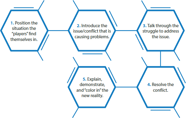
There are a lot of books that tell you how to tell a story, but most of them are incredibly complex and fairly confusing.
They simply need to follow a structure that gains interest, and then follow it up with sufficient emotion and engagement to keep the audience on board.
Let’s consider the most basic of story structures:
Advertisers have used this approach for many years to sell their wares—and still do. Look out for tell-tale signs the next time you watch a TV ad.
For example, consider this commercial for shampoo:
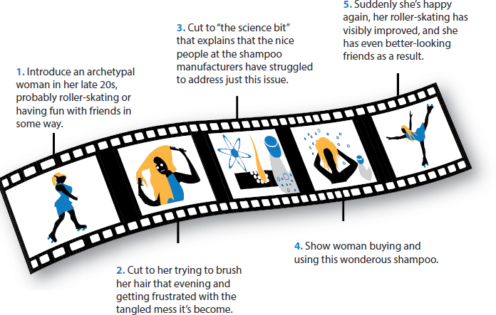
Even though this example is a little tongue-in-cheek, you can see how the same structure can be used for all manners of different scenarios.
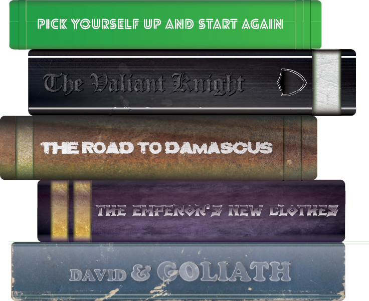
You can apply numerous story themes in a business environment, from the fantastical to the mundane but relevant. Here’s a selection of personal favorites:
| Summary | Example | Optimal Usage | |
| The plucky individual or company that takes a hit but bounces back with aplomb and renewed vigor to win the day. | Steve Jobs bouncing back after being fired from his own company, Apple, and going on to lead Apple to astonishing success years later. | When looking to motivate a team into digging deep and finding the passion to try again—and succeed. | |
| Where either a company or an individual identifies that there is a problem and decides to do something—usually, something drastic and/or remarkable—about it. | The UK upstart “King of Shaves” taking on the might of Gillette and Wilkinson Sword in the tough men’s toiletries sector or Richard Branson’s Virgin brand competing with established airlines/banks/soft drink manufacturers (the list continues). | Perhaps in developing a new service or improving on a service that a lazy or unengaged incumbent provides. | |
| The corporate equivalent of “seeing the light” and thinking and acting differently. | Perhaps it was a heavy industrial company who goes from pollutant to guardian of all things green or maybe a bank that wishes to conduct its business in a different manner. | Setting the scene for a brave new strategy and having the faith and commitment to see it through. | |
| Using an example of where the corporate norm had become so engrained that change is almost impossible. | The invention of 3M’s Post-it Note happened by accident—but rather than throwing it out, an individual saw the potential and persisted. | Empowering new employees/partners to drive fresh thinking and innovate from within the current confines of the organization. | |
| The small company or individual who takes on a giant and wins through pure hard work, grit, determination, and skill. | Apple taking on the might of the recorded music industry and telephone handset industry through hard work and determination (and the iPhone, of course). | Demonstrating to a demotivated audience that hard work, commitment, and faith pay off and can change not only companies, but entire industries. |
Thankfully for presenters, the list of story themes is long and rich with opportunity. It’s also crucial to remember that you shouldn’t limit these themes to purely business situations; some of the most lucid and engaging stories are those from our childhood or family life. If they work and support your message, grab them with both hands.

One of the most important but, in truth, least glamorous stages of developing a presentation is the planning stage. It’s vital to get your ducks in a row early on, because you set yourself up for a fall if you dive into a presentation without the required preparation.
At Eyeful Presentations, we use a methodology called Presentation Optimization to ensure we don’t miss any essential content or, perhaps more important, skip any steps. Presentation Optimization has evolved over a number of years and, like any good process, is constantly checked and tweaked to ensure it remains valuable and viable for our customers and consultants to use.
I remember when it “came of age” in the very early days of Eyeful after we had “stress tested” it within an inch of it’s very young life.
Picture the scene:
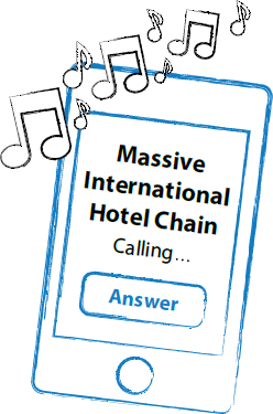
Many, many years ago, I received a phone call from a large international hotel chain. This was in the very early days of Eyeful, so it was rare to receive any phone calls, let alone one from an international brand like this. Despite this, I answered the phone as if this is what I did everyday (call it salesmanship).
The chap on the other end of the phone was lovely—really engaging and full of enthusiasm for his new project. He explained that the hotel chain was looking to expand its network of franchised hotels and had developed a presentation for it’s executive team to use to convince external parties to invest. The only problem was that while the presentation was aesthetically very pleasing, it wasn’t performing in the way that they had hoped.
I asked him to e-mail the slides to me and said that I’d review for him, prepare some feedback and ideas, and perhaps pop into their offices for a coffee and a chat later that week. He explained that the file was too large to e-mail so he’d arrange for a courier to send it around “to your studio.” (Little did he know I was speaking to him from our spare bedroom in a very nice but not particularly “media city–style” suburban street outside of Oxford).
After frantically dashing around trying to make the outside of our house look “studio like,” the courier turned up with a beautifully packaged CD.
With a fair amount of trepidation, I loaded the CD into the computer and sat slack-jawed as one gorgeous, impeccably crafted slide after another appeared on the screen. The artwork and animation were things of beauty and prompted just two questions in my mind: How the hell was I going to add any value to this masterpiece? And what the heck was I going to chat about with him later that week?
After the rising sense of panic slowly subsided, I took a second, closer look at this work of presentation art . . . and actually started to spot a couple of areas that I would change. None of this had to do with the presentation’s look and feel; rather, it had everything to do with the message and content of their story.
Summarized, their story went as follows:
They were portraying their message in the worst possible ways—from kicking off the presentation with an organizational chart that prominently featured their company’s Most Important People (including pictures and microscopic text), followed by page after page of charts depicting growth and success for the very clever people who ran this international business.

Not one slide mentioned the issues, opportunities, or aspirations of the equally successful audience! The more I reviewed and looked beyond the fancy slides, the more I realized what a train wreck of a presentation it actually was. And I went from being petrified of meeting with the prospect to being excited.
Finally the time came to visit the hotel chain’s headquarters. I duly prepared for a nice quiet chat over coffee to share my thoughts and ideas on how we could improve the presentation. My approach was to make it informal with no finger pointing or big gestures. To me, this was all about supporting a new friend in tweaking some of their content.
This led to my next surprise. Upon my arrival, my contact came around the corner, shook my hand warmly, and uttered those immortal lines: “The other guys are just finishing their pitch and then the board will be ready for you.”
They expected a pitch?! The board?! I had come with a “steam-driven” laptop, some basic feedback, and a handful of doodles—no more. Indeed, with this being so early on in the life of Eyeful, if they had wanted a full pitch, I wouldn’t have had much more to pull upon.
Thinking of my wife and newly born daughter and the knowledge that I’d have to earn some money to feed them at some point, I entered the room. A group of frankly grumpy-looking middle-aged men faced me in an intimidating horseshoe of desks and told me to set up my personal computer and take them through my concepts.
“Well, actually, I’d rather share with you my feedback on the current presentation first,” I croaked while simultaneously wondering, “What samples can I show them” and “Where is the nearest exit?”
I took a deep breath and displayed their current deck while highlighting a few concerns. I asked them about their audience and why they thought kicking off with an organizational chart of their business was a good idea. I followed up by asking some simple questions about what was important to their audience. I also emphasized the fact that if they were very lucky, they could be seen as a small cog in a big machine—the franchised part of the business was renowned for looking after its franchisees and had delivered great returns for all that had gotten involved.
The questions kept flowing and the board’s uncertain (or was it impatient?) shuffling increased. Finally, the biggest and scariest member of the board brought my line of questioning to a halt by slamming his fist down onto the desk and exclaiming,
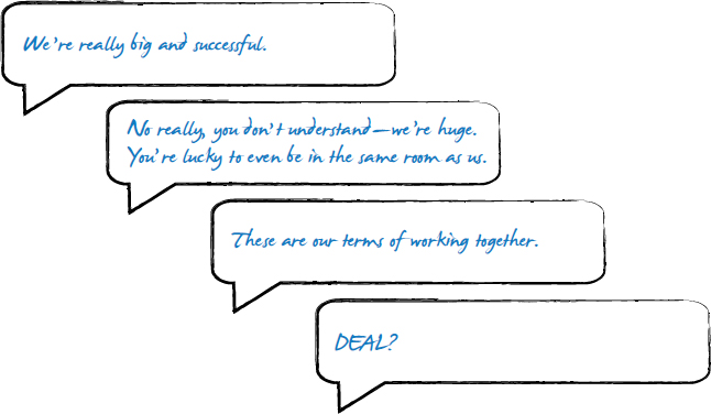
“I’ve wasted the past 3 hours listening to creative types telling me what they can do with my PowerPoint template and logo—but you’re the first person to actually point out what’s wrong with the presentation.
We’re not communicating the way we should. It shouldn’t be about us; it should be about our audience.
I arranged a time for a full consultation workshop, shuffled out of the room as quickly as I could, and went to lie down.
What followed was a pretty intense series of workshops, visual redesign (we agreed less was more), and the development of a completely new presentation story. I’m pleased to say our customer grew the franchise side of their business and, nine years down the line, we continue to work closely with people across the group (even the scary board members).
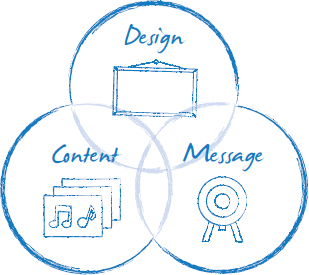
But more important, from this experience, Presentation Optimization was born. We now had a methodology that allowed us to look beyond the aesthetics and really hone in on the important stuff: the message, the use of valuable content, and the need to always keep the audience top of mind.

It’s a methodology that we’ve since used on thousands of presentations for companies large and small across the globe. No matter what people have thrown at it over the years—from workshops in Russian via an interpreter to late night storyboarding sessions—it’s remained robust and agile enough to cope. Truth be told, we’re rather proud of it and it’s achievements over the past nine or so years.
That said, it will continue to be a work in progress for many years to come as new technologies, new external factors (online, the proliferation of social media as a feedback channel), and new experiences all come along to influence our thinking. In fact, perhaps the most important thing we’ve learned from our approach is that nothing’s ever set in stone.
There are, however, some constants . . . the audience and the need for a powerful and engaging story.