
Clear communication has never been as important in business as it is today. The examples range from something as simple as crafting a lucid e-mail to a colleague, all the way to sharing a vision and inciting passion in an audience via a more complex presentation. The ability to do these things—and so many others—is a must-have for every successful businessperson today.
So much of our professional interaction has moved away from the “old school,” formal scenario of standing and presenting to a group of businesspeople (often in a horseshoe configuration of desks . . . just to make you feel that little more nervous/inferior).
Nowadays, we tend to find ourselves communicating quite informally—in person over a coffee/beer in an airport lounge or at networking events and online via social media or webinars. More often than not, the opportunity for our communication (and presentations) to be interactive crops up, and we should be grabbing these chances with both hands.
Wherever you happen be when these exchanges begin, you have a chance to not simply shine as a presenter but, more important, to share your ideas, vision, proposition, or just plain old story in a powerful way. Add to that the fast-growing list of presentation tools and technologies now available to us and we’re in a golden age of presentation development. Happy days.
Of course, some people seem to have that innate ability to get up there and present . . . and others don’t. We all have those wonderfully talented colleagues who are usually so gregarious—but who freeze as soon as they step up to the front of an audience (heck, you might be one of them!). There are also those incredibly bright individuals who have so much to share that they end up confusing their audience rather than imparting their knowledge.
Sadly, people’s inability to clearly communicate their message through presentations in all its forms (and we’re not just talking about PowerPoint here, as you’ll find out later) can have a devastating impact on what should be a brilliant career.
One of the reasons there are so many presentation-coaching companies out there (most are, strangely enough, run by ex-actors who know little or nothing about business) is that these frustrated but brilliant colleagues recognize the importance of getting this part of their job right. And sometimes, this coaching works, because it was their soft skills that needed a spit and polish. But too often, the issue lies much deeper—in the creation and development of the entire presentation process. Business presentations should not be seen as a grand performance; they should be seen as a powerful interaction between presenter and audience. And it’s the latter that this book focuses on.
There are endless books, coaching companies, and websites that offer hints and tips on managing the soft skills part of the process (you know the kind of thing—don’t jingle change in your pocket, don’t stand in front of the projector, check your zipper before you go on stage). However, there’s a very scant offering in terms of constructing and visually telling your story.
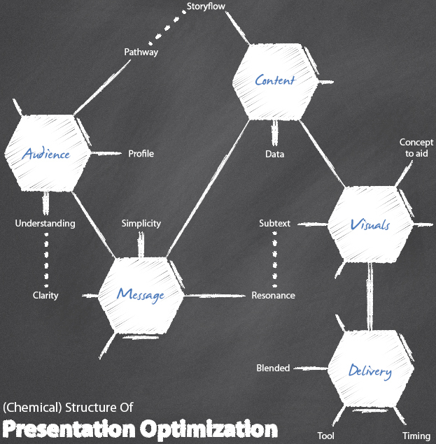
The Presentation Lab is here to change that . . . for good. Over the next eight sections, I’m going to share with you the steps and stages required to create a presentation story that not only works for you as the presenter but, more important, delivers exactly what your audience needs—no matter what environment you’re presenting in or what demographic/ethnic/socioeconomic mix your audience is.
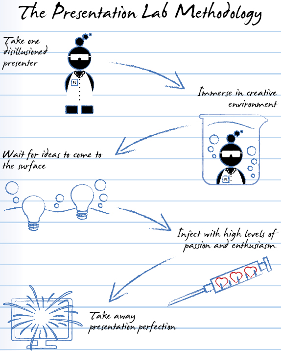
And keeping them at the core of everything we do is vital to the success of the presentation. But, we’re already getting ahead of ourselves. First, let’s look at where the concept of the Presentation Lab came from in the first place.

The idea for a “Presentation Lab” has been bubbling away for some time within my business, Eyeful Presentations.
We wanted a place to test new ideas, invite customers and friends to try different approaches out, and never have to worry that they were making themselves look daft in front of a live audience. And the Presentation Lab does just that. We give people the opportunity to use new technologies, develop innovative hooks and story structures, and generally get completely immersed.
More exciting is the fact that by creating a truly immersive environment, we are able to equip the most engaged, influential people within a business with the skills and vision to make a real difference to their corporate view of presentations. The people who visit our Eyeful Labs facility in the United Kingdom—or, I would imagine, who’ve spent their hard-earned money on this book—are the same people who make change happen within an organization. Companies need only a handful of passionate and committed voices to point out the futility of poor presentation thinking, and build sufficient momentum for change.
Business presentations need to change—of that there is no doubt. The theory and approach we embrace at the Presentation Lab will equip you with the insight, tools, and passion to affect that change within your own organization.
You come to the answer by using a variety of different options and solutions, mixing them up and testing them in as open and engaging way as you can. And hopefully, your company can become a bit like the Presentation Lab in some small way—a fun place where sometimes the most random aside can spark new ideas and presentation inspiration.
That pretty much sums up the Presentation Lab approach. We want to create an environment where new ideas can spark relatively random thoughts and comments and then inject them with sufficient passion and enthusiasm to see them cross over the line from great idea to reality. It’s about giving you the skills and, equally important, the confidence to do this within your own organization. It will be fun, challenging and, on occasion, headache inducing, but I assure you it will be worthwhile . . .
Writing a book is one of the most exciting things I’ve ever done. It’s my chance to put down in black and white (or whichever color scheme the boys in the studio agree upon) the thoughts, frustrations, and lessons learned over many years of working with huge companies to improve the impact of their presentations and their engagement with audiences.
It’s like a musician laying down their first album after many years of touring and playing in front of live audiences. There’s just so much to share. And that’s where it can get tricky.
If I try to squeeze everything I know into one book, it’ll be a mess. We’re bound to fail if I overdo it and attempt to cure all the presentation ills that befall businesses every day. As you’ll come to learn in later chapters, it’s as much about what you leave out as what you keep and deliver on.
So with this in mind, here’s a list of the things we won’t be covering here, along with the reasons why:
 | NOT IN THE PRESENTATION LAB | |
 Soft Skills
We have some truly gifted soft skills trainers within my business who are located all over the globe. They spend their (very long) days working with presenters to improve their ability to take the story we have created for them and knock it out of the park in terms of personal performance. They have an extraordinary impact; I’ve witnessed previously timid executives morph into powerful orators— and, if I’m being frank, I’ve seen many arrogant and overly confident speakers tweaked and coerced into becoming more genuine and selfless presenters. It’s powerful stuff.
The reason I’m not including any of the soft skills alchemy in this book is that in my experience, developing and enhancing your presentation soft skills chops is an incredibly personal journey. Our trainers understand that many of the individual foibles that keep people from delivering a presentation with passion, gusto, and commitment involve more than learning where to stand, how to project your voice, and what to do with your hands. At its best, it’s a process that’s tailored to each presenter. Therefore, squeezing a chapter in about this very involved and important element of presenter success (note: not presentation success . . . we’ll be sure to sort that out for you) seemed a little silly—and not the best use of our (or your) time.
 Getting to Prettier PowerPoint
As we’ll demonstrate over the course of this book, we love PowerPoint. We think it’s a tremendous tool—when used properly and in appropriate situations. We also recognize that, despite the somewhat boring and unoriginal bad press around its use, it’s still a firm favorite among the vast majority of business presenters.
In a similar vein to the soft skills stuff, a good PowerPoint slide is a bespoke creation. And we will be explaining how to create visuals to accompany your story. They will need to fit into the flow of the presentation; sit nicely alongside you, the presenter, as a natural extension of your message and style; and help drive your communication home.
What we won’t be covering is click-by-click use, demonstrating how to work with templates, create impactful animations, or insert videos. There are a plethora of books available for these elements depending on the version of PowerPoint (or Keynote for that matter) you’re using, and frankly I think we have more important issues to cover, such as messaging, story structure, and audience engagement. Don’t you?
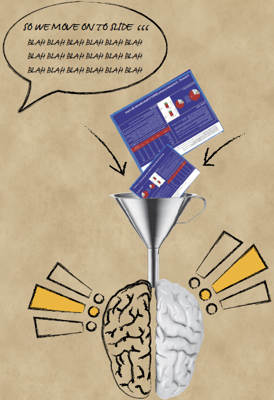
There’s no getting away from it: Business communication is in crisis. Boardrooms across the globe are grinding to a halt under the weight of poor presentations. Decisions are taking longer and, sadly, thanks to presentations’ shockingly inadequate quality, people are often making these decisions based on incorrect assumptions and patchy, poorly presented data.
There’s no denying the fact incidents such as NASA’s wrong decision are happening in businesses across the globe every day. As you’re reading this, someone somewhere is presenting information in such a verbose and complicated manner that the decision makers sitting before them (who, let’s be frank, the presenter likely had to chase down with all of his energy to actually book the meeting in the first place) have mentally checked out. Their minds are on the stack of e-mails slowly building up back at their desks (or, if they’re a little on the rude side, on the e-mails they’re checking on their phones as the presenter sweats his way through yet another PowerPoint slide).
Maybe the audience members are thinking about the next meeting, or what might be for dinner that evening, or what’s on TV tonight. Ultimately, the most pressing issue is that the audience, especially the most important members, the decision makers—has stopped paying attention and is no longer listening to a thing being shared.

The net result is that, at best, no decision will be made. At worst, the wrong decision could be made. If this happens, the business suffers, leaving employees, shareholders, and other stakeholders to feel the impact—all because the presentation failed to deliver.
Scary, isn’t it?

So why do such a large number of presentations fail? There are a number of factors, ranging from time and skills through to executive support and recognition of the part presentations play in clear communication.
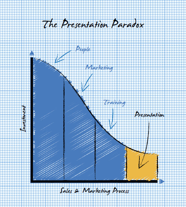
The Presentation Paradox is prevalent in companies large and small across the globe and manifests itself in a last-minute panic to prepare a presentation for a sales meeting.
Chances are the sales meeting will have been the culmination of vast amounts of work and investment in people, marketing, and skills training. If you ever want to see all the color drain from a CEO’s face, have him or her calculate the true cost of getting a trained salesperson in front of a qualified prospect; the numbers are mind-boggling.
Yet it is only at the last minute that the thought of a presentation enters the salesperson’s mind. The inevitable response is either copying and pasting some slides together (also known as a Frankenstein presentation), passing it on to a Personal Assistant to create, or working on it all night in front of the TV—all surefire ways of creating a mediocre presentation at best.
Despite these avoidable “crimes against presenting,” PowerPoint is often the tool that gets blamed for the failings of the presenter! This injustice puts me in mind of some other myths that need busting . . .

One of my biggest frustrations (and I wager, one of the reasons for poor presentations becoming the norm in business today) is the prevalence of myths that surround presentations.
We’ve all been party to the alleged wise words from the “business sage”—and unfortunately over time, many of these opinions have become fact. Here are some of my favorites:
Myth #1: PowerPoint Is Intrinsically Evil
A couple of years ago, a Swiss chap by the name of Matthias Poehm came up with a cunning plan: He started a “Ban PowerPoint” political party. Poehm’s movement garnered worldwide publicity (which coincided rather fortuitously with his book’s launch) and got everyone with a blog back on the old hobbyhorse: PowerPoint should be banned by all for the crime of dumbing down business presentations.
PowerPoint’s biggest failing is simply that it’s too damned easy to use. Microsoft has made available to people all over the World—and businesspeople in particular—a tool that can help deliver powerful visual presentations. The drawback is that only a tiny percentage of these people have a clue as to how to begin to create such a presentation. Yet this (unfortunately) doesn’t seem to deter them. The generally accepted best guesstimate is that 30 million* PowerPoint presentations are created or delivered every day, which goes to demonstrate the ease by which death by a thousand bullets can be achieved.
The blame sits squarely with the person who sat in front of the computer and his or her inability to understand or learn the skills required to deliver a powerful visual presentation.
*Note: No one has been able to verify this number, but it seems like as good a guess as we’re going to get based on the number of legal and bootleg copies of Microsoft Office that reside on personal computers (PCs) across the World.
Myth #2: The Slides Are the Presentation
The most revealing sign that the tail is wagging the dog is when a colleague—or even worse, a prospect—asks you to send the deck of slides while referring to them as “the presentation.”
As will become clear through the pages of this book that a presentation is a combination of many things, the most important being the presenter. Sending a slide deck through to a prospect is akin to sending the visuals that comprise your website or brochure minus any copy. The visuals wouldn’t (and shouldn’t!) make sense without the accompanying commentary—which, surprise, surprise, comes from you, the presenter.
One of the most frustrating results of this sort of thinking is that people create slides that aim to serve two purposes: one as a visual prompt to support the presenter (the right way to think about PowerPoint) and the other as a “leave behind,” which inevitably means slides full of explanatory text to make up for the absence of the presenter. The net result fails on both counts; presenters sacrifice visual impact for the inclusion of copy. But wary of having too much text on the slide (for we know this is a bad thing, right?), there is insufficient detail in the words.
The impact of this on the audience is obvious: When faced with the challenge of trying to work their way through text heavy slides while simultaneously listening to the presenter talking away, they do neither particularly well—and ultimately end up mentally checking out. The fancy scientific explanation of this phenomenon is Cognitive Load Theory, which, in layperson’s terms, means that human beings are not particularly adept at doing more than one thing at a time. (Although this is not exactly groundbreaking news, it’s handy to drop into a dinner party conversation should the need arise.)
Myth #3: Presentation Zen/Typography
To mangle a well-used phrase, with great influence comes great responsibility. The well-respected Godfather of Presentation Design, Garr Reynolds, released his 2007 book, Presentation Zen, to international acclaim. At last, someone had created a reference book on slide design that neither condemned the use of PowerPoint nor alienated its audience with overly complex design-speak and waffle.
Well done, Garr.
There is no doubt that Garr Reynolds has made a difference to the way people think about their visuals. However, as is too often the case with this sort of book, far too many people have lost sight of his premise due to misinterpretation and skim reading.
It’s easy to spot the warning signs that a presentation has been “Zen’d” without the presenter really understanding the finer details. The use of beautifully shot, high-resolution images that (although artistically gorgeous) add nothing to the story being told are surefire signals that someone has read only the liner notes and didn’t really understand Garr’s major points. Look out for close-up shots of nature, ripples in water, or, God forbid, pebbles stacked up on top of each other as examples of where the hunt for a great image on Corbis or iStockphoto has come at the cost of true visual communication.

Much the same can be said for a trend that we saw rear it’s well-designed but ultimately ineffective head a few years ago when Wordle came out.
If you’ve not had a chance to Wordle, I highly recommend it. It’s a lot of fun, takes no time, and provides you with a quick and artistically pleasing way of pulling together a lot of words onto a slide.
Here’s a Wordle from our own blog:
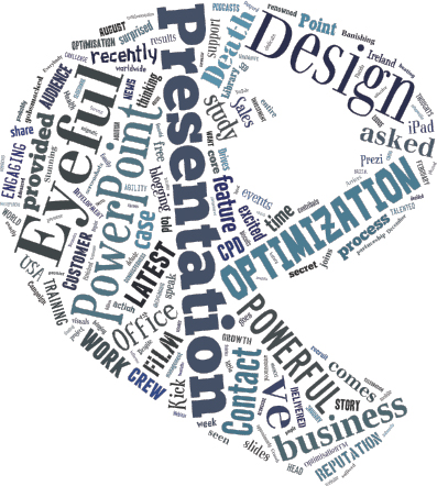
Nice, eh? But here’s the rub: Although it might look very nice, it’s of little or no use to you as a presentation visual unless you really are looking to highlight the fact that presentations is a key term in your search engine criteria. It looks great printed out as a poster and wonderful as a blog visual, but it does little more than confuse a live presentation audience as they’ll spend their time trying to read the fancy font and totally stop listening to you.

Myth #4: The 10/20/30 Rule
This comes courtesy of Guy Kawasaki, a very clever man who has done wonders in his field of business. However, his thinking when it comes to presentations is dated, is incredibly restrictive, and relies on an assumption that all presentations come with a slide deck—which, as you’ll learn later on, should no longer be a prerequisite.
Guy comes from a venture capital background, where time is money and patience runs short. As such, he and his brethren have little time for presentations that meander and fail to get to the point. That makes him like the rest of us: We don’t want to take up our precious time with a presentation that doesn’t hit the mark either. My issue with this 10/20/30 model is as follows:
 Rule 1
No more than 10 slides are allowed, in a very particular order. Now, some elements of Guy’s structure work well for me. I like the (seemingly obvious) idea of opening with the issue you are looking to address. Although there’s nothing particularly revolutionary about this, it makes for a pleasant change to the “this is how big we are, this is a picture of our head office” introduction slide that befalls most below-par business presentations.
I do have one beef, though: Sticking religiously to 10 slides is simply too restrictive. Failure to give your message sufficient room to grow and develop is as detrimental to the audience as stuffing every slide with content and noise. Less is more is a good guide, but don’t fall into the trap of hampering yourself.
 Rule 2
Speak for no more than 20 minutes. Again, this is great advice for a pitch where you have been allocated a full 60 minutes. However, it’s irrelevant (and potentially damaging) for other types of presentation formats. As we will explain in later sections, many presentations have moved on from the “I speak; you listen” format of old. A passionate and engaging conversation for much longer than 20 minutes is likely to be a sign of a productive presentation.
 Rule 3
Font size of 30. This is spot on; if only PowerPoint and Keynote could force good practice like this with a button to override those who really like seeing their audience strain to read their slides. But this font size rule isn’t sufficient. Making your text large enough to read is a great place to start, but if, in doing so, all you’ve done is increase the size of too much text. This doesn’t address the bigger issue: presenters forgetting the importance of visualization as part of their presentation experience. If the only purpose of PowerPoint is to throw up large words, why not simply print them off and hand them over to your audience?
Guy provides some great presentation advice, but just as with Garr’s teachings, people need to look beyond the basic “rules.” The problem is that people have taken Guy’s wise words about a very specific presentation environment—the venture capital pitch—out of context and applied them to all presentations. So we now have people delivering internal communications in the same frantic style as someone pitching for multimillion-dollar investment.
I guess the thing to take away from this grumpy section is not that these myths themselves are bad. In fact, the original ideas behind them all stack up and are designed to help us all develop better presentations. The issue is that the ideas have mutated; they have been twisted and tweaked to fit situations for which they were never designed and suffered at the hands of Chinese whispers or people who only read the Cliff’s Notes version.

Alas, dear reader, there is no silver bullet for developing your presentations. (We know; we’ve looked.) As explained in the next section, success is about equipping yourself with the right tools, know-how, and most important, frame of mind to move your presentation from okay all the way to “Optimized.”