Chapter 3: Texture
There are many well-intentioned designers out there who build a standard two- or three-column website layout, pick a few colors for it, and call it a day. They don’t bother pushing their design any further, or tweaking any details. Perhaps there’s no time or money in the project budget to go the extra distance, or maybe they’ve taken the “less is more” axiom a little too literally. Not every website has to be beautiful, but every website can be. CSS has given web designers a great amount of control over how a site looks, but I think the real problem is that many people are just unsure where to start when it comes to customization. This chapter is all about that process: taking your design a step further with the help of texture.
Texture is anything that gives a distinctive appearance or feel to the surface of a design or object. When you put your hands on a brick wall, a wooden beam, or a wet bar of soap, what do you feel? Can you make a website “feel” like one of these surfaces? Thankfully, it’s impossible for a website to give visitors splinters, but you can make it relate to and evoke memories of real materials. First, you need a way to describe the surface. You might start off by talking about relative roughness or smoothness, but there are other factors that give a surface its unique characteristics. Does the texture incorporate repeated patterns? Does it have a unique shape? What are the lines like that make up the shape? Does the shape have volume?
These questions might seem random, but they arise directly from the elements of graphic design: point, line, shape, volume and depth, and pattern. Understanding these components will help you not only to explain texture, but to create it as well.
Point
If you’ve worked with CSS, then you’re probably familiar with using pixels as a unit of measurement. One pixel (short for “picture element”) is one of the millions of dots on your computer screen. If your resolution is set to 1280×1024 pixels, you have 1,310,720 pixels on your screen, arranged in 1,024 rows and 1,280 columns. All these pixels come together to create a digital image.
This is all very elementary technical knowledge, but as we’re about to see, it applies specifically to the concept of points in graphic design.
Just as the pixel is the fundamental element of digital images, the point (or dot) is the fundamental element of graphic design, and can be used to build any graphic element. Points have no scale or dimension unless they have a frame of reference. For instance, a point on a huge billboard might look like a period, but up close it’s probably about as big as your head. When points are grouped together, as they are in the figure below, they can create lines, shapes, and volume.

When you’re working on website graphics, it’s easy to look at the big picture and ignore the points that make up each image. Points themselves have a lot of power, though. Just take a look at Craig Robinson’s Flip Flop Flyin’. Among other forms of tiny art, Craig creates portraits of famous people, bands, and groups that he calls Minipops. The one below is a close-up of Craig’s A-Team Minipop. Hard-core fans will notice that Hannibal even has his trusty cigar.

Line
When two or more points are connected, they form a line. The line is the most common element of graphic design, and is among the most expressive. When designing websites, most people only consider lines for CSS borders or hyperlink underlines, but they can be used in countless ways throughout your web creations.
When a line is diagonal, it evokes a sense of movement and excitement. Like a falling domino, a diagonal line has potential energy. Using a pattern of horizontal lines as a background element provides texture and interest to a design, but using a motif of diagonal lines will make the design feel a little more “on edge,” causing users’ eyes to move around constantly. Compare the two examples below. Which keeps your eyes moving around more successfully?

Just as diagonal lines suggest movement, varying the thickness and direction of a line generates a sense of expression and character. Jagged lines with sharp angles can feel dangerous and frantic. Gently rolling, curvy lines tend to feel relaxing and smooth. Lines comprising 90-degree angles tend to feel sharp and mechanical. Finally, lines with lots of curves and angles convey expressiveness—such as handwriting, graffiti, and sketches.
When you’re working on the prototype stage of a website’s development, try to keep in mind that lines are far more useful than just being dividers, borders, and stripes. They’re the foundation of art, drawing, and design. As the Web is such a rigid and technical medium, it’s easy to forget about fundamental art tools such as pens and brushes. So try creating variations in the quality of a line, either by scanning in some of your own traditional artistic endeavors, or using the predefined brushes in a program like Adobe Illustrator, as I have below. This is a great way to bring a traditional artistic feel to a medium that’s sometimes all too digital.

Shape
Any time the two end points of a line come together, a shape is created. There’s probably little more I can add to your knowledge of the basic geometric shapes—circles, triangles, and rectangles. Arrows, stars, diamonds, ellipses, plus signs, semicircles and more are geometric as well. The image below illustrates a few of them. The precise curves, angles, and straight lines involved in geometric shapes make them difficult to draw by hand, unless you have a compass, protractor, and ruler. On a computer, though, geometrically defined lines, curves, and angles are usually the default forms in any image-creating program. For that reason, these types of shapes have a reputation for feeling technical and mechanical.

The other main category of shape is organic or freeform. Freeform shapes are more abstract than geometric shapes, and consist of non geometric curves, random angles, and irregular lines, as can be seen above. Freeform shapes have a free-flowing nature that conveys a sense of informality and spontaneity. They can represent the outline of a product, human gestures, or an organic doodle. The example below represents the gradual transformation of a geometric shape into a freeform shape.

When it comes to website design, it can be easy to forget that freeform shapes exist. In Chapter 1, I explained how the anatomy of a website consists of a bunch of blocks. No matter how you arrange them on the page, these blocks are inherently geometric. Unlike print design, which gives us the freedom to draw whichever layout shapes we like, the Web limits us to rectangles. However, although the containing blocks may be rectangular, that doesn’t mean they have to look rectangular.
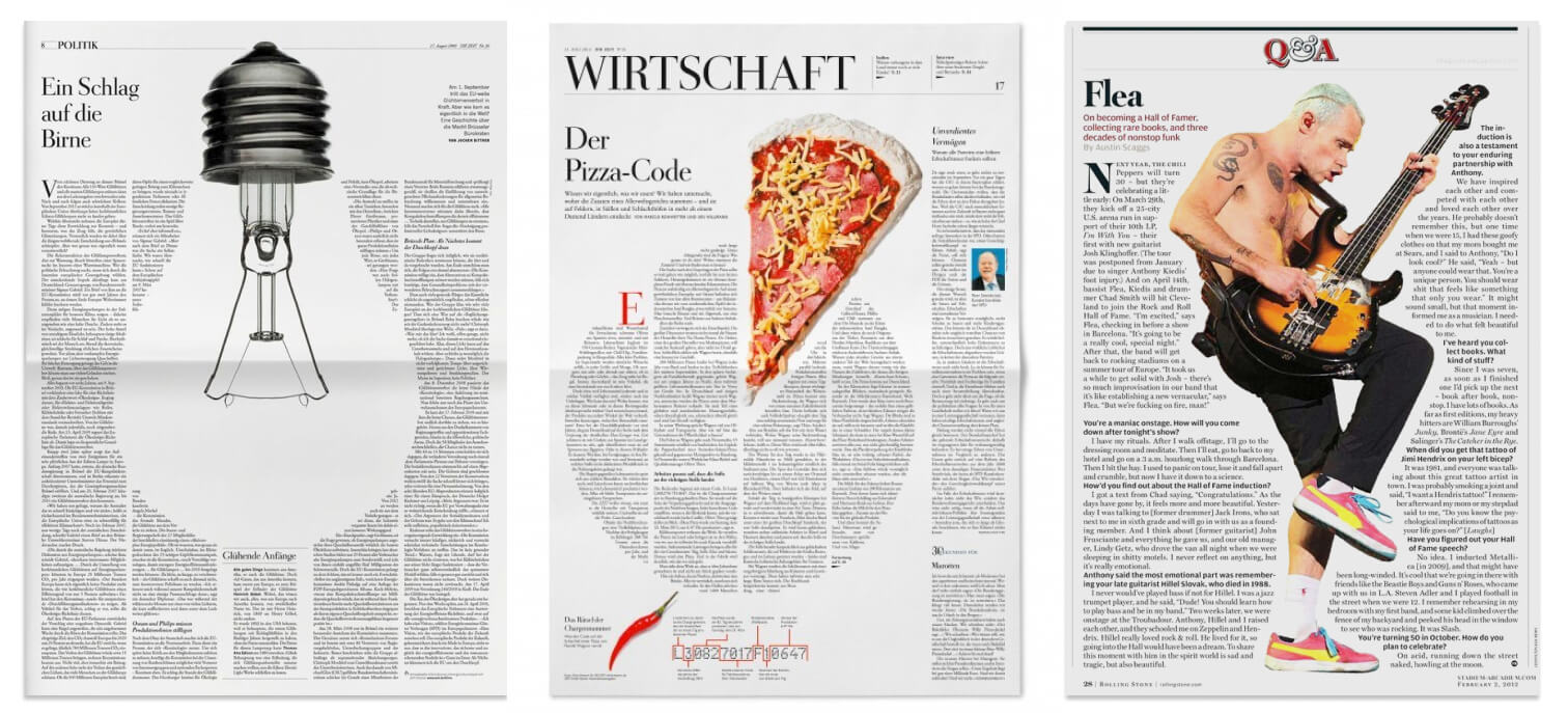
As these examples from Die Zeit and Rolling Stone magazine show, print layouts often reshape text blocks to help illustrate the story.
Modern browsers now allow you shape the flow of text using CSS Shapes. The simplest non-rectangular shape to apply to text is the circle. In the example below, we’re floating the image of Neptune to the left of the text. Normally, we’d expect the text to form a vertical edge against the right edge of the Neptune image. However, if we apply a class with shape-outside: circle(50%) to the image, the text immediately wraps around an invisible circle inside the area of the image.

CodePen Demo
You can see a CodePen demo of this technique at https://codepen.io/alexmwalker/pen/qBOwaWX
That 50% figure generates a circle radius half the width the image. Any parts of a circle() larger than the image get automatically cropped, leaving flat edges. At about 70% there will be no circle edge left visible. Circles smaller than 50% create a “shrinking island” that the text will flow into and around.

But let’s face it: there are only so many circular dinner plates, coins or planet layouts to wrap your text around. The ability to flow text around any shape is a much more powerful design tool, and this is exactly what the shape-outside:polygon(…) option allows you to do. Generate a set of polygon coordinates contoured to your image and you should be able to wrap text around practically any image.
In practical terms, I’ve found that creating a polygon shape can be tricky, as most SVG editors prefer to convert shapes into PATHs rather than POLYGONs. BoxySVG is the one SVG editor I’ve found that will keep your polygons as polygons. Bennett Freely’s Clippy tool is another useful option for generating polygon coordinates:
/* Star shape */
shape-outside: polygon(50% 0%, 61% 35%, 98% 35%, 68% 57%,
    79% 91%, 50% 70%, 21% 91%, 32% 57%, 2% 35%, 39% 35%);
Ultimately, I’ve found the simplest way to shape text is to simply plug an SVG URL directly into the shape-outside property (shape-outside: url(arm.svg). In this working example, I’m going to riff on the classic Saul Bass movie poster for The Man with the Golden Arm.

I started by splitting the movie title and the description text into two separate column divs. The SVG arm graphic was then slotted in immediately before the movie title and floated to the right:
<div class="row-1">
    <div class="title">
      <img class="arm" src="arm.svg" alt="arm" />
      <h1>The Man with the Golden Arm</h1>
    </div>
    <div class="description">
      <p>...</p>
    </div>
  </div>
If we give the arm graphic a negative margin-right, we can make it straddle the right and left columns. Applying that same SVG graphic to shape-outside property of the image then instantly reshapes the text to fit the left edge of the arm:
img.arm {
  shape-outside: url(arm.svg);
  shape-margin: 15px;
  float: right;
  margin-top: 0px;
  margin-right: -100px;
}
Nice. However, since our description text (that is, the right column) lives in a different column from our SVG image, we’ll need to be a little bit crafty to make the text wrap on the right side.
To tackle this, we’ll need to create a new :before pseudo element inside the right-hand panel, give it the exact size of our SVG arm, and then load the SVG arm into the background. We now have two copies of the arm SVG on screen. However, if we use negative margins we can carefully reposition this new image to sit precisely on top of the original SVG image. Add the shape-outside: url(arm.svg) property and our description text immediately contours itself to our arm:
.description:before {
    display: block;
    position: relative;
    float: left;
    content: '';
    width: 200px;
    height: 400px;
    margin-left: -100px;
    margin-top: -1rem;
    background-image: url(arm.svg); /* delete: used for positioning only */
    shape-outside: url(arm.svg);
    shape-margin: 20px;
  }
The nice thing is, once we have the text flow working, we can safely remove the background-image and just leave the shape:outside to do its job.
CodePen Demo
You can see a CodePen demo of this example at https://codepen.io/alexmwalker/pen/NWGZbGP
Designing in CSS
Some designers have created amazing artwork without images, using pure CSS. The image below shows off the amazing animation work of Agathe Cocco. Agathe took Tony Babel’s artwork, rebuilt it from a complex stack of HTML divs, and then stitched a series of CSS animations into that HTML. You can see the full example on CodePen. Other examples of pure CSS artwork include Nicolas Gallagher’s pure CSS GUI icons.

Rotation and Angles
I mentioned at the start of this chapter that diagonal lines often evoke a sense of movement and excitement. Rotating elements “off the square” in your design can have a similar effect. Angled objects break up the horizontal and vertical monotony of the Web and create new paths that lead the eye into the design.
Wedding planners Foudamour.ca (above) provide a good example. Their tasteful pastel tones and romantic photography are entirely orthodox, but simply angling the imagery injects so much extra energy into the layout. It also creates curling “whitespace tracks” that draw your eye down and around the layout.

The ability to guide people’s eyes with text, imagery and whitespace is a big part of your success as a designer. This is an idea that applies as much to books, newspapers, and even movie posters as it does the Web. Let’s see it in action in a classic movie poster.
Directing the Eye
In most layouts, we have a list of page elements—such as headings, images, and text—and position them on the page. In the classic poster for the movie Breakfast at Tiffany’s (below), you could argue there are three major focal points:
- Audrey Hepburn’s face
- her billing credit text at the top right
- the Breakfast at Tiffany’s movie title
Study it for longer and you might notice the cat and the kissing couple, but it’s difficult not to be almost magnetically drawn back to her face. It turns out that humans are very good at noticing what other people are looking at. We’re naturally nosey creatures and want to know what others find interesting.
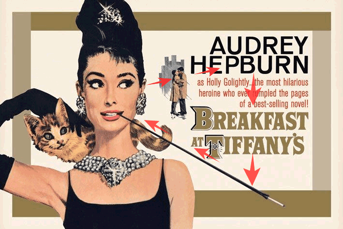
And where is Audrey looking? We almost can’t help following her eyes, past the lovers, to her starring credit before naturally reading our way down to the movie title.
Then we hit that huge cigarette extender. Why did they decide to make it almost comically long? It’s long because it creates a natural path that draws our eye straight back to the lovely Audrey—and we probably begin that loop again. Even the little cat’s eyes help reinforce this circuit. It’s as if an invisible tour guide is directing our attention through the layout.
But what happens if we make a tiny Photoshop edit and turn her glance back towards us? Let’s try it in the image below.
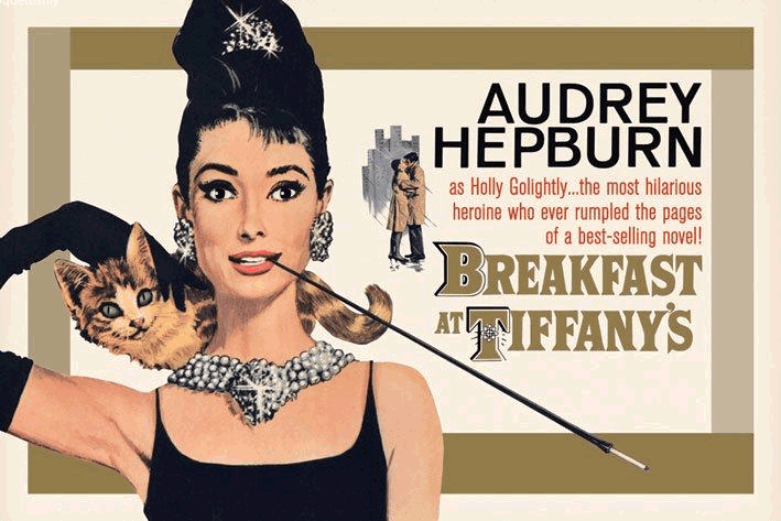
Such a trivial change alters the flow of this poster dramatically. Audrey is no longer interested in that text, so it’s instantly less interesting to us too. Sure, we can force ourselves towards the text, but our eye no longer glides effortlessly around the whole composition. Instead, it’s almost like there’s an invisible gravity pulling us back to Audrey. This can have a huge effect on how users interact with our interfaces.
Putting It Into Practice
Great UI design is often about drawing attention to just the right thing at just the right time. I think this “eye line” technique is underutilized on the Web, but there are a few good examples out there. Although they’ve redesigned their site recently, I particularly loved the way t-shirt maker Real Thread (Fig 3.15) previously used this idea.
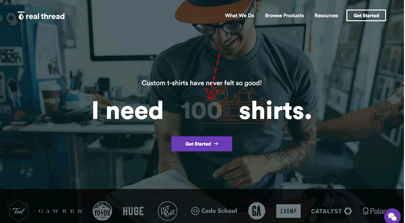
This Real Thread design takes a fantastically bold, no-nonsense sales approach. Rather than trying to sell you on the idea of buying t-shirts, it jumps the conversation straight to “how many do you want?” This page is 95% focused on accomplishing this singular task—getting you to enter a number to complete the sentence “I need X shirts”. In the background, we see a happy, tattooed, t-shirt–making hipster setting the scene. And where is this guy looking? Out at us? Around the room?
No, he’s looking directly at the blinking cursor—reinforcing the only thing the company wants you to pay attention to. Super clever. This is a very simple layout, but I suspect it was a very effective page design.
Be aware: this “follow the eyeline” technique takes more work to implement, as you’ll need to be planning for it from the start, rather than sourcing images towards the end of the project. You might get lucky and find just the right stock photo, but it’s more likely that you’ll need to take your own photos to get the eyeline angles you want. That shouldn’t be a big deal, as most of us can source a decent camera at a pinch.
Volume and Depth
We’ve talked about point, line, and shape, but now it’s time to take this chapter to another dimension. The elements we’ve discussed so far only exist in two dimensions: width and height. They’re just marks on paper or a screen, without any indication of depth. However, as we live in a world of three dimensions, we’ve learned to rely on visual cues that help us to determine the width, height, and depth of the objects around us.
Perspective
When we see a path that disappears into the horizon, as the Great Wall of China does below, we don’t think that its width actually decreases to a single point. Similarly, when we look at an open door, we’re aware that the top and bottom of the door are parallel, even though they seem to converge towards the door frame. We’re not fooled by these spatial illusions, because we know (consciously or otherwise) that objects tend to look smaller as they become further away.

Proportion
In Chapter 1, I mentioned that altering the proportion of objects was a good way to create emphasis. This is true because we humans rely on the relative proportion of adjacent objects to determine not only the size of those objects, but also their location in three-dimensional space. Although the horses in the background of the image below are proportionately smaller than the horse in the foreground, our eyes tell us that they’re about the same size in reality.

Light and Shadow
Light and shadow are the most important visual cues we can use to determine or create depth and volume in compositions. Even with accurate perspective and proportion, a composition without highlights and shadowing will look flat. Light and shadow establish visual contrast, and help to create the illusion of three-dimensional depth with two-dimensional media, such as pencil on paper or pixels on your computer screen. Light and shadow alone can also be used to make two-dimensional objects look like they exist in three-dimensional space.
Each of the three cyan-colored circles below are the same size, but the different lighting effects and shadows applied give each a unique feeling of depth and volume. A basic drop shadow has been applied to the first circle. It’s obvious that this is a two-dimensional object, but the drop shadow gives the illusion that the circle is hovering above the surface beneath it. The second circle has a linear gradient, and a shadow that’s skewed to the right. This combination of light with the tilted shadow suggest that it’s a two-dimensional circle that’s casting a shadow on an angled surface.
The fact that the shadow is closer to the bottom than the top of the circle creates a sense of movement: it looks as if the top of the circle is falling towards or away from the viewer’s eye. A radial gradient—meaning one that’s applied in all directions from a central point—has been applied to the third circle, which looks spherical due to the highlight and shadows that the gradient creates. The shadow that it casts matches the location of the light source, which lends credibility to the volume and depth of the shape.

From 3D Renders to Flat design
If you were around for the early versions of Apple’s iOS, you might remember it had a unifying design idea: apps were richly rendered imitations of their real-world equivalents. For example:
- the podcast app looked like a reel-to-reel tape player
- the sound recorder was a shiny, metal microphone with brushed steel buttons
- the Find My Friends app had stitching and leather trim
This is a design approach called skeuomorphism and, to be fair, it wasn’t a horrible idea at the time. The original iPhone was entirely different from all the phones before it, so the idea of making the sound recorder look like a microphone helped explain the new functionality to new users. As they say, “Show, don’t tell”.

However, there are some undeniable downsides to skeuomorphism.
- Once you understand the purpose of an app, the real-world imagery becomes mostly redundant. In the recorder screen example above (center), more than four fifths of the interface is wasted on a picture.
- Sometimes skeuomorphic design accidentally transmits bad information. For instance, the reel-to-reel tapes in the iOS podcast app used to authentically stream tape from left to right, giving you an idea of progress. Yet every podcast began with precisely the same amount of tape, whether the podcast was two minutes in length or two hours. It echoed real-life, but not.
- Often these real-world analogs are becoming less and less relevant every day. How many 20-year-olds have ever used a tape deck? A phone handset? A leather-bound appointment book? Analogies are only useful if everyone knows them.
Flat Design
Over the next five years, designers began to drift away from the finely rendered detail of skeuomorphism towards a simpler, less decorative design style. It was actually Microsoft who got the flat ball rolling with their Metro UI, and then successive versions of Android and IOS got flatter and visually simpler. Eventually, Material Design distilled it all down into a cohesive theory. Flat design stripped away all non-critical decoration, gradients, shadows and colors to give complete focus on the remaining UI elements.
And on the whole, we’re all much better off for it. Graphics files are lighter and faster, and UIs are simpler and less cluttered.
Of course, there are some who might argue that flat design can have a cool, clinical sameness to it. So, where to from here?
Is UI Design Still a Flat Earth?
Although the design pendulum is unlikely to swing all the way back to 3D photorealistic UIs, many designers have found ways to add some natural warmth and grain to flat designs without loading up on visual clutter. Print design can give us some useful clues here. In the first half of the 20th century, most print design was “flat design” simply because that was all most printing presses could produce.
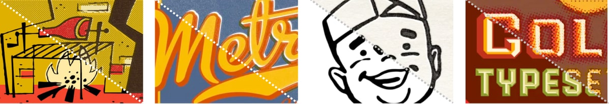
Ironically, those same low-tech printing techniques often accidentally gave that work extra character. Check out the vintage labels shown below. You’ll see the flat color designs showing rough paper grain, halftone dots, rough organic edges and ink bleeding together. We can steal this idea.

Photoshop Filters
So, do I need to eBay a vintage printing press now? That could be fun, but no. Photoshop Plugin developers like Mr Retro have made a living out of riffing on old print styles with their Permanent Press set of filters. Each filter mimics different aspects of the natural, grungy imperfections of offset presswork. These print glitches include:
- rough paper grains
- chunky halftone dots
- misaligned printing plates
- ink overlap and bleed
These filters are highly configurable and can add a heap of tactile warmth to flat-color designs without necessarily adding a lot more clutter—especially if used sparingly. However, at $99 they aren’t cheap. But there are other less expensive ways to squeeze some of the flatness out of a design. We’ll cover some of them in this chapter.
Pattern
I still remember my first exposure to website design. I was in a tenth-grade typing class and the instructor took it upon herself to teach us HTML. It was optional, but choosing between timed typing tests and learning how to build web pages was an easy choice to make. By the end of that year I’d created quite a few little websites. The common denominator among those admittedly hideous creations was repeating backgrounds. You probably know the kind I’m talking about: those backgrounds that tile seamlessly to give the appearance of continuous water, stone, starry skies, metal, or canvas texture.
Although repetitious background images like the ones below are the hallmark of early 1990s web design, they’re also classic examples of pattern. Pattern has long been used to add richness and visual interest to all types of design. On the Web, seamless background images were originally favored because they reduced page size and download times. Using a small image that could be tiled to fill a background area, rather than a large non-tiling image, significantly reduced the download time for website visitors with 56k modems.

Just because tiling background images with repeated patterns has a tacky past, it doesn’t mean you should avoid it today. In fact, it’s used more often than you probably realize. CSS has greatly improved the degree of control designers have over the way background images work. Before CSS was around, we could only assign background images to body and table elements. Now, with CSS, backgrounds can be applied to just about any element you choose. You can use any of five CSS properties (and one additional shorthand property) to set the background of an element:
background-color:This is the property we use to set a solid background color for any element. For example, if we wanted to set the background color of an element to a nice green-blue (
#00B2CC), we’d add the following declaration to the element’s style rule:background-color: #00B2CC;When using hexadecimal values in CSS, you need to prefix the color code with
#, as shown above. You can also specifytransparenthere if you don’t want the background of your element to be filled with a color.transparentis actually the default value of thebackground-colorproperty. You might be tempted to use an HTML color name, likeAquamarineorBlanchedAlmond, but as only 16 color names are officially sanctioned by the W3C in the HTML 4.0 specification (and even those will generate warnings when you try to validate your CSS), it’s recommended that you use the hexadecimal values we talked about in Chapter 2.background-image:If we want an image to be used as the background of an element, we can specify that image using the
background-imageproperty. The possible values for this property areurl("filename")ornone. If we wanted to set the background of an element toanimalcracker.png, we’d add the following declaration to that element’s style rule:background-image: url("origami.png");background-repeat:There are four possible values for
background-repeat:repeat,repeat-x,repeat-y, andno-repeat. The default value isrepeat, which sees that the specified background image will be tiled vertically and horizontally. Therepeat-xsetting will cause the background image to be repeated horizontally. This is handy if you want to apply a horizontally tiling image or gradient to an element, but want the rest of that element to be filled with the specified background color. Similarly,repeat-yspecifies that the background image should be repeated vertically. Finally,no-repeatis used when you have a background image that you don’t want to tile at all. The effect of each of these settings is shown below.
background-attachmentThis property determines whether the background image stays in the same location or moves with the content when the page is scrolled. It can be set to the values of
fixedorscroll, the latter of which is the default. Whenbackground-attachmentis set tofixed, the background will be fixed relative to the viewport (or browser window), so that when you scroll the page, the background image will stay in the same location.background-position:This property controls the position of a background image and accepts two values: the horizontal and vertical position of the image. These values can be set using CSS measurements, percentages, or keywords (
right,center, ortopfor the horizontal position;top,center, orbottomfor the vertical). For example, if you wanted a background image to be centered horizontally and aligned to the top of an element, you could specify this using keywords (background-position: center top) or using percentages (background-position: 50% 0%). If we wanted to position the image 300 pixels from the left edge, and 400 pixels from the top, we could use the declarationbackground-position: 300px 400px. The effect of both of these possible values is shown below.
background-size:This property controls the scaling of the background image. By default, background images will render at their inherent pixel size. The
background-sizeproperty will stretch or compress your background to the size you specify. It looks for two values—a width and a height, in that order. If only one value is provided, it will apply the same value to both. Valid values forbackground-sizeincludeauto,(unit length/%),cover,contain,initialandinherit.Coveris the equivalent of100% 100%.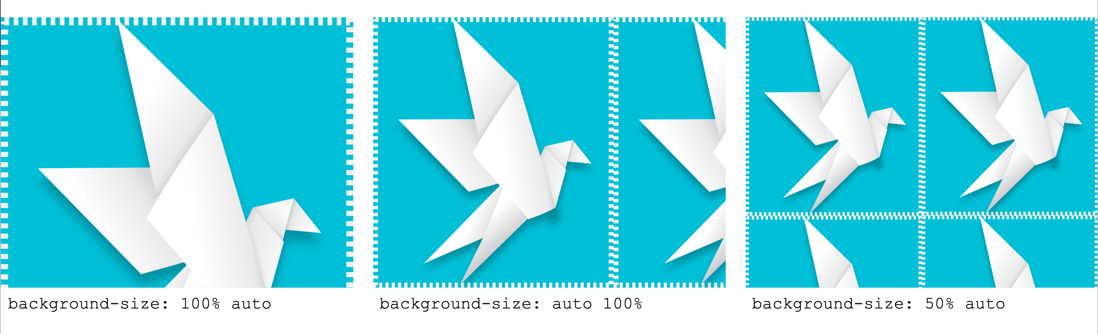
To help streamline all this background code, the developers of CSS have created a shorthand property, which allows us to specify all six of these properties in a single background declaration. It works like this:
element {
    background: background-color background-image background-repeat background-position background-attachment;
    }
As an example, consider the following two rules that produce exactly the same output—a row of repeated animal crackers displayed on an orange background, along the bottom of a div with id="hihopickles":
#hihopickles {
    background-color: #FF9900;
    background-image: url('animalcracker.png');
    background-repeat: repeat-x;
    background-position: left bottom;
    background-attachment: fixed;
    }
#hihopickles {
    background: #FF9900 url('animalcracker.png') repeat-x left bottom fixed;
    }
When applied to our document, our hihopickles element might look like the display shown below.

Building Texture: Vintage, Patterned, Worn, and Nostalgic Styles
In review, the texture-related elements we’ve described so far are point, line, shape, depth and volume, and pattern. Individually, each of these components creates some level of texture. But when you begin to use them together, they build on one another to create more complex visual imagery. How you combine them depends on the type of effect you’re trying to create. So, the question is: what is the textural effect you want to achieve? Let’s look at a few options.
Paper Grain
In 2019, Google released a side project called “The A-Z of AI”, which was designed to explain the basic concepts of Artificial Intelligence. The styling is modern and friendly, using broad panels of color, simple children’s book illustrations, and big, expressive typography. But look closely at the flat color areas and you’ll notice a papery graininess. I zoomed up a small area in the image below, but you may need to examine the real thing to fully appreciate this texture. It’s subtle enough that most users probably won’t consciously notice it, but it backs up the uncomplicated children’s book style perfectly.
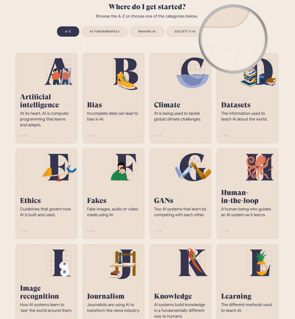
How do they get this effect? I have to admit, I spent some time combing through the background-image CSS of all the large flat panel areas looking for a tiling graphic—but found nothing. It was only the next day that I had a little revelation. What if, rather than adding grain to each and every panel, they created a barely visible “grainy lens layer” that overlayed the entire site? Think of it like a Snapchat filter for graininess. Bingo! I’d been looking in the wrong place.

If you inspect the HTML, you’ll find an :after pseudo element with the attached CSS:
._3rV4LQ0BePEq9V1dxEjhEF::after {
    background: url(/static/noise.jpg);
    content: "";
    height: 100%;
    left: 0;
    opacity: .05;
    pointer-events: none;
    position: absolute;
    top: 0;
    width: 100%;
    z-index: 201;
}
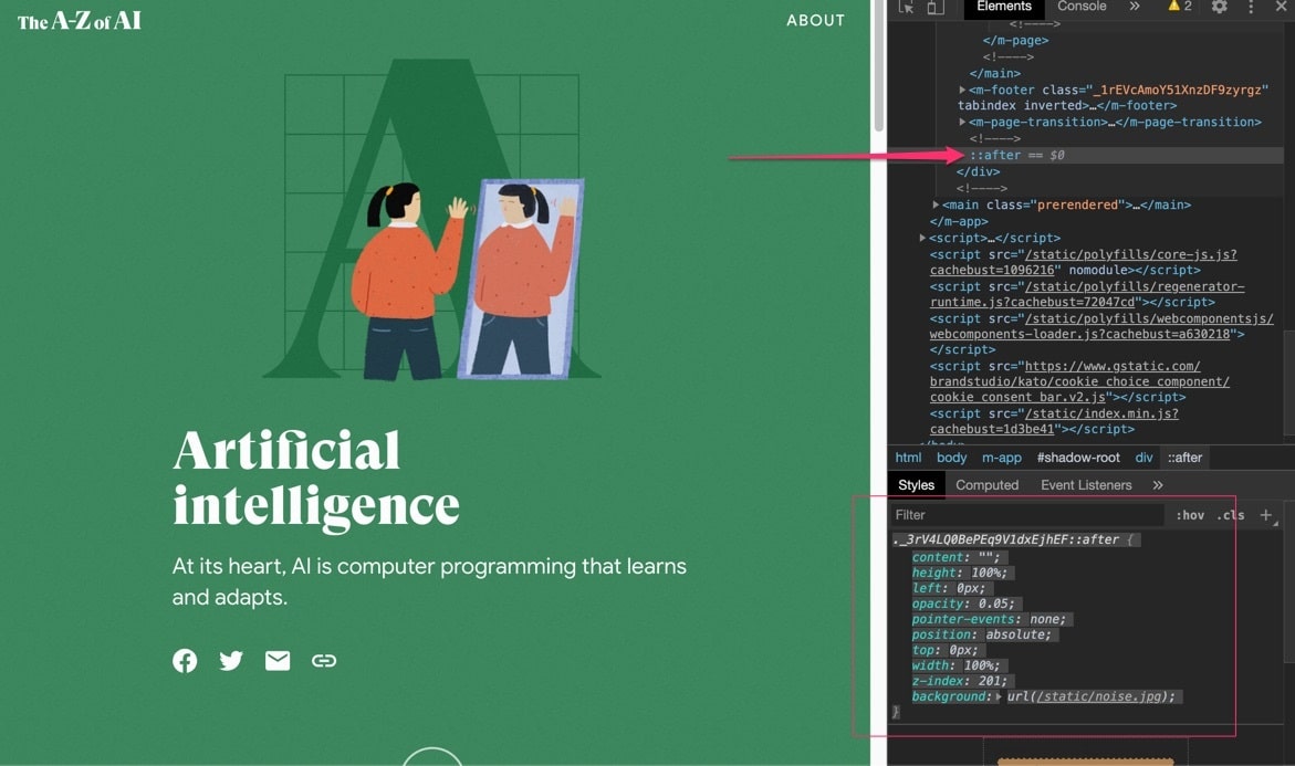
This layer uses the grain image (noise.jpg) as a tiling background, and they’ve positioned it to cover the entire screen (width:100%, height: 100%, top:0, left:0, and z-index:201). As we suspected, the opacity is set to almost transparent (opacity: .05), so that all that remains is a hint of uneven grain. The only potential gotcha with covering the screen with a “lens layer” (even if it’s transparent) is that it will block access to all the links, inputs, and other user interactions below it. However, this is easily solved by adding pointer-events: none, which makes this lens layer invisible to the cursor.
I think this is a really useful technique. It delivers site-wide visual impact using no more than one tiny graphic and a dozen lines of CSS. That’s great bang for buck.
Paints, Pencils and Other Traditional Media
Computers are built to be precise and clean, and unlike most traditional media, digital colors don’t accidentally run or smudge or bleed or smear. This is great for keeping your desk clean, but it also means real, loose, organic, natural media like paint and pencils really stand out when you can find the right setting for them.
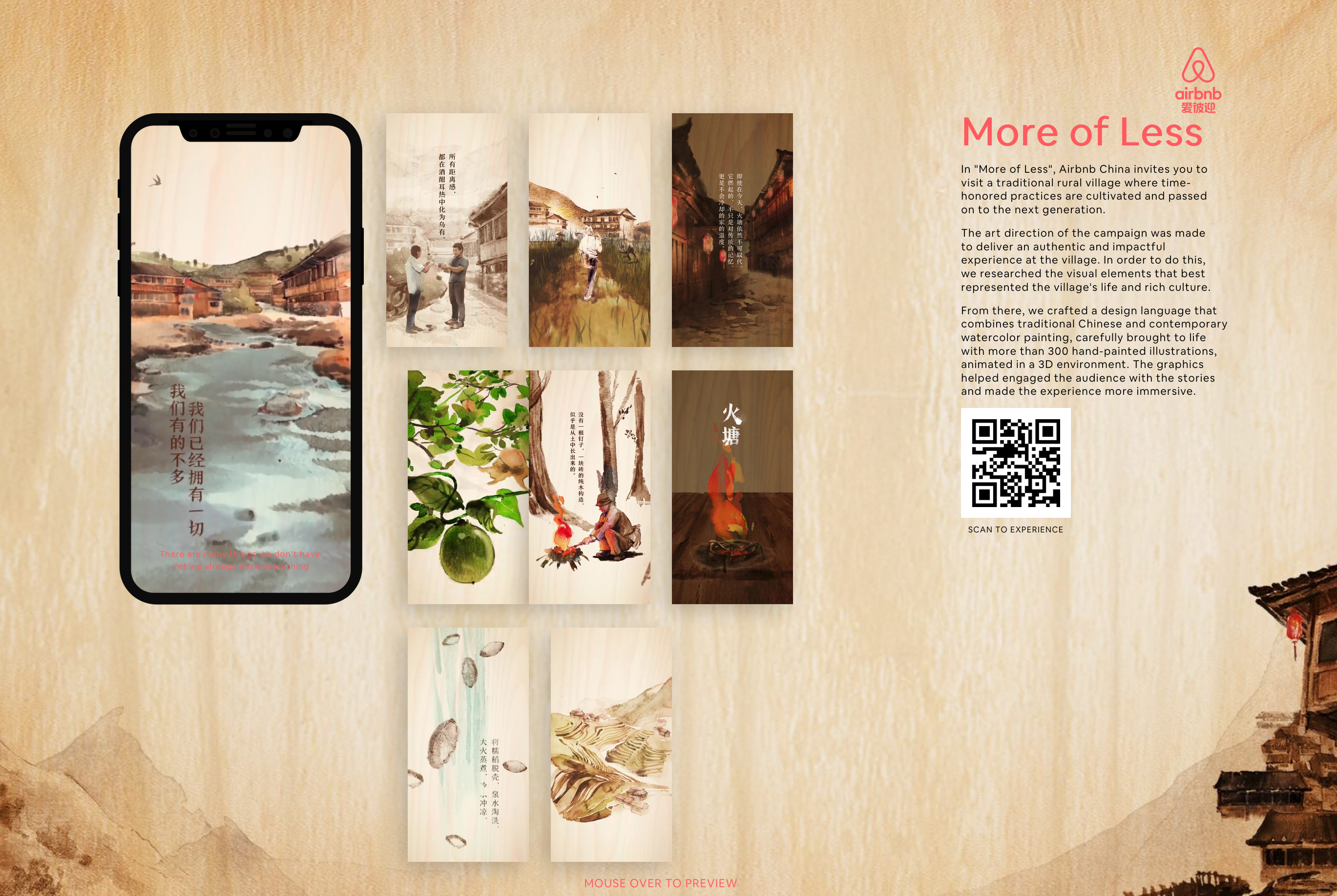
New Zealand agency Resn gives us a perfect example, authentically reproducing a traditional Chinese watercolor style to promote AirBnB experiences in rural China. This watercolor style permeates every pixel of the application, from dollying animation sequences to full-screen backgrounds, making it a huge undertaking.
Faded Memories
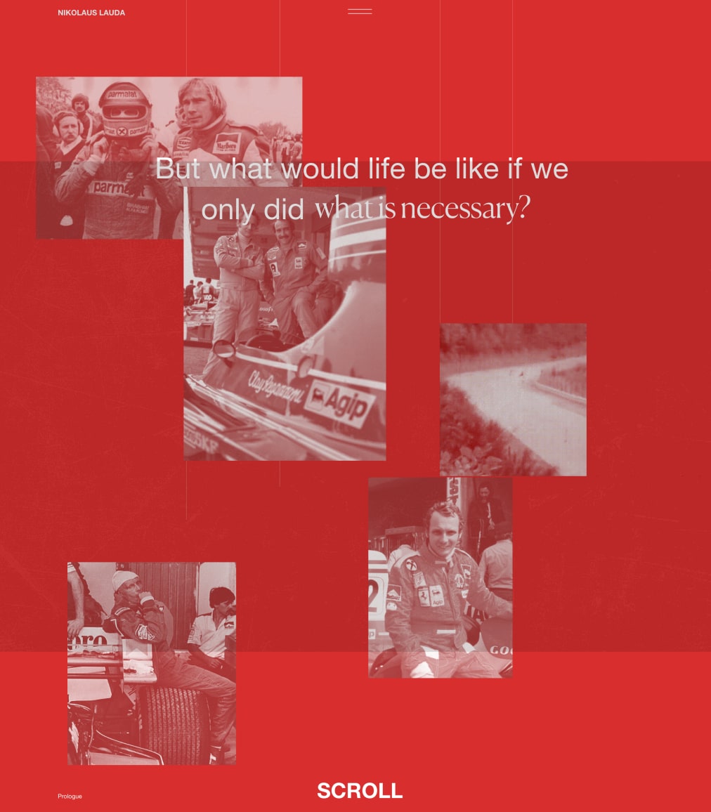
When Obys Agency paid digital tribute to Formula One ace Niki Lauda, their design approach leaned heavily on the mountains of fantastic archive photos and footage from Niki’s career. The gravelly red-sepia photos give the site a warm, slightly wistful feel. It can be tempting to follow the retro theme too far, and perhaps mimic an old book or newspaper. Happily, Obys avoided this cliche by being able to showcase archive imagery within the kind of a dynamic web layout that’s simply not possible in a traditional book.
The Digital Retro Look
Of course, “retro” isn’t a time, but a perspective, as Hypebeast demonstrates with their 1980s take on the retro theme. Their spinning vortex, two-color linework and glowy scanlines evoke visions of Tron light cycles, WarGames strategic command centers, and Blade Runner.


Although Hypebeast have used HTML5 canvas to render their animations, this “glowy TV scanline effect” would be perfectly suited to the lens layer technique we dissected earlier in the chapter.
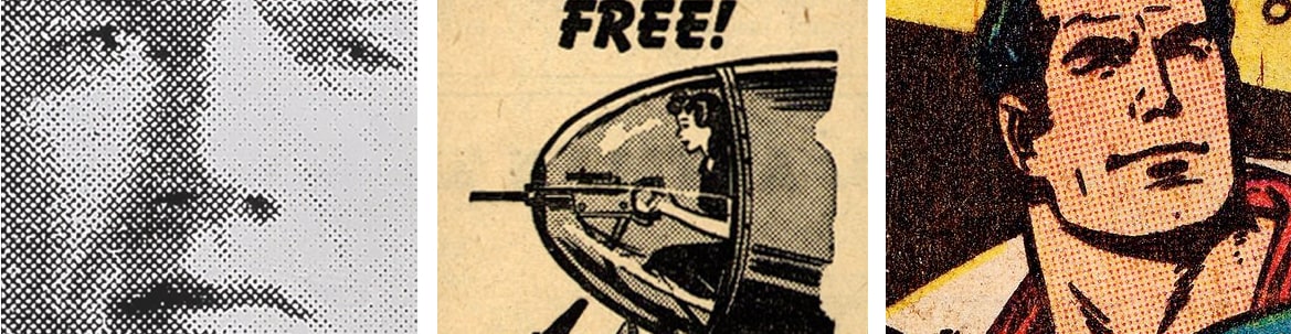
Halftone and Ben Day Dots
If you’ve ever looked closely at any comic book, newspaper or magazine, you’ve probably noticed the pattern of dots creating the tone in images. Technically, there are two types of dot patterns in print. Halftone screens create an image by varying the size of each dot. The first panel of the figure below shows a halftone sample from a 1964 Andy Warhol mural.
Ben Day dots are slightly different. Comic books—like the Superman example shown below —typically take black linework art and drop in areas of flat, evenly sized Ben Day dots to simulate extra ink colors. A grid of small red dots on a white base is a cheap way to get pink. Although the grungy, stippled look of these techniques began as an accidental byproduct of the print process, eventually it became an artistic statement in its own right—and continues to be used that way today.
The small Japanese village of Misato, Shimane, gives us my favorite recent example of this technique. Their site presents as an illustrated map that lets you take a virtual tour of the village. The illustrations are fun and mostly flat color but with some wonderful halftones, adding depth and texture.

DIY Halftones
There are dozens of Photoshop filters that will mimic the halftone process on your images (including Mister Retro, who we mentioned above). They’re fine, but if we’re going to flush image detail out of a photo by converting it to a halftone, in my view it makes sense to convert it into a vector graphic—ideally an SVG we can use online. For this, I can happily recommend HalftonePro.
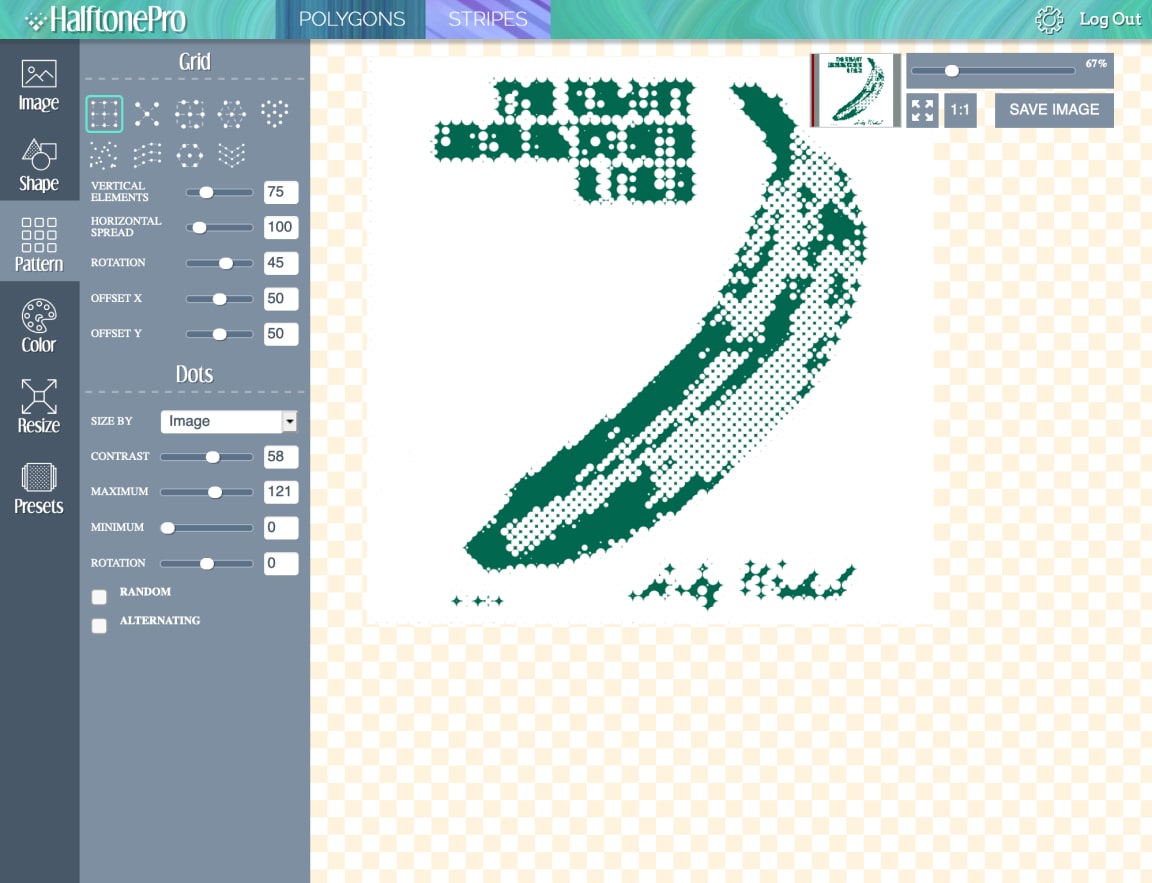
HalftonePro lets you upload any bitmap and apply a raft of halftone settings, including:
- grid scale
- grid pattern (circle, square, triangle, etc.)
- dot shape (circle, square, triangle, etc.)
- contrast
- color output
Here are some tips for making good halftones:
- Not all images are suited to this style. Bold, high contrast images are generally more successful.
- File sizes can get big and unruly if you select a very fine grid. Embrace the grunginess.
- Use the presets to begin with to help you get a feel for what works.

HalftonePro isn’t free. It’s currently a $15 outlay, but note that this is a one-time payment for lifetime membership—in a world full of monthly or yearly subscription plans. I paid for it and still think it’s good value.
Hidden Grain
Perhaps the sneakiest use of texture I’ve seen recently is displayed on the Harvard Film Archive. Open the site and you may think, “What texture? This site is as flat color as they come.”

However, pay close attention to the images and you’ll begin to notice a humming energy there—something not unlike the flickering of celluloid. The front-end designers have subtly animated a film grain across the surface of all images. (Note, however, that the effect is absent from the mobile view on my phone.) I doubt most users consciously notice it, but I’d argue that it somehow makes these still photographs feel like film stills.
How do they do it? For those interested in the technical detail, the developers use JavaScript to create an HTML5 canvas layer on top of each image. Each canvas plays a nearly transparent random noise animation. As clever as it is, the complexity of this idea only makes me admire the simplicity of the paper texture more.
Starting Your Own Textural Trends
As illustrated by the websites we’ve featured above, texture can have a big impact on how people perceive your design. Staying on top of current web design trends is essential for creating effective contemporary designs, but having a knowledge of past modes that occurred outside the ethereal history of the Internet will help you to establish your own style and original designs.
Some of the most useful web design resources can be found in the art history section of your local bookstore or library. Becoming familiar with the architectural patterns of the High Renaissance, investigating the Realist movement (and understanding how it influenced artists like Van Gogh and Cézanne to break all the rules on texture in paintings), and learning how modernism set the course for the design trends of today will help you do more than answer Jeopardy questions. A knowledge of graphic design history will expand your visual toolbox, giving you the creativity to develop a style that’s all your own, and the artistic variety to suit any client’s needs.
Ultimately, the image that your clients are trying to establish, and the communication goals they’ve set, should be the determining factors in how much and what types of texture you apply.
Application: Adding a Design Motif Using SVG Patterns
In Chapter 2 we resolved to limit our color palette so our design wouldn’t clash with or detract from the art being displayed. What other methods are there to add some visual distinction to our design? The great museums and art galleries of the world have the same challenge, so perhaps we can pinch some ideas from them?
One trick I’ve noticed is they often develop some kind of simple design motif not dependent on color—a shape, design, pattern or texture they can reuse and repurpose without having to worry about a preset color palette. Two killer examples are shown below.

The top row shows the branding used by the amazing Museum of Old and New Art (MONA) in Hobart, Tasmania. That “X+” shape isn’t just a logo. It’s used continually throughout the building, the grounds and even on the ferry terminal that takes you there. It’s even punched into metal as a repeating pattern. It works in almost any size, color or building material.
The bottom row shows how London’s Tate galleries repurpose their grungy halftone brand in everything from cloth bags to ticket booths. Sure, the base logotype is the word “TATE”, but it’s often cropped so hard that it switches from being legible text to a purely graphic motif.
While we may not have the budget, time or—let’s face it—mad skills of the MONA and Tate design teams, we might try to develop a motif of sorts for our project using the color palette we settled on in the last chapter.
Using a Pattern as a Motif
Vector applications like Figma, Sketch, Adobe XD, and Illustrator are great tools for leveraging the geometry of patterns. Symbols (known as “components” in Figma) make manipulating pattern elements much easier because edits to the “parent” pattern shape are passed on to the child shapes instantly.
I’m going to start with a set of concentric circles as a base unit, and then I’m going to overlap three of those units like fish scales. If I make a vector mask to isolate half of the visible part of the back-most circle (that is, the blue area shown below), we now have a versatile little tile that we can convert into a reusable symbol (or component) in your graphics editor.

If we mirror a duplicate of that tile along its vertical axis we get that original “scallop shell” unit. However, if we simply rotate a duplicate of the tile 180 degrees and fit those flat edges together, we get what I’m calling the “wavy bacon” unit. Wavy bacon fits perfectly into the scallop shell. The right edge of that wavy bacon matches perfectly with an upside-down scallop shell. And so on …
We now have an interesting pattern that we can use:
- with any color palette
- in high contrast or subtle faded versions
- in border trims or full background panels
And because everything is based on our original tile symbol, any changes to color, scale, tone, or contrast in that symbol ripple through the entire pattern immediately.
Although the easiest option is to simply export a PNG to use as a seamless background tile, SVG has some fantastic, built-in <pattern> properties that let you build super-efficient vector patterns, which is what you see below (below).

Diving deeply in SVG pattern code is perhaps best left to another book, but if you’re interested in the code, feel free to tinker with the CodePen demo I used when building it.
For now, it’s time for us to move on to the next chapter of this design adventure: typography!