Chapter 5: Imagery
From layout, to color, to texture, to type, we’ve been talking about imagery since the beginning of this book. So why should there be a chapter dedicated to imagery alone, right at the end? As with typography, there are many practical concerns related to imagery that we need to cover—including file-type choices, image resolution, and photography sources. But naturally, there are also artistic aspects to this topic, and these deserve some detailed discussion.
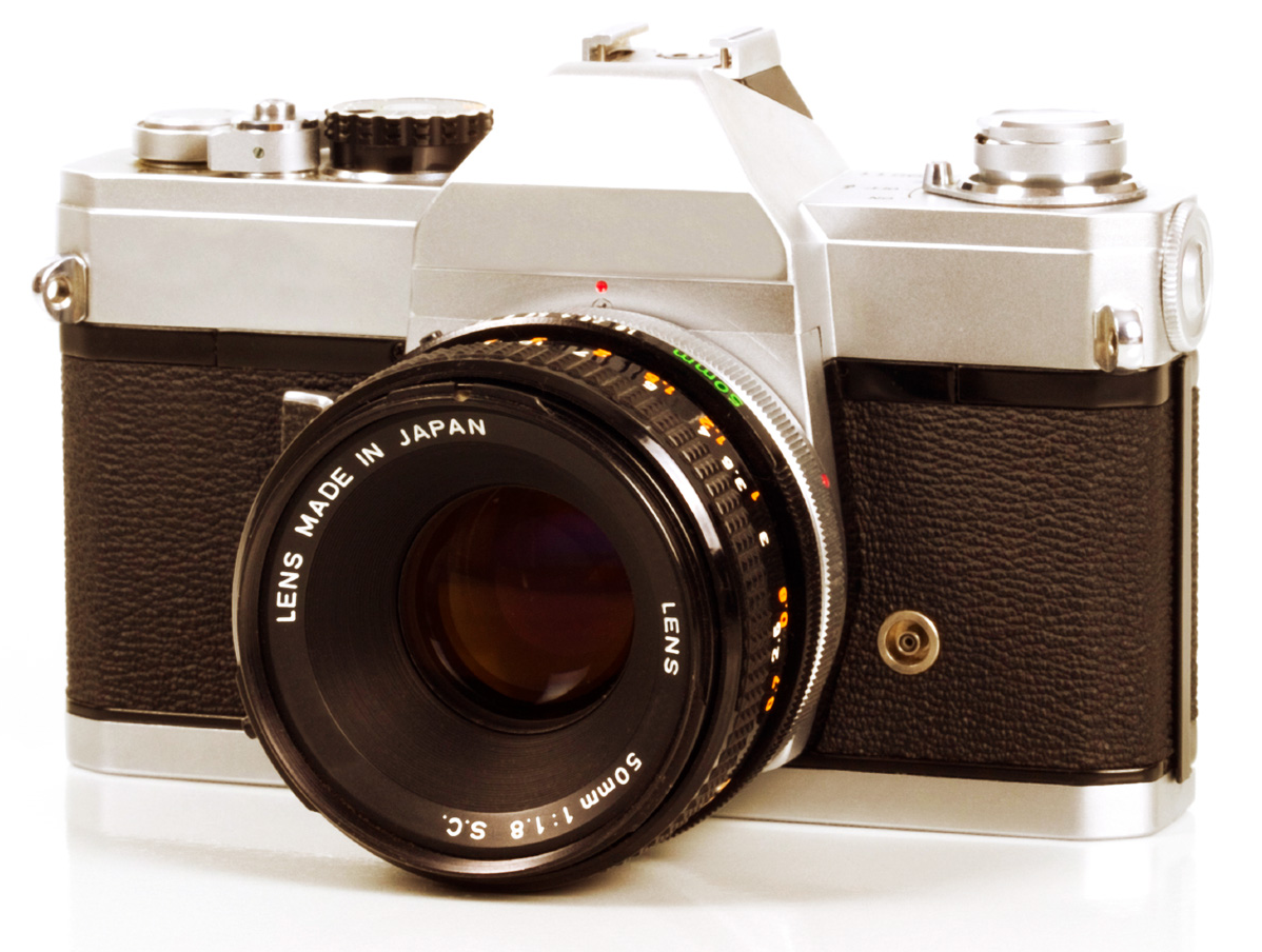
The process of choosing photographic, iconic, and illustrative elements for a website design requires a basic understanding of the design principles we covered in the first few chapters. Take the image above for instance. I wanted to use an image of a camera at the top of the page as an iconic representation of the subject.
However, when I was looking for a suitable picture, my decision was based more on the angle of the image than the type of camera pictured. The direction the camera faces in this picture greatly affects the sense of movement on the page. If the camera were facing straight ahead, the page would look just fine, but it would feel static. If it were facing off to the right, your eye would gravitate off the page rather than into the content. This phenomenon is due to the rules of emphasis I talked about in Chapter 1. The placement of the camera at the top of this page helps to ensure it will be noticed. Isolating the image makes it stand out even more as a focal point. Finally, the direction of the lens creates a line of continuance that determines the next focal point of the page.
By the end of this chapter, you’ll understand these concepts, and know how to apply them to your own designs.
What to Look For
The old adage that a picture is worth a thousand words certainly holds true on the Web. Photographs and illustrations often serve as visual lures that catch passing visitors and reel them in to your content. On the other hand, the wrong images, or even a poor presentation of the right ones, can be detrimental to a website’s appeal. Every viewer of a photograph or illustration sees that image differently, depending on the person’s own background and individual experience. So the thousand words that one person draws from an image may be different from the thousand words another person takes from it.
Before you choose an image or illustration to include in the layout or content of a website, ask yourself the following three questions.
Question 1: Is It Relevant?
Relevant images can add interest to your design and enhance the content of a web page. They provide visual bookmarks that help visitors remember what was covered on the page, and where to look when they return.
Take a look at the promo page for the Bite eco-friendly dental products. Bite are asking customers to change a deep-seated habit: squeezing tube toothpaste and plastic brushes. So explaining the new habit in a single image is critically important. At first glance, their hero shot looks like a completely random jumble of items, but break the image down and you’ll see they answer at least five important questions:
- How big are the these tooth pills?
- How many pills are there in a jar?
- What does a bamboo toothbrush look like?
- Does the handle detach?
- What will the delivery look like?
This is, in fact, a very carefully composed photography that skillfully tells their story while also showing off a stylish product made from attractive materials.

Question 2: Is It Interesting?
Your imagery doesn’t even need to be beautiful to be effective, as Julian Breheny shows us (no offense, Julian) with his personal site. Julian had to tackle the problem of showcasing his wide array of marketing, writing, video and design skills. The most obvious approach would be to create a portfolio spotlighting his best work. Unfortunately, this puts you in a “portfolio arms race” with every fantastic designer on the planet—which is a tough gig.
Instead, Julian designed and built a web app that asks clients to select only the skills they require, and then the app instantly rewrites Julian’s “elevator pitch” to match their needs. This is no small feat. A typical site design requires one pitch and one hero shot. For this project, Julian had to create 62 pitches paired with 62 hero shots. That’s hours of spreadsheets, copywriting, preparation, studio time and execution.
However, if you’re anything like me, you probably spent time clicking around looking for new combinations and visual gags. That’s both engaging and memorable.

The real beauty of Julian’s approach is that the very act of creating the site perfectly showcases his:
- organization skills
- copywriting chops
- problem solving ability
- work ethic, and …
- comic timing
Frankly, it’s hard to imagine any conventional portfolio site selling Julian’s strengths more effectively that this site does. I salute you, sir.
Question 3: Is It Appealing?
Images that are aesthetically or emotionally appealing can be a very efficient hook for attention and emphasis. The issue is that beauty and attractiveness are different for everyone. Depending on the subject matter and target audience of the site you’re designing, an appealing image might be a portrait of a mother and her child, a panoramic cityscape, or an adorable cartoon mascot.
Appealing images are especially important for sites dealing with restaurants, recipes, and catering. If the food seen on the website fails to make your mouth water, customers will avoid eating, cooking, or ordering it. The photography on the St. Hubertus Restaurant site, seen below are rich, tactile and inviting. They create an atmosphere that makes you want to go there. There’s one shot of somebody searing a marshmallow with a red-hot coal that has me convinced I can smell the burning sugar. Images like this don’t just show the product, but also hint at a great experience awaiting you.

I realize that relevancy, interest, and appeal are all very subjective, but sometimes subjectivity and artistic license are appropriate. If you think it’s a good image for the project, run with it. Generally speaking, I’d avoid monsters, slime, and aliens in most websites, but as we’ve seen above, given the right client and target audience, it may be a valid design direction.
For every image you select for a design, you need to be able to answer “yes” to at least two of the questions above. Why not all three? Well, sometimes it’s fun to toss in an appealing and interesting image that has nothing to do with your content—perhaps something as random as a bunch of birds carrying a whale in a net (the sadly departed Twitter “fail whale”, shown below).

Legitimate Image Sources
So, where does one acquire interesting, appealing, and relevant imagery to use for a website project? You basically have three options: create it yourself, purchase stock images, or hire a professional. The approach you take will depend on the budget and needs of your client, as well as your own skills.
Take It or Make It
For me, taking pictures with my own camera or creating my own illustrations is usually a win-win situation. If local clients need pictures to use on their websites, it gives me a chance to escape the office and do something different for a change. I’ve had the opportunity to take pictures of products, restaurants, a factory, apartments, a martial arts studio, and storefronts. I was even able to ride around in a golf cart to take pictures of a golf course one morning, all while I was on the clock. But it’s more than just a fun outing for me. Clients usually like the idea because it shows them that I want to be involved in every step of the project. It can also cost them less than it would to contract a professional photographer.
Photography Can Be Learned
While you may not think of yourself as a photographer, taking good photos is a skill that, like design, can be learned. A great place to start is SitePoint’s Photography for the Web.
The same is usually true for illustration and animation work. Most of the time, a custom site design requires some level of illustration. For items like icons, buttons, backgrounds, basic drawings and logos, you might consider taking a stab at fulfilling the client’s needs yourself. Keep in mind that illustration doesn’t necessarily have to be complex or time-consuming for the message to be communicated successfully.
Take a look at the website for the agency Designzillas below. The overlapping palm leaves create a lush, dappled jungle for their trademark cartoon dinosaur to erupt from. This simple dinosaur illustration has become a company mascot, following them through a number of site redesigns. The current site incarnation includes a pterodactyl, a hatching egg and three dinosaur appearances. Like Jeremy Breheny earlier, their imagery is used to emphasize fun and approachability over eye candy and awe.

Occasionally, the do-it-yourself method doesn’t work out for me. The illustration work the client needs might be outside my skill set, or it may be too complex for me to feel confident taking it on. If it’s a particular photo the client wants, I might lack access to the subject, or the quality of the image they need may be beyond the capabilities of my equipment. In those cases, my first instinct, and the next best option, is to turn to stock photography and illustrations.
Stock Photography
If you’re short on the time or ability to create or commission your own images, chances are that you’ll find what you’re looking for in a stock photo archive. These photo archives, or image banks, consist of photographs and illustrations that are created for general use, rather than a specific client or project. For a licensing fee (or sometimes for free), you can select any of these images for use in your project.
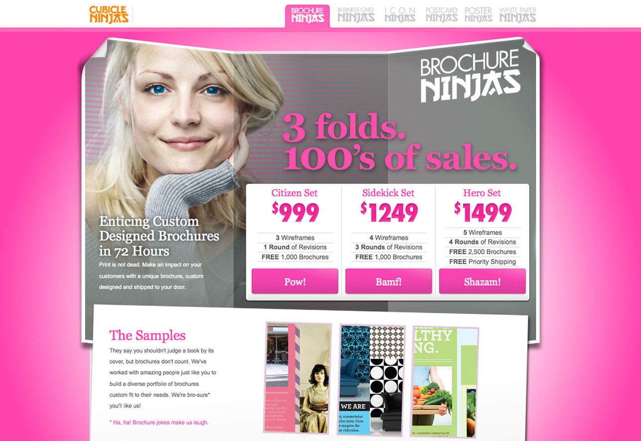
Finding the right images and photos for a design project can be a difficult task, depending on the subject matter and your budget. If your project requires pictures of animals, scenic vacation destinations, office supplies, or some random inanimate object, then you’re likely to find what you’re looking for easily. Every stock photo archive has these types of subjects well covered. Finding photos of people—like the girl with the unnaturally blue eyes and curiously long sleeves on the Brochure Ninjas site—can be a little trickier. Most stock photo sites require that the photographer submit a signed model release for any image that includes a person’s face.
For this reason, you should expect to pay for good-quality pictures of people. Finally, if you need pictures of a product logo, current celebrity, or famous work of art, you have some work to do. Even though you may be able to find these sorts of images easily on search engines, using them for a professional project will likely require a very detailed licensing agreement.
Always Look for Image Usage Guidelines
Even if an image is restriction-free, you should ensure that your use of the image falls within the guidelines of the site’s image licensing agreement. The guidelines for each stock photography source differ, so be sure you know what these are before you start looking for images. Some galleries even restrict their images to personal and nonprofit use.
The next question you must answer before you begin your quest for the perfect stock image is how much you’re willing to pay. The price of using a single stock photograph can range from zero to hundreds of dollars. As you can probably imagine, the average quality of free images is dramatically lower than the quality of those you pay for. Free images can still be worth your while, though; you just might have to wade through a bunch of crummy pictures before you find what you’re after. The same goes for expensive images. Just because you’re willing to pay $500 for a single photo, there’s no guarantee you’ll receive a Ferrari instead of an early ’90s Chrysler minivan with faux wood paneling. No matter what the licensing price of an image is, it all boils down to finding what you’re looking for. If you can find it quickly, and at a great price, you’ll have more time to spend on the design.
Three tiers of stock photography are available: free, royalty-free, and rights-managed. Let’s look at each of these in turn.
Free Images
I’m sure you’ve heard the saying, “There’s no such thing as a free lunch”. That principle could be applied to just about everything, and it definitely applies to the world of stock photography. Even though there are some excellent free stock images available, somebody is still paying for the equipment and the time it takes to create those images. Why would photographers do all this for free? For the same reason a talented musician might publish free MP3s, or a team of programmers might spend time on an open-source project. It’s what they love to do, it allows many more people to enjoy their work, and it’s an opportunity for their work to be noticed.
Of all the free stock photography sources out there, the one with the largest collection of free images, and the one that I use most often, is Free Images, pictured below.

Free Images has over 400,000 high-quality, user-submitted images. To ensure the quality and relevance of the gallery’s database, site moderators check each submission before it becomes available. When you’re downloading images from Free Images, be sure to check the restriction status of the image. Most images in the database are restriction-free, which means you can use them for most personal or commercial uses.
Other image resources worth checking out include:
- PxHere
- New Old Stock
- Pexels
- ISO Republic
- Unsplash
- StockSnap.io
- Picjumbo
- SplitShire
- NegativeSpace
- Life of Pix
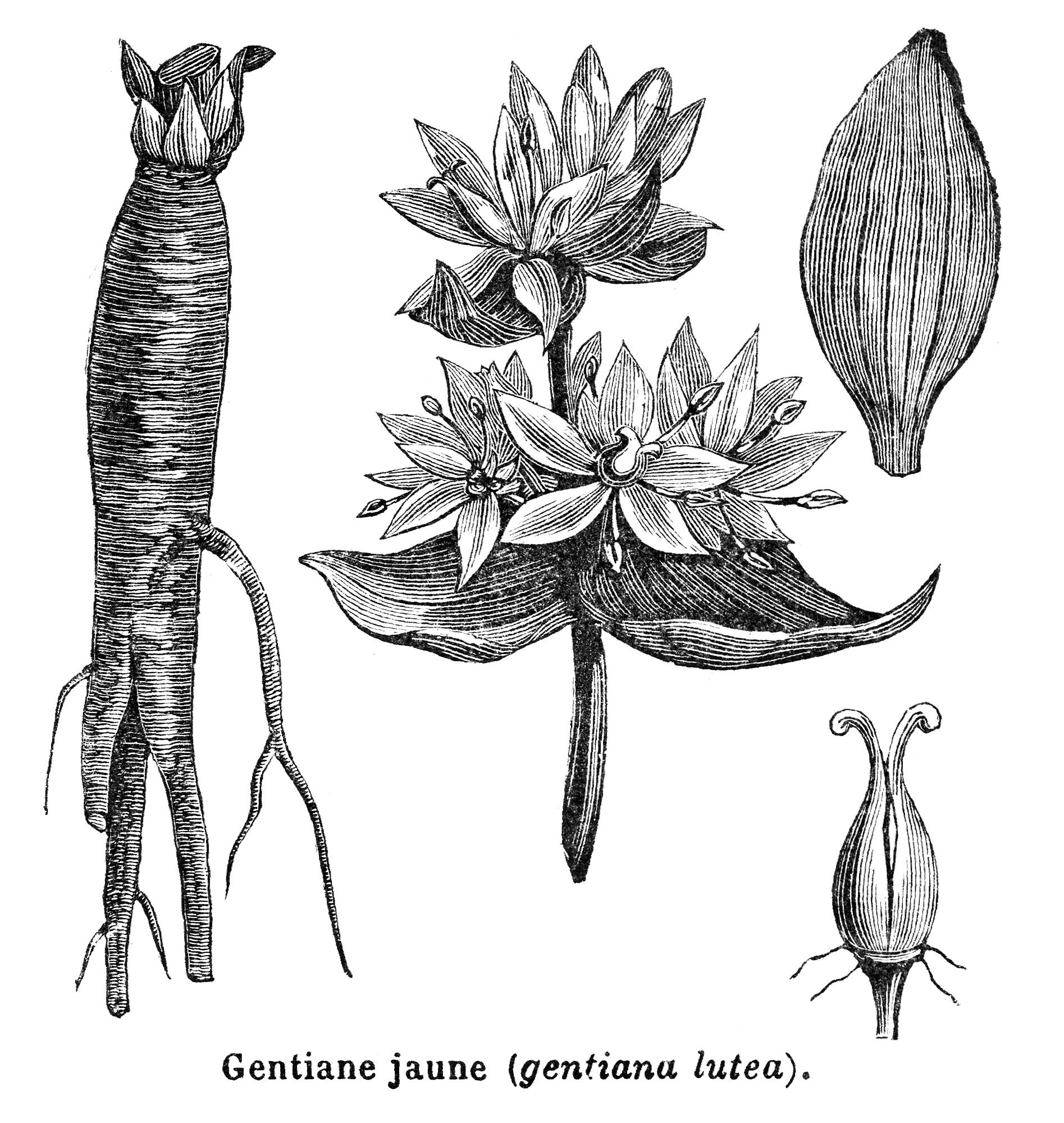
The size of a stock photography collection plays a big role in how useful it can be. The more photos there are for a given search term, the more likely you are to find one that’s useful. Although there are many free stock photo resources online, most of them have significantly fewer images, or the images they do have cover very specific, narrow topics. One such niche site for images is Old Book Illustrations. The site has a large collection of scanned artwork and illustrations, like the image below, that are all old enough to be in the public domain. You can find a list of other sources for public domain images at Wikipedia’s listing for public domain image resources.
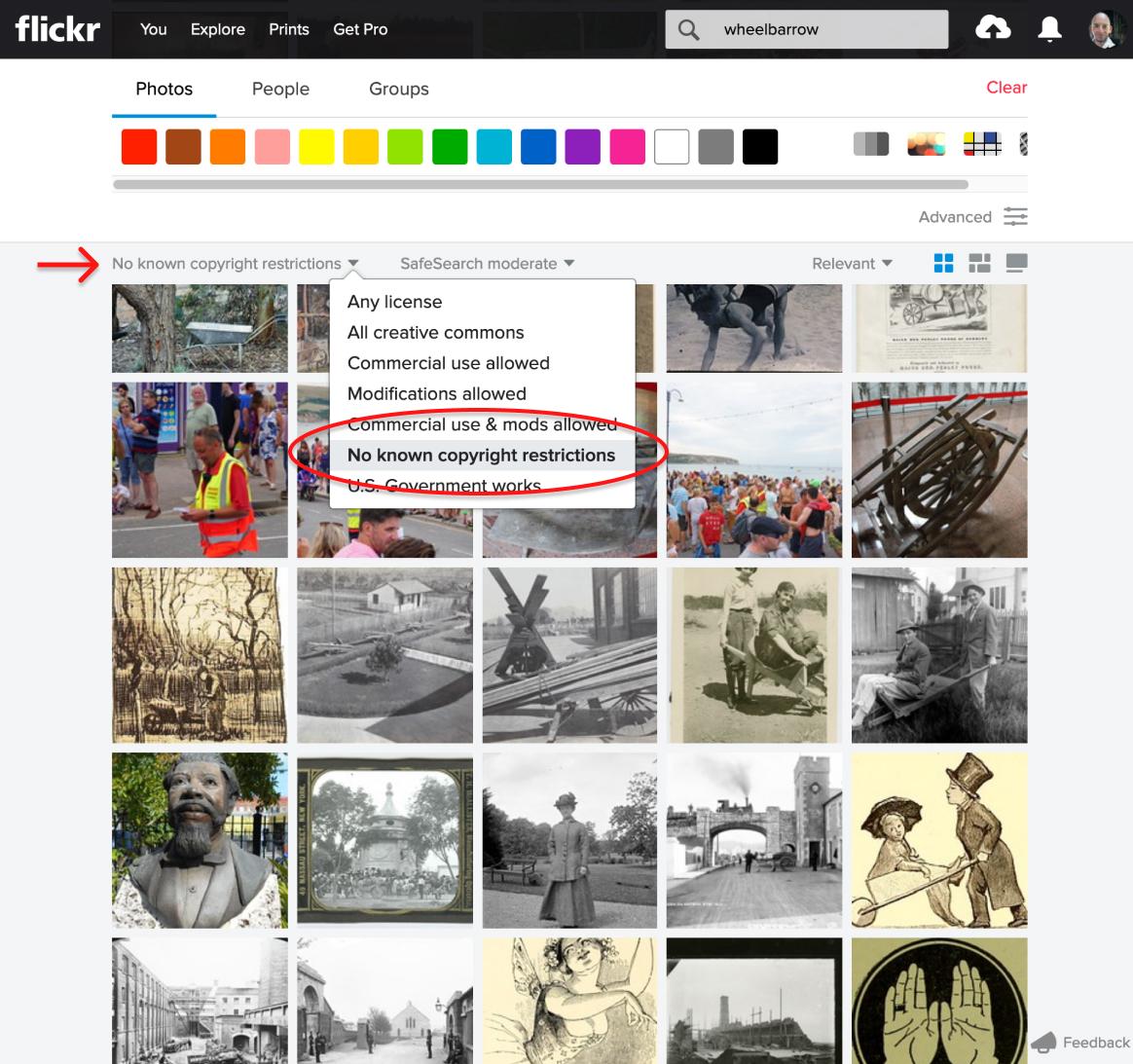
In a similar vein, Flickr.com has mountains of royalty-free imagery if you know where to look. Over some two decades, hundreds of state libraries, museums, and government archives have digitized and uploaded their collections to Flickr as a public service. To be clear, most Flickr imagery is protected by copyright, but if you switch the licensing dropdown on the Flickr search page to “No known copyright restrictions”, you’ll unlock a treasure trove of old cartoons, engineering diagrams, maps, historical photographs, postcards and other assorted visual gems. You may have to dig, but there are some amazing images in there (and there’s some super weird stuff, too).
If you’ve spent any time looking for the right stock image, you’ll know that finding what you need can be a frustrating experience. Sometimes you’ll spend more time searching than designing, and when it’s a client project you’re working on, you simply can’t afford to waste time. When you’re willing to pay a little for the right image, the task of finding that image becomes much easier. That’s when paid stock images come to the fore. They generally come in two flavors: royalty-free, and rights managed.
Royalty-free Images
Contrary to what you might think, a royalty-free image is not available for use free of charge. The term refers to the details of the image’s licensing agreement. A royalty-free image license is one that allows you to pay a single, up-front fee for an image. The payment buys you the right to use that image for other clients and projects without paying further licensing fees, known as royalties. As you can imagine, this is a popular option with designers who may need the same types of images again and again, and want to avoid the hassle of negotiating usage rights. One of the most popular places to purchase royalty-free stock photography is iStockphoto, shown below.
While many of the larger stock photo sites only source content from professional photographers, iStockphoto makes it easy for anyone to put their photos, illustrations, and even audio or video content up for sale. To maintain the quality and diversity of the iStockphoto collection, the site administrators accept only high-quality images, and they often reject offerings that duplicate the abundance of imagery they already have.

The reason for the difference in quality between stock imagery from Free Images and iStockphoto is quite simple. iStockphoto pays its artists. Therefore, the site attracts more submissions of higher quality. Purchasing images here is based on a credit system. Once you’ve created an account, you can purchase a pack of credits, which is sort of like buying tickets for a carnival. The price of each credit ranges from around $9 to $12. The more credits you buy, the cheaper they are. The standard “cost” for images on iStockPhoto ranges from two to 25 credits, depending on the size of image you need, and some images have a higher tariff. I know what you’re thinking: $10 per credit times 25 credits is $250 per image. Typically on the Web, we only require one of the lower resolution image sizes, which cost between two and ten credits.
There are two things in particular to be aware of with credits:
- Buying credits doesn’t solve all your problems. Like poker chips in a casino, they tend to disconnect you from the money you paid in. For instance, if you paid $22.50 for 11 credits on Site A and used four credits on an image, how much did you pay for that image? And how does that compare with the same image on Site B with a different credit system? There are no easy solutions to this, other than always keeping a strong sense of the cash value of a credit.
- Credits expire. Yes, that’s right: if you don’t consume your credits within a set period—usually a year from purchase date—they’ll expire and become as worthless as old bananas in a fruit bowl. Unless stock providers are converting their revenues into bananas, there’s no plausible, user-friendly reason to explain why a credit should have a shelf life. The takeaway? Don’t be too quick to purchase a huge cache of discounted credits thinking you’ll “use them eventually”.
Another service that’s similar to iStockphoto, but slightly less expensive, is Dreamstime. While iStockphoto used to be my go-to resource, I’ve found that I can usually find what I’m looking for in Dreamstime’s collection, which also features a growing number of free images. Depositphotos.com and Shutterstock.com are two other providers that, in my experience, offer a good balance of value and range.
Subscription Plans
Almost all stock providers offer a monthly/yearly subscription service. In the past, this often meant unlimited “all-you-can-eat” image downloads, but today it usually includes weekly or monthly cap limits. If your monthly image usage is consistent, subscriptions may be the most cost-effective option. However, I’ve found I might need 20 images one month and none the next, which nullifies any savings made with a subscription. Unless you’re a big company, stick with the credit model.
Rights-managed Images
A third level of stock photography service is known as rights-managed. This type of stock photography can be quite a bit pricier than the others, as you pay a fee based on the size of your business, the number of people who’ll be exposed to the image, and the amount of time you’ll need to use the image. Most of the larger stock providers—such as Corbis and Getty Images—have rights-managed options for their exclusive images. The photos in a rights-managed collection are usually of a professional quality.
Because the company in charge of the rights knows who’s using the images and for how long, it’s extremely unlikely that your client’s competitor will have the exact same image on its home page that you’ve used for your client. With such a large pool of royalty-free images available, this may already seem improbable, but whether people notice it or not, this happens all the time.
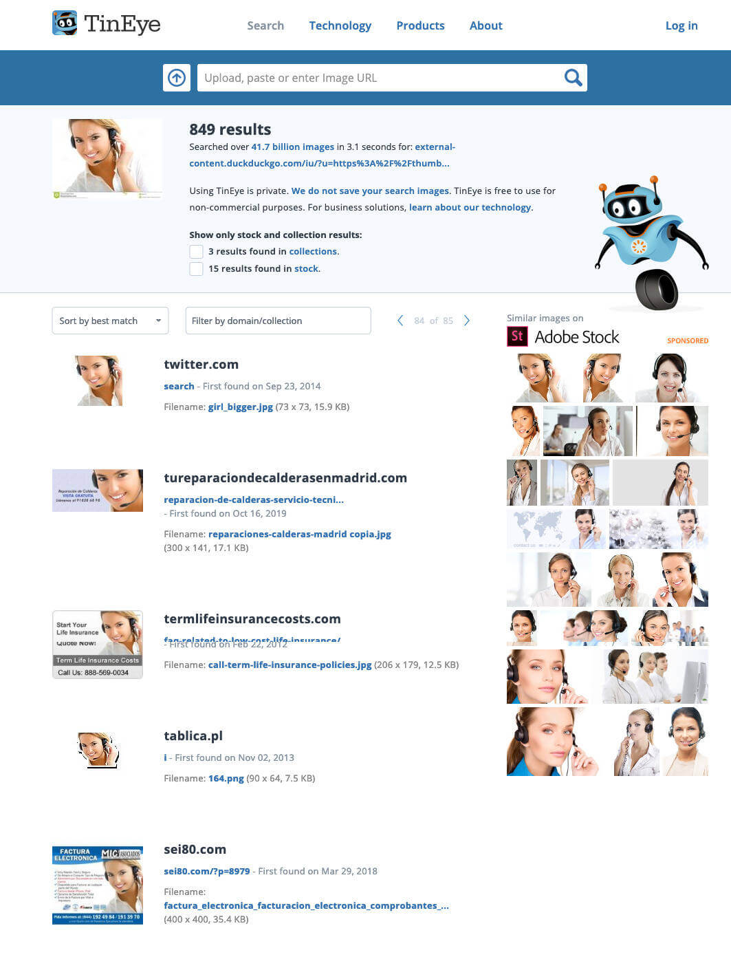
TinEye is a great tool for checking how widespread the use of a particular stock image is. This browser plugin touts itself as a reverse image search engine. You simply right-click on an image that you want to research and it searches for matches in its index of nearly two billion images. As you can see below, it will even find heavily modified versions of the original image. It’s important to note here that, while there are many images of female customer service representatives with microphone headsets on stock photography sites, it’s a horribly overused cliché. You should think twice before using this type of image, or any picture you can conceive involving business people standing around or shaking hands.
While shelling out extra money for rights-managed photography may help your clients to avoid this type of scenario, there’s no real guarantee of exclusivity. If you need to, the best option is to have photos taken professionally.
Getting Professional Help
If you plan to hire a professional photographer to do your dirty work, be sure to find one who has experience with commercial photography and the type of shots you’re looking for. That excellent photographer that captured your brother-in-law’s tears at your cousin’s wedding, for instance, may be great at portraiture and event shots, but might know nothing about architectural or product photography.
The best way to find a good commercial photographer is by word of mouth. If you know of other companies that have hired a professional photographer, ask them who they use on a regular basis, and what their experience is. If you don’t have any references you can ask, try starting with a local professional association. If you’re based in the United States, the American Photographic Artists website is a great place to start. Many of the photographers listed in the APA database have biographies and portfolios that can give you a good idea of their capabilities.
To get an accurate handle on the costs, be very specific when writing a request for proposal. Be sure to include the details of each shot you need. State where you’d like to have the pictures taken if they’re going to be done outside the photographer’s studio, and be ready (with models, locations, wardrobes, and so on) to take all the pictures on the same day if possible. Most professional photographers charge by the day or half day. Daily rates can vary quite a bit, depending on the market and the photographer’s experience, but they can range from just under one thousand to several thousand dollars. Another aspect to take into consideration is the photographer’s copyright and usage guidelines. Many photographers will grant full ownership of the original photographs to your client upon payment. Some will require credit if the work is used in a commercial publication. A few photographers may require that they retain exclusive rights to the pictures they take, and they’ll charge per use of the photos. You should try to negotiate full ownership and usage permissions whenever possible, but keep in mind that this type of contract may cost more.
If it’s a professional illustrator you’d like to hire, another resource to look into is Hire an Illustrator. This industry index hosts almost 500 artists, and makes it easy to find the person for the job by name, style, medium, or location.

As with hiring a photographer, though, the best way to find the right person for the job is often by word of mouth. If you live in or near a big city, chances are there are user groups or meetups for whatever branch of the web, tech, or design industry you’re interested in. These are great places to find the talent you need to complete your next project, or even to hire for your team.
No matter what sources you use for your images—whether they’re from a free stock website like Free Images, or whether a paid professional creates them—it’s ultimately your clients who should have the final say. Even though it’s likely you’ll be choosing the images you feel best represent their company, sometimes your clients will disagree with your choices. Always be ready to adapt and make changes where necessary. As long as you’re creating good work and acquiring your images from legitimate sources, your hard work should pay off, and the client will be impressed.
How Not to Impress
So far, I’ve told you about a number of legitimate ways to obtain imagery for your projects. Now it’s time to talk about how not to source imagery.
Google Ganking
As a web designer, you may find inspiration by running a Google image search for topics you’re building a website around. Let’s say you’re building a website for a bike shop. If the owner of the shop is yet to give you any images to work with, doing an image search for mountain biking, bike races, road bikes, and other related subjects can give you a better visual understanding of the topic, and an idea of the types of images you’ll want to use on the site. Usually, this type of search will return some images that would work well in your design. You might even feel the urge to save some of these images to your computer, open them up in Photoshop, and crop, resize, and modify them a little to fit your needs. This is known as Google Ganking, and it’s a serious problem in web design. Unless images on the Web are specifically marked as being free to use or available in the public domain, you can assume they’re copyrighted, so you’ll need permission to use them. You may think image owners will never notice you’ve ripped off their work, but you risk facing embarrassment when a cease-and-desist letter is sent to your client, or worse still, a lawsuit is filed against them.
Hotlinking
If there’s anything designers and website owners hate more than seeing their designs or images copied and reused, it’s seeing them ripped off by a site that’s linking directly to the original files. Usually, images for a website are placed on the same web server as the site, and are linked to like so:
<img src="/images/image.jpg" alt="Image Description" />
However, images can also be linked to from outside the website, using the full URL of the image:
<img src="http://www.somesite.com/images/image.jpg" alt="Image Description " />
Going back to my theoretical bike shop example, let’s suppose I wanted to use a picture of a particular make and model of bike. Let’s say I found an image of the right bike on the manufacturer’s site and wanted to use it. Rather than requesting product images from the manufacturer, or even downloading the image and placing it on my client’s web server, let’s imagine I decide to link straight to the image on the bike manufacturer’s website. This dubious practice is called hotlinking.
Copyright issues aside, hotlinking uses the bandwidth of the website on which the images are located. With most hosting accounts, bandwidth is limited, and extra bandwidth can be expensive. So as a real-world metaphor, hotlinking is a bit like using another person’s cell phone minutes to make your call. Most web professionals know that hotlinking is a big no-no, so the usual hotlinking suspects are forum users, bloggers, and Tumblr users who don’t know any better. So if you were unaware before, now you know better, too. Not to mention an additional problem with hotlinked images: the owner of the image could move or remove that image and replace it with something crude or embarrassing at any time.
Clip Art
There are many websites that offer free, or very cheap, clip art and illustration packages. While these cheesy generic graphics may work for an internal company bulletin or do-it-yourself greeting card, they should be considered off limits for any professional project.

You may think I’m being a little harsh with that statement, but take a moment to think about it. If you go to a five-star restaurant, would you expect to be served instant mashed potatoes from a box? Of course not! You’d expect fresh ingredients, cooked from scratch. As a designer, you have an obligation to cook something up for your client that’s as original as it is astonishing. While the quality and “freshness” of stock photography can be questionable as well, there’s nothing worse than seeing a good design blemished by stale, clichéd clip art. If your clients ask you to use clip art or a corny animated GIF on their site, you should push back a little. Just remember that if the client has come to you for the design, it’s your job to provide feedback that’ll make their site look good. However, you also have to remember that, ultimately, the client is always right. Sometimes a client will force a design decision, and you’ll just have to go with it. I guess some people really like their instant potatoes.
Image Presentation
Regardless of how good a job you’ve done choosing images for your design, there’s another critical factor to consider: presentation. When you’re formatting images for use on your site, their presentation will often depend on the constraints of the layout you’ve chosen. The image size, for instance, may depend on the size of the rectangle you have available in your grid. As the designer, it’s up to you to determine how an image will be cropped, if an image will have any framing or borders, and what types of visual effects will be applied to the image, if any.
Creative Cropping
One of the most profound impacts you can make on the presentation of an image comes from wisely choosing how much of it to use. This process is known as cropping, and is a fundamental image manipulation technique.
At its most basic level, cropping can be used to eliminate unnecessary or unsightly details from a picture. The picture below is one that I took while wandering around with my wife in downtown Charleston, South Carolina. It’s an okay picture, but the people in the immediate foreground and the power lines that run down the shady right-hand side of the street are distracting.

By cropping out some of the bottom and the right side of the photo, the edited image—shown below—feels less busy, more like a casual holiday shot. In the original photo, the perspective made the church steeple the focal point, but the image included too many other elements that competed for the viewer’s attention. With the image cropped, the steeple is still the focal point, but the pair of shoppers jumps out as a secondary focus—due, in part, to the rule of thirds I talked about in Chapter 1. Even though the steeple is no longer in the center of the composition, the perspective lines that run along the top of the buildings, the edge of the road, and even the yellow line, point toward the steeple’s base. Having this off-center element as the focal point of the image creates a more interesting composition, and helps to give the image a more intentional, balanced feel.

We can also crop images in unexpected ways to portray a sense of emotion, show an interesting perspective, or change the overall message of an image. Below, an image of a guitar player has been cropped tightly to show only the body of the guitar. This treatment highlights the sense of movement that’s inherent in a musical performance, and provides a degree of anonymity that allows more people to connect with the image.

Size Matters
When cropping images tightly, like the guitar image above, it’s important to be aware of the overall size of the image you’re working with. You may want to crop to a very detailed area of the photo and then enlarge it, but if the image’s resolution is too low, the cropped image will look pixelated (unless, of course, you’re part of a TV crime drama, in which case you’ll acquire magical powers to zoom in infinitely). Fortunately, images that are used on the Web can have much lower resolutions than those used in print, but always check the quality of your final image to make sure it’s not grainy or blurry.
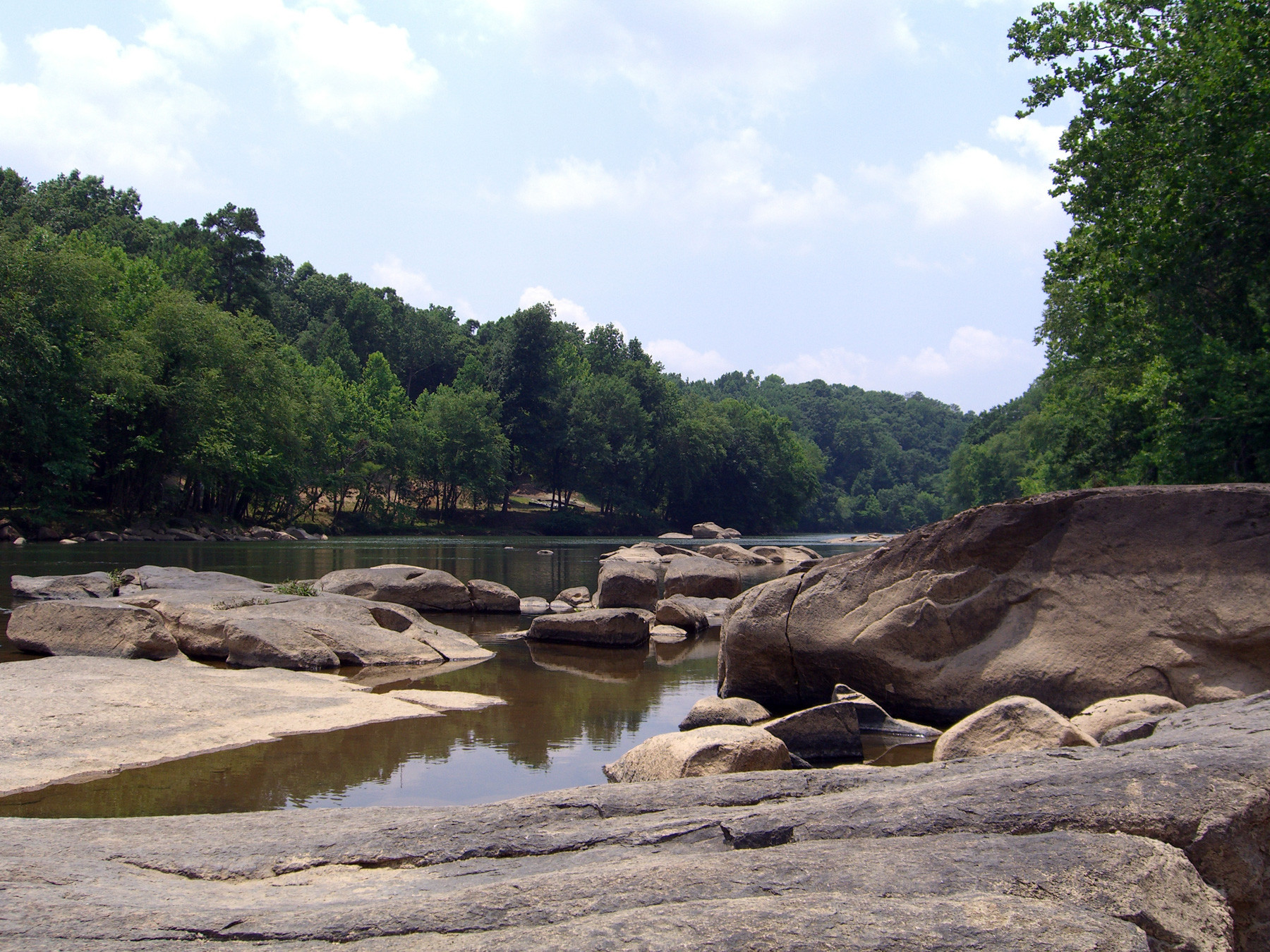
Images don’t always have to be contained in boxes. Many of the fun and useful ways we can crop photos are more creative than just trimming off the sides. The photo below is one that I took from the banks of the Saluda River. I love this picture so much in its unedited form that I made it into a background image for my computer, but let’s try to think outside the box.
Unconventional cropping methods can come off as amateur if they’re poorly executed, but if they’re done well, they can be used to create some very striking graphics. Let’s say I was designing a website for an outdoor center that rented kayaks for use on the Saluda River. In that case, I might use a technique like the one illustrated below.
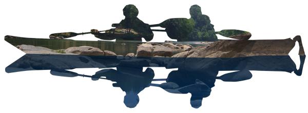
Here, I’ve used a vector image of a pair of kayakers as a mask around which to crop my original Saluda River picture. In image editing software, a mask is basically a window you can see the image through. When I laid the mask of the kayakers over the image of the river, I produced the top half of the image above. By flipping the mask vertically, and applying it to a blue-tinted duplicate of the original, I was able to create the appearance of a reflection.
Now that image might work for a kayak rental center website, but what if we were creating images for a website that promoted a regional visitor center? The center wouldn’t want to limit the river as only being great for kayaking. It’s also a great area for swimming, hiking, and fishing. By using the text “RIVER” as a mask below, I’ve made the image much more versatile, while establishing a fresh and creative look.

One final, non-rectangular approach to cropping involves removing part of an image from a scene. That part of the image we remove is known as a knockout. A knocked-out image can be featured without a background, placed onto another image, or even duplicated and rotated several times to make a flower. Okay, so maybe the last example of using a knockout as shown below is a bit far-fetched, but you have to admit that my banana flower looks fairly darn cool.

As you can see, cropping provides endless possibilities for the production of unique images and design elements. The only limiting factors are your imagination and the ability to flesh out ideas in your photo editor.
Image Adjustments
Although Photoshop occupies a less important role in my design workflow than it once did, it’s still my tool of choice for correcting and perfecting photographs. In this section, we’re going to look at a handful of useful Photoshop image adjustments, but don’t worry if you don’t have access to Adobe’s Creative Cloud (which includes Photoshop). Each technique can be accomplished in Pixelmator, Affinity Photo and even online tools like Pixlr.
When I’m taking personal pictures with my digital camera, I usually try to think a little about composition and lighting, but as I’m no real photography pro, my photos vary in quality. The not-so-great images often go straight to my personal photo gallery as records of places or events. If I’m taking a picture for a design project, though, these images always undergo some form of change before they’re suitable for use in client work. At a minimum, the changes I’ll make usually include cropping, and altering the brightness, contrast, and saturation of the photo.
The image below is an example of a photo straight from my digital camera. It’s a picture of the amazing stonework around the entrance to the Biltmore Estate in Asheville, North Carolina, that I took during a visit last summer. It’s an okay photograph, but it’s definitely unfit for professional use. Even as a straight content image, it has competing focal points and feels unbalanced.
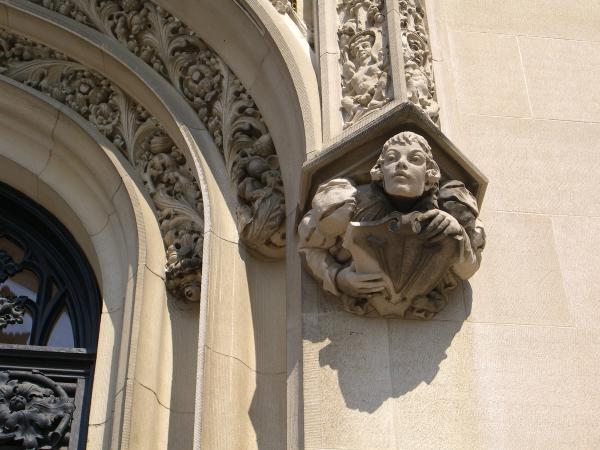

My first step is usually to crop the image to focus on the aspects I want to show. In this case, I plan to highlight the human figure to the right of the door. As a hypothetical scenario, let’s say I want to use it for the feature image in a news article about the Biltmore Estate. I like the close-up of the sculpture in the image above, but I want to find a creative way to hide the eave over its head. One way I could achieve this would be to use an image box that cuts off that part, but shows the figure popping out of the top and left-hand sides.
To create this effect in Photoshop, I need two image layers: one that has the isolated stone figure, and another that has the background. I start out by duplicating my image several times, making sure to keep one completely unedited version in case I need to go back to step one. For the top layer, I carefully knock out the figure by zooming in and using the Polygonal Lasso tool to select the perimeter of the figure and cut off the excess. To create the background image, I use the Rounded Rectangle tool to create a mask of the area I want to show, then drag the mask onto my background box layer.

The resulting image (above) looks quite good, but it could still use some adjustments. The first issue I have is that the grimy areas on the figure’s shoulders and its shield are a bit unsightly. I’m not going to eliminate that completely, but I can take some steps to reduce the contrast in those areas. The tools for this job are the Dodge and Burn tools. The Dodge tool is a brush-like tool that actually lightens the area you click on, while the Burn tool darkens the area. By using these tools together, I can lighten the dark areas, and darken the light areas, to give the image more consistent shading and contrast.
Next, it’s time to adjust the overall brightness and contrast of the two layers. Brightness and contrast are two controls that are provided by just about every image-editing tool. They can be accessed in the Photoshop menu via the Image > Adjustments > Brightness/Contrast… option. The controls are shown below.
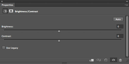
As we learned in Chapter 2, the brightness of an image actually refers to the overall amount of light or darkness in the image. The contrast of an image is the difference between the light and dark areas in the image. Kicking the brightness and contrast of the Biltmore figure up a few notches, and pushing the brightness and contrast of the background block down a bit, will help to give the composition a little more pop.
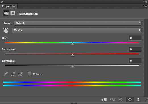
After I adjust the brightness and contrast, I move on to work on the hue and saturation. The Hue and Saturation controller shown below can be accessed via the Image > Adjustments > Hue/Saturation… menu option. The Hue control affects the overall color of the image. By moving the Hue slider up and down, you can shift the colors in the image so that it appears more blue, or red, or orange, and so on. The overall tone of this image is fine, so I don’t really want to adjust its hue too much, but it’s sometimes necessary to alter the hue if you want to change the overall color of an image.
The Saturation slider affects how saturated the colors appear within the image. If you turn the saturation off, you’ll be left with a grayscale image, but if you turn it all the way up, all the colors will be brighter and more dramatic. I want to increase the saturation of the figure in the image, and reduce the saturation of the background. This will further highlight the contrast, and give the image the pop I was talking about before.

Finally, the image is just about ready for posting! Notice how the figure above stands out from the background, and the shading is more even than before. These subtle details make a big difference to the overall effect of the image. To adjust a little more of that detail, I’ve applied an outline stroke around the background block by accessing Layer > Layer Style > Stroke… and giving the block an inside black stroke.
Besides making brightness, contrast, and saturation adjustments, another way to give an image a Photoshop facelift is by using filters.
Filters
In earlier editions of this book, Photoshop filters were a worthy talking point. Back then, web browsers were much simpler creatures, and there was simply no way to re-style an image without editing its pixels in a photo editor like Photoshop, GIMP, or even MS Paint. That’s not the case any more.
Today, we’re at a point where permanently altering images for styling reasons should be your last resort. When we use CSS, we fully expect to be able to change layouts, color palettes, and typography choices from a single place without needing to re-author the content. Images are just another type of content and should be treated in the same way. Good content lasts; fashions come and go.
Of course, that doesn’t mean we should throw out Photoshop. As we saw earlier, raw photos nearly always need cropping, color correction, level adjustments and repairs to any issues that prevent them from presenting in their best natural state. But from there, always try to find “non-destructive”, browser-based methods to style them. Here are a few ways to get you started.
Styling Images with CSS Filters
CSS filters offer probably the simplest way to style images without permanently altering them. The table below shows the ten basic CSS filters we can use, which are all well supported by modern web browsers. The last in the list—the SVG filter—is the most complicated and powerful, so we’ll cover that in the next section. The syntax for the remaining nine filters is relatively easy to follow.
| Filter | CSS | Value |
|---|---|---|
| Blur |
filter: blur(2px);
|
px, em, mm, etc |
| Brightness |
filter: brightness(1.5);
|
0–10 |
| Sepia |
filter: sepia(.8);
|
0–1 |
| Saturate |
filter: saturate(3);
|
0–10 |
| Invert |
filter: invert(1);
|
0–1 |
| Opacity |
filter: opacity(.5);
|
0–1 |
| Contrast |
filter: contrast(1.6);
|
0–10 |
| Drop shadow |
filter: drop-shadow(3px 3px 5px rgba(0,0,0,0.9));
|
(x-offset y-offset blur color) |
| Hue rotate |
filter: hue-rotate(90deg);
|
0deg–360deg |
| SVG |
filter: url("filters.svg#filter-id");
|
(hand coded) |

Applying the filter to an image is straightforward. Create a new class (for example, I’ve called mine .blur-me) and add the filter property, filter type (such as blur), and value (2px for me):
<img class="blur-me" src="river.jpg" />
.blur-me {
  filter: blur(2px);
}
We can also combine CSS filters to create more complex effects:
.blur-me {
  filter: sepia(.5) contrast(1.2);
}
CSS Filters and Browser Performance
Be aware that applying lots of filters to lots of images can impact browser performance, so don’t go too crazy.
Overall, you can see this gives us a lot of design scope that can be updated or removed with a few keystrokes. However, I’d argue the most powerful design magic comes when we begin to build our own filters from SVG and then call them via our CSS. That’s a topic we could easily dedicate an entire book to, but let’s look at a simple way to tap some of that power.
Styling Images with SVG Filters

CSS Superhero Una Kravets gives us a super-easy entry into using non-destructive SVG filter methods with her CSSgram project. As it happens, SVG can reproduce most of the blend modes you find in Photoshop’s layer panel (such as multiply, darken, color burn, and so on). Using blend modes to combine images with a colored gradient unlocks a ton of incredible effects, and CSS filters bring them through to our page. If you’re an Instagram user, you’ll probably recognize the names of some of the filters Una built using these SVG blend modes. Applying these pre-built filters to your own images is simple:
Download the CSSgram Library.
Link that CSSgram library file within your project:
<link rel="stylesheet" href="where-your-css-lives/cssgram.min.css">Wrap your image with a
<figure>element and add the filter class:<figure class="hudson"> <img src="../img.png"> </figure>
Attaching this CSSgram file gives you access to 27 filters for less than 1KB. Of course, if you only needed one filter—which is probably a good idea—you could just copy that filter into your main CSS file. The only potential downside is that Internet Explorer support for SVG filters is patchy before 2019, so do some testing. I found about half the CSSgram filters work in 2018 Edge.
File Formats and Resolutions
No matter which photo-editing program you use, to prepare images for the Web, you’ll need to know a few basics about the standard image file formats and when each should be used. Currently, three image formats are widely supported by web browsers: JPEG, GIF, and PNG. Choosing the format that’s right for your image is a matter of determining which will provide the smallest file size for the highest-quality image.
JPEG
JPEG (
.jpg) is an image compression format that was developed by the Joint Photographic Experts Group specifically to store photographic images. In most circumstances, JPEG will produce a smaller file size at 24-bit color than the equivalent PNG. This makes JPEGs great for any type of photography, or graphics with heavy textures or long gradients. Although there’s no limit to the number of colors the JPEG format can display, it’s a “lossy” format that can create visual artifacts depending on how much you compress the file. When saving a.jpgfile, you’ll have to carefully consider the amount of compression you apply. As you can see below, a highly compressed image might be great for page load speed, but if you go as far as I did with the right-most strawberry, it becomes blocky and blurry.
GIF
GIF (Graphics Interchange Format) is an 8-bit format that compresses files by limiting the number of colors in an image to a palette of (at most) 256 colors. It’s like copying a photograph with a strict limit on the number of colored pencils you can use. Although the compression ratio of the GIF format is good, its 256 color limit is unsuited for most photographic images. Two nifty features of GIFs are that they display transparency (see below) and they support animation. In the late 1990s, UNISYS (the company behind the compression algorithm used in GIF images) tried to claim that GIF was a proprietary format, and charged companies royalties for any program that created GIF files. This—as well as the 256-color limitation of the format—led to the creation of the PNG format. Although the GIF format is still widely used on the Web, using PNG instead is strongly encouraged.

PNG
The PNG (Portable Networks Graphics) format was developed by the W3C as an alternative to GIF. The lossless compression style of the PNG algorithm works similarly to that of GIF, in that files with fewer colors end up having the smallest file sizes. PNG images can be saved in either 8-bit (like GIF) or 24-bit (like JPEG) format. Both of these flavors of PNG support transparency, but transparency in 24-bit PNG images is implemented by means of an alpha channel that sits alongside the red, green, and blue channels. This means that each pixel in a PNG image can have up to 256 different levels of opacity. The effects of this difference are illustrated above: notice that you can still see the background image through the PNG image, while the GIF is either completely opaque or completely transparent. 8-bit transparency is like that of the GIF above: it’s either on or off. Therefore, if you plan to put your transparent PNG image over a different background image or texture, you’ll have to modify the image so that the opaque edges match the background. It’s also worth noting that the 24-bit version of an image will be several times the size of its 8-bit cousin.
Creative Image Treatments
Once you’ve inserted your JPEG, PNG, or GIF image into your web page, you may still find yourself a bit underwhelmed by its presentation. By default, images that are placed on a web page using an HTML <img> tag sit inline with the text that surrounds them. A hyperlinked image typically has a rather unattractive blue border. Not a very exciting default presentation, but that’s what CSS is there for. What if you want to give an image a frame like one you might use to display a picture on your wall? What if you want an image to have a border around it that makes it look like a Polaroid picture? Perhaps you want it to have corner tabs like the ones you’d use to stick an image in a photo album. In each of these cases, you have two options: apply your desired effects directly to the photo using image-editing software, or use CSS background images and borders to style the image within your web page.
Using Images to Enhance Images
Altering an image to add borders, edge effects, and transparency may seem like minimal hassle. It only takes a few minutes in Photoshop to give a photo the look you want. But problems can arise if you have to give every image on a website the same look. And what would happen if you had to add new images or change any of the existing pics? In either case, a task that would normally involve only a minor change to your HTML, plus a second or two to copy the new photo to the web server, might take half an hour or more. On top of that, the whole point of semantic markup is to separate style from content. An image in the content of a website is just that: a piece of content.
Although her site has sadly passed, graphic and web designer Wing Cheng had one of my favorite examples. With CSS turned off, Wing’s portfolio simply looked like a page full of images, as shown below.

Now take a look at the site with CSS turned on, below. The style of Wing’s portfolio was fun, whimsical, and creative. The paper pages angled in and out to give the appearance that it was a single 3D piece of paper that was accordion-folded. Each of the folds below the “about” page you see in the screenshot contained a single portfolio item. There were several items for each of the categories, and the site ended with a contact form and then the back cover of the leather sketchbook.
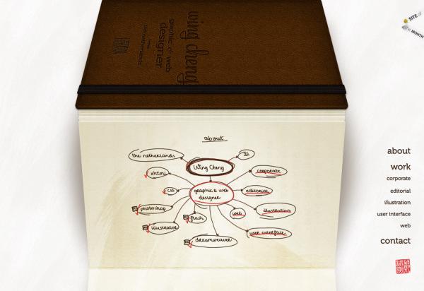
If Wing had incorporated the alternating page textures into the background of each portfolio item, the file size of each image would have been much larger, and the site would have taken too long to load. Instead, there were just two different paper textures—one angled in at the bottom and one angled out. These were applied as 24-bit PNG background images on the div elements that contained each portfolio item. If she wanted to add a new portfolio item, she only needed to shuffle the background images in the CSS, rather than having to recreate all the images for her entire portfolio.
In this example, the portfolio images were the content, and they were enhanced by the 3D paper backgrounds placed behind them.
Using Pure CSS to Enhance Images
Applying a background or overlay is a great way to give your content images a unique and unified look. Of course, not all CSS-based image effects involve extra images. CSS borders provide myriad possible effects. As you may already know, the standard CSS2 borders have three properties—width, style, and color—which are controlled individually via the border-width, border-style, and border-color properties, and by the shorthand border property. The border-width and border-color properties are fairly self-explanatory. border-width sets the thickness of the border using either a CSS measurement (such as 1px or 0.5em) or a keyword (one of thin, medium, or thick). The border-color property takes a hexadecimal color value.
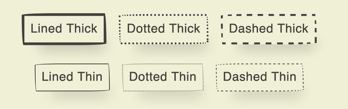
The border-style property is where the developers of CSS got their creativity on. We have eight visual styles to choose from: dotted, dashed, solid, double, groove, ridge, inset, and outset—in addition to the invisible values, none and hidden. You can see these standard styles on display below.

Each style is clearly distinguished and potentially useful. I use the word “potentially” because, depending on how they’re used, these borders can also be ugly. Just as good typography exists to complement text, a good border should complement the item it surrounds. Borders that are particularly large, or have a lot of color contrast, will distract viewers from the image you want to draw more attention to.
You can take full advantage of the ugly potential of these borders by specifying completely different borders for each side of a block. The ability to specify these values separately can be useful if you want a border on just one side of a block, or if you want to use different colors within the same border. But mixing different styles, colors, and thickness values around the same element or image usually only leads to trouble. As you can see from the scary monkey image below, this approach can produce some fairly horrific results (though I admit the toy itself doesn’t help matters).
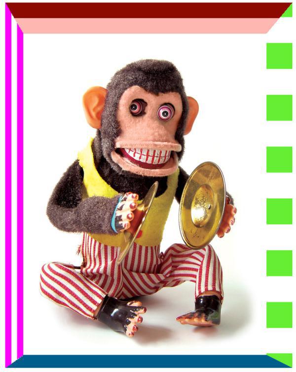
Here’s the CSS I used to create those scary borders:
img.uglybox {
  border-top: 20px groove #ff1100;
  border-right: 16px dotted #66ee33;
  border-bottom: 8px outset #00aaff;
  border-left: 12px double #ff00ff;
}
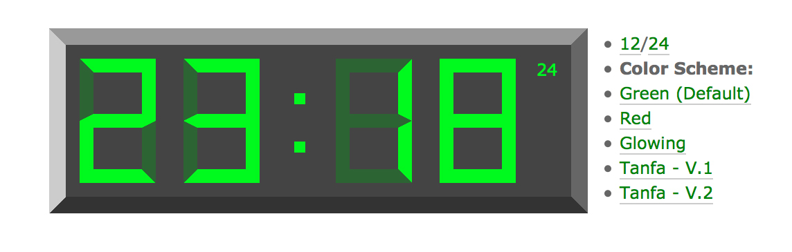
Thankfully, applying different CSS border properties to a single image doesn’t have to be scary. The awesome power of borders can be used just as well for good as they can for evil. One graphic edge effect designers often apply to images to add dimension is a subtle drop shadow, inset or groove. I mentioned in Chapter 3 that CSS3 could be used to create drop shadows, but sometimes the effect you’re going for is a little simpler and more subtle—like the one Claire Campbell employs on her site. In the figure below, you can see a real, working CSS digital clock. It was made by creatively manipulating CSS borders.
Breaking
Interestingly, if you’re clever, there are even ways to break the sometimes tedious sharpness of CSS borders.
Tiffany Rayside’s Imperfect Buttons use a fiendishly simple trick to create a range of what appear to be rough, hand-drawn CSS borders. There’s no JavaScript, images, or tricky SVG hacks. What’s the trick? There’s a good chance you know that giving border-radius a single pixel value (or percentage) will apply that value to all four corners of an HTML element:
border-radius: 5px;
It’s also fairly commonplace to provide four values that will be applied to each corner respectively—starting top left and going clockwise:
border-radius: 2px 6px 0px 13px;
Tiffany has taken advantage of the less known and used ability to set a different radius for each side of a corner. Tiffany’s eight border radius settings look like this:
border-radius: 255px 15px 225px 15px/15px 225px 15px 255px;
This is a great idea, and I’ve even seen examples using a handful of extra :nth-of-type() selectors to add a little more randomness to the mix.
It’s an exciting time for web design and development. The example above represents just a tiny sliver of the new styling options in CSS3. For a full breakdown of the border properties, I recommend checking out Estelle Weyl’s “Border Properties, Values, and Browser Support” guide. The main goal with all these display effects is to bring more attention to the images in our content, whether it’s done with creative overlays, simple border properties, or new CSS3 effects. The most important point to remember is that borders and effects should enhance the images they surround, not drown them out. Avoid adding effects that call more attention to themselves than to the image they’re highlighting.
The Project: Pulling the Design Together
So we have wireframes, a color palette, a pattern motif, and a solid typography system. It’s time to stitch those elements together.
The basic typography grid that I established in Chapter 4 provides a system for sizing components and setting margins and padding. This makes life easier in three ways:
- It helps keep visual consistency across the design.
- It simplifies decision-making. If a top margin of two units isn’t quite enough, it can really only be three.
- Text rows will often (but not always) align with the top and bottom edges of adjacent images and other components.

However, it’s very likely that some page components simply won’t fit perfectly into your grid. For instance, I have five square, parallel paintings and it just happens that squares of that width don’t fit perfectly into my horizontal grid. And that’s perfectly okay.

Sure, the text below shifts up a little, but the overall sense of harmony and balance isn’t broken by a handful of exceptions. The grid advises; it doesn’t demand.
Importing Existing HTML or CSS into Figma
While most design tools offer HTML/CSS export, often it can be useful to be able to import existing HTML/CSS into your design (such as the code we got from Gridlover). In my experience, Figma seems to offer the best HTML import options.
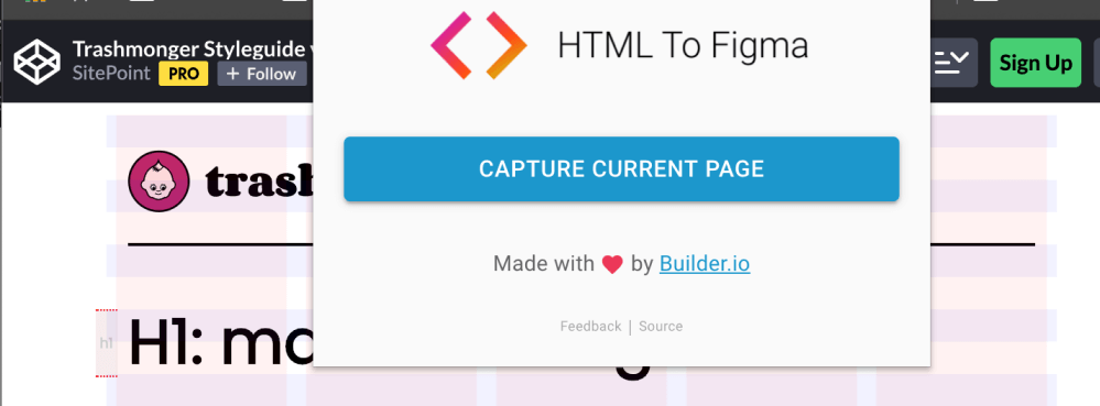
Builder.io have developed an excellent, free Figma plugin called “HTML to Figma”, which converts any URL into a Figma file. This can be paired with a Chrome Extension that even allows you to import HTML from your local system. I’ve had impressive results with this plugin. PNGs and JPEGs are converted to blank rectangles, but most typography, linework and color is faithfully rendered ready to work with.
Note that there’s also an equivalent HTML-to-Sketch project on GitHub, but I’ve had less success with it in my limited testing.
Pulling in the Pattern Motif
It’s time to integrate our pattern. I’m going to use it quite boldly at the edges of the hero section, as this will be cropped off on smaller screens. Further down, I’m going to use it as a patterned border ribbon on the dark panel sections. It’s providing a lot of visual bang for buck.

Complete: Trashmonger v1.0

Here’s the final design—although, in my experience, final designs are never that final. The five-column layout was fun to work with, even if it did make the mobile design more complicated. Overall, it’s a relatively easy layout to build, it should load quickly, and it should be a good vehicle for showing off the artwork. That’s a good starting place.
Onward and Upward
One of the most exciting aspects about designing for the Web is the sense of community and interaction that exists among web professionals. Whether it’s on blog comments, Twitter, Dribbble, SitePoint Community or even local tech meetups, there are always talented people who are willing to share their opinions, techniques, and expertise. The design community truly is an invaluable resource—but it can also become an unnecessary crutch. I’m always looking for new sources of inspiration, and because there are so many authoritative designers out there who offer their ideas and portfolios online, it would be easy for me to find all the inspiration I need from web design alone. In and of itself, that isn’t so bad, but if every web designer is getting their ideas from other web designers, eventually we’ll all end up with the same designs.
While the design principles and guidelines we’ve discussed throughout this book can help you make aesthetically pleasing and practical design decisions, they’re no substitute for character and originality. The most important resources you can bring to the design table are your own personality, experiences, and interests. These three resources should form the foundations of your design work. If every designer spent less time trying to emulate the latest design trends and more time defining their own style, the Web would be a much more interesting place. While I’d love to be able to tell you how to define your own style, I’m continually trying to learn what this is for myself. I wish you the best of luck in your future design endeavors, and hope you’ve found this book to be both helpful and encouraging as you kick off a career—or hobby—in web design.