Chapter 4: Typography
Let’s face it: the core purpose of all web design is communication. Whether we’re talking about an online retail store, a web presence for a Fortune 500 company, or a profile for a social networking site, typography is a vital component of your message. For most people, typography is simply about arranging a familiar set of shapes to make words, sentences, and paragraphs. But ironically, having the ability to set type with only a few mouse clicks or strokes on a keyboard has allowed us to forget about the creative and artistic possibilities of this medium.
There are numerous obstacles to the effective customization of typography for the Web—and I’ll address these in the coming pages—but the power of type should be motivation enough to push the proverbial envelope. Unconvinced? Pick up a magazine, turn on a television, or take a walk through a grocery store. You’ll undoubtedly see hundreds of creative and effective uses of type. It’s the substance of branding, the key to unspoken communication, and an essential piece of the web design pie.
This Topic May Be Addictive!
After studying typography for some time, you’ll never look at a billboard, brochure, or book the same way again. You might start snapping pictures of ride signage at theme parks rather than of your kids. Pondering whether the entrées in a restaurant menu are set in Cantoria or Meyer Two may become more interesting than choosing between the entrées themselves. The study of typography is one that draws many people in … and never lets them go! Consider yourself warned.
In order to unlock the potential of type, we must first understand it. Admittedly, this is no easy task. The minute details of letterforms and the spaces around them have been carefully calculated over centuries of investigation and practice. In the early days of print, every letter of every typeface had to be carved into wood or cast from lead, inked, and then pressed into paper. This was a professional craft requiring exacting attention to detail. Even though the physical craft has long been surpassed by modern printing methods, many colleges and universities offer classes in letterpress, so that future graphic designers can both appreciate the benefits of working with type on a computer and see the potential for typographic exploration.
My personal love of typography is twofold. As a designer, I enjoy working with type for the artistic aspects of it. I like the unique voices that different fonts provide, and the expressiveness of type like the example below After all, the root words that comprise typography are typos , meaning impression or mark, and grapheia, meaning writing. Typography literally means making impressions with writing. As a programmer, I also appreciate the puzzle-like problem solving that working with type involves. The choices of font and color are only the tip of the type iceberg. In fact, the majority of the decisions that need to be made in our work with type involve the space around the letterforms and text blocks, rather than the actual type itself. Nevertheless, choosing an appropriate typeface is a crucial step.

The history and implementation of type is a topic that’s filled hundreds of books. In this chapter, though, I’ll merely provide a brief introduction to the world of typography. First, I’ll cover some of the issues with—and solutions for—taking type to the Web. Then we’ll examine some basic typeface terminology, explore some usage guidelines, and investigate the characteristics of different fonts. From our discussion of legibility concerns, to the question of using dynamic headings online, I hope you’ll find this chapter to be practical and inspirational.
If you like what you see here, and would like to explore the rabbit hole a little deeper, here are a few web resources I highly recommend:
- The Elements of Typographic Style Applied to the Web
- Practical Typography
- Typewolf
- I Love Typography
- Typographica
Taking Type to the Web
When it comes to the Web and choosing fonts for text that will be displayed in a browser, it doesn’t matter if you have five or 5,000 fonts installed: you have to think in terms of the lowest common denominator.
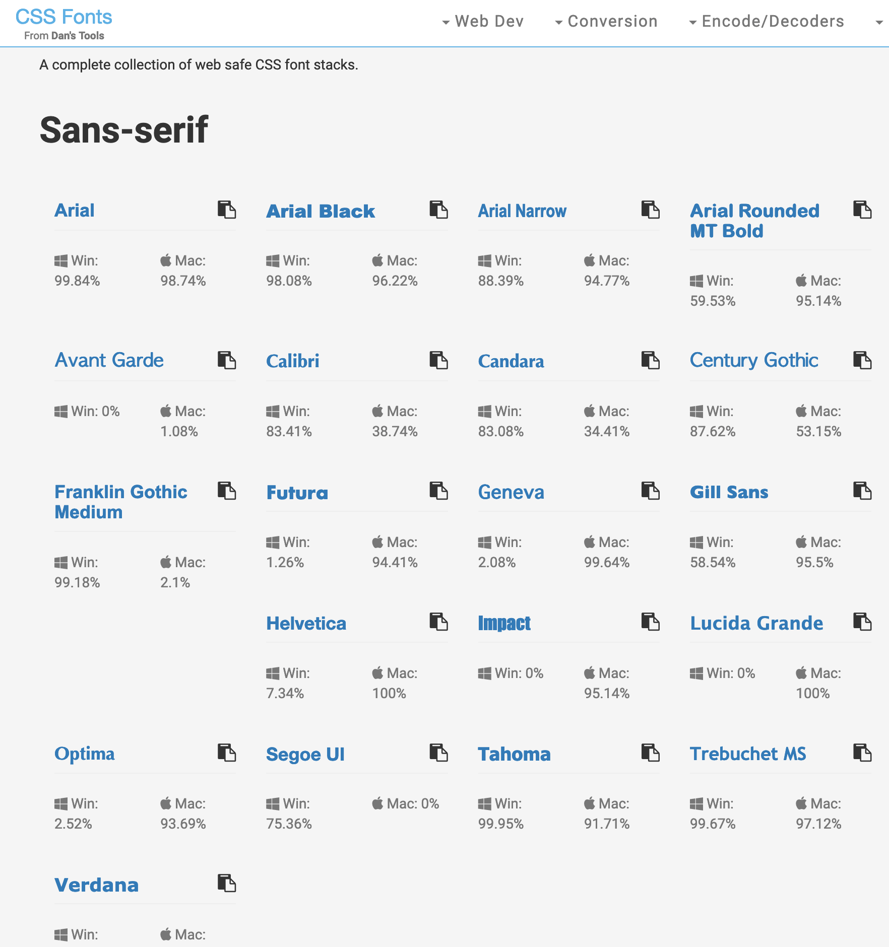
The number of font families that are supported, by default, across both Mac or PC is very small. This list of nine font families below is commonly known as web safe fonts.

The downside to the safe list is that there’s limited variety within each font category. If you need a standard sans-serif font, you have to choose between Arial, Trebuchet MS, and Verdana. (If you’re not sure what “sans-serif” means, jump ahead to the section called “Typeface Distinctions” for an in-depth look at the different categories of fonts.) For someone who hasn’t been exposed to many fonts, that may seem like a reasonable variety, but for those of us who know the nuances of other sans-serif fonts like Helvetica Neue, Futura, and Univers, using one of the safe fonts can be like using a screwdriver to drive in a nail.
Fortunately, the font-family property of CSS allows you to choose multiple fonts in order of preference. This is referred to as a font stack. If the first font is unavailable, the second font will be used; if the second font is absent, the third font will be used; and so on. Let’s say you want your section headlines to have a serif font. You think the best font for the job is Calisto MT, so you specify that first—for the few people who have it installed. Your second choice is your first backup plan, and for this you choose Georgia. If users don’t have Calisto MT installed, they’ll see Georgia. Even though Georgia is on the safe list, some people may not have it installed. Times New Roman is a close equivalent, so you decide you might as well add it as your next alternative. To finish off the preferential list, to cater to users who don’t have any of those fonts installed, you add what the W3C calls a generic font family. The generic font families are serif, sans-serif, cursive (similar to script or hand lettering), fantasy (or novelty), and monospace. All your font choices so far have been from the serif family, so that’s the generic family you specify. In summary, your font stack would look like this:
.class {
  font-family: 'Calisto MT', Georgia, 'Times New Roman', serif;
}
Font Names with Spaces
Any font family names that include spaces should be quoted, either using single (') or double (") quotes (see the quotes around Callisto MT and Times New Roman in the code above). This is long-standing best practice, so even though it’s not strictly necessary (see Mathias Bynens on this topic), it’s best to stick with it, just to be safe.
The key to creating an effective font stack is knowing which fonts are most similar and, more importantly, which ones are installed by default in each operating system. CSSFontStack.com (below) helps you make decisions by providing useful data on the current state of the world’s typographic ecosystem.
Self-hosted Web Fonts
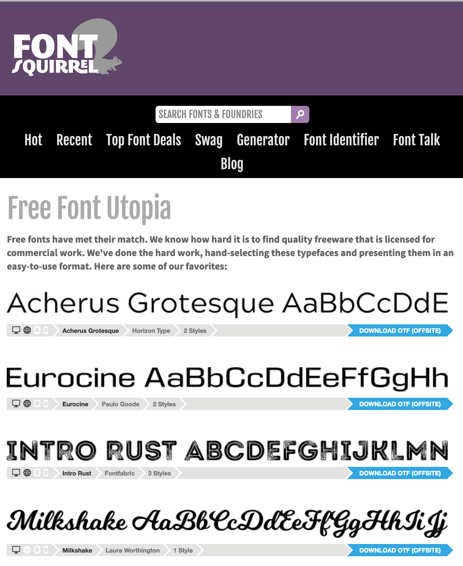
Because the Web requires fonts to be presented in a special format that’s different from your computer’s font formats (a discussion for a different book), you can’t just upload a TTF file from your computer to your web server and link it in your stylesheet. What’s more, doing so would most likely violate your End User Licensing Agreement (EULA) with the font’s foundry. If you want to host your own fonts, they’ll have to be licensed for web embedding. You’ll also need several different font formats, and you’ll need the latest code for embedding all those formats. That’s where Font Squirrel (shown below) comes to the rescue. On this very useful site, you’ll find hundreds of excellent free fonts, downloadable kits for embedding those fonts into your sites, and a generator that can convert your own font files into all the required web formats.
If you’re unable to find what you’re looking for in Font Squirrel’s collection of free fonts, visit their sister site, Fontspring. Here you can purchase commercial fonts from actual font foundries who allow @font-face embedding, many of which offer an unlimited domains license for a small surcharge.
Web Font Services
If you’d rather not bother with all the font files and ever-evolving code for embedding them, there are several services that host the fonts and keep up with the embedding nuances for you. With each of these services, you simply pick a font, grab a snippet of code to drop into your site, and voilà!—your type is displayed in that font.
Let’s look at a few of the better-known ones.
-
As with many of their services, Google have slowly but surely become the default choice for hosted web fonts. They have an easy-to-use UI, a monster CDN backbone, and are currently closing in on 1,000 font families on offer. They also don’t rely on the service to pay the bills, so unless they get bored, Google Fonts is probably your safest long-term option.
-
Typekit was the original hosted font solution, developed by Jeffrey Veen and Jason Santa Maria and now owned and operated by Adobe. The service has built strong relationships with a number of leading type foundries, giving it a selection of high-quality, distinctive type products. Typekit offers a free trial library for a single site. Otherwise, their pricing is based on a yearly subscription that varies based on page views per month.
-
Hoefler & Co. is a New York type foundry founded and run by rock star type designer Jonathan Hoefler. They offer an exclusive selection of original typefaces via a yearly subscription service, either via their cloud service or a “host-your-own” option.
-
Brick offers a small but well-curated collection of quality free fonts ready to be linked from your site or web app. According to their site, they count Runkeeper, Buffer and Playlist as clients, so that gives me some confidence in their staying power.
-
Font Library is always worth a look. You’ll definitely find a lot of fonts you won’t find elsewhere. The quality of the individual fonts varies more than some of the services listed above, but you may find just the font you need.
Now, you may be wondering if font-hosting services like Google Fonts have made CSS font stacks redundant. Well, not at all. The reality is that externally hosted fonts fail. Technology has a habit of glitching. Sometimes the files get withdrawn or moved or blocked by a proxy or bandwidth restrictions. By all means choose attractive, interesting typography—but also think carefully about your fallbacks when things inevitably go wrong.
Anatomy of a Letterform
Some of the design classes I took in college delved fairly deeply into the anatomy and terminology of type. Many people can already identify serifs, ascenders and descenders, but for one class, we had about 100 terms to memorize. While I’ll be nicer here, it’s important that you know some basic terminology before we continue learning about type. Sure, I could just talk about type using informal words like “squiggles”, “slants”, and “thingies” to describe letterforms, but that could grow confusing rather quickly.
The figure below represents an example of each component of a typeface. We’ll go over them in turn below.
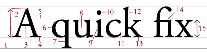
Baseline
The baseline is the imaginary horizontal line on which most characters sit. The only character that hangs below the baseline above is the lowercase “q”.
Cap height
The cap height or capline is another imaginary line. This one marks the height of all capital letters in a typeface. Notice that the cap height is below the maximum height of the typeface.
Crossbar
A stroke that connects two lines in the capital letterforms of “A” and “H” is called a crossbar. A horizontal stroke that doesn’t connect two lines, like the one in the lower case “f” or “t”, is known as a cross stroke.
Serif
Serif is the name given to the finishing strokes at the bottoms and tops of certain typefaces. I’ll talk more about serifs when we cover typeface distinctions.
Mean line
Another imaginary horizontal line that marks the top edge of the lowercase letters is the mean line (or midline). Despite what its name might imply, the mean line isn’t always exactly centered between the baseline and the cap height.
Bowl
The bowl of a letter is the rounded curve that encloses negative space in a letterform. Examples of bowls can be seen in the letters “D”, “o”, and “g”.
Descender
The lower portion of a lowercase letter (such as “g”, “j”, “p”, “q”, and “y”) that extends below the baseline of a typeface is known as the descender. The only other characters that typically extend below the baseline are the old-style numerals in some typefaces. These types of numerals—examples of which can be seen in the Georgia typeface below—were thought to blend better with lowercase roman numerals. They also look particularly good when used within a body of text.

Counter
The negative space within a letter is called the counter. In some letters, like “A”, “o”, and “P”, the counter is fully enclosed. The non-closed negative spaces in letters like “G”, “u”, and “c” are also known as counters.
Stem
A stem is the main vertical or diagonal stroke in a letterform. These include the vertical portions of the letters “I” and “H”, as well as all the strokes in the letter “W”.
Tittle
This is probably my favorite typeface term. Tittle is the name given to the dot above the lowercase “j” and “i”.
Terminal
The end of a stem or stroke that has no serif is known as a terminal. Even the ends of some serif typefaces have terminals, as you can see in the letter “c” above.
Ascender
Some lowercase letters have an ascender, which is an extension that rises above the mean line. Those letters are “b”, “d”, “f”, “h”, “k”, “l”, and “t”.
Leg
The lower angled strokes seen in the letters “K”, “R”, and “Q” are known as legs. These are also sometimes referred to as tails.
Ligature
You may have noticed that the “f” and “i” of the word “fix” are combined into a single character. This joining of characters is known as a ligature. Most ligatures fall into one of two categories. The majority solve a recurring spacing problem between two characters. More recently, coding font designers have used ligatures to substitute common multi-character sequences (such as
-->or<=) with their single-character mathematical symbols, as the image below illustrates.
x-height
Simply put, x-height is the vertical space occupied by the lowercase “x” in a given typeface. More accurately, it’s the distance between the baseline and mean line that defines the body of lowercase letterforms—excluding ascenders and descenders. X-height is a key factor in typeface identification, and typefaces with larger x-heights are generally regarded as being more readable. Although it’s impractical, you can actually use x-height (
ex) as a relative unit of measurement in CSS.
Text Spacing
Now that you know how to describe the parts of a letterform, the next step is to be able to define and adjust the space between letters. I mentioned before that many typographic decisions are based on spacing. This has always been true with printed type, and became applicable to web type with the advent of CSS. Regardless of whether we’re talking about using type for print or for the Web, there are two directions in which we can control spacing: horizontally and vertically.
Horizontal Spacing
Kerning and tracking are two terms you’ll often hear in conversations about horizontal letter spacing. Kerning is the process of adjusting the space between individual letters. Often when you’re working with type, you’ll notice pairs of letters that appear too close together, or too far apart.
Most fonts have a set of rules that determine the spacing between specific characters. The kerning between the letters “Wa”, for instance, should be—and is—much tighter than the kerning between the letters “WV”. Most of the time, the rules for the font are sufficient to make the text readable. Otherwise, you can adjust the individual letter pairs within your image creation software of choice. The image below shows examples of text with no kerning applied, automatic kerning, and manually adjusted kerning.

For the text in a web page, it’s impossible to make letter-by-letter kerning adjustments. What you can do is adjust the letter-spacing CSS property, which is known in the print world as adjusting the font’s “tracking”. Like kerning, tracking adjusts the horizontal spacing between letterforms, but applies to the space between each letter. If you want your text to have a more open, airy feel, try adding a bit of letter spacing as I’ve done below.
Another horizontal spacing option in CSS is provided by the word-spacing property. This property can take a positive or negative length, or the keyword normal. As you might expect, it affects the amount of whitespace between words.
Vertical Spacing
In print design language, the vertical space between lines of text is known as leading (pronounced “led-ing”). This term comes from the early days of letterpress, when blank strips of lead were used to separate lines of metal type. When there were no added spacers, the lines were said to be set “solid”. Text with added vertical space is much easier to read. As you can see in the first paragraph below, the default spacing between lines of text is too small. Ideally, you want the line height on your body copy to be about one-and-a-half times the size of your text. So if you have 12px text, 18px is a good, readable line height.
In the second paragraph, we’ve adjusted the CSS line-height property to 1.5em. An em is a CSS unit that measures the size of a font from the top of its cap height to the bottom of its lowest descender. Originally, the em was equal to the width of the capital letter M, which is where its name came from.

Text Alignment
Have you ever noticed that the text you see in books and magazines is often aligned along both the left- and right-hand sides of the page or column? This type of text alignment is known as justification. When text is justified, the letter and word spacing is automatically adjusted so that each full line of text has a word or letter that lines up against the left and right edges of the text area. Many print designers will use justified text for any text block that’s over two lines long and is wide enough. You can take this same text treatment to the Web with CSS by setting the text-alignment property to justify. Before you go and justify the whole Internet, though, let me give you two warnings about justified text.
A river runs through it.
Occasionally, a gap created by wider spacing in one justified row will line up with a gap in the next row, and the next, and the next … and you end up with a canyon or river in your type, as shown below. This can be distracting for the reader. Print designers can makes adjustments to fix this sort of problem, but on the Web, it’s difficult to predict and impossible to fix.
What. Are. You. Saying?
The river problem is even more pronounced with narrow columns. Words will often be isolated against the left and right margin, or stretched over the entire width of the column. Most word-processing programs fix this problem by hyphenating words where necessary. Browsers are unable to do this kind of auto-hyphenation, so web designers should avoid using justified text in narrow spaces.

If you don’t want to change the text-alignment of your text to justify, your other options are left, right, or center. When text is centered or aligned along the left or right edge of the page or column, the spacing between the characters and words remains constant. The river problem can occur with any text block, but it’s much less likely to cause legibility issues in text that’s centered or justified on one side only.
Typeface Distinctions
Everybody knows what a font is. It’s a set of letters (or characters) that appear in a certain style. Fonts come pre-installed on your computer. And you change the font when you want your text to look different. The average Windows PC has just over 40 fonts installed by default, while the average Mac user has access to around 100 fonts. Many of these fonts are grouped together into font families, with each font within the family representing a different variation of the core font. Most font families include the regular font face, along with italic, bold, and bold italic variants. Some fonts have no variations at all, some may only have bold or italic, and some commercially available font families have hundreds of variants.
Font? Typeface? What’s the difference?
A family of fonts is called a typeface. For example, Times New Roman is a typeface. It’s a collection of fonts, including Times New Roman Regular, Times New Roman Italic, Times New Roman Bold, and so on. Some typefaces include a vast array of fonts. If you’re choosing a typeface for the Web (or for print), make sure it includes the font variations you require. Some beautiful typefaces don’t include any variations for bold or italic text, for example, meaning you’ll get disappointing results if you need bold or italic text.
Just as all the members of some families have big ears or abnormally long pinkie toes, every font family has its own unique, identifiable characteristics. Take a look at the variation that exists between fonts for the letter “g” below.
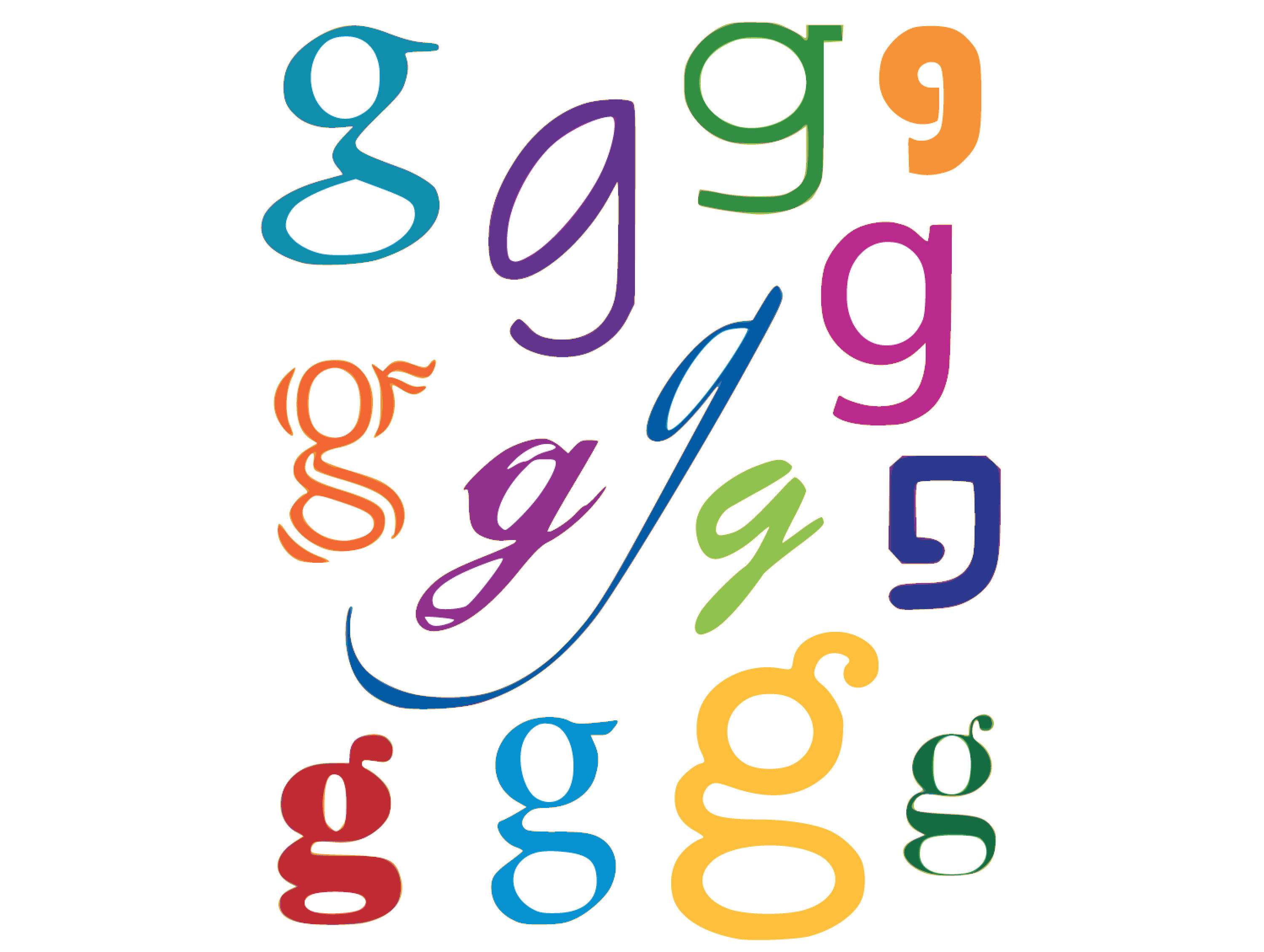
These characteristics are what help us to categorize fonts and font families. The majority of font families can be classified as either serif or sans-serif. Of the 14 different fonts represented in the image below, seven could be classified as serif and seven as sans-serif. Can you distinguish between them? Beyond this distinction, there are many other ways in which we can classify and group fonts. I prefer to group fonts into six simple categories: serif, sans-serif, handwritten, monospace, novelty, and dingbats. Let’s look at each of them now.
Serif Fonts
Historians believe that the serif has its origin in Roman stone carving. There is much debate over the original purpose of these ornamental strokes, but in more recent history, they’ve been proven to increase legibility in large blocks of text by providing a horizontal line of reference. When many of us think of a serif font, Times New Roman is often the first one that comes to mind. However, there’s a great variety of serif fonts on offer. To help us choose one, it’s a good idea to first decide what type of voice we want our text to have.

Take a look at the Palatino text above. Palatino is an old-style serif font. Old-style serif fonts are adapted from the brushstrokes of Italian scribes, and can be recognized both by the smooth transitions between thick and thin strokes, and by their rounded serif edges. Old-style serif fonts exude historic, handcrafted charm. At the same time, fonts like Garamond are extremely versatile: they’re not so old-fashioned that they’re unusable in modern applications.
The second font pictured above is Baskerville, a transitional serif font. The curved angle that connects the terminal of the stroke to the serif is known as a bracket. The brackets of transitional serif fonts are rounded, but the edges of the serifs are squared off. The simple addition of 90-degree angles and perfectly straight lines gives this category of font a more modern and mechanical voice. This category of serif fonts is known as transitional, because it provides a transition between old-style and modern serif fonts.
The third font, Bodoni, is known as a modern serif font. Modern serif fonts use a more pronounced contrast between the thick and thin strokes, and their serifs are often completely unbracketed. Modern serif fonts were introduced during the Industrial Revolution as a radical alternative to the transitional serif style.
Ironically, today these fonts have a much stronger association with a timeless elegance and sophistication than the cutting-edge modernity of their birth. Because of the delicacy of their lightest linework, modern serif fonts are generally only suitable for use in headlines. The consistent use of Italian Didot and Playfair Display in Vogue magazine, shown below, helped to establish both the font and the magazine as icons of style. Other famous magazines that use modern serif font faces for their mastheads include Brides, W, Elle, Parents, Seventeen, and Harper’s Bazaar. They’re fairly uncommon in web design, but are certainly a classy choice if high style is what you’re aiming for.

In the later part of the 1800s, as advertising, posters, and flyers became more common, a bolder variation of modern serif fonts was needed to catch people’s attention. It was at this time that slab serif fonts were first introduced. You can see an example of Roboto Slab above. Slab serif faces like Rockwell and Bodoni Egyptian have an industrial but friendly voice that’s far less snooty than modern serifs, and even more contemporary. Because most slab serifs were designed to be readable from a distance, they make for excellent headlines and have had bouts of popularity on the Web. The image below shows an example of slab serifs in action. Harewood Estate’s choice of Bodoni Egyptian Pro gives a nod to the tradition of a grand English estate house without appearing stern or unwelcoming—an unconventional but clever choice.

Sans-serif Fonts
Sans-serif fonts are fonts with no serifs at all. When typographers began experimenting with slab serifs, the idea of eliminating the serif altogether seemed like a huge mistake. Serifs were a tradition, so removing them was typographic castration. The initial sans-serif fonts were so loathed in the 1800s that they were referred to as grotesque. Eventually, though, people began to warm to the idea of serif-less typefaces, and by the 1920s some speculated that the serif would soon be eliminated.
Although serif fonts are still used extensively, the popularity and versatility of the sans-serif font category continues to grow. These types of fonts have a cleaner and more contemporary feel. They stand out as headlines, especially when paired with body text that’s set in a serif face. This has long been a standard practice in print design, and is a tip I was taught in college for creating contrast between headlines and body copy.
On the Web, though, the roles have been reversed for a very long time. This is mainly due to the one-two punch of lower-resolution display hardware combined with poor text hinting and rendering in older operating systems. Because of the stroke variation and minute detail of serif fonts, they can become almost unreadable at small sizes on lower-resolution displays. As the pixel density of displays has increased and older computers die off, we’ve been freer to choose whether to serif or not to serif. The image below shows how Kubrick.life pays tribute to the great film director’s eye for dramatic shape and contrast by using Acumin Pro’s broad sans-serif letterforms as a mask.

Regardless of how they’re used, sans-serif fonts are extremely legible and practical for almost any purpose. The most ubiquitous sans-serif fonts on the Web are Arial and Verdana. Each of these font families exists in the default font sets of both major operating systems, and, as a result, they’re predictably the workhorses of web body copy. In the design world, these families have a reputation for being overused and generic (and in the design community, Arial has the added stigma of being widely considered the poor cousin of Helvetica). Sometimes a stronger serif font, or a more distinguished sans-serif font, will do the trick, but there are certainly many more options available outside these two categories.
Handwritten Fonts
Before the invention of movable type systems, all text had to be carved, brushed, or written by hand. The downside to handwritten text—especially my own—is that achieving a uniformity of letterforms, alignment, and spacing can be frustrating. And, as a result of these challenges, handwritten text can be very difficult to read. Yet the wonderful aspect about handwriting is that it acts as a symbol of humanity, giving a tangible personality to the text it represents.
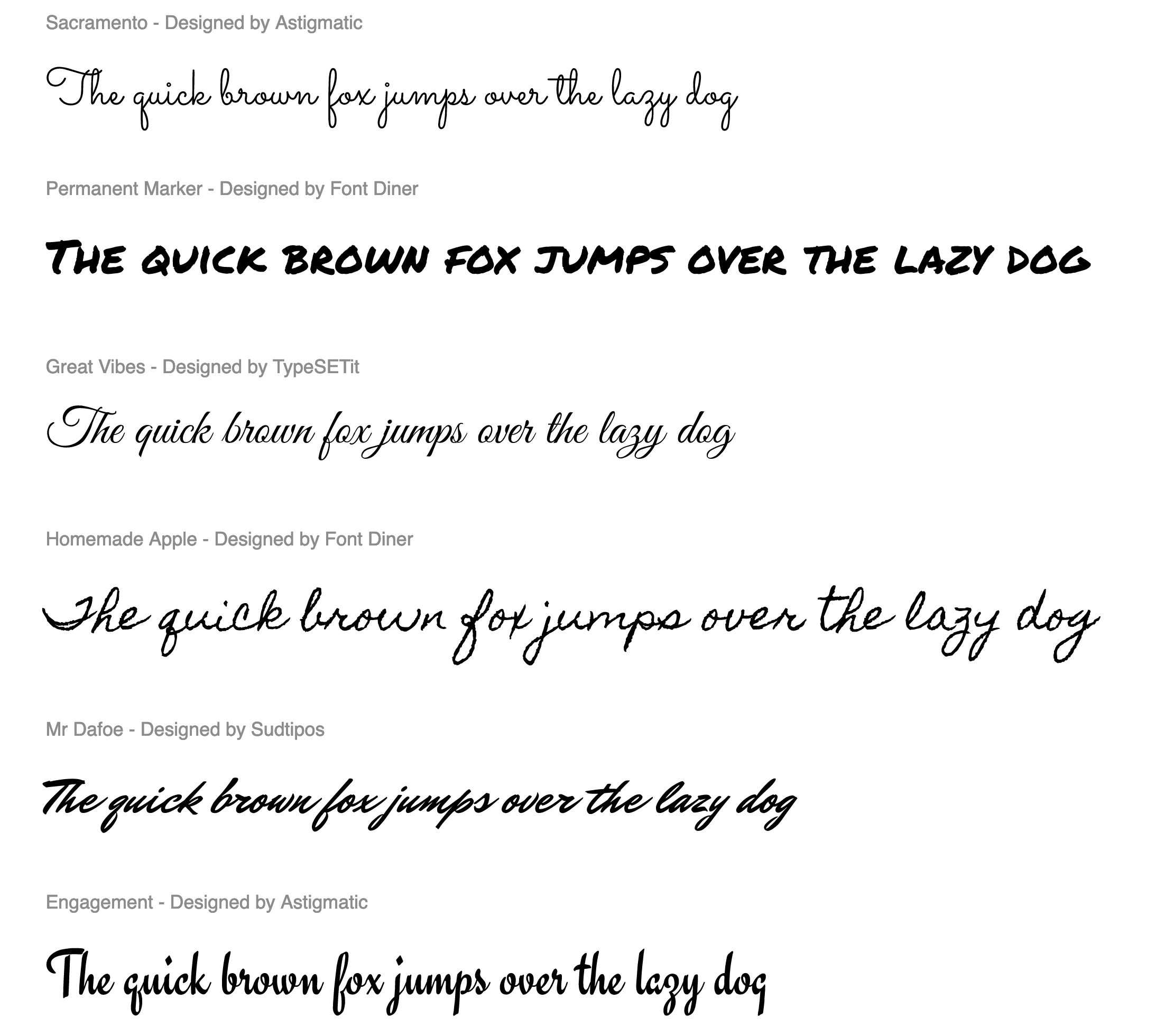
Handwritten fonts provide a personal touch without the human error factor. The lettering and alignment in a handwritten font will be consistent, and if the font is well designed, the spacing should be good, too. As you look around at handwritten fonts on the Web, you’ll probably start to think that anyone and their cousin’s dog could create one, and it’s true.
Unlike serif and sans-serif faces that require practice and precision, handwritten fonts are all about personality. If you want to create a font from your own handwriting, there are plenty of tools and services out there. One of the simplest sites for this is Calligraphr. You simply print out a template, inscribe your glyphs on the grid, photograph it, upload it, and then download an OpenType format font file.
Calligraphr even supports OpenType Contextual Alternates, a feature that allows you to design and mix in multiple variations of any letterform. This is particularly useful for common double-letter combinations like “ee”, “oo”, “nn”, “ss”, “ll”, and “tt”. When supported and enabled in Sketch, Figma, InDesign, Photoshop, Illustrator, Affinity Photo, and even MS Word, this feature will guarantee repeating letters are never identical.

In the image above, we see that Spanish recruitment agency Humann have created their own impressive, hand-scrawled “Humann” font to give their company voice an unpolished but relatable tone. As effective as it is, contextual alternatives might have been especially useful here with such a raw, irregular typeface—and the continual occurrence of a double “n” in their company name (Humann).
Fixed-width Fonts
You may have noticed by now that, in most fonts, each letter takes up a different amount of space. For instance, the capital “W” takes up a large area, while the letter “l” has a very narrow footprint. To illustrate this point in plain text, take a guess which of the sentences in the image below has more characters.

That was a trick question; they actually have the same number of characters! So why does the first sentence appear so much longer than the second? The explanation for this phenomenon is that the majority of fonts are proportionately spaced. Associated with each character of each font are rules that determine not only the width of the character, but also the amount of space that will appear around each character. Take a look at those two sentences again, this time displayed in the Courier font.

The reason the two sentences appear to be the same width now is that Courier is a fixed-width or monospaced font. This category of fonts has uniform spacing, and the letterforms are designed so that they’re similar in width. Fixed-width fonts were initially designed around the technical limitations of typewriters. Since early typewriters were incapable of moving the typed page a different distance when a “w” was typed, rather than an “i,” specialized fonts were developed for these devices. These fonts had to remain readable, despite the spacing being the same for every letter. Early computer displays employed fixed-width fonts as well, but it was only a short time before computers were able to display much more legible, variable-width (or proportional) fonts.
So why are fixed-width fonts still around today? Mainly for the sanity of coders and accountants. When you need to write code or display data as text, it’s helpful when characters line up from row to row and column to column. Because you’re reading this book, you’re probably already familiar with fixed-width fonts from writing HTML and CSS. Code-focussed sites such as GitHub and Codepen.io make great use of these monospaced faces in their code panels.
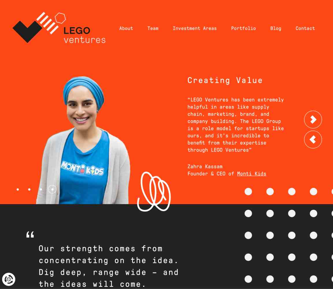
However, monospaced fonts aren’t only a utilitarian choice. The monospaced GT Pressura Mono lettering on LegoVentures.com (below) stacks together like little bricks—an elegant design nod to the product that inspires the site.
Fixed-width Fonts and the HTML pre Element
In web browsers, text within <pre> … </pre> tags is displayed in fixed-width fonts by default (although you can change this via CSS if you wish). A handy way to display text in a fixed-width font is to wrap it with pre tags. pre is short for preformatted text, and the pre element preserves tabs, spaces, and line breaks.
The pre element is really useful for displaying code or tabular data on a website, because it preserves line breaks, tabs and spaces that are common in that kind of data. You can simply copy your original code or tabular data and paste it into your web page inside pre tags.
However, there’s one gotcha. If your code includes tags like <div>, <p> and so on, you can’t just paste them in with the rest of your code, because the browser will still render them as an actual element, rather than just displaying them as code. You’ll need to replace any < characters with <, the character code equivalent, and > characters with >.
As with every other HTML element, pre elements can be styled with CSS. Apart from choosing the font to display in the pre element, web developers often give the pre a border, a background color or texture, additional margins, and various text treatments to help it stand out.
Novelty Fonts
Novelty fonts, which are also known as display, decorative, or fantasy fonts, represent the vast majority of free fonts available online. Some of the fonts in this category are modified versions of popular serif or sans-serif fonts, and some are completely off-the-wall ideas that would be better described as conceptual art than a font face. By their very nature, these fonts are less legible than their traditional counterparts, but when used sparingly, they can add a wealth of personality and flair to a design. A few examples of novelty fonts are shown below.

Often, novelty fonts are good starting points for a logo design or your site’s main pitch text. Cyber-Duck’s “How GDPR stole Christmas” manages to channel some serious Dr. Suess vibes by using this wonderfully Grinchy typeface.

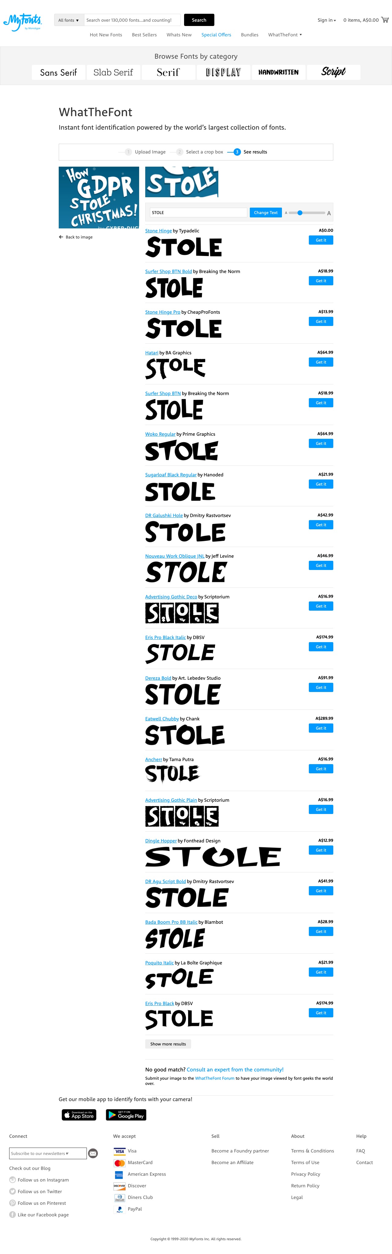
While I do know a thing or two about typefaces, I’m hardly a font-recognizing machine. Usually, if I come across an interesting string of text in an unfamiliar font, the first thing I think is WTF! I am, of course, referring to MyFont’s excellent WhatTheFont automatic font identification system. All you have to do is crop and clean up a text sample, upload it to WTF, and it will search for character matches in its database. The image below shows some of the matches for the “How GDPR stole Christmas” text above. WTF really is an invaluable tool, and if it fails to recognize your text, the site has a forum of “nerdy font detectives” who love to solve typographic puzzles.
As with all design choices, before you use a novelty font, you should think about your client’s requirements and target audience. Most clients will already have some form of branding in place, and choosing a bizarre or offbeat novelty font may tarnish the company’s image. Even so, it’s best to keep an open mind when you’re coming up with themes for a website design. It may be that the company you’re working with wants to stray from its corporate image.
Dingbat Fonts
When you’re looking for illustrations and artwork to incorporate into the design of a website, you should consider “dingbat” or “symbol” fonts. In the early days of print, dingbats were ornamental characters used to separate printed text and fill whitespace. Original dingbat fonts consisted mainly of flourishes and commonly used symbols. However, the concept of dingbat fonts changed radically with the digital font revolution. Now, any series of graphics can be assigned as characters in a dingbat font.
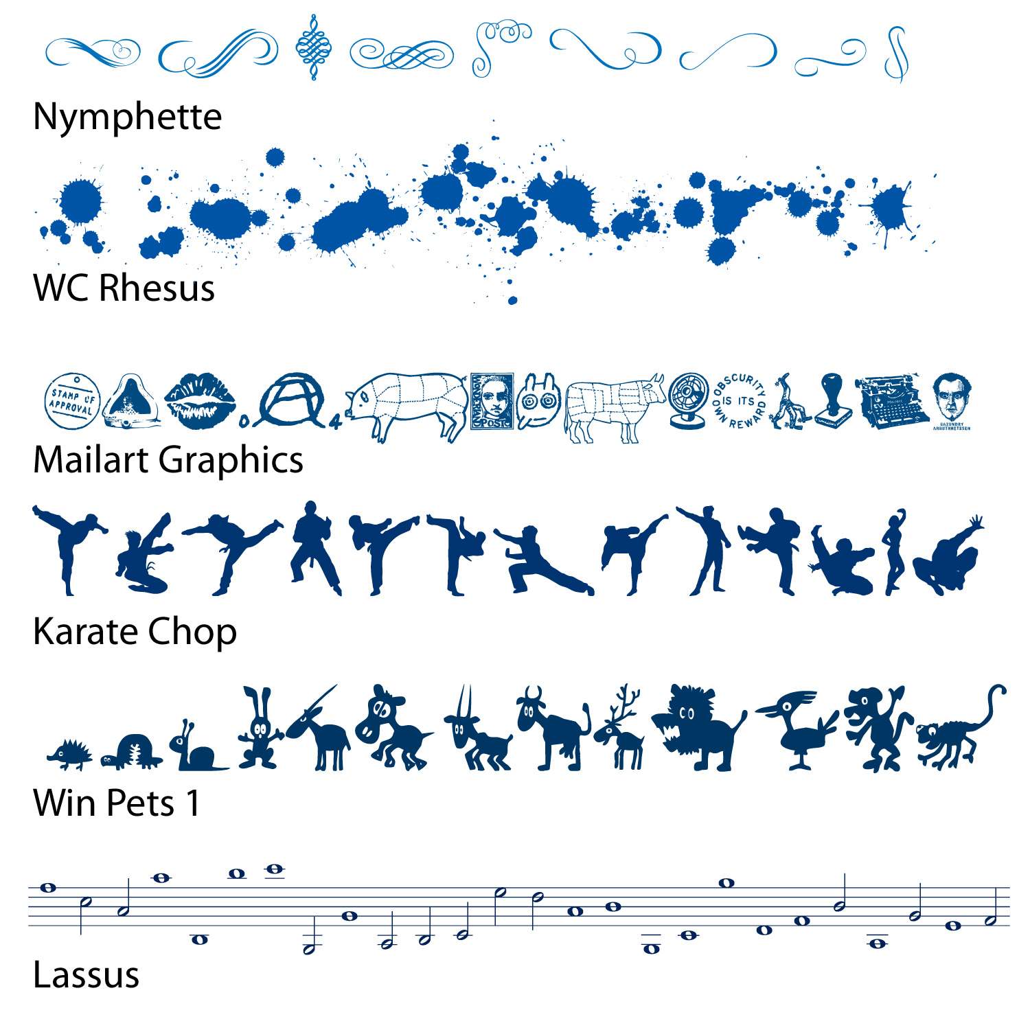
While these fonts may not be of much use from a typesetting perspective, they can be useful as supportive vector graphics and icons. Since fonts consist of scalable vector shapes, dingbat glyphs can be converted to outlines in Photoshop or Illustrator, and then resized, dismantled, and manipulated without any loss of quality. The only issue when using these fonts is that you have to know where to find the glyph you’re after. Occasionally, I’ll remember an arrow or symbol from a dingbat font, and type out half the alphabet before I find the one I want. Fortunately, though, most dingbat fonts have a theme, so it’s easy to remember which font the glyph is in, even if the specific character is hard to find.
When people think about dingbats, the first sets that come to mind are Wingdings and Webdings, the dingbat fonts that come pre-installed in Windows. There are actually hundreds of other dingbat fonts available on the Web. A few examples are given below.
Finding Fonts
Although I’ve mentioned that you can find fonts on the Web a few times now, I’ve yet to really give you any places to look for them. If you start googling for fonts, you’ll probably discover that there are three main categories of font sites out there: free font galleries, commercial font galleries, and sites for individual artists and foundries. All are great sources of fonts to add to your typographic tool belt.
Desktop Fonts vs Fonts for the Web
Before we proceed, just a reminder. As noted earlier, font files need to be available in specific formats to work reliably on the Web. If you’re buying a font for use on the Web, make sure it’s available in a web-friendly format. Often you’ll see the webfont version of a typeface offered separately from the desktop version, so make sure you’re choosing the version you really want!
Free Font Galleries
These websites list and categorize free fonts from many designers. Some of the designers listed on these galleries have their own websites, through which they sell other fonts that they’ve designed. If you enjoy the fonts created by particular designers, be sure to track down the rest of their work. Remember that there are lots of really ugly free fonts out there, and while many websites claim to offer free fonts, you often have to wade through loads of annoying ads to download them. Also, if you plan to embed a font (even a free one) into your site using @font-face, be sure that the font’s license allows it. With that said, here are a few great resources for free fonts:
Commercial Font Galleries
Like the free and shareware galleries mentioned above, these websites promote fonts from many different designers and foundries. But unlike those galleries, most of the fonts here cost money. In most cases, though, you really get what you pay for with typography. If you license a font from one of these sites, as well as gaining a complete set of characters, the purchased fonts often include bold, italic, oblique, and other variants.
Individual Artists and Foundries
Many of my favorite contemporary fonts come from a handful of individual artists and companies. Most of these websites have a few free fonts, as well as offering fonts for sale:
- Schick-toikka. This foundry offers beautiful, supremely useful, versatile fonts. I have a particular love for Noe.
- Jos Buivenga’s Exljbris.com Font Foundry. Jos is the creator of such popular typefaces as Museo, Anivers, and Diavlo.
- Letterhead Fonts. This little foundry has over 200 high-quality, unique fonts with an early 20th century theme.
- Blue Vinyl Fonts, by Jess Latham. Like many font designers, Jess started designing fonts as a hobby. His freeware and commercial fonts have a unique style and an emphasis on script styles.
- Fountain Type, by Peter Bruhn. Fountain features some of the best fonts from about 20-odd designers around the world. The site also provides attractive freeware fonts.
- Typodermic Fonts, by Ray Larabie. Ray has been a rock star in the free fonts world for a long time. His work is known for having high-quality character sets across a vast range of typographic styles.
- Misprinted Type, by Eduardo Recife. Eduardo offers a tasty range of fonts with a particular penchant for theatrical pen scripts, distressed blockfaces and three-ring circus ornamental faces. His work is unmistakably unique, if a little twisted.
- Pizzadude, by Jakob Fischer. Jakob makes fun, loose, irreverent typefaces and has cranked out over 500 handmade fonts since 1998.
Choosing the Right Fonts
Even if you understand all the technical aspects of letterforms and typeface categories, and have access to all the fonts in the world, you can still have difficulty choosing the right ones. That’s because font selection is based just as heavily on artistic license and emotional association as it is on technical issues. So, where do you begin?
In order to start your quest for the perfect font, you should first define the feelings you’re trying to evoke in your target audience. Are you trying to show that the company the website represents is hip and young, or would you rather portray an aura of steadfast wisdom? Do you want to create a site based on a certain theme, like a Hawaiian luau or a Mexican fiesta, or are you trying to convey a more formal identity? By asking yourself these kinds of questions, and thinking about fonts on an emotional level, you should be able to decide reasonably easily whether a given font is appropriate for your application.
If you’re unable to answer those questions about a particular font, make up your own questions. Sometimes the answer isn’t always the obvious choice. Take a look at USA Networks Mr. Robot mini-site (below). The series title uses the most harmless-looking fonts imaginable—a tribute to early-80s Sega that I couldn’t have imagined any plausible use for. Yet it becomes truly sinister set against the dim rooms and palely lit faces of Elliot Alderson’s world. This was an edgy type choice, but I believe it paid off in spades. Tellingly, they didn’t overplay their hand by reusing the typeface throughout the site. The color choices and smaller type choices support the dark 80s vibe without needing to mimic it precisely.

Think about it: you’ve seen billions of letters and millions of words in your lifetime. So, whether you know it or not, you already have some emotional connections to base your font choices on. Think back to the logos, the album covers, the textbooks, and the signage you’ve seen. How have those typographic elements affected your perception of the entities they represent?
Now, let’s take that idea and work backwards, using a generic entity like Joe’s Restaurant. The font you choose for this design will play a crucial role in the way potential diners perceive the attitude and identity of the restaurant. Take a look at at the image below and try to choose some fonts that make you think of a casual Italian bistro. Okay, now pick fonts that suggest a metropolitan restaurant serving five-star cuisine. How about a tacky dockside bar? There’s no right answer for any of these scenarios, but there are definitely some fonts that will outright fail to work in each case. First, try to narrow the field down to a few good candidates, and then try to refine your choices again, until you find one that works well.
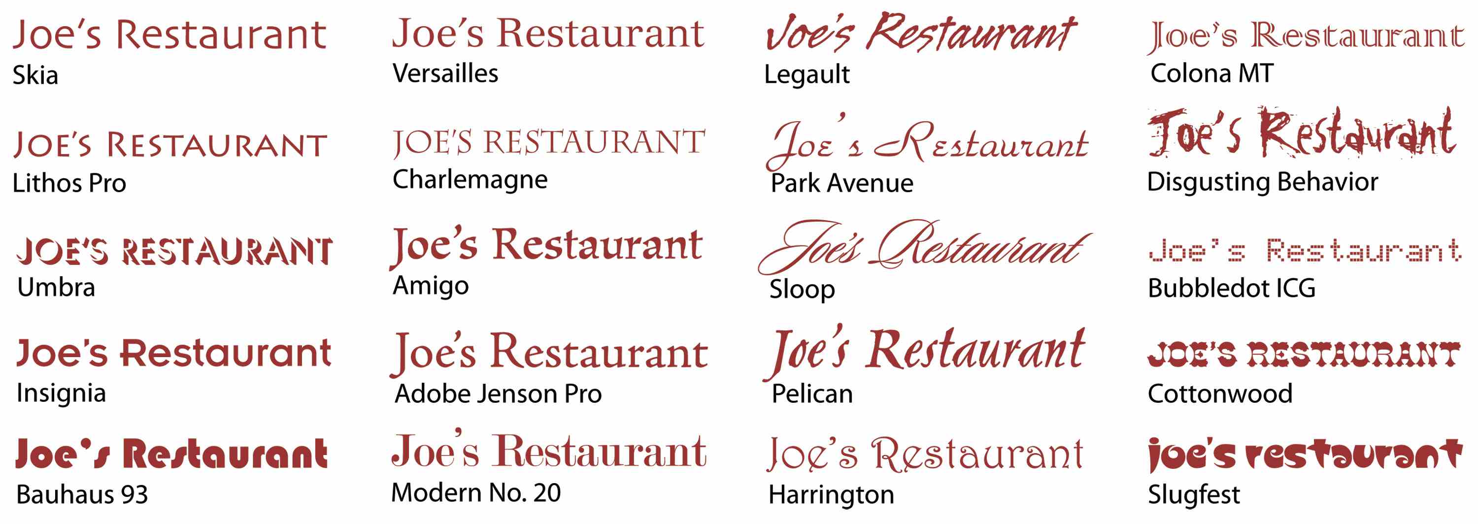
Keep in mind that, like kids, there are no bad ones—just regrettable choices. While a particular font might fail to work for one purpose, it may strike just the right chord in another situation. The trick is to try to keep an open mind. If you can narrow the field to a few possibilities, try asking a friend or co-worker the question, “Which one makes you feel more ......?”, inserting the feeling you’re aiming to elicit.
Finally, when you’re choosing fonts, it’s important to limit your selection. As a rule of thumb, try to use at least two, but no more than four, different fonts in a website design. Before incorporating a new font, remember that you probably have some variants (bold, italic, condensed, black, regular, and so on) at your disposal to vary your type while maintaining consistency. Try to also avoid combining two different serif fonts or two different sans-serif fonts in the same project. Like the discordant colors phenomenon I talked about in Chapter 2, placing different fonts from the same family next to each other in a design can feel eerily uncomfortable.
Establishing a Typographic System
Setting up the typography for any sizable project is always complicated. There are literally hundreds of tweakable variables, and it’s very easy to spend endless hours adjusting sizing, line heights, margins and weights. The best way to save your sanity is to have a design system that can generate quick answers to most of the little questions—which lets you concentrate the “big picture” decisions.
Often our first big typography decision is to set the body font size for our default layout. (Let’s put responsive design to the side for now.) For many years, 16 pixels was considered the default body size of the Web. However, with today’s larger screens, text-heavy sites such as blogs and news services are generally choosing 18- to 21-pixel body font sizes. Social media and ecommerce apps that use busier, more modular UI units have tended towards 14- to 16-pixel body fonts. Obviously, these are broad trends, and not hard and fast rules, but you can see these general trends in the list below.
Typical Body Font Sizes
- Medium.com:
21px - NYTimes.com:
18px - CNN.com:
18px - Airbnb.com:
18px - SitePoint.com:
18px - BBC.co.uk:
16px - Developer.mozilla.org:
16px - Twitter.com:
15px - Etsy.com:
14px - Wikipedia.com:
14px - Facebook.com:
14px
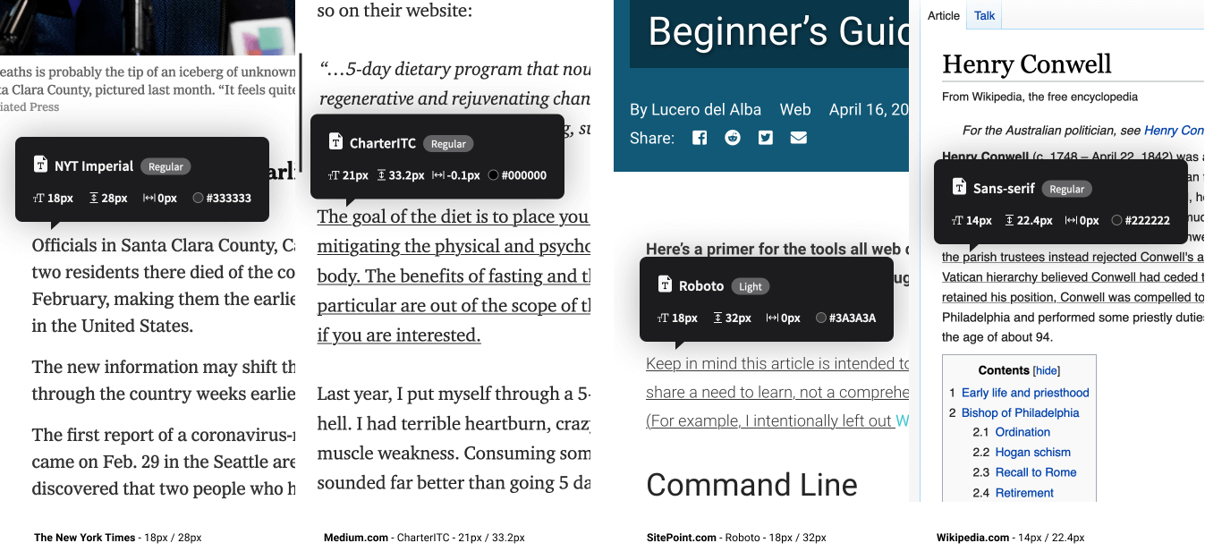
Remember that these big internet properties do a lot of user testing, so put some thought into where your application fits into this list. When you’ve settled on your base text sizes, eye-test them on real screens, tablets and phones until you’re happy with them as a starting point.
Scaling Your Type
So, now you’ve set your body font size. How do you decide on the sizing of your titles, section headings, subheaders, lists and blockquotes?
For me, the answer used to be, “Umm … tweak it till it looks … kinda right.” I’d scale up a heading, bump the weight a little, jog it a pixel up, … push it back down, … and back up again. Frankly, it was exhausting, because there were so many finicky little decisions and very few totally wrong answers.
Type scaling—sometimes called modular scaling—lets you use simple math to give you simple typographic answers. It allows us to set a single scaling ratio to generate all our font sizes while keeping them in harmony. It’s like a musical scale for type sizing.
Type Scaling in Practice
Let’s start with a body font size of 18px. That makes our default paragraph size 1em (or 18px):
body{font-size: 18px;}
p   {font-size: 1em; /* (or 18px) */ }
I’m going to set a type scale of 1.25. To calculate my h5 font size, I simply multiply my paragraph font size by 1.25. That that’s 1em * 1.25, or 1.25em:
h5 = p * 1.25 = 1.25em
Our h4 headings would be the h5 size multiplied by 1.25 (1.25em * 1.25) or 1.563em. Continuing the process gives us something like this:
/* Using a type scale of 1.25 */
h5 {font-size: 1.25em;}  /* 22.50px */
h4 {font-size: 1.563em;} /* 28.13px */
h3 {font-size: 1.953em;} /* 35.16px */
h2 {font-size: 2.441em;} /* 43.95px */
h1 {font-size: 3.052em;} /* 54.93px */
If I decided that my h1 headings felt a little oversized at that scale, I could bump my type scale down to 1.2 to get this result:
h5 {font-size: 1.2em;}   /* 21.60px */
h4 {font-size: 1.44em;}  /* 25.92px */
h3 {font-size: 1.728em;} /* 31.10px */
h2 {font-size: 2.074em;} /* 37.32px */
h1 {font-size: 2.488em;} /* 44.79px */
Okay, so I need a pocket calculator to size my text? Happily, no. There are some great tools that let you tweak and test type scales in generated CSS in real time. My favorite is Jeremy Church’s Type-scale.com (below), a tool that lets you quickly test different type scales and generate working CSS. There’s even a dummy layout on the right panel to eye-test your work and a CodePen export option. This is a great foundation for your typography CSS.

Mobile Considerations
A good question to ask at this point is, “Does a single type scale ratio work for all device sizes?” The answer is, no, often it doesn’t.
If you compare the typography of a typical newspaper to that of a classic paperback novel (below), you’ll notice some interesting differences beyond the obvious paper sizes.

While their body font sizes may be quite similar, there’s much great variation in heading sizes in the newspaper. Common sense tells you those headlines in The Times aren’t going to work as chapter titles for The Wizard of Oz. As a general rule, smaller formats (such as phones and novels) need shallower type scales.

Note that this difference in type scales doesn’t need to be large. As te image above shows, a small increase in type scale—from 1.125 up to 1.25—ripples through the scale to generate a much larger top-level heading. While that h1 title looks fine on a laptop, it would chew up far too much real estate on a mobile device. In short, it’s wise to use CSS @media queries to serve two type scales—a steeper type scale for large screens, and a more compressed type scale for smaller screens. We’ll tackle this later in the project.
So, now that we have a reliable, repeatable process to scale the type in our designs, let’s look at the spaces in between that type.
Vertical Baseline Rhythm
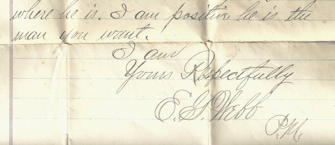
Vertical baseline rhythm—sometimes called the vertical measure—is a grid of horizontal lines that you can use to hang your typography in. It’s not unlike the blue-lined school workbooks many of us learned to write in. The trick is getting your larger type units to fit into same grid as your body text. In a simple handwritten letter (below), E.G. Webb is allowing an extra row for his signature. He’s probably using a baseline rhythm without even knowing what it’s called.
In The Elements of Typographic Style Applied to the Web, Richard Rutter describes baseline rhythm like this:
Headings, subheads, block quotations, footnotes, illustrations, captions and other intrusions into the text create syncopations and variations against the base rhythm of regularly leaded lines. These variations can and should add life to the page, but the main text should also return after each variation precisely on beat and in phase.
How does that work on the web? Let’s look at a real-world example. The excellent Colossal magazine uses a very open, airy layout, yet it still somehow manages to feel strong and structural. How does it do that? It turns out that if we superimpose a 21px vertical grid over the whole layout (see below), we see a previously hidden structure emerge. For this example, I’m going to call one row of this grid a “unit”.
You’ll notice that:
- the site branding fits nicely into a box five units high
- the main navigation is three units high
- article titles are two units high
- secondary navigation and social links are one unit high
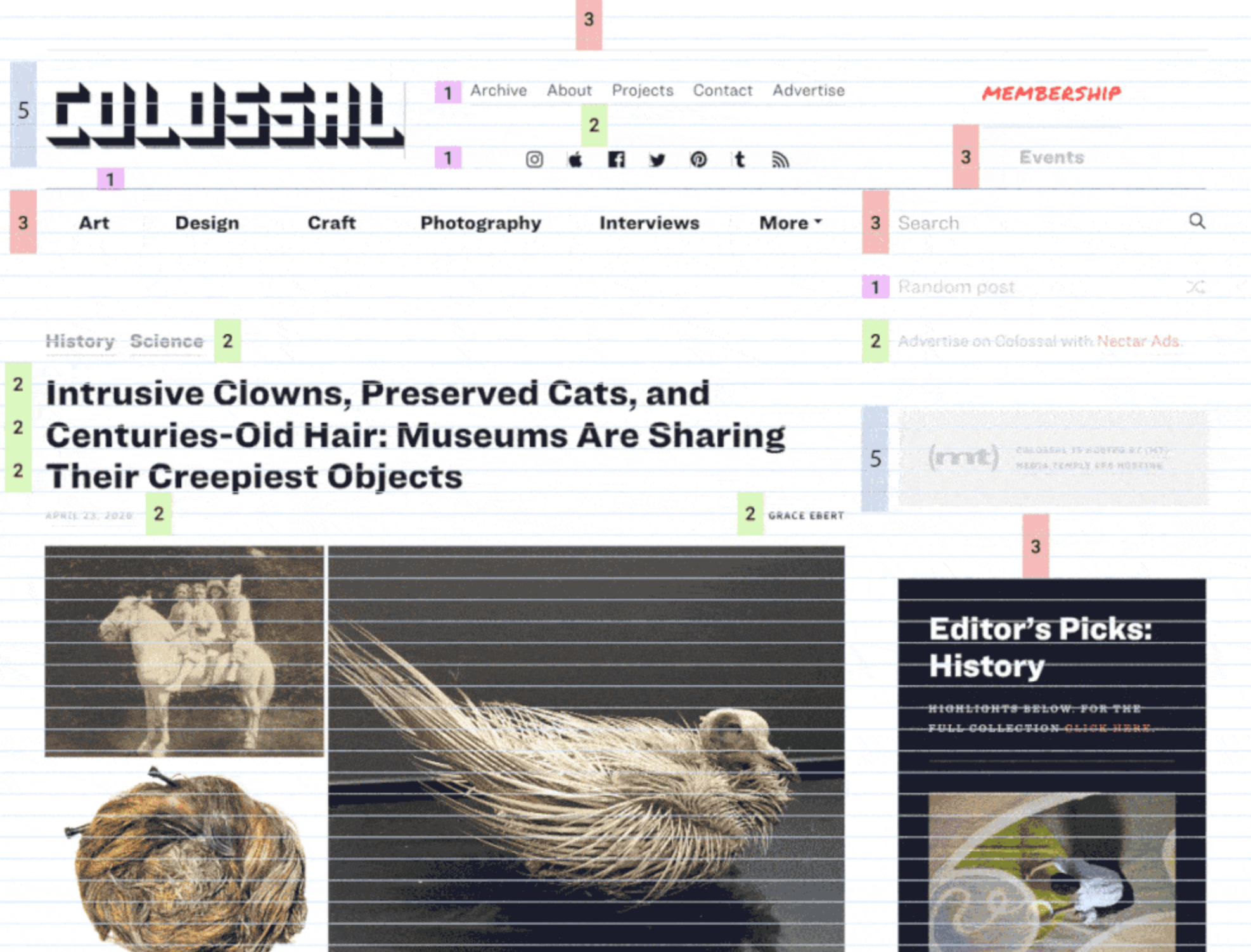
In fact, most UI elements “hang” on this underlying grid like socks pinned on an invisible clothesline. Even though we can’t see the underlying grid, we’re aware of it through a feeling of balance and harmony. It just feels right.
Note that we’re not talking about just font size, but instead the whole space the text occupies—including the line height and margins. So in the Colossal example, the article title would have a line height of 42px, or two units for each line.
However, you’ll notice that not every element is locked to this grid. The designers have chosen to offset elements like the photos from the grid. That’s fine too. The grid is a great starting point, not martial law.
Using Layout Grids
Most modern graphic layout tools (such as Sketch, Figma or Adobe XD) make it easy to add a vertical baseline to any canvas/frame. In this Figma example (see below), I selected the document frame and used the + button to add separate rows and columns in the Layout Grid panel.

These grid layers can be switched on and off using the eye icon. I find that, with a grid in place and “snap-to-grid” switched on, it simply becomes easier to size items with the grid than without it. And that makes your life easier.
There’s even a tool to help you work out the CSS. Gridlover.net (below) is an excellent, free tool that lets you experiment with different base font sizes, line heights and type scalings—all locked to a vertical baseline. If you try adjusting any of the line heights or margins on the right CSS panel, you’ll notice the number only changes by a full “grid unit” each time.
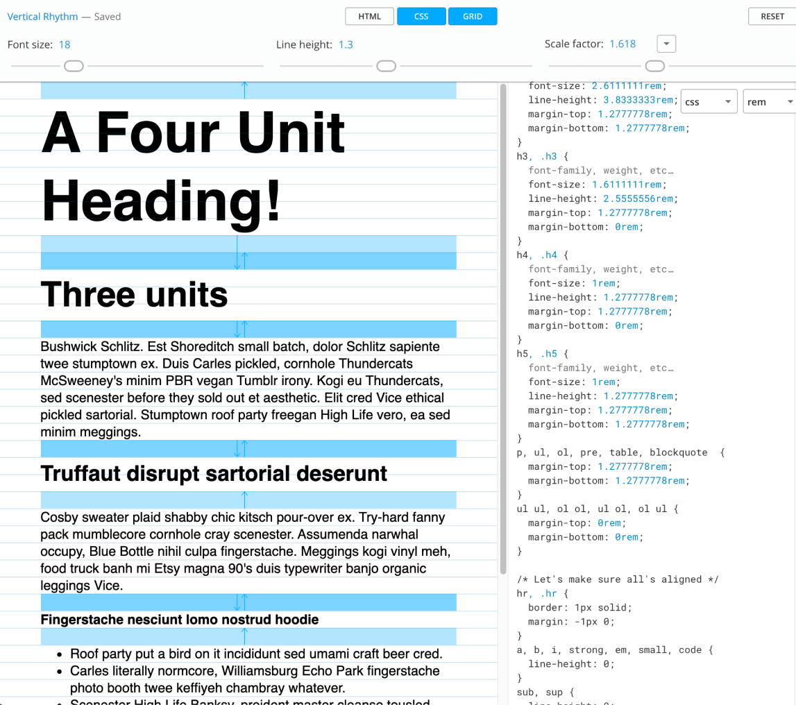
You might also notice that the tool avoids using CSS padding in its typography. I’ve found this to be a good policy when working with a vertical baseline system. Use padding freely on your container units, but never on typography. Even text buttons can be given height with a line-height setting rather than CSS height or padding.
Gridlover not only writes useful CSS, but it really helped me get my head around how vertical baseline and type scaling can work in the real world. I believe this is a great place to start your CSS typography.
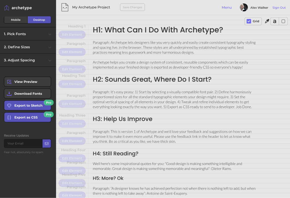
Archetype is another tool designed to help you create well-planned, integrated type systems. It offers controls for both type scale and baseline rhythm in one very thoughtfully conceived UI. It even encourages you to set different type scales for mobile and desktop out of the box. I believe this is the most sophisticated tool in this area.
The only caveat to Archetype is that it currently costs $59 per year to unlock the “Export as CSS” option. Clearly that’s a bigger outlay than Gridlover (free), but if you spend a lot of time crafting type systems, it could save you a lot of time (and money). Archetype is very good.
Vertical Baseline Rhythm Is a Tool, Not a Religion
Vertical baselines are a handy tool, but they shouldn’t become the end goal of your design. I have to admit, there was a time where I spent too much sweat trying to bend every page element to obey my mighty grid rules. I was arm-wrestling typographic percentages and margins, and “hitting the grid” became a goal in itself, rather than just a tool to help me design better.
That’s neither fun nor useful.
Today, I think it’s better to look at vertical baselines as a strong bass drum in a band—a regular beat that helps to measure out the space for the rest of the band to play in. Set up a nice backbeat that everyone can feel, but don’t be afraid of dropping little off-beat flourishes. Often they can add energy and flavor to a composition (visual or musical).
Personally, I like to start with a strong grid and use it. If there’s whitespace between headings or paragraphs, it might as well be one, two, or three whole “vertical units”, rather than 1.3 or 2.75 units.
Likewise, your hero image might as well be exactly 12 units tall, rather than 11.8 or 12.3, as now the bottom edge of the image is more likely to nicely line up with the bottom edge of any text flowing alongside it. It’s “self-tidying”.
But if, on the other hand, the caption on your images just looks too spacey when it’s spread over 25-pixel line heights, that’s fine. Forget the grid there. Just make it look good.
The Takeaway
Ultimately, most design work is just a long, long list answers to “why” questions.
- Why did you make that major heading 49 pixels high?
- Why is that bottom margin 17 pixels?
- Why does the
h3have a line height of1.7778?
And so on.
There are potentially hundreds of these little questions in even a small project. And you probably have enough natural “designer gut instinct” to answer them all—eventually. The problem is, it’s exhausting.
However, if you can come up with a repeatable system that delivers viable answers to most of the boring, little questions, you can save your designer gut instinct for the bigger, more important questions.
Which is usually the fun part anyway.
The Project: Building a Type System
Selecting typefaces for a project—like selecting a color palette—is always at least partly a personal choice. While there certainly are quantifiably bad choices, there’s never just one correct answer.
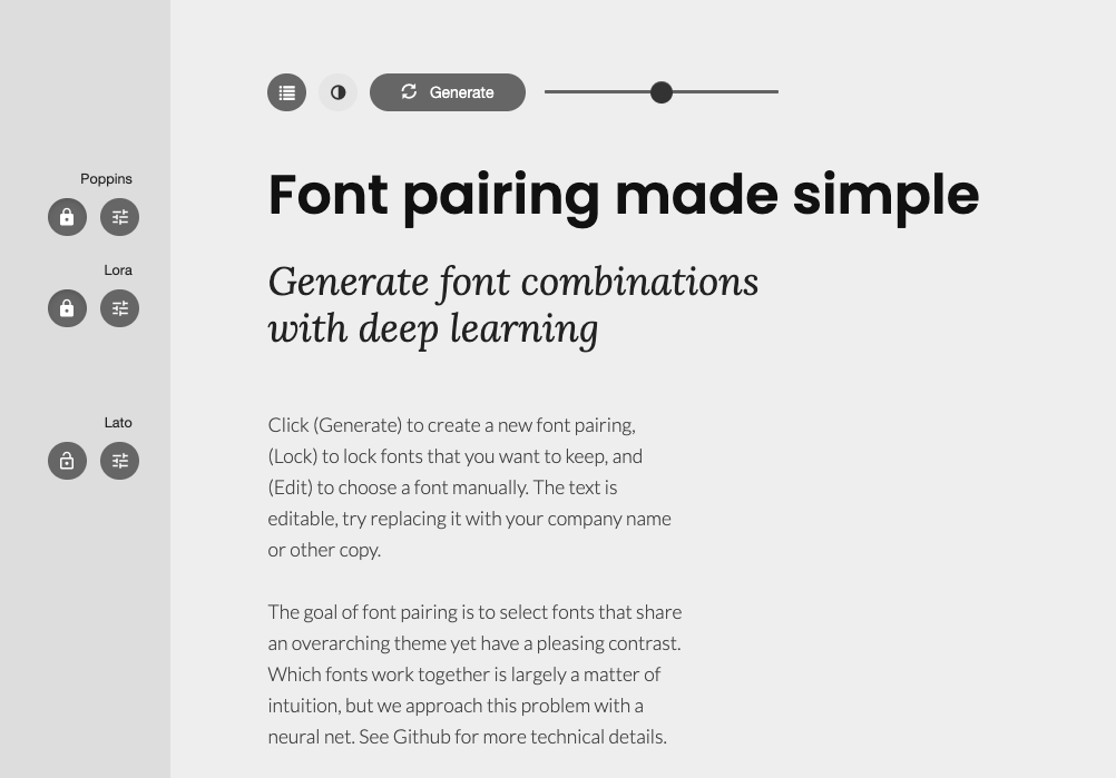
This is a good opportunity to experiment with tools like Fontjoy (below), which allow you to eye-test lots of different Google Fonts combinations and sizes quickly. Hit Generate to deliver a randomized combination. When you find a typeface you like, lock it in and regenerate the others.
For the Trashmonger project, I’ve settled on these fonts:
Google Fonts gives us this code snippet to add to our pages:
<link href="https://fonts.googleapis.com/css2?family=Lato:ital@0;1&family=Poppins:wght@300;500&display=swap" rel="stylesheet">
We can load our new fonts straight into Gridlover.net (shown in green below) and begin to tweak the type scale and margins. I’ve set my HTML root element font size to 14px, and this is the only pixel measurement on the page. Every other font size, line height and margin will be set in rems. This means any change we make to that root element font size will automatically ripple through all the typography. This makes media queries much simpler.
You’ll notice that one row is always equal to 1.5rem in this design, so that’s the “magic number”. Unless we have a good reason not to, all line heights and vertical margins should be multiples of 1.5rem.

In the example above, I’ve used a type scale of 1.414 (Gridlover calls it the “Scale factor”), which is good for tablets and laptops. But, as we discussed earlier, we’re going to export a second slab of CSS for mobile with a type scale of 1.25.
Creating a Basic Typography Style Guide
The next step is to put this CSS base into a simple one-page style guide. I find it’s often easy to start this step in your favorite code playground (CodePen.io, WebMaker.app, and so on) and move it inside your app/site later. Our base CSS will work something like this:
/* Mobile first CSS (Type scale: 1.25) */

html, .root {
  font-size: 14px;
  line-height: 21px;
}
body, .article {
  font-family: 'Lato',sans-serif;
  font-weight: 300;
  font-size: 1rem;
}
h1, .h1 {
  font-size: 1.9285714rem;
  line-height: 3rem;
  /* and so on ... */
}

@media screen and (min-width: 720px) {
 /* Tweaks for larger screens - Type scale: 1.4141 */
  h1, .h1 {
    font-size: 2.8571429rem;
    /* and so on ... */
  }
}
The mobile typography type scale is placed at the top of the file—as the default. A media query is set at 720 pixels to give us the steeper type scale font sizes, line heights and margins on non-phone screens. This relatively simple but robust core gives us a useful base for our typography. If we’re not happy with anything, it’s still easy at this stage to go back to Gridlover and tweak the type scale or line heights.
Here’s that core CSS set up as a simple CodePen demo. Scale the window to see the type scale switch between mobile and desktop modes.
CodePen Demo
Here’s that core CSS set up as a simple CodePen demo: https://codepen.io/SitePoint/pen/qBZbeK. Scale the window to see the type scale switch between mobile and desktop modes.
Adding a Visual Grid
You might also notice that I’ve added my own grid as an overlay. I find it really useful to be able to see the grid I’m working with as I’m building HTML prototypes. It’s really easy to add and remove.
First, I set up two CSS variables at the top of my CSS file. We don’t need the columns for this style guide, but they’re ready when we do need them:
:root{
  --columns: 5;
  --lineheight: 1.5rem;
}
Then I tack this CSS snippet onto the bottom of my CSS file. It uses CSS gradients that are sized to the line height to create a temporary grid overlay:
.showgrid::after {
  display: block;
  position: absolute;
  content: "";
  width: 100%;
  height: 1000rem;
  opacity:.75;
  top: 0;
  left: 0;
  z-index:999;
  background: repeating-linear-gradient(
   /* columns */
      90deg,
      rgba(0, 0, 0, 0) 0%,
      rgba(0, 0, 0, 0) 5%,
      rgba(255, 0, 0, 0.05) 5%,
      rgba(255, 0, 0, 0.05) 95%,
      rgba(0, 0, 0, 0) 95%,
      rgba(0, 0, 0, 0) 100%
    ),
    repeating-linear-gradient(
      /* rows */ 0deg,
      rgba(0, 0, 0, 0) 0%,
      rgba(0, 0, 0, 0) 50%,
      rgba(0, 0, 255, 0.05) 50%,
      rgba(0, 0, 255, 0.05) 100%
    );
  background-repeat: repeat, repeat;
  background-position: 0 0, 0 0;
  background-size: calc(100% / var(--columns)) auto, 100% calc(var(--lineheight)*2);
}
You can add the grid to the <body>—or any HTML container—by simply adding the .showgrid class:
<body class='showgrid'>
...
</body>
Any time I want to turn the grid off, I just add a - temporarily to the class name (such as class='-showgrid') and it disappears.
What Now?
We now have a useful set of simple type units in a predictable structure. Later, if we decide we need more variation or different type scaling, we have a sensible system that we can easily extend.
So let’s move on to Chapter 5, where we’ll look at how imagery can combine with our new typography system.