
Overview
By the end of this chapter, you will be able to read and write to files using Python; use defensive programming techniques, such as assertions, to debug your code; use exceptions, assertions, and tests with a defensive mindset and plot, draw and create graphs as outputs using Python.
We will cover the basic input/output (I/O) operations for Python and how to use the matplotlib and seaborn libraries to create visualizations.
Introduction
In Chapter 3, Executing Python – Programs, Algorithms, and Functions, you covered the basics of Python programs and learned how to write algorithms, functions, and programs. Now, you will learn how to make your programs more relevant and usable in the IT world.
First, in this chapter, you are going to look at file operations. File operations are essential for scripting for a Python developer, especially when you need to process and analyze a large number of files, like in data science. In companies that deal with data science, you often do not have direct access to a database, stored on a local server or a cloud server. Rather, we receive files in text format. These include CSV files for column data, and txt files for unstructured data (such as patient logs, news articles, user comments, etc.).
In this chapter, you will also cover error handling. This prevents your programs from crashing and also does its best to behave elegantly when encountering unexpected situations. You will also learn about exceptions, the special objects used in programming languages to manage runtime errors. Exception handling deals with situations and problems that can cause your programs to crash, which makes our programs more robust when they encounter either bad data or unexpected user behavior.
Reading Files
While databases such as MySQL and Postgres are popular and are widely used in many web applications, there is still a large amount of data that is stored and exchanged using text file formats. Popular formats like comma-separated values (CSV), JavaScript Object Notation (JSON), and plain text are used to store information such as weather data, traffic data, and sensor readings. You should take a look at the following exercise to read text from a file using Python.
Exercise 58: Reading a Text File Using Python
In this exercise, you will be downloading a sample data file online and reading data as the output:
- Open a new Jupyter Notebook.
- Now, copy the text file from the URL (https://packt.live/2MIHzhO), save it to a local folder as pg37431.txt, and remember where it is located.
- Upload the file to your Jupyter Notebook by clicking on the Upload button in the top-right corner. Select the pg37431.txt file from your local folder, and then click on the Upload button again to store it in the same folder where your Jupyter Notebook runs:
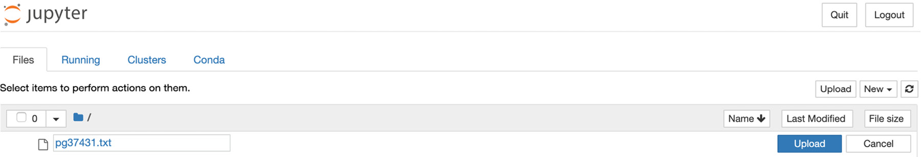
Figure 4.1: The Upload button on the Jupyter Notebook
- Now, you should extract the content of the file using Python code. Open a new Jupyter notebook file and type the following code into a new cell. You will be using the open() function in this step; don't worry too much about this, as you will be explained about this in more detail later:
f = open('pg37431.txt')
text = f.read()
print(text)
You should get the following output:
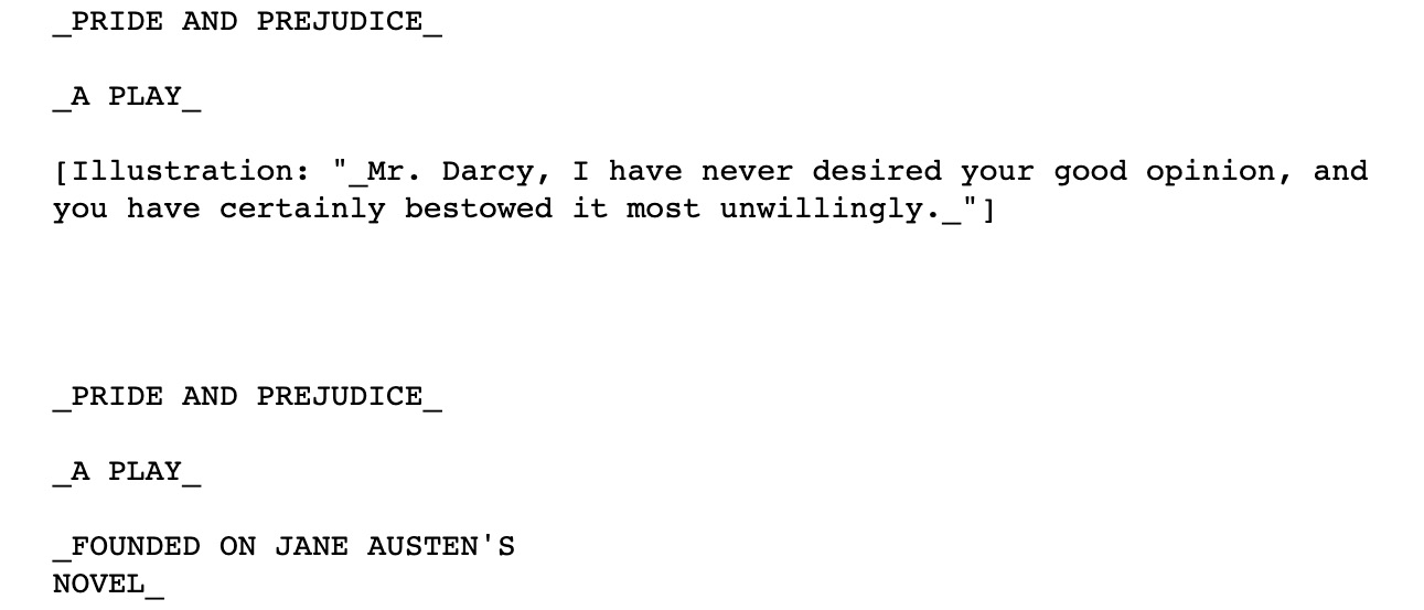
Figure 4.2: Output showing the extracted content from the file
Note that you can scroll within the cell and check the entire content.
- Now, in a new cell, type text only, without the print command, and you will get the following output:
text
Figure 4.3: Output with the text-only command
The difference in the output between this cell and the previous cell, shown in Figures 4.2 and 4.3, is the presence of control characters. Using the print command helps us to render the control characters while calling text shows the actual content and does not render as the output.
In this exercise, you have learned how to read the content of the entire data sample file.
Moving ahead, you will take a look at the open() function that you used in this exercise. It opens the file to let us access it. The open() function requires the name of the file you want to open as the argument. If you provide a filename without the full path, Python will look for the file in the same directory where it is currently running. In your case, it looks for the text file under the same folder where our ipynb file is, and where the Jupyter Notebook started. The open() function returns an object, which you store as f (which represents "file"), and you use the read() function to extract its content.
You may also be wondering whether you need to close the file. The answer is that it depends. Usually, when you call a read() function, you can assume that Python will close the file automatically, either during garbage collection or at the program exit. However, your program might end prematurely, and the file may never close. Files that have not been closed properly can cause data to be lost or corrupted. However, calling close() too early in our program will also lead to more errors. It's not always easy to know exactly when you should close a file. However, with the structure shown here, Python will figure that out for you. All you have to do is open the file and work with it as desired, trusting that Python will close it automatically when the time is right.
Although most of the data in the real world today is in the form of databases, and content such as videos, audio, and images is stored using respective proprietary formats, the use of text files is still important. They can be exchanged and opened in all operating systems without requiring any special parser. In practical use cases, you use a text file to record ongoing information, such as server logs in the IT world.
But what if you are dealing with a large file or you only need to access parts of the content or read the file line by line? You should check this out in the next exercise.
Exercise 59: Reading Partial Content from a Text File
In this exercise, you will be using the same sample data file from Exercise 58, Reading a Text File Using Python. Here, however, you will only be partially reading the content from the text file:
- Open a new Jupyter Notebook.
- Copy the pg37431.txt text file that you used in Exercise 58 and save it in a separate folder that will be used to execute this exercise.
- Write the following code in a new cell to read the first 5 characters:
with open("pg37431.txt") as f:
print(f.read(5))
You should get the following output:
The P
In this way, you include an argument to tell Python to read the first 5 characters each time.
Notice that you use a with statement here. The with statement is a control flow structure of Python. It guarantees that the preceding file object, f, will close automatically after the code block exits, no matter how the nested block exits.
If an exception occurs before the end of the block, it will still close the file before the exception is caught. Of course, it will close the file even if the nested block runs successfully.
- Now, access the text file by reading it line by line using the .readline function for which you need to enter the following code in a new cell on your notebook:
with open("pg37431.txt") as f:
print(f.readline())
You should get the following output of the very first line in the text file:
Figure 4.4: Output accessing the text line by line
By completing this exercise, you have learned the use of the control structure that is used in Python to close a code block automatically. Doing so, you were able to access the raw data text file and read it one line at a time.
Writing Files
Now that you have learned how to read the content of a file, you are going to learn how to write content to a file. Writing content to a file is the easiest way for us to store content in our database storage, save our data by writing it to a particular file, and save data on our hard disk. This way, the output will still be available for us after you close the terminal or terminate the notebook that contains our program output. This will allow us to reuse the content later with the read() method that was covered in the previous section, Reading Files.
You will still be using the open() method to write to a file, except when it requires an extra argument to indicate how you want to access and write to the file.
For instance, consider the following:
f = open("log.txt","w+")
The preceding code snippet allows us to open a file in w+, a mode that supports both reading and writing, that is updating the file. Other modes in Python include the following:
- R: The default mode. This opens a file for reading.
- W: The write mode. This opens a file for writing, creates a new file if the file does not exist, and overwrites the content if the file already exists.
- X: This creates a new file. The operation fails if the file exists.
- A: This opens a file in append mode, and creates a new file if a file does not exist.
- B: This opens a file in binary mode.
Now, you should take a look at the following exercise to write content to a file:
Exercise 60: Creating and Writing Content to Files to Record the Date and Time in a Text File
In this exercise, you will be writing content to a file. We are going to create a log file, which records the value of our counter every second:
- Open a new Jupyter Notebook.
- In a new cell, type the following code:
f = open('log.txt', 'w')
From the code mentioned in this step of this exercise, you open the log.txt file in write mode, which you will be using to write our values.
- Now, in the next cell of your notebook, type the following code:
from datetime import datetime
import time
for i in range(0,10):
print(datetime.now().strftime('%Y%m%d_%H:%M:%S - '),i)
f.write(datetime.now().strftime('%Y%m%d_%H:%M:%S - '))
time.sleep(1)
f.write(str(i))
f.write(" ")
f.close()
In this code block, you are importing the datetime and time modules that Python provides us with. You are also using a for loop to print the year, month, and day, as well as the hour, minutes, and seconds. You are using the write() function here to add on to the previous condition; that is, every time the loop exits, the write command prints a number in place of i.
You should get the following output:

Figure 4.5: Output with the write() function in use
- Now, go back to the main page of your Jupyter Notebook, or browse to your Jupyter Notebook folder using Windows Explorer or Finder (if you are using a Mac). You will see the newly created log.txt file present:
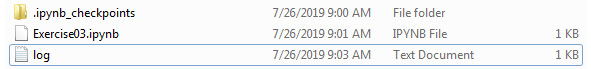
Figure 4.6: The log file is created
- Open the file inside Jupyter Notebook or your favorite text editor (for example, Visual Studio Code or Notepad), and you should see content that is similar to the following:
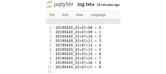
Figure 4.7: Content added to the log.txt file
You have now created your first text file. The example shown in this exercise is very common in most data science processing tasks; for instance, recording the readings of sensors and the progress of a long-running process.
The close() method at the very end makes sure that the file is closed properly and that all content in the buffer is written to the file.
Preparing for Debugging (Defensive Code)
In the programming world, a bug refers to defects or problems that prevent code or programs from running normally or as expected. Debugging is the process of finding and resolving those defects. Debugging methods include interactive debugging, unit testing, integration testing, and other types of monitoring and profiling practices.
Defensive programming is a form of debugging approach that ensures the continuing function of a piece of a program under unforeseen circumstances. Defensive programming is particularly useful when you require our programs to have high reliability. In general, you practice defensive programming to improve the quality of software and source code, and to write code that is both readable and understandable.
By making our software behave in a predictable manner, you can use exceptions to handle unexpected inputs or user actions that can potentially reduce the risk of crashing our programs.
Writing Assertions
The first thing you need to learn about writing defensive code is how to write an assertion. Python provides a built-in assert statement to use the assertion condition in the program. The assert statement assumes the condition always to be true. It halts the program and raises an AssertionError message if it is false.
The simplest code to showcase assert is mentioned in the following code snippet:
x = 2
assert x < 1, "Invalid value"
Here, since 2 is not smaller than 1, and the statement is false, it raises an AssertionError message as follows:
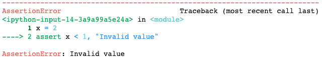
Figure 4.8: Output showing AssertionError
Note
You can also write the assert function without the optional error message.
Next, you will take a look at how to use assert in a practical example.
Say that you want to calculate the average marks of a student in a semester. You need to write a function to calculate the average, and you want to make sure that the user who calls the function actually passes in the marks. You will explore how you can implement this in the following exercise.
Exercise 61: Working with Incorrect Parameters to Find the Average Using Assert with Functions
In this exercise, you will be using the assertion error with functions to check the error message when you enter incorrect parameters to calculate the average marks of students:
- Continue in the previous Jupyter notebook.
- Type the following code into a new cell:
def avg(marks):
assert len(marks) != 0
return round(sum(marks)/len(marks), 2)
Here, you created an avg function that calculates the average from a given list, and you have used the assert statement to check for any incorrect data that will throw the assert error output.
- In a new cell, type the following code:
sem1_marks = [62, 65, 75]
print("Average marks for semester 1:",avg(sem1_marks))
In this code snippet, you provide a list and calculate the average marks using the avg function.
You should get the following output:
Average marks for semester 1: 67.33
- Next, test whether the assert statement is working by providing an empty list. In a new cell, type the following code:
ranks = []
print("Average of marks for semester 1:",avg(ranks))
You should get the following output:
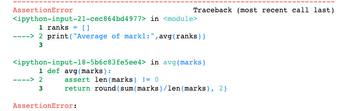
Figure 4.9: Assertion fails when we pass in an empty list
In the cell with the code where you provide 3 scores, the len(marks) !=0 statement returns true, and therefore no AssertionError will be raised. However, in the next cell, you did not provide any marks, and therefore it raises an AssertionError message
In this exercise, you have used the AssertionError message to throw the output in case it is incorrect or if missing data is provided. This has proved to be useful when, in the real world, data can be of the incorrect format, and you can then use this to debug the incorrect data.
Note that although assert behaves like a check or data validation tool, it is not. Asserts in Python can be disabled globally to nullify all of the assert statements. Do not use assert to check whether a function argument contains an invalid or unexpected value, as this can quickly lead to bugs and security holes. The baseline is to treat Python's assert statement like a debugging tool and not to use it for handling runtime errors. The goal of using assertions is to let us detect a bug more quickly. An AssertionError message should never happen unless there's a bug in your program. In the next section, you will look at plotting functions to provide you with a visual output using Python.
Plotting Techniques
Unlike machines, humans are terrible at understanding data without graphics. Various visualization techniques have been invented to make humans understand different datasets. There are various types of graphs that you can plot, each with its own strengths and weakness.
Each type of chart is only suitable for a certain scenario, and they shouldn't be mixed up. For instance, to present dropped-out customer details for marketing scatter plots is a good example. A scatter plot is suitable for visualizing a categorical dataset with numeric values, and you will be exploring this further in the following exercise.
For the best presentation of your data, you should choose the right graph for the right data. In the following exercises, you will be introduced to various graph types and their suitability for different scenarios. You will also demonstrate how to avoid plotting misleading charts.
You will plot each of these graphs in the following exercises and observe the changes in these graphs.
Note
These exercises require external libraries such as seaborn and matplotlib. Please refer to the Preface section of this chapter to find out how to install these libraries.
In some installations of Jupyter, graphs do not show automatically. Use the %matplotlib inline command at the beginning of your notebook to get around this.
Exercise 62: Drawing a Scatter Plot to Study the Data between Ice Cream Sales versus Temperature
In this exercise, you will be aiming to get scatter plots as the output using sample data from the ice cream company to study the growth in the sale of ice cream against varying temperature data:
- Begin by opening a new Jupyter Notebook file.
- Enter the following code to import the matplotlib, seaborn, and numpy libraries with the following alias:
import matplotlib.pyplot as plt
import seaborn as sns
import numpy as np
You should take a look at the following example. Imagine you are assigned to analyze the sales of a particular ice cream outlet with a view to studying the effect of temperature on ice cream sales.
- Prepare the dataset, as specified in the following code snippet:
temperature = [14.2, 16.4, 11.9, 12.5, 18.9, 22.1, 19.4, 23.1, 25.4, 18.1, 22.6, 17.2]
sales = [215.20, 325.00, 185.20, 330.20, 418.60, 520.25, 412.20, 614.60, 544.80, 421.40, 445.50, 408.10]
- Plot the lists using the scatter plot:
plt.scatter(temperature, sales, color='red')
plt.show()
You should get the following output:

Figure 4.10: Output as the scatterplot with the data of the ice cream temperature and sales data
Our plot looks fine, but only to our eyes. Anyone who has just seen the chart will not have the context and will not understand what the chart is trying to tell them. Before we go on to introduce other plots, it is useful for you to learn how to edit your plots and include additional information that will help your readers to understand it.
- Add a title command to your plot, as well as the x-axis (horizontal) and y-axis (vertical) labels. Then, add the following lines before the plt.show() command:
plt.title('Ice-cream sales versus Temperature')
plt.xlabel('Sales')
plt.ylabel('Temperature')
plt.scatter(temperature, sales, color='red')
plt.show()
You should get the following output:
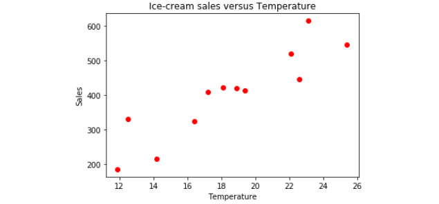
Figure 4.11: Updated scatter plot of ice cream sales versus temperature
Our chart is now easier to understand. In this exercise, you used the sample ice cream sales versus temperature dataset and used the data to create a scatter plot that will be easier to understand for another user.
However, what if your dataset is a time-based dataset? In that case, you will usually use a line plot. Some examples of a line plot include the plotting of heart rate, the visualization of population growth against time, or even the stock market. By creating a line plot, you are able to understand the trend and seasonality of data.
In the following exercise, you will be outputting the line chart, which corresponds to the time (that is, the number of days) and the price. For this, you will be plotting out stock prices.
Exercise 63: Drawing a Line Chart to Find the Growth in Stock Prices
In this exercise, you will be plotting the stock prices of a well-known company. You will be plotting this as a line chart that will be plotted as the number of days against the growth in price.
- Open a new Jupyter Notebook.
- Enter the following code in a new cell to initialize our data as a list:
stock_price = [190.64, 190.09, 192.25, 191.79, 194.45, 196.45, 196.45, 196.42, 200.32, 200.32, 200.85, 199.2, 199.2, 199.2, 199.46, 201.46, 197.54, 201.12, 203.12, 203.12, 203.12, 202.83, 202.83, 203.36, 206.83, 204.9, 204.9, 204.9, 204.4, 204.06]
- Now, use the following code to plot the chart, configure the chart title, and configure the titles of the axes:
import matplotlib.pyplot as plt
plt.plot(stock_price)
plt.title('Opening Stock Prices')
plt.xlabel('Days')
plt.ylabel('$ USD')
plt.show()
In the preceding code snippet, you are adding a title to the graph, and adding the number of days to the x axis and the price to the y axis.
Execute the cell twice, and you should see the following chart as the output:
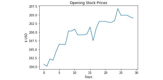
Figure 4.12: Line chart for opening stock prices
If you've noticed that the number of days in our line plot starts at 0, you have sharp eyes. Usually, you start your axes at 0, but in this case, it represents the day, so you have to start from 1 instead. You can fix these issues.
- You can fix this by creating a list that starts with 1 to 31, representing the days in March:
t = list(range(1, 31))
- Plot this together with the data. You can also define the numbers on the x axis using xticks:
plt.plot(t, stock_price, marker='.', color='red')
plt.xticks([1, 8, 15, 22, 28])
The complete code with the underlined changes is shown here:
stock_price = [190.64, 190.09, 192.25, 191.79, 194.45, 196.45, 196.45, 196.42, 200.32, 200.32, 200.85, 199.2, 199.2, 199.2, 199.46, 201.46, 197.54, 201.12, 203.12, 203.12, 203.12, 202.83, 202.83, 203.36, 206.83, 204.9, 204.9, 204.9, 204.4, 204.06]
t = list(range(1, 31))
import matplotlib.pyplot as plt
plt.title('Opening Stock Prices')
plt.xlabel('Days')
plt.ylabel('$ USD')
plt.plot(t, stock_price, marker='.', color='red')
plt.xticks([1, 8, 15, 22, 28])
plt.show()
You should get the following output:
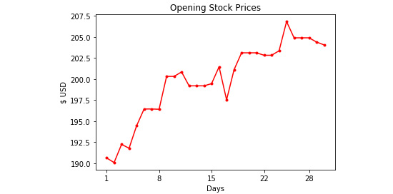
Figure 4.13: Updated line chart with customized line color, marker, and date range
In this exercise, you learned how to generate a line graph that displays the output based on time. In the next exercise, you will learn how to plot bar graphs, which is another useful visualization for displaying categorical data.
Exercise 64: Plotting Bar Plots to Grade Students
A bar plot is a straightforward chart type. It is great for visualizing the count of items in different categories. When you get the final output for this exercise, you may think that histograms and bar plots look the same. But that's not the case. The main difference between a histogram and a bar plot is that there is no space between the adjacent columns in a histogram. You will take a look at how to plot a bar graph.
In this exercise, you will draw bar charts to display the data of students and corresponding bar plots as a visual output.
- Open a new Jupyter Notebook file.
- Type the following code into a new cell, to initialize the dataset:
grades = ['A', 'B', 'C', 'D', 'E', 'F']
students_count = [20, 30, 10, 5, 8, 2]
- Plot the bar chart with our dataset and customize the color command:
import matplotlib.pyplot as plt
plt.bar(grades, students_count, color=['green', 'gray', 'gray', 'gray', 'gray', 'red'])
Execute the cell twice, and you should get the following output:

Figure 4.14: Output showing the number of students without any labels on the plot
Here, you define two lists: the grades list stores the grades, which you use as the x-axis, and the students_count list stores the number of students who score a respective grade. Then, you use the plt plotting engine and the bar command to draw a bar chart.
- Enter the following code to add the main title and the axis titles to our chart for better understanding. Again, you use the show() command to display the rendered chart:
plt.title('Grades Bar Plot for Biology Class')
plt.xlabel('Grade')
plt.ylabel('Num Students')
plt.bar(grades, students_count, color=['green', 'gray', 'gray', 'gray', 'gray', 'red'])
plt.show()
Execute the cell, and you will get the following chart as the output:
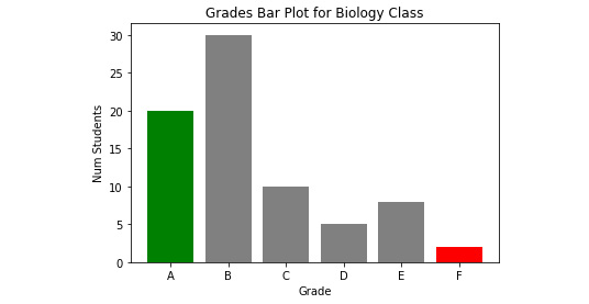
Figure 4.15: Bar plot graph outputting the grade and number of students with labels
Sometimes, it is easier to use horizontal bars to represent relationships. What you have to do is to change the bar function to .barh.
- Enter the following code in a new cell and observe the output:
plt.barh(grades, students_count, color=['green', 'gray', 'gray', 'gray', 'gray', 'red'])
You should get the following output:
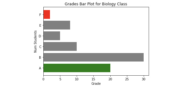
Figure 4.16: Horizontal bar plots
In this exercise, you implemented a sample list of data and outputting data as bar graphs; these bar graphs were shown as vertical bars and horizontal bars as well. This could vary depending on your usage.
In the next exercise, you will be implementing pie charts that many organizations use to pictorially classify their data. Pie charts are good for visualizing percentages and fractional data; for instance, the percentage of people who agree or disagree on some opinions, the fractional budget allocation for a certain project, or the results of an election.
However, a pie chart is often regarded as not a very good practice by many analysts and data scientists for the following reasons:
- Pie charts are often overused. Many people use pie charts without understanding why they should use them.
- A pie chart is not effective for comparison purposes when there are many categories.
- It is easier not to use a pie chart when the data can simply be presented using tables or even written words.
Exercise 65: Creating a Pie Chart to Visualize the Number of Votes in a School
In this exercise, you will plot a pie chart on the number of votes for each of the three candidates in an election for club president:
- Open a new Jupyter Notebook.
- Type the following code into a new cell by setting up our data:
# Plotting
labels = ['Monica', 'Adrian', 'Jared']
num = [230, 100, 98] # Note that this does not need to be percentages
- Draw a pie chart by using the pie() method, and then set up colors:
import matplotlib.pyplot as plt
plt.pie(num, labels=labels, autopct='%1.1f%%', colors=['lightblue', 'lightgreen', 'yellow'])
- Add title and display the chart:
plt.title('Voting Results: Club President', fontdict={'fontsize': 20})
plt.pie(num, labels=labels, autopct='%1.1f%%', colors=['lightblue', 'lightgreen', 'yellow'])
plt.show()
You should get the following output:
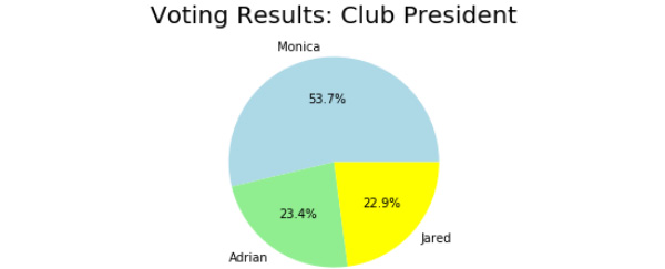
Figure 4.17: Pie chart with three categories
Having completed this exercise, you are now able to generate data as a pie chart. This type of representation is the best visual aid that many organizations use when sorting out data.
In the next exercise, you will be implementing a heatmap visualization. Heatmaps are useful for showing the relationship between two categorical properties; for instance, the number of students who passed exams in three different classes. Now you will follow an exercise and learn how to draw a heatmap visualization.
Exercise 66: Generating a Heatmap to Visualize the Grades of Students
In this exercise, you will be generating a heatmap:
- Open a new Jupyter Notebook.
- Now, type in the following code snippet to define a heatmap function. First, you prepare the plot:
def heatmap(data, row_labels, col_labels, ax=None, cbar_kw={}, cbarlabel="", **kwargs):
if not ax:
ax = plt.gca()
im = ax.imshow(data, **kwargs)
- Define the color bar as colorbar, as mentioned in the following code snippet:
cbar = ax.figure.colorbar(im, ax=ax, **cbar_kw)
cbar.ax.set_ylabel(cbarlabel, rotation=-90, va="bottom")
- Show all ticks and label them with their respective list entries:
ax.set_xticks(np.arange(data.shape[1]))
ax.set_yticks(np.arange(data.shape[0]))
ax.set_xticklabels(col_labels)
ax.set_yticklabels(row_labels)
- Configure the horizontal axes for the labels to appear on top of the plot:
ax.tick_params(top=True, bottom=False,
labeltop=True, labelbottom=False)
- Rotate the tick labels and set their alignments:
plt.setp(ax.get_xticklabels(), rotation=-30, ha="right",
rotation_mode="anchor")
- Turn off spine and create a white grid for the plot, as mentioned in the following code snippet:
for edge, spine in ax.spines.items():
spine.set_visible(False)
ax.set_xticks(np.arange(data.shape[1]+1)-.5, minor=True)
ax.set_yticks(np.arange(data.shape[0]+1)-.5, minor=True)
ax.grid(which="minor", color="w", linestyle='-', linewidth=3)
ax.tick_params(which="minor", bottom=False, left=False)
- Return the heatmap:
return im, cbar
This is the code you obtain directly from the matplotlib documentation. The heatmap functions help to generate a heatmap.
- Execute the cell, and, in the next cell, enter and execute the following code. You define a numpy array to store our data and plot the heatmap using the functions defined previously:
import numpy as np
import matplotlib.pyplot as plt
data = np.array([
[30, 20, 10,],
[10, 40, 15],
[12, 10, 20]
])
im, cbar = heatmap(data, ['Class-1', 'Class-2', 'Class-3'], ['A', 'B', 'C'], cmap='YlGn', cbarlabel='Number of Students')
You can see that the heatmap is quite plain without any textual information to help our readers understand the plot. You will now continue the exercise and add another function that will help us to annotate our heatmap visualization.
- Type and execute the following code in a new cell:
Exercise66.ipynb
def annotate_heatmap(im, data=None, valfmt="{x:.2f}",
textcolors=["black", "white"],
threshold=None, **textkw):
import matplotlib
if not isinstance(data, (list, np.ndarray)):
data = im.get_array()
if threshold is not None:
threshold = im.norm(threshold)
else:
threshold = im.norm(data.max())/2.
kw = dict(horizontalalignment="center",
verticalalignment="center")
kw.update(textkw)
if isinstance(valfmt, str):
valfmt = matplotlib.ticker.StrMethodFormatter(valfmt)
Note
If the above link does not render, use https://nbviewer.jupyter.org/
- In the new cell, type and execute the following code:
im, cbar = heatmap(data, ['Class-1', 'Class-2', 'Class-3'], ['A', 'B', 'C'], cmap='YlGn', cbarlabel='Number of Students')
texts = annotate_heatmap(im, valfmt="{x}")
This will annotate the heatmap and give us the following output:
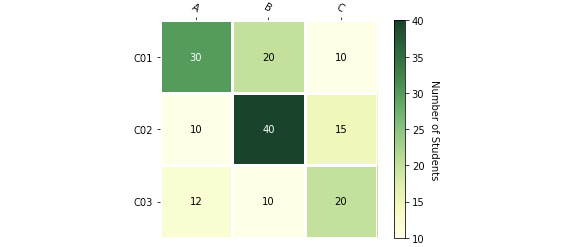
Figure 4.18: Heatmap output from the sample data
Note that you put our data in a numpy array (np.array). This is because the methods you are going to call expect a numpy array.
Next, you plotted our heatmap using the heatmap method. You passed in our data, the row labels, ['Class-1', 'Class-2', 'Class-3'], and then our column labels, ['A', 'B', 'C']. You also pass in YlGn as cmap, which means you want to use the color yellow for small values, and the color green for big values. You pass in cbarlabel as Number of Students to denote that the values we are plotting represent the number of students. Lastly, you annotate our heatmap with the data (30, 20, 10…).
So far, you have learned how to visualize discrete categorical variables using heatmaps and bar plots. But what if you want to visualize a continuous variable? For example, instead of the grades of students, you want to plot the distribution of scores. For this type of data, you should use a density distribution plot, which you will look at in the next exercise.
Exercise 67: Generating a Density Plot to Visualize the Score of Students
In this exercise, you will be generating a density plot from a list of sample data:
- Begin by continuing from the previous Jupyter Notebook file.
- Enter the following code into a new cell, set up the data, and initialize the plot:
import seaborn as sns
data = [90, 80, 50, 42, 89, 78, 34, 70, 67, 73, 74, 80, 60, 90, 90]
sns.distplot(data)
You have imported the seaborn module, which is explained later in this exercise, and then created a list as data. sns.displot is used to plot the data as a density plot.
- Configure the title and axes labels:
import matplotlib.pyplot as plt
plt.title('Density Plot')
plt.xlabel('Score')
plt.ylabel('Density')
sns.distplot(data)
plt.show()
You should get the following output:
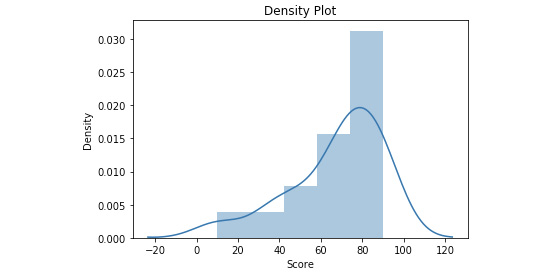
Figure 4.19: Density plot output from the sample data
So far, in this exercise, you have used the seaborn library, which is a data visualization library based on matplotlib. It provides a high-level interface for drawing appealing visual graphs and supports chart types that do not come with matplotlib. For example, you use the seaborn library for density plots simply because it is not available in matplotlib.
In this exercise, you were able to implement and output the density plot graph, as shown in Figure 4.19, from the list sample data we inputted.
If you were to do it using matplotlib, you would need to write a separate function that calculates the density. To make things easier and create density plots using seaborn. The line in the chart is drawn using kernel density estimation (KDE). KDE estimates the probability density function of a random variable, which, in this case, is the score of students.
In the next exercise, you will be implementing contour plots. Contour plots are suitable for visualizing large and continuous datasets. A contour plot is like a density plot with two features. In the following exercise, you will examine how to plot a contour plot using sample weight data.
Exercise 68: Creating a Contour Plot
In this exercise, you will be using the sample dataset of the different weights of people to output a contour plot:
- Open a new Jupyter Notebook.
- Initialize the weight recording data using the following code in a new cell:
weight=[85.08,79.25,85.38,82.64,80.51,77.48,79.25,78.75,77.21,73.11,82.03,82.54,74.62,79.82,79.78,77.94,83.43,73.71,80.23,78.27,78.25,80.00,76.21,86.65,78.22,78.51,79.60,83.88,77.68,78.92,79.06,85.30,82.41,79.70,80.16,81.11,79.58,77.42,75.82,74.09,78.31,83.17,75.20,76.14]
- Now, draw the plot using the following code. Execute the cell twice:
import seaborn as sns
sns.kdeplot(list(range(1,45)),weight, kind='kde', cmap="Reds", )
- Add legend, title, and axis labels to the plot:
import matplotlib.pyplot as plt
plt.legend(labels=['a', 'b'])
plt.title('Weight Dataset - Contour Plot')
plt.ylabel('height (cm)')
plt.xlabel('width (cm)')
sns.kdeplot(list(range(1,45)),weight, kind='kde', cmap="Reds", )
- Execute the code and you will see the following output:
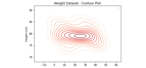
Figure 4.20: Contour plot output using the weight dataset
By the end of this exercise, you learned to output a contour graph from a dataset.
Compare this with the scatter plot that we have implemented before in Exercise 62, Drawing a Scatter Plot. Which chart type do you think is easier for us to visualize the data?
Extending Graphs
Sometimes, you will need to show multiple charts in the same figure for comparison purposes, or to extend the depth of the story that you are telling. For instance, in an election, you want one chart that shows the percentage, and another chart that shows the actual votes. You will now take a look at how you can use subplots in matplotlib in the following example.
Note that the following code is shown in multiple plots.
Note
You will use ax1 and ax2 to plot our charts now, instead of plt.
To initialize the figure and two axis objects, execute the following command:
import matplotlib.pyplot as plt
# Split the figure into 2 subplots
fig = plt.figure(figsize=(8,4))
ax1 = fig.add_subplot(121) # 121 means split into 1 row , 2 columns, and put in 1st part.
ax2 = fig.add_subplot(122) # 122 means split into 1 row , 2 columns, and put in 2nd part.
The following code plots the first subplot, which is a pie chart:
labels = ['Adrian', 'Monica', 'Jared']
num = [230, 100, 98]ax1.pie(num, labels=labels, autopct='%1.1f%%', colors=['lightblue', 'lightgreen', 'yellow'])
ax1.set_title('Pie Chart (Subplot 1)')
Now, plot the second subplot, which is a bar chart:
# Plot Bar Chart (Subplot 2)
labels = ['Adrian', 'Monica', 'Jared']
num = [230, 100, 98]
plt.bar(labels, num, color=['lightblue', 'lightgreen', 'yellow'])
ax2.set_title('Bar Chart (Subplot 2)')
ax2.set_xlabel('Candidate')
ax2.set_ylabel('Votes')
fig.suptitle('Voting Results', size=14)
This will produce the following output:
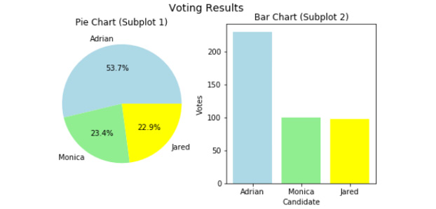
Figure 4.21: Output showing a pie chart and a bar chart with the same data next to each other
Note
If you want to try out the previously mentioned code example, be sure to put all the code in a single input field in your Jupyter Notebook in order for both the outputs to be shown next to one another.
In the following exercise, you will be using matplotlib to output 3D plots.
Exercise 69: Generating 3D plots to Plot a Sine Wave
Matplotlib supports 3D plots. In this exercise, you will plot a 3D sine wave using sample data:
- Open a new Jupyter Notebook file.
- Now, type the following code into a new cell and execute the code:
from mpl_toolkits.mplot3d import Axes3D
import numpy as np
import matplotlib.pyplot as plt
import seaborn as sns
X = np.linspace(0, 10, 50)
Y = np.linspace(0, 10, 50)
X, Y = np.meshgrid(X, Y)
Z = (np.sin(X))
# Setup axis
fig = plt.figure(figsize=(7,5))
ax = fig.add_subplot(111, projection='3d')
First, you import the mplot3d package. The mplot3d package adds 3D plotting capabilities by supplying an axis object that can create a 2D projection of a 3D scene. Next, you will be initializing data and setting up our drawing axis.
- You will use the plot_surface() function to plot the 3D surface chart and configure the title and axes labels:
ax.plot_surface(X, Y, Z)
# Add title and axes labels
ax.set_title("Demo of 3D Plot", size=13)
ax.set_xlabel('X')
ax.set_ylabel('Y')
ax.set_zlabel('Z')
Note
Enter the preceding code in a single input field in your Jupyter Notebook, as shown in Figure 4.22.
Execute the cell twice, and you should get the following output:
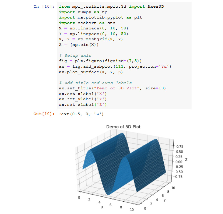
Figure 4.22: 3D plot of demo data using matplotlib
In this exercise, you were successfully able to implement a very interesting feature provided by matplotlib; that is, the 3D plot, which is an added feature in Python visualizations.
The Don'ts of Plotting Graphs
In newspapers, blogs, or social media there are a lot of misleading graphs that make people misunderstand the actual data. You will be going through some of these examples and learn how to avoid them.
Manipulating the Axis
Imagine you have three students with three different scores from an exam. Now, you have to plot their scores on a bar chart. There are two ways to do this: the misleading way, and the right way:
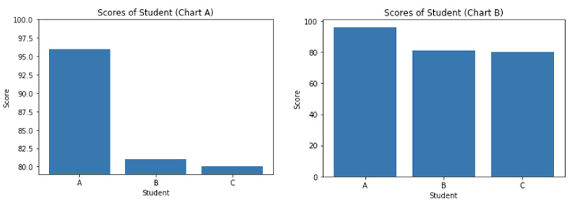
Figure 4.23: Chart A (starts from 80) and Chart B (starts from 0)
Looking at Chart A, it will be interpreted that the score of student A is about 10 times higher than student B and student C. However, that is not the case. The scores for the students are 96, 81, and 80, respectively. Chart A is misleading because the y-axis ranges from 80 to 100. The correct y-axis should range from 0 to 100, as in Chart B. This is simply because the minimum score a student can get is 0, and the maximum score a student can get is 100. The scores of students B and C are actually just slightly lower compared to student A.
Cherry Picking Data
Now, you will have a look at the opening stock prices:
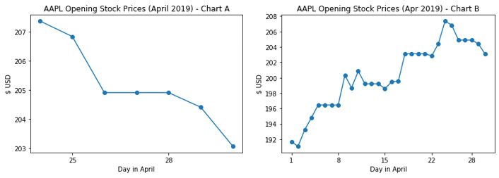
Figure 4.24: Chart A (shows only 7 days) and Chart B (shows the entire month)
Chart A, with the title AAPL Opening Stock Prices (April 2019), shows a declining trend on Apple® stock prices. However, the chart is only showing the last 7 days of April. The title of the chart is mismatched with the chart. Chart B is the correct chart, as it shows a whole month of stock prices. As you can see, cherry-picking the data can give people a different perception of the reality of the data.
Wrong Graph, Wrong Context
You can have a look at two graphs that show a survey to demolish an old teaching building:
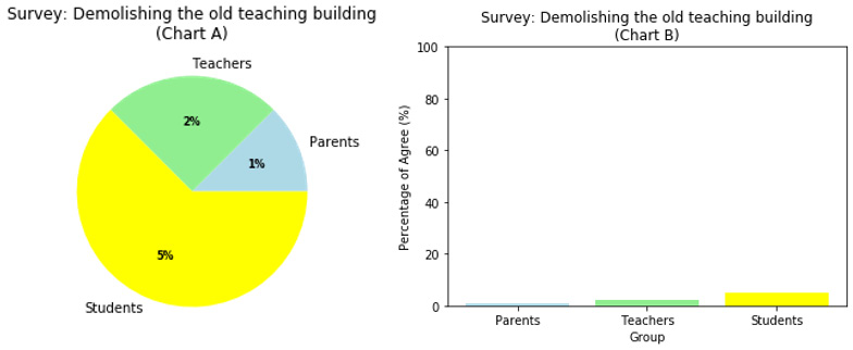
Figure 4.25: A pie chart versus a column chart
Using the wrong graph can give readers the wrong context to understand the data. Here, Chart A uses a pie chart to make readers think that the students want to demolish the old teaching building. However, as you can see in Chart B, the majority (95%) of the students voted to not demolish the old teaching building. The pie chart should only be used when every piece of the pie adds up to 100%. In this case, a bar chart is better at visualizing the data.
Activity 13: Visualizing the Titanic Dataset Using a Pie Chart and Bar Plots
Charts are not only a useful visualization device in presentations and reports; they also play a crucial role in Exploratory Data Analysis (EDA). In this activity, you will learn how to explore a dataset using visualizations.
In this activity, you will be using the famous Titanic dataset. Here, you will focus on plotting the expected data. The steps to load the dataset will be covered in the later chapters of this book. For this activity, the steps that you need to complete are as follows.
Note
In this activity, we will be using the Titanic dataset. This titanic_train.csv dataset CSV file is uploaded to our GitHub repository and can be found at https://packt.live/31egRmb.
Follow these steps to complete this activity:
- Load the CSV file.
To load the CSV file, add in the code, as mentioned in the following code snippet:
import csv
lines = []
with open('titanic_train.csv') as csv_file:
csv_reader = csv.reader(csv_file, delimiter=',')
for line in csv_reader:
lines.append(line)
- Prepare a data object that stores all the passengers details using the following variables:
data = lines[1:]
passengers = []
headers = lines[0]
- Now, create a simple for loop for the d variable in data, which will store the values in a list.
- Extract the following fields into their respective lists: survived, pclass, age, and gender for the passengers who survived:
survived = [p['Survived'] for p in passengers]
pclass = [p['Pclass'] for p in passengers]
age = [float(p['Age']) for p in passengers if p['Age'] != '']
gender_survived = [p['Sex'] for p in passengers if int(p['Survived']) == 1]
- Based on this, your main goal and output will be to generate plots according to the requirements mentioned here:
- Visualize the proportion of passengers that survived the incident (in a pie chart).
You should get the following output:
- Visualize the proportion of passengers that survived the incident (in a pie chart).
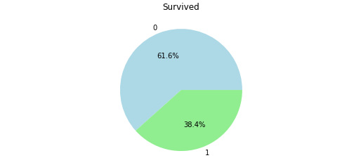
Figure 4.26: A pie chart showing the survival rate of the passengers
- Compare the gender of passengers who survived the incident (in a bar plot).
You should get the following output:
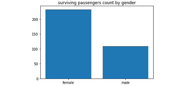
Figure 4.27: A bar plot showing the variation in the gender of those who survived the incident
Note
The solution to this activity is available on page 533.
Summary
In this chapter, you looked at how to read and write to a text file using Python, followed by using assertions in defensive programming, which is a way of debugging your code. Finally, you explored different types of graphs and charts to plot data. You discussed the suitability of each plot for different scenarios and datasets, giving suitable examples along the way. You also discussed how to avoid plotting charts that could be misleading.
In the next chapter, you will learn how to use Python to write Object-Oriented Programming (OOP) codes. This includes creating classes, instances, and using write subclasses that inherit the property of the parent class and extending functionalities using methods and properties.