Chapter 9
The data visualization continuum
Abstract
This chapter provides a definition of data visualization and illustrates the power of visualization by comparing numbers against their visual counterparts. It also explores the three categories of data visualizations and reviews some of the most prolific chart types and where they fit into the data visualization continuum. Finally, it offers a focused discussion on what we can consider the “golden rules” that guide the process of building a successful data visualization.
Keywords
data visualization
exploratory
explanatory
infographics
best practices
chart
“There is a magic in graphs. The profile of a curve reveals in a flash a whole situation — the life history of an epidemic, a panic, or an era of prosperity. The curve informs the mind, awakens the imagination, convinces.”
—Henry D. Hubbard
We began the last chapter with a simple parable—a quote from Harry Potter’s potion master, Severus Snape, if you remember—that provided a useful analogy of the “subtle science and exact art” that can be applied to building and designing data visualization. The point, again, was simply this: the best data visualizations are, like potions, a carefully curated blend of art and science, and thus require equal attention to be paid both to the visualization method (the science) as well as to how the data is visually presented (the art).
These are highly interrelated but separate concepts that should be understood individually on their own merit, and together insofar as how they work together when applied to data visualization. When building a visualization to create meaning and communicate visually with data, nothing happens in a vacuum—not art, or science, or even storytelling for that matter. Each of these elements work in tandem and are, to some degree at least, contingent on each other for the whole to be successful. This is a holistic view of data visualization that takes into account how each of these parts become something intimately interconnected and understood completely only by reference to the whole, or by the outcome—the visual itself. (This view, for what it is worth, is conceptually similar to that of systems thinking, a holistic approach to analyses that focuses on the way a system’s constituent parts interrelate within the context of a larger ecosystem whole (Senge, 2006). This is a practice requisite of the learning—or within our context, the discovery-oriented—organization.)
Chapter: The Importance of Visual Design, provided a high-level overview of some of the most important and deliberate of design considerations—like color, size, shape, typography, and so on—that go into curating meaningful design applied in data visualization. The intent of that chapter was to earn a basic understanding of how these features can make the best use of our brain’s cognitive functions to help us better see and understand information. However, there are many designers who know the principles of design yet lack the understanding of how to visualize data effectively in a way that properly presents the information clearly and effectively, for maximum impact and communication. The opposite, of course, is true, too. There are just as equally a number of statisticians, data scientists, and other analysts with deep knowledge of data and context, but less knowledge of how to create engaging and actionable graphics.
If the previous chapter was the art, then this chapter is the other half of the coin: the science. However, this chapter is not meant as a field guide on how to create a data visualization, though we will touch on a diagnostic of some of the most prolific chart types and where they fit into the data visualization continuum. Nor is it intended as lesson in data visualization graphicacy mechanics. There are many references available that go deep into the weeds of those practices. What this chapter is an exploration of the purposes and processes of various forms of information visualization, with a focused discussion on what we can consider the “golden rules” that guide the process of building a successful data visualization.
9.1. Data visualization definition
If you ask a room full of people with varying backgrounds in data science, graphic design, analytics, or any other assortment of skills and experiences for the definition of “data visualization,” chances are you are going to receive just as varied a response as the personalities in the room. Chances are, too, that you will also uncover some resonant themes and understandings, as well as some very contrary opinions. If you do a quick Google search online, or ask a number of leading minds in the data visualization space, you will likely get a similar result. As with any type of tool or principle, a level of disagreement is to be expected—encouraged even, as a consequence of greater discussion is (generally) more engagement, clarity, and thoughtful consideration into supporting components. Even in my journey, I have worked with companies and data scientists who are building visualizations so scientific and its almost hard to believe that they are data visualization. At the other end of the spectrum, I have also seen organizations where graphic designers are responsible for building data visualizations that sometimes are more suitable for artistic display, than in any corporate boardroom. I have seen dashboards both glorious and banal. I have even met people who have metaphorically lived by data visualization, and others than snub their nose at it. When it comes to any area of data, we are a mightily opinionated group.
Most broadly, the term data visualization generally describes any effort to help people understand the significance of data by placing it in a visual context. Some define data visualization purely as an analytical tool. Others are more liberal in their definitions, and probably the vast majority are those who draw the proverbial line in the sand between the artistic and scientific qualities of data visualization and dance between the two. And, regardless of the chosen definition, there are always likely to be distinctions that exist between data visualization and other subsets of visual information graphics, particularly infographics.
So, what is the definition of data visualization? Is it information art? Is it science, dependent on strict graphicacy guidelines for analytical use that benefit from intentional design process? Is it design, a creative endeavor to foster visual data storytelling or exploration? Is human science, or computer science, or both? The lines are blurry at best. And, the reality is that unlike the 20 magical Rings of Power, there is no one absolute definition to “rule them all.” It would seem that definitions for data visualization are as diverse and dynamic as the people who use them—and as the visualizations themselves, which exist on a continuum from explanatory to exploratory, simple to complex, traditional to innovative.
Now is not the time to sort out all the arguments on data visualization, but that is not to say that we can dismiss the necessity of a guiding definition by which to frame conversations on data visualization. There is an obvious need to articulate what a data visualization is, even if it is an umbrella term with a smattering of subcategories beneath it.
Before definition let us first acknowledge the core value of data visualization in a culture of visual data discovery. Data visualization has been widely acknowledged as key to the democratization of data, primarily because it is really the only meaningful way to consume and digest large quantities of diverse information. Effectively—and creatively—built data visualizations support information literacy by painting a picture by which to assemble data points in relevant and expressive ways to depict quantitative information in a way that leverages our visual communication abilities; cognitive hardwiring and the perceptual powers of our brains; and our intrinsically human need to tell stories.
Thus, we can define data visualization as a visual display of information that is transformed by the influence of purposeful design decisions with the intent of encoding and conveying information that would otherwise be either difficult to understand or unlikely (or impossible) to connect with in a meaningful way. We can further elaborate on that definition by considering the following:
It is a process (as described by Scott Murray (2013), Assistant Professor of Design at the University of San Francisco and author of Interactive Data Visualization for the Web) of “mapping values to visuals,” and blending visual design and information graphicacy to connect ideas, illuminate patterns, or answer or invite questions.
It is a tool by which to translate data into easier and better ways to see and understand in order explore patterns, trends, correlations, and relationships in data and convey results and insights. It can be built by any number of visualization tools or technologies, some of which are automated software while others require a large degree of human interaction and discretion in each step of the visualizing process.
It is a communication mechanism by which to explore or explain data. As an output, a data visualization can be used to build a narrative around, and communicate—or tell a story—about what is represented visually in the data. This can be achieved by using one data visualization to support text or persuade an audience (like in data journalism) or within a collection of several visualizations intended to provide a more complete picture of multiple pieces of related information (like in a data dashboard or scorecard).
9.2. The power of viz
Perhaps the most quintessential of examples of the power of data visualization comes from what is known as Anscombe’s Quartet, four seemingly identical data sets constructed in 1973 by statistician Francis Anscombe. The data sets, shown in a table (Figure 9.1), appear to be identical when compared by their summary statistics. Each set has the same mean of both X and Y, the same sample variance, the same correlations between X and Y in each case, the same linear regression, and so on.
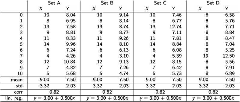
Figure 9.1 Anscombe’s Quartet, in Table Form
However, when each of the data sets is graphed (Figure 9.2), we can see beyond the limitations of basic statistic properties for describing data. You would expect that since each data set has the same summary statistics, they would also look very similar when visualized. But, as you can see, they actually look entirely different, and the effects of curvature and outliers drastically throw off summary statistics. This illustrates the power of visualization: simply by plotting the four data sets on an x/y coordinate plane, we get very distinctive results, demonstrating how important it is to plot your data—visualize it—rather than relying on a table or summary statistics alone. We can see the real relationships in the datasets emerge. Likewise, we can pick out trends, patterns, and outliers.

Figure 9.2 Anscombe’s Quartet, Visualized
While a similar procedure to generate data sets with identical statistics and dissimilar graphics has since been developed, another more modern example of the power of visualization was another personal data experiment conducted by graphic designer Chelsea Carlson (whose work on social media addiction habits was shared in chapter: Separating Leaders From Laggards).
Carlson began her experiment—titled “Netflix & Chill” by doing what many of us do today: organizing information in Microsoft Excel. She listed the 27 television shows that were her favorites, including supporting information that quantified them across genres, budgets, and languages (see Figure 9.3). As a tool, the spreadsheet helped her to understand the correlation of the categories that showed interesting trends (number of seasons, popularity of IMDB, award winners, etc.) and those that did not (age and race of lead, setting, length of show, etc.), however this was the extent of meaningful analysis that could be done when limited to rows and columns.

Figure 9.3 Carlson’s Netflix and Chill Data Spreadsheet, in Table Form
Like Anscombe’s Quartet, when visualized, Carlson was able to earn a deeper level of insight into the same data that already existed in Excel (Figure 9.4). As she worked through a visual discovery process, Carlson used a variety of graph types—including scatterplots, packed bubble charts, timelines, and even pie charts—unified with a few consistent elements. She also used visual elements like size and color to provide additional visual cues to assign meaning to the visualization. As a result, she was able to come away with a few key realizations, including her bias for costume dramas, female leads, and genre-bending storylines.
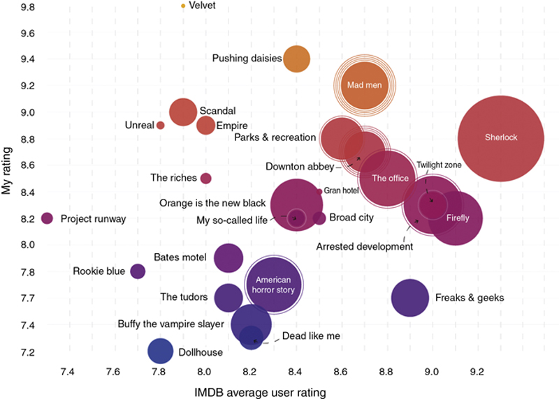
Figure 9.4 Carlson’s Netflix and Chill Data Visualized
See more at https://www.umbel.com/blog/data-visualization/netflix-chill-little-data-experiment-understanding-my-own-taste-tv/
See more at https://www.umbel.com/blog/data-visualization/netflix-chill-little-data-experiment-understanding-my-own-taste-tv/
The power of visualization goes beyond how powerful graphs are to better represent the intricacies of relationships within data, and extends to how audiences perceive and are influenced visually by data visualization, too. For example, researchers from Cornell found that merely including a graph in an article significantly increases reader persuasion. The researchers found that only 68% of participants believed a scientific claim without a graph, whereas 97% believed the same claim when a graph was included (Tal & Wansink, 2014).
The power of data visualization, whether for discovery or for persuasion, is obvious. However, as remarked a few times throughout the course of this text, along with that power comes great responsibility. Visualizations should be used for good—not to mislead or misconstrue information. And, they should work to leverage the incredible capabilities and bandwidth of the visual system to facilitate the movement of information into the brain very quickly in order to identify patterns, communicate relationships and meaning, inspire new questions, and incite further exploration.
9.3. To explain or explore—or both?
While there is a vast host of different visualization types, there are generally three categories of visualizations. Each serves a different purpose, and because of this, it is important to understand the distinctions between each category and how they can be used to accomplish the goal for the data visualization. We will explore each type (with a relevant example for context) in the subsequent sections (Figure 9.5).
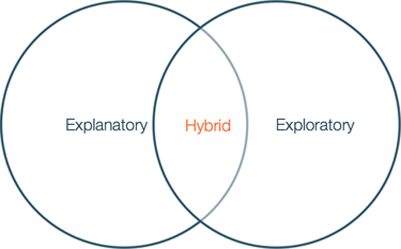
Figure 9.5 Three Categories of Data Visualization
9.3.1. Explanatory
As its title implies, explanatory data visualizations are intended to explain, thus they are the visualizations most efficient in telling a story to an audience or otherwise communicating insights to others who are likely not as familiar with the data, its context, or its meaning.
In an explanatory graphic, the goal of the visual is to communicate some kind of information—a story, an insight, an invitation to action—to the viewer. It is the responsibility of the designer to craft a visual that will facilitate this explanation, and typically the visualization will follow a well-defined narrative structure that begins with the main story point and trickles down through each part of the visual. Explanatory visualizations should be able to make a point effectively at a glance to facilitate and support a story told from the perspective of a designer.
For example, take a look at Figure 9.6. Created using the same data set on America’s favorite pie flavors that was the inspiration behind the #onelesspie chart highlighted in chapter: The Data Science Education and Leadership Landscape, this simple bar chart plots an assortment of pie flavors (axis X) arranged according to percentage of Americans who selected the flavor as their favorite (axis Y). The main narrative in the simple chart is to show the most preferred pie flavor by Americans: apple. As an explanatory graphic, we are only concerned with highlighting the flavor with the highest value. The process that the designer and the receiver follow when designing and subsequently interpreting this chart is remarkably similar. First, ask a question of the data—“which pie flavor is most preferred?”—and then answer this question.
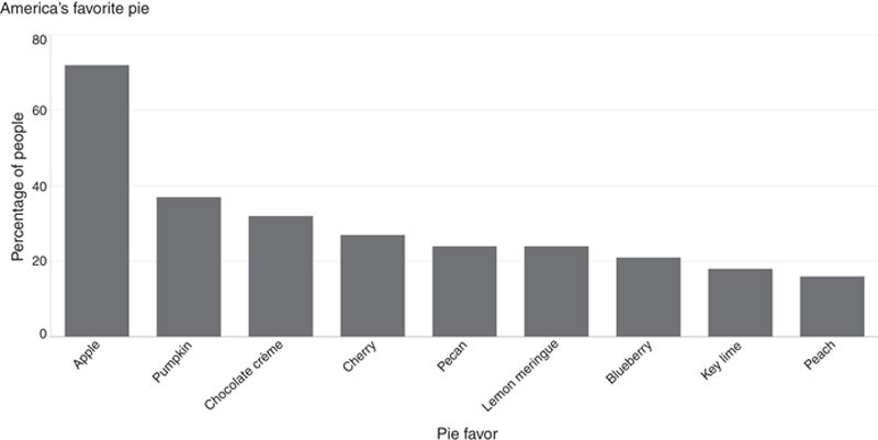
Figure 9.6 Explanatory Bar Chart Showing the America’s Favorite Pie Flavors
Explanatory graphics are fundamentally intended to share information that is already known on the side of the designer. Therefore, they are editorially driven. Since the goal is to bring out a single story most clearly, the value of the visual is on simplicity. Thus, as much noise—distractions, points for discovery, etc.—are stripped from the visual, taking care not to remove the visual cues that emphasize the salient point of the story. Explanatory graphics, wherein visual discovery and exploration is discouraged, tend to be static and not interactive, which also puts more control in the hands of the designer.
Consider these scenarios in which explanatory visualizations are likely to be used:
• Answer a question
• Prove a point
• Support a decision
• Communicate information
9.3.2. Exploratory
As you might expect, if explanatory graphics are meant to explain, then exploratory graphics are meant to explore. With exploratory visualization, the goal is to uncover stories that can later be explained. You, as the designer, are interested in exploring the data to find the story that it is telling you—the premise of using data visualization to enable visual discovery. Thus, exploratory visuals are inherently not editorially driven, but the emphasis is instead on plucking through the visual to discover one valuable story or perhaps even many small stories. When designing an exploratory graphic, it is unlikely that the designer knows what the story is, though they may know a point of interest or have a hypothesis they would like to investigate further. It is aimed at presenting the data in a way that the viewer can notice the obvious while also discovering something new.
Contrary to the stativity of explanatory visuals, exploratory visualizations work best when they are interactive and allow the viewer to follow train of thought thinking to dig deeper to discover trends, patterns, or problems as they think through various questions or points of interest in the data presented to them. They should compellingly invite the viewer to get an overview of the visual at a high level, ask questions along the way, and find answers to those questions as they move visually through the data.
For example, see the visual in Figure 9.7. Created using a publically available data set on the yearly number of important discoveries from years 1860–1895, this area chart plots the sum of discoveries (axis Y) according to year (axis X). The most obvious narrative in the chart is the period of time in which a number of important discoveries were made: 1884. But, taking the entire visual into account, there are many more questions that almost immediately come to mind. By exploring the visual, and interacting with the data in various ways (including drill down or further sorting and refinement), we can take guesses at questions that we would need answers to in order to tell a deeper story and find answers to many salient story points. For instance, what kinds of discoveries were these? Who made them? Where did they occur? By laying on additional data too, such as the invention of new technologies, we could put together some hypotheses in the trends that enabled a general rise in important discoveries after the peak in 1884.
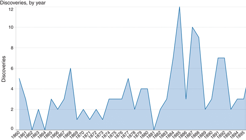
Figure 9.7 An Exploratory Visual Showing the Number of Important Discoveries Made in the Second Half of the 19th Century
Exploratory visuals work best when there is a high volume of data to be visualized and when the visuals are interactive and contextualized. As with any type of data discovery, exploratory visualization-led discovery can by cyclical, iterative, and without a specific end point. It may yield one insight, or many, or none at all. Thus, consider scenarios when exploratory visualizations are likely to be used:
• Pose new questions
• Discover new areas of interest
• Explore previously unknown or unexplored data
9.3.3. The hybrid model
Hybrid visualizations are a bit of both exploratory and explanatory. The best way to determine which type of visual you are looking at is to consider from which perspective the visualization is doing the work to reveal insights from the data—either the designer, who has built the visual in a way to facilitate a story and make known insights clear, or from the viewer who needs to explore the visual and determine which insights should be made clear. Inevitably, most visualizations probably fall somewhere in between.
There is a third category of visualization that is neither exploratory nor explanatory while it is both exploratory and explanatory. This third category would be considered a type of hybrid visualization, which involves some degree of a curated dataset (Iliisnky & Steele, 2011) designed to support a story that is presented openly and with the intention to allow some exploration on the viewer’s part. The user can then take visual discovery further or provide a collaborative opportunity for new exploration. These visualizations are usually interactive with some kind of graphical interface that gives the viewer some freedom to choose and constrain certain parameters and thereby personalize the discovery experience.
Figure 9.8 is an example of an everyday hybrid visualization. It is a screen shot of the Google Hot Trends screen, grabbed on November 5, 2015, which is both celebrated as Guy Fawkes Day and the day of a major NASA headline (and hoax—I hope no one was bothered by that pesky 15 days of darkness in November 2015), both of which are represented in the grab. Google Hot Trends (view online in plain text or visual format at https://www.google.com/trends/) visualizes Google search queries in real-time in the form of a colorful, tree map-like grid. The queries, shown as they change, update every second to keep pace with the rate of change in what users are searching for online. This visualization does not highlight any single search query, but invites the viewer to explore any part of the visual at will. The story is left to the viewer to discover by interacting with the visualization.
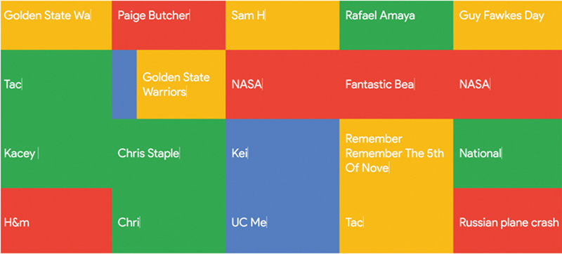
Figure 9.8 This Screen Grab of the Google Hot Trends Screen, Taken on November 5, 2015, is an Example of a Hybrid Visualization
In summary, the two main categories of visualizations—which may or may not be tempered by the actual visualization medium chosen—are to explain or to explore data. In the end, the distinction between the two comes down to the application and how the designer puts the visualization into use. If the visual is designed to tell a story that is already known then it is probably an explanatory visualization. Instead, if the visualization is a vehicle for the designer (or the viewer) to discover a new story to tell or to learn some other new insight into the data, it is likely an exploratory graphic. The balance between from which side—the designer or the viewer –the visualization is to be used by, and what degree of freedom or interaction is to be allowed by the visual.
Many visuals are a hybrid of both categories of visualization, and are designed to orient the viewer with an idea or engender them with a curiosity to further explore the visual in order to come to new conclusions or discover new insights and new stories.
9.4. The rise of the infographic
One of the best depictions of hybrid data visualization can be found in the infographic.
An infographic both is and is not a data visualization. As a mechanism to communicate and convey information, it tends to fall somewhere along the continuum as a subset of data visualization, and it follows many of the same design principles. However, it does not meet the specific standards of data visualization as we have traditionally defined them, and it stands apart from what many would consider a “true” data visualization due in part to its design process, visual abundance (minimalistic approaches are definitely not par for the course in infographics), and use cases. It could be an exercise in semantics, but the use of an infographic could be best described as an activity to “illustrate” information, rather than to “visualize” it. Nonetheless, the consensus seems to be that while different, infographics do play an important role in data analysis—perhaps especially (or, perhaps only) for its storytelling qualities.
In Nathan Yau’s blog, FlowingData, Yau took a stab at articulating the difference between an infographic and a data visualization, saying, “a visualization is the representation of data via geometry and math while infographics are a subset of visualization where an actual human being had a hand in explaining the (hopefully interesting) points in the data in question” (Yau, 2011). Further, in Designing Data Visualizations, Iliinsnky and Steele (2011) define it as: manually generated around specific data, tending to be shallow, and often aesthetically rich. To add to this, infographics tend to be almost always static and put a premium on creative representations of data, sometimes at the sacrifice of accuracy. Probably the most striking demarcation between a data visualization and an infographics is this: data visualization is a discipline, while infographics are merely a deliverable (or an item). While infographics present data and solicit a conclusion on the data, true data visualizations just present the data. The job of analyzing it and coming to a conclusion is left to the viewer.
Unlike data visualizations, which are typically designed with the intent to explore or explain information, infographics are generally created for the purpose of telling, and will thus usually be intended for a specific audience. Infographics, then, are subjective, self-contained, and discrete: it is information designed and presented in a way that is accessible for an audience.
Infographics are highly curated and the graphic design work is obvious. Often iconography and other graphical flair is used to illuminate the content, along with multiple approaches to visualization—including various chart and graph types, both traditional and more advanced. Because of this level of complexity, infographics are usually constructed by hand and digitally developed through graphic design tools (like Adobe Illustrator) as opposed to any standard data visualization solution (like Tableau). Many templates also exist to fulfill infographics needs, too, and can be purchased from stock photography portfolios.
9.5. Choosing the chart: a quick diagnostic
In chapter: Improved Agility and Insights Through (Visual) Discovery, a conversation on the forms of visual discovery, we reviewed—at a very basic level—traditional forms of visual discovery (forms that provide simple, straightforward visual representations of data) and the more innovative visualizations (like heat maps or network visualizations) that take the next step to advancing visual data discovery through visualization.
While, there are many types of charts and graphs to choose from—far too many to cover all with any useful level of depth and application (see Figure 9.9 to explore a larger variety of graphics routinely used for data visualization purposes)—this section is aimed to include a diagnostic of some of the most commonly accessible and most familiar chart types available today. Many, if not most, of these are visualization types included in visualization tools of all calibers—from Microsoft Excel to Tableau and beyond. For the most part, these graph and chart types fall into the bucket of the more traditional types of visualizations, and thus serve as a good starting place for those users just beginning the journey to visually working with data, however some do tiptoe the line crossing over into the more advanced visualization types as well.
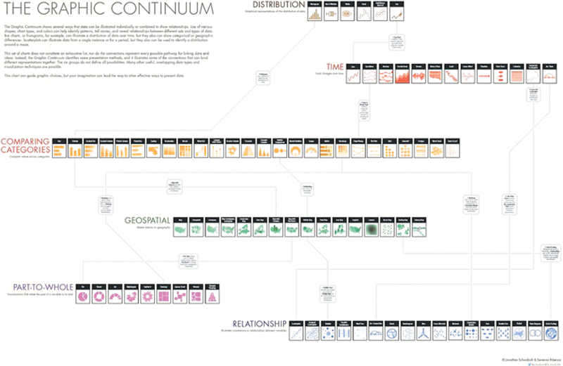
Figure 9.9 The Graphic Continuum, Conceived by Jonathan Schwabish and Severino Ribecca
(Note: This graphic should be given an entire page and oriented vertically)
(Note: This graphic should be given an entire page and oriented vertically)
As a sample set, this section will look briefly at:
• The bar chart
• The line chart (and area charts)
• The pie chart (and its newer cousin, the donut chart)
• The scatter plot
• The bubble chart
• The histogram chart
• The treemap
• The heat map
1. The bar chart
One of the most common ways to visualize data, the bar is a traditional favorite that can be used to quickly compare information and reveal highs and lows (trends) at a glance. This type of chart is best suited for numerical data that can be divided cleanly into distinct categories. Bars can be oriented on either the vertical or horizontal sides of the axis. This can be especially helpful for spotting trends, when both positive and negative data are plotted along a continuous axis.
There are a few ways to spice up a simple bar chart. On a dashboard, several bar charts could be added to help a viewer quickly compare information side by side without moving through several charts in isolation. On the design side, overlaying bars with highlight colors or with texture. Finally, additional layers of information can be added to bar charts by either using side-by-side (or, clustered) bars, or by stacking related data on top of each other, or by adding a reference line to indicate a key value. These tactics give depth to an analysis and have the propensity to address multiple questions at once.
2. The line chart
Like the bar chart, the line chart is another of the most frequently used chart types (which can also be paired with bar charts, too, to show trends). These charts connect individual numeric data points to visualize a sequence of values. The best use cases for a line charts involve with displaying trends over a period of time.
When two or more lines are present, line charts can be transformed into area charts by filling the space under each respective line to extend the analysis and illuminate the relative contribution that a line contributes to the whole.
3. The pie chart/the donut chart
We all love to hate the pie chart, and to a lesser extent, its shiny new(ish) cousin, the donut chart. Both are great options to visualize proportions (part of a whole). Unfortunately, they are also among the most misused (and overused) of chart types.
The donut is basically the same idea as the pie, but with a hole cut in the middle that can be fun emphasizing a key metric of KPI. In either, the circle represents the whole, and the size of the wedge—the largest starting on the upper right—represents a percentage of the whole. Combined, each wedge in the pie should add up to equal 100%. Both charts are best used for comparing a few values, and viewers should not be asked to translate wedges into relevant data or compare one pie to another.

4. The scatter plot
Scatter plots (also known as a scatter diagram, scattergram, scatter chart, or scatter graph) are an effective way to compare two different measures and visualize data points to quickly identify patterns, trends, concentrations (clusters), and outliers. These charts can give viewers a sense of where to focus discovery efforts further, and are best used to investigate relationships between variables.
Adding a trend line to a scatter plot can be helpful to guide the eye and better define correlation. Incorporating filters can also reduce noise and prompt viewers to limit their investigation to the factors that matter most to their analysis.

5. The bubble chart
One variation of the scatter plot is the bubble chart—also known as the packed bubbles view—wherein the data points are replaced by bubbles. This is a method to show relational values without regard to axes. It is used to display three dimensions of data, two through the bubble’s (or disk’s) location and the other through its size. These charts allow for the comparison of entities in terms of their relative positions with respect to each numeric axis and size. The various sizes of the bubbles provide details about the data they represent, and colors can be used as an additional visual cue to encode the bubbles and answer many questions about the data at once.
As an example of a bubble chart, refer back to the pie graphic in chapter: The Data Science Education and Leadership Landscape. The size of the bubble represents the increasing percentage of people who selected each flavor as their favorite, while the bubbles themselves are “colored” as the topping of each pie to visually showcase the flavor itself. As another technique for adding richness to bubble charts, consider overlaying them on top of a map to put geographically-related data quickly in context.
6. The histogram chart
A different take on the bar chart, histograms can be used to understand the distribution of data by grouping data into categories and plotting them with vertical bars along an axis. These charts can be used to test different groupings of data, too, and can—like scatter plots—benefit from the use of filters to drill down into different categories and explore many data views quickly.
7. The treemap
A more advanced visualization, the treemap uses a series of rectangles of various shapes and sizes to show relative proportions. It works especially well if the data being visualized has a hierarchical structure (with parent nodes, children, etc.) or when analyzing part-to-whole relationship. As its name suggests, a treemap works to divide and subdivide based on parts of a whole by breaking down into smaller rectangles, often of a different color or different color gradient, to emphasize its relationship to the larger whole.
The treemap also provides a much more efficient way to see this relationship when working with large amounts of data by making efficient use of space. It is ideal for legibly showing hundreds (or perhaps even thousands) of items simultaneously within a single visualization.
8. The Heat Map
Among the more advanced visualizations is the heat map. This type of graph is a great way to compare categories of data using color and size as visual indicators to quantify the individual values through a matrix of colors. Similar to treemaps, a heat map represents the values by a variable in a hierarchy. They are similar in concept to the type of complex visual data representation that you might see used on your local weather forecast by the meteorologist to illustrate rainfall patterns across a region.
Tip for navigating this type of visualization would include adding a size variation for squares to show the concentration of intersecting factors while adding a third element, or even using a shape other than a square to convey meaning in a more impactful way.
9.6. Data visualization golden rules
It was data visualization pioneer Edward Tufte (1983)—referred to by The New York Times as “the da Vinci of Data” (Shapley, 1998) who wrote, “Graphics reveal data. Indeed, graphics can be more precise and revealing than conventional statistical computations.”
In Tufte’s opinion, data visualization should show the data while inducing the viewer to think about the substance it is presenting rather than about methodology, graphic design, the technology of graphic production, or anything else. It should make large data sets coherent by incorporating design principles to present many numbers in a small space in a way that leverages the brain’s natural visual processing horsepower. It should encourage the eye to compare different pieces of data, while revealing the data at several levels of detail—from a broad overview to a fine structure.
When bringing together the art, the science, and the story of any data visualization you should take into account the following as 10 Golden Rules of data visualization.
9.6.1. Rule #1: visualize with goals in mind
Goals come first. Creating an effective data visualization should begin first with knowing the purpose that the visualization is intended to serve. A clear goal in mind will shape how the designer will build a visualization that brings together all the necessary ingredients in alignment with one specific purpose. If the goal itself is unclear, it can be useful to start by thinking about how the visualization will be used once it is completed. For example, is it intended for strategic reasons, for analytical, for operational? Or, will it explain a specific insight, or be used as a tool for others to explore and discover new insights? Answering these questions will determine its purpose, and help to reverse engineer the approaches which may work best to build the visualization in order to meet its goal.
Separately, the goal of the data visualization is not the same as its message (which comes in a later step), though the two work in tandem so it is useful to mention this upfront, too. Whether the visualization is designed with the goal of prompting decision or action, or with the goal of inviting an audience to explore the data to find new insights, the designer of the data visualization is tasked with identifying the relationships and patterns of the data that support their goal. Then, pivot the perspective to think from your audience’s point of view. Knowing both sides of the story will make sure that the goal of the data visualization is the same from the viewpoint of the designer and the viewer.
9.6.2. Rule #2: know your data
Almost anything can be turned into data and encoded visually, but before a designer can successfully create (or recreate) a data visualization, they must understand the underlying data. This includes the type of data, its context, and its meaning.
At a basic level, data can be classified into two primary groups: quantitative and qualitative. Qualitative data, measurements that are expressed by natural language description rather than numbers (eg, favorite color = yellow) can be further divided into two subsets: categorical and ordinal.
Quantitative data are variables that are expressed in exact numbers and always associated with a scaled measure. These are metrics that can be counted, ordered, and aggregated. They can be discreet or continuous. Example: life expectancy, income per person, year
Categorical (also, nominal) data are variables that do not conform to natural ordering, though they can be logically organized into groups (or categories). These may take on numerical values, but these values do not necessarily carry any mathematical meaning. Example: gender, sport, geographical location (regions or states)
Ordinal data is similar to categorical data, except these can be counted and ordered (or ranked) in some way yet still cannot be aggregated.Example: count bins (0-100, 101-200), rankings (easy, medium, hard), grades (A, B, C)
Other factors—like data cardinality—also affect classification of data. Beyond data type, there are graphs, charts, and other visualization types best suited for specific types of data, as well as key data features most important to visualize. However, these decisions should come after the data itself and its context are well understood.
9.6.3. Rule #3: put your audience first
The goal of the data visualization can be lost if it is not designed to suit its audience. Therefore, data visualizations should always be customized to fit the unique and diverse needs of its audience and only include what they need to know (message) in alignment with the visualization’s purpose (goal) in a clear and focused way that is compelling and meaningful. What is relevant or needed by one group may be irrelevant or overwhelming to another. Too much information can cause information overload (drowning in data) or too little, increasing the likelihood that key points may be lost in data visualization noise or, conversely, stripped out or lost.
A helpful guide to determine the needs of the audience is to consider the following questions:
• Who is looking at the visualization?
• How will they be looking at it—in a static report, an interactive dashboard environment, on a mobile device?
• How will they be given its message?
• What kind of action might be taken?
• Does the visualization provide the right level of detail?
• Does it include the right type and amount of data to justify action?
• Does it tell a compelling story? Is it clear?
• What assumptions or bias might affect design choice?
9.6.4. Rule #4: be media sensitive
While it is not especially critical to think mobile-first, when designing a data visualization you should be aware of form factor bias and rethink the way storytelling is performed via mobile devices. One way to think about this is to consider how the visualization will be used on a mobile device—will it only be consumed, or is it intended to be exploratory, shared, or presented? If a desktop-based data visualization is anticipated to transform to fit a mobile device—whether a laptop or a smartphone—there are important design concerns to keep in mind. For example, how will the visualization orient on a mobile screen? Will it be large enough to convey meaning without losing depth of analysis? Will color gradients appear with clarity? Will headings and labels make sense, or will they be removed completely? Will users expect and/or desire to interact with the visualization the same way on a mobile device as they would on the desktop?
9.6.5. Rule #5: choose the right chart
For each type of data there is a diagnostic of visualizations best suited for specific analytic needs. Among these are: contribution analysis, time-series analysis, correlations, and so forth. For each, there are appropriate ways to visualize data and intended visual takeaways. Line charts, for example, are used to track changes or trends over time and show the relationship among variables. Bar charts are used to compare quantities of different categories; scatter plots to show joint variation of two data items; and the pie chart to compare parts of a whole. Many other advanced visualization types—like heat maps, treemaps, and histograms—span the continuum of exploratory and explanatory graphics. We explored some of these in the previous section, and there are many guidelines and practices that can guide the selection of the appropriate method. There are also key features to visualize, and best ways in which to visually represent them.
Regardless of the type of graph, chart, or other visualization method chosen, the designer must be keenly aware of its strengths and limits. They must know what kind of data it is best suited to visualize, and employ whatever type of graphic best conveys the story as simply and succinctly as possible. And, they should only include relevant visuals that deliver important information to the target audience. Remember, too, how data visualizations can work together if more than one is presented in story succession or on a dashboard. However, be careful because using too many different types of graphs, charts, or graphics that can leave the audience unsure of the message, and deterred from the goal.
9.6.6. Rule #6: practice responsible charting
Understanding of data and an awareness of the most appropriate ways to visually represent them are the first step in building an effective data visualization, but beyond that comes the following mandate: chart with integrity. The ability for a visualization to lead us to answers can also occasionally lead us to the wrong answers. Data visualizations should not be used—intentionally or unintentionally—to distort, mislead, or misrepresent information. It is as important to avoid cherry picking of data to manipulate a visual representation. One should not treat all data equally nor force the data to fit a message that is untrue.
First, understand bias, and work to avoid it. There are several types of biases (confirmation, social, hindishgt, and priming, to list a few), and, to quote Jock Mackinlay, Vice President of Research and Design at Tableau Software, the “smarter you are, the stronger your cognitive biases are.” Exploring data effectively is what protects you from cognitive biases.
Second, avoid Simpson’s paradox, or a trend that appears in different groups of data but disappears or reverses when these groups are combined. One of the best-known real-world examples of Simpson’s paradox occurred when the University of California Berkley was sued for a perceived bias against women in the 1970s based on analysis that suggested that women who applied for admission to graduate schools were admitted at significantly lower rates than men. Data for the fall of 1973 showed that the male applicants (a total of 8442) were admitted at a 44% admission rate, compared to female applicants (4321) who were admitted much lower, at a 35% admission rate. The illustration in Figure 9.10 shows how significant this difference appears at a surface glance.
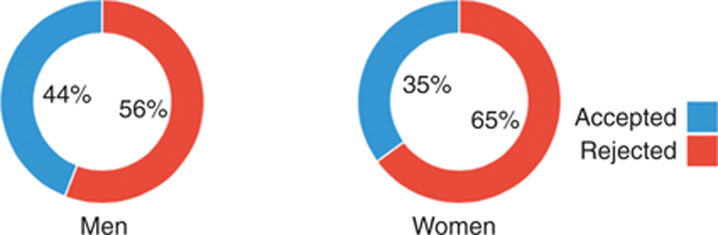
Figure 9.10 Male Versus Female Applicants to UC Berkley Graduate School in 1973
However, by exploring the data deeper, and understanding additional levels of categorization of the data (see Figure 9.11), we can actually see that this is not so significant after all, and that we have fallen prey to a contradiction in probably and statistics—Simpson’s paradox. In fact, depending on the academic department, women’s admissions rates were actually higher than the men’s in many cases, and each unit was dependent on the number of applications received.
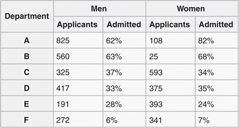
Figure 9.11 A Deeper Look at the UC Berkley Admission Data, by Department, Applications for Each Gender, and Percentage of Applicants Admitted
The visual in Figure 9.12, presented by Visualizing Urban Data Idealab (or, VUDlab, a student-led organization formed at University of California-Berkeley) revisualizes this data in a much more appropriate way.

Figure 9.12 A Better Look at UC Berkley 1973 Admission Data From VUDlab.
Available at http://vudlab.com/simpsons/
Available at http://vudlab.com/simpsons/
9.6.7. Rule #7: use labels wisely
This is less of a design conversation and more of an emphasis, again, on context. When labeling visualizations, include a compelling headline to orient the viewer and communicate the main focus of the visual—this is your title—and do it as clearly and concisely as possible. Headers are not the place to get fancy with typographies, keep them simple and do not capitalize every letter or go to unnecessary extremes to force attention. Label axis’s horizontally so that they are easy to read, and again, be clear and concise. Minimize the use of legends and other explanatory elements, and instead design your visualization to communicate visual meaning without additional layers of description and clarification.
Using labels wisely amounts to providing source information and leveraging supporting elements—like story points and annotations—with discretion. Do not be cryptic or clever, and do not over embellish. Just explain what the graphic is intended to do. This will help to put the visualization immediately into context.
9.6.8. Rule #8: design with care
Without revisiting a host of design considerations for data visualization, a good rule of thumb to designing with care is to make sure everything on the visualization serves at least one purpose. The design effort should be focused on showing the data above everything else. Therefore, design to the point: be straightforward and do not feel the need to fill every space on the page. Too much clutter makes the important information harder to find, harder to remember, and easier to dismiss.
Edward Tufte calls this “maximizing the data-ink ratio.” Eliminate all extra ink—including chart features, unnecessary headers, etc., and redundant information, including background colors, borders, and grids—that add visual complexity to the graphic. Always choose the simplest, clearest, most efficient way to convey information correctly. Use color, size, position patterns, etc., discriminately to help the reader see what is important. Color adds emphasis, highlights the particular data points, and draws connections between graphs. The hue, value, and intensity of the color are significant and may have cultural or social connotations that you should be aware of, too.
Size and position draws attention to particular data points and hierarchy. The top of the charts and larger objects tend to draw the eye first, and this rule of thumb applies both to the individual data visualization, how visualizations are grouped together in a dashboard, and the dashboard layout itself. Cultural reading conventions also determine how people read charts (similar to how they read text).
Capitalize on the best features of data to visualize. As a guideline, consider the below:
• Categorical data: position, color hues, shape, clusters, boundaries
• Ordinal data: position, size, color intensity, color hues, shapes
• Quantitative data: position, length, size, color intensity, orientation (to communicate change)
9.6.9. Rule #9: let the data speak
The most important component of a data visualization is (and always will be) the data. No matter what visual elements are included, or what chart or graph type best presents the data, the data itself should be the focal point of the visualization. Therefore, when viewers or analysts interact with a visualization, the data should be let speak first. So, when building a visualization, distracting elements should be avoided so they do not get in the way of the data. Rather than being force-fed a visualization users should be allowed to interact with the graphic on their own as they move through the visual discovery process.
Visual cues and story points are important aspects of a visualization, but come secondary to the data. Use visual cues strategically as indicators or visual cues to guide the audience and draw their attention, but let the data tell the story, not the design. While interaction and animation can assist the discovery experience, special effects—like 3D—should be avoided. Likewise, if the visual is intended to tell a story, make sure it does so in a way that is in line with your strategy. Narratives help to explain the data in words and adds depth to the story while contextualizing the graphics and embellishing on key points or implications. Aligning the visualization’s story with the organization’s strategy provides support on both sides, and helps the data speak within a larger, more meaningful, context.
9.6.10. Rule #10: edit and revise before you share
The more you design, the more you learn. The better you know your data, the better you can represent it appropriately. It is important to give yourself time to revise and edit iteratively, as well as take the opportunity to share data visualization drafts with other business experts or with candidates from the intended audience. Use this feedback to refine and fine-tune your graphic.
Mistakes are a normal part of life as well as a fundamental part of how science works. Researchers publish their findings along with their data so that other scientists can look for mistakes, flaws, or future areas of research opportunity.
9.7. Conclusions
This chapter concludes the depth of discussion that we will take on the mechanics and best practices (or, golden rules) of data visualization. More resources can be found in the Appendix. The point here was simply to provide a distilled look at some of the criteria for successfully crafting an accurate and appropriate visualization, and beginning to understand the plethora of options available and the undercurrent of meanings and uses behind them, as well as how some of the visual design principles of the previous chapter are applied and affected when putting data at the forefront of a visual conversation.
Moving forward, the final section of this book focuses on building a foundation for data visualization within a visual culture of data discovery. We will approach this by stitching together each of the conversations of the preceding chapters into meaningful applications on architecting for discovery and establishing data visualization as a core competency within the organization, and, further, how both of these work together to enable visual data discovery by design as part of a visual, data-centric culture.
..................Content has been hidden....................
You can't read the all page of ebook, please click here login for view all page.