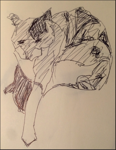
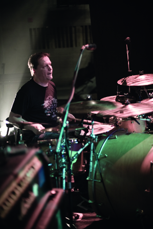
Everyone needs to draw, even lighting designers, sound designers, and composers. Although those works are etherial, communication is not. Drawing is one way we all communicate. A sine curve might describe how music changes, or light builds. Drawing is the first step towards describing any design. Drawing is a great way to hash out many ideas quickly. Pen and paper are still faster than any computer.
As much as the foundation of design is the thought process, it is also critical to develop presentation and communication skills. These things go hand in hand.
In this chapter, and throughout, drawing might be a metaphor. Drawing might mean putting pencil to paper to create a two-dimensional representation of a three-dimensional object. It might also mean a sound designer/composer tapping his or her fingers on a table top to suggest a rhythm. It might mean sculpting with clay or paper, swatching fabrics for color or pattern, or collaging. Drawing is how you express your ideas.
How you draw and what you draw is a personal thing. Some might like pencil and paper, others watercolor. The medium does not have to be traditional; apps like Painter, Sketchbook, and ProCreate can emulate traditional media on hand held devices.
Drawing, painting, collaging all connect the hand to the eye.
Pixelmator, Photoshop and Illustrator can be places to start. They can also be places to finish art began by hand or in other programs. Vectorworks/ESP Vision can combine and animate finished set, lighting, and projection designs. Audio can be added to an exported movie file.
The critical nature of drawing is the visceral hand to eye connection.
Show business is a social business. Entire productions, even the sound scape have been designed on the back of a place mat. That may or may not mean the work was drawn upside down, and accurately, so that the illustration was properly oriented for the director.
Designers must observe the world closely and bring those observations to the table and the team.
Drawing, doodling, collaging, and swatching are all tactile ways to first explore, and then express design ideas. These initial experiments and reactions can also be part of the path to an expressive metaphor.
When reading a script, does a designer feel silk, velvet, or burlap? When reading and doodling, are you inspired to draw straight lines, or curved lines? These are the beginnings of the ways designers express how the show will sound, what the actors might wear, and how the lighting may shift from moment to moment.
Designers have to be keen observers of the world. Ideally, that’s through experience. Sometimes, it is through research. The light as it appeared on the street in Rome when you visited the city may suddenly illuminate a moment in a play. Perhaps that play, or another, evokes a painting that hung on the designer’s grandmother’s wall.
In any event, designers need ways to record what they see and hear. They need to record how these things make them feel, in order to create similar feelings in an audience. On cue.
Sometimes, drawing is a means to record moments in your life.

Cabaret
Many designers have a style. Not so for Costume Designer Jennifer Caprio. She adapts her sketching to help illustrate her concept. She starts with a rough hand drawn sketch and works the image using a tablet and Photoshop.
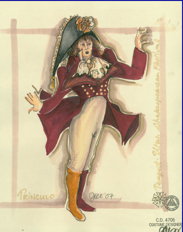
The Tempest
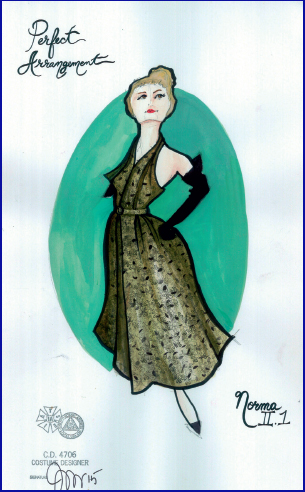
Perfect Arrangement
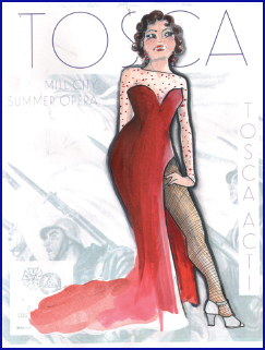
Tosca
Everyone must draw, in fact, everyone does draw, not only designers. Drawing assists in communicating ideas. Drawing, even crude drawings, can facilitate discussion and collaboration. Often drawings need to be done, on the fly, in meetings. Quick sketches can eliminate hours at a computer, or on a hand-painted rendering.
Scay’s first rule: in Doodles; there are no rules.
Stephen J. Scaysbrook
Architectural Technologist
In a meeting with colleagues, and when dealing with visual images and ideas, everyone will grab a pen, or pencil to add their ideas. This might be a traditional pen or pencil, but it also might be markers on a white board, or an iPad.
What’s important here is that everyone communicates. The director, the TD, the producer will all draw. The design team will be expected to translate their drawings, that is, to draw what others have already drawn, just better.
Not every designer or artist is DaVinci. Don’t worry about your abilities, especially your abilities today. Draw all the time; draw every day; your drawing will improve.
Every designer needs to be able to use squiggles, lines, or cartooning to express ideas, their own and others, quickly, clearly and efficiently. Drawing does just that.
Drawing is an important part of any artist’s process. We have discussed Picasso and the Cubists, in terms of their formal painting. While working out the ideas behind Cubism and later abstractions, Picasso kept sketchbooks. He drew constantly throughout his very long life. Picasso was an amazing technician, and that ability to communicate ideas is seen in his sketchbooks. Much of his social life is detailed in his sketchbooks. Picasso liked to party and often drew his drinking companions.

Unless otherwise indicated, drawings are from the author’s sketchbooks.
Drawing creates a direct link with the work and the creative process. Not every drawing is something to be framed and hung. If you think that, get over it. If you lack confidence in your drawing skills, see above.
Look at the drawings and sketchbooks of any master. You will see variation of quality and completeness. Look at the growth of their ability over their lifetimes. Like researching paupers clothing in Paris, it is often a challenge to find the not-so-good examples of the masters’ work, but they are out there and they explain how artists grow.
Whether you draw well, or lack confidence, there is only one path; draw every day. Draw something, your coffee mug, your hand, the person across the coffee shop. Take a life drawing class with a good instructor. It is true that when you can draw the human form, you can draw anything. Drawing is a matter of training the eye.
Drawing is a metaphor for communicating ideas visually.
It is amazing what can be learned in a short amount of time. Yes, the first drawings may stink, but when you have done several hundred or several thousand, you will have something. Just don’t give up. Draw often, pick ubiquitous objects. It’s a nice relief from staring at a computer screen, or a sewing machine.

Some of Campbell Baird’s costume sketches for Happy Birthday.
Drawing is observation and learning about the world around the artist. Drawing helps to cement the memories of things seen for future use.
The Designer’s Sketchbook/Journal
This is where you draw every day. This is where you may paste images cut from print magazines, snippets of sound, inspirational quotes, or poetry. This is where you might draw any of the everyday objects that surround you, or the person next to you. A drawing does not have to take long, it might only take 30 seconds. It will not hurt.
Every type of artist keeps a sketchbook or journal. These should be plural, and they shouldn’t last long; they should get filled up quickly. There are different size sketchbooks, and different papers, materials, and looks. Finding the right combination can be an enjoyable hunt. Consider a few different sizes; a small book that can fit in a pocket, a medium book that goes in a bag, and a larger book for organized drawing sessions or classes.
These are traditional ways to sketch; they should be learned and respected. Technology allows more options. It is difficult to have access to oil paints at all times, unless you have an app for that on your iPad. Apps mean you can start a sketch on your phone in a meeting and refine it on other devices. The sketch might become the rendering.
Sketching is visual note taking, not necessarily about creating art for the ages, although we all inevitably have flashes of brilliance.
It is important to be comfortable with your tools and materials. You will find that comfort through experimentation.

Set designer and professor Campbell Baird began his design for Hello Dolly in his sketchbook. A first step is in the image below. Above detail has been added.
Consider choices in bindings, paper, and sizes for the actual books. In terms of media, the choices are almost unending. Pens and pencils come in many forms and colors. Will you sketch in color, or black and white? Start simply — this should be a joy, not a burden. Purchase better quality materials. Cheap brushes can turn an artist off of painting. It’s better to have fewer, even just one, better brush, than many cheap brushes.
Some designers keep a different sketchbook or sketchbooks for each project. This would be in addition to their day-to-day sketchbooks. Making the choice to keep a project specific sketchbook allows the artist to make choices about the sketchbook and media that relate directly to the concept and metaphor they will be illustrating. For instance, if you’re expressing nothing but hard and straight lines, a straight edge might be added to the kit. Paper for sketchbooks comes in many different colors and textures. Choice of paper and drawing tool can be made with the metaphor in mind, just as sketching can lead to the discovery of a metaphor.
Some metaphors may call for the opaque color of an acrylic or gauche paint, others for the more etherial transparent color of traditional watercolor. If you want to design in a film noir look, perhaps the doodles or sketches are just India Ink, or very soft pencil.

In some architectural or communication design firms, each member of a design team is issued a specific sketchbook for every project. This helps to keep everyone’s notes, visual and literal, collected in one place.
In addition to a sketchbook, there are many other methods of taking visual notes and then creating a personal library. Not just a sketchbook, but a library of images, historical research, and things that inspire. Photographs, found and taken, can be used to create an online or strictly personal resource. A library might be hard copy, electronic files, or both.
Adding to a library is a part of the research process, but the collection becomes a source for ongoing inspiration. First, there is the obvious ability to always have something interesting to draw when you have a collection of images readily at hand. Perusing sketchbooks or libraries is one way to inspire creativity, imagination, and thought.
For example, a website like Pinterest is a library, and can be used to manage your collection.

Seemingly random images may eventually inspire or find a specific use.
Photography is another way to train the eye and keep visual notes. This is not in lieu of sketching, but as an enhancement to sketching.

Cameras, lenses, even phone cams force the artist to view the world in certain, specific ways. The lens frames the visible world, like a proscenium in a live theatre. The choice of lens and the relationship to the subject further refines the view.
Photography, digital or with traditional film, can and will affect the colors of the natural world. Infrared film or effects can change a traditional landscape into something other worldly. Digital and traditional photo filters can also enhance, or completely change, the original image.
Of course, your sketchbook can be the first line of attack in developing the designs for any project. Whether through a beginning doodle or a ground plan, ideas can flow freely from the artist’s mind to the page and revisions can be instant.
In this case, the term painting may refer to any preliminary color studies. It’s a metaphor. Shocking.
Working with color is an important step in the design development process. Color does not have to start as definitive choices. Allow yourself to explore and play with color, possibly in a sketchbook, possibly in your studio.
Painting doesn’t necessarily follow sketching. Often color can help a designer understand their emotional reaction to a piece. Doodling with water color, whether the doodles are representational or not, can help focus a designer’s thoughts as they react to a script, story, or a piece of music. There is no reason a lighting, sound, or projection designer cannot experiment with watercolors.
While color study can begin in a sketchbook, it will eventually migrate to a more compete look in a larger scale. Experimentation in traditional media will likely precede computer modeling, or any form of final rendering in traditional media.
During the design development process, color can be brought into the picture in many ways. Black and white or line drawings from a sketchbook might be photocopied, or scanned and worked over with color media, or in Photoshop. This is a quick way of looking at numerous studies. Color collages can be a source of inspiration or used to start a discussion.
It is important, especially early in any design process, to be flexible and open to different ideas. Exploring many ideas helps to move past any preconceived notions as to the final design. Quick and cheap or down and dirty artwork will open the team to looking at a number of approaches without any member of the team taking too much ownership too early in the process. These kinds of renderings or studies are not precious.

Exploring color can help a designer or all of the designers reach a metaphor. Color exploration might happen with the metaphor already established. Perhaps both ways, on the same project. It is important to realize that the first conceptualization and metaphor reached might not be the right answer. Doodling with pen and color allows the team to proof the metaphor, much like a mathematician proofs an equation.
There is nothing wrong with discarding a metaphor after you have begun to work with the image. This is certainly preferable to completing a project that follows a commanding image to the wrong destination.
That bears repeating, never be afraid to throw out an idea when you have determined it isn’t working. Accept early that shows often have to be designed two or three times. The process leads to the destination.

Bruce Rodgers of Tribe Design uses many different techniques to communicate his ideas. Here is a collage created for Madonna.
Collage is both an option and a choice for communicating Design Ideas. For those who are still developing their drawing and presentation skills, collage is a way to communicate without relying wholly on those skills.
Collage might also be a design idea to pursue either on its own or as a specific look for certain projects.
In either case, collage requires excellent studio skills to create clean, organized and presentable work. Just because it is collage does not mean that excellent craft is not required. The more so as the ideas are solidified. In other words, no one wants to see the glue.
In preliminary design, collage offers a great way for a designer or designers to manipulate elements, without time consuming re-creation. Directors can play as well. Starting with larger elements, collage colors, shapes and images to seek the overall look and feel.
Designers sketching stage space need to be able to illustrate three-dimensional space using two-dimensional media. Stage space immediately invokes the fearsome thought of using perspective. Vanishing points; — one, two, or three — mechanical perspective, even perspective grids, and other scary things come in time. The most difficult thing about perspective is getting over the fear.
Perspective isn’t hard. It just takes practise.
When drawing, or when creating a reality, overlapping objects can suggest depth. Large objects, whether they are architectural, characters, or simple geometry are in the front, or Foreground. Smaller objects recede, or get smaller, to show that they are in the Background. In context, here, this is a drawing technique. These are also important Principles of Design.

In traditional perspective, objects in the Foreground appear to be darker or more defined than objects in the Background. That basic principal can be reversed with great effect, and to indicate lighting.
Artists in the Renaissance developed this technique of rendering form with values of light and dark. It isn’t just the strict mechanical representation of objects, or clothing that indicate a moment, but how those things are seen, or not seen, for that matter.
Invented during the Renaissance, and then all but perfected by the Dutch Masters.

The Matchmaker, 1625, Gerard van Honthorst (1590—1656), oil on canvas, 71 cm × 104 cm.
Not just for painters, Chiaroscuro is one way to sculpt space in a sketch. It can also be very inspiring.
In photography, film or digital, still or motion, depth of field helps to direct the viewer’s eye by determining what part of the image will be in focus. In turn this can produce lovely images. Although the human eye sees everything, at every distance, in focus, we have come to accept this convention.
Just because it’s a film thing doesn’t mean you cannot use this technique with other media and force the viewer to focus where you want them to focus.
We all like some smoke and haze onstage, Pyro too, but I digress. Rendering, or sketching with some objects defined, and others left to be simple, barely recognizable shapes or lines, can create a sense of depth and space, much like Depth of Field.
The short story here is that it is important and necessary to communicate visually with the other artists on the project. Drawing, doodling, swatching, or collaging are inspired by the physical world. Together or individually, they are ways designers begin to understand their feelings for the story.
It is possible to sketch and design using a computer as a paintbrush, or a camera.
Sketching, doodling, being free and easy; these are great things. They are part of the process, but at some point your pre-visualization has to get real, and has to get accurate.
Costume sketches do not have to be a perfect portrait of each actor in character. They do have to provide enough information for the drapers, dyers, stitchers, tailors and pattern makers to build the costume. They also have to provide the actor, producer, director and the rest of the team a pretty good idea as to how the finished garment will look and feel.
Similarly, set sketches have to evolve into finished renderings, paint elevations, models, real and/or virtual, and detailed drafting. How these things come to fruition, and in what order, is different for every designer. No matter the path, the process is always about collaboration.
As all of the designs come closer to fruition, more and more people are added to the collaborative effort — the artisans who will execute the designs.

Some of Bruce Rodgers/Tribe Design’s preliminary sketches for an unrealized permanent stage in Shanghai location.
Everything that a designer wants to see on stage, and everything that designer has communicated will be onstage, needs to be clearly conveyed to the people who will execute the designs.
Communicate poorly; you get poor results.
Technology has reached a point where directors and producers will be expecting to see full visualizations of lighting, projections, audio, and scene changes. Pre-visualization can save hours of time in the theatre. Producers will like that savings. Directors will want to use that time to rehearse.
Lighting and projections tested on accurate computer generated scenic models can express how the show will feel before load-in.
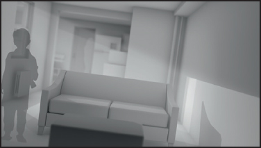
The key is to build from loose preliminary work, to very precise and illustrative final work.
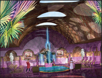
The sketch in the upper left led to the rendering below, inspired by a bathroom the designer once visited.

After all this, communication is just visual. Often we actually speak to one another. Sometimes in meetings, with other people around. Your verbal skills and confidence are also important and require learning.
Designers must be able to speak in public, at least to an audience of other designers, artists, directors and managers.
Speaking doesn’t mean pontificating. It generally means engaging in a public dialogue.
Be fearless with your ideas, be fierce in expressing those ideas. Have confidence, but don’t be rude.
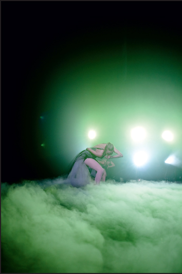
Ballet Deviare (derived from the Latin for deviate) is a New York City Ballet Company that dances a classical ballet form to heavy metal music. Diana Kesselschmidt is their lighting designer.
As one might expect, the dancers movements are always elegant, while their bodies and the choreography illustrate the fear, darkness, strength, and defeat in the music. Ballet Deviare is outrageous in performance and in their mission statement which asks: Who the Hell said that high art can’t kick ass?

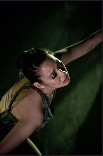
Ballet Deviare. Photography courtesy of Lukas Drapala.

Ballet Deviare is about rebellion. There is nothing typical metal or typical ballet about their work. There is fusion; dancers destroy their feet and bodies to make beauty using strength, the Metal lifestyle and aesthetic uses violence to whittle and crystalize art and beauty. The two art forms mix and create transcendence. Ballet Deviare honors the classical form: they do not mock those who came before them, they dance with strength, break the fourth wall with unexpected eye contact, and move with intensity.
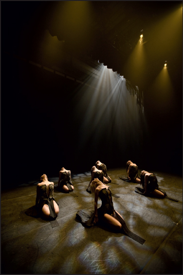
Like a blacksmith forging poetry, the lighting for performance has to bring out all of these qualities.