
Once the intellectual framework for a design has been established, or you have the foundation for the idea, designers need to design.Yes, there are apps for that, but first there are elements and principles that remain consistent without regard to software or artistic medium.
The Elements of Design and The Principles of Design (or Composition) are basic to any artistic endeavor. There are similar principles involved in the composition of music, and audio soundscapes. Rhythm and timing, as examples, are certainly key to both audio and visual creations.
Everything can be reduced to basic elements. In chemistry those elements are shown in the Periodic Table. When cooking, combining simple spices creates strong flavors. In visual design those ingredients might be called; line, form, mass, texture, and color. Sound might be simplified as timbre, time, texture and tenacity. There are stronger correlations between the visual Principles of Design and Principles of Music Composition.
Whatever the terminology, the similarities between the visual and audio is strong.

Image courtesy Gaderidge.
While every designer may express these elements differently, the roots are similar. We don’t have quite the same hard and fast rules that chemists have to use.
This is all about the basics and the importance of the strength of a good foundation for the creation of any good design.
How the elements of design are assembled has everything to do with your metaphor. If the metaphor is cotton candy, the forms and lines should be soft. If the metaphor is pink cotton candy, then the color follows. Steel as a metaphor would feel completely different, and look completely different.
Let’s look at what we have to work with.
Line is the most fundamental element of design. Line is the root of most all of the visual elements.
At a base level, lines are the simple straight or curved connections of points as defined in high school geometry. Bezier curves which define lines in vector-based drawing programs are simply more complex math that describe lines that can be like bold curves drawn with the entire arm. Lines can also be calligraphic, and in that way, they almost become forms. Sometimes lines do become forms.
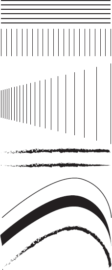
One thick and thin line can be used to describe or render many dramatic elements. Fashion illustration can often be only about a line.
Your metaphor directs your initial choice of line and type. If your image is of a steel rail, your lines would be hard, sharp, and direct. Objects would likely be clearly, and definitively, delineated.

Lines can be found everywhere in nature. Views of a leaf are, at their root, a design using just line. The outline of a leaf can define form.
Is this calligraphic flourish a design that uses line or form?


St. Peter’s, The Vatican.
A Line isn’t always just a Line.
Line can be used to describe composition. A Colonnade (a collection of architectural columns) might be described as a linear design. The sweeping line of a galaxy might be described as linear.
A Line or Lines can be dynamic, and suggest movement even while static on a page. Music can have linear, or sweeping motion. Stereo sound, or complex audio that travels in a linear fashion, can suggest movement.

Photo by Mike Peters, courtesy of Montclair State University
The light streaming through a gobo (or not) into and through haze can be seen as linear. Sidelight on a dancer can define the form of the body in many ways; one way is as a complex line.
Lines can create Forms.
Of course, Form does not necessarily need line.

Forms are the two-dimensional creations of a series of lines, or a line that touches itself creating a closed space. Any single line or series of lines that can enclose a shape creates a form. Back to basic geometry, squares, rectangles, circles, ovals, and ellipses are basic forms. The human body, a car, or a tree in silhouette are also forms.
In costume design, a Form might be used to describe the Silhouette or the basic shape of the costume, or the character. Pagliacci, the clown, for example, is generally considered to be or is portrayed as round or rotund.
Cotton candy suggests soft, cloud-like forms. That might contrast dramatically with a steel rail metaphor which would likely be rectilinear. If that rail was disappearing into the distance, the specific type of rectangle might be a trapezoid.

The Figure–Ground Relationship
Forms, even when Mass, define the Figure and Ground Relationship. Simply put, the Figure is what you (or more critically, your audience) sees, and the Ground is everything else.
Foreground Objects (the Figure, or where you want the audience to focus) should be more prominent than the background. The audience’s eyes will differentiate an object from its surround. A form, silhouette, or shape is naturally perceived as a figure, while the surrounding area is perceived as ground. Whether actual figures or not.
Balancing figure and ground can make the perceived image more clear. Unusual figure/ground relationships can add visual interest and subtlety to a composition.
Figure/Ground doesn’t actually have to involve a human form, but we do focus on the actors.

Two people facing one another, or a goblet? Depends on the Figure-Ground Relationship.

Lighting and Projections Designer Herrick Goldman kept the Figure-Ground Relationships in this production of Evita constantly changing to force focus where needed. Photographs by and courtesy of Herrick Goldman and Bob Tucker.


Forms might be said to create Mass. Form can certainly create the two dimensional suggestion or illusion of a three-dimensional object. A Mass is a Three-Dimensional object.

Photo by Mike Peters, courtesy Montclair State University
A square becomes a cube, a circle becomes a sphere, and that human silhouette, that’s now a dancer.
Cotton candy is light and airy, it is fluffy like clouds. It can be transparent or translucent. Cotton candy is only dense when it is layered. The layers create Mass.

Steel is strong, but it can be beautiful, decayed, linear, or slick.

A Steel Beam is all about strength. Even if your image is further defined as a steel beam, bent and contorted by extreme heat, there is still strength, unless your image definition is clear that steel is molten. In which case, it is hot and dangerous.
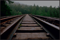
Does your image need further definition or refinement? Is there an importance to the piece as to why your steel beam might be a railroad track and not an I-Beam? Adding detail to your image helps to specify the look of the Forms and Masses in your design.
Just because your metaphor might be steel doesn’t mean you can’t use that image for costume, or lighting.
Adding detail specific to your metaphor may or may not be desired.

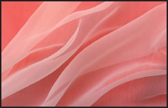
Texture is surface design. A lack of texture is still texture.
Chrome is just as textured as burlap. Most anyone type of surface can have many textures. Gold isn’t necessarily smooth.

Textures might be decorative, or tactile. Texture can be seen directly on an object, or by the way light is used to illuminate an object. Light through trees and leaves (or a gobo) will create texture. Light on a glossy surface will create texture, just as light on a matte surface will create a different type of texture. A gradient fill or a watercolor wash create texture in a rendering.

Every fabric has a different texture and every fabric evokes a different reaction. It doesn’t mater if the fabric is used in clothing, as part of the decor, or as a background projection image.
Cotton candy isn’t one color. The stringy sugary substance is essentially white, although since it is translucent that material is never actually completely white and always sees through to the background. Similarly the food coloring applied is uneven so there are shades of color and bare areas that remain whitish. The color and the white base Masses (the stringy sugar) create a texture. Sugar is slightly glossy, with a bit of a sheen, the imperfections blend away.
Steel has many finishes. Define your steel. Is it a brand new railroad track, or one that is rusted on the sides and polished from use on the top? Is the I-Beam new and polished, primed in a dull color, or rusted? Perhaps the right metaphor isn’t just simply steel, but the chrome-plated hood ornament from a 1932 Packard, or a rusted, seldom-used rail track at Sunset.
Texture can have more impact through variation, contrast, and relief — alternating rough, course areas with an orderly pattern, or a smooth surface provides visual relief that make a design more interesting.
You should make these and other specific choices about your metaphor before you begin to design. Although sometimes the design and the metaphor evolve together, you should not modify your image to suit the design. In our progression it helps at this point to look at these design options while considering the elements of design.

Remember, there are many kinds of finishes and many kinds of hood ornaments. Each one makes a different statement and evokes different emotions.
Texture and color are complex elements. Your commanding image may suggest a limited palette of surface types and/or color. Often you must look to your image for inspiration and then find appropriate variations that speak to the look and feel.

Color is complex. There are entire books, entire careers, about color. This is a broad-stroke overview. Whatever your design specialty, color and color study will be a part of your entire life. Even sound designers and composers use color to organize thoughts and projects. Color can also be thought of metaphorically when referring to audio or the soundscape.
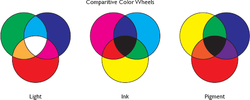
Most everyone, designer or not, is familiar with the primary colors of pigment: red, blue and yellow, that they gleaned from a grammar school art class. We’re going to look at three different color mixing systems;
• Pigment
• Light
• Ink
The color theories remain the same, regardless of the system of color mixing.
Producers and directors may come to the table with only a rudimentary understanding of color and design. The designers may need to translate their comments and ideas.

Color is everywhere. Image courtesy of Karla Hansen
Color is very subjective. While red or blue can be defined in pigment and light, peach is more problematic. Your peach might be someone else’s beige, salmon, or pink.
It is really important that all of the designers understand all of the color systems. Costume designers should be able to look at a light plot and paperwork and discuss how the lighting design palette will affect the colors of the fabric.
Obviously, a lighting designer needs to choose color knowing the colors of the clothes and the performance space.
Color is measured in terms of Hue, Saturation and Value (HSV).
Hue is another word for the pure color; Red or Blue to use examples that overlap light and pigment.
Saturation, Intensity or Chroma refer to the amount of color. This is the purity of the color. Colors high in saturation have not been grayed. Browns are generally low intensity (saturation) oranges.
Value is the relative lightness or darkness of a hue. In a ten step artist’s gray scale, a value of one would be pure white and a value of ten would be absolute black. Conversely, when thinking in terms of light a value of zero is the absence of light and a value of 10 or 100% is the light at full intensity when on a dimmer. Pink pigment is a lighter or higher value red (adding white), maroon might be the same hue with black added.
You may also see HSV described as HSI (intensity), HSB (Brightness), and/or HSL (Lightness).
It is possible to specifically define a color like pink or turquoise by assigning numerical values to HSV, etcetera. While you may be able to communicate this kind of definition, it’s unlikely a director will have a clue.
Color is completely subjective.
It is important to note that since light, pigment, and dye are essentially different, it is not really possible to exactly match colors from one system to another. Remembering that all of the illustrations here translate different color systems into CMYK, let’s look at these three systems of color and mixing.

Triangles, 2014, by Maud Vantours. Much of this contemporary artist’s work involves the manipulation of hue, value and intensity. With geometry.
Cyan, Magenta, Yellow and Black (CMYK) are the colors of ink used on a printing press to produce a full color output. You’ve likely seen these in the cartridges loaded in an ink jet printer.
The CMYK color printing system is also referred to as process color or four color printing. Dye is transparent and in print white typically comes from the white of the paper page.
A colored page affects the mix of the inks, for example, printing red on a yellow page will produce a shade of orange. CMYK color mixing is a subtractive process. The applied ink works by partially or entirely masking colors on a lighter background. The color of the ink reduces the color(s) of the light that can be reflected.
This type of color system is called subtractive because the inks subtracts brightness from the white background.
This information is included here for a few reasons. Designers will frequently need to output paper from computer files. That will be a CMYK output whether this means a costume sketch, or the art for a full stage digitally printed backdrop.
Also, since the designers are the artists associated with a project, they will often be asked to create art for marketing or to sell the production. The more the designer knows about the printing process, the more control the designer has over the output, and the look of the show.

Tony Walton designed the scenery for the original Broadway production of Pippin, as well as the logotype. The 2014 revival staged a live version of this composition, with a costumed cast member representing each letter.
Besides, you might have an idea for the show poster you want to share. Perhaps creating the poster image or the logotype helps you to formulate your design idea. Whether for film, a play, a restaurant, or a giant corporation, the look and logo must succinctly and quickly describe the story.
Most set designers will have to create a sign now and then. In film and television, there are classifications of set designers who work as graphic artists. These people create everything from show logos to product labels, down to every scrap of paper needed as a prop. Here is a career path that builds on the need for typography and branding on a resume, to creating show posters.


Tony Walton designed the scenery for the original Broadway production of Chicago, and based the show’s poster on his design for the scrim show curtain.
Calibrating a computer monitor which displays using the RGB values of light to simulate CMYK output is then a critical part of the designer’s work flow. Every monitor is different and maintaining visual integrity is an ongoing process specific to the hardware.
There is no color without light, and without light, theatre is radio.
Red, Green, and Blue (RGB) are the primary colors of light. In turn, they are also the primary colors of your monitor screen and projection systems. When the primaries are mixed together in theoretical equal amounts, they create white light. Red and blue combine to create magenta, Blue and green mix to cyan/turquoise, while red and green make amber/yellow.
Red and green making amber can be a challenge for those whose understanding of color mixing comes from pigment.

Tony Walton designed the scenery and poster for Sophisticated Ladies on Broadway. The artwork was also seen on the stage left side of the show scrim opposite a mirror image with the cast in their youth.
The Subtractive mixing of two secondary colors, say magenta and cyan, will produce their common color. In this case; a blue.


The pure physics showing the subtractive mixing of magenta and cyan to blue.
White light is a combination of all of the colors of light in the spectrum. That makes white light a challenging concept.
Any white light source is defined by color temperature.
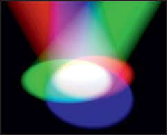
Lighting Designer Diana Kesselschmidt used color and light to paint the guitarist for Ballet Deviare. Photography courtesy of Lukas Drapala
The lower the color temperature, the warmer (more red) the white. The higher the color temperature, the cooler (more Blue) the color of the white.
Changing the light can change the way things are perceived and felt by the audience. The movement of the light, the color, the intensity, can all affect the way the audience feels. Colored light can be used to paint sets and costumes.
When filtering, coloring or gelling a typical stage lighting fixture, careful consideration must be given to the type of light source and the color temperature of that light’s white value. An incandescent light’s value can be adjusted by dimming, however, the light source will also burn redder when dimmed.
Dimming an incandescent source takes an already somewhat warm white and begins to turn the light amber. Gel and lamp choices must be made with consideration towards the value of the light that will be used.
In theory, an RGB-LED fixture ought to be able to provide a full spectrum of color and value from a single source. That is, like much of this discussion, in theory. Different fixtures, different combinations of LEDs, produce different results. Amber, magenta, white and/or other colored LEDs are often added to fixtures to affect the color range a specific unit can produce.
The absence of color or light makes black.
So, without light, there is no color. There is radio.
We see a tomato as red only because the object absorbs the blue and green light and reflects the red light. Somewhat counter intuitively, we see objects as black because they are absorbing the full spectrum of light.


Lighting Designer Diana Kesselschmidt used color and light to paint the roller coaster of emotions that is Cat on a Hot Tin Roof. It is best to alert the set and costume designer before making this kind of choice.
In collaboration with the other designers, projections can also be used to paint or otherwise totally alter the look of the cast, set, and/or costumes.
Filtering light to specific colors affects the way colored objects are perceived. Lighting a tomato with a red light will make the red tomato more red. Using a green light on a tomato will make the object begin to appear brown, or towards black. Depends on the exact color of the light, and the color of the tomato.
The tomato lit red will be appetizing, a green light will make the tomato less appealing.
When picking a paint color, or looking at fabric swatches, it is important to look at them under the proper light. If you really want to see the true color, go outside on a sunny day.
You can see this point clearly illustrated when looking at a photograph, object, or fabric swatch under florescent light, then with incandescent light, and then in sun light. Notice how the color of the photo actually appears to change.
The change in appearance will alter your reaction to the object. Try dimming the incandescent light source, and see how that affects the appearance of the image/color, and how your reaction may change.
When selecting pigment or fabric, it is best to look at the color in actual, real daylight, or the specific light under which the final product will be seen.
Florescent light, unless properly and specifically balanced for film and television, is always bad.
In paint, the primary pigment colors are Red, Blue, and Yellow, but you knew that. In theory these three colors can be mixed to create the full spectrum of visible colors. In practical application, many other pigments are needed.
In Theory. That keeps repeating. Theory is based on pure physics, or pure chemistry. An artist’s palette does not necessarily, or often, use pure colors. There is no perfect pure red lighting gel to filter a perfect white light source. There are often vagaries in LED output.

This free form color wheel in watercolor is not theory. Whatever your medium, it is best to see how the colors in your palette work together, first in a free form manner like this, and then in controlled steps.
That said, in theory; red and blue pigment mix to create purple. Red and yellow together create orange. Blue and yellow combine into green. These are the results of the additive mixing of primary colors to create secondary colors.
The additive mixture of all of the primary colors of light make white light. Conversely, the additive mixture of all of the primary colors of pigment create black.
Consider the rectilinear gray scale with eleven values from white to black. The circle of 50% gray placed in the center of each rectangle, appears darker against the lighter values, and lighter against the darker values.

This perception is not just true of gray. Any one color adjacent to other colors will be perceived differently.
Complimentary Colors, those opposite one another on the color wheel, will mix in equal part to, theoretically, create gray. Shades of brown happen along the way, because all mixtures aren’t necessarily equal.
Colors work with or against each other in different ways. Generally speaking, color schemes that are monochromatic, complementary, or analogous are considered pleasing or tasteful. A monochromatic color scheme utilizes different values and saturations of one hue. Complementary colors sit across from one another on the color wheel. Analogous colors are adjacent on the color wheel.
Colors react differently when seen together or when they are adjacent to one another. This called Simultaneous Contrast, and impacts light as well as pigment.
Complimentary colors — true, really actual complimentary colors — when adjacent to one another create an edge, or a line, that seems to visibly vibrate. This is best visualized using Color-aid paper or opaque paint.

Color appears differently in relation to other colors. The two green dots are the same color. They look different because of their relationship to the adjacent colors.

This is a representation of pigment using ink. Try this with Color-aid paper or gauche.
There are many stereotypes about color and emotion. Although stereotypes often have their roots in a truth, they are best avoided.
Purple is often associated with royalty because Caesar decreed it so. Then and now, the Romans have had widespread influence over Western culture. In Caesar’s time, purple pigment was incredibly difficult to create, requiring shell fish to rot in urine. The process was smelly and unpleasant at best, one might think.
Other powerful leaders have had similar effect on color. Purple isn’t the only royal color in Western culture. Saturated colors, reds, blues, and purples have always been, and remain, expensive to produce. They have often been favored by the wealthy and powerful.
White was also once prized. White pigment has traditionally been expensive to make and to maintain. Generally, gray, or muted colors using earthen pigments were easier to create. Traditionally, painters mixed their own colors and made their own paint. Commercial lines of paint did not exist until the latter half of the 20th century.

Red is a very important color in Chinese culture.
Consider and research cultural color associations, they may matter to your audience. Designers need a broad understanding of color and culture. Using color to garner an emotional reaction from your audience, you must understand that audience. When analyzing and conceptualizing a piece that takes place in a Chinese restaurant, think about, and research, the culture of the place, and the characters.

In the roaring 1920s, a small-town girl chases her dreams of love and success in New York City. National tour director Brandon Mason and his team were inspired by this image of the glitz and the grit of the city.
The visual production illustrated the highly polished male-dominated social structure infiltrated by the new, feminine, modern woman. Masculine scenic elements complemented sensual, and sometimes racy, costumes, fused by lighting that emotionally guided the audience through the journey.

Sheran Keyton. Photo by Zach Blane.
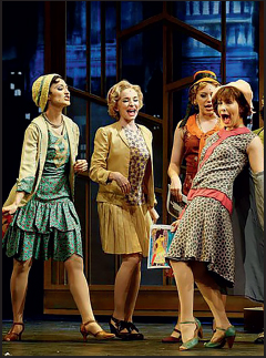
Taylor Lewis, Barbara Jo Bednarczuk, Tori Greshman, and Erin Kei. Photo by Michael C. Foster.
Four articulating Art Deco panels, by Paul Tate dePoo, arranged to create different scenic locations. An abstract city scape added the illusion of depth and possibility. The spaces, and the decor, from glamorous crystal curtains, to drying laundry, helped show class structure.
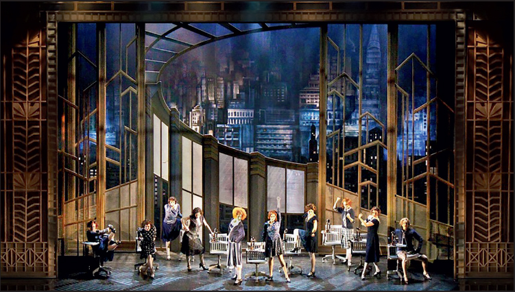
Anneliese van der Pol and the female ensemble; Ashley White, Barbara Jo Bednarczuk, Natalie Rankin, Caitlin Galloway, Tori Greshman, Anna Hudgins, Erin Kei, Taylor Lewis, Jenna Meador.
Photo by Zach Blane
Tristan Raines costumes were further inspired by Erté and the seductive underground culture that resided in NYC night life during Prohibition.

Jackson Perrin, Andrea Enright, and Ryan Finley. Photo by Michael C. Foster.

Jackson Perrin and Ryan Finley. Photo by Zach Blane.
Lighting by Zach Blane reinforced the contrasts. Safe places for the young women were basked in warm hues.
The male dominated offices were sterile with the light slashing across the scenery, and speakeasies were sexy, seedy, and dangerous.
Working together, this team created a world that helped the advance and tell the story to the audience.
There is much to been seen, studied, and learned from in the world of traditional fine art. Sometimes a painting can serve as a metaphor, at other times, a painting can serve as a springboard. There is fine art sprinkled throughout this book as inspiration and, hopefully, to encourage further exploration.
How every artist of every stripe handles color can be different. There have been and continue to be masters of color working throughout the ages.
Fauvism
Working during the early part of the 20th century, The Fauvists, French for Wild Beasts, were inspired by the likes of van Gogh, Seurat, and Gauguin. These artists were a loosely aligned group led by Henri Matisse who explored the use of intense color as a vehicle for describing light and space. Instead of chiaroscuro, this group, which included André Derain, Marc Chagall, Georges Braque, and others, used simplified forms and saturated colors to draw attention to the to dimensionality of the surfaces.
They simply used bold color to create strong and powerful works.
The Fauvists were neither the first nor the last to use color effectively to create a new way to see.
Finding Art
Visits to museums should be a part of every designer’s study, and life routine, but don’t neglect art galleries and living artists.
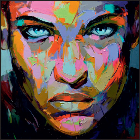
Untitled 616
110cm by 110cm
by Françoise Nielly
Françoise Nielly
An artist totally unafraid of color, contrast, motion, and action is Françoise Nielly. An author, architect, and swordster of pigment and paint who creates portraits that reflect the intense energies of civilization, sex, and emotion.

Untitled 778
110cm by 110cm
by Françoise Nielly
There is no traditional chiaroscuro or modeling in her work, but nonetheless her work appears realistic, even as it can be shocking. Rather than a brush, Nielly applies color with palette knives. The choice of tool is in some ways a metaphor, and creates its own look. Far different from the softness of a brush.
Nielly was raised in the South of France and works in Paris, creating art as dynamic as a kaleidoscope falling into place. Her color is vibrant, layered and nuanced.
Your metaphor will guide all of your color choices.
If you are using that cotton candy metaphor, that pretty much starts to define your color choices. What colors are cotton candy? Pastels come immediately to mind, although it might also be produced in a rainbow of colors.
If you define your metaphor as pink cotton candy, that narrows your choices, but it certainly does not limit your choices to pink. Pink is actually a whole range of colors. Additionally, you will need contrasting color and shadows to create definition. Shadow often appears in nature as a compliment, or a shade of blue. Just because your metaphor is Pink Cotton Candy, it does not mean that adding blue or turquoise won’t help make the pink pop!
Consider different color schemes, and their subsequent impact on your audience.
What if your cotton candy was spun glass, spun gold, or spun steel? A spider web is pretty much a the same thing as cotton candy. A spider web is a spun fibre. However, a Spider Web creates an entirely different feeling.
The elements of design are your building blocks. Add a dash of metaphor and see what can be created!
The original Broadway production of Guys & Dolls was designed by Jo Mielziner, a prolific scenic and lighting designer who practiced in the middle of the 20th century. Even if you’re not familiar with Mielziner, you are no doubt familiar with some of his designs. If you’re not familiar with Mielziner, you should be; he, and his body of work, are well worth researching.
When Tony Walton was asked to design the 1992 Broadway revival of Guys & Dolls, he was certainly familiar with the original designs.

Mid-stage portion of Walton’s design for the Crapshooters sewer location

Early color sketch for Havana’s Cathedral Square.
Mielziner’s original designs were dark and earthy, to contrast with and heighten the fantastic and entertainingly colorful stories by Damon Runyon on which the musical is based.
Runyon remains best known for his short stories celebrating the people and the world in and around Broadway during Prohibition. To Runyon’s readers, and the original audience for Guys & Dolls, a Damon Runyon character, or Runyonesque brings immediately to mind distinctive social stereotypes from Brooklyn, or the fringes of Mid-town Manhattan, Times Square and Hell’s Kitchen.

Rendering of the Guys & Dolls company on a scrim version of Runyonland, For the finale, the scrim bled-thru to the cast identically lined up for their bows.

Charing Cross Bridge by Andre Derain. London 1905-06. Oil on canvas,
© 2015 Artists Rights Society (ARS), New York / ADAGP, Paris
Digital Image © The Museum of Modern Art/Licensed by SCALA / Art Resource, NY
Writing in a time when these areas were certainly gritty, and considered undesirable. Runyon perceived and transformed the people and the neighborhoods into his own colorful and unthreatening personal territory. These areas are now completely different.
Mielziner reflected the grime of Times Square. Tony Walton preferred to accentuate Runyon’s colorful take on the fictionalized characters he portrayed.
Tony’s point of departure or metaphor for his design, specifically his palette, was the painting Le Pont de Charing-Cross by André Derain, a Fauvest, one of les Fauves aka the wild beasts. Appropriate for many of the characters in Guys & Dolls.

Production photograph of the show’s finale in Runyonland.
Referencing Derain’s palette for by Le Pont de Charing-Cross, trying to create his own splodgy (his own word) imagery inspired by this painting. This preliminary interpretation expressed his feelings about Runyon’s and Frank Loesser’s work, as influenced by his metaphor, and paved the way for his non-Mielziner palette for Runyonland.

Tony Walton’s painted splodges for Guys & Dolls Runyonland were inspired by Derain’s color palette for Le Pont de Charing-Cross.
Many of Runyon’s characters might be referred to as Demimonde. They are flagrant Hedonists, and conspicuous about their imbibing, gambling, spending, fashion, and wantonness. Although the term has gone out of fashion, it was generally used in a demeaning manner. Pity. It is a colorful and entreatingly sobriquet for many of the surprisingly endearing characters of Guys & Dolls.
Tony Walton won both the Drama Desk Award and the Tony Award for Outstanding Set Design for his design of Guys & Dolls.