
Chapter 12. Time Series Analysis
A time series is a sequence of measurements from a system that varies in time. One famous example is the “hockey stick graph” that shows global average temperature over time.
The example I work with in this chapter comes from Zachary M. Jones, a researcher in political science who studies the black market for cannabis in the US. He collected data from a website called Price of Weed that crowdsources market information by asking participants to report the price, quantity, quality, and location of cannabis transactions. The goal of his project is to investigate the effect of policy decisions, like legalization, on markets. I find this project appealing because it is an example that uses data to address important political questions, like drug policy.
I hope you will find this chapter interesting, but I’ll take this opportunity to reiterate the importance of maintaining a professional attitude to data analysis. Whether and which drugs should be illegal are important and difficult public policy questions; our decisions should be informed by accurate data reported honestly.
The code for this chapter is in timeseries.py. For information about downloading
and working with this code, see Using the Code.
Importing and Cleaning
The data I downloaded from Mr. Jones’s site is in the repository for this book. The following code reads it into a pandas DataFrame:
transactions = pandas.read_csv('mj-clean.csv', parse_dates=[5])parse_dates tells
read_csv to interpret
values in column 5 as dates and convert them to NumPy datetime64
objects.
The DataFrame has a row for each reported transaction and the following columns:
- city
String city name
- state
Two-letter state abbreviation
- price
Price paid in dollars
- amount
Quantity purchased in grams
- quality
High, medium, or low quality, as reported by the purchaser
- date
Date of report, presumed to be shortly after date of purchase
- ppg
Price per gram in dollars
- state.name
String state name
- lat
Approximate latitude of the transaction, based on city name
- lon
Approximate longitude of the transaction
Each transaction is an event in time, so we could treat this dataset as a time series. But the events are not equally spaced in time; the number of transactions reported each day varies from 0 to several hundred. Many methods used to analyze time series require the measurements to be equally spaced, or at least things are simpler if they are.
In order to demonstrate these methods, I divide the dataset into groups by reported quality, and then transform each group into an equally spaced series by computing the mean daily price per gram.
def GroupByQualityAndDay(transactions):
    groups = transactions.groupby('quality')
    dailies = {}
    for name, group in groups:
        dailies[name] = GroupByDay(group)

    return dailies
groupby is a DataFrame method
that returns a GroupBy object, groups;
used in a for loop, it iterates the names of the groups and the DataFrames
that represent them. Since the values of quality are low, medium,
and high, we get three groups with
those names.
The loop iterates through the groups and calls GroupByDay, which computes the daily average
price and returns a new DataFrame:
def GroupByDay(transactions, func=np.mean):
    grouped = transactions[['date', 'ppg']].groupby('date')
    daily = grouped.aggregate(func)

    daily['date'] = daily.index
    start = daily.date[0]
    one_year = np.timedelta64(1, 'Y')
    daily['years'] = (daily.date - start) / one_year

    return daily
The parameter, transactions, is a
DataFrame that contains columns date
and ppg. We select these two columns,
then group by date.
The result, grouped, is a map
from each date to a DataFrame that contains prices reported on that date.
aggregate is a GroupBy method that
iterates through the groups and applies a function to each column of the
group; in this case there is only one column, ppg. So the result of aggregate is a DataFrame with one row for each
date and one column, ppg.
Dates in these DataFrames are stored as NumPy datetime64 objects, which are represented as
64-bit integers in nanoseconds. For some of the analyses coming up, it
will be convenient to work with time in more human-friendly units, like
years. So GroupByDay adds a column
named date by copying the index, then adds years, which contains the number of years since
the first transaction as a floating-point number.
Plotting
The result from GroupByQualityAndDay
is a map from each quality to a DataFrame of daily prices. Here’s the code
I use to plot the three time series:
    thinkplot.PrePlot(rows=3)
    for i, (name, daily) in enumerate(dailies.items()):
        thinkplot.SubPlot(i+1)
        title = 'price per gram ($)' if i==0 else ''
        thinkplot.Config(ylim=[0, 20], title=title)
        thinkplot.Scatter(daily.index, daily.ppg, s=10, label=name)
        if i == 2:
            pyplot.xticks(rotation=30)
        else:
            thinkplot.Config(xticks=[])
PrePlot with rows=3 means that we are planning to make three
subplots laid out in three rows. The loop iterates through the DataFrames
and creates a scatter plot for each. It is common to plot time series with
line segments between the points, but in this case there are many data
points and prices are highly variable, so adding lines would not
help.
Since the labels on the x-axis are dates, I use pyplot.xticks to rotate the “ticks” 30 degrees,
making them more readable.
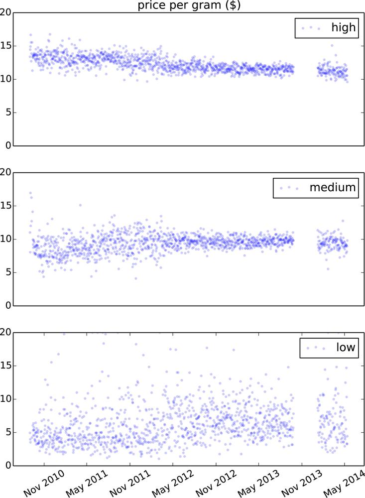
Figure 12-1 shows the result. One apparent feature in these plots is a gap around November 2013. It’s possible that data collection was not active during this time, or the data might not be available. We will consider ways to deal with this missing data later.
Visually, it looks like the price of high quality cannabis is declining during this period, and the price of medium quality is increasing. The price of low quality might also be increasing, but it is harder to tell, since it seems to be more volatile. Keep in mind that quality data is reported by volunteers, so trends over time might reflect changes in how participants apply these labels.
Linear Regression
Although there are methods specific to time series analysis, for many problems a simple way to get started is by applying general-purpose tools like linear regression. The following function takes a DataFrame of daily prices and computes a least squares fit, returning the model and results objects from StatsModels:
def RunLinearModel(daily):
    model = smf.ols('ppg ~ years', data=daily)
    results = model.fit()
    return model, results
Then we can iterate through the qualities and fit a model to each:
    for name, daily in dailies.items():
        model, results = RunLinearModel(daily)
        print(name)
        regression.SummarizeResults(results)
Here are the results:
Quality | Intercept | Slope | R2 |
High | 13.450 | -0.708 | 0.444 |
Medium | 8.879 | 0.283 | 0.050 |
Low | 5.362 | 0.568 | 0.030 |
The estimated slopes indicate that the price of high quality cannabis dropped by about 71 cents per year during the observed interval; for medium quality it increased by 28 cents per year, and for low quality it increased by 57 cents per year. These estimates are all statistically significant with very small p-values.
The R2 value for high quality cannabis is 0.44, which means that time as an explanatory variable accounts for 44% of the observed variability in price. For the other qualities, the change in price is smaller, and variability in prices is higher, so the values of R2 are smaller (but still statistically significant).
The following code plots the observed prices and the fitted values:
def PlotFittedValues(model, results, label=''):
    years = model.exog[:,1]
    values = model.endog
    thinkplot.Scatter(years, values, s=15, label=label)
    thinkplot.Plot(years, results.fittedvalues, label='model')
As we saw in Implementation, model contains exog and endog, NumPy arrays with the exogenous
(explanatory) and endogenous (dependent) variables.
PlotFittedValues makes a scatter
plot of the data points and a line plot of the fitted values.
Figure 12-2 shows the results for high quality
cannabis.

The model seems like a good linear fit for the data; nevertheless, linear regression is not the most appropriate choice for this data:
First, there is no reason to expect the long-term trend to be a line or any other simple function. In general, prices are determined by supply and demand, both of which vary over time in unpredictable ways.
Second, the linear regression model gives equal weight to all data, recent and past. For purposes of prediction, we should probably give more weight to recent data.
Finally, one of the assumptions of linear regression is that the residuals are uncorrelated noise. With time series data, this assumption is often false because successive values are correlated.
The next section presents an alternative that is more appropriate for time series data.
Moving Averages
Most time series analysis is based on the modeling assumption that the observed series is the sum of three components:
Regression is one way to extract the trend from a series, as we saw in the previous section. But if the trend is not a simple function, a good alternative is a moving average. A moving average divides the series into overlapping regions, called windows, and computes the average of the values in each window.
One of the simplest moving averages is the rolling mean, which computes the mean of the values in each window. For example, if the window size is 3, the rolling mean computes the mean of values 0 through 2, 1 through 3, 2 through 4, etc.
pandas provides rolling_mean, which takes a Series and a window
size and returns a new Series.
>>> series = np.arange(10)
array([0, 1, 2, 3, 4, 5, 6, 7, 8, 9])

>>> pandas.rolling_mean(series, 3)
array([ nan,  nan,   1,   2,   3,   4,   5,   6,   7,   8])
The first two values are nan; the
next value is the mean of the first three elements, 0, 1, and 2. The next
value is the mean of 1, 2, and 3. And so on.
Before we can apply rolling_mean to the cannabis data, we have to deal
with missing values. There are a few days in the observed interval with no
reported transactions for one or more quality categories, and a period in
2013 when data collection was not active.
In the DataFrames we have used so far, these dates are absent; the index skips days with no data. For the analysis that follows, we need to represent this missing data explicitly. We can do that by “reindexing” the DataFrame:
    dates = pandas.date_range(daily.index.min(), daily.index.max())
    reindexed = daily.reindex(dates)
The first line computes a date range that includes every day from
the beginning to the end of the observed interval. The second line creates
a new DataFrame with all of the data from daily, but including rows for all dates, filled
with nan.
Now we can plot the rolling mean like this:
    roll_mean = pandas.rolling_mean(reindexed.ppg, 30)
    thinkplot.Plot(roll_mean.index, roll_mean)
The window size is 30, so each value in roll_mean is the mean of 30 values from reindexed.ppg.
Figure 12-3 (left) shows the result. The rolling
mean seems to do a good job of smoothing out the noise and extracting the
trend. The first 29 values are nan, and
wherever there’s a missing value, it’s followed by another 29 nans. There are ways to fill in these gaps, but
they are a minor nuisance.

An alternative is the exponentially-weighted moving average (EWMA), which has two advantages. First, as the name suggests, it computes a weighted average where the most recent value has the highest weight and the weights for previous values drop off exponentially. Second, the pandas implementation of EWMA handles missing values better.
    ewma = pandas.ewma(reindexed.ppg, span=30)
    thinkplot.Plot(ewma.index, ewma)
The span parameter corresponds roughly to the window size of a moving average; it controls how fast the weights drop off, so it determines the number of points that make a non-negligible contribution to each average.
Figure 12-3 (right) shows the EWMA for the same data. It is similar to the rolling mean, where they are both defined, but it has no missing values, which makes it easier to work with. The values are noisy at the beginning of the time series, because they are based on fewer data points.
Missing Values
Now that we have characterized the trend of the time series, the next step is to investigate seasonality, which is periodic behavior. Time series data based on human behavior often exhibits daily, weekly, monthly, or yearly cycles. In the next section I present methods to test for seasonality, but they don’t work well with missing data, so we have to solve that problem first.
A simple and common way to fill missing data is to use a moving
average. The Series method fillna does
just what we want:
reindexed.ppg.fillna(ewma, inplace=True)
Wherever reindexed.ppg is
nan, fillna replaces it with the corresponding value
from ewma. The inplace flag tells fillna to modify the existing Series rather than
create a new one.
A drawback of this method is that it understates the noise in the series. We can solve that problem by adding in resampled residuals:
    resid = (reindexed.ppg - ewma).dropna()
    fake_data = ewma + thinkstats2.Resample(resid, len(reindexed))
    reindexed.ppg.fillna(fake_data, inplace=True)
resid contains the residual
values, not including days when ppg is
nan. fake_data contains the sum of the moving average
and a random sample of residuals. Finally, fillna replaces nan with values from fake_data.
Figure 12-4 shows the result. The filled data is visually similar to the actual values. Since the resampled residuals are random, the results are different every time; later we’ll see how to characterize the error created by missing values.

Serial Correlation
As prices vary from day to day, you might expect to see patterns. If the price is high on Monday, you might expect it to be high for a few more days; and if it’s low, you might expect it to stay low. A pattern like this is called serial correlation, because each value is correlated with the next one in the series.
To compute serial correlation, we can shift the time series by an interval called a lag, and then compute the correlation of the shifted series with the original:
def SerialCorr(series, lag=1):
    xs = series[lag:]
    ys = series.shift(lag)[lag:]
    corr = thinkstats2.Corr(xs, ys)
    return corr
After the shift, the first lag
values are nan, so I use a slice to
remove them before computing Corr.
If we apply SerialCorr to the raw
price data with lag 1, we find serial correlation 0.48 for the high
quality category, 0.16 for medium and 0.10 for low. In any time series
with a long-term trend, we expect to see strong serial correlations; for
example, if prices are falling, we expect to see values above the mean in
the first half of the series and values below the mean in the second
half.
It is more interesting to see if the correlation persists if you subtract away the trend. For example, we can compute the residual of the EWMA and then compute its serial correlation:
    ewma = pandas.ewma(reindexed.ppg, span=30)
    resid = reindexed.ppg - ewma
    corr = SerialCorr(resid, 1)
With lag=1, the serial correlations for the de-trended data are -0.022 for high quality, -0.015 for medium, and 0.036 for low. These values are small, indicating that there is little or no one-day serial correlation in this series.
To check for weekly, monthly, and yearly seasonality, I ran the analysis again with different lags. Here are the results:
Lag | High | Medium | Low |
1 | -0.029 | -0.014 | 0.034 |
7 | 0.02 | -0.042 | -0.0097 |
30 | 0.014 | -0.0064 | -0.013 |
365 | 0.045 | 0.015 | 0.033 |
In the next section, we’ll test whether these correlations are statistically significant (they are not), but at this point we can tentatively conclude that there are no substantial seasonal patterns in these series, at least not with these lags.
Autocorrelation
If you think a series might have some serial correlation, but you don’t know which lags to test, you can test them all! The autocorrelation function is a function that maps from lag to the serial correlation with the given lag. “Autocorrelation” is another name for serial correlation, used more often when the lag is not 1.
StatsModels, which we used for linear regression in StatsModels, also provides functions for time series
analysis, including acf, which
computes the autocorrelation function:
    import statsmodels.tsa.stattools as smtsa
    acf = smtsa.acf(filled.resid, nlags=365, unbiased=True)
acf computes serial correlations
with lags from 0 through nlags. The
unbiased flag tells acf to correct the estimates for the sample
size. The result is an array of correlations. If we select daily prices
for high quality, and extract correlations for lags 1, 7, 30, and 365, we
can confirm that acf and SerialCorr yield approximately the same
results:
>>> acf[0], acf[1], acf[7], acf[30], acf[365]
1.000, -0.029, 0.020, 0.014, 0.044
With lag=0, acf computes the correlation of the series with
itself, which is always 1.
Figure 12-5 (left) shows autocorrelation
functions for the three quality categories, with nlags=40. The gray region shows the normal
variability we would expect if there is no actual autocorrelation;
anything that falls outside this range is statistically significant, with
a p-value less than 5%. Since the false positive rate is 5%, and we are
computing 120 correlations (40 lags for each of 3 times series), we expect
to see about 6 points outside this region. In fact, there are 7. We
conclude that there are no autocorrelations in these series that could not
be explained by chance.

I computed the gray regions by resampling the residuals. You can see
my code in timeseries.py; the function
is called SimulateAutocorrelation.
To see what the autocorrelation function looks like when there is a seasonal component, I generated simulated data by adding a weekly cycle. Assuming that demand for cannabis is higher on weekends, we might expect the price to be higher. To simulate this effect, I select dates that fall on Friday or Saturday and add a random amount to the price, chosen from a uniform distribution from $0 to $2.
def AddWeeklySeasonality(daily):
    frisat = (daily.index.dayofweek==4) | (daily.index.dayofweek==5)
    fake = daily.copy()
    fake.ppg[frisat] += np.random.uniform(0, 2, frisat.sum())
    return fake
frisat is a boolean Series,
True if the day of the week is Friday
or Saturday. fake is a new DataFrame,
initially a copy of daily, which we
modify by adding random values to ppg.
frisat.sum() is the total number of
Fridays and Saturdays, which is the number of random values we have to
generate.
Figure 12-5 (right) shows autocorrelation functions for prices with this simulated seasonality. As expected, the correlations are highest when the lag is a multiple of 7. For high and medium quality, the new correlations are statistically significant. For low quality they are not, because residuals in this category are large; the effect would have to be bigger to be visible through the noise.
Prediction
Time series analysis can be used to investigate, and sometimes explain, the behavior of systems that vary in time. It can also make predictions.
The linear regressions we used in Linear Regression can
be used for prediction. The RegressionResults class provides predict, which takes a DataFrame containing the
explanatory variables and returns a sequence of predictions. Here’s the
code:
def GenerateSimplePrediction(results, years):
    n = len(years)
    inter = np.ones(n)
    d = dict(Intercept=inter, years=years)
    predict_df = pandas.DataFrame(d)
    predict = results.predict(predict_df)
    return predict
results is a RegressionResults
object; years is the sequence of time
values we want predictions for. The function constructs a DataFrame,
passes it to predict, and returns the
result.
If all we want is a single, best-guess prediction, we’re done. But for most purposes it is important to quantify error. In other words, we want to know how accurate the prediction is likely to be.
There are three sources of error we should take into account:
- Sampling error
The prediction is based on estimated parameters, which depend on random variation in the sample. If we run the experiment again, we expect the estimates to vary.
- Random variation
Even if the estimated parameters are perfect, the observed data varies randomly around the long-term trend, and we expect this variation to continue in the future.
- Modeling error
We have already seen evidence that the long-term trend is not linear, so predictions based on a linear model will eventually fail.
Another source of error to consider is unexpected future events. Agricultural prices are affected by weather, and all prices are affected by politics and law. As I write this, cannabis is legal in two states and legal for medical purposes in 20 more. If more states legalize it, the price is likely to go down. But if the federal government cracks down, the price might go up.
Modeling errors and unexpected future events are hard to quantify. Sampling error and random variation are easier to deal with, so we’ll do that first.
To quantify sampling error, I use resampling, as we did in Estimation. As always, the goal is to use the actual observations to simulate what would happen if we ran the experiment again. The simulations are based on the assumption that the estimated parameters are correct, but the random residuals could have been different. Here is a function that runs the simulations:
def SimulateResults(daily, iters=101):
    model, results = RunLinearModel(daily)
    fake = daily.copy()

    result_seq = []
    for i in range(iters):
        fake.ppg = results.fittedvalues + Resample(results.resid)
        _, fake_results = RunLinearModel(fake)
        result_seq.append(fake_results)

    return result_seq
daily is a DataFrame containing
the observed prices; iters is the
number of simulations to run.
SimulateResults uses RunLinearModel, from Linear Regression, to estimate the slope and intercept of the
observed values.
Each time through the loop, it generates a “fake” dataset by resampling the residuals and adding them to the fitted values. Then it runs a linear model on the fake data and stores the RegressionResults object.
The next step is to use the simulated results to generate predictions:
def GeneratePredictions(result_seq, years, add_resid=False):
    n = len(years)
    d = dict(Intercept=np.ones(n), years=years, years2=years**2)
    predict_df = pandas.DataFrame(d)

    predict_seq = []
    for fake_results in result_seq:
        predict = fake_results.predict(predict_df)
        if add_resid:
            predict += thinkstats2.Resample(fake_results.resid, n)
        predict_seq.append(predict)

    return predict_seq
GeneratePredictions takes the
sequence of results from the previous step, as well as years, which is a sequence of floats that
specifies the interval to generate predictions for, and add_resid, which indicates whether
it should add resampled residuals to the straight-line prediction.
GeneratePredictions iterates through
the sequence of RegressionResults and generates a sequence of
predictions.
Finally, here’s the code that plots a 90% confidence interval for the predictions:
def PlotPredictions(daily, years, iters=101, percent=90):
    result_seq = SimulateResults(daily, iters=iters)
    p = (100 - percent) / 2
    percents = p, 100-p

    predict_seq = GeneratePredictions(result_seq, years, True)
    low, high = thinkstats2.PercentileRows(predict_seq, percents)
    thinkplot.FillBetween(years, low, high, alpha=0.3, color='gray')

    predict_seq = GeneratePredictions(result_seq, years, False)
    low, high = thinkstats2.PercentileRows(predict_seq, percents)
    thinkplot.FillBetween(years, low, high, alpha=0.5, color='gray')
PlotPredictions calls GeneratePredictions twice: once with add_resid=True and again with
add_resid=False. It uses
PercentileRows to select the 5th and
95th percentiles for each year, then plots a gray region between these
bounds.
Figure 12-6 shows the result. The dark gray region represents a 90% confidence interval for the sampling error; that is, uncertainty about the estimated slope and intercept due to sampling.

The lighter region shows a 90% confidence interval for prediction error, which is the sum of sampling error and random variation.
These regions quantify sampling error and random variation, but not modeling error. In general modeling error is hard to quantify, but in this case we can address at least one source of error, unpredictable external events.
The regression model is based on the assumption that the system is stationary; that is, that the parameters of the model don’t change over time. Specifically, it assumes that the slope and intercept are constant, as well as the distribution of residuals.
But looking at the moving averages in Figure 12-3, it seems like the slope changes at least once during the observed interval, and the variance of the residuals seems bigger in the first half than the second.
As a result, the parameters we get depend on the interval we
observe. To see how much effect this has on the predictions, we can extend
SimulateResults to use intervals of
observation with different start and end dates. My implementation is in
timeseries.py.
Figure 12-7 shows the result for the medium quality category. The lightest gray area shows a confidence interval that includes uncertainty due to sampling error, random variation, and variation in the interval of observation.

The model based on the entire interval has positive slope, indicating that prices were increasing. But the most recent interval shows signs of decreasing prices, so models based on the most recent data have negative slope. As a result, the widest predictive interval includes the possibility of decreasing prices over the next year.
Further Reading
Time series analysis is a big topic; this chapter has only scratched the surface. An important tool for working with time series data is autoregression, which I did not cover here, mostly because it turns out not to be useful for the example data I worked with.
But once you have learned the material in this chapter, you are well prepared to learn about autoregression. One resource I recommend is Philipp Janert’s book, Data Analysis with Open Source Tools, O’Reilly Media, 2011. His chapter on time series analysis picks up where this one leaves off.
Exercises
My solution to these exercises is in chap12soln.py.
The linear model I used in this chapter has the obvious drawback that it is linear, and there is no reason to expect prices to change linearly over time. We can add flexibility to the model by adding a quadratic term, as we did in Nonlinear Relationships.
Use a quadratic model to fit the time series of daily prices, and
use the model to generate predictions. You will have to write a version
of RunLinearModel that runs that
quadratic model, but after that you should be able to reuse code in
timeseries.py to generate
predictions.
Write a definition for a class named SerialCorrelationTest that extends HypothesisTest from HypothesisTest. It should take a series and a lag as data,
compute the serial correlation of the series with the given lag, and
then compute the p-value of the observed correlation.
Use this class to test whether the serial correlation in raw price data is statistically significant. Also test the residuals of the linear model and (if you did the previous exercise), the quadratic model.
There are several ways to extend the EWMA model to generate predictions. One of the simplest is something like this:
Compute the EWMA of the time series and use the last point as an intercept,
inter.Compute the EWMA of differences between successive elements in the time series and use the last point as a slope,
slope.To predict values at future times, compute
inter + slope * dt, wheredtis the difference between the time of the prediction and the time of the last observation.
Use this method to generate predictions for a year after the last observation. A few hints:
Glossary
- time series
A dataset where each value is associated with a timestamp, often a series of measurements and the times they were collected.
- window
A sequence of consecutive values in a time series, often used to compute a moving average.
- moving average
One of several statistics intended to estimate the underlying trend in a time series by computing averages (of some kind) for a series of overlapping windows.
- rolling mean
- exponentially-weighted moving average (EWMA)
A moving average based on a weighted mean that gives the highest weight to the most recent values, and exponentially decreasing weights to earlier values.
- span
A parameter of EWMA that determines how quickly the weights decrease.
- serial correlation
Correlation between a time series and a shifted or lagged version of itself.
- lag
The size of the shift in a serial correlation or autocorrelation.
- autocorrelation
A more general term for a serial correlation with any amount of lag.
- autocorrelation function
A function that maps from lag to serial correlation.
- stationary
A model is stationary if the parameters and the distribution of residuals does not change over time.