
Chapter 4
Technical Analysis and Trading Concepts
My evolution from a struggling trader to a consistently successful trader would not have been possible without technical analysis. Technical analysis allowed me to read the market and identify trading opportunities. I examined many, many trading tools over the years and have come to rely on a dozen or so indicators.
I am a pragmatist in the selection and use of technical indicators. I want to know how they operate and respond in various market conditions. However, I'm not particularly concerned about why they operate as they do. For me, the proof is in the pudding. If they work, I'm happy. If they don't work, I get rid of them.
Moving Averages
Moving averages are used to emphasize the direction of a trend and smooth out price and volume fluctuations or “noise” that can confuse interpretation.
I use a 21/55/89 period moving average. These are all Fibonacci numbers. They can be used for any time frame, from a 2-minute chart to a weekly chart. I've experimented with other moving averages over the years, but have found the 21/55/89 period works best for me.
Moving averages were one of the first technical analysis tools ever developed, and they have been an integral part of my trading for years. Just because moving averages are relatively simple in their construction, do not underestimate their usefulness. When combined with other indicators, they can produce excellent trading signals.
A moving average is constructed by computing the average price of a security over a specified number of periods. For example, a 10-day moving average adds the closing price of the market for 10 consecutive days and divides that number by 10. Each day, the new closing price is added and the oldest closing price is dropped from the equation. With a new value generated each day, the moving average is displayed on a chart in conjunction with the actual market prices.
There are two types of moving averages: simple and exponential. A simple moving average weights each closing price the same. As a result, there is a lag between the simple moving average and the most recent price action. If there is a price breakout from a consolidation pattern, it will take some time for the simple moving average to catch up to the price action.
An exponential moving average (EMA) reduces the lag by placing more weight on recent prices. Charting packages calculate the EMA for you, so you really don't need to know how to calculate the average yourself. In any case, the formula for calculating an EMA is:
| where | CP = | Current price |
| SF = | Smoothing factor, which is calculated: 2/1 + N | |
| N = | Number of time periods selected |
As you might infer from weighting multipliers, the shorter the EMA, the more weight that is placed on recent price action. A very short-term EMA, say five days, will track prices very closely. And regardless of the chosen period, an EMA will tend to track price more closely than a simple moving average.
What Moving Averages Reveal
Moving averages essentially identify the level of underlying bullishness and bearishness in the market. A rising moving average indicates the market is becoming more bullish. A falling moving average indicates the market is becoming more bearish. The sharper the slope, the greater the bullishness or bearishness.
You can also infer market sentiment from the relationship between prices and the moving average. When prices drop below the moving average, bearishness is increasing. When prices rise above the moving average, bullishness is increasing.
When you use multiple moving averages, the alignment of the moving averages is critical. Using three moving averages, a bullish alignment consists of the short-term average on top, the medium-term average in the middle, and the longest-term moving average at the bottom. A bearish alignment consists of the longest-term moving average on top, the medium-term moving average in the middle, and the short-term moving average on the bottom.
As markets change direction, the slope of the moving averages shift and the shortest-term moving average will often cross the medium-term and long-term moving average. As short-term momentum increases, the moving averages will tend to separate. As prices settle down and volatility lessens, the moving averages will tend to converge.
Figure 4.1 shows all of these properties. On the left side of the chart, the moving averages (21/55/89) are in a bullish alignment and the prices are above all three moving average lines. Prices then fall back into the moving averages and the moving averages begin to flatten, an indication that the trend is changing. Eventually, prices drop below the moving averages, and the moving averages realign themselves into a bearish alignment. On the right side of the chart, the 21-bar moving average is sloping up, and prices have returned to the moving averages. The level of bearishness is decreasing.
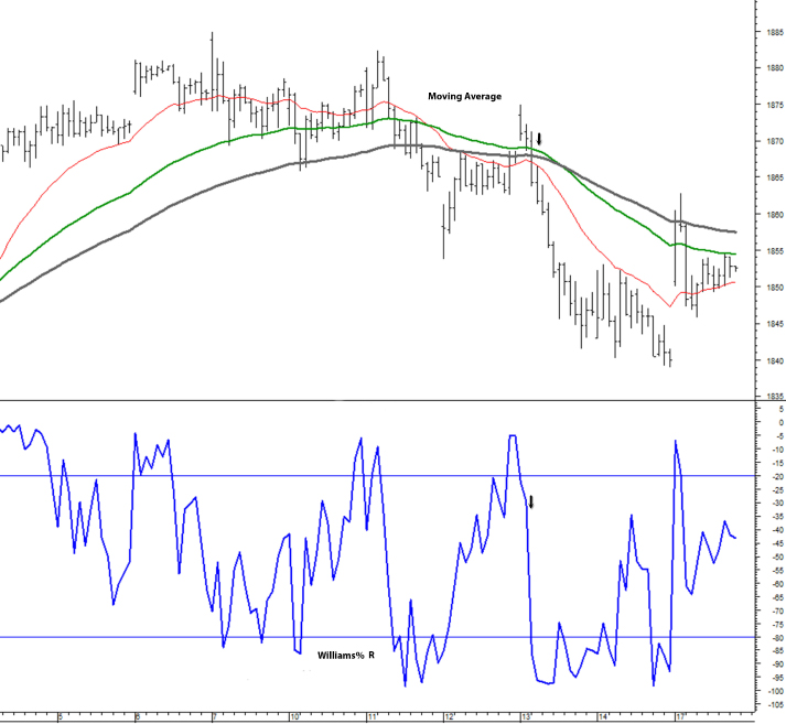
Figure 4.1 Moving Average: 21/55/89 Bars
How to Use Moving Averages
I use moving averages in my trading, and I venture to say most other short-term traders do as well. I move in and out of the market quickly every day. By being more responsive to the most recent price movements, exponential moving averages suit my trading style.
But moving averages can also be valuable for a longer time frame. Many traders track the 50-day and 200-day moving averages to time long-term trends in the stock market and use crossover signals from the two moving averages to move in and out of stocks. In essence, when the 50-day moving average is above the 200-day moving average, the long-term trend is bullish. When the 50-day moving average is below the 200-day moving average, the long-term trend is bearish.
As I mentioned, I use the 21/55/89 period moving averages. In most market conditions, the three moving averages tend to bunch together. I am always alert for situations where the 21-day breaks out from the bunch. I will then trade in the direction of the breakout. Typically, the longer the moving averages stay bunched together, the more explosive the breakout move. Figure 4.2 exemplifies this idea very well.

Figure 4.2 Moving Average: Breakout from Congestion
More commonly, I use changes in the slope lines and crossover signals. Typically, I'll look for the 21-bar moving average to begin to move more sharply up or down and to cross the 55-bar moving average and the 89-bar moving average. In Figure 4.3, a sharp change in the slope of the 21-bar line leads to crossover signals and realignment from bearish to bullish and then back to bearish.
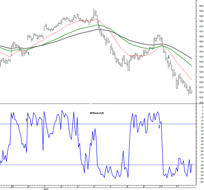
Figure 4.3 Moving Average: Realignment from Bearish to Bullish to Bearish
As stated earlier, moving averages lag behind market activity. Thus, a moving average crossover signal will get you into the market only after the market has already turned. Crossovers will not identify tops and bottoms. At their best, crossovers identify change in trend direction and tradable market swings. Depending on the situation and what other signals are doing, I may trade based on the slope of the line or I may wait for the crossover signal.
MACD
The moving average convergence-divergence (commonly called MACD) is one of the most popular technical indicators. Developed by Gerald Appel in the 1970s, you can find the MACD on all standard charting packages. I've found the MACD to be very valuable in my trading.
The MACD provides both trend-following and momentum information. The primary MACD line is formed by taking two moving averages and subtracting the longer moving average from the shorter moving average. The signal line is then formed by creating an exponential moving average of the primary MACD line. On a chart, the primary MACD line fluctuates above and below a zero line and converges, crosses, and diverges from the signal line over time.
The MACD histogram is formed by subtracting the signal line from the MACD line. Like the MACD line, the histogram fluctuates around a zero line on a chart. The histogram registers a positive reading (above zero) when the MACD line is above the signal line and a negative reading (below zero) when the MACD line is below the signal line.
I use the default settings on the MACD, which are as follows: a 12-bar moving average, a 26-bar moving average, and a 9-bar moving average of the MACD line. You can experiment with settings to make them more or less sensitive, depending on your trading style. If you lengthen the settings, you'll get fewer trading signals; if you shorten the settings, you'll get more trading signals.
The MACD provides useful information about the momentum of the market. When the MACD line and the signal line are moving apart (diverging), directional momentum is increasing. When the MACD line and the signal line are moving closer (converging), directional momentum is decreasing.
Crossovers
Many traders use signal line crossovers as a trading signal. A signal line crossover occurs when the MACD line crosses the signal line. When the MACD line crosses the signal line on the way higher, it's bullish. When the MACD line crosses the signal line on the way lower, it's bearish. Generally, signal line crossovers work best at the beginning or middle of a price swing. In the later stages of a price swing, when prices are at an extreme and directional momentum is slowing, there may be a quick series of signal line crossovers, reflecting a battle between bullish and bearish traders.
Centerline crossovers are another popular MACD signal. A centerline crossover occurs when the MACD line crosses the zero line. When the MACD line crosses the zero line on the way higher, it's bullish; when the MACD line crosses the zero line on the way lower, it's bearish.
In Figure 4.4, the uppermost chart is the MACD. As you can see, there are three occasions where the MACD line crosses the signal line. In each case, the market continued in the direction of the crossover. Notice, too, that each time the MACD line crossed the zero line, the market also continued in the crossing direction. Late in the session, the market touches the zero line—but doesn't cross it—and then continues higher.

Figure 4.4 MACD Crossover Signals
Divergences
One of the most popular uses of the MACD—and indeed, any momentum indicator—is to spot divergences between price and momentum. The core idea is that when prices reach a new high or low on lesser momentum, the market is ready to move in the opposite direction.
Divergences can occur in any time frame: weekly, daily, or intraday. You can read them using the MACD line and signal line or on the MACD histogram. Some traders like to draw trend lines on the MACD lines or histogram to get a better sense of the trend in momentum.
While divergences do not always lead to an immediate price reversal, they work frequently enough that they always merit attention. When I spot a divergence, I become very interested in a possible trade and look closely at my other indicators for confirmation.
About four-fifths of the way into the session in Figure 4.5, there is a pronounced bearish divergence. The market makes a new high, but the MACD falls substantially short of its previous session high. The divergence is confirmed by similar formations in the stochastic momentum.

Figure 4.5 MACD Bearish Divergence
A word of caution about divergences in strong trending markets: When a new trend begins with a very strong initial move, it's quite possible that the next move in the direction of the trend will be more muted—and will generate a divergence signal. In those situations, pay attention to the signal line: as long as it's above the zero line in an uptrend and below the zero line in a downtrend, it's telling you that the momentum is still in favor of the underlying trend. Generally, in a strong trend, it's less risky and more rewarding to trade divergences in the direction of the trend.
Williams %R
The Williams %R indicator was developed by Larry Williams. It is a momentum indicator that identifies bullish and bearish conditions and overbought and oversold areas.
The %R formula compares the current closing price of the market to the high and low of the market for a designated number of days. In essence, the indicator shows where the market is trading in relation to the upper and lower boundaries of the selected trading range.
Williams used 14 days as the setting, which is the default setting on most charting packages. If you reduce the setting, you'll speed up the indicator and generate more signals. If you increase the setting, the indicator will slow down and generate fewer signals.
The value of the %R ranges from a low of –100 to a high of 0. To register a –100 value, the most recent closing price has to be the lowest low of the designated number of days in the range. To register a 0 value, the most recent closing price has to be the highest high of the designated number of days.
Traders use the Williams %R in a variety of ways. Some use it to identify overbought and oversold conditions. They might look to buy a market when the Williams %R falls below –80, and they might look to sell a market when the indicator rises above –20. The problem with this approach is that in a strongly trending market, the Williams %R can stay at extreme levels for long periods of time. Personally, as a day trader, I have no problem going long when the indicator is overbought or going short when it is oversold—provided my other indicators are flashing buy and sell signals.
I prefer to use the Williams %R as an indicator of bullish or bearish conditions and then use other signals for confirmation to make a trade. Figure 4.6 provides a good example. A little short of halfway into the chart, the Williams %R rises above –20 and stays there for some time, which indicates the market is bullish. When the 21-bar moving average turns up and crosses the 55-bar moving average, that's the signal to go long.
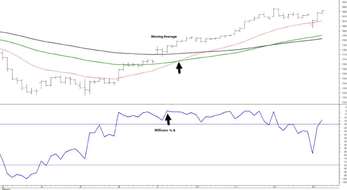
Figure 4.6 Williams %R, Bullish Signal
Stochastic Oscillator
The stochastic oscillator is another momentum indicator. It's a popular indicator used by many traders and technicians. Developed by George Lane over 50 years ago, the stochastic oscillator tracks the speed or momentum of price movements. The core idea of the indicator is that momentum changes often precede price changes.
My style of trading is to take a profitable piece from short-term price swings. I don't try to pick tops or bottoms. I don't try to predict the market. I wait for the market to confirm a directional price swing. I get in quickly. If the market stalls, I'll usually exit immediately. If the market moves my way, I'll usually take my profit prior to the completion of the price swing.
For a trade to make sense to me, the stochastic oscillator must be moving in the direction of the potential trade. Ideally, I like to see the stochastic oscillator turn up or turn down from an extreme level, with the fast line decisively crossing the slow line, and a nearly vertical ascent or descent.
The stochastic oscillator shows the location of the close in relation to the high/low range of a select number of periods. In essence, if price is closing near the top of its range for several periods, the stochastic oscillator will trend up. If the price is closing near the bottom of the range for several periods, the stochastic oscillator will trend down.
The stochastic oscillator is calculated as follows:

The stochastic oscillator is plotted on a 0–100 scale. The %K is the fast line and most responsive to the latest price action. The %D is the slow line. Readings below 20 indicate the price is near its low for the time period. Readings above 80 indicate the market is near its high for the time period.
The terms overbought and oversold are used a lot in the markets, and in particular with the stochastic oscillator. Without question, markets become extended. And often, when markets reach an extreme level, some traders take profits and other traders enter new positions in expectation of a reversal, all of which can cause the market to reverse from the original trend. However, the fact that the stochastic oscillator is above 80 or below 20 does not mean a reversal is imminent. I've made a lot of money over the years being long with the stochastic oscillator above 80 and short with it below 20.
The far right side of Figure 4.7 exemplifies what I like to see in the stochastic oscillator when considering a trade. Note that it sold off from an extremely high level and moved down in nearly vertical descent, with the fast line crossing the slower line. Also note that the bearish signal of the stochastic oscillator was confirmed by the other indicators.
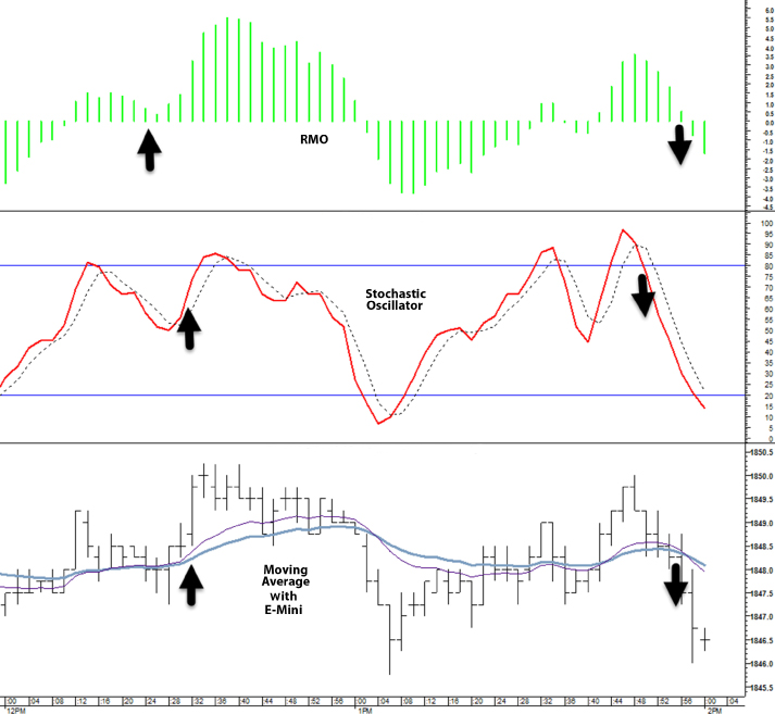
Figure 4.7 Stochastic Oscillator Identifying Price Swings
Stochastic Momentum
Stochastic momentum derives from the stochastic oscillator. Whereas the stochastic oscillator calculates the distance between the current close and the high/low range for a chosen period, the stochastic momentum calculates the distance of the current close to the center of the high/low range for a chosen period.
Stochastic momentum originated, or was at least popularized, by William Blau in the early 1990s. Blau felt the original stochastic oscillator gave too many false signals, in part, because it was based on the high/low range. Blau felt by connecting the close to the midpoint of the high/low range, the stochastic momentum indicator would reflect market conditions more accurately and produce a higher percentage of accurate signals.
Formula
The stochastic momentum values range between –100 and +100. While I use the stochastic momentum as a means to identify the strength of the current trend, other traders use the stochastic momentum to identify when a market is overbought or oversold. Generally, when the stochastic momentum crosses +60 or –60, the market is beginning to get overextended. Readings of +80 or –80 are strongly overextended.
The stochastic momentum tends to be a little faster than the traditional stochastic oscillator. When the markets turn, it's often the first indicator in the template to flash a signal. Used alone, you would be whipsawed by too many short-term moves. But used in conjunction with other indicators in the template, it is a very powerful tool.
I use stochastic momentum primarily as a means to detect the beginning of new price swings. When it's moving sharply high or lower, and the fast line crosses the slow line, I become very interested and look to other indicators for confirmation. In addition, because it is very sensitive to recent price movements, the stochastic momentum sometimes alerts me to stay out of a trade where slower moving indicators might be flashing a buy or sell signal.
Figure 4.8 shows how the stochastic momentum works in conjunction with other indicators. Throughout the session, a change in slope and the fast line crossing the slower line coincided with tradable price swings and were confirmed by activity in the other indicators.
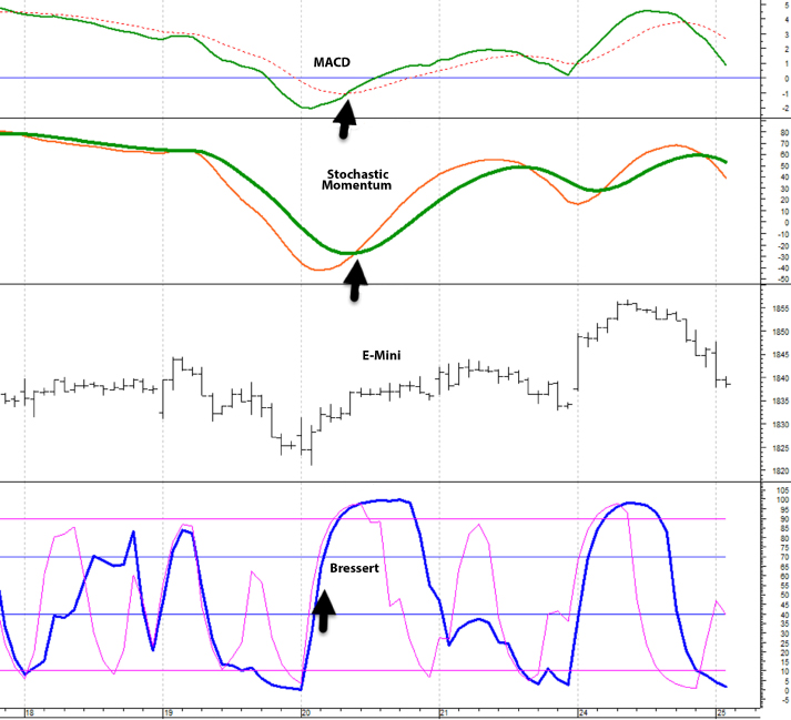
Figure 4.8 Stochastic Momentum: Slope Changes and Crossover Signals
Bressert
The Bressert is a proprietary indicator offered on the MetaStock platform. Developed by Walter Bressert, it is based on cycle analysis and shows trend direction, anticipates cycle turning points, and identifies market cycle tops and bottoms as they occur with mechanical buy and sell signals. I do not use the mechanical buy and sell signals. Instead, I use it in conjunction with other indicators. Often, the Bressert gives an early indication of a change in trend direction and possible trade. I will then look for confirmation from other indicators.
In Figure 4.9, the Bressert is the first indicator to turn (about halfway into the session) and begins to ascend on a sharp angle. The other indicators quickly confirm the move.

Figure 4.9 Bressert: Lead Signal
RMO
The Rahul Mohindar oscillator and its associated tools and indicators were developed by Rahul Mohindar of Viratech (viratechindia.com). Like the Bressert, the RMO is available over the MetaStock platform.
The RMO is designed to identify market direction and the primary trend. It is displayed as a histogram. A bullish signal is when the histogram moves up and crosses the oscillator's zero line going upward. A bearish signal is when the histogram moves down and crosses the zero line going down.
In Figure 4.10, the RMO starts out well above the zero line, but prices are relatively flat. About midsession, price makes a new high, but the RMO does not make a new high, indicating a bearish divergence. The divergence is confirmed on the stochastic oscillator.
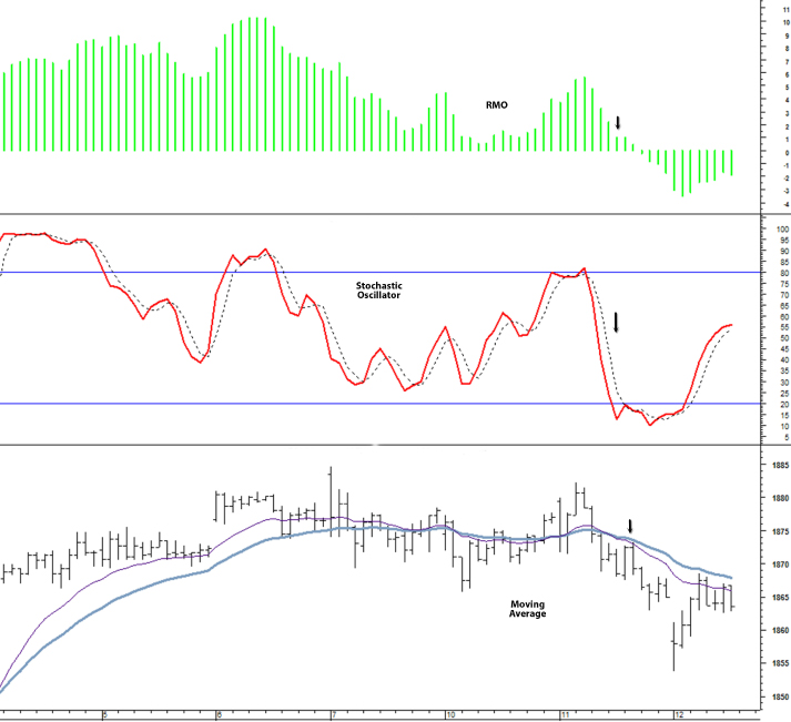
Figure 4.10 RMO: Bearish Divergence and Sell Signal
The RMO begins to show bearish signs and finally late in the session it crosses the zero line on the way down. This is a valid RMO signal, and it is confirmed by the other indicators.
Moving Ribbons
Moving ribbons combine a large number of moving averages onto the same chart. When all the averages are moving in the same direction, the trend in that direction is obviously very strong. In trading ranges, moving ribbons tend to converge on one another. As directional volatility increases, they tend to widen. When markets reverse trend, there will be a series of crossovers as the moving ribbons realign to reflect the direction of the new trend.
In Figure 4.11, initially the moving ribbons are tilted higher in concert with the prices moving up. As prices flatten, the moving ribbons converge and there are some crossovers of the faster moving averages through slower moving averages. Then the uptrend resumes and the moving ribbons diverge and tilt higher. Toward the right side of the chart, the prices move down again. In response, some of the moving averages tilt down and cross slower moving averages. From a trading perspective, the resumption of the uptrend midway through the session was confirmed by other indicators and represented a good trading opportunity.
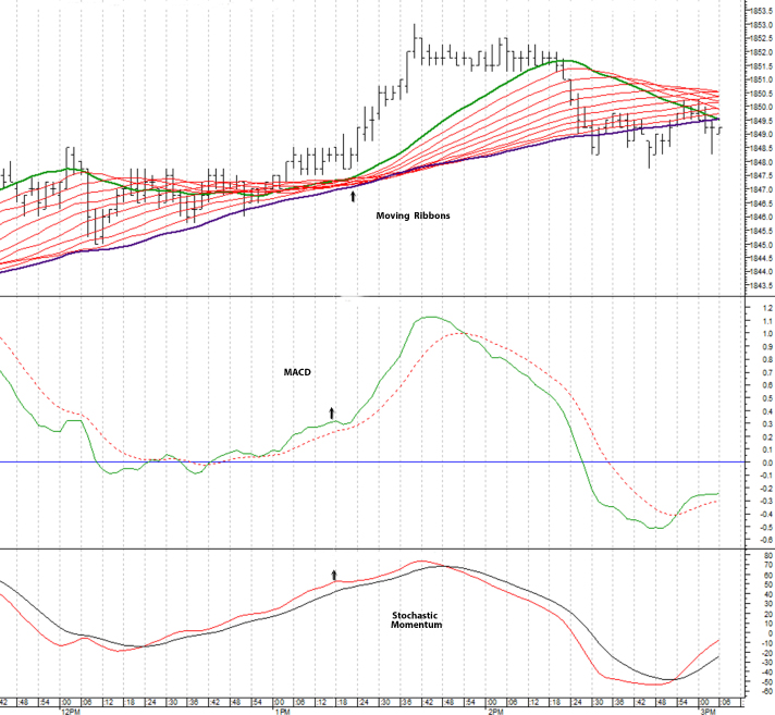
Figure 4.11 Moving Ribbons Converging and Diverging