
Communicating to People
“If we want users to like our software, we should design it to behave like a likeable person.”
—ALAN COOPER
“Designing an interface to be usable is like a chef creating edible food.”
—AARON WALTER
If our user interfaces were designed to communicate with robots—robots whose only requirement is mechanical usability—we would be largely done at this point. But our target users aren’t robots. Our UIs are designed to communicate with humans—emotional humans who have incomplete knowledge, who constantly make small mistakes, who want to feel productive and don’t like wasting time, who want to be treated with respect, and who want to enjoy what they are doing and don’t want to be bored. These emotional humans want our UIs to be worth the trouble to learn and use and to feel confident when they’re using them.
Traditionally UI design focuses on completing tasks mechanically, where the UI boils down to performing individual transactions through features. The UI presents some set of inputs, users perform some actions, then the UI responds with some output. The user’s goals are presumed to be achieved on the first try, after which the user immediately moves on to the next task. Lather, rinse, repeat until done.
If enough users can perform the tasks in a reasonable amount of time, the UI is declared usable. But at the human level, being merely usable is a rather low bar. As Aaron Walter describes, it’s like eating food that is merely edible. If you have ever screamed in frustration while doing a simple task with a “usable” product (a common occurrence for me), you know exactly how low that bar is.
Great UI design transcends mechanical usability by recognizing that there is an emotional, impatient, error-prone human at the other end of the interaction, so well-designed interfaces strive to make a personal connection. We need higher expectations than
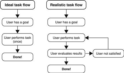
FIGURE 4.1 Users rarely perform complex tasks perfectly on the first try, yet complex tasks are usually designed with that ideal task flow.
mechanical usability. Aaron illustrated this well by remapping Maslow’s hierarchy of needs to a hierarchy of user-experience needs. To this idea I have taken the liberty of adding a bit more detail in Figure 4.2. As Aaron points out, the pleasurable top of the pyramid is often missing, and users generally take useful and usable for granted—as they should.
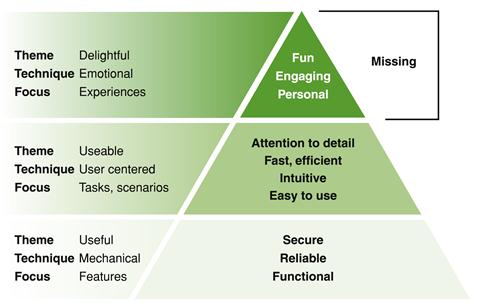
FIGURE 4.2 Maslow’s hierarchy of needs remapped to user-experience needs; gives a new meaning to “missing the point.”
The goal of this chapter is to explore the human side of human/computer interaction. Most of the topics presented here have a clear communication angle, but for some the relationship to communication is less obvious. But in all cases the topics go beyond mechanical usability and address how tasks are communicated on a human level.
The importance of making an emotional connection
Great modern user experiences go beyond usability—they are so engaging that people want to use them and develop an emotional attachment to them. Consider two competing products. Suppose both products fulfill their purpose equally well mechanically, but the first product is unattractive, has no recognizable personality and feels technical and unengaging, whereas the second product presents itself in a way that is beautiful, engaging, and delightful. Which product would you prefer to use? That’s not a hard decision—in most circumstances, the beautiful, engaging product wins.
Just because users can perform tasks mechanically doesn’t mean they will. And it doesn’t mean that they will like it. If your product solves real problems, has a simple, intuitive interaction and an appealing, easy-to-read visual design, yet people aren’t using it, chances are your product is failing to communicate at a human level.
When Steve Jobs introduced the first Macintosh in 1984, half the story was a self-contained, high-tech, low-cost graphical user interface (GUI)-based computer. The other half was that the Mac had a personality. Its personality is what made the most impact and is the part that has endured long after the original technology became obsolete.
We must have the same standards for software interaction as we do for social interaction. If an interaction wouldn’t be acceptable between people, we shouldn’t expect users to accept it with software. For all the talk about user-centered design, the truly human side of design is often ignored. Thinking about UI design as human communication forces that consideration.
Having a personality
Personality refers to the characteristics of a product that connect emotionally with users. All software has a personality—whether intentional or not—so it is better to have a personality that is carefully designed than one that is accidental.
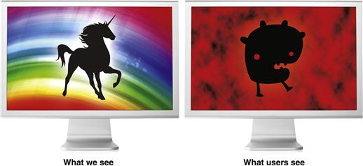
FIGURE 4.4 What we see in our software isn’t what our users see. We see the technical challenges required to get the project done. Users don’t see any of that, but they do see its personality—which we don’t see at all.
Personality is not a minor detail. Think about a recent experience, whether real world or with technology, that you really enjoyed. Why was that? Now think about a recent experience that you strongly disliked. Why was that? Consider the difference between the two.
Although it is possible that this difference was your mechanical ability to get tasks done, it is more likely that the difference was your emotional reaction to your experience. As users, we react emotionally to:
We react badly to such experiences in real life, but we tend to lower our expectations when we’re dealing with technology. We shouldn’t. With technology, we are often thrilled if it just works the way we expect.
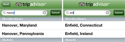
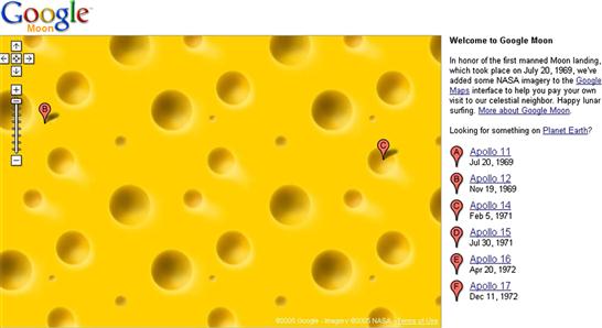
FIGURE 4.5 These would be good guesses if I did this search anywhere other than Hanover and Enfield, New Hampshire. We shouldn’t lower our expectations when we’re dealing with technology. 
We rationalize rude, arrogant, unintelligent behavior from technology because we know that technology isn’t human. But we recognize that technology is crafted by humans, so we often transfer our feelings about an experience to the organization that designed the technology. If the experience is poor, we think “Those idiots! What were they thinking when they designed this?” If the technology’s tone is cold and impersonal, we think that the organization that created it is also cold and impersonal. Whether good or bad, a user experience says a lot about the organization that designed it. The best user experiences feel like they were designed by intelligent, thoughtful, caring, respectful people.
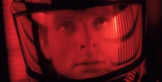
FIGURE 4.6 In 2001: A Space Odyssey, the HAL 9000 computer was more human than the depersonalized crew.
Anthropomorphism gives human characteristics or behaviors to objects that are not human. To have a personality, it isn’t necessary and often isn’t appropriate to present software as a person. In fact, doing so is off-putting in some contexts and cultures. There are many modern products that have a human personality.
But this approach is risky in more formal environments where there are significant consequences, such as physical well-being, destruction, or personal loss.

Personality attributes
Since personality refers to the characteristics of a product that connect emotionally with users, it’s not surprising that software personality characteristics mirror those of human personality. Here are some common personality attributes:
• Human (versus robotic, mechanical, technical, unemotional)
• Friendly (versus impersonal, aloof, hostile)
• Professional (versus casual, overly familiar)
• Respectful and polite (versus rude, disrespectful)
• Humble (versus arrogant, condescending)
• Sincere, genuine, honest (versus patronizing, fake)
• Encouraging (versus discouraging, negative, harsh)
• Relaxing (versus stressful, hazard prone)
• Flexible, adaptive (versus stiff, unforgiving, bureaucratic)
• Fun (versus boring, dull, pedantic)
A simple way to design a software personality is to define a short list of desirable attributes and make sure that your design decisions are consistent with them. Those personality attributes should be appropriate for your product and its target users. For example, a Web-based photo sharing app targeting young users might be friendly, casual, fun, and humorous. By contrast, an emergency room triage app should be professional, respectful, concise, and sincere.
A great way to communicate a product or feature personality is through its name. Although there is nothing wrong with choosing a name that reflects its technical functionality, modern software names often reflect personality and attitude.
Having a good tone
Tone is the attitude a UI conveys to users. Tone is an important personality attribute and is conveyed through the use of language, text presentation, and icons. Here are some tones that you might see in software:
• Friendly tone. Feels like users are having a casual conversation with a friend.
• Professional tone. Feels like users are having a business conversation with a colleague at work.
• Encouraging tone. Feels encouraging, positive, and goal focused, inspiring users’ confidence.
• Robotic tone. Feels like users are having an impersonal, mechanical conversation with a robot.
• Corporate tone. Feels like users are being told what to do by a powerful corporation.
• Salesman tone. Feels like users are being sold something, perhaps contrary to their best interests.
• Law enforcement tone. Feels like users are being interrogated with a barrage of intrusive questions and being forced to explain their questionable actions.
• Lawyerly tone. Feels like users are being asked to perform some legally significant act and acknowledging that they will bear all the responsibility if anything goes wrong.
• Negative tone. Feels like the software is obsessed with user mistakes and doing everything perfectly.
• Arrogant, condescending tone. Feels like the product is belittling non-expert users and makes them feel foolish for their mistakes—as though it’s the user’s fault that the UI is confusing and hard to use.
• Boastful tone. Feels like the software is bragging about its accomplishments—as though it wants praise from users for actually working correctly.
• Flippant tone. Feels like users aren’t being taken seriously or being taken for granted.
Of these, a combination of professional, friendly, and encouraging tone is a good choice because it is always appropriate. The other tones are undesirable and even antisocial.

Do designers actually use these undesirable tones? All the time—usually unintentionally. You just have to look for them.
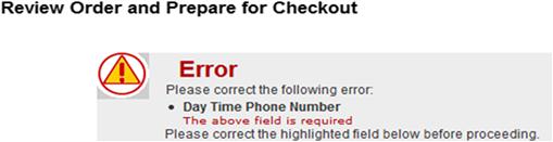
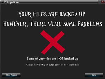
FIGURE 4.11 This error message has a law enforcement tone. The big red “Error” heading, the cultish-looking error icon, and the extreme overexplanation of a minor problem convey its tone. Saying “please” twice doesn’t improve the tone but rather gives it a “good cop/bad cop” feel.
To get the right tone, be careful with the words you use (and their connotations), the way you phrase sentences, and the way you present problems. If the text and tone reflect what you would actually say to the target user in person, it is probably the right tone. As the Google Android Design Guidelines recommend, “Pretend you’re speaking to someone who’s smart and competent, but doesn’t know technical jargon and may not speak English very well.” Great advice!
Speaking the user’s language
Speaking the user’s language is important not only because it is the language that your target users understand but because it is the best way to communicate on a human level. Here are some steps you can take to speak the user’s language:
• Define a minimal vocabulary list. Make a list of terms that your target users routinely use in performing your app’s tasks, eliminate any redundancy, and use that vocabulary consistently.
• Remove unnecessary jargon. Jargon exists for a reason—it is a specialized language for precise communication for a particular profession or field. Using jargon is fine as long as your target users routinely use it, but if they don’t, use plain-language alternatives instead.
• Avoid unnecessary abbreviations and acronyms. A well-designed layout usually gives enough space to make most abbreviations and acronyms unnecessary, so spell these words out if you can.
• Avoid unnecessary negative phrasing. Use positive phrasing if it is more concise, natural, and encouraging. Negative phrasing has a discouraging tone and can be harder to understand.
• Use clean data. If your database is displayed in your UI, you need to make sure it is clear, natural, and easy to understand. Why say “1KNG 1BDRM EVO STE NSMK” when you can say “Evolution Suite with 1 King Bed (nonsmoking)”? Yes, you have the screen space to spell this out. Also, note how using abbreviations and all capital letters gives the data a very unfriendly, technical feel.
• Refer to users as you would in person. Address users as you and their objects with your. Use the active voice for user actions.
• Use complete sentences. Use sentence fragments only if you would in person. Use explicit verbs unless they go without saying (such as “view” and “go”).
• Be polite but not too polite. Design your product to be polite, but be careful not to go too far. For example, say “Please” when users are inconvenienced or when its absence would be rude. The overuse of “please” sounds patronizing.
Motivating users by providing obvious value
Your product helps users perform some task, solve some problem, or achieve some goal. If your users must use your product, then of course they will. But if they should use your product, there is a strong possibility that they won’t—unless your product delivers obvious value.
Providing clear value motivates people to use your product. Solving a problem isn’t good enough. Users measure value by comparing a product’s benefits relative to their cost—the cost of owning the product plus the time and effort required to use it. It’s a classic design mistake to assume that all you need to do is solve a problem to have a successful design.
Your product should maximize value by maximizing its benefits while minimizing its costs. And your product should be designed to make its value obvious; don’t assume that users are going to invest time and effort to figure it out on their own. If you have a great product that people aren’t using, chances are the design isn’t clearly communicating its value.
To address to benefit side of value, don’t just allow users to perform tasks; encourage them to achieve their goals better than they could with the alternatives. For example, a mobile photo-sharing app must be designed to share photos quickly and easily while on the go, especially compared to the alternatives. If there’s another solution that’s quicker and easier to use, that’s what users will use instead.
To address the cost side, design your product to eliminate any unnecessary effort (and the perception of effort) required to see the value—especially for first-time users. Does using your product require an account? Do users have to sign in to do anything? Do they have to perform some initial configuration to perform a task? Do they have to do a lot of typing or answer a lot of questions? Do they have to plan how they will use your product in advance? All this work requires a great deal of motivation. To deliver value, do everything you can to make such steps unnecessary.
Minimizing effort
Well-designed UIs reduce the effort required to perform tasks, as well as the perception of effort. Robots don’t care how much effort is required to perform a task, but people certainly do.
Assuming that users want to get a task done as quickly as possible (which, with the exception of games, you should always assume), of the two plans that follow, which approach do you think users would rather take?
Plan A:
1. Perform the task immediately (perhaps as a guest with default settings).
2. Optionally refine the results or save the work for later.
Plan B:
1. Register to create an account.
3. Configure a whole bunch of settings and account information.
4. Answer a whole bunch of questions about the task.
5. Specify how to display the results.
Plan B is likely easier to program, but users would rather get right down to business with Plan A. Plan B has an inconsiderate personality that says the user’s time doesn’t matter. Instead, put results users want ahead of knobs, dials, and questions whenever you can.
Here are some techniques to reduce the effort (and perception of the effort) required to perform a task:
• Remove any hurdles that get in the way of users satisfying their goals. Don’t require users to have an account or sign in to perform basic tasks.
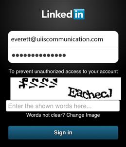
FIGURE 4.13 Please don’t make me do a CAPTCHA on my smartphone just to read a post. In my opinion, CAPTCHA stands for “Crappy Automated Public Turing test to Completely piss off HumAn users.” Robots don’t mind them but people do.
• Don’t require users to set options before performing a task. Better to have good defaults and delay any changes until users know what they want.
• Start with the top task. If there is a top task that users almost always do, just start there instead of making them choose it. For mobile apps, consider eliminating homepages and surface the most important info instead.
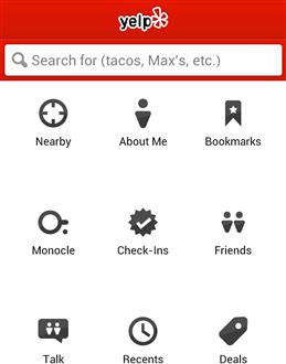
FIGURE 4.14 The Yelp app has a home screen, even though the top task (“help me find good places to go near me now”) is by far the most likely action. The home screen is just an unnecessary step.
• Don’t require users to tweak the UI to make it usable. Display objects with the right size and format so that they don’t have to scroll, resize, sort, or the like to do the task.

• Don’t require users to save work. If users might want to save their work, either save the work automatically or offer the option at the end instead of requiring the effort at the beginning.
• Respect the user’s privacy. Don’t ask for personal, sensitive, or complex information until users are about to make a commitment. Otherwise, let them explore freely.
Here is a simple test to determine if you are minimizing effort: Take any task that users are likely to repeat and perform it twice in a row. Ideally, the second try should have been a streamlined version of the first. If by contrast you had to repeat everything, redesign the task to eliminate unnecessary steps and input.
Having forgiveness
Robots might perform tasks perfectly, but people make small interaction mistakes all the time. Users tend to blame themselves, ignore any design problems, and redo the interaction until they get it right. But what if the user’s intent is clear and unambiguous? What if there is a simple design alternative that prevents the problem or makes it easy to fix? Must we force users to redo the work even when we know what they want?
Your product can be forgiving by:
• Preventing the mistake. Use constrained controls to restrict input to valid values. Use appropriately sized controls to prevent mistargets.
• Doing the right thing anyway. Recognize when the user’s intent is clear and unambiguous and just do the right thing by default. Don’t punish the user for not knowing the “correct” way.
• Making problems easy to correct. Provide users the ability to fix small interaction mistakes with minimal effort. Users shouldn’t have to redo a task or reenter input.
Whenever you see users frequently make mistakes with your product, ask yourself whether the problem could be prevented or easily fixed with a better design.
With this is mind, I would like to propose Everett’s Law of Forgiving UI:
For every UI that requires users to constantly correct small mistakes, there exists an alternative design that prevents the mistake, makes it easy to recover from the mistake, or does the right thing anyway.
Beyond supporting the obvious Undo/Redo commands, let’s review some common minor interaction mistakes and what we can do about them.
Mistargeting
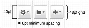
Users often miss their intended targets by a few pixels. You can prevent mistargeting by using controls of appropriate size. Different platforms have different sizing guidelines. For example, Windows recommends a minimum control size of 16 × 16 pixels with a minimum of 7 pixels between controls, whereas Macintosh has standard regular, small, and mini control sizes with regular-sized controls recommended for most UI. Touch-based UI has larger minimum sizes that are based on the size of the typical finger. Research shows that touch targets of 9mm square or larger greatly improve touch accuracy, but translating this minimum physical size into points or pixels requires knowing the resolution of the display used.
Since arguably all modern UIs should be designed for touch, you should consider designing desktop UI for touch as well. iOS recommends using a 44 × 44 point layout grid for comfortable touch support, whereas Android recommends 48 × 48 points. Figure 4.17 shows a sizing approach that should work well for most platforms.
You can also prevent mistargeting by providing a margin for error. One approach is to make click targets larger than they appear on screen.
FIGURE 4.18 Selecting text in most browsers is a very mechanical and unforgiving process. One pixel too short and you have a partial selection. One pixel too many and you select the entire document.
Another approach is to put noninteractive space between objects that respond to similar direct manipulations.
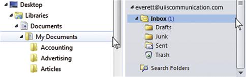
FIGURE 4.19 Windows Explorer and Microsoft Outlook have no margin for error between the folders and their scrollbars. If users are off by one pixel, they end up moving a folder instead of scrolling—usually without even realizing it.
You can reduce the consequences of mistargeting by keeping disruptive controls physically separate from other controls. A control is disruptive when accidentally clicking it results in lost work or having to start a task over.
Finally, if you are designing custom controls, always provide a way to abandon a mistaken interaction before completion—usually by holding and releasing the control.
Performing (slightly) wrong interactions
Users often perform slightly wrong interactions. The following common interactions are often confused:
| Single-click | Select or invoke the object being clicked. |
| Double-click | Select the object being clicked, then perform its default action. |
| Right-click | Show an object’s context menu. |
| Shift+click | Extend a selection or display a link in another window. |
There are similar problems with touch-based UI. For example, touch-based UIs often confuse flick gestures for scrolling with press gestures for selection.
Often these distinctions are important, and if users make a mistake, they must correct it. But what about situations in which the user’s intention is clear and the distinction isn’t important? For example, suppose an object isn’t selectable (making double-click technically unnecessary), but the user double-clicks anyway? Should that double-click be interpreted as one single click or two—where the second is likely to undo the effect of the first? Should we do the right thing or must we teach those users a lesson? I vote for doing the right thing and performing one single click.
FIGURE 4.22 In a browser, Shift+clicking a link means display the link target in another window. It could mean the same thing in Outlook, but since the Shift is technically unnecessary (because the link must be displayed in another window), Shift+clicking a link in Outlook “extends the selection” by selecting the entire document to the click point. This is never the user’s intention.
Providing wrong data, typos
Users often enter wrong data, especially in unconstrained text boxes. Users might type the wrong word or make a typo. Does your product make users start completely over?
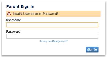
FIGURE 4.23 I typed in the wrong password. For that, I get the pleasure of retyping my username, too.
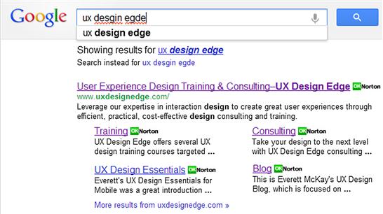
Does your product return an error message or the most likely intended matches? For sites like Google and Amazon, returning an error message is leaving money on the table, so they boldly provide the closest matches without asking. After all, you can’t sell things customers can’t find.
Working in the “wrong” order
Many products are designed for users to perform steps in a strict sequence, even if that sequence isn’t necessary or obvious. If users work out of sequence, the previous input might get reset. Should we provide flexibility or must we teach those users a lesson? I vote for providing flexibility and letting users work the way they prefer.
Not reading text carefully
As Steve Krug points out in Don’t Make Me Think!, users don’t read, they scan—yet UI text is often written to require careful, complete reading to avoid confusion. Here are some techniques to avoid user confusion with your UI if text isn’t read carefully:
• Make distinctions distinct. If it is different, make it look different using both labeling and visual distinctions.
FIGURE 4.28 Users aren’t likely to confuse ordering with pre-ordering on Amazon. Not only are the labels different, but their look is different as well. 
• Use self-explanatory, yet simple, concise labels. Say enough to be self-explanatory, but remember that the longer the label, the more effort required to read and understand it.
• Use explicit verbs. A few verbs such as “view” and “go” go without saying, but most don’t. Put the explicit verb near the beginning of the label.
• Avoid nuanced phrasing. Users shouldn’t have to give it deep thought to understand the meaning of the label.
• Avoid redundancy in related options. For sets of related options, don’t repeat the similarities. Put the most important information and any differences toward the beginning of the label.
• Avoid negative phrasing, especially double negatives. Users who are scanning are likely to miss those negatives and therefore completely misunderstand the label.
If you find that users are constantly misinterpreting your UI text, rewrite it! Adding a word or two for clarity can make a big difference.
Accidentally choosing catastrophic actions
Catastrophic actions are actions with significant, often irreversible results that are catastrophic when unintended. Catastrophic actions should be difficult to trigger, but all too often they are presented as an ordinary command like any other. Combine this misleading presentation with users’ tendency to not read carefully and you have a hazard-prone experience. In his book, About Face, Alan Cooper describes this as not hiding ejector-seat levers.

One simple way to avoid catastrophic actions is to assume that users want to save their work and they should have to take some action not to do so. Classic UI takes the opposite approach, requiring users to save their work explicitly.
Another simple approach is to make catastrophic actions hard to do, either by asking for a confirmation or by making these actions hard to do accidentally.
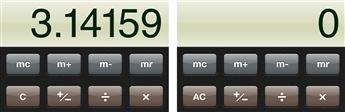
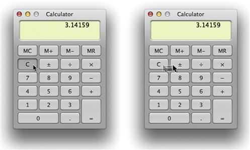
FIGURE 4.32 The iPhone Calculator app hides the draconian All Clean (AC) button, revealing it when users tap Clear (C). This prevents accidents and saves a button in the process. Clever!
Make it easy to correct or undo the last interaction. Never make users reenter previously entered text. Never make users start completely over because of a small mistake. Most important, make catastrophic mistakes really hard to commit. Users should never lose anything by accident that isn’t easily replaceable.
Building trustworthiness
Trust is a relationship that is earned by consistently demonstrating competent, open, honest behavior so that people are willing to rely on or take risks with something or someone. In a risk-free world, trust wouldn’t matter much.
In the real world, trust is required because risks are everywhere. Users are constantly being asked to reveal their names, email addresses, physical addresses, personal information, financial information—even their current physical location. Financial and medical apps usually involve sensitive or private information. Search engine queries reveal a tremendous amount of personal information that could be abused in the wrong hands.
Beyond protecting sensitive information, trustworthiness requires basic competence. Purchasing products online requires users to trust that companies will ship the right product to the right location at the right time for the right price in the right physical condition. Even something as basic as an alarm clock app has no value if users can’t depend on it to sound an alarm audibly at the appropriate time. Risks that require trust can be as small as wasting time or being disappointed.
As designers, we usually take users’ trust for granted. We assume that users will trust that our product will do the job competently and satisfy their goals. We assume that users will provide personal information whenever we ask for it. But if we haven’t earned their trust, why should they? If users aren’t willing to depend on your product, chances are it is failing to earn their trust.
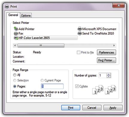
FIGURE 4.33 I don’t use the Print Current Page option in Microsoft Windows, even though I frequently want to print only the current page. Why? Because I don’t trust that Windows’ assumption of the current page is the same as mine. This dialog box takes my trust for granted.
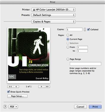
FIGURE 4.34 By contrast, I frequently use the Print Current Page option in Microsoft Office and Adobe Reader. Why? Because they earn my trust by showing me the current page. Making the effort to earn my trust makes all the difference.
Your product can earn the user’s trust by:
• Demonstrating competence. Yes, your product can do the task, but is that obvious to users? In working with valuable assets (such as documents and photos), are they never lost, corrupted, or misplaced? When users view information, is it clearly accurate, credible, and timely? Explicitly setting accurate expectations and providing timely feedback are essential here.
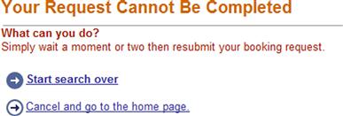
FIGURE 4.35 Their mistake, but I pay the price. And when they say “start search over,” they mean completely over.
• … for the small things, too. Developers tend to worry about the primary functionality but not too much about the details. But if simple tasks aren’t done competently, why should users assume that the more challenging functionality will be done right?
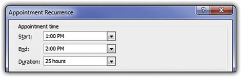
FIGURE 4.36 I set an appointment to start at 1:00 P.M. and end at 2:00 P.M. Microsoft Outlook somehow concluded that my appointment ran for 25 hours. If my personal assistant did this, he or she would be looking for a new job.
• Avoiding surprises. If users are unpleasantly surprised by the results, your product isn’t trustworthy, even if it does the job correctly in the technical sense. Common offenders are commitment points that aren’t obvious, promising but not delivering special offers, and unreasonably high fees and shipping charges that are either hidden or revealed very late in the task.

FIGURE 4.37 Go Daddy is offering a fantastic sale on one-year domain registrations on its homepage. You don’t get that sale price by default but instead get a longer registration at the normal price. To get the sale price, you have to manually change the registration length back to one year, but that isn’t made obvious here. Surprise!
• Providing specific information. Vague information or feedback doesn’t build trust because users can’t distinguish real problems from false alarms or routine mistakes. Does my account have insufficient funds? If so, tell me so that I don’t try the task again. Is there a security risk? Tell me specifically what the risk is so that I can make an informed decision. Is there really a problem? Tell me what is specifically wrong so that I can fix or prevent it.
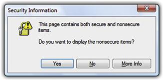
FIGURE 4.38 Do I need to display the nonsecure items? What is the specific security risk here? How can I possibly answer the question without knowing? But I am feeling lucky …
• Providing timely information. Present information required to build the user’s trust as soon as you can. Users who lack confidence might not see it later.
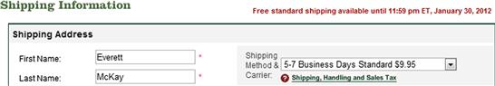
FIGURE 4.39 This site promises free standard shipping, so why can’t I find that option here? Turns out that I will see it on the last step, but I might not get there.
• Taking responsibility. If your product performs tasks that involve risk, it shouldn’t evade responsibility by asking a bunch of questions users can’t answer.
• Putting the user’s goals ahead of yours. Are you offering options for your business goals and not the user’s? If so, make their effect clear and disable them by default (that is, users must opt in rather than opt out). You won’t earn trust by tricking users into accepting options they don’t want.
• Not requiring unnecessary sensitive information. If sensitive information isn’t clearly required to perform a task, make it optional. To improve conversion rates, consider explicitly labeling such info as optional to build users’ confidence. If the need for information isn’t obvious, explain why it’s required.
• Making it feel right emotionally. Success should look like success. Failure should look like failure. Never the twain shall meet.
Earn the user’s trust and do everything you can to keep it—even if it conflicts with your business goals. Once that trust is broken, it is very hard to earn back.
Being smart without looking stupid
Modern user interfaces are aware of what users are doing now, along with users’ preferences and past behavior. Robots don’t mind if they are interacting with something that lacks intelligence—they are used to that—but people certainly do. Consequently, modern UIs are better able to focus on what users are likely to want by presenting the right contextual commands, options, and defaults. Past performance really is the best indicator of future performance, so modern UI has a memory and takes advantage of it.
Your product can appear intelligent by performing an appropriate combination of these qualities:
• Paying attention to user input. Keep track of previous user input and reuse it automatically as appropriate. The user should never have to reenter previous (nonsensitive) input to complete a task, even if the user changes options, goes back to a previous step, restarts the task, or the task times out. Don’t reset anything unless you must.
FIGURE 4.45 My favorite hotel just offered me a special rate for my birthday. I entered my arrival and departure dates, plus the number of adults and children. Not liking the deal, I clicked Specials and tried another offer, again having to enter my arrival and departure dates, plus the number of adults and children. Not liking that deal either, I decided to make a regular reservation. Guess what they are asking me again.
• Paying attention to user preferences. The user’s preferred way of working is always right, so your product should adapt to user preferences—not the other way around. Presenting tasks the way the code works and not being flexible is easier to implement, but that doesn’t make it right.
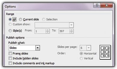
FIGURE 4.46 Nearly every time I save a PowerPoint deck to a .pdf file, I publish Handouts with six slides per page and frame the slides. You would never know that from the Options, which appear to prefer publishing Slides. PowerPoint likes having its way better than accommodating mine.
• Understanding the target users and their goals. Your product’s behavior should make sense for its target users and their goals. Being unaware doesn’t look very smart.
FIGURE 4.47 People buying cars usually want the lowest-priced car that meets their needs. So why does AutoTrader show search results starting with the highest price first by default? As if …
• Knowing what makes sense in the current context. Taking full advantage of the current context is a great way to simplify a UI because you can eliminate actions and options that don’t make sense. If an option is impossible now, why even offer it?
There are more advanced techniques to appear intelligent, such as applying heuristics and using data mining. But keep in mind that you risk looking stupid if you try too hard to look intelligent—especially if you do so in a very visible way.
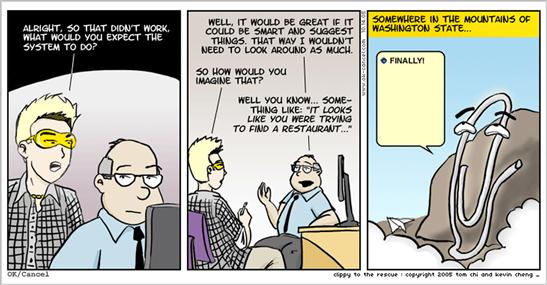
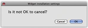
FIGURE 4.50 Office Clippy tried way too hard to look intelligent—and failed, in a very visible way. No, I’m not writing a letter. Please don’t ask again! OK/Cancel ©2005 Tom Chi and Kevin Cheng. Used by permission.
Set a high bar when trying to appear intelligent, and don’t draw attention to your product’s intelligence. The more attention you draw, the more embarrassing the mistakes. As Abraham Lincoln once said, “It is better to remain silent and be thought a fool than to speak and remove all doubt.” Good advice.
Not being annoying
Robots have no emotions, so they can’t be annoyed. People, on the other hand, are easily annoyed. The techniques we already mentioned for being smart are a great start.
Here are some annoyances your UI should avoid:
• Constantly demanding attention. Products that constantly demand attention are annoying. They demand your attention by being in your face, drawing attention to themselves (flashing being the worst way), and constantly requiring maintenance and handholding. Any UIs that users routinely dismiss without performing any action should be reconsidered.
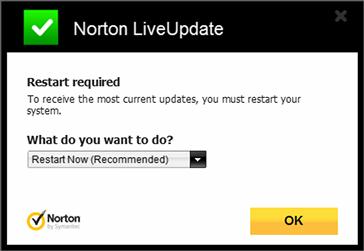
FIGURE 4.51 I have better things to do than restart my computer, and the constant reminders aren’t helping.
• Interrupting. Products that interrupt users to ask unimportant questions or point out minor problems are annoying. Don’t interrupt users and break their flow unless it is truly warranted. Don’t ask users to confirm an action unless you can give a strong reason not to proceed.
• Repeating. Interrupting users once without good reason is annoying; repeating the same or similar interruptions is infuriating. Interrupt once—at most—unless the situation changes dramatically.
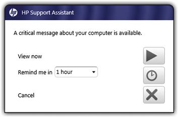
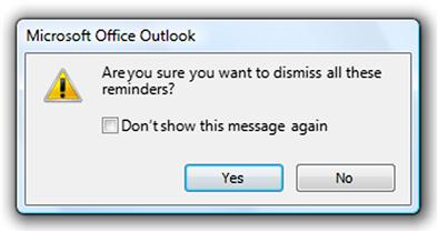
FIGURE 4.54 I didn’t forget the reminder from an hour ago; no need to remind me again. And honestly, the message isn’t that critical.
• Not paying attention to user input, preferences, or context. I mentioned these in the last section. Very annoying!
Many tasks are designed as though they were individual transactions that users perform perfectly on the first try. In reality, achieving users’ goals might require research-based refinement involving many related transactions. For example, comparison shopping might involve finding and comparing several related products with minor variations. Requiring users to repeat all or most of the steps each time can be really frustrating.
Using courageous design
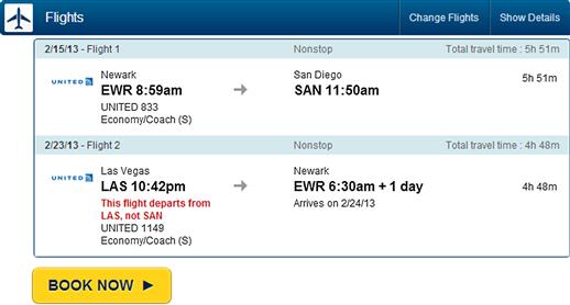
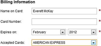
Suppose you have a question, and there’s a 99 percent chance you know the answer but a 1 percent chance you don’t. Do you ask anyway? Apparently many designers don’t like those odds. For example, here I’ve told Expedia that I want to travel to Ontario, California. I think my request is pretty clear. (Note that CA is the U.S. Postal Service’s abbreviation for California and that I performed this search in the United States.) So, is this question really necessary?
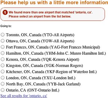
If you were to tell someone in the United States that you wanted to travel to “Ontario, CA,” and they asked if you really meant Fort Frances, Ontario, Canada, what would you think? Would you be impressed by their meticulousness?
Well-designed UIs have the courage to take intelligent risks to do the right thing without asking. When users’ input is clear and unambiguous, you can’t always be certain, but you can usually be right. The only reason to ask anyway is to avoid responsibility.
Why be dull? Make it fun!
Any task has the potential to be engaging. Robots might not care if tasks are drudgery (in fact, robots tend to be really good at such tasks), but people want to be engaged by what they do and definitely don’t want to be bored.
If you were to make a list of the most boring tasks you could think of, chances are many of them would involve using forms. Yet Wufoo, a Web service that enables you to create, manage, and use forms, is one of the most delightful apps I use regularly.
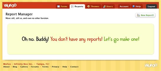
FIGURE 4.57 Why be dull? Even form building can be engaging. Note that this is a solid error message because it explains a specific problem and provides a solution. But unlike typical error messages, it isn’t scolding and it doesn’t draw attention to the user’s mistake.
Wufoo’s fun personality and attitude are very much by design, as its lead designer Kevin Hale describes:
The inspiration for our color palette did come from our competitors. It was really depressing to see so much software designed to remind people they’re making databases in a windowless office and so we immediately knew we wanted to go in the opposite direction. My goal was to design Wufoo to feel like something Fisher-Price would make. We were determined to make sure Wufoo was fun.
Special experiences
Special experiences are opportunities for special user engagement, product differentiation, and branding. Although you might assume that special experiences are situations in which a product fulfills its purpose particularly well, in practice they are usually the opposite. That is, specific experiences tend to be those necessary evils required to use a product and that don’t necessarily relate to fulfilling its primary purpose.
Here are common opportunities for special experiences:
In these situations, users aren’t yet fully productive or engaged with getting their work done. Rather, they are distracted by getting your product to work properly, making this an excellent time to engage users with special experiences that have a human touch. Why be dull?
Summary
If you remember only 10 things:
1. Users are humans, not robots. Humans are emotional. They want to enjoy what they are doing. They make small mistakes all the time. They are focused on their work and are easily distracted. Your product should communicate to users at a human level, so it’s not just what you say but how you say it. Good software interaction should have the same standards as good social interaction.
2. Mechanically enabling tasks is only the first step in great design, not the last. Great UI design transcends mechanical usability by recognizing that there is an emotional, error-prone human at the other end of the interaction. We need higher expectations than mechanical usability.
3. Give your product a likeable personality to make an emotional connection with users. All software has a personality, so it is better to have a personality that is carefully designed than one that is accidental. You can design a personality by defining a short list of desirable attributes, being consistent in using them, and choosing a name to match.
4. Motivate people to use your product by providing obvious value. Maximize its benefits and reduce its costs compared to the alternatives. Don’t assume that your product’s value is obvious just because it solves some problem. Remove any hurdles that get in the way of users finding your product’s value. Don’t assume that users will invest a lot of time and effort to find it.
5. People make mistakes all the time, so design your product to prevent mistakes, do the right thing anyway, or make mistakes easy to correct. Never make users reenter text or start completely over. Make catastrophic mistakes really hard to do. If you find a common interaction mistake, look for simple design alternatives that prevent the problem or make it easy to fix.
6. Earn the user’s trust by consistently demonstrating competence, avoiding surprises, providing specific information, taking responsibility, and putting the user’s goals ahead of your business goals. Once that trust is broken, it is very hard to earn back.
7. Make your product intelligent by understanding the target users and their goals, paying attention to user input and preferences, and taking advantage of the current context. But have a high bar for intelligence, and don’t draw attention to your product’s intelligence.
8. Avoid your product being annoying by making it appear intelligent, and not demanding attention, interrupting users, or repeating itself.
9. Show design courage by doing the right thing without asking based on the information you have rather than playing it safe and asking every possible question.
10. Be engaging and fun! Any task has the potential to be engaging, so engage users whenever appropriate. Special experiences are excellent opportunities to engage users because they are usually points of low productivity when users aren’t getting their work done. Why be dull?
All the good examples in this chapter have something in common: They feel like natural, friendly conversations between people. By contrast, the bad examples often feel like mindless, mechanical interactions between robots. If your user interface feels professional yet friendly and reflects what you would actually say in person to the target user, the design is probably good.
Exercises
To improve your ability to design UIs that communicate on a human level, try the following exercises. Assume that anything is possible. Don’t let concerns about development costs or current technology limitations inhibit your thinking.
1. People are motivated by value. Can you think of a product that solved a real problem and that appeared well designed, yet you didn’t end up using it as expected? Can you explain why?
2. People are emotional. Can you think of a time when you yelled or screamed at a product while using it? What specifically made you scream and yell?
3. Software is crafted by humans. Can you think of a time when you had a low opinion of a company or its employees because of the way its products are designed? What was the specific design problem? What did you think about the product’s designers?
4. Having a good personality. Find a product that has a good personality. Characterize its personality in human terms and find the specific design elements that reinforce that personality. Would you feel differently about the product if it didn’t have that personality?
5. Avoiding a poor personality. Find a product that has a poor personality. Characterize its personality in human terms and find the specific design elements that reinforce that personality. Redesign three aspects of the product to improve its personality.
6. Having a good tone. Write an error message for a situation in which the user removes a storage device while it is being formatted. How is the tone? Does it match what you would say in person? Does it make sense from the user’s point of view?
7. Preventing small mistakes. Find a product that you often use on a daily basis. While performing several typical tasks, monitor every mistake that you make, no matter now small (have a friend record your mistakes if necessary). When you’re done, analyze your mistakes for the type and cause. Was the UI confusing? Was your intention clear and unambiguous? Are there alternative designs that could have prevented the mistakes?
8. Having intelligence. Find a product that lacks intelligence. Review the list of UI elements that improve intelligence and use them to redesign a product. Can you think of ways in which trying to appear intelligent might appear unintelligent?
9. Building trust and confidence. Can you think of a time when you didn’t complete a task because you didn’t trust the product or lacked confidence that it would do what you wanted? What did you do instead? Can you think of design alternatives that would fix the problem?
10. Avoiding being rude. Find a product that has rude error messages. Redesign the error messages to address the problem without the rudeness.