
Communication Design Principles
“One cannot not communicate. Because every behavior is a kind of communication, people who are aware of each other are constantly communicating. Any perceivable behavior, including the absence of action, has the potential to be interpreted by other people as having some meaning.”
—PAUL WATZLAWICK
The concept behind UI is Communication is that a user interface (UI) is essentially a conversation between users and a product to perform tasks that achieve users’ goals. A user interface differs from human conversation primarily in that it uses the language of UI instead of natural language. A well-designed UI boils down to communicating to users in a way that is natural, professional and friendly, easy to understand, and efficient. By contrast, a poorly designed UI is unnatural, is technological and mechanical, and requires users to apply thought, experimentation, memorization, and training to translate it into something meaningful. Effective communication is often what makes the difference.
The goal of this chapter is to establish baseline principles of intuitive UI design as a form of effective human communication, which I will use throughout the book. In doing so, I will present the attributes of intuitive UI for both individual interactions and entire tasks. Many UIs involve asking users questions, so I will present principles for doing this common pattern intuitively. Finally, I will present a model for typical user behavior to help determine how well your designs communicate.

Imagine this typical UI design situation...
Imagine this: You are working in a small team developing a new software product, and you realize that having a great user experience is crucial for its success. Everyone on the team is a manager, developer, business analyst, or tester, but unfortunately, nobody on the team has a UI design background or any experience designing “user-friendly” UI. You can’t hire any design talent or one of those user experience (UX) design consultants—the budget is too tight—so you are on our own. (If you are like most readers, you shouldn’t have to imagine too hard, because this situation is quite typical.)
But not to worry—Bob and Alice are our best developers and have been assigned to the UI design. Although they don’t have any UI design experience, they are smart and articulate, they have a strong command of the technology, and everyone on the team loves working with them. They have an excellent track record for getting things done.
You have watched Bob and Alice from a distance for the past few weeks and you are cautiously optimistic. After all, they have taken time to talk to everyone on the team, they have talked to customers and key stakeholders, they even did some site visits, and they have done lots of UI sketching on their white boards. You have heard them constantly use terms like user experience, user friendly, usability, intuitive, and simple. They frequently talk about having user empathy.
Right now, Bob and Alice are about to present their initial UI design proposal to the team for the first time. What do you expect to happen? I have two questions:
Please think these questions through before turning the page. Base your answers on your personal experience.

This is a purely hypothetical situation and there are no right or wrong answers, but here are my expectations based on my experience:
1. Their initial UI design won’t be very good. Even though Bob and Alice have gone through the motions, they will make the classic mistakes that everyone else makes, such as designing for themselves, considering only one solution, and ultimately focusing on technology and features instead of user goals and tasks. Their page designs will be confusing, overly complicated, and nonstandard. Frankly, the pages will look like they were designed by programmers—because they were.
2. The meeting itself will go quite well. Bob and Alice are smart and articulate, they have a strong command of the technology, and everyone on the team loves working with them. Their talent will show up in the meeting. They will do an excellent job of explaining (and defending) the design to the team, and their designs will make much more sense after they explain them. If anyone on the team objects to a questionable design decision, Bob and Alice will have a technology-based defense as to why it has to be that way.
Neither of these likely outcomes should be very surprising. After all, UI design is challenging, and Bob and Alice don’t have any training or experience. But they have plenty of experience explaining their ideas in person—a lifetime of experience, in fact—so that skill comes naturally.
What is surprising is that these two results are so different! If Bob and Alice can communicate the tasks to us effectively using English, why can’t they communicate those tasks equally well using the language of UI? Aren’t they ultimately communicating exactly the same thing—just using a slightly different language? During the design review, you might have thought, “If they just put what they said in the meeting directly in the UI, it would all make sense!” Good question—why didn’t they?
As humans, we are extraordinarily skilled at communicating to other people, because this is a skill that we have continuously developed throughout human civilization. Communication between people tends to:
• Be natural and friendly and use plain language.
• Be goal-oriented, results-oriented, and very purposeful; we carefully explain why people need to do things.
• Follow the person’s mental models and natural workflows (where the mental model is their interpretation of how a program works or how the task should be performed).
When we communicate directly in person, we are totally focused on the person’s goals: What does this person care about now?
By contrast, communication through technology tends to:
• Be unnatural, using technical language and tone.
• Be technology or mechanically oriented—rarely bothering to explain why.
• Follow the way the code works, revealing the raw data structures.
When we communicate through UI, we are focused on the technology and details: What does the software need now?
If our ability to communicate in person is so much better, why can’t we use the same approach? Why don’t we put essentially what we say in person directly on the UI? Simply put, we can and we should! Often, great UI design boils down to eliminating these differences, making the experience simple and natural. The old technical approach is artificial, historical (that is, we have always done it that way), and no longer necessary.
Too often, we design UIs by exposing the underlying technology directly to users—asking users to fill in raw data structures and perform the task the same way as the code does—and expect the results to be usable. We are surprised when this approach leads to poor UI. We shouldn’t be. From the point of view of effective communication, there are no surprises here.
Core principles of UI is Communication
Here are the UI is Communication core principles:
Principle #1: UI is Communication. A user interface is essentially a conversation between users and a product to perform tasks that achieve users’ goals. Start a design by understanding what you need to communicate to users, then let that communication drive the design process and the UI design itself. At the highest level, many UIs that are confusing, hard to use, and unintuitive relate to a failure to communicate.
Principle #2: Explain tasks clearly and concisely, as you would in person. The key is to understand that the UI isn’t some completely different type of communication. Rather, it’s the same communication using a slightly different language.
Principle #3: Every UI element can be evaluated by what it communicates and how effectively it does that job. The need for effective communication applies to everything, including control selection, layout, icon and other graphic design, color, and animation. Controls even have a “body language,” in which their presentation suggests details on how they are used. If users need to translate your UI into something meaningful, you should use that translated, meaningful version instead. If your UI has elements that communicate nothing, you should remove them.
Principle #4: Be polite, respectful, and intelligent. We must have the same standards for human-to-computer interaction as we do for human interaction. If an interaction would be inappropriate, rude, disrespectful, or stupid between people, it is equally inappropriate with software. Software shouldn’t get a free pass for rudeness and disrespect. Like people, UIs communicate through their personality, tone, and attitude.
Principle #5: If a UI feels like a natural, professional, friendly conversation, it is probably a good design. This is a simple yet remarkably effective technique for evaluating a design. If someone is explaining a design, compare the explanation to what is on the screen. If you are reviewing your own design, ask yourself: Would I actually say this in person? Either way, any discrepancies reveal problems.
Focusing on effective communication is the simplest way to make designs intuitive and to focus on users and their goals. This is because communication between people tends to be naturally intuitive and user centered.
I will apply these core principles throughout the remainder of the book.

Effective communication
This communication-focused approach to UI design allows you to leverage everyday interpersonal communication skills that you have practiced all your life. Clearly I’m assuming that you have developed fantastic interpersonal communication skills. In case you haven’t, here’s a quick refresher.
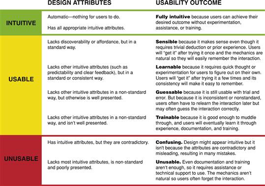
A UI communicates effectively when it has the appropriate combination of these attributes:
• Useful, relevant, necessary. The UI provides information that is useful and relevant to the task at hand and that doesn’t go without saying. If a completely confused user could readily provide the same information, skip it.

• Purposeful. The UI helps users understand the task, focusing on the objective and tying them to the user’s goals and motivation, not the basic mechanics of the interaction. If novice users who understand basic interaction could provide the same information, skip it.
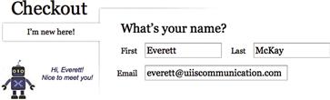
FIGURE 1.7 OK, great … but what’s a Snarfbladt and why do I need to provide one? This instruction is focused on the mechanical interaction, not the purpose.
• Clear and natural. The UI speaks the user’s language—using language users would naturally say in conversation. The text avoids unnecessary jargon, abbreviations, and acronyms, fully spelling out words in plain language whenever possible. It’s common advice to avoid jargon, but jargon exists for a reason—it is a specialized language for precise communication between people in a particular profession. Using jargon is fine as long as your target users routinely use it. But if they don’t, use plain language instead.
• Easy to understand. Even if the information is useful and in plain language, the UI shouldn’t require thought, experimentation, documentation, or special knowledge to understand.
• Specific and explicit—it doesn’t undercommunicate. The UI provides the right level of detail so that users know what to do. For example, error messages should identify the specific object that’s encountering a problem, what specifically is wrong, and specifically what to do about it.
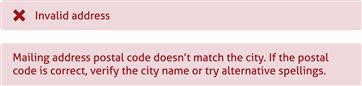
FIGURE 1.10 The bottom example explains specifically what is wrong with the address and what to do about it, whereas the vague top example makes users experiment to figure it out.
• Concise, efficient—it doesn’t overcommunicate. The UI provides the right level of detail so that users can make informed decisions confidently but without going overboard. It provides the essential information by default but, when appropriate, allows users to get more details when they really need them. By contrast, UIs that overcommunicate explain every detail, no matter how irrelevant, often in large blocks of text that discourage reading.
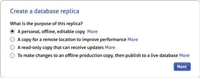
FIGURE 1.11 Although these options and the technology behind them are complex, the options here focus on the purpose of the replica types without overwhelming the user. If users want more information, all they have to do is ask. 
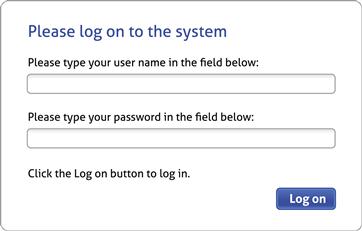
FIGURE 1.12 By contrast, this logon screen severely overcommunicates. The extra language only says the obvious and discourages reading. 
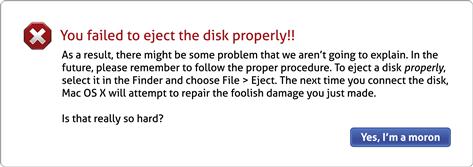
• Inspires confidence—it doesn’t overwarn. The UI is encouraging and builds users’ confidence that they are doing the right thing. Warnings should be reserved for infrequent issues that require special attention. Minor problems should be presented as minor problems, not disasters. Nothing should ever be described as catastrophic, fatal, critical, a failure, or illegal. Users should never asked to abort, kill, or terminate anything.
• Timely. The UI provides the information at the right time and in the right context, neither too early nor too late. Information presented too early presumes that users will read something that isn’t relevant yet and remember it, whereas information presented too late presumes that users will proceed with the task confidently without it. If the information is important to the task, neither presumption is valid.

• Good personality and tone. I address personality and tone extensively in Chapter 4, but Alan Cooper’s summary is best: “If we want users to like our software, we should design it to behave like a likeable person.”
• Rarely interrupts. The UI rarely interrupts and never breaks the user’s workflow to ask unnecessary, unimportant questions. Rather, the UI interrupts users only if it has a very good reason to. The UI confirms actions only if there is a good reason not to proceed without asking.

These effective communication attributes clearly apply to text, but they apply to all other UI elements as well.
Put some thought into these attributes in your everyday conversations. Think about conversations that are unimportant, hard to understand, overly terse, overly chatty, and rude and when you are constantly interrupted. I’m sure these are not pleasant experiences. The exact same rules for good in-person conversations apply to conversations through software.
Intuitive UI
For any software project, it’s a sure thing that having an “intuitive UI” is a top goal. For users, describing a UI as intuitive is among the highest praise they can bestow. For marketers, it’s a requirement to describe their product’s UI as “intuitive and easy to use”—regardless of whether it is.
Given this universal design goal, it’s reasonable to ask what it means for a UI to be intuitive. Surprisingly, nobody really knows. Ironically, most people’s definition of intuitive is, well, intuitive itself, as they struggle to define the term in a specific, meaningful way. (Try defining it yourself before continuing.) For most people, intuitive just means better. How can you achieve a project goal if you don’t even know what it is?
Intuitive: A definition
Given all the talk about intuitive UI, you would think every UI design book would define and explain the term in detail. Surprisingly, few do. The world’s most confusing UI could be credibly described as intuitive as long as the term isn’t defined specifically. So let’s define it.
I struggled to find an existing definition worth repeating, so here is my own definition of intuitive UI:
A UI is intuitive when target users understand its behavior and effect without use of reason, memorization, experimentation, assistance, or training.
In other words, a UI is intuitive when users can quickly figure it out on their own.
No manual required
Well-designed products shouldn’t need a user’s manual, online help, or training to use. Any task, even an advanced task, can be designed to be sufficiently self-explanatory to make a user’s manual, help, or training redundant.

To be clear, many advanced tasks require documentation or training. But the instruction should be focused on learning how to perform the task itself, not how to figure out how to use a confusing UI to perform the task. Although I absolutely want my airline pilots to be thoroughly trained, I sure hope their training is focused on flying the plane safely, not on how to use poorly designed, confusing, unintuitive avionics.

FIGURE 1.18 Oh, so that’s what the Water button does! Perhaps I should have checked the manual first.
User’s manuals are relics of poor design that document the way confusing UIs should have been designed so that users could understand them. But why should users have to go somewhere else to figure out how to use your product? That’s the proper purpose of the user interface itself! If you can explain how to do a task in the manual, you should present the same information in the UI itself.
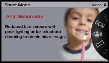
FIGURE 1.19 Note how this shooting mode description is self-explanatory, whereas the icon alone is not. No manual required!
In reviewing a client’s product, I often start with the user’s manual or training documents because that is a quick way to find the well-known usability problems. I recommend that you do the same.
Users, it’s not your Fault!
As Donald Norman observed in The Design of Everyday Things, when users don’t understand a product or make mistakes using it, they have a tendency to blame themselves. They shouldn’t, because it’s not their fault. Rather, the product is poorly designed. It’s not intuitive—by definition.
Every confusing design element or botched interaction, no matter how small, betrays potential for improvement. For every routine botched interaction, there exists a better design that reduces or prevents confusion for its target users. For every confusing design element, there exists an alternative that is self-explanatory. And it’s the product designer’s responsibility to find them.
Based on this concept, I would like to propose Everett’s Law of Intuitive UI:
For every UI design that requires experimentation, assistance, or training to understand, there exists an alternative, self-explanatory design that doesn’t.

Intuitive attributes
My definition of intuitive is a good place to start because it clearly describes the outcome for an intuitive UI. However, that definition doesn’t offer any insight into how to achieve that outcome.
What exactly do you need to do to make an interaction intuitive? To think this through, let’s review the steps in an interaction life cycle. An interaction starts with a goal—the user thinks, “Now I want to <achieve some goal>…” From there, the user must:
1. Determine a task or set of tasks that will achieve that goal.
2. Find the starting point for the each task and initiate it.
• Determine how to perform the interaction.
• Review the results for acceptability and fix any problems.
Don Norman outlines a similar model that he calls the Seven Stages of Action in The Design of Everyday Things.
Based on these steps, a UI is intuitive when it has an appropriate combination of:
• Discoverability. Users can easily find the starting point in context—when and where they need it. The command is visible, obviously a command (and not something else), and in an expected location.
• Understandability. Users can make an informed decision quickly and confidently. Users don’t have to experiment or get assistance to make a choice. Many task steps boil down to making decisions.
• Affordance. The UI has visual properties that indicate how to perform an interaction. Users don’t have to experiment or deduce how to perform the interaction.
• Predictability. Functionally, the UI delivers the expected results with no surprises or confusion. It has natural mapping. Users don’t have to experiment or deduce the result of the interaction.
• Efficiency. The UI enables users to perform the action with a minimum amount of effort or tweaking. Inefficient and cumbersome interactions do not feel intuitive.
• Responsive feedback. The UI gives clear, immediate feedback to indicate that the action is happening. When the user is done, the UI makes it clear whether the action was successful or unsuccessful, providing specific details when needed.
• Forgiveness. If users make a mistake, either the right thing happens anyway or they can fix or undo the action with ease. Users make small mistakes all the time, so UIs that punish for such mistakes do not feel intuitive.
• Explorability. Users can explore the UI without fear of doing something wrong or getting lost.
Not every attribute listed here is required for every interaction, so the key is to determine the appropriate combination, which we will do soon. I address how to achieve these attributes extensively in terms of interaction in Chapter 2 and visually in Chapter 3.
Given that the word intuitive is so poorly understood, I recommend against using it in design discussions. Teams often waste enormous amounts of time debating whether a feature is intuitive, without accomplishing anything. Even though I understand the term well, when somebody tells me a UI that I designed isn’t intuitive, usually I don’t have a clue what they mean. Instead, I recommend using the specific attributes of an intuitive UI when you’re giving feedback. When somebody tells me that a control has misleading affordance, I understand exactly what that means and know what to do about it.
Necessary (and unnecessary) consistency
If you review the list of intuitive attributes carefully, you’ll notice that discoverability, affordance, and predictability are strongly influenced by users’ prior experience. It’s worth considering Jakob Nielsen’s Law of the Internet User Experience:
Users spend most of their time on other sites.
which can be more generally stated as:
Users spend most of their time using software other than yours.
Users’ expectations about discoverability, affordance, and predictability are set by their prior experiences with all the other software they have used. If your product is unexpectedly inconsistent with those other experiences, it’s your product that is unintuitive; users will constantly have to relearn that your product is unexpectedly different.
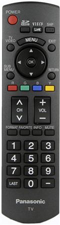
FIGURE 1.23 Many Panasonic television remotes flip the volume and channel controls. This lack of consistency makes their UI unintuitive.
Designers are constantly coming up with new methods for interaction. Such new interactions may work well when they are obviously necessary and users can figure them out with ease. By contrast, unnecessary or accidentally novel interactions are rarely successful, because any small improvements or efficiencies they achieve through inconsistency are easily outweighed by users’ lack of familiarity.
For intuitive interaction, start with standard interactions for your environment and consider creating new ones only when you have demonstrated that the standard approach won’t meet your objectives. Knowing and applying the UI design guidelines for your environment is a great way to start.
That said, not all consistency is good, and people often make poor UI decisions in the name of consistency. Consistency with respect to interaction is almost always a good idea. By contrast, visual consistency often isn’t necessary and may even be harmful. Although nobody would complain that a Ferrari is visually inconsistent with a Yugo, the accelerator and brake pedals on both cars had better be placed consistently and predictably.
Strategically unintuitive UI
If you were to take a well-designed product that you think is intuitive and apply the attributes from the previous section, you would probably discover that some interactions don’t have all the attributes. You might also discover that you don’t care that much and you consider the product to be intuitive anyway.
How can this be? In short, not every interaction in a well-designed UI needs to be intuitive. Intuitive UIs have an appropriate combination of these attributes—they aren’t all always required.
Being intuitive is important, but being intuitive often has a cost, and sometimes those costs aren’t worth it. There may be other design objectives, such as simplicity and efficiency, that are more important. Sometimes a small amount of unintuitiveness can be traded for a whole lot of simplicity. Apple’s iPhone makes this tradeoff successfully all the time. For example, the Undo command is the shake gesture, which isn’t discoverable but is easily remembered and eliminates the need for displaying the command everywhere it’s needed.
Here are the costs for some of the intuitive attributes:
• Costs for discoverability. Having visible access points for every interaction may result in cluttered pages. For advanced and infrequent commands, it may be better to not have visible access points.
• Costs for affordance. Having static affordances for every control results in cluttered pages and a heavy feel. It might be better to display affordances dynamically or sometimes even not at all. I explore the downside to affordances in detail in Chapter 3.
• Costs for predictability. Sometimes users might not be able to accurately predict the results of an interaction, but this may be acceptable with trivial deduction or quick experimentation.
• Costs for forgiveness. Providing the ability to correct or undo certain actions may not be practical or may harm performance unacceptably.
You should design basic commands that all users must perform to be intuitive, but here are some situations in which being intuitive isn’t required:
• Shortcuts and gestures. The nature of shortcuts and gestures—streamlined interactions that require memorization—is to not be readily discoverable or have any affordance. Yes, shortcuts and gestures aren’t intuitive, but that is by design. But for basic commands, there must be an intuitive, less efficient alternative.
• Inevitable discoverability. If the discoverability of an interaction is inevitable, it doesn’t have to be visible. For example, playing a full-screen video hides all commands and their affordances (sometimes called lights-out mode), but this is acceptable if any interaction displays them. For another example, the iOS and Android keyboards insert a period at the end of a sentence when users type two spaces. There are no clues that this will happen, but users will inevitably discover it.

FIGURE 1.25 A full-screen video player’s controls aren’t visible, but they are displayed when users do any interaction.
• Advanced, infrequent commands. Making advanced, infrequent commands discoverable and giving them affordances might not be worth the visual clutter or the development cost required to make them intuitive. Given their usage, it is acceptable if users have to do a quick experiment to figure them out.

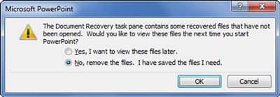
FIGURE 1.26 You can select multiple slides in PowerPoint for moving and deleting. But this action is so infrequent that the undiscoverable Ctrl+click and Shift+click command selection is a better choice than displaying a checkbox affordance on each slide.
• Delighters. Some interactions are unintuitive by design so that expert users are delighted and rewarded when finding them. Such unintuitive interactions are often used in games, where players are rewarded for finding them. As the Google Design Principles state: Engage beginners, attract experts.

FIGURE 1.27 In rare cases, interactions are unintuitive on purpose so that advanced users are delighted when they discover them. Here the yellow tilting man, although discoverable, lacks any standard affordance. Still, it’s delightful to discover that dragging him will show Street View in Google Maps.
• Advanced modes. Advanced modes, like programming modes, benefit from being unintuitive so that users don’t enter them accidentally. Many products use a push and hold (sometimes a very long hold) to enter a programming mode, which requires documentation or assistance to discover.
Strategically trading off intuitiveness for power and simplicity for advanced, infrequently used features is a great way to engage beginners and attract experts—without overwhelming either group.
But being unintuitive works well only when it is deliberately and strategically designed rather than accidental. Having to figure out poorly designed, unintuitive UIs is never delightful.
Levels of intuitiveness
A good general approach is to make all basic commands intuitive, and for the rest, make strategic compromises when necessary to achieve other goals. Figure 1.29 shows the levels of intuitiveness, which I find helpful when making these strategic compromises. Note that by standard, I refer to interactions that are used consistently in a product’s environment, so experienced users may be familiar with them and expect them.
To work through some examples, suppose you are designing a walkup kiosk where users can check in for an airline flight. Such users are in a hurry, aren’t likely to be familiar with the kiosk UI, don’t have prior experience that you can leverage, and will consider the need for external assistance to be a design failure. In this case, all kiosk interactions should be fully intuitive. Intuitive but nonstandard interactions might work (as long as they don’t confuse experienced users) because the target users are unlikely to know standard kiosk interactions anyway.
Now suppose you are designing keyboard shortcuts or gestures for advanced users. A level of sensible is the right target because shortcuts and gestures aren’t discoverable and don’t have affordances. Well-designed gestures should make sense based on real-world physics, behaviors, and natural mapping, so they will make sense to users after they try them once.
Now suppose you are designing an advanced feature that has significant value but will be rarely used, and making it fully intuitive would be too costly. Here, a design that is learnable or guessable would be the right target level.
Finally, let’s look at a real example. Here is a digital shower control used in a hotel room. Does it have the right level of intuitiveness?
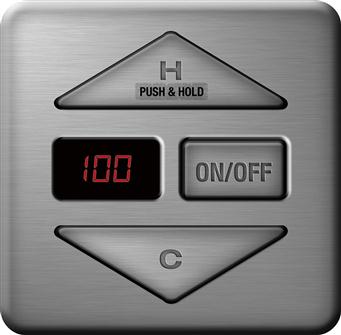
Unfortunately, it’s not. Like the kiosk user, a hotel guest needs a shower control to be fully intuitive. The affordance of a push button is to push, yet as the sticker indicates, to increase the temperature users must push and hold—which is unexpected. Note how the hotel tried to compensate for this confusion by adding a “Push & Hold” sticker—guessable and perhaps learnable information, but not intuitive or even sensible. The difference: Because this task is not intuitive, most users will fail on the first few tries—until they notice the sticker.
An interesting question: Does intuitive UI change over time? Yes, because users’ expectations for discoverability, affordance, and predictability change over time. For example, users’ expectations for touch-based interactions have changed significantly recently, so users now expect UIs to be touchable whereas they wouldn’t have before. Still, if I were designing a touch-based kiosk where touch might not be expected, the first screen would prominently say “Touch to continue” somewhere.
Inductive UI
The previous intuitive attributes apply at the individual interaction level—find the right control, interact with it, and interaction does what you expect. But these attributes are too low level to make entire tasks intuitive. Designing intuitive task flows is also very important, so let’s explore that now.
Presentation Zen
Presentation Zen is an approach to designing slide presentations developed by Garr Reynolds in his book of the same name. Instead of the traditional titles and bullets, slides using the Presentation Zen approach have a strong image with a minimum amount of text—a quotation, sentence, phrase, or even no text at all. Such slides make a stronger, more emotional, more memorable impact on viewers.

FIGURE 1.31 A visually powerful slide, but what does it mean? The presenter will have to explain it because the slide itself isn’t saying.
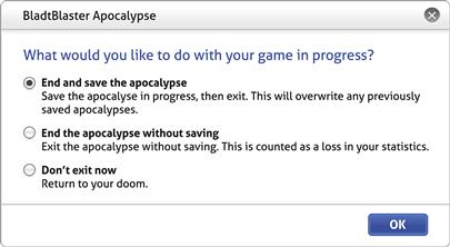
Many UI tasks are like this—not because they are visually impactful but because they aren’t self-explanatory. Consider the example shown in Figure 1.32.
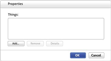
What does this UI do? How do you interact with it? What does this UI accomplish in a task? Please take a moment to think about these questions before continuing.
OK, got it?
How do you interact with this UI? You click Add. But how do you know that? You scan the page, you determine that the Properties title and the Objects instruction don’t really tell you anything, that Remove and Details are disabled and therefore not useful, that OK and Cancel are enabled but clicking them first will accomplish nothing, so you click Add because there is nothing else to do.
What does this UI do? What does this UI accomplish in a task? As a user, you don’t have a clue. Your best hope is to click Add and see what happens next. You might then have to experiment to figure out what is going on. Another UI puzzle to figure out.
You might not be aware of it, but what you are doing is the process of elimination plus a bit of experimentation, both of which are forms of deductive logic. You have to deduce what to do because the UI itself isn’t telling you. Unfortunately, such deductive, unintuitive task flows are all too common. Not exactly Zen-like.
To design products that don’t require training, you need to design task flows that are self-explanatory. My friend Jan Miksovsky coined the term inductive UI to describe self-explanatory task flows because they lead users through the task. With Presentation Zen, there is a presenter in the room who explains the meaning of the slides to the audience. Deductive UIs need a presenter, too, but for software that person is called a trainer.
Inductive UI
The core principle behind inductive UI is that an easily explainable UI is an easily understandable UI. Simply put, if you can’t easily explain the steps to perform in a UI you are designing, there’s little chance that users are going to easily figure them out themselves. Thus, it’s important for task steps to be easily explainable.
The key is to break multistep tasks down into individual steps and describe each step with a clear, concise explanation. Let’s call these explanations main instructions, to distinguish them from ordinary instructions. A good main instruction should be what you would actually say to users to explain the page, so this instruction should be long and complicated only if what you would say in person would be long and complicated. (And most likely it wouldn’t be—so keep it short, simple, and purposeful.)
The main instruction answers the first question users have with an unfamiliar UI: What am I supposed to do here? Although it’s possible that users could answer this question on their own, why force them to? If a main instruction is something that you would say in person in explaining the step, say it explicitly in the UI as well instead of forcing users to figure it out on their own.
Another important goal is that the design of the page should accurately reflect its main instruction. If a UI element isn’t clearly related to the instruction, it shouldn’t be on the page. If a UI element is crucial to performing the step, it should be on the page. As you will see in Chapter 5, a communication-driven design process starts by identifying and optimizing these main instructions and designing pages to support them.
By doing so, all UI elements are on the page because they belong, not because they fit physically. You aren’t playing a game of UI Tetris.
Effective main instructions (and therefore well-designed pages!)
The quality of the main instruction is an excellent leading indicator of the quality of the page. If you can’t explain the purpose of a page clearly and concisely, the page lacks focus, cohesion, and integrity. Main instructions with vague verbs like manage or maintain are a bad sign, too—it is rarely a real user goal to manage or maintain stuff, and just about any action falls under these umbrella verbs—so try to design pages around instructions with more specific verbs.
Often designers and developers don’t worry about UI text much because technically it can be changed at any time before release. Although this is technically true (ignoring

FIGURE 1.34 What is the purpose of dashboards generally? What is the purpose of these dashboards? Which one is more obvious? What factor makes the difference?
localization concerns), if UI is ultimately communicating to users, then not thinking about these instructions early in the design process is a huge missed opportunity.
If the main instruction sounds like what you would actually say to users in person, it is probably a good instruction. Most likely what we would say in person will have a specific verb—we rarely give instructions without verbs in person, and weak verbs (like manage) are more confusing than specific verbs (like back up).
Here are some instruction types to give you a better idea of instruction quality (best first):
• The instruction explains what users need to do conceptually, explaining the purpose if helpful:
Select your photos to share
• The instruction vaguely hints at what users need to do:
Your photo album
• The instruction explains how to perform the step mechanically, but without explaining the purpose:
Click to select photos
• The instruction gives the step name, often from the code’s point of view:
Photo selection
• The instruction provides information that isn’t helpful or relevant and that could mean anything:
Photo management
Of these, only the first main instruction is desirable; the remaining aren’t very helpful. Note that a main instruction may be a question.
Note how a page named Select your photos to share is likely to have a very focused, easy-to-understand design. By contrast, a page named Photo management could have just about anything related to photos on it.
Strategically deductive UI
Not every UI needs a main instruction, and many don’t have them. The key: If a user were to ask you what to do in person, would you bother to say the instruction? If not, the page is better off without it. In such cases, the main instruction is so obvious or the deduction required to use the page is so trivial that giving the instruction is more annoying than helpful.
If you choose not to provide a main instruction, make sure it’s because of the high quality of the page design, not the low quality of the instruction itself. In my experience, main instructions for complex or unfamiliar tasks don’t go without saying.
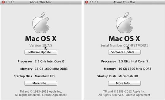
FIGURE 1.35 Although this main instruction might seem obvious to the developer, it’s not obvious to most users.
You might have noticed that most mobile app screens don’t have a main instruction. Here’s why:
• Mobile apps are focused on doing “one thing” well.
• Apps screens are focused on a single clear step. Often the step is explained visually.
• Given the context of performing a specific step on a focused screen within a focused app, the purpose of a screen is usually obvious in context by quick inspection.
• Mobile apps are optimized for small displays, and the top of the screen is especially valuable real estate.
Putting all these factors together results in a higher bar for explicitly showing the main instruction. The context of mobile apps is often so specific that users can accurately predict what to do on a screen without looking at it at all. Even so, main instructions are sometimes used to keep users oriented.
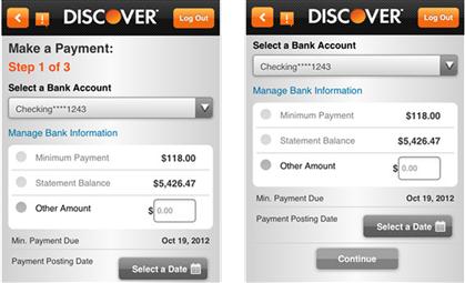
FIGURE 1.36 The focused nature of mobile apps makes explicit main instructions less important. Still, this screen works better with the Make a Payment instruction than without it.
Even if you don’t display the main instructions, you can still design better, more intuitive mobile task flows by breaking them down into individual steps, describing each step with a clear, concise instruction, and designing the screens to accurately reflect that instruction. In fact, not having explicit instructions makes this technique even more important because users must figure out the screens on their own. This part always works—even for mobile apps.
Asking intuitive questions
Many task steps involve asking users questions, and questions are a common type of main instruction. What’s surprising is how often those questions are unnecessary or poorly presented. There’s an art to asking well-presented, easy-to-answer questions. The following section explains that art.
Don’t ask if you don’t have to
Many questions are unnecessary and result from the lack of design courage. Not sure about something? It’s better just to ask, right? Why take a chance? The problem is that always asking the user is the easy way out and results in a cumbersome, annoying, and even frustrating experience.
Suppose you have a question, and there’s an 80% chance you know the answer. Do you ask anyway? What if you are 95% sure? What if you are 99% sure? Apparently many designers don’t like those odds. Consider this example: I’m physically in Vermont (which my IP address would indicate) and I search for Berlin, VT. Is the question in Figure 1.37 really necessary? In About Face: The Essentials of Interaction Design, Alan Cooper refers to this as “stopping the proceedings with idiocy.”

Given my current physical location, I suppose there is a 0.00001% chance that I really meant Viangchan Kampheng Nakhon, but why not play the odds and make me refine my search if that’s what I really wanted?
Here are some ways that you can avoid asking questions in your UI:
• Don’t ask if the user doesn’t care. Users don’t care if they always choose the default option or the question has no consequence because users don’t do or think differently as a result. It’s surprising how many questions just aren’t worth asking.
• Don’t ask if you already know the answer. Often you can determine the answer based on the task, the context, or best practices. Many questions can be answered simply by remembering the user’s previous input.
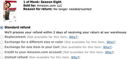
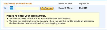
FIGURE 1.39 I love how Amazon makes it clear why the other return options aren’t available, but there’s no choice here. Why ask?
• Don’t ask if you probably know the answer. If there’s an 80% chance that you know the answer, just do it without asking. Raise the bar significantly if there is a consequence for being wrong. Slide that bar down significantly if the user’s effort required to answer the question is on par with the effort to fix any mistakes.

FIGURE 1.40 I just searched for the Great Wall of China (a lot of typing on a touch keyboard) mere seconds ago, but I made a small mistake. I clicked Back to fix the mistake—only to return to a blank form. Guess what I want to search for now? 
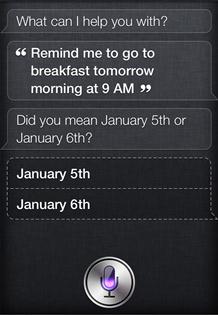
FIGURE 1.41 For a good example, I gave this reminder after midnight. Siri recognizes that “tomorrow” is ambiguous and asks for a clarification.
• Don’t ask if users can’t possibly answer intelligently. If users can’t make an informed decision, why ask—unless your goal is to shift liability?
Ask the real question directly
Many questions are poorly phrased—often dancing around the question rather than asking it directly and not providing specific information. The better the phrasing of the question, the better the answer users will give.
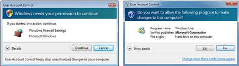
FIGURE 1.43 The Windows Vista User Account Control dialog box (left) hints at a question, whereas the Windows 7 version (right) asks it directly.
Sometimes questions (such as “What is your password?”) are better phrased as instructions (such as “Please type your password”) or even as ordinary labels (just “Password” in a form). As always, interpersonal communication provides insight here: we often give instructions instead of asking explicit questions when questions would be tedious or chatty.
Ask once
If you must ask a question, ask it once. Sometimes programs ask the same question multiple times because they don’t bother to remember a prior answer. Sometimes they ask partial questions instead of one complete one. At other times programs ask multiple questions because different layers in the technology stack aren’t aware that the question has already been asked.

Provide enough information to answer intelligently
Even if the question is necessary and well phrased, the responses might be confusing and poorly presented—making it difficult for users to make an intelligent, informed decision. Here are the attributes of intuitive question responses:
• There’s enough information to understand the response. Too often responses are tersely listed, requiring help to understand what they mean. Instead, present responses that can be easily understood on their own and selected with confidence.
• There’s enough information to choose the response with confidence. It’s not enough to understand what responses mean; users also need enough information to make an informed decision.

FIGURE 1.48 I’m in a restaurant looking for a Wi-Fi hotspot. The iPhone provides the minimum information, whereas Android provides enough information to help me choose confidently.
• But there isn’t too much information, either. If there is too much information, there’s a good chance users won’t read the descriptions at all. Consider using progressive disclosure if options really need more information than can be easily read.
• The responses are presented in order of likelihood (more or less). As Steve Krug points out in Don’t Make Me Think!, users don’t optimize, they satisfice. So, instead of reading the entire list of options, users scan until they find an option that sounds promising. Presenting the options in order of likelihood helps ensure that the promising option is the right one.
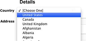
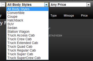
FIGURE 1.51 As someone who does most of my business in the United States and Canada, I appreciate not having to scroll this long list past Uganda to find the United States.
• The responses are presented in a usable order. Short lists can be presented in logical order, but longer lists should be alphabetized.
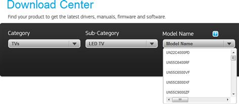
FIGURE 1.52 This long list isn’t sorted. It looks like I’m going to have to browse the entire list to find my TV.
• The recommended responses are clearly identified. Having recommendations helps users choose with confidence.
Ask at the right time and in the right place
Finally, even if a question and its responses are well presented, an intuitive question needs to be asked at the right time and in the right place. Here are some problems to look out for:
• Don’t ask too early. If you ask a question too early, users either aren’t fully engaged or won’t know how to answer yet.
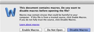
FIGURE 1.54 I don’t know yet. Better to open the document securely without asking and let me enable macros once I need them.
• Don’t ask too late. If you ask an important question too late, users might not have confidence that they are doing the task correctly and may abandon the task before getting there.
• Ask in context. By asking questions when they are relevant, users can make more informed decisions. Contextual questions are often much easier to answer with a nonmodal UI.
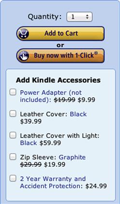
FIGURE 1.56 It’s much easier to think about accessories in the context of buying a product, and it’s more convenient, too.
A model for users
You need to understand your target users with enough detail so that you can make good design decisions on their behalf. Ideally, your team will do plenty of user research and create models, called personas, for your target users; I describe these in detail in Chapter 5. Unfortunately, it isn’t always practical to build these models based on research. Many teams don’t have the time, budget, research talent, or even customer access.
In this section, I will build a general model for users, to give you a better understanding of how real users are likely to behave. Understanding this model will help you design for that behavior. Yes, all target users are different and have different knowledge, needs, and preferences. But instead of focusing on their differences, let’s now focus on their similarities. These user attributes are fairly safe bets. Your target users’ characteristics might be different from what I have outlined here, but unless your research shows otherwise, don’t bet on it.
What users know
• Users know their goals but not how to achieve them. They know the task destination but not the starting point or the steps to get there.
• Users know what to choose at a high level but not necessarily the specific details. Assume that they know only the most essential data from memory and need help with everything else.
• Without prior knowledge or experience, users don’t know what your program does, what tasks it performs, how it works, or that they can trust it. They have questions and concerns that you take for granted.
• Users are smart, but they might be focused on other things. “Dumbing down” your program is disrespectful and not likely to solve any real problems.
• Unless they have been trained or already know what to do based on prior experience, users know only what your program tells them. If your program fails to communicate important information, users will have to discover the information through experimentation, research, or training.
• Unless you are designing features clearly targeted at experts or novices, assume that your target users are efficient beginners in terms of computer experience, domain knowledge, and vocabulary. That is, they know the basics and want to work efficiently, but they don’t have much experience and have very little memorized.
• Unless they use your product frequently, assume that your target users will routinely forget their username (unless it is their email address), account number, and password. They might not even remember whether they have an account and may sign up for a new one unnecessarily.
Bottom line: Make it clear what your program does, how to do its tasks, and what the options are. Don’t assume that users have anything beyond the essentials memorized. Don’t take users’ trust for granted; show that your program will achieve their goals. Make it easy for users to sign in and recover forgotten account information.
User motivation
• Users are motivated by value—where the benefit of a task clearly exceeds the time and effort required. If that is not the case, nothing else matters, because users won’t be sufficiently motivated to perform or complete the task.
• Different target users have different levels of motivation:
• If users have high motivation, they will do whatever it takes to get the task done. Users are likely to be highly motivated if a task is required for their job or there is financial incentive to complete the task.
• If users have low motivation, they will make a modest effort to perform the task but abandon it if they can’t figure it out easily and they don’t believe it is worth continuing.
• Unless you have research data to the contrary, assume that your target users have low motivation for most tasks.
Bottom line: Users are motivated by value, so always take the user’s motivation into account. Make using your UI worth the time and effort.
Top questions users have when looking at a UI
• What does this UI do? Am I even in the right place?
• What am I supposed to do here?
• Is this going to do what I want? Will it meet my needs? Can I trust it?
• What is the difference between these options? Which one should I select?
Bottom line: Design your UIs so that users can easily answer these questions quickly and confidently.
How users figure things out
• Users will assume that your program has design patterns and interactions that are standard for its environment.
• If users are familiar with a similar task from another feature or other program, users will assume that the current feature has a similar interaction.
• Unless they perform a task frequently, users won’t remember exactly how to perform it from memory and will have to relearn it each time. If your UI is well designed, that relearning will be trivial and hardly noticeable. If the UI is nonstandard or inconsistent, users won’t remember the next time and will have to relearn it.
• If an action is discoverable, looks relevant, and has a clear affordance, users will try it right away.
• If an action doesn’t have affordance, users will try it only after eliminating all obvious alternatives first.
• If an action isn’t discoverable, novice users won’t find it.
• If users discover an unusual interaction or control, they will form a hypothesis as to how it works and perform a quick experiment to confirm. If their hypothesis is correct, they will consider interaction intuitive (and will be delighted that they figured it out). If not, they will consider the interaction unintuitive and poorly designed.
• Only the most motivated users bother with online help and only after exhausting all other possibilities first.
Bottom line: Simple, standard, intuitive, self-explanatory, and consistent works best. Good help can’t save a poor UI.
What users will and won’t do
• As Steve Krug points out in Don’t Make Me Think!, users don’t read, they scan. That is, they don’t read UIs completely for comprehension; rather, they scan to find what they are looking for quickly.
• Users don’t read large blocks of text or long instructions. They do read control labels for clicking on them.
• Users don’t optimize, they satisfice (again, from Krug). That is, given many options, users act on the first promising option they find.
• Users will scroll long pages, but only if they have a reason to. (Mobile UIs are an exception because users are used to scrolling them.) Users won’t scroll to see if there is anything worth scrolling for—so the motivation to scroll needs to be visible without scrolling.
• Users won’t memorize anything.
• Users don’t learn how things work, they muddle through. (Another one from Krug.)
• Users won’t reveal sensitive information without a good reason. Nor should they. They are likely to abandon a task if sensitive information is required without a clear justification.
• Users won’t register, create an account, or sign in unless they are really, really motivated. This is doubly true when users are typing on a touch keyboard.
Bottom line: Users are focused on their work, not on learning how to use your UI. They are in a hurry and don’t want to take the time to learn, memorize, or perform unnecessary steps.
What users dislike doing
• Creating accounts, signing in, and retyping CAPTCHAs.
• Waiting or other forms of wasting time.
• Unnecessary typing or other interaction.
• Reentering previously entered information.
• Providing apparently unnecessary information, especially if sensitive.
Bottom line: Users’ time and effort is precious, so don’t waste it—especially on mobile devices.
How users lose confidence
• Users need to gain confidence as they perform a task and are reluctant to proceed with a task or make commitments without building sufficient confidence. Without confidence, users may restart a task or look for alternatives.
• Users need to know where they are at each step in a task. They need clues to confirm that they are in the right place.
• Users need to know how to make the next step confidently. The likely next step should always be obvious.
• They can’t find what they are looking for.
• They don’t understand the instructions, options, or other UI text.
• They aren’t clearly making progress toward their goals.
• The results don’t meet their expectations.
• They feel like they are being taken advantage of, such as with poorly chosen defaults and opt-out options, along with unreasonable costs (shipping and handling or “convenience” fees).
• After performing an interaction, users need clear feedback that the action was successful or unsuccessful.
Bottom line: Users won’t complete a task if they lack confidence. Don’t take users’ confidence for granted; instead, make sure your UI builds it.
Again, these are pretty safe bets for most users. It’s surprising how often user research boils down to discovering these basic observations about users.
Summary
If you remember only 13 things:
1. UI is Communication. A user interface is essentially a conversation between users and a product to perform tasks that achieve users’ goals. Start a design by understanding what you need to communicate to users, then let that communication drive the design process and the UI design itself. Great UI design often boils down to communicating to users as we do in person: in a way that is simple, natural, friendly, and focused on the user’s goals.
2. Explain tasks clearly and concisely, as you would in person. The key is to understand that the UI isn’t some completely different type of communication. Rather, it’s the same communication using a slightly different language.
3. Every UI element can be evaluated by what it communicates and how effectively it does that job. The need for effective communication applies to everything, including control selection, layout, icon and other graphic design, color, and animation. Controls even have a “body language,” whereby their presentation suggests details on how they are used. If users need to translate your UI into something meaningful, you should use that translated, meaningful version instead. If your UI has elements that communicate nothing, you should remove them.
4. Be polite, respectful, and intelligent. We must have the same standards for human/computer interaction as we do for human interaction. If an interaction would be inappropriate, rude, disrespectful, or stupid between people, it is equally inappropriate with software. Software shouldn’t get a free pass for rudeness and disrespect. Like people, UIs communicate through their personality, tone, and attitude.
5. If a UI feels like a natural, professional, friendly conversation, it is probably a good design. This is a simple yet remarkably effective technique for evaluating a design. If someone is explaining a design, compare the explanation to what is on the screen. If you are reviewing your own design, ask yourself: Would I actually say this in person? Either way, any discrepancies reveal problems.
6. Too often we design UIs by exposing the underlying technology directly to users—asking users fill in raw data structures and perform the task the same way the code does—and expect the results to be usable. We shouldn’t be surprised when this approach leads to poor UI.
7. Effective communication is useful, relevant, necessary, clear, natural, purposeful, specific, explicit, concise, efficient, and timely. It neither overcommunicates nor undercommunicates. It has a pleasant personality and tone and inspires the user’s confidence.
8. A UI is intuitive when it has an appropriate combination of discoverability, understandability, affordance, predictability, efficiency, responsiveness, forgiveness, and explorability. Users spend most of their time using software other than yours, so what users consider intuitive is often based on their prior experiences with other software.
9. Although you want your UIs to be intuitive, being intuitive often has a cost, and sometimes those costs aren’t worth it. There may be other design objectives, such as simplicity and efficiency, that are more important. A good general approach is to make all basic commands intuitive and strategically downplay discoverability and affordances when necessary for advanced commands and shortcuts.
10. Inductive UIs are intuitive at the task level. You can make multistep tasks inductive by breaking them down into individual steps and describe each step with a clear, concise explanation. Furthermore, each page should accurately reflect its explanation. The core principle behind inductive UI is that an easily explainable UI is an easily understandable UI. If you can’t easily explain the steps a user is to perform, there’s little chance that users are going to easily figure the steps out themselves.
11. Not every UI needs a main instruction, and many don’t have them. The key: If a user were to ask you what to do in person, would you bother to give the instruction? If not, the main instruction is so obvious or the deduction required to use the page is so trivial that giving the instruction is more annoying than helpful. If you choose not to provide a main instruction, make sure it is because of the high quality of the page design, not the low quality of the instruction itself.
12. Unintuitive UIs often ask questions that are unnecessary or poorly presented. Well-designed UIs ask the real question once, at the right time and place, and provide enough information for users to answer intelligently and confidently.
13. When making design decisions, have a model for how your target users think and behave as well as what motivates them. This chapter presents a general model that most users share. It’s a smart idea to do user research to see how your actual users differ.
Exercises
To improve your ability to design intuitive user interfaces through effective communication, try the following exercises. Assume that anything is possible. Don’t let concerns about development costs or current technology limitations inhibit your thinking.
1. Understanding intuitive UI. Find an unfamiliar product that you have never used before (a coffee maker, for example), examine it carefully, and predict how to perform its top tasks without experimenting with it, reading the user’s manual, or anything else. Now try to use the device and see if you can perform the task successfully on the first try without making any mistakes. If you can, explain how you were able to figure it out. If you can’t, explain what led you astray.
2. Eliminating user’s manuals. Find a product that has a user’s manual. Carefully examine each instruction in the manual. For each instruction, determine a design that could eliminate the need for instruction. Could a better design make the manual unnecessary?
3. Explaining a task to a friend. Find a product that is unintuitive and confusing but that you understand how to use. Ask a friend to perform the top task with it and see what happens without any coaching. Now walk your friend through the task, this time explaining each step in plain language. Hopefully your friend is more successful. Now compare your in-person explanation to how the product’s design explains itself and see what is different. Do those differences help you understand how to improve the UI?
4. Natural, friendly conversation. Find an example of a UI that does not reflect what you would naturally say in person. Now redesign the UI to reflect what you would actually say. Is your redesign better?
5. Understanding unintuitive UI. Find a product that is unintuitive and confusing. Evaluate the design for each of the intuitive attributes (discoverability, affordance, etc.) and look for weaknesses. Do those weaknesses explain why the product is unintuitive or is there more to it? Now redesign the UI to make it intuitive. Characterize the changes.
6. Consistency. Find a variety of products that more or less have the same purpose but have radically different designs (consider reviewing apps in the same category in an app store). Evaluate each design for intuitiveness. Now evaluate each design for consistency with the most standard design. Did you find a correlation between intuitiveness and consistency?
7. Intuitive with poor communication. Find an example of a product that you believe is intuitive (demonstrate why by evaluating the intuitive attributes) yet communicates its purpose rather poorly. Were you able to find such an example?
8. Strategically unintuitive UI. Find an example of a well-designed UI that has elements that appear to be unintuitive on purpose. Are there other design objectives (such as simplicity or efficiency) that are more important than intuitiveness? Or were these elements design mistakes?
9. Inductive UI. Find an example of an unfamiliar complex, multistep task that you have never done before. Perform the task and make a note of how easy each step was to perform. Now go back and see if each step has a clear, concise explanation. Is there a correlation between the ease of use of each step and its explanation?
10. Poorly presented questions. Find examples of poorly presented questions in UIs. Characterize why each question is poorly presented. Now redesign each question to be easier to understand and respond to.
11. Designing a user settings UI, part 1. Choose an everyday product that has a variety of user settings and that has a UI with buttons and a small display. Design a UI that enables users to modify the settings by enabling a mode (if necessary), choosing a specific setting, selecting a value, making the change, moving on to the next setting, and leaving the mode (if necessary). Strive for a design that uses three or four buttons. Determine the function of each button, design a good label, and determine what the display needs to show in each state. For the labels, try both icons and text. Determine the level of intuitiveness based on Figure 1.29.
12. Designing a user settings UI, part 2. Continuing with the previous exercise, try adding more buttons to your design to make it more intuitive, efficient, and forgiving. For example, if you have a three-button design, trying adding a fourth, then a fifth, and then a sixth or more buttons. Determine the function of each button, design a good label, and determine what the display needs to show in each state. What does each extra button buy you? Is there a correlation between the ease of explaining each button and the ease of using each button?
Now go in the opposite direction and try removing buttons from your original design while maintaining functionality. Try a one- and two-button design. What does removing each button cost in terms of intuitiveness, efficiency, and forgiveness? Once done, choose the optimal design for first-time users.