
A Communication-Driven Design Process
Getting the right design and the design right.
—BILL BUXTON
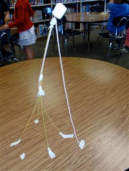
The Marshmallow Challenge is design exercise that encourages teams to experience simple but profound lessons in collaboration, innovation, and creativity. The task is simple: In 18 minutes, teams must build the tallest freestanding structure out of 20 sticks of spaghetti, one yard of tape, one yard of string, and one marshmallow. The marshmallow needs to be on top.
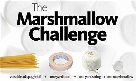
There are surprising trends in team performance. Teams consisting of MBA graduates tend to perform poorly. They are trained to analyze the problem, identify the best solution, assign roles and responsibilities, develop a plan, execute the plan … then realize it’s wrong and run out of time.
But teams of kindergarteners tend to perform surprisingly well. They dispense with politics and planning and get right down to business by trying out ideas. They quickly learn what works through trial and error and find creative solutions to improve their designs.
There are several important takeaways here:
• Effective collaboration, innovation, flexibility, and creativity are keys to success.
• Quick trial and error leads to rapid innovation.
• Careful planning doesn’t work well if you don’t know what you are doing and don’t have a lot of time.
But before we draw any more conclusions, let’s take a step back and think about the nature of the Marshmallow Challenge for the typical participant:
• Time is extremely short; speed is critical.
• The resulting product is unlike any product team participants have used before, making their past experience irrelevant.
• The challenge is unlike any design problem team participants have done before, potentially making careful planning counterproductive.
• The challenge is modest; the teams are small, focused, and in the same physical location; there is no need to coordinate or integrate with anything or anybody outside the team.
• The resulting product doesn’t have to be useful to anyone. There are no target users, no important user goals or scenarios, no design principles or guidelines to follow, no customer training or support to worry about, and no customer expectations. Nobody has to like it or want to use it. A successful design just has to be tall and freestanding.
• Failure has no significant financial or career penalty. You won’t lose customers or market opportunities, nor will you harm your company or product’s reputation or brand. Nobody’s bonus is on the line. Crazy is good—as long as it is tall and freestanding.
• All the competition has to follow exactly the same rules. No exceptions.
Although some user interface design problems are similar to the Marshmallow Challenge, most are not. It would be a mistake to conclude that careful planning and design are generally counterproductive. My top takeaways from the Marshmallow Challenge are that there is no single best design process and that you must recognize and adapt to the situation at hand.
A communication-driven design process
Imagine having a UI design perspective where you could consistently leverage past experience. Design is iterative and the first efforts are never right, but what if you could make them close to right—or at least closer than you usually do?
UI design is very similar to golf in this respect. In golf, every hole and every lie is different, every hole requires iteration, and getting a hole-in-one is never a realistic expectation. To play well, you need to keep the ball on the fairway consistently and on the green instead of whacking it into the weeds. Although you can learn from your mistakes, there are other ways to learn that are less haphazard, less risky, and less time consuming.

FIGURE 5.3 Golf is also an iterative process, but hitting the ball into the weeds isn’t considered a beneficial learning experience.
I believe that effective human communication is that design perspective. A user interface is essentially a conversation between users and a product to perform tasks that achieve users’ goals—except that it uses the language of UI instead of natural language. If we focus the UI design process on effective communication, we can leverage our understanding of the target users, their goals, their tasks, and the way the UI needs to communicate to users on a human level.
At the highest level, a communication-driven design process looks like this:
1. Determine a solid product concept that provides clear value.
2. Understand the target users, their goals, tasks, and problems.
3. Determine the top scenarios that achieve those goals, and let them drive most design decisions.
4. Design task flows and pages that communicate effectively, for both interaction and visual design.
5. Get the other details right.
6. Evaluate, test with real users, and iterate until you have achieved your design objectives.
This communication-driven approach allows you to leverage everyday interpersonal communication skills that you have been practicing all your life. If you can explain how to perform a task in person in a way that’s clear and concise, this process will help you map that explanation into the language of UI—both in terms of interaction and visual design—in a way that feels simple, natural, easy to understand, and humane. The outcome of this approach is naturally user and user-goal centered.
Although there is no single best design process, a communication-driven approach works well for most situations and removes much of the mystery and subjectivity. Yes, collaboration, innovation, flexibility, and creativity are very important, but you no longer have to resort to trial and error to drive the process. Let’s save trial and error for those innovative situations in which we really do need it. Routine tasks like having users fill in a form to buy a product online don’t require innovation—they require basic competence.
The goal of this chapter is to present a communication-driven design process. Covering the entire UX design process in complete detail is a subject worthy of its own book (Kim Goodwin wrote that book—it’s called Designing for the Digital Age), so I will only outline the process but will focus on the details that are communication related. In the next chapter, we will apply this process to some real design problems.
Another important goal for this chapter is to discourage what I call “sketching a pile of features.” Too often teams design UI by creating a list of features, then sketching to explore different ways the features could be presented physically. Aimlessly “sketching a pile of features” by focusing on controls and their physical placement leaves to chance important objectives such as having value, achieving user goals, and, of course, effective communication. We can do better by focusing on these goals deliberately.
Don’t design like a programmer
I sometimes say that a user interface looks like it was designed by a programmer, which is my way of describing UI design mistakes that programmers are particularly prone to make. These designs happen because programmers find them easier to develop, don’t notice their usability problems, and often aren’t aware that there are better solutions.
The root cause of designing like a programmer is to believe that a well-designed UI mechanically enables a task. Programmers tend to let the features and technology drive their UI design decisions.
A “designing like a programmer” process looks like this:
1. Identify a problem to solve.
2. Design a technology and set of features that solve the problem.
3. Directly expose in the UI whatever the features need from users.
4. Lay out the UI based on where things fit, not where they belong. Use as few pages and as little whitespace as possible. (I call this UI Tetris in Chapter 3.)
5. Have the marketing department declare the UI to be “intuitive and easy to use,” regardless of its actual usability.
Even though this approach enables users to perform the task mechanically, it doesn’t mean that the results are usable.
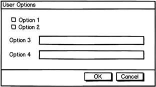
Mechanically enabling a task isn’t the last step, it’s just the first! To see the potential problems, suppose the technology needs the following information (presented as a C++ data structure):
struct UserOptions {
bool Option1;
bool Option2;
String Option3;
String Option4;
…
};
It’s natural to assume that a good UI might look something like Figure 5.4.
But consider these potential problems:
• What if the technical descriptions in the data structure aren’t meaningful? (Example: Duplex printing vs. printing on both sides of paper.)
• What if users don’t know the right value? (Example: How would a user know to set a volume to 47?)
• What if users know roughly what they want but not the exact value? (Example: User wants to fly to a city but doesn’t know the nearest airport or airport code.)
• What if users provide the right value but in the wrong format? (Example: Program requires a phone number or date in a specific format.)
• What if users don’t want to give the information because it is personal or unrelated to the task? (Example: UI requires a credit card number for a task that shouldn’t require one.)
• What if the date format isn’t appropriate for the task? (Example: User is performing a task that requires an age, but the program asks for a birth date.)
• What if providing the data is unnecessarily difficult? (Example: User has to select from a long, unsorted list or has to provide the same information repeatedly.)
• What if providing the data is more trouble than it’s worth? (Example: Program requires a lot of input for a simple task.)
• What if providing the value is error prone? (Example: The control isn’t constrained to valid input [such as a text box] or gives vague, unspecific errors for minor, easily correctable problems.)
Displaying the raw data structure enables users to perform the task mechanically, but it doesn’t mean that they will understand it or want to use it or that it satisfies their goals.

What exactly is design?
A good place to start is by asking: What exactly is design? There are many definitions, but here is the one I use:
Design is making creative decisions on behalf of target users to create a product that satisfies their goals.
I like this definition because it explains the essential ingredients of a good design process:
• Design is to create a product. Of course, a product is the output of the design process.
• Design is driven by decision making. Design, and therefore the design process, is ultimately about making decisions. But to make decisions, we must have options to choose from.
• Design is on behalf of target users. We are making those decisions on behalf of our target users, not ourselves. Therefore, what we personally like or dislike doesn’t really matter.
• Design is creative. We can choose any practical solution we can think of, so this is where creativity comes into play. Usually nobody is forcing a solution on us.
• Design is to satisfy users’ goals. Satisfying users’ goals is ultimately the point of the design process. Otherwise, why bother?
A basic design process
The design process is ultimately a decision-making process. Fortunately, there’s already a well-known process for making good decisions, known as the rational decision-making process. We routinely use it to make important, potentially risky decisions. Here are the steps:
2. Identify decision criteria (goals, requirements, resources, priorities) as a basis to choose.
3. Determine the possible options (that you can choose from).
4. Make a choice (by applying decision criteria to the options).
A good design process should have these essential elements.
The UI design process is generally broken into planning, design, and refinement phases. Here is a basic design process that mirrors the rational decision-making process, with the traditional design steps filled in:
Design, like golf, is an iterative process. Designs are seldom right the first time; there is always room for improvement. Holes-in-one are rare in both domains. Consequently, finding and correcting problems during the refinement phase is a sign of success, not failure. Iteration is the price we must pay to do our best work; not finding problems is failure here.
Although this process works well in general, remember that there is no single best design process and that you must recognize and adapt to unusual situations. So, if you need to design the tallest freestanding structure in only 18 minutes, you might want to try something different.
The classic design process mistakes
To fully appreciate a good design process, we need to understand what an ineffective process looks like. Doing so will help you understand why intelligent, capable, well-motivated teams with the best of intentions so often fail to create good designs. Bad design happens for a reason. I already mentioned what an ineffective design process looks like for programmers: merely enabling a task mechanically by directly exposing what the technology needs.
For more experienced designers, an ineffective process often looks like this:
2. Do lots of brainstorming, sketching, explorations, stuff with walls and sticky notes.
3. Poof! Magic happens! … or not.
4. Do many high-fidelity prototype variations in Photoshop.
5. Get buy-in from management, customers, and other stakeholders.
… or something like that.
This approach can work well—especially when your product needs innovative ideas—but it’s very labor and time intensive and there is too much left to chance. As with the Marshmallow Challenge, if you brainstorm quickly enough you are likely to stumble on a good design idea or two.
But why leave your design to chance when you can make it more deliberate and principled? And what if that magic doesn’t happen? Many fundamental product design blunders can be traced back to some process mistake. If you review the previous design process outline, you will see that there is opportunity to make disastrous mistakes at every step.
Here are the most significant mistakes that everyone tends to make, which I call the classic process mistakes:
• Trying to do too much (instead of setting clear goals and priorities)
• Designing for yourself or for everyone (instead of having clear target users)
• Focusing on technology and features (instead of target users and their goals)
• Falling in love with one—usually the first—design solution (instead of considering design alternatives)
• Worrying about feasibility during brainstorming (which dampens the creative process by discouraging the free flow of ideas)
• Prototyping at the wrong level (usually too high-fidelity too early, which takes too long, has too much commitment, and discourages feedback)
• Not scheduling time for iteration and refinement (instead assuming that you’ll get it right the first time)
• Not fixing the small bugs, releasing before ready (instead assuming that your customers won’t care about such details)
Pay attention to what your team is doing and look out for these classic process mistakes. My experience suggests that your team is making many of them and not doing its best work as a result.
The planning phase
For the planning phase, I will focus on to whom you are communicating (personas), what they want to accomplish (scenarios), why they are going to use your product (value propositions), and staying focused (project themes).
Together, the scenarios, personas, and value propositions form a decision-making framework to help you make the right decisions for the right reason. Use this decision-making framework to drive the design process.
Let’s start with value propositions.
Use value propositions to deliver obvious value
A value proposition briefly states the reason your target users will want to buy and use your product or feature, so in defining your concept and vision there’s no better place to start. It’s a classic process mistake to assume that having technology to solve a problem is sufficient. You can use value propositions to make sure that your product or feature delivers value.
Why bother? Because value motivates people! People ultimately decide to use a product or feature based on its value; value is often the first thing users think about. If you ask someone if they are going to buy or use a product or feature, the answer they give will be their value proposition. When people say things like “No, I won’t use it—it’s too much trouble,” they are really saying that they don’t see value.
Value is best measured by comparing a product’s benefits to its costs. Surprisingly, most value propositions I see completely ignore costs, as though the products were free and users’ time and effort have no value. Most people think of cost first.
Users have choices, so a good value proposition states a product’s or feature’s value in both absolute and relative terms compared to the alternatives. Doing nothing is always an alternative and sometimes a formidable one, so make sure your product concept is much better than doing nothing! If your design’s acceptance or usage isn’t meeting expectations, chances are it’s not delivering value compared to the alternatives. Why do customers need your product or feature? Why are your customers going to care? You must know the answer to these questions.
If your product or feature lacks value, nothing else in the design process matters, because your customers simply aren’t going to care. Putting all this together, a good value proposition identifies:
• The target users and their motivation for using a product or feature
• The benefits of the product or feature (compared to the alternatives)
• The costs of the product or feature (compared to the alternatives)
• Why target users will prefer the product or feature over its alternatives
One more thing: A good value proposition sounds like something target users will actually say. If a value proposition sounds like it was written by an executive or a public relations firm, it’s not real and isn’t going to be useful.
By costs, I’m not referring to just economic costs—so, even free software has a cost! To use a free service on the Web or a free mobile app, users must take the time and effort to:
Make sure your team knows your product’s value proposition and actively uses it when making design decisions. If you have a marketing team, they will own the product’s value proposition. (But they probably won’t have feature-level value propositions.) Many marketing teams have a habit of keeping the value proposition to themselves, but clearly this technique has no value unless it is used to drive design decisions.
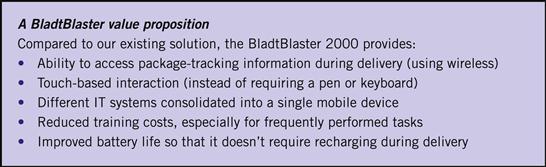
For an example, here is a value proposition for a handheld package tracking device:
You are using value propositions correctly when:
• Everybody on your team knows and uses the value proposition to make design decisions that improve the product or feature.
• The design maximizes the product’s or feature’s benefit relative to the alternatives.
• The design minimizes the product’s or feature’s cost to users.
• The design makes its value obvious so that users understand it right away.
The last point is especially important: Don’t expect users to spend a lot of time trying to figure out your product’s or feature’s value. They won’t—so make it obvious!
Use scenarios to understand what users want to do
User-centered design requires us to understand what users are going to do with our product from their point of view. If you have ever wondered why a design looks good to you and your team but not to users, scenarios are the best place to start.
A scenario describes a specific target user trying to achieve a specific goal or perform a specific task in a specific context. Concisely:
All three elements are important. Since some products might support hundreds or even thousands of scenarios, it helps to identify the top scenarios. The top scenarios are the ones users care about the most—the tasks they are most likely to perform and what delights them when it’s done especially well.
To fully appreciate scenario-based design, it helps to compare it to feature- and task-based design. In feature-based design, the design process is focused on adding features to the product—on the assumption that features are what users want and that more features are better. The problem is that users don’t do features, they do tasks—so it’s very easy to add features that have little practical value. Having a long list of features might initially appear impressive, but having many complex, poorly coordinated features doesn’t necessarily help users get their work done. Unfortunately, feature-based design is the way many teams work.
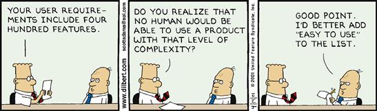
FIGURE 5.7 Makes sense … “ease of use” is just another feature, right? DILBERT ©2001 Scott Adams. Used by permission of UNIVERSAL UCLICK. All rights reserved.
Task-based design recognizes this problem, so it focuses on enabling tasks—where tasks are a unit of activity with your program. Given this focus, task-based design tends to produce designs that are much more useful than feature-based design.
Task-based design sounds pretty good, so what’s the problem? The problem is that great user experiences are designed for their target users, and task-based design often doesn’t consider target users, their goals, or their context at all. Do users really want to do those tasks? Can they really use them? Do they like them? Add the tendency for people to design for themselves, and task-based design often leads to designs that their developers love but customers don’t. Great user-centered design requires designing for clear targets. That’s what scenario-based design is all about!
You can’t use scenarios to determine the right solution if the solution is already baked into the scenario. Good scenarios focus on the users’ goals, their problems, and their context, without providing any solutions. The purpose of scenarios is to help you make the right decisions quickly and confidently, so if your scenarios don’t achieve that goal, rewrite them!
Unfortunately, scenarios have a spotty track record in practice. I have seen many scenarios that aren’t very useful. Consider this scenario:
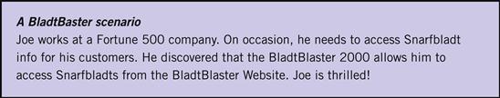
What’s wrong with this scenario? In short, everything. Although it provides a task (Joe needs to access Snarfbladts), we have no clear idea who the user is, what he is doing, where he is doing it, or why. By saying “Joe is thrilled,” this scenario is basically saying that customers will be thrilled if we ship a feature. That is feature-based design! Clearly, this scenario has little value, but scenarios like this are surprisingly typical. Such scenarios tend to live in specs, unused.
Here is a better scenario:
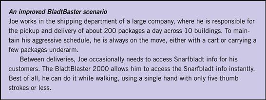
Note that the task in the two scenarios is exactly the same, but we now know who Joe is, what he is doing, where, and why. We can now make good design decisions on Joe’s behalf.
Context is a crucial part of a scenario, but it’s something we tend to overlook. The context might be where the users are physically (are they at their desk or somewhere else?), where they are in a task flow or other context (what’s the big picture?), or perhaps where they are mentally (are they under stress or in a hurry?)
In fact, understanding the users’ context is so important that it is often the difference between a good design and a great design. Here are some levels of design greatness:
• Acceptable design. Enables tasks mechanically.
• Good design. Performs tasks smoothly for target users.
• Better design. Achieves goals well for target users.
• Great design. Achieves goals well for target users in their context.
Great design requires clear targets, and scenarios provide those targets! You can’t design well by having random people doing random things for random reasons in random contexts.
Use personas to understand your users
Great design requires clear target users. It’s a classic process mistake to design for yourself (assuming your target users are just like you) or to design for everyone (because designing for everyone is equivalent to designing for no one). You can’t hit a target if you don’t have one, so you can use personas to set clear target users for your design process.
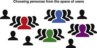
A persona is a fake person constructed using real user research data to represent a class of real target users. Personas are the actors in our scenarios. In a nutshell, you create personas by determining the entire space of possible users, picking the classes of users that you care about most, defining personas to represent those classes, and using these personas to drive design decisions. The key concept is that if your design delights a persona, it will delight everyone in that space of users.
Without personas, everyone on your team forms their own independent picture of the target users. And somehow, those target users are always remarkably similar to the people on the team. Furthermore, that undefined target user may change from feature to feature or even from discussion to discussion. Ultimately, without a clear definition, target users are basically whatever the person who is speaking wants them to be at the time—not a very solid foundation for user-centered design. This problem is known as the elastic user.
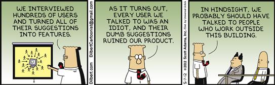
FIGURE 5.11 If your personas look like your team members, you are probably doing it wrong. DILBERT ©2012 Scott Adams. Used by permission of UNIVERSAL UCLICK. All rights reserved.
Personas provide clear, well-defined targets. A typical persona includes a name, a general description, a list of specific attributes, and perhaps even a picture. To have value, everyone on your team needs to know these personas and their specific attributes and use them to make design decisions.
Unfortunately, personas have a spotty track record in practice. Many teams have tried and abandoned them because they can consume a substantial amount of time and may accomplish very little. User researchers would start the process by spending a significant amount of time gathering data about target users, defining personas to represent them, and crafting long, detailed persona documents. These documents would be filled with irrelevant life-story details like the persona’s kids, coffee, cars, cats, and so on. The fact is, people don’t read long documents, and those details weren’t all that useful in make design decisions anyway. Such personas are created and talked about but not really used in making design decisions.
Often design teams would use those personas by learning the persona names, their high-level descriptions, and … well, that’s about it. In practice, “using personas” often boiled down to replacing an elastic user with an equally elastic persona with a very specific first name. Not really a big step forward in user-centered design.
That said, I am a strong believer in personas. The solution to these common persona problems is simple: Instead of creating long documents with many irrelevant details, create short user models with relevant details focused on the task at hand. Include the details that are relevant to making good design decisions, and exclude everything else. Don’t bother to make the persona feel like a real person. If the persona reads like an online dating profile, you’re doing it wrong.
Here are some useful characteristics that should be in most personas:
• Their general computer knowledge. Are your target users experts, intermediates, or novices? What relevant computer concepts can you safely assume that they know?
• Their domain knowledge. Are your target users domain experts, intermediates, or novices? What specifically do they know about the tasks and the data involved? This affects the domain concepts that you can safely assume. Note that a computer expert can be a domain novice and vice versa.
• Their goals, tasks. What exactly are your users going to do with your product, and why?
• Their frequency of using the product and doing tasks. A heavy UI might be appropriate for rarely performed tasks, but a lightweight UI is much better for frequently performed tasks.
• Their vocabulary. So that your UI speaks the user’s language, determine what terms your users know and use regularly.
• Their motivation. How motivated are the target users to get the task done? Highly motivated users will do whatever it takes, whereas unmotivated users will abandon tasks that require too much effort.
• Their context. In what physical conditions do your users work? Is the environment relaxed and casual, or high stress and fasted paced? What is the scale? Do they work with a few things? Hundreds? Thousands? Hundreds of thousands?
• Their age, physical abilities, access preferences. Studies have shown that about 37 percent of the workforce has some physical impairment. If that number seems high, think about impairments such as poor eyesight, color confusion (often called color blindness), or carpel tunnel syndrome. Consider the fine motor skills required to hit small targets. These are all quite common issues that affect design.
For example, here is a persona for “Joe the shipping guy,” who is the target user for our handheld package-tracking device:

That’s it. That’s all we need! Given this simple model, we have what we need to design for Joe. We don’t need Joe’s life story and every detail about his daily routine. Although the scenario in the previous section provided a lot of useful information, the persona fills in many important details about Joe that were missing.
Every decision you make should be consistent with the relevant persona. Any discrepancies reveal design problems. You are making design decisions on behalf of your target users, so having personas like these help you understand exactly who you are designing for. To be practical, everyone on your team needs to know the personas from memory so that they can aim for the same target. If someone makes an assertion about Joe that’s not in the model, you can easily flag it and either validate it or reject it. Having a one-page handout for each persona on every team member’s desk is a great way to get started.
In creating personas, keep in mind that the entire purpose is to help you make better design decisions. Anything that gets in the way of the goal should be reconsidered. If the persona has irrelevant, too vague, or overly specific details that don’t potentially impact decisions—remove them. If you have too many personas, eliminate the less important ones. Specific details are useful when they provide goals and context for the class of users, but they’re harmful if they narrow the class down to a few individuals.
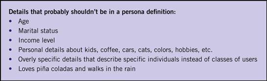
FIGURE 5.14 Details that probably shouldn’t be in a persona. If a persona reads like an online dating profile, you’re doing it wrong.
Consider age. People often put ages in their personas, but I recommend against doing so unless age is relevant to the target class of users. Clearly, if a product is targeted at children, teenagers, or the elderly, age is relevant. But does age matter for business software? Is a business app or feature only targeted at certain age groups? Probably not. Sometimes ages are used to imply work details, such as level of experience, willingness to make changes in work style, interest in technology, or preferences for email versus texting. If so, I recommend skipping the age and putting those assumptions in directly.
For more information on creating and using personas, I recommend The Essential Persona Lifecycle: Your Guide to Building and Using Personas, by Tamara Adlin and John Pruitt.
Staying focused with project themes
When they’re working on a release of a product, your team can’t do everything that it would like to do—and it certainly can’t do everything well. Staying focused is a key to success, and trying to do too much is a classic process mistake. Prefer to “do less better” than to attempt to do everything poorly.
There are many ways to stay focused. Traditionally, project schedules, staffing, and budgets are used to keep project scopes in check. This is a practical technique because it limits the project scope to what the team can actually produce with the resources it has.
A shortcoming of this resource-based approach is that it is focused purely on delivering a project mechanically. The resource-based approach doesn’t give any guidance on the product design unless a proposed UI is a budget buster. The resulting user experience needs to be considered as well.
A more user-centered way to stay focused is to create project themes, which identify a small number of high-level user experience goals for a project. Everything your team works on should tie into the project’s themes in some way. For example, here are project themes for a typical project:
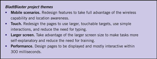
FIGURE 5.15 Possible project themes for a handheld package-tracking device. Better to focus on doing a few things well.
An important benefit to using project themes is that they help customers appreciate what you are doing in a new release. Customers might not appreciate a release with hundreds of new features and thousands of bug fixes, but they can easily appreciate a product release with five new capabilities they really care about.

The design phase
For our discussion of the design phase, I want to focus on how effective communication should drive brainstorming, task design, and the decision-making process.
Traditionally, the design phase starts by understanding the goals of the project determined in the planning phase, brainstorming ideas on how to achieve those goals, then sketching and prototyping the physical presentation of the UI (such as page layouts) to explore, refine, confirm, or reject those ideas. In turn, the evaluation of these sketches is largely visual.
However, if UI is essentially a conversation between users and a product to perform tasks, there is a crucial missing step here: The traditional process skips understanding the natural in-person conversation. So, going directly from brainstorming to sketching the physical presentation skips the most important step!
How can you determine the best way to present the conversation physically when you don’t even know what it is yet? Not designing the personal conversation is a huge missed opportunity because the quality of the communication is an excellent predictor of the quality of a design. Instead, focusing on physical presentation encourages the very technology- and feature-focused design approach that we want to avoid.
Imagine a conversation with the target user
For a communication-driven design process, imagine a conversation between you and the target user who is performing the task you are now designing. If that person were to ask you, “How do I perform this task?” think about what you would say: the steps you would give, their order, the language you would use, the questions you would ask, and the details you would provide. Think about the various questions and details that you wouldn’t mention until they were relevant, because you already know the answer, or because they were too early or too late in the conversation or otherwise inappropriate. Also, think about the questions and details that you wouldn’t bother mentioning at all because they just aren’t important enough. Finally, think about this conversation from the user’s point of view. Would the user be able to answer your questions or perform the steps? Will the user want to?
For example, suppose you own a small store and a first-time customer just walked in the door. Would you immediately make that customer create an account, sign in, and recommend that he follow you on Twitter? Would you make him prove that he is really human? Agree to terms of use? Would you offer him a tour and instructions on how to interact with your merchandise? Would you constantly remind him that you are there to help and to feel free to ask questions? Would you make him start completely over if there is a problem? Probably not! You would let the customer explore first and let him ask questions when he is ready. Your UI should do the same. A polite UI doesn’t behave like it is on a commission.
FIGURE 5.17 Thanks for the tour, but I’m just not ready yet. Let me explore first and I’ll ask for help when I need it.
Continuing with our handheld package-tracking device, imagine a friend asks you, “How do I look up a Snarfbladt?” Here is what you might say as a response:
I call these high-level task outlines conversations. They are a high-level guide for the task flow and page design. These task step descriptions can be used for main instructions to help make the task flow more intuitive. If you aren’t familiar with these main instructions, you might want to review the “Inductive UI” section in Chapter 1 before continuing.
Focusing on effective communication suggests that if there is a discrepancy between what you would say in person and what is in the proposed UI, most likely the personal conversation is right and the proposed design is wrong. Why? Because what you would say in person is the most natural, concise, intuitive way to explain the task. What we put in UI is often technical, unnatural, and unintuitive. Such technical UIs tend to reflect how the code works, not how users think about the task.
FIGURE 5.19 If we don’t think about the personal conversation, the task becomes mechanical and resembles the way the code works instead. In this case, the steps are roughly the same, but all the human nuances are missing.
Use these conversations, plus the scenarios, personas, and value proposition from the planning phase, to help you make design decisions. Once you have determined the right communication, most other significant decisions naturally follow. It’s much easier to get the communication right, then figure out the right presentation and details, than to start with a presentation and details, then try to figure out a way to communicate that conforms to them. Sketching a pile of features is the hard way.
FIGURE 5.20 A good UI is like a conversation between friends. Let’s use those conversations to drive the design process. 
I’m assuming that you have the basic skills required to communicate to your target users effectively in person—which isn’t always a safe assumption. If you have trouble here, please review Chapter 1, “Communication Design Principles,” before continuing.
Finally, if you can’t explain how to perform the task to someone in person, you aren’t ready to design yet. Before designing, be sure to do enough research and analysis so that you can explain the task.
Communication brainstorming to generate ideas
Brainstorming is an interactive group process for generating many ideas rapidly in order to discover creative and unobvious solutions to a challenging problem. The key to success is to encourage the free flow of ideas—without inhibition. It’s a classic process mistake to explore only one design idea, so brainstorming helps teams to look at many.
Here are some rules for effective brainstorming:
• Have a facilitator. The facilitator keeps things moving, prods people with questions, enforces rules, challenges assumptions, and prevents dwelling on one idea.
• Have clear goals. The brainstorming session should have clear goals, and the facilitator should keep the session focused on them.
• Focus on quantity, not quality. Finding the creative and unobvious requires looking at many ideas, whereas looking at ideas in depth doesn’t achieve that goal. Simply put, dwelling on the details is a waste of time during brainstorming.
• Record, don’t debate. The facilitator should write ideas down quickly and move on. The facilitator should not let anyone say “no,” critique, judge, or debate the ideas.
• Don’t worry about feasibility. The facilitator should discourage concerns about feasibility. It’s a classic process mistake to worry about feasibility too early in the process. The wild and impractical can encourage ideas that are innovative and practical, so don’t inhibit them.
• No ego. Nobody owns the ideas, so the facilitator should discourage team members from referring to “my idea” versus “your idea.” Owning ideas makes them personal and encourages advocacy and bias.
• Build on ideas. However, the facilitator should encourage people to build on, extend, and combine other ideas. That’s what brainstorming is all about.
From the communication angle, at least part of a brainstorming session should be directed toward effective, natural communication. When appropriate, the facilitator might direct the team to discuss “What are we really asking the user here?” or “How would you explain that in person?” If the responses sound unnatural or mechanical, the facilitator should keep prodding for new communication ideas by asking, “Would anyone say it differently?”
FIGURE 5.21 What a typical brainstorming session looks like. Note that the facilitator is writing the ideas down quickly.
Sketching to explore ideas quickly
Sketching is a quick way to conceive, suggest, and explore design ideas with your team, usually on paper or whiteboards. Sketching is used to explore design directions in the first place, whereas prototyping is used to communicate, improve, and test established ideas. And to be clear, you don’t want to be prototyping yet; prototypes are too heavy and time consuming for quick exploration. Sketches are easy and quick to make, timely, and inexpensive without commitment. As Bill Buxton said in Sketching User Experiences, a rough sketch screams, “This is an idea! I’m not done!”
An important benefit to sketches is that they are ambiguous and may be interpreted in a variety of ways. As Buxton emphasizes, this is a good thing. Many times I have seen (mis)interpretations of sketches that were much better than the originally intended idea.
Your current sketching skills should serve you well here, but be aware of what you are proposing, suggesting, and exploring. Are you exploring different ways to communicate with users, or different visual presentations? As I suggested previously, your sketching efforts will be more productive if you initially focus on exploring ways to communicate. Postpone sketching the physical presentation until you have a strong understanding of what you need to present.

FIGURE 5.22 When sketching, are you thinking, “How can I best explain this task?” or are you thinking, “Where can I fit this widget?”
For more information on sketching and its value to the UI design process, check out Bill Buxton’s Sketching User Experiences.
Exploring many design alternatives is much better than one
Design is ultimately about making good decisions. Can you make a good decision by exploring only one option? Suppose that one option is really good—but how do you know it’s really that good if you don’t compare it to the alternatives?
You can’t make a decision confidently if you don’t know the alternatives. It’s a classic process mistake to fall in love with one design. Consequently, experienced designers force themselves to explore alternatives. However, I have observed that inexperienced designers have a very hard time doing this. Once they come up with a solution, they find it very difficult to see other alternatives, because that one solution seems so obvious and natural to them. This is a classic mistake for a reason.
I would like to encourage you to come up with radically different design alternatives (minor layout variations don’t count) during this early part of the design phase. But if you are absolutely convinced that you couldn’t possibly have a better design, here are some possible variations that you should consider:
• Try a simpler, more streamlined variation.
• Try a more standard variation (using standard interactions and patterns).
• Try a radically innovative variation.
• Try a deluxe “five-star” version.
• Try a version optimized for a different goal or platform (such as a mobile device).
Even if you stick with your original design idea, these variations will make the idea stronger and give you more confidence. But my bet is that at least one of these variations (probably the simpler, automatic, or standard one) will be much better.
Innovation sometimes considered harmful
Designers often want to create innovative designs—novel approaches that have a form or function that hasn’t been done before. Although that certainly sounds good, using an innovative design might be counterproductive if it isn’t necessary for the task at hand.
In my experience, many of the “innovative” designs are unnecessary, poorly done, and not readily understood—created primarily because their designers didn’t recognize more standard, familiar solutions. Don’t get me wrong; I love great, innovative designs as much as the next guy. But it’s better to use standard, familiar approaches based on established design patterns for your environment than to come up with radically different approaches without a clear justification. The best innovations have the right motivation. Start with the standard and familiar first, then innovate if the familiar fails to do the job well.
Identify the best design ideas
Working with many ideas early in the design phase helps you understand the possibilities before making a commitment with confidence.
To help make that commitment, you need to narrow the ideas down in order to focus on the most promising. Bill Buxton illustrates this process quite well with a diagram from Sketching User Experiences (see Figure 5.24). The idea is that you start the design process with a single starting point—the product concept—then expand your thinking to many options through brainstorming. Now you have to start to reduce those options to a single focal point—the product you actually intend to build.
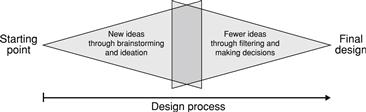
FIGURE 5.24 Brainstorming expands our thinking by looking for new opportunities, but now we need to narrow our focus by making decisions. (Based on a concept by Paul Laseau.)
How do you do this? The decision-making framework we established during the planning phase, plus the effective communication analysis at the start of the design phase, will show the way. There are many other possible considerations, but they are often secondary.
Here are some criteria to consider, roughly in order:
• Scenarios. Which design alternatives best support the top scenarios?
• Personas. Which design alternatives best match the target user characteristics?
• Effective communication. Which design alternatives communicate the task best?
• Value proposition. Which design alternatives deliver the most benefit or have the least cost?
• Design principles. Which design alternatives best uphold our design principles (such as the intuitive design attributes from Chapter 1)?
• Resources, themes. Which design alternatives are realistic with our available resources? Which best support our project themes?
At this point in the process, you’ll probably want to settle on about three design directions before starting to prototype. You want to build your confidence, but you don’t want to waste time.
Prototyping to communicate and improve established ideas
A prototype is an interface mockup that demonstrates how a program or feature is going to look or behave. Effective prototypes have clear goals; you shouldn’t prototype for the sake of prototyping.
Common goals for prototyping are to:
• Communicate and visualize design ideas.
• Evaluate, compare, get feedback, and improve design ideas.
And most important, the ultimate goal of effective prototyping is to achieve your goals more efficiently than with production code. It’s all about efficiency because the prototype is always a means but rarely an end.
Prototypes can have different levels of visual and functional fidelity:
• Low fidelity. A sketch or wireframe, with no attempt to look real. Not all functionality needs to be included. May show task flows.
• Medium fidelity. A modest attempt to look real, but obviously not. May show task flows and minimal functionality.
• High fidelity. Looks like a real program. May be interactive or demonstrate some functionality.
Generally, the lowest-fidelity prototype that achieves your goals is best. Choosing the right level of fidelity is an important decision—it’s a classic process mistake to prototype at the wrong level. Lower-fidelity prototypes:
• Enable quick design, faster iteration, and creativity.
• Have the least investment and commitment.
• Focus on the high-level issues instead of details.
• Are perceived as unfinished and easily changeable, so they don’t discourage feedback.
The last benefit is especially important: If your goal is to improve the design, the last thing you want is the presentation of your prototype to discourage feedback. I find that people react emotionally to beautiful things and that beauty hides flaws. Consequently, beautifully rendered prototypes often receive less critical feedback than rough ones—which isn’t what you want here.
Designers often add fidelity to their prototypes as they progress through the design phrase. Low-fidelity prototypes are useful for determining task flows, rough page layouts, and basic interaction, whereas high-fidelity prototypes are great for getting pixel-level visual details like fonts, colors, and exact layout, plus high-level visual goals such as visual appearance and appeal, scannability, and personality.
Getting the details right
Once you have the interaction and visual design established, it’s time to think about the details. Here are some important details that you should not overlook:
• Performance. Great performance is the ultimate feature because it benefits all users in all scenarios. Design tasks to be responsive, give great feedback, and avoid unnecessary waiting.
• Efficiency. Make sure frequent tasks can be performed efficiently, especially by advanced users. Design shortcuts and gestures for minimal user effort.
• Defaults and recommendations. Good defaults and recommendations make tasks more efficient and give users confidence in their selections.
• Animations and transitions. Animations and transitions give your UI a modern, realistic feel. The best transitions don’t demand attention but rather make state changes more natural and less noticeable.
• Forgiveness. Users make small mistakes all the time, so strive to handle such mistakes gracefully. Avoid giving big punishments for small mistakes.
• Error handing. Good error handling must be designed in instead of being an afterthought. Good error messages are specific, actionable, and helpful.
The refinement phase
Designs are never right the first time. UI design is an iterative process, so you need to review and evaluate your design decisions throughout. Effective evaluations are crucial for your team to do its best work. I find the techniques that nondesigners tend to use aren’t very effective. The feedback tends to be arbitrary, visual, and emotional, and the reception tends to be defensive. We can do better.
There are many evaluation techniques, but they boil down into two categories:
• User-based evaluation. A UI is evaluated using actual target users. Usability lab studies are the most commonly employed user-based evaluation.
• “Expert”-based evaluation. A UI is evaluated using “experts” who represent target users. Simply put, the “experts” aren’t actual target users. An expert evaluation might involve your team applying an evaluation method or a set of design principles to a design.
Between these two options, user-based evaluation clearly has the advantage of testing with actual users. For example, a usability lab study evaluates a design by having actual target users perform realistic tasks to determine if they can complete them successfully. Will your target users understand your UI? You will never know until you test with real users.
Usability lab studies are the ultimate measure of usability and user behavior (predeployment), and they always trump expert-based evaluation, speculation, and personal opinion. As a result, usability lab studies are considered the gold standard for design evaluation. For more information, I recommend Usability Engineering, by Jakob Nielsen, and Rocket Surgery Made Easy, by Steve Krug.
Expert evaluations have the less obvious advantage of being quick, inexpensive, and focused. There is no single best technique; use the technique that best achieves your evaluation goals.
There are too many evaluation techniques to cover them all, so I will focus on those that evaluate how well a design communicates. These evaluation techniques tend to be quick, easy to do, and very effective.
That said, there are several “expert”-based evaluation techniques that I won’t cover that you effectively already know. Everything you do during the planning phase can be used to evaluate a design by looking for discrepancies. For example, you can evaluate a product’s value proposition by evaluating how well a design maximizes its benefits while minimizing its costs. Design principle reviews are also very effective. For example, you apply the attributes of intuitive UI from Chapter 1 to help you determine whether a design is intuitive.
(Ineffective) Team-based design reviews
Team-based design reviews, where the designer presents a UI to the team during a meeting, is quite common, so let’s start there. As I suggested earlier, these reviews usually aren’t very effective.
Here is the format for a typical team-based design review:
1. The designer explains the project and its goals, plus the goals of the design review.
2. The designer walks through the UI page by page.
3. Team members make random comments about the design, usually based on personal preferences.
4. To address the feedback, the designer defends the various design decisions.
5. Someone starts to propose new design ideas during the meeting.
6. A debate breaks out over some random topic completely unrelated to the goal of the design review.
7. A developer points out that the design is going to be really hard to implement within current technology and schedule.
8. The team lead points out that he or she doesn’t like the colors, fonts, and icons, and quibbles over minor text details.
9. Someone mentions that his or her mom would never use the proposed design.
This is the worst case, but this worst case happens quite often. Nothing good comes from this.
In the best case, the designer manages to make it all the way through and the team says “Looks good!” for each page. But this is still an ineffective design review. Why? Because the “Looks good!” assessment likely based on the design’s visual appearance—the mockup itself literally looks good to the reviewers. This is a visual, largely emotional response, not a real assessment of the quality of the design.
A better approach: Scenario-based reviews
Instead of this undisciplined approach, consider setting some design review rules. Here are some rules that I recommend: staying on topic; no defending, designing, or debating; give specific, actionable feedback; your mom isn’t the target user, and so on. I present these design review rules in more detail in Chapter 6, “UI Design Examples.”
But effective design reviews strive to evaluate the design from the user’s point of view instead of random, emotional, visual feedback. How can we do that? With scenarios!
Here is the format for a scenario-based design review:
1. The designer explains the project and its goals plus the goals and rules of the design review.
2. The designer presents the top scenarios for the review.
3. The team walks through each scenario step by step.
4. Team members give specific, actionable feedback in terms of the scenario and its target users instead of personal opinion.
5. The designer records the feedback quickly and moves on. No defending, designing, debating, or going off topic.
6. The team lead points out that he doesn’t like the colors, fonts, and icons and they all quibbles over minor text details—because he can’t resist. But because this is off topic, he does it after the meeting, through email!
Much better!
Communication reviews
A communication review evaluates how well a design communicates by comparing it to what you would say in person, as I described earlier in the section “Imagine a Conversation with the Target User.” If the UI feels like a natural, friendly conversation, it is probably a good design. By contrast, if you wouldn’t say something in person, why say it in a UI? There’s little point in doing a usability lab study with designs that don’t communicate well.
You could perform a communication review as a separate step, but I usually do it while I’m performing another type of design review, such as the just-mentioned scenario-based review. Here is one way of doing it:
1. Perform a scenario-based design review, as previously described.
2. Compare what the presenter says to the team to what is on the page in terms of steps, their order, language, instructions, questions, and details. Also, make note of significant design elements on the page that the presenter doesn’t bother to mention and that aren’t used in the scenario.
3. If there are any significant differences, ask why. Chances are you have found a problem.
A communication review applies a core UI is Communication principle: What we say in person tends to be the right explanation, so if the design is different, it is probably wrong. To simulate this technique, suppose a designer presents the page in Figure 5.25 during a design walkthrough.
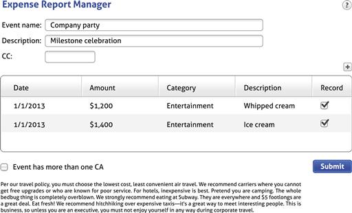
Further, let’s say that the designer describes the page as follows:
On this page, employees create expense reports, which must be filed within 30 days. First the employee needs give the name of the trip, its purpose, and the cost center to charge the expenses to. Then the employee needs to enter each expense item, including the category, date, and amount. Expenses over $100 require a receipt. The employee also needs to give a justification for entertainment expenses. When done, the employee submits the report to his or her manager for approval.
Based on this description, some good feedback might be:
• The page title is “Expense Report Manager,” yet you didn’t describe any of these activities as management. Can we use a more useful, less technical title?
• The first thing you mentioned is that expenses must be filed within 30 days, yet that isn’t anywhere in the UI. Seems important. Shouldn’t we mention that? If we don’t, how are users going to know?
• You described this as a “Trip,” yet the UI says “Event,” which is rather vague. Are most expenses for travel? If so, can we be more specific?
• You mentioned that each expense report needs a purpose, yet the UI says “Description.” Isn’t asking for the purpose more clear?
• You mentioned that all travel expenses need a justification. How do users know that?
• You mentioned “cost center,” yet the UI has CC as well as CA for “cost assignment.” Do all our employees know what CC and CA mean? Can we spell them out?
• You mentioned that some expenses require receipts, yet the UI says “Record.” Receipt sounds more natural … should we change this?
• When done, it sounds like the employee is really submitting the expenses for approval, yet the button just says “Submit.” Should we make that clear?
• The page has a large block of text that explains corporate travel policy, yet you didn’t mention any of that. It doesn’t appear to be very important and it is really hard to read. Can we remove or simplify it?
All good questions. This technique is remarkably effective for finding communication problems quickly.
Highlighter reviews
A highlighter review evaluates the integrity of a page as well as its effective use of layout and screen space. Here is the process:
2. Make a printout of every page used in the scenario.
3. Perform the scenario, highlighting everything that is potentially useful along the way.
4. (Optional) Repeat for other scenarios, using a different highlight color.
In evaluating the results, here are some things to look for:
• How much of the page is highlighted? What didn’t get highlighted, and why is it there?
• Where are the most important screen elements placed? Is the prime screen real estate used appropriately?
• How much of the page is dedicated to the most important screen elements? Is the star of the show getting top billing?
• Are screen elements truncated or do they require scrolling to see?
To show an example, Figure 5.26 shows a screen for a travel reservation app. The scenario is to check the status of my next flight to make sure everything is according to schedule.
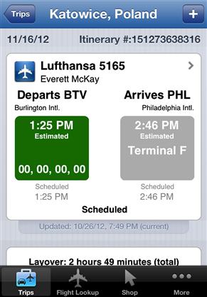
OK, what do you think at this point? The results of the highlighter review are shown in Figure 5.27.
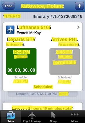
The highlighter review shows that this screen did well, because I highlighted most of its content. Still, not everything was highlighted, so applying the process suggests these questions:
• I didn’t highlight the itinerary number because it doesn’t mean anything to me or the airline. According to the iOS guidelines, the top of the screen is considered the most valuable, so why is this information there? Does it really have to be at the top of the screen?
• I didn’t highlight the generic airplane icon because it tells me nothing that isn’t obvious. It might have value if there were other types of reservations, but could this icon be more useful, perhaps using the Lufthansa logo instead?
• I didn’t highlight my name or the updated time stamp, but they don’t take much space. Let’s assume that these might be useful in other scenarios.
• Notice how much screen space didn’t get highlighted. Although generous whitespace is a good thing, is there a more space-efficient layout that might work better on a smartphone?
These are all good questions and suggest room for improvement, and they are all easier to identify with the highlighter test.
Scanning reviews
A scanning review evaluates how scannable a page is by reading it according to three sets of rules: immersive reading rules, scanning rules, and “Ginger” rules. Remember from Chapter 3 that users don’t read, they scan—so you should design pages specifically for scanning.
Immersive reading is for comprehension. Here are the rules for an immersive read:
• Read all text on the page in a left-to-right, top-to-bottom order.
• Read standard icons. For example, read a warning icon as “Warning!”
• Ignore anything that requires interaction, such as tooltips or flyouts.
In applying these rules, the text should make sense, should be well written and not redundant, and it shouldn’t sound silly or feel tedious. After all, that is the text that is there, so reading all of it should be a good experience.
Scanning is for finding things quickly. Here are the scanning rules:
• Read generally from left to right, top to bottom, but let your eye gravitate to things that demand attention.
• Read all prominent text, but only the first line.
• Read all interactive control labels.
• Read error and warning icons and red text, but only if they stand out.
In applying these rules, it should be clear what to do. If not, the page isn’t scannable.
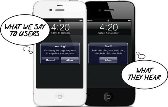
The “Ginger” rules are like the scanning rules but more extreme. Ginger is a dog in a famous Gary Larson cartoon called What we say to dogs vs. what they hear. (see Figure 5.28) Unfortunately, I can’t show you the cartoon, but the joke is that the only thing that Ginger hears is her name. It turns out that when quickly scanning a UI, users behave very much like Ginger.
Here are the “Ginger” rules:
• If there is a heading, read the first seven words or so.
• Read all interactive control labels.
• Read anything that the heading or interactive controls indicate that you should read.
In applying these rules, it should still be clear what to do. If it’s not, the page isn’t scannable for users who are barely paying attention.
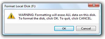
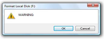
For example, here is the Format Local Disk confirmation from Windows.
If you apply the immersive reading rules, you will read all the text in the confirmation in a left-to-right, top-to-bottom order. Note that the warning icon is read twice. Does this feel well written? Not redundant? Does it sound silly or feel tedious?
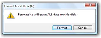
Now let’s apply the scanning rules. In Figure 5.30 I have removed what you wouldn’t read based on these rules.
Is it clear what to do?
Now, here is the Ginger read (see Figure 5.31).
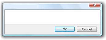
You might think the warning icon would show up here, but that’s not my experience. Rather, users often click OK to immediately dismiss the dialog box, realize that it had a warning icon, and regret not reading it more carefully before dismissing it. Often all the warning icon does is lead to regret.
Is it still clear what to do? Of course not! Ginger (like everyone else) will click OK without reading anything. This UI is not designed for scanning. Fortunately, the fix is simple, as shown in Figure 5.32.
This technique is remarkably effective in identifying scanning problems.
Five-second tests
A five-second test evaluates the scannability and memorability of a page simply by having users view it for five seconds and then answer a few basic questions about the purpose of the page and important design details, such as the call to action. If users can’t answer those questions, that strongly suggests that you need to redesign the page to make it more scannable and make those key details stand out more.
Five seconds is a very brief period of time, but this amount of time is used to capture users’ immediate impression rather than their analysis.
Here is the process:
1. Determine your goals for the study.
2. Chose the pages to evaluate.
3. Design a small number of questions to ask users to achieve your goals.
4. Run the test with a variety of users:
a. Show a page for five seconds.
5. Look for trends across the responses to identify areas for improvement.
To simulate a typical study, review the page in Figure 5.33 for exactly five seconds (no cheating!).
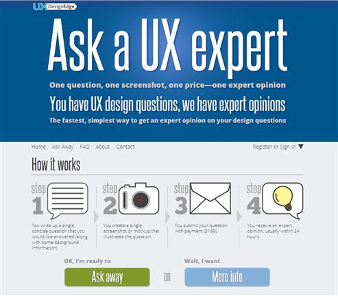
Now answer the following questions:
• What product or service does this page promote?
• Why should you consider buying or using it?
Were you able to answer these basic questions? If not, what does this tell you about the design?
Giving and receiving feedback
The ability to give and receive effective design feedback is crucial for teams to do their best work. I have noticed that these are not natural skills, so I would like to share some tips on each.
When giving feedback:
• Give feedback at the right level. If the goal is to get high-level, big-picture feedback, don’t give feedback on fonts and colors—even if you are the boss.
• Avoid feedback based on personal opinion. Instead, frame feedback in terms of scenarios, personas, value, and design principles.
• Give feedback that is specific and actionable. Saying that a UI isn’t intuitive is vague and not actionable. Saying that a UI needs better feedback is.
• Be supportive and encouraging. Remember that you are working together as a team. And be balanced by starting with positive feedback; it doesn’t have to all be negative.
When receiving feedback:
• Welcome the feedback. Smile and say thank you. Remember that this is the price you have to pay to do your best work.
• Don’t take the feedback personally. Remember that the goal is to improve the product, not to criticize you—even if the feedback isn’t delivered diplomatically.
Regarding giving feedback at the right level, I have noticed a phenomenon that I call manager feedback inversion, where managers tend to give feedback at exactly the wrong level. Here is what might be going on:
• Early in the process. Here, you present rough wireframes to get high-level, big-picture feedback. Unfortunately, managers perceive the roughness to mean that the design isn’t yet worthy of serious attention, so they give feedback on what they easily notice—usually the details!
• Late in the process. Here, you present higher-fidelity mockups to get lower-level, detailed feedback. Now managers perceive that the design is getting real, so they start to pay serious attention by noticing high-level, big-picture problems that they should have noticed much earlier in the process.
The best solution to manager feedback inversion is to set design review rules and enforce them—even for managers.
What about agile development?
It’s important for any UI design process to be compatible with agile development. Many development teams have either adapted an agile development process or are working on it. Chances are, your team has, too. The design community is still working on how best to integrate UI design into an agile process.
In case you are unfamiliar with the term, agile refers to lightweight software development methods based on rapid, iterative, adaptive development, where working software is delivered in regular time-limited phases, requirements and solutions evolve through collaboration and evolutionary development, and rapid and flexible response to change is encouraged. This is in contrast to the traditional heavyweight waterfall model, where the process steps are sequential and relatively inflexible, and the resulting product isn’t evaluated or fully debugged until the end of the process—once the work is mostly complete.
Agile methods are based on the Manifesto for Agile Software Development, which is quite simple. In fact, here it is:
We are uncovering better ways of developing software by doing it and helping others do it. Through this work we have come to value:
• Individuals and interactions over processes and tools
• Working software over comprehensive documentation
That is, while there is value in the items on the right, we value the items on the left more.
Though the concept of agile development is simple, there is plenty of room for interpretation. My interpretation is that traditional software methods are too heavy, time consuming, and inflexible and often fail to produce good results. As a result, we shouldn’t waste time on planning, documentation, and process that aren’t effective but instead get immediate feedback to make sure we are on track and respond accordingly.
Not everyone shares this interpretation. Many people interpret agile to mean that most planning, design, and documentation are wasteful, that we don’t know what users want without constant feedback and iteration, and so the best thing to do is start coding right away. They believe that writing code is the best measure of progress. For example, here is an excerpt from Getting Real: The Smarter, Faster, Easier Way to Build a Successful Web Application, by 37signals:
Get something real up and running quickly. Running software is the best way to build momentum, rally your team, and flush out ideas that don’t work. It should be your number one priority from day one … Stories, wireframes, and even HTML mockups are just approximations. Running software is real.
With real, running software everyone gets closer to true understanding and agreement. You avoid heated arguments over sketches and paragraphs that wind up turning out not to matter anyway.
Although I’m sure this approach works well for 37signals (a very small, very agile team), I believe this is poor advice generally. For larger, less agile teams developing complex systems with dependencies, writing production code is the worst way to make most UI design decisions.
The communication-driven design process that I have described in this chapter clearly requires up-front planning and design work. Many agile teams are loath to do such up-front planning, especially with short sprint cycles. But UI design, ultimately, is planning.
To make the case for this investment, I would like to modestly propose a Manifesto for Communication-Driven UI Design:
• Effective UI design decisions require effective team communication. Effective communication is focused on clear goals: communicating the right information to the right people at the right time. We shouldn’t waste time communicating when there is no clear need—just because the process says so.
• Lighter forms of communication are better. Generally, use the lightest-weight form of communication that does the job well. Lighter forms of communication are easier to create and change, and they allow for faster iteration. There is little investment, so it’s easier to look at alternatives or even start over. They also encourage more and better feedback because they are focused on high-level issues and perceived as unfinished and easily changeable. Agile methods prefer face-to-face communication, but it’s hard to communicate significant UI design ideas this way.
For communicating design ideas generally, sketching works best during ideation, wireframes work best for interaction design, and tools such as Photoshop and Illustrator work best for pixel-level visual design. Large, overly detailed documents that nobody reads are never a good choice.
• Production code is commitment. Yes, production code is real, so it involves real effort, real investment, and therefore real commitment. During the design phase, discovering better, completely different designs should be good news, but it won’t be if there is already a significant code investment in the old design. No matter how agile the team, nobody wants to throw away working production code. By contrast, nobody gets emotional when a sketch or rough paper prototype is thrown away.
• Effective UI design planning is practical. The trick is to be focused and principled—which ineffective planning often fails to do. Customer collaboration, no matter how close and frequent, accomplishes little if nobody knows what to do or what a good UI design looks like. Focusing your design planning on effective human communication is an excellent way to stay focused and principled.
• Efficient UI design planning is an excellent investment. If done properly, efficient UI design planning is lightweight and entirely compatible with the agile goals of rapid iteration, collaboration, and being flexible and responsive to change.
Efficient UI design planning enables teams to make good decisions quickly and confidently by design instead of stumbling across them by accident. For a communication-driven process to work, teams have to accept this manifesto to be willing to make the modest up-front investment and perhaps use longer sprints to accommodate the extra work required.
The payback is to make the overall process more efficient. The ultimate measure of progress is the number of good decisions made and the least time wasted. By contrast, UI design by coding trial and error is a long, rough slog. Wasting time incrementally improving a poor, hastily “designed” UI is never agile.
Summary
If you remember only 12 things:
1. Although there is no single best design process, a communication-driven approach works well for most situations and it allows you to leverage everyday interpersonal communication skills. If you can explain how to perform a task in person in a way that’s clear and concise, this process will help you map that explanation into the language of UI—in a way that is naturally user and user-goal centered.
2. A good user interface must go well beyond mechanically enabling a task. Enabling a task is the first step, not the last. You need to do some work to map what the technology wants into a UI that users can understand and use easily and that meets their goals.
3. Design is making creative decisions on behalf of target users to create a product that satisfies their goals. A good design process incorporates the essential ingredients of this definition. The rational decision-making process is a good foundation for making important, potentially risky decisions.
4. Watch out for the classic process mistakes, which are those process-related design mistakes that everyone tends to make. Doing so will help you understand why intelligent, capable, well-motivated teams with the best of intentions so often fail to create good designs. Many fundamental product design blunders can be traced back to some basic process mistake.
5. Define your product’s (or feature’s) value proposition—the reason your target users will want to use it—and ensure that the design delivers it by maximizing its benefits, minimizing its costs, and making its value obvious. Value motivates people, so if your product or feature doesn’t deliver clear value, little else matters.
6. Use scenarios to understand your product from the customers’ point of view. Great design requires clear targets and scenarios provide those targets. If your product supports many scenarios, identify the top scenarios and focus on them. You can’t design well by having random people doing random things for random reasons in random contexts.
7. Define personas to better understand your target users. Instead of long day-in-the-life stories, use short user models with relevant details that are focused on the design task at hand. Every decision you make should be consistent with the relevant persona. Discrepancies reveal design problems.
8. Start the design phase by sketching out the conversations—what the UI needs to communicate to determine how you would explain the task in person. Traditionally, many people start the design phase by exploring the UI’s physical presentation, which tends to miss the communication angle. Once you understand what to communicate, you are then better able to explore the physical presentation of that communication through sketching.
9. Use sketching during brainstorming to express and explore many ideas quickly. Choose the strongest ideas based on the scenarios, personas, and value propositions you developed during the planning phase. Then develop those strongest ideas by prototyping.
10. Generally, the lowest-fidelity prototype that achieves your goals is best. Low-fidelity prototypes are great for determining task flows, rough page layouts, and basic interaction, whereas high-fidelity prototypes are great for getting pixel-level visual details such as fonts, colors, and exact layout plus high-level visual goals such as visual appearance and appeal, scannability, and personality.
11. Effective design evaluations are crucial for your team to do its best work. Use scenarios to drive the refinement process to evaluate the design from the user’s point of view. Communication-driven evaluation techniques such as communication reviews, highlighter reviews, scanning reviews, and five-second tests are quick, easy to do, and very effective in finding communication problems.
12. The communication-driven UI design approach requires modest up-front planning and designing to make the overall process more efficient. Doing so enables you to make the right decisions quickly and confidently by design, making it compatible with agile processes. However, agile teams are under pressure to deliver working code right away and are reluctant to make such investments. To make it work, teams have to trust the process and be willing to make those investments and adjust the process to accommodate the need for up-front UI design planning.
Exercises
To improve your ability to use the design process, try the following exercises. Assume that anything is possible. Don’t let concerns over development costs or current technology limitations inhibit your thinking.
1. Adapting the design process. Think of a design challenge that requires an innovative solution. Devise a design process to help you find such innovative solutions quickly and confidently. How important is a working prototype (or code, if software) in this process?
2. Design is effective human communication. Find an example of a good design that doesn’t communicate well on a human level. What does the design do to compensate? Alternatively, find an example of a poor design that communicates poorly. How can you improve the design by improving its communication?
3. Don’t design like a programmer. Find a UI that looks as though it were designed by a programmer (you shouldn’t have to look too hard!). Why specifically does the design feel that way? Propose an alternative design that feels less technical and more user focused.
4. Bad design CSI. Find a product that is potentially useful but suffers from poor design. Review the classic process mistakes and choose the top three that most likely explain why it failed. Now suppose that you were managing the team that created the product. What could you do to prevent or correct those process mistakes?
5. Value propositions. Find a product that you really love and write its value proposition. Now do the same for a product that you thought you would love but don’t. In both cases, what does value proposition tell you about the product’s design? Now assume that you wrote those value propositions before the products were developed. Do you think you could accurately predict the products’ success?
6. Scenarios. Take a feature that you are working on and design a UI based on that feature description alone. Evaluate the results. Now think about the tasks the feature is used for and improve your design based on supporting those tasks. Evaluate the results again. Now define the top scenarios for that feature and improve your design based on the scenarios. Be sure to put a lot of thought into the user’s context. Evaluate the results again. Do you see an improvement over your original feature-based design?
7. Personas. Design a set of three personas for a project you are working on. Now define a persona for yourself and for your team. Compare. Do you have any insight into how you differ from your users?
8. Brainstorming. Think of a design challenge that requires an innovative solution. Think this problem through on your own and propose a strong solution. Now get a group of people together, have a brainstorming session, break up into teams, and have each team present its solution.
Now take your original solution plus all the new ideas from the brainstorming and propose another design iteration. How much better is it than your original design? Do you think you could have created that new design working alone?
9. Focus on the communication. Think of a design challenge for a complex task. Get a group of people together and form two teams. Have Team A focus their effort purely on the UI. Have Team B initially focus on explaining the task to someone in person (without knowing they are designing a UI), then after that have them design the UI. Use the same, fixed amount of time for both teams. Did Team A sketch a pile of features? Did Team B focus on effective communication? Which team’s design is better?
10. Prototyping. Think of a design challenge for a complex task. Get a group of people together and brainstorm the problem as a group. Now break into two teams and give each team the same fixed amount of time. Have Team A develop a single high-fidelity, detailed prototype. Have Team B develop as many high-level prototypes as they can using rough, low-fidelity prototypes including paper. Evaluate the results. Which team has the better design ideas?
11. Innovation. Think of a design challenge for a complex task. Get a group of people together and form two teams. Have Team A focus on creating a radically innovative solution, and have Team B focus on creating a familiar approach based on established design patterns. Which design is better? Which is easier to use and understand?
12. Communication design reviews. Find a multipage task that has room for improvement. Quickly perform a communication review, a highlighter review, a scanning review, and a five-second test. What problems did you find? Which design review technique was the most useful? Which was the most effective at finding problems quickly?