
Chapter 6. Just Enough Design
Learn several important tips for designing the right stuff faster.
Get tools that give you real insight into whether or not you should build a feature.
Understand how to tell necessary features from nice-to-have features.
Sorry, still not going to teach you how to be a brilliant designer. Instead, I’m going to teach you something just as important: when not to design. If the previous chapter was about the fundamentals you need to know in order to design something, this chapter is about ways to figure out when not to jump into the design process at all.
Remember, it is important to know how to design things, but it’s just as important to know when not to design anything. Avoiding extra work isn’t lazy. It’s smart. It means you’ll have more time to do great design work on the things that matter.
You see, the beauty of the Lean methodology is that it forces you to get rid of many of your old, ingrained habits that slowed you down and made you design things that never got built or build things that never got used.
Lean UX is often about doing just enough design. Please note that the word “enough” is pretty important here. Just enough design doesn’t mean crappy design or hard-to-use design. Just enough design means doing what you need to do to learn what you want to learn.
Design the Necessary, Not the Neat
Designers design. It’s right there in the job title. The problem is that we can overdesign. We can spend a lot of time focusing on the details and the vision and a lot of other things that don’t directly relate to solving a problem.
Look, I just explained that you need to figure out how you’re going to test to see whether your design change actually made a measurable difference to your business. Now let’s talk about making sure you’re only making design changes that make a measurable difference to your business.
Those two things are different. Seriously.
Whether you’re a trained designer or somebody who just needs to know enough design to get your product in front of users, you’re going to have to stop thinking about design primarily as a way to make things beautiful or cool or interesting. Your goal for this type of design is to make things easy, obvious, and useful.
The way to do that is to strip out everything that isn’t necessary to validate your hypothesis or to move your key metric.
This is a tough concept to get, so let’s look at some examples, both good and bad. Have you bought anything at Amazon recently? Oh wait. You’re human, so probably.
Have you noticed all the stuff it has on its product pages? There’s a lot of it. It has recommendations and reviews and other places to buy and descriptions and ratings and...about a million other things. It also sells a couple of versions of virtually every product known to mankind.
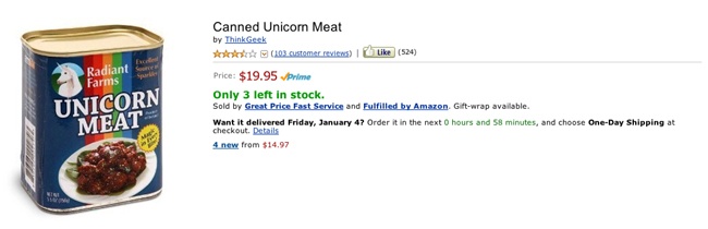
Because of the way Amazon creates its product, I have a fairly high certainty that each of those things helps it sell more products. I also know, because I was around at the time, that it didn’t have most of that stuff when it started selling books back in the prehistoric era of the Internet.
That’s the thing. Each of those elements it’s imagined and designed and built and tested took a really long time to imagine, design, build, and test. If you decide to build a product page with all that stuff on it, you’d better be independently wealthy, because that shit’s going to take awhile.
What You Should Do Instead
Let’s imagine that you are going to sell something. What do you need to validate whether you can sell that thing?
Well, you need all of this:
Reasons a person might want to buy the thing
A way for people to indicate that they might want to buy the thing
Enough people to conduct an experiment to see how many people actually want to buy the thing
Would it be great if people could also comment on the thing they bought? Sure! Will that make people buy the thing if they weren’t planning to buy it previously? Unlikely. How about ratings on the thing? Will those significantly affect the number of people who buy? Hard to say. Or what if you showed people more things to buy? That could increase the number of things they buy.
Are any of those things absolutely necessary to test whether people will buy something from you? Nope.
You see, you need to design and build the things that are absolutely necessary first. In this case, give people something they might want to buy and give them a way to buy it. The other things are nice to have, but they are not absolutely, critically necessary for validation of your assumption.
They’re also getting in the way of you launching the necessary stuff and starting to get people buying things from you.
When you’re designing a new feature, for example a product page where people can buy things, try to strip it down to only the most necessary parts. Maybe, for you, comments are absolutely necessary, because your entire model is based on personal referrals of products. Maybe ratings are the critical element because your idea is that professional ratings increase intent to purchase.
Regardless, you need to find, design, and build everything that is absolutely necessary first and no more. Because if the necessary is an abysmal failure, there’s an excellent chance that slapping on the nice-to-have won’t save it.
Here’s Another Example
I talked with some people from a company that had a fairly successful product. They wanted to add a new feature to their product. They spent a lot of time discussing how the feature would work, what it would do for users, how users would interact with it, and all the other sorts of conversations you tend to see around exciting new features.
Then they got to a key question: How would users access the feature?
They decided that the feature was important enough to include in their main navigation. Unfortunately, there wasn’t any place that their new feature fit nicely.
They decided they would need to redesign their entire main navigation for the product. This, of course, meant that all the other small changes they’d been saving for the main navigation had to go into this redesign. Also, they’d have to do a full visual redesign of the main navigation. Oh, and if they were doing a full visual redesign of the navigation, obviously they’d have to update the visual design on the rest of the application to match.
Did I mention that, when they finally launched the new feature, users didn’t care about it? It failed to move a single metric, and the company eventually pulled it entirely.
What They Should Have Done
They should have done pretty much anything else. The whole experience was incredibly expensive and demoralizing, and I’d like to say it’s the only time I’ve ever seen it happen, but that would be a lie.
The most important thing they failed to do was to validate the feature itself before changing the entire site to accommodate it.
They could have done this in a number of ways:
They could have done more customer validation before they created the feature to see if the feature would solve a real customer pain point.
They could have added the feature and advertised it directly to a small percentage of their users and asked them explicitly to try it out and give feedback.
They could have added access to the feature from someplace that wasn’t the main navigation, but that was still accessible to users, and tested with it there.
They could have just made small changes to the current main navigation in order to fit the feature in with the idea that they would go back and improve the display in the main navigation later if the feature was a hit.
They could have used what I call a Feature Stub. That’s next.
Build a Feature Stub
OK, that last example depressed me. Let’s look at a nice example of the right amount of design. This is probably the most commonly used trick in the Lean UX arsenal. It’s wonderful, because it allows you to test a feature without building anything at all! What could be faster than that?
I often consult with companies that are considering selling a particular item or package or feature. For example, I was talking to a company that wanted to start charging for certain features on its free product.
When we spoke, they immediately started talking about things like whether they should charge a one-time fee or a subscription, whether they should allow a free trial, and what payments they should accept. They told me that they wanted me to design the payment flow so that users would be more likely to buy the upgrade.
I stopped and asked what I think is a reasonably important question: Do you have any evidence that anybody will buy this thing at all?
The reason I asked was that all of the questions they were trying to answer are hard to solve, design, and build. Despite the sheer number of things being bought and sold on the Internet, great payment flows can still be tricky. Also, did you know that integrating with payment systems is the leading cause of Developer Rage Syndrome, which is a syndrome I just totally made up? True story.
The first step was to validate whether anybody wanted to pay for any part of the company’s free system. Here is the design that you need to start testing that assumption: a button that says Upgrade and a static page with a price and a couple of features you might offer when the user upgrades.
You also need a way on the backend to calculate the number of people who click on that button and a way to A/B test how changing the price and benefit statements affect conversion. These are far easier to build than an entire payment system and flow. Besides, you should really have the ability to A/B test this kind of stuff anyway.
What Does This Have to Do with Design?
OK, I admit it. This doesn’t seem to have a lot to do with great design. It’s more like avoiding design. But a huge component of great design is spending the time on the stuff that’s important and not wasting time on the things that aren’t going to work.
If you like, think of it as experiment design. Your job is to design the best possible experiment to validate or invalidate your hypothesis.
Maybe your hypothesis is that people will love your new feature or will be willing to pay for certain parts of your system. Whatever it is, do as little work as humanly possible to figure out if that’s true, because you’re going to have a whole hell of a lot of work to do once you figure out that people desperately want whatever you’re selling.
Build a Wizard of Oz Feature
When I was consulting, I worked with a company called Food on the Table. Now, Food on the Table has a product that helps people plan their meals around whatever is on sale at their local grocery store. At the time I write this, they have the daily sale information from literally thousands of grocery stores all over the United States.
It’s a great idea. It’s also a giant pain in the ass to implement. After all, you have to have some way to collect all that information from all those grocery stores in order to share with users. You also have to have an easy-to-use onboarding flow to gather information from people about where they shop and what food they like.
So they didn’t do that. At least, they didn’t do it at first. Instead, they decided they needed to learn more about how people shop and whether people would be interested in the product they wanted to build.
Instead of doing all the design and engineering work to build the product for everybody all at once, they got a few potential customers and did the work manually. That’s right. Instead of spending the first few weeks getting sale data and building a user interface, they went to the store, got the sale circulars, and sat down with some potential users to help them plan a meal. There was no design or engineering involved at all.
Now, it turned out that people loved the idea, so that’s when they decided to go ahead and start designing and building. But if people had hated the idea, even when they had somebody literally sitting down with them and helping them plan their meals for free, would there really have been any point to building the rest of the product? Probably not.
We call this the Wizard of Oz feature or sometimes a concierge service, and tons of companies use it all the time. Here are some other examples of great Wizard of Oz features:
Using crowdsourcing or something like Mechanical Turk to collect data rather than writing code to gather it.
Packing and shipping products yourself rather than integrating with a distribution center.
Approving orders manually rather than trying to build an entire fraud detection system to make sure that you have valid orders. Once again, this gives you a way to avoid design entirely, because avoiding wasted design is one of the best ways to save time in the entire universe.
Solve Only the Important Problems
First, let me tell you a story about a very small bug we encountered at Food on the Table, one that was having a pretty big effect on metrics.
As I mentioned before, Food on the Table lets users create meal plans based on what’s for sale at their local grocery stores. There was a call-to-action button that allowed a user to add a meal to her meal plan.
When the company tested the button locally, it all worked perfectly. Users pushed the button and the meal was added. Worked every time.
The problem came when users with slower connections or slower computers pushed the button. In many of those cases, when users pushed the button, there was a delay of up to a few seconds. What this meant was the user would push the button, but nothing would appear to be happening. She would then push the button several more times, hoping to make something happen. When the button clicks registered in the UI, the user would have added the meal to the meal plan several times, which was clearly not her intention.
We discovered this bug quickly in observational testing. It was happening to enough people that we were fairly certain it was negatively affecting key metrics, especially for new users.
Then we needed to figure out how to fix it. This is where the concept of “as little design as possible” came in.
Now, as you can imagine, there are lots of ways to fix this problem. The immediate engineering response might be to reduce the latency on the button so that the button clicks were recorded faster. Anybody who’s ever written any code will recognize this as potentially a Very Hard Problem.
A different approach might be to simply have the user interface reflect the change the user made without waiting for a response from the server. This is fraught with dangers, of course, because it can allow what the user sees to get out of sync with what’s in the database.
I could give you five or six other possible solutions, but the very simple one that we came up with was simply to show a working state spinner on the disabled button until the process finished. Since the wait was never more than a few seconds, people were perfectly content to wait while their choice was recorded.
Why do I bother to tell this story? Well, it’s important to realize that this solution worked in this particular case for a lot of reasons. For example, users were typically adding only three to five meals to their meal plans at a time. Waiting a few seconds for each one to be added did not significantly affect their total time performing the task. If it was a task they had to repeat hundreds of times, the three-second pause would have become a problem.
That’s the important thing to remember here. If all goes well, over the course of your product’s life, you will make far more of these small, iterative changes than you will big, sweeping changes. It’s important to have a process for figuring out the smallest possible change you can make that is appropriate to your situation.
How You Can Do It Right Now
Find a bug you want to fix. Not a typo-type bug. Something that is clearly affecting your metrics but that may not have an absolutely obvious fix. This could be a user-experience bug, like “Nobody knows how to share a file,” or a technology bug, like “It takes five minutes to upload a profile picture.”
The first step is to determine if it’s worth fixing at all.
To do that, try to answer the following questions:
Who is this problem affecting?
How often does it affect them?
Which key metric is it potentially damaging?
If it’s affecting important users a decent percentage of the time and negatively affecting a key metric, it’s certainly worth fixing. If it’s two of the three, it’s still probably worth fixing. The point is, not all bugs need to be fixed, but too many serious bugs can create an extremely negative experience for your users.
The next step is to find the key problem it’s causing for users. Just “not behaving as expected” isn’t necessarily the issue. It’s got to be getting in the way of people using your product successfully.
The best way to really understand a problem is, of course, to see it in action. Get some real users to show you the problem themselves on their own computers or devices. Understand what the bug is, when people are encountering it, and what it’s preventing them from doing.
Now—and this is the tricky design part—you need to solve the actual problem that the bug is causing. This is where you have to brainstorm some different solutions. The one you select should satisfy two important rules:
It should solve the problem that users are having.
It should be the best solution that takes the least amount of time.
I can almost hear some of you saying, “But sometimes things that take very little time now can cost time in the future!” That’s both true and irrelevant. Try not to solve problems you don’t have yet. If you take too long solving this problem, your company may not survive to solve the next one.
This is why in my example we chose to simply display to the user that her button push had been accepted rather than implement the more costly solution of making round trips to the server much faster.
We didn’t do the harder thing because we didn’t need to. We could solve the main user problem—they pushed the button too many times because they didn’t know it worked the first time—by simply letting them know it worked the first time.
This may seem like a lengthy process for something that seems as simple as fixing a bug. And, of course, I’m not in any way advocating that you do this when fixing typos. But anytime there are multiple approaches to fixing a bug, some of those approaches will be faster than others. Spending a little time to find a faster way to solve a problem saves you time in the end.
The other thing you may notice I didn’t tell you to do was extensive prototyping and user testing of the bug fix. There are lots of kinds of design changes where these are necessary. This type of UI bug fix, as long as the user problem is well enough understood ahead of time, tends not to require prototyping or usability testing.
Loosely Related Rant: Stop Worrying About the Cup Holders
Every startup I’ve ever talked to has too few resources. Programmers, money, marketing...you name it, startups don’t have enough of it.
When you don’t have enough resources, prioritization becomes even more important. You don’t have the luxury to execute every single great idea you have. You need to pick and choose, and the life of your company depends on choosing wisely.
Why is it that so many startups work so hard on the wrong stuff?
By “the wrong stuff” I mean, of course, stuff that doesn’t move a key metric—projects that don’t convert people into new users or increase revenue or drive retention. And it’s especially problematic for new startups, since they are often missing really important features that would drive all those key metrics.
It’s as if they had a car without any brakes, and they’re worried about building the perfect cup holder.
For some reason, when you’re in the middle of choosing features for your product, it can be really hard to distinguish between brakes and cup holders. How do you do it?
You need to start by asking (and answering) two simple questions:
What problem is this solving?
How important is this problem in relation to the other problems I have to solve?
To accurately answer these questions, it helps to be able to identify some things that frequently get worked on that just don’t have that big of a return. So what does a cup-holder project look like? It often looks like the following things.
Visual Design
Visual design can be incredibly important, but 9 times out of 10, it’s a cup holder. Obviously colors, fonts, and layout can affect things like conversion, but it’s typically an optimization of conversion rather than a conversion driver.
For example, the fact that you allow users to buy things on your website at all has a much bigger impact on revenue than the color of the buy button. Maybe that’s an extreme example, but I’ve seen too many companies spending time quibbling over the visual design of incredibly important features, which just ends up delaying the release of these features.
Go ahead. Make your site pretty. Some of that visual improvement may even contribute to key metrics. But every time you put off releasing a feature in order to make sure you’ve got exactly the right gradient, ask yourself, “Am I redesigning a cup holder here, or am I turbocharging the engine?”
Retention Features
Retention is a super important metric. You should absolutely think about retaining your users—once you have users.
Far too many people start worrying about having great retention features long before they have any users to retain. Having 100% retention is a wonderful thing, but if your acquisition and activation metrics are too low, you could find yourself retaining one really happy user until you go out of business.
Before you spend a lot of time working on rewards for super users, ask yourself if you’re ready for that yet. Remember, great cup-holder design can make people who already own the car incredibly happy, but you’ve got to get them to buy it first, and nobody ever bought a junker for the cup holders.
Animations
I am not anti-animation. In fact, sometimes a great animation or other similar detail in a design can make a feature great. Sometimes a well-designed animation can reduce confusion and make a feature easy to use.
The problem is, you have to figure out if the animation you’re adding is going to make your feature significantly more usable or just a little cooler.
As a general rule, if you have to choose between usable and cool, choose usable first. I’m not saying you shouldn’t try to make your product cool. You absolutely should. But animations can take a disproportionate amount of time and resources to get right, and unless they’re adding something really significant to your interface, you may be better served leaving them until later.
“But wait,” a legion of designers is screaming. “We shouldn’t have to choose between usable and cool! Apple doesn’t choose between usable and cool! They just release perfect products!”
That’s nice. When you’ve got more money than most first-world governments, you’ve got fewer resource constraints than startups typically do. Startups make the usable/cool trade-off every day, and I’ve looked at enough metrics to know that a lot of cool but unusable products get used exactly once and then immediately abandoned because they’re too confusing.
This may seem to contradict my point about attracting users first and then worrying about retention, but I’d like to point out that there’s a significant difference between solving long-term retention problems and confusing new users so badly that they never come back.
Before you spend a lot of time making your animation work seamlessly in every browser, ask yourself if the return you’re getting is really worth the effort, or if you’re just building an animated cup holder.
Your Feature Here
I can’t name every single project that might be a cup holder. These are just a couple of examples that I’ve seen repeatedly.
And, frankly, one product’s cup holder might be another product’s transmission. The only thing that matters is how much of an effect your proposed change might have on key metrics.
As a business, you should be solving the problems that have the biggest chance of ensuring your survival. Cup-holder projects are distractions that take up too much of your time, and it’s up to you to make sure that every project you commit to is going to give you a decent return.
If you want to identify the cup holders, make sure you’re always asking yourself what problem a feature is solving and how important that problem is compared with all the other problems you could be solving. Cup holders solve the problem of where to put your drink. Brakes solve the problem of how to keep you from smashing into a wall.
Of course, if I got to choose, I’d rather you built me a car that drives itself. Then I can use both hands to hold my drink.
Go Do This Now!
Be the Wizard: Try running a Wizard of Oz test on a complicated new feature you’re considering building.
Understand your current product: Try looking at usage on each of your product’s current features and figuring out which were truly necessary. You might be surprised.