
Chapter 8. Diagrams, Sketches, Wireframes, and Prototypes
Learn the difference between a wireframe, a sketch, and an interactive prototype.
Understand when you can save time by skipping higher fidelity design deliverables.
See the drawbacks of paper prototyping.
Up to now, I’ve talked rather vaguely about “design,” but UX design isn’t synonymous with creating big, pixel-perfect Photoshop files. In fact, in many ways, starting a design in Photoshop is the opposite of Lean.
As we’ve already explored, starting a design means starting with a hypothesis and designing tests to validate or invalidate that hypothesis. The Photoshop mockup of a final screen is a very tiny part of the entire user experience, and in many cases it should be skipped entirely. The UX is what the user is going to do and how she is going to do it, as well as what the product is going to look like.
But, still, we need to create something. It can’t all be scribbles on whiteboards and enthusiastic hand waving.
At some point, we need to create designs. For the purpose of this chapter, a “design” is going to be represented by some artifact that fulfills one of several very different types of functions.
These artifacts might be one of the following:
A diagram
A sketch
A set of wireframes
An interactive prototype
A visual design
They are all at very different levels of fidelity, and they’re all used for very different functions in design.
The most important thing to remember is that, to create a good design, you don’t need to do all of these. In fact, often you’ll want to produce only one or two different artifacts for any particular thing you’re designing. The trick is knowing which one you want to produce at any given time.
In this chapter, I’m going to give you a high-level overview of what each of these design deliverables is, why you might make it, and when you should skip it. As with the other design chapters, I want you to understand that you shouldn’t necessarily be creating all of these things for every design change. Sometimes you’ll want one of these artifacts, while other times you may need several.
Remember, design is about creating an experience, and these are tools that can help you create and communicate that experience. No single tool is important on its own. All of these tools can help you flesh out your designs and explain your ideas to your coworkers or users. They’re all helpful at different points in the process.
Confused? Yeah, I get that. Let’s look at some examples.
Why Diagram?
There are all kinds of different diagrams, but the ones I’m referring to here are the kind that help you figure out the flow of a complex interaction.
Now, when I say “complex interaction” you may think to yourself, “Oh, I’m good, then. Everything on my site is really simple!” You would be wrong.
Let’s take a “simple” interaction like signing into a product. Seems pretty straightforward, right? You get a username or email address and maybe a password, and you’re good to go.

Except, what if the user enters the wrong password or you can’t find the email address in your database? You should probably have an error state for that, maybe even two different error states, depending on how you want to treat this error.

Or what if the user has forgotten her password? You should probably have some way for her to recover it. There are a few different options, but you’ll need to figure out which one is right for you.

Oh, how about if the user hasn’t actually created an account yet? You’ll need to let her create one here.

And don’t even get me started if you also want to offer different ways to sign in, like Twitter or Facebook, or allow people to sign into multiple accounts. That just gets crazy.
My point is that any interaction that is more than one or two steps or that has the potential for branching or errors can often be helped by a simple flow diagram.
The diagrams aren’t merely exercises in documentation. They’re a way for you to visualize your design and decide which states need designs. For example, does this particular flow need some sort of error state? Does it need synchronous interactions like responding to an email? Does it need to respond in different ways to user input?
Once you start to think through all the different possible flows, you get a much clearer view of the amount of design and engineering you need to do, which in turn will help make it easier to predict the amount of work that needs to go into your feature.
If you’re working on an application that is a series of screens, like a web application or a mobile app, you may also want to do some sort of site map or navigational diagram.
While site maps may seem less useful now that everything is an application, you’ll find that many products have some sort of navigational flow that can be expressed in a site map.
For example, imagine a shopping application. There’s a lot of information architecture involved in allowing people to quickly find a product in a catalog. If you want your users to never get lost while using your product, you’d better start by making sure that you know where everything should go.
What’s It Good For?
Use a flow diagram or a site map when you’re trying to figure out how users will move around your product and complete common tasks. It can also be extremely helpful for estimating how much time something will take to build and for communicating the design to engineers.
It’s not particularly good for validating a hypothesis or for testing for usability, since these are not artifacts that are meant to be shown to users. Don’t worry. We’ll get to some methods that will help with that.
How Can You Make One?
As I just mentioned, these are not meant to be shown to users, so any time you spend making these pretty or interesting is just a total waste of time. These are items that are meant for purely internal consumption, so make them incredibly clear and easy to understand, but don’t bother with the bells, whistles, and gradients.
My favorite tools for making diagrams like this are Visio or OmniGraffle. I’ve also made them in Balsamiq, on whiteboards, and on Post-It notes. Really, you should just use whatever you’re comfortable with.
One technique that can be kind of fun is to create sketches of expected screens and print them out onto pieces of paper, which you then move around physically.
The most important thing to remember about diagrams is that they will change. Sometimes a lot. Don’t feel like, just because you’ve made a flow diagram, you’ve got everything figured out. I can’t tell you the number of times that I’ve made a lovely flow for a particular task—for example, checking out with an online cart—and then found a whole new path that I needed to add later, as soon as I began prototyping.
Because they change, I strongly recommend using some sort of tool that allows you to easily update the diagram, since an out-of-date diagram is just wildly confusing.
When Do You Sketch?
There is an important concept in design that you’ve probably never noticed, but that has affected absolutely every interface you’ve ever used. Some things need to be close to other things.
There’s a technical term for this, but I’m not telling you what it is, because it’s not particularly important. Well, the term isn’t important. The concept is critical.

My friend Jenny, an interaction designer, tells the story of the time she asked her husband to put up a sign asking people not to ring the doorbell, because the baby was sleeping. A little while later, someone came to the door and rang the doorbell.
After she answered the door, she realized the problem. Her husband had put the sign on the door.
Now, that placement makes some intuitive sense. A person comes to the door. They see the sign. They read it. They don’t ring the doorbell.
But there was a much better placement for the sign. Jenny moved the sign to hang directly over the doorbell. Nobody rang it again.
Why am I telling you this story? You’re not designing doorbells. I’m telling you because it illustrates how important the placement of information is. Critical information must be placed in very close proximity to whatever call-to-action it concerns. In other words, you need to put the sign in a place where people are forced to read it as they are in the act of starting to ring the doorbell.
By the same logic, you need to put the buy button very close to the price of an item, because that is critical information that the user needs at the moment of decision. You must put error messages where the error that needs to be fixed has occurred.
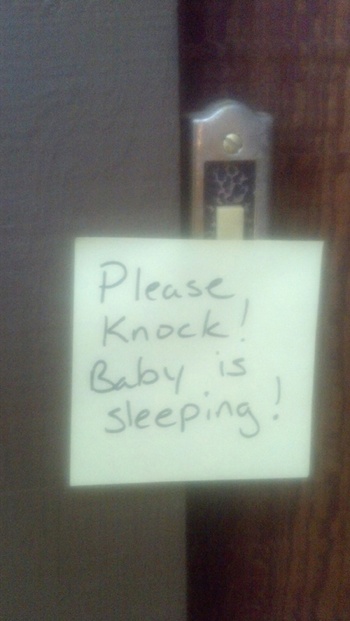
Figure out which part of the form is not filled in correctly.
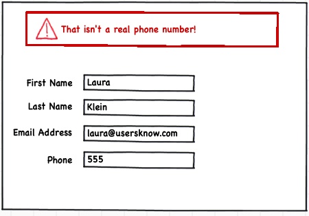
Error messages are often put at the top of forms. Unsurprisingly, they’re often missed by users, who have to spend time figuring out what they did wrong.
OK, how about this one?

Doesn’t that make it clearer?
You need to do this with every piece of critical information and call-to-action on your product. Once you start thinking of design this way, you will be shocked at how few applications get this right.
And this is where sketching comes in.
What’s It Good For?
As with diagrams, sketching is incredibly useful for helping you to think through problems.
Sketching is the first time that you start to visualize your product or feature. You stop thinking of it as “User needs to log in” and start thinking of it as a group of elements that a user would need to log in. You also start to think of where those elements go in relation to one another.
You do it in a sketch because sketches are quick and disposable. You can throw a bunch of elements onto a page and move them around and toss some and add some new ones in a matter of minutes. You can make a half-dozen sketches, each of which presents different elements, or groups information differently. You can experiment easily.
Sketching can also be great for starting to communicate your design to other people. If you’ve got a good enough engineering team and a simple enough feature, a quick sketch can be all that’s needed to get a version of a feature built.
If it’s not such a simple feature, then combining a series of sketches with a flow diagram to show how they all fit together can be a good way to go.
Sketches are less good for getting feedback from users, unfortunately. While you can get some overall information from them by showing a sketch, too often you’re simply asking them to fill in information on their own. People who are unfamiliar with your product are not going to be able to form much of an opinion when faced with a static sketch.
How Can You Make One?
My absolute favorite tool for this is Balsamiq, but there are lots of good, easy-to-use ones out there, including things like Mockingbird, MockFlow, OmniGraffle, and paper templates for various different mediums. There are dozens of others you can use at all price points and levels of complexity. Find the kind that works for you.
Lots of people go for pencil and paper, and that’s fine, but it has some drawbacks. It’s hard to keep paper sketches up to date or to change them much. After you’ve moved a few things around, they can tend to look like nothing more than a bunch of scribbles.
Also, they’re hard to keep around for reference later. I have thousands of sketches of various projects stored on my computer, and I can generally find the one I’m looking for. I couldn’t have nearly that many in hard copies.
Once you have your tool, just start putting things together. Group them loosely. Think about the hierarchy of your screen, or, if you’re not designing for a screen, the context in which you’d like to present things.
Put simply, figure out what goes with what. If you show user information, do you also want to show a picture? A name? Other identifying information? If you’re showing a list of things, what things would a user need to know about each item to select from that list? Is it a single list or is the list split into smaller lists for quicker skimming? Does everything fit in one place, or do you need to split things up so that you don’t have information overload in one area? Should things be done in steps?
The only way to learn to sketch better is to sketch. A lot. Go create a sketch. Then do it again.
What’s a Wireframe, and Why Do You Care?
It turns out that there’s no definitive consensus as to what exactly a wireframe is. I know. I was annoyed as you are when I found out.
I’ve seen wireframes so high level that they look like they’re just a series of boxes. I’ve also seen them so detailed that they are practically at the point of an interactive prototype. What someone defines as a wireframe appears to depend entirely on who taught him to design.
But the important thing about wireframes is what they are used for. A wireframe, for me, is somewhere between a rough sketch and an interactive prototype. It’s when I really start thinking about a feature’s details at the screen level.
A useful wireframe, in my opinion, needs to include all the copy, buttons, calls-to-action, and navigation elements of a real product. It doesn’t have any visual design yet. That comes later. But it’s definitely where you’re taking all the elements that you sketched out and making sure that they not only fit together on one screen but that they also hold up throughout an entire feature or product.
For example, if you’re creating a feature to allow people to post pictures of their children, your wireframe is where you’re going to figure out all the privacy settings and the upload settings and the filtering and sorting. All of them. You don’t just scribble in a little drop-down menu with the words, “some sort of filter” like you might in a sketch. You specify whether people want to see photos of only their children or if they want to see pictures of other people’s children, and how they would do that.
It’s where you decide how much content you need in order to describe the feature and where it should go contextually on the screen. I once saw someone try to pass something off as a wireframe that had nothing but lorem ipsum text on it. Nothing at all. I laughed at them and told them that what they had shown me was a series of rectangles.
Content is critical to wireframes, because without it, you don’t actually know how much space to leave for it. This is where you’re figuring out if everything you want really does fit together on a screen, and you can’t do that if you don’t know whether you’re going to need a line of text or a novel.

While you can make wireframes at all sorts of different levels of fidelity, the most important thing is to remember that this is where you’re figuring out everything that goes into each screen or mode of your product.
If you can hook multiple wireframes together, you can even create a very simple version of an interactive prototype, which can be wildly useful, since it gives you 80% of the benefits of a fully interactive prototype with far less work.
What’s It Good For?
Wireframes are awesome because they are good for so many things. I use wireframes for figuring out this deeper level of design. By forcing myself to write copy, I come to understand what a screen is really about. By forcing myself to fill in a filter drop-down box, I’m thinking through many different user stories and trying to anticipate what a person might think or feel when interacting with the screen.
But they’re not just good for the designer. Wireframes, especially when you string a few together, are high enough fidelity to start to get good usability feedback on them. They look enough like a real product that users can react to them and tell you things like what they think a screen does or how they would accomplish a task by using them.
They’re also pretty much my go-to replacement for design specs. Back in the day, we used to write multipage documents specifying every single different thing a product would do and every different error state a user might encounter. It was like a horrible, complicated essay paper that engineers hated to read as much as we hated to write. It was a dark time.
Then I realized that, instead of giving people a giant written document, I could just show them exactly what was supposed to be on a screen. It could include all the different states right there. Want to know what’s in a drop-down list? Click on it! Want to know where the error messages go and what they say? They’re all right there in context.
A single wireframe is worth a hundred stories in Pivotal Tracker and a dozen pages of unread design spec. I’m not overselling this. If you learn how to do one thing, learn how to make a very detailed wireframe.
How Can You Make One?
This is tricky. Much as there are a hundred different definitions of what a wireframe is, there are as many different products that promise to help you make them. I’m sure they’re all great. I haven’t used the vast majority of them, because I’ve got stuff that works for me.
For low-fidelity wireframes that are a step above a sketch, I tend to use Balsamiq. For higher fidelity wireframes that have a little more interactivity, I use HTML and CSS. This means I can easily convert the higher fidelity ones to an interactive prototype.
But you can make them however you want. Some of the nice programs that people use to create wireframes are Axure, OmniGraffle, Mockingbird, JustInMind, and dozens of others. Seriously, Google it. There have probably been six more wireframing tools created in the time it took for you to read this.
Do You Have to Make an Interactive Prototype?
You never have to make a fully interactive prototype. Except for when you do. Because sometimes it’s really the only way that you’re going to avoid a huge amount of rework later.
There are only a few reasons for making an interactive prototype, and one of them is stupid.
The stupid reason for making one is that you are going to use it to sell an idea to an investor or somebody higher up in your organization. If you’re doing this, you should consider quitting. Honestly, if anybody thinks a full interactive prototype is a reason to give you money, they should learn about things like traction.
The best reason for making an interactive prototype is to figure out all the things that are wrong with your design before you spend a lot of time and money building your real product. You see, the only thing better for usability testing than an actual product is a close facsimile of that actual product.
So here’s the deal. If you have a very complicated product or feature that would take a very long time to build, or if you have a product that, for some reason, you won’t be able to easily and quickly fix, it is worth making an interactive prototype. If you have a question about two very different approaches to an interactive feature, you might want to prototype both of them and test them against each other.
Basically, you use interactive prototypes when they will save you time and money by allowing you to test something that is very close to a real product without having to bother to build the whole thing.
Here’s an example. I was working with a client that made a product for small businesses. The product really worked best once the users connected it to all their financial accounts, kind of like Mint.
The client wanted a simpler way to get people connected to their accounts. The problem, as is often the case with outside integrations, was that making changes to the way this worked was big and complicated and hard.
Now, that by itself isn’t too much of a problem. Engineers tackle big, complicated, hard problems all the time. The problem was that, based on user research, we had a few different approaches to the problem, and we weren’t entirely sure which would be the best method.
This is pretty typical. You can understand a user’s problem perfectly but still have a few different ideas of how to solve the problem.
Now, in a world with unlimited resources, we could have just built all three different approaches and put them into production and watched to see how they performed. In fact, if the differences had been small, like messaging or button placement, this is almost certainly what we would have done.
But the differences weren’t small. That’s why we built interactive prototypes.
Once we had three different interactive prototypes, which were built in a fraction of the time it would eventually take to build the real feature, we were able to do some basic usability testing.
We ran five people through each of the three prototypes and asked them to perform the main task—connecting their financial accounts. There was no backend to the system, so the interactions were all entirely fake, but they felt real enough for users to understand what was going on and to react in the same way they would normally.
Obviously, we followed all the best practices for testing—not leading the users, mixing up the order in which they tried the different prototypes, getting a decent mix of user types, etc.
At the end of the test, all five of the users were able to complete the tasks easily with one of the prototypes. With another, they were able to complete the tasks, but they were slower and had more questions during the process. With the final prototype, which had been built to imitate the behavior of the feature that was already in production, a few of the users weren’t even able to complete the tasks.
We also found a few problems and questions that came up during the prototype testing that we were able to fix before the feature was built, which meant less work after we launched the feature.
What’s It Good For?
So the important thing about interactive prototypes is that they’re great for testing your product with real users when building different variations of a feature would simply take too long in production or be extremely hard to fix later.
Anytime you’re creating something that you can’t easily fix after you’ve released it, like a physical device or boxed software, interactive prototypes are crucial for finding as many problems as possible before your product is in the hands of users.
Similarly, if you’re building something you need to get right the first time or that will be used only once, it is incredibly important to test the product or feature in a state that is as close as possible to the real thing.
How Can You Make One?
This is entirely dependent on what you’re building. For web applications, the best interactive prototyping tool is HTML, CSS, and JavaScript. This may be the best interactive prototyping tool for mobile apps, as well, since it allows you to quickly build, test, and iterate on your design.
However, if you are a masochist and love Flash or Silverlight or some other sort of impossible tool, feel free to use one of those. If you’re a programmer, go ahead and build the prototype in whatever language you’re comfortable with. The trick is to acknowledge that this is a disposable item, so you should build it in a way that isn’t going to break your heart when you toss it all and build it from scratch the right way.
So Which Should You Build?
The key is to remember that, the closer you get to reality, the better information you’ll get. It’s also important that you not build more than you need to get the sort of information you want.
For example, it’s stupid to spend time building a full-scale interactive prototype with a complete visual design in order to get some feedback on messaging. You can test your messaging with a landing-page test or a quick A/B test.
On the other hand, trying to test a complicated interactive feature with a rough sketch is simply not going to get you the kind of information you need.
Also, consider the needs of the engineering team building the feature. How much guidance do they need? Do they need every single interaction fully scoped out? Sometimes they do. Other teams working on other features can be given a wider scope for interpretation of the design.
If you trust your engineering team to make some interaction design decisions, then you can present them with lower fidelity mocks and work through things like corner cases with them as they build. I often do this sort of thing with my team, and I find it saves us all a lot of time. Then again, I work with incredibly brilliant senior engineers, which, obviously, I recommend as another best practice.
Whatever happens, do not feel like you need to go through every one of these steps with every feature or product you build. I would say that I rarely go through more than one or two of these when I’m adding features to an existing product.
Let’s face it, most features you’re adding to an existing product aren’t huge. A lot of work we do as designers involves testing minor iterations. Spending time doing diagrams, sketches, wireframes, and prototypes can be a giant waste of time if you’re adding comments to a product page.
However, it is critical that you make a conscious decision every time about whether you are going to go through a particular step. Don’t decide not to prototype because you don’t have time. Decide not to prototype because your particular feature really doesn’t need it or because there’s a faster way to get the information you need. Decide not to diagram because the feature isn’t complicated enough to warrant it, not because you don’t know how.
Make sure that you fully understand the benefits and drawbacks of each step and make the decision about whether or not to use it every single time. It will quickly become second nature to you, but until it does, you need to go through the process.
Should You Make It Pretty?
Premature prettification is the cause of more UX disasters than Myspace. There, I said it.
Whether you are at the diagramming, sketching, wireframing, or prototyping step, the one thing you should not be concentrating on is making it gorgeous.
Yes, make it clean. Make it clear. Make it obvious. Do not obsess over fonts or gradients or colors. Definitely include some images. Do not spend any time making sure those images are perfect or well lit or even decently cropped.
Spending time making things pretty at this stage is just a colossal waste of time, largely because you’re going to have to change bunches of it after you run your user tests and figure out all the stuff you screwed up. You don’t want to know how awful it is to spend days putting every pixel in its right place and then throw it all out and start over when it turns out your navigation structure was dead wrong.
Also, getting everything pixel perfect is going to make you far less likely to want to make sweeping changes to your design, even if it’s necessary. The mere fact that you spent hours of your time or thousands of your dollars getting a design to look fabulous is going to get in your way if you have to, for example, throw out the entire main page because it confused people.
The other, less obvious, problem with making gorgeous prototypes, is that user-test subjects are less likely to give you critical feedback on usability. A strong visual design can be very distracting, and test participants will tend to focus on the visual aspects of the design, no matter how many times you tell them they shouldn’t.
Also, a fully visually designed prototype feels more “done.” There is a tendency by user testers to be polite, and the more finished a product feels, the more likely they are to not want to give you any bad feedback about it.
I’m not saying you won’t get any useful feedback. I’m just saying that you’ll get better, more usability-focused feedback if you eliminate visual design during the testing phase.
The last reason you shouldn’t make things pretty at this stage is because you will subconsciously start making compromises to suit the visual design before you’ve fully thought out the user experience. When you start spending time focusing on things like what the buttons are going to look like, you narrow your vision and stop thinking about the bigger issues, like whether you have the right buttons at all.
This is a serious problem. This early part of the design process is when you figure out the big problems, like navigation and grouping of features and what tasks and flows a user will encounter. It’s very hard to think about all those things while simultaneously finding the perfect shade of blue.
It’s not that the perfect shade of blue isn’t important. It can be tremendously important. It’s just important later in the process. After all, you might end up getting rid of all the elements of your interface that you were going to make blue once you realize that they’re just confusing the hell out of your users.
So, not only am I giving you permission not to spend any time on visual design at this stage, but I’m also telling you that you absolutely must not spend time thinking about visual design at this point, no matter how much you want to.
As a final note of caution, I’ll just mention that, if you’re working with an outside agency of any sort, it is almost certainly spending time making its deliverables attractive. It is generally not in the best interest of an agency to show work that looks half-finished or ugly. This is a fairly significant problem because you’re paying for the hours they spent making a work in progress look great.
My suggestion is to always ask for the agency to share as much of the work product as possible rather than waiting to share pixel-perfect mockups and finished designs. The earlier you can see the design, the more likely you are to be able to fix things that aren’t testing well without having to pay an arm and a leg to get everything made pretty more than once.
Loosely Related Rant: Why I Hate Paper Prototypes
Every interaction designer I’ve ever met has gone on and on about the virtues of paper prototyping for getting quick feedback from users.
“It’s so fast!” they squeal. “You can get great feedback just by dashing off a sketch and showing it to users!”
I will admit that I am in violent disagreement with the majority of people in my discipline, but whenever people suggest paper prototyping as a method for getting actual feedback from actual users, I just want to punch them in the face.
Look, paper prototypes and sketches have their place in interaction design. For example, they’re great for helping to quickly brainstorm various different approaches to a problem at the beginning of a design process and I’ve mentioned a lot of them already in this book.
But, in my opinion, they have several serious drawbacks.

I like sketching in bars as much as the next person, but you have to admit that it’s hard to run a decent usability study off of this.
Before I get too far into this, let me define what I mean by a paper prototype, since I’ve heard people use the term to refer to everything from sketches on actual pieces of paper (or cocktail napkins in a couple of cases) to full-color mockups with a polished visual design.
In this instance, I’m referring to a totally noninteractive screen, mockup, or sketch of any sort of application that is meant to be shared with customers or test participants for the purpose of getting feedback on an idea. It can be printed on actual paper or shown on a computer screen, but whatever the viewer does to it, a paper prototype is not interactive.
So what don’t I like about them?
Screen versus Paper
This first peeve applies to screens that are actually printed out or drawn directly on paper. With a few exceptions that I’ve listed below, I’ve found this approach to be really counterproductive for getting feedback from people unfamiliar with a product or idea.
Whether they’re sketched out by hand or printed out on paper, people interact with paper differently than they do with computer screens. They view them at a different angle. They focus on different parts of the layout. They use their hands rather than a mouse and keyboard to interact with them. They have to shuffle through papers to see various states.
When you show somebody a piece of paper, they are in a different mind-set than they would be if you were to sit them down at a computer or hand them a tablet. They simply don’t have the context for understanding what you’re trying to show them. When I’ve tried getting feedback from paper, users have spent far too much time trying to understand what the things on the paper represented. For example, a radio button on a screen is an immediately recognizable thing, while a radio button on paper can often look like a little round circle. All that time spent figuring out what they’re looking at completely biases the feedback that the user could give you on the actual idea.
Any feedback you get on a printed design will be colored by the fact that people are interacting with it in a fundamentally different way than they would if it were on a computer screen.
Of course, you can get around this by showing the “paper” prototype on a computer screen, right? Yeah, kind of, except for the following issues.
Animations and interactions
I am an interaction designer. A big part of my job is to determine what happens when a user interacts with a product. Sometimes that’s obvious. For example, if I click on a link with some text that reads, “Contact Us,” I expect to be able to communicate in some way with the people who have created the product.
But is it so obvious? Back in the day when links could only take you to another static web page, sure it was. But now, all sorts of things could happen. I might have different behavior on hover versus on click. I could be given the option to have a live chat with a rep. I might be presented with an inline contact form so that I don’t have to leave the page I’m visiting. The contact form could have some information already pre-filled for me based on my present location or account type. There could be animation involved in displaying the contact information. There could be some sort of contact wizard that would change later screens depending on choices the user makes initially.
All these interactions are much harder to convey with paper prototypes than with interactive wireframes. Sure, you can make a different screen showing each stage of the interaction, but with anything more complicated than a few steps, your observers can get lost pretty fast shuffling through papers.
If you aren’t showing the various interaction states to users with your paper prototype, then what exactly are you trying to accomplish? Typically, user research of this sort is useful because it helps you understand whether users can understand an interface or accomplish a task. Reducing the interface to paper makes that nearly impossible.
Now, I’ve run a lot of user tests. I’ve run them with working products, interactive prototypes, pictures of screens displayed on computers, pure paper prototypes, and physical mockups of products. I’ve used prototypes built with everything from HTML to Visio to cardboard.
The one constant was that the closer the prototype mimicked the final product interaction, the fewer problems we found once the product was built. And since I recommend iterative testing during development rather than waiting to test until the product is 100% built (you know, just in case your design wasn’t entirely perfect the first time around), an interactive wireframe is the best trade-off of speed for functionality because it allows for natural exploration and discovery on the part of the test subject without requiring a fully working product.
Testing exploration
Paper prototypes, because of their complete lack of interactivity, are totally unsuited to allowing users to explore a product. Let’s face it, most of us aren’t simply designing a single screen in a vacuum or even a collection of standalone pages.
We’re designing products. Products allow users to explore and perform multiple tasks. Think about all the different sorts of activities you might want to perform in an email application, for example. You need to read, send, save, find, and get rid of messages, at a minimum. Each of those tasks has its own flow, and it probably has things that can go right or wrong at each step.
Showing a single page to a user allows you to test only the first step in each of those processes. It doesn’t let the user explore naturally and find all sorts of issues. What if they want to start writing a message and then stop to go to another one? What if they accidentally get rid of something? There is literally no way to naturally test these interactions by showing people pieces of paper.
OK, there are exceptions
Given these drawbacks, there are a few situations when designs printed on paper can be used effectively to get feedback from users or to communicate with team members:
You are at the very, very earliest stage of design, and you’re just brainstorming lots of different ideas with team members to make sure everybody is thinking about the product in the same way. In this case, paper can be very fast and effective, but don’t expect that you’re going to get very deep into the details without moving to a better medium almost immediately. And you’re still not going to show it to a potential user—just members of the team.
You’re designing material that is meant to be printed, like brochures, user manuals, books, etc. In this case, you want to know how people will interact with the printed media.
You’re designing a mobile interface. Paper prototyping for mobile is more acceptable than paper prototyping for any other sort of nontouch interface. You still don’t get any sort of feedback from your gestures, and it’s really awkward to try to understand what happens when you touch parts of the interface, but at least you’re not asking people to imagine that they’re using a mouse and keyboard. You can get away with this for longer on mobile, but try to move quickly to real prototypes.
Your product is an interface for some sort of embedded or small-screen device that would be very difficult to replicate in a quick interactive prototype. For example, a heads-up display for a car dashboard might be hard to show interactively in the appropriate context—although you may also want to consider prototyping on things like iPads when you want to go higher fidelity.
You have several different visual designs, and you’d like to show them all to users at the same time in order to see which one is the most attention-getting. You’ll still need to show the designs onscreen, of course, since colors can vary so much between screen and print, but it can be helpful to lay out several pieces of paper so that the various options can easily be compared.
You need to test designs with people in an environment with absolutely no access to a computer whatsoever. You know, maybe your users are Amish, or you are designing in a post-apocalyptic wasteland where the computers are trying to destroy humanity.
If none of these cases apply and you’re designing desktop or web applications for standard computers, then learn to prototype. You’ll get infinitely better and more detailed feedback from both users and teammates, and you’ll get it earlier in the process.
Go Do This Now!
Pick a sketching tool: Try getting away from scraps of paper and moving toward something that’s easier to test.
Figure out fidelity: Try looking at the features you’re currently designing and determining which deliverables you really need.
Move out of your comfort zone: If you’re used to building all your mocks in Photoshop, try sketching a few versions in Balsamiq. If you sketch everything on a cocktail napkin, maybe try drinking a little less. Also, try an interactive prototype.