Communicating Your Ultimate Dashboard
You already know what a great dashboard looks like if you happen to drive a car. When you are considering how to design your dashboard, keep your car’s dashboard in mind. It’s simple. It gives you important information by scanning it quickly. It tells you when there is danger or when you should accelerate. Great dashboards are visual representations of data used to make important decisions.
Making a great dashboard is not easy. There are people who dedicate their entire lives to representing data clearly, elegantly, and simply. For an in-depth look at different ways of representing your data, explore Edward Tufte’s books, including The Visual Display of Quantitative Information (www.edwardtufte.com), and W. Bradford Paley’s work seen at http://textarc.org. These will give you a few ideas on how to represent and clearly communicate your data:
Stoplights. Stoplights are a traditional project manager’s tool to convey risk in projects. Using red, yellow, green highlights on your metrics can immediately communicate visually how the organization is performing against goals without much need for explanation on the page, which make them ideal for a dashboard. Figure 15.1 shows an example of the stoplight approach as applied to Intel’s HR metrics (see Chapter 13 for more on Intel’s dashboard).
Progress Against Goals. Showing metrics without context creates more difficult executive meetings—you have not provided them with the information that they need to help move the HR agenda forward. What is required is a key indicator on each of the metrics provided in the dashboard. An example from Dr. John Sullivan, the head of Human Management at San Francisco State University (Sullivan 2002) is shown in Table 15.1.
| Metric | Last Year | 3 Months | 3 Month Recurring Average | Current | Warning Level |
|---|---|---|---|---|---|
| New hire performance (based on performance-appraisal scores at 6 months) on scale of 0 to 5, 5 being highest | 3.4 | 3.6 | 3.78 | 3.65 | 3.5 |
| Time-to-productivity in days | 45 | 42 | 44 | 43 | 45 |
| Turnover rate of top performers | 6.8% | 4.7% | 4.9% | 5.1% | 3% |
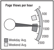
Gauges. Just like stoplights, gauges are an easy-to-understand way to convey current performance information and the goal of that information. Readers intuitively understand gauges from driving automobiles or simply from reading the temperature. Gauges for dashboards can be used to interpret complex data in one visual. In the example in Figure 15.2, the needle is indicating the current value of the metric. The range of average values is represented by the larger rectangle the needle is sitting in, and the top rectangle represents the goal for the metric (www.dundas.com).
Figure 15.2.

Combining Notes, Tables, and Visuals. Most dashboards have a combination of tables and graphics. Managing to balance the dashboard and notating the data appropriately is a true art. When creating the visual dashboard, try splitting up your page with two columns: one column should take two-thirds of the page; the other data will populate the other third of the page. Many times, this layout works for visual representations of your data since it allows you to display time-based line graphs if needed and show a few months of data. Long bar charts will have the same result.
Notice in Figure 15.3 that many of the data items have notes attached to them, but they do not overwhelm the dashboard. You may not immediately notice that the notes are there at all. After meeting with your executive team a few times, you may begin to build an intuition as to what types of information they tend to ask about, or what departments they’ll tend to question the data on. Build easy-to-find notes right into the dashboard. This will make communication of the core data much easier.


