
4. Making It Real

However deeply you have investigated the problem and however many creative ideas you have produced, you’ve little to show for your time until you turn your work into something concrete.
It’s time to make things real. Where objectives, requirements, and unrequirements previously took a backseat to exploration, you should now look carefully at which of your ideas meet both business and user needs.
It’s natural to have a hunch about which ideas you want to pursue. Now you should combine these diverse concepts into a more definite form. You’re moving toward a complete design by adding detail, but there’s still room to change your mind and tweak your designs as you go.
The Role of Deliverables
We don’t like jargon, but sometimes we’re stuck with it. The word deliverable has become part ofthe UX vocabulary—a way to describe the outputs that UX designers share with stakeholders.
Whether these outputs are personas, sitemaps, or wireframes, creating deliverables is a craft that demands practice and expertise in the tools of the trade. It’s not surprising, then, that user experience designers are sometimes guilty of “fetishizing” deliverables, seeing their creation as the raison d’être of great UX design. To an extent, this attitude is understandable since designers are often judged on the quality of their deliverables. There’s nothing wrong with aiming high, but remember that in our manifesto we pledged allegiance to delivery. Deliverables are a stop on the journey, not the end of the line.
The most important role of deliverables is to document your design choices. Deliverables play an important role in the success of the project, helping you to communicate key concepts and the project’s direction. They also reduce project risk by recording decisions made throughout the process.
But deliverables are more than mere documentation. They’re also useful design tools. Just as a visual designer uses graphics software to work up an idea into a full page mockup, the UX designer needs a medium for refining ideas. Particularly in the early stages of project, the act of creating the deliverable can be as valuable as the deliverable itself.
Wireframes, personas, sitemaps, and other deliverables are therefore living documents, steadily getting closer to the final design with time. Some organizations struggle with this suspended uncertainty, believing that if a design is on paper it’s final. If you work for this kind of company, be careful not to let people fixate on early designs.
* Design Deliverables
In Chapter 2 we discussed deliverables that capture research findings. Now we’ll focus on deliverables that you can use to document your ongoing design work.
Sitemap
A sitemap is a visual representation of a site’s structure ![]() . Usually arranged hierarchically, sitemaps indicate how content and information are organized and, consequently, how users will navigate the system. A sitemap documents the system as a whole, pulling back from interface specifics to look from a broader vantage point.
. Usually arranged hierarchically, sitemaps indicate how content and information are organized and, consequently, how users will navigate the system. A sitemap documents the system as a whole, pulling back from interface specifics to look from a broader vantage point.
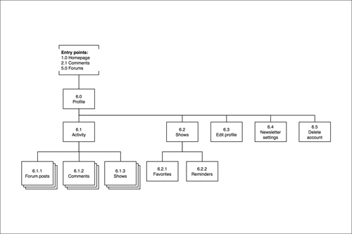
![]() This sitemap uses a top-to-bottom hierarchy to show site structure.
This sitemap uses a top-to-bottom hierarchy to show site structure.
A sitemap is a familiar tool to every UX designer; you’ll use one for most sites you design, particularly large, information-heavy sites. Use what you learned in your research (card sorts, interviews, and so on) to draft a structure that holds the site’s content in a way that’s meaningful to your users. It’s worth starting this process as early as you can, so that you can fully appreciate the components of the system and what work lies ahead. It’s not unusual to discover branches reaching farther than you expected.
Creating a sitemap will help you understand not only scope but also how sections and pages should be arranged and labeled. By the end of the exercise you should have a fair idea of how your site navigation will work, and what labels you should give to site sections.
Documenting a sitemap is a relatively simple task, thanks to Jesse James Garrett’s visual vocabulary (www.jjg.net/ia/visvocab), in which you’ll find a standardized set of shapes and connectors for use in your sitemaps and other deliverables. But don’t let a sitemap’s simplicity fool you: it will play an important role in the project. It might be the first deliverable you share with your team, so don’t be surprised if it sparks debate. We’ll talk more about feedback and critique in Chapter 5.
Since a sitemap is all about structure and hierarchy, starting with a text outline ![]() can be useful. Tools like Microsoft Excel and the Omni Group’s OmniOutliner will help you shuffle pages around before you start creating all those boxes and arrows.
can be useful. Tools like Microsoft Excel and the Omni Group’s OmniOutliner will help you shuffle pages around before you start creating all those boxes and arrows.
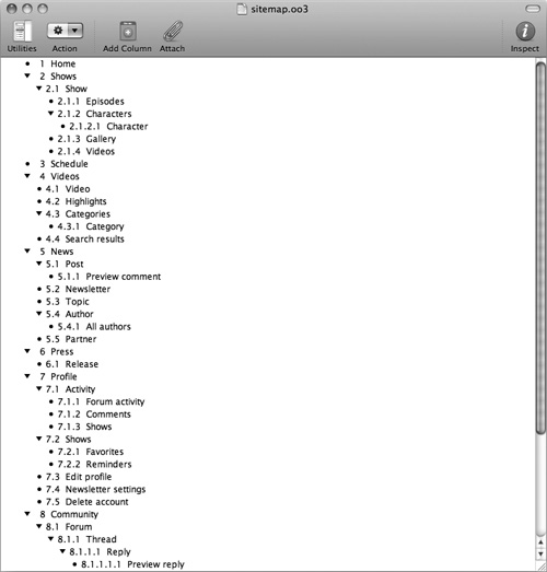
![]() Text outlines help you plan the site’s structure before you translate it into a visual sitemap.
Text outlines help you plan the site’s structure before you translate it into a visual sitemap.
Sitemaps get big quickly, so make your drawing canvas as large as possible. Don’t worry too much about laying the structure out beautifully; your sitemap will change a great deal over the course of the project. However, do try to use your software’s connection tools properly, so that when you move a section, its connections move with it.
If your sitemap is becoming unwieldy, use the visual vocabulary’s continuationpoint symbol to break the sitemap into smaller subsections. Finally, add a simple numerical identifier to each page you depict. This will help you cross-reference pages with other deliverables.
User Flow
A user flow ![]() shows the steps a user can take to complete a task or activity.
shows the steps a user can take to complete a task or activity.
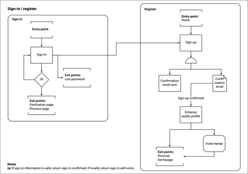
![]() This user flow captures a sign-in/register process using Jesse James Garrett’s visual vocabulary.
This user flow captures a sign-in/register process using Jesse James Garrett’s visual vocabulary.
The simple hierarchical nature of a sitemap can be too limiting on sites with complex navigation, large amounts of user-generated content, or process-heavy applications that branch according to user input.
Under these circumstances a user flow may be more suitable. This deliverable describes how a user moves through a process, rather than capturing a hierarchical information structure. User flows are particularly suitable for task-driven sections of your site, such as creating a new account or adding an item to a shopping cart.
If only a few sections of your site are process-led, you can create a user flow in tandem with a sitemap; simply cross-reference the two using your numbering scheme.
User flows are great at explaining complex logic, but don’t let them become swamped with detail. It’s easy to overwhelm user flows with irrelevant minutiae. Instead, pay attention to the high-level interactions. You might also need to consult with your developers if your proposed solution involves tricky technical logic.
Wireflow
Like a user flow, a wireflow ![]() shows how a user moves through the site, but replaces labels with rough representations of the relevant interfaces. Wireflows are particularly effective when the behavior of the interface is unconventional and demands visual explanation. Again, a wireflow and a sitemap can work well together.
shows how a user moves through the site, but replaces labels with rough representations of the relevant interfaces. Wireflows are particularly effective when the behavior of the interface is unconventional and demands visual explanation. Again, a wireflow and a sitemap can work well together.
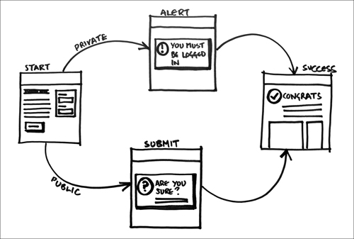
![]() This sketched wireflow combines high-level user flow with basic screen layout.
This sketched wireflow combines high-level user flow with basic screen layout.
Storyboard
Storyboards ![]() are another powerful tool for illustrating user flow. We covered storyboards as research deliverables in Chapter 2, but you can also use them at this stage to show how the interface behaves and any offline activity or thought processes required of the user.
are another powerful tool for illustrating user flow. We covered storyboards as research deliverables in Chapter 2, but you can also use them at this stage to show how the interface behaves and any offline activity or thought processes required of the user.
![]() Storyboards let you add instructional detail to complex interactions.
Storyboards let you add instructional detail to complex interactions.
Scenarios, if created in your research phase, make excellent starting points for illustrating user journeys. You can show users in their context of use (home, office, and so on) and any interactions or emotional responses that take place off the screen.
Storyboards excel when an interaction is difficult to communicate using an abstract deliverable like a sitemap or user flow. A storyboard’s visual and narrative approach gives an additional layer of context.
It’s impractical to storyboard your entire site, but presented alongside other deliverables, storyboards can offer the extra level of detail required for crucial interactions.
To save time, use a single frame to show related interactions, labeled with numbers to show the order in which they occur. Thought and speech bubbles can be a useful adjunct to textual descriptions, adding character and helping to humanize the storyboard. Keep your output simple in case you want to start over.
Tip
Save time by using a storyboard template, available for free online:
• Konigi’s OmniGraffle template (www.konigi.com/tools/omnigraffle-ux-template) and Graph Paper (www.konigi.com/tools/graph-paper)
• Comic book–style templates from the Sun.com customer experience team (http://blogs.sun.com/MartinHardee/entry/design_comics_templates_1_0)
Wireframe
A wireframe ![]() is a low-detail representation of an interface. It omits color, image detail, and other visual design specifics, providing instead a simple inventory of what’s on the page and how it should be laid out.
is a low-detail representation of an interface. It omits color, image detail, and other visual design specifics, providing instead a simple inventory of what’s on the page and how it should be laid out.
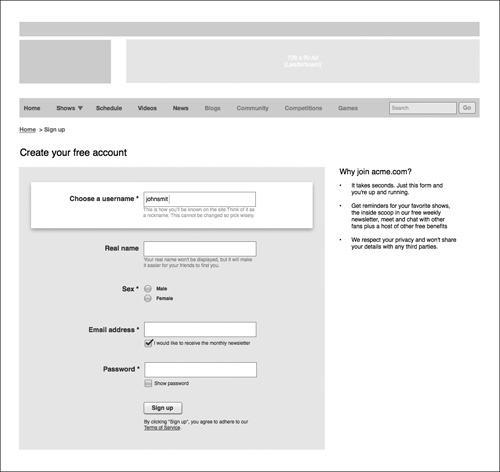
![]() This wireframe shows the first screen of a sign-up process.
This wireframe shows the first screen of a sign-up process.
A wireframe addresses several design issues:
• Information organization. Which items should be grouped and where? Are there any particular relationships that need to be made more evident than others? How should these groups be prioritized?
• Content. What content needs to be present on the page? Will it be prose alone or does the page need to accommodate images and video?
• Functionality and controls. What can users do on the page? How will users navigate the site? Is there a search function? A log-in control? Are there any inputs such as forms?
• States. What are the various states of the page? How do forms handle errors? Does the page vary depending on the user’s status—for example, logged in versus logged out?
• Behavior. Are there interactions that happen without a full page refresh? How does the page respond to input?
• Metadata. What page is this? How does it relate to the sitemap? What project does it belong to? Who is the author? What version is it?
• Annotation. Nuanced interactions or complex points may need further explanation. Use annotation callouts to highlight these areas.
Note
It can be hard to capture page behavior with static wireframes. If your design requires rich interaction, then storyboards or a prototype may be more suitable ways to explain site behavior.
The wireframe has long been the bread and butter of user experience design, and will undoubtedly be one of your most commonly made deliverables. With practice you should be able to produce a wireframe quickly, freeing up more time to discuss it with others and explain your design choices.
Try to ensure that your wireframes show consistency between pages; it can be easy to focus on an individual page and lose sight of how other pages are designed. If you are confident in your HTML skills, you may also want to include some suggestions about semantic markup on your wireframe, to help communicate its structure to your developer colleagues.
Page Description Diagram
A page description diagram (PDD) ![]() is a written inventory of every element on your web page. Elements are categorized into high, medium, and low priority and ordered horizontally.
is a written inventory of every element on your web page. Elements are categorized into high, medium, and low priority and ordered horizontally.
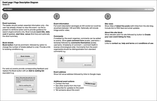
![]() This page description diagram shows the contents of a page in priority order.
This page description diagram shows the contents of a page in priority order.
Wireframes may be the most commonly used tool in the UX designer’s kit, but they aren’t always suitable. If visual or graphic designers are currently in charge of deciding layout—what goes where on the page—they may complain that your wireframe relegates them to the role of “coloring the boxes.” A PDD might be a better approach in this scenario.
Dan Brown of EightShapes invented the PDD as a way for UX designers to explain content hierarchy without dictating the specifics of layout. The PDD describes what’s important to a UX designer—the contents of the page and which are the most important for common user tasks—without stepping too far into the time-consuming world of layout.
PDDs leave the door open for visual designers to interpret page layout, while allowing stakeholders to focus on the important issues of content and priority. This makes PDDs ideal if you’re trying to squeeze a user experience focus into an existing design process.
If an element within your PDD needs more visual detail, you can supplement its text description with a simple diagram.
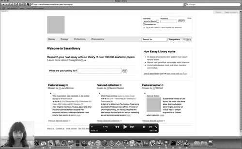
Prototype
A prototype ![]() is a simplified but functional model of a system, used to explore, communicate, and test a design. Users can move directly through a prototype, with pages following each other in chronological order.
is a simplified but functional model of a system, used to explore, communicate, and test a design. Users can move directly through a prototype, with pages following each other in chronological order.
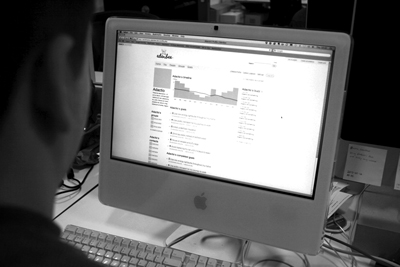
![]() An HTML prototype being used for usability testing.
An HTML prototype being used for usability testing.
The previous deliverables are all in some way abstracted from the final product. Stakeholders must imagine how these documents will translate into a finished website. However, stakeholders who aren’t familiar with user experience may not be convinced by skeletal deliverables. Instead, they will want to see solutions.
Prototypes excel at presenting solutions, since they involve the smallest leap of imagination between deliverable and end product. They let people experience the real flow of a system, meaning your stakeholders can feel firsthand the benefit of good user experience. It’s better to test-drive a car than to look at it in the showroom.
An effective prototype will not only communicate your design to stakeholders, but also enthuse them in a way no other deliverable can. Get a senior manager excited by a prototype, and your battle to integrate UX is already half won.
Prototypes also have the great advantage that you can run usability tests with them. We’ll cover that in the next chapter, but for now, get buy-in for the concept by explaining that a prototype allows you to gather insight into what works for real customers and what doesn’t. Couple this with the message that a prototype will help you incorporate customer feedback before costs become too high, and you’ll have a compelling argument for your case.
The most obvious downside of a prototype is the effort required. A prototype takes longer to build and calls for more specialized skill than other deliverables, and if your assumptions and decisions are wrong, you could waste time.
To minimize the time you spend on your prototype, remember that you’re not looking to create the real thing. Don’t worry about polish—quality of code, beautiful aesthetics—you’re only after a platform to demonstrate and test your ideas. Rough edges are a necessary part of the bargain.
A prototype will typically change beyond recognition as the project progresses. Make it modular and disposable. It’s not a good idea to use the code of a prototype as a basis for the actual website; you’re more interested in making it work than making it perfect.
Functional Specification
A functional specification ![]() is a detailed document describing in full the behavior of your site, its functionality, and how it responds to user input.
is a detailed document describing in full the behavior of your site, its functionality, and how it responds to user input.

![]() This functional specification documents the design and functionality of a news website.
This functional specification documents the design and functionality of a news website.
Due to the effort involved, the functional specification has fallen out of favor in modern web design. However, some organizations—such as those in high-risk sectors that employ a “waterfall” model where design fully precedes development—still embrace this deliverable.
A functional specification poses a headache to any user experience designer, particularly an undercover one. Once created, it demands that the design be locked down, since the work required to change it later is so great. As such, UX designers often dissuade their businesses from demanding a functional specification, and instead try to sell the benefits of testing and iteration.
If you have no other option than to create a functional specification, investigate whether this would be your responsibility or whether a product owner or business analyst might be able to generate one from a prototype. If the responsibility falls to you, set aside a lot of time and prepare for some painstaking work.
* Fidelity
The term fidelity describes the level of detail of your deliverables. Low-fidelity deliverables are a rough approximation of the intended user experience. They’re quick and dirty, capturing the essential characteristics of the site. High-fidelity deliverables give a more accurate representation of the site, including not just core features but also specifics of the site’s behavior and even aspects of the final visual design.
The right fidelity for your deliverables will depend on your project. Before talking about that decision, let’s look at how fidelity affects the tools and techniques you use (and vice versa), and which fidelity is most suited to which deliverables.
Low Fidelity
Low-fidelity tools are increasingly popular in UX design. With no technical knowledge required, you can create lo-fi deliverables with very little fuss.
Pen and paper deliverables are extremely versatile: you can use them to produce almost any deliverable, from sitemaps to wireframes and even paper prototypes. Hand-drawn deliverables are very quick to produce and easy to improve upon, but production time will quickly mount up if you need to redraw the same elements over and over again.
Low-fidelity deliverables don’t make for good formal documentation, but they’re ideal when you need to convey decisions quickly. In Chapter 3 we explained how to use a detailed sketch to convey an idea; the hand-drawn wireframe ![]() uses the same techniques and tools but offers more detail, proposing a solution rather than exploring a concept. It includes annotations that explain the major components of the page and how they work together.
uses the same techniques and tools but offers more detail, proposing a solution rather than exploring a concept. It includes annotations that explain the major components of the page and how they work together.
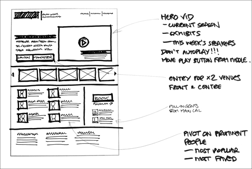
![]() This low-fidelity wireframe, although hand-drawn, includes more detail than an exploratory sketch.
This low-fidelity wireframe, although hand-drawn, includes more detail than an exploratory sketch.
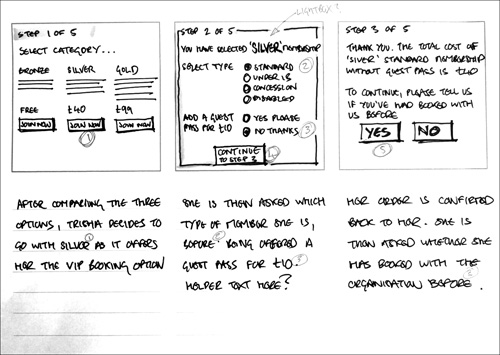
Paper prototypes ![]() are an easy way to test complex systems without the time and expense of making a digital prototype. Use sticky notes to represent panels that open and close, use overhead-projector transparencies for pop-up windows, and cut out your navigation and tape it to a background “master” so you don’t have to recreate it on every page. Paper prototypes need someone “behind the scenes” to operate the system based on the actions of the user: opening dropdown menus, entering data, and so on.
are an easy way to test complex systems without the time and expense of making a digital prototype. Use sticky notes to represent panels that open and close, use overhead-projector transparencies for pop-up windows, and cut out your navigation and tape it to a background “master” so you don’t have to recreate it on every page. Paper prototypes need someone “behind the scenes” to operate the system based on the actions of the user: opening dropdown menus, entering data, and so on.
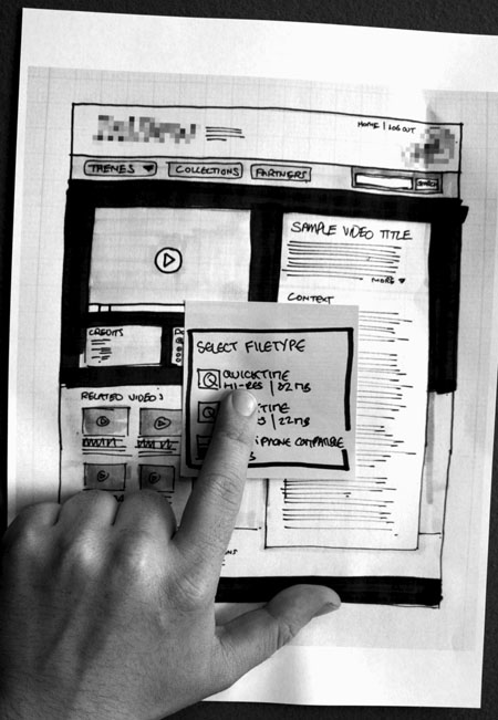
![]() This paper prototype uses sticky notes to mimic user interaction.
This paper prototype uses sticky notes to mimic user interaction.
Medium Fidelity
When you need more detail than a sketch, it’s time to pull out the professional tools. Although they demand more investment of time and money than a simple sketch, they provide professional output and the flexibility to make changes without having to redraw everything from scratch.
If you want to create a family of deliverables with shared elements, you’ll immediately benefit from being able to copy and paste elements between documents. Many of these tools offer sophisticated functionality such as master layers and shared libraries, allowing you to create your own collection of templates and stencils to reuse across projects. If you’re producing lots of deliverables, this efficiency alone is probably a good enough reason to adopt medium-fidelity tools.
Professional tools let you export to a wide range of formats including graphics files, PDF, and even HTML, making it easy to share your deliverables with stakeholders across the world.
The medium-fidelity wireframe ![]() , created using the Omni Group’s OmniGraffle software, shows a page with placeholder images and annotations.
, created using the Omni Group’s OmniGraffle software, shows a page with placeholder images and annotations.
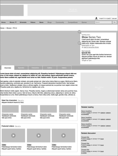
![]() A medium-fidelity wireframe conveys more detail than its low-fidelity counterpart.
A medium-fidelity wireframe conveys more detail than its low-fidelity counterpart.
If you want to demonstrate basic interactivity, you can also use medium-fidelity tools to create simple clickable wireframes ![]()
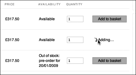
![]() Clickable wireframes let you mock up basic interactions such as adding an item to a shopping cart.
Clickable wireframes let you mock up basic interactions such as adding an item to a shopping cart.
Presentation tools like Keynote and PowerPoint, although not specifically designed for creating design mockups, make this surprisingly easy. Keynote in particular has several built-in motion transitions that mimic the visual behavior of interactive web applications.
Dedicated tools like OmniGraffle, Visio, and Fireworks include basic prototyping features and can easily be extended with shared libraries and stencils.
High Fidelity
If your product includes particularly nuanced interactions, or you need to include significant visual detail, you should create high-fidelity deliverables. In the UX world, this high level of fidelity usually means creating a prototype.
Specialist prototyping tools such as Axure can reduce the steep learning curve often associated with high-fidelity prototyping. Like some of the medium-fidelity tools, these specialist tools provide a WYSIWYG interface and generate functional HTML to allow your prototype to run in a browser.
Alternatively, you can get your hands dirty with HTML, CSS, and JavaScript yourself ![]() . This can be daunting, but fortunately there are a number of libraries and frameworks that can reduce the legwork involved in layout, cross-browser compatibility, and interaction.
. This can be daunting, but fortunately there are a number of libraries and frameworks that can reduce the legwork involved in layout, cross-browser compatibility, and interaction.
![]() Screenshot showing a usability test conducted on a high-fidelity HTML prototype.
Screenshot showing a usability test conducted on a high-fidelity HTML prototype.
Note
• Popular CSS frameworks include Blueprint (www.blueprintcss.org) and the 960 Grid System (www.960.gs).
• To prototype interactions, use JavaScript libraries such as jQuery (www.jquery.com) and MooTools (www.mootools.net). If you’re not well versed in JavaScript, the IxEdit tool (www.ixedit.com) can help generate the code required.
• Basic PHP can be an excellent addition to your prototyping palette. PHP lets you reuse code efficiently across pages, and using basic string functions, you can mock up surprisingly complex search components.
Choosing Fidelity
A useful principle for undercover work is to adopt the lowest fidelity necessary to get the job done. What you lose in detail you’ll gain back in time and effort. However, the most appropriate level of fidelity for your deliverables will depend on several factors.
Audience
Your deliverables should be tailored for your stakeholders, so that you don’t underdeliver or waste time that you could use elsewhere.
Stakeholders will have differing needs from your deliverables; specifically, they’ll need enough information to do their jobs. For example, product owners will be eager to see whether solutions meet business objectives. Content specialists will want to know what copy needs to be created and where it should go. Developers will want to learn about required functionality.
In some instances, you’ll be able to provide further detail and clear up ambiguity with a discussion. There’s no point creating glossy deliverables for the person sitting next to you; sometimes, a simple picture and a conversation is all you need to get your message across.
Also consider what you learned in your cultural analysis of the organization. Some stakeholders will respond better to high-fidelity deliverables, whereas others will be happy with a sketch of the essentials.
You may be able to create a single deliverable that covers these diverse needs, or you may need to create a couple of versions to explain relevant items in more detail. Just remember that extra deliverables take extra time to create and maintain.
Finally, if you plan to conduct usability testing with these deliverables, you should use a higher-fidelity method, although this will also depend on the goal of your testing. Medium-fidelity deliverables might suffice for simple tests of basic elements, but for subtle interactions or those that will depend on particular content, a high-fidelity prototype is ideal.
Time
As an undercover UX designer, it’s better to work on the design than create beautiful deliverables. While this clearly implies that low fidelity is desirable, you must find the balance. Too much haste will lead to ambiguity or confusion, meaning wasted time revisiting your deliverables or clarifying the situation. If in doubt, use the tools with which you are most comfortable.
You can reduce time pressures if you can take advantage of other resources. Could you convince the business to let a willing developer convert your sketches into a high-fidelity prototype?
Life span
Most deliverables are made obsolete when the site goes live, but until that point remember that every deliverable you create will have to be kept up-to-date. This can be especially time-consuming if you’re creating several types of deliverable.
Scope
How much of the site experience do your deliverables need to capture? A sitemap and handful of wireframes that capture a single user journey may provide enough detail for your team, or you may need to depict lots of journeys and permutations. Be careful not to overcommit. Let your scope and fidelity be guided by what you can realistically achieve.
Innie or outtie
Outties—external agency staff or consultants—typically have to produce higher-fidelity deliverables than innies. Deliverables will usually form part of an agency contract, and can be the only way for the client company to assess the quality of thought and work they are getting for their money.
Agencies may have agreed formats for deliverables; be sure to match these to reduce the risk of wasted work.
* Better Deliverables
There’s no perfect way to make deliverables; the best approach depends on the project and your personal style. However, since an undercover designer’s deliverables will be central to the case for UX, here are some tips on how to get the most out of them.
Try Everything, Master Something
Try out various tools to develop your proficiency and appreciate which of them are best suited to which deliverables. Most of the software listed in this chapter has a free trial version, so get downloading and experimenting.
You’ll probably find that one tool suits you better than the others, or perhaps you’ll be limited to one application since that’s all that your organization can offer. Take the time to learn the nuances of that tool and become a real expert in it. Keyboard shortcuts will save you hours, as will learning how to create master templates and stencil libraries.
The largest risk with this approach is that you’ll fixate on your chosen tool as the only appropriate answer to every problem. Be sure to choose your weapon based on the problem at hand, not just on whatever’s most comfortable.
Consult Design Pattern Libraries
A pattern library ![]() documents effective solutions to a common problem. Each pattern explains the problem, the proposed solution, and the context in which the problem occurs.
documents effective solutions to a common problem. Each pattern explains the problem, the proposed solution, and the context in which the problem occurs.
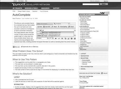
![]() Popular pattern libraries include Yahoo Pattern Library (http://developer.yahoo.com/ypatterns), Quince (http://quince.infragistics.com), and Martijn van Welie’s collection (www.welie.com).
Popular pattern libraries include Yahoo Pattern Library (http://developer.yahoo.com/ypatterns), Quince (http://quince.infragistics.com), and Martijn van Welie’s collection (www.welie.com).
As users have become more familiar with the web, standardized approaches to targeted problems have begun to emerge. Pattern libraries document these designs, and detail the rationale behind them.
Design patterns won’t make your design decisions for you, but they can be a shortcut past some of the legwork you’d otherwise have to do yourself. They can save you time and reinforce your decisions with the knowledge that others have successfully tested these approaches over the years.
However, be careful not to apply patterns blindly. A design that works elsewhere isn’t guaranteed to work on your site, and a subtle difference in requirements can render an approach invalid.
Build a Personal Library
As you gain experience, you’ll inevitably build up a set of stencils, shapes, and templates that suits your style. By continually tweaking the set and making it your own, you’ll end up with a set of tools that can act as your own artist’s palette.
Similarly, you’ll subconsciously build your own library of design patterns that work well for specific problems. Take the time to build these into a design pattern library of your own, and you’ll find yourself becoming more efficient, focusing on your design rather than the tool you’re using.
If you’re on a team, share these stencils, templates, and design snippets on a shared drive or intranet. If you’re prototyping in HTML, ask whether your developers have a library of code snippets that can save you coding time.
Learn HTML and CSS
While we’re on the topic, since HTML and CSS are the media you work in, learn them. Just as a composer must know the range of each instrument she writes for, learning HTML and CSS will help you truly understand the possibilities and limitations of web technology.
The fundamentals are surprisingly simple and take only a couple of weeks to pick up. Don’t worry about advanced tricks, but learn enough so that you would know how to start coding your wireframes. Not only will HTML and CSS give you another viable prototyping option, but also they will improve the quality of your designs and help you communicate better with your developer colleagues.
Tip
• There are dozens of online tutorials to help you learn HTML and CSS, such as www.w3schools.com; and books such as Designing with Web Standards, (3rd edition) by Jeffrey Zeldman (New Riders, 2009), which give an excellent grounding in modern standards-based web development.
• The WaSP InterAct curriculum can be a useful reference (http://interact.webstandards.org/curriculum/front-end-development).
Identify Key Pages
Each site has a couple of pages that lie at the heart of the user experience. For example, the photo-sharing site Flickr centers around just two key pages: the photo page and a user’s photo stream. Without these, the hundreds of other pages on the site could not exist.
Make key pages your top priority since their structure and design will affect the rest of the site. You should already have a hunch about which pages are key—your sitemap and design principles will often help to highlight them. Give key pages the attention they deserve, and your site’s user experience is off to a great start.
It’s rare that the homepage is a key page. Although it’s an irresistible draw for stakeholders, the homepage’s main job is usually to direct visitors to the key pages. Designing a good homepage is easier once you’ve defined the core essence of the site; as such, consider leaving it until later.
Get the Main Function Right
Similar logic applies within a page. It’s better to get a page’s main function absolutely right and forget about the rest, than to spread your effort thinly. It’s easy to lose sight of what really matters when your head’s full of competing requirements. If you find yourself struggling, break the problem down. What is the one thing this page needs to accomplish? Forget the secondary content—sidebars, footers, and so on—and focus on the core.
Explore as you go
Although you’re starting to converge toward a final design, don’t be afraid to explore new alternatives as they crop up. You can use any of the techniques discussed in Chapter 3.
The line between generating ideas and refining them is blurry. It’s OK to switch between the two modes, although in later stages you should focus on polishing the details rather than generating additional ideas.
Consider the ‘First-Run’ Experience
Pay special attention to the user’s first experience with your site. Is the site clear about what it does and how it should be used? It’s easy to neglect this state if you’re short on time, but even though a user may only see this state once, the first experience forms the important first impression.
If you’re designing a site that relies on user-generated content, remember to design the “blank slate”: how the page will look without this content. A design that seems active and useful once it’s full of content can appear imbalanced and deserted without that content. Provide direction and incentives for users to contribute so that the site’s emptiness doesn’t appear intimidating.
Use Real Content
For years, UX designers created wireframes and prototypes with “lorem ipsum,” dummy text indicating that the real content would follow later.
Designing around dummy text means that you have no way of knowing if the main visual focus of the page matches the main written focus of the page. Without knowing what’s on the page, you may leave too much space, or too little. Dummy text also means you can’t run valid usability tests on the system, since real users will want to read the text and look for trigger words.
Use real content wherever possible. If the content is unavailable, outdated, or being rewritten, talk with your content providers about the contents of the page, what its features are, how long it is, and what the main focus and calls to action should be.
Note
If you must use lorem ipsum, online tools such as www.lorem2.com can generate the text for you in a variety of formats.
As an undercover designer, you may have to use lorem ipsum if you don’t have access to content providers. However, aim to replace it with real content—even a first draft—as soon as you’re able. Only then will you be able to judge whether the design and content together meet your users’ goals.
Come Up For Air
Creating deliverables can be enjoyable, but be careful not to drown in detail.
A simple and effective way to avoid losing focus is to build regular peer review into your routine. We’ll cover formal critique in the next chapter, but before that point, consider whether you can share work in progress with close coworkers who are sympathetic to the UX cause. This could be something as simple as an impromptu discussion: simply print out your designs and take them to your colleagues for their thoughts. If you find yourself stuck on a problem, a few minutes spent describing it to colleagues can force you to focus on the heart of the issue.
A more advanced form of peer review is pair design, where you and a colleague work on a design simultaneously at one desk. Pair programming, the developer equivalent, is common within Agile environments (see Chapter 6, “Working with…”), where it’s used to improve quality and create easily maintainable code. Applying the same technique to UX design can drive up the quality of your work and help colleagues buy in to your recommendations.
Although it’s common for UX designers to conduct pair design together, you can partner with anyone involved in the project: developers, visual designers, content specialists, and so on. If you’re using software while pair designing, let one person “drive,” sitting at the computer, while the other provides input and suggestions. Swap every hour or so to keep things fresh.
Of course, pair design takes two people, so it can be tricky to arrange. However, it will teach you a great deal and can help build strong relationships.