3. Generating Ideas

After the hard work of research and analysis, finally you understand the design problem—or at least come close. Perhaps you even had your first glimpse of a solution. Buoyed with excitement or, more realistically, pressured by deadlines, it’s tempting to kid yourself that you’ve experienced that breakthrough moment—a design epiphany. In reality, that first glimpse was more likely mirage than miracle. However exhilarating your first idea feels, it won’t be your best.
Armed with the knowledge from your discovery phase, it’s time to explore the world of ideas, looking for creative ways to design a great user experience. Generating ideas is enjoyable; the trick is to channel that energy in the right direction.
Divergent Thinking
The key to generating a wide range of ideas is to think “divergently.” If you’ve ever taken part in a brainstorming exercise, you’ll recognize this way of thinking. Divergent thinking is broad and shallow, concerned more with quantity than quality. It suppresses the urge to appraise an idea, instead using each thought as a springboard to reach other ideas. With divergent thinking there are no bad ideas and no criticism. Smart answers are useful, but insightful questions are even better.
Divergent thinking comes naturally to some, but it can feel counterintuitive and unnatural when the pressure to find a solution is on. Fortunately, divergent thinking is a skill that can be learned like any other.
For best results, involve others. Divergent thinking isn’t just for UX designers. Everyone sees from a different viewpoint, so use this to your advantage and work with your colleagues to generate ideas. You can be sure that others will see something you haven’t, whether their ideas come from a short chat, a formal peer review, or a long collaborative design workshop (see the section “Collaborative Design,” later in this chapter).
At this conceptual stage of the project, the risks are low. Don’t be afraid to express bold ideas, and encourage others to do the same. Try to remove the fear of failure or embarrassment by setting an example and encourage others to follow suit.
Give people the space and time to generate good ideas. Consider, for instance, the physical space you work in. Moving away from the everyday office environment can generate excitement and get people thinking in new and interesting ways.
Autonomy and freedom usually motivate people, and creativity tends to evaporate if people feel constrained. Just be sure the open-ended nature of idea generation isn’t seen as an excuse to drift. Stay focused on the problem you’re trying to solve and stay within its boundaries.
* Sketching
The undercover UX designer needs a quick and efficient way to describe dozens of ideas. Enter sketching.
Sketching has a low barrier to entry. Anyone can draw a line, and everyone has the requisite tools. Look around right now and you can probably lay your hands on something to draw with—no need for expensive software, batteries, or Wi-Fi.
Pen and paper sketches let you capture and revise ideas more quickly than any digital tool. They help you set your ideas free, rather than getting bogged down in detail. Sketches are unresolved, and abstract. They contain holes for ideas to grow into, and invite comment.
Sketches are expendable. Often, you’ll discuss them once and then move on. It’s a liberating feeling to know from the outset that you’ll throw away most of your sketches. Suddenly you have the freedom to express any ideas, even the eccentric notions that won’t stop whispering, “There’s something in this.”
Let’s be honest: sketching is also good fun. Your job is to draw pictures for a living—tell your kids! Enjoyable work makes for a happier working environment and more motivation to succeed.
How to Sketch
People often respond to the notion of sketching with trepidation: “But I can’t draw!” Let’s kill this misconception now. In the words of graphic designer Jason Santa Maria, “Sketchbooks are not about being a good artist, they’re about being a good thinker.” You should use sketches to capture ideas, not demonstrate virtuosity, and with practice your skills will improve.
Different types of sketch fulfill different purposes for different audiences. UX design sketches usually fall into one of three modes.
Sketching for yourself
At one end of the scale, sketching is a visual way to capture your thoughts, for your eyes only ![]() .
.
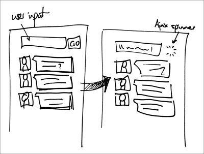
![]() Scribble down any ideas that you have, and don’t worry about whether they’re well drawn.
Scribble down any ideas that you have, and don’t worry about whether they’re well drawn.
Your research will fill your brain with ideas; finally you have the opportunity to get them out of your head and into the world. Grab a pen and let your ideas flow onto the page. Don’t worry if this outpouring of ideas leads to untidy sketches. Remember that you’re going broad and shallow, not narrow and deep. The number and breadth of these sketches is more important than their artistic quality and legibility, and since these sketches are just for you, your audience is easy to please.
Visual communication
Communicating ideas to others requires a little more care than sketching for yourself. Whether it’s the famous “back of the napkin” scribble to make a conversational point, or a group discussion around a whiteboard, your aim is to combine visual representation with discussion ![]() .
.
![]() Whiteboards are perfect for sharing ideas and provoking debate.
Whiteboards are perfect for sharing ideas and provoking debate.
These sketches exist purely to facilitate discussion, so they needn’t be detailed, but they should at least be legible to others. The temporary nature of a whiteboard is perfect for this ephemeral approach.
Detailed sketching
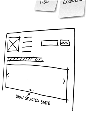
As you explore the specifics of your designs, you can use a more precise sketch ![]() to capture fine-grained details.
to capture fine-grained details.
![]() A detailed sketch encourages discussion of the finer details.
A detailed sketch encourages discussion of the finer details.
Use a sketch if your thoughts are still divergent—that is, if you’re provoking rather than resolving. If your thinking is more concrete you may prefer to create a more formal deliverable (see Chapter 4, “Making It Real”).
Tools
It pays to have the right tools for the job. Take this as official clearance to visit the art supply store and stock up.
Canvas
When choosing sketching materials, pick convenience over quality. A pocket-size paper sketchbook will prove indispensable for visual note-taking and supporting impromptu design conversations.
A whiteboard or easel pad is more appropriate for groups. Even Picasso would struggle to use it elegantly, but that’s not a problem. Gather your team around it when you need to solve problems collaboratively. Remember, standing up means no drawn-out meetings.
Pens
Fat-tip markers are ideal for exploring ideas ![]() . Markers are cheap, durable, and easy to use. Their heavy line weight can be clumsy, but that’s exactly what you want at this stage. You shouldn‘t be precious about your early sketches, and you don’t want detail at the start.
. Markers are cheap, durable, and easy to use. Their heavy line weight can be clumsy, but that’s exactly what you want at this stage. You shouldn‘t be precious about your early sketches, and you don’t want detail at the start.
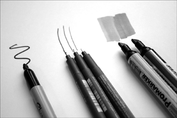
![]() A small collection of pens will help you sketch better. Don’t spend a fortune, but find tools you’re comfortable with.
A small collection of pens will help you sketch better. Don’t spend a fortune, but find tools you’re comfortable with.
Later, as you begin to refine your ideas, you’ll need tools with more precision. A set of fine-liner pens will be invaluable, but there’s no need to go crazy.
Three weights—say 0.1mm, 0.5mm, and 1mm—will give the detail required for UX sketches.
For a touch of professionalism, buy a set of chisel-tip blendable gray markers. These markers are ideal for shading and shadows, which add extra visual appeal to your sketches.
Techniques
To describe digital interactions you’ll deal mostly in two dimensions, so you needn’t worry much about depth or perspective. Most UX sketches use just a few basic techniques and components; master these and you’ll be an accomplished sketcher in no time.
Posture
Before you draw, adjust your posture. If you’re tense and unbalanced, your sketch will be too. Try to relax and rest your non-drawing arm on the paper, so it won’t slip around.
Lines and shapes
The humble line ![]() forms the basis for almost everything you’ll draw. It pays to get it right.
forms the basis for almost everything you’ll draw. It pays to get it right.
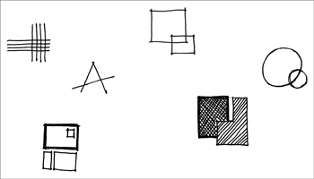
![]() Lines and simple shapes are the fundamental units of sketching.
Lines and simple shapes are the fundamental units of sketching.
Draw lines with intent and conviction. Delicate, feeble lines create fragile, unconvincing sketches. Use a single, controlled, fluid motion, rather than constructing a line with short overlapping segments. Give your lines an extra sense of purpose by adding a slight emphasis to their endpoints. To add further emphasis, simply double or triple the line.
When making basic shapes, let your lines overlap slightly where they meet. Unnecessary gaps make your sketch less solid.
Circles and ovals are tricky, but get easier with practice. Keep your wrist firm and rehearse the motion with the pen off the page first and you’ll produce surprisingly even results.
Shadows and texture
If you’re designing solely for a two-dimensional screen you may have little need for shadows or texture. However, any time you’re working in three dimensions—for instance, creating a storyboard involving a tablet computer—shadows and texture ![]() can add surprising life to your sketches.
can add surprising life to your sketches.
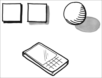
![]() The two squares have simple drop shadows, while the sphere is drawn with both a cast shadow and a form shadow. The front of the cellphone is drawn with a glassy texture.
The two squares have simple drop shadows, while the sphere is drawn with both a cast shadow and a form shadow. The front of the cellphone is drawn with a glassy texture.
There are three types of shadow. The drop shadow helps an image “float” above the page. It is often used in interface design to make elements such as buttons more prominent. The cast shadow is created by a solid object blocking light. It falls over the surface the object rests on, anchoring it. The form shadow is seen on the dark side of the object itself.
Conventionally, drop shadows appear below and to the right of objects, representing a light source emanating from the top-left corner of the screen. Drop shadows should be sharp and well defined. Cast shadows and form shadows vary depending on the position of the light source. Cast shadows can be softer when the light source is diffuse, and form shadows are softer still and follow the contours of the object.
Use your gray marker or hatched lines to add shadow. Take your time, take note of the shape of the object, and don’t overdo it. Use an improvised real-life model for guidance if required.
Textures can be useful when sketching physical surfaces. Add a couple of sheen lines to represent glass, grain marks for wood, and so on.
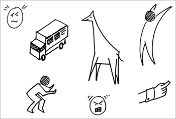
Complex shapes and people
Complex shapes are usually just combinations of basic shapes. The key is to start with the largest elements. Draw the outline of a scrollbar before the arrows ![]() , and draw the flank and neck of a giraffe before the head
, and draw the flank and neck of a giraffe before the head ![]() .
.
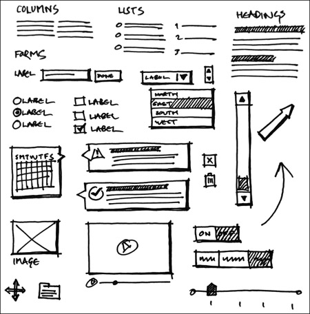
![]() User interface controls are simply combinations of basic shapes.
User interface controls are simply combinations of basic shapes.
![]() The same fundamentals, and a bit of practice, will help you draw more complex shapes and figures.
The same fundamentals, and a bit of practice, will help you draw more complex shapes and figures.
Follow the same pattern to draw human figures. First sketch the torso, adding an angle if required to represent posture, then add limbs and work down to the smaller features. When you’re confident using posture to represent context and emotion, you may wish to create figures using a single connected shape.
Heads should be approximately one seventh the height of the entire figure. Place eyes about halfway up the head and pay particular attention to eyebrows, which convey emotion surprisingly well. Point eyebrows inward to show anger, or askew to show confusion.
Don’t worry about drawing detailed hands unless they’re essential to the sketch. A curved box with the top half divided into four fingers will usually suffice. Extend a single rectangle to represent a finger.
Practice complex shapes by sketching everyday objects in your sketchbook. You’ll soon develop an eye for the key features of an object.
Lettering
Legibility is your top priority when drawing letters ![]() . Slow down and space the characters evenly. For short pieces of text such as annotations or dialogue, stick to uppercase for its consistency.
. Slow down and space the characters evenly. For short pieces of text such as annotations or dialogue, stick to uppercase for its consistency.
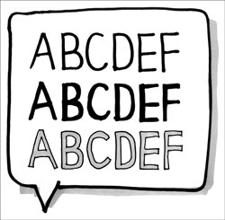
![]() Take care with your lettering and aim for consistent size and weight.
Take care with your lettering and aim for consistent size and weight.
As with lines, try to emphasize the beginning and end of each stroke, and feel free to overlap lines slightly where they meet. Subtly angle the horizontal strokes of the letters upward to give them a more open feel.
For emphasis, add lines on either side of your original lines and, optionally, fill the spaces between them. For even stronger headings, create your letters with a gray marker and use a fine-liner to outline the characters.
If your letters will be contained within a speech bubble or thought bubble, write the text first and use a subtle drop shadow to lift the bubble off the page.
* Collaborative Design
As an undercover UX designer, you won’t initially spend as long designing as you would like. Even if you did, you wouldn’t have the authority to change whatever you please, since your stakeholders will have strong opinions about the site and how it should be developed. See this as a blessing, rather than a curse. By adopting a collaborative design approach, you can harness your colleagues’ ideas and attack the problem more thoroughly and quickly than you could alone.
Collaborative design naturally encourages divergent thinking. Diverse stakeholders bring a broad range of perspectives, helping you to see the problem from many angles in a short timescale. Collaborative design also builds relationships early in the project and gives stakeholders a deeper interest in the design process. Establishing lines of communication, agreeing on goals and sharing understanding helps to avoid the them-and-us mentality that can result when design is conducted behind closed doors.
Learning to Let Go
For all its benefits, collaborative design can be a worrying prospect. Everyone has experienced the frustration of a good idea being progressively diluted by too many cooks. Is collaborative design just another term for “design by committee?”
As long as you retain control of the process, the answer is no. Collaborative design isn’t just about working together; it’s an opportunity to set the tone of the project. Lead collaborative design efforts and you will have the perfect opportunity to set the UX agenda. Explain at the outset that you want the group to focus on user needs, not just their own.
It takes courage to kick-start a collaborative design process. Be prepared for a few failures along the way. Some of your initiatives will fly, while others will flop, and it’s likely that people will only let you take the helm of minor projects until you prove your worth. But get collaborative design right and you’ll have an extremely effective tool to introduce undercover UX.
Undercover user experience and collaborative design may seem like strange bedfellows, but remember our manifesto. We don’t want to hide the user experience work—we want to get people excited about it without noticing. Collaborative design gives stakeholders the opportunity to express their pent-up ideas, and gives you a chance to introduce the UX way of thinking. As an added bonus, you’ll also learn more about team dynamics: who does what, what biases they bring, and where you fit into the group.
A quick way to involve stakeholders in generating ideas is to hold a collaborative design workshop, in which you explain the problem and your research, and work together to explore dozens of possible solutions.
Planning a Collaborative Design Workshop
Before planning a collaborative design session, think about what you want from the session. Do you want ideas, debate, or consensus? Make sure you’re clear on these high-level goals, so your workshop has focus.
Invite the right people
Invite a cross-section of your stakeholders, even if they’re only likely to be heavily involved further down the line. Groups of more than 12 participants tend to become unmanageable, so you may need to hold more than one session.
Don’t underestimate the logistical challenge of finding a suitable time slot in everyone’s schedules. By all means emphasize the importance of the workshop and the urgency of fixing the UX issues on the site, but if you have time to spare it’s generally better to wait for a time slot that everyone can make.
Practice
Schedule time in advance to get everything set. Prepare a summary of your research and select the exercises you’d like to run (see “Design games” below for some ideas). If you’re covering unfamiliar territory, try out a cut-down version with close colleagues first. Until you become confident running collaborative design workshops, start with shorter sessions and smaller design challenges.
Get the right equipment
Provide every participant with same type of pen, preferably a fat-tip marker. This may sound pedantic, but it’s worthwhile. First, everyone starts the exercise with the same equipment. It means everyone’s designs can be treated equally and, when stuck on a wall, no one’s work stands out more. Second, the quick and friendly nature of a marker is perfect for the rapid, high-level ideas we want to capture. Third, a fat marker line makes any photos you take of the sketches clear and easy to read. Avoid fine-liners and especially pencils, which are difficult to read from afar and don’t show up well in photos.
Invest in good-quality sticky notes, so people’s work won’t fall down halfway through the session. Make sure everyone has the same size and colors of sticky note at their disposal. The standard yellow works well, but some exercises need extra colors. Book a room that has plenty of free wall space, and check that sticky notes actually stay stuck to its walls. Bring some masking tape for sticking up sketches, but first check to make sure it won’t mark the wall.
Tip
Use a sharp downward movement to remove a sticky note from the pad. This prevents it from curling up when you stick it on the wall.
Bring plenty of blank paper for people to scrawl on, and any special paper your exercises require. You’ll end up with a lot of sketches across dozens of sheets, so bring a decent digital camera to photograph the output.
Finally, a projector can be helpful when explaining your research, introducing an exercise or displaying the rules of a game.
Running a Collaborative Design Workshop
Like public speaking, running a workshop involves a degree of performance. Participants will look to you to take the lead, so you want to be self-assured and help everyone feel at ease. Some of the exercises will take people away from their comfort zones, so plan to offer guidance and encouragement throughout the session. Avoid taking part in exercises yourself, so you can be on hand to help your participants.
Set the scene
Reiterate the goals of the workshop at the beginning. Emphasize that you are not necessarily looking for answers, just ideas, and that the short, playful exercises you’ll go through are great ways to spark creativity. By reinforcing simple notions like “there are no wrong answers” and “quantity not quality,” you’ll help reduce people’s inhibitions.
Be a good host
Workshops can be hard work, so make sure people are comfortable throughout. Provide drinks, take regular breaks and, if you’re running a longer workshop, be aware that people will tire toward the end of the day.
Design Games
Design games are a perfect vehicle for collaborative design. Their hands-on, inclusive nature puts design in everyone’s hands, encouraging a sense of shared ownership that other approaches lack. The communal spirit of adventure can break down barriers between team members and promote stronger team bonds.
Well-run games are enjoyable and memorable. People who are having fun tend to be more open to the unbounded nature of divergent thinking. Contrast this to a long requirements-gathering meeting—where would you rather be? This open thinking, spurred on by free conversation and creative activity, can reveal previously unspoken expectations. Remember the objectives, requirements, and unrequirements from the previous chapter? It’s not unusual to find collaborative design exercises adding to or changing these lists.
However, games also come with baggage. Some stakeholders may not see the prospect of the team playing games as an appropriate use of time and money. In these circumstances, substitute a different label—try exercise if in doubt.
Here are some of the design games we use on a regular basis. Feel free to invent your own, or consult Donna Spencer’s list at www.designgames.com.au for more inspiration.
Design the Box
The Design the Box game ![]() encourages participants to consider the product from the user’s perspective. What do users need and want from the site? How can the site communicate with them? What will get them excited? It’s an excellent icebreaker, and works well as the first exercise of a workshop.
encourages participants to consider the product from the user’s perspective. What do users need and want from the site? How can the site communicate with them? What will get them excited? It’s an excellent icebreaker, and works well as the first exercise of a workshop.
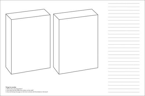
![]() Design the Box focuses the team on what makes their product appeal to users. Download this template at www.undercoverux.com/resources.
Design the Box focuses the team on what makes their product appeal to users. Download this template at www.undercoverux.com/resources.
Divide people into small groups of three or four and ask each group to design and draw the packaging for the website, as if it were for sale on supermarket shelves. Ask them to think about the core proposition of the site and how to distil that down into a clear and concise form. Why would a customer choose this box over those next to it? What are the main messages the packaging should convey—perhaps the name, tagline and key features—and what details should be included on the reverse? Would the box include pictures or just text?
Allow plenty of time for this exercise, between 20 and 30 minutes depending on the size of the groups. At the end of the design phase, ask each group to stick their sketches on the walls, and discuss their ideas with the other participants.
Design the Box is an ideal way to open a discussion about what the site should do, how it stands out, and what it offers users. It forces people to think clearly about how the site—and the organization—must differentiate itself from competitors, and what features will appeal most to potential users. Participants must also consider the product’s tone of voice, and key visual elements like color and imagery.
For an even more hands-on approach to Design the Box, provide a foldable card template, scissors, glue and colored pens so that your participants can make the box itself. You can then spread the various boxes around the office to spark further discussion.
The KJ Method
The KJ Method ![]() , named after its Japanese creator Jiro Kawakita, helps groups reach consensus on what the most important aspects of a product should be. A single session using the KJ Method will generate dozens of ideas about user needs, features, grouping, and priority, which will directly guide your UX design work. Through a democratic process involving a wide cross-section of the organization, you encourage creativity while avoiding the dominant personalities or politics that so often hamper traditional meetings. The exercise lasts around an hour, so you can run it as a single meeting or slot it alongside other exercises in a longer workshop.
, named after its Japanese creator Jiro Kawakita, helps groups reach consensus on what the most important aspects of a product should be. A single session using the KJ Method will generate dozens of ideas about user needs, features, grouping, and priority, which will directly guide your UX design work. Through a democratic process involving a wide cross-section of the organization, you encourage creativity while avoiding the dominant personalities or politics that so often hamper traditional meetings. The exercise lasts around an hour, so you can run it as a single meeting or slot it alongside other exercises in a longer workshop.
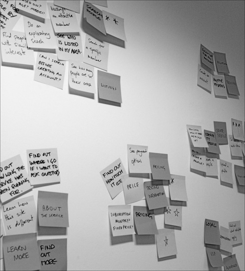
![]() The KJ Method is a fast way to understand the group’s thoughts about features and priority.
The KJ Method is a fast way to understand the group’s thoughts about features and priority.
First, establish a focus question, such as “What will users want to achieve when they visit this section of the site?” Spend some time sharpening this question; it’s important to get it right.
Ask participants to work individually and think of as many answers as possible to the focus question, writing each one on a sticky note (make sure everyone is using the same color). Stop your participants after ten minutes, and ask them to put their sticky notes—in random order—on the wall.
Now, instruct participants to work together to group all of the sticky notes, by identifying similar items and clustering them on a separate part of the wall. Ask your participants to remain silent, but reassure them that they’ll have the opportunity to discuss the exercise shortly. Some groupings will be easy if several people have put up similar notes, while some will be more contentious. Expect some silent disagreement and compromise in this communal exercise, and only stop when everyone seems happy with the final groupings.
The next task is to name the groups. Give participants some sticky notes of a new color and ask them to write down a name for each group that’s been formed. If they want to further rearrange the groups to make the task easier, that’s fine. To avoid the effects of groupthink, ask participants to keep their labels to themselves and again stay silent. Once everyone has written a name for each group, ask participants to stick their labels next to the corresponding groups.
At this stage you can pause for discussion or press on with the final task of voting. Ask participants to decide which three groups are the most important, in order of priority. Give everyone three final sticky notes in a third color, and ask them to draw three stars on the first, two on the second, and one on the last. Finally, ask participants to place these stars alongside their chosen groups, with their highest-priority group receiving three stars; the next group, two; and the lowest-priority group, one. Add up the votes to find the group’s aggregate opinion on where the priorities lie.
By now, most groups will be desperate to discuss the exercise, so finish with a conversation about the answers, groups, labels, and priorities proposed.
Mobilify
Since any screen can be designed in thousands of ways, knowing where to start can be a headache. The Mobilify game helps you overcome the fear of the blank page by imposing the artificial constraint of a mobile device. Participants are asked to decide the order of page elements as seen on a rudimentary cellphone that can only display web pages vertically, from top to bottom.
Arrange participants into groups of two to four people, and ask them first to think of elements that could make up the web page in question. These can range from trivial elements such as a help link to complex components such as a registration form or a video clip. Ask participants to write each item on a sticky note and, if they have an opinion on how the element might look, to squeeze in a basic sketch. Finally, ask participants to stick their notes on the wall and, as a group, agree which elements are necessary and arrange them in the order they should appear on our hypothetical cellphone.
Mobilify forces participants to discuss what the most important things on the page really are, but the real value comes in the debate that typically ensues. People often begin the exercise with different preconceptions of the contents of each element, but in focusing on priority and form, the group must consider exactly what each element should be. You should emerge with a clearer picture of not only what makes up the page, but also how it should be arranged.
Design Consequences
Created by independent UX consultant Leisa Reichelt (www.disambiguity.com), the Design Consequences game generates multiple interface ideas and healthy discussion in a playful and engaging format. The slightly tweaked version below gives a simple form of rapid interface sketching an interesting twist that makes it particularly suitable for sites with longer user journeys.
Divide participants into groups of five or six. Tell each participant to pick a page or relevant area of the site, and give them five minutes to sketch a design for this page. Some participants will find this freedom daunting, so again clarify that you’re not worried about neat drawing, just getting an idea down on paper.
Once the five minutes are up, ask everyone to briefly describe their sketch to the rest of their group, and allow five more minutes for the group to comment on any notable similarities or glaring differences. Provide some sticky notes for the group to record any salient points.
Now for the twist. Get each participant to pass his sketch to the person on his left. Ask participants to think about how they would interact with the interface they’ve been given—perhaps they’d push a button or click a link—and then sketch the next screen that they’d expect to see. They may choose to take ideas from the sketch they’ve been given, stick with the style of their original sketch, or create a sketch that combines the best parts of both designs.
After five more minutes, again ask participants to share their sketches with the group, describing the sketch they received, which screen they decided to draw next, and the features of their second design.
Using Design Consequences, a group can produce a wide array of ideas in a very short time. The range of perspectives can be eye-opening, and the page choices people make often reveal valuable information about perceived importance. The group will usually lean toward designing the screens it believes are the most important.
Six-to-One
Six-to-One, our version of an exercise popularized by Leah Buley and Brandon Schauer of Adaptive Path, also uses sketching to explore ideas rapidly.
Give each participant a “six-up” template of six basic grids ![]() , and ask everyone to produce six interface sketches within a fixed time frame—10 to 15 minutes should do it.
, and ask everyone to produce six interface sketches within a fixed time frame—10 to 15 minutes should do it.
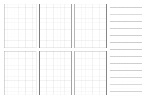
![]() A “six-up” template encourages participants to squeeze out more ideas than they think they’re capable of. Download this template at www.undercoverux.com/resources.
A “six-up” template encourages participants to squeeze out more ideas than they think they’re capable of. Download this template at www.undercoverux.com/resources.
Once time runs out, ask participants to switch to a “one-up” template ![]() . They must now take their best ideas from the six-up phase and distill these into a single sketch, within the same time limit as before. The larger template encourages more detail, meaning participants must resolve some of the unanswered questions from their six-up sketches.
. They must now take their best ideas from the six-up phase and distill these into a single sketch, within the same time limit as before. The larger template encourages more detail, meaning participants must resolve some of the unanswered questions from their six-up sketches.
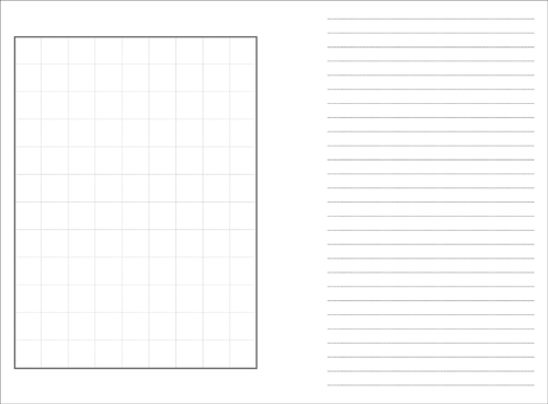
![]() A “one-up” template lets participants explore their best ideas in more detail. Download this template at www.undercoverux.com/resources.
A “one-up” template lets participants explore their best ideas in more detail. Download this template at www.undercoverux.com/resources.
At the end, stick everyone’s sketches on a wall, and ask each participant to explain her ideas, warts and all. Comment on the similarities and differences between people’s approaches, and ask the group to agree which approaches are worth further thought and which don’t warrant further exploration.
The power of Six-to-One comes from forcing people to consider alternative solutions. The first couple of ideas come easily and are usually conservative, based on known conventions. When the tank of obvious ideas runs dry and participants have to think about different ways to tackle the design, the divergent thinking truly begins. Ideas emerge that would never otherwise be considered, and in turn spark new areas of inquiry.
Creative prompts
Although divergent thinking becomes more comfortable with practice, your participants may initially struggle to look from multiple viewpoints. To help ease the transition, consider using creative prompts that encourage people to think in new directions and conjure up interesting solutions.
One of the simplest forms of creative prompt is a prepared list of phrases such as “rotate”, “sharing”, and “images.” Make your own list—it’s much more enjoyable than using someone else’s—and use these words as inspirational triggers. Other creative prompts include outputs from your research (personas or competitive analysis, for instance) or a scrapbook of visual ideas; even something as simple as screenshots and photographs on a shared drive. These stimuli can bring two apparently unrelated ideas together to suggest a new avenue of exploration. In the words of designer Alan Fletcher, sometimes one plus one can make three.
Should you want a more structured approach, consider how you would design a system for various user types. How would your site look if every user were a first time visitor? Or a regular customer? How would you design a screen that suits an impulsive shopper? Or someone who prefers to make decisions based on data?
If you’re still making slow progress, try changing the scale at which you view the problem. Break the problem down into smaller components and tackle those first, or zoom out to see the problem from afar. For instance, could the problem be better solved elsewhere on the site? Or even elsewhere within the business?
Finally, you can provoke new ideas using custom-made tools like Stephen P Anderson’s Mental Notes (www.getmentalnotes.com) or Dan Lockton’s Design with Intent Toolkit (www.danlockton.com/dwi). These tools give insight into the psychology of design and suggest ways of thinking that incorporate these psychological principles.
* Sharing the Spark
After generating so many creative ideas, it’s important to sustain the momentum. Try not to let the organization forget about the UX cause and slip back into its usual mindset.
To keep the fire alive, share your sketches and the outputs of your collaborative design workshops. In particular, stick them up around your workspace in prominent places that are visible to passersby. Sketches and other visual tools are a rare sight in most businesses, and people will usually be curious to know more. Ideally, your sketches will catch a colleague’s eye and cause him to stop for a closer look. You then have the perfect opportunity to answer his questions and talk about the user experience focus you’ve adopted.
Although sharing early concepts can seem premature, the rough and ready nature of your sketches announces that the problem is still unresolved, encouraging others to share their opinions. You can even put up a sign asking people to air their thoughts on your work, or leave a pen nearby so colleagues can add their own ideas.
In this way, the UX design cause spreads across the business, open to anyone who takes an interest. As curator of the concepts, you’ll become known as someone who cares about the design of the site and the experience of users, but you’ll also gain a reputation for openness and honesty. Your ideas, successes and mistakes are there for all to see, and your pride in your work shines through.
Finally, there’s a personal benefit to having your concepts within easy reach. As you work on further concepts or flesh out the details of a proposed solution, your sketches show the shape of both individual pages and the whole site. You can scan ideas quickly while understanding how your design should fit in with the pages that accompany it.
If you’re stuck in an open-plan office without any wall space of your own, see whether you can use communal areas such as break rooms or meeting rooms. You’ll only need a large notice board, a wall, or a window. Do whatever you can to get the team’s sketches and designs in plain view, but if wall space is truly at a premium, capture them with a scanner or digital camera, and share them through your intranet, wiki or email system. Electronic systems are more easily overlooked, but it’s still preferable to hoarding the sketches on your desk, where they’ll quickly be forgotten.
Sketchboards
Design consultancy Adaptive Path developed the sketchboard ![]() as a simple, portable way to display design work in progress.
as a simple, portable way to display design work in progress.
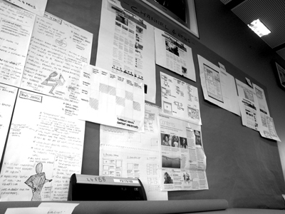
![]() A sketchboard from our work with the UK’s Channel 4 News team.
A sketchboard from our work with the UK’s Channel 4 News team.
* Design Principles
Design principles are a set of pithy, memorable statements that embody the desired experience of your website. They provide a set of criteria against which all major design decisions can be measured, so you keep the individual parts moving in a similar direction.
Features, design, or content alone don’t make an experience. The whole is greater than the sum of its parts, and UX designers should look at a problem from the top down as well as from the bottom up. Design principles give you a way to consider the system as a whole, giving a different view from the world of user interface specifics.
Instead of involving all stakeholders in every design discussion, try to encourage senior managers to agree instead to design principles that can guide the site’s direction. Once senior managers agree design principles, you can use this to encourage delegation. Managers no longer need to be involved in small decisions since the principles act as an agreed reference point.
Even if you aren’t involved directly in these smaller decisions, you can rest assured that the principles will help the business make decisions that have users’ best interests at heart. Design principles are UX knowledge in deep freeze.
Design principles can also help you generate ideas. They offer another way to look at problems, and encourage designs that fit well with other areas of the site.
Composing Design Principles
Try to create design principles early so they can guide your designs. At this stage of the project, you have a solid understanding of the project’s objectives and the needs and motivations of users, but you haven’t yet invested significant time or resources in any particular direction. Agreeing on design principles now can help you design in the right direction, but don’t feel that they should be set in stone yet. Some might shine through at this stage, but others will only emerge with time and the benefit of hindsight.
Look for common characteristics in the ideas and sketches you’ve created so far. What benefits will these ideas bring to users? Do any approaches seem particularly likely to make the project a success? Look for emerging patterns, find simple adjectives to describe them, and build them into fuller design principles as you go.
Here are some tips for creating compelling design principles.
• Keep your design principles brief—below ten words.
• Don’t create too many. Seven is plenty.
• Don’t focus on features or functions. You should be looking to guide and inspire, not prescribe and dictate.
• Stay specific to your project. Universal design truisms such as “design is in the details” and “the user should always comes first” offer little value.
• Avoid ambiguity. Design principles that are open to interpretation don’t work.
• Avoid contradiction and overlap. Each principle should stand alone but work in harmony with the other principles.
• Focus on what makes your experience unique. Would your competitors have the same principle? If so, think again. Check your research to understand what sets your organization apart from the competition, and build your principles around these differences.
• Make your design principles memorable. Don’t be afraid of humor or controversy if it helps the principles gain traction.
Once you have composed and agreed on your design principles with stakeholders, share them widely. Print them on postcards or posters and stick them around the office. The more people know and remember the principles, the easier it will be to refer to them.
Now use the principles to inform and validate your everyday design decisions. Just as you use a persona to assess the likely appeal of features, use design principles to gauge how well these features support the agreed user experience. See “Real-world design decisions” below for examples of how we have used design principles to guide our work.
Good design principles last. They may even outlast your involvement in the project. But they will live even longer if you update them as the project evolves. Build time to validate the principles in your team’s design reviews, and make sure they remain central to the project’s UX strategy. In doing so, you’ll have a better chance to create the cohesive, holistic experiences your users will appreciate.