
2. Exploring the Problem

The experts will tell you that great user experience comes from crystal-clear strategy and exemplary leadership. They’re right of course, but that doesn’t help us much right now. As a UX aficionado in a company that doesn’t share your passion, you’re not going to be able to have that kind of impact right off the bat.
Starting the UX conversation at your organization by asking difficult abstract questions isn’t likely to be effective. It’s easy to point out deficiencies, but what senior managers want is for people to show initiative. So take a pragmatic view, start small and focus on achieving results through UX. Succeed and you’ll gain the ammunition to kick the UX discussion off in the right way. Instead of expressing subjective complaints, you’ll be able to benchmark your site experience against competitors, uncover unknown problems, and highlight areas for improvement.
* Hit the Ground Running
So let’s follow the advice of our manifesto and get right into the action. Here are some undercover UX techniques you can use today that don’t need money or lots of time. You won’t even need official clearance—just find some spare time and do them. These techniques offer a great chance to show the value of UX and will give you a headstart on the hard work that lies ahead.
Expert Review
Estimated time: Two hours.
An expert review—also known as a heuristic evaluation or simply a site review—involves a structured appraisal of your website, exploring UX issues using rules of thumb known as heuristics.
Choose the most important user tasks on your site and step through the various pages involved, considering the points in our heuristic list below. This list gives guiding principles that lie behind a good website, along with some questions to prompt your analysis. It’s based on the work of human-computer interaction experts such as Jakob Nielsen, Rolf Molich, and Bruce Tognazzini, but streamlined for undercover UX work.
The questions listed here are a starting prompt only; don’t be afraid to add more. You can either give your site a score for each heuristic or just record any issues you come across.
Undercover UX heuristics
A good website is:
• Made for humans. Is the site relevant and useful? Is it enjoyable? Does it match users’ mental models—that is, their understanding of how the site should work? Does the site speak in user-friendly language? Does it offer the right level of user control?
• Forgiving. Does the site prevent errors? When errors do occur, are they clearly explained and easy to recover from? Does the site minimize the user’s mental workload?
• Accessible. Is the text legible? Does the site cater to color-blind users? Is there unnecessary animation? Does the site work with assistive technology such as screen readers?
• Self-evident. Is it clear what and who the site is for? Is it easy to navigate? Is the layout logical, with the most important information prominent? Do the icons and graphics make sense?
• Predictable. Is the site consistent? Does it use known web conventions? Are there good defaults for user input? Does the site remember user preferences?
• Efficient. Are text, imagery, and structure concise? Is the site responsive, giving good feedback? Does it prioritize the most important tasks?
• Trustworthy. Is the site accurate? Is its content up-to-date? Are there any bugs? Does the site keep its promises?
The prescriptive nature of expert reviews can feel artificial, but they’re an excellent way to analyze your site against tested design principles. They also help build your familiarity with the site and, by conducting them at regular intervals, you can see whether the site is improving.
Competitive Analysis
Estimated time: one or two days.
A logical next step is to conduct expert reviews on competitor sites. Use the same list as before and add further detail about competitor sites’ functionality, structure, content, and visual style. You can also extend this analysis to well-designed sites that aren’t direct competitors, to act as an aspirational benchmark. Screen shots can help illustrate your thoughts and, if you’re giving scores, plot them on charts for simple comparison ![]() .
.
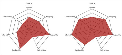
![]() Use radar plots for a quick way to show how your site compares to competitors.
Use radar plots for a quick way to show how your site compares to competitors.
Competitive analysis, twinned with an expert review, is a perfect conversation starter. What do other sites offer that you don’t? What do you offer that they don’t? What opportunities arise? Do your competitors use different language? Are they after the same types of customer?
Competitive analysis can reveal valuable information about the business landscape, but remember it’s only a small step in the UX design process. Don’t get hung up on competitors. If you’re always chasing their tails, how will you ever get ahead?
Analytics Snapshot
Estimated time: one to three days.
Site analytics ![]() are a goldmine for undercover UX work, but they’re often overlooked. Your first task is of course to find out whether you already have analytics data. If you don’t, it should be easy enough to make the case for gathering some: entry-level tools such as Google Analytics (www.google.com/analytics) and Mint (www.haveamint.com) are free or very cheap, and require just a tiny snippet of JavaScript.
are a goldmine for undercover UX work, but they’re often overlooked. Your first task is of course to find out whether you already have analytics data. If you don’t, it should be easy enough to make the case for gathering some: entry-level tools such as Google Analytics (www.google.com/analytics) and Mint (www.haveamint.com) are free or very cheap, and require just a tiny snippet of JavaScript.

![]() Analytics data tells you how people are using your site.
Analytics data tells you how people are using your site.
Leave your analytics software to gather data for at least two weeks, then examine the following metrics for useful clues about how your site is being used and who your users are.
• Unique visitors: how many does your site have? Remember that the more visitors you have, the more diverse they are likely to be.
• New versus returning visitors: whose needs are you serving best?
• Visits per unique visitor: are people coming back regularly, or only using the site once?
• Day and time of visit: are users browsing on the weekends or during the working week?
• Location: are your visitors local or spread across the world?
• Entry pages: are people coming to your homepage or a page deep within your site?
• Bounce rate: what’s the proportion of users who are leaving after seeing just one page? This figure gives a hint about the quality of your entry pages. A bounce rate of 60 percent or higher may be a cause for worry.
• Referring sites: how are users getting to your site anyway?
• Keywords: what phrases are people putting into search engines to find your site? Is your site the right destination for those keywords?
• Navigation paths: are visitors finding the main areas of the site? How? Where are they going next?
• Conversion rate: how many visitors are going on to become registered users? Or customers? How long does this take them?
• Page views per visitor and time spent on site: are these figures increasing? Usually you want them to, but be aware that high values here could also mean that users are getting lost.
• Browser, operating system, and screen resolution: what are people using? This data will suggest technical constraints and can also give subtle hints about users. If they’re using the latest release of Mozilla Firefox, they’re probably web-savvy. If they’re using Microsoft Internet Explorer 6 at 1:00 p.m., they might be surfing on their lunch break. Call it a hunch rather than reliable data, but it can be helpful.
• Registered users and paying customers: what proportion of your users comes from these valuable groups? Is that figure growing? Do these visitors use the site differently than first-timers? How many of your customers visit on any one day?
Search logs
If your site has an internal search function, spend some quality time with your search logs ![]() . Search data can give you pointers about user intent, from which you can infer gaps in your content, reasons for visiting, success (or otherwise) of your navigation, and users’ mental models of the site.
. Search data can give you pointers about user intent, from which you can infer gaps in your content, reasons for visiting, success (or otherwise) of your navigation, and users’ mental models of the site.
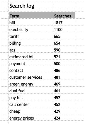
![]() Look at your search logs to see what people are trying to find.
Look at your search logs to see what people are trying to find.
You might be surprised by the most popular search terms on your site. Do they reflect your main business priorities? Is there any pattern to them—for example, seasonal variation? Do visitors use narrow search phrases such as “The Godfather Part II,” or broad terms like “films”? Are people using negative keywords—keywords they want omitted from their search, as in “godfather -films”—to clean up search results? Do any geographic terms crop up in your search logs?
You can run a rough test of the search system by trying the most popular terms yourself. Are the results relevant? Appropriately ranked? Overall, is search helping or hindering users?
Other analytics
There’s plenty more data you can gather beyond regular site analytics. Click-tracking tools such as CrazyEgg (www.crazyegg.com) can help you monitor which links and page elements are attracting attention, by creating a heat map of user clicks. Social media activity can also be revealing, and you may find that the marketing team is already monitoring it. Which pages on the site are people commenting on, retweeting, and saving on social bookmarking sites?
Content Audit
Estimated time: one to five days.
We admit it: content audits are dull. However, if your site is content-heavy and informational, a content audit is the only way to fully understand the structure and quality of the content you offer, which in turn will help you tackle future information architecture (IA) and content challenges. A content audit is also useful for content teams, so partner with them if you can. It can act as the foundation of content strategy and hence provide a way to improve the site’s content and how it’s managed. For more on working with content teams, see Chapter 6, “Working with…”
Begin by taking a content inventory ![]() . Step through your site and map out its structure in a spreadsheet, giving the title and URL of each page, and a short description of its contents (text, images, videos, links). Use indentation to represent the site hierarchy, and introduce a numbering scheme if your site is large enough. Bigger inventories will of course take longer to compile. For very large sites, you may only have time to analyze the first few levels, but try to explore at least a few branches to the end; it’s often in the deep areas of the site that problems lie.
. Step through your site and map out its structure in a spreadsheet, giving the title and URL of each page, and a short description of its contents (text, images, videos, links). Use indentation to represent the site hierarchy, and introduce a numbering scheme if your site is large enough. Bigger inventories will of course take longer to compile. For very large sites, you may only have time to analyze the first few levels, but try to explore at least a few branches to the end; it’s often in the deep areas of the site that problems lie.
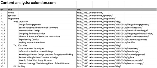
![]() A content inventory helps you come to grips with your site’s content.
A content inventory helps you come to grips with your site’s content.
This simple inventory should help you understand exactly what you’re dealing with and any obvious problems such as gaps, broken links, and inconsistent labeling.
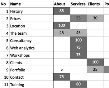
For extra insight, you can build this inventory into a full content audit by adding detail. Take a closer look at the content of each page and comment on how well it meets the likely needs of both businesses and users. Make note of any content that is redundant, outdated or trivial, and provide a score if you wish. If possible, add a column to note who is responsible for this content and give some thought to how frequently the page should be reviewed. You can even enrich your content audit with analytics data. Are the good pages the ones that people are visiting? Are any critical pages hampered by broken links? Is what you’re providing the same as what people are looking for?
Build the Buzz
Alongside these specific techniques, look for ways to share your passion for UX. Forward interesting articles to your teammates, point out novel interfaces on sites you see, or hold a lunchtime workshop to try out UX techniques. Do whatever it takes to get knowledge and enthusiasm into the business.
Also spend some time thinking of a suitable UX kickoff project, preferably something manageable and relatively low-risk to begin with. Perhaps it’s creating personas, improving help pages, or prototyping a new sign-up process. Small projects make good choices since they provide a self-contained way to demonstrate the value of UX. Whatever you choose, write a short outline of the problem and a plan of what you’d like to do. If your subliminal infiltration is successful, eventually someone will officially tell you to “give this UX thing a shot.” Having a project in mind means you can leap at that opportunity.
What’s Next?
These quick undercover techniques won’t give you a conclusive list of your site’s UX problems, but they’ll give you something to get your teeth into. They should at least get people talking about user experience, and might give you a good platform to volunteer for further UX work.
However, don’t expect this quick skirmish to win you the war. To make a convincing case for lasting change, you’ll need to learn more about the business, the site, and who’s using it.
* Defining the Problem
The design process is a complex beast. The experts all agree it’s made up of several phases, but they disagree about what these stages are and where they overlap. Rather than open that can of worms, we’ll just start with what we call the discovery phase, in which you explore what needs to be done and the context of the project.
The techniques we’ve covered helped you hit the ground running, but to make a real difference you should weave UX principles into the entire design process. Look around for a new project that needs some UX love, or take on your starter project as a quick win.
It will be tempting to jump at the chance to learn about users. Hold that thought. You’ll get there soon, but we recommend you first spend time truly understanding the problem you’re trying to solve. In his book Unfolding the Napkin, visual thinking maestro Dan Roam says, “Whoever is best able to describe the problem is the person most likely to solve it.” He’s right. This stage may not be glamorous, but time spent here will be repaid later.
Design Problems
Design problems are typically framed in terms of objectives, requirements, and what we call unrequirements.
Objectives
Objectives answer the question “What do we want to achieve?” If you can become involved in setting project objectives that meet both business and user experience goals, your mission to embed UX is off to a shining start. Here are some example objectives that could be good for both businesses and users:
• Reduce shopping-cart abandonment by 15 percent within a month
• Increase customer repeat business by 10 percent by Christmas
• Reduce log-in errors to 10 per day throughout February
Good objectives should be SMART: specific, measurable, achievable, realistic, and time-bound. Objectives therefore need metrics: measurements that help you know if the objective was met. These may be simple site-use statistics—unique visitors, shopping-cart abandonment rates—or broader, attitudinal data such as the Net Promoter Score.
Requirements
Requirements answer the question “How should we do it?” They’re usually a delicate combination of what users want and what the business needs to earn a profit, and range from the highly specific (“Allow users to upload an image under 1MB”) to the decidedly vague (“Keep my work safe!”).
Unrequirements
If requirements are the “how to,” unrequirements are the “how not to.” They come in two forms: constraints and exclusions.
Constraints are usually imposed and immovable, while requirements are usually chosen and flexible. Constraints may come from many areas—deadlines, technology, regulations, and more—but they exist for every project. Projects with few constraints lend themselves to a more open-ended design, whereas tightly constrained projects require a more focused design. You may find you have a preference for one or the other, but both present interesting UX challenges.
Exclusions are approaches that the business deliberately wants to avoid. Perhaps they want to steer clear of areas that competitors dominate, or ignore feature requests that are too expensive or contravene company policy. Talking about exclusions not only saves effort later in the design process, but can also focus people’s minds on the core essence of the product.
The Impossible Problem
To understand the problem, you just need to find out all the objectives, requirements, and unrequirements. Sound easy? Sadly, it’s impossible. Objectives, requirements, and unrequirements are classic examples of what’s known as “tacit knowledge,” which can never be adequately stated in full. However thorough you are in the discovery phase, extra requirements and constraints will creep out once you start proposing solutions. Sometimes you simply need to see a design to understand why it won’t work.
Design problems are also rife with subjectivity. Everyone has a unique opinion, which will often cause conflict. You might see your Marketing and IT departments locked in a bitter debate over whose requirements are correct, while the users are scratching their heads and asking for something altogether different. Not only that, but people change their minds. Objectives, requirements, and unrequirements appear from nowhere and vanish without warning. Customers start using a competitor, the economy collapses, or your new CEO wants to do things differently.
Since you can never fully understand the problem, you can never design the perfect solution either. Hopefully that’s a liberating feeling; embrace it. In lieu of perfection, your job is to learn whatever you can about the objectives, requirements, and unrequirements of your users and business, and use this information intelligently in your design.
Researching the Business
Unlike most users, businesses aren’t afraid to make demands, so it’s usually not difficult to discover business needs. These needs might be unnecessary, vague, or misdirected, but you should still bring them to the surface. Only when business needs are in the open can you explain how to marry them with the needs of users.
There are two main sources of business objectives, requirements, and unrequirements: the brief and stakeholders.
The brief
First, we need to know if you’re an “innie” or an ”outtie.”
If you’re an outtie, your client will have prepared a written brief. It’ll give basic information about how your client sees the design problem and what they’re hoping for in a solution. You’ll find similar information in the Request for Proposal (RFP), or they may even be the same document. If you’re an innie, there probably won’t be a brief per se, but whoever kick-started the project will have created a business case explaining their view of the problem and the benefits of solving it. This could be held in a formal project initiation document or simply an email.
Note
Innie or outtie? Don’t worry, it’s not a personal question. An “innie” is someone who works in-house, and an “outtie” is an external consultant or agency employee. We’ll use these terms a fair bit, so work out which term applies to you.
The brief will never tell you the whole story, but getting your hands on it will save you valuable time in the discovery phase.
Stakeholder interviews
Every project has two types of stakeholder: people who can affect the project, and people whom the project affects. Both groups can help you understand business needs, so find out who your stakeholders are and talk to them, either in an informal chat or a scheduled interview.
It can be hard to arrange these conversations, particularly with senior stakeholders or people in different offices, but be politely persistent and be sure to talk with everyone who can affect the project’s outcome. Poor access to stakeholders can seriously delay UX projects, and there’s nothing worse than seeing your hard work wasted because you didn’t talk to the right person in advance.
Here are some questions we ask stakeholders on our projects. Since we’re outties, we ask for lots of background information, but we never ask all of these questions. Instead, we pick ones that are most relevant and add others as we see fit. You should too.
The organization
• What’s the organization’s history?
• What’s the current standing of the organization?
• What are the organization’s goals?
• Who are our competitors?
• What are our strengths and weaknesses compared with them?
• How is the organization structured?
• How do we want the organization to be seen?
The site
• What’s the site for?
• What’s the site’s history?
• What does the site do well? Poorly?
• What technical platform does it run on?
• Does the site use a content management system (CMS)?
• What content management processes support the site?
• How much flexibility for technical change is there?
• How would you rate the site’s usability? Structure? Content? Visual design?
• Who are the current users?
• Are they the people the company is targeting?
• What characteristics do they have?
• Why do they use our site and not a competitor’s?
• What do users say about our site?
• How do they use our site now?
• What do users need to do for us to be successful?
People
• What’s your role in the project?
• Who else is working on the project?
• What are their roles?
• What is the decision-making/sign-off process? How long will it take?
• Who else do we need to talk to?
The project
• What problem will the project solve?
• What are the project’s objectives?
• How do they relate to the overall business objectives?
• Why are we doing the project now?
• What specific project requirements do you have?
• What are the constraints (time, resources, technical, legal, and so on)?
• What’s causing them?
• When do you think the project will be released?
• Have we tried anything like this before? What happened?
• Does anyone else do this well?
• What factors could make the project a success? Could we handle success?
• What issues could throw the project off course? Could we handle failure?
• How could we really screw this up?
• How will we measure success or failure?
• What’s your gut feeling about the project?
Take thorough notes either by hand or, if possible, audio recording since you’ll revisit these answers throughout the process. As you review your notes, look out for anything that sounds like an objective, a requirement, or an unrequirement.
* Culture
The brief and your stakeholder interviews are a great start to the discovery phase, but the skilled undercover UX designer must also read between the lines.
Just like people, organizations have complex and varied personalities, so a design approach that works in one situation could fall flat on its face in another. It takes skill and practice to appreciate the cultural factors that affect design, but the rewards are substantial. Understand what makes the organization tick, and you can anticipate problems before they happen and tailor your approach accordingly; this is all the more important if you don’t have the luxury of trying various strategies to see which fits.
Innies will already have a feel for the organizational culture. Outties should make finding it out a top priority. Look over the notes from your stakeholder interviews. What do people talk about most? Are stakeholders motivated by numbers? Or success stories? Are there any terms, phrases, or concepts that hint at the underlying corporate mentality? One useful exercise is to write down the adjectives you would use to describe the organization to a friend. Innovative? Conservative? Angry? Efficient? Then consider how these traits could affect your undercover UX quest. It can be helpful to take your adjectives to extremes and consider the impact they would have. For example, a “nimble” company could, at its worst, become flighty and unable to commit to an idea. This would suggest you should focus on execution and a defined sign-off process so that new ideas don’t become a distraction.
Red Flags
With experience, you’ll develop a sixth sense for cultural red flags, and learn ways to change your approach accordingly. Here are some warning signs we watch for in new projects.
Design disinterest
Many organizations simply don’t care about design, or see it as an expensive luxury rather than a strategic investment. The website might have been made by hired hands, but ongoing design (if there is any) is undertaken by staff with little design training. Without clear ownership, the site usually degrades from its launch state until finally another redesign is grudgingly approved.
Thankfully, these organizations are ripe for a UX intervention. Done right, UX can set these companies apart from their competitors, helping them reach new customers, sell more, and pull ahead. However, you must make the value of this disruptive new approach clear—and the sooner the better, so that you yourself don’t become fossilized into a particular role or mindset. So hit the ground running and keep pushing. Focus on small, winnable areas, supplementing them with case studies showing the difference design has made in similar companies, and you can demonstrate return on investment for UX work.
Cash cows
Cash cows are products or site sections that earn serious revenue. They’re typically fueled by very high traffic, or they may be critical pages on sites with large, passionate user bases. Cash cows are protected zealously either by the business or users. As such, they’re risky targets for undercover UX work. Unless you can prove you’ll have a positive effect, you won’t be allowed to make meaningful changes to that part of the site. You may prefer to aim for easier wins and build trust in your ability, but if you still want to take on the challenge of a cash cow, you’ll need a low-risk approach. This means conducting thorough research to prove you understand user and business needs, heavy testing to make sure your design works (see Chapter 5), and carefully managing stakeholder and user concerns. Even with these safeguards, be ready to fail fast and don’t get attached to your solutions. If they don’t work, they’ll be abandoned immediately.
Enormous expectations
If different stakeholders have conflicting expectations of the project, or it is seen as the savior of all the company’s ills, trouble usually lies ahead. Sky-high expectations can cause disappointment, paralyzing fear of failure, and poor decisions. In these conditions, clarify expectations in advance, revisiting the objectives, requirements, and unrequirements, and agreeing on whose version is the one that matters. You may need to downplay particularly unrealistic expectations in light of your time or budget constraints and prioritize problems accordingly. Strong research can greatly help refocus people on customer needs rather than their own flights of fancy. Learning more about users increases your chance of getting things right and thus satisfying stakeholders’ expectations.
Power problems
Every organization has its own approach to authority and sign-off. Some companies make decisions as a team, some as a dictatorship. Either extreme can make life difficult for UX designers. Flat power structures typically mean lots of stakeholders and the dreaded “design by committee,” while a project with a dominant senior authority can mean you’re subject to personal whim, even in the face of clear contradicting opinions from his staff and users. Power struggles between departments are equally dangerous: designers can be caught between these warring factions, causing frustration and wasting time. Finally, external designers are sometimes brought in “too low down the chart.” As an outtie, you may have been hired by a middle manager: will this person actually have the final say?
Concerns about sign-off authority are awkward but should be raised early in the project, before they create too much tension. You should diplomatically clarify whose authority is final—you might have to ask senior managers—and ensure you have access to that person early in the project. You may need to involve her in your sign-off process or persuade her to delegate responsibility to a subordinate if she can’t spare the time. You might also allow more time for review and sign-off if you foresee power problems.
Difficult deadlines
Does the organization want an exemplary site no matter how long it takes, or are there immovable deadlines for the project? If time constraints are unrealistic, find out what’s driving them. External deadlines are usually enforced, but internal ones may be chosen for convenience. If deadlines are indeed fixed, be prepared to vary scope and pare functionality down to a minimum, postponing inessential requirements until a future release. You should also consider keeping your documentation quick and low fidelity, and heavily involving others in the design process so you don’t become a bottleneck.
Paralyzing process
Large organizations in particular can be hamstrung by process. Did it take you weeks to get an access badge? Does the site have pressing legal implications? Does everything have to be put in writing? Process-heavy organizations are prone to the “That’s not how we do things around here” syndrome, which quickly suffocates the user-centered spirit. The good news is that you can do a lot of UX work in these companies without anyone even noticing. Instead of taking on the futile challenge of proposing new processes, work quickly and stealthily so you can demonstrate successful results. It will still be an uphill struggle, but if senior staff in these organizations see UX design as good practice, they’ll push for it to be integrated into the entire business. Convince these influential implementers of process and you’re set for life.
Content confusion
Large informational sites hold an enormous amount of content, which needs careful curation and management. Unless thorough content strategy and processes are in place, these projects will cause painful content bottlenecks. Content management systems (CMSs) can relieve the labor but introduce extra technical constraints, so learn about the system you’re using. Additionally, buddy up with content colleagues, put aside extra time to handle content provision, and phase content work early in the project. Ideally your project team will include a content strategist; if not, you may have to adopt the role and push content to the top of everyone’s priority list (see Chapter 6).
Culture and Relationships
Taking the time to talk with people, listen to them, and learn about your organization’s culture will help you not only to plan your work, but also to build relationships. You may have noticed that the stakeholder questions all spoke of “our” needs, not “yours.” This is an important point, even if you’re an external consultant. This attitude of ownership helps build a collaborative mindset.
You’ll need to find allies to do effective undercover UX work, and it’s easier to work with friends. If you genuinely understand and care about their concerns, they’ll help your cause by contributing to design, committing to action, and co-owning the results. As we mentioned, UX requires asking difficult questions; it may create more work for your colleagues or erode some of their power. But if these people like and trust you, they’ll be more receptive to ideas they’d otherwise resist.
* User Research Under the Radar
There aren’t many shortcuts to all this business analysis, but it’s essential. UX design requires a careful balance between the needs of business and customer, and without either half, the equation fails. So now that you’ve learned about the problem from the business perspective, it’s time to find out how to thrill your users.
Do you Need to Research?
User research isn’t an easy sell to most businesses. It has a reputation for being long, expensive, and hard to act upon. Some companies even claim it’s a waste of time. Instead, they believe in “scratching your own itch”—that is, making software for your own needs. This is an excellent approach if you genuinely represent the target audience. In these situations, the design process flows naturally since you can answer questions and make clear decisions without recourse to research and testing. But most of us aren’t the end users of our websites, so this approach only works in select circumstances.
Similarly, marketing specialists often think that design can be based on market research. On the surface, it’s understandable: market research and user research both reveal valuable information about customers and how to reach out to them. However, they focus on different things. Market research is primarily about opinions: about a brand, about personal beliefs, or about a specific marketing approach. User research is about behavior: what drives people, how they do things, how and why they’re likely to use your site.
So is market research useless for UX design? Certainly not. Most marketing teams really do care about the customer. They’re usually very research-focused and as such possess mountains of data, which can help you understand who your users are. By supplementing this with user research to find out why and how they’ll use the site, you can build a better picture of customers. So don’t think of it as a research deathmatch where only one format can win; both market research and user research are relevant to both UX and marketing staff, and it can be a great way to build a relationship between the departments.
Sometimes it’s true that user research is overkill. For small, low-risk projects it’s better to get something out there and improve it through testing and trial and error. But on any decent-sized project where quality matters, user research will help.
Get Permission or Go Undercover?
As an innie, it might not be too hard to persuade the company to undertake user research. After all, most organizations see the importance of building up knowledge of the customer. However, if you’re an outtie, you’ll have a tougher time of it. Unless clients are already willing to pay for user research, they might deem it unnecessary—particularly if it’s the consultant, rather than the business, that’s going to benefit from the knowledge. To get agreement for user research in these circumstances, you need to be involved in writing proposals, going to pitches, and getting clients to talk about user experience.
Until then, or if you think asking permission will be more trouble than it’s worth, you can conduct research under the radar. Undercover methods might cost you a few lunchtimes or a few favors, but they’re worth the effort. On the upside, with these lightweight methods, you’ll find your designs are much stronger and the case for UX should be firmer.
Finding Participants
First, you’ll need to find people to talk to. There are many ways to approach this.
Research recruiters
If money is no object, pay a research recruiting service. It’ll help you define a target profile, find participants, and schedule sessions. However, it’s expensive: often over $100 per user. If you have this kind of budget, don’t hesitate to use it, but for most undercover work you’ll probably want to recruit users yourself.
Existing customers
Talk with your customer service or sales teams to see if they could identify people who’ll be willing to help—these could be local customers, or people farther afield if you don’t mind doing some remote research.
Alternatively, you could approach people in your customer database. Emailing is a quick and cheap approach, but be careful of data protection law: in some countries, the customers will have had to consent to receiving emails first. If your site has user forums, or you know of other places online where your potential customers hang out, you might be able to approach people there, as long as you do so with the right attitude and treat the community with honesty and respect. You could also consider recruiting directly through your site: you can build a recruitment form either on the site itself or with a service such as Google Docs (http://docs.google.com) or Wufoo (www.wufoo.com), and direct a select group of users to the form by a link or a pop-up panel on your homepage.
Friends, family and colleagues
Friends and family may be appropriate undercover research participants if they’re representative of the site’s users. Ask around, or put the word out on Facebook, Twitter, and similar sites. However, keep an eye on who you’re getting. It’s easy to end up with people similar to yourself who don’t really reflect the diversity of your users.
If you work in a large organization, you could try asking employees to participate in your undercover research. There will be a large pool of people to draw from with a wide range of technical literacy, but be aware that their domain knowledge may skew your results.
Public recruitment
Finally, you can resort to complete strangers. It’s often surprisingly effective to pop to a local coffee shop and ask people for ten minutes in exchange for their coffee. The online equivalent is to post a message on a free classifieds site such as Craigslist. You’ll probably want to use a short screener: a set of simple questions designed to filter out people who don’t fit the profile for your research. In our experience, students, the unemployed, and stay-at-home parents tend to be over-represented when recruiting through classified ads, especially if you are asking them to be available during working hours.
Your knowledge of your user base will help you know whether public recruitment is appropriate. For sites with broad appeal, it can be easy and worthwhile, but if your site is aimed at a niche user base—for example, commercial pilots—you’re wasting your time. For these specialists, go straight to your existing customers or find the money somehow and commission a recruiter.
If you’re handling the recruitment alone, allow yourself sufficient time. You’ll need to find people, assess their suitability, schedule mutually acceptable times, and sort out payment, so you’ll need a couple of hours per user.
Incentives
Existing customers will often give up their time for free; being heard can be sufficient payoff. But for people who don’t already have an emotional connection to your website, you’ll need to provide an incentive.
This is usually driven by what you can come up with. Cash is ideal ($40 a hour and above), but you may find it easier to arrange gift vouchers, free subscriptions, or whatever your finance team or client will allow. If you’re going with the coffee shop approach, bring cash and try your luck at persuading people to help in exchange for a cup of coffee and a muffin. Keep the receipts and claim them on expenses, but do clear this first so you don’t end up paying out of your own pocket.
Research Methods
All research methods have advantages and limitations, with some particularly suited to undercover work. Rather than blindly applying your favorite approach, become familiar with a range of methods and choose the right one based on your project’s circumstances.
Corridor test
One of the simplest ways to find out more about users is to watch them using your existing site. (Since we also recommend you do this frequently with your own designs, we’ll cover guerrilla usability testing in depth in Chapter 5.) A corridor test is so called because all it takes is a laptop and a passerby, assuming they’re not heavily involved with the site. You can even ask employees in the lunchroom or agency colleagues working on other projects. Ask them to run through some critical tasks on the site. By watching how they use the site, you can uncover flaws with the existing system.
One-on-one interviews
The most obvious way to find out more about people is to talk with them. Interviews can tell you not only how customers might use your site, but also more about their lives, needs, and motivations.
Tip
If at all possible, and with the participant’s permission, record interviews on a voice recorder or a laptop (free software such as Audacity and GarageBand is ideal). It’s still worth bringing along a pen and paper to face-to-face interviews, since you or the participant might want to sketch out a particular point. Taking pictures or video with your cellphone is a great way to preserve these diagrams for future use.
A good interviewer uses a number of well-known techniques:
• Asking open-ended questions that encourage the participant to elaborate (who, what, where, when, why, and how questions are particularly useful)
• Avoiding leading questions that might distort responses (for example, “What’s wrong with our website?”)
• Clarifying understanding by paraphrasing what the participant says
However, the undercover interviewer needs another skill: the art of small talk. You won’t have a great deal of time to plan sessions in detail, so you should be comfortable listening to people and getting them to open up. The more confident you are at talking to different types of people, the better you’ll be at research interviews and truly listening to what people have to say. If small talk isn’t your strong point, maybe it’s an excuse go to more parties—for research purposes, of course.
Face-to-face interviews make it easier to build rapport, but they can take a lot of arrangement. If you need to talk to geographically remote users or don’t have the time to travel around to meet people, remote interviews are an excellent undercover tool. You can either use the phone (make sure you’re paying!) or, if your participants are technically proficient, voice over IP (VoIP) software such as Skype. If you’re holding a phone interview, it can be helpful if the participant is near a computer with internet access so you can refer to the site itself. Interviews can be tiring and generate large amounts of information that need processing, so try not to schedule more than three a day.
Group interviews and focus groups
If you’re really pressed for time or can’t arrange to meet people individually, group interviews can help. However, there’s significant baggage to be aware of. The focus group, close cousin of the group interview, has a bad reputation among user researchers, since it’s used mostly as a market research tool. Although the group format can be a helpful vehicle for user research, we strongly recommend avoiding the “focus group” label, which will instill certain presumptions and arouse suspicion in your marketing colleagues.
Note
A focus group is a form of qualitative research in which a representative group of people are led through a structured discussion in order to reveal their desires, opinions, and attitudes toward a product or service.
One of the major difficulties with group formats is ensuring that loud and opinionated participants don’t overwhelm a group. As facilitator, you need to tactfully encourage others to have an equal say.
Don’t even think of using a group interview to test an interface. Group interviews are tools for research, not evaluation. Save them for times you want to learn about the potential audience for a new idea and their responses to specific suggestions.
Contextual inquiry
Interviews have limitations, not least the problem of self-reporting. People naturally omit salient points or make inaccurate claims about their goals because of the challenges of remembering details and the unusual task of self-analysis. Contextual inquiry—studying people as they go about their daily lives —avoids these problems.
Contextual inquiry isn’t really undercover: you can’t exactly do it on your lunch break. But you still have options. Jump at the opportunity to go on site visits—perhaps with sales staff as they meet new prospects or with engineers when they go to customer sites. If possible, ask in advance if you can shadow an end user while you’re there. Customers are often quite happy for you to do this, since it shows you’re genuinely interested in trying to make a site that will benefit them. While shadowing, you’ll mostly observe and take notes, but you may be able to ask some interview questions during a quiet moment, so pick some juicy ones. Two that we’ve found particularly useful are “What one thing could we do to make your life easier?” and “What other sites or companies do this well?”
While we’re on the topic, contextual inquiry is one of those jargon phrases that we don’t recommend you use too widely. Direct observation or fly on the wall is a good substitute.
Note
Contextual inquiry is a technique for examining and understanding how users interact with products or services in their natural environment. Using a combination of direct observation and interview, the technique provides detailed insight on tasks, pain points and user preferences.
Surveys
Surveys have the clear undercover advantages of being quick, cheap, and easy to analyze, even with lots of responses. Survey results are unambiguous and direct: unlike other methods, there’s no need to “read the tea leaves”—meaning they often give clear and powerful evidence to support or disprove a particular belief. However, like other quantitative methods, surveys tell you the what, but not the why. They’re best paired with qualitative methods like interviews.
Your survey should consist mostly of closed questions, yes/no responses, and Likert scales (such as a scale from “Disagree strongly” to “Agree strongly”), but you can also include more open-ended questions. Be aware that these will dramatically increase analysis time, so start with a small sample size so as not to overwhelm yourself, and seek more responses if you need further information.
Many organizations already conduct regular surveys, so instead of creating one from scratch, you may be able to piggyback one or suggest a collaborative survey with other teams who need customer feedback. Online tools such as Survey-Monkey (www.surveymonkey.com) can make your job easier, but make sure that your organization is comfortable with you using a third-party service, since data may be stored externally.
Customer feedback
Customer service representatives are the undercover UX designer’s best friend. However large the organization, they’re always closest to real users and can be an invaluable source of information about customer needs and issues.
Most customer service reps will be glad of the opportunity to share their knowledge, and a day spent shadowing front-line reps can teach you more than a week of focus groups. Customer service reps can also provide invaluable knowledge about patterns in customer types or behavior. For instance, do inquiries come from men or women? Are they typically new customers or repeat customers? What are their typical frustrations? How interested are they in different features of the company’s products? In addition to talking to and shadowing customer service staff, ask whether the organization keeps a log of feature requests from customers. Some of these ideas will be extremely valuable. Some will be useless. Either way, a short time trawling through these requests can often give a clearer understanding of users’ pain points.
Just bear in mind that customer feedback is by its nature exceptional. This data will show an inherent bias toward customers who have enough free time to contact the company, or those who are stuck and have gripes they need help with. Satisfied or busy users won’t appear on the customer service radar.
Card sorting
A card sort is a tool for examining how people group topics. The technique is simple. Write down topics or site sections on index cards and ask your participants to group related items. In an open card sort, participants can group the cards freely, and then choose a label for each group. In a closed sort, cards must be grouped into predetermined categories. Card sorts are predominantly used to determine labeling and structure, but can also reveal deeper insights into people’s expectations of content and functionality.
It’s straightforward to add a card sort onto other research methods, especially interviews. Simply allow an extra 10 to 15 minutes at the end to explain the process, run the test, and note the results. Remote card sorting tools such as OptimalSort (www.optimalworkshop.com/optimalsort.htm) and WebSort (www.websort.net) let you run tests online, but we believe card sorting is better done in person if possible. Not only can you explain the rules of the game more effectively, but also you can question the participant about why they made certain choices.
Card sorting can help you understand how users form relationships between concepts, and allow you to create a shared vocabulary from the results. They can also generate surprisingly convincing quantitative data. Many card sort analysis templates—such as Donna Spencer’s free template (www.rosenfeldmedia.com/books/cardsorting/blog/card_sort_analysis_spreadsheet)—include basic cluster analysis, which can give highly visual results ![]() . Closed card sorts are easier to analyze than open ones.
. Closed card sorts are easier to analyze than open ones.
![]() Card sorts can give surprisingly quantifiable results.
Card sorts can give surprisingly quantifiable results.
Third-party research
External research such as market reports can be a useful supplement to your knowledge. However, they’re a poor substitute for firsthand user research. In the words of Jared Spool, outsourcing your research “is like outsourcing your vacation. It gets the job done, but not the results you were seeking.”
For other external advice, consider reaching out to fellow specialists on UX mailing lists and blogs. Many will have encountered similar projects before or have sector experience that can aid your understanding. However, each project is different, so be wary of relying too much on third-party information. Also be sure to protect your client’s confidentiality if you’ve signed a nondisclosure agreement (NDA).
Other research methods
Subject-matter experts (SMEs) within an organization will certainly have something to say about users and their habits. On occasion, they may get so caught up in the minutiae of the topic that they overlook bigger issues, but SMEs will have valuable knowledge of the end user, any noticeable clusters, and their likely behaviors. This can give you a great start, but try to back up their suggestions with first-hand research.
Some circumstances may call for you to use less popular research methods. In a trigger word analysis, you simply give users a representative task and ask what words or phrases they would look for on the user interface (UI). A task like “Learn about member discounts” might elicit words or phrases such as benefits, money off, membership deals, and so on; you can then analyze these results and ensure they are incorporated in your content strategy or UI itself.
Finally, for user interactions that happen over a long time, diary studies can prove useful. These involve asking users to record all their interactions with a particular product or task over a long time frame, such as a week. As such, they’re not ideal for undercover work, but they can be useful if you need to know how people approach a complicated task that can’t be done in one sitting. Where appropriate, cellphone cameras are excellent tools for turning a diary study into a photo journal.
Recording and Analyzing Research
After your research is complete, you need to put some time aside to analyze it. Revisit your recordings and notes, keeping an eye out for repeated themes. Do users talk about their goals? What are their likes and dislikes? Where are their needs not being met? Do they have any interesting alternative approaches? What language do they use to describe the domain? To parallel the business objectives, requirements, and unrequirements, draw up a similar list for users.
While you’re analyzing your research, make a note of your techniques. Did you ask the right questions? Did you let the participant speak or constantly interrupt them? What worked? What didn’t? What would you change next time?
There’s no magic to research analysis except hard work, lots of sticky notes, and grouping. But, just like the business research, put in the effort here and your designs will be stronger and more likely to be useful.
How Much Research is Enough?
No matter how much research you have, a UX designer will always yearn for more. So it’s best to let your project time line dictate how much effort to dedicate to research. If you only have, say, ten weeks, you won’t want to be researching into week five. But don’t panic if you can’t do as much up-front research as you’d like. You can still learn about users later in the design process. We’ll talk more about that in Chapter 5, “Refining Your Solution.”
* Research Outputs
Most UX books advise that you pause at this stage to present your research to your stakeholders or client. But if you’re undercover, we’re not so sure.
The main reason to present your research is to get sign-off. Certainly if you asked for permission to conduct the research, you need to report back with your findings. Similarly, if people need to approve the objectives, requirements, and unrequirements you’ve gleaned, pause here to get consensus. But if you ran the research without the organization knowing, it’s usually easier to convince people of the benefits of UX once you can show them designs—asking for blessing to continue opens up the possibility of denial. In this scenario, you should still analyze and summarize your research carefully, even if you don’t share it yet. You’ll need to back up your design decisions later, and the act of condensing research into a digestible format will help you focus on the most important issues.
But let’s assume that you need to come up for air and show your work so far. In what formats should you present your research?
Just the Executive Summary
We don’t recommend writing a big report. If your company’s not particularly into design, your report could lie forever unread on someone’s desk. That’s not going to start the organization thinking about UX. Instead, write just the executive summary. Summarize both the business needs and the user needs—one or two pages should suffice—and circulate this among your key stakeholders.
The approach you take is important. Don’t just mention the problems; talk about how you’ll address them, too (hopefully using the techniques we’ll cover in the next few chapters). Assume agreement instead of asking permission. “We have some problems; can I fix them?” shows less confidence and initiative than “I thought I’d look at the user experience of our site. We have some problems, so here’s my plan to fix them.” This may sound presumptuous, but think of it this way: If your dentist asked if he could treat you with a new procedure, what would you think? Probably “What’s the downside?” and “Could this go wrong?” Now how about if he just told you instead? You’d let him get on with it and wonder why on earth he thought you’d care.
One or two pages isn’t much, so you’ll have to leave things out of this executive summary. That’s fine. If people want to know more, they can talk to you in person. That’s a big win for your cause. It means you get a chance to talk to people about UX, and it’s much harder for them to shut down your enthusiasm and knowledge in person than it is on paper.
Whatever you include in the report, keep it personal and relevant. Although it can be useful to discuss general findings, individual stories can lend authenticity to your work. These could be stories you heard firsthand from research participants, or perhaps feedback from shadowing the customer service team. Quotations can be very persuasive, as can corridor test videos if you have them.
Quantitative Data
Although your research findings are probably mostly qualitative, numerical data can add legitimacy to your findings. Analytics data can be displayed graphically, as can card sort clusters, usability test success rates, customer complaints, and, of course, surveys ![]() . Some stakeholders will respond better to charts and numbers than words; hopefully your interviews and cultural analysis will have identified the people for whom you should take this approach. If you’re dealing with a lot of quantitative data, it’s worth learning some basic statistics so you can see the true patterns in your data, as well as how the data could be abused or misinterpreted.
. Some stakeholders will respond better to charts and numbers than words; hopefully your interviews and cultural analysis will have identified the people for whom you should take this approach. If you’re dealing with a lot of quantitative data, it’s worth learning some basic statistics so you can see the true patterns in your data, as well as how the data could be abused or misinterpreted.
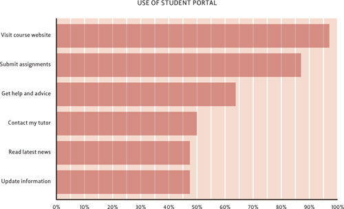
![]() You can graphically display user responses gathered from a survey.
You can graphically display user responses gathered from a survey.
Personas
Personas are research-based documents that describe typical users. Each persona contains a name, photo, age, occupation and a brief description of the person, their traits and their habits ![]() . Personas are the ideal tool to give everyone a shared view of genuine customers. Like secret agents synchronizing their watches, they give stakeholders a common reference point, helping people make decisions for customer needs, not their own. But they also have another benefit: they get people talking about user experience and how to design a website for customers. Exactly what we want.
. Personas are the ideal tool to give everyone a shared view of genuine customers. Like secret agents synchronizing their watches, they give stakeholders a common reference point, helping people make decisions for customer needs, not their own. But they also have another benefit: they get people talking about user experience and how to design a website for customers. Exactly what we want.
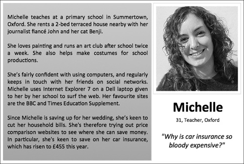
![]() A simple persona helps the team focus on users, not assumptions.
A simple persona helps the team focus on users, not assumptions.
Since Alan Cooper introduced the concept of personas in his book The Inmates Are Running the Asylum, thousands of people have tried them in their own organizations. It’s now widely agreed that for best results, you should interview dozens of representative users and identify common goals, traits, and behaviors. Creating a set of robust research-driven personas can take weeks. But what if you don’t have that luxury? Is it possible to make quick, cheap, undercover personas?
Cut-price personas
When you raise the topic of personas, your marketing team may question the need. If they’ve spent a long time working on a detailed market segmentation project, they’re likely to query what personas offer that marketing data doesn’t.
It’s a fair point. Some UX designers see a clear dividing line between the two forms of data, explaining that market segments don’t address the most important design issues such as why people come to the site and the role it will play in their lives. These designer argue that it’s easier to design for a person (Joe, aged 34) than numbers (a group that’s 78% male, aged 26-35), and that marketing data tells us little about people’s mental models, the language they use, and so on.
In our undercover world, these differences are accurate in principle but petty in practice. Personas represent the other side of the marketing data coin. Segments cluster individuals into groups. Personas create individuals to represent groups. Since we prefer good design today to great design next year, marketing data is a decent starting point for cut-price personas.
Look at the marketing data the organization has gathered and you may be surprised at what it contains. Although demographic information will probably dominate, you may find information about other purchasing behaviors, sites that these users visit, and even psychographic information such as the VALS segmentation tool (www.strategicbusinessinsights.com/vals). Instead of instinctively rejecting this information, build on it, explaining that by creating a realistic persona to represent each segment you will be able to design a more effective site.
Of course, cut-price personas have limitations. Ideally, you should supplement them with firsthand research, surveys, analytics and any other information you can gather. However, UX designers are naturally skilled at evaluating information, understanding bias, and coming to even-handed solutions. Keep your wits about you, and you might find that cut-price personas suffice for your initial design work. We don’t recommend you rely on cut-price personas for critical decisions, but they do a good job as a tool to get the organization talking. Your personas will already have the support of your marketing colleagues and your willingness to work with, not against, other teams will smooth the adoption of UX techniques.
Treat cut-price personas as living hypotheses; keep them sketchy to begin with, and slowly refine them as you build up your behavioral understanding of users throughout the project. Perversely, ambiguity can help your case for conducting user research: “Let’s settle this by talking to people directly.”
Another technique is to base a persona on someone you already know. Just like “scratching your own itch,” this provides an unambiguous reference point, but it comes with dangers. The primary risk is that you’ll become locked into that persona and, when confronted with more data, won’t be able to evolve the persona in a different direction. Again, be aware of the limitations of this approach, and consider your persona a stand-in until you can talk with enough users to check its validity.
Persona tips
Choosing believable names and photos for your personas can take longer than you’d think. To save time, search on dating sites to find photos of suitably aged people—so long as your personas won’t be made publicly available, of course. Then, calculate your persona’s year of birth and pick a unique initial for their first name, to reduce the chance of people mixing up your personas. You can then use name charts (such as www.babynamewizard.com/namevoyager) to find popular names from that era.
If a full persona would be overkill, think creatively about how to achieve the same goal. Do your research participants write a blog, upload photos on Flickr, or post on Twitter? Could you take a snapshot and share it with the team? (Don’t share anything personal, of course.)
Most stakeholders embrace personas since they give a personal view on the customer that’s rarely seen. However, some stakeholders—usually the ones who rely on numerical evidence—consider personas too flimsy since they by necessity involve a little creative license. You will need to convince these people by showing the rigor of your research, rather than the output; the quantitative approaches mentioned above are likely to be more persuasive.
The other source of resistance is the refrain “But we want our website to work for everyone!” You can counter this with a thought experiment. Ask your stakeholder to imagine how they’d explain a complex concept, such as inflation, to a friend. They might choose to use pictures, words, or both. Then ask them to imagine how they’d explain the same topic to a 10-year-old schoolgirl and to an economics graduate. Would they use the same language? The same pictures? The lesson is of course that it’s impossible to write and design in a way that communicates equally with everyone. Once you put pen to paper, you inevitably use a style that will appeal to some people more than others. The same goes for your website. Personas are therefore about playing to your strengths. Rather than trying to appeal to everyone and ending up pleasing no one, you choose the right customers and talk to them in their language.
However good your personas, don’t let them become a safety blanket. They provide an ideal snapshot of users, but you should continually keep your knowledge fresh by talking with users and testing your designs.
Scenarios
Personas are useful tools to understand users, but they don’t offer much insight into how people will interact with the site. You can use scenarios to explain why personas come to the site and how they use it to meet their goals.
Good scenarios tell the whole story of how the persona’s problem is solved before, during, and after their interactions with your site. What tasks are they trying to achieve, and what needs do they have? How would they get to your site? Once they’re on the site, where do they go? At what stages do they need to pause to gather information, review their options, or discuss with a friend? Does the story end happily ever after? Will they use the service again?
Storyboards & Comics
Scenarios are usually textual, but they’re natural candidates for visual presentation. If you have time and confidence in your drawing ability, storyboards and comics can bring scenarios to life ![]() . All you need are some basic drawing skills—how to combine simple shapes into scenes and how to put people into basic poses—to make convincing stories. Just like a scenario, your storyboards can focus on details of users’ lives, not just their limited interactions with the site.
. All you need are some basic drawing skills—how to combine simple shapes into scenes and how to put people into basic poses—to make convincing stories. Just like a scenario, your storyboards can focus on details of users’ lives, not just their limited interactions with the site.
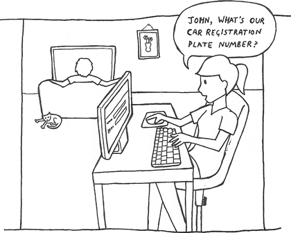
![]() Comics can communicate the context of a user’s visit.
Comics can communicate the context of a user’s visit.
We’ll cover some basic sketching techniques in the next chapter, but if you’re not confident in your abilities, you can create comics by taking posed photographs and tracing over them. There’s plenty of software (such as Plasq’s Comic Life, www.plasq.com/comiclife) to help you create convincing comics from scratch.
Other Formats
There are a few other well-known UX research deliverables—tools like Mental Models, popularized by Indi Young, and concept maps—but they’re not ideal for undercover work. Instead, they excel on large projects that involve modeling an entire domain and very diverse user needs.
However, don’t be afraid to improvise. You’ll want your organization to see UX as a new, refreshing way to look at the world: is another dreary document going to excite your colleagues? Novel formats can be catalysts for conversation. Storyboards and comics are particularly unusual in business, but feel free to get creative and create your own formats. How about a newspaper-style report, or a small deck of persona playing cards?
Whatever the format, good research generates discussion. Your stakeholders or clients will want to contribute their own views on users and their tasks, and often these sessions will lead to conversations about possible design solutions. Next, we’ll talk about how to take the hard work you’ve done in the discovery phase and generate ideas that put users first.