
11
CAUSATION
The joy of social science lies in the discovery of relationships between variables. Following the Wheel of Science allows us to think about how one variable may cause changes in another variable. Using theory to propose hypotheses lets us see if variables impact each other. Up to this point we’ve relied on looking at simple relationships that link an independent variable with a dependent variable. In thinking about how one variable causes changes to another variable, however, it is seldom the case that only one variable is involved.
Let’s go back to our earlier discussion regarding the relationship between education and income. Is it really that education, alone, causes changes to income? We noted previously that if we didn’t believe that education impacts income, we would not invest the time and money it takes to earn a college degree. Think again about the inconsistencies (the negative cases) within the relationship between education and income. Your professors with PhDs have the highest levels of formal education. Yet those earning the most money in our society tend to be celebrities and sports figures, many of whom do not even have college educations. If those who make the most money are not the most highly educated, why do we continue to place such an emphasis on getting more education, assuming it causes higher levels of income?
When we think about causes, we’re looking at variables that produce a change in another variable. Thus far we’ve focused on single independent and dependent variables; independent variables being the variable that our theory says should cause change in the dependent variable (thus the dependent variable is affected by what happens with the independent variable first); put another way, when we know how the independent variable changes (the cause), we can predict changes in the dependent variable (the effect).
CRITERIA FOR CAUSATION
When thinking about variables that cause change in other variables we need to consider the criteria for determining if one variable (an independent variable) does in fact cause changes in the dependent variable. If we follow some simple procedural rules, we can have a better idea if one variable may in fact cause changes to another variable. The criteria for causation are composed of three rules used to establish whether there is a causal relationship among study variables. These three criteria include time, correlation, and nonspuriousness.
Time
The first criteria we need to determine if an independent variable causes changes in the dependent variable is time order, or making sure the independent variable occurs before the dependent variable. This seems like an obvious trait in the case of the relationship between education and income. Not many people earning higher incomes subsequently decide to go to school to earn more education. When relationships become more complex, however, which variables come first in time order can be more complicated. Just remember that in thinking through the sequence of relationships, causes must occur before their effects. In most cases, we will not know for sure which variable should precede the other (only through experiments do we see time order clearly because we put the independent variable in play and then watch how (or if) it causes changes in the dependent variable). Our theory should help us to determine which variable should logically come first in time order.
Correlation
Once we’ve determined the time order or sequence of variables (independent comes first, dependent second), the next task is to determine if there is a correlation between variables. Correlations illustrate that two variables naturally vary with each other, meaning they have a relationship with each other. Correlation is part of the criteria for causation because if variables are not correlated, there is no relationship between them; if there is no relationship between them, the independent variable cannot cause changes in the dependent variable. When we talked about empirical generalizations earlier in the book, we noted that there is a difference between correlation and causation. Just because two variables are correlated does not mean there is a causal relationship. However, in order for there to be a causal relationship, there must be some correlation between them (correlation is a necessary condition to causation, but it is not a sufficient condition).
A classic example of the difference between correlation and causation is the relationship between ice cream consumption and crime. There is a positive correlation between rates of ice cream consumption and crime; when one increases, so does the other. Think about why. Which variable should come first in a hypothesis? Is it that ice cream consumption leads to feelings of grandeur or a propensity for aggression, which causes people to commit crime? Or is it that good ice cream is so expensive that people commit crimes in order to support their ice cream habit? Which makes most sense? Although we could come up with several reasons why one of these variables causes the other, we need to be cautious. Just because we can predict one of these variables when we know what’s going on with the other, it doesn’t mean that one causes the other. Again, this example seems silly, but when we posit more complex relationships, determining correlation versus causation gets more complicated. Minimally we must recognize that if one variable causes changes in another, the variables must be correlated—the variables must vary together.
Up until this point we’ve been working with simple relationships, testing one variable against another. If we go back to the relationship between education and income, we should ask the question, “Do increases in education alone account for the increases in income?” Does education directly give you a paycheck? Apart from being a “funded” graduate student, where the federal and state governments give you a stipend to attend graduate school, being a student most often does not result in a paycheck. What other factors may impact (or cause changes) in levels of income? The following variables offer some possibilities and a theoretical rationale:
In light of thinking through how variables other than education may contribute to income, we need to combine our thinking about time order and correlation to figure out how to think about adding new variables to our equation.
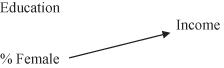
First, we’ve hypothesized a positive relationship between education and income, stating that people first need to acquire higher levels of education before they attain higher levels of income. We note this original relationship in shorthand, illustrating that it is education that precedes (or comes before) income:
![]()
Both the order of the variables and the causal arrow are important in our shorthand. The independent variable should be stated first, with the causal arrow pointing in the direction of the relationship, in effect stating:
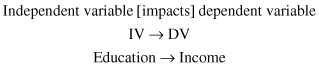
Thus we’ve stated the time order of the variables for testing this relationship.
Next, we need to test the hypothesis to see if there is a correlation. We can use the General Social Survey (GSS) data to help us detect possible correlations between the example variables. Figure 11.1 shows how we can operationalize education and income using data from the GSS. As you can see, with lower levels of education there are lower levels of income (which still states a positive direction, since both variables are moving in the same direction).
Figure 11.1. The relationship between education and income in the GSS data.
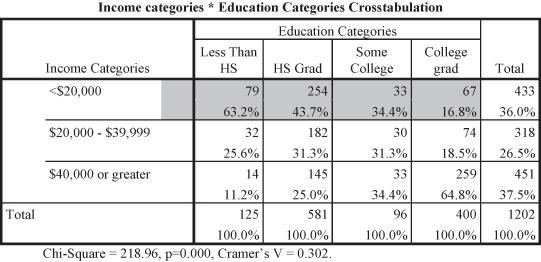
Since we hypothesize that increases in education lead to increases in income, we can examine how the cells for categories of education, our independent variable, intersect with the categories for level of income, our dependent variable. As education increases we see the percentages for those who make the highest level of income also increasing. For example, 63.2 percent of those without high school degrees earned less than $20,000 per year compared to 16.8 percent of college graduates. Similarly, 64.8 percent of college graduates earned at least $40,000 per year compared to only 11.2 percent of those without high school degrees. The correlation between education and income is statistically significant as indicated by the probability level (p = 0.000). The Cramer’s V (0.304) indicates a medium effect size.
Thus far, we’ve inferred time order and observed a statistically significant correlation between our variables measuring income and education. We have now met two of three of the criteria for causation. Recognizing that there may be multiple causes for one effect (e.g., education along with occupation, gender, age, and/or race may cause changes to levels of income), however, social scientists need to look to one more criteria for causation: no spuriousness.
Nonspuriousness
The word spurious means that there is not a true or genuine relationship between factors; that some unobserved or unnoticed variable is correlated with the other variables, making them appear to have a cause-and-effect relationship. For example, earlier in the chapter we talked about the positive correlation between ice cream consumption and crime. When ice cream consumption increases, so does crime. When crime increases, so does the consumption of ice cream. These two variables are consistently correlated with each other. They do not, however, have a causal relationship. Both ice cream consumption and crime are correlated to a third factor: temperature. When temperatures rise, ice cream consumption increases (people eat more ice cream in the summer than winter). When temperatures rise, crime increases. If we take temperature into account, the relationship between ice cream consumption and crime disappears—controlling for temperature takes away the correlation between ice cream consumption and crime because the two are linked by temperature.
Figure 11.2. The spurious relationship between storks and babies. Identifying potentially spurious relationships is often quite difficult and comes only after extended research with a database. We discuss several research examples of spuriousness later in this chapter.

If we are trying to determine when one variable causes changes to another, whenever we find a correlation between variables we need to make sure that the relationship between them is not spurious, that there is no unaccounted variable making the original variables appear to be correlated. Remember, if variables are not correlated, changes in one cannot cause changes in another. A variable that causes another must vary with it. In order to figure out if our correlated variables have a spurious relationship, we need to go back to the drawing board and figure out how another variable impacts the original variables, which means thinking again through time order.
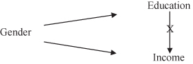
In looking at the additional variables that we stated may impact the relationship between education and income, let’s take the variable “gender” to see if it impacts the relationship between education and income. If we are putting together a time line of which variables come first, we have at least one hint; we know we’ve already determined that we believe education comes before income in our equation seen in Figure 11.3.
Figure 11.3. Causal diagram of one independent and dependent variable.
Where would gender fit into this equation? We have two options: gender either comes before education as an antecedent variable, or gender comes between education and income as an intervening variable. Let’s look more closely at the differences between antecedent and intervening variables.
Antecedent Variables
An antecedent variable can be the cause of spurious correlations between other variables. In other words, an antecedent variable precedes both original variables. Gender is something one is born with, which means gender occurs before you enter the education system and earn an income. Therefore, gender precedes both education and income in time order. In our causal argument we want to illustrate how we think variables are related. When we introduce a new variable that comes before both original variables, we want to be able to note that in shorthand as Figure 11.4 illustrates
Figure 11.4. Causal diagram of an antecedent variable.

The diagram in Figure 11.4 shows we believe there is an antecedent variable that is related to both our independent and dependent variables that may be causing the independent and dependent variables to be correlated. We need to make sure, however, that we also illustrate that we believe that when we take the antecedent variable into account (or when we “control” for the new variable), we expect the relationship between the independent and dependent variables to disappear—or to be spurious. Therefore we use an “X” to “cross out” or denote that the original relationship between the independent and dependent variables is expected to be spurious (to disappear) when controlling for the antecedent variable. If the antecedent variable reveals spuriousness, there will no longer be a correlation between the independent and dependent variables.
Since we’ve hypothesized that gender precedes both education and income, we would diagram our causal argument like Figure 11.5.
Figure 11.5. Causal diagram with gender as an antecedent variable.
In order to test our new causal argument, we need to go back to the data. The measure we use to control for gender in the GSS database is the variable “sex,” which has two categories: male and female. In cross-tabulations, we have a two-dimensional table, which works well when you have only two variables. Now that we are adding a third variable, we need a third dimension. Unfortunately, the computer screen or the book page can only come in two dimensions. That means that we’ll have to look at two additional tables, one table for each category of the control variable, when testing to see if the relationship between education and income is spurious when controlling for gender (a control variable is used to account for the effects of one variable on other variables, holding the control variable effects constant).
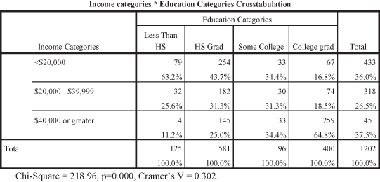
Figure 11.6 shows the original table testing the relationship between education and income, indicating the two variables are correlated.
Figure 11.6. The “original” relationship between education and income.
Using chi square to include control variables is fairly straightforward. Refer to the earlier chapter on using SPSS with contingency tables to recall how to conduct a chi-square analysis (in Chapter 7 using SPSS to analyze the relationship between work autonomy and health). Utilizing the same procedure for contingency tables, we’ll analyze the relationship between education and income. Introducing a control variable (“sex”) to the analysis can be done by using the Layer window in the Crosstabs specification in SPSS.
Figure 11.7. Using SPSS to introduce control variables.
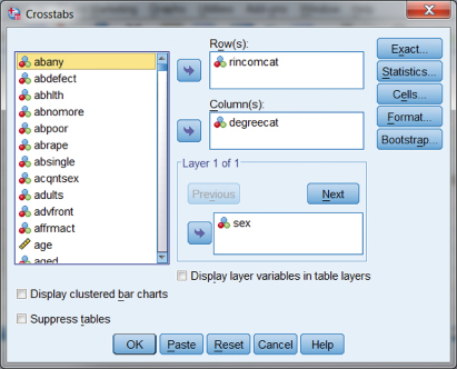
When we introduce the control variable “sex” into the relationship between education (operationalizing with the variable “degreecat”) and income (operationalizing with the variable “rincomcat”), SPSS produces the output table shown in Figure 11.8. As you can see, there are three tables stacked together.
- Top table (light shading): The relationship between education and income with MALE respondents.
- Middle table (darker shading): The relationship between education and income with FEMALE respondents.
- Bottom table (darkest shading): The original relationship between education and income.
Figure 11.8. The stacked results table for chi square with a control variable.
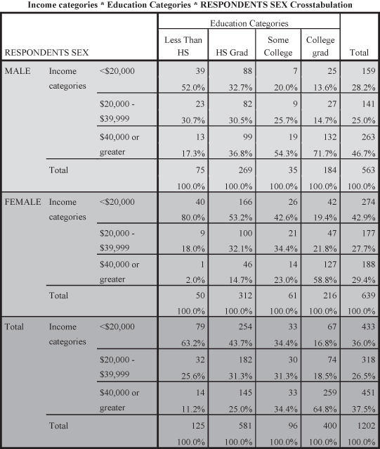
As you can see, the table in Figure 11.8 presents the three tables together so that you can compare the results of the two control categories (MALE and FEMALE) with the original table on the bottom of the stack. If you look at each of the control tables, you will find the same results as you observed for the original table. Thus, for example,
- For males, 52 percent of those with less than high school earned less than $20,000 compared to only 13.6 percent of college graduates. Further, 71.7 percent of college graduates earned at least $40,000 compared to only 17.3 percent of those with less than high school.
- For females, 80.0 percent of those with less than high school earned less than $20,000 compared to only 19.4 percent of college graduates. Further, 58.8 percent of college graduates earned at least $40,000 compared to only 2.0 percent of those with less than high school.
- For the original table (combining male and female), you will recall that 63.2 percent of those with high school earned less than $20,000 compared with only 16.8 percent of college graduates. Further, 64.8 percent of college graduates earned at least $40,000 compared to only 11.2 percent of those with less than high school.
Using this procedure in SPSS also produces the significance and effect size results in stacked tables. Figures 11.9 and 11.10 show these tables separately using corresponding shading to that in Figure 11.8. As you can see, both control tables indicate significant chi-square tests (with probability = 0.000 in each case) and near to medium effect sizes (Cramer’s V values of 0.280 or larger).
Figure 11.9. Chi-square test results including control variable.

Figure 11.10. Chi-square results showing Cramer’s V values for control variable.

Using Control Variables to Detect Spuriousness
You can see from the preceding chi-square analyses that we added sex as the control variable in the relationship between education and income to see whether the original relationship became spurious (in other words, we tested to see if the originally significant relationship was no longer significant when we added sex as a control or antecedent variable). When looking at two-dimensional displays, keep in mind that we are only controlling for one variable, even though we now have multiple (stacked) tables (one table for each category of the control variable). Because we have more than one table, we have to take all of them into account when determining if the relationship between education and income is spurious when controlling for the variable sex.
If our antecedent variable (sex) does impact the original relationship, we expect the original significant relationship between education and income to disappear. That would mean that neither of the two new tables (i.e., for male and female) would show a significant relationship between education and income. Since the probability statistic tells us whether or not a relationship is statistically significant, what do you take away from the results of the tables in Figures 11.9 and 11.10? Both the tables for male and female have probability levels that show statistical significance between education and income (p = 0.000). Since both tables show significance, can our causal argument that gender is an antecedent variable be true? No. Even when controlling for the effects of gender, the relationship between education and income is still significant. If gender were indeed an antecedent variable, both tables for the variable sex (for categories male and female) would show that there was no statistically significant relationship between education and income. Thus our causal argument (and our causal diagram) is not supported by the data.
Intervening Variables
There is a second possibility for time order when adding a third variable to an equation. There could be an intervening variable impacting the relationship between education and income. Let’s look at the variable occupation. In thinking about time order, where do you see occupation and its relationship to education and income? If it was an antecedent variable, we would expect that a person obtains an occupation, then gets an education, and then earns more money. In our culture, however, it seems that getting an education comes before getting an occupation, and it’s the occupation that then allows people to earn more money. Therefore, occupation would be an intervening variable. An intervening variable is a variable that comes between the independent and dependent variables. In effect, an intervening variable is a link between independent and dependent variables. Figure 11.11 illustrates the causal diagram for an intervening relationship.
Figure 11.11. Causal diagram of an intervening variable.

If we believed that occupation was an intervening variable, coming between the original independent variable (education) and dependent variable (income), then our causal diagram would look like Figure 11.12.
Figure 11.12. Causal diagram with occupation as an intervening variable.
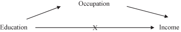
Figure 11.12 shows how we expect the relationship between education, occupation, and income to work. The causal arrows drawn to show the direction of the causation, allow us to follow the logic of the causal argument (that education impacts occupation and that occupation subsequently impacts income). In this analysis we expect that when controlling for occupation, the original relationship between education and income will disappear (thus the added “X” to the casual diagram in Figure 11.12).
In order to test to see if occupation is in fact an intervening variable linking education and income, we need to go to the data to find a measure operationalizing occupation. The variable “prestige” measures the prestige of a person’s occupation on a scale from 1 to 100. The categories for the variable are respondent’s occupational prestige less than 43 or 43 and higher.1 Since there are two categories of the control variable, we will need to look at two new tables to see if our causal argument is correct.
Figure 11.13 shows the original table testing the relationship between education and income.
Figure 11.13. The relationship between education and income without prestige.

Figure 11.14 shows the stacked table including the original relationship within categories of the control variable prestige (“PrestigeHiLo”). As you can see, we used the same shading scheme to highlight each of the categories of the control variable “prestige.”
Figure 11.14. The chi-square table including the control variable “prestige.”

The two top tables (the lightest top table and the medium shaded middle table) each report the relationship between education and income when controlling for the effects of occupational prestige. The first table shows the relationship accounting for the category of prestige less than 43, the second for the category of prestige 43 or higher.
If occupational prestige is in fact a link between education and income, we would expect to see that the two tables measuring occupational prestige would show no statistical significance between education and income. Yet both tables (prestige lo and prestige high) in Figure 11.15 indicate that even when controlling for occupational prestige, there remains a statistically significant relationship between education and income. Examining Figure 11.15 shows that, despite either high or low prestige rankings, higher education categories show higher incomes than lower education rankings. Figures 11.15 and 11.16 show that both the control categories indicate significant relationships and small to medium effect sizes (Cramer’s V).
Figure 11.15. Significance tests for prestige categories.
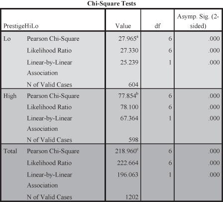
Figure 11.16. The effect size results for the control categories of prestige.

Thus our causal argument and diagram (Figure 11.12) are incorrect: the effects of occupation do not intervene between education and income.
We’ve now controlled for two variables, gender and occupation, that do not make the original relationship between education and income disappear. This is evidence that education is a causal factor for income. There is a third possibility: it could be that income has more than one cause. Perhaps gender and/or occupation, along with education, impact income. Unfortunately, when using a two-dimensional table like a cross-tab, it is difficult to test for this possibility. Although we could add more than one control variable to a cross-tabular equation, it becomes increasingly difficult to read the multiple tables. Regression analysis is a better statistical technique to test for the possibility of multiple causes, which we describe later in the chapter. Before we do, let’s revisit antecedent and intervening arguments using a new example.
The Effect of Income on Politics
Let us look at the relationship between socioeconomic status and politics. Previous research has found links between these two variables; those with higher socioeconomic status tend to identify with the Republican Party; while those with lower socioeconomic status tend to identify with the Democratic Party. Using income as a measure of socioeconomic status and the variable “PolParty” for political party, we hypothesize that those with higher income will be more likely to report being a member of the Republican Party. Testing this hypothesis we find the results shown in Figure 11.17.
Figure 11.17. Chi-square results between income and political party.
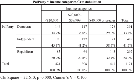
First, look at the percentages in the table. Does it appear that as income increases, more people identify as Republican? Remember, begin with the independent variable and compare across columns (what happens to the percentage of people who report being Republican as the categories of income change/increase). The direction of our hypothesis appears to be borne out in the table data. As income goes from less than $20,000 (20.2 percent), to those making $20,000 to $39,999 (20.8 percent), to those making $40,000 or higher (32.4 percent), more people identify as Republican. Is there a statistical relationship, however? The significance statistic is the probability, which is less than 0.05 (p = 0.000), and it means that the relationship is statistically significant. Is the strength of the relationship relatively weak, moderate, or strong? The Cramer’s V indicates a small but meaningful effect size. What do you conclude? There is a significant relationship between income and political party.
Two of the steps for determining causation have been put in place. By choosing income as our independent variable, we are inferring that income has an effect on political party preference (thus, income/SES comes first in time). Next, we’ve determined that there is a significant relationship (correlation) between income and political party preference. Finding a significant correlation, however, is not enough to help us determine causation. We need to test for spuriousness.
What variable may impact the relationship between income and political party? Some research suggests that race may be a factor for political party preference, that racial/ethnic minority groups are more likely to identify as Democrat while whites are more likely to identify as Republican. How might race impact the original relationship between income and political party preference? Would race be an antecedent variable (a variable that precedes both income and political party preference—something about race causes changes in both income and party preference) or an intervening variable (a variable that comes between income and party preference—something about income causes changes to race and race then causes changes to party preference)?
In thinking about the causal logic, race is a characteristic that is ascribed at birth; thus it has to come before both of the other variables (level of income cannot change a person’s racial/ethnic category). Therefore, race must be an antecedent variable (Figure 11.18).
Figure 11.18. Race as an antecedent variable.

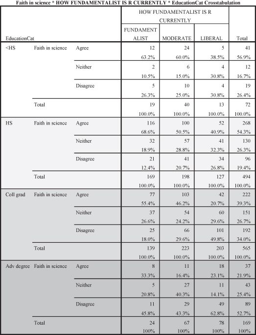
Let us test the causal relationship between income and political party preference using the variable RaceCat as an antecedent variable, following the process we used earlier. Figure 11.19 shows the stacked table including the categories for race (white and black) using the shading process we have used with earlier tables.2
Figure 11.19. The chi-square analysis showing the categories of race.

Figures 11.20 and 11.21 show the significance and effect size results, respectively. As you can see in Figure 11.20, the table showing the control condition for “White” is significant (p = 0.012); the control condition for “Black” is not significant (p = 0.922). The effect sizes shown in Figure 11.21 also show a divergence between the control categories. The effect size for the first category (White) is V = 0.085; the effect size for the second category (Black) is V = 0.052. Both of these effect sizes would be considered small, with the second (V = 0.052 for “Black”) much less significant and meaningful.
Figure 11.20. The significance tables for the chi-square analysis.

Figure 11.21. The effect size tables for the chi-square analysis.

In looking at the tables in Figures 11.20 and 11.21, there are mixed results. How do we interpret these findings? In using a third factor as a control variable, we are looking for the effect on the original significant relationship when adding a third variable. In terms of causation, we are looking to see if the original relationship maintains statistical significance, that even when controlling for a third factor the relationship is not spurious. One table for one category of race shows significance; the other table does not. What do we conclude? If any table of the control variable shows that the original relationship is still significant, the original relationship cannot be spurious. A spurious relationship is one that is no longer statistically significant. All tables (in this case both tables) would have to show no significant relationship in order for us to conclude that the relationship between income and political party is spurious when controlling for race. This is not the case. We conclude that the relationship between income and political party is not spurious, even when controlling for race. Since one table of the control variable maintains statistical significance, the relationship between income and political party is not spurious when controlling for race.
What does this tell you about the causal diagram? Do the table results support the hypothesis that race is an antecedent variable? If a variable is an antecedent variable, the original relationship would no longer be significant. Since one table of the control variable shows significance, race cannot be an antecedent variable. The diagram is not supported by the data.
Income and Voting Example
Let’s explore the relationship between social class and political participation. Using income as a measure of social class and whether or not a person voted as a measure of political participation, we hypothesize that as income increases, people will be more likely to have voted. Figure 11.22 shows the relationship between income and voting.
Figure 11.22. The chi-square results between income and voting.
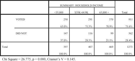
First, are the data arrayed in the direction we hypothesized? As levels of income increase, what happens to the percentage of people who say they voted? The direction of the data support the hypothesis. The percentage of the those who voted increases across the income categories from 63 percent (less than $35,000) to 71.5 percent ($35,000 to $64,999) to 78.9 percent ($65,000 and higher). Clearly, as level of income increases, more people report voting. Is there a statistically significant relationship between income and voting? Yes, the probability level is less than 0.05 (p = 0.000), illustrating a significant relationship between income and voting. The effect size, however, is somewhat small (Cramer’s V = 0.146). The data support our hypothesis: as the level of income increases, people are more likely to report having voted.
Again, two of the three criteria for causation have been met: time order and correlation. Now we need to test for spuriousness. Using education as the control variable, how would you diagram a causal argument that though income impacts voting, education impacts both income and voting? As a variable that impacts both original variables, education would be an antecedent variable.
Figure 11.23. Education as an antecedent variable.

When controlling for education, we find the results shown in Figure 11.24. As before, the stacked tables are shown with different shading to allow you to identify the control conditions. In looking at the two tables, there are consistent results.
Figure 11.24. Chi-square test results including control variable education.
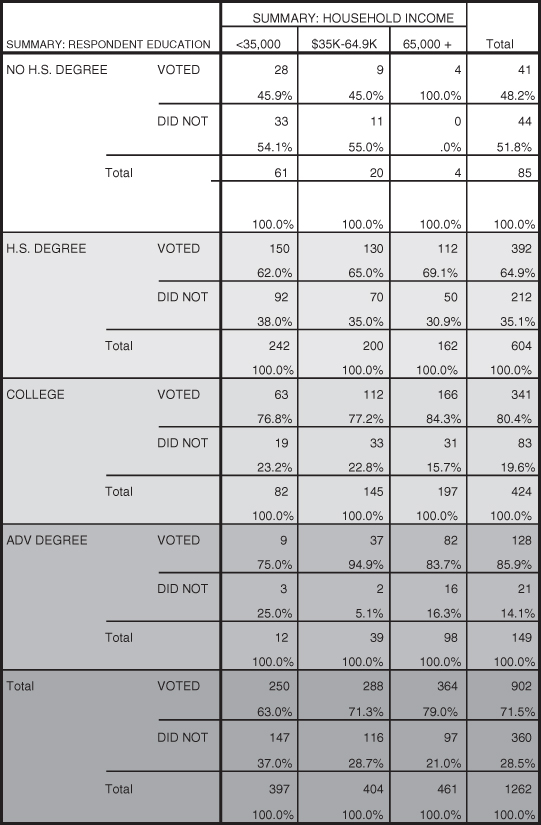
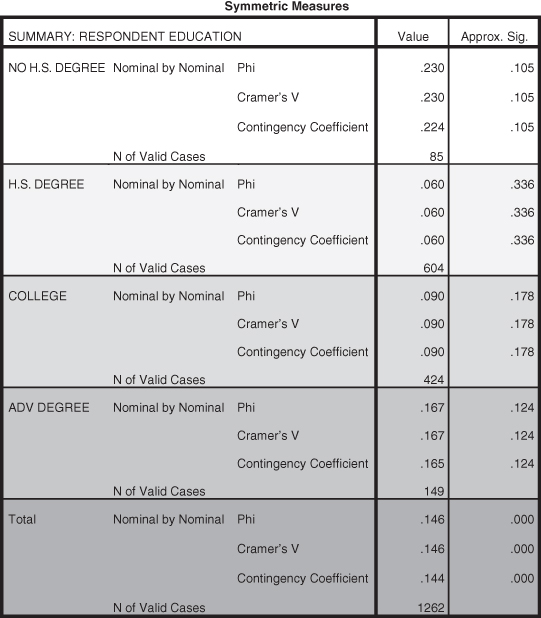
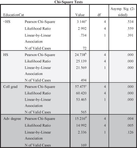
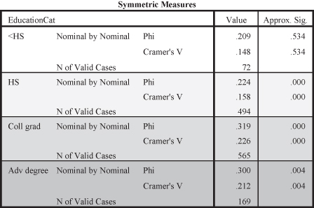
The tables in Figure 11.25 show statistically insignificant relationships for all categories of the control variable (p = 0.105 for less than a high school education, p = 0.336 for a high school education, p = 0.178 for a college education, and p = 0.124 for having an advanced degree). How do we interpret these findings? When controlling for a third factor the question we ask is, “Does the original relationship become spurious?” All of the tables of the control variable show that there is no significant relationship between income and voting when controlling for each category of education. A spurious relationship exists between income and voting when there is no longer any statistical significance. Since none of the tables show statistical significance, we conclude that when controlling for education there is no longer a statistically significant relationship between income and voting. The relationship between income and voting is spurious when controlling for education.
Figure 11.25. Significance tests for education categories.
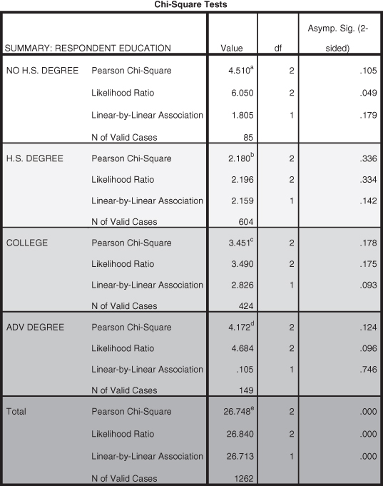
What do these results tell us about the causal diagram? Do the table results support the hypothesis that education is an antecedent variable? If a variable is an antecedent variable, the original relationship would no longer be significant. Since the tables show that the relationship is no longer significant, we determine that education is, in fact, an antecedent variable. The causal diagram is supported by the data.
Keep in mind that there is nothing about the data specifically that tells us if a third variable is an antecedent or intervening variable. For either case we look to the same indicators to determine if an original relationship exists or not when controlling for another variable. In thinking through causal logic, we have to determine theoretically if a new variable comes before (antecedent) or between (intervening) the original variables.
Figure 11.26. The effect size results for the control categories of education.
REGRESSION ANALYSIS AND TESTING FOR SPURIOUSNESS
In Chapter 10 we discussed regression analysis. Regression analysis allows us to test the effects of multiple independent variables on the dependent variable. While our earlier examples of testing for spuriousness in cross-tabs limited the number of variables we can use, regression gives us the opportunity to see the effects of several independent variables. Using census data (aggregate-level data) for the states, let’s look at how to use regression analysis to test the relationship we used as an example earlier in the chapter—between education and income. Since we are using aggregate level data, we operationalize education using a measure for “percent of the population with a bachelor’s degree or higher” and we operationalize income using “median family income.” Following our previous example, we hypothesize that as percentage of the population with a bachelor’s degree or higher increases, the median family income in states will also increase, a positive directionality. Let’s go to SPSS to analyze the data.
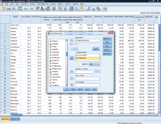
Figure 11.27 shows you how to use the Analyze menu in SPSS to select regression analysis for linear regression. Once you’ve selected your independent variable (percentage college degrees) and dependent (median family income) variable (Figure 11.28), click the statistics button in order to select “Model fit” and “R squared change” (Figure 11.29).
Figure 11.27. The Analyze task in SPSS using linear regression.
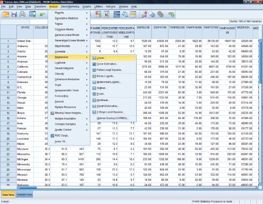
Figure 11.28. Selecting the independent and dependent variables for regression.

Figure 11.29. Selecting “Model fit” and “R squared change” in the Statistics task.

Once these statistics have been specified, SPSS will take you to the output screen where three tables (Figure 11.30) show the results of the regression analysis of percentage of the population with college degrees in a state and median family income.
Figure 11.30. SPSS regression output for percentage college degree and median family income.
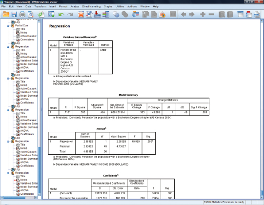
We focus on just two of these output tables, the table for “Model Summary” and for “Coefficients.” Figure 11.31 shows the model summary for the regression analysis. We have used shading to highlight the important pieces of the analysis and to focus your attention. The “R Square” figure (0.505) is very important because it indicates how much variance in the dependent variable (family income) is explained (or contributed) by the independent variable (education). These results show that over 50 percent of the variance in family income is due to education. (Translating the R square figure of 0.505 to the amount of explained variance is simply a matter of moving the decimal place to the right two places so that it becomes 50.5 percent). This is a very large effect and indicates a strong relationship between the variables.
Figure 11.31. Model summary of percentage college degrees on median family income.

Figure 11.32 shows the findings that help us to see whether the predictor (percentage of the population with bachelor’s degrees or higher) is significant in its relationship to median family income. The significance statistic shown in the table for the independent variable is p = 0.000 (see shaded portion). Note, however, that there is also a significance statistic for the constant. When evaluating the relationship between the independent and dependent variable, make sure to use the correct significance statistic (for the independent variable, not the constant). Based on significance, we can see that there is a statistically significant relationship between the percentage of the population with college degrees and median family income.
Figure 11.32. Coefficients for percentage college degrees on median family income.
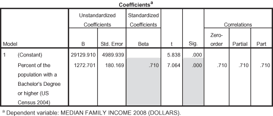
What about the effect size? We described effect size in the chapter on regression as the squared correlation (R Squared, as just described). We can also look at another indicator of effect size, the “standardized Beta.” The standardized Beta is a correlation coefficient measured like a Pearson’s r to indicate the importance (i.e., effect size) of the predictor. The standardized Beta for percentage of the population with college degrees is 0.710 (see shaded portion), which is considered relatively strong. The standardized Beta is also a positive number, indicating that the relationship between percentage of college degrees and median family income in states is positive: as the percentage of the population with a college degree increases, so does the median family income in states, which is what we hypothesized.
Detecting Spuriousness
Now that we’ve determined that there is a significant correlation between our two variables, we need to think about the possibility that we have a spurious relationship. When we tested this relationship using cross-tabs, we controlled for the effects of gender, hypothesizing that gender served as an antecedent variable. Using the same causal logic, that gender serves as an antecedent variable (since it comes before percentage of college degrees and median family income), let’s use the variable “percentage of the population that is female” to test the effect of gender and be consistent between analyses.
In regression analysis, we treat our new variable as a second independent variable. When we go to the Analyze task and select linear regression, we simply add our gender variable to the independent variable section as shown in Figure 11.33.
Figure 11.33. Adding the control variable of “percentage female” to the regression analysis.
The appropriate statistics should still be selected (Model Summary and R squared change). Again, we focus on just two tables from the SPSS output. The SPSS Model Summary is shown in Figure 11.34.
Figure 11.34. Model summary with gender included in the analysis.
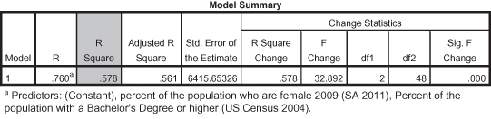
As you can see, the R Square figure when both of the predictors are acting together to correlate with the dependent variable (family income), is 0.578. Therefore, adding a second predictor to the regression analysis adds 0.073 to the original R Square figure (0.505) where education was the only predictor of family income. (We arrived at 0.073 simply by subtracting -0.505 from 0.578, yielding 0.073). Thus adding the second predictor (Female percentage of the population) increases how much additional variance in the dependent variable is explained by virtue of adding one additional predictor. In this case, adding female percentage of the population to the analysis increases how much we know of the variance in income by 7.3 percent. This may seem like a small amount, but it is meaningful. The next question is whether this additional amount is a significant (nonchance) amount.
Since we are using percentage of the population that is female as a control variable, the first statistic we need to check is the significance statistic for percentage of the population with a college degree. This is shown in Figure 11.35. The probability shown in the top of the panel, with lighter shading (p = 0.000), indicates that even when controlling for percentage female, the relationship between percentage of the population with a college degree and median family income is still significant, and therefore not spurious. (Thus percentage female is not an antecedent variable.) The Standardized Beta (0.760) is also strong and positive. If the significance of education disappeared (i.e., showing a significance value greater than 0.05) when we added percentage female, then education would be considered spurious.
Figure 11.35. Coefficients for percentage of the population with a college degree and percentage of the population that is female.
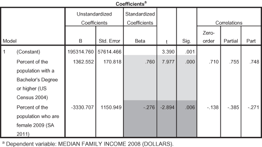
One benefit of using regression analysis is that you notice in Figure 11.35 that more information is given about the effect of percentage female on median family income. Whereas in cross-tabs, it is difficult to know the precise relationship of the control variable to the dependent variable, in regression we can see that percentage of the population that is female is also a significant factor in median family income (p = 0.006). The standardized Beta for percentage female is equal to −0.276; it is a negative and small effect illustrating that as percentage female in states increases, median family income decreases.
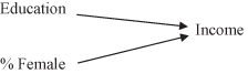
Using our earlier models, we can show these results. The model in Figure 11.36 shows the results of our regression analysis. Both % Female and Education have a significant relationship to Income. Adding % Female did not reduce or eliminate the original relationship between Education and Income.
Figure 11.36. The regression results of predicting family income from Education and % Female.
The next model, shown in Figure 11.37, indicates that had the relationship between Education and Income disappeared when % Female was added (indicated by the disappearance of the arrow between Education and Income), then the Education–Income relationship would be spurious.
Figure 11.37. The regression results indicating a potential spurious relationship.
Regression Example
Let’s use another example from the cross-tabs section to test a second regression analysis. Earlier in the chapter we hypothesized that those with higher levels of income would be more likely to participate in politics. If this is true at the individual level, then we would expect to see a similar relationship at the aggregate level. Operationalizing social class with median family income, and operationalizing political participation with “percentage of the population who voted in the 2008 presidential election,” we hypothesize that as median family income increases, so will the voter turnout in states.
Having selected the appropriate variables and statistics in SPSS, we look at the output for the relationship between median family income and voter turnout in states. Figure 11.38 gives the model summary for the analysis.
Figure 11.38. Model summary for median family income on voter turnout.

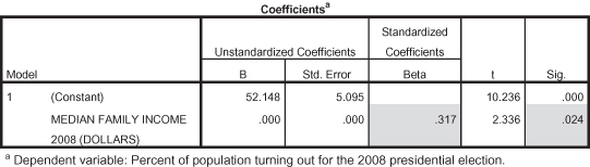
As you can see from Figure 11.38, the R Square is 0.100, indicating that 10 percent of the variance in voter turnout is explained by family income. This is a small, but meaningful, effect size.
Next, we turn to Figure 11.39 to look at the significance statistics and correlation coefficients to see additional indicators of effect size and directionality. In the Coefficients table we see that median family income has a significant impact on voter turnout (p = 0.024). The standardized Beta of 0.317 shows a positive relationship with a moderate effect size. Therefore we can conclude that the data support our hypothesis; states with higher median family income have higher voter turnout.
Figure 11.39. Coefficients for median family income on voter turnout.
Now that we have determined that the relationship is significant, we need to think about testing for spuriousness. In our cross-tab example addressing this relationship, we used a variable for education to test for spuriousness, hypothesizing that education served as an antecedent variable (coming before the other two variables). For the sake of consistency, let’s rely on our previous causal logic to use education as a control variable, operationalizing it as “percentage of the population with a bachelor’s degree or higher.”
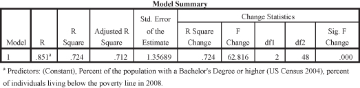
Having added the variable for percentage college degree to our original analysis, Figure 11.40 shows the model summary for the analysis. You can see that adding another predictor to the model does not increase the R Square very much. Only 0.019 (or 1.9%) is added to the explanation of variance in voter turnout by adding education (0.019 = 0.119 − 0.100 from the R Square figures).
Figure 11.40. Model summary with median family income and percentage college degrees.

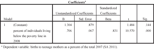
Figure 11.41 shows the significance and correlation coefficients for the analysis. Since we are testing for spuriousness, using percentage of college degrees as a control variable, we first want to evaluate whether or not the original independent variable maintains statistical significance. The significance statistic for median family income, when controlling for percentage college degrees, is now equal to 0.361; median family income is no longer significant when controlling for percentage college degrees. Therefore we conclude that the relationship between median family income and voter turnout in states is spurious when controlling for percentage of college degrees.
Figure 11.41. Coefficients for median family income and percentage college degrees on voter turnout.
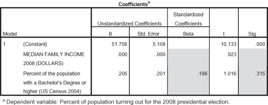
Again, because we are using regression analysis, we can also evaluate the effect of the control variable on the dependent variable. The significance statistic (p = 0.315) illustrates that percentage college degrees does not have an effect on voter turnout. The standardized Beta shows a positive but small effect size (0.196).3

____________________________________________________________________
____________________________________________________________________
____________________________________________________________________
____________________________________________________________________
____________________________________________________________________
____________________________________________________________________
____________________________________________________________________
____________________________________________________________________
____________________________________________________________________
____________________________________________________________________
____________________________________________________________________

____________________________________________________________________
____________________________________________________________________
____________________________________________________________________
____________________________________________________________________
____________________________________________________________________
____________________________________________________________________
____________________________________________________________________
____________________________________________________________________
____________________________________________________________________
____________________________________________________________________
____________________________________________________________________
____________________________________________________________________
____________________________________________________________________
____________________________________________________________________
____________________________________________________________________
Notes
1 We created these categories using SPSS to identify values that split the overall set of respondents into equal groups.
2 We used these GSS categories to indicate race in this analysis, although other analyses could introduce additional race categories.
3 You will note that neither variable, median family income or percentage college degree, is significant in the analysis when they are both present as predictors. This may be due to an interaction effect that impacts the analysis. For our purposes in this analysis, we will only highlight that when both variables are present; the original relationship between median family income and voter turnout is spurious.