
Key 2
Find areas with the best growth potential
The previous key showed you how the housing market works and we revealed the three dynamics of the housing market: people, purchasing power and properties. This key shows you how to:
 easily and quickly read the housing market in a suburb, including:
- how to tell if overdevelopment is likely
- whether it is a good idea to speculate in a particular area
- predict the likely price performance of any suburb or town anywhere in Australia.
No housing market prediction can be 100 per cent correct in practice because random events may intervene and change the dynamics in unexpected ways. The further ahead a forecast is made, the more likely it is that such events will occur, so predictions made for three or more years into the future often end up being based on prophecy rather than fact.
Nevertheless, the three housing market dynamics of population, purchasing power and properties are the constants operating in the housing market that work together to cause price and rent movements. They are easily tracked, so that you can check the accuracy of any housing market prediction.
We have seen that it is impossible to obtain accurate indications of population and housing finance changes at suburb level, simply because no-one measures them. Some reports show population or income growth from one census to the next as part of their selection basis for suburbs, meaning that they are relying on growth figures from, for example, 2006 to 2011, which is almost ancient history. Many suburbs, especially those in inner urban renewal precincts and outer suburban areas in our major cities, have undergone significant demographic changes since then. Be wary of any reports that rely on census data, or even worse, do not even reveal the sources of their demographic data.
Other researchers and analysts go through contortions to try to estimate where people are moving and whether they will rent or buy. The types of statistics that they look at include:
- employment changes
- economic changes
- affordability
- income levels
- cost of finance
- consumer confidence.
The issue is that while all of these may have some general effect on the housing market, none of them can be assessed at suburb level.
This forces some experts to dig deeper and look at housing market indicators or measurements such as:
- dwelling approvals
- building commencements
- stock on market
- vendor discounting
- time on market
- auction clearance rates
- hold time between sales
- rental yields
- rental vacancy rates
- online search ratios
- keyword trawls
- listings to stock ratios
- median sale price movements.
While some of these figures may well provide useful information about a local housing market, they are hard to obtain and difficult to understand. Many are based on samples and others are simply unreliable. Taken as a whole they are even likely to provide completely contradictory conclusions. The only accurate way to measure where people are moving and whether they are buying, selling or renting, is by watching their effect on the:
- number of property sales
- properties listed for sale
- rental vacancies
in any suburb or town.
Predict short-term price and rent changes
Housing prices are subject to the same laws of supply and demand as other commodities, and they can change quite dramatically at suburb level in response to rises and falls in potential buyer and seller numbers. In particular we can estimate when and where dramatic growth spurts, known as booms, are likely, and be ready to make a purchase decision. Because such growth is sweet but short, only a small percentage of the 15 000 housing market suburbs have boom potential at any one time, but by buying in those suburbs and then selling before the growth stops, investors can make significantly higher returns than those who ‘hold and hope’, even with the high entry and exit costs that such short-term investments tend to incur. This makes it important for you to know both the current type of market in a suburb as well as how it is predicted to perform in the future. To make this easy, we can describe the current type of house or unit market in any suburb as one of the five possible types shown in Table 2.1.
Table 2.1: the five types of house or unit markets
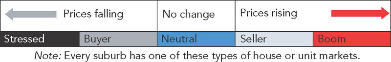
Source: Adapted from Property Power Database, Property Power Partners.
Stressed markets
Stressed markets are suburbs with many potential sellers and few intending buyers. Prices are likely to be falling by more than 10 per cent per annum and changes tend to take several years to occur because of the large surplus of properties in the market waiting to be sold. If the prediction is for stressed market conditions to continue, prices will keep falling by more than 10 per cent per annum until and if the market eventually changes to a buyer market.
Buyer markets
Buyer markets are suburbs where there are more potential sellers than intending buyers and there's a tendency for prices to fall by 10 per cent or less per annum. Due to the surplus of properties listed for sale on the market, these markets are slow-moving and the change to a neutral or stressed market can take up to a year or more to occur.
Neutral markets
Neutral markets are suburbs where the numbers of potential sellers and intending buyers is equally balanced; there is little opportunity for anything other than small price falls or rises to occur while such conditions continue. It usually takes from six months to a year for neutral markets to change to buyer or seller markets.
Seller markets
Seller markets are suburbs with fewer potential sellers than intending buyers and there is continual pressure on prices to rise, although the rise is usually 10 per cent per annum or less. Because of the low numbers of properties listed for sale on the market, these suburbs can change to boom markets or change back to neutral markets in six months or less if conditions change.
Boom markets
Boom markets are suburbs with few potential sellers and many intending buyers. Prices are likely to be rising by more than 10 per cent per annum and will continue to rise at this rate if the prediction is for boom conditions to continue. Because there are typically few properties listed for sale in such suburbs, they have the most price volatility and can revert to seller markets within three months if buyer demand decreases.
The five types of housing markets shown in Table 2.1 (on p. 36) can apply either to house or to unit markets, but you should never assume that a suburb's houses and units have the same types of markets, as they can be very different. A suburb may simultaneously have a shortage of houses on the market and a surplus of units listed for sale and they could be trending in different directions. To take this snapshot in time of the current type of housing market, we simply look up the ratio of annual sales as published in the Databank in Australian Property Investor magazine for houses or units in the suburb in which we are interested, and then look up the number of current online listings for house or units for sale in that suburb.
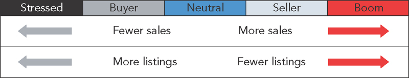
Using the ratios shown in Table 2.2 you can easily check the current state of any suburb's housing market by comparing the total number of sales in the last year for houses or units to the total number of houses or units currently listed for sale in that suburb.
Table 2.2: what the annual sales and current listings totals tell us
| Four or more times current listings as annual sales | Three or less times current listings as annual sales | About the same number of current listings as annual sales | Ten or less times annual sales as current listings | Eleven or more times annual sales as current listings |
| Stressed | Buyer | Neutral | Seller | Boom |
Source: Adapted from Property Power Database, Property Power Partners.
In other words, a suburb with 20 house sales in the last year and 40 houses currently listed for sale on the market is a buyer market, while a suburb with 20 houses sold in the last year and 20 current house listings is a neutral market and a suburb with 40 house sales in the last year and only three houses currently listed for sale is a boom market.
If your selected suburb is a buyer or stressed market, it's going to take a large movement of new households into the suburb to take up the surplus before any price rise can occur, and this could take years. During all this time, housing prices will probably continue to fall, so that any future rise first needs to claw back previous losses. The bigger the ratio of current listings to annual sales, the longer this will take. On the other hand, if your selected suburb is a seller or boom market, prices are already rising because there are stock shortages and the only question is whether you can find a property that meets your investment criteria, is priced at fair market value or lower, and whether the demand will continue to outpace supply so that prices continue to rise.
While the listings data is current when you obtain it online, the reason I use Australian Property Investor magazine's published annual sales for houses or units is that this information is easy for you to find and the ratios have already been put to work, as this is published data that is three months old by the time you use it. The time lag doesn't really matter, because the published annual sales figure in the magazine is updated each month, with the oldest month's sales being subtracted and the new month's sales added to the annual figure. This simple analysis is like a snapshot, frozen in time, of the state of the house or unit market when you do it. But if you do this analysis every month when you receive your Australian Property Investor magazine, you start to build up a series of snapshots of the same suburb. This is what statisticians call a trend, and using trends to predict the future is one of most accurate forecasting methods there is. Table 2.3 shows how the changing annual sales and current listings trends indicate which way a market is moving.
Table 2.3: what the changing annual sales and current listings trends tell us
Source: Adapted from Property Power Database, Property Power Partners.
Not every suburb will end up as a stressed or boom type of market. In Key 1 I explain how most suburbs are sleepers and only occasionally burst into high price-growth, with some even becoming shooting stars. It takes longer for suburbs to move from stressed or buyer conditions, because there are large numbers of stock on the market waiting to be sold. At the other end of the scale, things can move quickly, because there are few properties listed for sale.
By trending the sales and listings figures each month you may well find your own shooting star suburb before anyone else, because those figures are the only accurate leading price change indicators at suburb level and reflect the true changing nature of supply and demand. The best time to buy is in a neutral market where the suburb is moving into seller or boom market conditions. You can continue to hold your investment property in the expectation of continued growth as long as the suburb's market position does not worsen.
You can update your research every month, but the most important thing is to be consistent; use the same data sources and don't set yourself a research schedule that proves too time consuming and ultimately causes you to put off the whole process. By also recording the median sale price you will see how the price changes take effect — bearing in mind that this is a lagging indicator.
What I mean by lagging is, when a property is sold, it takes several months before settlement occurs, at which time the details are sent to the government department or agency responsible for recording the transfer from one owner to another. This information is purchased by data providers, who then calculate the new median sale price for each suburb based on the number of sales that took place in each preceding month. This data is provided to property investment magazines, and then it takes several more months before the data is published, because of the time required to produce, print and then distribute the magazines. This is why published sale price data is already several months old when you receive it; it is providing information about the median sale price of properties sold even earlier.
How to generate your own housing market forecasts
The annual sales and median price data you need is published in Australian Property Investor magazine, and real time listings data, that is, number of houses for sale, can be collected from any major property listing site. Even if the listing site does not show all available data, your aim is to pick up trends — and a sizable sample will do this for you. Also be aware that each site has different ways of assembling and displaying the data, so make sure that you are obtaining only the data you require for the type of properties and suburb that you are interested in and assemble your housing research data in a table or spreadsheet such as Table 2.4.
Table 2.4: tracking the market in a suburb
| Suburb name | Houses or units | ||||
| Month | Current listings | Published annual sales | Published median sale price | Ratio | Type of market |
| July 2015 |
20 |
20 |
$350 000 |
1 to 1 |
Neutral |
Because property investment magazines are published monthly, it is easiest to update your spreadsheet at the same time each month when you receive the magazine. Remember that the two numbers you are obtaining are quite different — the number of listings (houses for sale) is a one-off snapshot of the total number of houses or units advertised for sale at the time you look this up, so it's real-time data, while the annual sales (number sold) shown in the back of the magazine is the annual sales total, updated monthly so it provides a demand trend.
When you update the spreadsheet each month it enables you to calculate the ratio of listings to sales (which is the ratio of supply to demand) and to see how this is trending. This does not need to be extremely accurate, as long as you can track the trend (if there is one). For example, if listings are rising and the annual sales total is falling, then the trend is worsening.
Read the trends
Remember that it is not changes in the number of sales and listings that causes price changes, but changes in their relationship, or the ratio between them that leads to such movements. There are some traps that you can easily fall into. For example, though sales may be rising as shown in Figure 2.1, if listings are also rising at the same rate then the difference between them does not alter. This means that prices will keep rising at the same rate as they currently are.
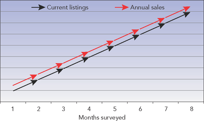
Figure 2.1: both listings and sales increasing
If the numbers of sales and listings are both declining, as shown in Figure 2.2 (overleaf), it indicates that price falls will continue at the current rate until the dynamics eventually change.
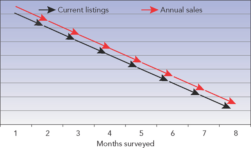
Figure 2.2: both listings and sales decreasing
These types of markets illustrate the danger of relying on either sales or listings but not both, because even when sales are rising, prices may still fall if the rate of supply grows faster than demand — and when sales are falling, prices may still rise when the supply of properties on the market runs out and shortages start to occur.
The aim of forecasting is to predict when and which way prices are likely to change, and this can only happen when the tipping point is reached, which is when the market moves into surplus or shortage caused by a drop in demand and/or rise in supply, or rise in demand and/or fall in supply. The tipping point is when the number of current listings and the total of annual sales are about the same (indicated in Figure 2.3 and Figure 2.4 at the point where the current listings and annual sales lines cross over each other). From this point onwards, prices are likely to fall in the example shown in Figure 2.3 and to rise in Figure 2.4.
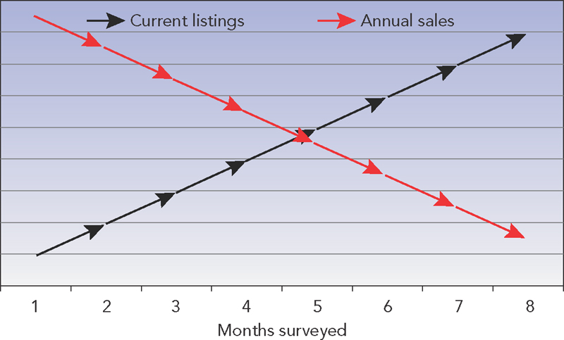
Figure 2.3: listings increasing and sales decreasing

Figure 2.4: listings decreasing and sales increasing
This simple method of housing market price prediction is highly accurate because it always looks forward, with the changes in listings and sales indicating the direction of likely price changes. The greater the difference between listings and sales, the higher the likely amount of price change, possibly even resulting in stressed or boom market conditions. Though not every suburb will move through all the various types of housing markets, the trend shows you which way the local market is heading and, because published sale prices lag by up to six months (as explained earlier in this chapter), you will have a head start when making a buy or sell decision based on the ratio of current listings to annual sales.
As a suburb moves from one type of market to another, the short-term sales and listings trends indicate the best time to consider buying a house or unit. Once the tipping point is reached, the trend will then show you which way the market (and the median sale price) is likely to move.
In Table 2.5 the monthly sales and listings in the NSW town of Hay were recorded and tracked over a ten-month period from early 2014.
Table 2.5: example of how the type of market in a suburb changes
| Suburb name | Hay | Houses or units | Houses | ||
| Month | Current listings | Published annual sales | Published median sale price | Ratio | Type of market |
| 1 | 80 | 40 | $90 000 | 2 to 1 | Buyer |
| 2 | 70 | 45 | $90 000 | 2 to 1 | Buyer |
| 3 | 60 | 55 | $90 000 | 1 to 1 | Neutral |
| 4 | 70 | 70 | $90 000 | 1 to 1 | Neutral |
| 5 | 60 | 80 | $90 000 | 1 to 1 | Neutral |
| 6 | 50 | 100 | $100 000 | 1 to 2 | Seller |
| 7 | 40 | 120 | $120 000 | 1 to 3 | Seller |
| 8 | 25 | 125 | $130 000 | 1 to 5 | Seller |
| 9 | 20 | 140 | $160 000 | 1 to 7 | Seller |
| 10 | 12 | 140 | $180 000 | 1 to 11 | Boom |
Source: Property Power Database, Property Power Partners.
By month four or five, an investor would notice that the sales were trending upwards and listings downwards each month and that it was highly likely to result in seller market conditions. Buying at this time the investor could secure a median-priced property for about $90 000 and within another five months, because the market went from seller to boom conditions, the house price doubled.
Because the median sale price is a lagging indicator, further house price rises would be likely and the investor could simply keep an eye on the ratio of listings to annual sales to estimate when it might be time to sell. Not every suburb or town will provide the same results as Hay did, but the value of this simple forecasting system is that it can enable you to compare the potential performance of different areas and also to investigate the actual causes of demand if the numbers start to change dramatically.
In Hay, for example it was clear from month four that something was on, and some on-the-ground research revealed that the largest cotton gin in the southern hemisphere was about to be constructed there, which was likely to cause a huge rise in housing demand. The house market boomed and not only did prices more than double, but rents rose dramatically as well. Using this simple tracking system, an investor could have purchased in Hay just before prices rose and made a significant profit, because the changing relationship between listings and sales indicates which way the market is likely to move in the short term.
This is how listings and sales play their part in alerting you to changes in trends and their likely impact on the local housing market. If you use a similar tracking system, over time you should notice a relationship between the listings and the monthly sales and median sale price and you should become an accurate forecaster of imminent price changes. This forecasting methodology has been proven to be about 90 per cent accurate, which begs the question: why is it not 100 per cent accurate? After all, it is firmly based on the foundations and immutable laws of supply and demand. The answer to this question is that both supply and demand can be fiddled with in ways that are peculiar to the housing market and, by understanding how to recognise such situations before they occur, your forecasting should be even more accurate.
The dangers of overdevelopment
One of the unforeseen dangers that housing investors must deal with is the prospect of overdevelopment. While many investors might view further development in an area as a good outcome, leading to improved amenities and facilities and generating higher prices, the reality is that high-density unit development or new subdivisions can have very different outcomes. It depends on who these dwellings are marketed to, as well as their price and quality compared to existing stock in the area.
New developments marketed to owner-occupiers can lead to the rejuvenation of entire suburbs if the new stock is substantially superior to existing stock, such as in the refurbishment of older inner suburbs in major cities. On the other hand, they can cause a deterioration in prices if the new stock is inferior, such as loft and studio apartments in inner urban areas, or single-bedroom retirement villas in coastal resorts. New developments marketed off the plan to investors can lead to an oversupply of rental properties if the rate of new rental stock on the market exceeds the rate of demand. This may not be apparent while rental guarantees are provided by the project marketers, but once the rental oversupply emerges it leads to the potential for both rent and price falls as frustrated and even desperate investors try to sell, often many at the same time.
How to check for potential overdevelopment
You need to check the numbers to see whether there is any possibility of an oversupply, which can easily occur due to a number of factors:
- Developers often work without the benefit of reliable predictive data about housing demand and so tend to rely on past performance to select the best areas for new housing and use recent price and rent growth to promote their developments to investors.
- It takes housing developers years to work their way through the various development stages, so rental demand in a mining town or dormitory town may be falling just as a supply of new housing comes on the market.
- Many of these developments are sold off the plan, before work has been completed or even commenced, so that the properties may not actually be occupied for several years after they have been purchased, by which time the market may have drastically changed.
Examples such as the collapse of the Gold Coast high-density unit market from 2008 onwards show us that while it is essential to analyse and estimate potential demand, forecasting future supply is equally important.
Because of these factors, you should ensure that your selected suburb is not a candidate for overdevelopment by checking its development potential for land subdivision, house and land sales and medium- or high-rise unit development using these three research techniques:
- Drive or walk around the suburb. Check whether there are large vacant unused land areas, roads ending abruptly that are obviously intended to go further in the future, vacant shopping strips on main roads with no ‘to let’ signs or blocks or groups of vacant, even derelict terraces or houses in an area with medium- to high-rise units. These are all signs that developers own the land.
- Check a listing site for new or off-the-plan house or unit listings. What often initially appears as one listing on the real estate site may reveal a potential development of several hundred units or a land subdivision. Go to the developer's or project marketer's site to see their plans for future development of the project, including the number and type of dwellings proposed and the timeline for both sales and occupation.
- Check with the local council. Any development applications in the area, the number and type of dwellings proposed and the timeline for both sales and occupation will be available through the council.
If there are significant numbers of new developments underway or proposed in a suburb or locality, you need to check the developer's and project marketer's websites to see:
- who they are being marketed to (overseas investors, local investors or owner/occupiers)
- the comparative quality of the new stock compared to existing stock (compare listings for new stock to those for existing stock of similar types of housing)
- the asking price of these dwellings compared to existing stock in the area.
The lure of property speculation
One of the most enticing carrots that the property market occasionally dangles before us is the promise of huge capital growth, usually associated with exciting news of:
- a new railway line
- a mine being opened or expanded
- a proposed port expansion
- a new university
- a new hospital.
Prospective housing investors are assured that a boom is imminent and urged to get in before the growth starts. This sort of speculative investment is based on a simple rule that has nothing to do with the demand for accommodation, but on the premise that you need to get in first and then get out first. You can buy properties in some remote or otherwise improbable location at bargain prices well before other less-informed investors find out about the proposed development project that will change everything.
The announcements that lead to such housing market booms are always associated with the development of some new type of infrastructure, so it's worthwhile taking a look at what ‘infrastructure’ actually is and how it affects housing markets. Infrastructure refers to the freeways, ports, railways and airports that enable communities and industries to operate effectively. Because they are huge undertakings, they can take years to complete. They cause housing booms when they open up areas for development, creating new communities, towns and even cities. This process has a long history, starting as far back as the nineteenth century when our interior was developed. At first, inland ports such as Wilcannia in NSW, Echuca in Victoria and Morgan in South Australia flourished as people and goods travelled along the Murray and Darling rivers. Those ports fell into disuse when the railway age arrived, but this opened up other growth opportunities for investors. Regional railway towns such as Werris Creek and Junee in NSW, Seymour and Shepparton in Victoria and Peterborough in South Australia had their time in the sun as the railways extended into the hinterlands. All these towns experienced similar patterns of property price boom, decline, revival and decay because they relied on the building and maintenance of infrastructure projects to create housing demand.
More recently, we saw a revival of port development in coastal cities such as Port Hedland and Gladstone and the infrastructure boom pattern occurred, as shown in figures 2.5 and 2.6.
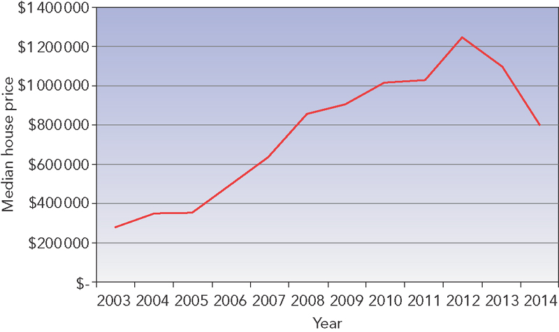
Figure 2.5: Port Hedland's housing boom and bust
Source: Property Power Database, Property Power Partners.

Figure 2.6: Gladstone's housing boom and bust
Source: Property Power Database, Property Power Partners.
These two markets were often touted as typical infrastructure hotspots and they behaved in a similar fashion over the last ten years. We can see that price-growth in both cities was high from 2005 to 2008 and again in 2011–12, yet before and after these years prices did not grow at all or they fell. These changes reflect the different effects that infrastructure development projects have on housing markets as they move through several stages:
- speculation
- construction.
Construction phases (the years of highest price-growth shown in figures 2.5 and 2.6) can provide high rents from workers involved in the project, plus price-growth from investors chasing high yields. These are true infrastructure development booms, but before we look at where they will occur and how to obtain the greatest benefit from them, we need to look at the speculative stages of a project first, because this is where investors are most likely to come unstuck.
Speculation
Announcements regarding a new infrastructure project are usually followed by housing price rises, such as the initial lift we see in figures 2.5 and 2.6, but the graphs also show how these first price rises can stall and sometimes fall before a single sod is turned. The rise in housing demand is purely speculative, caused by investors jumping in early to secure low prices. The stakes for loss are high because projects invariably suffer from changes and delays. The history of announcements for new freeways, railways, tunnels, ports or bridges is littered with amendments, delays and abandonments as governments come and go, funds dry up or priorities alter.
A classic example is the Victorian Regional Rail Link, which started as the Fast Rail Project way back in 2000, promising to drastically cut train times from Victoria's three major regional cities. The proposed reduction of travelling time from Geelong to 45 minutes, Ballarat to 60 minutes and Bendigo to 80 minutes was to bring residents in these cities within commuting distance of Melbourne and started a round of property speculation and development based on these outcomes. It was a brilliant concept and promised to revolutionise regional Victoria, but substantial modifications, cutbacks and delays have dramatically changed the vision.
In fact, as Figure 2.7 shows, the average annual house price-growth of the three regional cities since the Regional Rail Link project was announced has been lower than that of Melbourne, even despite the hype that surrounded the announcement back in the early 2000s. The general expectation by investors that prices in the three regional cities would boom as a result was never realised.
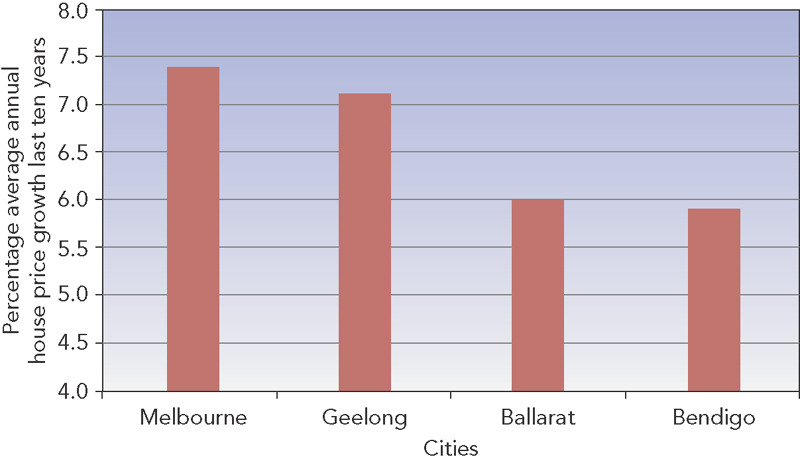
Figure 2.7: house price-growth in regional Victorian cities and Melbourne
Source: Australian Property Monitors house price data adapted from Australian Property Investor Databank.
If we look at the history of Port Hedland's housing market in more detail, we can clearly see the speculative period after the immense high-grade iron ore deposits in the Pilbara were discovered and the intention to mine and export them via Port Hedland was announced. As there was no initial housing shortage, house price rises were slow and irregular and rental demand was slack. The only option for investors wanting to take a profit was to sell to other investors who still expected further price-growth (even though doubts existed that the ore could ever be profitably mined and exported because of its remote and inaccessible location). At this stage, property investment in Port Hedland was purely speculative.
Figure 2.8 shows the lethargic house price-growth that occurred right up until 2003 when China's demand for high-grade Pilbara iron ore changed everything.
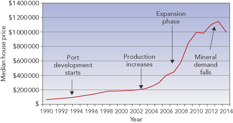
Figure 2.8: the stages of Port Hedland's mining boom
Source: Housing data provided by Australian Property Monitors.
Port Hedland's median house price of $200 000 in 2004 doubled to $400 000 in 2006 when demand was no longer speculative; it was firmly based on a genuine demand for local housing. Investors were able to buy positively geared properties providing a net return from day one due to the extreme shortage of rental accommodation as prices doubled again by 2008, reaching $1 000 000 in 2010. Port Hedland is now in its third stage, which is one of consolidation. Only future demand for iron ore and the ability of Pilbara mines to produce it competitively will stem the otherwise inevitable slide of housing prices.
The investors who did best were those who bought before prices started escalating and then sold to other investors when they had peaked. Such experiences occasionally motivate investors to buy in other potential mining, tourist or infrastructure development locations with the expectation of price-growth that is based purely on speculation. But while they expect a huge growth wave in housing prices and rents, they may instead find something very different, wasting time waiting for wealth that doesn't eventuate. Even worse, when proposed projects are delayed, abandoned, or fail to deliver the expected lift in housing demand, housing prices can fall and sometimes even crash as frustrated investors jostle each other in a rush to sell out and avoid further losses. Figure 2.9 demonstrates how this recently played out in the western Tasmanian town of Zeehan, once a city on a par with Launceston and Hobart due to the immense wealth created from the silver mined in the area.
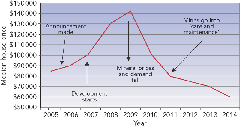
Figure 2.9: the stages of a speculative mining town (Zeehan, Tasmania)
Source: Housing data provided by Australian Property Monitors.
During the mining boom years leading up to the Global Financial Crisis, a number of mining companies announced expansion plans and new mines to develop the remaining nickel, zinc and tin mineral reserves around Zeehan. Speculators rushed in to buy houses in town for under $100 000 and prices soon rose to over $130 000, with investors expecting housing demand to soar just like in Port Hedland. Sadly, within a year it was all over — the nickel, tin and zinc ores turned out to be of lower quality and quantity than expected, and falling mineral prices and demand put an end to the new mining ventures. House prices in Zeehan fell well below their pre-boom levels.
The very different examples of Port Hedland and Zeehan serve to illustrate that there are two reasons growth can occur in any housing market. The first is speculative demand from investors who compete against each other to buy properties in the expectation of further growth. The second is genuine demand for accommodation, which can be generated directly by owner-occupiers or indirectly by renters, who drive up rents and attract investors in the process.
Any growth in housing prices created by a new mine, infrastructure project or tourist resort before actual accommodation shortages occur is pure speculation. The rise in buyer demand can lead to price booms that have nothing to do with the actual demand for homes to live in. All speculative booms can become price bubbles that will burst unless there is a real increase in demand for local accommodation. Even when some new project is completed, the effect on housing prices may be very different to what investors expect, and in some cases there may be no appreciable effect at all.
Some housing markets are so large that new infrastructure developments will have no measurable effect on housing prices or rents. The city of Newcastle has the largest coal loading facility in the world, and its current annual export capacity of about 100 metric tonnes is planned to double in coming years. Yet this expansion is unlikely to have any significant impact on Newcastle's housing market, because the city has a population of over 300 000, which is more than some capital cities, and its economic welfare is not dependent on coal exports. In fact, mining plays only a minor part in the port's activities and its long established mines have little impact on the housing market.
It's the same story in Townsville, the largest city in northern Queensland and the region's administrative, defence, commercial, business and retail centre with a population of nearly 180 000. The Townsville housing market does not rely on mining or port expansions because mineral exports only form a very minor part of its economic activities. In fact, some mining developments and other infrastructure projects can actually have a negative impact on local housing markets due to the high pollution and noise levels they create.
Because speculative housing investment is not based on current housing demand but on the expectation of increased housing demand in the future, investors must be prepared to wait for the anticipated renters or purchasers to materialise, or sell the property to another speculative investor. This sort of investment enables housing price bubbles to form and to burst if demand falls or if overdevelopment overtakes demand. The ‘get in first and get out in time’ notion is crucial, especially in areas where housing demand from a new mine or infrastructure development could be years away. Here are some simple rules to follow if you are confronted with a speculative housing investment opportunity.
Rules for deciding whether to speculate
First, do your research.
- Examine the type of infrastructure or development project that will happen in the area.
- Assess the location: the more remote, the better.
- Assess the housing market: the cheaper, the better.
- Assess the current rental market: the smaller, the better.
- Assess planned publicity: the bigger, the better.
- Estimate local and overseas investor appeal: the higher, the better.
- Determine the expected hold time for your purchase: the longer you can manage to hold, the better.
- Determine your hold costs and sell price target: the more they outweigh your initial cost, the better.
Once all of these points have been answered satisfactorily, you can make your purchase decision.
Construction
The construction stage provides the greatest opportunities for investors because of the high number of workers involved and the lack of suitable housing for them. These opportunities also carry the least risk, because potential housing surpluses resulting from completion of the project are years away.
Even so, infrastructure development projects in cities and large urban centres play a very different role in changing housing demand to those in regional or remote locations. In large population centres there's no rise in housing demand at all, because the workers engaged on the project commute from their existing homes in the city or town. In fact, reductions in housing demand can occur because the noise, dust, pollution, traffic congestion and delays go on for a number of years and drive many local residents, especially renters, away.
In regional areas there may not be enough skilled workers on hand to undertake the construction project, so they must be brought in and locally housed. Rental demand rises and causes rents and rental yields to increase as well, leading to higher investor interest. In theory, this in turn will result in housing price rises as investors compete with each other to buy properties. In practice, however, the accommodation solutions adopted by the construction companies and contractors can take a number of forms, with different effects on local housing markets.
They may compete with investors to purchase properties for their employees to live in, directly putting upward pressure on housing prices but none on rental demand. In other areas they take out long leases to guarantee accommodation for their employees, providing investors with high rent security but only for a limited selection of properties. They may also erect demountables to house drive-in drive-out or fly-in fly-out workers so that there is no change to local rental demand. If none of these strategies is adopted by the construction companies and if rental accommodation shortages become acute, workers pay for board or lodging with local families, book hotel rooms, motels, holiday cabins and even stay in caravan parks. Sorting out this confusing array of possibilities is not difficult, because you can easily research and track the progress of large publicly funded infrastructure projects on the National Infrastructure Construction Schedule at www.nics.gov.au. This site gives you a full description of the infrastructure project, the type of industry, its location, estimated total value, the current stage and the timeline from commencement to completion.
With the National Infrastructure Construction Schedule at your fingertips, the only question remaining is where the construction workers and their families will reside and whether this will cause a local housing shortage. Housing markets with the greatest boom potential from infrastructure development projects are those located near the site that are likely to end up with rental accommodation shortages, and those housing markets where fly-in fly-out and drive-in drive-out employees are likely to live with their families when not rostered on-duty.
Conducting some further online research about a project will show you where the impact on rental demand is likely to be the greatest. The good news is that rising rental demand coupled with growing investor demand are the ingredients for a housing market boom. The better news is that you can estimate where and when this is most likely to occur. While infrastructure development booms can occur anywhere, the best investment opportunities may also be located in areas set to benefit from other emerging booms such as retirees and tourism so that they offer both high growth potential and low risk.
When to sell
The aim is to hold your property until demand from other investors increases your expected selling price sufficiently to cover your purchase, holding and selling costs, plus your profit. If in the meantime the prospects for successful completion of the project have advanced, you can always hold the property for a further period of time, but your continued research into the nature and progress of the development or project is crucial.
Large projects, whether public or private, have a habit of being delayed, altered or even abandoned, usually with far less fanfare than when they were initially announced. For many investors, housing is about securing returns based on the demand for accommodation. They need to know where speculation ends and real demand starts.
The solution to this problem is simply to track the progress of new projects and remember that real demand only comes from the households that will move into the area. Wait until there's evidence of real demand, such as reducing rental vacancies and stock on the market. Whether you choose to speculate or wait, housing purchases based on real housing demand are secure, while the only demand that speculation creates is more speculation.
![]()
This key has shown you how find the areas with the greatest growth potential, and how to predict the likely direction of future price and rent changes in any suburb or town in Australia. The next key shows you:
- how different types of markets work
- when they are likely to provide the best returns
- how to find markets that perform well against the trend, even booming when there is no growth to be found elsewhere.