4. Designs and Layouts
In this chapter, you learn how to use Publisher to create postcards, calendars, and other types of documents.
In Chapter 3, I spent some time talking about templates, and I showed you how templates could be used to make a brochure. In this chapter, I continue the discussion by showing you some more creative projects that you can make by using templates. I also add a few more creative elements to your projects by talking about color schemes and word art.
Calendars
As I explained in the previous chapter, Publisher includes predefined templates that enable you to easily produce various types of documents. One of the more useful document types that you can create is a calendar.
The easiest way to create a calendar is to open Publisher and select the Calendars option from the list of available templates. When you do, Publisher creates a document containing a blank calendar.
At this point, the first thing you must do is tell Publisher what type of calendar you want to create. Most people will probably choose to create a regular calendar, but Publisher does enable you to create academic calendars. An example of an academic calendar would be a calendar for the 2010–2011 school year.
The Other Calendars section currently contains only an option to create a calendar for Kwanzaa, but I would be surprised if Microsoft didn’t eventually make additional calendars available for download.
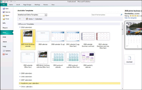
Because regular calendars are going to be the most commonly used, watch what happens when you click the 2010 option. As you can see in Figure 4.1, Publisher gives you a choice of several different calendar formats. You can choose to create a photo calendar, a business card-sized calendar, a quarterly calendar, or any one of several other options.
When you select a calendar format, the column at the far right presents you with any available configuration options. The only option shown in Figure 4.1 is the Download button, which is used to download the template. However, some of the calendar formats enable you to alter things like fonts and color schemes.
Figure 4.1 You have many options for creating calendars.
After you download the template, Publisher displays the calendar document. Each month is displayed on a separate page of the calendar, and the photographs are already included in my photo calendar. You could print out the calendar in its current form. However, the thing that sets templates apart from documents is that they are designed to be customizable.
LET ME TRY IT
![]()
Replacing a Photo
Even though I like the default pictures that Microsoft provides, two of my passions in life are travel and photography. I have been fortunate enough to have visited several dozen countries, and I have pictures from most of them, which I would like to use instead of the default pictures. There is an easy way to accomplish this. To replace a photo in the calendar, follow these steps:
- Using the slide bar in the lower-right corner of the screen, zoom the document so that you can clearly see the photograph.
- Click on the photograph to select it.
- Go to Publisher’s Picture Tools Format tab.
- Click the Change Picture icon, found on the toolbar.
- Choose the Change Picture option from the Change Picture dropdown menu.
- When prompted, browse to the location of your replacement image.
- Select your replacement picture, and click the Insert button.
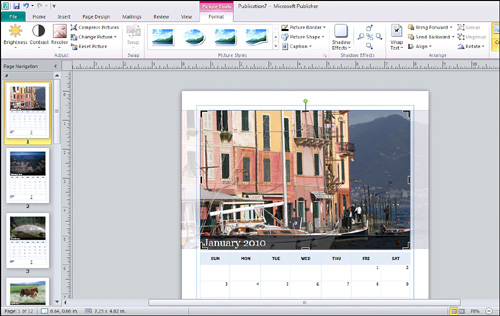
As you can see in Figure 4.2, I have replaced the default image with a picture that I took in Portofino, Italy.
Figure 4.2 Replacing an image is quick and painless.
Additional Customizations
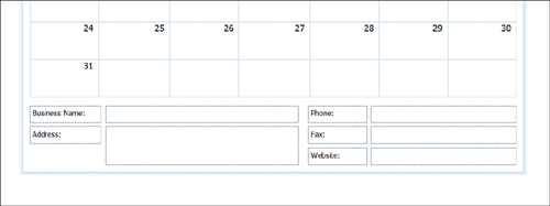
In Figure 4.3, I have zoomed in on the bottom of the calendar. As you can see, Publisher provides you with text boxes that you can use to fill in the name of your business, along with some other basic information, such as your phone number and website.
Because everything that you see is based on text boxes, you have the option of adding, deleting, or modifying fields as you see fit. For example, if you were printing a personal calendar, you wouldn’t need business contact information. In that case, you could just delete all the fields. You may, however, want to replace some of Microsoft’s fields with a text box that you can use to describe the calendar. In this case, I might create a text box that says something like “Portofino Italy, Thanksgiving 2009.”
Figure 4.3 You can personalize a calendar for your business.
SHOW ME Media 4.1—Creating a Calendar
![]()
Access this video file through your registered Web edition at my.safaribooksonline.com/9780132182591/media.
LET ME TRY IT
![]()
Creating Other Types of Calendars
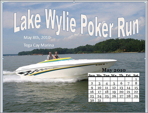
Although you can create your own calendar, you might need to include a calendar within another type of document. For example, if you created a flyer advertising an event, you might want to include a small calendar that shows when the event takes place. Publisher makes this possible through the use of page parts, as follows:
- Go to Publisher’s Insert tab.
- Click the Calendars icon.
- Select the calendar component that you want to use in your document, as shown in Figure 4.4.
- Once the calendar has been inserted into your document, adjust its size and position.
You can see an example of a flyer with an embedded calendar in Figure 4.5.
The calendar that we have just inserted into a document is really nothing more than a table. As such, you can customize this calendar using the same techniques you would use to alter the appearance of a standard table. I talk all about table formatting in Chapter 6, “Tables.”
Figure 4.4 Choose the type of calendar you want to insert.
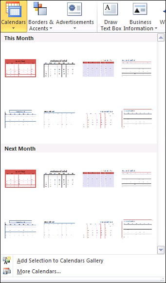
Figure 4.5 A Publisher document with an embedded calendar.
Postcards
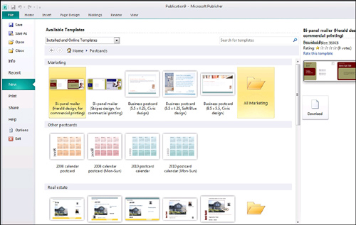
Postcards are another type of document that you can create using Publisher 2010. The easiest way to create a postcard is to open Publisher and select the Postcards template (see Figure 4.6).
As you can see in the figure, Publisher contains templates that you can use to create marketing postcards, as well as postcards for real estate. There are also templates for calendar postcards.
Figure 4.6 Publisher 2010 enables you to create custom postcards.
You might find that none of the templates I just mentioned will work for you. Fortunately, Publisher contains templates for 18 different sizes of blank postcards, as shown in Figure 4.7. Publisher also groups postcard templates by manufacturer as a way of helping you match your Publisher document to the paper on which you are going to print.
As was the case with calendars, you can create a postcard by selecting the template that you want to use, and then clicking the Download button (if necessary). The template is displayed as a Publisher document, as shown in Figure 4.8. You can edit any part of the postcard using exactly the same techniques that I showed you for editing a calendar.
Figure 4.7 Publisher offers paper-specific templates.
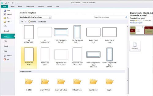
Figure 4.8 The postcard template is loaded as a Publisher document.

SHOW ME Media 4.2—Creating a Postcard
![]()
Access this video file through your registered Web edition at my.safaribooksonline.com/9780132182591/media.
Greeting Cards
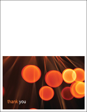
When you select the Greeting Card template, Publisher lists templates that you can use to create various types of greeting cards. For instance, Publisher has templates for thank-you cards, anniversary cards, birthday cards, and the list goes on. As was the case with the postcard template, the greeting card option offers blank templates that are specifically formatted for certain paper sizes.
Most of the greeting card templates are pretty simple. As you can see in Figure 4.9, the greeting card template I have chosen is made up of two pages, which would be printed on two sides of a single page. There is ample room on both the inside and outside of the card to add your own text or images. Of course, replacing the card’s existing text and images is always an option, too.
Figure 4.9 The greeting card templates are pretty simple.
Additional Visual Elements
So far in this chapter I have shown you how to make a variety of creative projects. Sometimes, though, you can add more flair to your projects by using additional visual elements. In this section, I show you how to use things such as color schemes and word art.
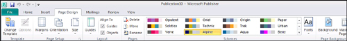
Color Schemes
When I talked about the calendar templates earlier, I mentioned that some templates contain options to modify things like fonts or business information. An element that is supported by some, but not all, templates is color schemes.
If you look at Figure 4.10, you can see that I have chosen a template that is classified as a Quick Publication. The right side of the screen displays the customizable attributes for this template, including the color scheme, font scheme, business information, and layout.
Figure 4.10 You can sometimes choose a color scheme.

Keep in mind that these options are not unique to the template I have selected. I chose this particular template randomly. Many of Publisher’s templates offer customizable attributes. At any rate, Publisher offers numerous color schemes from which you can pick. When you select a color scheme, the document preview above the color scheme changes to reflect the scheme you have selected. When you have made your choice, click OK and the template will be applied to your document using the color scheme and other attributes you have specified.
Even after you have chosen a color scheme, you are not committed to sticking with it. The Page Design tab, shown in Figure 4.11, displays all the available color schemes, and Publisher enables you to switch color schemes on the fly by simply clicking on a new one.
Figure 4.11 You can pick a new color scheme at will.
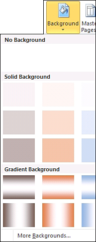
Using Color Schemes in Blank Documents
You can also use a color scheme in a made-from-scratch document. If you look at Figure 4.12, for example, you can see that I have chosen a color scheme from the Page Design tab. When you go to add a background to the page, the available backgrounds match the color scheme you have chosen. Of course, it is probably really hard to tell that the colors in the screen capture match because this book is being printed in black and white, but you can always look at the Web version to get a better feel for the color scheme.
Figure 4.12 You can apply a color scheme to an empty document.
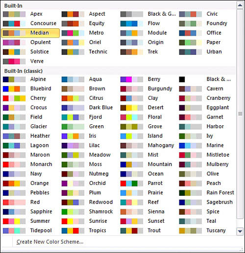
Custom Color Schemes
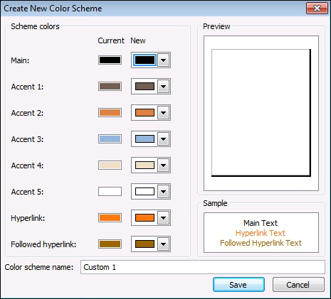
You aren’t just limited to using Publisher’s built-in color schemes. If you have a creative side, you can define your own. If you expand the color schemes that are displayed on the Page Design tab, notice in Figure 4.13 that there is a Create New Color Scheme option at the bottom of the menu.
Figure 4.13 You can create your own color schemes.
The actual process of creating a color scheme is simple. As you can see in Figure 4.14, Publisher displays the colors that are currently being used and gives you a chance to replace each color with one of your own choosing. When you are done, just give the new scheme a name and click Save.
SHOW ME Media 4.3—Creating a Custom Color Scheme
![]()
Access this video file through your registered Web edition at my.safaribooksonline.com/9780132182591/media.
Creating custom color schemes is helpful if you work for an organization that demands consistency. For example, I volunteer at charitable organizations. Their websites contain numerous documents, and all the documents use consistent formatting. Creating a custom template with a custom color scheme is an easy way of ensuring that all documents are created with a consistent look and feel.
Figure 4.14 To create a color scheme, replace the default colors with your own colors.
Word Art
Word art is a feature that you can use to produce lettering that exceeds the capabilities of standard fonts. For instance, you could use word art to form letters that appear hollow, or to apply a gradient texture or 3-D effect to your lettering. Word art can also be used to bend text into various shapes. You will see several examples of this later on.
LET ME TRY IT
![]()
Inserting Word Art
The technique that you must use to add word art to your document is similar to the techniques I have already shown you for adding things such as pictures and shapes to a document. To insert word art into a document, complete these steps:
- Go to Publisher’s Insert tab.
- Click the Word Art icon, located on the toolbar.
- Select the style of word art that you want to insert, as shown in Figure 4.15.
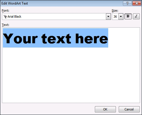
- Enter the text that you want to transform into word art, as shown in Figure 4.16.
- Select the font and point size that you want to use. You can also apply the Bold or Italic attributes if you like.
- Click OK.
Figure 4.15 Choose the word art style that you want to apply.
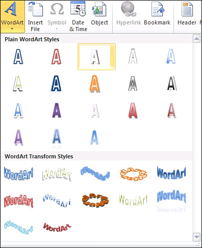
Figure 4.16 Enter your text and choose a font.
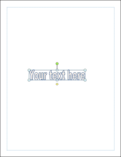
You can see a simple example of word art in Figure 4.17. The word art appears within a box, and you can use the box’s now-familiar markers to stretch, move, or resize the word art box.
Figure 4.17 A simple example of word art.
In addition to the markers on the corners and in the middle of the word art box, there is also a green dot above the word art. Clicking this dot and moving your mouse causes the word art to rotate in the direction in which you move your mouse.
The yellow dot below the word art box is used to control the slant of the text. Dragging this dot to the left, for example, causes the text to be slanted to the right.
LET ME TRY IT
![]()
Editing the Word Art Text
If you find a typing mistake in a word art image, you don’t have to re-create the image from scratch. Simply modify the text, and the various word art attributes will be applied to the corrected text. To make a correction to your word art text, follow these steps:
- Select the word art box.
- Go to the Word Art Tools Format tab.
- Click the Edit Text icon.
- Enter the corrected text, and click OK.
Keep in mind that although Publisher does a relatively good job of retaining word art attributes after text is modified, the very nature of editing text means that the size of the word art image will change. As such, you might find it necessary to resize your word art after altering the text.
LET ME TRY IT
![]()
Changing Word Art Spacing
When you type regular text into the text box, the text’s appearance is dictated by the font that you are using. In some ways, this is also true for word art, but you do have more control over how the text is displayed. You have the ability to change the spacing between the individual letters.
Publisher won’t give you complete granular control over the text spacing, but you can set the spacing to Very Tight, Tight, Normal, Loose, or Very Loose. Letters that are spaced very tightly tend to overlap each other, whereas very loosely spaced letters tend to have big gaps between them. You can control text spacing by following these steps:
- Go to Publisher’s WordArt Tools Format tab.
- Select the word art that you want to format.
- Click the Spacing icon, shown in Figure 4.18.
- Choose the spacing that you want to use.
Figure 4.18 Word art enables you to control the spacing between letters.

SHOW ME Media 4.4—Using WordArt
![]()
Access this video file through your registered Web edition at my.safaribooksonline.com/9780132182591/media.
Color Effects
Because word art is really nothing more than just a complex shape, it shouldn’t come as any surprise that your options for coloring word art are practically identical to those available for coloring shapes. Because I discussed shape coloring in detail in Chapter 3, “Working with Visual Elements,” I don’t want to bore you by repeating myself. I do, however, want to give you a quick overview of the options that are available to you.
LET ME TRY IT
![]()
Coloring Word Art
There are two primary aspects to coloring word art images. You can color the letters themselves, and you can apply a color to the outline around the letters. To change the outline color, follow these steps:
- Select the box containing the word art.
- Go to Publisher’s WordArt Tools Format tab.
- Click the Shape Outline icon, located on the toolbar.
- Choose the desired outline color from the Shape Outline menu, shown in Figure 4.19.
Although the Shape Outline menu’s primary purpose enables you to change the color of the outline around a word art image, there are a couple of other menu options that I want to point out. One option is the Sample Line Color option. Use this option if you want the outline color to match a color used elsewhere in the document.
Figure 4.19 Choose the shape outline color that you want to use.
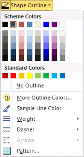
When you choose this option, the cursor changes into the shape of an eyedropper. Simply move the tip of the eyedropper over the color that you want to duplicate, and then click your mouse button.
Another option is the Weight option. The weight option enables you to control the thickness of the outline. Higher weights produce thicker lines. Similarly, the Dashes option enables you to change the outline into a dotted (or dashed) line. This usually has the effect of making the words appear fuzzy. A similar effect can be achieved by applying a pattern to the outline, but the pattern is usually visible only if you are using a high weight number and a large font size.
To apply color to the inside of the letters, you must click the Shape Fill icon, found on the WordArt Tools Format tab. As you can see in Figure 4.20, Publisher gives you the same options for coloring word art images as you have for filling in other types of shapes. You can use a solid color, a gradient color, a pattern, a texture, or even an image.
Applying an image to a block of lettering might seem like an odd concept, but you can actually create some pretty neat effects by using this technique. To show you what I mean, I have created the document shown in Figure 4.21, in which I applied a picture from a trip to Tahiti to the word Tahiti.
Figure 4.20 Options for filling Word Art images are similar to those available for filling shapes.
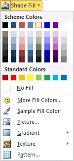
Figure 4.21 You can fill a word art image with a picture.

Incidentally, if you use this technique, you can adjust the picture’s position to some degree. If you hover over a letter, the cursor changes to display four arrows. When this happens, you can hold down the mouse button and drag the picture to the desired position. Depending on the size of your lettering and the dimensions of your picture, though, you might find that you can move the picture in only one direction.
Creating Shadow Effects
You can add depth to your word art images by adding shadows. Publisher enables you to create anything from a subtle hint of a shadow to a large drop shadow. To create a shadow, follow these steps:
- Select the word art to which you want to apply the shadow.
- Go to Publisher’s WordArt Tools Format tab.
- Click the Shadow Effects icon.
- Choose the effect that you want to apply, as shown in Figure 4.22. You can see a preview of each effect by hovering your mouse pointer over it.
Figure 4.22 Choose the type of shadow that you want to use.
![]()
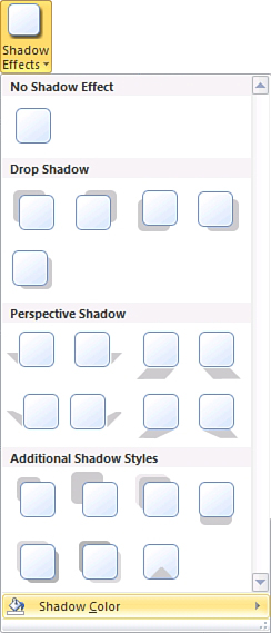
It is worth noting that the Shadow Effects menu contains a Shadow Color option, which is also shown in Figure 4.22. Although you can’t get quite as creative with shadow colors as you can with the color of the lettering and its outline, you do have the option of making your color of choice semi-transparent.
LET ME TRY IT
![]()
Creating 3-D Effects
I will never forget attending a Windows NT Server certification class back in the 1990s. As much great material as was presented, one of the things that I remember most was the screensavers that came with Windows. One of the screensavers allowed you to enter a word or a short phrase and then rendered your text in 3-D and made it bounce across the screen. You can use Publisher to create similar text effects. To do so, follow these steps:
- Click on the word art image to select it.
- Go to Publisher’s WordArt Tools Format tab.
- Click the 3-D Effect icon.
- Choose the effect that you want to apply, as shown in Figure 4.23.
Figure 4.23 You can apply 3-D Effects to word art text.
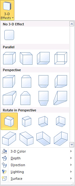
As you can see in the figure, the options for rendering text in 3-D are identical to the options I showed you in Chapter 3 when we applied a 3-D effect to a shape. Publisher gives you total control over the depth, direction, and lighting used in rendering the 3-D text. Likewise, you can create numerous surface and coloring effects.
LET ME TRY IT
![]()
Shifting Shapes
Word art is probably best known for its ability to twist words into all kinds of wacky shapes. You already got a preview of this capability a few pages back when I showed you the screen that enables you to select the style you want to use for your word art image.
It’s important to understand that selecting a word art style is only a shortcut. Any of the effects that can be chosen as a style can also be created manually. To see what I mean, perform these steps:
- Click on your word art text to select it.
- Go to Publisher’s WordArt Tools Format tab.
- Click the Change Shape icon, found on the toolbar.
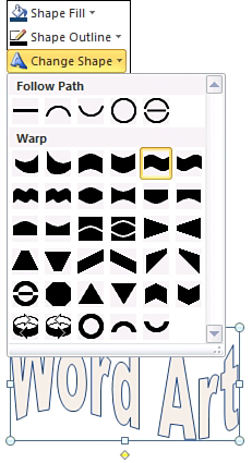
- Pick the shape that you want to apply to your text from the Change Shapes menu, shown in Figure 4.24. Once again, you can get a preview by hovering your mouse pointer over each shape.
As you looked at Figure 4.24, you might have noticed the yellow dots below and to the left of the word art box. As I already showed you, you can drag the dot below the image back and forth as a way of controlling the slant of the letters. The dot to the left of the image is a control for adjusting the height of the letters. Simply drag the dot up to make the letters taller, or drag it down to make the letters shorter.
Creating Building Blocks
As you have seen, a lot of work can go into creating a shape or a word art image. If you create a shape, word art image, or even a block of text that you want to reuse in other documents, you can save those objects as building blocks.
Figure 4.24 You can apply a variety of shapes to word art text.
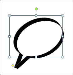
To show you how building blocks work, I have taken one of the default shapes and applied a 3-D effect, as shown in Figure 4.25.
Figure 4.25 You can turn objects into building blocks.
Converting an Object into a Building Block
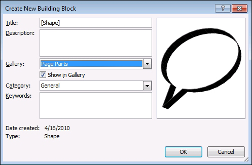
Let’s pretend that we want to turn this into a building block. To do so, follow these steps:
- Right-click on the object.
- Select the Save as Building Block command from the shortcut menu.
- Publisher displays the Create New Building Block dialog box, shown in Figure 4.26. Enter a title and an optional description for your building block. It is also a good idea to provide some keywords to make your building block show up in search results.
- Select the gallery in which you want to store the building block, and click OK.
Figure 4.26 You can adjust the wrapping points as needed.
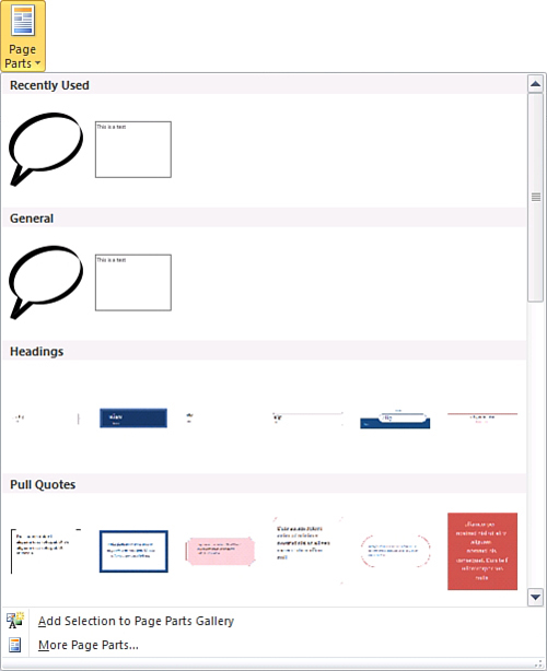
You can access your newly created building block at any time by going to Publisher’s Insert tab and clicking the Page Parts link. The building blocks that you create are displayed within the Pager Parts galleries, as shown in Figure 4.27.
TELL ME MORE Media 4.5—More Design Ideas
![]()
To listen to a free audio recording about some additional design ideas, log on to my.safaribooksonline.com/9780132182591/media.
Figure 4.27 Building blocks are accessible through the Page Parts icon.