3. Working with Visual Elements
You learn all about visual elements in this chapter.
In Chapter 2, I showed you some basic techniques for laying out a document page. Now that you have performed the initial setup for your document, it is time to begin adding design elements to the page. I show you how to add text to your document, and then we make things more interesting by adding various types of graphics.
Text Boxes
In this section, I teach you about text boxes. Before I do, you need to understand how Publisher differs from a word processor, such as Microsoft Word. Although Microsoft Word is capable of incorporating many of the same design elements as Publisher, the two applications are very different.
Microsoft Word is primarily geared toward producing text documents, whereas Publisher mixes text, graphics, and other design elements. As such, when you want to produce a text document in Microsoft Word, you start typing. Publisher will also enable you to type text into a new document, but the process works a bit differently than it does in Word.
In the previous chapter, I mentioned that any design elements that you use in a Publisher document must exist within a box. This goes for text too. If you try to create a new Publisher document, and then you just start typing text, Publisher will automatically create a full-page text box to accommodate your text.
When you create a text box, Publisher places a large rectangle just outside the page margins. This rectangle is the text box that holds the text you type. You can use the small circles and squares that are incorporated into the rectangle to resize the text box. Simply click on one of these markers and drag it into the desired position to resize the text box.
If you move your mouse over the text box anywhere other than above one of the resize markers, the cursor will take the shape of four arrows. This is Publisher’s move icon. When the cursor takes this shape, hold down the mouse button, and then move the text box to another location on the page.
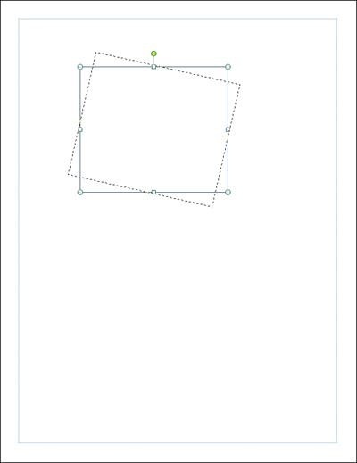
Any time you create a text box, Publisher places a green circle just above it. This circle can be used to rotate the text box. To do so, just click on the green circle, and then move your mouse to the left or to the right to rotate the text box, as shown in Figure 3.1.
Figure 3.1 Click on the green circle, and then drag your mouse to rotate the text box.
As we progress through the various lessons, it is important to keep in mind that every visual element that we will be working with is placed in a box. As such, you will be able to resize, reposition, or rotate any design element using exactly the same methods that you used for the text boxes.
Creating a New Text Box
From the previous section, if you simply start typing text onto a blank page, Publisher creates a text box for you. As you might have already guessed, though, this isn’t the preferred way of doing things. In Chapter 2, “Getting Started with Publisher 2010,” I showed you how to use grid guides to lay out your document, and I did that for a reason.
There is nothing wrong with letting Publisher automatically create a text box, and then sizing and positioning the text box to meet your needs. However, as you will eventually discover, most Publisher documents require the use of multiple text boxes. As such, it is important for you to know how to create additional text boxes on demand.
LET ME TRY IT
![]()
Creating a New Text Box
Publisher enables you to create a new text box by drawing it in the shape and location that you want. To create a text box, complete these steps:
- Click Publisher’s Home tab.
- Click the Draw Text Box icon, located on the toolbar.
- Move the cursor to the area where you want to place the new text box’s upper-left corner.
- Hold the left mouse button, and move the cursor into the position where you want to place the text box’s lower-right corner.
- Release the mouse button, and the text box will be created. You can adjust the text box’s size and position by using the techniques that I showed you earlier.
Entering Text into a Text Box
The concept of entering text into a text box probably sounds like a no brainer. Just click on a text box before you enter text into it. It’s that easy.
Note that when you are working on other design elements, text boxes you have previously created might seem to vanish. If this happens to you, all you have to do is click on the area where the text box should be, and it will reappear.
If you have already entered text into the text box, locating the text box is easy because the text itself won’t usually disappear. You might have to hunt around a bit if you need to locate an empty text box. That being the case, if you create a text box but aren’t ready to populate it yet, I would put a few words of placeholder text into the text box just to make the box easy to find.
Normally, if a text box contains text, the text box may disappear while you are working with other visual elements but the words within the text box will remain onscreen. This isn’t always the case, though. Publisher makes it possible for visual elements to overlap one another. When this happens, you might see a text box’s contents disappear. I show you how to deal with this problem later in this chapter.
SHOW ME Media 3.1—Creating a Text Box
![]()
Access this video file through your registered Web edition at my.safaribooksonline.com/9780132182591/media.
Fonts
Just like every other Microsoft Office application, Publisher 2010 enables you to choose from a variety of different fonts. You also can change a font’s point size and color, and can make a number of additional customizations that I talk about in Chapter 4, “Designs and Layouts.”
Because fonts are used heavily within Publisher, I wanted to take the opportunity to give you a crash course on the fonts that Windows supports.
Windows 7 supports two types of fonts: TrueType and OpenType. Unlike the bitmap font files that were used by some of the older versions of Windows, TrueType fonts are designed to scale cleanly. If you increase the size of a bitmap font, eventually it will become blocky. TrueType fonts do not have this problem. Furthermore, TrueType fonts work with any printer that Windows supports.
OpenType fonts are similar to TrueType fonts, except they are Unicode based. The Unicode support allows OpenType fonts to support a greater range of character sets than what is possible with TrueType fonts. In addition to the basic character set, an OpenType font might also include a small capitalization set or a condensed set.
Purchasing Fonts
Windows ships with a fairly decent collection of built-in fonts; in fact, Windows 7 contains about 40 new fonts. In addition, Publisher includes many additional fonts. Even so, you may find that the built-in font set simply doesn’t contain a font that conveys the desired look and feel for your project.
To give you a more concrete example of such a situation, a few years ago I bought a new Cigarette boat. For those of you who are not familiar with marine culture, it is traditional to give a boat a name and to display the boat’s home port (the city where you keep the boat) in a smaller type size beneath the boat’s name.
When it comes to higher-end boats, the name is almost never displayed in plain text. It is usually more like a logo. That being the case, I decided that Publisher would be the perfect tool for creating the lettering for my boat.
Laying out the text for the home port and for the boat’s registration numbers was no big deal. I just used a standard font in the boat’s color scheme and added a drop shadow. Designing the boat’s name was much more challenging, though. For one thing, the fonts that were included with Windows all seemed either too businesslike, too childish, or too overused. I wanted something unique. Thankfully, there are numerous fonts available on the Internet. Many of these fonts are free, but if you can’t find exactly what you are looking for, there are also fonts available for purchase.
To make a long story short, I ended up purchasing a TrueType font for use in my boat’s logo. I got the font for a decent price, but it is worth noting that font prices can vary widely.
Since it has been about five years since I created the logo for my boat, I can’t remember exactly how much the font cost me, but if memory serves me, I think that I paid around $10 for it. As I said, though, the price of fonts varies widely. I have seen fonts sell for as low as a buck, or as high as about $400.
So why the big difference in cost? Typically, the higher-priced fonts give you a little bit more bang for the buck. For example, a high-priced commercial font may provide you with many different variations of that font (light, bold, ultra black, light italic, bold condensed, and so on). Free and low-priced fonts, on the other hand, typically include fewer (if any) variations.
For example, I recently downloaded the font that the band Iron Maiden uses on all their album covers. Because this was a free font, it included only a single TTF file, with no variations. I’m not saying that you can’t make it bold or italic or change the point size—you can. It’s just that the free font didn’t include variations, such as black condensed or ultra bold.
Obviously, these days everyone is on a budget, and paying big bucks for a single font might not be an option. Fortunately, there are some alternatives to purchasing expensive commercial fonts.
One option is to do an Internet search on the font name. Sometimes a font will be available from multiple websites, and the pricing is not always consistent from one site to another. It pays to shop around.
Another option is to see whether you can find the font included as a part of a font family. A font family is a collection of fonts that have a similar appearance. Using fonts that are vastly different from one another can sometimes give the document a feeling of disarray. Designers create font families as a way of grouping fonts that do a good job of complementing each other. I have found that font families can be less expensive than a single font, but may lack the style variations found in a high-priced commercial font.
Typography
In the previous section, I talked about how I used Microsoft Publisher to create the logo for my Cigarette boat. In retrospect, Publisher was the perfect tool for the job. I was able to give the font a color that matched my boat, add a drop shadow, and insert a graphic to go along with it. More importantly, though, the rulers that I talked about in the previous chapter allowed me to ensure that my design would fit within the allotted space on the boat, but without being too small. Incidentally, this also required me to work with the printing company to ensure that my vinyl graphics would be printed in the correct dimensions. I talk all about the printing process in Chapter 8, “Printing.” For right now, though, I want to show you how to install and preview a font.
Installing a Font
Because fonts are a Windows-level component, the method for installing them differs from one version of Windows to the next. In Windows 7, you can install a font by copying the font file to the C:WindowsFonts folder.
LET ME TRY IT
![]()
Enabling ClearType
ClearType is a technology used by Windows to make fonts easier to read. It works by applying shading to certain parts of the characters, to make the characters appear smoother. You can enable ClearType in Windows 7 by following these steps:
- Open Windows Explorer and navigate to C:WindowsFonts.
- Click the Adjust ClearType Text link.
- Select the Turn On ClearType check box.
- Click Next.
- Windows shows you two text previews. Select the preview that looks the best to you, and click Next.
- Windows displays three more screens, each requiring you to select the text that looks the best to you. When the process completes, click Finish.
Previewing a Font
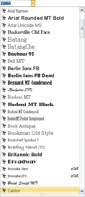
As you prepare to add text to your document, one of the first decisions that you will have to make involves choosing the font that you want to use. Publisher contains a dropdown list on the Home tab that you can use to select the font of choice. This dropdown list provides a short preview of what the various fonts look like, as shown in Figure 3.2, but it usually isn’t the best option for deciding on a font.
Figure 3.2 You can select a font from Publisher’s Home tab.
Previewing Fonts
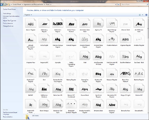
In my opinion, you are better off using Windows as a mechanism for previewing fonts. The exact method for doing so varies from one version of Windows to another. In Windows 7, you can preview fonts by performing the following steps:
- Click the Start button.
- Open the Control Panel.
- Click the Appearance and Personalization link.
- Click the Fonts link.
The resulting screen shows you a list of each available font, as shown in Figure 3.3. Although you can get somewhat of an idea of what each font looks like from this screen, you can do better. Simply right-click on a font and choose the Preview option to see a full-blown preview. Windows even gives you the option of printing the preview.
Figure 3.3 The Windows Control Panel displays each font that is installed on the system.
SHOW ME Media 3.2—Working with Fonts
![]()
Access this video file through your registered Web edition at my.safaribooksonline.com/9780132182591/media.
LET ME TRY IT
![]()
Inserting Pictures
Inserting a picture is easy. To do so, follow these steps:
- Go to Publisher’s Insert tab.
- Click the Picture icon, located on the toolbar.
- Select the picture that you want to insert into your document.
- Click the Insert button.
As you can see in Figure 3.4, Publisher inserts the picture between the document’s margins. Like all visual elements, the picture exists within a box, and you can use the markers on the box to rotate, move, or resize the picture.
Figure 3.4 Pictures can be inserted directly into Publisher documents.
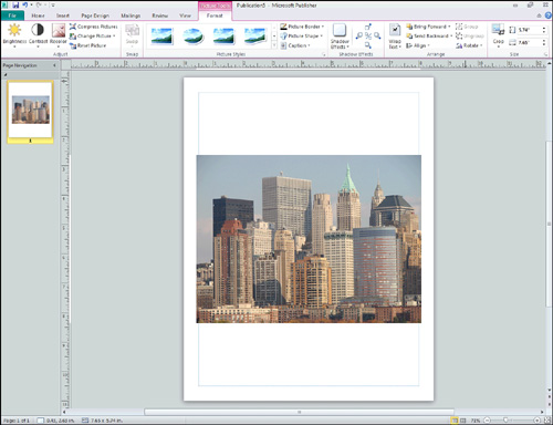
Formatting Pictures
As you look at Figure 3.4, notice that the toolbar icons have changed to reflect the fact that I currently have a picture selected. As you can see in the screen capture, Publisher displays icons that can be used for adjusting the picture’s brightness and contrast.
Another cool option is the Recolor option. By clicking the Recolor icon, shown in Figure 3.5, you are given the opportunity to recolor the image using a variety of effects. For example, you can make a color image black and white or turn the whole image sepia.
Figure 3.5 Publisher gives you the option of recoloring pictures.
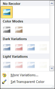
If the color variations that are presented on the recolor menu don’t fit your needs, you can always use the More Variations option. This option enables you to tint your picture to match any color in the rainbow.
Transparency
Another fun thing that you can do with colors is to make a portion of an image transparent. To do so, you must designate a color within the image to become transparent. When you do, the background (or underlying layers of the image) will be displayed in place of the color that you have removed.
Make an Image Transparent
To make a portion of an image transparent, complete these steps:
- Go to Publisher’s Format tab.
- Click on the image that you want to work with.
- Click the Recolor icon, found on the toolbar.
- Choose the Set Transparent Color option from the Recolor menu.
- Move the cursor to the color that you want to render transparent, and click the left mouse button.
It is worth noting that making a color transparent tends to work much better if your picture is a diagram rather than a photograph. Photographs tend to use millions of colors. As such, an object within a photograph may appear to be a solid color, but in reality it is commonly made up of numerous different shades of that color. Publisher does not always pick up on all of the varying shades. Experience has shown that sometimes transparency is also applied to unexpected areas of a photograph.
LET ME TRY IT
![]()
Resetting a Picture’s Color
Sometimes you may recolor all or part of an image, only to decide that you don’t like the change. If you make this decision immediately, you can use the Undo button to undo your changes. Sometimes, though, you might not decide that you want a change until much later in the design process, when it is far too late to click Undo.
To reset a picture to its original color, complete these steps:
- Go to Publisher’s Format tab.
- Click on the image that you want to modify.
- Click the Recolor icon.
- Choose the No Recolor option from the Recolor menu.
This process will not remove a transparent color. The only way to do so is to right-click on the picture and choose the Change Picture | Reset Picture commands from the shortcut menus. Keep in mind, though, that this resets everything about the image, including positioning and scaling.
Picture Styles and Shapes
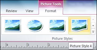
You can achieve some rather dramatic effects by applying styles or shapes to the photographs that you include in your Publisher documents. In Figure 3.5, you might have noticed the Picture Styles section on the toolbar. You can choose from any one of these styles, and Publisher will change the shape of the image to match the style that you have chosen. Although only four styles are initially shown, additional styles are available by clicking the down arrow in the lower-right corner of the Picture Styles section. You can see an example of some of the styles that are available to you in Figure 3.6.
Figure 3.6 Picture styles enable you to change the shape of an image.
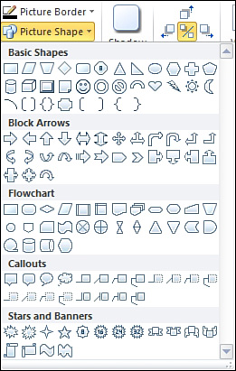
As you look at Figure 3.6, you might have noticed that although numerous picture styles are available, they all conform to the same basic shapes. Publisher doesn’t limit you quite as much as you might think, though. If you want to mold a picture into a shape other than what is available through the Picture Style section, you can do so by clicking the Picture Shapes icon located on the toolbar. As you can see in Figure 3.7, there are a wide variety of shapes that you can apply to your picture.
SHOW ME Media 3.3—Picture Styles and Shapes
![]()
Access this video file through your registered Web edition at my.safaribooksonline.com/9780132182591/media.
Changing a Picture
The picture toolbar, displayed on the Format tab, contains an icon labeled Change Picture. You can use this icon if you want to reset the picture to its original state or replace it with a new picture. Using this icon removes the picture but leaves the picture object behind. Because the picture object retains its shape and position, it is easy to place the replacement picture in exactly the same position.
Figure 3.7 Numerous shapes are available.
Picture Captions
If you are including photographs in your Publisher document, you might find that you occasionally need to annotate your pictures with captions. You can do so by using Publisher’s Caption feature.
LET ME TRY IT
![]()
Inserting a Picture Caption
You can insert a picture caption by completing the following steps:
- Go to Publisher’s Format tab.
- Click on the picture to which you want to add a caption.
- Click the Caption icon, located on the toolbar.
- Select the caption that you want to add to the picture.
- Click the default text within the caption to select it.
- Replace the default text with your own caption.
- Format your caption with the font, color, and style of your choosing.
You can see an example of a caption in Figure 3.8.
Figure 3.8 Publisher makes it easy to add captions to pictures.

Changing a Caption’s Color
By default, Publisher uses a background color that is based on the current theme (the default color was red in this case). You are not stuck with the default color. Before I show you how to change a caption’s color, it is worth noting that a caption is really nothing more than a shape that has a text box in the middle of it. Consequentially, all the techniques I am about to show you can also be applied to shapes.
Changing Colors
If you refer to Figure 3.8, you will notice that our caption had some wavy lines at the top. Publisher treats each of these lines as a separate shape. As such, you will have to apply coloring to each section individually. You can change the caption’s color by completing these steps:
- Right-click on the portion of the caption that you want to modify (but not on the text box within the caption).
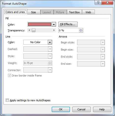
- Choose the Format AutoShape command from the shortcut menu.
- When Windows displays the Format AutoShape text box, select the Colors and Lines tab.
- Choose the color that you want to use from the Color dropdown list, as shown in Figure 3.9.
Figure 3.9 You can change a caption’s color.
Going Beyond Simple Colors
There is nothing wrong with setting a new color for a caption, but you don’t have to stop there. There are numerous effects that you can apply to your caption. To get started, right-click on a section within the caption (but not on the text box within the caption), and choose the now-familiar Format AutoShape command from the shortcut menu. When you do, you will be taken to the same dialog box that I showed you a moment ago.
I have already shown you how to choose a new color, but we can do much more than that. For example, refer to Figure 3.9 and notice that the Colors and Lines tab contains a rather large section called Line. This section controls the appearance of the line that is used to separate one section of the caption from another. By default, the line is invisible, but you can make the line visible by assigning it a color. After doing so, you can also control the style and the weight of the line.
Having the ability to control the line’s appearance is nice, but the reality is that this probably isn’t a feature that you will use very often. You can access a more practical feature by clicking the Fill Effects button. When you do, Publisher will display the Fill Effects properties sheet shown in Figure 3.10.
Figure 3.10 You aren’t stuck filling a shape with a solid color.
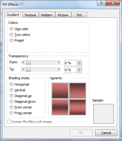
Gradients
The Gradient tab, shown in Figure 3.10, enables you to use a gradient instead of a solid color. To begin, you must tell Publisher whether you want to use a single color or two colors within the gradient. You also have the option of using a predefined gradient, but most of the predefined gradients tend to be a bit on the psychedelic side.
If you have chosen to use a single color gradient, the next step in the process is to choose the color on which you want to base the gradient. You also have the option of controlling how light or dark the gradient should be.
If you have chosen to create a two-color gradient, you will have to pick two colors instead of one. Normally, the colors that you choose should not be similar to each other. Picking colors that are too similar can cause the gradient effect to be overly subtle.
After picking your colors, you have the option of setting a range of transparency for the gradient. I tend to like to leave this option alone, but you shouldn’t be afraid to experiment with it. You can achieve some rather strange results by monkeying around with the transparency.
The last step in creating your gradient is to choose the shading style that you want to use. The shading style controls the way in which the gradient is generated. Remember, a gradient is a transition from light to dark or from one color to another; therefore, a horizontal gradient might start with a light color at the top of the shape and fade into a darker color near the bottom of the shape. In contrast, a vertical gradient might place the lighter color on the left side of the screen and the darker color on the right side.
Even though you have to pick a shading style, the creation of the gradient isn’t quite as rigid as the previous paragraph might lead you to believe. That’s because choosing the shading style is only part of the process. If you refer to Figure 3.10, you will notice a section labeled Variants just to the right of the shading styles. This section enables you choose the specifics of how you want the gradient fill to appear with regard to the shading style that you have chosen.
One last thing that I want to mention about this tab is the Rotate Fill Effect with Shape check box that appears at the bottom of the window. Once you have selected a caption, you probably won’t be rotating it very much. This isn’t necessarily the case for other types of shapes, though. Sometimes you might find that after rotating a shape, the gradient no longer looks right. The Rotate Fill Effect with Shape check box enables you to preserve the effect you have created by moving the gradient along with the shape.
The Texture Tab
The Texture tab, shown in Figure 3.11, enables you to fill a caption with a texture rather than a color. This tab is extremely simple to use. All you have to do is select the texture that you want to apply to the shape, and click OK.
Figure 3.11 You can apply a texture to a shape.
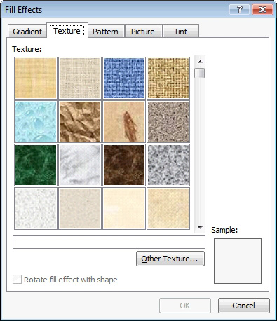
Of course, Publisher will only show you the textures that it knows about. If you have a non-default texture that you want to use, you can click the Other Texture button and then specify the texture file you want to use.
Publisher gives you the option of rotating textures in conjunction with the movement of shapes. Doing so works in exactly the same way that it did for gradients.
Patterns
Just as Publisher enables you to apply textures to a shape, you also have the option of filling a shape with a pattern. To do so, select the Pattern tab, shown in Figure 3.12.
As you can see in the figure, applying a pattern to a shape is a two-step process. First, you must choose the pattern that you want to apply, and then you must choose a foreground and a background color for the pattern.
Photos
Another design element that you can include in a shape or a caption is a photograph. Filling a shape with a photo is extremely easy. As you can see in Figure 3.13, you must simply select the picture that you want to use.
Figure 3.12 You can fill a shape with a pattern.
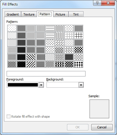
Figure 3.13 You can fill a shape with a photo.
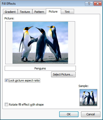
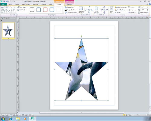
The one bit of advice that I would give you regarding the use of photos within shapes is to lock the picture aspect ratio by using the check box shown in Figure 3.13. This prevents the image from becoming stretched or distorted, which can really become a problem if you have an irregularly shaped image or are trying to fill a shape that is not of uniform dimensions. When a photo is used to fill a shape, the end result looks similar to what you see in Figure 3.14.
Figure 3.14 The photo is displayed within the shape.
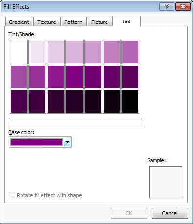
Tint
The last option for filling a shape is to use the tint option. As you can see in Figure 3.15, tinting a shape involves picking a base color, and then deciding how dark the tint should be. The end result is similar to that of filling the shape with a solid color.
SHOW ME Media 3.4—Fill Effects
![]()
Access this video file through your registered Web edition at my.safaribooksonline.com/9780132182591/media.
Figure 3.15 Tinting is essentially the same as filling a shape with a solid color.
Clip Art
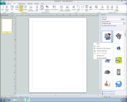
The process of adding clip art to a Publisher document is similar to that of adding an image, but there are a few key differences in the process. The biggest difference between adding clip art and adding a picture is that Publisher does not seem to provide you with a method for browsing all the available clip art. You need to have an idea going in of what type of clip art you want to use. You must then search for the clip art that you want to use.
LET ME TRY IT
![]()
Inserting Clip Art
The whole process of inserting clip art sounds much more difficult than it really is. To see how easy it is to work with clip art, perform these steps:
- Go to Publisher’s Insert tab.
- Choose the Clip Art icon, located on the toolbar.
- Enter a search term into the Search For box.
- Click Go.
- Any clip art that matches your query will be displayed beneath the search box.
- Click on the piece of clip art that you want to use. When you do, a down arrow appears next to the clip art. Click this down arrow to reveal a menu, as shown in Figure 3.16.
- Choose the Insert option from the menu to insert the clip art into your document.
Figure 3.16 Click on the down arrow to reveal the clip art menu.
Clip Art Key Words
When you search for clip art, you are searching by entering keywords into the search engine. Although the built-in clip art is fairly well indexed, you will probably run into situations in which finding the clip that you want requires a lot of effort.
Reviewing Key Words
You can make it easier to find the clip in the future by revising the list of keywords that are associated with the clip art image. To do so, follow these steps:
- Click on the image that you want to revise.
- When the down arrow appears alongside the image, click it to reveal the clip art menu.
- Choose the Edit Keywords option from the menu.
- The Keywords dialog box appears and enables you to add keywords to the image.
Copyright Issues
I need to take just a moment and discuss some of the copyright issues you will encounter while creating Publisher documents. Whenever you create a document, it is your responsibility to ensure that images used within the document do not violate someone’s copyright.
You really don’t have to worry about copyright issues if all you are using is clip art. Microsoft makes clip art freely available as a part of Publisher, and you are free to include it in any type of document.
Photos are another story, however. The safest way to ensure that a photograph does not violate someone’s copyright is to use your own original work. For instance, the image that I used in the section on pictures was a photograph that I took on a recent trip to New York City.
Generally speaking, photographs found on the Internet are copyrighted and are usually either owned by or licensed to the owner of the website where they are displayed. There are exceptions, though. Some websites specialize in stock photography that you can use for your own purposes. A good example of such a site is Corbis (www.Corbis.com), where I have purchased several photos.
If you decide to use stock photography in a document, you must take the time to check the terms for licensing the photograph. Some of the images on Corbis and on other stock photography sites are royalty free. Other photographs are rights managed, and licensing such photographs can be tricky.
Shapes
When you think of adding graphics to a Publisher document, you probably think of pictures or clip art. Although you can certainly add these types of graphics to a Publisher document, you can also add shapes. I talked about shapes to some degree when I covered captions. You can create other types of shapes, though.
LET ME TRY IT
![]()
Inserting a Shape
Shapes don’t add a lot to a document by themselves, but they can be combined with other design elements to create some nice effects. You can add shapes to a document by completing the following steps:
1. Go to Publisher’s Insert tab.
2. Choose the Shapes option from the toolbar.
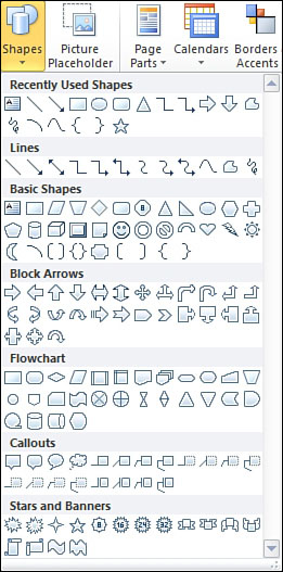
3. Select the desired shape from the Shapes menu, as shown in Figure 3.17.
Figure 3.17 The Shapes menu contains a variety of shapes to choose from.
4. Move the cursor to the location where you want to place the lower-left corner of the shape.
5. Hold the left mouse button, and then move the cursor to the location where you want to place the upper-right corner of the shape.
6. Release the mouse button.
7. Move or resize the shape as needed by dragging the markers on the box surrounding the shape.
Adding a 3-D Effect
As you can see, Publisher has no trouble adding a shape to the page, but in its present form, the shape is a bit lackluster. It doesn’t have to stay that way, though. There are a number of things that we can do to make the shape a bit more exciting. For starters, we can make our two-dimensional shape three dimensional.
LET ME TRY IT
![]()
Creating a 3-D Shape
To convert a shape into a 3-D shape, follow these steps:
- Click on the shape to select it.
- Select Publisher’s Format tab.
- Click the 3-D Effects icon, found on the toolbar.
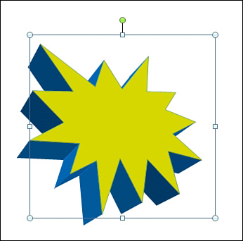
- Choose one of the predefined 3-D shapes from the 3-D Effect menu. If you aren’t sure which effect to use, you can see a preview of each effect by hovering your mouse over it. You can see a sample of a 3-D effect in Figure 3.18.
SHOW ME Media 3.5—Creating 3-D Shapes
![]()
Access this video file through your registered Web edition at my.safaribooksonline.com/9780132182591/media.
Figure 3.18 This is what a shape looks like after one of the 3-D effects has been applied.

Coloring a Shape
Even though we have made our shape 3-D, it is still a bit boring. One way to brighten things up a bit is to add some color. There are two different techniques that I want to show you for coloring a shape.
The first technique will work for both 2-D and 3-D shapes. In the case of a 2-D shape, this technique will fill in the shape with the color that you choose. When you use this technique on a 3-D shape, the center becomes a solid color and the 3-D edges become gradients of the chosen color.
LET ME TRY IT
![]()
Adding Color to a Shape
To apply color to a shape using this method, follow these steps:
- Click on the shape to select it.
- Go to Publisher’s Format tab.
- Select the Shape Fill icon from the toolbar.
- Choose the desired color from the resulting menu.
Coloring a Shape’s Outer Edges
The next technique that I want to show you is applicable only to 3-D shapes. This technique colors the shape’s outer edges. You can combine this technique with the one I just showed you so that you end up with a colored shape with a different colored border. To do so, follow these steps:
- Click on the shape to select it.
- Go to Publisher’s Format tab.
- Click the 3-D Effect icon, found on the toolbar.
- Choose the 3-D Color option from the 3-D Effect menu, and then choose the color you want to apply to the shape. You can see the results of this technique in Figure 3.19.
Figure 3.19 A 3-D colored shape.
Layering
Earlier in the book, I mentioned that it is possible for visual elements to overlap each other. When done correctly, you can use this technique to produce some fairly impressive documents.
If you look at Figure 3.20, you can see that I have dummied up something like what you would see in a cheesy advertisement. This effect is the result of combining multiple layers. The bottom layer is the page’s background. The middle layer is the 3-D shape that we created in the last section. The top layer is made up of word art.
Figure 3.20 You can add a text layer on top of a shape.

In this particular case, it was easy to create the desired effect because the 3-D shape already existed. All I had to do was create the word art and then drag it so that it was on top of the shape. In the real world, however, things don’t always go quite so smoothly. You may occasionally find that you have not created the layers in the correct order. This isn’t a problem, though. Publisher enables you to arrange document layers on the fly.
Imagine, for example, that I had created the word art before I created my three-dimensional shape, and that in the process of creating the shape, the word art became covered up, as shown in Figure 3.21.
LET ME TRY IT
![]()
Pushing a Shape to the Back
In a situation like this, we would need to move the word art to the outer layer so that it is displayed on top of the shape. This actually is very easy to do. If you look at Figure 3.21, you will notice that the toolbar contains Bring Forward and Send Backward icons. The easiest way to bring the text to the front is to push the shape to the back. To do so, follow these steps:
- Click on the shape to select it.
- Go to Publisher’s Home tab.
- Click the Send Backward icon found on the toolbar.
- Choose either the Send Backward option (to move the shape back one layer) or the Send to Back option (to move the shape to the bottom layer).
Figure 3.21 Layers can accidentally become covered by other layers.

In this case, it doesn’t really matter which options you choose because we have only a couple of layers. In more complex documents, though, you will most likely have to move objects one layer at a time.
Other Objects
I want to conclude this chapter by showing you some other types of objects that you can include in your Publisher document. Generally, Publisher offers the ability to incorporate just about any design element that is supported by other Microsoft Office applications. For example, you can import a Microsoft Word document, an Excel spreadsheet, or PowerPoint slides. These are far from being the only types of Microsoft Office objects that you can import, however.
I don’t really want to get into importing Microsoft Office documents right now, because I cover the topic at length in some of the later chapters. For example, Chapter 4 deals with Microsoft Word documents (among other things). I also talk about Excel in Chapter 6, “Tables,” and I even spend some time in Chapter 10, “Bulk Mail Techniques,” discussing Microsoft Access.
For right now, though, I want to show you a couple of examples of other types of Microsoft Office data that you might want to include in your document.
Drawings
If you have ever used Publisher 2007, you probably know that it includes some crude drawing tools. Microsoft seems to have removed these tools from Publisher 2010. However, that doesn’t mean that Publisher no longer supports drawings.
LET ME TRY IT
![]()
Using the Paintbrush
Publisher 2010 is designed to use Paintbrush (the drawing applet that comes with Windows) as its drawing tool. If you want to doodle in Publisher, follow these steps:
- Go to Publisher’s Insert tab.
- Click the Object icon located on the toolbar.
- When the Insert Object dialog box appears, choose the Paintbrush Picture option, as shown in Figure 3.22.
- Make sure the Create New option is selected, and click OK.
- Windows will now open Paintbrush. Go ahead and create your drawing.
- When you complete your drawing, I recommend that you save a copy of it for future reference.
- Choose Paintbrush’s Exit and Return to Document option, shown in Figure 3.23.
- Your drawing is seamlessly imported into Publisher, as shown in Figure 3.24.
Figure 3.22 Paintbrush is Publisher’s new drawing tool.
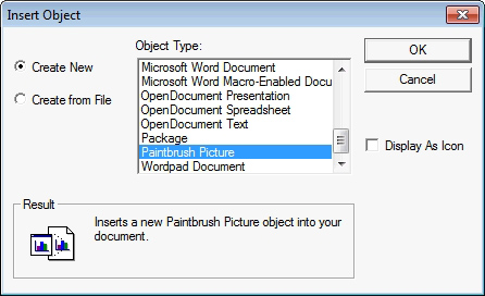
Figure 3.23 Choose the Exit and Return to Document option.
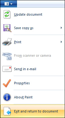
Figure 3.24 Your Paintbrush drawing is imported into publisher.
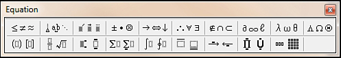
Equations
The Equation Editor is something that a lot of people don’t seem to realize exists. Because I am an engineer, I tend to use a lot of math, so I wanted to introduce you to this feature.
LET ME TRY IT
![]()
Accessing the Equation Editor
You can access the equation editor by completing these steps:
- Go to Publisher’s Insert tab.
- Click the Object icon.
- Choose Microsoft Equation 3.0 from the list of available objects, and click OK.
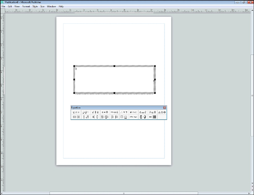
You can see what the Equation Editor looks like in Figure 3.25. At first glance, this editor probably looks a bit cryptic. However, you can use it by clicking the icon that most closely represents the symbol that you need. Doing so causes the editor to display a submenu containing individual symbols. When you select a symbol, it is displayed within the text box. Once your symbols are in place, you can begin filling in numbers and variables.
Figure 3.25 The Equation Editor is one of my favorite toys.