17. Dashboarding with Sparklines in Excel 2010
One of the new features in Excel 2010 is the ability to create tiny, word-size charts. If you are creating dashboards, you will want to leverage these charts.
The concept of sparklines was first introduced by Professor Edward Tufte. Tufte promoted sparklines as way to show a maximum amount of information with a minimal amount of ink.
Microsoft supports three types of sparklines:
• Line—A sparkline shows a single series on a line chart within a single cell. On a sparkline, you can add markers for the highest point, the lowest point, the first point, or the last point. Each of those points can have a different color. You can also choose to mark all of the negative points or even all points.
• Column—A sparkcolumn shows a single series on a column chart. You can choose to show a different color for the first bar, the last bar, the lowest bar, the highest bar, and/or all negative points.
• Win/Loss—This is a special type of column chart where every positive point is plotted at a 100% height and every negative point is plotted as –100% height. The theory is that positive columns represent wins and negative columns represent losses. With these charts you will always want to change the color of the negative columns. It is possible to highlight the highest/lowest point based on the underlying data.
Creating Sparklines
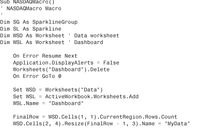
Microsoft figures that you will usually be creating a group of sparklines. The main VBA object for sparklines is the SparklineGroup. To create sparklines, you apply the SparklineGroups.Add method to the range where you want the sparklines to appear.
In the Add method, you will specify a type for the sparkline and the location of the source data.
Say that you apply the add method to a three-cell range of B2:D2. Then the source must be a range that is either three columns wide or three rows tall.
The type parameter can be xlSparkLine for a line, xlSparkColumn for a column, or xlSparkColumn100 for Win/Loss.
If the SourceData parameter is referring to ranges on the current worksheet, it can be as simple as "D3:F100". If it is pointing to another worksheet, use "Data!D3:F100" or "'My Data'!D3:F100". If you’ve defined a named range, you can specify the name of the range as the source data.
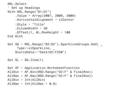
Figure 17.1 shows a table of NASDAQ closing prices for three years. Notice that the actual data for the sparklines is in three contiguous Columns, D, E, and F.
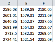
Figure 17.1. Arrange the data for the sparklines in a contiguous range.
Because each column might have one or two extra points, the code to find the final row is slightly different than usual.
FinalRow = WSD.[A1].CurrentRegion.Rows.Count
The .CurrentRegion property will start from Cell A1 and extend in all directions until it hits the edge of the worksheet or the edge of the data.
In this case, the CurrentRegion will report that row 253 is the final row, even though A253 and D253 are blank (see Figure 17.2).
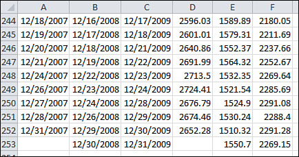
Figure 17.2. The sparkline source should extend to row 253.
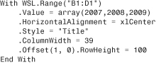
For this example, the sparklines will be created in a row of three cells. Because each cell is showing 250 points, I am going with fairly large sparklines. The sparkline will grow to the size of the cell, so this code will make each cell fairly wide and tall:
The following code will create three default sparklines. These won’t be perfect, but the next section shows you how to format them.
![]()
The three sparklines are shown in Figure 17.3. There are a number of problems with the default sparklines. Think about the vertical axis of a chart. Sparklines always default to have the scale automatically selected. Because you never really get to see what the scale is, you cannot tell the range of the change.
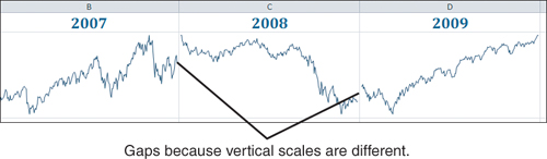
Figure 17.3. Three default sparklines.
Figure 17.4 shows the min and max for each year. From this data, you can guess that the sparkline for 2007 probably goes from about 2300 to 2900. The sparkline for 2008 probably goes from 1300 to 2650. The sparkline for 2009 probably goes from 1250 to 2300.
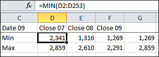
Figure 17.4. Each sparkline will assign the minimum and maximum scale to be just outside of these limits.
Scaling the Sparklines
The default choice for the sparkline vertical axis is that each sparkline will have a different minimum and maximum.
There are two other choices available.
One choice is to group all the sparklines together, but to continue to allow Excel to choose the minimum and maximum scale. You still won’t know exactly what values are chosen for the minimum and maximum. Looking at Figure 17.5 it seems to be roughly 1200 to 2900, but there is absolutely no way to tell for sure.
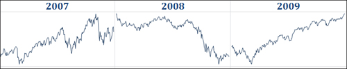
Figure 17.5. What is scale? It is hard to tell.
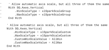
To force the sparklines to have the same automatic scale, use this code:
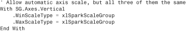
Note that the .Axes belongs to the sparkline group, not to the individual sparklines themselves. In fact, almost all of the good properties are applied at the SparklineGroup level. This has some interesting ramifications. If you wanted one sparkline to have automatic scale and another sparkline to have a fixed scale, you would have to create each of those sparklines separately, or at least ungroup them.
Figure 17.6 shows the sparklines when both the minimum and maximum scales are set to act as a group. All three lines nearly meet now, which is a good sign. You can guess that the scale runs from about 1250 up to perhaps 1300. Again, there is no way to tell.
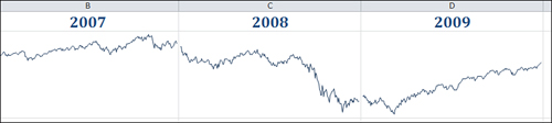
Figure 17.6. All three sparklines have the same minimum and maximum scale, but we don’t know what it is.
Another choice is to take absolute control and assign a minimum and maximum for the vertical axis scale. The following code forces the sparklines to run from a minimum of 0 up to a maximum that rounds up to the next 100 above the largest value:
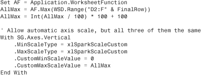
Figure 17.7 shows the resulting sparklines. Now, you know the minimum and the maximum, but you need a way to communicate this to the reader.
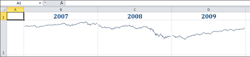
Figure 17.7. You’ve manually assigned a min and max scale, but it does not appear on the chart.
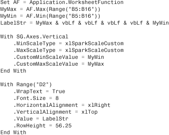
One choice is to put the minimum scale on the lower left and the upper scale on the upper right, as shown in Figure 17.8.
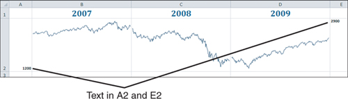
Figure 17.8. Labels in A2 and E2 show the upper and lower limits.
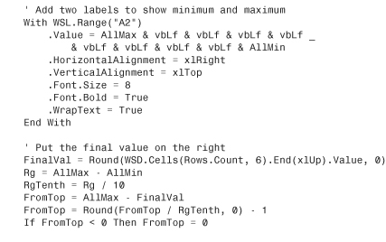
The code for Figure 17.8 is as follows:
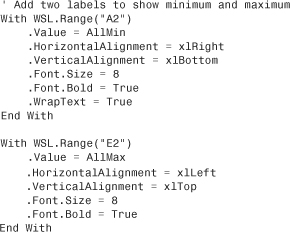
Alternatively, you could put the minimum and maximum value in A2. With 8-point bold Calibri, a row height of 113 will allow 10 rows of wrapped text in the cell. So you could put the max value, then VbLf 8 times, then the min value. (vbLf is the equivalent of pressing Alt+Enter when you are entering values in a cell).
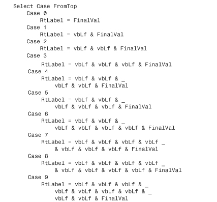
On the right side, you can put the final point’s value and attempt to position it within the cell so that it falls roughly at the same height as the final point.
Figure 17.9 shows this option.
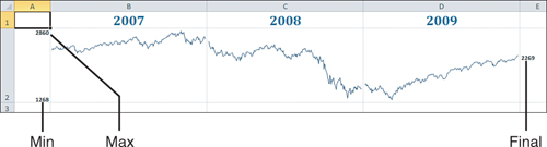
Figure 17.9. Labels on the left show the min and max. Labels on the right show the final value.
The code to produce Figure 17.9 is shown here:

Formatting Sparklines
Most of the formatting available with sparklines involves setting the color of various elements of the sparkline.
There are a few methods for assigning colors in Excel 2010. Before diving into the sparkline properties, you can read about the two methods of assigning colors in Excel VBA.
Using Theme Colors
Excel 2007 introduced the concept of a theme for a workbook. A theme is comprised of a body font, a headline font, a series of effects, and then a series of colors.
The first four colors are used for text and backgrounds. The next six colors are the accent colors. The 20 built-in themes include colors that work well together. There are also two colors used for hyperlinks and followed hyperlinks. For now, focus on the accent colors.
Go to Page Layout, Themes, and choose a theme. Next to the theme drop-down is a Colors drop-down. Open that drop-down and select Create New Theme Colors from the bottom of the drop-down. Excel will show the Create New Theme Colors dialog as shown in Figure 17.10. This gives you a good picture of the 12 colors associated with the theme.
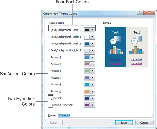
Figure 17.10. The current theme includes 12 colors.
Throughout Excel, there are many color chooser drop-downs (see Figure 17.11). There is a section of the drop-down called Theme Colors. The top row under Theme colors shows the four font and six accent colors.

Figure 17.11. All but the hyperlink colors from the theme appear across the top row.
If you want to choose the last color in the first row, the VBA is as follows:
ActiveCell.Font.ThemeColor = xlThemeColorAccent6
Going across that top row of Figure 17.11, the 10 colors are as follows:
xlThemeColorDark1
xlThemeColorLight1
xlThemeColorDark2
xlThemeColorLight2
xlThemeColorAccent1
xlThemeColorAccent2
xlThemeColorAccent3
xlThemeColorAccent4
xlThemeColorAccent5
xlThemeColorAccent6
On your computer, open the fill drop-down on the Home tab and look at it in color. If you are using the Office theme, the last column is various shades of orange. The top row is the orange from the theme.
There are then five rows that go from a light orange to a very dark orange.
Excel lets you modify the theme color by lightening or darkening it. The values range from −1 which is very dark to +1 which is very light. If you look at the very light orange in Row 2, that has a tint and shade value of 0.8, which is almost completely light. The next row has a tint and shade level of 0.6. The next row has a tint and shade level of 0.4. That gives you three choices that are lighter than the theme color.
The next two rows are darker than the theme color. Because there are only two darker rows, they have values of −.25, and −.5.
If you turn on the macro recorder and choose one of these colors, it looks like a confusing bunch of code.
.Pattern = xlSolid
.PatternColorIndex = xlAutomatic
.ThemeColor = xlThemeColorAccent6
.TintAndShade = 0.799981688894314
.PatternTintAndShade = 0
If you are using a solid fill, you can leave out the first, second, and fifth lines of code. The .TintAndShade looks confusing because computers cannot round decimal tenths very well. Remember that computers store numbers in binary. In binary, a simple number like 0.1 is a repeating decimal. As the macro recorder tries to convert 0.8 from binary to decimal, it “misses” by a bit and comes up with a very close number: 0.7998168894314. This is really saying that it should be 80 percent lighter than the base number.
If you are writing code by hand, you only have to assign two values to use a theme color. Assign the .ThemeColor property to one of the six xlThemeColorAccent1 through xlThemeColorAccent6 values. If you want to use a theme color from the top row of the drop-down, the .TintAndShade should be 0 and can be omitted. If you want to lighten the color, use a positive decimal for .TintAndShade. If you want to darken the color, use a negative decimal.
Tip
Note that the five shades in the color palette drop-downs are not the complete set of variations. In VBA, you can assign any decimal value from -1 to 1. Figure 17.12 shows 200 variations of one theme color created using the .TintAndShade property in VBA.
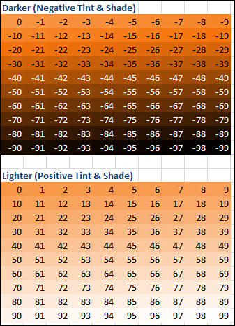
Figure 17.12. Two hundred shades of orange.
To recap, if you want to work with theme colors, you will generally change two properties, the theme color in order to choose one of the six accent colors, then tint and shade to lighten or darken the base color.
.ThemeColor = xlThemeColorAccent6
.TintAndShade = 0.4
Note
Note that one advantage of using theme colors is that your sparklines will change color based on the theme. If you later decide to switch from the Office theme to the Metro theme, the colors will change to match the theme.
![]() To see a demo of using theme colors, search for Excel VBA 17 at YouTube.
To see a demo of using theme colors, search for Excel VBA 17 at YouTube.
Using RGB Colors
For the last decade, computers have offered a palette of 16 million colors. These colors derive from adjusting the amount of red, green, and blue light in a cell.
Do you remember back in art class in elementary school? You probably learned that the three primary colors were red, yellow, and blue. You could make green by mixing some yellow and blue paint. You could make purple by mixing some red and blue paint. You could make orange by mixing some yellow and red paint. As all of my male classmates and I soon discovered, you could make black by mixing all of the paint colors. Those rules all work with pigments in paint, but they don’t work with light.
Those pixels on your computer screen are made of up light. In the light spectrum, the three primary colors are red, green, and blue. You can make the 16 million colors of the RGB color palette by mixing various amounts of red, green, and blue light. Each of the three colors is assigned an intensity from 0 (no light) to 255 (full light).
You will often see a color described using the RGB function. In the function, the first value is the amount of red, then green, then blue.
• To make red, you use =RGB(255,0,0).
• To make green, use =RGB(0,255,0).
• To make blue, use =RGB(0,0,255).
• What happens if you mix 100% of all three colors of light? You get white!
• To make white, use =RGB(255,255,255).
• If you shine no light in a pixel? You get black =RGB(0,0,0).
• To make purple, it is some red, a little green, some blue: RGB(139,65,123).
• To make yellow, use full red and green and no blue: =RGB(255,255,0).
• To make orange, use less green than the yellow: =RGB(255,153,0).
In VBA, you can use the RGB function just as it is shown here. The macro recorder is not a big fan of using the RGB function. It instead shows the result of the RGB function.
You can assign a number to each of the 16,777,216 colors by doing this math with the three RGB values:
• Take the red value times 1.
• Add the green value times 256.
• Add the blue value times 65,536.
If you choose a red for your sparkline, you will frequently see the macro recorder assign a .Color = 255. This is because =RGB(255,0,0) is 255.
When the macro recorder assigns a value of 5287936, it is pretty tough to figure that color out. Here are the steps I use:
In Excel, enter =Dec2Hex(5287936). You will get an answer of 50B000. This is the color that web designers refer to as #50B000.
Go to your favorite search engine and search for color chooser. You will find many utilities where you can type in the hex color code and see the color.
In Figure 17.13, ColorSchemer.com shows that #50B000 is RGB(80,176,0). This is a somewhat dark green color.
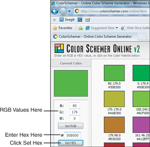
Figure 17.13. Convert hex to RGB.
While you are at the web page, you can click around to find other shades of colors and see the RGB values for those.
To recap, to skip theme colors and use RGB colors, you will set the .Color property to the result of an RGB function.
Formatting Sparkline Elements
Figure 17.14 shows a plain sparkline. The data is created from 12 points that show performance versus a budget. You really have no idea about the scale from this sparkline.
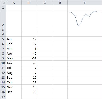
Figure 17.14. A default sparkline.
If your sparkline includes both positive and negative numbers, it will help to show the horizontal axis. This will allow you to figure out which points are above budget and which points are below budget.
To show the axis, use the following:
SG.Axes.Horizontal.Axis.Visible = True
Figure 17.15 shows the horizontal axis. This helps to show which months were above or below budget.
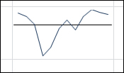
Figure 17.15. Add the horizontal axis to show which months were above or below budget.
Using code from “Scaling the Sparklines,” you can add high and low labels to the cell to the left of the sparkline:
The result of this macro is shown in Figure 17.16.
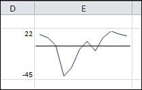
Figure 17.16. Use a nonsparkline feature to label the vertical axis.
To change the color of the sparkline, use this:
SG.SeriesColor.Color = RGB(255, 191, 0)
The Show group of Sparkline Tools Design tab offers six options. You can further modify those elements by using the Marker Color drop-down.
You can choose to turn on a marker for every point in the data set, as shown in Figure 17.17.
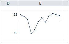
Figure 17.17. Show All Markers.
The code to show a black marker at every point is as follows:
With SG.Points
.Markers.Color.Color = RGB(0, 0, 0) ' black
.Markers.Visible = True
End With
The code to show a black marker at every point is this:
With SG.Points
.Markers.Color = RGB(0, 0, 0) ' black
.Markers.Visible = True
End With
Instead, you can use the markers to show only the minimum, maximum, first, and last points. This code will show the minimum in red, maximum in green, first and last in black:
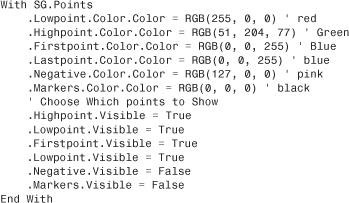
Figure 17.18 shows the sparkline with the only the high, low, first, and last chosen.
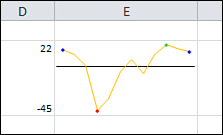
Figure 17.18. Show only key markers.
One other element is the negative markers. These come in particularly handy when you are formatting Win/Loss charts.
Formatting Win/Loss Charts
Win/Loss charts are a special type of sparkline for tracking binary events. The Win/Loss chart shows an upward-facing marker for a positive value and a downward-facing marker for any negative value. For a zero, no marker is shown.
You can use these charts to track proposal wins versus losses. In Figure 17.19, a Win/Loss chart is showing the last 25 regular-season baseball games of the famed 1951 pennant race between the Brooklyn Dodgers and the New York Giants. This chart shows how the Giants went on a 7-game winning streak to finish the regular season. The Dodgers went 3-4 during this period and ended in a tie with the Giants, forcing a three-game playoff. The Giants won the first game, lost the second, and then advanced to the World Series by winning the third playoff game. The Giants leapt out to a 2-1 lead over the Yankees but then lost three straight.
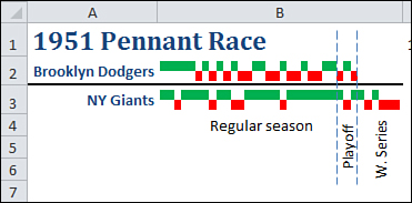
Figure 17.19. This Win-Loss chart documents the most famous pennant race in history.
Note
The words Regular season, Playoff, and W. Series, as well as the two dotted lines, are not part of the sparkline. The lines are drawing objects manually added with Insert, Shapes.
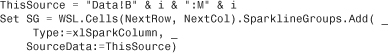
To create the chart, you use .Add a SparkLineGroup with a type of xlSparkColumnStacked100:
Set SG = Range("B2:B3").SparklineGroups.Add( _
Type:=xlSparkColumnStacked100, _
SourceData:="C2:AD3")
You will generally show the wins and losses as different colors. One obvious color scheme is red for losses and green for wins.
There is no specific way to change only the “up” markers, so change the color of all markers to be green:
' Show all points as green
SG.SeriesColor.Color = 5287936
Then change the color of the negative markers to red:
'Show losses as red
With SG.Points.Negative
.Visible = True
.Color.Color = 255
End With
It is easier to create the Up/Down charts. You don’t have to worry about setting the line color. The vertical axis is always fixed.
Creating a Dashboard
Sparklines have the benefit of communicating a lot of information in a very tiny space. In this section, you see how to fit 130 charts on one page.
Figure 17.20 shows a data set that summarizes a 1.8 million row dataset. I used the new PowerPivot add-in for Excel to import the records and then calculated three new measures:
• YTD Sales by month by store
• YTD Sales by month for the previous year
• % increase of YTD Sales versus previous year
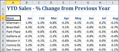
Figure 17.20. This summary of 1.8 million records is a sea of numbers.
This is a key statistic in retail stores; how are you doing versus the same time last year. Also this analysis has the benefit of being cumulative. The final number for December represents if the store was up or down versus the previous year.
Observations About Sparklines
After working with sparklines for a while, some observations come to mind:
• Sparklines are transparent. You can see through to the underlying cell. This means that the fill color of the underlying cell will show through and the text in the underlying cell will show through.
• If you make the font really small and align the text with the edge of the cell, you can make the text look like a title or a legend.
• If you turn on wrap text and make the cell tall enough for 5 or 10 lines of text in the cell, you can control the position of the text in the cell by using vbLf characters in VBA.
• Sparklines work better when they are bigger than a typical cell. All the examples in this chapter either made the column wider, the height taller, or both.
• Sparklines created together are grouped. Changes made to one sparkline are made to all sparklines.
• Sparklines can be created on a separate worksheet than the data.
• Sparklines look better when there is some white space around the cells. This would be tough to do manually because you would have to create each sparkline one at a time. It is easy to do here because you can leverage VBA.
Creating 100’s of Individual Sparklines in a Dashboard
All those issues can be taken into account when creating this dashboard. The plan will be to create each store’s sparkline individually. This will allow a blank row and column to appear between every sparkline.
After inserting a new worksheet for the dashboard, you can format the cells with this code:
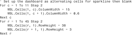
Keep track of which cell will contain the next sparkline with two variables:
NextRow = 1
NextCol = 1
Figure out how many rows of data there are on the Data worksheet. Loop from row 4 to the final row. For each row, you will make a sparkline.
Build a text string that points back to the correct row on the data sheet using this code. Use that source when defining the sparkline:
You want to show a horizontal axis at the zero location. The range of values for all stores was −5 percent to +10 percent. The maximum scale value here is being set to 0.15 to allow extra room for the “title” in the cell:
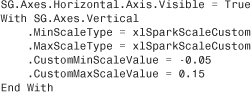
Like in the previous example with the Win/Loss chart, you will want the positive columns to be green and the negative columns to be red:
Remember that the sparkline has a transparent background. Thus, you can write really small text to the cell, and it behaves almost like chart labels.
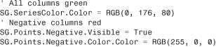
The following code joins together the store name and the final percentage change for the year into a title for the chart. The program writes this title to the cell but makes it small, centered, and vertically aligned.
The final element is to change the background color of the cell based on the final percentage. If it is up, then the background is light green. If it is down, then the background is light red:
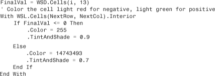
Once that sparkline is done, the column and/or row positions are incremented to prepare for the next chart:
NextCol = NextCol + 2
If NextCol > 11 Then
NextCol = 1
NextRow = NextRow + 2
End If
After this, the loop continues with the next store.
The complete code is shown here:
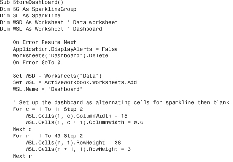

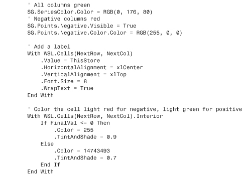
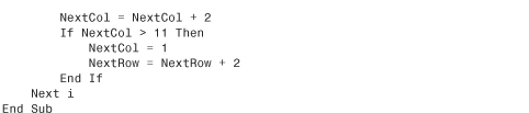
Figure 17.21 shows the final dashboard. This prints on a single page and summarizes 1.8 million rows of data.
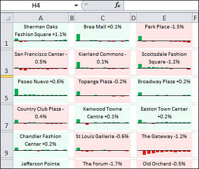
Figure 17.21. One page summarizes the sales from 140 stores.
If you zoom in, you can see that every cell tells a story. In Figure 17.22, Park Meadows had a great January, managed to stay ahead of last year through the entire year, and finished up 0.8 percent. Lakeside also had a positive January, but then a bad February and a worse March. They struggled back toward 0 percent for the rest of the year but ended up off seven-tenths of a percent.
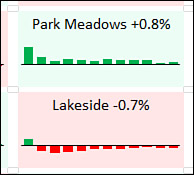
Figure 17.22. Detail of two sparkline charts.
Note
The report is addictive. I find myself studying all sorts of trends, but then I have to remind myself that I created the 1.8 million row dataset using RandBetween just a few weeks ago! The report is so compelling I am getting drawn into studying fictional data.
Next Steps
The next chapter steps outside the world of Excel to talk about how to transfer Excel data into Microsoft Word documents. Chapter 18, “Automating Word,” looks at using Excel VBA to automate and control Microsoft Word.