Mohammad Khorasani1, Mohamed Abdou2 and Javier Hernández Fernández1
(1)
Doha, Qatar
(2)
Cambridge, United Kingdom
Streamlit regularly extends its features to incorporate additional capabilities that can be utilized by developers in a few short lines of code. At some point however, developers will need to take matters into their own hands and build something tailored to address their own specific user requirements. Whether this is to modify the user interface or to offer a bespoke experience to the user, Streamlit allows the developer to create custom components on demand. Furthermore, Streamlit supports using ReactJS as a wingman to build components that can be used as a live web server or built using deployment-ready code. In this chapter, we will walk through the steps required to make new Streamlit components, to use them in a Pythonic context, and to share them with the general public.
10.1 Introduction to Streamlit Custom Components
Fundamentally, Streamlit is a backend server, serving web page changes to client browsers using DG. HTML and JavaScript can be generated by any web frameworks. Hence, Streamlit can help serving components from any web application framework. Web application frameworks can be quite advanced like ReactJS, where the developer codes in JSX but builds the application to give out a combination of files that can be served statically from disk. In a production environment, it is highly advised to have static files served from disk as illustrated in Figure 10-1. However, Streamlit still allows including components that are hosted locally, but as a trade-off, this component imported in the Streamlit application will share different features from the Streamlit app. For instance, if you print the current URL from the custom component, it will not give out the same URL which the Streamlit application is hosted on.
Figure 10-1
How custom components are served through Streamlit
10.2 Using ReactJS to Create Streamlit Custom Components
In this section, we will showcase how to make a ReactJS-based component to be used in Streamlit. Along with that, we will also demonstrate how to share data bidirectionally between Streamlit and the component. This can be used to send initial values, user action triggers, or even styling themes and colors to the custom component.
10.2.1 Making a ReactJS Component
Initially, Node and npm needs to be installed from NodeJS.org. Then, we will use Streamlit’s official template for making custom components from GitHub. In this subsection, we will quickly cover making a ReactJS component.
In this example we will produce a rating stars widget as shown in Figure 10-2 in ReactJS and build upon it in the following subsections. The developer community of ReactJS is considerably larger than that of other frameworks, making it worthwhile to invest time in creating such components. .
Figure 10-2
Interactive rating star view from Material UI
Copying the content of component-template/template/my_component to our working directory will set up a ReactJS application with a one file module, which is in src/MyComponent.tsx, and that is the file that needs to be modified in order to achieve our goal of making a rating star component. Modifying the file will result in Listing 10-1
import {
Streamlit,
StreamlitComponentBase,
withStreamlitConnection,
} from "streamlit-component-lib"
import React, { ReactNode } from "react"
interface State {}
class MyComponent extends StreamlitComponentBase<State> {
Use the following command to install the Material UI library:
npm i @mui/material
Then run the following command to install other packages in the package.json file:
npm i
After running both commands, make sure to change the name in package.json to be your component’s reference name in Streamlit down the road as shown in Listing 10-2.
{
"name": "rating_star",
"version": "0.1.0",
"private": true,
"dependencies": {
"@mui/material": "ˆ5.0.6",
"...
},
"scripts": ...,
"eslintConfig": ...,
"browserslist": ...,
"homepage": "."
}
Listing 10-2
Updated Package.json
Having the necessary packages ready, and with a little JavaScript/TypeScript knowledge, or with a little bit of Googling, we can start making our first ReactJS module to be used as a custom Streamlit component. We have to modify Listing 10-1 to display the rating stars as documented in Material UI’s site. As an end result, the new file content will be as shown in Listing 10-3 which should reside in frontend/src/. And don’t forget to change the file to be run in the index.tsx.
import {
Streamlit,
StreamlitComponentBase,
withStreamlitConnection,
} from "streamlit-component-lib"
import React, { ReactNode } from "react"
import { Rating } from '@mui/material';
interface State {}
class RatingStar extends StreamlitComponentBase<State> {
To get the React application ready, run the following command. If errors popped up mentioning a missing package, install it using the command mentioned before.
npm start
Now, on Streamlit’s side, we will use the already running ReactJS application as a component, by leveraging Streamlit’s API to include external components. But first, we need to populate the __init__.py as shown in Listing 10-4.
The previous code snippet uses a live component running locally on port 3001, which in our case needs to be the ReactJS app. Then it exposes a function to be used by any other Python source to be run as a Streamlit module. Executing Listing 10-5 with Streamlit's CLI tool, will result in what is shown in Figure 10-3.
import streamlit as st
from rating_stars import rating_stars
st.title("Rating stars demo!")
rating_stars()
Listing 10-5
Initial version of main.py
Figure 10-3
First custom component!
That being made, we were able to display a live ReactJS application in a Streamlit context, but if we become more creative and make more custom components, it will be a hassle to go to the folder of each and run it as a ReactJS application before running the Streamlit application. Maybe even run out of ports as each custom component has its own unique local URL. Hence, we can overcome this issue by building the ReactJS application into static files, after it is been developed, by running
npm run build
Now a new folder called build will appear in the frontend folder, containing the necessary JavaScript, CSS, and HTML files to be used by Streamlit to load it into an application. Once that is done and it is fixed to run the built version of a component, we need to change the IS_RELEASE to True, forcing Streamlit to load the new custom component from the frontend/build/ folder. And that is exactly what is being conveyed by Figure 10-1.
10.2.3 Sending Data to the Custom Component
At this point, we can just display ReactJS applications in a Streamlit context, albeit without a communication mechanism between the front and back ends. Now, we will showcase how to send data from Streamlit to ReactJS, when the transferable data is dynamic, giving us the capability of sending information from Streamlit with every rerender to the ReactJS application.
As a step toward making our rating star custom component more useful, we will add the support of setting the total star count and how many of them are selected, all from Streamlit’s Python code. First, we need to understand that Streamlit converts Python’s passed parameter of _component_func to ReactJS’s properties. So, our goal is to refactor the component’s __init__.py file to allow the new parameters as shown in Listing 10-6 and read them from RatingStar.tsx and then place them in the view’s properties like Listing 10-7.
Bringing this new update to action, we will make the Streamlit application as shown in Listing 10-8 to showcase native and custom components side by side. Figure 10-4 shows the homogeneity between our newly made configurable component and out-of-the-box components by Streamlit.
After playing around with the sliders to set our custom rating component, we can notice how our Streamlit application’s view is bloated with extra widgets that are used to set another view’s behavior, when we already could have set the number of selected stars by hovering the mouse to and clicking any star. However, this will require the Streamlit application to know what value is selected, and here comes a way to get data from custom components in Streamlit.
Streamlit didn’t only make an API to include a ReactJS application in its context but also communicate bidirectionally with it. Sending data out of ReactJS can be made using a library already included in the template’s package.json. Using this library, we can trigger many ReactJS component–specific actions, but we will only shed the light on the function Streamlit.setComponentValue, which makes the component’s return value in a Streamlit’s Python context the same as what is fed to its first parameter. Knowing this, we will add it to the callback of the rating view in ReactJS as shown in Listing 10-9. Then accordingly change the component’s __init__.py content to be as shown in Listing 10-10 to forward the return value back to our ran Streamlit file.
import {
Streamlit,
StreamlitComponentBase,
withStreamlitConnection,
} from "streamlit-component-lib"
import React, { ReactNode } from "react"
import { Rating } from "@mui/material"
interface State {}
class RatingStar extends StreamlitComponentBase<State> {
Now in our main Streamlit file, we remove the slider for the selected star count and then replace it with the output of the custom component. And finally, we display on our application the number of stars selected, as shown in Listing 10-11, with the output shown in Figure 10-5.
st.write(str(selected_stars) + " star(s) have been selected")
Listing 10-11
main.py, Streamlit file to be run
Figure 10-5
Result of communicating back and forth with a custom Streamlit component
10.3 Publishing Components As Pip Packages
Once you finally make your first custom component, you will want to share it with your friends or dedicate it to the open source developer community like many do. Sending a zip file of the source code or uploading the component to a version control service like GitHub might not be a scalable option to reach unlimited number of developers with ease, as this adds more overhead for them to get it running.
A more developer-friendly yet professional approach to share Python packages specifically is to compress them in a pip wheel format, which then can be easily installed in the interpreter by running
pip install <PIP_PACKAGE_NAME>.whl
Following up with the continuous example in this chapter, we don’t need to install any new package to make this possible as Python supports wheel building out of the box. The goal is to package the rating_stars/ folder in a file which then can be installed and referenced from any script like it is a local package.
Building a pip file is as simple as running the following command:
python setup.py sdist bdist_wheel
Before making the pip wheel, make sure to build the ReactJS part of the custom component, as it will not be run live on the user end; rather, it should be a seamless plug-and-play experience using that new component. After navigating to the rating_stars/frontend/, run
npm run build
However, the wheel builder needs more information about the exact folder to package and other miscellaneous metadata such as version number and description. No need to mention the folder to be packaged, as Python looks for all “Python Packages” in the current folder, and for a folder to be considered as a Python package, it needs to have an __init__.py file, which we already have. However, by default the wheel builder doesn’t include non-Python files and folders if they don’t have a single Python file. This is an issue in our case as our component relies on the ReactJS build folder which contains all static web files necessary for it to run. To overcome this issue, a new file as shown in Listing 10-12 needs to be added in the project’s root folder with its content to force inclusion of the build folder and its content.
recursive-include rating_stars/frontend/build *
Listing 10-12
MANIFEST.in
As we now have half of the requirements to make a pip wheel, we can tackle the final part by making a file called setup.py with the content shown in Listing 10-13 in the same folder as the MANIFEST.in. The setup file can include the version number of your custom component, description, and other information such as its pip download name if uploaded to pypi.org.
After finally running the Python package command, we can find three new folders appearing in the project’s root folder as seen in Figure 10-6. We are interested in the rating_stars-0.1-py3-none-any.whl file in the second folder; this file can be sent to anyone and installed easily as long as the package requirements are met.
Other created folders can have some benefits as well. For instance, the dist/ folder can be used by twine, which is the package and tool used to upload pip wheels to the global pip repository. If interested in sharing your package with the general public, sign up to pypi.org and then run the following command:
python -m twine upload dist/* --verbose
after building the wheel to upload it.
Figure 10-6
New folders after building the custom component
10.4 Component in Focus: Extra-Streamlit-Components
Streamlit as a framework is constantly evolving, which means it may not offer certain bespoke features that you may need for a production-ready web application. Features such as application routing and having custom URLs for multiple views or saving user-related data on the browser side. Apart from our usability requirements, sometimes it may just be necessary to offer a unique look and feel for the application or to add a widget which is not natively supported by Streamlit. Previously, we learned how to make a simple custom component; however, with components the sky is truly the limit, and in this chapter, we will showcase Extra-Streamlit-Components (STX), an open source collection of intricate Streamlit components and services. In addition, we will explain how every subcomponent is built from the Streamlit and ReactJS perspective, and hopefully creative developers will be inspired enough to unleash components of their own.
10.4.1 Stepper Bar
This is inspired by Material UI’s Stepper. As mentioned before, ReactJS’s developer community withholds various useful components that can be imported into the Streamlit world without a big hassle. And this stepper bar can actually be useful in the context of most Streamlit application, as it allows moving through sequential steps in a specific order to do something which is mostly data science related. It is a simple component as it returns the index of the stage the user has arrived to, as seen in Figures 10-7, 10-8, and 10-9. You, as a developer, are not bound to only three phases; rather, you can supply a list of all tab names, and the return value will be the selected list item index as might be shown in Listing 10-15. Numbering and animations are already taken care of.
Figure 10-7
Stepper bar phase 3
Figure 10-8
Stepper bar phase 3
Figure 10-9
Stepper bar phase 3
The ReactJS side of this component requires installing the stepper package through npm, then importing it in the source file as shown in Listing 10-14. This file is responsible in detecting user clicks and returning the equivalent level index, as well as managing each step’s theme depending on where the user currently is.
import {
Streamlit,
StreamlitComponentBase,
withStreamlitConnection,
} from "streamlit-component-lib"
import React from "react"
import { withStyles, createStyles } from "@material-ui/core/styles"
import Stepper from "@material-ui/core/Stepper"
import Step from "@material-ui/core/Step"
import StepLabel from "@material-ui/core/StepLabel"
This component offers zooming animations for an image with a bouncing effect. It can be used in loading moments or splash screen. This might not be a frequently used component, but when it does, the animation duration, control switch, and dimensions are needed for it to work based on different requirements as seen in Listing 10-16. The ReactJS aspect of it is a little more complex than thePythonic aspect, as it needs to manage animation cycles and return back the status which requires setting state and reporting widget state back to Streamlit every cycle. Even though JavaScript is not the main focus of this book, Listing 10-17 is relatively simple to understand. However, the final result shall look something like Figure 10-10.
Bouncing image demo (a snapshot from the zoom animation)
10.4.3 Tab Bar
Instead of making a Streamlit column widget to host multiple buttons which will act as a tab bar, you can just use this custom component. It provides a way to encapsulate the title, description, and ID of each button in a UI-organized way as it provides a horizontal scroll view if the tabs – side-to-side length – exceeded the window’s width.
Figures 10-11 and 10-12 show the behavior of the tab button once it is clicked and the output of the component in Streamlit. Creating those tabs requires passing a list of specific Python objects as shown in Listing 10-19 which will then be parsed to JSON and be processed by the TypeScript ReactJS component in Listing 10-18.
import {
Streamlit,
StreamlitComponentBase,
withStreamlitConnection,
} from "streamlit-component-lib"
import React, { ComponentProps, ReactNode } from "react"
import ScrollMenu from "react-horizontal-scrolling-menu"
interface State {
numClicks: number
selectedId: number
}
interface MenuItem {
id: number
title: string
description: string
}
class TabBar extends StreamlitComponentBase<State> {
public state = { numClicks: 0, selectedId: 1, list: [] }
This has been introduced before in the previous chapter; however, it was treated as a black box which can just save data we think of on the client browser side. The Cookie Manager is not only a custom component but also a Python service, as it relies on data managing in a Pythonic context with CRUD operations on a ReactJS-based component. If you are a web developer, you might already know that setting cookies is not a big deal, as you are writing code to be executed on the client side. Fortunately, in Streamlit we can write both server-side and client-side code in the same script. Knowing that we can make React custom component which will then be executed on the browser, we can set it up to control cookies on the client’s end, as shown in Figure 10-13.
Figure 10-13
Using Streamlit to control client-side data
Leveraging the knowledge from the material introduced in this chapter, we can set up a bidirectional communication between Streamlit’s server end and the custom ReactJS component running on the client’s browser. By doing so, we can command our component to gather, delete, or add cookies on the browser and even listen to the return value, if any. Starting with the ReactJS side in Listing 10-20, we first read the expected arguments such as the operation needed and then the data to act on, then based on what is asked we take actions against the cookies using the npm’s package universal-cookie, and finally we send back a response about the status of the operation.
On Python’s end, Listing 10-21 just encapsulates the whole communication method with the browser’s component. Also, it stores all the cookies in memory for that user once initialized, in order to save more network traffic time. However, if the class’s constructor is not cached once first initialized, it will have no added value as it will be executed every time Streamlit reruns. That is why it is advised to use the snippet in Listing 10-22 when using the Cookie Manager. Figure 10-14 shows a demo of this custom component.
import {
Streamlit,
ComponentProps,
withStreamlitConnection,
} from "streamlit-component-lib"
import React, { useEffect, useState } from "react"
Cookie Manager demo from Extra-Streamlit-Components
10.4.5 Router
In almost any web application, different URLs exist. This helps in providing two main benefits, modularization of content’s code to the developer and an easy access for the user to specific pages. This STX component is different than its counterparts, as it doesn’t make a ReactJS application, rather uses Python and Streamlit tools to make use of query parameters for routing.
Query parameters is used as Streamlit – as of version 1.1.0 – didn’t support URL path modification, as the application by default loads at root http://<DOMAIN>:<PORT>/. However, query parameters are manipulable, as you set the key-value pairs in the URL like http://<DOMAIN>:<PORT>/?key1=v1&k2=value2 by using the native Streamlit function:
As we can control the query parameters, nothing is stopping us from mimicking a URL behavior with it, to make something like this: http://<DOMAIN>:<PORT>/?nav=/electronics/computers. To the untrained eye, this looks like any other URL, but it technically works differently by achieving the same goal. Listing 10-23 of this component shows usage of session state along with query parameters as Streamlit’s query parameter has some time delay causing problems in navigating between different routes as it is still experimental as of that time. It also calls the view’s passed function or class whenever it is asked to by calling show_route_view which checks the current route and if there is an equivalent callable function. Usage of this module can be referred to Listing 10-24.
import streamlit as st
from urllib.parse import unquote
import time
def does_support_session_state():
try:
return st.session_state is not None
except:
return False
class Router:
def __init__(self, routes: dict, **kwargs):
self.routes = routes
if "key" in kwargs:
st.warning("No need for a key for initialization,"
" this is not a rendered component.")
if not does_support_session_state():
raise Exception(
"Streamlit installation doesn't support session state."
" Session state needs to be available in the used Streamlit installation")
def show_route_view(self):
query_route = self.get_nav_query_param()
sys_route = self.get_url_route()
if sys_route is None and query_route is None:
self.route("/")
return
elif sys_route is not None and query_route is not None:
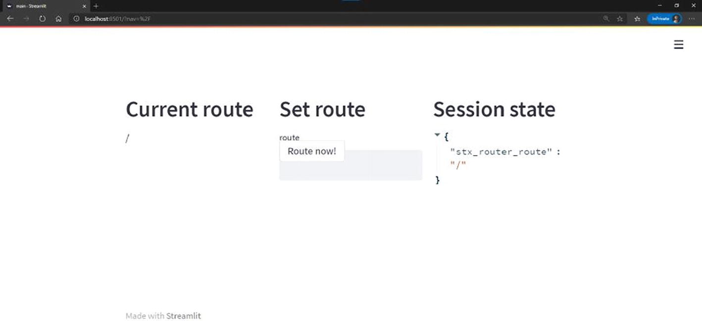
Trying the demo out with multiple routes, we can notice that it acts as expected where the routes having the nav parameter set to either /landing or /home show the equivalent page content as seen in Figures 10-16 and 10-17, respectively. We can also see the root route returns nothing in Figure 10-15, and the same behavior occurs in Figure 10-18. This module can be further enhanced by adding a not found route, which is something like the infamous 404 page seen quite often on the Internet.
Figure 10-15
The root route
Figure 10-16
/landing route
10.5 Summary
As you come to the end of this chapter, you are banking on the knowledge needed to render innovative and exciting custom components for Streamlit. By using the simplified version of ReactJS’s template and by referring to online resources, you can pretty much not only clone ReactJS’s Material UI views to Streamlit but also control some browser functionalities to add a native web application UX to your application. In this chapter, we also discussed how certain aspects of the user interface in Streamlit can be customized to add more versatility and exclusivity to an application. The techniques discussed in building this library can indeed be scaled and implemented by any developer for a multitude of other purposes. It is just worth mentioning that no component is done justice without sharing it with the open source community, to improve it iteratively with feedback and suggestions from other developers.