Chapter 3. Image Harvesting
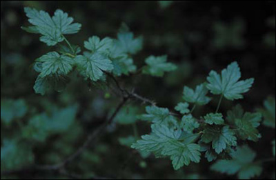
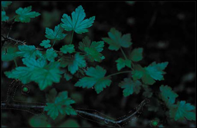
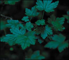
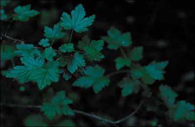
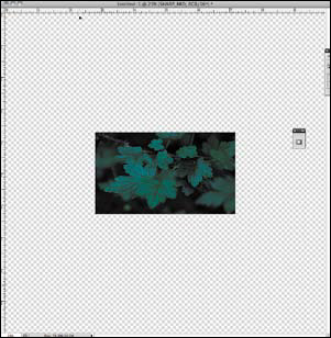
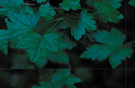
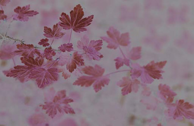
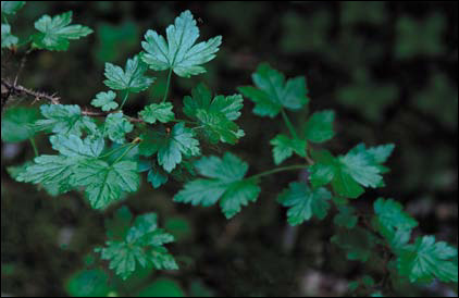
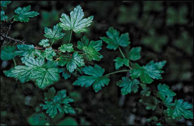
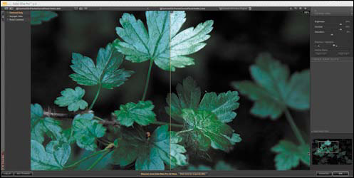
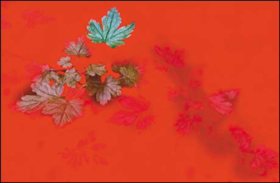
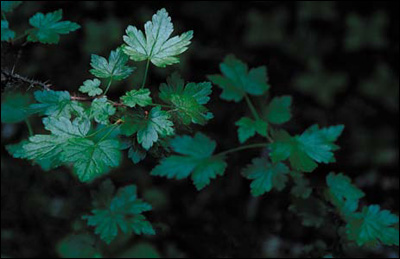
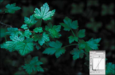
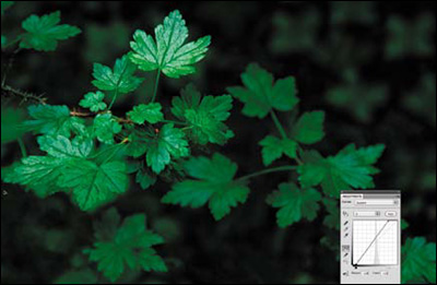
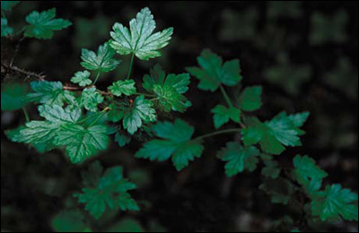
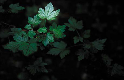
Figure 3.0.1. Before
Precision does not mean accuracy. Accuracy is how well precision reflects reality.
—Lane H. Decker
In this chapter, I will explore the concept and teach you the techniques of image harvesting. This is the practice of shooting multiple images of the same subject while changing not only the exposure, but the shutter speed, focus point, and image structures. This practice guarantees that your source files will contain the optimum aesthetic aspects of exposure, DOF, bokeh, and focus, so that you can later combine the best of each to create a single, final image.
Recreating What the Eye Saw
The human eye is an amazing biological optical system. It can discern detail in light as dim as moonlight and as bright as noon’s direct sunlight at the equator. It also acts as a motion sensor, sees events as they happen, and changes focus so rapidly that everything, near to far, appears in focus, all while adjusting for changes in the light intensity.
A digital still camera, on the other hand, does not have all the capabilities of the human eye. It is simply an image-capturing device that records a very small part of what we see. It records only fractions of seconds, while the majority of what we see is witnessed in unlimited motion. The human eye has the ability to see multiple objects at different distances and see them all in focus. A digital still camera cannot. If you are using a fixed lens system, like a SLR, where the film/sensor plane and the lens are permanently locked into a relationship with each other, you simply cannot have two objects that are at different distances be in focus. No amount of stopping the lens down will change this.
The human eye is capable of adjusting for changes in light and has the ability to determine detail in both extremely low and high light situations. Cameras, on the other hand, always seek to expose for 18% gray. This means that if you take a picture of a white wall and then a black wall, when viewed, neither image would be black or white; they would both be 18% gray. Additionally, no matter how sensitive the light meter in the camera, it cannot determine what area of the image is the most important. Only the photographer can do that.
So how do you replicate what you saw with a device that does not record the image the way you experienced it when you saw and shot it? The answer is this: rather than shoot one image and hope for the best, consider harvesting many images and combining them into one. This is the best way I know to create an image that looks like what the eye saw—not just what the camera captured.
Practicing Preemptive Photoshop
An interesting plainness is the most difficult thing to achieve.
—Ludwig Mies van der Rohe
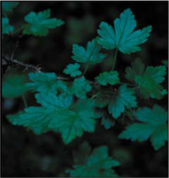
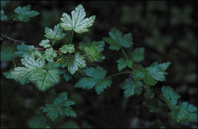
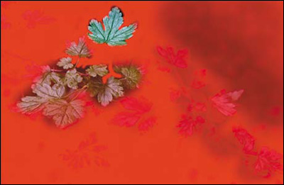
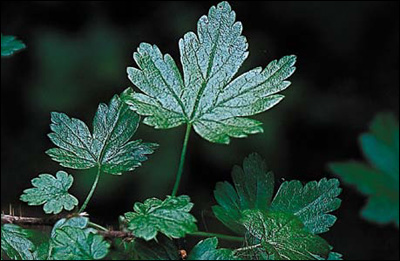
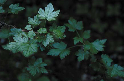
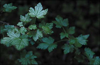
The image that will be the outcome of this lesson, Hearing the Whisper of the Green Fairy (Figure 3.0.2), was harvested rather than captured in one image. It is also the first time that I went beyond mere High Dynamic Range (HDR) capture and moved into exploring Extended Dynamic Range (EXDR) photography, although I did not know it at the time.
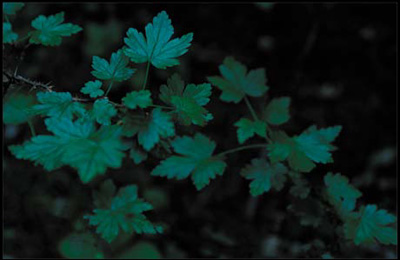
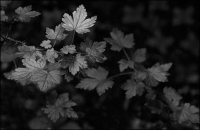
Figure 3.0.2. After

I decided that while revisiting this image harvesting chapter, I should mention that I believe that the importance of expanding dynamic ranges may be being missed in the rush to use HDR imagery to simply make images look strange. I believe that HDR photography is frequently over-used, misused, and abused. I read a blog that said that if you do not like HDR images then you do not understand Photoshop. You should not have to understand the technology used to create an image (even though you may) to appreciate it. If an image is simply strange, and does not move you, you know that it is not the culmination of the photographer’s vision; it is simply manipulation.
The High of Dynamic Range Thinking
If you don’t like change, you’re going to like irrelevance even less.
—General Eric Shinseki
Though HDR traditionally refers to widening the range of exposure by shooting multiple images, there is more to this concept than merely using tonemapping software to create the “grunge” look. I believe that shooting multiple images for exposure is just a small part of the high of dynamic range thinking.
When Welcome to Oz was first published, there were some critics who thought image harvesting unnecessary, too time consuming, or irrelevant. Now, software exists (Helicon Focus, CS4, and CS5) that creates one completely focused image from several partially focused ones by combining the focused areas of each. In addition, Photoshop automatically aligns multiple images, and there is tonemapping software for assembling images based on exposure (HDRSoft’s very aggressive Photomatix and Nik Software’s kinder, gentler HDR Efex Pro). Obviously, the concept of harvesting multiple images for specific needs has taken hold and entered the mainstream of digital processing techniques.
As you work through the chapters in this book, keep in mind that you are not limited by the medium in which you work; you are limited only by your imagination and your personal vision. As you have seen in the first two chapters, and you are about to see in this and the next chapter, owning a fast lens cannot solve problems of selective focus, and stopping the lens down in a fixed lens/capture plane system (such as an SLR) cannot bring objects at different distances from the sensor plane into focus all at once. That is simply physics.
From HDR to XDR to EXDR
My wish for you is that you capture images because you are so taken by what you see that you have no choice but to press the shutter. And I understand how frustrating it is when the limitations of the technology keep you from achieving the fulfillment that you realize when you know that your voice has been heard. Because what you see with your eyes is not what your camera sees when you capture an image, I invite you to extend the dynamic range of those images in such a way that no one will be aware of the manipulation when you are done.
The term XDR was coined by John Paul Caponigro when he and I produced an Acme Educational tutorial DVD to teach his techniques and belief that there were many ways to extend the exposure range (XDR) of an image. What I have observed, through the course of my creative work, is that we should be going beyond extending only exposure range and should be looking to extend the dynamic range of all that makes up image structure: time, specific focus points, multiple objects in focus, blur, color, etc. I call that ExDR. In the next two chapters, you will be exploring this concept.
When I first encountered the subject of Hearing the Whisper of the Green Fairy, I stared at those leaves for an hour, captured 87 images, and out of those, I chose to use only four. I made so many captures because I shot some at different exposures, some at different focus points, and some were a combination of both. When capturing those images, I was practicing “preemptive Photoshop”—making informed decisions about the way I was shooting (different exposures, focus points, DOF, etc.) so that I got it right in the camera at the time of capture. This allowed me a large number of options when I sat down later at my computer. Remember to approach Photoshop as a noun and not a verb. You cannot always fix it in Photoshop. Photoshop is only a means to an end. Although your goal should always be to get it right in the camera, when the camera cannot give you your vision, adapt to the situation and give yourself as many choices as you can when you are taking the picture, so that later you are not limited by captures you lack.
I have found that real pixels are infinitely better than artificially generated ones. The image that I chose as the main, or base, image for this lesson was one in which I liked the relationship between its main point of focus—the leaf in the upper part of the picture—and the overall image. From the three other captures, I took those parts that I felt resolved areas in the base image that were issues to me. The issue areas were the leaf in the foreground, the cluster of other leaves in the mid-ground, and the absence of interesting detail in the background. After making the composite, I enhanced it as if it were a single image.
Before you dive into all that follows, think about whether you are creating a believable improbability or a believable probability. Ponder this as you work your way through this lesson.
Photoshop Setup and Workflow
As with any image, the first steps are to analyze the image, determine which problems need to be addressed, and decide on the appropriate workflow. As discussed earlier, workflow is a dynamic thing and is specific to each image. In image harvesting, you must first choose the images you will use, then:
• fix any problems with the base image.
• combine the desired elements taken from the other images.
• do color correction and aesthetic image manipulation.
It is wise to solve the biggest problems first. Here, for example, the biggest issue is not correcting the color cast of all four images; it is getting one image from the four. It is easier to color correct one final image than to do each separately.
Try to develop a workflow that minimizes artifacting. Every time you do something in Photoshop, you clip or dump some data, and that causes artifacts. While some of these are visually appealing, some are not. And, as I have previously mentioned, all artifacting is cumulative and can be multiplicative. One way to minimize this is to work in 16-bit and in the ProPhoto color space. This image’s workflow is approached with that in mind.
Here are the four harvested images that make up the palette for this lesson:
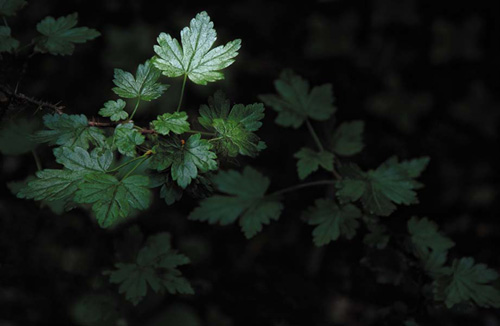
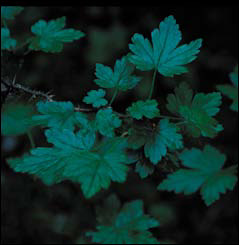
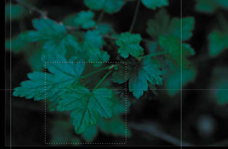
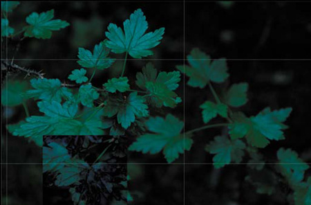
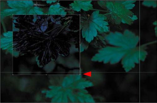
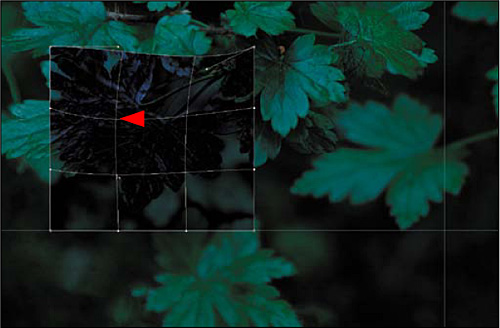
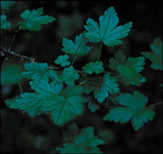
• Image 1: This is the base image and contains the central focus point of the final image, the large leaf at the top (the primary focus area) (Figure 3.1.1).
Figure 3.1.1. Image 1: the base image

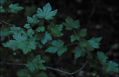
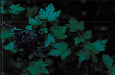
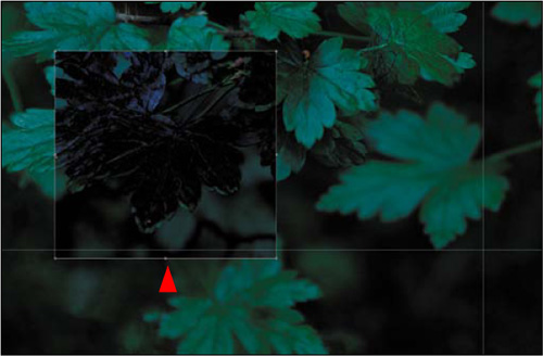
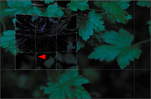
• Image 2: A nearly identical photo with the focus on a cluster of leaves beneath the large leaf at the top (the secondary focus area) (Figure 3.1.2).
Figure 3.1.2. Image 2: focus on the leaf cluster
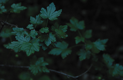
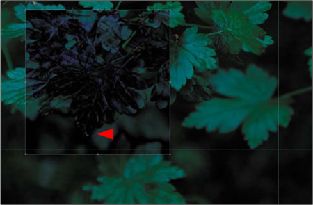
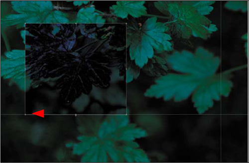
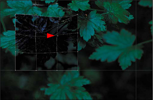
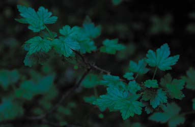
• Image 3: A slightly different image, where a single leaf below the cluster is in focus (the tertiary focus area) (Figure 3.1.3).
Figure 3.1.3. Image 3: focus on a single leaf
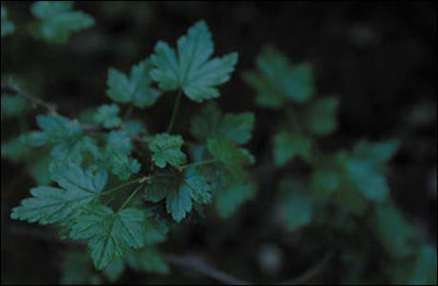
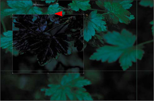
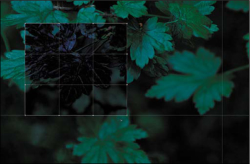
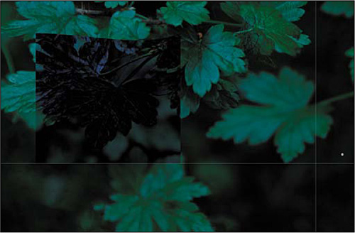
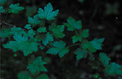
• Image 4: An image taken from a different angle that contains three leaves in focus and a nice pattern for the background (Figure 3.1.4). (See the Image Harvesting sidebar)
Figure 3.1.4. Image 4: interesting background
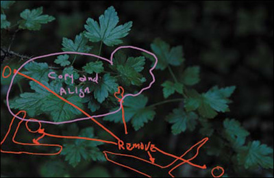
This is the image map of what you will be doing (Figure 3.1.5).
Figure 3.1.5. Image map of combining images
From Many to One: Creating the Composite Image
There are numerous reasons for creating a composite image and they range from duplicating the reality of what you originally saw to creating an image of something that exists only in your mind’s eye. For instance, if you want a shallow DOF because you like the bokeh at 2.8, and your vision of the image includes having the objects in front of the focus point to also be in focus, you will need to combine multiple images into one. Also, you need to combine multiple images if you want multiple objects that are at different distances from the sensor plane to be in focus. It is this last goal that I had in mind for Hearing the Whisper of the Green Fairy.
Step 1: Combining the Four Images into One
When combining multiple images into one, keep in mind:
• All of the image manipulation decisions you make should be made based on the way the eye works when it “sees.” As I discussed in Chapter 1, the eye goes to patterns that it recognizes first: areas of light to areas of dark, high contrast to low contrast, high sharpness to low sharpness, in-focus to blur (which is different from high sharpness to low sharpness), and high saturation of color to low saturation of color.
• You cannot simply combine captures taken with different f-stops to put multiple objects in focus that are at different distances from the sensor plane. (See Chapters 1 and 2.) If you want to do this, then you need to have a common point of focus in each image that will be used in the composite.
• It is in the digital domain, both at capture and in the digital darkroom, that impossible is just an opinion. You are limited only by your ingenuity and imagination.
• Most importantly, always solve the biggest problems first and work down to the smallest, i.e., correct from global to granular.
- Go to the folder CH_03_OZ_3.0 that you downloaded from www.welcome2oz.com. Using BANFF0274.tif as the base file, double-click on the background layer, and rename it BASE IMAGE. One at a time, Shift-click and drag the image icon in the Layers panel from the three harvested images to the base image.
By using the Shift-click method, the copied image will pin register with the base image. In other words, Photoshop will place the copied image exactly on top of the base image. Here is the layer order, from the bottom up:
- Close the BANFF0273.tif, BANFF0277.tif, and BANFF0269.tif files. They are no longer needed.
- Save the file (Shift + Command + S / Shift + Control + S) as a Photoshop or PSD, file (not as a layered TIFF) and name it GREEN_LEAVES_16BIT.
Note
Photoshop should be set to Snap To Guides (on the View > Snap To menu), and the viewing mode should be set to Full Screen with Menu Bar. Keyboard shortcut F displays the image on top of a neutral gray background.
Step 2: Removing Unwanted Elements from the Base Image
In the base image, the viewer’s eye is drawn away from the main leaf by a distracting branch. This is the biggest problem, because it will show up in everything that you do until you remove it. Prior to CS5, the only way to do this was by using the Patch tool. CS5 has something better: Content-Aware Fill. (Quite a moniker!) It works by removing a selected element and filling it with detail that matches the surrounding area. It can seamlessly generate bushes, trees, clouds, etc., and fill the selected area so that, for the most part, you will be hard pressed to see that something has been done.
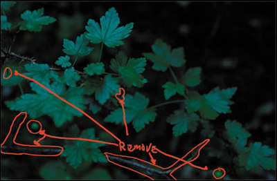
Working global to granular, the biggest issues in this image, besides making four images into one, are the sins of our base image—specifically, the unwanted branches and dead leaves (Figure 3.2.1).
Figure 3.2.1. The image map for removing unwanted elements
Content-Aware Fill
- Make a copy of the BASE IMAGE layer (Control + J / Command + J) and name it CA_FILL.
- Select the Polygonal Lasso tool (L).
Note
The Polygonal Lasso tool is one of three Lasso tools. The others are the Standard Lasso and the Magnetic Lasso tools. By pressing Shift + L, you can move through the Lasso tools to pick the desired one. The Polygonal Lasso is best for extracting pieces of images that have reasonably straight edges or a semi-polygonal shape, while the Magnetic Lasso is best for complicated figures. To use the Polygonal Lasso, click specific points around an image, and Photoshop will draw straight lines from point to point. Also, if you hold down the Shift key while clicking, you can create straight lines and 45° angles. To undo / redo a point, use the Del / Delete key. For this image, I will have you use the Polygonal Lasso.
- With the Polygonal Lasso tool, make a selection around the lower left twig. (You do this by periodically clicking the mouse as you move around the object.)
- Holding down the Shift key for each of the areas that you want to remove, repeat this process so that when you are done you will have a series of selections that looks like this (Figure 3.2.2).
Figure 3.2.2. The selection of areas to be removed
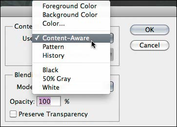
- Go to Edit > Fill (Shift + F5 key) and select Content-Aware from the Fill dialog box’s Content pull-down menu (Figure 3.2.3).
Figure 3.2.3. Choose Content-Aware in the Fill options
- Click OK. Click Command + D / Control + D to deselect the selection (Figure 3.2.4).
Figure 3.2.4. The image after the unwanted areas are removed
Note
If you need to touch up an area that you missed or there are areas where there is a noticeable edge after you run Content-Aware Fill, simply use the Clone Stamp tool or the Spot Healing brush to touch it up.
Step 3: Extending the Dynamic Range of Focus While Maintaining a Shallow DOF
I chose the base image because I liked the way the leaf in the upper part of the composition (the central focal point) related to the overall image. But the image was shot at f/5.6, so its DOF is fairly shallow, and the mid and foreground are out of focus. I chose this DOF for aesthetic reasons; I wanted just the leaf cluster to be in sharp focus. As I have already discussed, stopping a lens down increases the area of acceptable out-of-focus, but it does not increase the number of elements that are actually in focus. Therefore, if I had chosen a base image in which I had stopped the lens down when I made the capture, I would have brought unwanted objects into acceptable out-of-focus, which would have taken the viewer’s eye away from the leaf cluster.
Even though this series of images was captured with a camera on a stable tripod, whenever you change the focus, you readjust the position of the elements within the lens. Depending on the lens, this may move the image slightly to the right or left. You will correct for that by replacing the mid-ground leaves with the in-focus leaves from Image 2 (Figures 3.3.1 and 3.3.2).
Figure 3.3.1. Out-of-focus leaves to be replaced
Figure 3.3.2. In-focus leaves that will be used instead
There are two ways to align an image: 1) manually, by changing the layer you want to move to the Difference blend mode, selecting the Move tool (V), and moving the layer to the placement you want with the arrow keys, or 2) by using Auto Align Layers. Auto Align Layers is the first tool to which I go when I want to align images for a composite. When it works, it works wonderfully. But frequently, it changes the orientation of the image in a way that I find unacceptable. Also, if there are too many blurred areas and too few hard edges, it will not work at all. In this lesson, you will work around Auto Align Layers’ penchant for wanting to rotate the entire image, as well as looking at the Difference blend mode approach when Auto Align Layers will not line things up. Both approaches are contained in the 100ppi version of the file that I created while writing this chapter.
Approach 1: Manual Aligning of Image Structure Using the Difference Blend Mode
- Make the MID_LEAVES layer (the one with the middle leaves in focus) active. Lower the opacity to 50% to compare the BASE and MID_LEAVES layers (Figure 3.3.3). Set the opacity back to 100% and select the Difference blend mode from the Blend Mode pull-down menu at the top of the Layers panel. Notice that the image has significantly changed in appearance (Figure 3.3.4).
Figure 3.3.3. MID_LEAVES layer set to 50% opacity to compare the alignment of the two layers
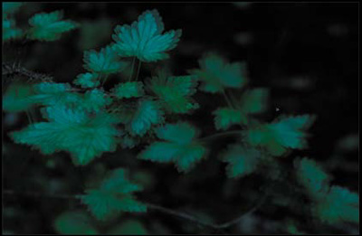
Figure 3.3.4. MID_LEAVES layer set to Difference
- Zoom into the central area of the image, select the Move tool (V), and click on that area with the left arrow key to move the image layer until the image is mostly dark (approximately 25 clicks for this image). Then, with the down arrow key, further fine tune the image alignment by clicking on it (approximately 2 clicks for this image) (Figure 3.3.5).
Figure 3.3.5. After moving the MID_LEAVES layer to better align with the BASE layer
- Select the Normal blend mode from the Blend Mode pull-down menu at the top of the Layers panel. Create a layer mask and fill it with black. Select the Brush tool, set the opacity to 100 percent (0) with a brush width of 70 pixels and brush in the mid-leaf area. Review the image map (Figure 3.3.6), the layer mask (Figure 3.3.7), the image before (Figure 3.3.8), and the image after (Figure 3.3.9).
Figure 3.3.6. The image map
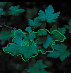
Figure 3.3.7. The layer mask
Figure 3.3.8. Before the brushwork
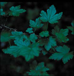
Figure 3.3.9. After the brushwork
Approach 2: Using Auto Align Layers
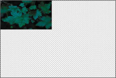
Auto Align Layers was very good in CS4, but it is great in CS5. However, it still has some limitations. First, if you select multiple layers to align, it will do just that, which means that it may change the orientation and relationship of all of the layers. That translates into potentially having to crop the image, which is to be avoided whenever possible. What happens when you align the layers is shown in Figure 3.3.10. You can work around this limitation by aligning your chosen elements in a separate file, then bringing those elements back into the original file after the alignment is done. This is the next thing that you will do.
Figure 3.3.10. The result of the Auto Align Layers function in CS5
- Select the Move tool (V) and make sure that the rulers are visible (Command + R / Control + R).
- Make the CA_FILL layer the active and visible one (the eyeball is turned on). (Make sure that the MID_LEAVES layer is not a visible layer.)
- Click on the top ruler and drag a guide line to just below the lower front leaf. Repeat this process for the top and sides of the mid-leaf area. When you are finished, it should look something like this (Figure 3.3.11).
Figure 3.3.11. The guides in place for the lower front leaf
- Select the Marquee tool (M) then click and drag from the top left corner of the area that you have outlined with guide lines to the lower right corner. You should see the “marching ants” indicating your selection (Figure 3.3.12).
Figure 3.3.12. Drawing a selection using the Marquee tool
- Copy this selection to its own layer (Command + J / Control + J) and name it BLUR_MID.
- Command- / Control-click on the BLUR_MID layer inside the Layers panel. This makes a selection of the contents of the layer.
- Turn on and make active the MID_LEAVES layer. Copy the selection to its own layer (Command + J / Control + J) and name it MID_SHARP.
- Create a layer group and name it MID_LEAVES_B.
- Click on the MID_SHARP layer and drag it into the MID_LEAVES_B layer group.
- Click on the MID_BLUR layer and drag it into the MID_LEAVES_B layer group.
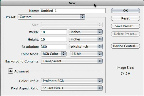
- Create a new file (Command + N / Control + N). Make both the width and height 10 inches and the resolution 360ppi. (Figure 3.3.13) (Also, make sure that the file is in the ProPhoto color space and 16-bit.) Click OK.
Figure 3.3.13. Creating a new file
- Making sure that you are in Standard screen mode, Shift-drag the MID_LEAVES_B layer group into the file that you just created (Figure 3.3.14).
Figure 3.3.14. The MID_LEAVES_B group copied into the new file
- Holding the Shift key down, make both the MID_SHARP and MID_BLUR layers active.
- Go to Edit > Auto Align Layers.
- When the Auto Align Layers dialog box comes up, make sure Auto is selected in the Projection part of the dialog box and click OK (Figure 3.3.15). After you click OK, you should see this (Figure 3.3.16).
Figure 3.3.15. The Auto-Align Layers dialog box
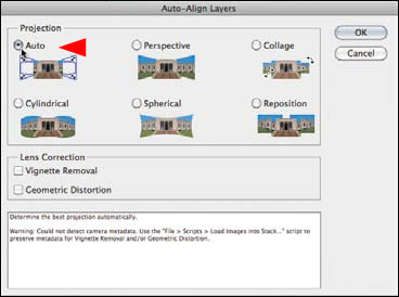
Figure 3.3.16. The image after using Auto-Align
- Rename the MID_LEAVES_B layer group MID_LEAVES_A.
- Click on the GREEN_LEAVES_16BIT.psd file to make it active. Drag the MID_LEAVES_B layer group to the trash. Make the CA_FILL layer active.
- Go to the file in which you just auto aligned the layers and turn off the MID_BLUR layer. Holding down the Shift key, drag and drop the MID_LEAVES_A layer group to the GREEN_LEAVES_16BIT.psd file.
- Select the Move tool and, using the arrow keys, fine tune your placement so that the stem of the top leaf of the layers that you just aligned lines up with the stem of the top leaf of the CA_FILL layer.
- Create a layer mask on the MID_LEAVES_A layer group and fill it with black. Follow the image map (Figure 3.3.17) to brush in the new leaves that are in focus on the layer mask (Figure 3.3.18). Compare the image before (Figure 3.3.19) and after the brushwork (Figure 3.3.20).
Figure 3.3.17. Image map
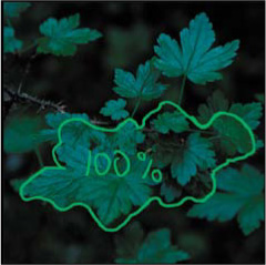
Figure 3.3.18. Layer mask
Figure 3.3.19. Before
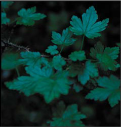
Figure 3.3.20. After
- Save the file.
- Close the file that you created to auto align the layers and do not save it.
Step 4: Leaf Swapping
The next step is to replace the base image’s out-of-focus foreground leaf with the in-focus leaf from the FRONT_LEAF layer. The issue with this leaf is that the camera position was moved from where it was when the base and mid-leaf images were captured, so that the sensor-plane-to-subject relationship was changed. When you change the angle between the camera and the subject, you also change perspective, and the distortions that were caused in relation to the base image need to be corrected. (For this reason, this is something to avoid if at all possible.) In this case, a correction is needed and you will do this using Free Transform and then the Warp tool that were both new in Photoshop CS2. Ben Willmore, in his book, Photoshop CS2: Up to Speed (Peachpit, 2005) wrote, “The new Warp feature allows you to bend and distort images almost as if they were printed on Silly Putty.”
Note
New to CS5 is the Puppet Warp tool that takes the Warp tool to a new level of controllability. But the simplest way is usually the best way, and for this image, just warping will do.
You have undoubtedly noticed that everything you do to an image is a bit of a dance. For everything you do, there will be some change elsewhere in the image that you may or may not like. As in almost everything you do in Photoshop, the global moves you make will need granular corrections until there is no more work to be done.
- Turn on and make the FRONT_LEAF layer active.
- Select the Marquee tool then click and drag a selection around the front leaf (Figure 3.4.1).
Figure 3.4.1. Making a selection with the Marquee tool
- Copy it to its own layer and name the new layer FG_LEAF.
- Turn off the FRONT_LEAF layer.
- Change the blend mode of the FG_LEAF layer to Difference. You should see this (Figure 3.4.2).
Figure 3.4.2. The FG_LEAF layer set to Difference
- Select the Move tool (M).
- Click on the FG_LEAF layer and move the leaf until its front tips are as closely aligned to each other as they can be (as in the previous step, you want as little lit area as possible) (Figure 3.4.3).
Figure 3.4.3. Moving the FG_LEAF layer to align it with the layer below
- Zoom into the FG_LEAF area and fill the screen.
- Select the Free Transform tool (Command + T / Control + T). Move the Reference point to the tip of the leaf. (Figure 3.4.4)
Figure 3.4.4. Moving the Reference point to the tip of the leaf
- Click on the top anchor point and move it until the upper part of the stems are more or less aligned (they will appear to be dark with no lightness around the edges) (Figure 3.4.5).
Figure 3.4.5. Moving the top anchor point to align the stems
- Click on the right anchor point and move it until the right parts of the leaf are more or less aligned (they will appear to be dark with no lightness around the edges) (Figure 3.4.6).
Figure 3.4.6. Moving the right anchor point to align the leaf
- Click on the bottom anchor point and move it until the tips of the leaf are more or less aligned (they will appear to be dark with no lightness around the edges) (Figure 3.4.7).
Figure 3.4.7. Moving the bottom anchor point to align the leaf
- Click on the left anchor point and move it until the left parts of the leaf are more or less aligned (they will appear to be dark with no lightness around the edges) (Figure 3.4.8).
Figure 3.4.8. Moving the left anchor point to align the leaf
- Control-click on the Free Transform box. This will bring up the Free Transform dialog box. Select Warp and the Warp grid will come up (Figure 3.4.9).
Figure 3.4.9. The Warp grid
- Click on the right corner control handle that rests on the top of the Warp grid box (one grid line to the left), and move it until the right side of the leaf mostly lines up. (Figure 3.4.10).
Figure 3.4.10. Moving the right corner handle to align the right side of the leaf

- Click on the upper left second control handle, (one grid line to the right, and one grid line down from the top), and move it until the left side of the leaf and stem mostly lines up (Figure 3.4.11).
Figure 3.4.11. Moving the upper left second control handle to align the leaf
- Click on the lower left second control handle, (one grid line to the right, and one grid line up from the bottom), and move it until the front of the leaf mostly lines up (Figure 3.4.12).
Figure 3.4.12. Moving the lower left second control handle to align the leaf
- Click on the upper right second control handle, (one grid line to the left, and one grid line down from the top), and move it until the right top side of the leaf and stem mostly lines up (Figure 3.4.13).
Figure 3.4.13. Moving the upper right second control handle to align the leaf
- Press Return / Enter and you should see this (Figure 3.4.14).
Figure 3.4.14. Finishing the warp and the resulting layer
- Switch the blend mode from Difference to Normal (Figure 3.4.15).
Figure 3.4.15. The layer after changing the blend mode to Normal
- Create a layer mask and fill it with black. At 100% opacity, using a brush diameter of 100 pixels, brush in (with white) the leaf that you just warped following the image map (Figure 3.4.16) as a guide. The layer mask should look like Figure 3.4.17. Compare the image before (Figure 3.4.18) and after (Figure 3.4.19).
Figure 3.4.16. The image map
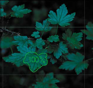
Figure 3.4.17. The resulting layer mask
Figure 3.4.18. Before the new layer
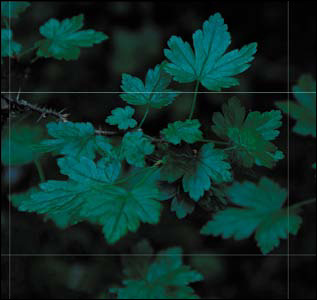
Figure 3.4.19. After the new layer
- Save the file.
Step 5: Matching the Base and Image 4 Colors
You are going to use the BG_PARTS layer to put some image structure elements in the upper right corner of the background, but the leaves in BG_PARTS look bluer than the ones in BASE IMAGE, so you must first match the colors of the two layers.
Note
The colors in the images are very subtle. I suggest you open the Histogram palette, set it to All Channels View, and see what happens when you repeatedly click the visibility icon for this layer.
- Make the BG_PARTS layer active, and select Image > Adjustments > Match Color.
- In the Match Color palette, select GREEN_LEAVES_16BIT.psd from the Source menu, and select BASE IMAGE from the layer menu (Figures 3.5.1 and 3.5.2). Click OK.
Figure 3.5.1. GREEN_LEAVES_16BIT.psd
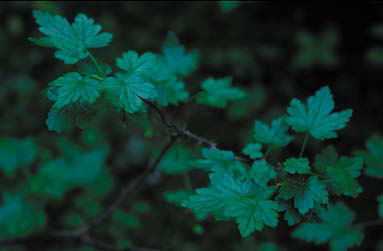
Figure 3.5.2. BASE IMAGE
Step 6: Adding the Background from Image 4
In the final step of the assembly, you will use some of the background details from the BG PARTS layer.
- Using the Marquee tool (M), select the leaf in the upper-right corner. Copy the selection to its own layer (Command + J / Control + J) and name the new layer BG_LEAF (Figure 3.6.1).
Figure 3.6.1. The new BG_LEAF layer

- Create a layer set and name it BG_PARTS.
- Turn off the BG_PARTS layer, and move the BG_LEAF layer into the BG_PARTS layer set. Choose the Move tool (V), and drag the BG_LEAF layer up and to the upper right corner (Figure 3.6.2).
Figure 3.6.2. Drag the BG_LEAF layer up and to the right
- Add a black-filled layer mask, making sure the foreground color is white and the background is black. Select a soft 175-pixel brush, and paint in just the area of the leaf. (Make sure that no hard edges remain after brushing.) This layer will be one of the two main building blocks you will use to fill in the aesthetic details.
- Duplicate the BG_LEAF layer. Move the new layer midway down the right side of the image. Choose Edit > Transform > Rotate. Rotate the layer 45° clockwise, and then move it slightly to the right. Press Return / Enter to apply the transformation. Name this layer BG_LEAF_45 (Figures 3.6.3 and 3.6.4).
Figure 3.6.3. Selecting the Transform tool on BG_LEAF
Figure 3.6.4. Rotating the layer 45°
You now have the two building blocks you need to construct the background. Bear in mind—and make use of—layer order and different levels of opacity.
- Duplicate the layer BG LEAF. Move the new layer to the upper-left corner of the BG_LEAF layer so that only the bottom half of the leaf is showing. Reduce the opacity to around 80%.
- Duplicate the BG_LEAF 45 layer. Move the new layer to the upper right of the BG_LEAF 45 layer. Lower the opacity to 80%. Duplicate this layer and move it to the upper left of BG_LEAF 45 and lower the opacity to 50%.
- Duplicate the layer BG_LEAF copy. Move that layer so that the upper-right part of the layer is just below the lower-left part of the layer BG_LEAF 45 copy. Lower the opacity to 50%.
- Duplicate the BG_LEAF layer copy 3. Move the new layer so that the upper right of the duplicated layer is below the lower right of the BG_LEAF 45 copy layer. Lower the opacity to 50%.
- Duplicate the BG_LEAF 45 layer. Move the new layer to the upper left of the BG_LEAF copy 2 layer so that only the bottom half of the leaf is showing. Lower the opacity to 50%. Duplicate this layer and move it to the upper left of BG_LEAF 45 and lower the opacity to 50%.
The composite image is now complete. The focal points on the various leaves are all correct, and the upper-right corner has the desired background detail (Figures 3.6.5 and 3.6.6).
Figure 3.6.5. Before
Figure 3.6.6. After
You now have the main image that is the sum of all of the harvested parts. Before starting the next set of aesthetic corrections, you need to clean up the file structure before merging all active layers into one while keeping all the previous layers intact, i.e., doing “the Move” (see Chapter 1).
- Click the top layer (BG_PARTS) to make it active, but do not make it visible. Holding down the Shift key, click on the BASE layer. (This will select the BASE layer and all of the layers below it.)
- Click-and drag the selected layers and layer groups to the Create Layer Set icon located at the bottom of the Layers panel. Name the new layer set MASTER_ALL.
- What you do next depends on which version of Photoshop you have. For CS2 and above, press and hold Command + Option + Shift + E / Control + Alt + Shift + E. For CS and below, press Control + Alt + Shift / Command + Option + Shift, then type N and then E.
In both cases, the result is a master layer that contains all the previous layers. Name it MASTER_1 (Figure 3.6.7).
Figure 3.6.7. The new master layer MASTER_1

Note
When you do “the Move” in CS2 and above, the name “Merge Stamp Visible” appears in the History palette.
Step 7: Removing the SLR Sensor Color Cast
As you have done in the previous two chapters, you will now deal with the image’s color cast attributable to the SLR sensor. This color cast is caused by data interpolation errors of the CCD or CMOS image’s Bayer array data in the post-processing of the capture, and occurs in all digitally captured images. (For a complete discussion of color cast correction, see Chapter 1.)
- Create a new layer set and name it BP/WP/MP.
- Create a Threshold adjustment layer. Select the Sample Point sampler from the tool bar. Move the slider all the way to the left, then slowly to the right until you see meaningful black. Shift-click a sample point.
- Move the Threshold slider all the way to the right, then move it slowly to the left until you see the first or second white pixel. Shift-click a sample point. Click Cancel.
- Create a new layer.
- Go to Edit > Fill > Fill with 50% gray and click OK.
- Select the Difference blend mode. You should see this (Figure 3.7.1).
Figure 3.7.1. The image after changing the blend mode to Difference
- Select the Threshold adjustment layer and move the slider fully left.
- Move the slider to the right until you first see black dots. (I went to a threshold setting of 4.) Zoom in to that area and place a sample point.
- Discard the Threshold adjustment layer.
- Discard the 50% gray Difference blend mode layer. You should now have an image with three sample points, one each for black, white, and midpoint (Figure 3.7.2).
Figure 3.7.2. Three sample points on the image
- Zoom in to the area where you placed the first sample point. Create a Curves adjustment layer. With the black eyedropper, click the sample point and click OK. Name this layer BP.
- Zoom in to the area where you placed the second sample point. Create a Curves adjustment layer. With the white eyedropper, click the sample point and click OK. Name this layer WP.
- Zoom in to the area where you placed the third sample point. Create a Curves adjustment layer. With the white eyedropper, click the sample point and click OK. Name this layer MP.
- Save the file.
Compare the image before (Figure 3.7.3) and after the color cast correction (Figure 3.7.4).
Figure 3.7.3. The image before the color cast correction
Figure 3.7.4. The image after the color cast correction
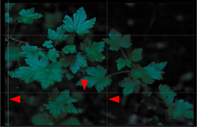
Side Step 7.5: Creating the Image Map for the Aesthetic Aspect of This Image
Now that you have one image with which to work, it is time to map out what aesthetic manipulations you want to make. At the moment that this image took me, I began pre-visualizing it as I wanted it to become, i.e., I asked myself what I might need to do to create the image that I saw in my mind’s eye. I captured, or harvested, images the way I did so that when I sat down at the computer to work, I could create the vision that I had in mind.
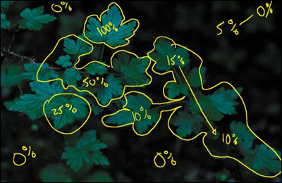
As I have previously discussed, there is a very specific way that the eye sees and moves across an image. In this picture, you want the eye to go first to the top leaf, then to the leaf in the middle, then to the foreground leaf, then to the back set of leaves, and finally, to the background.
- Select the Pen tool, make the brush size 8 pixels, and choose a yellow color from the color picker. Create a new layer and name it GF_OVER_ALL_IM.
Here is the image map that I created (Figure 3.7.5).
Figure 3.7.5. The image map
Step 8: Making Lemonade Out of Color Cast Lemons
If you look at all three of the of the corrections you just made, you should observe that the BP adjustment adds a little coolness to the image (Figure 3.8.1), WP lightens and slightly warms up the image (Figure 3.8.2), and the MP adds even more warmth (Figure 3.8.3). Also, take a look at what all three corrections look like combined (Figure 3.8.4).
Figure 3.8.1. The image with the BP adjustment
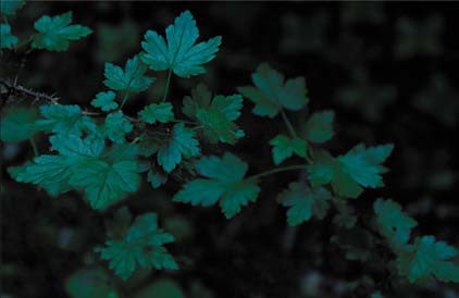
Figure 3.8.2. The image with the WP adjustment
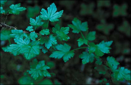
Figure 3.8.3. The image with the MP adjustment
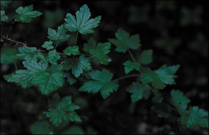
Figure 3.8.4. The image with all three adjustments
Because you are trying to replicate the reality of the light (shadows are bluer than lit areas, warm colors appear to move forward, and cool colors appear to recede), minimize the cumulative and possibly multiplicative effects of image manipulation artifacting, and undo some of the limitations of the technology that was used, you will use the color cast of the file to your advantage.
- Fill the WP Curves adjustment layer with black.
- Select the Brush tool (B), set the opacity to 100% and the brush width to 100 pixels, and brush the upper leaf.
- Set the opacity of the brush to 50% and brush in the mid-leaves area. Bring up the Fade effect dialog box and increase the amount to 72%.
- Brush in the front leaf at 50%.
- Brush in the leaf cluster to the lower right of the image, bring up the Fade effect dialog box, and lower the opacity to 27%.
- Brush in the leaf cluster below the front leaf, bring up the Fade effect dialog box, and lower the opacity to 15%.
- Brush the upper right corner of the image (where you added the background image structure), then bring up the Fade effect dialog box, and reduce it to 15%.
- Now, re-brush over the area closest to the right set of leaves, bring up the Fade effect dialog box, and reduce the opacity to 20%.
- Holding down the Option / Alt key, click on the layer mask you have just created and drag it to the MP layer mask. When Photoshop asks if you want to replace the layer mask, click OK.
- Do “the Move” and name this layer MASTER_2.
- Save the file.
Compare the image before (Figure 3.8.5) and after the brushwork (Figure 3.8.6). Also look at the resulting layer mask (Figure 3.8.7).
Figure 3.8.5. The image before the brushwork

Figure 3.8.6. The image after the selective brushwork
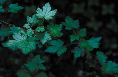
Figure 3.8.7. The layer mask for the brushwork
Step 9: Removing the Blue Cast
Objects photographed in sunlight tend to have a blue cast, and if they are in shadow, they are even bluer. You will use the Nik Software Color Efex Pro 3.0 Skylight filter to color correct the Green Fairy image. This filter removes the blue cast and makes the colors more realistic.
- Create a layer set and name it SKYLIGHT/CONTRAST/SHARPEN.
- Duplicate the MASTER_2 layer (Command + J / Control + J) and convert it to a Smart Filter. Duplicate the layer that you just converted so that you have two Smart Filter layers.
- Turn off the second Smart Filter layer (the one you just made) and make the first Smart Filter layer (MASTER_2copy) active. Name this layer SKYLIGHT.
- Go to Filter > Nik Software > Color Efex Pro 3.0 Versace Edition. Select Skylight from the three plug-in options and click OK. For this image, the default of 25% appears to be best.
- Holding down the Option / Alt key, click on the layer mask of the MP Curves adjustment layer and drag it to the SKYLIGHT layer. This will copy the layer mask from the MP layer and add it to the SKYLIGHT layer. Compare the image before the Skylight filter (Figure 3.9.1) and after (Figure 3.9.2)
Figure 3.9.1. Before the Skylight filter
Figure 3.9.2. After the Skylight filter

- Do “the Move.” Make a master layer and name it COLOR. Select the Color blend mode from the Blend Mode pull-down menu at the top of the Layers panel (Figure 3.9.3).
Figure 3.9.3.
- Place this layer above the MASTER_2copy2 layer.
Note
You create this layer to preserve the color decisions that you have made to this point. In the next series of steps, you will address issues of contrast and sharpness using the Luminosity blend mode that may affect the image’s saturation. By creating this layer with the Color blend mode, the color choices you made will be preserved.
- Save the file.
Being Selective with Contrast, Tonal Contrast, and Sharpening
Let me reiterate. The human eye goes first to patterns it recognizes in light areas and then in dark ones. The eye also tracks from high to low contrast, in-focus to blur, high to low sharpness (which is different than in-focus to blur), and then high to low saturation of color. In this next step, you are going to play with contrast and sharpness.
Contrast is often confused with contrast ratio. Contrast is the difference in brightness between the light and dark areas of a picture. If there is a large difference between those two, the image has high contrast. Contrast ratio is the ratio of the luminance (brightness), as measured on a meter, of the whitest pixel divided by the luminance of the blackest pixel. By adjusting that ratio, you can increase or decrease the contrast in an image.
Sharpening (or specifically in Photoshop, Unsharp Masking) is the increase of apparent edge contrast accomplished by increasing contrast on either side of the pixels’ edges. In this way, contrast and sharpness are related. It is worth noting, however, that contrast is normally spoken of on a global scale, and sharpness is highly localized.
Note
When an image is sharpened using Unsharp Masking, Photoshop does not really sharpen the image. Rather, it creates an illusion of sharpening by increasing contrast at the edges of objects within the image. This illusion (called the Craik-O’Brien-Cornsweet Edge illusion) is created when an edge of an element in an image is modified by lightening one side and darkening the other. After this is done, the area next to the darkened side of the edge appears darker in tone and the area next to the lighter side appears lighter. (For a visual example of this, go to http://en.wikipedia.org/wiki/Cornsweet_illusion.)
The technique of Unsharp Masking is not a new one. It actually had its origins in, and derived its name from, a darkroom printing technique developed in the 1930s. This technique involved printing a normal negative sandwiched with a blurred positive copy of that negative. The result was a print in which the edges of the image elements had the illusion of higher contrast and, therefore, sharpness. Photoshop does this mathematically by manipulating pixels.
Though contrast and sharpness (or more specifically, Un-sharp Masking) are technically similar in digital imagery, they differ in the way they can interact in an image. This is why you will be addressing the issues of selective aesthetic contrast and sharpness on two different layers. I will have you start with selective contrast.
Step 10: Selective Tonal Contrast
- Duplicate the MASTER_2copy2 twice. Turn off the two layers you just copied and make the MASTER_2copy2 active.
- Name this layer TONAL_CONTRAST.
- Set the layer blend mode to Luminosity.
- Select Filter > Nik Software > Color Efex Pro 3.0 Versace Edition. When the Nik filter dialog box appears, select Tonal Contrast.
- If you have not already, select Split View.
- Zoom in so that you have a view that shows part of the top and mid-leaves area (Figure 3.10.1).
Figure 3.10.1. Zoom in to the upper left leaves in Tonal Contrast
- For this image, first move the Contrast slider to +70, and then the Shadow slider to +40. Leave the Highlight at the default of +30.
- Lower the layer opacity to 63% and click OK (Figure 3.10.2).
Figure 3.10.2. The image after applying Tonal Contrast globally
- Holding down the Option / Alt key, click on the layer mask of the SKYLIGHT layer, and drag it to the TONAL_CONTRAST layer. Compare the image before and after the Tonal Contrast layer (Figures 3.10.3 and 3.10.4).
Figure 3.10.3. Before the Tonal Contrast layer

Figure 3.10.4. After the Tonal Contrast layer
Note
When copying layer masks to layers where sharpening and contrast are applied, you may see things that were not apparent before copying and applying the layer mask. This is what happened when I first worked with this image. Just tighten up the layer mask with the techniques that were discussed in Chapter 1.
Step 11: Adding Contrast Using the Contrast Only Filter
- Turn on and make the MASTER_2copy3 layer the active one.
- Name this layer CONTRAST_ONLY.
- Select the Luminosity blend mode.
- Select Filter > Nik Software > Color Efex Pro 3.0 Versace Edition. When the Nik filter dialog box appears, select Contrast Only. Zoom in to an area that has the main leaf and mid-leaves (Figure 3.11.1).
Figure 3.11.1. Zoom in to the main leaf area
- From the default setting of 50%, move the Brightness slider to 20%. You should see that the contrast is good, but the shadows are blocked up (Figure 3.11.2). Open the Protect Shadows and Highlights dialog box and set Protect Shadows to 50%. Raise the contrast to 55%. Lastly, adjust the Saturation slider to about 20%. (Even though you are working in Luminosity mode, by correcting for saturation, you add back some image structure that may be lost by boosting the contrast. I prefer this approach to contrast, because it offers me a level of control not found in other techniques.) This is what the dialog box should look like (Figure 3.11.3).
Figure 3.11.2. The shadows are blocked up
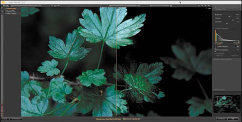
Figure 3.11.3.
- Click OK.
- Holding down the Option / Alt key on the layer mask of the TONAL_CONTRAST layer, drag it to the CONTRAST_ONLY layer.
- Move the CONTRAST_ONLY layer beneath the TONAL_CONTRAST layer.
- Reduce the opacity to 74%.
Note
There is a bit of a dance between Contrast Only, Tonal Contrast, and Sharpening. Every image is different and, frequently, that difference determines what the layer order should be. The reason for separating Contrast, Tonal Contrast, and Sharpening into separate layers has to do with the multiplicative nature of artifacting. If you add sharpening to a layer that has any form of contrast applied to it, you will cause serious artifacting that will show up as noticeable halos around the edges of the objects in the image and will also aggravate any noise in the image. By separating out the different forms of sharpening and contrast, you can use layer opacity to blend them together.
You can also increase contrast with the Brightness/Contrast sliders (Image > Adjustments > Brightness/Contrast) or with Curves adjustment layers, a better choice than Photoshop’s Brightness/Contrast. You increase contrast with a Curves adjustment layer by creating such a layer and clicking on the center point of the curve to lock it. You then place the mouse pointer over the curve, two grid lines up and right, and you drag that point up and to the left to increase the contrast until it is visually pleasing. Don’t drag too far; you need but a small correction. Click OK. Create a layer mask filled with black, and do the appropriate brushwork. In my opinion, however, the Nik Software algorithm is superior to the one in Photoshop and you now own it.
- Save the file. Compare the image before (Figure 3.11.4) and after the Contrast Only layer (Figure 3.11.5).
Figure 3.11.4. Before the Contrast Only layer

Figure 3.11.5. After the Contrast Only layer

Step 12: Selective Sharpening
Some believe that you should sharpen an image only to allow for an increased output size. Others believe that sharpening is the last thing you do before printing. In my experience neither is always true. What I have experienced is that most people do not know how to correctly sharpen an image once, let alone how to do it correctly multiple times.
Whether TIFF, JPEG, or RAW, all digitally captured files require some form of sharpening. This is due to the interpolation process that occurs when the data is converted from its original form to the form on which you will work.
In addition to sharpening the original digital capture, another consideration is aesthetic, or selective, sharpening that you are going to do in this step. There is also sharpening for output, which is one of the last things you will do to an image, but not always the very last. So an image may be sharpened as many as three times.
It is important to understand some of the problems associated with sharpening. As I discussed at the beginning of this section, Unsharp Masking does not really sharpen an image. It adds visually appealing artifacts that create the illusion of increased sharpness. There are other issues. When you view an image on your monitor, you view a file that is 240 to 360ppi (pixels per inch) on a 72ppi screen. Such images will be printed at either 720, 1440, 2880, or 5760dpi (dots per inch). So what looks right on the screen is probably under-sharpened for output, and what looks over-sharpened on the screen is probably about right. How do you know how much to over-sharpen? You do not—and that is a problem.
There is more: flat planes, lines, foliage, blur, and skin tones all need to be sharpened differently, because each requires different amounts of sharpening at different values in order to minimize artifacting and image noise, and to maintain a pleasing visual experience. In addition, viewing distance, paper type, printer output resolution, printer type, and the amount of dot gain (the expansion of the ink droplet on the paper) are all factors that affect sharpness. Because of this, I generally sharpen using Approach 1 below, because the Nik software is able to detect if something has been sharpened more than once and adjusts accordingly. You should be aware, however, that I also use some or all of the types of sharpening in the Photoshop Only approach.
In this step, I will show you two ways to sharpen an image: one with third party software and one with Photoshop. Both are contained in the 100ppi version of the file that I created while writing this chapter. I recommend that you explore both approaches.
Note
If you do not have the Nik Software, you can download a fully functional demo at www.niksoftware.com. Also, if you do not want to play with this software, skip to Approach 2: Sharpening with Photoshop Only.
Approach 1: Using the Nik Software Sharpener Pro 3.0 Filter
- Make the MASTER_2copy4 layer active and name it NIK_SHARPEN.
- Set the layer blend mode to Luminosity.
- Go to Filter > Nik Software > Sharpener Pro 3.0 (2) Output Sharpen.
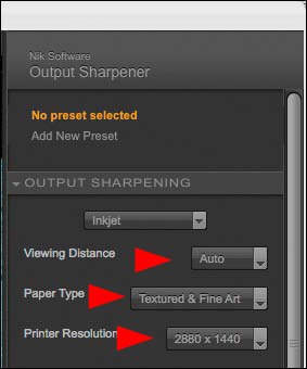
- In the Output Sharpening pull-down menu, select Inkjet (Figure 3.12.1).
Figure 3.12.1.
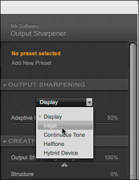
- When the Output Sharpening choices update for the sharpening type you selected, leave the Viewing Distance set to Auto. You are creating a fine-art print, so select Textured & Fine Art for the Paper Type. I normally use Epson Somerset Velvet or Epson Cold Press Natural paper. The printer resolution for these papers is 2880 ×1440 (Figure 3.12.2).
Figure 3.12.2.
- In the Creative Sharpening dialog box, start with Structure and move the slider until you have a bit more correction than you think you need. I chose 40% (Figure 3.12.3).
Figure 3.12.3.
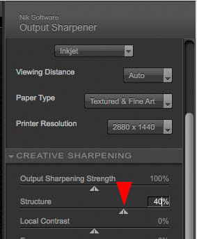
- Next, move the Local Contrast slider until you have a bit more correction than you think you need. I chose 33% (Figure 3.12.4).
Figure 3.12.4.
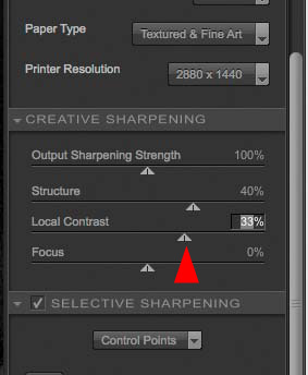
- Move the Focus slider until you have a bit more correction than you think you need. I chose 45% (Figure 3.12.5).
Figure 3.12.5.
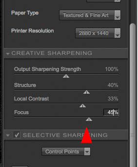
- Leave the Output Sharpening Strength at the default of 100%.
- Click OK.
- Holding down the Option / Alt key, click on the layer mask of the CONTRAST_ONLY layer and drag it to the NIK_SHARPEN layer.
Before moving on, compare the image before the NIK_SHARPEN layer (Figure 3.12.6), after the NIK_SHARPEN layer (Figure 3.12.7), and then after adding the layer mask (Figure 3.12.8).
Figure 3.12.6. Before the NIK_SHARPEN layer
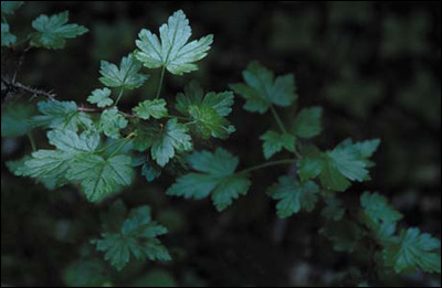
Figure 3.12.7. After the NIK_SHARPEN layer
Figure 3.12.8. After adding the layer mask to the NIK_SHARPEN layer

There are two reasons that it is critical to make the layer mask as tight as possible, as well as to make sure that any unwanted areas of sharpness are removed. First, whenever you sharpen an image, you add contrast to the edge of pixels that tends to enhance noise. Second, you do not want to sharpen areas that you want blurred. In this next step, you will tighten up the layer mask.
- Making sure that the newly added layer mask is active, click on the backward slash key (), which puts the layer mask in Quick Mask view mode. You should now see this (Figure 3.12.9).
Figure 3.12.9. The image in Quick Mask view
- Select the Brush tool, make the foreground color black, and the background color white. Set the brush opacity to 100% with a width of 300 pixels. Brush in the upper right corner (the area in which you added background detail) just up to the lower leaves (Figure 3.12.10).
Figure 3.12.10. Cleaning up the mask on the upper right
- Reduce the brush size to 30 pixels, and brush in the area around the upper leaf and any areas in the mid-leaf part of the image through which areas of unwanted sharpening show (Figure 3.12.11).
Figure 3.12.11. Tightening up the layer mask in the midleaf area
- Now it is time to fine tune the individual leaves even further. Zoom into the left leaf just below the upper leaf. Option- / Alt-click on the leaf. Even though you see the screen in red, this action will sample the gray of the layer mask. Brush in the leaf.
- Repeat this process until you have completely refined the layer mask to your liking (Figure 3.12.12).
Figure 3.12.12. The final layer mask

- Clicking on the backward slash key () takes you out of the layer mask in Quick Mask view mode. Lower the opacity to 59% (Figure 3.12.13).
Figure 3.12.13. The image after lowering the opacity to 59%

- Save the file.
Approach 2: Sharpening with Photoshop Only
In this approach, you will sharpen using three different methods: High Pass, LAB, and Smart Sharpen for lens blur.
Sharpening Using the High Pass Filter
- Inside SKYLIGHT/CONTRAST/SHARPEN, create a layer group and call it CS_SHARPEN.
- Duplicate the MASTER_2 layer, and place the duplicate into the CS_SHARPEN layer set. Take the duplicate you just placed into the CS_SHARPEN layer set and duplicate it twice more. You should now have three layers.
- Change the top layer’s (MASTER_2 copy 2) blend mode to the Color blend mode. Name this layer COLOR.
- Turn off the COLOR layer.
- Turn off the second duplicate layer (MASTER_2 copy 1), make the first layer (MASTER_2 copy) in the layer set active, and name it HIGHPASS.
- Desaturate the HIGHPASS layer (Command + Shift + U / Control + Shift + U) (Figure 3.12.14).
Figure 3.12.14. The HIGHPASS layer desaturated
- Convert the HIGHPASS layer to a Smart Filter.
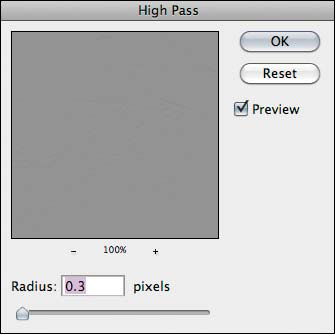
- Go to Filter > Other > High Pass.
- If it is not there already, move the Radius slider all the way to the left, or to a radius of 0.3 (Figure 3.12.15).
Figure 3.12.15.
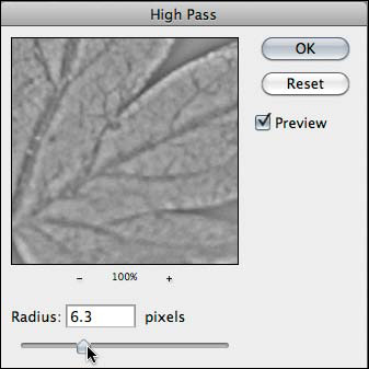
- Move the slider to the right until you start to see just the edges of the image structures, in this case the leaves. I chose a radius of 6.3 (Figure 3.12.16).
Figure 3.12.16.
- Click OK and change the HIGHPASS layer blend mode to Softlight (Figure 3.12.17).
Figure 3.12.17. The image after applying the High Pass filter

- Holding down the Option / Alt key, click on the layer mask of the CONTRAST_ONLY layer and drag it to the HIGHPASS layer.
If you did not do Approach 1, do steps 12 through 18 from Approach 1: Using the Nik Software Sharpener Pro 3.0 filter. If you did Approach 1, just copy the layer mask from the NIK_SHARPEN layer.
- Reduce the layer opacity to 55%.
- Turn the COLOR layer back on.
Note
High Pass sharpening is good for sharpening only the edges in an image, but not the image structures in which the noise tends to be found. Because you need to use the Overlay or Softlight blend modes to do this type of sharpening, using the Luminosity blend mode to avoid sharpening color is not a option. When sharpening with the High Pass filter you should always desaturate the layer first.
Sharpening in Lab
To sharpen in the Lab space requires converting the file from the RGB space to the Lab space.
Note
I learned this sharpening technique and the specific approach to increasing saturation in Step 10 from Dan Margulis. I highly recommend his book, Photoshop LAB Color: The Canyon Conundrum and Other Adventures in the Most Powerful Colorspace (Peachpit, 2005).
Many of the limitations of sharpening have to do with the light artifacts it inserts, rather than the dark ones. The following action separates the two functions; the darkening is on the middle layer and the lightening on top, and the action automatically cuts the lightening in half.
- Duplicate the image file on which you are working by going to Image > Duplicate.
- When the Duplicate Image dialog box comes up, rename the file GREENLEAVES_16BIT_LAB.
- Turn off all the layers above the SKYLIGHT layer, so that only the SKYLIGHT layer is visible.
- Flatten the image. Click OK when the Flatten Image dialog box comes up asking you to discard hidden layers.
- Go to Image > Mode and select Lab Color (Figure 3.12.18).
Figure 3.12.18. Converting the image to Lab color
- Duplicate the BACKGROUND layer.
- Name it SHARPEN and change the blend mode to Luminosity.
- Create a layer set and name it LAB_SHARPEN. Drag the SHARPEN layer into the LAB_SHARPEN layer set.
- Go to Filter > Sharpen and select Smart Sharpen.
- In the Smart Sharpen dialog box, select Gaussian Blur from the Remove pull-down menu and set the Amount to 500% and the Radius to 0.1 (Figure 3.12.19). (This approach is know as “He-Man Sharpening.”)
Figure 3.12.19. Starting He-Man Sharpening with High Pass
- Move the Radius to the range of sharpening you desire. I chose 1.5 pixels (Figure 3.12.20).
Figure 3.12.20. Setting the Radius to 1.5 pixels
Lower the Amount of sharpening until you remove the crispyness (or hardness) and halos around the edges of the image. I chose 229% (Figure 3.12.21).
Figure 3.12.21. Lowering the Amount to reduce halos
- Click OK.
- Do “the Move” and name this layer LAB_SHARPEN.
- Holding down the Shift key, drag the LAB_SHARPEN layer to the layer set folder CS_SHARPEN in the GREENLEAVES_16BIT file. Set the layer blend mode to Luminosity.
- Turn off the LAB_SHARPEN layer set in the GREENLEAVES_16BIT_LAB file and save the file. (You will be revisiting this file in a moment.)
- Copy the layer mask from the HIGHPASS layer.
- Reduce the layer opacity to 55%.
- Save the file.
Note
The Gaussian Blur Removal option is a good call if the image on which you are working is slightly out of focus. This is very similar to the regular unsharp masking technique.
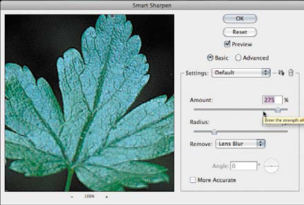
Sharpening Using the Smart Sharpen Lens Blur Filter
- Turn on MASTER_2copy2 and make it the active layer.
- Change the blend mode to Luminosity and convert the layer to a Smart Filter. (This layer should be the top layer in the CS_SHARPEN layer set folder.) Name this layer SMART_SHARPEN_LENS.
- Go to Filter > Sharpen and select Smart Sharpen.
- In the Smart Sharpen dialog box, select Lens Blur from the Remove pull-down menu and set the Amount to 500% and the Radius to 0.1.
- Move the Radius to 1.7 and set the Amount to 229% (Figure 3.12.22).
Figure 3.12.22. Using Smart Sharpen Lens Blur, Radius at 1.7 pixels and Amount at 229%
- Click OK.
- Copy the layer mask from the HIGHPASS layer.
- Reduce the layer opacity to 55% (Figure 3.12.23).
Figure 3.12.23. The image after copying the HIGHPASS mask to the SMART_SHARPEN_LENS layer
Making One Sharpening Effect Out of the Three
Each type of sharpening sharpens the image in a slightly different way and each has a benefit. However, if you were to do all three types of sharpening to the same layer at the amounts that you just did in the steps above, this is what it would look like (Figures 3.12.24.1 and 3.12.24.2). The artifacting that you see here is not only cumulative, it is multiplicative as well. Let me give you an extremely hypothetical example. If you were to make an adjustment to a layer, and it caused a 5% image quality decrease due to artifacting, and then you made a second adjustment to that same layer that caused another 5% quality decrease, the total decrease in quality would not be merely 5 + 5 = 10%, it would be 5 + 5 = 10 × 5 for a 50% quality decrease. It has been my observation that the multiplicative effect of artifacting tends to be a larger issue when dealing with adjustments to contrast and sharpening.
Figure 3.12.24.1. The same three sharpening methods applied to one layer

Figure 3.12.24.2. A close-up of the same three sharpening methods applied to one layer
By separating the different forms of sharpening into different layers and then by using opacity to blend them together, you get the benefits of each, but without undue exacerbation of the artifacting (Figures 3.12.25). Also, this approach allows you the ability to change the order of the sharpening(s) as well as the individual amounts.
Figure 3.12.25. All three sharpening methods applied to different layers to reduce artifacting
Now That That is Done...
Whichever way you go—using just one approach to sharpening or combining High Pass, Lab, Smart Sharpen, and/or Nik Software Sharpener Pro—do the following.
- Make the SKYLIGHT/CONTRAST/SHARPEN layer set active.
- Do “the Move” and name the new layer MASTER_3.
- Turn off the SKYLIGHT/CONTRAST/SHARPEN layer set. (This will speed up both the opening and saving of this file.)
Step 13: Increasing Saturation in the LAB Color Space
- Make MASTER_3 the active layer and, holding down the Shift key, drag it to the file GREENLEAVES_16BIT_LAB. Create a new layer set and name it LAB_COLOR. Place the MASTER_3 layer into the LAB_COLOR layer set.
- Create a Curves adjustment layer. (If you do not have the small grid on the Curves adjustment layer, Option- / Alt-click on the grid to switch it to Fine Grid mode.) Select “a” and move both the top and bottom anchor points over two grid lines (Figure 3.13.1).
Figure 3.13.1. Adjusting the Curves to increase saturation while in Lab color mode
- Select “b” and move the top anchor point over two grid lines and the bottom over one grid line (Figure 3.13.2).
Figure 3.13.2. Adjusting the “b” channel to increase saturation
- Do “the Move” and name this new layer LAB_COLOR.
- Save the file.
- Shift-drag the LAB_COLOR layer into the GREEN_LEAVES_16BIT.psd file.
- Set the layer blend mode to Color.
- Save the GREEN_LEAVES_16BIT_LAB file.
- Close the file.
- In the GREEN_LEAVES_16BIT.psd file, lower the opacity to dial in the color. I chose 56% (Figure 3.13.3).
Figure 3.13.3. The image after the layer opacity is lowered to 56%
Note
The “L” of Lab is the Lightness or Luminance channel, “A” is Red to Green, and “B” is Yellow to Blue. Keep in mind that the settings used here are only for this image. As a rule, I never move the anchor points more than three grid points to the left or right, depending on whether it is to the top or bottom of the curve. As much as possible, I try to keep movement to one grid point. The positive values, or the top of the curve, address warm colors, and the negative values, or bottom part of the curve, adjust cooler colors.
Step 14: Using Multiple Curves Adjustment Layers for Selective Dark-to-Light and Light-to-Dark
In this step, you are going to create the dappling of light that occurs when sunlight travels through the leaves of a tree. You will do this by using two Curves adjustment layers and by changing the blend modes to Multiply and Screen.
Dark-to-Light Curves Adjustment Layer Using the Multiply Blend Mode
You are now at the point in this workflow to add dark into this image. You should begin with the Curves adjustment layer set to the Multiply blend mode. You will add more darkness than lightness, so it makes sense to cover the most ground first. Also, by addressing the “dark” issues, it will be easier to see where the additional areas of light should go to create the dappled light effect.
- Make the MASTER_3 layer active, make a new layer set, and name it L2D/D2L/LIGHTING. (The latter set should be between the LAB_COLOR layer and the MASTER_3 layer.)
- Create a Curves adjustment layer and name it D2L_MULTI.
- Change the blend mode of this layer from Normal to Multiply.
- Lower the opacity until you can see some of the background leaves. I chose 70%.
Note
Notice that the lighting of the image has begun to look the way you want it. That is because everything you have been doing up to this point is to reinforce, through the use of color, sharpness, and contrast, the image in your mind’s eye. What you will do next is to remove everything that is not your vision of the image.
- Select the Brush tool (B), and set the opacity to 100% and the brush width to 100 pixels. Brush the top leaf. Compare the image before (Figure 3.14.1) and after the brushwork (Figure 3.14.2), and the resulting layer mask (Figure 3.14.3).
Figure 3.14.1. The image before brushing in the D2L_MULTI layer
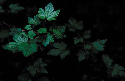
Figure 3.14.2. The image after the initial brushwork
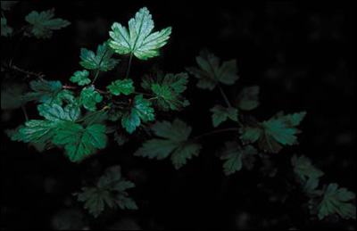
Figure 3.14.3. The beginning layer mask for D2L_MULTI
- Set the brush opacity to 50% and the brush width to 200 pixels, and brush the area of the mid-leaves. Bring up the Fade effect dialog box and increase the opacity to 69%. Figure 3.14.4 shows the resulting layer mask.
Figure 3.14.4. The layer mask after more brushwork
- Brush in the leaf cluster that is in the lower right of the image. Bring up the Fade effect dialog box and lower the opacity to 33%. Figure 3.14.5 shows the resulting layer mask.
Figure 3.14.5. Brushing in the leaf cluster in the lower right
- Brush in the background in the upper right corner. Bring up the Fade effect dialog box and lower the opacity to 10%. Compare the image before the brushwork (Figure 3.14.6), the image after (Figure 3.14.7), and the final layer mask (Figure 3.14.8).
Figure 3.14.6. Before the brushwork

Figure 3.14.7. After the brushwork
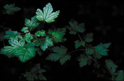
Figure 3.14.8. The final layer mask
Light-to-Dark Curves Adjustment Layer
- Create a Curves adjustment layer and name it L2D_SCREEN.
- Change the blend mode of this layer from Normal to Screen.
- Create a layer mask and fill it with black.
- Select the Brush tool (B), and set its opacity to 50% and its width to 100 pixels. Brush in the leaf in the lower left corner, just below the mid-leaf cluster that is right under the foreground leaf on which you did the warp work. Use the Fade effect command to lower the opacity to 28%. Look at the layer mask (Figure 3.14.9) and the image after the initial brushwork (Figure 3.14.10).
Figure 3.14.9. The layer mask for the L2D_SCREEN layer

Figure 3.14.10. The image after initial brushwork

- Brush in the area at the bottom of the image between the leaf you just brushed and the leaf cluster to the right. Use the Fade effect command to lower the opacity to 39%. View the layer mask (Figure 3.14.11) and the image after the brushwork (Figure 3.14.12).
Figure 3.14.11. The layer mask

Figure 3.14.12. The image after brushwork
- Brush in the lower bottom left corner of the image and bring up the Fade effect dialog box. Use the Fade effect command to lower the opacity to 39%. View the layer mask (Figure 3.14.13) and the image after the brushwork (Figure 3.14.14).
Figure 3.14.13. The layer mask

Figure 3.14.14. The image after brushwork

- Brush in the upper left leaf at 50% opacity, and then brush in the middle of the lower right leaves. Bring up the Fade effect dialog box and lower the opacity to 16%. Brush in the corner. Bring up the Fade effect dialog box and lower the opacity to 39%. Lastly, lower the overall layer opacity to 71%. View the layer mask (Figure 3.14.15) and the final image after the brushwork (Figure 3.14.16).
Figure 3.14.15. The layer mask after all brushwork
Figure 3.14.16. The image after all brushwork
- Save the file.
Step 15: Adding a Ray of Sunlight
To add the final touch to this image, you will create the effect of a dappled ray of sunlight hitting the various leaves. But first, there is one problem you need to address. The file on which you are working is in 16-bit, and the Render Lighting Effects filter works only in 8-bit.
You do not need the Render Lighting Effects filter to light this image because you have already done that. You will use the Render Lighting Effects filter because it creates ambient light by adding gray to the haze in a image. This quality is what is needed to finish the look of light coming through tree branches in a forest.
It seems a shame to have come all this way in 16-bit ProPhoto RGB only to have to go to 8-bit Adobe RGB. So here is a work-around for this issue.
- Make MASTER_3 the active layer.
- Select All (Command + A / Control + A).
- Deselect the section. Select the Crop tool (C) and click on the image.
- Copy the MASTER_3 layer to the Clipboard (Command + C / Control + C).
- Create a new file (Command + N / Control + N).
- Make sure that the color space is ProPhoto and that you change the bit depth to 8-bit in the Title dialog box. Name the file RENDER_LIGHT_GREENLEAF.
- Click OK.
- Paste the image that you copied to the clipboard into this file.
- Name the newly created layer RENDER_LIGHT and convert it to a Smart Filter.
- Go to Filter > Render > Lighting Effects.
- When the Render Lighting Effects dialog box comes up, select Soft Omni from the Light Type pull-down menu.
- Click on the center handle and move the center point to the middle of the upper leaf (Figure 3.15.1).
Figure 3.15.1. Moving the light to the upper leaf
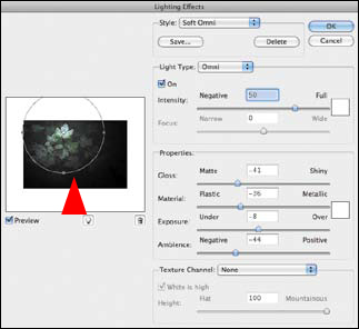
- Click on the right handle and reduce the size of the light until it is around just the leaf (Figure 3.15.2).
Figure 3.15.2. Reducing the size of the light

- Lower the Intensity to 34 and increase the Ambience to 7 (Figure 3.15.3).
Figure 3.15.3. Adjusting the Intensity and Ambience
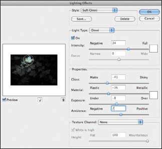
- Click OK.
- Do “the Move.” Make a master layer and name it RENDER_LIGHT.
Note
You now have two layers named RENDER_LIGHT. One is a Smart Filter layer—the one you can readjust should the need arise, and one that is a snapshot of the Smart Filter layer. You are doing this because the Render Lighting Effects filter works only in 8-bit. Therefore, the Smart Filter would not transfer over.
- Save the file.
- Shift-drag the RENDER_LIGHT layer to the GREENLEAF_16BIT file and place it in the L2D/D2L/LIGHTING layer group so that it is below the two Curves adjustment layers.
- Close the RENDER_LIGHT_GREENLEAF.psd file.
- Add a layer mask to the RENDER_LIGHT layer.
- Turn off the D2L and L2D Curves adjustment layers.
- Brush the front leaf at 33%, the lower right leaf of the mid-leaf cluster at 22%, the lower left corner at 43%, the area at the bottom between the mid-leaf cluster and the lower right leaves at 43%, and the upper right corner at 20%. View the resulting layer mask (Figure 3.15.4) and the image after the brushwork (Figure 3.15.5).
Figure 3.15.4. The layer mask after brushwork
Figure 3.15.5. The resulting image after brushwork
- Turn on the D2L and L2D Curves adjustment layers. Make a L2D/D2L/LIGHTING layer group and lower the opacity to suit your eye. I chose 66%. Compare the image before (Figure 3.15.6) and after the layer opacity adjustment (Figure 3.15.7)
Figure 3.15.6. The image before the opacity adjustment
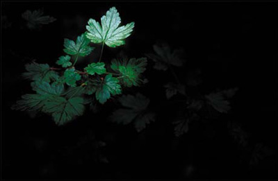
Figure 3.15.7. The image after the opacity adjustment
- Make the LAB_COLOR layer active.
- Do “the Move” creating a master layer that you will name FINAL.
- Save the file.
Expanding Your Vision
I am always doing things I can’t do; that’s how I get to do them.
—Pablo Picasso
Image harvesting, or ExDR, is a way to recreate what you originally saw in spite of, and by understanding, the limitations of camera technology. The real limitation is not the camera; it does what it does. You are limited only by your imagination, but if you are open to the impossible and view it merely as an opinion, you can do anything.
Is the image that you just created a believable improbability or a believable probability? Is your answer the same as it was at the beginning of this lesson? If your opinion has changed, you will realize that your feeling for any image may change as you work with it, and that is okay as long as it suits your vision and retains your voice.
In the next chapter, you will further explore the concept of ExDR for focus, blur, exposure, and image structure. The goal will be not only to recreate your original vision, but to cause shape to become the unwitting ally of color in your pursuit to guide the viewer’s unconscious eye.
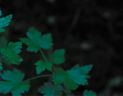
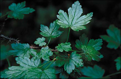
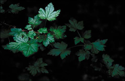
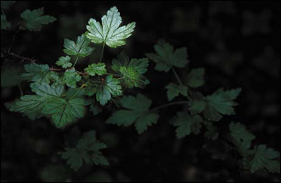
Figure 3.16.1. The final image