
Views and Tiles
In this chapter, I describe two of the features that allow an app to fit into the wider user experience presented by Windows 8. The first of these features is the way that apps can be snapped and filled so that two apps can be viewed side by side. I show you how to adapt when your app is placed into one of these layouts and how to change the layout when your interactions don’t fit inside the view constraints.
The second feature is the tile model. Tiles are at the heart of the Windows 8 replacement for the Start menu. At their simplest, they are static buttons that can be used to launch your app, but with a little work, they can present the user with an invaluable snapshot of the state of your app, allowing the user to get an overview without having to run the app itself. In this chapter, I show you how to create dynamic tiles by applying updates and by using a related feature, badges. Table 4-1 provides the summary for this chapter.
Table 4-1 . Chapter Summary
So far, my app has assumed that it has full and exclusive use of the display screen. However, apps can be arranged by the number so that they are snapped or filled. A snapped app occupies a 320-pixel strip at the left or right edge of the screen. A filled app is displayed alongside a snapped app and occupies the entire screen except for the 320-pixel strip. To demonstrate the different views, I have added some content to the DetailPage.xaml file, as shown in Listing 4-1. (This is the file I added in the previous chapter to demonstrate navigation, but it didn’t contain any functionality other than a simple message.)
Listing 4-1. Adding Content to the DetailPage.xaml File
<Page
    x:Class="GrocerApp.Pages.DetailPage"
    xmlns=" http://schemas.microsoft.com/winfx/2006/xaml/presentation "
    xmlns:x=" http://schemas.microsoft.com/winfx/2006/xaml "
    xmlns:local="using:GrocerApp.Pages"
    xmlns:d=" http://schemas.microsoft.com/expression/blend/2008 "
    xmlns:mc=" http://schemas.openxmlformats.org/markup-compatibility/2006 "
    mc:Ignorable="d">

    <Grid x:Name="GridLayout" Background="#71C524">
        <Grid.RowDefinitions>
            <RowDefinition/>
            <RowDefinition/>
        </Grid.RowDefinitions>
        <Grid.ColumnDefinitions>
            <ColumnDefinition/>
            <ColumnDefinition/>
        </Grid.ColumnDefinitions>

        <StackPanel x:Name="TopLeft" Background="#3E790A">
            <TextBlock x:Name="TopLeftText"
                       Style="{StaticResource DetailViewLabelStyle}"
                       Text="Top-Left"/>
        </StackPanel>

        <StackPanel x:Name="TopRight" Background="#70a524" Grid.Column="1"
                    Grid.Row="0">
            <TextBlock x:Name="TopRightText"
                       Style="{StaticResource DetailViewLabelStyle}"
                       Text="Top-Right"/>
        </StackPanel>

        <StackPanel x:Name="BottomLeft" Background="#1E3905" Grid.Row="1">
            <TextBlock x:Name="BottomLeftText"
                       Style="{StaticResource DetailViewLabelStyle}"
                       Text="Bottom-Left"/>
        </StackPanel>

        <StackPanel x:Name="BottomRight" Background="#45860B" Grid.
                    Column="1" Grid.Row="1">
            <TextBlock x:Name="BottomRightText"
                       Style="{StaticResource DetailViewLabelStyle}"
                       Text="Bottom-Right"/>
        </StackPanel>
    </Grid>
</Page>
I have defined a new style called DetailViewLabelStyle for this page in the /Resources/GrocerResourceDictionary.xaml file, as shown in Listing 4-2.
Listing 4-2. Adding the DetailViewLabelStyle Style
. . .
<Style x:Key="DetailViewLabelStyle" TargetType="TextBlock"
        BasedOn="{StaticResource HeaderTextStyle}">
    <Setter Property="FontSize" Value="50"/>
    <Setter Property="Margin" Value="10"/>
    <Setter Property="HorizontalAlignment" Value="Left"/>
</Style>
. . .
This layout creates a simple colored grid. You can see this new content by starting the app and using the NavBar I added in the previous chapter to navigate using the Detail View button.
Figure 4-1 shows the app in its filled and snapped views. The remaining space is a simple app that reports its view. I use this for testing and have included it in the source code download for this book, which you can get from Apress.com.

Figure 4-1. The example app shown in the filled and snapped views
 Note Apps can be snapped only in the landscape view, and Windows 8 supports snapping only if the horizontal resolution of the display is 1366 pixels or greater. You must ensure that you have selected the correct orientation and resolution in the simulator if you want to experiment with snapping.
The loss of 320 pixels to make room for the snapped app doesn’t cause a lot of disruption for most apps. The problems start to appear when your app is moved from the filled to the snapped view, which you can see on the right of the figure. Clearly, the app needs to adapt to the new view, and in the sections that follow, I’ll show you the different mechanisms available for doing just that.
Tip You can move through the different views for an app by pressing Win+. (the Windows and period keys). Each time you press these keys, the app will cycle into a new view.
Responding to View Changes in Code
You monitor changes in the view through the Page.SizeChanged event. By handling this event, you can determine the current view through the Windows.UI.ViewManagement. ApplicationView.Value property and reconfigure your app as required. Listing 4-3 shows the code for the DetailPagepage, with additions to handle this event.
Listing 4-3. Controlling the View in the DetailPage Code-Behind Class
using Windows.UI.ViewManagement;
using Windows.UI.Xaml;
using Windows.UI.Xaml.Controls;
using Windows.UI.Xaml.Navigation;

namespace GrocerApp.Pages {
    public sealed partial class DetailPage : Page {

        public DetailPage() {
            this.InitializeComponent();

            SizeChanged += DetailPage_SizeChanged;
        }

        void DetailPage_SizeChanged(object sender, SizeChangedEventArgs e) {
            if (ApplicationView.Value == ApplicationViewState.Snapped) {
                GridLayout.ColumnDefinitions[0].Width
                    = new GridLength(0);
            } else {
                GridLayout.ColumnDefinitions[0].Width
                    = new GridLength(1, GridUnitType.Star);
            }
        }

        protected override void OnNavigatedTo(NavigationEventArgs e) {
        }
    }
}
The ApplicationView.View property returns a value from the ApplicationViewState enumeration, describing the current view. The values in this enumeration are Snapped, Filled, FullScreenPortrait, and FullScreenLandscape; these last two allow you to differentiate between the landscape and portrait modes when the app is shown full-screen.
In my example, the DetailPage_SizeChanged method determines the kind of view being used and adapts the app layout accordingly. If the app is being shown in the snapped view, then I set the width of the first column in my grid to zero. Your app state isn’t reset automatically when the app is restored to the full-screen view, so you must also define code to handle the other event states. In this case, for any other view but snapped, I reset the width of the column. (The syntax for working with columns is awkward, but you get the idea.) You can see the change in the snapped view in Figure 4-2.

Figure 4-2. Adapting to the restrictions of the snapped view
Rather than squishing everything into a tiny window, I have shown only part of my app. Showing reduced functionality is the most sensible way of dealing with the relatively small amount of screen space that a snapped app has access to. You will be surprised just how much you can pack into this space, but it just isn’t the same as having access to the full screen.
Responding to View Changes in XAML
You can set out the changes you want to make to your app using XAML. The XAML syntax for this is verbose, hard to read, and more difficult to work with—so much so that I recommend you stick with the code approach. But for completeness, Listing 4-4 shows how I can specify the changes I want using XAML.
Note The VisualStateManager feature, which is what this XAML uses, is a standard WPF and Silverlight feature. It has a lot of features, and I am unable to give it full attention in this book. My advice is to use the code-based approach, but if you are a true XAML fan, then you can see the WPF or Silverlight documentation for further details of the elements you can use.
Listing 4-4. Defining View Changes in XAML
<Page
    x:Class="GrocerApp.Pages.DetailPage"
    xmlns=" http://schemas.microsoft.com/winfx/2006/xaml/presentation "
    xmlns:x=" http://schemas.microsoft.com/winfx/2006/xaml "
    xmlns:local="using:GrocerApp.Pages"
    xmlns:d=" http://schemas.microsoft.com/expression/blend/2008 "
    xmlns:mc=" http://schemas.openxmlformats.org/markup-compatibility/2006 "
    mc:Ignorable="d">

<Grid x:Name="GridLayout" Background="#71C524">

    <VisualStateManager.VisualStateGroups>
        <VisualStateGroup x:Name="OrientationStates">
            <VisualState x:Name="Snapped">
                <Storyboard>
                    <ObjectAnimationUsingKeyFrames
                            Storyboard.TargetProperty="Grid.
                            ColumnDefinitions[0].Width"
                            Storyboard.TargetName="GridLayout">
                        <DiscreteObjectKeyFrame KeyTime="0">
                            <DiscreteObjectKeyFrame.Value>
                                <GridLength>0</GridLength>
                            </DiscreteObjectKeyFrame.Value>
                        </DiscreteObjectKeyFrame>
                    </ObjectAnimationUsingKeyFrames>
                </Storyboard>
            </VisualState>

            <VisualState x:Name="Others">
                <Storyboard>
                    <ObjectAnimationUsingKeyFrames
                            Storyboard.TargetProperty="Grid.
                            ColumnDefinitions[0].Width"
                            Storyboard.TargetName="GridLayout">
                        <DiscreteObjectKeyFrame KeyTime="0">
                            <DiscreteObjectKeyFrame.Value>
                                <GridLength>*</GridLength>
                            </DiscreteObjectKeyFrame.Value>
                        </DiscreteObjectKeyFrame>
                    </ObjectAnimationUsingKeyFrames>
                </Storyboard>
            </VisualState>

        </VisualStateGroup>
    </VisualStateManager.VisualStateGroups>

    <Grid.RowDefinitions>
        <RowDefinition/>
        <RowDefinition/>
    </Grid.RowDefinitions>
    <Grid.ColumnDefinitions>
        <ColumnDefinition/>
        <ColumnDefinition/>
    </Grid.ColumnDefinitions>

    // ...StackPanel elements removed for brevity...
</Grid>
</Page>
In this listing, I have declared two VisualState elements. The first, Snapped, sets the width of the first column to zero pixels. This is the state I will enter when the app is snapped. The second is called Others, and it restores the width. This is the state that I will enter when the app is not snapped. You can see what I mean about verbosity; it takes me 31 lines of XAML to replace 8 lines of code.
And, I still have to handle the SizeChanged event so that I can enter the XAML states I defined. Listing 4-5 shows the changes required to the code-behind file.
Listing 4-5. Invoking the VisualStateManager in Response to the ViewStateChanged Event
using Windows.UI.ViewManagement;
using Windows.UI.Xaml;
using Windows.UI.Xaml.Controls;
using Windows.UI.Xaml.Navigation;

namespace GrocerApp.Pages {
    public sealed partial class DetailPage : Page {

        public DetailPage() {
            this.InitializeComponent();
            SizeChanged += DetailPage_SizeChanged;
        }

        void DetailPage_SizeChanged(object sender, SizeChangedEventArgs e) {
            //if (ApplicationView.Value == ApplicationViewState.Snapped) {
            //    GridLayout.ColumnDefinitions[0].Width
            //        = new GridLength(0);
            //} else {
            //    GridLayout.ColumnDefinitions[0].Width
            //        = new GridLength(1, GridUnitType.Star);
            //}

            string stateName = ApplicationView.Value ==
                ApplicationViewState.Snapped ? "Snapped" : "Others";
            VisualStateManager.GoToState(this, stateName, false);
        }

        protected override void OnNavigatedTo(NavigationEventArgs e) {
        }
    }
}
I call the static VisualStateManager.GoToState method to move between the states I defined in XAML. The arguments for this method are the current Page object, the name of the state to enter, and whether intermediate states should be displayed. This last argument should be true, since Windows provides the animations for transition between views.
Breaking Out of the Snapped View
If you are presenting the user with reduced functionality in the snapped view, you may to revert to a wider view when the user interacts with your app in certain ways. To demonstrate this, I have added a Button to the layout for the DetailPage page, as shown in Listing 4-6.
Listing 4-6. Adding a Button to the Layout
. . .
<StackPanel x:Name="TopRight" Background="#70a524" Grid.Column="1"
     Grid.Row="0">
    <TextBlock x:Name="TopRightText"
                Style="{StaticResource DetailViewLabelStyle}"
                Text="Top-Right"/>
    <Button Click="HandleButtonClick">Unsnap</Button>
</StackPanel>
. . .
Listing 4-7 shows the handler for the Click event, which unsnaps the app using the TryUnsnap method.
Listing 4-7. Unsnapping an App
using Windows.UI.ViewManagement;
using Windows.UI.Xaml;
using Windows.UI.Xaml.Controls;
using Windows.UI.Xaml.Navigation;

namespace GrocerApp.Pages {
    public sealed partial class DetailPage : Page {

        public DetailPage() {
            this.InitializeComponent();

            SizeChanged += DetailPage_SizeChanged;
        }

        void DetailPage_SizeChanged(object sender, SizeChangedEventArgs e) {
            //if (ApplicationView.Value == ApplicationViewState.Snapped) {
            //    GridLayout.ColumnDefinitions[0].Width
            //        = new GridLength(0);
            //} else {
            //    GridLayout.ColumnDefinitions[0].Width
            //        = new GridLength(1, GridUnitType.Star);
            //}

            string stateName = ApplicationView.Value ==
                ApplicationViewState.Snapped ? "Snapped" : "Others";
            VisualStateManager.GoToState(this, stateName, false);

        }

        private void HandleButtonClick(object sender, RoutedEventArgs e) {
            Windows.UI.ViewManagement.ApplicationView.TryUnsnap();
        }

        protected override void OnNavigatedTo(NavigationEventArgs e) {
        }
    }
}
The TryUnsnap method will change the view, but only in response to user interaction. You can’t change the view if the app is in the background, for example.
Tiles are the representation of your app on the Start screen. At their simplest, tiles are static icons for starting your app. However, with a little effort, you can use your tile to present the user with a useful summary of your app’s state and to draw their attention to activities they may want to perform.
In the sections that follow, I demonstrate how to present information through the tile of my example app. There are two possible, and conflicting, goals when you create a dynamic tile; you are either trying to encourage the user to run your app or dissuading them from running it. If you are trying to attract the user, then your tile becomes an advert for the experience, insights, or content that you offer. This is appropriate for entertainment apps or those that present external content such as news.
Dissuading the user from running an app may seem like a strange goal, but it can significantly improve the user experience. Consider productivity apps as an example. I dread to think of the hours I have lost waiting for calendar or to-do apps to load just so I can check where my next appointment is or what my most urgent actions requires. You can reduce the friction and frustration that your users experience when using your app and create a more pleasing and immediate experience by displaying the information that the user needs in your app tile.
Both goals require careful thought. The overall Windows 8 experience is flat, simple, and subdued. If you are using your tile as an ad, then the muted nature of Windows makes it easy to create tiles that stand out. If you go too far, though, you will create something that is discordant and jarring and is more of an eyesore than an attraction.
If your goal is to reduce the number of times the user needs to run your app, then you need to present the right information at the right time. This requires a good understanding of what drives your users to adopt your app and the ability to customize the data that is presented. Adaptability is essential; there is no point showing me the most urgent work action on my task list on a Saturday morning, for example. Every time you present the user with the wrong information, you force them to run your app to get what they do need.
Tip An app can update its tile only when it is running. In Chapter 5, I detail the app life cycle, and you will learn that apps are put into a suspended state when the user switches to another app. This means you can’t provide updates in the background. Windows 8 supports a push model where you can send XML updates from the cloud, but this requires setting up server infrastructure to support your app.
Improving Static Tiles
The simplest way to improve the appearance of your app in the Start screen is to change the images used for your app’s tile. You should customize the images for your app, even if you don’t use any other tile features.
To do this, you will need a set of three images of specific sizes: 30 by 30 pixels, 150 by 150 pixels, and 310 by 150 pixels. These images should contain the logo or text you want to display but be otherwise transparent. I used a barcode motif for my example app, creating images called tile30.png, tile150.png, and tile310.png and placing them in the Assets folder of my Visual Studio project.
To apply the new images, open the Package.appxmanifest file from the Solution Explorer. There is a Tile section on Application UI tab that has options to set the logo, wide logo, and small logo. There are hints to explain which size is required for each option. You will also have to set the background color that will be used for the tile; I set mine to the same color I use for the background of my app (the hex RGB value #3E790A), as shown in Figure 4-3.

Figure 4-3. Applying images in the app manifest
Tip It is important to set the background color in the manifest, rather than include a background in the images. When you update a tile, which I demonstrate in the next section, the image is replaced with dynamic information on a backdrop of the color specified in the manifest.
You may have to uninstall your app from the start screen for the tile images to take effect. The next time you start your app from Visual Studio, you should see the new static tile; you can toggle between the standard and wide views by selecting the tile, right-clicking, and picking the Larger or Smaller buttons from the AppBar. You can see the square and wide tile formats for the example app in Figure 4-4.

Figure 4-4. The updated static wide tile
Notice that the word GrocerApp is displayed at the bottom of the tile. This text is specified as the value for the Short Name option in the Application UI tab. The All Logos option for Show Name means that it is applied to both the regular and wide tiles.
Tip You can also replace the splash screen that is shown to the user when the app is loading. There is a Splash Screen section at the bottom of the Application UI tab in which you can specify the image and the background color it should be displayed with. The image used for the splash screen must be 630 pixels by 300 pixels.
Creating Live Tiles
Live tiles provide information about your app to your user. For my example app, I am going to display the first few items from the grocery list. Tile updates are based on preconfigured templates, which contain a mix of graphics and text and which are designed for either standard or wide tiles. The first thing you must do is pick the template you want. The easiest way to do this is to look at the API documentation for the Windows.UI.Notifications.TileTemplateType enumeration, which is available at http://msdn.microsoft.com/en-us/library/windows/apps/windows.ui.notifications.tiletemplatetype.aspx. The template system is based on XML fragments, and you can see the XML structure for each template in the API documentation. I have chosen the TileSquareText03 template. This is for a square tile and has four lines of nonwrapping text, without any images. You can see the XML fragment that represents the tile in Listing 4-8.
Listing 4-8. The XML Fragment for the TileSquareText03 Tile Template
<tile>
  <visual lang="en-US">
    <binding template="TileSquareText03">
      <text id="1">Text Field 1</text>
      <text id="2">Text Field 2</text>
      <text id="3">Text Field 3</text>
      <text id="4">Text Field 4</text>
    </binding>
  </visual>
</tile>
The idea is to populate the text elements with information from the app and pass the result to the Windows notifications system. I want to set up my tile updates in the MainPage class, but doing this means refactoring my app so that the ViewModel object is created there, rather than in the ListPage class. Listing 4-9 shows the changes required in the MainPage class to support the view model and to update the tiles.
Listing 4-9. Refactoring the MainPage Class
using GrocerApp.Data;
using System;
using Windows.Data.Xml.Dom;
using Windows.UI.Notifications;
using Windows.UI.Xaml;
using Windows.UI.Xaml.Controls;
using Windows.UI.Xaml.Navigation;

namespace GrocerApp.Pages {

    public sealed partial class MainPage : Page {
        private ViewModel viewModel;

        public MainPage() {
            this.InitializeComponent();

            viewModel = new ViewModel();

            // ...test data removed for brevity...

            this.DataContext = viewModel;

            MainFrame.Navigate(typeof(ListPage), viewModel);

            viewModel.GroceryList.CollectionChanged += (sender, args) => {
                UpdateTile();
            };

            UpdateTile();
        }

        private void UpdateTile() {

            XmlDocument tileXml = TileUpdateManager.
                GetTemplateContent(TileTemplateType.TileSquareText03);

            XmlNodeList textNodes =
                tileXml.GetElementsByTagName("text");

            for (int i = 0; i < textNodes.Length &&
                    i < viewModel.GroceryList.Count; i++) {
                textNodes[i].InnerText = viewModel.GroceryList[i].Name;
            }

            for (int i = 0; i < 5; i++) {
                TileUpdateManager.CreateTileUpdaterForApplication()
                    .Update(new TileNotification(tileXml));
            }
        }

        protected override void OnNavigatedTo(NavigationEventArgs e) {
        }

        private void NavBarButtonPress(object sender, RoutedEventArgs e) {
            Boolean isListView = (Button)sender == ListViewButton;
            MainFrame.Navigate(isListView ? typeof(ListPage)
                : typeof(DetailPage), viewModel);

        }
    }
}
I also need to update the ListPage.xaml.cs file so that the view model object that is passed from the MainPage class is used, as shown in Listing 4-10.
Listing 4-10. Updating the ListPage Class in the ListPage.xaml.cs File
using GrocerApp.Data;
using Windows.UI.Xaml;
using Windows.UI.Xaml.Controls;
using Windows.UI.Xaml.Navigation;

namespace GrocerApp.Pages {

    public sealed partial class ListPage : Page {
        ViewModel viewModel;

        public ListPage() {
            this.InitializeComponent();
        }

        protected override void OnNavigatedTo(NavigationEventArgs e) {
            viewModel = (ViewModel)e.Parameter;

            ItemDetailFrame.Navigate(typeof(NoItemSelected));
            viewModel.PropertyChanged += (sender, args) => {
                if (args.PropertyName == "SelectedItemIndex") {
                    if (viewModel.SelectedItemIndex == -1) {
                        ItemDetailFrame.Navigate(typeof(NoItemSelected));
                        AppBarDoneButton.IsEnabled = false;
                    } else {
                        ItemDetailFrame.Navigate(typeof(ItemDetail),                        viewModel);
                        AppBarDoneButton.IsEnabled = true;
                    }
                }
            };
        }

        private void ListSelectionChanged(object sender,                SelectionChangedEventArgs e) {
            viewModel.SelectedItemIndex = groceryList.SelectedIndex;
        }

        private void AppBarButtonClick(object sender, RoutedEventArgs e) {
            if (e.OriginalSource == AppBarDoneButton
                    && viewModel.SelectedItemIndex > -1) {

                viewModel.GroceryList.RemoveAt(viewModel.SelectedItemIndex);
                viewModel.SelectedItemIndex = -1;

            } else if (e.OriginalSource == AppBarZipButton) {
                    HomeZipFlyout.Show(this, this.BottomAppBar,                     (Button)e.OriginalSource);
            } else if (e.OriginalSource == AppBarAddButton) {
                AddItemFlyout.Show(this, this.BottomAppBar,                     (Button)e.OriginalSource);
            }

        }
    }
}
There is a lot going on in just a few lines of code, so I’ll break things down in the sections that follow
Populating the XML Template
To get the template XML fragment, I call the TileUpdateManager.GetTemplateContent method specifying the template I want with a value from the TileTemplateType enumeration. This gives me a Windows.Data.Xml.Dom.XmlDocument object to which I can apply standard DOM methods to set the value of the text elements in the template. Well, sort of—because the XmlDocument object’s implementation of GetElementById doesn’t work, I have to use the GetElementsByTagName method to get an array containing all of the text elements in the XML:
. . .
XmlNodeList textNodes = tileXml. GetElementsByTagName("text") ;
. . .
The text nodes are returned in the order they are defined in the XML fragment, which means that I can iterate through them and set the innerText property of each element to one of my grocery list items:
. . .
for (int i = 0; i < textNodes.Length     && i < viewModel.GroceryList.Count; i++) {
    textNodes[i].InnerText = viewModel.GroceryList[i].Name;
}
. . .
Tip Only three of the four text elements defined by the XML template will be visible by the user on the Start screen. The last element is obscured by the app name or icon. This is true for many of the tile templates.
Applying the Tile Update
Once I have set the content of the XML document, I use it to create the update for the app tile. I need to create a TileNotification object from the XML and then pass this to the Update method of the TileUpdater object that is returned from the static TileUpdateManager.CreateTileUpdaterForApplication method:
. . .
for (int i = 0; i < 5; i++) {
    TileUpdateManager.CreateTileUpdaterForApplication()
        .Update(new TileNotification(tileXml));
}
. . .
Not all tile updates are processed properly in Windows 8, which is why I repeat the notification using a for loop. Five seems to be the smallest number of repetitions that guarantees that an update will be displayed on the Start screen.
Calling the Tile Update Method
I call my UpdateTile method in two situations. The first is directly from the constructor, which ensures that the tile reflects the current data in the view model when the app is started. The second situation is when the contents of the collection are changed:
. . .
viewModel.GroceryList.CollectionChanged += (sender, args) => {
    UpdateTile();
};
. . .
The CollectionChanged event is fired when an item is added, replaced, or removed from the collection of grocery list items. It won’t be fired when the properties of an individual GroceryList object are modified. To arrange this, I’d have to add handlers to each object in the collection. There are no app-specific techniques to show you how to this, so I’ll just focus on tile changes in this chapter.
Testing the Tile Update
A couple of preparatory steps are required before I can test my updating tile. First, the Visual Studio simulator doesn’t support updating tiles, which means I am going to test directly on my development machine. To do this, I need to change the Visual Studio deployment target to Local Machine, as shown in Figure 4-5.
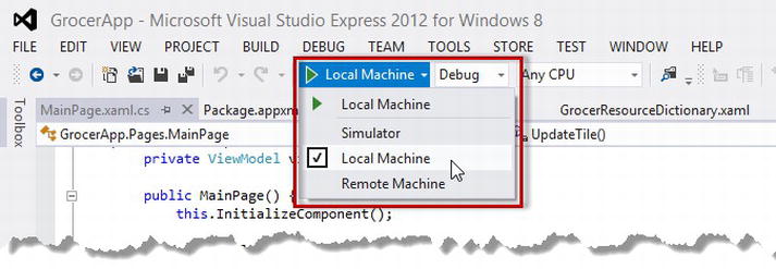
Figure 4-5. Selecting the local machine for debugging
The second step is to uninstall my example app from the Start screen (which you do by selecting Uninstall from the AppBar). There seems to be some “stickiness” where apps that have previously relied on static tiles don’t process updates correctly.
With both of these steps completed, I can now start my app from Visual Studio by selecting Start Debugging from the Debug menu. When the app has started, I can make changes to the grocery list, and a pithy summary of the first three items will be shown on the start tile, as shown in Figure 4-6.
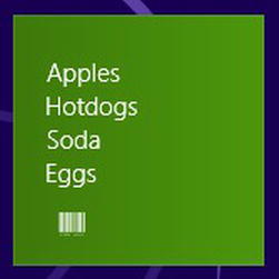
Figure 4-6. Updating an app tile
It can be difficult to get the updating tile to appear initially. Here are some of the things that I have found can help:
- Closing the simulator
- Restarting Visual Studio
- Uninstalling another (unrelated) app from the Start screen
- Searching for the GrocerApp app using the Start screen
- Moving some other tiles around the Start screen
- Restarting
It can be frustrating to get the tile to appear initially, but once it is there, everything will work as expected, and further updates to the app rarely make the tile disappear again. These problems don’t happen when users install apps from the Windows Store; it is just the change from static to live files that causes the problem.
Updating Wide Tiles
The technique I showed you in the previous section is useful if you want to be able to update the square or the wide tile for your app. But, unless you have very specific presentation needs for your data, you should provide updates for both square and wide tiles since you have no idea which your users will select.
To update both tile sizes, you need to combine two XML templates to create a single fragment that contains both updates. In this section, I am going to combine the TileSquareText03 and TileWideBlockAndText01 templates. The wide template has a couple of additional fields, which I will use to display the number of stores that the user has to visit to get all of the items on the grocery list. You can see what I am aiming to produce in Listing 4-11: a fragment that follows the same format as a single template but that combines two binding elements.
Listing 4-11. Composing a Single XML Fragment
<tile>
    <visual lang="en-US">
        <binding template="TileSquareText03">
            <text id="1">Apples</text>
            <text id="2">Hotdogs</text>
            <text id="3">Soda</text>
            <text id="4"></text>
        </binding>
        <binding template="TileWideBlockAndText01">
            <text id="1">Apples (Whole Foods)</text>
            <text id="2">Hotdogs (Costco)</text>
            <text id="3">Soda (Costco)</text>
            <text id="4"></text>
            <text id="5">2</text>
            <text id="6">Stores</text>
        </binding>
     </visual>
</tile>
There is no convenient API for combining templates. The approach I have taken is to use the XML handling support to populate the templates separately and then combine them at the end of the process, which you can see in Listing 4-12.
Listing 4-12. Producing a Single Update for Square and Wide Tiles
. . .
private void UpdateTile() {

    int storeCount = 0;
    List<string> storeNames = new List<string>();

    for (int i = 0; i < viewModel.GroceryList.Count; i++) {
        if (!storeNames.Contains(viewModel.GroceryList[i].Store)) {
            storeCount++;
            storeNames.Add(viewModel.GroceryList[i].Store);
        }
    }

    XmlDocument narrowTileXml = TileUpdateManager
        .GetTemplateContent(TileTemplateType.TileSquareText03);
    XmlDocument wideTileXml = TileUpdateManager
        .GetTemplateContent(TileTemplateType.TileWideBlockAndText01);

    XmlNodeList narrowTextNodes = narrowTileXml.GetElementsByTagName("text");
    XmlNodeList wideTextNodes = wideTileXml.GetElementsByTagName("text");

    for (int i = 0; i < narrowTextNodes.Length
        && i < viewModel.GroceryList.Count; i++) {

        GroceryItem item = viewModel.GroceryList[i];
        narrowTextNodes[i].InnerText = item.Name;
        wideTextNodes[i].InnerText = String.Format("{0} ({1})", item.Name,             item.Store);
    }

    wideTextNodes[4].InnerText = storeCount.ToString();
    wideTextNodes[5].InnerText = "Stores";

    var wideBindingElement = wideTileXml.GetElementsByTagName("binding")[0];
    var importedNode = narrowTileXml.ImportNode(wideBindingElement, true);
    narrowTileXml.GetElementsByTagName("visual")[0]        .AppendChild(importedNode);
    for (int i = 0; i < 5; i++) {
        TileUpdateManager.CreateTileUpdaterForApplication()
            .Update(new TileNotification(narrowTileXml));
    }
}
. . .
The wider format tile gives me an opportunity to present more information to the user on each line; in this case, I include information about which store an item is to be purchased from in addition to the overall number of store visits required.
Combining templates isn’t a difficult process to master, but you have to take care when trying to merge the two XML fragments. I have used the template for the square tile as the basis for my combined update. When I add the binding element from the wide template, I have to first import it into the square XML document, like this:
var importedNode = narrowTileXml. ImportNode (wideBindingElement, true);
The ImportNode method creates a new copy of my wide binding element in the context of my square document. The arguments to the ImportNode method are the element I want to import and a bool value indicating whether I want child nodes to be imported as well (which, of course, I do). Once I have created this new element, I insert it into the square XML using the AppendChild element:
narrowTileXml.GetElementsByTagName("visual")[0]. AppendChild (importedNode);
The result is the combined document I showed you in Listing 4-11. You can see the appearance of the wide tile size in Figure 4-7. (You can toggle between the square and wide versions by selecting the tile and using the Start screen AppBar.)

Figure 4-7. Updating a wide tile
Applying Badges
Windows 8 manages to pack a lot of features into tiles, including support for badges, which are small icon or numeric overlays for a tile. The latter fall into the tile-as-an-ad category because there are very few situations in which a numeric representation does anything other than invite the user to start the app.
Tip Although I show tiles and badges being used together, you can apply badges directly to static tiles.
To demonstrate badges, I am going to show a simple indicator based on the number of items in the grocery list. Listing 4-13 shows the additions to the MainPage class.
Listing 4-13. Adding Support for Tile Badges
using GrocerApp.Data;
using System;
using Windows.Data.Xml.Dom;
using Windows.UI.Notifications;
using Windows.UI.Xaml;
using Windows.UI.Xaml.Controls;
using Windows.UI.Xaml.Navigation;
using System.Collections.Generic;

namespace GrocerApp.Pages {

    public sealed partial class MainPage : Page {
        private ViewModel viewModel;

        public MainPage() {
            this.InitializeComponent();

            viewModel = new ViewModel();

            // ...test data removed for brevity...

            this.DataContext = viewModel;

            MainFrame.Navigate(typeof(ListPage), viewModel);

            viewModel.GroceryList.CollectionChanged += (sender, args) => {
                UpdateTile();
                UpdateBadge();
            };

            UpdateTile();
            UpdateBadge();
        }

        private void UpdateBadge() {

            int itemCount = viewModel.GroceryList.Count;

            BadgeTemplateType templateType = itemCount > 3
                ? BadgeTemplateType.BadgeGlyph : BadgeTemplateType.                BadgeNumber;

            XmlDocument badgeXml = BadgeUpdateManager.GetTemplateContent(te                mplateType);
            ((XmlElement)badgeXml.GetElementsByTagName("badge")[0]).                SetAttribute("value",
                (itemCount > 3) ? "alert" : itemCount.ToString());

            for (int i = 0; i < 5; i++) {
                BadgeUpdateManager.CreateBadgeUpdaterForApplication()
                    .Update(new BadgeNotification(badgeXml));
            }
        }

        private void UpdateTile() {
            // ...code removed for brevity...
        }

        protected override void OnNavigatedTo(NavigationEventArgs e) {
        }

        private void NavBarButtonPress(object sender, RoutedEventArgs e) {
            Boolean isListView = (Button)sender == ListViewButton;
            MainFrame.Navigate(isListView ? typeof(ListPage)
                : typeof(DetailPage), viewModel);

        }
    }
}
Badges work in a similar way to tile notifications. You obtain an XML template, populate the content, and use it to present some information to the user via the Start screen. Two types of badge template are available; the first, the numeric template, will display a numeric value between 1 and 99, and the second, the glyph template, will display a small image from a limited range defined by Windows.
The numeric and glyph templates are the same and, as Listing 4-14 shows, are much simpler than the ones I used for tiles.
Listing 4-14. The Template for Numeric and Image Badges
<badge value=""/>
The objective is to set the value attribute to either a numeric value or the name of a glyph. I display a numeric badge if there are three or fewer items on the grocery list. If there are more than three items, then I use an icon to indicate that the user should be concerned about the extent of their shopping obligations.
The process for creating a badge begins with selecting a template. The two template types are Windows.UI.Notifications.BadgeTemplateType; for numeric badges, you use the BadgeNumber template, and the BadgeGlyph template is used for icons. You could use the same template in both situations because they return the same XML. This may change in later releases, so it is prudent to select the right template, even though the content is the same.
The next step is to locate the value attribute in the XML and assign it either a numeric value or the name of an icon. The numeric range for badges is very specific; it is from 1 to 99. If you set the value less than 1, the badge won’t be displayed at all. Any value greater than 99 results in a badge showing 99.
The list of icons is equally prescriptive. You cannot use your own icons and must choose from a list of ten that Windows supports. You can see a list of the icons at goo.gl/YoYee. For this example, I have chosen the alert icon, which looks like an asterisk. Once the XML is populated, you create a new BadgeNotification object and use it to post the update. As with tiles, I find that not all badges updates are processed, so I repeat the update five times to make sure it gets through:
. . .
for (int i = 0; i < 5; i++) {
    BadgeUpdateManager.CreateBadgeUpdaterForApplication()
        .Update(new BadgeNotification(badgeXml));
}
. . .
All that remains is to ensure that my badge updates are created. To do this, I have changed the event handler for the grocery list events so that the tile and the badge are updated together. You can see the four different badge/tile configurations in Figure 4-8: wide and square tiles, with number and icon badges.

Figure 4-8. Displaying a badge on a tile
Summary
In this chapter, I showed you how to adapt to snapped and filled views and how to use tiles to provide your users with enticements to run your app or the data they require to avoid doing so. These features are essential in delivering an app that is integrated into the broader Windows 8 experience.
You may feel that the amount of space available in a snapped layout is too limited to offer any serious functionality, but with some careful consideration, it is possible to focus on the essence of the service that you offer and omit everything else. If all else fails, you can present an information-only summary of your app and explicitly break out of the layout.
Careful consideration is also required to get the most from tiles and badges. Well-thought-out badges can significantly improve the attractiveness or utility of your app, but ill-considered tiles are annoying or just plain useless.