
CHAPTER 5
Styles and Templates
The most common way for programmers new to XAML to set styles on their controls is with inline styles. In other words, the styling information (font size, font family, etc.) is set as attributes on the control itself, as shown in the following code:
<Button

    FontSize="24"

    Height="60"

    Width="180"

    Content="Click Me!" />
While this works well in small demonstration programs, it gets tedious when setting the same styling information on dozens of controls. Worse, if you decide to modify the style (and you will modify the style!), you must replicate the changes on all of the dozens of controls.
The solution to this problem is to create styles as resources. Styles have a target type and a key, and you can then associate a style with a control with one line of XAML, as shown in the following example:
<Page.Resources>

     <Style

         TargetType="Button"

         x:Key="ButtonStyle">

         <Setter

             Property="FontSize"

             Value="24" />

         <Setter

             Property="Height"

             Value="60" />

         <Setter

             Property="Width"

             Value="180" />


     </Style>

 </Page.Resources>


 <Grid

     Background="{StaticResource ApplicationPageBackgroundThemeBrush}">

     <StackPanel>

         <Button
             Style="{StaticResource ButtonStyle}"

             Content="Click Me!" />

         <Button

             Style="{StaticResource ButtonStyle}"

             Content="No! Click Me!" />


     </StackPanel>

 </Grid>
You could define the style inline, but in this case you’ve defined a reusable style in the Page Resources section. Any button on the page can set its font size, height, and width just by setting its style to this style resource, using the assigned key ButtonStyle. In Figure 5-1, you see an example of two buttons doing just that in the stack panel; they each use the same style and so each have the same width, height, and font size.
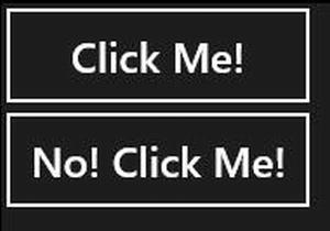
Figure 5-1. Defining styles
You can set as many properties and corresponding values as you like in a style.
Based on Styles
You can create new styles based on existing styles, overriding one or more properties and adding new properties. For example, you could create an Urgent button based on the ButtonStyle shown above, but with the letters in yellow, as shown in the following code:
<Page.Resources>

    <Style

        TargetType="Button"

        x:Key="ButtonStyle">

        <Setter

            Property="FontSize"

            Value="24" />

        <Setter

            Property="Height"

            Value="60" />

        <Setter

            Property="Width"

            Value="180" />

    </Style>

    <Style TargetType="Button" x:Key="UrgentButtonStyle" BasedOn="{StaticResource ButtonStyle}">

        <Setter
            Property="Foreground"

            Value="Yellow" />

    </Style>

</Page.Resources>


<Grid

    Background="{StaticResource ApplicationPageBackgroundThemeBrush}">

    <StackPanel>

        <Button

            Style="{StaticResource ButtonStyle}"

            Content="Click Me!" />

        <Button

            Style="{StaticResource UrgentButtonStyle}"

            Content="No! Click Me!" />


    </StackPanel>

</Grid>
In this simple example, a second style, UrgentButtonStyle, is based on the original ButtonStyle, but a new property is added (Foreground). Using “Based on” you can create an entire hierarchy of related styles.
Implicit Styles
So what if you want to apply a given style to every button on your page but don’t want to define the style in each button? In that case, you can create an implicit style. Implicit styles are defined exactly like explicit styles, except that there is no key; every control of the target type is assigned the implicit style, … implicitly, as illustrated in the following code:
<Page.Resources>

     <Style

         TargetType="Button">

         <Setter

             Property="FontSize"

             Value="24" />

         <Setter

             Property="Height"

             Value="60" />

         <Setter

             Property="Width"

             Value="180" />

     </Style>

 </Page.Resources>


 <Grid

     Background="{StaticResource ApplicationPageBackgroundThemeBrush}">

     <StackPanel>

         <Button

             Content="Click Me!" />

         <Button

             Content="No! Click Me!" />

         <Button
             Content="Thing 1" />

         <Button

             Content="Thing 2" />


     </StackPanel>

 </Grid>
Note that the style does not have a key, and none of the buttons set their style. They are assigned the new style implicitly specifically because it doesn’t have a key, based on the TargetType. Figure 5-2 shows the result.
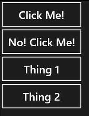
Figure 5-2. Implicit styles
Templates
While styles can give you a great deal of flexibility, they can only go so far. If you want to take full control over the appearance of a control, you will want to provide a custom template. Every control in Windows 8 is “lookless” in that it has no inherent appearance. Its appearance is controlled by a template, either the template created by Microsoft or the template created by you.
To see this, let’s create a template to make your buttons round and blue. To do so, open Expression Blend and create a new project. Drag a button onto the design surface and right-click the button, choosing Edit Template  Create Empty, as shown in Figure 5-3.
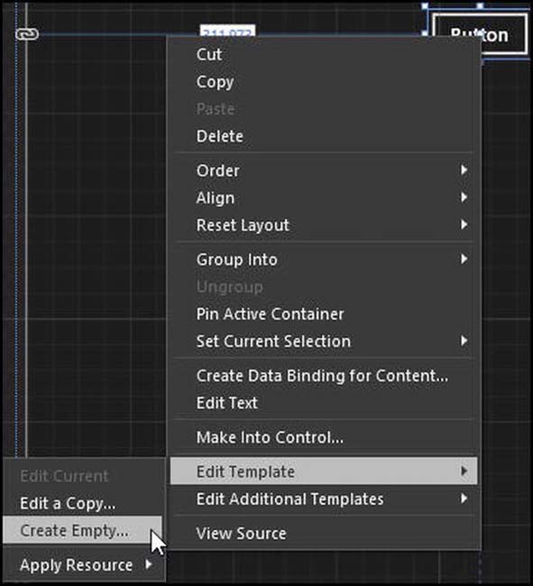
Figure 5-3. Creating an empty template
A dialog box will open and ask you to name the template and set its scope. Your choices are
- Application (any page in this project)
- This document (this page)
- Resource dictionary (a reusable DLL that just contains resources for use across projects)
Choose Application, as shown in Figure 5-4.
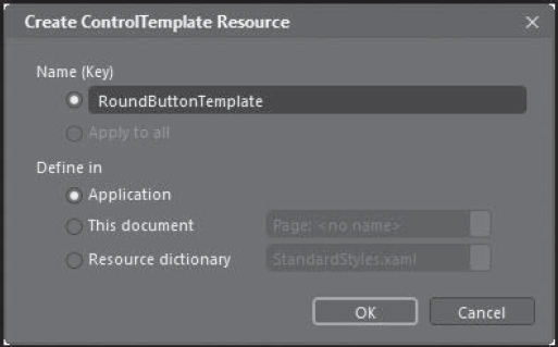
Figure 5-4. Setting the scope of the template
This will put you in the template editor, creating a new template for buttons. In the center of the template is a small grid. Click on the grid, and in the Properties window, set its size to 100x100. Drag an ellipse into the grid, and set its size to 80x80, centered and with no margins, as shown in Figure 5-5.
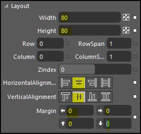
Figure 5-5. Setting the size of the ellipse
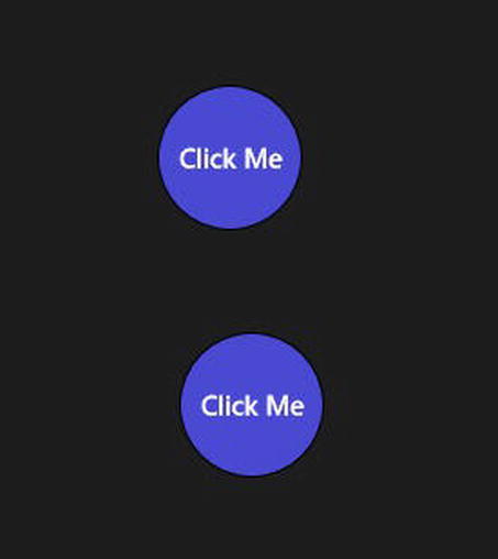
Set the fill color of the ellipse to a light blue. Drag a TextBlock into the grid, center it, and set its contents to Click Me. You now have an ellipse with the words “Click Me” superimposed above it. That is your template for the button.
To exit the template editor, double-click on MainPage.xaml at the top of the designer. You will exit the template designer and be back in the page designer.
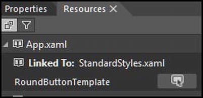
Drag a second button onto the page. Click on the Resources tab and expand App.xaml. You’ll see your newly minted template, which is called RoundButtonTemplate in this example (see Figure 5-6).
Click and drag RoundButtonTemplate onto the new button. Notice that the cursor now has a + sign (see Figure 5-7).
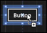
Figure 5-7. Setting the scope of the template
When you let go of the mouse, a menu will appear where you are dropping the template. Select Template to add the template to this button (as shown in Figure 5-8) and hey! Presto! The button changes to your template shape.
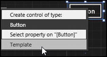
Figure 5-8. Selecting the Template option
Click F5 to run the application and your two templated buttons will appear as shown in Figure 5-9.
Your new buttons will still respond to click events (they are buttons), even though you have dramatically changed their appearance. To prove it, close the application in Blend and open it in Visual Studio. Put the buttons into a StackPanel and add a TextBlock to display a message. Finally, add a Click event handler to the second button as follows:
<StackPanel>

    <Button

        Content="Button"

        HorizontalAlignment="Left"

        VerticalAlignment="Top"

        Template="{StaticResource RoundButtonTemplate}" />

    <Button

        Content="Button"

        HorizontalAlignment="Left"

        VerticalAlignment="Top"

        Template="{StaticResource RoundButtonTemplate}"

        Click="Button_Click_1" />

    <TextBlock

        Margin="20"

        FontSize="40"

        Name="Msg"

        Text="Ready" />

</StackPanel>
The event handler for the Click event will just update the TextBlock, as shown in the following code:
private void Button_Click_1(object sender, Windows.UI.Xaml.RoutedEventArgs e)

 {

        Msg.Text = "Clicked!";

 }
When you click on the second button, voila! the text changes, as shown in Figure 5-10.
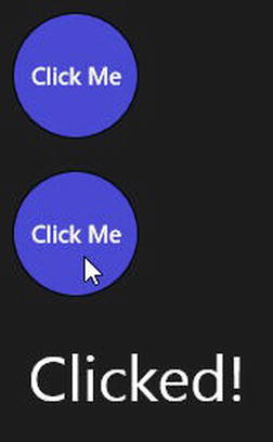
Figure 5-10. Changing text
While the buttons do still respond to click events, they do not give the positive feedback of appearing to be depressed when you click on them. To accomplish that, you need to know about animation and visual states, the topics of the next chapter.