
There is more work we could do during the research phase, but we have an initial list of realistic features and a clear goal of what the product has to offer the end user. Since the product seems realistic and the team is in alignment with the objective, it is time to start mapping out the details of how these features might work and knit together.
We start by creating an interaction map to illustrate how users will access these features and how the user navigates through the application. This flowchart is very similar to the site map we created for the website, though it will likely be a little more complex, and will focus a bit more on task flow; the path a user must follow to complete any given objective. We will ignore some of that complexity in our first map. Our goal will be to start capturing the high-level details.
Similar to the MVP concept mentioned previously, it is important to start with simplicity in mind. Perhaps the most difficult part of this process is learning to avoid digging too deep into the details at the start. If we aim at having multiple versions of this map in advance, it might be easier to avoid the trap of getting bogged down by too much information. Start by documenting concepts and high-level tasks rather than specifics and plan on adding the finer details later.
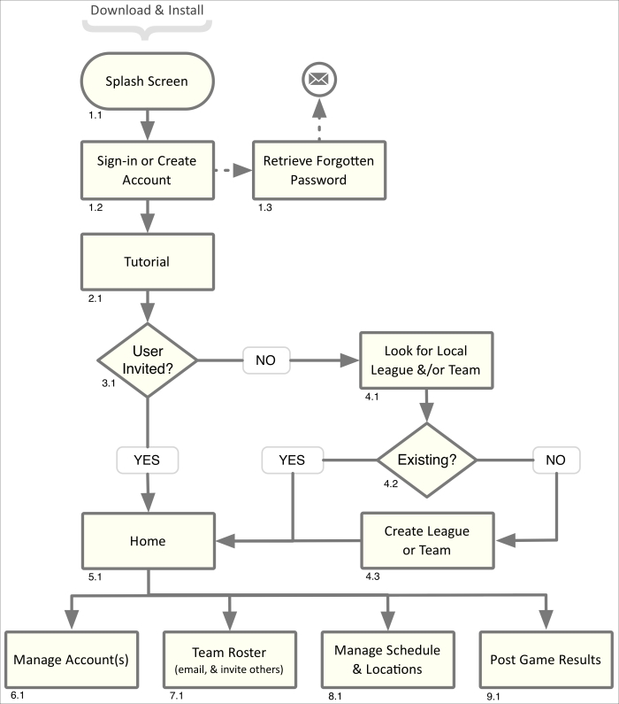
In this case, we start by quickly mapping out the mechanics of how the user will be introduced to the product. We know they will download and install the application on their phone. When they start it for the first time, they will first see a splash screen that will usually display the logo and possibly the version number for a few seconds. They will then need to create an account or sign in if they already have one. We can offer a quick tutorial if it will help the user understand how to navigate the application.
At this point, the path the user will follow will depend upon how they were introduced to the application itself. If they found the application on their own, they will need to locate the team or league they belong to and join it. If they were sent an invitation from a league representative, coach, or another parent or player, they will be taken directly to the team page they were invited to. The experience I just explained with text should become a map that looks something like this:
We should note that our aim as UX designers is to find the best interface solution possible. To accomplish this, we will need to start by exploring various options. Inexperienced designers will often leap too quickly to adopt a solution before accounting for all of the details. They then end up assuming a defensive posture in meetings when problems with the UX logic are exposed. We should be wary of situations where we have to defend our work too much, or if we find ourselves getting emotional or frustrated. It usually means that we just didn't think through everything we should have, or perhaps there was some data we didn't have access to.
We should attempt to keep our minds open when this happens (and it will happen). We do ourselves no favor by staunchly defending a solution that is not comprehensive. Sometimes we have to back up and try again. This is especially true when new features are added to the project, or when unexpected complexities are found in a particular task flow. I am of the opinion that if we define and consider all the details, a true and proper solution will materialize for us. Adopt the process of proposing a solution and inviting the team to punch holes in it by exposing UX snarls that negatively affect the experience. This invitation of criticism will help keep us from getting defensive, help us refine the experience, and will assist us in obtaining team alignment and buy-in with the final UX strategy.
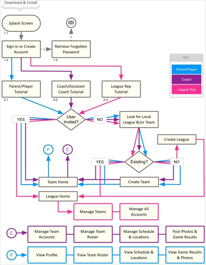
For our second version of the interaction map, we expand it to illustrate the task flow followed by each user type. Parents/players, coaches, and league representatives will each have different objectives and tasks. Three different colored lines have represented the path of those tasks.
With these different users in mind, we find that we need to add several management pages for the coach and league representatives. These pages will let them invite new team members as well as delete or edit other roster details. They will require a means of managing the game schedule and locations. If we offer the ability to upload photos and comments about the games, then we will also likely need to offer a means of moderating that content. We can offer those privileges to the league representative, coach, assistant coach, and even the parents and players themselves.
We add all of these features to our map, and it evolves into this:
There are many different ways to interpret this data into shapes. Take the Sign-in section shown at point 1.2 in the preceding figure. That could be represented as a decision point using a diamond shape. As in, do we want to sign in or create a new account? We could also use a parallelogram to represent that data is being input into the system. It all depends upon the level of detail we require. Since the focus of this particular chart is to examine the task flow, not account management, we will just label it as a manual process. It's not entirely accurate, but to show it in more detail would bog down the message we are attempting to get across.
We have vetted our interaction maps with the team and they have agreed on the overall task flow defined for the various user types. These are: parent, player, coach, and league representative. We will use our Susan Soccermom persona to represent the parents and players using the application. We will use our Eric Enthusiast persona to represent the coach and possibly the league representative user types.
As we add more detail to the experience, we may find the league representative's tasks are unique enough to justify the creation of a persona to represent that specific user type.
When in this type of situation, we will need to make a judgment call on when technique-like persona generation is helpful and when it will slow down the process. I have seen designers who are very thorough about using such techniques. Though it takes time and effort, it can pay off in the end. Accounting for all possible scenarios will likely mean fewer revisions.
There is not a 100 percent correct answer for this. We will need to account for the needs of the product, as well as the pace of the team, and refine our approach depending on those circumstances.
For this project, let's say the team agrees to utilize the personas we have already generated to represent our user types. Now we move onto the next step in the Information Architecture phase, the creation of mockups.
We start by sketching the different pages shown in our interaction maps. While drawing out the details, we include notes about navigational decisions, observations about potential areas of confusion, and questions that we'll need to answer later on.
The following figure shows our sketch, and eventual wireframe, of the interface to create a new account. Since asking for too much personal information can cause people to abandon the account creation process, we pare down our list of required data to only the essentials.
The experience should be fairly quick and painless by asking for the user's name and e-mail address. We'll also ask for the user's zip code to assist in locating their league or team from our database. This should be enough personal information to get started and is light enough to not scare them away. We'll capture any other data we need as they get more invested in the application and use more of its features.
We can gather credit card information within the store's checkout process. Other personal information can be collected when the user joins a team and is added to the roster, or becomes a coach or league representative.
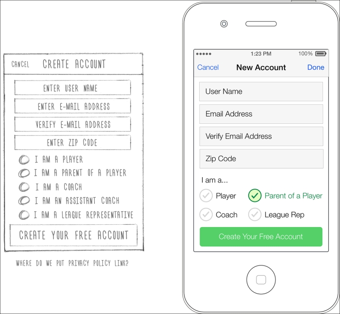
Please keep in mind that there are laws requiring us to communicate our intentions regarding the usage of personal information in a privacy policy. We will likely be required to include other policies such as a "terms of use" policy, and possibly an End Users Licensing Agreement (EULA). These need to be made available when the user creates their account, and will need to be made available within the product as well. Since the user will require a page to manage their profile and account information entered on this page and elsewhere, we'll plan on including access to these policies there as well.
Now that we have our initial account creation page defined, let's move onto the next step in the user experience.
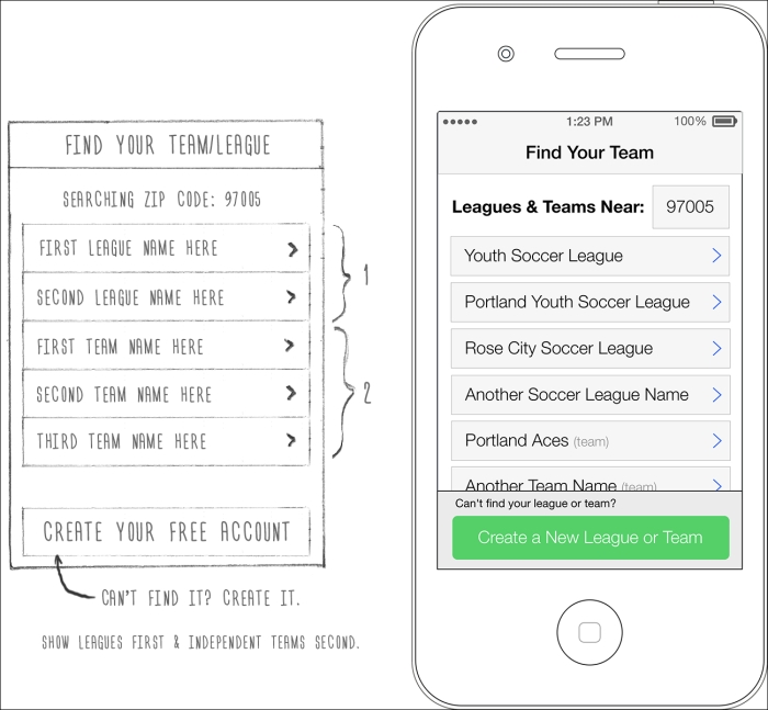
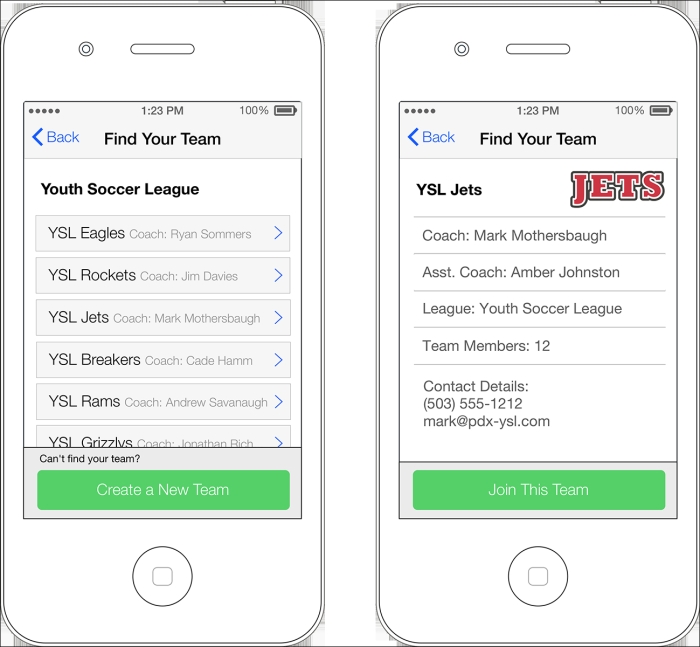
This sketch and wireframe show the follow-up step that occurs once we have created a new account. If the user was invited, they will skip this step as the system will know exactly what league and/or team they were invited to. If the user was not invited, the application takes the zip code entered during the account creation process and presents a list of leagues and teams that are nearby. This is represented by block 4.1 in the interaction map. If the user cannot find the league or team they belong to in the list, chances are they haven't been created yet. The button at the bottom of the page will let anyone start defining a team. They may then send out invitations to other parents, players, and league representatives to install the app and join the team roster. Selecting the "League Rep" account type will offer the ability to create and manage leagues and multiple teams.
It's natural to discover elements and features we didn't account for in our flowcharts as we dig into the wireframe details. The more thorough we are while developing our interaction maps, the fewer revisions we'll have to make later on.
Here are a few things to consider when sketching out our initial wireframing thoughts on paper. You may notice that my sketches are slightly inaccurate and, well, messy. I know many designers who have purchased stencils, rulers, and templates to help make their sketches look more professional and presentable. I too have tried this, but found it to be counterproductive. When sketches look too clean or beautiful they become precious. There is a natural desire, especially in designers, to protect precious things. Since this step in the process is all about quickly examining and abandoning ideas until you find those that work, this preciousness can slow you down and hamper your ability to think beyond your perfect sketches. I would encourage you to make them loose, fluid, and fast. Making your sketches on a whiteboard can be a good way to avoid this scenario, and makes it easier to involve others in the discussion.
The following wireframes show how the process will continue for the user who locates their league and team.
The user who locates their team without an invitation will be able to join the team by clicking on the button that says "Join This Team" at the bottom of the screen. We can give the coach or league representative the ability to approve requests to join a team if added security is desired. The decision to offer this will need to be agreed upon by the team. And, if needed, the functionality will need to be added to the interaction map. The ability to monitor these requests will need to be added to the coach and league representative management screens.
This brings us to a common scenario when designing the task flow for such interfaces. We can either offer instant access to the team or send an approval request to the coach or website administrator. Instant access requires the least amount of interface, but is also the least secure. Since we are dealing with children's contact information, we'll likely want to restrict access to only those who are approved. Because of this, we'll likely need to create a system later on in the project that will let the administrator manage those requests.
There is one other common solution in these situations. We can offer an option in the administrator's control panel that will let them define whether they would like to manage these access requests or not. This is the most flexible option, but as you might expect, flexibility almost always increases complexity. This is another situation where we'll need to examine the user's needs and make a judgment call on what is most appropriate. We'll also want to ensure that we include the development team in the discussion. Very often, adding features like this can add a significant amount of development time to the schedule. If our proposal is too costly, we may need to brainstorm another solution with the development team. Once agreed upon, we'll need to update our interaction maps and wireframes with our new feature.
Once the user has located and joined their team, they will be taken to the team home page. This page will become the default landing page anytime they open the application. Considerations may need to be explored to account for parents who use this application to track the games of multiple children.
We can see from the following figure that there are a lot of options to consider regarding possible content and features for the team home page. We have included access points to the coach and team's contact information, the maps to the games, notifications, and a few other things.

Page content isn't the only thing that needs to be carefully considered. The navigation model we choose to employ can have a monumental impact on the usability of our application. It is important to understand the options at our disposal and their associated pros and cons.
There are many commonly used styles, and an almost infinite number of navigational options we could dream up. That being said, when it comes to navigational schemas, there are really only two paradigms to choose from. Our options are to employ a portal navigation model or a global navigation model.
The portal navigation model consists of a primary portal page that contains all the navigational access points to every tool or task in the website or application. We move from this page to the tool or feature we wish to use, and when done, we must return to the portal to select another one. This model usually requires navigational links known as "breadcrumbs" that will lead us back up the trail of navigation we travelled down. Mobile device applications that use this model often have to rely on the use of many back buttons to return us to the main portal or index. This is often caused by the amount of space breadcrumb trails take up, which is not always compatible with the limited screen space mobile devices offer.
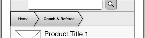
The portal model can be seen in the sketches and wireframes of the store portion of this example found in the next section. The home page of the store contains the access points to all of the product categories. I opted for a breadcrumb navigation model rather than back buttons to return the user to the portal page. The breadcrumb navigation looks like this:
The global navigation model consists of a set of navigational links that are shown on nearly every page of the website or application. This is usually shown in a nav bar or row on navigational links/access points. This prevents the need to use breadcrumb navigation or back buttons. The user can simply click on whatever feature they want to go to at any point.
As illustrated in the following figure, you can see we chose to use a global navigation model for the team- and league-related screens in our application:

Regardless of the model chosen, the navigation (portal or global) is usually removed when the user is working on a task that spans multiple screens, or that follows a specific and rigid set of steps. The navigation will return once they have completed their task, or have cancelled out of the process.
The typical e-commerce checkout process is a good example of this. When a customer has added items to their cart and is attempting to make their purchase, it is best to reduce the number of navigational links that will lead them away from that experience. Retaining the navigation options used elsewhere in the store will not only complicate the experience by adding more content to the page, but it is also counterproductive to our ultimate goal of completing the sale. Offer the user several links out of the checkout process and they will be more likely to abandon their shopping session.
In addition to the checkout process, we will likely want to remove the navigation on tasks that require multiple screens or pages to be completed. If the user is midway through entering their data and they navigate away from the page, we'll need to stop the experience and ask them if they are leaving intentionally. It's often easier to reduce the number of links that lead away from the task at hand. They will either need to complete their task or expressly choose to cancel it to return to a screen that has the navigational links.
Up to this point, we have been addressing the needs and desires of the end user. Now let's examine the reason the application has been created by our client. They need a way to bring customers into the store. They could have spent their advertising budget on traditional media. Instead, they opted for an application that would offer a service to their existing and potential customers, which would allow them to advertise directly to their target market in a more controlled way.
The following sketches and wireframes will explore the Futbol Finder store as found in the application we have been developing:
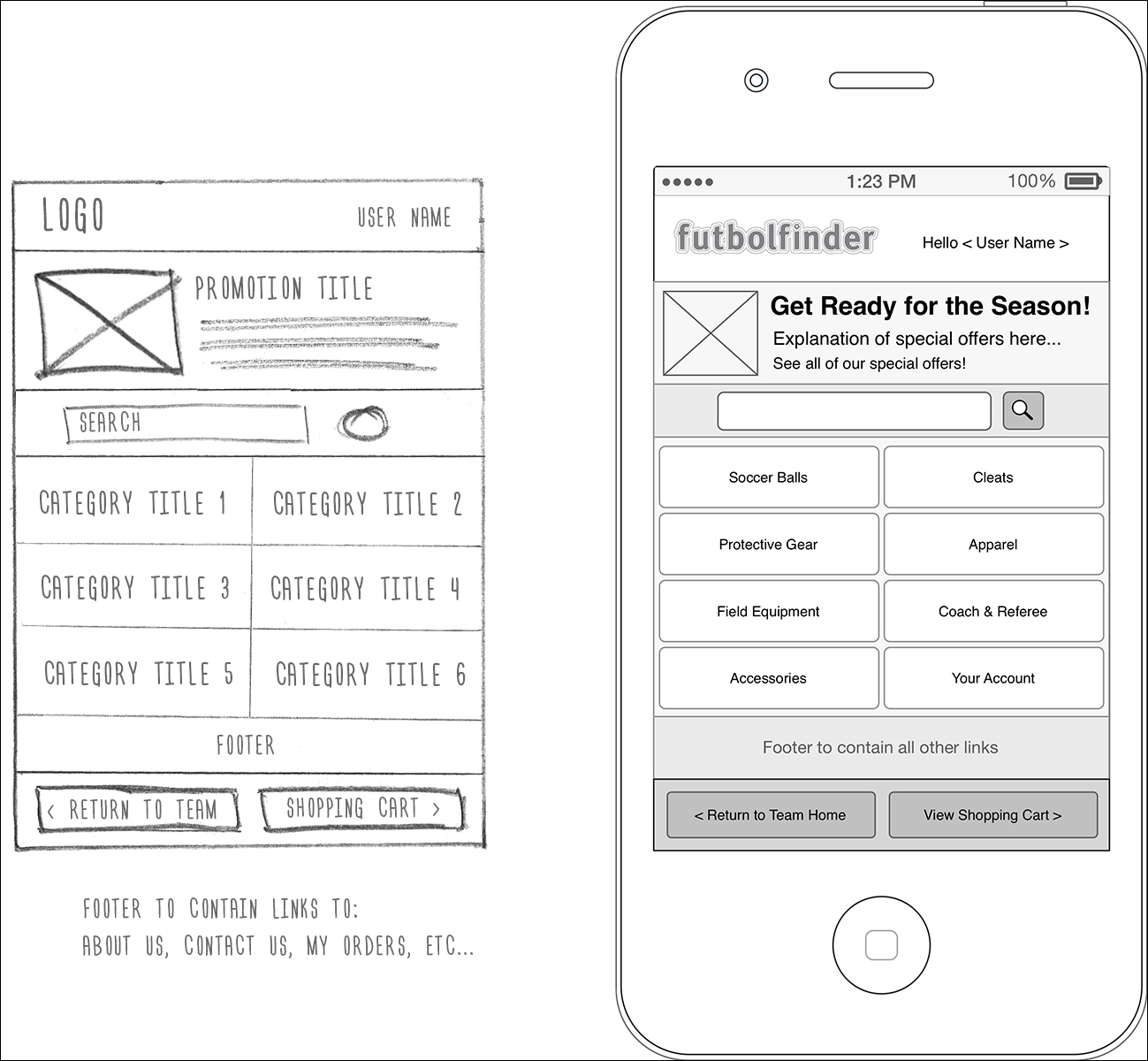
This figure shows a rough sketch and subsequent wireframe of the mobile device version of the store's home page. This storefront is accessed from the team- and league-related pages in two ways. The first is a direct link to the store's home page that resides on the right-hand side of the global navigation bar. The other access point takes the form of an advertising banner that resides at the top of the screen on the league and team tracker portion of the application. This banner lets the client advertise special offers and sales, which can take the user directly to a product detail page or some other promotional page.
Once the user has entered the store, the experience changes significantly. The navigation paradigm switches from a global model to a portal model, meaning the home page will lead the user to category pages. If they wish to browse to another category, they will need to return to the home page and select another category.
We have included a button at the bottom of the page that will return the user to the team- and league-related pages, but the intent is to keep the user in the store and not offer them too many obvious paths out. The bulk of the navigation in this portion of the app will be focused on guiding them through the store.
Having walked through the design of the website as our first example project, we can see that there is a major difference in the desktop version of the website and the mobile device version. Since the limited screen size reduces the amount of marketing that can be done, we have created a fairly basic storefront that offers stripped down search and browse functionality. The store structure and product taxonomy will remain the same, but we may find that it benefits the user by reducing some of the content and product details to optimize the experience for the reduced screen size of our mobile device.
The primary links on the home page will let the user search for specific product keywords or browse the different product categories.
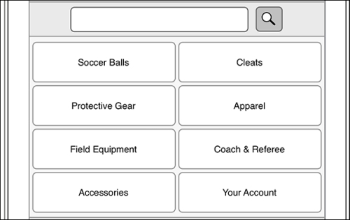
Our next task will be to design the experience for a category page.
This particular wireframe shows where the user would be taken if they tapped on the Coach & Referee category button on the home page:
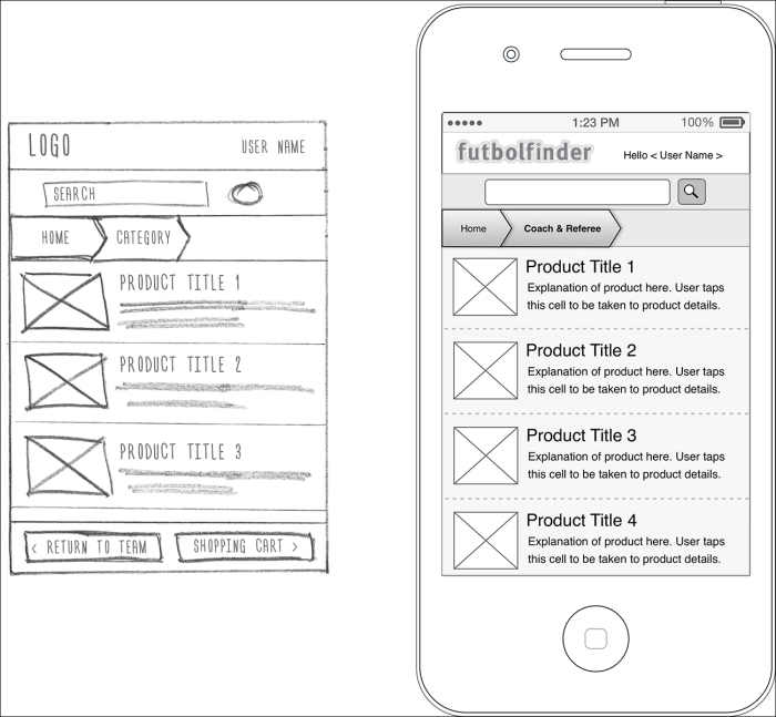
Our wireframe of this category page will be used as a template for our other category pages, just as we did with the website version of the store.
We block out where the product images will reside. This is shown with a simple box on the left-hand side of the screen. We include the product title and some explanatory text for each product. Tapping a product will take the user to the product detail page. Here, we can offer much more information about the product and include reviews, ratings, and other details.
We may wish to explore a few other versions of this page to ensure that we are creating the best possible interface. For instance, instead of adding the first sentence of the product description under the product title, perhaps we could show the price, and let the customer add the item to the cart directly from this category page. We'll still need to add a means of accessing the product detail page, but this alternative solution could possibly slow down the purchase process. After we explore some of these different solutions, we can review them with the client to decide which one we should go with.
This would be the time to start testing our design decisions. This can be as simple as finding a few people we know who match our personas and having them take a look at our wireframes to gauge their reaction. We can create prototypes of our designs or just print them out. We can show them a single wireframe of each interface or display multiple options and let them choose the one they prefer.
The more opinions we receive, the higher the likelihood that we will be giving the customer what they want. We can always guess and make assumptions about what they want, but it's surprising how often we get it wrong. The important thing here will be to get some feedback from people who are likely to use the product before taking our designs to a higher fidelity.
It is common practice to have a formal review of each round of wireframes with the client or team. To make our work easier to present and understand, we create a document that first contains our interaction map and then the wireframes in an order that guides the audience through the task flow. Including comments about each wireframe is a great way to ensure our thoughts and concerns are accurately communicated.
Most wireframing applications will let us apply links to our pages. We can add a great deal of clarity by linking the cells of our task flow diagram to the wireframes each cell represents. We can add even more clarity by linking the navigation in our wireframes so our presentation becomes a navigable prototype.
Once we have received feedback from the team, we can update our flowcharts and wireframes and prepare a new presentation for our next review. During this iterative process, our goal will be to address all the issues found during the review and increase fidelity by adding text, graphics, and other details. We will continue to work with the client and team to refine these wireframes until all the details and content have been satisfactorily defined.