
In this chapter, we will examine just a few of the many information -architecture-related techniques that have been developed to assist in the filtering and ordering of information. Of the few that I have included, I have really only scratched the surface with my brief explanation of how they work and what they do. I would recommend researching these techniques and methodologies further by finding more examples and discussions about them online or by searching out related UX design reference materials.
Task flow diagrams and wireframes are the primary methods used to architect, design, and document our site or application. The information needed to fill in the details of these deliverables will be captured during the research phase. However, we will still need some help in filtering and organizing the data collected. The techniques shown here are aimed at doing just that. Again, we'll need to familiarize ourselves with these techniques to know when it's appropriate to utilize each one.
Reality mapping is a technique that helps us understand and document the existing task flow of a website or application. In a way, it's a little bit like card sorting; however, it offers a bit more detail. This exercise can be done alone, but is made much more effective and fun when completed with a group. The process requires a wall, a marker, a stack of different colored sticky notes, and access to the site or application we need to redesign.
The goal of this exercise is to document the construction of a product as we journey through it. In addition to capturing the different steps required to complete our desired tasks, we will also document the different questions, concerns, and ideas that come to us along the way. Our end result will look something like the following diagram:
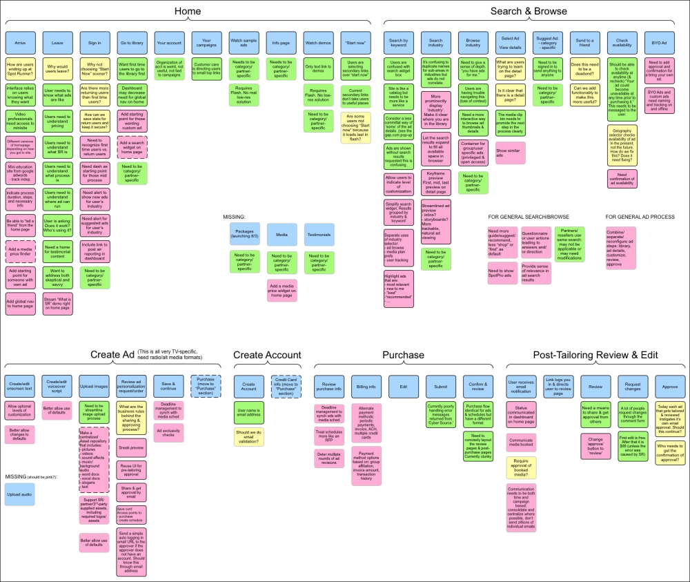
This particular map was generated to help understand a client's complex web application that required redesigning.
As we can see from the preceding example, we started on the home page and created groupings of notes about the experience as we worked our way through the entire product.
We wrote the title of each step in the process on a blue sticky note and placed it on the wall in the order in which it occurred. As we examined each step, we used the other sticky note colors to document our questions (yellow notes), comments and concerns (pink notes), and our new ideas and suggestions (green notes).
After the reality mapping session, we cleaned up our notes by documenting them in our wireframing application of choice.
A detailed view of a single page in the process looked something like the following figure:
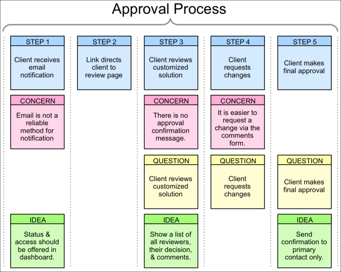
As we can see from this example, the steps in the approval process are documented in blue across the top. Below each step are the associated concerns, questions, and ideas we have for each step.
We can make the most of our reality mapping session by defining the color meanings at the start, and have a means for all to view the site or application being examined during the session. Ensure all participants have a small stack of notes and a pen, and invite them to get out of their seats and add their notes to the chart on the wall at any time.
By the end of the session, we will have not only documented the existing task flow process, but also captured a great deal of valuable information that should help us define how the flow should be reordered and what type of corrections or additions need to be made to the interface.
This technique was created by John Pruitt and Tamara Adlin. More can be learned about this in their book titled The Persona Lifecycle (published by Morgan Kaufmann in 2006).
There are several task flow diagram variations that are worth considering. They all have the same core objective of mapping out the flow of ordered steps in a process, but offer slight differences regarding the granularity of the data they include.
This is a diagram that maps out every step of a task that is found on a single screen or page of the product. In the following example, the user is being asked to specify the options required when selecting to add a door to their house and the subsequent decisions it requires:

As we can see from this example, the flowchart explains the steps and options that the user has to select from on a single page of an experience. Each decision point in the diagram is represented by a diamond shape, steps by a rectangle, and options to choose from are represented by a manual entry shape.
Site maps are fairly straightforward and easy to comprehend. Each page of the site is represented by a rectangle. Arrows show how the user can navigate from one page to another, thus showing an at-a-glance view of the entire site.
Applications can be mapped out the same way, although they usually contain more complex interactions that require more than the standard rectangle shape to explain. This is the most commonly created task flow diagram solution.
The following diagram shows a simple example of a site map:

Mapping out the expected task flow, or the anticipated navigational path each of our personas is likely to follow, can add insight into the overall navigability of our site or application. To create this style of diagram, we start by assigning each persona its own color. We then illustrate their paths through the site map. This technique can help communicate the differences expected for each user type and can help us see how a single screen or page may need to offer multiple messages or solutions to address each unique viewpoint:

In the preceding example, we show the path of someone shopping, someone looking to gather information, and another user who is seeking answers about a shipment or otherwise needing customer service support. The chart allows us to trace their most likely path. The preceding diagram shown is rather basic, and thus might show how to create this type of diagram, but might not fully illustrate its benefit. This type of diagram can be particularly helpful when we have user profiles that are very different from one another. It can help ensure that each user type gets the messaging and interface elements needed to accomplish their specific set of tasks.
This method uses small screenshots, mockups, or wireframes instead of basic shapes to illustrate the task flow. The following diagram is an example utilizing the wireframes from Chapter 3, Example Project – Mobile Device Application:

This technique is often used to document the layout of a site or application when working on a redesign. As we might expect, the added detail can help by mapping out a comprehensive set of interactions, while at the same time showing the entire site or application with enough detail that it can be understood at a glance.
Paper prototyping is an effective and inexpensive method for testing the effectiveness of our wireframes. This technique is simply the act of printing out our wireframes on paper and letting a test participant walk through them as though they were actually using the finished product. We place the printout of the interface in front of the test participant and ask what they would do to complete a specific task. We then swap out the printouts with the appropriate pages that match their path through the product. If they decide to click on a certain button, we place the page that the button leads to in front of them.
One benefit of this technique is the ability to write down the user's comments directly on the page. We can cross out items they don't like, flag areas of confusion, and so on. It can make the experience much more interactive, and breaks down the barrier usually experienced when testing software on the screen. In such situations, it is common for the test participant to feel like it is an IQ test that they must pass or fail. This can cause them some embarrassment if they don't understand the interface. Having this test take place on paper can help the user feel like they are participating in the construction effort, rather than trying to understand a finished product or having their intelligence tested.
One common drawback of paper prototyping is the difficulty of managing a large number of printouts. It's fairly easy with smaller products, but it can be extremely difficult to manage products with complex interactions. In these situations, we may wish to hold the test directly in the wireframing application itself. Wireframing applications such as Axure, Omnigraffle, and Visio all allow us to apply links to any page element. So, if a button is clicked, it will automatically take the user to the page we connect it to. This doesn't give us the same benefits of taking notes as the paper prototype version does, but it can make for a cleaner and faster test.