
In this chapter, we will cover the following topics:
- Interface Builder – the storyboard
- Creating a mockup
- Adaptive layouts
- Connecting code
In the last chapter, you learned about Swift, the alternative programming language. There is an increasing pressure on developers to make a pretty-looking application; the designers deliver a design and it is mostly up to the developers to convert this design into an application. Earlier, an external component of Xcode, Interface Builder (IB) now is an integrated part of Xcode. Interface Builder allowed you to visually layout the UI of the application in forms/screens that were saved as XIBs. With iOS5 and Xcode 4.3, Apple introduced storyboards. Storyboards were generally used in the movie and animation industry, where sequences of images were used to previsualize the scene or flow of the movie. The concept remains and a storyboard in Interface Builder also allows you to previsualize the different scenes in your project including the interaction between them. The different scenes in a storyboard are called views and the transitions between the two scenes linking them is called a segue. Segues can be drawn between the UI elements in a scene to the destination scene.
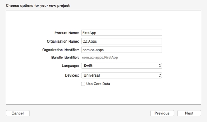
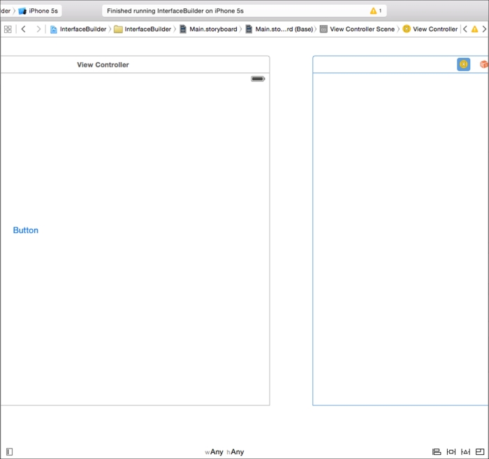
Interface Builder has now been a part of Xcode for a while and can be used as you can use the code editor. Create a new project with a storyboard to create a simple UI. To start, create a new project (File | New | Project) and create an iOS project:
To work with the storyboard UI, first click on the Main.storyboard option to open the storyboard in the editor for you to work with. This area is called the canvas; this is where you drag-and-drop your elements:

Now you can place items onto the canvas. You can drag-and-drop elements from the library, scroll down to a button object, and drag and drop it onto the canvas. Use the blue guidelines to align it right at the center of the view.
On top of the scene, there are three icons: the first yellow and the next two orange. These are the View Controller, First Responder, and Exit as can be seen in the following screenshot:
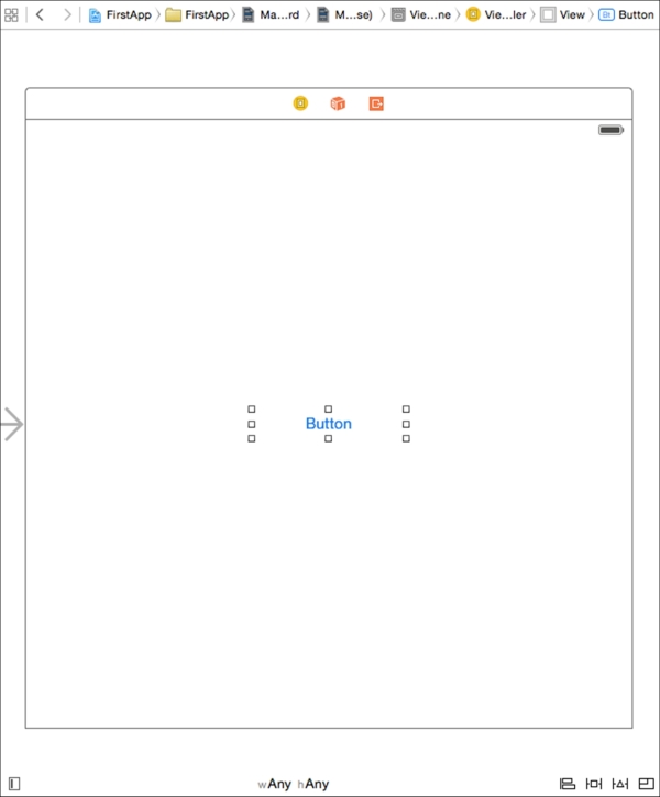
The following is the description of the three icons:
- The View Controller element is the object that handles the interface events and it is also the
UIViewControllerclass. You can change it to make it manage your custom class. - The First Responder element is a placeholder that informs the application that it should be the first one to handle the events. This is mainly useful for
UITextViewsand other controls that require a first responder to be set. - The Exit element is used to connect code that is called when exiting a segue scene.
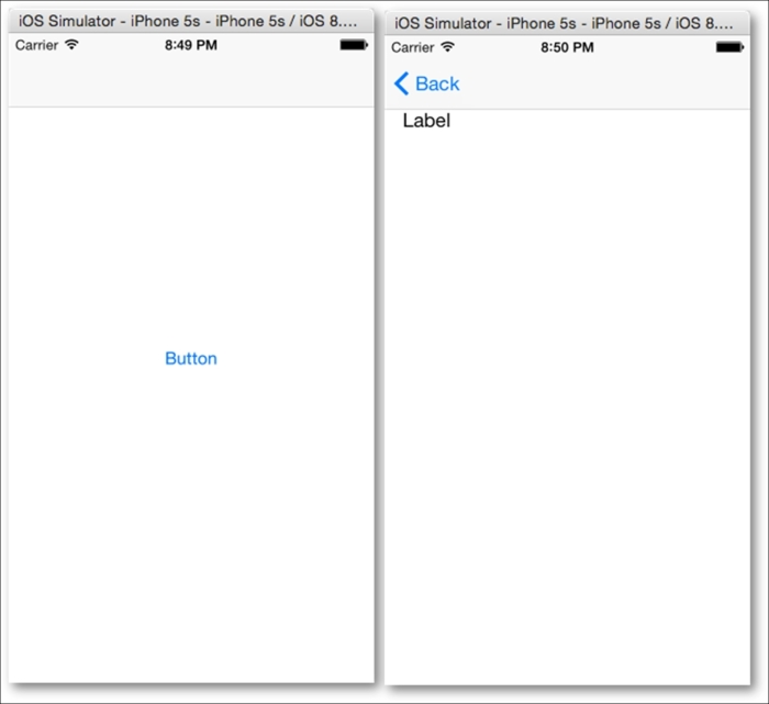
You can simply press CMD+R or click on the Run button. You will see it running in the simulator, as shown in the following screenshot:
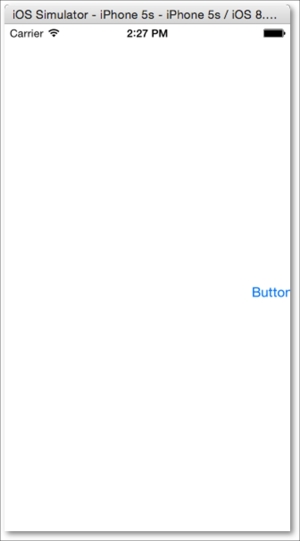
You might wonder why the button is being cut off even when you centered it and aligned it. The main reason for this is that Interface Builder sets the size of the view to 600 x 600 by default. When this is run and positioned on an iPhone-sized screen, the elements are culled or clipped and hence half the button is shown in the preceding screenshot. When you switch off the size class, the sizes are retained for either the iPhone or the iPad screen size and thereby they remain as you might have laid out your elements. You can switch off the size class from your storyboard by navigating to the first tab of Utilities Navigator (OPT + CMD + 1) under Interface Builder Document and deselecting Use Size Classes. With size classes, you can create a single view that adapts based on the device and the orientation it is run on. You can also switch off Autolayout for the project.
Adaptive UI is quite exciting, especially since it allows defining how the UI should adapt to different orientations and resolutions. The first thing that Apple has done to make this possible is to do away with UIInterfaceOrientation and UIDeviceIdiom and replace them with the size class. Earlier, your code could have been littered with a lot of conditional code determining the orientation and the device to run code. Obviously, you would not have done so with Swift as it is a new feature with Xcode 6, but this is a sample of what it would look like with Objective-C:
UIDevice *device = [UIDevice currentDevice];
UIDeviceOrientation currentOrientation = device.orientation;
BOOL isPhone = (device.userInterfaceIdiom == UIUserInterfaceIdiomPhone);
BOOL isPortrait = ([[UIScreen mainScreen] bounds].size.height == 568.0);
This would then be followed up with a series of conditions such as:
if (isPhone == YES) {
    if (isPortrait == YES) {
        // Do something when in Portrait orientation
    } else {
        // Do something when in Landscape orientation
    }
else
    {
        //You could check for iPad and its orientations
    }
This is quite cumbersome. Instead, the size class offers three options on each of the dimensions: width and height. The size options are Compact and Regular and the third option is Any, which is basically a way of saying it could be either.

Xcode has nine values available for creating your UI; this includes the third option Any that we mentioned earlier. In the following figure, you can see that this allows you to adapt to more UI's easily, so you do not have to explicitly check for sizes any more; it is all about the space available. The sizes as displayed by 1, 3, 7, and 9 are final values, specifically for the desired orientations, whereas 2, 4, 5, 6, and 8 are base values. Final values are more like fixed values that conform to a particular device size, whereas the base values are those that can adapt to or be used for more than one device and/or orientation. Constraints created in the Any | Any layout are applied to all of the layouts, while constraints created for a specific layout are applied for that layout only.

If you look at the bottom of the Interface Builder screen, you can see wAny and hAny, if you click on that, it will show a pop-up as shown in the following screenshot. This allows you to select the size you want to create your UI at:

For now, we will work with the Any | Any layouts. This is the universal layout that would work on most devices.
The scene size in Interface Builder can be adjustable (in case you need to) by first setting Simulated Size to Freeform in Size Inspector (OPT + CMD + 5) after you select the view. Then, set the width and height to the desired size.
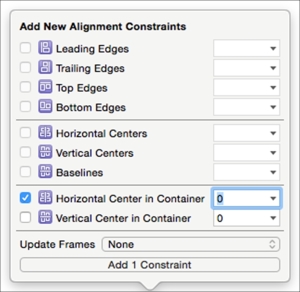
The first task is to ensure that the button remains in the center as we expected it to be. To do that, we need to add constraints. Constraints are not new; they were introduced with iOS 6 and Auto Layout. This allows you to specify how the elements would be displayed on the view, and how they will be displayed when viewed on different devices. To ensure that the button stays in the center of the screen, you can add two constraints, one to center it horizontally and another to center it vertically. To do that, press Control and then click and drag from the button towards the left and release; it displays a pop-up that allows you to center vertically in the container.
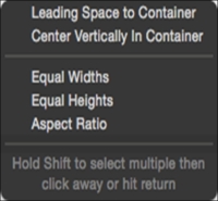
Alternatively, you can also click on the Align button and select the alignment options:
Now, when you run the project again, you will see the button display in the center as expected to start with.
If you click on the button that we just created, nothing happens; that is OK because we have not specified anything for it to do. Let's look at creating a mock-up without writing a single line of code. The first thing you need is another view that will be displayed when you click on the button. Drag-and-drop View Controller from the library and position it next to the existing one.
Now press control and click and drag from the button to the new View Controller that you just added to the storyboard. This displays a pop-up option to select the method to use when displaying the new View Controller; select show:

Let us quickly add a label to the new view and set the constraints to the top-left corner. Now, if you run the application and click on the button, it will display the second view. There is no way to go back to the previous view. We do not see the back button that you would have expected from many iPhone applications that navigate between views.
To get the View Controller that you would have expected along with the back button, you need NavigationViewController. An easy way to add NavigationViewController is to select the root View Controller (the root View Controller can be identified as the one with the half arrow that is not connected from any other View Controller) and navigate to the menu option Editor | Embed In | Navigation Controller. You will notice that the root View Controller changes to new navigationViewController.
Now, when you run the project, you will notice that the view has space for a navigation bar in Interface Builder. Run the project again and you will notice the top navigation bar space in gray; and when you click on Button, the new presented view also has the Back button that works as expected without doing anything much.
You can add more UI elements and scenes that can be connected with segues.
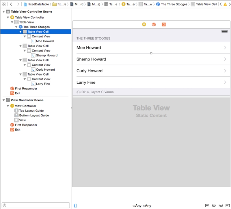
Start a new project of the Single View Application type, name it as fixedDataTable. Click on the Main.storyboard option to open it in the editor. Drag Table View Controller from Utilities Library and arrange it to the left of the view. Delete the main View Controller; now select Table View Controller and check the Is Initial View Controller checkbox. This will make Table View Controller the main controller. Run the project and you will see Table View blank for now.
To be able to access the various parts of Table View, such as the cells and the content, you can activate the document outline that allows you to access each element more accurately than by simply clicking on them.
Click on Table View and, under the Attributes Inspector tab, change the value of Prototype Cells to 4. This determines the number of items displayed in Table View. Change the Content option to Static Cells from Dynamic properties. Change the style to Grouped from Plain. Next, click on each of the Table View Cell options and change the type to Basic from Custom. Now, select the Table View section. ensure that the value of rows is 4, and add Header and Footer text.
Click on each of the Table View Cell options and, under Accessory, change the value to Disclosure Indicator from None. This will display the > indicating that, when the tableCellView is clicked, it will display some other detail.
Now, double-click on each of the cells to edit and set its text. We are making a Stooge-o-dex so we have the names of the four stooges. The show was called the Three stooges; however, there were as many as six stooges but that's beside the point here. We will have information about four stooges in our sample application.
Name the cells as Moe Howard, Shemp Howard, Larry Fine, and Curly Howard:
Add four View Controllers, add an image view, and add two labels on each of them. The image will hold the picture of the stooge and the two labels will display some information about the stooges. Position the image view to be centered horizontally and towards the top of the view. Position the first label just below the image view and position the last label at the bottom of the view. Refer to the following screenshot. In the Attributes Inspector tab, name the View Controllers as per the names of the stooges. Add the four images (you can get these from the companion files download) to your project; then select the image view and set its image property from the Attributes navigator. Type relevant text into the two labels. Set your constraints to have them display as per the following screenshot:

Next, press Control and click-and-drag from each of Table View Cells to the View Controller to connect them with a segue. Select show when asked how you would like to display the View Controller. After you are done connecting Table View Cells to the View Controllers, you should have a storyboard with multiple arrows connecting the scenes, as seen in the following screenshot:
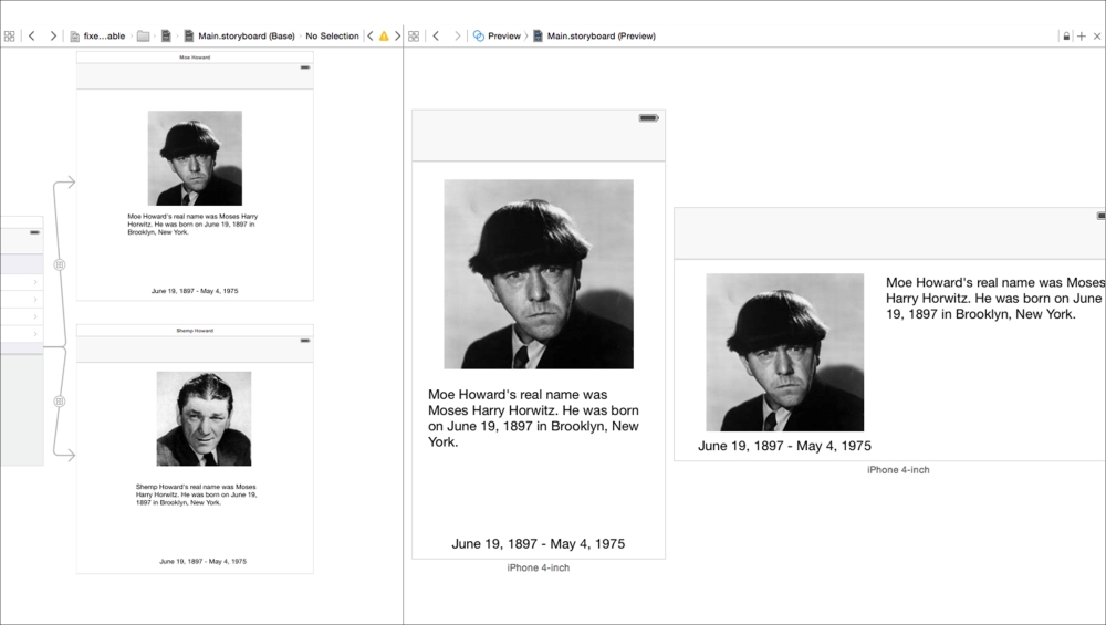
A storyboard with multiple arrows connecting different scenes
Open the assistant editor (press OPT + CMD + Enter) and then select the storyboard. Next, click on the first icon on the left; it looks like a set of 4 squares. Scroll down to the Preview option and select it. This displays a preview of the view. If you do not get the Preview option, but see a code file in the assistant editor, select the storyboard from the list of recent files (in the assistant editor), and then select the Preview option again.

Click on the plus button (+) at the bottom; it offers three choices: the iPhone 3.5, iPhone 4.0, and iPad. When you select a particular device, it is added to the preview and the view in the main editor is displayed as adapted for that particular device. It is very useful to preview your work live on various-sized devices. You can add two of the same and keep them in different orientations, as shown in the previous screenshot. You can see how the View Controller for Moe Howard in both portrait and landscape is adapted and displayed based on the view and constraints. This would speed up the process to create adaptive UIs. In addition to this, designers can create the UIs with Xcode and add basic functionality without writing a single line of code. This book does not go into details of auto layout and constraints as that is a topic that might require a chapter or more by itself. It could be used to create pixel-perfect and aligned UIs as your designer might expect while designing it in some image manipulation software.
Once you have populated the screens for all four of the View Controllers, you are all set. You have just created a static application without writing a single line of code.
You can also select which controls are seen in a particular orientation, work with the Any | Any option for the common elements, then switch to the desired orientation or size; for example, navigate to Compact | Any for widescreen layouts on an iPhone device. Rearrange or add the component you want for that orientation.
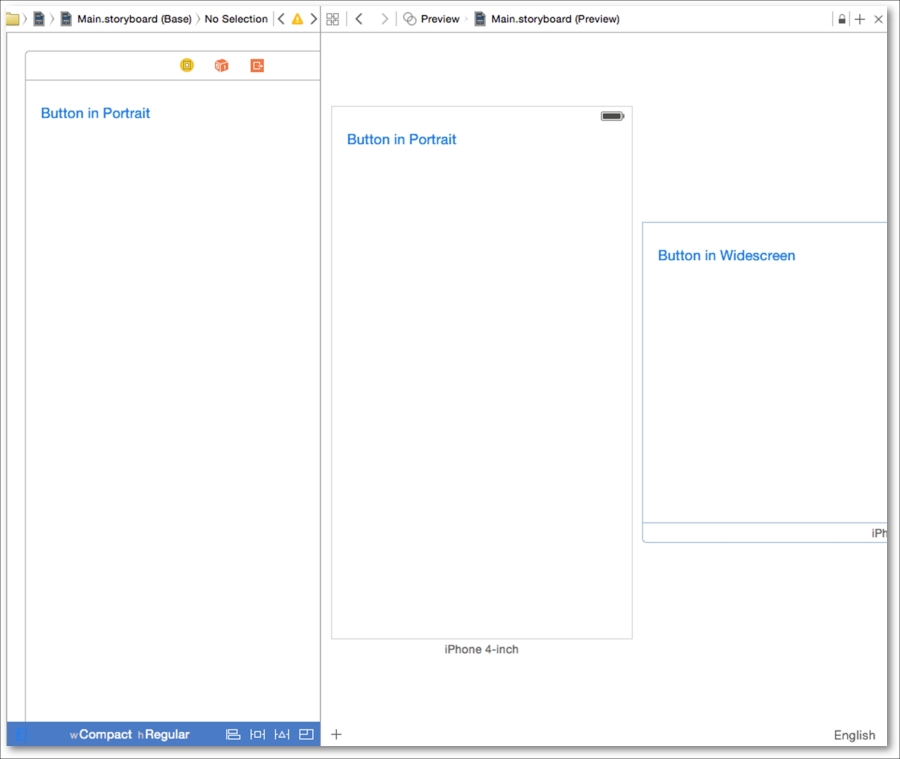
You might notice in the preceding screenshot that the two previews have different buttons depending on the orientation they are displayed in.
While it is easy to create UIs in Interface Builder, there is only so much that you can do. If you want to add a button that displays another view, it is rather difficult to do that in Interface Builder.
Before we start writing some code, there are a couple of things that we need to know about Interface Builder and Xcode:
- Interface Builder follows the Model-View-Controller (MVC) model. This, in simple terms, means that there is a model that holds the data, a view that you see on the screen that displays the data, and a controller that liaises between the view and the controller.
- You can create a custom class of the
UIViewControllertype that allows you to work with the View Controller—that is, add code that can be executed. - You need to make connections between the elements on a View Controller in Interface Builder and the code via outlets. These are similar to variables but are connections to your UI elements, thereby allowing you to refer to them from code.
If you are new to Xcode, you would want to take care of what you connect from. This is because there are differences between, say, connecting an element to the first responder and connecting the first responder to an element.
- Simply add a new row to the existing Table View and name it
counter. - Add a new View Controller to the storyboard and connect the table cell to the View Controller by pressing control and dragging from the table cell to the View Controller.
- Next, add a button, position it in the center of the screen, and set the appropriate constraints, aligning the button centrally in the container, both horizontally and vertically.
- Double-click to change the title of the button and type in
Press me for more – UIAlertView. - You can also change the TextColor color to White and the Background color to Blue. This would give it contrast while on the screen.
- Next, add a label above the button and set its constraints accordingly.
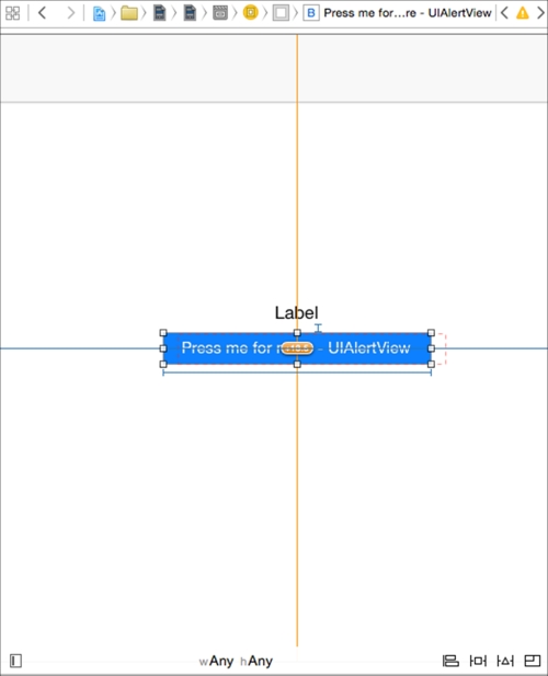
This book will not delve into autolayout, but a quick look at it would help you to understand a bit more about autolayouts. In the following screenshot, the button has its constraints set to position it in the center, both horizontally and vertically. There is another constraint that sets the vertical spacing between the button and the label. There are another two constraints: the width and the height. Interface Builder shows you where the element would be shown at runtime as seen via the orange dotted lines. In fact, it would even show you inconsistencies and missing constraints, including if any of them are ambiguous or conflict with others. It even tells you that the frame will be different at runtime.

You can also individually click on each of the constraints like any other object in Interface Builder and it will show up in Properties Inspector, which you can tweak as required.

You have the simple UI that you need (also referred to as the view). To create the controller, we navigate to File | New | File. Under iOS Source, select Cocoa Touch Classes, name this myViewController and select it as Subclass of UIViewController. Do not select Also create XIB file as we are using storyboards, and choose the language as Swift.

To create the connections, open the storyboard in the editor and position the view, in Identity Inspector, change the class from UIViewController to myViewController. Now, if you open the assistant editor (by pressing OPT + CMD + Enter) it will open the myViewController.swift code in the assistant editor. Now press control and drag from the label to the code at the top just after the class name declaration, and select to create an outlet connection, name it theText, and ensure that storage is of type weak.
This would create the code:
@IBOutlet weak var theText: UILabel!
Next, press control and drag from the button to the code and create a connection of type action, name it pressMe. This would generate the following lines of code:
@IBAction func pressMe(sender: AnyObject){
}
You need to supply the code for that action. In this case, to create UIAertViewController, type the following code between the curly braces:
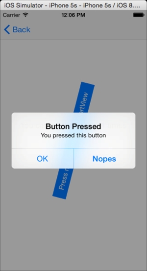
let alert = UIAlertController(title: "Button Pressed", message: "You pressed this button", preferredStyle: .Alert)
let actionOK = UIAlertAction(title: "OK", style: .Default, handler: nil)
let actionNo = UIAlertAction(title:"Nopes", style: .Cancel, handler: nil)
alert.addAction(actionOK)
alert.addAction(actionNo)
self.presentViewController(alert, animated: true, completion: nil)
This would create an alert as expected when the button is pressed:

To be able to process the alert button, that is, handle the button pressed, you need to add a function block to the action's handler. We had specified it as nil previously. For now, we will simply display a message to the Xcode console window using println. Modify UIAlertAction as follows:
let actionOK = UIAlertAction(title:"OK", style:.Default, handler: {_in println("We clicked OK"})When you are writing code, there are times when you are unsure of the methods or properties; Xcode offers a quick and easy method to lookup the words. If you keep the option key pressed and hover over a class, it underlines the word with a dotted line and the cursor changes to a question mark, this will display a pop up with the details of the word under the cursor. If it is a function or a method it displays its details:
If you have the command key pressed, the cursor changes to a hand cursor and the word under the cursor changes to a solid line. Then, if you click on the word, it would open the corresponding header declaration and even display the declares (from the system file headers) and so on as their Swift equivalents. If the class is your own custom class, then the source code file is displayed.
Connections created using Interface Builder can end up with multiple connections if you create, change elements and maybe recreate the connections. Most importantly, if these connections are invalid or changed, they may cause crashes. It is best to check the connections and removing them if they are no longer required. To bring up the connections, you can right-click on the object and it will display a list of items; it will also show the connections (if any). Another way to look at the connections is in Connections Inspector (OPT + CMD + 6) under Utilities Inspector.

Connections Inspector
Once you start to connect code and views in storyboards, you can do a lot more than display simple alert boxes. You can attach gesture recognizers to make your UI interact with gestures. Continuing with the example project, you can add a rotation gesture recognizer and then rotate the button, which looks really cool and still works like a button.

First, look up for Rotation Gesture Recognizer from Object Library and drag it to the view. Notice that this does not show up on the view; it sits on top of it. It looks like a yin-yang symbol. Then, set up the gesture recognizer by connecting it. Press Control and drag from the button to the gesture recognizer; from the pop-up menu outlet collections, select gestureRecognizers. Next, open up myViewController.swift in the assistant editor; press control and drag from the gesture recognizer to the editor and add a new IBAction called rotateMe. This creates a blank function with the name rotateMe in myViewController.swift. You can add the following code to this function:
@IBAction func rotateMe(sender:AnyObject){
    let gesture = sender as UIRotationGestureController
    let transform = gesture.view?.transform as CGAffineTransform!
gesture.view?.transform = CGAffineTransformRotate(transform, gesture.rotation)
    gesture.rotation = 0
}
First of all, the parameter passed to this function is of the AnyObject type; we could have instead specified that we need this to be UIRotationGestureController. The code simply changes the rotation of the view by using CGAffineTransformationRotate and then sets the rotation as 0, so it continues from that point. Otherwise, it goes a bit crazy with the rotation adding up. You can comment the gesture.rotation = 0 line and have a look. Alternatively, Apple offers you something called the CGAffineTransformIdentity. This is basically the default position with no transformations applied, no rotations, no scaling, etc. So you could use this as the starting point to apply your transforms.
If you are in the simulator, you can press the option key to get the second touch and then rotate the button. The rotated button works just as it did when it was normal.
The last thing you need to know with Interface Builder is segues. It is pronounced as seg'ways as in the two-wheeled self-balancing transportation vehicle. Segues are the lines with arrows that connect various scenes with the elements on another scene. If you are a designer, you can use this to quickly create mock-ups that work natively and move between scenes without writing a single line of code. The other thing about segues is that you can name them. In the attributes inspector, you can give them an identifying name. This name can be used via code to present or identify segues.
Add another button and position it at the bottom of the view; create Center Horizontally in Container and a Bottom Space to Bottom Layout Guide constraints. Next, add a new View Controller, press control and drag from the button to the View Controller, and select show. Click on the newly created segue and, in the attributes property, select mySegue as the identifier.
Now, in the assistant editor, open myViewController.swift. Add the following code to that file:
override func prepareForSegue(segue: UIStoryboardSegue!, sender: AnyObject!) {
    println("The segue '(segue.identifier)' was called")
}
The prepareForSegue function is called every time a new scene is called. This allows you to prepare and be able to pass data to the new scene or set up the new scene. It provides you with access to the new scene's View Controller . However, this function is invoked in the current View Controller before the new View Controller is displayed. Now if you run the project, navigate to this scene, and click on the button, you will see the message The segue 'mySegue' was called displayed in the console.
You can also manually invoke segues from code then rely on design-time connections. If you called the presentSegueWithIdentifier function at the end of the viewDidLoad function, it will navigate to the new view when this view is displayed:
self.performSegueWithIdentifier("mySegue", sender:self)