It's natural that the design of an e-commerce website, its visual look, feel, and appearance, play a major role in the sale process. Product specification and price play an even more important role, but it's the design that can make the whole online sales process smooth and easy, or so very complicated that the customer may even leave the site.
Effective design of an online store is a sales and marketing instrument and should be used accordingly, to improve the customer's experience with the online shop in general and increase online sales in particular. Visual impressions can affect the customer's decisions, and for an e-commerce website, they should help achieve the main goal—to sell goods online.
This chapter is dedicated to various aspects of osCommerce design. What design is, how to use design to improve online sales, how to optimize design for different types of customers—all this has been put together here.
It should be noted that not all advice and ideas mentioned in this chapter are available as downloadable contributions. Quite a number of those pieces of advice and ideas may require help of a qualified osCommerce consultant or web designer. Once the changes are carefully selected and properly implemented, they may pay off very soon!
But first, let's just briefly touch base about what design is in terms of osCommerce.
osCommerce site's design should not be mistaken for its functionality. Design is what the customers can see and how its pages look when customers browse the website, from the main or landing page of the online store to the checkout success page. All still graphics and animation elements of the website pages, layout of individual elements on each page of the website, fonts and colors of texts on those pages, all this is a part of osCommerce design. We will not consider design of the back end of an osCommerce website in this chapter, but osCommerce front-end design.
When choosing a design for an osCommerce online store (or for any online store based on an e-commerce technology) several main principles should be taken into account. Even if the online stores already has a certain design integrated, it can be reviewed to make sure the current design is the best for helping customers with online ordering.
Before we proceed any further, let's talk about the main principle of e-commerce design in general and osCommerce design in particular.
The design of an osCommerce online store should help the sales. It should not be applied just to demonstrate the capabilities of the web designer who created it, or how much of an artistic taste the online merchant has. It's quite often actually the case that online store owners make decisions about whether to apply this or that design to their online stores based solely or mostly on their own feelings about the design, using their own style, color, and other preferences. Or they make decisions following advice given by friends, partners, or colleagues.
While this can sometimes work, the best results can rarely be achieved that way, even if the online store looks brilliant with the chosen design integrated. There are plenty of online stores that look brilliant but do not sell that brilliantly at all.
The best way to create a design that helps sales is to look at it from the customer's point of view only, and never from any other side! Even if the online merchant doesn't personally like the look and feel of the site, the main point should always be about whether the customers will like it or not, and whether it will help online sales or not.
Decisions made about online stores should not be based on intuition or the personal preferences of decision makers. Those decisions should be based on studies and measures of target customer groups. This not only relates to design issues, but to all other aspects of e-commerce development too.
We will restate it again: No one, especially anyone who influences the decision making process on how the online store should look, should ever put individual design preferences above customers' preferences, and above whether that particular design would help online sales or not.
When a customer first comes to an online store, it should be quite obvious what sort of products the online store sells. The design of an online store should be related to the products it sells, or at least not confront the products.
When buying products, the customers have certain expectations of how their needs should be addressed with the products that they buy. Online store designs should to some degree "prepare" the customer, remind the customer either about the products that are being sold online, or something related to how those products can be used to satisfy customer's needs.
Alternatively, the design of an online store can be made very neutral to avoid drawing the customer's attention away from products and avoid irritating customer's sight.
Nowadays more and more customers would have fast Internet connection when they browse through pages of an online store. This is especially true if customers buy online from their workplaces. But some customers (and depending on the marketing strategy and target audience it can be quite a number) still have slower Internet connections at home or where they browse websites from.
The design of an online store should never make the browsing experience worse; it should always improve it, make it more pleasant to customers.
Therefore, the design of an online store should not seriously affect the page load speed of the website. If it does, the site either needs to be redesigned completely, or the existing design needs to be optimized to improve page load speed. Customers are used to an almost instantaneous page loading experience, and should the website take longer to load up its pages, the customers will more likely be disappointed, "tired" of waiting (even if it takes only several extra seconds to load a page), and the chance of them leaving the online store without making a purchase increases.
Dependending on who the targeted audience are, the list of computer platforms and web browsers that should be supported by an online store may vary. By "supported", here we mean "looking good and in accordance to the original design". One and the same website may look different, and sometimes worse, on certain computer platforms than on others, and in certain web browsers than in others.
Most multi-platform and cross-browser design compatibility issues are related to improper page structure, or to the specifications of the corresponding computer platforms and web browsers.
A reasonable solution here doesn't require an online store to be designed in a way that makes it compatible with absolutely all computer platforms and web browsers. Instead, it requires the online store to be compatible with all computer platforms and web browsers that its targeted customers use.
Even if only 5% of the targeted customers are reported to be using a certain web browser, not having the online store compatible with it can cause almost a 5% loss in revenue—something not every online merchant can afford or would like to see.
To ease browsing and purchase experience for users and customers, the website's design should not draw away their attention from products, special offers, and of course the ordering facilities. Also, to maintain and promote the brand of an online store its logo, identifiable colors, and styles of main design elements (such as information boxes, buttons, backgrounds, etc.) should be present on as many pages of the website as possible.
Therefore, it's not recommended to change design style, colors, even font sizes and types between the pages of an online store without a good reason.
For an online store with a large product range, a good approach would be to identify certain parts of the product range (like separate categories or brands) as individual mini-stores, where each mini-store would have its own color scheme or design style. Even in such a case, changing color scheme would be the best way to achieve marketing goals, leaving the design style, layout, and of course the logo of the online store intact.
Design elements should not only be present on the web pages; the logo and certain design elements should also be also put on printed documents such as invoices, packing slips, and order confirmations to further promote the brand of the online store and also help customers identify printed documents with the online orders they placed.
osCommerce has all the facilities for maintaining design unity through the whole online store, even though some online merchants neglect those opportunities and eventually lose out on converting more visitors into customers and customers into returning customers.
Web designs can't "sell" products on their own, it's the product itself and its price that make the difference and affect the customer's decision to buy it. But the design of an online store can very much help to sell products (just as it can confuse the customers and make some of them go away from the online store).
osCommerce comes with a certain default design. This includes the logo, CSS style sheets, buttons, information box designs, and a number of "standard" osCommerce images and icons that are displayed on different pages of the website (such as images on the User Account page, or the header of the website, or the Quick Search icon).
It comes with the header, left, middle, and right columns, and the footer. All or almost all bits of information are displayed in the so called "information boxes" that share the same or a very similar style of the title, border, and content.
Actually, osCommerce comes with a complete design and is ready to be installed and start selling products online right away. That's certainly a benefit of this e-commerce solution.
At the same time, the default osCommerce design, being very generic and basic, may not suit each and every online store owner, and may not help selling certain product ranges. Also, it has not been changed for several years now, and doesn't look as contemporary as it was in the past. Also, there are some design elements (like standard osCommerce icons for example) that do not help customers very much in understanding what this or that page is about, thus confusing the customers instead. Actually, and many web design and development companies would testify, online merchants often ask to remove those standard osCommerce icons and design elements from the very first.
The osCommerce standard design doesn't permit easy manipulation of information boxes or other elements; webmasters or web developers should be involved in order to make changes in the design or layout of the website.
Actually, if a website consists only of an online store, and products are either very unique or the prices are very competitive, one can afford leaving the standard osCommerce design intact—as the sales will be coming through the website anyway.
Otherwise, it may be a good idea to consider changing the design of an osCommerce online store to something that would either match the design of the main website, or accompany the product range, or make the browsing and purchase experience smoother for customers—or just implement the three tasks all together.
Several recommendations could be given for the design of an osCommerce website.
But of course, detailed suggestions can only be made when the product range is established and the target audience is known.
A logotype should be present on all pages of the online store, and also on all printed and/or downloadable documents as was suggested earlier. Usually, the logo is placed at the header of the website, in the top left corner.
A banner promoting featured products or special offers, or links to pages with information about the store can be added to the header of the website. Sometimes, links to the Shopping Cart and Checkout pages are also added to the header of an online store, even though the Shopping Cart is usually present as an information box in one of the columns.
Categories (or rather top categories or the most important categories if there are many) can be also added into the header of online store, usually as a horizontal menu. Sometimes, if there are too many sub-categories they can be added as pop-up menus (similar to how menus look and feel in MS Windows).
Finally, the header may contain the so called "breadcrumbs"—clickable parent-to-child category names that indicate where in the tree of categories the user is currently located, and allow for easier navigation between levels of the category tree (and other pages of the online store as well). Breadcrumbs also play an important role in SEO.
The left column of an osCommerce online store usually contains navigational elements.
It is suggested to put the Quick Search box in there and the tree of categories (also in a box) right after it.
Since there might be multiple levels in the category tree, it would make sense to display only top categories and then allow customers clicking those top categories to see their content (sub-categories and products), and sometimes, sub-categories can be displayed right under their parent categories in the tree in order to make navigation easier for users. It all depends on how deep the category tree is, and how many sub-categories exist, on the average, per level.
Navigation can be performed in many more different ways than by categories only. For example navigation by the manufacturer (or brand, or special occasion, depending on the online store and its product range) can make a significant difference and can make navigation much easier for customers.
So the left column (in a three-column layout, as in osCommerce left and right columns can be disabled) usually contains quite some information in it, and is quite a long one. It would probably make sense to add the Information Box (with links to various information pages) there, under all other boxes and design elements.
The right column can start with the Shopping Cart box that would contain brief information about the content of the Shopping Cart, plus links to the Checkout pages. Along with the Shopping Cart box, it would make sense to add various security seals and certificates to the right column, and icons of the payment methods that could be used to pay for the orders placed in the online store. The right column can be used to display all sorts of additional information, like a Special Offers box, Featured Items, Best-sellers, also Manufacturer information (name, associated image, and links), and again can also contain links to additional information pages.
The footer of an online store can be used to display contact and copyright information, and also contain links to the information pages.
Banners (leading either of the pages of the same online store, or to external pages) can be added to the header, to the side columns, footer, or of course to the middle area of the site. The middle area (which is made wider than either of the side columns in almost all cases) contains all the most important information—products, textual and graphics content, certain navigation controls, and various forms (registration, checkout, newsletter sign up, etc.).
It's not recommended to change the general page layout from page to page when the user navigates through the online store. It may be confusing if one of the side columns disappears where the user navigates to certain pages of the online store, or if side columns change their width, or if the header changes its height or disappears.
In fact, it makes sense to change the layout of the online store while user navigates through its pages only in two cases.
First, if the user proceeds to the Shopping cart page, Customer Registration page, or Checkout Pages—in that case it may make sense to remove certain design elements that could distract the user's attention, or cause confusion.
Secondly, if there is so much important information available on certain products or categories of the online store that removing some design elements (such as side columns for example) can make it much easier for users to read that information completely, without unnecessary scrolling.
Font styles should not change from page to page either, to make a good impression on users. Ideally, font style would not be changed within a single page, having all design elements (textual and graphical) sharing the same font style.
Font size should be used rationally to highlight only the required bits of information, and also make it easy for customers to read all the textual information from the screens.
It is quite often the case that webmasters "forget" about the needs of their target audience and instead of making it easy and pleasant to read from the screens, they use font styles and sizes that look fancy but certainly do not improve the reading experience.
Font styles and colors of design elements should not distract user's attention from Product Information or from the purchase process. Instead, colors should help the user to see the most important information on the pages first, and also make it easy to locate control elements on pages of the online store (for the latter, it's especially recommended to highlight those control elements that lead customers to the purchase completion leaving other control elements less highlighted).
Product Information should be presented in a way that makes it very easy for customers to see the main features of the product and how that product could actually help the customers to address their needs.
In osCommerce, Product Information appears in:
Information boxes in side columns and in the middle area (specials, featured products, etc.)
Product Listing pages (category Product Listing and search results)
Product Information pages
The Shopping Cart page
The Checkout confirmation page
Where there's not much space dedicated to an individual product, only a little of the available Product Information can be displayed. Therefore, it's especially important to present that information to the customers in a way that will make the customers interested in the product, and possibly further interested in purchasing it.
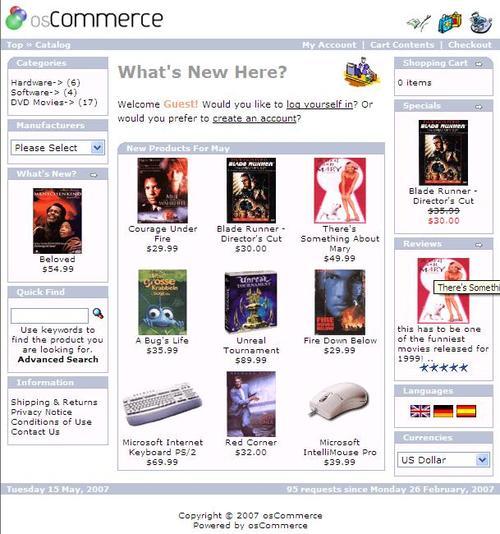
Information boxes in the side columns can usually only display the product name and one image, and sometimes its price. The product name should ideally not take more than one line of text, otherwise it won't look nice in the limited space of a side column. So product names should be made reasonably long to let the customer know more about the product, but at the same time not too long to avoid breaking the design elements such as information boxes in the side columns. The product image that is displayed along with the product name should be made sharp and clean. It will most probably be a thumbnail of a bigger product image, and it's especially important to make it very crisp; if it doesn't look nice the customers may not want to click the product link to get more information about the product or proceed with the purchase. The price of the product is usually displayed along with its name. It is also possible to add certain special icons, like "new", or "hot", or "special" to indicate popularity of the product, or the fact that the product is on a special offer, etc.
Boxes displayed in the middle area of the website that contain one or several products will usually contain the same amount of information, plus they may contain also a short description and information about stock levels (if it's important for a particular website).
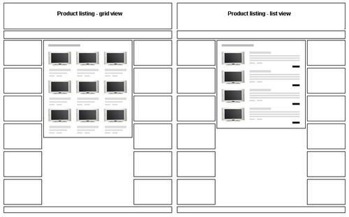
Product listings can be designed in at least two standard ways, and of course any number of very bespoke ways too.
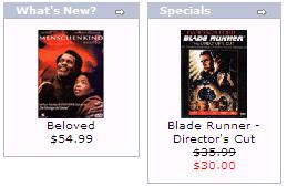
Either list or grid layout can be used, depending on how many products are supposed to fit into one page of Product Listing. It's recommended not to make Product Listing pages too long, as it may be difficult for customers to scroll down to the end of the page if it takes more than one or two mouse scroll wheel turns. Grid-style layout may look similar to the following screenshot:
and list-style layout similar to the next screenshot:
Depending on the layout and the products sold online, the Product Listing may contain product name, model number, short or long description, thumbnail (again, the clearer and the crispier, the better), stock levels, prices, and of course buttons like "More info" or "Add to cart" or "Buy now" that would either send customers to the Product Information page or directly to the Shopping Cart page. Sometimes online stores allow the customers to choose the layout of the Product Listing page according to their preferences, by providing a switch between the two layouts for the Product Listing pages. Using dynamic elements of JavaScript or using AJAX technology it's possible to let the customers see the full product description when the customer hovers the mouse cursor over one of the products, and display the short description when the mouse cursor leaves the product area.
Product listing is where the customers often make up their mind on buying or not buying certain products. It's worthy to note that should the Product Listing contain only one product (say there's only one product found when doing a Quick or Advanced search, or if the category only contains one product), instead of the Product Listing page it's better to show the Product Information page to the customer to avoid one extra click.
The product Information page is obviously the most important page in the product browsing and purchasing processes. Its job is to give the customer complete information about the product, how can it be used (i.e. how exactly will it make a customer happier by addressing their needs), what its main features are, how it looks and feels, what its price and how can it be bought, and what other customers have to say about that product. Also, the very same page can give customers an idea about similar products or products somehow related to the one being browsed.
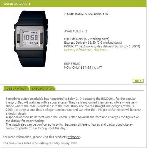
Usually, the product name is put onto the top part of the Product Information page, along with the product model number, stock level, price, and "Buy now" button. If the product cannot be bought, being out of stock, information about when the product is likely to be back in stock would be highly appreciated by some customers. The product short description can be also put into the header of the page.
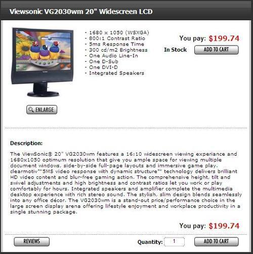
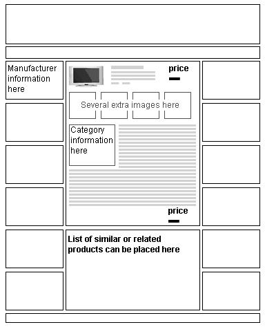
The product image (medium or large rather than small) can be put along with all the information into the header, or right under that data block. Again, it should be very crisp to give the customer an opportunity to see as many of the product features from the picture as possible, without the need to enlarge it. Additional product images, featuring certain details of the product or explaining how the product is built or how it can be used are also displayed on the Product Information page, usually just under the main image. The detailed description (long description) is often displayed further below. It should not be made too long and should usually contain detailed information about products and their features, and sometimes will be joined by product technical specification for products of corresponding nature, where certain technical parameters make the difference. At the bottom of the page, there may be one more block containing product code, price options, and control buttons like "Add to Cart" or "Buy now". This will help those customers who scrolled down to the very bottom of the page in order to read the description in every detail to buy the product without the need to scroll back all the way to the top of the page. Below that block there could be a list of compatible or related products, accessories, etc, for cross-selling. The following screenshots demonstrate different variants of the Product Information page design for osCommerce.
This Product Information page has been modified a bit with respect to the osCommerce standard layout:
One can see a short description added to the top of the page, stock indicator, price and the "Add to Cart" button also added into the top part of the page. Also, the "Add to Cart" button appears in the bottom of the page so that after reading the description the customer doesn't have to scroll up to the very top of the page if the customer is ready to place an order online.
The layout of the following Product Information page has been left almost intact:
The next screenshot of the Product Information page contains an enlarged image of the product, stock information, information about available shipping methods, price information (including the recommended retail price), marketing product description, and product specification:
Standard osCommerce doesn't display too much information about products on the Shopping Cart page. It only displays product name, price, and additional attributes (if selected). Instead, it may be an excellent idea to display not only a thumbnail of the product image but also the short description in the Shopping Cart product list too, to remind the customers what they actually pay for.
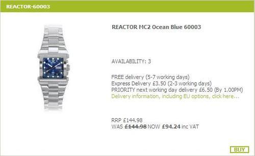
Almost every occurrence of a product on the website, either in the Product Listing or Product Information page, and also in the information boxes (like special, featured, new, etc.) displayed in the middle area of the site, or in one of the side columns, should be accompanied by the product's price. There can be several different prices associated with one single product: recommended retail price (RRP), current price, special price, tax inclusive or exclusive price, quantity discount price, etc. Customers should be always given a clear way to see the price they are paying for each product.
For example, an RRP price, if present (this is not a part of the standard osCommerce installation but can be easily added as a contribution—see http://addons.oscommerce.com/info/3574) should be struck out and its color should be paler than the color of the current product price. In the same manner, current price should be struck out if there is a special price—special prices can be defined in the osCommerce Administration panel. It may be useful to demonstrate to the customer how much the discount is (in percent) comparing RRP and current price, or current and special prices—again the amount of the calculated percent should usually be made less noticeable than the actual price the customer is to pay for product.
The final price customers are paying for product should be highlighted compared to all other price information related to the product.
Sometimes, online stores prefer to display tax inclusive and/or exclusive prices. In that case, an indication of if the prices are inclusive of tax or exclusive of tax should be displayed on every page where the product price is displayed. It's possible to display a corresponding message (or tax inclusive or exclusive figures) along with each product's price, but it may be better from the design stand point to only display one message per page. That message would explain if tax is included in or excluded from the price, and what the rate of tax is. Such a message can be shown in the footer of the website.
Design controls that lead to the purchase should be highlighted, to make it very easy for every customer to find them on the pages, whatever page the customer is browsing at the moment. An example is the Add to Bag button on that Product Information page that is made red and is highlighted comparing to the grayed Continue control button.
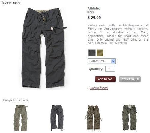
It should be noted that putting two blocks of buttons that lead the customer to the purchase on the Product Information page only makes sense when product description or additional images and similar design elements make the page really long (say more than 1.5-2 screens). Also, as a rule of thumb, purchase controls should never be too small, too thin, too hidden among other design elements. Therefore, it's better not to use text links for "Add to Cart" or "Buy Now" but to use clear noticeable images of buttons that the customer can press with the mouse cursor.
As was said earlier, design of an online store would ideally accompany its product range in various ways. Either the style or colors would remind customers about the products offered online, or would remind customers about something associated with the products, or what that can be achieved by using such products.
For example, an online store that sells security and protection systems for homes may benefit from choosing "police" style and color design (i.e. mostly gray, blue, black and white color scheme, certain font types, additional design elements that would make a corresponding impression of the security and order the customers can expect after buying and installing the offered products). An online store that sells picnic baskets (including food, crockery and cutlery) would benefit from choosing a design that reminds customers about picnics and spending time out (i.e. nature-like colors, maybe photographs of trees, fields, or a river bank in the header of the online store, of course with a widely opened picnic basket, and maybe some happy family photographs too).
To choose a design style, one should consider how it will match with the products, or rather how the prospective customers of an online store will associate it with the products being offered online.
There can be several approaches to choosing the design style of an online store:
Neutral—a good sample is the osCommerce standard design, which is not associated with any specific product range, but just accompanies products. A design may not be associated with products at all—in that case it probably makes sense to make it of neutral colors and style to not draw customers attention away from the product catalog
Associated with products directly—a website that sells, for example, DVDs online can first of all use licensed photographs of actors and screens from the movies in its header and banners, but it can also use all that "movie" style in order to make an appropriate impression on its customers. For example, its boxes can have perforated film edges instead of regular osCommerce information box borders, its control buttons may have icons of a movie projector, film roll, white screen, etc.
Associated with products indirectly—as described in the example with the picnic baskets. Also, as an example, a website that sells American souvenirs will be most probably be designed in US patriotic style, with the obvious choice of red, white, and blue colors, with American flags used in multiple design elements, so that the customers would associate products they can buy online with the country, its history, and all what's related to the very "brand" of USA.
The design of product listing and Product Information pages may depend on the products being offered online.
Of course, the obvious requirement is to make all pages look and feel so that it's very easy to locate information about the products, and manipulate controls that would lead customers to the purchase pages.
But, depending on the product type, the Product Information page may contain only a few lines of text, or quite a long description. Just compare an online store that sells MP3 players with another online store that sells D.I.Y. tools—it's obvious in the former case there will be much more marketing and technical information put on the Product Information pages than in the latter one.
A website that sells devices for machinery will most probably have a number of key product attributes listed on the Product Information pages, besides general description. The same goes for a website that sells home appliances. In contrast, an online store that sells luxury food products would rarely have anything on its Product Information pages except general or marketing description and a nice looking main picture of the product (maybe "serving suggestion" pictures too).
Product listing page design may vary depending on the type of products being sold. An online store that offers watches and related products to the customers will show crisp and relatively big product image, highlight its brand, and list key features in the Product Listing to gain maximum customer interest in the listed products. That website would benefit from displaying products in a grid on the listing page. For a selected category, it will list all products, may be even without splitting them into sub-categories. Of course, the price of the product should be displayed too, but instead of the "Buy Now" button it would make more sense to display the "More Information" button along with each product, as only very few customers would be ready to buy a watch without reading detailed information about the product, its features, warranty conditions, etc.
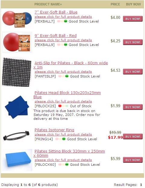
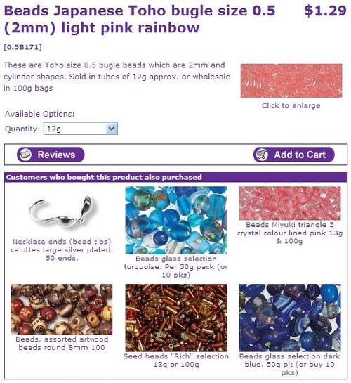
At the same time, an online store that sells coffee and related products may not even display a picture of each product it has on the Product Listing page—one picture per category of products will be quite enough, and then each sort of coffee may be just given a name and price on the Product Listing page along with the weight, obviously providing more detailed product data on the Product Information page. A list of products split by sub-categories with each sub-category having its picture would be a good choice for such websites. Also, because many customers would be already familiar with the products sold online, it would make sense to add the "Add to Cart" button to the Product Listing page, and quantity boxes, so that customers could select several sorts of coffee from the same Product Listing page and add them all to the Shopping Cart at once, without the need to spend time on going to each product's information page and adding products to the cart one by one.
Naturally, before starting an online business, one should carefully study the market, define the targeted audience, and study it, so that products will be interesting to the prospective customers, prices will look reasonable to the targeted audience, and advertising campaigns will reach the desired target group of prospective customers.
Therefore, design of an online store should also "match" the supposed target audience. It should look attractive to prospective customers in any way. It should correspond with the lifestyle of prospective customers, and match their expectations.
Of course, it conflicts a little bit with the concept of design matching the product range, but if we look closely into this matter, we will see that the products themselves will always "match" the target audience—because otherwise the online store would be targeting the wrong audience. So there's no problem in the online store's design matching the product range and target audience at the same time.
If an online store is dedicated to, for example, products for families, its design will most probably have all soft and round design elements, soft and clean font style, include some photos of happy families, etc. Even if that online store sells video games, its design will stay the same to make it attractive to those parents who would buy those video games for their kids.
An online store that sells toddler-oriented products (merchandise, apparel, shoes, toys, games, even confectionery) will most probably be designed in a fun style, with lots of bright design elements, funny virtual page-mates, and of course photos of happy children, so that both kids and their parents would be pleased to browse through the pages of the website—as most likely both the kids and parents will be involved into the process of choosing products.
Yet another example would be an online store dedicated to selling its products to those who take sports seriously. The design of such a website will be more active, bright sometimes it can be even a bit aggressive. It can be made reminding of the spirit of exercise, strength, competition. And if it offers a broad range of products, some of them may not be 100% related to sports—like casual cloths, but nevertheless the style of the whole website will be delivering the corresponding "message" to its target customers.
One more important detail about choosing design of an online store is the default font size. Quite often, online store owners or web designers forget about the importance of all the contents being easy for customers to read for the sake of nice looking pages.
Yet without the ability to read the information displayed on the page, the customer will very likely not complete the purchase process and leave the online store. There are a lot of online businesses with their target audience including middle age and senior people. Therefore, bigger font size should be used by default to guarantee that the prospective customers will not experience any difficulties reading any text on the website.
Of course, the design of the website should be made in a way that allows customers to change font sizes using the facilities of their web browsers, so that the website still looks well with any default font size. Also, in some countries and regions there are certain legal regulations that determine how the websites should be designed to allow for their usage by customers with sight problems.
Design of an online store determines its look and feel. Of course, design is a result of a special process that includes lots of creativity, planning, and implementation work. Design is specially created to make the online store look attractive to its customers, to help selling products online.
But what if under certain circumstances, design of an online store changes such that the look and feel of the website are no longer the same as were supposed to be, or, even worse, if it changes so badly that customers can't buy products online from the website anymore, even if they do not care how the website looks and feels?
There are multiple web browsers nowadays that many customers use to browse through the Internet. Web browsers also run under different operating systems like MS Windows, Apple Macintosh, Linux, etc. The most popular web browsers nowadays for Microsoft Windows are Internet Explorer, Mozilla Firefox, Opera, and Netscape. For the Apple Macintosh platform those would be Safari, Internet Explorer for Macintosh, and so on. For Linux-like systems the most popular browsers would be Mozilla Firefox and Netscape.
Statistics available for study differ depending on the type of service used to collect them, on geographical location of the target audience of the website or web service, and on many other factors. In fact, they can be different for any other online store as the target audience may have its own preferences for using certain web browsers or operating systems.
Statistics may sometimes be misleading if they are not applicable to the same target audience as the online store.
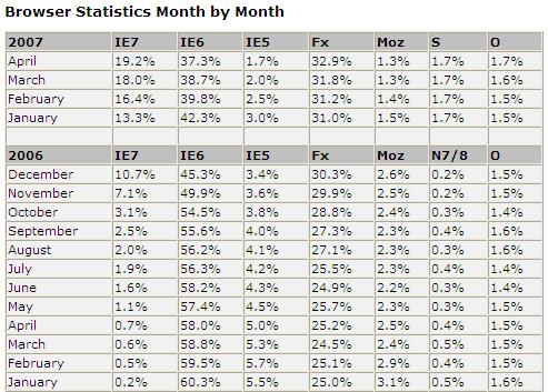
The following screenshot shows web browser usage statistics of www.w3schools.com—a website used mostly by webmasters and e-commerce developers, therefore they cannot be fully applicable and should not be used to make qualified decisions about support of this or that browser version by an online store:
Since web browsers have been developed by different companies, they sometimes "understand" the same web pages differently. Even different versions of the same web browsers can display one and the same web page in a different way. The difference in most of the cases is only about something very minor, like certain design elements moved by one to two pixels on the page, or a block of text information aligned differently. But sometimes those differences can be quite noticeable, as the page will look scrambled; for example one of osCommerce side columns may disappear, or some design elements will change their position, or disappear, or backgrounds will disappear in the information boxes making it impossible to read the text, etc.
It's not safe to suppose that "most" of the customers will use a certain type of a web browser and only have that web browser in mind when creating and testing the design for web browser compatibility.
The mathematics is very simple here. Say most of the customers of an online store use a web browser of a certain type. The figures can be retrieved from web server logs/statistics and would be quite accurate if the online store receives many visitors daily. It should be also noticed that those figures tend to change with time, as the number of customers in the Internet who use this or that web browser changes too, or new customer groups start visiting the online store. If the online store has no statistics of visits yet, one should study general statistics of what browsers are used by the prospective target audience.
With or without those statistics, it's always safe to design an online store to look in the same way independent of the web browser (either type or version of the same type) used by its customers.
We can see that with an imaginary example. Let it be that 92% of the website visitors use Internet Explorer, and 6.5% use Safari, and 1.5% use some other web browsers. A website is designed to look nice in Internet Explorer and it does work very well for those 92% of visitors converting them into customers with this or that efficiency. But if the website has not been designed to look absolutely the same in Safari, and if it has certain design issues in Safari, those who use Safari browser may think the site is broken or just not feel confident enough to buy products from that online store.
Effectively, according to the imaginary figures we have taken as an example, this will result in losing (well, actually not making, but not making a sale because of web design issues is almost the same as losing it!) up to 6.5% of all sales, or even worse, up to 8%!
If the imaginary online store has, for the sake of simplicity, a one million annual turnover, it would have given the store owners from $65,000 to $80,000 extra turnover had it been designed to be compatible with multiple web browsers.
As said earlier, the easiest and most straightforward way seems to be to always design online stores to be compatible with all major web browsers that can be used by customers who belong to the targeted audience. That would be the best assurance and would help to avoid any issues in the future and ensure that the online store continues to receive revenue from selling its products to customers who use different web browsers.
The first step to take is to test the online store (actually, its main page, Product Listing, Product Information, Shopping Cart, checkout pages, user account pages, and general information pages) against W3C HTML standards using the W3C HTML validator. Chapter 3 of this book contains suggestions and advises on how to do it. Validation is important because all or almost all web browsers supposedly support W3C HTML format, and should the page be considered valid in terms of W3C HTML format, it will more likely be displayed in the same or very similar way by all major web browsers.
However, the best way to ensure that the online store actually looks and feels correct under different web browsers would be to test it under different web browsers. A web designer who intends to test the compatibility of an online store will more likely require two or even more different computers in order to test how the website looks and performs under different browsers under different platforms (PC, Apple Macintosh, Linux, etc).
Ideally, an online store should not go live without such tests being successfully completed. More than that, since the design of an online store changes from time to time, each such change should be checked for compatibility with multiple web browsers as well, to ensure the whole website is always compatible with multiple web browsers.
Another issue with compatibility that online store owners should take into consideration is screen resolution. Customers may have screens of many different resolutions and even though nowadays most of the prospective customers would have better monitors and higher screen resolutions than several years ago, there still can be certain limits applied to design of an online store because of limited screen resolution of its target audience.
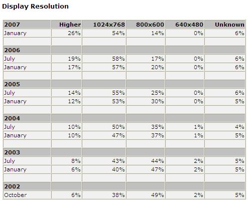
These screen resolution statistics is based on the statistics published by www.w3schools.com and may not be fully suitable for online store owners as it also very much depends on the preferences of the target audience.
As the report says, most customers use 1024 by 768 screen resolution. But there are some customers who still use the 800 by 600 screen resolution (almost 15%):
It becomes an important task to gather information about screen resolutions and monitors used by customers belonging to the targeted audience. If this information is not accessible, it's better to count on the worst case, i.e. on the worst screen resolution and smallest display size to make sure even those customers with smaller/older screens will be able to see the pages and navigate through the online store without any difficulties.
Actually, customers with smaller screens and lower screen resolutions can experience two sorts of problems: the web page can be wider than the screen, or can be much longer than the screen.
The first case is considered to be the worst, since no customers really like scrolling horizontally to see missing information on the web page. More than that, if the page is much wider than the screen, customers may miss some important piece of information just because they would not think there's something else there, to the right of the vertical scroll bar.
Pages that are too long will require customers with lower screen resolutions to scroll the page vertically up to several times to see the information that was supposed to be visible to customers either without scrolling at all, or with just one scroll wheel turn. A good example would be the user registration page in osCommerce. Should it be modified to get some additional information from the customers, and should the customers have lower screen resolutions—they would have to scroll the page vertically to fill in all the required fields, which will effectively make an impression of a long and boring registration process and may change the customer's mind about proceeding further with the purchase.
The customers may feel confused, and web pages may not work as efficiently as they would if the customers had screens with higher resolution, or rather if the website was optimized for lower resolutions and smaller screens.
This leads to several suggestions on how to make an osCommerce online store look nicer and work efficiently if prospective customers are likely to have lower screen resolutions:
First of all, the website should be tested under the worst (lowest) screen resolution as is supposed to be set on the target customers' screens.
The pages of an online store should be built in such a way that the most important information is always aligned to the left side of the screen, or is available in the middle area, so that the right-hand-side is used for some additional, non-crucial information like promotion banners, Shopping Cart, etc. This way, should the customer have a screen with lower resolution, and should a part of the website be located "out" of the customer's screen, the customer will still see all the important information on the screen (like website logo and main navigation, category tree, search facilities, middle area with all product, checkout, and user account information).
There is an interesting approach that changes page layout depending on the customer's screen resolution, by, for example, hiding the right-hand-side column completely when the customer's screen resolution is too low, and displaying all the "hidden" design elements (information boxes, texts, banners, etc.) in the left column instead.
Pages should not be made too long in any case, as the less effort is required by the customer to reach the end of the page when reading some information or filling in a form—the less tiresome the process will seem to the customer and the greater the chances the customer will continue to browse through the website, complete the purchase, and come back in the future, or recommend the website to friends or colleagues.
But it would be wrong to assume that problems only come when customers have lower screen resolutions. Actually, should a part of the target audience have screens with higher resolution than the rest of the customers, it may also result in a problem, since the website would be optimized for lower screen resolutions and look "empty" on screens with higher resolutions.
The solution depends on the way the website is built; either it has a fixed width design, or a so called "ribbon" design, when instead of a fixed width the content of the page scales to occupy a certain percent of the available page width.
In the case of a fixed width design, the easiest solution would be to display additional banners on the left or right-hand sides of the page, should it be optimized for lower screen resolution and should a particular customer have higher screen resolution instead. Screen resolution can be determined on the server side (in osCommerce PHP scripts) when the customer opens any page of the website, and is forwarded by the web browser to the web server along with the request to bring up a certain page.
In the case of a "ribbon" design, there are at least two solutions. The first, is the same as in the case of the fixed width design, i.e. to display additional banners and promotions at the side of the screen.
The second solution is much trickier and may require significant additional programming effort to implement. Depending on the screen resolution, it would change the amount of information displayed on each particular web page. For example, in the case of the Product Listing page it would display some additional fields if the screen resolution is higher than the page that it was optimized for (like additional attributes, or a longer marketing description). If the Product Listing page uses grid layout, it could display four products in a row instead of the three products that are usually displayed there on screens with lower resolution.
Many companies that trade online nowadays face global challenges, when instead of winning market share in one particular country or a certain region of a country they try to break into the international market. Trading internationally helps an online merchant to increase turnover and profits, but also brings up certain difficulties that local businesses may not have to deal with.
Solving those difficulties in the most efficient way is the key to success in international trading for any online merchant.
To make international trading possible, an online merchant needs to address at least the following requirements:
Have the website available to those prospective customers who come from countries and regions where the online store trades.
Implement corresponding delivery methods for all countries and regions where the online store trades.
Implement local payment methods for certain countries and regions.
Have Product Information and prices available in the corresponding local languages and currencies.
Ideally, have the complete website available in local languages of countries and territories where the online store trades.
Finally, to help the sales, all local design preferences should be respected in the way the online store would look and feel for local customers.
There are many ways to run international sales.
It is possible to have all orders processed in one office, and all products delivered to any country or region from one central location. This is sensible if the products are very unique, and if the customers are ready to wait while the goods are being delivered.
Online merchants must study local markets in all countries and regions to which the online store will be delivering orders to, and make sure the prices stay competitive in the currency for each territory. So ideally, products would have different prices in various currencies, not necessarily according to currency exchange rates. At the same time, this approach leads to several issues:
Customers can change currency or location and find products priced differently for different regions.
If products and orders are all managed from the same office, the product cost price will be the same but product sale price will vary depending on the country or region where the customers live, therefore turnover and, more importantly, profits, will also change, sometimes leaving almost no profits at all.
Taking this into account, and also the fact that international customers, the same as local customers, demand prompt delivery and local support, the best way to run international sales would be either opening a child company and a special online store (a new front end, having all front ends linked to the same back end and the same osCommerce database) per each country or region with a significant number of prospective customers, or, instead of opening a child company, outsourcing management to a local partner who might be able to take even better care of business because of their knowledge of local markets.
Another variant is to perform customer support and order processing from one and the same office, but having deliveries done from drop-shipping partners in each country or region where the online store trades.
Delivery is a very important part of the online sale process. For companies that sell their goods internationally, selecting the best and the most cost effective local delivery method is a highly important task. It is of course possible to use international carriers, but then the price the customers would be paying for delivery could scare some of them off the website.
It is the same with local payment methods—in a number of countries there are local payment processing gateways that local customers are already familiar with. It's very important for "local image" and of course, for customers' convenience, to support those very local payment methods in an online store, for each country or region. And of course, international payment methods should be available to the customers too.
Although many prospective customers would be able to read and understand Product Information in English (or another default language), they may prefer having it available in their local language. Proper translation of Product Information is the key to successful international sales and to proper Search Engine Optimization of the website, because having important keywords translated properly into several languages significantly increases the chances of an online store to be found in search results when customers search in their local languages. The same relates to the whole website, if it is translated properly and thoroughly, so that there are no texts left in default language—this demonstrates respect and attention to the needs of local customers.
But it's not only the texts that need to be translated. It's the brand, the whole look and feel of the design sometimes that need changing to match expectations and preferences of prospective customers from different locations.
Launching an online store that trades internationally is a part of the globalization process. But having said that, we should not forget about the cultural diversity that makes online trading in each country or region a bit different than in another.
Of course, there are different local regulations that an online store should comply with. These will affect terms and conditions, various policies (like returns, refunds, delivery, etc.).
But launching an online store for customers from other countries or regions is not only about dealing with the legal side of the business, or having product prices competitive in every country or region, or choosing local payment gateways and shipping carriers. It's also about ensuring that the online store looks and feels in a way that local customers will feel comfortable with, and also ensuring that the marketing and advertising of the online store is being performed in a way that will most effectively reach local customers.
Customers who belong to different cultures would expect an online store to look and feel easy and comfortable for them to browse the product catalog and place orders. They would expect the online store to "speak their language" too. The following aspects should be taken into consideration and made look and feel "local":
Logotype and slogan (if any)—these design elements change very rarely, but still a merchant may want to change the slogan so that it would sound better for local customers and would ensure better "reach" of the target audience in every country or region where the online store trades.
Some online stores have completely different designs for each country or region they trade in. This is explained by the fact that prospective customers belong to different cultures and may prefer different color schemes and design styles that look more "local" to them.
Advertiseing and banners—the way special promotions and ad banners are placed on the pages, the content, and the look of those promotions and banners should be made very "local" for each country or region.
The text content of the pages of an online store may differ depending on country or region, not only because of the translation but also because different approaches (text content) may be required to better "reach" customers who belong to different cultures.
Finally, product marketing description may be different too, as although prospective customers would be looking into addressing similar needs, they may pay attention to different details in the product description depending on the culture they belong to.
By having those aspects of international trading properly addressed, an online store will benefit a lot from cultural diversity and will see an increase in the turnover.
Technically there exist three possible ways to deal with multicultural design in osCommerce:
Have one and the same design implemented for all countries and regions.
Have separate online stores, each with a different design, implemented for some countries and regions.
Have separate front ends implemented for some countries and regions, and have all those front ends linked to the same osCommerce back end.
The first two solutions are self-explanatory.
It is possible to create several osCommerce front ends (catalogs), all linked to the same database, and then have one osCommerce back end (Administration panel) linked to the same database too. This will provide a facility to change the design of each front end, individually, according to the best practices for a certain country or region. The main issue the online merchant will face would be the necessity to actually maintain multiple online stores, as a change or new feature implemented in one front end will have to be replicated in all other front ends.
So effectively, even though this particular solution is better than the one with completely separate online stores (because this solution uses only one database with products and orders), in terms of the difficulties associated with maintenance and further improvements it's not much different.
Yet another way to implement multiple front ends in osCommerce would be using design templates. We will consider design templates in more detail later in this very chapter. The main benefit of such an approach is that even though design of each front end can be made different, all front ends will be effectively connected to the same database, the same back end, and also use the same front end scripts, which makes maintenance and further improvements less difficult than working with a single online store, not dependent on the number of front ends.
This solution assumes that all front ends will be hosted on the same web server.
Therefore, all separate domain names or sub-domains or URLs associated with individual front ends should be properly configured. In the case of using design templates for a multiple front ends solution, all domain names (or sub-domains) would point to one and the same copy of the online store.
Usually, in the header of the website there would be placed links that lead customers to the corresponding local version of the online store. Those links can be implemented as corresponding country flags, or as a drop-down menu with the list of countries/regions for which the online store has local versions.
It is possible to determine where the customer's coming from using the GeoIP features, and switch to the corresponding front end (domain name, sub-domain, or just a special URL associated with the country or region the customer is browsing the site from) automatically. Of course, the customer should be given an opportunity to change the front end if desired.
Certain suggestions can be given as to how to design an online store based on osCommerce.
The main (or home) page of an osCommerce online store can be implemented in two ways.
First of all, the standard osCommerce main page can be used. It is operated from the index.php file, and by default displays all standard layout elements (the header, two side columns, footer, and the middle area) and their content (various information boxes, texts, links, and images). Depending on the design concept, certain standard osCommerce design elements can be absent, or the layout can be changed. It is important to remember that the main page is a part of the same osCommerce script responsible for further navigation within the product catalog, so changes in the main page (index.php file) may result in changes in the rest of the online store.
The second approach would be using a special HTML design template solely for the main page of the online store. That template would be easy to edit using any HTML authoring software. Its content, layout and practically anything can be changed easily without affecting the rest of the online store.
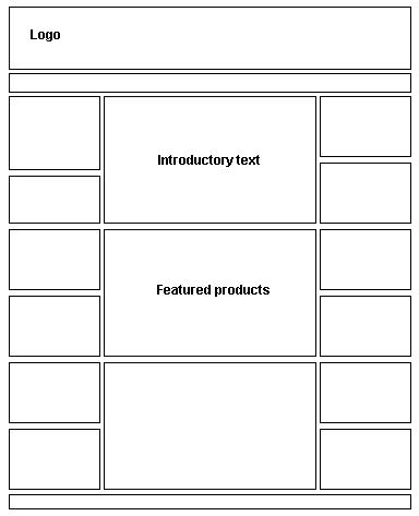
Independent of the layout of the main page, it's recommended to have the following elements displayed there: the logo, main menu links, category tree, quick search box, box with links to information pages, Shopping Cart box, and possibly additional boxes promoting products and hot offers.
The middle area of the main page is very important, as this is what the customers see when they first open the website. Its content, like the design and content of other design elements, depends a lot on the product catalog. It can contain top or featured products, the complete list of all products (if the product range is relatively small), explanation texts and images that will tell the customers what the online store is about, promotion banners, or all this together.
The main task of the main page of an online store is to:
Inform customers about what they can buy on the website
Promote certain products or special offers
The design of the main page should be implemented in a way that will make the customer aware of the logo (brand) of the online store, and also make the customer either read the introductory text of the website, or divert the customer's attention to certain products or categories.
As for customers, the main page of an online store is very important for search engines too, because in most cases, it is the first page a search engine bot can "see" when it gets to the site.
Once a category is selected, the customer can see a new page that contains the list of sub-categories and products.
The following recommendations can be given for the content of the middle area of that page (the rest of the page, header, side columns, and footer would not change too much when navigating from one page to another):
Current category name highlighted in the header of the page, with the path to parent categories, all clickable
Title, description, and picture associated with the category—the picture can be of one of the products that belong to that particular category or to one of its child categories
Several of the most popular products of that category, along with sub-categories
All the products that belong to the category, with navigation controls that allow easy navigation between the products that belong to the category—though it makes sense to hide the navigation controls if all products within the category can be put on a single page
Additional Product Listing filters, if applicable
The design of the search results page is just a bit different from that of the category page. It would not have the sub-categories section. Instead, it would display the search criteria the customer used to find desirable products. This would help the customer to quickly check if there was a mistake in the search criteria if no products were found.
Also, the search criteria box should be pre-filled with the very same query as submitted by the customer in the previous step, to give the customer an opportunity to edit the search conditions if required.
Products displayed in the search results page, the same as on the category page, can be sorted in any way by customers. It is recommended to have a special filter in place that would allow for refining search results and also sorting products within the search results alphabetically, by newest/oldest date range, popularity, or lower/higher price.
Even if there are no results found, the search results page should try to suggest similar searches or at least today's most popular products.
Product listing is a part of several pages, including category pages and search results pages. Product listing in some cases may appear in the main page of an osCommerce online store.
Products in the listing can be sorted in various ways. It makes sense to use featured/not featured sorting by default to promote products marked as "featured" by the Administrator of online store.
Depending on the osCommerce settings of how many products should be displayed per page, and depending on product type, the listing can look like the standard osCommerce product list or appear as a more advanced product grid.
In either case, each product requires a name (or model), image, price, and, if fits into the page layout, description (or set of the most important technical characteristics).
Along with each product, its stock level could be displayed and also the "Buy Now" button—if the product can be bought directly from the Product Listing, i.e. if it doesn't have attributes that should be selected by the customer prior to the purchase.
Indication of stock level makes it possible for customers to see right from the Product Listing which product is and which product isn't in stock, sparing customers one more click into the Product information page.
On the Product Information page, Product Information is an essentially main design element that the customer should be able to see. Product name and product model number (if present) should be displayed across in the top part of the page. It is recommended to use one of the HTML header tags for the product name.
It should be noted that on the Product Information page the customer's attention should be on the product and, maybe, accompanying products. It makes sense to remove banners that advertise anything else but similar products or services from the Product Information pages. The concept here is that the closer the customer is to the purchase process, the less extra information should be shown to the customer. This not only requires banners not related to the specific product or category of products to be removed from the Product Information pages, but also assumes there will be less and less extra information provided to the customer on the Shopping Cart and checkout pages to avoid distracting him/her from the purchasing process.
The price of the product, or rather product prices—as there can be several prices given per product, including RRP price, special price, etc.—are usually displayed under the product name, or to the right of the product name dependending on the design.
It is important to note that the current price should be highlighted (made bigger or of a different color than other prices, like RRP, previous price, etc.), so that the customer would see without a doubt exactly how much the product costs.
The product main image can be displayed aligned to the left or right side under the product name and price. It should give space for the product's short description to be put alongside, so the main product image should not be made too wide. Along with the main product image there could be displayed several additional images. Additional images are usually displayed as relatively small thumbnails, but it's possible to display additional images of the same size as the main product image, depending on the layout of the page and specifics of the product range.
The product description can be shown alongside the main product image, or directly under it. Depending on whether the product has a short or long description, and also if the product has any properties or technical specification that should be made available to customers, they can be displayed in the following order: short description, properties or technical specification, long marketing description. Alternatively, if the Product Information page has tabs, the long marketing description can be put on the first information tab, and the properties or technical specification can be put on the second tab. More tabs can be added: one with complementary products, another with accessories, yet another with information about the manufacturer or product type, etc.—this solely depends on the product type and the amount of Product Information available.
The "Buy Now" or "Add to Cart" control buttons are usually placed along with the product price. If the product's marketing description is supposed to be long, it makes sense to display product price(s) and "Buy Now" control buttons at the bottom of the page too, so that customers do not have to scroll up to buy the product after reading its description.
Manufacturer/brand information in osCommerce is usually displayed as an information box in one of the side columns. That information box should be aligned so that it can be easily seen when looking at the Product Information page. Alternatively, it's possible to display manufacturer information directly in the middle area of the Product Information page. This would include manufacturer name, logo, and can include two links: one to the manufacturer's own website and another to the list of other products that are made by the same manufacturer.
Brief information about the manufacturer and, ideally, the category the product belongs to can be put on the Product Information page for customer's convenience, and also for SEO.
Pressing the "Buy Now" or "Add to Cart" button on either the Product Listing page or the Product Information page adds the selected product(s) to the Shopping Cart. Depending on the osCommerce settings, the user can be redirected to the Shopping Cart page after that, or can stay on the very same page.
This behavior should depend on how many products the online merchant expects the customers to buy from the website at a time. If the customers are expected to buy multiple products at once from the Product Listing (like, for example, an online store that sells beads for jewelry making, or coffee) it's better to leave the customer on the same Product Listing instead of opening the Shopping Cart page each time the customer adds something to the Shopping Cart. On the contrary, if the online store sells, say, home appliances, it's better to open the Shopping Cart page to show the customer its content, calculated shipping fees, and estimated delivery dates, etc.
The default design of the osCommerce Shopping Cart page is not optimal. Here are several suggestions on how to improve it:
Display small product images within the list of products in the Shopping Cart.
Instead of the "remove" tick boxes and the "Update" button it's better to display small "Remove" icons (like little red crosses or waste bins) near each product in the Shopping Cart giving the customers a facility to remove individual products easily.
Ideally, the Shopping Cart page would also display shipping fees, so it would allow customers to specify their location (by selecting country and region within the country or ZIP code) to have the online store recalculate the shipping fees accordingly.
If the Discount Coupons feature is installed, the customers should be given a facility to enter a coupon code and press the "Redeem" button on the Shopping Cart page to see what the order total will look like with the discount coupon redeemed.
Finally, knowing how much all products in the Shopping Cart cost, the delivery fee, and having applied the discount coupon (if any) the Shopping Cart page can display the order total value to the customers, without the need for customers to register or login to find out what the total order amount will be.
As was suggested earlier, control buttons should have different style or colors depending on if they lead the customer to the purchase or not. Therefore, the "Checkout" button on the Shopping Cart page should be somehow highlighted compared to other buttons to make it easier to find on the page.
It's quite often the case that customers and online store owners find the osCommerce checkout process too long and too complicated. This causes confusion and some customers may leave the online store even though they wanted to place an order at first.
Therefore, it's recommended to simplify the checkout process of osCommerce by reducing the number of pages involved in customer registration and the actual checkout process itself.
By default, the checkout process in osCommerce consists of the login page (with a choice to register for new customers and log in for existing customers), customer registration page (for new customers), customer registration success page (for new customers), checkout shipping page (optional, skipped if the online store sells downloadable or virtual products), checkout payment page, checkout confirmation page, and checkout success page. Seven pages all together in the worst-case scenario.
It's suggested to reduce the number of checkout pages to only three: Checkout page, Checkout Confirmation page, and Checkout Success page. Effectively, it means combining customer login and registration, selection of payment and shipping methods, and display of the order total on the same page.
Let's consider the Checkout page.
First of all, it's recommended to display the Product Listing (along with the images and attribute details, if any) at the very top of the checkout page, so that customers will know what they are about to pay for.
After that, it's recommended to display login facilities for existing customers, just an email address and password. But in order to make the page look more compact, login facilities for existing customers can be hidden by default, and can be opened if the customer clicks a corresponding "Existing customers login" link on the page. Once the customer has entered email address and password, the page would refresh with all other fields pre-filled with customer details.
New customers would be asked to enter two addresses: billing address (for invoices) and shipping address (optional for when the online store sells products that can be physically delivered to the customer). There should be a special control button or a tick box that would automatically copy the content of the billing address fields into the shipping address to speed up the process and not make customers enter the same information twice. Alternatively, that option can be ticked by default, hiding the shipping address controls and reducing the page size. Un-ticking the box will un-hide the shipping address controls.
The selection of delivery methods would be updated dependending on the country, region, and ZIP code entered by the customer in the shipping address fields. It is possible to use AJAX technologies to reload available shipping methods and shipping charges for the selected location without reloading the whole Checkout page.
The redeem section for discount coupons could be also displayed on the Checkout page, right before the shipping methods section.
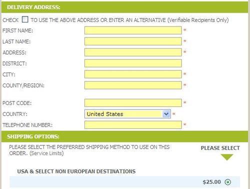
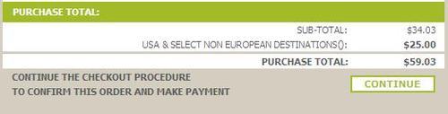
The order total would finish the Checkout page, and would be updated automatically depending on the selected shipping method (and of course taking into account order sub-total, taxes, and discount coupons). Again, it is possible to use AJAX technologies to update order total values.
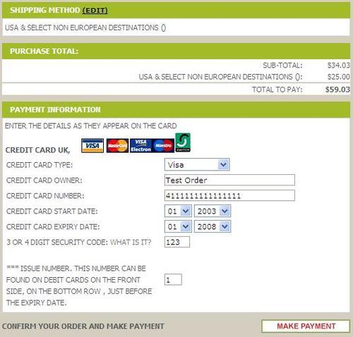
Once the Continue control button is pressed by the customer, the website would open the next page—the Checkout Confirmation page. Basically, this would contain all the same information as the previous page, but it would not be editable, and customers will be expected to check all order information and confirm it is all correct (i.e. the list of products is correct, billing and shipping address information is correct, selected shipping method is correct, and also the entered discount coupon, if any, is correct). Order total values (including detailed explanation of costs) will be also displayed there. As a confirmation of the order, the customer will be asked to enter payment information, so the list of available payment methods will be displayed at the very end of the page, and by selecting one of the payment methods and entering corresponding payment information the customer will confirm the order.
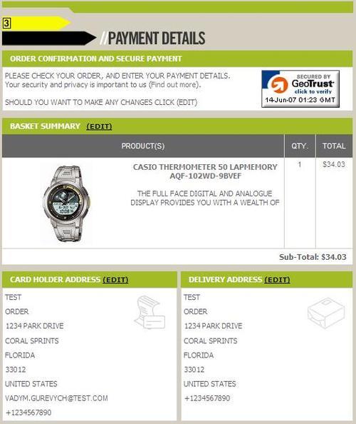
It is important to note that if the website is protected by SSL, a corresponding security seal should be displayed on the Checkout Confirmation page (in fact on all Checkout pages) to improve the customer's confidence in placing that online order.
The third and final page of the optimized checkout process, the Checkout Success page, should again contain the list of products that have just been ordered, billing and shipping address, and order total information. And of course, a message that thanks the customer for placing an order and explains what will be happening with the order next.
There is no known contribution that would allow for such changes in the default osCommerce checkout process. If you'd like to have your online store modified in the way described here, you may want to seek the assistance of a professional osCommerce consultant. Fortunately, there are many individuals and companies that professionally design and develop osCommerce online stores.
After creating an account with an osCommerce online store, and of course after placing an order, the customer gets access to the User Account page. It contains three groups of links: to manage account information (like personal data, addresses, password, or close the account), to view order history (the newest several orders are usually displayed on the main user account page, and the rest are available on the Order History page), and manage email notifications (i.e. subscribe or unsubscribe from the newsletters).
Unless there are some extensive requirements for the user account management, (like some sort of subscription service, or credit account functionality), the standard osCommerce user account pages are well designed and would not require significant changes.
Besides general recommendations about the look and feel of an online store based on osCommerce, recommendations could be given to particular design elements of osCommerce design. Positioning, color schemes, dimensions—all these give an online store a good or bad look, and eventually affect how many of the visitors to an online store become its customers.
The logo of an online store is one of its key design elements. It is present on all pages of the website, and also on its printed documents (like invoices, packing slips, and order details) and downloadable materials (like PDF product catalogs).
The logo is usually placed at the top left corner of the page, or sometimes in the middle of the page header. The logo of an online store should be easy to notice on the page, but at the same time it usually should not be wider than 25% of the page header.
It is important that the logo is presented by an image of the highest quality. It means that if the logo is represented by (for example) a JPEG image, its compression level should be set to such a that has absolutely no affect on the image quality.
The logo may contain a short description, or a slogan of the online store, to ensure that customers will further associate that description or slogan with the logo and with the entire online store.
The color scheme of the online store's logo should of course match the color scheme of the rest of the design elements, or rather vice versa, as the logo is the most important part of the online store's identity, and its colors and style should be used when creating other elements of design.
The main requirements for the fonts used throughout the online store is to make it very easy for customers to read and understand textual information from the web pages.
Therefore, the font style and size should allow for easy reading.
It's not recommended to use fancy font styles unless its a strict requirement; however nice and artistic they look, they may make the reading experience more difficult for some customers.
Also, small letters can make it difficult to read textual information from the pages for quite a number of customers, or big letters will make it impossible to put enough textual information on the pages without breaking the layout.
Using all large caps in the textual information may not work as the customers would not be able to concentrate on a particular highlighted part of the text, because all the text will be highlighted in that case. The same applies to highlighting text with bold or italic font styles; only certain parts of the text can be highlighted in that way to grab customers' attention.
The colors used to display text should provide an easy reading experience to the customers. So, the text colors should be always checked against the colors of the background where the text is to be displayed. Customers should not experience any difficulties reading textual information from the web pages because the text colors are very similar to the background colors or the contrast between text and background colors is too low. For example, light gray text on a whiter background, or light green text on a gray background will be difficult to read.
At the same time, a part of the textual information that is not very important and is placed on the web pages for general information purposes or legal purposes only can deliberately use a color that will make it almost unnoticeable on the pages, especially compared the important information, such as product description, terms and conditions, etc. This is done not to hide that information, but rather to avoid drawing the customer's attention away from the products.
As said above, different font sizes and colors can be used for prices, to indicate which is the current price and which is the previous or RRP price. Customers should not have any doubts about that the current price should be always highlighted relative to any other previous or RRP price displayed alongside.
The Quick search box is especially important where there are many products in the product catalog, and when the product names and product description contain keywords that many of the prospective customers would use to find such products in the product catalog. If there are only a few products in the database (say less than 20), it doesn't really make sense to occupy the space on the screen with the Quick search box at all.
The quick search box can be added into the header of the online store pages or even into the horizontal bar below the header, usually on the right-hand side as the left corner is usually occupied by the logo. This will ensure that the customers always have access to the Quick search facility, whichever page they are browsing at the moment.
It can be placed into the left side column, usually as the very first information box, over the box with the category tree. Again, this makes sense when there are too many entries in the product catalog and prospective customers are expected to know keywords associated with certain products, but may not know where to find such products in the category tree.
The Quick search box can be placed into the middle area of the website pages, at the very top. This will ensure the search box is one of the first design elements that customers see when they first open the website pages. This can be done to push prospective customers to use the search facility rather than the category tree or other means of navigation.
Finally, it can be added to the right side column, either to the top or the middle. This approach will make customers concentrate on using the category tree and other means of navigation rather than using the Quick search box.
The Quick search box itself should not be put very close to other design elements, so that it can be easily noticed by customers.
It should not be made too short, so that customers can type longer keywords or key phrases consisting of several keywords without losing any part of the search string.
Ideally, the auto-suggest feature should be implemented for keywords, as was described in previous chapters (there are several contributions for osCommerce that allow for this functionality).
Some sources recommend setting auto-focus onto the Quick search box when the page is loaded, though this may not be applicable to a particular online store.
If there are many entries in the product catalog (several thousand entries for example), it will be a good idea to give customers a facility to pre-filter search results by top categories, so along with the search box there will be a drop-down menu with category names, and the search results will be limited by the selected category.
Finally, pressing Enter should initiate the search process in the same way as pressing the Search button. The search button should always be present there. It's recommended to simply use the "search" as the name of the button, and not a graphic icon. It will make the function of the Quick search box more prominent to customers.
The shopping cart box is used to display the content of the Shopping Cart to the customer, or to display general information about what's located in the customer's Shopping Cart without actually displaying it in detail there.
The shopping cart box in osCommerce is usually placed in either the header of the page or the right side column. If placed in the header, the Shopping Cart box doesn't usually display the actual content of the Shopping Cart, but only the number of products in the cart and total order amount. There should be a link added there to lead the customer to the Shopping Cart page. There can be also a link for the Checkout page there, which will skip through the Shopping Cart page and redirect the customer directly to the login/checkout pages.
Sometimes an osCommerce online store will display a corresponding icon (shopping trolley) instead of displaying the name of the information box. A better practice would be to display both the icon and the actual name of the shopping cart box. Both the icon and the name should be made clickable and should lead the customer to the Shopping Cart page.
If the shopping cart box is put into a side column (and it makes sense to put it into the right-hand side column, at the very top of it), its look and feel will change slightly.
First of all, the list of products that are currently in the Shopping Cart may be displayed there. Depending on the width of the column and correspondingly the width of the shopping cart box, it may or may not contain a very small thumbnail for each product. It will also contain product name and quantity. In default osCommerce, the link on each product actually leads the customer to the Product Information page. It can be changed and lead the customer to the shopping Cart page instead. Along with each product it's possible to display a small "Remove" icon (as a tiny red cross for example) to make it easier for customers to manage the content of their Shopping Cart.
The current order total can be also displayed in the shopping cart box, or a sub-total (depending on whether the shipping fees and taxes are known).
In the very bottom of the Shopping cart box, it makes sense to display a security seal and/or logos of the payment methods accepted by the online store (credit card logos, PayPal logo, etc.).
If the customers are expected to have a significant number of products in their Shopping Cart, and the rest of the information boxes in the right side column contain some important information, the shopping cart box may have to be shortened. The product listing may be removed from it in exchange of the total number of products and total price if the number of products in the Shopping Cart is greater than a certain predefined value (five for example). In that case the shopping cart box will display the Product Listing of not more than four products, and as soon as the customer adds one more product to the cart, the list of products will be changed to a piece of text that informs the customer about the total number of products in the Shopping Cart and their total price.
Again, both shopping cart box icon and title should be linked to the Shopping Cart page for user convenience.
Currency and language selection are implemented as two separate information boxes in osCommerce. They are usually placed in the right side column of an online store.
But quite often, an online store only trades locally, and in that case would only accept one currency and would not have more than one language. Therefore the currency and language boxes would become redundant and could be removed to save the page space for more important information.
If the online store accepts multiple currencies, the currency box can be placed right under the shopping cart box, so that customers could easily switch the currency and see order total values in the preferred currency. The currency box by default contains a drop-down box with the list of all accepted currencies. Selecting any currency from the list causes automatic page reload, and all prices change according to the selected currency. This method seems optimal for changing the current currency of an osCommerce online store. Alternatively, clickable currency icons could be displayed in the Currency box, and clicking an icon would change currency selection in osCommerce and also highlight the clicked icon.
To allow customers to switch between multiple languages, osCommerce has a special Language box. It's usually placed in the right column, and contains flags for all installed and enabled languages. It can be improved further. First of all, it doesn't necessarily have to be put into the right side column, but can be added to the header of pages of the online store. Instead of a drop-down box there will be clickable language icons.
In order to improve usability, it's better to add hint texts with the name of each language to the corresponding language icon. Also, it's better to have the currently selected language highlighted while other language icons are pale, so that the customers can easily see which language is currently selected.
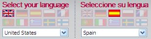
It should be noted that osCommerce can automatically set the default language based on the customer's browser's locale settings. Also, a language in osCommerce can be associated with its default currency. If a corresponding option is enabled in osCommerce, changing the language also automatically changes the currency.
The so called "Breadcrumbs" design element is intended to help customers with navigation through the product catalog when they are browsing through sub-categories.
It contains the category path, starting from the very top-level categories down to the currently selected sub-category, plus it may also contain the currently selected product.
This design element is usually present on almost all pages of an osCommerce website, in the header of the page, and is aligned to the left.
In osCommerce's default design, this element may not be very noticeable. This can be improved by making its colors more contrasting and also by making its font size a little bit bigger than in the default design. It can be also moved to the top part of the middle area of the pages to make it even easier to find if the prospective customers are expected to often go deep into the category tree and then come back to categories of previous levels.
The standard breadcrumbs feature can be improved further by turning it into a fully functional navigation panel. It will be then moved into the top part of the middle area of osCommerce pages, and, besides the trail of categories will contain Previous and Next links (or control buttons). Those links or buttons will work differently depending on the content of the page:
On the category details page, they will navigate back and forth between the sister categories of the same level in the category tree.
On the product details page, they will navigate back and forth either between the sister products of the same parent category, or between the sister products of the same search results.
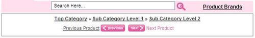
Along with the links or control buttons, it makes sense to display the actual names of the corresponding previous or next category or product—it will make the navigation easier and more predictable for customers, and will also work well for SEO.
The category tree is one of the key navigation elements of osCommerce design. But before suggesting on how it should look and where to put it on the pages, let's consider the case when the category tree becomes redundant and can be excluded from the design completely.
If there are few products in the product catalog, and if the products are all similar or can be all listed in one page without the need to implement Previous and Next navigation controls—the category tree is not required, and can be totally excluded from the design to make it look simpler, and to save page space for other design elements.
The category tree, if placed in a box, is usually located in the left side column of an online store based on osCommerce, either at the very top of the column or after the Quick Search box.
Some designs have the tree of categories (or at least the very top categories) replicated in the header of the web pages as tabs, so that the customers can have access to the categories from absolutely every page of an online store. This approach also gives customers a clearer feeling of browsing through departments of the online store, where each department (category) is visually separated from others by a separate category tab.
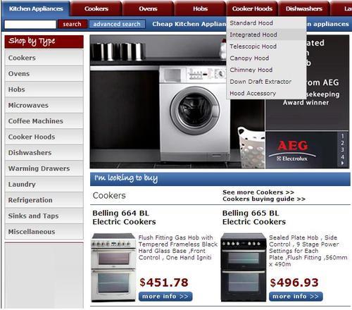
The regular osCommerce category box contains the tree of categories. Clicking on a category reloads the page and opens its sub-categories in the box and also in the middle area of the page. Each category by default displays the number of products within itself or within its sub-categories. Actually, this number of products is of not much use, and can be disabled to make the category box look more consistent (and much faster—as then the online store will not have to query the database to find out the number of products in each category and its sub-categories every time the category box loads up).
If there are only a few categories in the category tree, and all are top categories, it is possible to show a special graphic representation of each category in the category box. This is not too good for SEO, but can improve the look and feel of the whole website. But in most cases, categories in the category box are displayed as text links.
If there are multiple categories and sub-categories of different levels, several solutions can be used.
First, the category tree can be implemented as a set of pop-up menus that pop up when the customer hovers the mouse cursor over the corresponding menu. Each pop-up menu is a category (with a link to the category details page), and it may contain sub-menus for sub-categories. It should be noted that this approach requires special JavaScript to be embedded into web pages (or a special CSS file), and, although it seems to be a good solution for product catalogs with two or three levels of sub-categories, it may not be suitable for larger product catalogs with more category levels.
It is important to note that the pop-up menu approach is very good for search engine optimization in terms of forwarding search engine bots from the main page of the online store directly to all pages of its categories and sub-categories. It should be noted that to make it search-engine friendly, the menu should not be built using JavaScript, but simple HTML lists and proper CSS instead. This way search engine bots will actually be able to reach Product Listings under each category or sub-category of literally any level directly from the main page. And since the main page usually has the highest page rank, its page rank will help to give higher page ranks to category and sub-category pages, and also, which is the most important, to the pages of individual products!
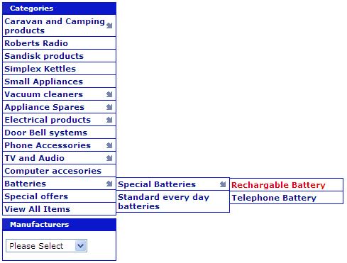
If there are many categories of different levels in the product catalog, the category box may only contain top-level categories in the beginning. Then, when the customer clicks any of the top categories link, the category box may change to only display the "child" categories of the selected top category. When the customer selects one of those "child" categories, the category box changes again, displaying "child" categories of the selected sub-category, and so on. The online store should of course contain links to categories of higher (parent) levels at any moment of time—the breadcrumbs feature can be used.
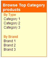
A variation of the latest approach would be not only to display top categories in the category box from the beginning, but also display one to two of the most popular sub-categories for each top category.
In order to improve navigation, an additional Filter box can be introduced when there are so many products in the catalog that standard navigation and search facilities are not enough.
A typical Filter box would usually contain filters that allow for limiting the current selection of products (either in a category or in the search results page) by product type, manufacturer (brand), price, and other properties.
The Filter box can be displayed in either of the side columns (preferably in the left-hand side column close under the category box if the latter is not too long, or even above the category box if it contains too many categories),
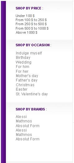
or in the middle area of the page, right over the Product Listing.
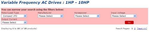
The Filter box may contain drop-downs with filter values and a "Filter" button, or clickable filter values, as links that immediately filter the Product Listing, whether it was a filter by product type, manufacturer, price or a filter by any of the product properties.
Customers should be given a facility to log in to their accounts, or register for a new account in the online store. Corresponding links to "My Account" are usually placed into the header of the online store's pages. They can be also placed into the very top part of the header:
or at the part of page header where other links are located (and where the breadcrumbs are also displayed):
Some online stores display the login facilities in one of the side columns (usually in the right side column).
Once the customer is logged in, a new link should appear called "Log off".
Actually, the link that leads the customer to the account pages should be enough. Even so, some online stores have a special information box, usually in their right column, where they duplicate the links the customer would see on the My Account page—links to the account management pages, to the address book management pages, to order history, and subscription management pages.
Control buttons should be distinct from other design elements on the pages of an online store. They can be split into at least two classes: general control buttons, and buttons that lead customers to the purchase.
Those buttons that lead customers to the purchase should be made brighter with more solid colors to ensure the customers can always easily find them on the pages. Such buttons would be:
"Buy now" on either Product Listing page or Product Information page
"Checkout" on the Shopping Cart page
"Continue" on the checkout pages
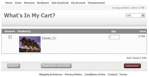
Control buttons in osCommerce are usually located in the bottom of the middle area of the page. However for example in the case of the Product Information page, it makes sense to duplicate control buttons in the header and in the footer of the main area of the page to make it more convenient and easier for customers to add products to the Shopping Cart.
Those buttons that assume further action should be aligned to the right side of the page, and buttons that assume return to the previous page or to the previous level when navigating through the product catalog should be aligned to the left side of the page. Such alignment will make navigation more obvious and comfortable for the customers.
osCommerce comes with a number of standard images that are displayed on all sorts of pages, for example on the Main page (the "What's new here?" icon), on the Shopping Cart page (the "What's in my Cart?" icon), the icon on the Login page, and so on.
Actually, those standard images had better be removed from the design of an online store completely; they are unlikely to match any design integrated into an osCommerce online store.
osCommerce generates certain messages (information, warnings, and errors) and those messages are either displayed on the pages of an osCommerce online store, or are displayed in pop-up message windows.
While message windows are displayed in a standard manner for websites, the warning and information and error messages that are displayed in osCommerce pages can be improved.
First, it's the font size of those messages. By default it's too small and should be increased to make it easier to read the messages, and make the messages look more prominent.
The background of the messages can also be changed to make it clearer for customers whether an error has occurred, or if it was a warning or a general information message or a notification.
Also, the tiny icons associated with messages can be improved too, again to make it easier for customers to understand what kind of message they are seeing on the page—whether it is a warning, an error, or a notification.
Design of an online store can affect the page load speed of every page. It can also affect the workload that is put on the web server by the online store. Of course, optimized SQL queries and PHP scripts are very important too, but both the speed of the website and optimized server performance depend a lot on the design.
Page load speed is very important especially for an online store, simply because customers do not like waiting. Customers of an online store may not want to wait more than just a few seconds (about four to eight based on different pieces of research) before they can see the content of the page.
Of course, if the page load time can be minimized to, say, one to two seconds that would be an ideal solution for an online store. But if it takes more than ten seconds to load a web page (irrespective of whether it's the Main page, Product Listing or Product Information page), the customers may choose to leave that online store and try another one.
Page load speed depends on how fast the database is, how fast the PHP scripts that query the database are, and on how large the resulting HTML page that is sent to the customer's web browser in response to the query is. Here, how large means how large the HTML itself is and how large all images and other objects embedded into HTML are, i.e. how large a total amount of data is to be downloaded to the customer's computer by the web browser over the Internet.
Of course the time required to download one and the same amount of data depends on the customer's Internet connection speed. So it would be of great help to know what is the average Internet connection speed of customers that belong to the targeted audience. Sometimes, the targeted audience are supposed to have only high-speed Internet connections, and the size of web pages will not be that critical.
But in all other cases, it's better to have web pages optimized in terms of their size.
Page load speed can be measured by free tools available in the Internet. Like, for example http://www.websiteoptimization.com/services/analyze/. It takes the entered URL and opens it several times, finding the average page load speed and reporting how much time it would take to load the page if the customers had Internet connection of various speeds (from modem to T1 connection). What's more is that the service reports on the size of certain parts of the page, such as pure HTML size, size of images, size of CSS files, etc.
It lists all page objects sorted by size too, so that it's possible to see which page elements cause the page loading to be slow.
There are several ways to optimize the page load speed of an osCommerce website (besides optimizing the database and PHP scripts of course):
osCommerce cache should be used where possible, to allow the web server to simply use cached parts of the page—such as the category tree for example, instead of generating corresponding HTML every time by querying the database.
Wherever possible included files should be used (JavaScript files, CSS files, just parts of HTML design that are not likely to be created using some data from the database) so that web browsers could use their own cache management facilities.
GZip compression can be turned on, so that all pages will be automatically archived on the web server before sending them to the web browser; this will decrease the page load time, but will put a certain workload on the customer's local computer (to open archived data) and on the web server.
Experiments demonstrate that considerably less workload is required to archive web pages than to push complete pages to the web browsers—in the latter case, when a lot of customers are browsing through an online store, the web sever may become overloaded and start responding slowly on further requests.
Product images should be made "lighter", i.e. thumbnails should be created for all product images and thumbnails should be used on Product Listing pages, and also in the information boxes through the whole online store.
The brand of an online store should be carried throughout the whole website. Actually from the visual point of view, brand would consist of the online store name (often the same as the domain name), logo, color scheme, and specific style of design elements.
It's an obvious requirement that those elements of the brand would not change when the customers browse from one page of the online store to another. The brand of an online store, the style of design elements through all pages and documents of an online store should be made consistent.
A recognizable brand can help an online store receive more orders from returning customers in the future, and also from new customers referred by existing customers.
A recognizable brand is easier (and cheaper!) to advertise.
Elements of the brand can be also added into emails and newsletters to improve brand awareness.
So the logo can be made a part of the HTML email template, and emails and newsletters can use a color scheme that resembles the online store design.
Email notifications (like customer registration, order confirmation, and order status updates) and also newsletters sent from the Administration panel of an online store can all use the same color scheme as the online store itself, and also use similar design elements.
All downloadable and printable documents that customers can receive from an online store (such as invoice, order details, packing slip, and receipt) can resemble the look and feel of the online store.
At the very least, those documents should contain the same logo as the online store, and ideally use similar font styles too.
Such documents can be downloaded as PDF files, and also printed directly from pages of the online store, or received along with order confirmation/status change notification emails.
It's not only documents related to an order that can be downloaded from an osCommerce online store, but also the entire product catalog or its parts (like information about an individual product) that can be made downloadable (preferably in PDF format) from the website.
By allowing customers to download a product catalog or individual product brochures, and by having those PDF files designed in a similar way to how the online store is designed, the following can be achieved:
Better brand awareness, affecting the customer who downloaded the product catalog or brochures, and also friends, colleagues, and relatives of the customer to whom the customer may show the downloaded brochure
Increased number of orders from those customers who were not ready to buy products immediately but needed some time to think and discuss the purchase with their partners or colleagues
The following elements should be included into downloadable product brochures:
Logo
Online store name
Color scheme that resembles the one used by the online store
URL of the online store and of each individual product or category page
Physical address and contact details (like telephone number, FAX, etc.) of the company behind the online store, ideally along with a map that would help customers find their way (if there is a showroom where the same products as can be ordered from the website, can be purchased by customers)
For each product or category there should be its name, description, URL on the website, model number (if any), main image and additional images, if any, key properties (if any), variants (if any), and price together with the date of when it was valid—this is very important since the customer may come back to the online store or come to the showroom days, weeks, months after the product brochure was downloaded and of course the price may have changed since then
The best way to generate a downloadable product catalog or product brochures would be to have them generated by a special scheduled script that would update PDF brochures nightly.
At the same time, should any product be changed from the Administration panel, the changes (either in its availability, name, description, price, etc.) need to be reflected in all downloadable content as soon as possible.
Therefore, a special button or menu item can be implemented in the Administration panel that would initiate the update procedure for all affected PDF downloadable documents.
PDF brochures would be linked from pages of an online store. A link to the complete product catalog can be put into the information box of the website, and links to individual product brochures can be added to Product Information pages.
This is not only good for customer confidence and for brand awareness, but also good for SEO, as search engines will index PDF brochures as well as they index other pages of the website, and links to the website and its PDF brochures will more likely appear in the search results, as keyword density in a PDF brochure would be even higher than on an individual Product Information page (because there are other design elements in HTML pages, and nothing but textual content and related product images in downloadable PDF documents).
Those banners that the online store uses to advertise itself on other websites should also be designed in a way that makes it impossible not to notice its brand. Therefore, ideally the logo of the online store (or at least its name) would appear on such banners, along with the special offer information or new product information.
The default osCommerce installation comes with a pre-integrated relatively simple design. Usually, online stores based on osCommerce require redesign before they can be launched and start receiving orders.
But what if after some time the design of an osCommerce online store needs to be changed or updated again?
Obviously as an online store develops, its design changes slightly; some design elements are removed, some added, some change position on the pages or change their style.
But there are certain cases when the design of the whole online store should be changed almost at the same time, or when an online store should have several variants of design, each used for its own purpose:
To test new design ideas it is better to have a copy of the current design where it is possible to add, delete, change design elements, colors, styles, etc.
To change design promptly in accordance with the latest promotion actions and marketing ideas.
To run an e-commerce solution consisting of several front ends linked to the same back end, where each front end can have its own design or share the same design template among several front ends.
To update the design of an online store seasonally (like adding some Christmas characters and snowflakes in winter, adding bunnies and chocolate eggs at Easter, implementing spring, summer, autumn, and winter moods, etc.).
To support a multi-cultural system where customers who come from different countries or regions are presented with different designs.
Design templates are the best way forward when the task is to be able to change design instantly, or to support several designs at the same time, or test new design ideas without affecting the design of the production online store.
Design templates allow the separating of design from the business logic of an osCommerce online store, where one and the same set of PHP scripts implementing business logic and communication with the database can be connected with one of several different design templates "on the fly".
A freely available contribution called STS allows for having the design templates concept implemented in osCommerce. The contribution can be downloaded from http://addons.oscommerce.com/info/1524. Its installation requires quite some modifications of an online store, so it's better to assign a professional osCommerce development company to integrate it. Note that once STS has been installed, installation of other contributions may not be as straightforward as described in installation manuals as STS, in fact, changes the way that osCommerce works from the inside, splitting what can be called "default osCommerce" into two parts: business logic and design.
Design is an important part of an online store. It not only makes the user's browsing and buying experience pleasant, but also can help improve online sales.
osCommerce comes pre-designed, but most online merchants may find it beneficial for their online business to have their osCommerce online store redesigned so that the site matches the corporate identity design, product catalog, or target audience, or a combination of these.
The design of an online store should be created in a way that it helps customers finding products they are looking for, and making a purchase.
osCommerce design should be made compatible and good looking on any customer's screen, irrespective of the customer's screen resolution or web browser used.
It's the design of an online store that can help to break into international Internet markets, besides of course support for multiple currencies, languages, and payment and shipping options.
Page load speed affects sales, and osCommerce design should be optimized to allow for fast loading pages (of course along with the optimization of the database and PHP scripts).
An online store may benefit a lot from having a design that can be easily changed. Design templates for osCommerce is the right solution that can help change the design easily without changes in business logic, testing new design conceptions, support promotions, and advertisement campaigns.
In the next chapter, we will review how sales can be improved in osCommerce by improving the product catalog.