CHAPTER 10
Choosing the Right Chart Type
Understanding the purpose of different chart types will help you decide which visualization to use for your data in order to communicate information most effectively. Bar charts and line charts are well documented in most data visualization books and you will find them in most of the chapters of this book as well. This chapter will focus on the charts that are not discussed as often, several of which have sparked a lot of discussion in the Makeover Monday community. Each chart type will have four sections:
- Purpose
- Description
- Examples
- Alternatives
There are several examples of each chart type and then alternatives that can be used in a similar situation. This chapter can be used as a visual reference library for these chart types. By the end of this chapter, you should have a better understanding of why certain charts work better than others. Finally, we will provide resources that describe chart best practices in detail.
Area Charts
Purpose
Show cumulative trends over time of one or more attributes of a field.
Description
Area charts are line charts that are typically stacked on top of one another, creating a cumulative view. The area below each line is filled down to the section below, with the lowermost section filled down to the zero axis. Area charts are useful for understanding:
- The contribution to the total
- The trend of the lowermost segment
- The trend of the total, which is represented as the top of the area chart
Area charts are problematic when trying to evaluate the trend of contribution of any segment other than the lowermost segment as each segment’s pattern is affected by the contribution of every other segment below it. See examples in Figures 10.1–10.5.
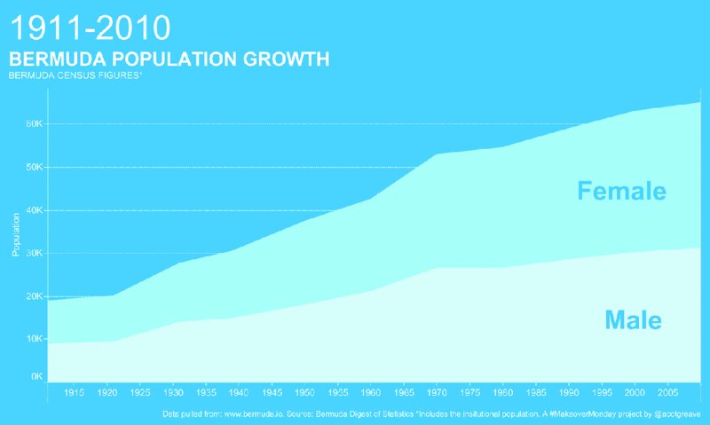
Figure 10.1 A stacked area chart makes the total and the lowermost attribute (male) easy to understand but can hinder our understanding of trends for other attributes (female).
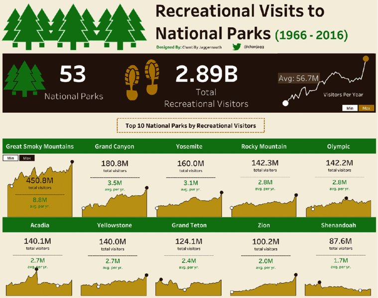
Figure 10.2 Individual area charts show trends for each National Park clearly and their proximity allows for comparisons between parks.
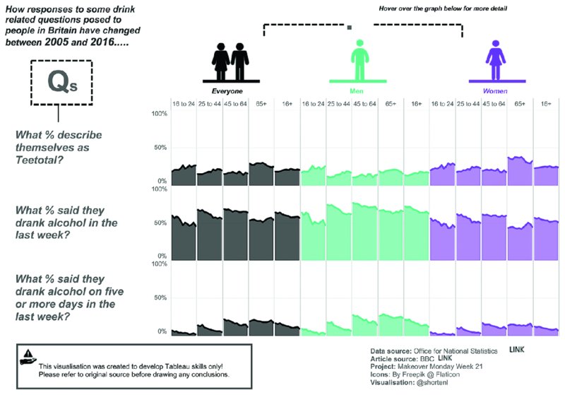
Figure 10.3 Individual area charts color coded by category let the audience compare differences quickly.
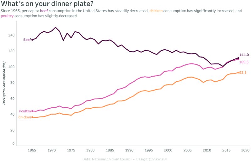
Figure 10.4 A line chart highlights only the actual data points without the shading of the area below the line and helps to compare different categories.
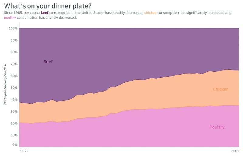
Figure 10.5 A percent of total area chart gives the top and bottom area a horizontal reference line (0% and 100%), which helps identify trends.
Examples
Alternatives
Stacked Bar Charts
Purpose
Show how members of a field contribute to the total.
Description
When attributes of a field are placed above one another in a bar chart, the top of the bar represents the overall total. Stacked bars are useful for understanding the contribution of segments to the total bar. Stacked bars are most effective when they allow for comparison of common parts across multiple segments.
Stacked bar charts are best when displayed vertically and should contain no more than two to three segments. Including more segments makes the chart harder to understand and hinders meaningful comparisons between segments. See examples in Figures 10.6–10.11.
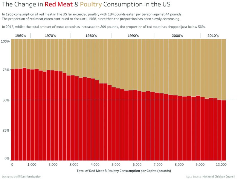
Figure 10.6 A stacked bar chart scaled to 100% shows the contributions of two categories to the total very clearly.
Figure 10.7 Comparing the contribution of the white bars is difficult because their starting point depends on the differing length of the green bars.

Figure 10.8 Using gray reference bars sized to 100% gives your data the appearance to “fill up” the reference bars.
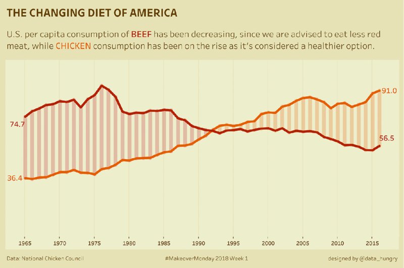
Figure 10.9 Vertical bars between two lines of a line chart highlight the differences between the two categories.
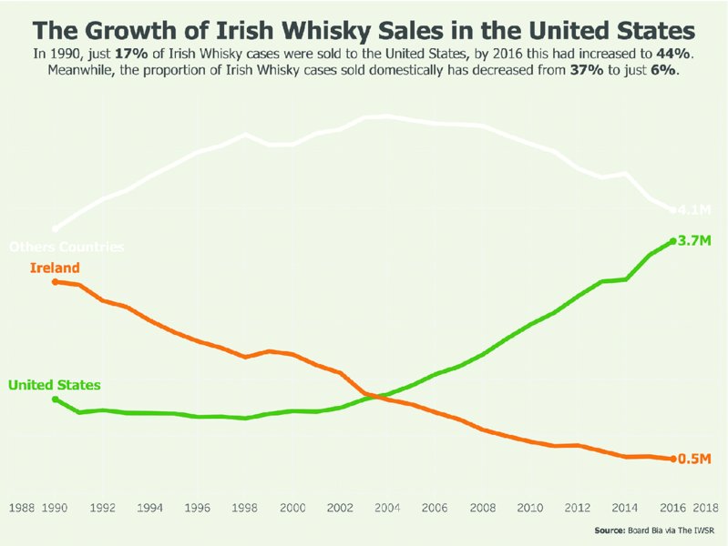
Figure 10.10 In a line chart, trends over time become easier to see than in a bar chart and comparisons between lines can be made with ease.
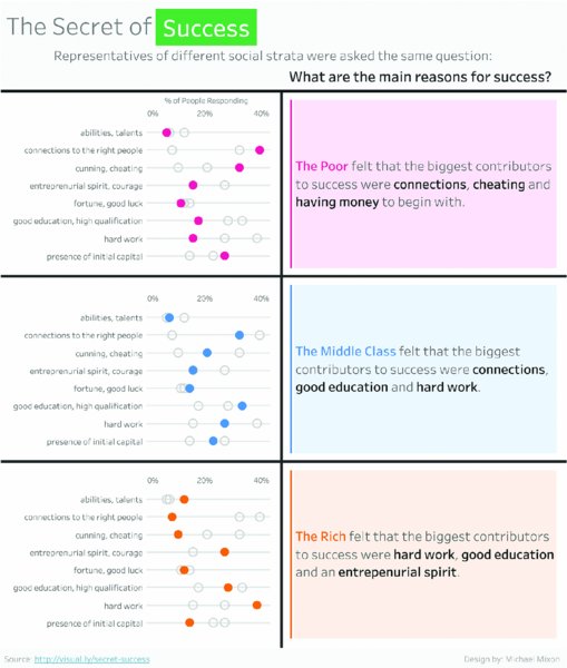
Figure 10.11 A dot plot moves the focus to the rank of each member within each category.
Examples
Alternatives
Diverging Bar Charts
Purpose
Show the spread of negative and positive values (e.g., customer sentiment regarding a product) or compare two attributes of a field along a common scale (e.g., male versus female by age).
Description
Diverging bar charts can be a good alternative to side-by-side bars or stacked bars. The bars point in opposite directions typically along a continuous scale (e.g., age, salary, year). When the chart splits a single field into two parts (e.g., Republican versus Democratic voters by income level), the chart is also known as a spine chart. See examples in Figures 10.12–10.18.
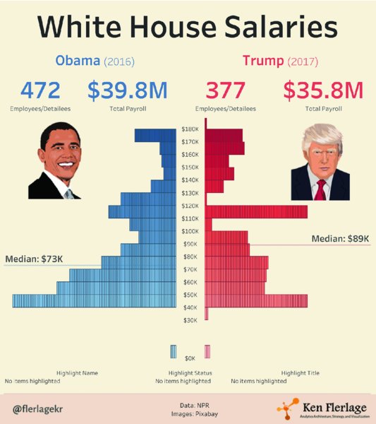
Figure 10.12 A diverging bar chart is useful when visualizing two opposing concepts, such as two political parties.
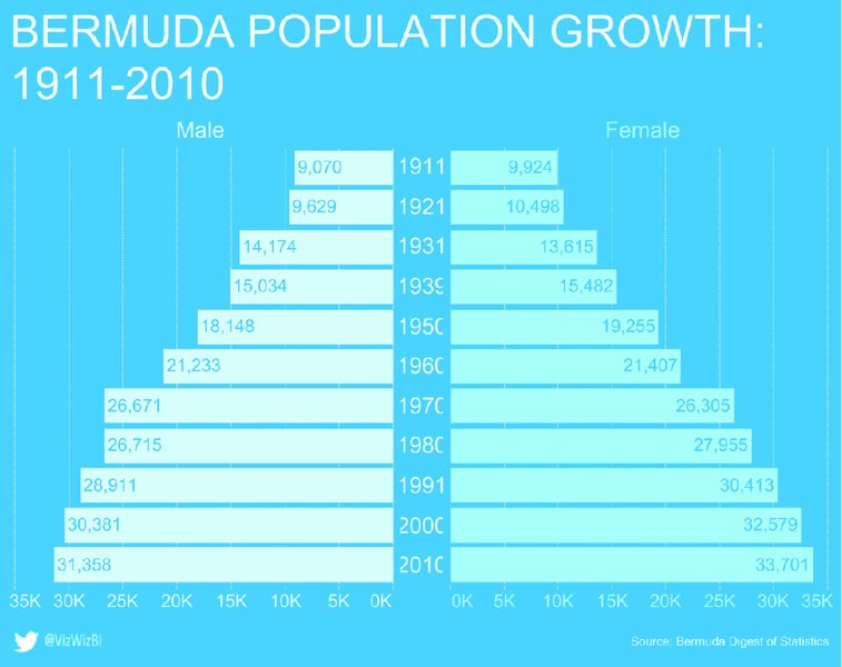
Figure 10.13 Labeling each bar with its numerical value makes the data more precise.
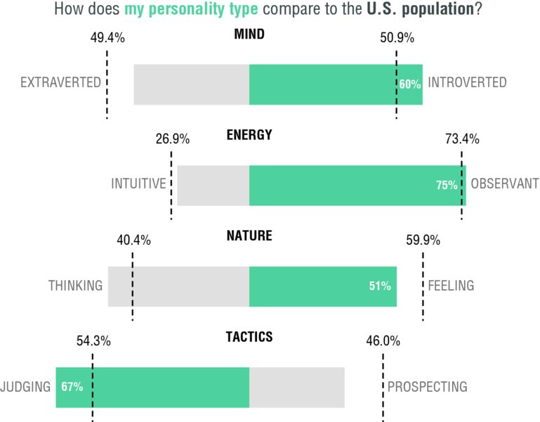
Figure 10.14 Highlighting in a diverging bar chart helps bring focus to the larger segment.
Figure 10.15 Shading the area between two dots in a diverging dot plot highlights the differences between the sides effectively.
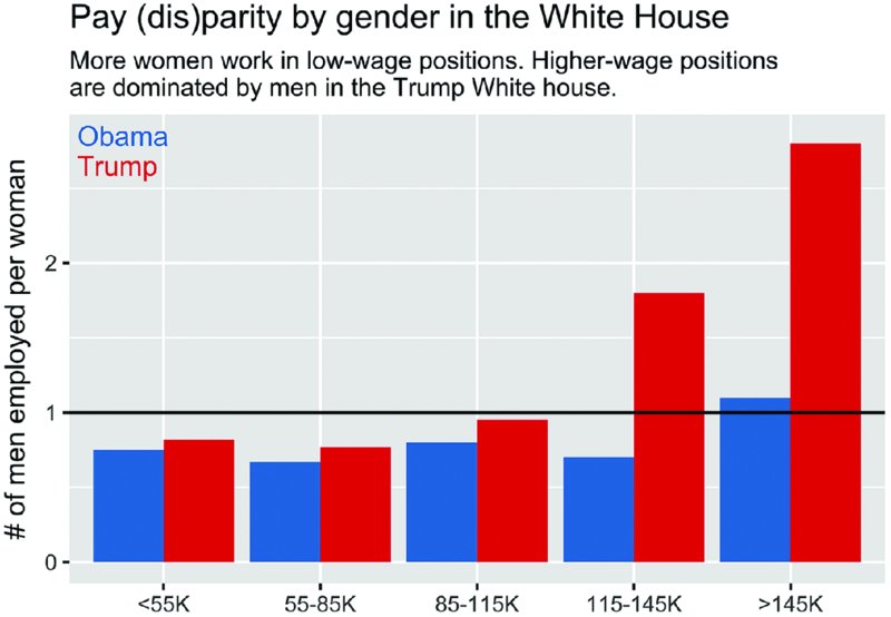
Figure 10.16 Grouping bars that should be compared together makes analysis of differences between two or more categories easier.
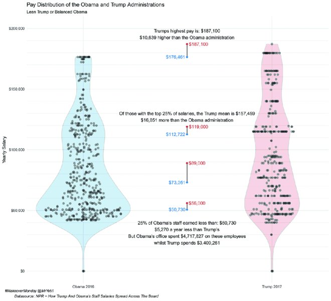
Figure 10.17 A violin plot is an effective way to visualize overall distribution of data and the detailed data points.
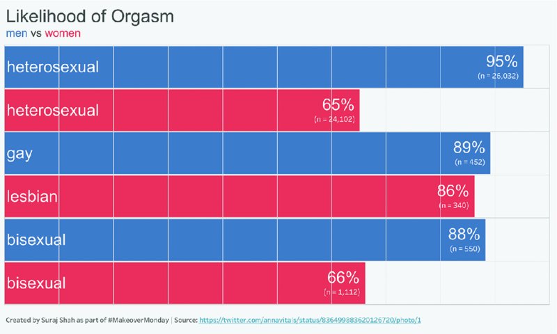
Figure 10.18 Vertical lines break these bars into 10% segments and help with comparisons across categories.
As a best practice, ensure that both sides of the chart are scaled the same, otherwise the reader might misinterpret the data.
Examples
Alternatives
Filled Maps
Purpose
Proportionally shade geographical areas by a data variable; also known as choropleth maps and thematic maps.
Description
Filled maps are used when the location of the data is the most important. Map locations are predefined and data is typically displayed as a proportion of a single variable to all geographical areas displayed or as a ratio of two variables within each area.
Filled maps are a popular visual display of data as they are familiar to the average user and visually pleasing. While data of a single variable can be displayed (e.g., population), a preferred visual display would have a common baseline (e.g., income per capita). Small geographical areas can be hard to compare to larger areas on filled maps. For example, comparing the color of Rhode Island to Texas in Figure 10.19 is harder on the user and because Texas is larger, it will be perceived as darker even if the values are the same.
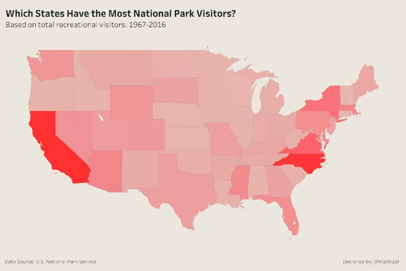
Figure 10.19 Filled maps make it difficult to see and compare small areas to large areas, because larger regions or states typically dominate the map.
If using a single variable that is always either positive or negative (e.g., number of visitors to national parks), then hues of a single color are preferred from light to dark or dark to light. If the variable spans a common midpoint (e.g., profit above or below zero), then a diverging scale of two colors is useful to distinguish the range of colors. See examples in Figures 10.20 and 10.21.
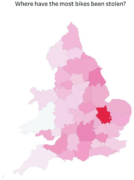
Figure 10.20 A single color in different levels of intensity is applied for a single metric in this filled map to show impact on different regions.

Figure 10.21 A diverging color palette can be used when a clear midpoint exists for the measurements in the data, such as the classification of good and bad drivers in this map.
Examples
Alternatives
There are many ways to visualize geographic data either to display distribution patterns more effectively or to give the different areas equal weight. See examples in Figures 10.22–26.
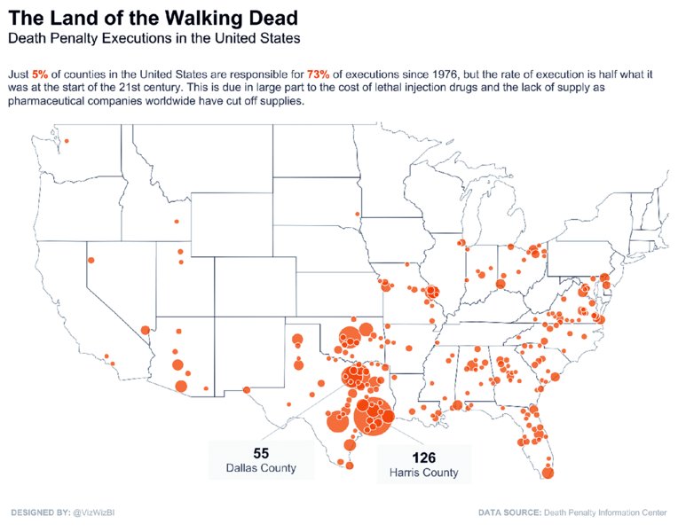
Figure 10.22 Bubble plots are useful for showing geographic distribution of the data. Bubbles are sized by a single, common metric.
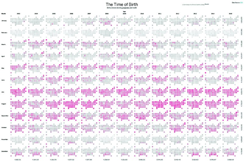
Figure 10.23 Small multiple-tile maps present patterns over time (left to right) and throughout the seasons (top to bottom).
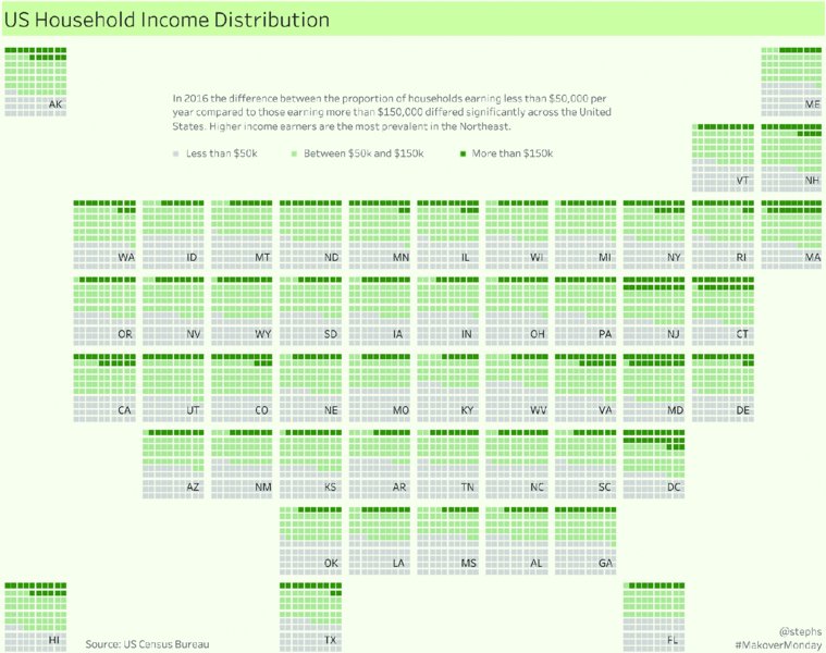
Figure 10.24 A tile map waffle chart shows each state through an equally sized square, filled according to a single metric.
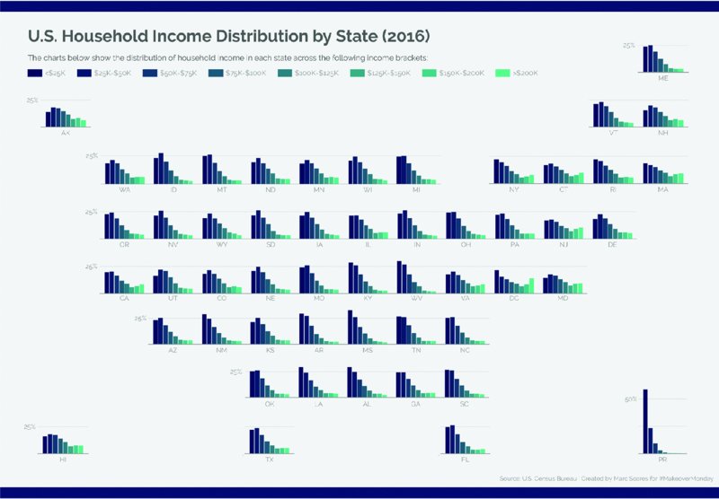
Figure 10.25 The tile map bar chart also gives each state an equally sized space and effectively highlights income distribution through colors and bar length.
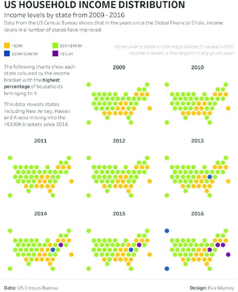
Figure 10.26 Multiple hexagon maps show changes over time, allocating an equally sized hexagon shape for each state.
Bubble Map
Time Series Tile Map
Tile Map Waffle Chart
Tile Map Bar Chart
Hex Map
Cartogram Map
A cartogram, as seen in Figure 10.27, is a map in which some thematic mapping variable—such as travel time, population, or gross national product—is substituted for land area or distance. The geometry or space of the map is distorted in order to convey the information of this alternate variable.1
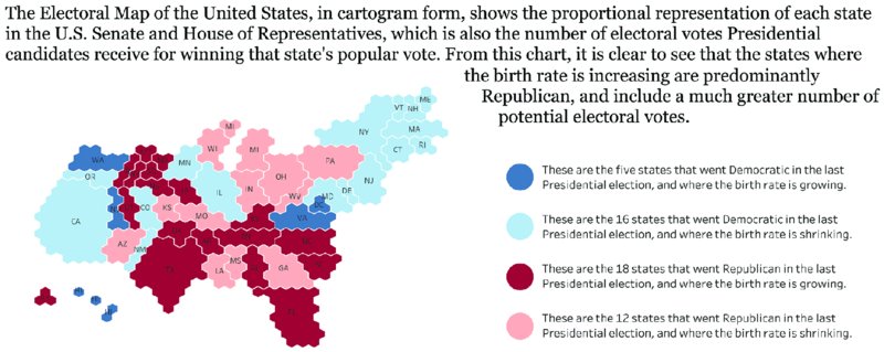
Figure 10.27 This cartogram shows each state clearly while sizing them according to the number of electoral votes.
Donut and Pie Charts
Purpose
Donut and pie charts are designed to show how individual subsegments divide up an entire segment, typically referred to as parts-to-whole.
Description
The area of each segment represents the proportion of each segment to the whole. All of the segments added together must total 100%. If designed properly, pie charts can provide quick insight into the distribution of the data, with focus on the largest segment.
There are many drawbacks to pie charts:
- Displaying more than a few values forces the size of each slice to become smaller, thus more difficult to compare. To avoid this, consider limiting pies to two or three slices for easy interpretation. Consider bar charts as an alternative for comparing segments.
- Accurate comparisons are difficult, especially across multiple pie charts. It is difficult for the human eye to distinguish the area of slices of a pie. Consider 100% stacked bar charts as an alternative.
- Pie charts require a legend or labeling, all of which takes up a lot of space. A bar chart takes up less space and does not require an additional legend to aid comprehension.
- Comparing the size of an area is more difficult than comparing length. Consider bar charts as an alternative.
The only difference in design between a pie chart and a donut chart is that the donut chart has a hole in the middle, typically reserved for a large summary figure. In addition to the drawbacks of pie charts, donut charts force the reader to compare the length of the arcs. This is especially difficult across multiple donut charts. See examples in Figures 10.28 and 10.29.
Figure 10.28 Pie charts with only two segments can show each category contribution clearly.
Figure 10.29 Adding large numbers in a donut chart with two segments gives exact values to each section.
Examples
Alternatives
Figures 10.30–10.32 show some alternatives to donut and pie charts.
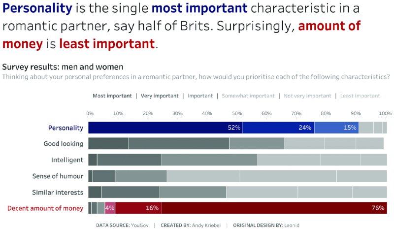
Figure 10.30 A stacked bar chart sized to 100% works better than a pie or donut chart for data with more than two or three attributes.
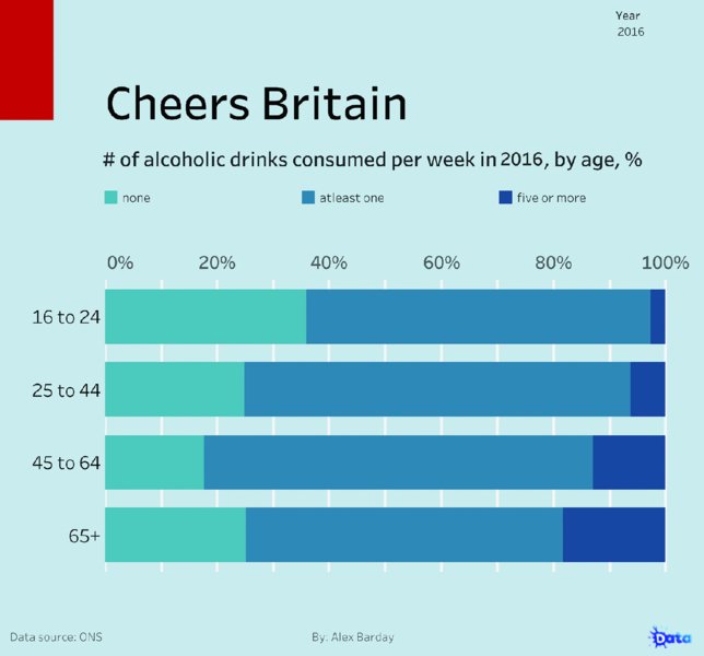
Figure 10.31 A stacked bar chart with a color gradient based on a single metric works well to show results across age groups.
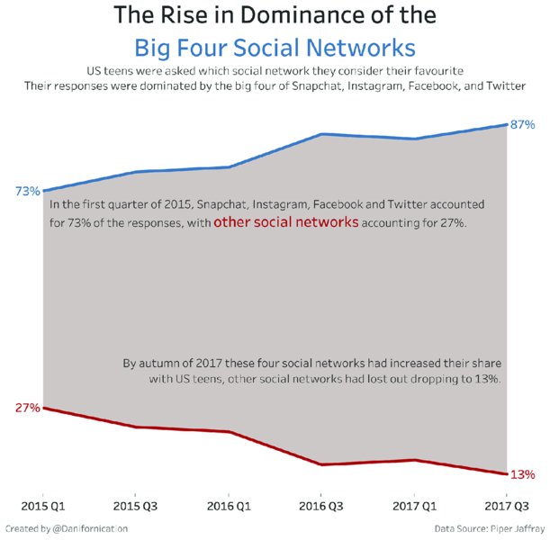
Figure 10.32 The difference between two lines can be accentuated by shading the area between the lines.
A heat map like Figure 10.33 focuses more on the patterns in the data and increases the data-to-ink ratio (Figures 10.34 and 10.35).
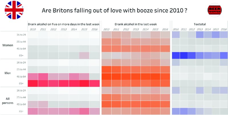
Figure 10.33 A heatmap focuses more on the patterns in the data and increases the data-to-ink ratio.
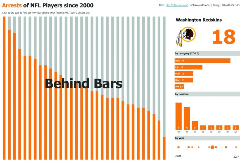
Figure 10.34 Stacked bars sized to 100% and colored in two distinct colors allow for easy comparisons and show trends.
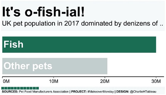
Figure 10.35 Bars sized by a specific metric clearly show which segments make the largest contributions to a total and allow for quick comparisons between segments.
Packed Bubble Charts
Purpose
Packed bubble charts, commonly referred to as bubble charts, display each attribute of a field as a circle, packed together as tightly as possible within the available space, with the size of the bubble representing the relative values of each attribute.
Description
In most cases, bubble charts provide a means to communicate two fields:
- What each bubble represents (categorical data like products or states)
- The value of each bubble scaled in proportion to every other bubble (continuous data like sales or number of customers)
Bubble charts in their simplest form have these two fields, which essentially means that the larger the bubble, the larger the value. A third field could be used for color to represent discrete data (e.g., regions) or continuous data (e.g., profit ratio). Bubble charts can be a useful way to quickly spot large outliers.
There are a few basic rules to follow when creating bubble charts.
- If including labels, ensure they fit inside the bubble. If the label does not fit, do not display it.
- Size the bubbles according to their area, not their diameter.
- Use shapes that make sizes as easy as possible to compare, preferably circles rather than squares or other marks.
Drawbacks of bubble charts include:
- Comparing the area of the circles is extremely difficult.
- The location of the bubble is determined by the available space. Sorting is controlled by an algorithm and does not contribute to helping your end user process the view.
- If the metric contains negative values, size cannot be used to represent the values.
Examples
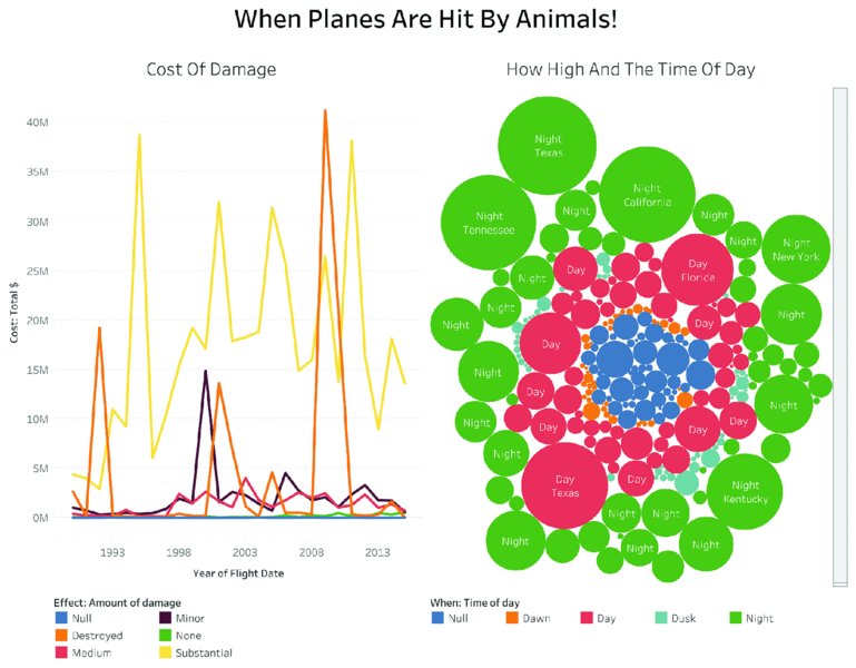
Figure 10.36 Comparing the size of bubbles or circles is much harder than comparing bars or rectangles.
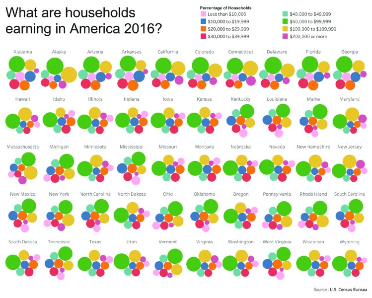
Figure 10.37 Small multiple-bubble charts are difficult to compare because the circles change their location to fill the available space.
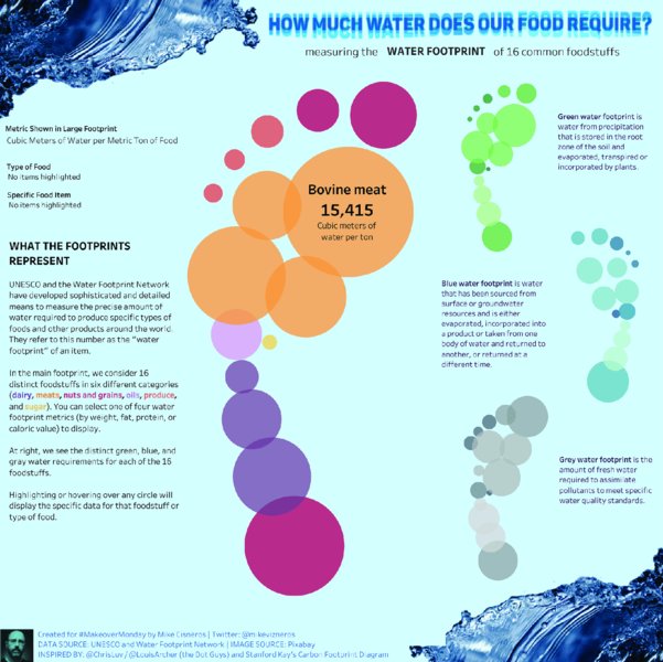
Figure 10.38 Designing a visualization for a specific topic can be helped by deliberately placing circles and bubbles to create greater shapes.
Alternatives
Figures 10.39 and 10.40.
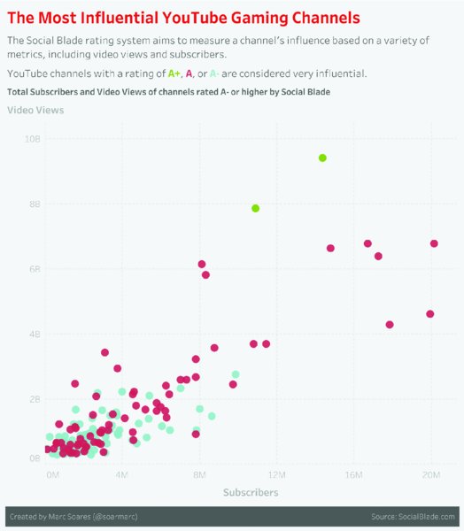
Figure 10.39 A scatterplot is an effective way to visualize the relationship between two metrics.
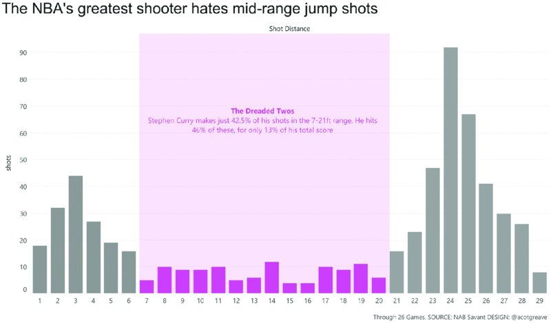
Figure 10.40 A histogram can be used to highlight how your data is distributed.
Treemaps
Purpose
Treemaps display hierarchical data in a single space that is split up into a series of rectangles. The size and position of each rectangle is determined by the proportion of a quantitative variable that each rectangle represents as part of the total quantitative variable.
Description
Treemaps are an alternative for displaying parts-to-whole data, typically where there is a hierarchical relationship in the data (e.g., a tree diagram). Each grouping of rectangles inside the treemap represents a category, with each rectangle inside each category representing the next level down in the hierarchy. The rectangles are displayed as a nested relationship. Each rectangle is sized by its proportion of the total. The rectangles are arranged via a tiling algorithm in the software that, ideally, organizes the rectangles from largest proportion to smallest. See examples in Figures 10.41–10.47.
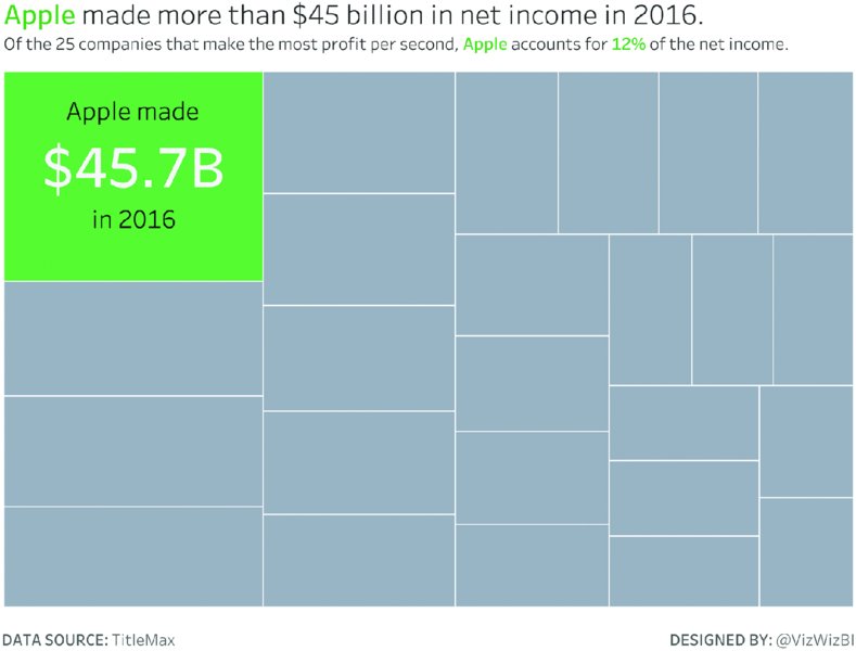
Figure 10.41 Treemaps with a clear focus on a single section make the key message more accessible for the audience.
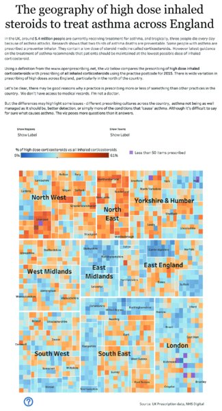
Figure 10.42 Applying a diverging color palette to a treemap that is structured geographically highlights problem areas effectively.
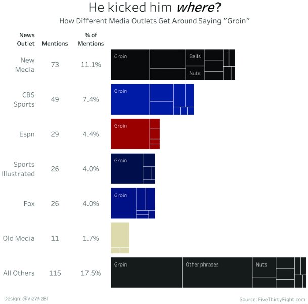
Figure 10.43 A treemap bar chart shows the ranking of each top-level segment, while providing a ranking of the subsegments within each bar.
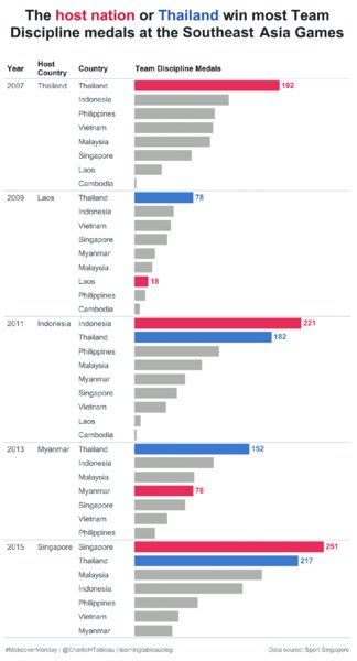
Figure 10.44 Bar charts that show categories over time make it easy to compare different attributes, especially when color highlighting is used.
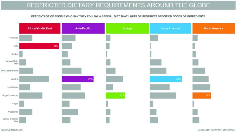
Figure 10.45 Color highlighting to show the largest bar helps when sorting by size does not apply.
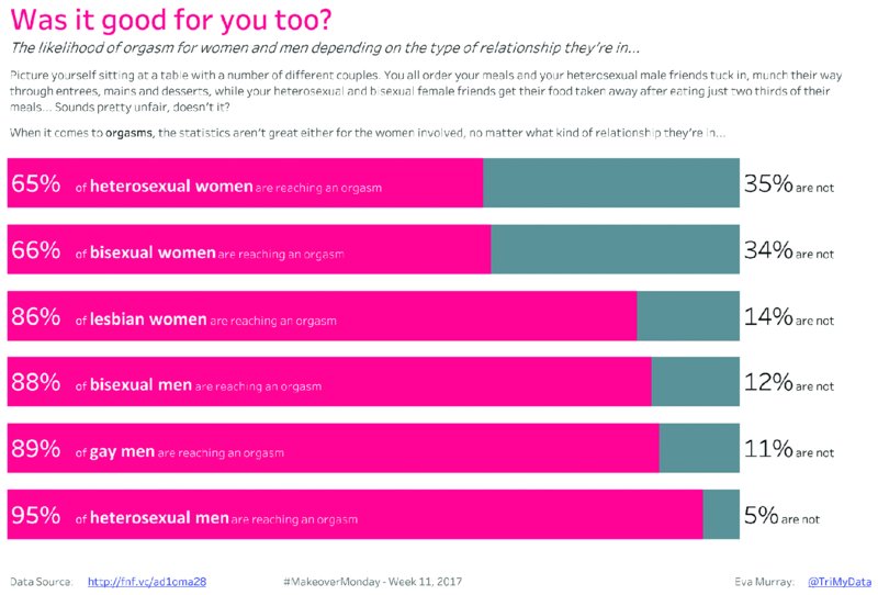
Figure 10.46 Stacked bars sized to 100% with labels for both segments provide clear and specific answers.
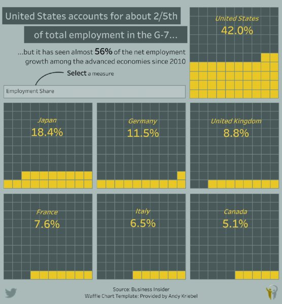
Figure 10.47 A waffle chart focuses more on each individual segment.
The proportion each rectangle represents is determined by its area. Therefore, the larger the rectangle, the bigger the rectangle’s share of the total. Treemaps are useful for quickly understanding the overall hierarchy of the data and helping you identify which section is the largest based on its position in the chart.
Drawbacks of treemaps include:
- Negative values are difficult to represent.
- Comparisons of rectangles that are not next to each other is difficult.
- Users have no control over the order of the rectangles because they are determined by the tiling algorithm.
Examples
Alternatives
Slopegraphs
Purpose
Slopegraphs, first invented by Edward Tufte, are typically used to show change between two time periods. They can also be used to show change between any two points.
Description
Slopegraphs are line charts, except they include only two periods; therefore, they ignore the time between the two periods to accentuate the change, or slope, between the two periods. Slopegraphs are useful if you want the reader to compare only the start and the end of a specific period. The ends of the lines are typically labeled, and the lines colored by either absolute change, relative change, or positive versus negative change (i.e., two colors). See examples in Figures 10.48–10.53.
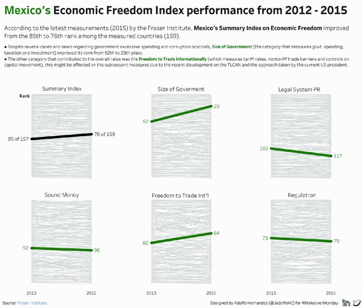
Figure 10.48 Small multiple slope charts become more informative with labels for the attributes selected by the user.
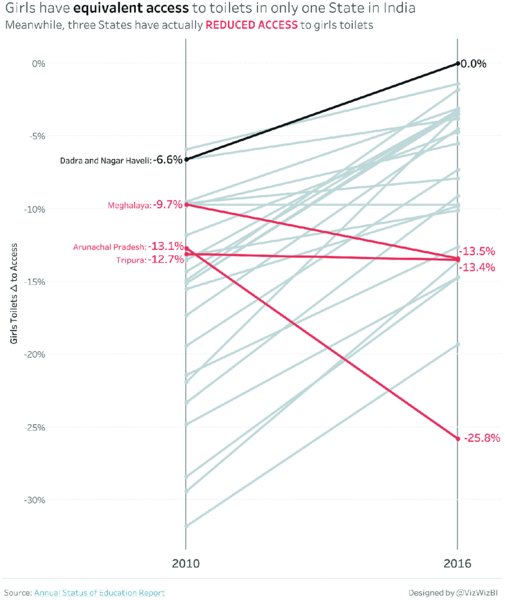
Figure 10.49 Labeling only selected lines in a slope chart highlights their relevance for the message you aim to communicate.
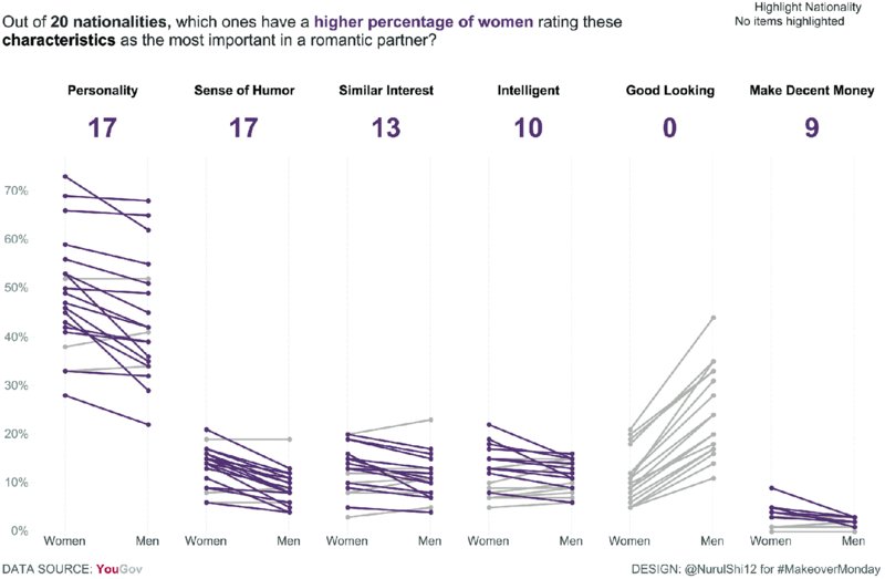
Figure 10.50 Two contrasting colors work effectively to highlight increases and decreases in a slope chart.
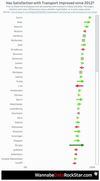
Figure 10.51 Arrows show the progress of customer satisfaction between two points in time, with decreases additionally highlighted in red and increases in green.
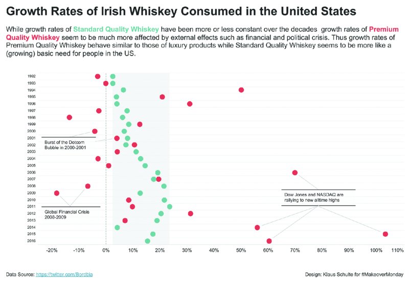
Figure 10.52 A dot plot focuses on the position rather than the slope of the difference.
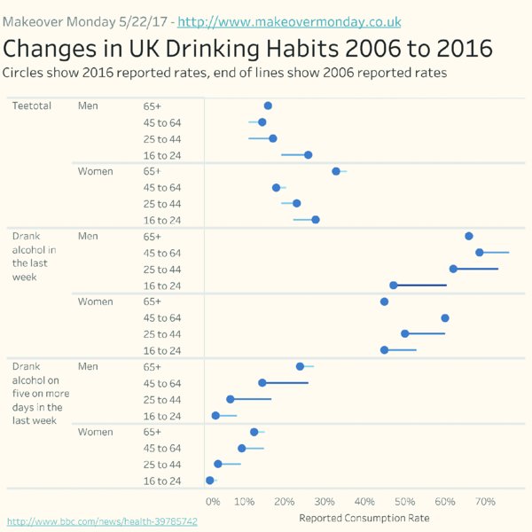
Figure 10.53 Connecting individual dots to lines in the direction of change between two points in time shows each age group’s development over time.
Other common use cases for slopegraphs include:
- Comparing the difference between two data populations
- Comparing the rank of two data populations
- Comparing the proportion of two data populations
Examples
Alternatives
Connected Scatterplots
Purpose
Connected scatterplots show two variables in a scatterplot and connect the points as a line over time.
Description
Connected scatterplots are nothing more than scatterplots with each data point in the scatterplot represented along a time dimension. One data variable is on each axis, a single dot is displayed for each member of the time series, and the dots are connected via a line in the sequence of the time series. These charts are useful for identifying correlated movement patterns between the two variables. See examples in Figures 10.54–10.61.
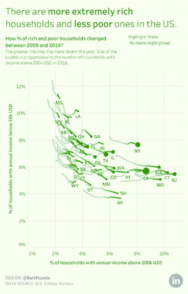
Figure 10.54 A scatterplot with a line connecting the dots of each attribute over the years shows most states progressing to more households being in higher income brackets.
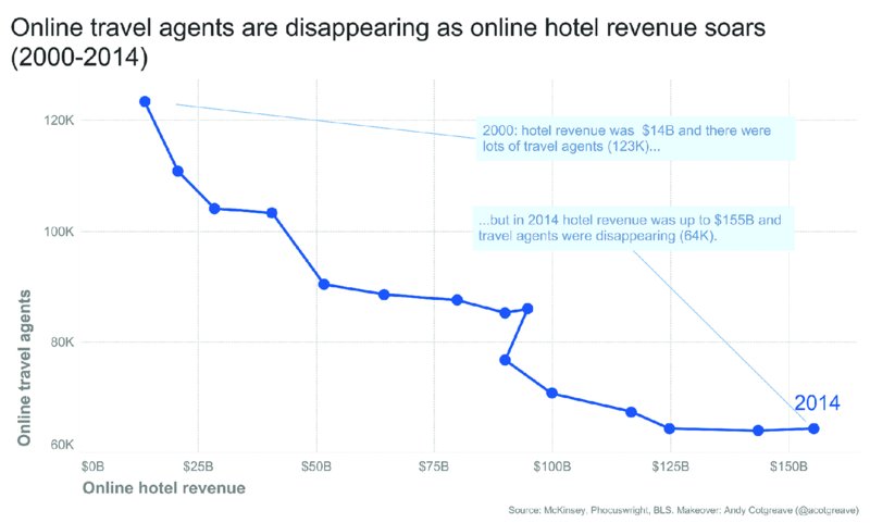
Figure 10.55 Clearly labeling the start and end point of a line in a connected scatterplot accentuates the development over time.
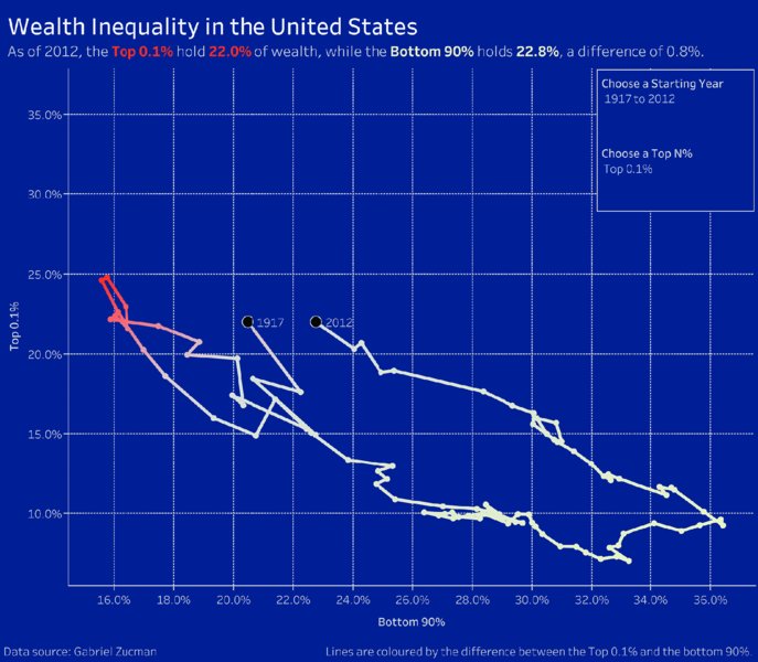
Figure 10.56 While this connected scatterplot shows dramatic changes over the years, the start and end point of the data are fairly close together as highlighted by their labels.
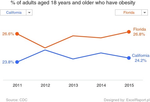
Figure 10.57 A simple line chart focuses your audience’s attention on the trends over time.
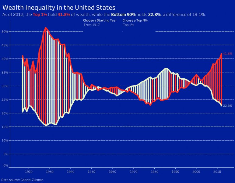
Figure 10.58 Adding vertical lines or bars between two lines accentuates the magnitude of the difference between the two lines.
Figure 10.59 A diverging area chart with a common baseline can be effective for showing the different trends of two attributes over time.
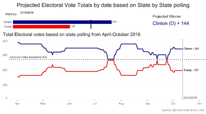
Figure 10.60 A diverging line chart highlights the differing or similar patterns of two attributes across the same variable.
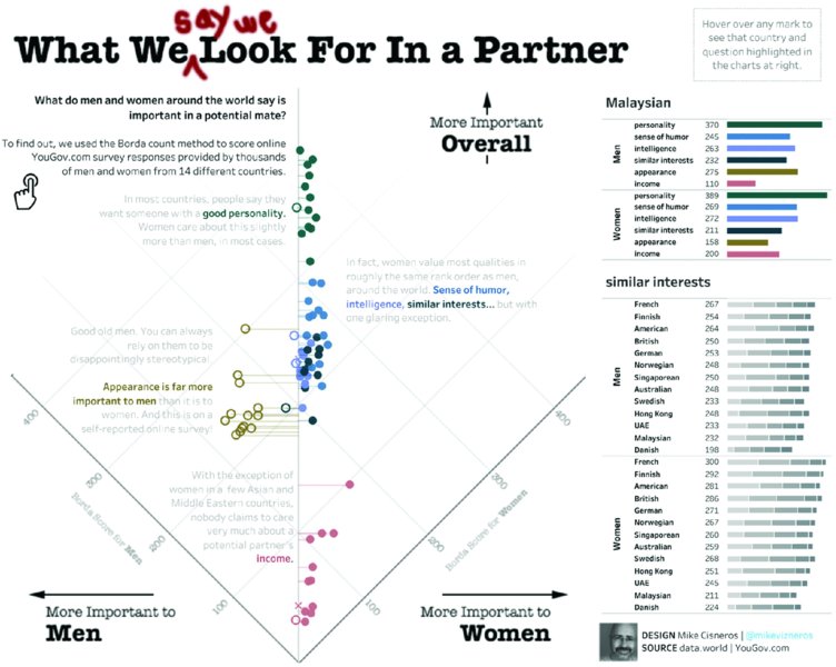
Figure 10.61 This dot plot highlights criteria that are more important for women compared to men and also indicates the overall importance.
If it is difficult to follow the sequence of the line and/or no overall pattern emerges, consider an alternative visualization.
Examples
Alternatives
Circular Histograms
Purpose
A circular histogram is used for displaying data around a circle as a series of bars with the bar length representing a data variable. See examples in Figures 10.62–10.68.
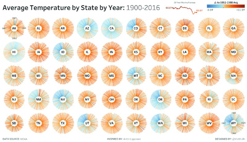
Figure 10.62 Changes over time are shown in a clockwise order in this circular histogram, which displays all the data at one time.

Figure 10.63 This circular histogram highlights outliers in the data with lines that are far longer than most other lines.
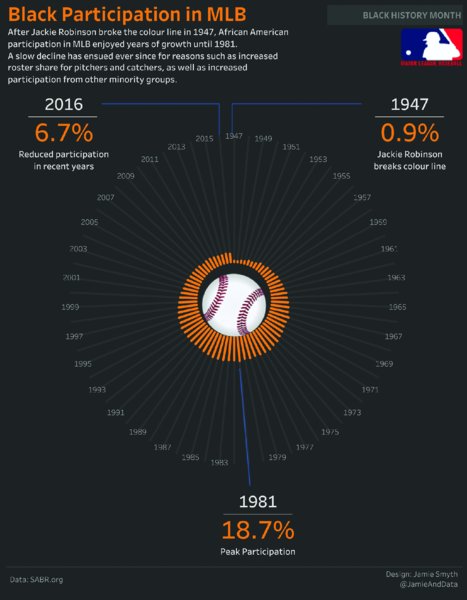
Figure 10.64 With bar length representing the magnitude of black participation, and labels for key points in time, this circular histogram clearly indicates changes over the years.
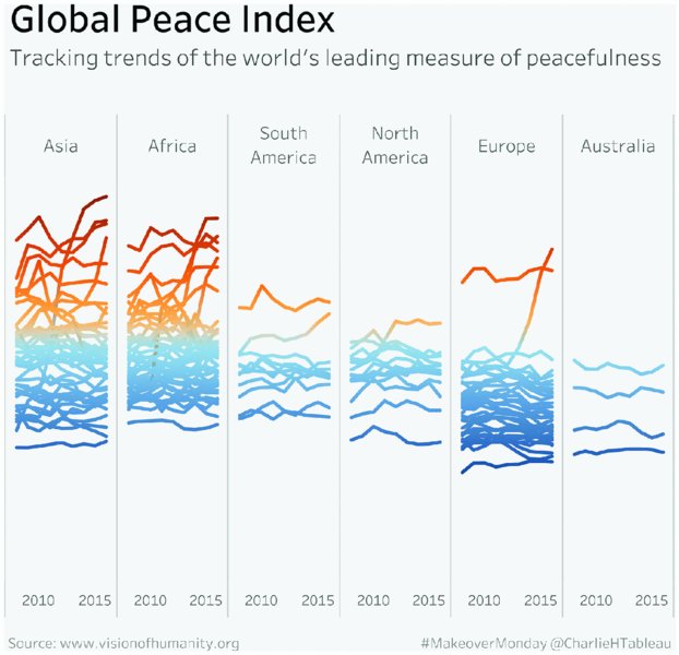
Figure 10.65 Line charts can be used to effectively show patterns in the data across multiple regions at once.
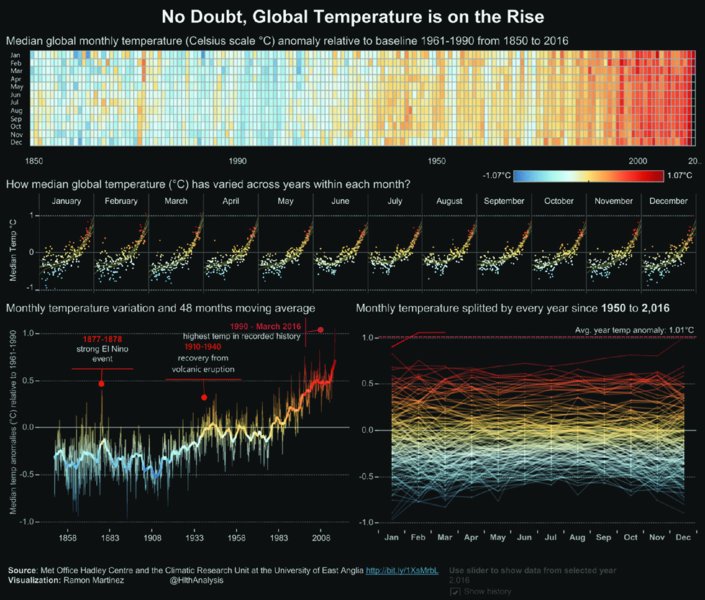
Figure 10.66 Giving the audience multiple visualizations of the same data provides a comprehensive picture of trends, changes, and key findings.
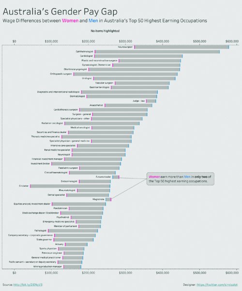
Figure 10.67 Shading the area between two data points highlights the differences between two attributes.
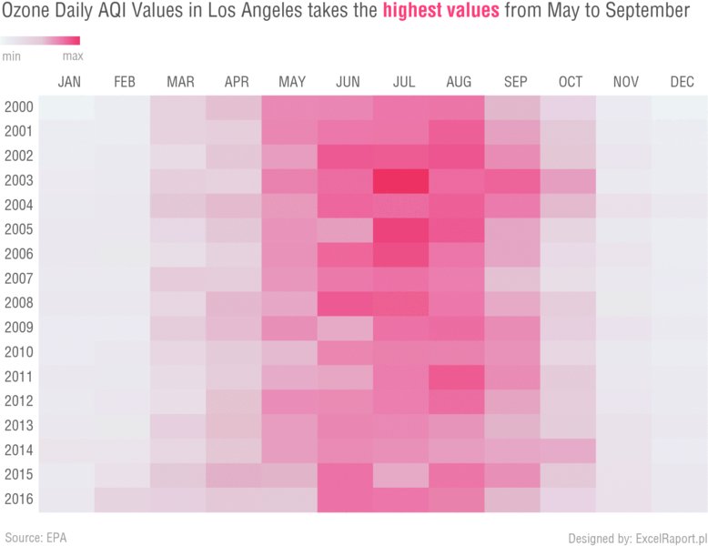
Figure 10.68 Seasonal trends and changes over time are easy to spot in a heatmap coloring values by a single variable.
Description
Circular histograms are similar to time series bar charts, except the bars extend outward from the edge of an inner circle. For easiest comprehension, begin the plot at the 12 o’clock position and continue clockwise around the circle in chronological or continuous order. Circular plots can also be used for comparing two elements of a single field or for ranked data. The bars should be spaced so that the number of bars wraps entirely around the inner circle once.
Drawbacks of circular histograms include:
- Patterns can be difficult to identify.
- Comparing the length of bars that are not next to each other is challenging.
- It is confusing for readers who are unfamiliar with the chart type.
Examples
Alternatives
Radial Bar Charts
Purpose
Radial bar charts are bar charts plotted on a polar coordinate system.
Description
Similar to a bar chart, radial bar charts are used for showing comparisons of categorical data elements. Radial bar charts are most effective when they represent parts-to-whole relationships with the radial chart starting and ending at 12 o’clock as the 0% and 100% marks. The bar should be sorted from outside to inside from the largest value to smallest value. See examples in Figures 10.69–10.74.

Figure 10.69 Radial bar charts can be easy to understand but can distort the viewer’s perception of the data.
Figure 10.70 While the outer bar dominates this view, the chart provides an overall impression of each bar’s contribution to the whole.
Figure 10.71 Straight rectangular bars are more effective because they do not require the audience to interpret the curvature of the bars as in a radial bar chart.
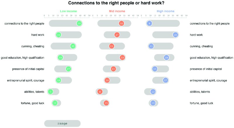
Figure 10.72 A dot plot with shading that indicates the minimum and maximum value shows the spread of the data as well as the value of each attribute.
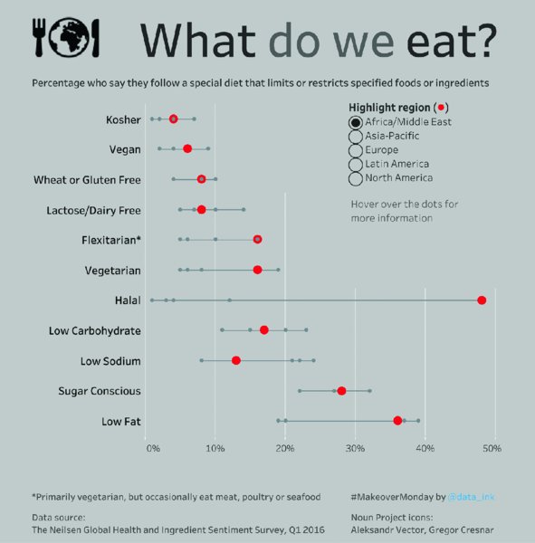
Figure 10.73 Connecting the data points in a dot plot with a line shows the spread of the data. Adding nonselected data as small gray circles provides context.
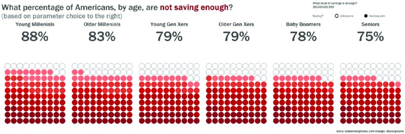
Figure 10.74 A unit chart sized to 100% is easy to understand and can be enhanced with large numbers showing the actual value for each age group.
Drawbacks of radial bar charts include:
- Comparisons are more difficult than with a regular bar chart, because curved bars are harder to compare to each other than straight bars
- Bars on the outside use more data ink than an arc on the inside of a similar percentage, thus looking longer
Examples
Alternatives
Resources
Below is a list of resources that we often use for charting best practices and charting ideas. These resources provide a short description of the chart’s purpose and the type of data that is best suited for the chart.
- Financial Times Visual Vocabulary: ft.com/vocabulary
- The Data Viz Project: datavizproject.com
- The Data Visualization Catalogue: datavizcatalogue.com
- Chart Chooser Cards–Stephanie Evergreen: chartchoosercards.com
- Chart Chooser Diagram–Andrew Abela: ExtremePresentation.com
Summary
The number of chart types available to display data can be overwhelming. After reading this chapter, you should have a better grasp of which charts to use in which situations and have gained inspiration from the visualizations we provided and their alternatives. This chapter does not cover all types; rather it is focused on those that are not discussed as often in the data visualization community. Some of the charts might be considered controversial or unconventional; however, we have provided well-executed examples that demonstrate when these charts can work.
Trying new chart types will help you learn by forcing you to develop new skills and techniques. Ultimately, the process of continuous learning will make you better at communicating information, it will develop your data visualization knowledge, and it will help you become a better data analyst.