CHAPTER 11
Effective Use of Text
Visual analysis means more than building a number of charts. It involves the use of text in titles, subtitles, labels, annotations, tooltips, footers, and so on to effectively communicate your insights and inform your audience. Text can elicit emotions and help ensure that your readers fully understand the impact and meaning of your findings.
In this chapter, you will learn how to use text elements to more effectively communicate your message by:
- Creating effective titles and subtitles
- Communicating your key message
- Guiding your audience through clear instructions and explanations
Effective Titles and Subtitles
The title of your visualization is typically the first thing your audience notices about your work. This title needs to draw them in and give them a snippet of what is to come, and can be used to inform them of your key message. Different data analyses lend themselves to different types of titles. For some data sets, an intriguing question or a provocative statement can work. Regardless of the type of title you use, it should not mislead your audience or impact your credibility.
This section covers four different types of titles:
- Using questions as titles
- Making definitive statements
- Using descriptive titles
- Working with quirky, funny, or poetic titles
For each of these concepts, you will see examples of how titles work in the real world and in the context of the data analysis supporting them.
Using Questions as Titles
A question in your title tells your audience what they can expect to find the answer to in your visualization. Using a clear question in your title and answering that question will make data more accessible for your audience.
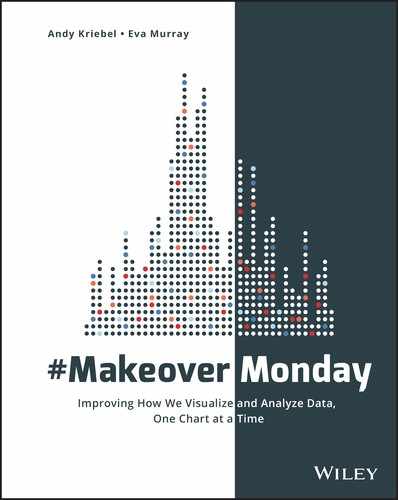
In Figure 11.1, Nish Goel analyzed data about the World Economic Freedom Index. His title reads “Which Countries Have the Biggest Decline in Economic Freedom from 2000–2015?”
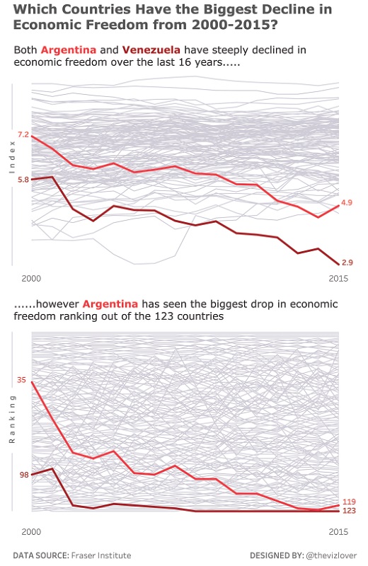
Figure 11.1 With a title in form of a question, this visualization guides the audience to look for and find the answer in the data.
This title works very well for the following reasons:
-
The question is very specific.
- “Which countries” informs the audience that they are looking at country-level data.
- “Biggest Decline” tells the audience that the analysis focuses on those countries that have decreased most significantly in the given time period.
- “Economic Freedom” indicates the topic.
- “2000–2015” provides a timeframe for the data.
- Whether the viewer is a layperson or an expert, the title sets the expectations for the type of answer the visualizations will provide.
- The title is supported by the data and insights.
- The individual chart titles, which spell out the findings in plain English sentences, provide the answer to the primary question.
In Figure 11.2, Matt Francis analyzed US meat consumption, asking, “Did Mad Cow and Cancer Scares Harm US Beef Consumption?”
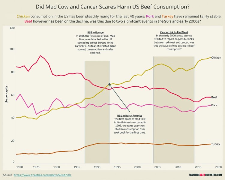
Figure 11.2 Questions in titles encourage your audience to take a position and see if the data supports their view.
Matt’s title is supported by a clarifying statement about the four different types of meat visualized in the chart. He further asks whether the decline of beef is due to the emergence of mad cow disease and the link of cancer to red meat consumption.
While we cannot definitely answer the question in the title of Matt’s visualization, the audience is guided through his analysis and can make the judgment for themselves, given the indicators in the data. In this case the title works well to engage the audience to come to their own conclusions and to consume the information provided to them.
Making Definitive Statements
As an alternative to the use of questions to gain your audience’s interest, clear and definitive statements can make for very effective titles. In data visualizations, definitive statements in titles can be used to clearly communicate your message and key insights upfront. It is essential that you follow this up with analysis that backs up your statement to avoid any confusion for your audience.
Kate Brown visualized Winter Olympics data and focused on the success of the Netherlands in speedskating (Figure 11.3). Kate states, “The Netherlands Dominated Speed Skating at the 2014 Winter Olympics.”
Figure 11.3 Making a clear statement in your title sets the tone for your analysis and highlights your insights from the start.
Her visualization backs up her claim in the following ways:
-
She provides a brief explanation of the key findings in the data.
- Dutch speed skaters won 23 Olympic medals in 2014.
- 63% of the total medals in that sport were won by the Netherlands.
- Three medals were won by the second most successful team.
- Kate adds a basic unit chart comparing the seven nations who won medals in speed skating in 2014 in order to show the dominance of the Netherlands.
- She gives an overview of the Dutch medal tally by games in speed skating.
It is almost impossible to disagree with the claim Kate put into her title. The Netherlands really did dominate speed skating at the 2014 Winter Olympics.
Using Descriptive Titles
The most commonly used type of title seen in Makeover Monday has a short description of the analysis. The way this differs from definitive statements is that descriptive titles do not make a claim and instead give an overview of the analysis to come. Sometimes you simply do not have the data to support a specific claim, so instead you can describe what your analysis shows or what the data is about.
As seen in Figure 11.4, Rob Radburn created a geographical treemap highlighting asthma medication prescriptions in the UK in 2015. His analysis focused on high-dose inhaled steroids and his title makes this clear: “The geography of high-dose inhaled steroids to treat asthma across England.”
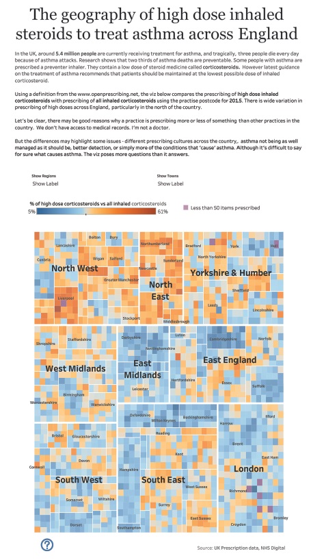
Figure 11.4 Titles are commonly used to describe the data set and the visualization.
Rob’s title shows his audience what he focused on:
- “The geography of” gives you an idea that his analysis provides geographical insights.
- The phrase “high-dose inhaled steroids to treat asthma” tells you that this visualization focuses on medication for asthma.
- “Across England” sets the geographical context.
The title, combined with the additional text, sets the scene for the audience to better understand the visualization.
Working with Quirky, Funny, and Poetic Titles
Some data visualization topics give room for a bit of humor. Charlie Hutcheson analyzed pet ownership data in the UK and created Figure 11.5 with the title “It’s o-fish-ial” as a play on words to show that fish are the most numerous pets in the UK.
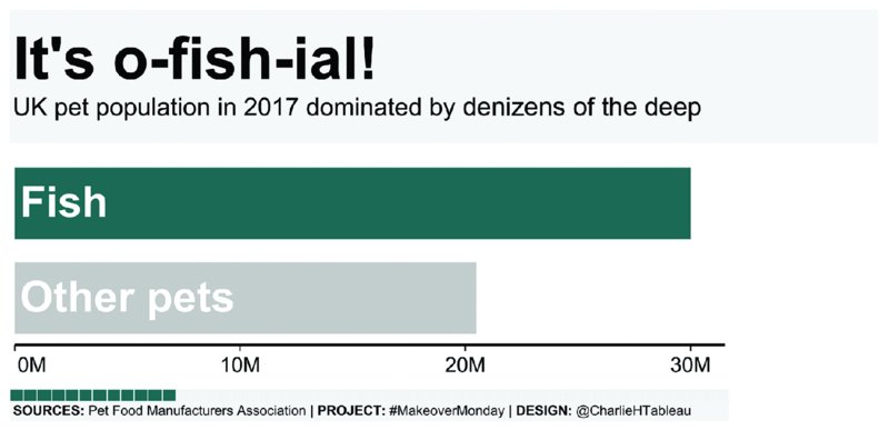
Figure 11.5 Many topics in Makeover Monday leave room for creative titles that make your audience smile.
In this context, a quirky title is absolutely fine to use because not every data visualization needs to be serious. Charlie added a simple bar chart showing that fish are more plentiful in numbers than all other pets combined and describes them in the subtitle as “denizens of the deep,” carrying the same humorous message throughout the visualization.
Completing two Makeover Monday challenges at once, Mike Cisneros combined the data sets from two weeks, one about the EU potato sector and one about Andy’s credit card spending, into the single dashboard in Figure 11.6 with the title “Potato Kriebel.”
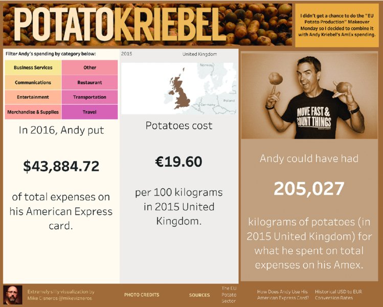
Figure 11.6 Not all analysis has to be serious and a humorous title supported by imagery brings out the lightheartedness of this visualization.
Humor is reflected in the choice of Andy’s picture, overlaid with two potatoes on his hands. The analysis itself goes into further detail about Andy’s credit card spending and how many potatoes he could have purchased for the amount he spent in 2016. The two topics have nothing to do with each other, making the combination of the data sets funny in a bizarre kind of way.
These types of headlines evoke curiosity and encourage people to look at your visualization.
Delivering on Your Promises
Once you choose a great title, make sure your visualization delivers on the promise of your headline. Ask yourself:
- Do my analysis and conclusions actually support the claim in my title?
- Does the analysis answer the question from the title?
- Is it easy to find the answer?
Your title draws your audience in; it makes a statement in some way that invites the readers to spend time looking at the work you created. Make sure that when they leave, they have answers to their questions, they are informed, and they have gained new knowledge or confirmed existing hypotheses. It is an opportunity for you to make them feel confident in your abilities as an analyst and to build trust and credibility as you impress them with your analysis, design, and storytelling.
What Is Your Key Message?
With every visualization ask yourself: What is the key message? If it takes a while to figure out what you wanted to communicate, then the message has probably not been visualized clearly and simply.
To ensure your key message gets through, consider the following recommendations:
- Assume your audience does not know anything about the topic or the data set.
- Assume your audience does not know how to work with interactive visualizations and will need some guidance on how to use your visualization.
- State your key insights and conclusions very clearly to ensure your audience knows exactly what you are showing them.
These suggestions help to create data visualizations that are easy to understand for the average person with little background knowledge. Instead of simply visualizing data and building charts, make an effort to communicate information effectively in visual and text form to help your audience understand and use your visualization.
State Your Message
The easiest way to ensure that your audience knows what your visualization shows is to tell them clearly. In Figure 11.7, Emily Chen visualized life expectancy and highlighted three countries to show how they deviate from all other countries in the data set.
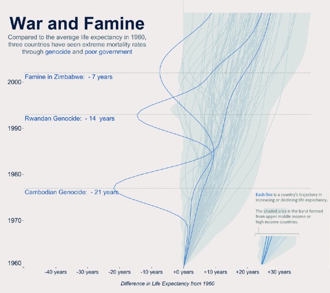
Figure 11.7 The subtitle is an element that can be used to effectively state your key message, reflecting the insights you derived from your analysis.
Emily’s subtitle clearly states what she found in her analysis: genocide and poor government led to extreme mortality rates in the countries highlighted.
As seen in Figure 11.8, Shawn Levin also took this approach to show the correlation he found between geographical location and obesity in the US.
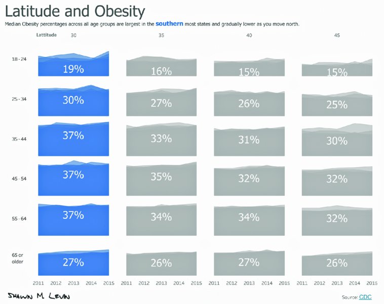
Figure 11.8 The subtitle states the key message, supports the short title, and summarizes the analysis visualized in multiple area charts.
Shawn’s visualization is called “Latitude and Obesity” and his subtitle reads: “Median Obesity percentages across all age groups are largest in the southern most states and gradually lower as you move north.” The audience can quickly understand that Shawn analyzed the commonalities between states according to their latitude and that he found a stable pattern across age groups.
Both Emily and Shawn used their subtitles to clearly state their focus on one particular insight in the data.
Semantics Matter
Language plays an important role for communicating effectively and a deliberate choice of words is essential to frame your message clearly. Titles, subtitles, and descriptions can be misinterpreted because authors are too vague.
Figure 11.9, created by Charlie Hutcheson, visualizes the basic level of accessibility in Singapore in red in his stacked bar chart. He concluded that religious buildings perform poorly compared to other buildings when it comes to accessibility.
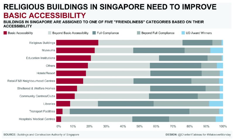
Figure 11.9 Being very specific in your title or subtitle helps your audience to understand your findings easily.
You will notice that he used a very specific title and a descriptive subtitle to explain his findings. These clarify exactly what he analyzed and the conclusions he came to. Had he chosen a title like “Religious buildings in Singapore are hard to access,” the meaning would be completely different.
When you choose a vague title, it leaves the visualization open to misinterpretation. Ensure that your analysis is visualized in a way that does not lead to misinterpretations and misunderstandings. As you create visualizations, ask for feedback regarding your title, subtitle, and descriptions. Ask your peers, friends, or family if your text communicates the key message clearly and ask which parts are difficult to understand. Having this feedback will help you create visualizations that are comprehensive and polished.
Big Ass Numbers
Using very large numbers in visualizations is a great way to highlight the key metrics and focus on specific figures. They provide an opportunity to bring actual data values back into a visualization, and to focus on selected numbers and why they matter.
In Figure 11.10, Sebastián Soto Vera used Big Ass Numbers (BANs) in his analysis of the UK pet population. He highlighted the large number of birds in captivity, drawing attention to the issue of birds being kept in cages.

Figure 11.10 A single large number in a visualization draws the audience’s attention and provides the focus for the key message.
After seeing the title, your eyes are immediately drawn to the large number of 700 000 caged birds, on which Sebastián built the narrative of his data story.
Paul Morgan used BANs with great effect in his visualization of US Winter Olympic performances (Figure 11.11).
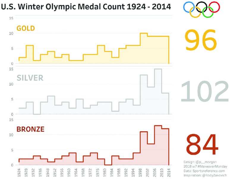
Figure 11.11 Large numbers provide an effective summary of each medal count in this visualization.
The large totals on the right side gives a quick overview of the medals won by the US over the years.
Curtis Harris built an interactive dashboard (Figure 11.12), where the audience could enter their date of birth and the age at which they expect to die. Based on these entries, Curtis uses BANs to show how many solar eclipses already happened in a person’s life and how many are remaining.
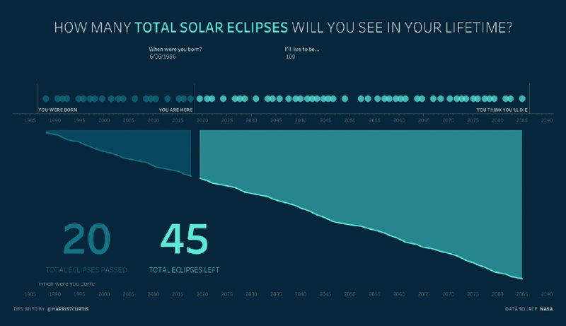
Figure 11.12 Dynamic BANs based on user selections show the impact of the parameter changes and highlight the most important metrics.
The large numbers are a focal area in the bottom left corner of his visualization and provide nice concrete figures that are relatable.
For BANs to be most effective, they need to become part of the overall design and stand out without looking out of place. In each example in this section, the large numbers are part of the visualization and blend in with the remaining elements on the page. Bringing these kinds of layouts together harmoniously will require a bit of practice and are a great way to enhance your analysis.
Call to Action
If you want your audience to engage, include a clear call to action. Makeover Monday participants have taken important topics around education, employment, public sanitation, climate change, and food choices and included strong calls to action so their audience would act on their new knowledge.
A very simple yet impactful dashboard, as seen in Figure 11.13, came from Klaus Schulte’s analysis of Indian school children’s access to functioning toilets.
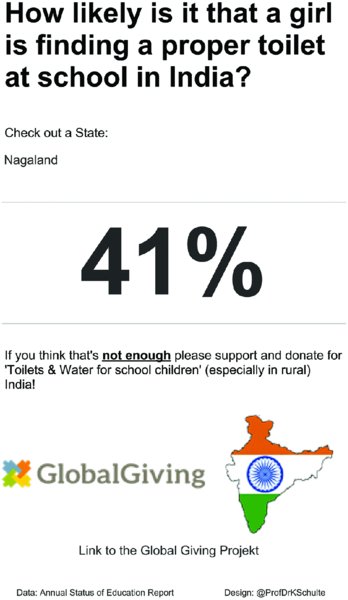
Figure 11.13 Including a call to action for your audience to donate, sign a petition, access further information, and so on can make your visualization very impactful.
Klaus combined a question in his title with a BAN to answer that question before his call to action. He encourages his audience to donate to the Global Giving Project to help improve sanitation facilities for school children in India.
Especially for social impact topics, a call to action can make your analysis transformative, allowing you to become an agent of change by combining your analytical and design skills to take your audience one step further. Data visualizations do not always have to be neutral and formal. Bringing emotion into your work, especially for topics that matter to you personally, is a great way to create impactful visualizations that address your audience at a different level.
Instructions and Explanations
Supporting your headline with instructions on how to interact with the data or with explanations that define metrics and technical terms can make your visualization more effective at communicating your intended message. Instructions can be simple statements like “click on the map to filter” or “select a country to see its data.” When the text is placed near the relevant filters, charts, or buttons, you help your audience find their way around your dashboard and understand how to use the interactive elements.
In general, be very specific with your instructions and assume that your audience has no experience with interactive dashboards. Including instructions in different places on the page helps you communicate to all members of your audience. It is easy to forget to include instructions in your visualization, because for you it may be obvious how to use the interactive elements and find your way around a dashboard. For your audience this may not be so clear. So before you share your work, take a moment to evaluate the guidance you have provided for the users of your visualization.
Filters
People who regularly use dashboards will likely be used to applying filters to limit the results shown in a visualization. When you include filters to enable interactivity, it is important to add instructions on how to use them. Otherwise, those who are unfamiliar with filters will never explore the data this way, resulting in a missed opportunity to engage with your viewers.
Charlie Hutcheson visualized Formula E race results, as seen in Figure 11.14, and added a filter for race venue and date in the top right corner of the dashboard. His instruction reads, “Select race venue and date,” encouraging his audience to explore the dashboard.
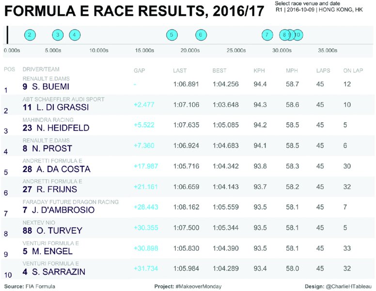
Figure 11.14 Adding simple instructions to your visualization encourages your audience to interact with the visualization and explore the data further.
If motor racing fans were to use Charlie’s dashboard, they may filter the results to show a recent race. This makes the dashboard relevant for the individual audience members.
Hover Interactivity
Filters are probably the most well-known type of interactions people use on dashboards and many data visualization tools offer additional layers of interactivity. In Figure 11.15, Lawer Akrofi visualized restricted dietary requirements around the world and added an option to highlight as you hover over the color legend. There is also the option to hover over a specific data point to see the percentage of people following a diet displayed in the tooltip.
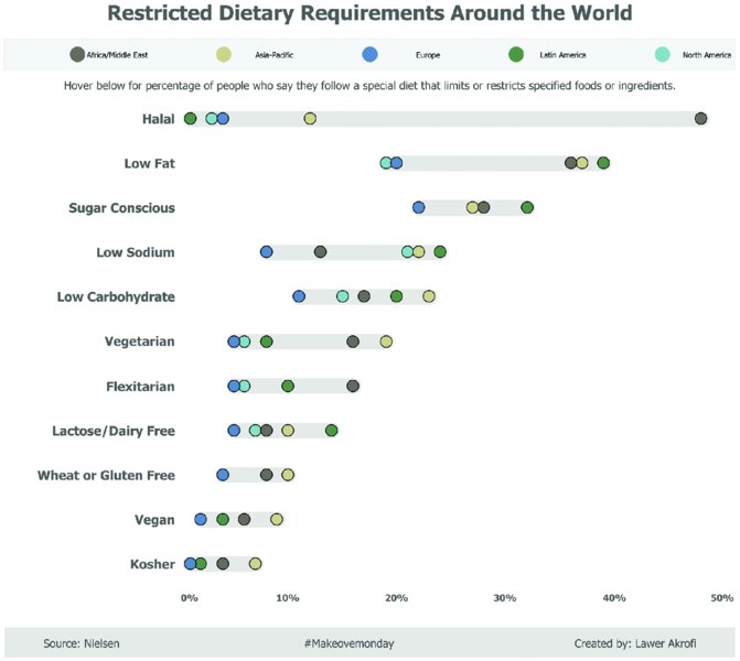
Figure 11.15 Clear and concise descriptions of dashboard actions show your audience that more information can be accessed by through interactivity on the visualization.
Lawer’s brief instruction below the color legend informs the audience that there is more information available if they hover over different parts of the dashboard.
Explanations
While instructions tell your audience how to interact with your visualization, explanations actually describe the data, the results of your analysis, and your findings. In data visualization, a very descriptive, text-heavy approach can be counterproductive to visual analysis and data exploration. When you combine color or icon legends with descriptions in a single sentence, you save space on the screen and bring different elements of the visualization together. This provides all the relevant context in one place. The audience does not need to look back and forth across the page to find the information that helps them understand the data and your key message.
Color Legends in Text
Paweł Wróblewski created the highlight table in Figure 11.16 to visualize data about ozone levels in Los Angeles and used his title as a color legend.
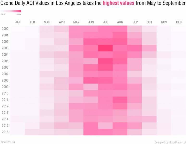
Figure 11.16 Coloring specific parts of the title to correspond with the visualization gives your audience an immediate understanding of the significance of the color chosen.
By coloring the words “highest values” in the same shade of red that also represents the highest values, the text immediately communicates the meaning of the color.
Consider Figure 11.17 from Jamie Briggs, who analyzed data about the Tate art collection. His title is a summary statement to show the dominance in numbers of J.M.W. Turner’s paintings compared to all other artists.
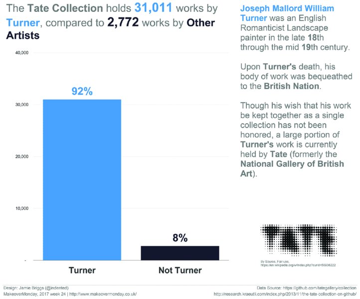
Figure 11.17 Applying two different colors to the title text relates artists clearly to their respective bars in the bar chart.
Jamie highlights this effectively by coloring all references to Turner in the same shade of blue as the bar chart. The title describes the key finding in a single sentence and intuitively explains the colors used in the visualization. Repeating the blue color for Turner in the descriptive text on the right further enhances the focus of the visualization.
Annotations
Annotations are small sections of text, a few words, or a short sentence, placed inside your visualization and associated with specific data points. They are commonly used to highlight outliers, describe a particular point in time, or show how a data point contributes to an interesting insight.
As seen in Figure 11.18, Shawn Levin created a vertical timeline of Andy’s credit card spending and used annotations that outline the “Road to the 2016 New York City Marathon.”
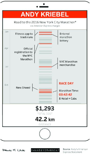
Figure 11.18 Annotating your charts helps guide your audience through different parts of your analysis and the key data points in your visualization.
Shawn investigated the spending categories and looked at running-related purchases that could be linked to the New York Marathon. Shawn added annotations only to the relevant data points, while other purchases throughout the year are visualized using gray lines for context.
Lindsey Poulter visualized data for the NCAA Basketball Tournament in the US in Figure 11.19, using historical data to show what seeded teams made it to the Final Four stage of the competition.
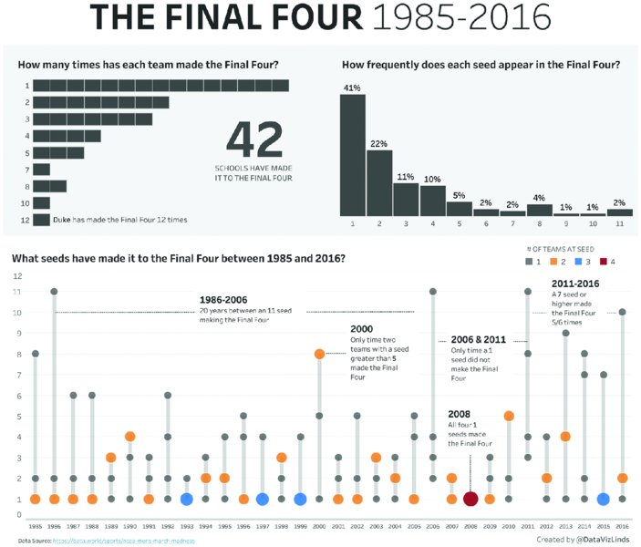
Figure 11.19 Annotations typically focus on the most important, interesting, or surprising data points and provide contextual information for your audience.
Lindsey’s use of annotations in the timeline are an excellent example of how insights and further information can be added for specific data points and timeframes. Without these annotations the audience may be left wondering so what? By including the additional text, Lindsey helps the audience understand the data and the context.
Labels
Labels can be used as reference points in your visualization and allow you to remove gridlines and axis lines. When you do not need or want to use annotations in your work, labels can be a good alternative for highlighting specific values in your data.
Colin Wojtowycz analyzed data on drug exporting nations in Figure 11.20 and created a simple bar chart using labels for the data values at the end of each bar.
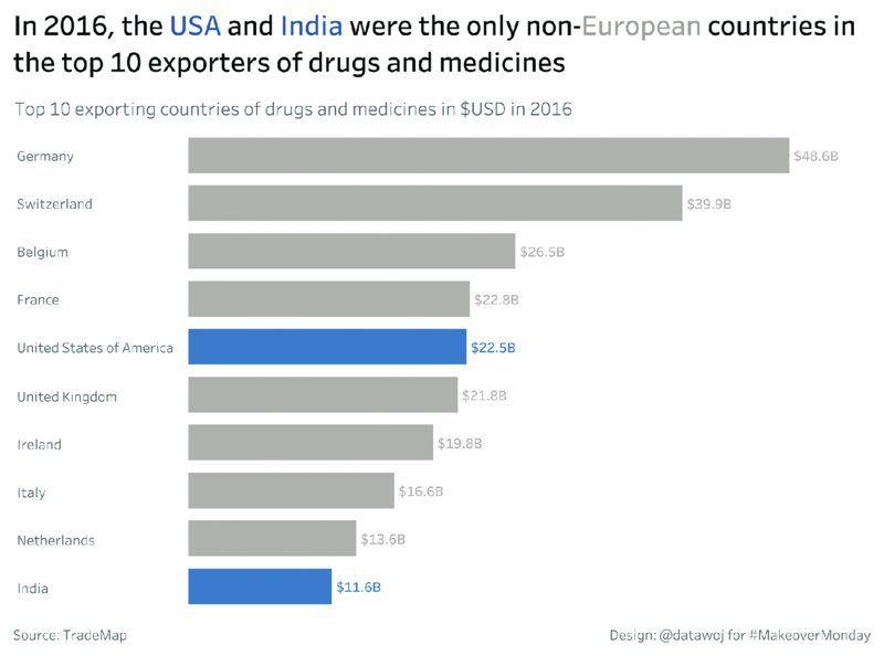
Figure 11.20 Stating the actual values of different data points adds precision and shows the contribution of each attribute.
Adding labels meant that Colin could remove all lines from the chart, while still allowing his audience to know which values the bars represent.
In Figure 11.21, Charlie Hutcheson considered data about the usage of social media platforms by teenagers in the US and visualized it using a bar chart to compare Snapchat’s dominance over the other social networks.
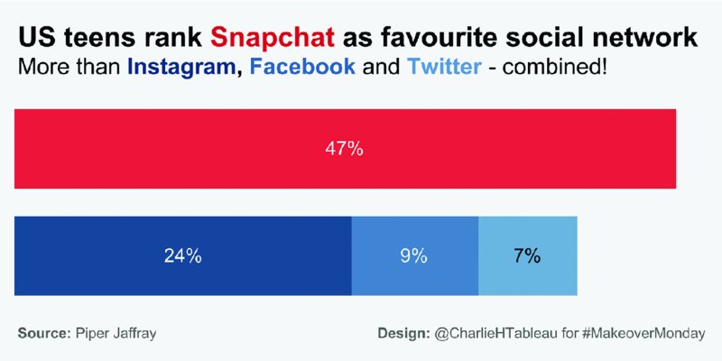
Figure 11.21 Percentage-of-total labels give the audience a better understanding of the significance of Snapchat compared to the other social networks.
His inclusion of labels on the bars, especially the stacked bar chart that combines Instagram, Facebook, and Twitter, helps relate the apps to one another. Note that Colin and Charlie also used colors on the text in their titles and subtitles to explain the colors of the bars in their visualizations.
You do not have to label every data point or category in your visualization. In fact, this could result in a very “busy”-looking dashboard. It is important to find the balance between labeling those points that help your audience better understand your message and keeping the visualization uncluttered, so your viewers can focus on the essential aspects.
Tooltips
Tooltips can provide useful layers of information when you want to give your audience additional information without adding it directly into your visualization. Sarah Bartlett formatted her tooltips to make them responsive, engaging, and impactful. Her infographic (Figure 11.22) about US birth statistics is an example of great use of tooltips.

Figure 11.22 Text is used throughout this visualization to explain the data and findings and make the analysis more accessible for the audience.
The dashboard itself provides a very comprehensive overview of the data that is supplemented by dynamic tooltips that appear whenever you hover over data points in one of the three charts. See Figure 11.23. The “median age for childbirth” tile map is supported by a tooltip that displays the median age of mothers when giving birth.
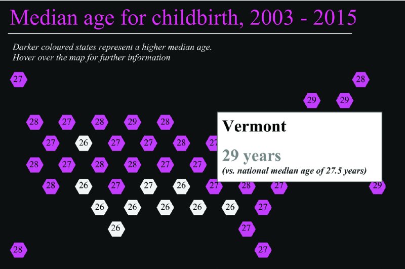
Figure 11.23 Tooltips that appear as a user hovers over the tile map show additional information for each state.
The median age distribution chart shows the number of births (one circle for each birth) across a range of ages displayed on the x-axis. The tooltip includes additional information in a couple of plain English sentences. This helps provide the context in which the data needs to be understood. See Figure 11.24.

Figure 11.24 The tooltip lists the total number of births per month and the median age of the mother. This information is provided in complete English sentences.
Tooltips are a neat way to make your visualization stand out and show your analysis and design skills at various levels of detail in your work. Make sure that you inform your audience somewhere on your visualization that additional information is available when they hover over a data point.
Summary
In this chapter we focused on the effective use of text to let your insights shine and your visualization tell a story that captivates your audience. By using titles, subtitles, large numbers, calls to action, explanatory text, instructions, labels, and tooltips, you can help communicate information clearly to your audience. Use text sparingly and deliberately. Consider removing text and see if it changes your message. If the message changes, then put the text back. If removing the text does not impact the key message, then leave it out.