


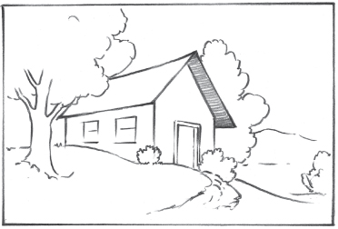
Introduction to Composition

The key to creating dynamic paintings is designing a pleasing composition—the arrangement of objects in a painting and the way in which they relate to one another. A good composition will appear balanced and harmonious, with the various elements working together to create an eye-catching scene. Over the next few pages, you’ll discover how to establish a center of interest, or focal point; create a visual path that leads the viewer’s eye through the painting; organize the elements in your painting; and choose a format—horizontal, vertical, or panorama—that complements your subject.

Positive and Negative Space
The interplay of positive and negative space in a work of art is an important dynamic often brushed aside by beginners. Paying close attention to how they work together to influence the shape, balance, and energy of the work can help you improve and refine your compositions.
Positive space is the area in your work occupied by the subject, whereas negative space refers to the area between and around the subject. Think of negative space as a support system for your positive space; it should not take attention away from the positive space but instead should complement it. For example, negative space can echo the shapes of the subject to create rhythm within the work.
Sometimes a beginner’s tendency is to fill a picture plane with as much subject matter as possible, cramming the scene with forms and utilizing every inch of empty space. However, the eye relies on areas of inactivity to rest and digest the scene as a whole. Many artists suggest aiming for a balance of positive and negative space, as too much of one can create a sense of excessive “fullness” or “emptiness.” Others argue that using equal parts of positive and negative space creates confusion; the eye doesn’t know where to focus. So, what to do? My advice is to let either the positive or negative space subtly dominate the composition. Play with ratios until you feel the dynamic best communicates your message.

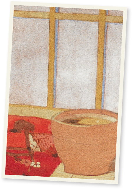
Painting Negative Space Negative space is the empty space between objects. If an object appears too complex, focus on the negative space instead. You can do this by squinting your eyes, which blurs the details so you can only see the negative and positive spaces. When you draw the negative shapes around an object, you’re also creating the edges of the object itself.

Creating a Focal Point
A key element in creating a successful composition is including more than one area of interest, without generating confusion about the subject of the drawing. Compositions are often based on one large object, which is balanced by the grouping, placement, and values of smaller objects. Directing the viewer’s eye with secondary focal points helps move the viewer through a scene, so that it can be enjoyed in its entirety.
The primary focal point should immediately capture the viewer’s attention through size, line quality, value, placement on the picture plane, and the proximity of other points of interest which call attention to it. The secondary focal point is the area that the eye naturally moves to after seeing the primary focal point; usually this element is a smaller object or objects with less detail. Another secondary focal point may be at some distance from the viewer’s eye, appearing much smaller, and showing only minor detailing, so that it occupies a much less important space in the drawing. This distant focal point serves to give the viewer’s eye another stop on the journey around the composition before returning to the primary focal point.
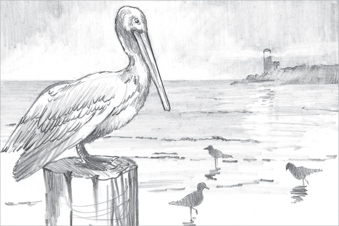
Primary, Secondary, and Distant Focal Points The size and detail on the pelican designates it as the primary focal point, and it immediately catches the viewer’s eye. The pelican’s gaze and the point of its bill shifts the attention to the small birds in the foreground (the secondary focal point). By keeping the texture and value changes subtle in the middle ground, the eye moves freely to this point. These three small birds are shaded fairly evenly so they don’t detract from the primary focal point. The triangle created by the birds, along with the water’s edge and the point of land, leads the viewer’s eye to another, more distant focal point—the lighthouse. Here the two subtle rays of light against the shaded background suggest a visual path. The rays of light, the point of land, and the horizon line all work together to bring the viewer’s eye back to the pelican, and the visual journey begins again.

Leading the Viewer’s Eye
Once you’ve determined the focal point of your painting, you need to decide its position. You don’t want your viewers to ignore the rest of the painting, so your focal point should be placed in such a way that the viewer’s eye is led into and around the entire painting, rather than focusing only on the center of interest. You can lead the eye using a number of techniques: incorporating diagonal and curving lines, avoiding symmetry, overlapping elements, and composing with light and color.
Using Diagonal and Curving Lines
Even if the focal point of your painting is fairly obvious, you should emphasize the center of interest by using visual “signposts” to direct the viewer’s eye toward it. Diagonal and curving lines often lead the eye from one of the corners of a painting to the center of interest. (For example, a diagonal street or a curving stream.) Curving and diagonal lines also can be formed by the placement of elements within the painting.
TOM SWIMM
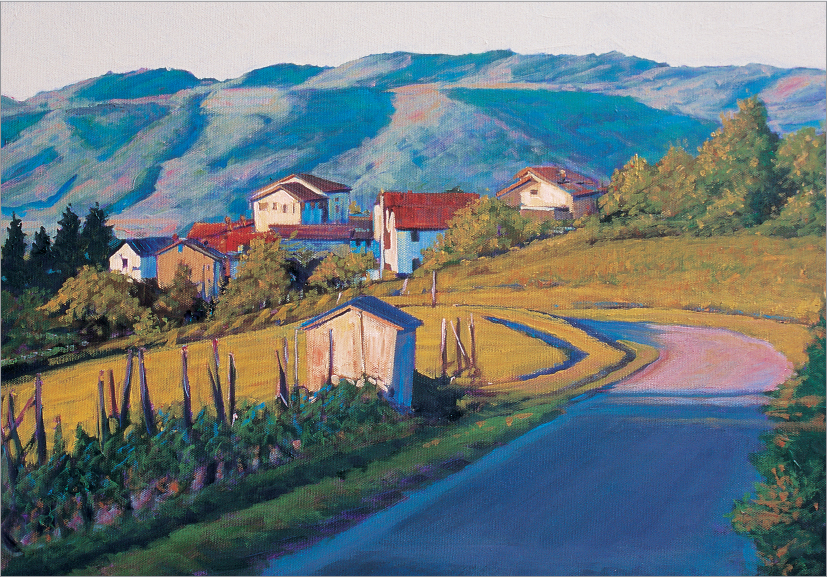
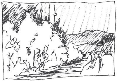
Composing with Curving Lines In this landscape, the curving road creates an inviting path that guides the viewer’s eye from the cool, bluish shadows to the warm, glowing fields and sunlit buildings.
Avoiding Symmetry
One of the most basic rules of composition is to avoid too much symmetry in your paintings. Placing your focal point in the middle of the scene, for example, divides the painting in half and results in a static, dull composition. Placing the center of interest slightly off center, however, creates a much more dynamic, pleasing composition. This leads the eye around the entire painting, rather than inviting it to focus solely on the center of the composition. Try working out asymmetrical designs on scrap paper with thumbnail sketches—small compositional studies—before committing to a design.

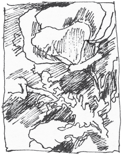
Poor Design In this thumbnail sketch, the elements are crowded into the center and are all on the same plane. The shapes are too symmetrical and uniform, and the eye is led out of the picture.
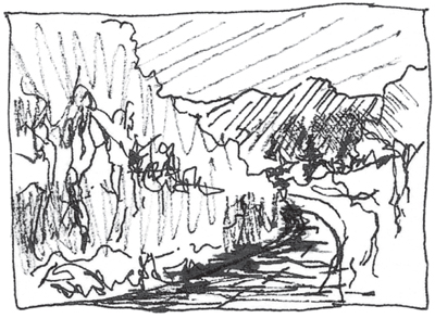
Good Design Here the center of interest is placed farther to the left; the elements are staggered on different planes and are overlapped; and the curving path directs the eye into the scene.

The Rule of Thirds
Determining the Focus
Determining the subject of your painting is only the first step; the next is to design the composition. To do so, ask yourself, “What do I wish to say?” The answer to this question will establish the center of interest—or focal point—of the painting. Surprisingly many artists don’t know what or where their center of interest is; and if they don’t know, neither will the viewer!
Once you’ve determined the focal point, you need to decide on its placement. You can always create a well-balanced composition if you follow the rule of thirds, also called the “intersection of thirds”; to follow this principle, divide the paper into thirds horizontally and vertically. Then place your center of interest at or near one of the points where the lines intersect. It’s as simple as that! The rule of thirds keeps your center of interest away from the extremes—corners, dead center, or the very top or bottom of the composition—all recipes for design disaster. The result is a piece that holds the viewer’s interest!
Approaching the Painting The rule of thirds helped locate the focal point of this painting. Note that the area containing my focal point has the greatest amount of detail and contrast; it features the lightest lights and the darkest darks.


Testing Your Designs
Even when applying the rule of thirds, you’ll usually find that you have a selection of designs to choose from. Thumbnail sketches—or small compositional studies—are the insurance policy of smart artists! They allow us to quickly work out a composition before committing time and effort to a sketch or painting. These sketches are small—2 to 3 inches at most—but they contain the necessary information about a scene’s arrangements and values. It’s always wise to make a few thumbnails before committing to a design.


The Golden Mean
The composition of most classical art is based on the Golden Mean, also known as the Golden Ratio, Golden Section, or the Divine Proportion. In ancient Egypt and Greece, design used a constant factor in a geometric progression, and that ratio was first calculated by a mathematician known as Fibonacci in the 13th century. The Golden Mean, or 1.618, is the constant factor in his continued proportion series: 1, 1, 2, 3, 5, 8, 13, 21, 34, 55, 89, 144, and so on. By adding the last number to the previous number, we arrive at the next number in the series; for example, 21 + 34 = 55, 55 + 34 = 89, and so on. By dividing any number by the previous, we get a result close to 1.618. In a continued proportion, the closest pair of numbers to the Golden Mean of 1.618 is 55 and 89—these two numbers are used most frequently in fine design to establish proportionate space.
Finding the Golden Mean in Nature
Examples of the Golden Mean are all around us in nature: the structure of sea shells, leaf and petal groupings, pinecones, pine-apples, and sunflowers, for instance.

The “Perfect” Ratio of 89:55 The center of the daisy, like the sunflower and other plants with large seed heads, shows the geometric pattern formed by the Golden Ratio. As the seeds or pistils move out from the center of the flower, they create spiral patterns that curve to the right and left at an 89:55 ratio.

Naturally Occurring Ratio The Golden Mean ratio and spiral pattern also can be seen in the structure of most pinecones. Note how the individual pieces spiral up from the bottom of the cone. There actually are two spiral patterns: one to the left and one to the right. Different types of conifers generate different spiral patterns. The pineapple spirals in this same manner.

Constant or Geometric Spiral The conch shell shown here demonstrates the Golden Mean—as each section of the spiral naturally increases in size by 1.618 as it moves outward. This is called the “constant spiral” or “geometrical spiral.”
Finding the Golden Mean of a Line
The 1:1.618 ratio is used by designers and artists in all media, such as architects, engineers, cabinet makers, and many other creative people. In this exercise, we concentrate on dividing a line into what is commonly accepted as the most aesthetic division.
You can find the Golden Mean of any line by measuring it and using a calculator to divide that number by 1.618 (Method 1). Mark a point at that measurement on the line to divide it into two segments of the perfect proportions. You can continue to divide each smaller section of the line by 1.618 to create more divisions in the Golden Mean ratio. You also can use simple geometry to achieve the same results that the Greeks used in their design (Method 2). Just follow the steps below that illustrate each method.
Method 1: Calculator
![]()
Step 1 Begin by drawing a line of any length and label the two endpoints as A and B. This particular line is 4 cm long.
![]()
Step 2 Divide the length (4 cm) by 1.618. The number you get (in this case, 2.47 cm) is the distance between A and C above.
Method 2: Geometry
![]()
Step 1 Begin by drawing a line of any length and label the two endpoints as A and B. Divide the line length in half and mark the center point.
Step 2 Draw a perpendicular line at point B that is equal in length to half of line AB (the measurement from the center point to A or B). Label the end of the new line point C (BC = 1/2 AB).

Step 3 Draw a circle with the center at point C and BC as the radius.
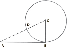
Step 4 Draw a line from A to C. Label the point where line AC passes through the circle as point D.

Step 5 Using point A as the center and AD as the radius, draw a partial circle which intersects line AB; that intersection is at point E (EA = AD). You should find that line AE equals a division of 144/89 and line EB equals a division of 89/55, where 144 is the original line length (AB). Contrast is created by the differing sizes of lines AE and EB, and unity is created by the correlation of line EB to the entire line AB (the Golden Mean).

Forming and Placing Elements
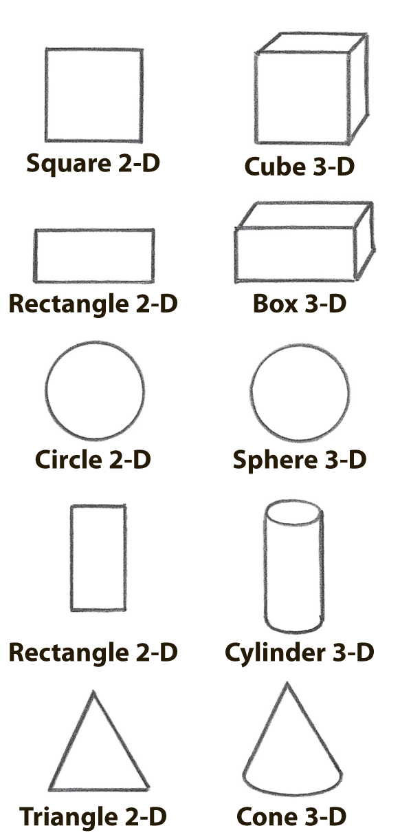
The basic shapes used in creating visual art—the square, rectangle, circle, and triangle—are two-dimensional (2-D). The diagrams below show how to create the illusion of depth (three dimensions or 3-D) by extending each 2-D shape. These 3-D forms are combined and modified to form the elements we draw. For an effective composition, they must be overlapped on the picture plane to unify the elements and provide depth. At the same time, the arrangement must display balance in which the elements’ size, placement, and value occupy the space to create a harmonious composition.
These two-dimensional shapes . . . . . . become these three-dimensional forms in your compositions.
Arranging Elements in a Still Life

Turning Shape into Form Derived from basic shapes, these elements can be used in a still life composition. Cut a sphere in half for a bowl. A circle can become an orange; a cylinder, a can. Stretch a circle horizontally to create a lemonlike ellipse.

Monotonous Composition Placing the elements in a continuous line, as shown here, creates monotony and boredom. There is a slight sense of depth achieved by overlapping, but all the attention is focused on the last item, the vertical can.

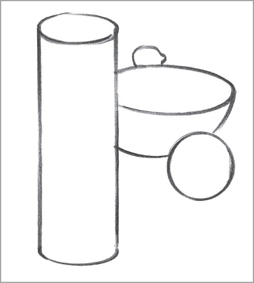
No Depth or Balance This C-shaped composition offers a slightly better placement, but when elements are just touching—not overlapping—nothing creates depth or balance.
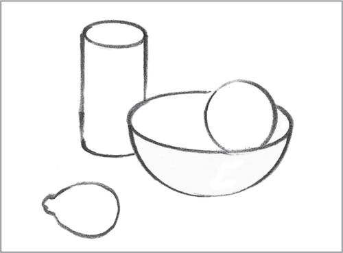
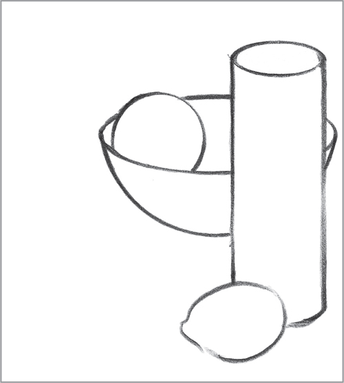
Pleasing Composition Here some elements overlap—the orange is placed in the bowl for further interest. The elements balance one another and hold the viewer’s interest.
One Dominant Element This arrangement is fairly comfortable, even though the cylinder is quite dominant. If you wish to emphasize one major element, be sure that it is worthy of the attention and that the other elements support it. Overlapping the objects creates depth and supports the cylinder.
Unbalanced Placement Even though all these objects are overlapping and the orange is once again placed in the bowl for interest, the viewer is left with the feeling that everything is falling off the page. In addition, the side of the cylinder is at the center of the bowl, visually cutting the composition in half.
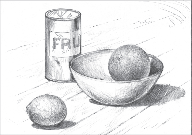
Placing Still Life Elements This finished sketch uses the “Pleasing Composition” thumbnail above as a guide. The two-dimensional shapes of the thumbnail have been transformed into three-dimensional forms through shading to create highlights, shadows, textures, and a surface (the wooden table). The finished composition shows depth and dimension.

Selecting a Viewpoint
After we have selected a subject for our composition, begin by considering viewpoint—the position from which we observe and portray our subject. The viewpoint incorporates the angle of view (from which direction—right, left, or centered—we observe the subject) and the elevation of view (how high or low our position is when viewing the subject). Once these basics have been determined and our composition is finalized, our viewpoint cannot change throughout the drawing process. We must view the subject and all other related elements from the same position at which we started. Objects and structures change greatly, as does the entire composition, if we move from one angle of view or elevation to another.
Angle of View
The viewpoint extends from our eye to the horizon and includes everything we see from a selected, set position. If we move right or left, changing our angle of view, dramatic changes take place in the way we perceive and record the objects and the overall scene. When you are setting up a composition for a drawing, survey your subject from all angles to find the view that will enhance it best. Consider the surrounding elements that you believe will most dynamically highlight the subject. Once these decisions are made, begin refining your composition.

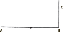
Changing Angle of View Above is an overhead view of an artist looking at a still life composition—a can, a box and a pear—from directly in front of it (A). The dotted lines represent the line of sight. As the artist moves to his left (B) and right (C) to achieve different angles of view, the appearance of the composition changes, as seen in the three illustrations at right.

How the Angle of View Affects the Composition From the A position in the diagram above, the artist sees the composition as it appears in the thumbnail sketch A, shown here. When the artist moves from that angle of view to points B or C, the composition changes as seen here in the left and right sketches; notice the differences in how all the objects appear and relate to one another in these three sketches. Also observe the change in the composition as a whole. Shifting your angle of view changes virtually everything in the composition; thumbnail sketches like these can help you see the differences in your own compositions.
Elevation of View
The elevation of view can be high, level (straight on), or low. From a high angle of view, we look down on the object and see the top and front; in this case, the object’s placement on the picture plane is above the horizontal center. In a straight-on view, we see only the front of the object; its position is at eye level, near the middle of the picture plane. But from a low angle of view, we see the bottom and front of the object; its location on the picture plane is below the center.
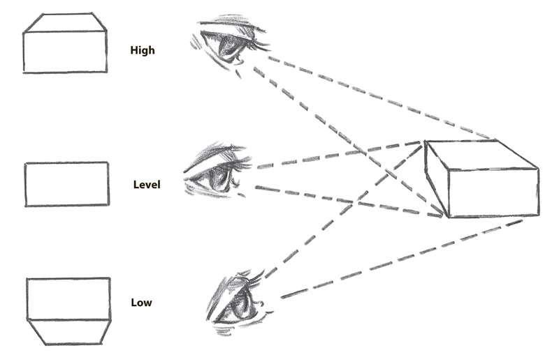
Changing Elevation of View High, level, and low elevation views of the same simple box result in three very different depictions of the subject (shown at the left side of the diagram).