
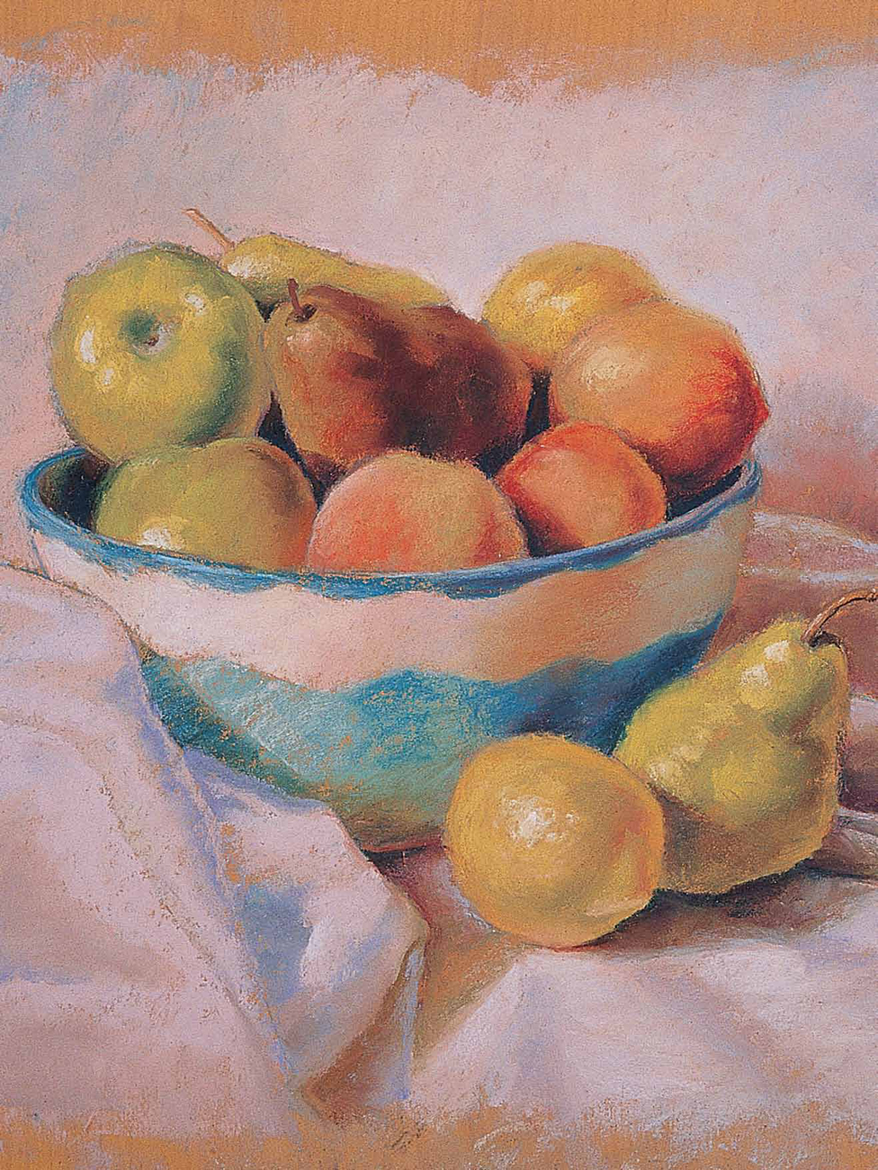

Introduction to Pastel
Although some artists argue over whether pastel is a painting or drawing medium, many agree that it combines the best of both worlds. It offers the color and richness of painting with the control of drawing—and because there is no brush or palette between you and the paper, you’ll find it an intimate and tactile experience. The medium is extremely versatile in appearance; you can create delicate strokes, bold strokes, soft blends, rough textures, or airy sketches. And pastel involves no drying time, so colors stay as true as the moment you stroke, making it perfect for the spontaneous artist who treasures immediate results.
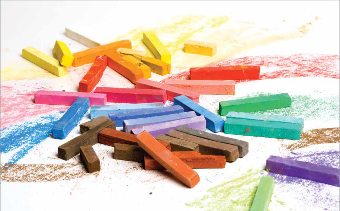
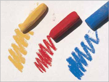
Pastels are powdered pigment mixed with a binder and packed into sticks. They are available in both hard and soft varieties, with the softer pastels containing a higher pigment-to-binder ratio. You can also find them in pencil form, which offers a clean alternative to sticks.
Oil pastels are much different from the “dry” pastels mentioned above. These oil-based sticks have a creamy consistency and yield more vibrant hues. They aren’t used in combination with dry pastels; however, they can be used effectively alongside oil paints.
Paper is an important part of the pastel equation. No matter what type of pastel you choose, work on paper that has a textured surface so the raised areas catch and hold the pastel. You might also opt for toned (or colored) paper, which eliminates distracting bits of white from showing through your final piece.
Here’s what you’ll need: pastels (a 12-piece set is a fine start), textured paper, soft rags for blending, blending stumps, drawing board or tabletop, and newspaper to place beneath your textured pastel paper.

Pastel Basics
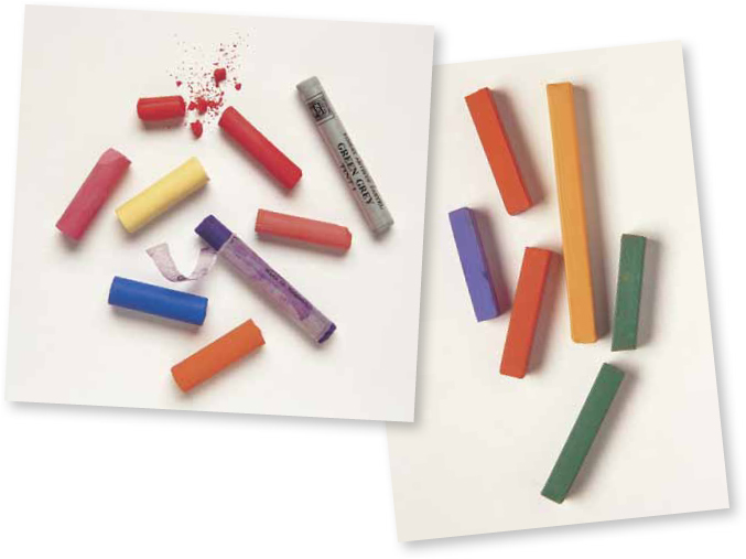
There are many choices of available pastels.
Soft pastels: Soft pastels are great for the undercoats of color, whether for the sky in the background or the horse’s coat.
Too soft: A pastel may be too soft if it fills up too much of the tooth (grooves or dips) of the paper early on and prohibits additional colors from going down on top.
Hard pastels: Hard pastels are useful for creating detail, such as hair, whiskers, hooves, and blades of grass.
Too hard: A pastel may be too hard if it is very difficult to even tint the paper with the color.
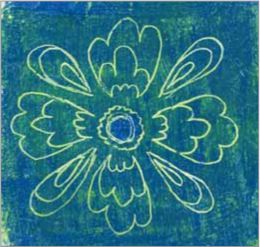
Velour paper
There are many wonderful papers to use with pastel. Try as many of them as you like. Then compare them to velour paper and see which you enjoy and feel the most comfortable using. Velour paper comes in many colors. You can buy it by the individual sheet and find the colors that best suit your style and personality. You can find velour paper at most big art supply stores and also through mail order.
These scraps of velour paper are leftovers trimmed off a larger painting. Keep your scraps and experiment on them or use them for a smaller painting or study.
Black Construction Paper
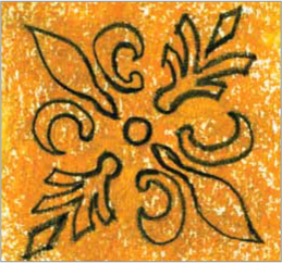
While pastel doesn’t smear as easily on velour paper as it does on other types, the oils and perspiration from your hand can change the nap of the paper. This will make the surface harsher and difficult to rework. To prevent this, cover the areas that are already finished with black construction paper to prevent damaging the artwork. Black construction paper is also helpful for creating a window around a difficult area, such as an eye. This focuses concentration on the area and prevents distraction.

Black construction paper has several uses, such as protecting finished areas of the painting or creating a frame of focus for an area of detail as shown above.

Pastel Techniques
Unlike painting with a brush, working with pastel allows you to make direct contact with the support. Therefore you have much more control over the strokes you make, the way you blend the pigment, and the final effects. Once you learn and practice the techniques shown here, you’ll know which ones will give you the results you desire.
Firm Strokes Use the ends of the pastel sticks to create thick, bold strokes. The more pressure you apply, the thicker the stroke will be. These strokes are ideal for rendering large textured areas, such as fields of grass.

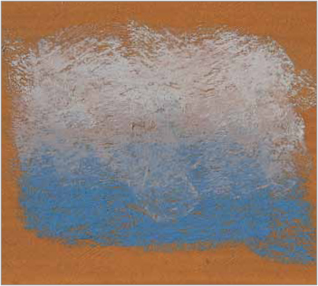
Side Strokes To quickly cover the support and fill in areas of broad color, drag the side of the stick across the support. This technique is effective for creating skies, water, and underpaintings.
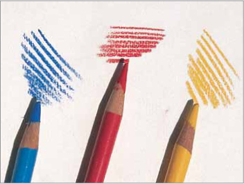
Pencil Lines Pastel pencils offer the most line control, as they are less likely to crumble or break than other types of pastel. If sharp, they can produce a very fine line, which is ideal for creating details or textures, such as fur or hair.
Experimenting with Strokes
The way you hold and manipulate the pastel stick or pencil will directly affect the resulting stroke. Some grips will give you more control than others, making them better for detail work; some will allow you to apply more pigment to the support to create broad coverage. The pressure you exert will affect the intensity of the color and the weight of the line you create. Experiment with each of the grips described below to discover which are most comfortable and effective for you.
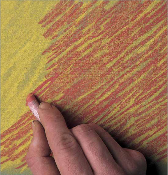
Broad Strokes Place the pastel flat on the paper and slide it back and forth to create broad linear strokes. This grip is also useful to create a “wash”; use the length of the pastel to cover large areas and create backgrounds quickly.

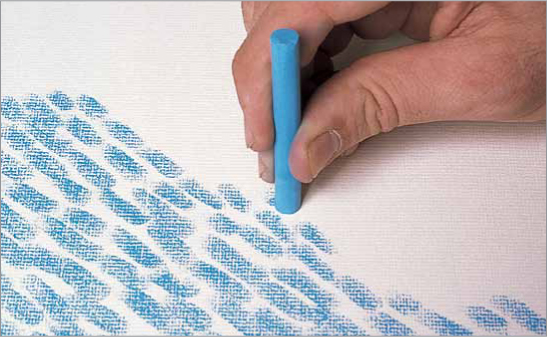
Linear Strokes To create linear strokes, grip the pastel stick toward the back end, and use your thumb and index finger to control the strokes. This grip is ideal for creating fine lines and details; however, it offers less control than the other grips.
Round Strokes Turn the pastel stick on its end and grip it toward the front to create short, rounded strokes. This grip is perfect for creating texture quickly in large areas. Try overlapping the rounded strokes to create a denser texture.
More Pastel Techniques

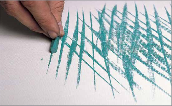
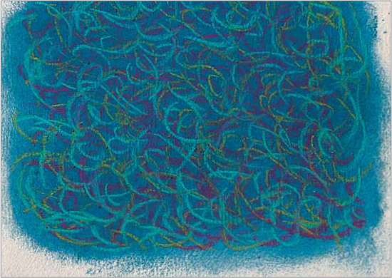
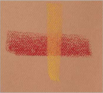
Crosshatching Hatched strokes are a series of parallel lines; crosshatched strokes are simply hatched lines layered over one another, but in opposite directions. You can crosshatch strokes of the same color to create texture or use several different colors to create an interesting blend.

Pointillism Another way to build up color for backgrounds or other large areas of color is to use a series of dots, a technique called “pointillism.” This technique creates a rougher, more textured blend. When viewed from a distance, the dots appear to merge, creating one color.
Removing Pigment When you need to remove color from a given area, use a kneaded eraser to pick up the pigment. The more pressure you apply, the more pigment will be removed. Keep stretching and kneading the eraser to expose clean, new surfaces.
Creating Patterns To create textures or patterns when rendering fabric or clothing, first lay down a solid layer of color using the side of the pastel stick or pencil. Then use the point of a pastel pencil to draw a pattern, using several different colors if you wish.

Using Tape You can create straight, even edges by using house painter’s tape. Just apply it to your support, and make sure the edges are pressed down securely. Apply the pastel as you desire, and then peel off the tape to reveal the straight edges.
Gradating on a Textured Support Creating a smooth, even gradation on a textured ground can be a little tricky. Add the colors one at a time, applying the length of the stick and letting it skip over the texture of the paper by using light pressure.
Glazing Create a “glaze” just as you might with watercolor by layering one color over another. Use the length of the pastel stick with light pressure to skim over the paper lightly. The result is a new hue—a smooth blend of the two colors.

Blending Pastels
There are a number of ways to blend pastels, and the method you use depends on the effect you want to achieve and the size of the area you’re blending. Smooth, even blends are easy to achieve with a brush, a rag, or even your fingers. You can also use your finger or a paper blending stump to soften fine lines and details. Still another method is to place two or more colors next to each other on the support and allow the eye to visually blend them together.
Applying Unblended Strokes In this example, magenta is layered loosely over a yellow background. The strokes are not blended together, and yet from a distance the color appears orange—a mix of the two colors.
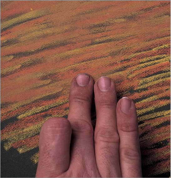
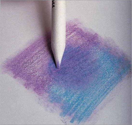
Blending with Fingers Using your fingers or the side of your hand to blend gives you the softest blend and the most control, but be sure to wipe your hands after each stroke so you don’t muddy your work. Or use rubber gloves to keep your hands clean.
Blending with a Tortillon For blending small areas, some artists use a paper blending stump, or tortillon. Use the point to soften details and to reach areas that require precise attention.
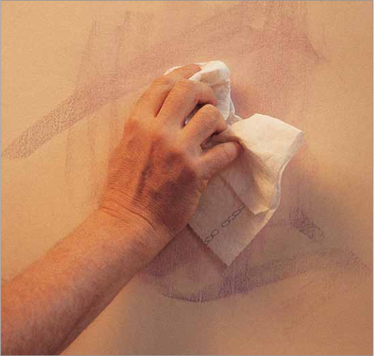
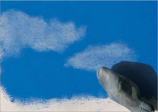
Using a Cloth For a large background, it is sometimes helpful to use a cloth or a paper towel to blend the colors. To lighten an area, remove the powdery excess pastel by wiping it off with a soft paper towel.

Shading with Pastel
Smooth Shading in Pastel
You can obtain a smooth look, such as shading for large areas of color, in your paintings by using the long side of a pastel. As you stroke the pastel onto velour paper, you want just a little color coming off the stick. That way the nap of the paper won’t completely fill with pigment, and you will be able to add more colors and layers on top. To do this, lightly crosshatch the color back and forth across itself until you build up a smooth layer. As you add the next color, your pastel will press the layer underneath into the paper to help add depth.
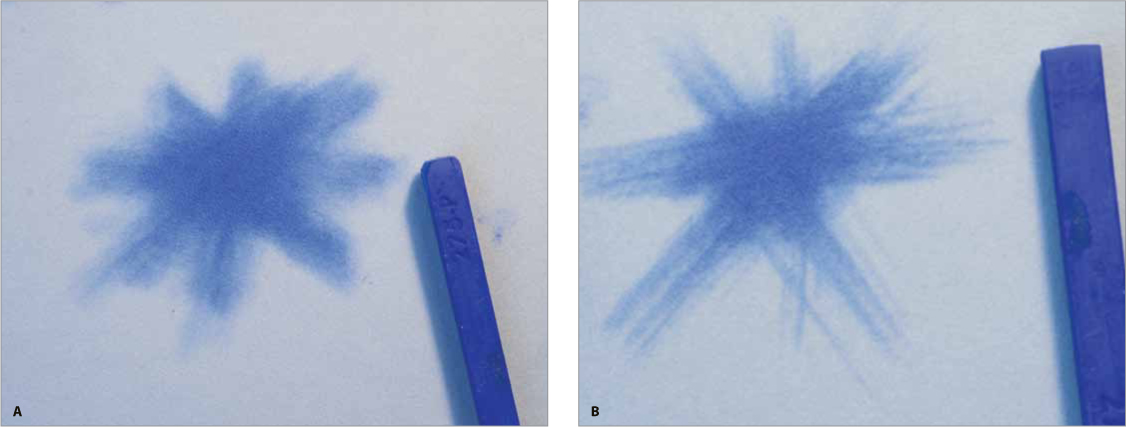
Shading with Hard Pastels Shading with an unsharpened hard pastel (A), you can achieve broader, softer strokes of color than with a sharpened hard pastel (B). Crosshatch the color in four different directions; the goal is for the area in the very center to be even and smooth with no edges or ridges of color showing as individual marks. It’s a good idea to practice on scrap paper until you feel you are getting a very smooth look with your color.
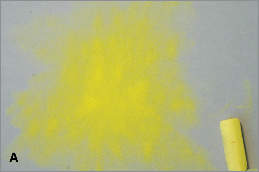
Shading with Soft Pastels Use a light touch when you work with soft pastels. Because they are softer, they naturally leave a lot more pigment on the paper. This demonstration shows you how to practice layering three different colors using smooth, crosshatching strokes with the side of your pastels. After you place the layer of yellow (A), you’ll likely notice that the ripples of the paper show through the color.

As you add the next layers of color, they will help push the yellow down into the nap of the paper for a smoother look. Next, cover the yellow with pink (B) and see how smooth the paper and layers now look.

Then, add light purple on top (C) and, again, notice how this third layer covers the other colors and continues to smooth the surface.

Special Effects with Pastel
Masking
The dusty nature of pastel makes it difficult to create clean, hard edges; but employing a simple masking technique is a great way to produce sharp edges. To mask, use a piece of paper or tape to create a straight edge, or create a clean-edged shape with a special mask you make yourself. Of course, you would use tape only to save the white of the paper; never apply it to a support that already has pigment on it.

Cutting the Shape Begin by drawing the shape on a piece of tracing paper and cutting it out.
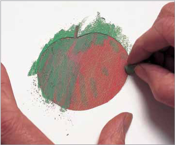
Applying the Color After painting the background, place the mask on top and then apply color.

Removing the Mask Carefully peel away the mask to reveal the crisp shape underneath.
Using a Combination of Techniques
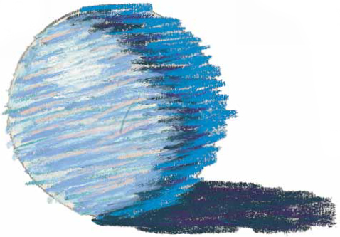
These techniques are useful in and of themselves, but you won’t truly understand the effects you can achieve until you apply them to an actual subject. Here you can see how the same subject is rendered using three different methods; notice the different look of each.

Blending Here the colors were applied thickly and smoothly. The even layers of color create the appearance of a slick, smooth object.
Linear Strokes Linear strokes are layered over one another to create a more textured appearance. From a distance, the colors still appear to blend together.
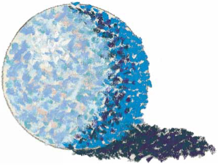
Pointillism Pointillism is used to create the form of the sphere. Although the same colors are used, the surface of the object appears much rougher.
Working with Oil Pastels
To begin working with oil pastels, you’ll need a few basic supplies, listed below. While there are a number of techniques that can be achieved with this medium, the basics are shown here.
• Oil pastels: Vandyke brown, Prussian blue, gray, yellow, yellow orange, brown, white, black, pink, ultramarine blue, yellow ochre, olive brown, yellow green, vermillion, deep green, pale orange, green, Prussian blue, orange, lemon yellow, red, pale blue, cobalt blue, gray green, green gray, olive gray, and purple
• Acrylic paints: Ultramarine blue, burnt sienna, yellow ochre
• Graphite pencils
• Conté black pencil
• Kneaded eraser
• Paper
• Heavy rag
• Gamsol
• Gesso
• Matte medium
• Palette knife
• Ruler (to tear down paper to size)
Scraping Back First put down a layer of color. This example shows yellow green. Next, smudge this until it becomes a solid. Then, layer another color on top of it, such as cobalt blue, and smudge it until it becomes a solid. Now, you can scrape detail back into your piece. Use a penny nail to carve through the top layer of color to reveal the yellow green beneath.

Blending with Oil Pastel Begin by covering one area with yellow. Next, add a layer of vermillion hue next to the yellow. Then, press hard and blend with the oil pastel crayon, using pressure in the middle where the two colors meet.
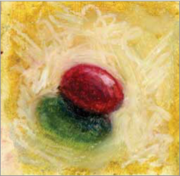
Highlight A highlight is the chunk of light that is the lightest spot on your image. After creating your rendering, place the highlight appropriately. This grape was created with vermillion hue as a middle tone, Prussian blue for the shadow shape, and white for the highlight. The background is an even layer of yellow ochre with thick white on top.

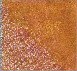
Acrylic Toned Base First, mix a transparent layer of Ultramarine blue and matte medium. Next, use this to cover the surface. Then, create a gradient with olive brown—the pressure of application determines intensity. Notice the difference between opacity and optical blending.
Smudge with Finger Put down an even layer of purple. On top of that, place a layer of yellow ochre, and then smudge/blend with your finger. Strive for even color.
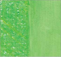
Blending with Turpentine First, crosshatch a layer of green. Then, layer an even color application of lemon yellow on top. Finally, blend with a large flat brush, using a little Gamsol or Turpentine to create an even color.
Stippling Start with pale blue. Create an even tone by making dots over the entire surface. Next, begin on one side and stipple Prussian blue until you’ve made a gradual value shift like shown in the example.
Draw Back Into Begin by cross-hatching an even layer of color with orange. Next, use a Conte or Derwent® black pencil to draw on top of the orange, thus creating detail. You can also do this with graphite.