How to Use This Book
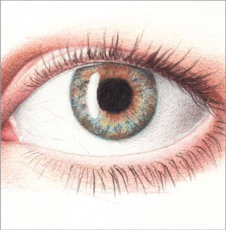
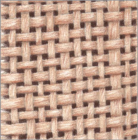
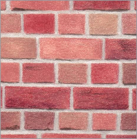
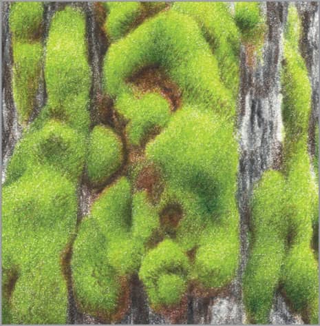
This book includes step-by-step instructions for achieving a wide range of textures with colored pencil.
1. GATHER the tools and materials you need to start drawing. (See here.)
2. LEARN the drawing techniques shown here. Acquainting yourself with the vocabulary and methods for working in colored pencil will help you quickly and easily understand the instructions for replicating each texture.
3. LOCATE your desired texture in the Table of Contents. The textures are organized in the following six categories:
|
|
|
People |
Animals & Insects |
Fabrics & Textiles |
|
|
|
Glass, Stone, Ceramics, Wood & Metal |
Food & Beverage |
Nature |
4. FOLLOW the step-by-step process outlined to draw your texture.
5. PRACTICE the texture as it appears in the book; then integrate the textures into your own drawings.
Tools & Materials
Paper

The tooth, or texture, of a paper grabs and holds onto pigment. The toothier the paper, the rougher it is and the more pigment it will hold, but that also makes it more difficult to achieve a smooth, blended look with no speckles of paper peeking through. Very smooth paper makes it easier to create fine, smooth details, but it will not accept as much pigment, making it more difficult to achieve rich, complex color. Examples of toothy paper are cold-pressed watercolor paper and papers made for use with pastels. Example of very smooth paper are smooth and plate bristol. In between are papers such as hot-pressed watercolor paper, vellum bristol, and printmaking paper, such as Stonehenge.
Choose good-quality, acid-free paper that has the right characteristics for the textures you plan to depict, and practice on it first to familiarize yourself before launching into a full project. For all my work, I prefer acid-free, 100-percent cotton rag, archival paper. I used white Stonehenge paper for all the examples in this book because of its consistent, fine tooth, durability, and availability in many art supply stores—in both pads and large single sheets.
EXTRA PAPER Always keep a disposable sheet of paper under your drawing hand as you work to protect the drawing from the oils of your hand and prevent smudging. Glassine is excellent for this—it looks like wax paper but is more slippery. Plain printer paper will also do.
Pencils
GRAPHITE For planning basic outlines, a graphite pencil of grade HB or H works well. It is a little harder than a standard 2B, so it deposits less graphite on the paper. Use it lightly so that it doesn’t dent the paper.
COLORED Whatever the brand, colored pencils fall into two main types: wax-based and oil-based. This refers to the composition of the binder that holds the pigment together to form the pencil core. Wax-based pencils are softer and creamier, while oil-based pencils are harder and drier. They can be used together, and neither is better than the other—they’re just different.
Depending on the brand, full sets range from 72 colors to 150 colors. Although purchasing the largest possible set of a brand is always tempting, it’s not necessary to make beautiful drawings. A smaller set of 24 or 36 colors can produce a broad spectrum once you learn a little color theory and how to layer them. Many stores also sell individual “open stock” pencils, so you can add the colors you need to your collection as you need them. Avoid cheap “student-grade” or children’s pencils. They don’t blend well and the colors will change or fade over time.
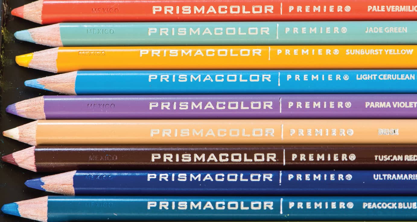
I used Prismacolor® Premier® colored pencils for all the examples in this book. These wax-based pencils are readily available from any store that carries art supplies and are reasonably priced. You may prefer a different brand. Experiment to find the pencils that suit you best.
Erasers
KNEADED RUBBER Applying a light color over a graphite outline is a recipe for disappointment—at best, the graphite will become more noticeable; at worst, it will smear. To avoid this, a kneaded rubber eraser is a must-have. Throughout the book, when preparing to draw with light colors, you’ll see that I suggest dabbing away as much of the graphite outline as you can and still see it. I recommend doing this ahead of not only light colors but any colors. Never scrub with the eraser—scrubbing damages the surface of the paper.
POSTER PUTTY Colored pencil is not easy to erase, and almost neer erases completely. Lifting it off paper reasonably well requires something with more tackiness than kneaded rubber: poster putty. This is the same stuff that students use to hang posters on walls! Depending on the brand, it might be white, blue, or green; the color doesn’t matter. Like kneaded rubber, it can be pinched and rolled into a fine point or a line. It works best by gently dabbing at the paper surface. Again, never scrub the paper. It’s a must-have for corrections, lifting the inevitable little blobs of pigment, and cleaning up edges.
OTHER Some artists find great value in electric erasers, or those that come in a holder that clicks like a mechanical pencil. Either of these can be sharpened to a fine point to make crisp edges.
Blenders & Solvents
Whether you choose to use blenders and solvents is a personal choice—some artists prefer their work to look like a drawing, even if they depict a very smooth texture, while others prefer their work to look like a painting, even if they depict a very rough texture. In this book, I often use a colorless blender or solvent to demonstrate what a big difference it can make.
COLORLESS BLENDER A colorless blender is a colored pencil with no color—just binder and waxes or oils. Most colored pencil manufacturers make a colorless blender designed to work well with their pencils, sold separately from their sets. I used a colorless blender for many examples in this book.
SOLVENT The binder that holds colored pencil pigment together is easily dissolved with a little solvent, either alcohol or odorless mineral spirits. Both evaporate quickly, leaving no residue. Solvent does not turn the pencil into a watercolor effect of liquid color that you can pull around with a brush; it drops the pigment in place into the tooth of the paper, eliminating speckles of paper peeking through and producing a more even, intense color. This is useful when you want to smoothly blend two to three layers of pigment but preserve the tooth of the paper so you can continue with more layers on top.

Whenever I mention using odorless mineral spirits, you can also substitute alcohol. I used odorless mineral spirits for several textures in this book: Smooth Skin (#1), Rusted Steel (#51), and Still Lake (#93).
Sharpener
There are hand-held, hand-cranked, and electric sharpeners. There is no “best” sharpener, but I do recommend getting an electric one to save time, since you will be sharpening often. When working with colored pencils, it’s crucial to get a very sharp point, and sometimes you may need to sharpen every 90 seconds! For an electric or hand-cranked sharpener, choose one with a helical mechanism, as it will last longer and be gentler on the pencils. Occasionally sharpen a graphite pencil in the sharpener to clean the blades of waxy buildup.
Stylus
A stylus is a pen-shaped instrument with a tiny steel ball tip, used for impressing lines into paper without damaging it. An empty extra-fine ballpoint pen will do in a pinch, but manufactured styluses are available with much smaller tips. Do not use a sewing pin or a wire, such as a straightened paper clip—the sharp end will cut your paper.
Swatch Chart
The biggest time-saver for working with colored pencil is a swatch chart. For every set of pencils you own, arrange them in color sequence. Then make swatches of color in that sequence on a large piece of paper, and label each swatch with its name. Keep your pencils arranged in that order, and keep your swatch chart next to you while you work. Whenever you need a certain color, you need only to find it on your swatch chart and go right to it in your set, without wasting time making test scribbles to see what color comes close.

I have several swatch charts available to download on my website: www.denisejhowardart.com/downloads-media.html.
Fixatives
Fixative is a liquid spray that creates a barrier. There are two main types: workable fixative and final fixative. Workable fixative allows you to continue drawing more layers on top without affecting or blending into the layers underneath. Final fixative completely seals the surface of the drawing to protect it from smudging, and is only used upon completion.
For wax-based pencils, final fixative is especially important to prevent wax bloom. Over time, the wax from the binder can migrate to the surface of a drawing, causing a blotchy, cloudy look, known as wax bloom. Bloom is more likely with heavy layers of pigment and more noticeable on dark colors. It’s easy to fix by gently wiping the paper’s surface with a very soft cloth or cotton swab, but it’s better to prevent it by using final fixative. Follow the directions on the can.
Drafting Brush
Crumbs of pigment inevitably appear, along with dust particles and fibers. Resist the urge to sweep them away with your hand, which could embed them into the paper or smudge your drawing. Instead, use a drafting brush; this is exactly its purpose.
Techniques & Color Mixing
As an art medium, colored pencil is similar to watercolor: you work from light to dark, reserving bare paper for the lightest highlights; once an area is dark, it’s impossible to make it fully light again. This is important to keep in mind if you’re familiar with media that work the opposite, such as pastels, where you work from dark to light and add the highlights last. Unlike paint, you cannot wipe out or paint over errors and start again. But since colored pencil drawings develop slowly, errors do too, so you have time to notice and correct them before they become irreparable.
Following are some of the basic stroke techniques, effects, and blending methods used to create the drawings in this book. Practice them several times on scrap paper before using them in a project, since colored pencil is not easy to erase!
Holding the Pencil
The position of the pencil relative to the surface of the paper is important for colored pencil drawing, because it affects how evenly and thoroughly the pigment is laid down.
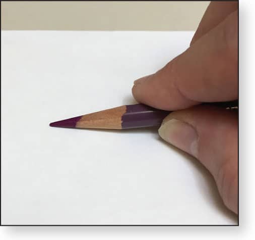
FLAT Holding the pencil so that the side of the point is flat against the paper and stroking with it deposits pigment unevenly and creates a very coarse look. This is useful for drawing textures like rough bark, sand, and rock.
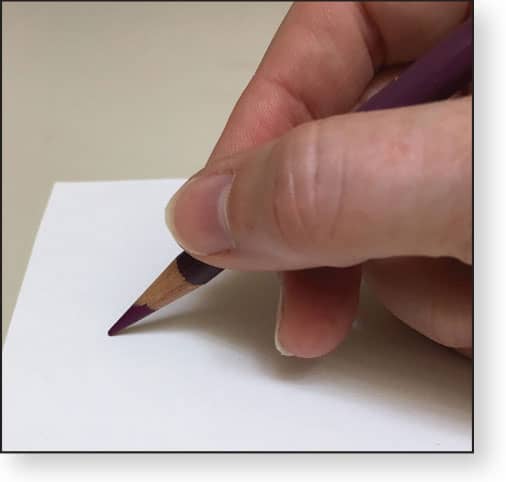
NORMAL Holding the pencil as if you are writing with it, but at a slightly more vertical angle, is the normal position for colored pencil. This ensures that a good amount of pigment gets into the tooth of the paper with each stroke.
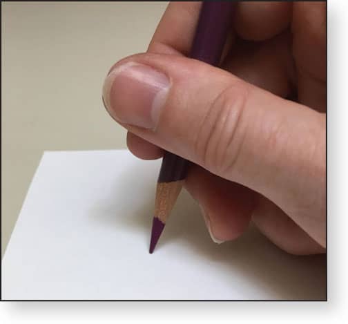
VERTICAL Holding the pencil perpendicular to the paper and using a circular/scumbling stroke ensures that the pigment gets fully down into and around the tooth of the paper to create very smooth, complete coverage that reveals no stroke direction.
Sharpness & Pressure
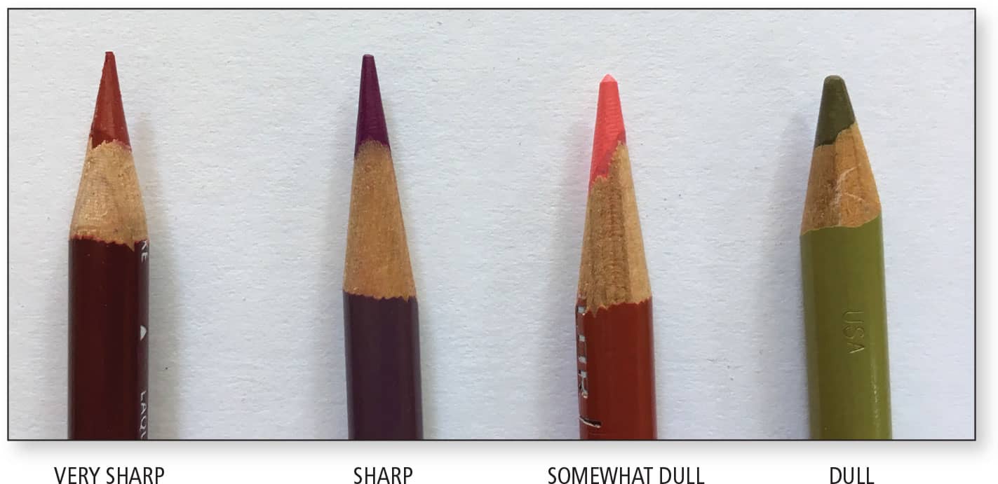
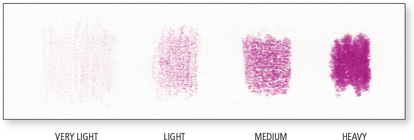
Throughout the tutorials in this book, each step describes the sharpness of the pencil and the amount of pressure to use. These details are important for achieving the desired results. For example, drawing a very smooth texture, like satin, requires a very sharp point and light pressure, while drawing a very rough texture, like rough bark, is most successful with a dull point and medium pressure.
Strokes
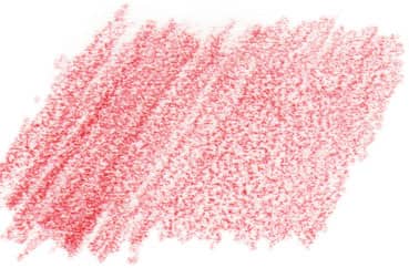
HATCHING Hatching entails drawing parallel lines close together with a smooth back-and-forth motion. By keeping the pressure constant as you move across an area, you can create an even area of color. By keeping the pressure constant and staying in an area, you can build up more pigment coverage without prematurely flattening the tooth of the paper.

CROSSHATCHING Crosshatching is hatching in more than one direction, so that the strokes cross, to reduce the linear appearance. Sometimes this is taught as crossing strokes at a perpendicular; however, when working with colored pencils, this can result in a weave or waffle appearance, which only worsens as you try to fill the gaps. I suggest crossing strokes at a shallow angle, 30 degrees or less.
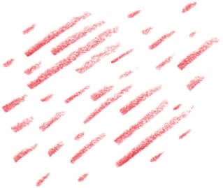
TAPERED A tapered stroke begins with a certain amount of pressure and, as you move the pencil, you apply less pressure until it is lifted away from the surface. This is useful for drawing things like eyelashes, clumps of grass, and short fur.
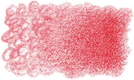
CIRCULAR/SCUMBLING By holding a very sharp pencil nearly vertical and moving the point in tiny, overlapping circles or ovals, the pigment can get fully down into and around the tooth of the paper to create very smooth, complete coverage that reveals no stroke direction. You can visualize this as how water fills all the spaces around rocks in a shallow pool.

BLUR A soft blur is easy to achieve if you remember that 1 + 1 = 2 and 1/2 + 1/2 = 1. If you partly overlap two full-strength areas of color, the area of overlap will be obvious because it has twice as much pigment, and it won’t be soft. But if you fade out Color A by half and Color B by half, so that the area of overlap is the half-strength of each, you’ll achieve a soft blur.
Effects
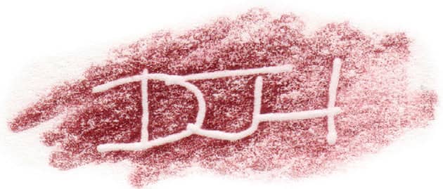
IMPRESSED LINES Impressing lines into your paper with a stylus before you begin drawing puts the indentations out of reach of pencil points. As you draw over them, they remain white. This is useful for depicting whiskers, single-hair highlights, distant twigs, and more.
WASH A wash is a thin, smooth layer of color. When working with colored pencil, the first step is often to draw a wash with white or another very light color. This provides a base color, as well as a waxy base for smoother blending of the darker colors to follow. A wash can also be a thin layer of color applied on top of another color to create a new color from the combination.
BLENDING Each strip is identical layers of crimson lake and indanthrone blue, applied more heavily at the left and transitioning to a thin wash at the right. Note the increase in color saturation when either a colorless blender or solvent is used, but also note that they can’t work as well when the pigment is thin.

OPTICAL Gently drawing one layer of colored pencil on top of another produces an “optical blend.” To the unaided eye, it appears to be a blend of the two colors, but viewing it through a magnifying glass reveals individual particles of each color and speckles of bare paper. It can also be considered a transparent blend. This is the most common way to blend colored pencil colors. Many people prefer this result because it looks “like a drawing.”

COLORLESS BLENDER When used as the last step of the drawing process, a colorless blender intensifies the colors and creates a smoother appearance. How smooth depends on how much pigment is on the paper and how hard you press. It works best with at least a couple of light layers of pigment. Pressing very hard with it is called burnishing. This obliterates the tooth of the paper, making the drawing a bit shiny and further adjustments difficult to impossible.

SOLVENT You need at least a couple of layers of pigment on your paper in order for there to be enough wax binder to dissolve for solvent to be effective at creating smooth color. An eyedropper-full of alcohol or odorless mineral spirits applied with a 1/4” flat brush is enough for a 3” × 3” square. Moisten only the tip of the brush, or blot excess on a tissue, and then touch it to your drawing. Gently stroke the pigment just enough to see it dissolve, and move on. Allow at least 15 minutes for it to fully evaporate before drawing more on top. Solvent can be reapplied after every couple of layers.
Color Mixing
Regardless of the size of your pencil collection, you probably won’t have exactly the right color for every situation. Even if you did, it would look better and richer with another color added. Learning how to “see” the individual colors in your reference, and knowing what colors to combine to achieve that color, takes observation and practice—and it starts with basic knowledge of color theory.
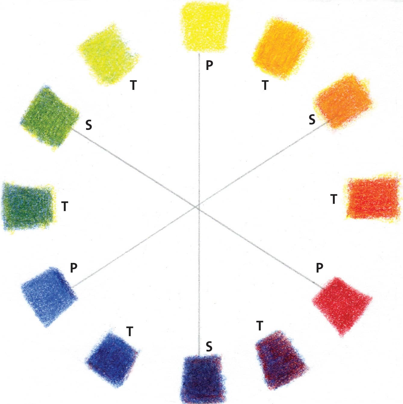
P = Primary color, S = Secondary color, T = Tertiary color. The color opposite a given color on the wheel is its direct complement. In this diagram, each primary is connected to its direct complement.
When working with pigments, there are three primary colors: red, yellow, and blue. Mixing these produces the secondary colors: orange, green, and purple. Mixing primary and secondary colors produces the tertiary colors, such as red-orange and blue-green. Drawing a color wheel with your pencils makes this easier to understand. The direct complement of a color is directly across from it on the color wheel; for example, blue and orange. Analogous colors are any three adjacent colors, such as red-orange, orange, and yellow-orange.
Placing direct complements next to each other produces vibrant contrast; mixing them produces neutral, gray/brown colors. This can also produce a more convincing “dark.” For example, when drawing a red apple, the dark side is made more convincing not by using a darker red or adding black to it, but by drawing a layer of green first (an underpainting), followed by red. Experiment with layering various colors on top of each other in different concentrations to see what interesting new colors develop!
WARM VS. COOL COLORS Warm colors are yellows, oranges, and reds, associated with fire, heat, and warmth. Cool colors are blues, purples, and greens, associated with water, sky, ice, and cold. In the real world, distant objects, such as mountains and forests, appear lighter and bluer in daylight, due to the atmosphere. Foreground features appear darker, so in general, we use cool colors to suggest distance and warm colors to suggest nearness.
VALUES Value is the degree of lightness or darkness of a color. For example, yellows and light blues are light in value, while earthy browns and deep purples are dark in value. In a black-and-white image, the range of grays from white to black are its values. Your drawing needs to consist of a full range of values to look three-dimensional; if the value range is too narrow, it will look flat and washed-out. Familiarize yourself with the range of values represented in your pencil collection by way of a swatch chart.
The first thing I do before I pick up a colored pencil is identify the absolute darkest dark and lightest light areas in my reference. Then I know that all the colors I choose and create must be between those values. If you’re unsure, convert your reference photo to grayscale on your computer to make the values easy to see. If you need to check your drawing’s values, view it through a sheet of red acetate. The red makes all colors appear as shades of gray. If you don’t have red acetate, try squinting your eyes, which subtracts a lot of detail.

