
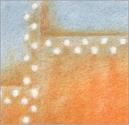
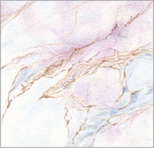
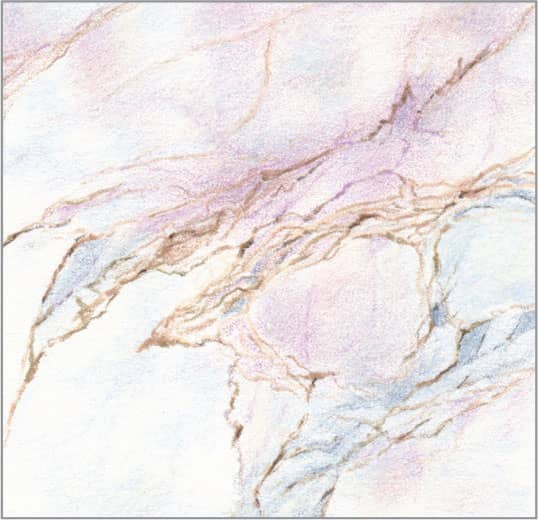
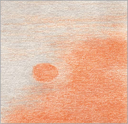
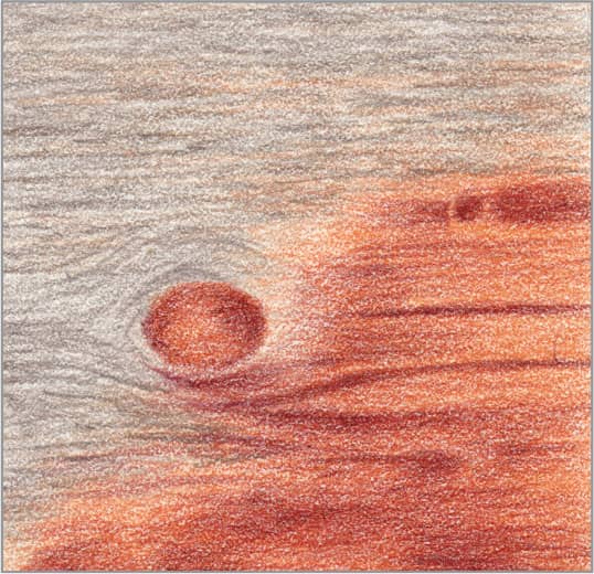
40 Stained Glass
STEP ONE The challenge of stained glass is that it has very saturated color and is translucent. The keys are to start with light, bright colors before adding darker tones, and to add the very dark strips between the panes last so the edges stay crisp and dark crumbs don’t pollute the panes. Begin with an outline of the panes and strips. Erase as much of the outline as you can and still see it, so the graphite lines won’t show through the light colors to come.
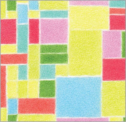
STEP TWO For the first layer of color, keep all your pencils very sharp and apply with light pressure to get to medium coverage. Use lemon yellow, pale vermilion, hot pink, carmine red, chartreuse, apple green, light aqua, and electric blue.

STEP THREE Apply the second layer of color in indistinct blobs to suggest the outdoors on the other side of the glass. Keep all your pencils very sharp and apply with light-to-medium pressure. In the same order as the previous colors, use sunburst yellow, henna, mulberry, crimson lake, spring green, cobalt turquoise, grass green, and Mediterranean blue. To suggest textured glass, apply the mulberry and the Mediterranean blue in uneven lines, and use very sharp white with medium pressure to enhance the contrast above these lines.
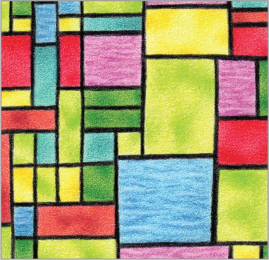
STEP FOUR Finish with very sharp black and heavy pressure to draw the strips between the panes. Try to keep the edges very crisp—sharpen the pencil often. It’s okay for the thickness of some strips to vary a bit, because real stained glass window strips usually vary as well.
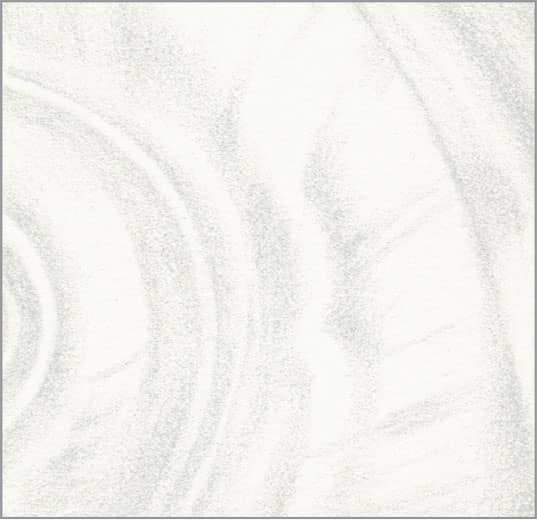
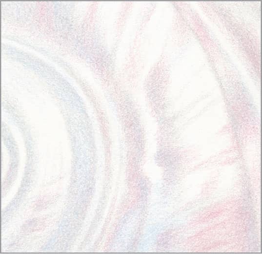
41 Clear Glass

STEP ONE Clear glass is surprisingly easy to draw, by keeping track of the refraction lines and curves where light bends inside it. For this example, we’ll use only cool grays to show that even with colored pencils, there are occasions when no color is needed. Start with an outline of the vase and its major refractions. Be sure to erase as much of it as you can and still see it, so the graphite won’t show through the light colors to come.

STEP TWO Reserve the bare paper for the clearest, brightest highlights. Use sharp cool gray 10% with light pressure to draw the lightest areas that are neither completely clear or highlights.
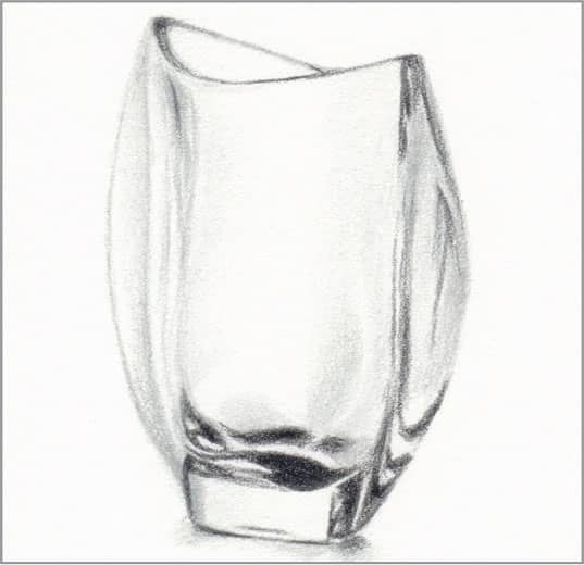
STEP THREE Use very sharp cool gray 30% with light pressure on top of some of the previous gray to increase the contrast and suggest subtle shifts in value. Use very sharp cool gray 90% with medium pressure to create the darkest areas in the base, and with light pressure to define the rim, the base where it meets the table, and some refraction lines along the sides.
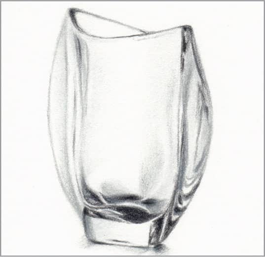
STEP FOUR Now that the lightest and darkest areas are defined, use very sharp cool gray 50% with light pressure to add the middle-value refractions along the sides and in the base. Make final adjustments to contrast in any of the grays as needed.
42 Translucent Balloons
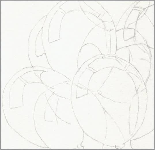
STEP ONE Balloons pose several challenges when grouped together: they’re very smooth, they’re translucent, and they’re reflective. Begin with a basic outline of the balloons, the major reflections, and the overlaps.
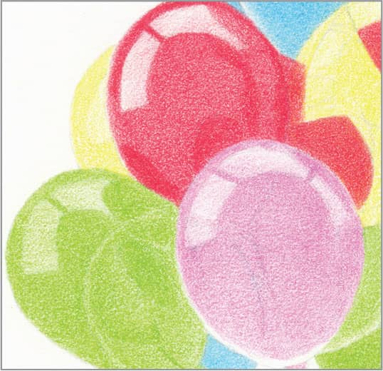
STEP TWO For the first layer, choose light, bright colors so that the end result will be bright and intense. In this example, use very sharp lemon yellow, hot pink, carmine red, spring green, and electric blue with light pressure for medium coverage.
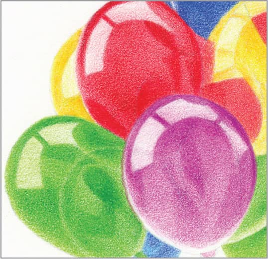
STEP THREE For the second layer, choose deeper values of the first colors: very sharp sunburst yellow, mulberry, crimson lake, grass green, and ultramarine with light pressure. Use these colors to define the darker areas with medium pressure.

STEP FOUR Now that the basic colors of the individual balloons are established, it’s time to add the reflected and transmitted colors that relate the balloons to each other. Using the same colors from the previous step, draw these areas with light-to-medium pressure. For example, the green balloon reflects onto the red balloon, so use grass green with medium pressure to draw that reflection. The blue balloon at the bottom shows through the purple balloon in front, so use ultramarine lightly on top of the mulberry to draw it. Keep all edges crisp. Finish with very sharp white to smooth the highlights and a colorless blender to smooth everywhere else.
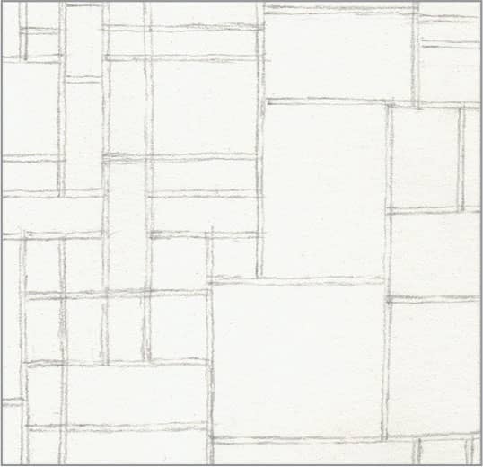
43 Cobalt Glass
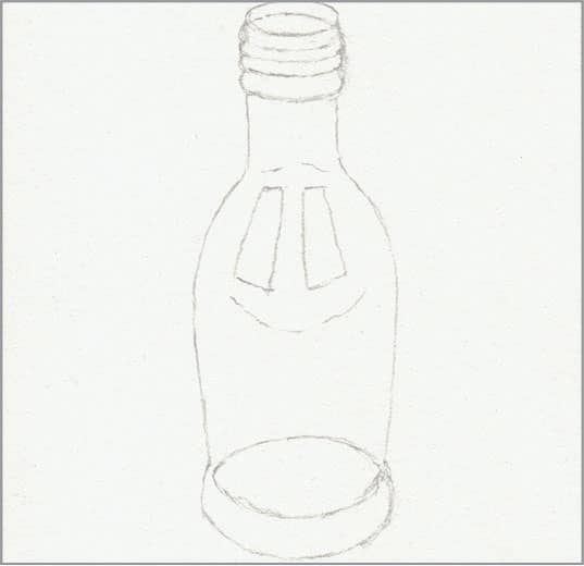
STEP ONE Like a translucent balloon, colored glass is smooth and reflective, but it’s more transparent and refractive, like clear glass. For this example of a cobalt-blue bottle, begin with a basic outline of the bottle and the major reflections. Erase as much of it as you can and still see it, so the graphite lines won’t show through the light colors to come.

STEP TWO With very sharp light cerulean blue and light pressure, create an overall light wash, with more coverage in the areas which will be darker, such as the collar and base.

STEP THREE With very sharp cobalt blue and light pressure, enhance the more saturated color areas—the collar, base, and shoulder—with medium coverage. Use it very lightly near the edges to begin giving the bottle form.

STEP FOUR With sharp violet blue and medium pressure, give final intensity to the deepest blues of the collar, shoulder, and base. Use it lightly near the edges to give the bottle its final form. Then use very sharp indanthrone blue with medium pressure to define the screw-top rings at the opening and the bottom of the base. Add hints of it in the center of the base and along the sides to enhance the transparent look. Clean up edges as needed, and finish with a colorless blender to smooth overall.
44 Porcelain
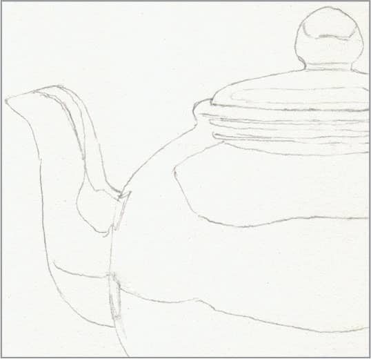
STEP ONE The challenge of porcelain is its saturated color with a very smooth, shiny glaze that produces reflections and smooth gradations. It calls for both very light and heavy layers. Begin with a basic outline that includes the reflective areas.
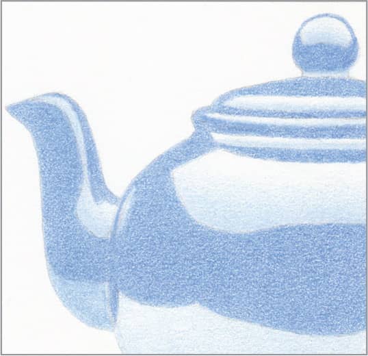
STEP TWO Use very sharp powder blue with light pressure to create a base for the gradients in the highlight reflections. Use very sharp Caribbean Sea with light pressure to create a medium wash in the rest. Apply both as smoothly as you can.

STEP THREE Use very sharp ultramarine with very light pressure on top of the powder blue in the highlight reflections. Use it with medium pressure in the rest. Keep the edges and borders very crisp.
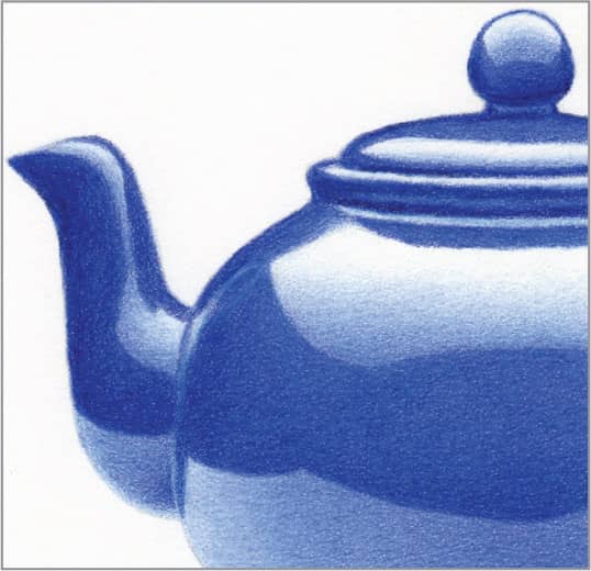
STEP FOUR Use very sharp indanthrone blue with medium-to-heavy pressure to model the forms in the dark areas—the undersides of the handle, lid, and spout, and the border of the pot. Also, use it to darken the lower part of the dark band around the center. Use more very sharp Caribbean Sea with light-to-medium pressure to smooth the highlight reflections, and sharp white with light pressure to smooth them to the brightest highlights. Finish with a colorless blender to completely smooth overall.
45 Shiny Gold
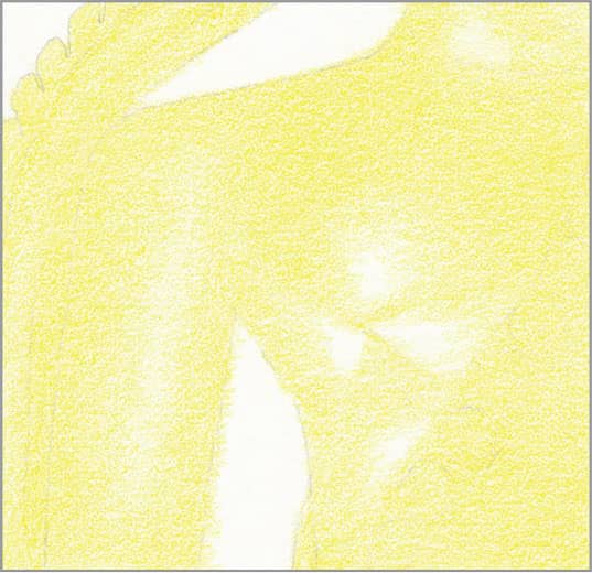
STEP ONE Shiny gold is surprisingly easy to draw, with just four colors. Begin with an outline and an overall medium wash of sharp canary yellow, reserving the bare paper for the brightest highlights.
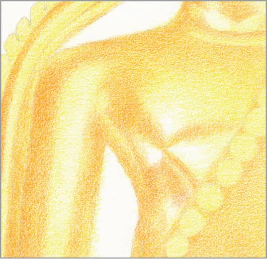
STEP TWO Use very sharp yellowed orange with light pressure on top of most of the canary yellow, except where it is very bright near the highlights.

STEP THREE Use very sharp sunburst yellow with light pressure to create an intense transition zone between the previous two colors, particularly down the arm and next to the highlights. Also, layer it lightly across the upper chest.
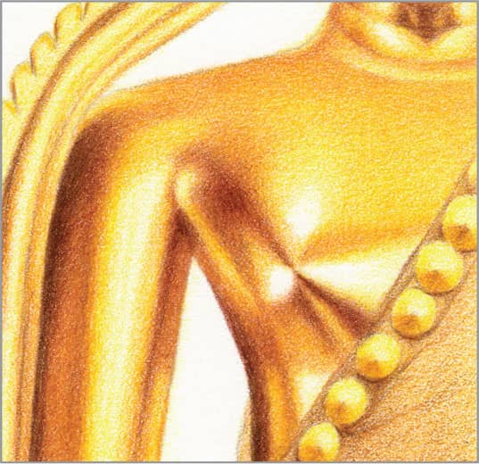
STEP FOUR With very sharp burnt ochre and medium pressure, add the dark areas that give form to the sides of the arm, the side of the body, and under the chin, and fade them into the surrounding color with light pressure. Then, for final contrast, use sharp chocolate with medium pressure along the outside edge of the arm, in the armpit, and along the side. Use it with light pressure in the center of the burnt ochre areas on the chest and under the chin. If desired, smooth with a colorless blender.
46 Polished Silver
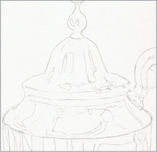
STEP ONE When polished, silver is almost as reflective as a mirror. This makes it surprisingly easy to draw with cool grays and blues, as long as you keep track of the reflections and highlights. Begin with a basic outline. Erase as much of it as you can and still see it, so the graphite lines won’t show through the light colors to come.

STEP TWO First identify shapes that contain blue and fill them with a light layer of powder blue. Then identify shapes that are the lightest gray and fill them with a light layer of cool gray 10%.
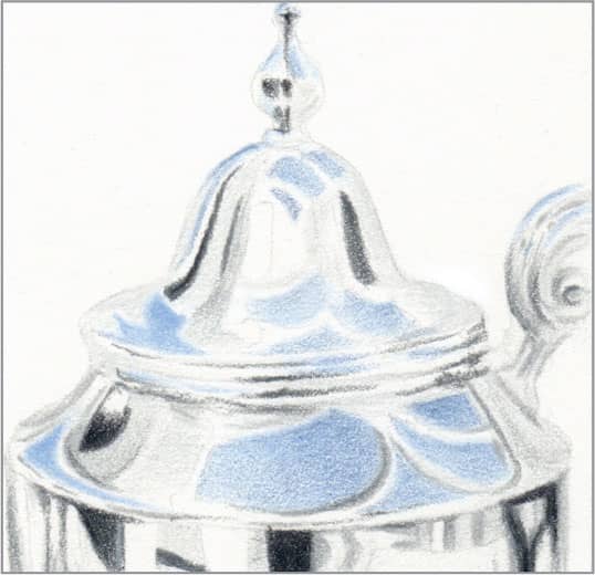
STEP THREE Use very sharp blue slate with medium pressure on top of the powder blue on the left-side shapes, and very sharp periwinkle with light pressure on the right-side shapes. Identify the very darkest shapes and fill them with sharp cool gray 90% and medium pressure. Identify the next-to-lightest gray shapes and fill them with very sharp cool gray 30% and light pressure. Reserve the bare paper for the highlights.

STEP FOUR Identify the next-to-darkest gray shapes and fill them with very sharp cool gray 70% and medium pressure. Now that all the basic shapes are filled, continue looking for more shapes and details and draw them with the appropriate blue or gray. Finish by cleaning up the edges of all the shapes and dabbing with poster putty to recover highlights as needed.
47 Pewter
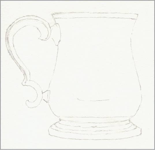
STEP ONE Pewter is an alloy of tin and either copper or antimony, with a silvery color and dull, nonreflective shine. It’s easy to portray with just four grays. Begin with a basic outline. Erase as much of it as you can and still see it, so the graphite lines won’t show through the light colors to come.
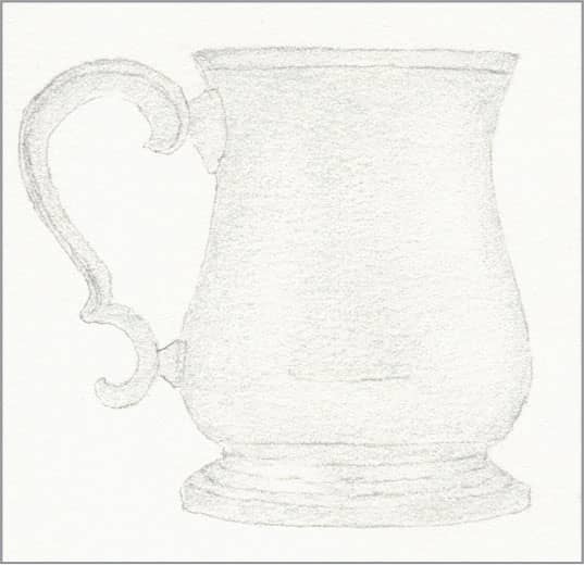
STEP TWO With cool gray 10% and light pressure, create an overall light wash.
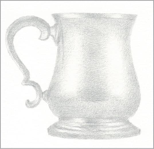
STEP THREE With cool gray 30% and light pressure, begin to model the round form of the cup by shading where it curves away at the edges, underneath the lip, and above the base. Use more coverage down the center where it is darkest.
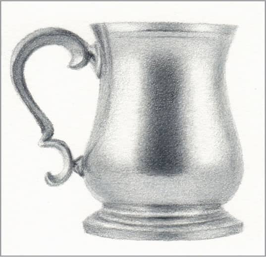
STEP FOUR With cool gray 70% and light pressure, build contrast by shading around the curves of the cup, its base, and the underside of the handle, with more coverage down the center dark area. Create the final contrast with touches of cool gray 90% in the very center of the dark area and along the details of the handle. Finish by smoothing with a colorless blender.
48 Copper
STEP ONE Although colored pencils are available in metallic copper colors, they’re of little use in creating a realistic copper texture. Five colors together work much better. Start with a basic outline of the pot and the major interior reflection areas. Erase as much of it as you can and still see it, so the graphite lines won’t show through the light colors to come.

STEP TWO With sharp light peach and light pressure, create an overall light wash, with more coverage in the dark reflection areas and underside and less in the light reflection areas.

STEP THREE With sharp nectar and medium pressure, add the dark reflection in the center, allowing its edges to be a bit soft. Use it with lighter pressure to add the dark reflections at the sides, and note the slightly lighter areas in their centers. Also, use it with very light pressure to shape the inside and underside of the bowl. Then use it very sharp to add the rim.
STEP FOUR Use sharp cadmium orange hue with medium pressure to brighten the center of the dark reflection in the center, and with light pressure in the dark reflections at the sides. Then use sharp Tuscan red with light pressure around the cadmium orange in those areas. The side reflections should be more orange. Use both colors very lightly on the inside and underside to achieve final contrast. With very sharp Tuscan red, define the rim. If necessary, smooth any roughness with a colorless blender.
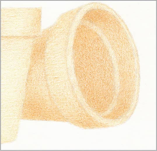
49 Hammered Brass

STEP ONE Brass is an alloy of copper and zinc that is a faded gold color with a slightly peach or orange undertone. Making hammered brass is a manual process, so the hammer marks aren’t perfectly round or regular, and this makes it a forgiving texture to render. Begin with an outline of the hammer indentations. Erase as much of it as you can and still see it, so the graphite lines won’t show through the light colors to come.
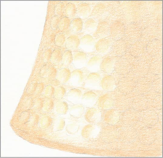
STEP TWO Use sharp cream with medium pressure to draw the shadowed parts of the highlighted indentations. Use sharp eggshell with light pressure everywhere else, and then use it with medium pressure to draw the shadowed parts of the indentations next to the highlighted ones. Note that the location of the shadow in the indentations varies a bit.
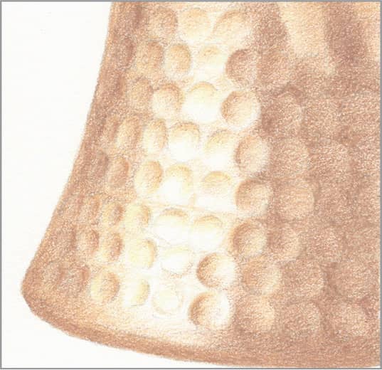
STEP THREE Use very sharp sand with light pressure to further define the shadowed part of the highlighted indentations. Use sharp beige sienna with light pressure to begin shaping the cup, creating more coverage around the indentations and less inside them.
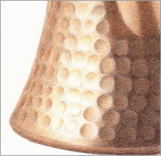
STEP FOUR Use very sharp pumpkin orange with very light pressure on top of the beige sienna to add warmth. Then use very sharp dark brown with medium pressure for contrast on the underside of the base and all over the dark side of the cup. Finally, use very sharp dark umber with light-to-medium pressure around the indentations on the dark side of the cup so that they’re only slightly visible. Finish by enhancing the contrast of the edges of some of the indentations.
50 Clay Pottery
STEP ONE Terra cotta clay pottery has a dull finish that lends itself to a different technique for blending. Begin with a basic outline and a light wash of yellow ochre, with more coverage where the pot curves away from the light on the inside and outside.
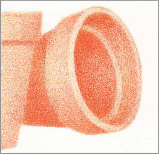
STEP TWO Use sharp cadmium orange hue with light pressure on top of the yellow ochre, again with more coverage where the pot curves away from the light. Don’t worry if the color is a little rough—the next step will take care of it.
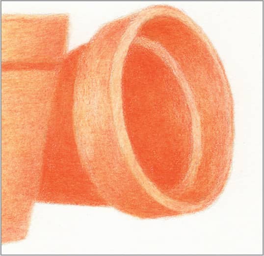
STEP THREE Moisten a paintbrush or cotton swab with odorless mineral spirits and gently apply it overall to dissolve the wax binder away, staying within all the lines. This eliminates speckles of paper showing through. Don’t worry about blotchiness—the next step will take care of that. Allow the mineral spirits to completely evaporate before proceeding, about 15-20 minutes.
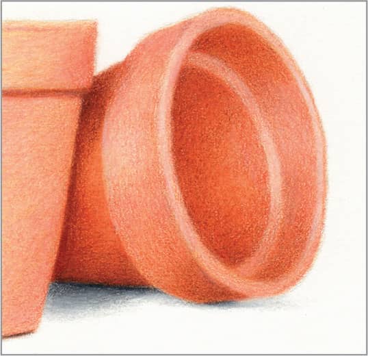
STEP FOUR The dissolved wax residue on the paper will aid in blending from here on. Use cadmium orange hue and sharp peach with very light pressure to even out any blotchiness and clean up the edges. Add the dark interior and external shadows with very sharp terra cotta and light pressure. Add the dull highlights with sharp light peach and medium pressure. Finish by adding a shadow under the pots with sharp cool gray 10%, 50%, and 90%, placing the 90% closest to the pot.
51 Rusted Steel

STEP ONE Rust ranges in color from light orange to dark reddish-brown. It’s easy to render its coarseness without drawing every speck. Start with a basic outline of the seams and rivets.
STEP TWO Apply layers of periwinkle and mineral orange that blend into each other with dull points, and don’t worry about unevenness. Note that rust migrates downward, so there should be more orange toward the bottom.
STEP THREE Moisten a paintbrush or cotton swab with odorless mineral spirits and apply it overall to dissolve the wax away. This will ensure that subsequent darker colors don’t blend into the light colors, but stay rough. This is the base color for the rust.

STEP FOUR With light pressure, hold the pencils on their sides and apply thin, sparse layers of cadmium orange hue and Tuscan red. Don’t blend. Apply more along the joints and toward the bottom. Use the same two colors to draw the rivets, using Tuscan red with medium pressure for the side away from the light and cadmium orange hue with light pressure in the center.
52 Wet Pavement

STEP ONE The challenge of wet pavement is the patchy sheen and reflections on top of painted lines and cracks. The keys are to address these features separately, and to keep all strokes horizontal. Begin with an outline of just the painted lines and cracks.

STEP TWO Reserve the bare paper for the brightest reflections of the lighted street lamps until the last step. With sharp powder blue and light pressure, block in the areas of sheen. Then fill around those areas of sheen with sharp blue slate and light pressure, allowing a bit of overlap.

STEP THREE With sharp indanthrone blue and light pressure, deepen the contrast of some areas of the blue slate so that the areas of sheen begin to stand out. Also, use it to define the cracks and with medium pressure and tiny strokes to make the dark pole reflections in the distance; note that these are irregular and broken by the areas of sheen, which get slimmer and closer together in the distance. Finally, fill the pavement paint lines with sharp powder blue and medium pressure.
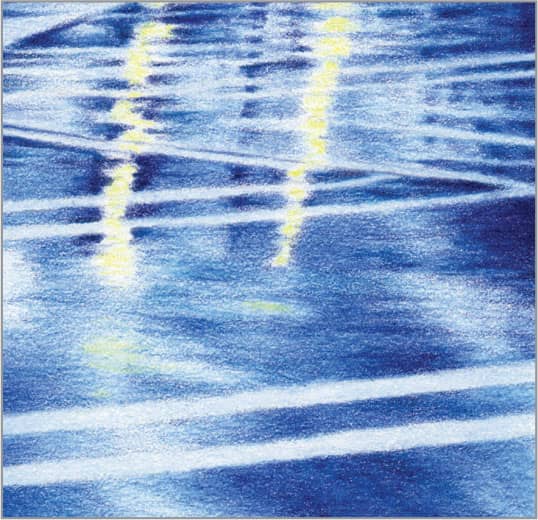
STEP FOUR Use very sharp indigo blue and heavy pressure to add final contrast to the darkest reflections. Smooth each area with a colorless blender. Finish by using sharp lemon yellow to add a few touches of color in the middle of the brightest streetlight reflections; avoid the edges to prevent a green blend.
53 Paint Drips
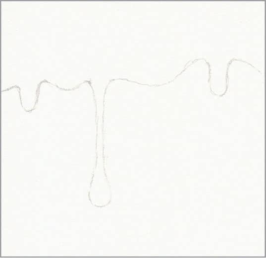
STEP ONE The viscosity of paint makes it run and drip differently than thinner liquids, like water. Gravity causes it to accumulate along a bottom edge until it’s too heavy to hold together; as it drips, a thread follows with it. There are no straight lines, only curves. Begin this example with a basic outline of the edge of the paint.

STEP TWO With sharp sunburst yellow and light pressure, create a very even, flat base layer of medium coverage. This will give brightness to the colors to come.
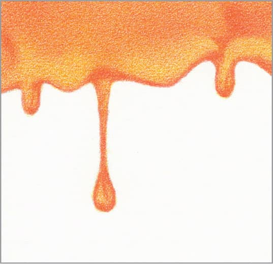
STEP THREE With very sharp orange and medium pressure, draw the crisp bottom edge of the paint and the shape of the drips. Then, with very light pressure and as smoothly as you can, create a gradation on top of the sunburst yellow, from medium coverage at the top to just a little at the bottom. This will make the bulge of the accumulated paint along the bottom edge appear.
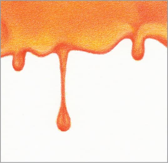
STEP FOUR With very sharp cadmium orange hue and medium pressure, reinforce the bottom edge of the paint and shapes of the drips. Use it with very light pressure to add a little more contrast to the gradation. Burnish with a colorless blender to finish.
54 Brick

STEP ONE Old bricks are fun to draw because they are rough, imperfect, and uneven in color—and the colors vary from brick to brick. Begin with an outline of the brick pattern and a medium wash of peach on the individual bricks.
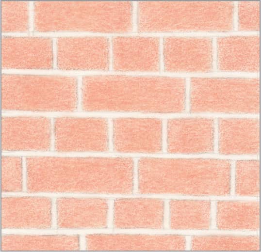
STEP TWO Moisten a paintbrush or cotton swab with odorless mineral spirits and gently apply it to the bricks to dissolve the wax away. This will eliminate speckles of paper showing through. Don’t worry about blotchiness. Allow the mineral spirits to completely evaporate before proceeding, about 15-20 minutes. This is the base color for the bricks.

STEP THREE In this next step, apply all the colors with a dull point: nectar, henna, beige sienna, chestnut, and black raspberry. Experiment with layering any two of these colors, in either order, for a given brick. Allow them to be coarse, but keep the edges crisp. Use a colorless blender to smooth the bricks just a little.
STEP FOUR Draw the mortar with dull French gray 20% and medium pressure, allowing it to be coarse. Finish by drawing the bottom edge of each brick with very sharp French gray 90%; make some of the edges and corners a little irregular to suggest that chips have broken off.
55 Peeling Paint
STEP ONE When paint peels, chunks of it blister and curl back, producing interesting shadows. Begin with a basic outline of the blisters and peels. Erase as much of it as you can and still see it, so the graphite lines won’t show through the light colors to come.
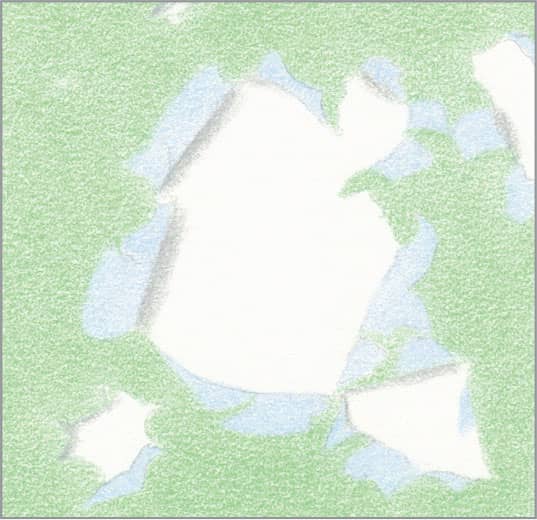
STEP TWO For the first layer of color, use sharp light green with light pressure for an overall medium wash on the flat paint, sharp cloud blue with light pressure for an overall medium wash on the peels, and sharp cool gray 10% with medium pressure for the shadows of the peels that fall on the white wall beneath.
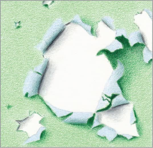
STEP THREE For the second layer, use very sharp peacock green with medium pressure to define the shadows under the peels that curl over the flat paint and the little blisters, sharp muted turquoise with medium pressure to shade the underside of the peels, and cool gray 90% with light pressure to define the fine line where some peels separate from the wall.
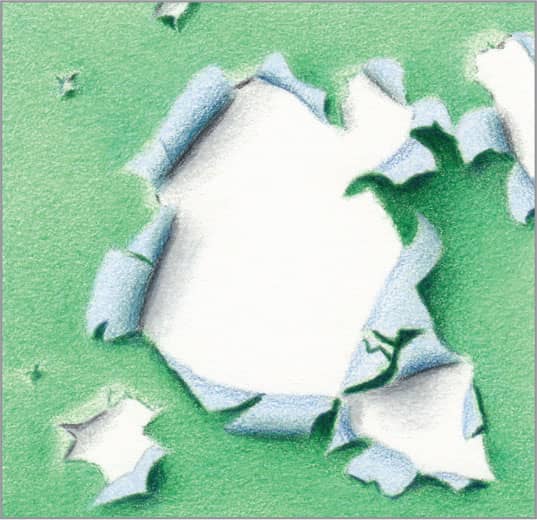
STEP FOUR For the third and final layer, use very sharp indigo blue with heavy pressure to deepen the contrast in the darkest curl shadows. Use it with light pressure to add contrast to the underside of the peels. Finally, use very sharp peacock green with very light pressure on top of all the light green; avoid the lighted side of the peels of paint that have separated from the wall but not curled, to give them a blistered look. If desired, smooth with a colorless blender.
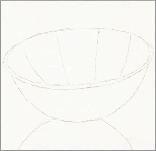
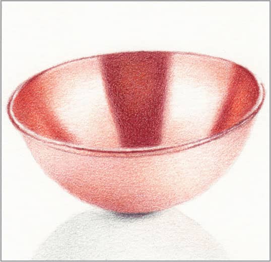
56 Marble
STEP ONE Marble is characterized by translucence that allows underlying veins to show through, like pale skin. This makes it easy to draw, because blotchiness and jagged lines only add to the realism. Begin with an overall light wash of white to provide a waxy base for smooth blending of the light colors to follow. Then block in faint blurry areas with sharp grayed lavender and cloud blue, using light pressure.

STEP TWO With very sharp beige and light-to-medium pressure, create the basic veins with jagged lines that cross each other in a few places. Darken some places in the cloud blue area with sharp periwinkle and light pressure.
STEP THREE Continue adding thin, faint veins. Reinforce a few small segments of veins with very sharp beige sienna and light pressure. Also, add a few very faint veins with sharp lilac and very light pressure. Continue building the bluish and purplish values throughout, including between some of the veins.
STEP FOUR With very sharp sepia and light pressure, reinforce some of the intersections of veins and indicate some veins that are at the surface. Although there isn’t much pigment on the paper, finish with a colorless blender to smooth some of the bluish and purplish areas and some of the faintest veins—this adds to the translucent effect.
57 Pearl
STEP ONE Much like marble, pearl has a translucent quality, but the surface gleams and is low contrast. Begin with an overall light wash of white to provide a waxy base for smooth blending of the light colors to follow. Then draw the basic curves and shadows with cool gray 10% and light pressure.

STEP TWO With sharp pink rose and light pressure, tint any areas that have even a hint of pink.
STEP THREE With sharp cloud blue and light pressure, tint any areas that have even a hint of blue. In some places, draw on top of the pink rose to build a purplish tint.

STEP FOUR With very sharp cool gray 50% and light pressure, draw the darkest creases; they don’t need to be perfect, because pearl is an organic form. With sharp cool gray 30% and very light pressure, darken the shadow side of the undulations. Add a little more pink rose and cloud blue as needed to intensify the color of those shadows. Where there are several layers of color, finish by smoothing with a colorless blender; where there are only a couple of layers, finish by blending with sharp white and light pressure.
58 Amethyst
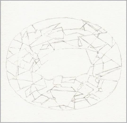
STEP ONE The keys to successfully drawing any cut gemstone are to keep the pencil points very sharp, which requires frequent sharpening, and to keep the edges very crisp. Begin with an outline of all the facets and refractions of facets that you can see.

STEP TWO For this amethyst, we will use only purples and white. First identify the pure white highlight facets, and fill them with white to preserve them. Then identify the very darkest facets, and fill them with dioxazine purple hue and medium pressure. Fill the top facet with a medium wash of lilac. Look for some other facets that are close to the same value and color, and fill them as well.
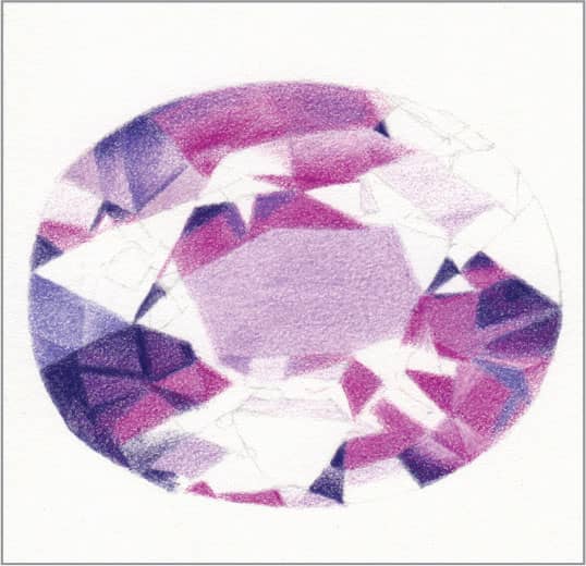
STEP THREE There are likely a couple of other distinct colors in the facets, so identify them and fill them with dahlia purple and imperial violet. Smooth facets with a colorless blender as you go.
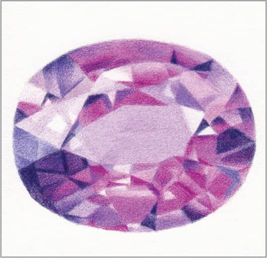
STEP FOUR Continue filling facets with the four purples and light-to-medium pressure. Some facets are indistinct. Some facets transition between two colors. Some need a bit of white for a lighter tint. If you get lost, don’t worry—a couple of small errors will not be noticeable. Finish by sharpening any edges that became soft during blending.
59 Smooth Wood
STEP ONE Smooth varnished or stained wood has a warmth and richness that shows off the wood grain. Make all pencil strokes in the direction of the wood grain. For this example of pine, begin with an overall medium wash of sand. Then use sharp burnt ochre and light pressure to suggest the areas where the wood is darker.
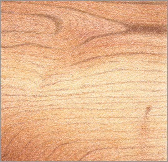
STEP TWO Use sharp goldenrod with light pressure on top of the burnt ochre to add warmth. With very sharp chocolate and light pressure, draw the grain lines. Don’t worry about detail yet.
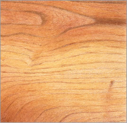
STEP THREE Moisten a paintbrush or cotton swab with odorless mineral spirits, and gently apply it overall in the direction of the wood grain to dissolve the wax binder. This will eliminate speckles of paper showing through and intensify the colors. Allow the mineral spirits to completely evaporate before proceeding, approximately 15-20 minutes.
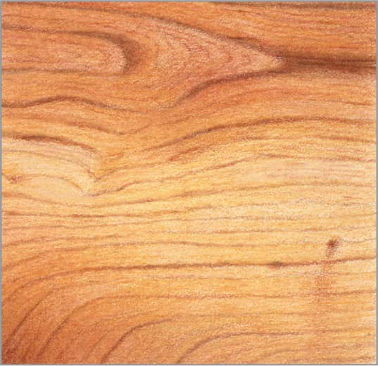
STEP FOUR To finish, use very sharp burnt ochre and chocolate with light pressure to reinforce some of the wood grain lines, and with very light pressure to add some fainter grain lines.
60 Aged Wood
STEP ONE Old, dry, fading, cracked wood that has been exposed to the outdoors is fun to draw because it rewards rough, heavy-handed treatment. Where it is especially dry and cracked, it’s very rough; where newer wood is exposed, it’s a bit smoother. For this example, begin with somewhat dull mineral orange and medium pressure to plan the areas of the knots and newer wood. Bring some streaks into the old wood area.
STEP TWO Use somewhat dull French gray 30% and medium pressure to fill the areas of the old wood. Overlap into the mineral orange a little, and bring some streaks into the new wood area; they will be hard to see.
STEP THREE With sharp French gray 70% and medium pressure, add long, uneven, jagged lines in the direction of the wood grain in the old wood area. Do the same with Tuscan red in the newer wood area, and start to indicate streaks and the inside perimeter of the knots.

STEP FOUR Use a colorless blender to somewhat smooth the newer wood. Then, with very sharp dark umber and heavy pressure, create large cracks and nail holes throughout. Keep the pencil very sharp and use medium pressure to make tapered strokes for the lesser cracks, including the cracks in the knots and grain lines throughout. Flow lines and cracks around the knots. With very sharp Tuscan red and heavy pressure, draw some grain lines in the newer wood. Finish by adding a few strokes of both Tuscan red and mineral orange with medium pressure in the old wood to suggest that it’s splintering off, and make a few little marks across the grain with dark umber.
61 Wooden Barrel
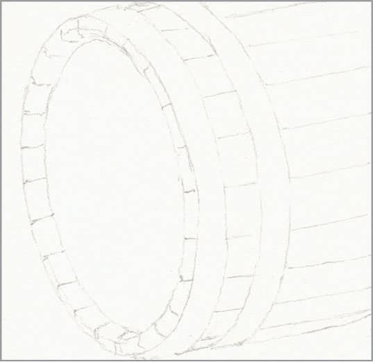
STEP ONE Barrels are most commonly made of oak, held together by steel hoops. For this example of a relatively new barrel, begin with a basic outline.
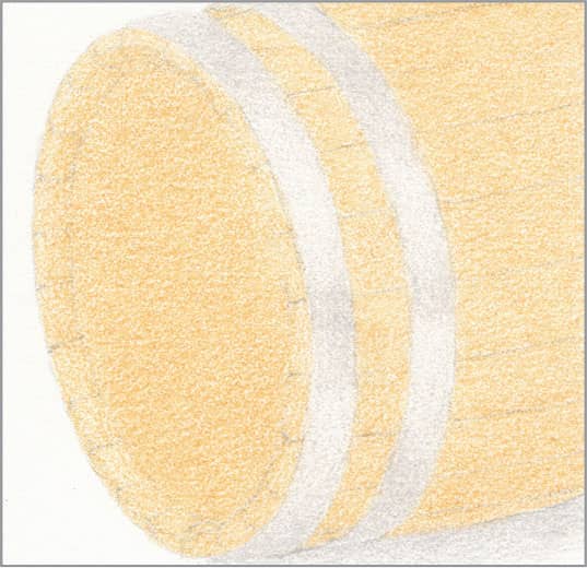
STEP TWO Use sharp sand and light pressure to create an overall medium wash for the oak. Use warm gray 10% and light pressure for the hoops and shadow, with more coverage where they are less reflective.
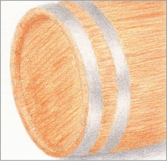
STEP THREE Use very sharp mineral orange with light pressure to draw many fine lines of varying length and thickness, representing the staves’ wood grain. They don’t need to exactly match your reference. Use medium pressure to begin defining the bold grain pattern on the lid, and create contrast under the top of the rim. Keep the edges of the hoops crisp. Use sharp warm gray 30% with light pressure to enhance the dark areas of the hoops and the shadow.
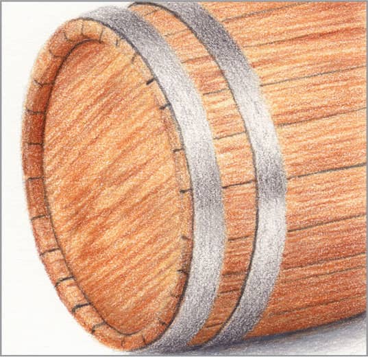
STEP FOUR Add more fine wood grain lines in the staves with very sharp terra cotta and light pressure, closer together and heavier where the barrel curves under. Use medium pressure under the top of the rim and to enhance the bold grain pattern on the lid. Use very sharp warm gray 70% with light pressure, stroking in the direction of the hoops, to give final contrast to the dark areas. Allow it to look a little rough, representing low-grade steel. Deepen the shadow closest to the barrel. Finish with very sharp warm gray 90% and light pressure to draw the front edges of the hoops and the stave edges; note that the hoop edges are more pronounced where they curve away, and the stave edges are more pronounced where they directly face the viewer.
62 Wrought Iron

STEP ONE Although you might think of wrought iron as black, it often has a dark, bluish-gray patina, which we will produce in this example with just three colors. Begin with a basic outline.

STEP TWO For the first layer, use sharp cool gray 30% and light-to-medium pressure to create a monochromatic drawing with more coverage in shadow areas. Keep the edges crisp.
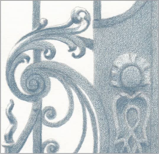
STEP THREE Repeat the previous step with sharp slate gray and light-to-medium pressure on top of the cool gray 30%.

STEP FOUR Repeat again with very sharp cool gray 90% and light-to-medium pressure on top of the slate gray. Allow the coverage to be a little uneven, as this adds to the realism of the patina. Then use the sharp cool gray 90% with heavy pressure to draw the darkest lines and shadows. Finish by smoothing somewhat with a colorless blender; allow a little roughness to remain for the patina.