

63 Red Wine
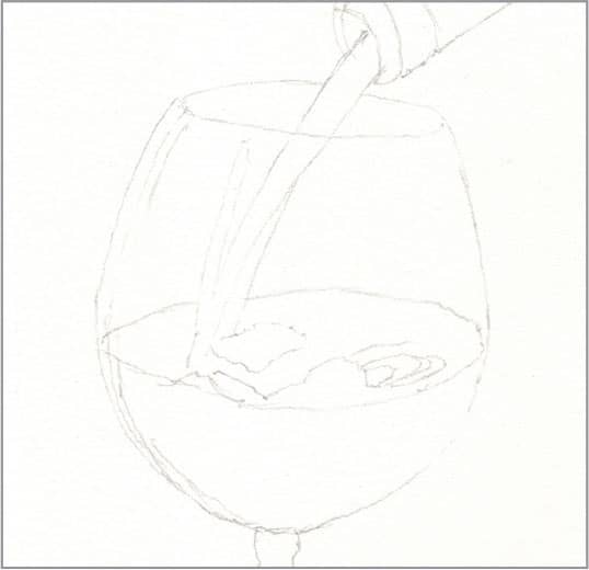
STEP ONE The challenge of red wine is that it is transparent in a small quantity, but darkly opaque in a large quantity. The key is to layer the colors so that the red shows through from underneath. Begin with a basic outline.
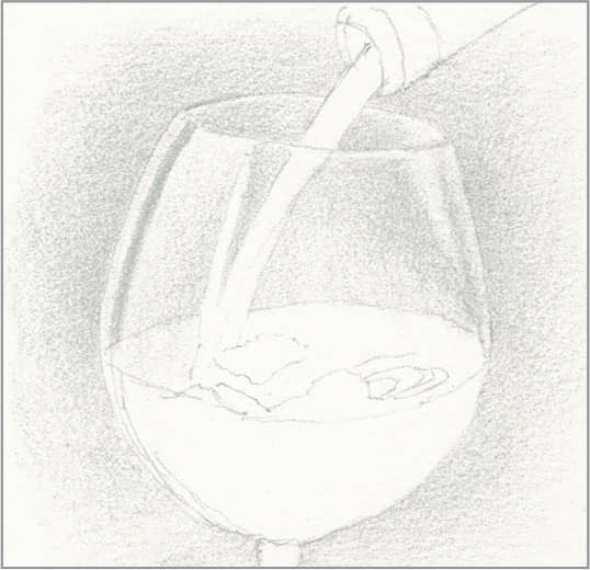
STEP TWO Clear glass is almost invisible without something dark behind it, so use sharp cool gray 20% and light pressure to create the background, reserving the bare paper for the brightest highlight on the side and around the rim.

STEP THREE Use sharp crimson lake with medium pressure to create an even, medium-heavy layer for the pour stream and the wine below the surface. Use it with light pressure for the surface foam. Reserve the bare paper for the bright reflections on the surface. Use sharp dark green to block in the bottle, reserving the bare paper on the lip for the next step.
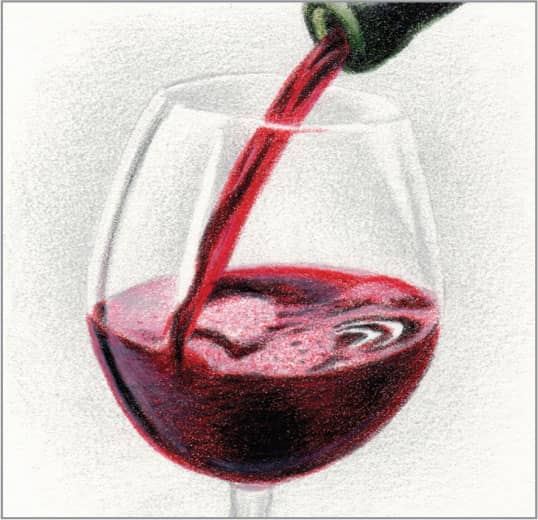
STEP FOUR Use very sharp black with heavy pressure for a few strokes in the pour stream and the dark highlight below the surface near the left side. Also, use it to darken the wine below the surface, allowing red to show through on either side of the center and along the right edge. Use it in the same manner on top of the green on the bottle. Use pink rose with medium pressure to darken some of the surface foam, and for the light highlight below the surface near the left side. Dot some crimson lake in the surface foam to suggest bubbles. Use sharp kelp green with light pressure for the lip of the bottle. Finish by brightening some of the pour stream and some small areas of the surface with touches of permanent red.
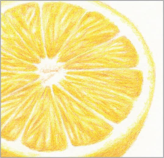
64 Citrus Fruit Rind
STEP ONE The dimpled skin of any citrus fruit, such as oranges and lemons, is surprisingly easy to render without drawing each individual dimple. For this example of an orange peel, begin with a basic outline. Erase as much of it as you can and still see it, so the graphite lines won’t show through the light colors to come.
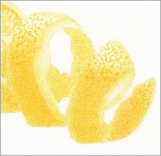
STEP TWO For the first layer of color, use sharp sunburst yellow and light pressure for an overall light wash on the exposed cuts, and a medium wash on the surface, reserving the bare paper for the highlights. Then use the point of the pencil to make dots in the highlights—darker where the light is strongest. The dots don’t need to be perfect.

STEP THREE Where the underside of the cut rind is visible, darken it with sharp goldenrod and light pressure. Use sharp yellowed orange and light pressure with small, overlapping, circular strokes on top of the sunburst yellow on the surface, and add a few more dots at the edges of the highlights.
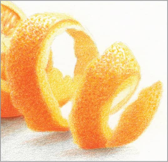
STEP FOUR Use sharp cadmium orange hue and medium pressure with small, overlapping, circular strokes on top of the yellowed orange on the lower half of the rind curls for final contrast. Use heavier pressure at the bottom edges. Add some dots in the middle of the curls. Finish by using sunburst yellow to make some dots along the area where the exposed cuts meet the surface.
65 Cut Citrus Fruit
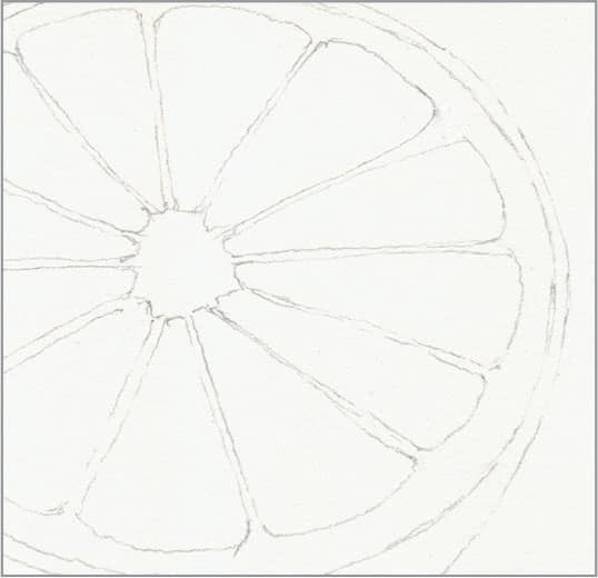
STEP ONE The segments inside any citrus fruit, such as grapefruit, are packed with little sacs of juice that, like the segments, radiate out from the center. So, all strokes should also radiate from the center. Begin with a basic outline of the segments. Erase as much of it as you can and still see it, so the graphite lines won’t show through the light colors to come.

STEP TWO With sharp lemon yellow and medium pressure, create short and long strokes out from the center, reserving the bare paper for highlights. They don’t need to exactly match your reference. Also, use lemon yellow for the skin and around the outside edge of the rim cut.
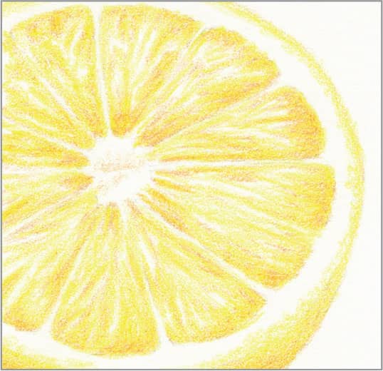
STEP THREE Identify some of the darkest striations in the juice sacs, and use sharp yellow ochre with light pressure to enhance their contrast. Because the sacs bulge upward a bit, create slightly more coverage near all the borders of each segment to create dimension. Also, use yellow ochre to shade the skin and draw the edge of the rim cut.
STEP FOUR Continue adding lemon yellow striations, with yellow ochre strokes on top of them that don’t completely overlap, until you are happy with the contrast. Be sure to reserve bare paper as highlights for a few striations. Smooth with a colorless blender, if desired.
66 Pineapple

STEP ONE The surface of a pineapple is a complex structure of hexagonal segments, each with an upward flap that has a center spine. Ripe segments tend to be greenish on the lower half and orangey on the upper half. Begin with a basic outline.

STEP TWO With sharp yellow ochre and light pressure, create an overall medium wash on the pineapple body. Use sharp celadon green with light pressure to block in the leaves.
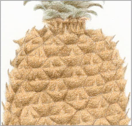
STEP THREE With sharp green ochre and light pressure, fade the lower half of each segment and, more lightly, the upper halves from the flap upward. Also, use it as a light second layer on the leaves.

STEP FOUR With sharp Spanish orange and light pressure, fade the upper half of each segment, and the lower halves from the flap downward. With sharp dark umber and medium-to-heavy pressure, draw the gaps between the segments. Don’t worry about making perfect hexagons—each segment is different and unevenly shaped. Use the same pencil very sharp with very light pressure to enhance the edges of the flaps and spines and to draw the darkest shadows under the leaves.
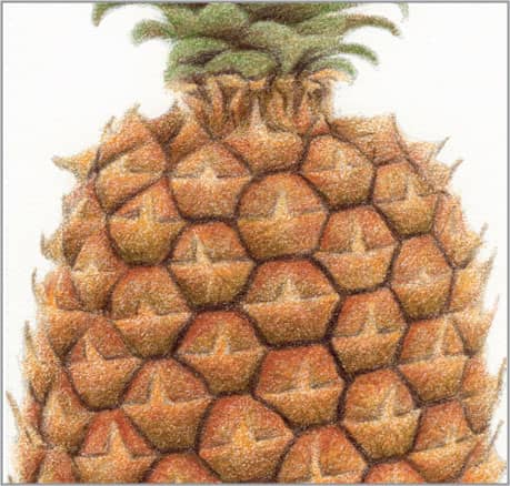
STEP FIVE Use sharp burnt ochre and light-to-medium pressure to add a reddish blush to the top half of each segment, heavier at the edges, and with very light pressure as a wash on the lower halves. Add a little more green ochre to the lower half of each segment. Finish by smoothing the leaves and any excessive roughness with a colorless blender.
67 Apple
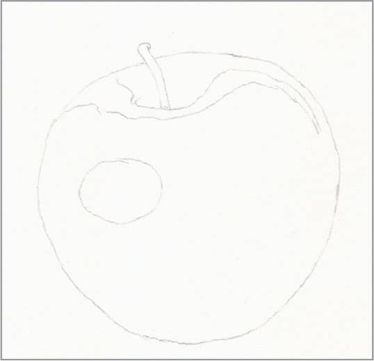
STEP ONE Apples are surprisingly easy to draw by taking a short detour through some unexpected colors, which help produce a more accurate final color and texture. Begin with a basic outline. Erase as much of the highlight outlines as you can and still see them, so the graphite lines won’t show through later.
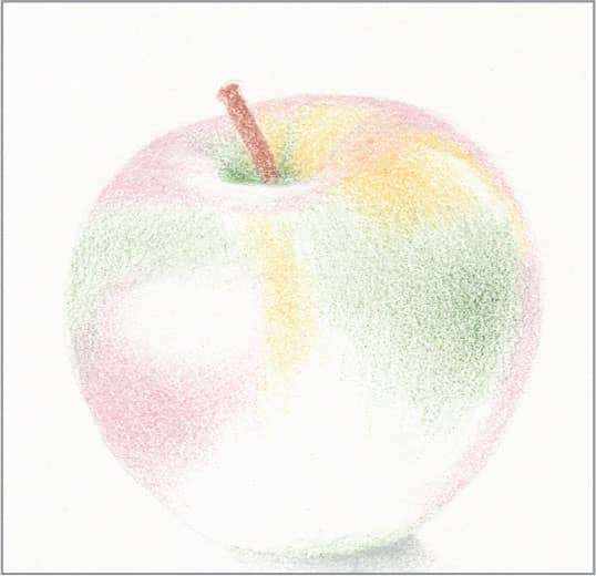
STEP TWO Where the skin is yellow, use sharp jasmine with light pressure to generally block in those areas. Where it is very dark red, due to shadow, use sharp dark green with light pressure to create an underpainting. Where it is very light red around curves, use sharp pink rose with light pressure to create an underpainting. Where there are strong highlights, such as around the top and on the side, use sharp white with medium pressure to preserve them and provide a waxy layer for smooth blending later. Fill the stem with sharp burnt ochre and medium pressure.

STEP THREE Use sharp scarlet lake with a full range of pressure everywhere the skin is red—heavy pressure on top of the dark green, light pressure on top of the pink rose, and very light pressure on top of the jasmine and next to the white. Fill the tooth of the paper as smoothly as you can. Notice how the dark green underpainting produces a convincing shadowed red!

STEP FOUR Use sharp scarlet lake with medium pressure to further shade the contours near the darkest areas, and to add the shadow on the stem. Finish by smoothing all over with a colorless blender.
68 Grapes
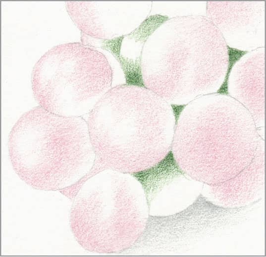
STEP ONE The challenge of grapes is their translucent glow combined with a waxy coating. The keys to drawing them are to keep your pencils very sharp, and use light pressure to make very small, overlapping, circular strokes. Begin with a basic outline and a light wash of white to provide a waxy base for smooth blending of the light colors to follow. In the darkest recesses, apply a light wash of dark green, and wherever you see waxiness, apply a light wash of pink rose.
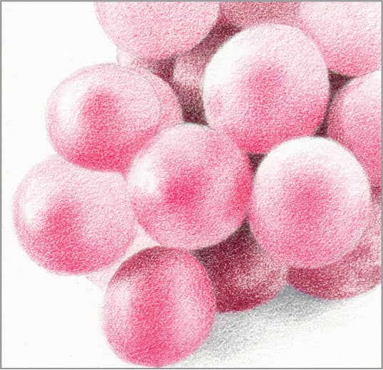
STEP TWO On top of the dark green in the darkest recesses, apply raspberry. Use magenta to carefully model the grapes with more coverage in the centers, where they are most intensely colored, and where they touch neighboring grapes.
STEP THREE On the darkest grapes in shadow, apply grayed lavender with medium pressure. Also, apply it with light pressure wherever you see waxiness. Reserve the bare paper for the brightest highlights. Apply permanent red on top of the most intense areas of magenta to begin producing the glow.
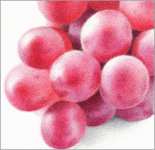
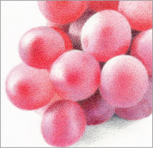
STEP FOUR For final contrast, apply a small amount of raspberry on top of the permanent red in the centers of the grapes and where they touch neighboring grapes. Use it to make a few splotches to represent where the waxiness is worn away. Finish by sharpening any blurry edges and smoothing with a colorless blender.
69 Strawberry
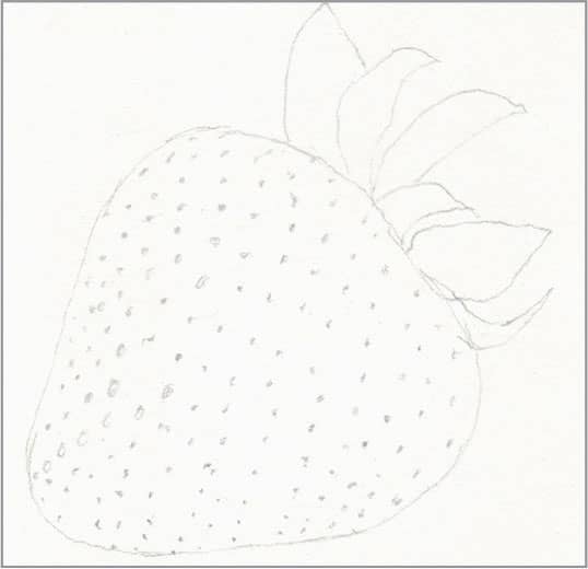
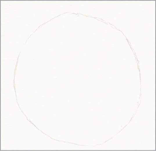
STEP ONE The key to success in rendering a ripe red strawberry is to simply not let the seeds scare you. Begin with a basic outline that includes the location of each seed.
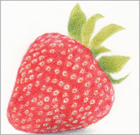
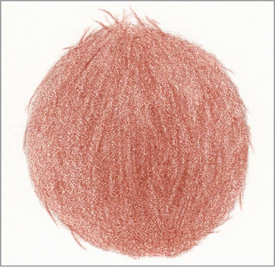
STEP TWO With very sharp yellow ochre and heavy pressure, draw a dot for each seed. With sharp permanent red and medium pressure, draw a circle around each seed and fill the gaps between the circles. Use heavier pressure at the bottom where it meets the table. Block in the basic leaves, with sharp dark green and sharp limepeel.
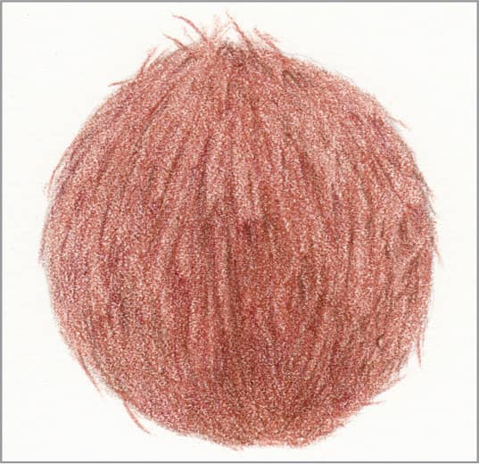
STEP THREE With very sharp dark green and medium pressure, fill each circle around the seeds; for those near the bottom where the berry meets the table, darken the seeds as well. Use sharp crimson red and heavy pressure to fully darken the berry and add dimples next to the seeds near the top and bottom. Finish the leaf details with very sharp dark green and light pressure; they should be darkest where they meet the berry.
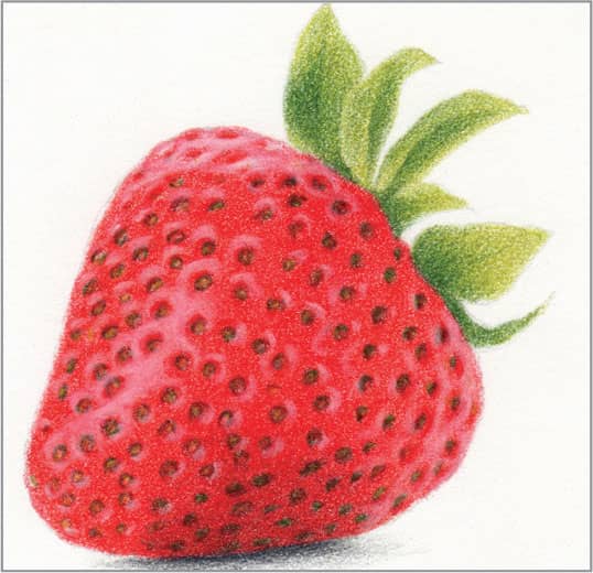
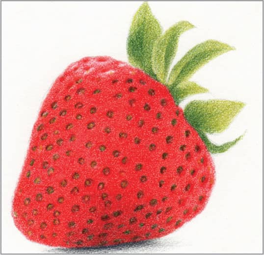
STEP FOUR Spray the drawing with workable fixative and let dry. This will enable you to add soft highlights on top of the heavy red pigment. With very sharp white and heavy pressure, draw little curves around the seeds that are not in shadow, as well as in a stripe down the center around the seeds there. The seeds should appear recessed; if they don’t, use crimson red again to restore a gap between the seed and the highlight. (Note: For an even whiter highlight, you can use the moist point of a white watercolor pencil.)
70 Coconut
STEP ONE The very fibrous shell of a coconut is easy to draw, because it’s so coarse that the fibers almost suggest themselves. Begin with a very simple outline.
STEP TWO With sharp burnt ochre and medium pressure, make long strokes that follow the contour of the coconut. In the center third, press harder to make darker lines to suggest fraying fibers. Make a few short, tapered strokes around the perimeter as well to suggest fraying fibers.
STEP THREE Use the lines from the previous step and a bit of imagination to “see” more and more frayed ends and fibers, and enhance them by using very sharp Tuscan red and chocolate with medium-to-heavy pressure to darken the spaces between and underneath them. They don’t need to match your reference.
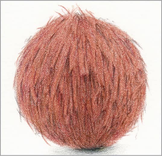
STEP FOUR Use a colorless blender to smooth most of the fibers somewhat to enhance the color without flattening the texture completely. Finally, use very sharp dark umber and medium-to-heavy pressure to increase the contrast even more between and underneath many of the fibers you created in the previous step.
71 Peach
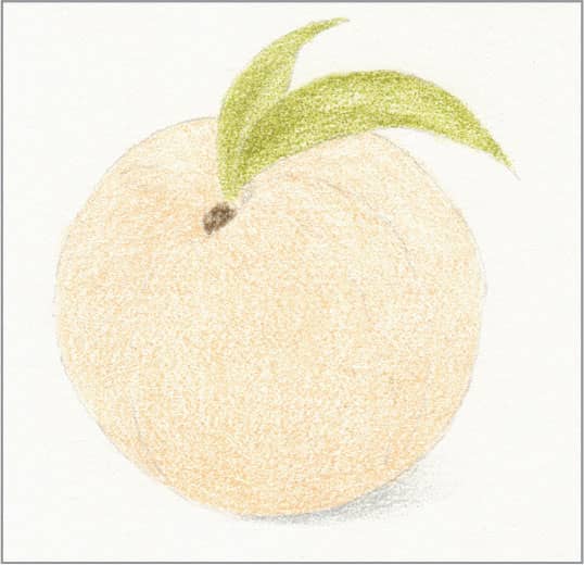
STEP ONE Peaches are known for blushing color with soft transitions. Begin with a basic outline. Erase as much of it as you can and still see it, so the graphite lines won’t show through the light colors to come. Use sharp eggshell to create an overall light base layer on the peach, sharp limepeel for the leaves, and sharp sandbar brown for the stem.
STEP TWO Where the peach skin is yellowish, apply sharp Spanish orange with light pressure, following the contours, and fade it out into the areas that will be reddish. Create more coverage in the more intensely yellow areas. Use sharp spring green as the second layer on the leaves.
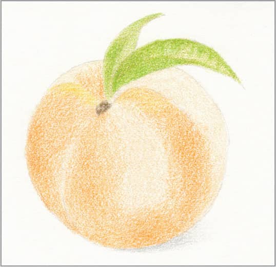
STEP THREE Where the peach skin is reddish, apply very sharp carmine red with light pressure as smoothly as you can, following the contours. Create more coverage in the darker areas, and fade it out into the areas that are yellowish. Allow some streaks and little blotches, which adds to the realism. With sharp dark green and light pressure, add final contrast to the leaves and a shadow on the peach under them. Also, add a few touches on the stem to increase its contrast.
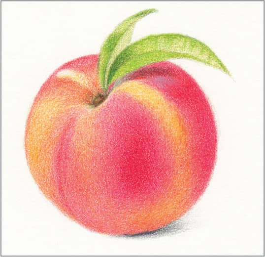
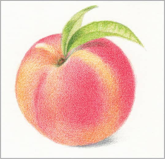
STEP FOUR Where the reddish areas are darkest, apply very sharp pomegranate with medium pressure, as smoothly as you can. Also, apply it on top of the dark green in the shadow under the leaves and on the stem for final contrast. Use sharp cool gray 20% with medium pressure to add a little patch of fuzzy appearance on the shoulder next to the leaf shadow. Finish by smoothing completely with a colorless blender.
72 Walnut Shell
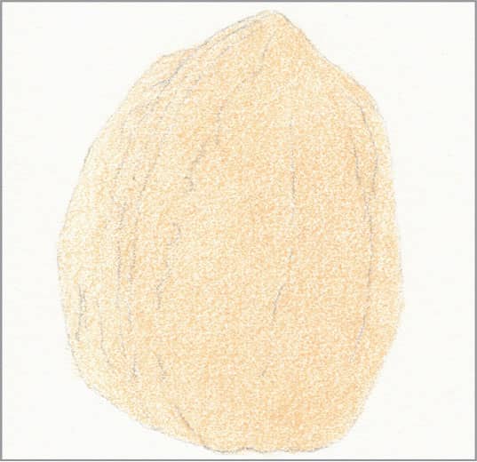
STEP ONE Walnut shells, like the nutmeat inside, are known for their undulating form, each one unique. For this example, begin with a basic outline and an overall medium wash of eggshell, applying lighter coverage on the lighted side.

STEP TWO With sharp light umber and light pressure, block in the basics of the undulating shapes and creases. They don’t need to exactly match your reference.

STEP THREE Add warmth and contrast to the shadowed undulating shapes with sharp burnt ochre and light-to-medium pressure, with more coverage in the richest-colored areas. Use very sharp dark brown with medium pressure to define the darkest creases and dimples.
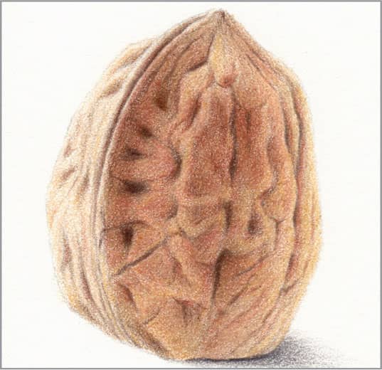
STEP FOUR Use sharp yellow ochre and light pressure overall, and then smooth with a colorless blender, being careful not to blur the shapes and creases. With very sharp dark brown and light-to-very-light pressure, draw the finest creases and enhance the contrast around the undulations.
73 Black Coffee
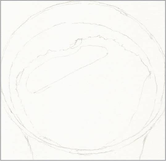
STEP ONE The key to successfully drawing black coffee is to not use black! Coffee is a very rich, dark brown, while black pigment is flat and dull. Begin with a basic outline of the cup, coffee, bubble rim, and reflection.
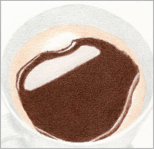
STEP TWO For the first layer, use sharp cool gray 10% and medium pressure for the cup, sharp beige and light pressure for the bubble rim, sharp chocolate and medium pressure for the coffee, and sharp warm gray 10% and light pressure for the big reflection. Reserve the bare paper for the strongest highlights on the rim of the cup and a band next to the bubble rim.
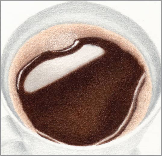
STEP THREE Use sharp cool gray 30% and light pressure to draw a line where the bubble rim meets the cup, and to darken the inside of the cup. With sharp beige sienna and light pressure, darken the bubble rim where it meets the coffee. Use sharp dark umber and heavy pressure on top of the chocolate, allowing some of the chocolate to show through in the center. Use sharp French gray 20% and light pressure to slightly darken half of the big reflection and blur its boundary on the flat side.
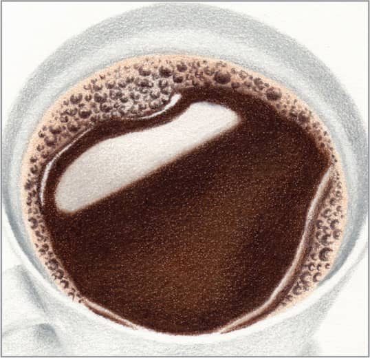
STEP FOUR With cool gray 50% and light pressure, create final contrast around the inside and outside of the cup. Finally, use very sharp dark umber and light-to-medium pressure to create the bubbles—crescents of various sizes, with dots filling some of the spaces between. Note that there are no visible bubbles at the boundary with the cup.
74 French Baguette
STEP ONE Bread can seem daunting because of the air pockets and holes. But you don’t need to draw every single hole, or follow your reference exactly, to render French bread. Begin with a light outline and an overall light wash of cream on the bread and putty beige for the shadow.

STEP TWO Use sharp yellow ochre and light pressure to block in the major holes and give shape to the loaf. Create more coverage where the crust is more toasted and where the holes are deepest. For the shadow, add a light layer of chocolate, with more coverage closest to the loaf. Also, use it to draw the gap between the loaf halves.
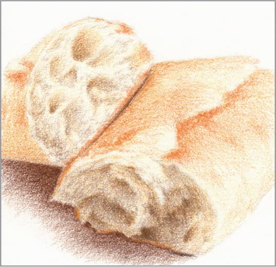
STEP THREE Use sharp mineral orange with light pressure to create a more toasted look on the crust, especially in the torn edges and seam down the middle. Use sharp light umber with very light pressure to increase the contrast inside the major holes on the top loaf half, and add some semi-random squiggles to suggest smaller holes. Use it with light-to-medium pressure on top of the yellow ochre on the end of the lower loaf half to darken and increase the contrast of the torn pieces and holes.
STEP FOUR Use very sharp burnt ochre and medium pressure to enhance the jagged, toasted seam and the bottom edge of the top loaf half. Use it with light pressure to make the crust more golden-toasted in a few places. Allow the look to be a little rough, which adds to the realism. Add more yellow ochre and light umber as needed until you’re happy with the contrast and color of the holes and crust. Finish by drawing the darkest shadow line under and between the loaf halves with sharp dark umber and medium pressure.
75 Frosting
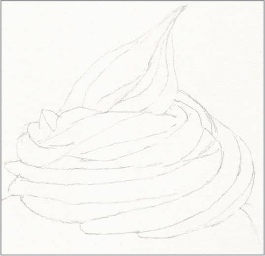
STEP ONE Cake frosting is made with either powdered sugar or cream cheese and is tinted with food coloring. It is low contrast and, where folds face each other, the color is multiplied. These steps would also work for drawing ice cream. Begin with a basic outline. Erase as much of it as you can and still see it, so the graphite lines won’t show through the light colors to come. Apply an overall light wash of white to provide a waxy base for smooth blending of the light colors to follow.
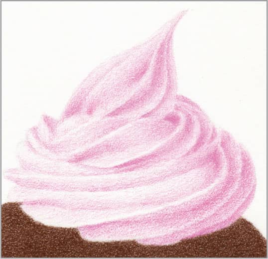
STEP TWO Use sharp hot pink and very light pressure to model the forms of the swirls, with more coverage in the dark creases. For the cupcake, use sharp chocolate and medium pressure.

STEP THREE Use sharp pink and light pressure on top of the hot pink to alter its color and increase the contrast in the darkest creases. For the cupcake, use sharp burnt ochre and medium pressure on the lit side. Keep the edges crisp.
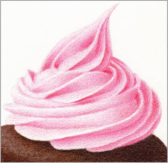
STEP FOUR Use very sharp permanent red and light pressure to add final contrast in the darkest creases. Use a colorless blender to smooth any roughness where there is more pigment, and use sharp white to smooth where there is almost no pigment. On the cupcake, use sharp dark umber with heavy pressure on the unlit side and directly under the frosting, and use somewhat dull white with medium pressure on the lit side. Then make several small marks with the dark umber on top of the white to suggest the spongy cake surface.
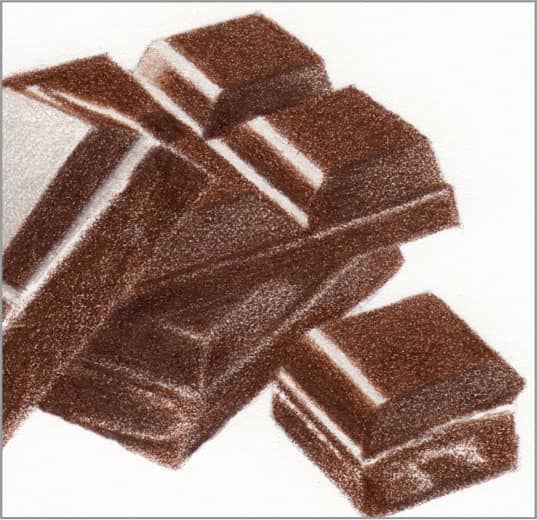
76 Dark Chocolate
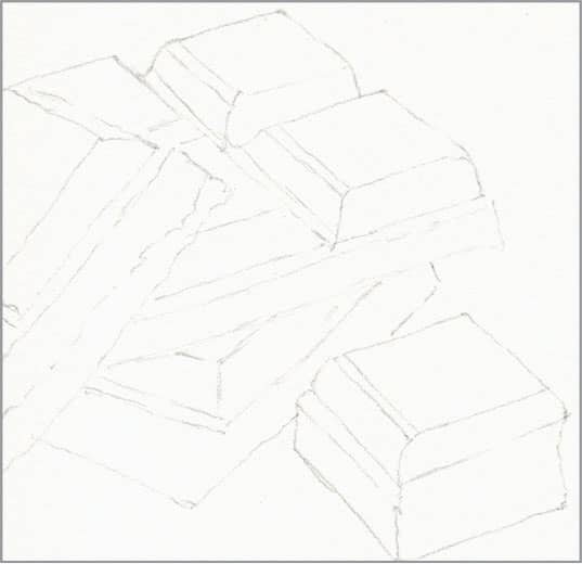
STEP ONE The keys to drawing convincing dark chocolate are to not use black and to save heavy pressure for later steps. Dark chocolate is a very rich, dark brown, while black pigment is flat and dull. Applying heavy pressure too early would prevent the addition of more color on top. Begin with an outline of the chocolate pieces.
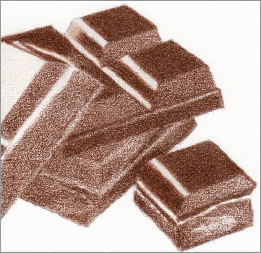
STEP TWO Preserve the almost-white highlights with very sharp French gray 10% and light pressure. Then use sharp chocolate with medium pressure on the top faces; they really are that color and will not change much. Use it with light pressure on the front faces, where more colors will be added to darken. Keep the edges very crisp.
STEP THREE On the front faces, which received only a light layer of chocolate in the previous step, add sharp dark brown with light-to-medium pressure, applying more coverage where the candy is in shadow. Also, draw sharp lines with heavy pressure where segment faces meet.
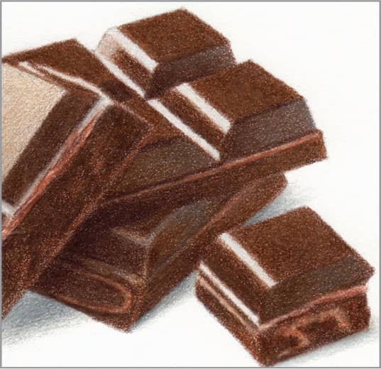
STEP FOUR Where there are breaks, use very sharp beige and very sharp burnt ochre together to draw the light color of the crumbs. Use sharp French gray 50% with light pressure to suggest soft reflection of ambient light on the front faces; if it’s too gray, lightly add another layer of dark brown on top. For final contrast, use sharp dark umber with heavy pressure in the darkest shadow areas. Finish by smoothing with a colorless blender and cleaning up the edges.