Chapter 5: Building Interactive Dashboards
In this chapter, we will learn how to develop interactive dashboards with Amazon QuickSight. You will learn how to add custom controls to your dashboards and add interactivity to your BI application using parameters. We will also look at advanced filtering options with point and click actions, as well as URL actions.
In this chapter, we will cover the following topics:
- Using filters and parameters
- Working with QuickSight Actions
Technical requirements
For this chapter, you will need the following:
- An AWS account
- A QuickSight account with the Author and Reader users configured
- The dashboard we created in Chapter 4, Developing Visuals and Dashboards
Using filters and parameters
Users can interact with dashboards by clicking on specific areas of the application or hovering over a visual to get additional information on specific data points. As a BI developer, you might come across scenarios where you will need to add additional interactivity to your dashboards, allowing your users to filter datasets or implement specific actions. In this section, we will learn how to leverage those specific QuickSight features to add interactivity to our dashboards. We will provide hands-on examples while using the New York dataset and dashboard we developed earlier in Chapter 4, Developing Visuals and Dashboards. But first, we will need to understand how to use QuickSight filters.
Working with filters
QuickSight authors can filter datasets. For example, you can use filtering when you need to refine a dataset before you visualize it. You can control the scope of the QuickSight filters so that they can be applied to the visuals you want. Filtering, when applied to a QuickSight analysis, is transparent from the reader's perspective. You can apply additional settings when sharing a dashboard with your readers if you need to allow your readers to filter data. Let's look at an example to understand how to add and apply filters. For our example, let's assume that we have detected null values and that we want to remove them from certain visuals:
- First, we will need to open our New York Taxi analysis.
- We will use the pivot table we created earlier. When we open the Borough category, we can observe the null value as the payment type. null values can be useful as they can help us detect issues with our data. For this example, let's assume we don't want to visualize the null values in the pivot table while keeping the rest of the visuals unaffected:

Figure 5.1 – Pivot table with null values
- Select the pivot table by clicking on the visual. Then, select the filter tab from the left-hand side menu, as shown in the following screenshot:

Figure 5.2 – Select visual for filtering
- Since we have no filtering, we will get a prompt to create one. Click on the Create one… prompt and then select the filter you need to filter against (Payment Type, in this example).
- This action will create a filter. Click on the newly created filter to get the filter configuration options.
- Now that we created the filter, we need to confirm its scope. By default, a filter is only applied to the selected visual. The filter will not be applied to the entire analysis. We can change the scope of a filter if we need to add more visuals to its scope.
- Next, we will need to define the conditions of the filtering. For our example, we will add a condition that excludes the NULL values, as shown here:

Figure 5.3 – Defining filter conditions
- Click Apply and observe how the NULL values are excluded from our visual. Note that the rest of the visuals that are outside of the scope of our filter remain unchanged.
By default, filters don't appear on the reader user interface. Some BI applications might need to give users the ability to filter data.
Note
When filtering a dataset, QuickSight will query the dataset and then apply filtering. If your dataset has been configured as a direct query, QuickSight will connect to the data source to fetch the latest data before filtering. If your dataset is configured as a SPICE dataset, then QuickSight will fetch the data directly from SPICE, without the need to query or import data from the original data source.
To allow our reader users to filter data, we need to check the Enable ad hoc filtering option on the dashboard publishing screen. This option can be found under Advanced publish options, as shown here:

Figure 5.4 – Enable ad hoc filtering
Now that we have learned how to add a filter, let's introduce the concept of QuickSight parameters.
Working with parameters
Parameters in QuickSight are variables that a user can set, commonly using on-screen controls. A parameter can be used in various ways. For example, we can filter the analysis data dynamically based on a parameter. To understand this concept, we will use our example New York taxi analysis. Let's assume that our business users need to understand patterns and changes in customer behaviors based on what payment type the customers are using. To implement this use case, we will create a parameter that will store the user selection for the Payment Type field.
Creating a parameter
Creating a parameter is straightforward, as shown here:
- You can either select the Parameter item on the left-hand side menu or click the + Add button at the top right-hand side of the screen and then select Add parameter. Once selected, you will see the parameter creation screen, as shown here:

Figure 5.5 – Adding parameters
- For this example, we will use the following values (as shown in the preceding screenshot):
- Name : paymenttype
- Data type: String
- Values: Multiple values
- Default values: Cash, Credit Card, Dispute, No Charge
- Next, click Create. The parameter should now be added to your analysis.
At this stage, our parameter has been added to the analysis, but we are not using it yet. Next, we will link this parameter to the filter we created earlier.
Linking parameters to filters
While we are still on the analysis and logged in as the author user, to link parameters to filters, we will need to do the following:
- First, locate the filter we created earlier. You can click on the visual where the filter has been applied and then click on the filters item on the left-hand side menu.
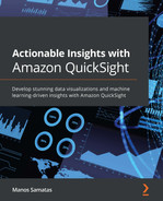
- Now click Edit, or simply click on the Payment Type filter we created earlier.
- To link a filter with a parameter, we will need to select Custom filter from the Filter Type drop-down menu.
- Next, tick the Use parameters checkbox.
- Next, there will be a pop-up, asking if you want to change the scope of your filter. Since we don't need to filter other visuals from our analysis, we will select No.
Note
The scope of the filter can be edited at any time once the parameter has been created. The scope update will have an immediate effect, without the need to update the parameters or your controls.
- From the drop-down menu, select the paymenttype parameter we created earlier. The following screenshot shows what the filter configuration will look like when linking a filter to a parameter:
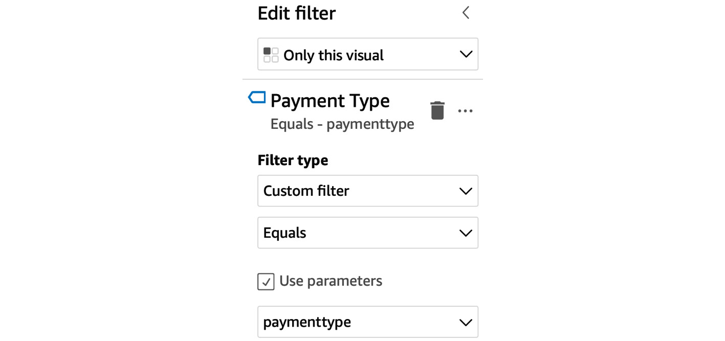
Figure 5.6 – Linking filters to parameters
- Click Apply and then Close.
Now that our filter and parameter are connected, the filter will inherit the default values of our parameter. In our example, we have used a multi-value parameter. We can confirm that the pivot table only displays the records that contain the default values of the parameter. Now that we have linked the parameter with the visual, we will learn how to add on-screen controls and allow readers to change the parameter value.
Adding on-screen controls
QuickSight allows you to add on-screen controls so that your reader users can set the value of a parameter dynamically. In our example, setting the paymenttype parameter value will result in changes in the value of the Payment Type filter, which has been applied to the pivot table visual. To add an onscreen control, follow these steps:
- First, select the Parameters item from the left-hand side menu.
- Then, select the paymenttype parameter we created earlier. From the drop-down menu, click Add control, as shown here:

Figure 5.7 – Adding on-screen controls
- From the control's creation settings, we will need to define the following parameters:
- Display Name: A user-friendly name for the on-screen control. In our example, we used Payment Type.
- Style: The type of control that your users will be using to set the parameter. The control styles options are also determined by the data type of the parameter. For example, if our parameter was a date type, Date Picker would be among the available options. For our example, we will use the List – Multiselect style, as shown in the following screenshot. This type will allow our users to select multiple values from a drop-down menu.
- Values: The values that the users can select from. You can link these values to values from a dataset, which ensures that the available values are synced with the dataset, so there isn't a need to maintain these values separately. In our example, we linked the values of the Payment Type field. The following screenshot shows an example of an on-screen control configuration:

Figure 5.8 – Adding on-screen controls to the parameter
- Click Apply to add the on-screen control.
Now that we've added the on-screen control, we have all the required components that allow us to publish interactive dashboards. Let's look at the sequence of events that enable interactivity on our dashboards:
- First, the user selects values using on-screen controls.
- The selected values are passed to parameters.
- Then, these parameters are used as filter conditions.
- Finally, the visuals in the scope of the filter are updated after user selections.
The following diagram depicts the flow described here:

Figure 5.9 – Components for interactive filtering
Now that we have configured all the required components, let's test the on-screen controls:
- First, notice that at the top of the screen, we have a new section named Controls, under which we have the newly created Payment Type on-screen control. The following screenshot shows the newly created control:

Figure 5.10 – Multi-select control
- Changing the selection of this control will automatically change the values of the paymenttype parameter, which was configured to work with our Payment Type filter.
- You can access additional options from the on-filter controls. One of the options that's available allows you to detach the control from the top of the screen and add it to the analysis sheet. This is a good option for filters that have a narrow scope. In our example, our filter covers only a single visual, so placing the control next to the visual might provide a better overall user experience while saving screen estate at the top of the screen. The following screenshot shows the on-screen control being placed next to the pivot table:
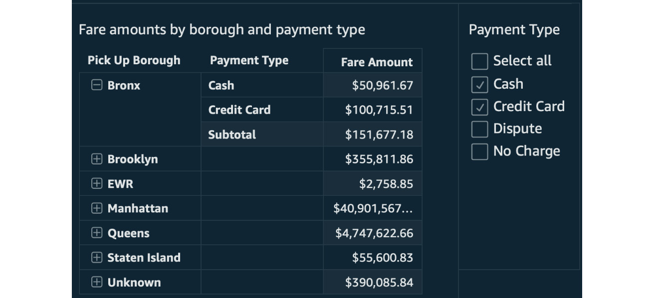
Figure 5.11 – On-screen control placed on the analysis sheet
Now that we have configured the analysis and arranged the onscreen controls, we can publish the analysis as a dashboard and share it with our reader users. With that, we have created our first truly interactive QuickSight dashboard. Next, we will learn how to use actions to add more interactive controls to our dashboards.
Working with actions
QuickSight Actions allow you to add interactivity to your dashboards. They can be any of the following:
- Filter actions
- Navigation actions
- URL actions
Next, we will look closer at each of these action types. To understand each type, we will configure them using our New York taxi sample analysis.
Working with filter actions
URL actions allow us to instantly filter data when the user clicks on a specific area of a dashboard. Filter actions make it easier for your readers to focus on specific data points of the analysis.
When configuring filter actions, you will need to choose a visual in your analysis and then provide the following information:
- Action Name: A user-friendly and descriptive name for the filter action.
- Activation: Menu Option or Select: Menu Option will add a menu item when you click a data point in your visual. This option, when clicked, will activate the URL action. On the other hand, with the Select option, your URL action will be activated directly when you click a data point.
- Filter scope: Which visuals will be filtered.
To understand filter actions, we will use an example from our New York Taxi analysis. Let's assume that we want our users to instantly focus on a specific borough and update the KPI and Sankey visual to reflect the selected borough only. To select a borough, we will use the bar chart diagram that displays the average tip per borough, which we configured in Chapter 4, Developing Visuals and Dashboards:
- First, navigate to the analysis and select the bar chart visual by simply clicking on it.
- Next, with the visual selected, click on Actions from the left-hand side menu.
- Click Add action and then Filter action from the Action Type drop-down menu.
- Add the values shown in the following screenshot:

Figure 5.12 – Filter action
We'll update the following parameters:
- Action name: Filter by borough
- Activation: Select
- Filter scope: Selected fields
- Target visuals: The KPI and Sankey visuals
- Click Save.
The filter action has now been applied. To quickly test the newly created action, just click on any Pickup Borough data point on the bar chart and notice how the target visuals update. For example, with the Queens borough selected, we can see an example of how the Sankey diagram looks, as follows:

Figure 5.13 – Sankey diagram once the filter action has been applied
Feel free to try adding add more filter actions to other visuals in your analysis. Next, we will learn how to configure navigation actions.
Working with navigation actions
As you are adding visuals to analysis, it can reach a point when there might be too many visuals for a single page. In these scenarios, you can organize visuals into sheets. For each sheet, you can provide a user-friendly name to help your BI users navigate the dashboard. For each sheet, you can provide the following details:
- Title
- Description
Both can help give your users context. Title and description can be particularly useful in scenarios where there are many sheets. Navigation actions can help you define actions that will allow your users to quickly navigate to different sheets within the same analysis.
When configuring navigation actions, you will need to choose a visual in your analysis and then provide the following information:
- Action name: The name of the navigation action.
- Activation: Menu option or Select: Menu Option will add a menu item when you click a data point in your visual. This option, when clicked, will activate the URL action. On the other hand, with the Select option, your URL action will be activated directly when you click a data point.
- Target sheet: The sheet name where your user redirects to when the action activates.
- Parameters: This lets the user set parameter values after navigating to the target sheet.
Next, we will look at another type of action: URL actions.
Working with URL actions
URL actions allow us to redirect our user to another website or another dashboard when the user clicks on a specific area of a dashboard. URL actions can help your BI users easily retrieve additional context for the dashboard.
When configuring URL actions, you will need to choose a visual in your analysis and then provide the following information:
- Action Name: A user-friendly and descriptive name for the URL action.
- Activation: Menu Option or Select: Menu Option will add a menu item when you click a data point in your visual. This option, when clicked, will activate the URL action. On the other hand, with the Select option, your URL action will be activated directly when you click a data point.
- URL: The URL where you want to redirect your user.
Note
You can add references to the parameters of field values in the URL field. This will allow you to redirect your users to different URLs, based on the user selection. The syntax to refer to a parameter is <<$parameter-name>>, while the syntax to refer to a field is {{field-name}}.
- Open in: This option determines how your browser will open the link from the URL actions. The options are opening in the same tab, opening in a different tab, or opening in a different browser window.
To understand how to set up URL actions, we will use our New York Taxi analysis. Let's assume that we need to add a link to an external website with additional information on each of the New York boroughs. For this example, we will use the bar chart visual we configured in Chapter 4, Developing Visuals and Dashboards. We will use Wikipedia as our external website:
- First, navigate to the analysis and select the bar chart visual.
- Next, with the visual selected, click on Actions from the left-hand side menu.
- Click Add action and then select URL action from the Action Type drop-down menu.
- Add the values shown in the following screenshot:

Figure 5.14 – URL action
These values are as follows:
- Action name: Wikipedia look up
- Activation: Menu option
- URL: https://en.wikipedia.org/wiki/<<{Pick Up Borough}>>
- Open in: New browser tab
- Click Save.
The URL action has now been applied to our visual. To test URL actions, you need to click on the data points of the visual where you applied the action. In our example, every data point will redirect to a different URL, since we are using the Pickup Borough field as part of our URL. When you test something like this in the real world, you will need to ensure that each URL is redirecting the user correctly. The following screenshot is what we'll see upon right-clicking on the Manhattan bar in our bar chart. Notice that a Wikipedia look up menu option appears, which will redirect us to the Manhattan Wikipedia page (https://en.wikipedia.org/wiki/Manhattan) when we click on it:
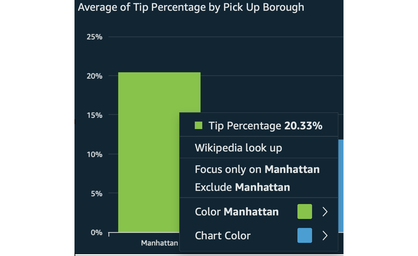
Figure 5.15 – URL action menu item
Thus, we have figured out how to work with various types of actions as well.
Summary
Congratulations on completing this chapter! In this chapter, we learned how to add interactivity to our dashboards. We learned how to add QuickSight parameters and on-screen controls to filter the data of our analysis following user input. We also learned how to configure the three types of actions: the filter action, the navigation action, and the URL action. Using these features, you will be able to create BI applications, with interactive controls enhancing the user experience of your BI applications. With the actions we learned about in this chapter, your users will be able to perform single-click filtering, navigate easily between multiple sheets, and open external websites that provide additional context.
In the next chapter, we will learn how to use insights and add machine learning to our analyses.
Q&A
- What filter type can be linked to a parameter?
- How can you use a parameter with a URL action?
- When do we need to use sheets?
- How can we help business users navigate between different sheets?
- What is the difference between filter actions and navigation actions?
- What is the difference between Menu option and Select for action activation?
Further reading
- QuickSight User Guide – AWS: https://docs.aws.amazon.com/quicksight/latest/user/amazon-quicksight-user.pdf