Long after releasing her first single in 1980, singer-songwriter Tori Amos continues going strong. It isn’t often a singer stays in the public eye for over two decades, continually selling out concerts. The audience is bound to see a change in the musician and her music when a career lasts that long, and that certainly applies to Amos.
For an artist, a Web site must reflect the artist’s persona and art. The release of her album American Doll Posse put Amos’ focus on the strong woman. The posse contains five different characters that together create a complete woman and her role today. The album and tour involve four other singers who each represent a “part” of Amos—accompanying Amos.
So what did this mean for the Web site? Amos’ management wanted to create, own, and manage a site separate from the record label’s site, ToriAmos.com. The idea was to make it the authoritative site providing information about Amos’ career and not just her latest work. They used the domain ToriAmosCom.com and posted a placeholder on the Web site—and they hired Philip Fierlinger to create harmony between Tori’s music and her Web site (FIGURE 6.1).

Fierlinger landed the project because of someone he knew who had worked with Tori Amos. During initial discussions with Tori Amos’ team, Fierlinger found them eager to build the site, but he discovered fan sites already doing a great job providing regularly updated and high-quality content. Fierlinger delved deeper to find the motivation for building the site, while considering his concerns that the management team would have limited access to content for logistical and legal reasons. He nearly talked himself out of a job during this discovery phase.
A passionate designer, Fierlinger wouldn’t design a Web site without meaningful and compelling reasons. He wanted to provide fans a place where they could get content and have an experience that they couldn’t find on any other site. He continued to review the official record label site and fan sites, and discovered these sites were missing the components of good design from the audience’s perspective, such as usability and a well-thought-out information architecture.
He began the project by exploring Tori Amos-related Web sites to see what was out there and where the gaps were. As soon as the project received direction, Fierlinger proceeded with the project using the standard Web design process, from building the wireframes and getting feedback on the initial comps to building the site’s structure and taking advantage of the power of CSS.
The record label’s site looked slick, but had Flash usability issues and content based on what the rrecord labels believed important, not what the fans wanted. On the other hand, fan sites like The Dent (www.thedent.com) contained obsessively detailed and relevant content, and provided a stunning experience. But while the content more than satisfied fans’ thirst for Tori Amos-related information, its design lacked the quality demanded by the management team. Here In My Head (www.hereinmyhead.com), another fan site, succeeded in the area of design and contained up-to-date content.
After completing his research, Fierlinger believed he could build a site that complemented fan sites and the label site while offering higher design standards and unique content. Although he wouldn’t control or maintain the content, he believed he could encourage the application of good content practices by building the site with the right content management system (CMS), including a blog that listed events, and providing RSS feeds.
Furthermore, he gave the team suggestions and ideas for content, even some that didn’t make it past the concept stages. One idea proposed that band members, Tori, fans, and other artists record their impressions and stories on audio and video resembling DVD commentaries. Another involved creating e-cards with interactive music that played audio and animation, like little digital vignettes. Neither idea made the cut because of the time and effort involved, and because providing the fundamentals had a higher priority.
The project took five months, from July through November 2004. Fierlinger used the following basic Web design process:
Gather requirements
Develop concepts
Create information architecture
Design comps
Provide time and budget estimates
Receive feedback, iterate, and resolve the overall design direction
Design and build
Iterate, iterate, iterate
Applying Web standards best practices also played an important part in the project, says Fierlinger, because Web standards provided better usability and accessibility, helped with search engine optimization, encouraged smart and flexible engineering as well as visual design flexibility, and afforded him the opportunity to stretch his design skills. At the time of the project, many designers hadn’t adopted Web standards.
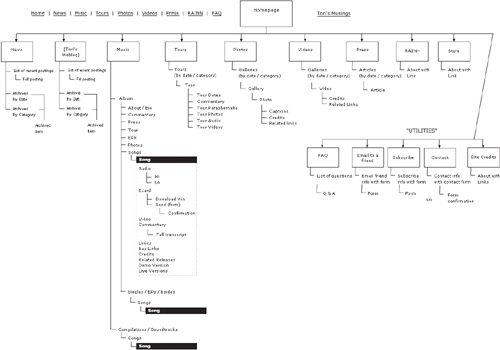
Not surprisingly, as in so many Web projects, creating content for the site was a slow and difficult process. Fierlinger, knowing that this process is usually underestimated, started requesting content early on in the project. The client submitted CDs with photos and short audio clips with interviews; the client wanted the full record catalog, tour history, press clippings, and links to Tori Amos’ charity as content along with an online store. Based on this information, Fierlinger drafted a high-level information architecture that defined the main parts of the site:
Music
Tours
Photos
Videos
Press
FAQ
News and blog
Footer utilities: Email a friend, subscribe, contact, site credits
Fierlinger put together the initial wireframes linking the frames to create a clickable prototype, as shown in FIGURE 6.2. Instead of pen and paper, he used Flash for the wireframes and screenflows, because the application simplifies the process of sketching ideas and wiring them together to see how things flow and to find the gaps.

Based on this architecture, Fierlinger created the full-blown wireframes shown in FIGURE 6.3, and discussed them with the client over the phone. He documented changes through several iterations. The wireframes included everything the client wanted to do and the time and cost estimates for the project using a spreadsheet outlining milestones, tasks, costs, and timeframes. The designer started by designing the wireframes with a grand vision and then stripped it based on the client’s feedback.
As expected, the client wanted a lower time and cost estimate. So the designer returned to the designing board and redacted the sitemap with red slashes to offer two additional approaches, as FIGURE 6.4 shows. The client received a choice of a full-blown version, a scaled-back version, and a basic version. The client chose the scaled-back version.

After making that decision, the designer switched from holding phone discussions to conversing with the client via videocasts, which helped him explain and clarify ideas as they developed.
After agreeing with the wireframes and sitemap, Fierlinger reviewed thousands of Web site screenshots that he had collected over the years for inspiration and reference. He flagged those that had elements he thought would work for the project. Using those elements and adding typography and photos of Tori Amos, he mixed the assets. He shared his favorites with the clients so they could pick the aspects and elements of the designs they liked. These set the tone for the design direction shown in FIGURES 6.5 and 6.6.
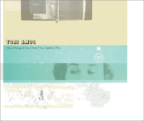
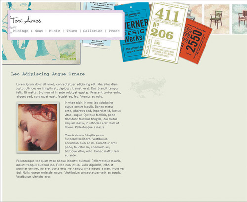
The client loved both collages, especially the typography shown in FIGURE 6.7 and the texture and scrapbook feel from FIGURE 6.8. Based on that feedback, Fierlinger combined the elements of the wireframes to create detailed comps, as shown in FIGURES 6.9, 6.10, and 6.11. The design process continued iteratively, with Fierlinger posting the latest designs on the staging site for the client’s review and updating the designs based on client input.


During the design phase, the designer searched for a CMS for the site. While he could’ve built the whole site from scratch in Dreamweaver, he opted not to go in that direction, as this approach would make it difficult for the client to update the content. He investigated blog engines and open-source CMS solutions. He considered Movable Type, but shied away due to concerns about the application’s complexity and its limited PHP support.
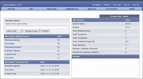
The PHP-based ExpressionEngine had potential, with its design flexibility and powerful features. He decided to use it, though first he had to learn how to use it himself. Conceptually, ExpressionEngine worked like other blog engines, but in practice it more closely resembled a big CMS system or Dreamweaver due to its use of object-oriented templates and subtemplates. The object-oriented and modular application used a different approach for site modeling and content creation. Adopting ExpressionEngine required changing the way of thinking about and building a Web site that runs on a CMS.
FIGURE 6.12 shows ExpressionEngine’s control panel, which gives only a small taste of the application’s power. It lets designers hack things in interesting ways, and blend in custom PHP code as needed. In a typical project, Fierlinger generally avoided adding much customized PHP. However, for this project, the gallery structure needed heavy-duty PHP. The nature of the content required a gallery format, so the designer needed to figure out the best way to design and build the gallery.
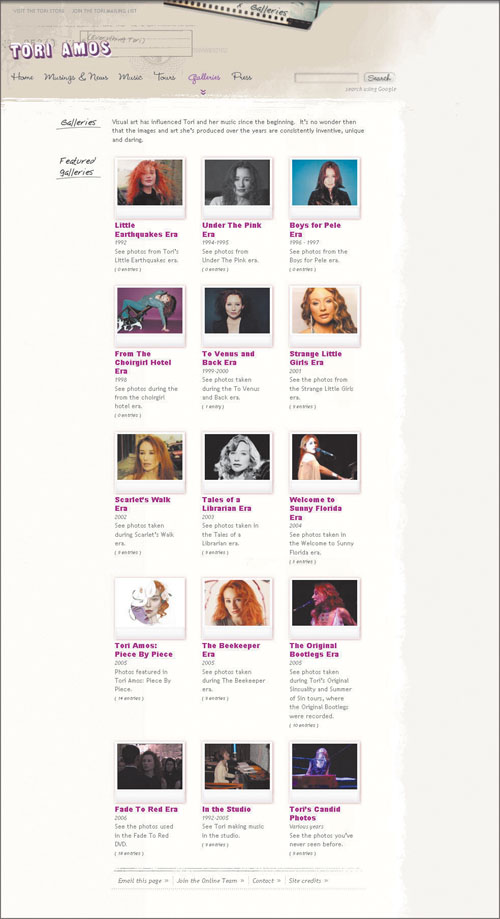
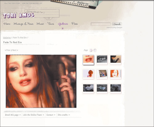
It would’ve been simple to build the gallery as a basic blog sequence in which users accessed entries sequentially with a preview and links to the next and previous entries. However, the designer wanted to offer more by setting up the gallery to appear as a set of pages containing a manageable number of thumbnail previews. He had customized a CMS for a photography site, so he adopted that same approach, which gave him the ability to generate an entire site design and layout as a gallery structure. FIGURE 6.13 shows the front page of the Galleries section.
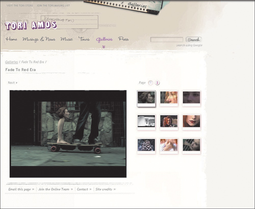
The most challenging part of designing the gallery was getting the thumbnail subsets to paginate, or automatically break up by pages. The gallery displayed up to nine thumbnails per page. If the gallery has more than nine images, then the CMS he designed created a new page for the next set of nine thumbnails. He applied the concept, not the code, from his photography site CMS, and built the gallery in ExpressionEngine with customized PHP. The gallery turned out well (see FIGURES 6.14 and 6.15) because of the mind-bending amount of work he invested in building it.
With the CMS decided, the project moved forward using the following build process:
Design the layouts in Photoshop.
Use Dreamweaver for designing the HTML and CSS structure.
Carve the design file for background images.
Build the initial templates so they work on the local machine to test and ensure all code works before migrating.
Migrate everything into ExpressionEngine.
Add dynamic elements in ExpressionEngine—the biggest job.
Tweak the design, HTML, and CSS in ExpressionEngine.
In working on the design approach, Fierlinger wanted to ensure the layouts were scalable. This scalability would allow the site to accommodate content, large and small, so the content could grow along with the site. To build a flexible structure for scalable layout, he used grid patterns with CSS, which play well together, since CSS provides the freedom to work with an underlying grid pattern without the restrictions that come with hard, formal, and obvious boundaries.
The flexible and scalable structure led Fierlinger to use backgrounds to loosen up the grid, to extend and overlap the edges, and to create a highly textured scrapbook feel. Though he designed the site with content scalability in mind, nothing will scale elegantly in situations where the copy, being either too short or too long for a given space, doesn’t synchronize with the design.
Since ExpressionEngine relied on PHP, the site loaded CSS using PHP with @import to separate the code from style. This allowed the site to import section-specific styles for each area of the site. In spite of these advantages, the site contained many <div> tags, leading to a case of “Divitis,” a common Web site ailment. The main role of <div> is to group the page into sections, such as the navigation, header, footer, and body. For EverythingTori.com, no other solution accomplished what the site needed. Though having many <div> elements and classes adds as much weight to a page as tables do, CSS still has advantages over tables. For instance, those using screen readers experience fewer problems with CSS than with tables. After all, it was 2004—a time when CSS wasn’t widely adopted by designers and supporting browsers.
The site’s subtle background images led to unforeseen issues cropping up in the design. For example, the home page’s “Musings & News” height is shorter than the background image, so the design crops it to the height of the block. Fortunately, it works naturally for the site with its use of textures and randomness to give it a scrapbook look and feel.
But the designer worried more about making the background images seamless while overlapping or tiled vertically or horizontally. Beyond that, it was better for the design to look random.
In dealing with browser issues, Fierlinger relied on “build, test, build, test, repeat” until the design behaved the way it should. He aimed to ensure the site worked with Internet Explorer 5.5 and FireFox 1.5 (remember, this was 2004). When he couldn’t find a solution for a situation, he resorted to the magic bullet: the underscore hack. The underscore hack isn’t valid CSS, but it did the trick:
hr {
   height:3px;
   _height:4px;
}
The three-pixel positioning looked right in every browser except Internet Explorer; four pixels worked better for IE. The underscore acts like a comment, and most browsers ignore anything with an underscore in the CSS. Internet Explorer is an exception, however, so it dutifully obeys the style following the underscore. (To make it work, the underscored attribute must come after the original attribute so IE obeys the “last command” it receives.)
While some purist designers believe that using the hack is a sin, Fierlinger believed the hack was, at least, more elegant than other hacks. So what if the site didn’t validate? The site would survive, and serve its purpose.
Another interesting aspect of the site comes in the sharing of the same HTML structure while giving each section a distinctive look through the different background textures. The texture frames the page and the custom imagery to define each section. Each section also features different search field and button styles. The underlying HTML all comes from the same template, demonstrating the beauty and ease of using CSS to separate structure and presentation. FIGURE 6.16 shows an overview.
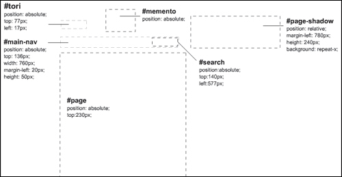
Most sites feature a <div> to frame the header, usually something like #header. In the case of the Tori site, using a header <div> would have restricted the background textures to a limited space. To get the textures to extend and flow into the overall page, Fierlinger used #body to define the background imagery. Notice that the page includes a drop shadow, adding dimension and depth and enhancing its tactile feel. He added a #page-shadow <div> with a margin-left of 780px to extend the shadow to the full page width, to accommodate varying browser widths. Thus, starting from the minimum page width of 780px, the background image extends to the right infinitely with the use of repeat-x. In some cases, Fierlinger added a background image in the #page <div> to frame the page content. The following CSS contains sitewide styles as well as styles specific to sections:
#page-shadow {
  top:0;
  height:200px;
  margin-left:850px;
  }
#memento {
  position:absolute;
  top:0px;
  left:320px;
  }
#tori {
  position:absolute;
  top:77px;
  left:17px;
  }
#main-nav {
  position:absolute;
  top:136px;
  width:760px;
  margin-left:20px;
  height:50px;
  border:0px solid green;
  }
#main-nav a {
  display:block;
  height:30px;
  margin-right:20px;
  text-decoration:none;
  float:left;
}
#nav-home {
  width:46px;
  background: url("../img/nav/home.gif") no-repeat 0 -30px;
  }
#main-nav a:hover#nav-home {
  background-position: 0 0;
}
#nav-musings {
  width:126px;
  background: url("../img/nav/musings.gif") no-repeat 0 -30px;
  }
#main-nav a:hover#nav-musings {
  background-position: 0 0;
}
#nav-music {
  width:48px;
  background: url("../img/nav/music.gif") no-repeat 0 -30px;
  }
#main-nav a:hover#nav-music {
  background-position: 0 0;
}
#nav-tours {
  width:48px;
  background: url("../img/nav/tours.gif") no-repeat 0 -30px;
  }
#main-nav a:hover#nav-tours {
  background-position: 0 0;
}
#nav-galleries {
  width:65px;
  background: url("../img/nav/galleries.gif") no-repeat 0 -30px;
  }
#main-nav a:hover#nav-galleries {
  background-position: 0 0;
}
#nav-press {
  width:46px;
  background: url("../img/nav/press.gif") no-repeat 0 -30px;
  }
#main-nav a:hover#nav-press {
  background-position: 0 0;
}
#search {
  position:absolute;
  top:140px;
  left:577px;
  border:0px solid yellow;
}
#search-box {
  width:124px;
  font-size:.9em;
  border:none;
  padding:6px 8px 6px 4px;
  border:0px solid black;
  float:left;
  }
#search-button {
  border:0px;
  width:66px;
  height:25px;
}
#search p {
  border:0px solid white;
  text-align:right;
  color:#999;
  font-style:italic;
  padding:0;
  margin:0;
  }
#search a:hover {
  color:#666;
  }
The following code comes from the Tours section’s CSS to show how its header differs from other sections:
body {
   background: #F3F7F7 url(../img/tours/bkgd.jpg) no-repeat;
}
#page-shadow {
   margin-left:850px;
   background:url(../img/tours/page-shadow.gif) repeat-x 0 0;
}

#mic-chord {
   position:absolute;
   top:0px;
   left:320px;
}

#nav-tours {
   width:48px;
   padding-bottom:20px;
   background: url(../img/tours/tours-current.gif) no-repeat 0 0;
   }
#main-nav a:hover#nav-tours {
   background-position: 0 0;
}
#search-box {
   background:url(../img/tours/search-box.gif) no-repeat 0 0;
   _background-attachment:fixed; /* underscore hack for IE
positioning */
   _width:120px; /* underscore hack for IE positioning */
}

#search-button {
   _height:28px; /* underscore hack for IE positioning */
   background:url(../img/tours/search-button.gif) no-repeat 0 0;
}
#tours {
   display:block;
   float:left;
   width:181px;
   height:51px;
   }
#intro {
   width:46em;
   float:left;
   padding-left:10px;
   padding-bottom:30px;
   }

.featured {
   display:inline;
   float:left;
   width:170px;
   padding-right:20px;
   margin-bottom:20px;
   }
.featured img {
   width:170px;
   height:108px;
}
.featured a img {
   padding: 0 2px 2px 0;
   margin-bottom:5px;
   background:url(../img/drop-shadow.gif) no-repeat 100% 100%;
   }
.featured a:hover {
   text-decoration:none;
}

.featured a:hover .title {
   text-decoration:underline;
}
.featured .title {
   font: 1.25em "Arial Black";
   }
.featured h3 {
   font-size:.9em;
   font-style:italic;
   font-weight:normal;
   padding:0;
   margin:0;
}
.duct-tape {
   position:absolute;
   padding-left:70px;
   margin-top:-8px;
   z-index:2;
   }
img.duct-tape {
   width:40px;
   height:15px;
   border:none;
   }
Here’s the HTML for the headers on the home page:
<title>Everything Tori | Home</title>
<style type="text/css">
@import url("http://everythingtori.com/go?css=core/general-css");
@import url("http://everythingtori.com/go?css=home/home-css");
</style>
<script type="text/JavaScript">
<!--
function MM_openBrWindow(theURL,winName,features) { //v2.0
window.open(theURL,winName,features);
}
//-->
</script>
</head>
<body>
<div id="page-shadow"> </div>
<img src="img/home/tori.gif" alt="Tori Amos" id="tori" />
<img src="img/home/memento.gif" id="memento" alt="" />
<div id="sitewide-store-link"><a href="http://www.thetoristore.com/"
target="_blank" title="Link opens in a new window.">visit the Tori
Store</a></div>
<div id="sitewide-mail-link"><a href="Javascript:MM_openBrWindow('/
mailing.html','mailing','width=400,height=450')" title="Link opens in a
new window">Join the Tori mailing list</a></div>
<div id="main-nav">
<a href="http://everythingtori.com/go/home/" id="nav-home"
class="hide-text">Home</a>
<a href="http://everythingtori.com/go/musings/" id="nav-musings"
class="hide-text">Musings & News</a>
<a href="http://everythingtori.com/go/music/" id="nav-music"
class="hide-text">Music</a>
<a href="http://everythingtori.com/go/tours/" id="nav-tours"
class="hide-text">Tours</a>
<a href="http://everythingtori.com/go/galleries/" id="nav-
galleries" class="hide-text">Galleries</a>
<a href="http://everythingtori.com/go/press/" id="nav-press"
class="hide-text">Press</a>
</div>
<div id="search">
<form method="get" action="http://www.google.com/search">
<input type="text" name="q" maxlength="255" value=""
id="search-box" />
<input type="image" src="img/x.gif" value="submit" alt="Search
(using Google)" title="search using Google" id="search-button"
/>
<p>search using Google</p>
<input type="hidden" name="domains" value="everythingtori.com"
/>
<input type="hidden" name="sitesearch" value="everythingtori.
com" />
</form>
</div>Compare the home page HTML to the Tours section’s header HTML:
<title>Everything Tori | Tours</title>
<style type="text/css">
@import url("http://everythingtori.com/go?css=core/general-css");
@import url("http://everythingtori.com/go?css=tours/tours-css");
</style>
<script type="text/JavaScript">
<!--
function MM_openBrWindow(theURL,winName,features) { //v2.0
window.open(theURL,winName,features);
}
//-->
</script>
</head>
<body>
<div id="page-shadow"> </div>
<img src="img/tours/tori.gif" alt="Tori Amos" id="tori" />
<img src="img/tours/memento.gif" id="memento" alt="" />
<div id="sitewide-store-link"><a href="http://www.thetoristore.com/"
target="_blank" title="Link opens in a new window.">visit the Tori
Store</a></div>
<div id="sitewide-mail-link"><a href="Javascript:MM_openBrWindow('/
mailing.html','mailing','width=400,height=450')" title="Link opens in a
new window">Join the Tori mailing list</a></div>
<div id="main-nav">
<a href="http://everythingtori.com/go/home/" id="nav-home"
class="hide-text">Home</a>
<a href="http://everythingtori.com/go/musings/" id="nav-musings"
class="hide-text">Musings & News</a>
<a href="http://everythingtori.com/go/music/" id="nav-music"
class="hide-text">Music</a>
<a href="http://everythingtori.com/go/tours/" id="nav-tours"
class="hide-text">Tours</a>
<a href="http://everythingtori.com/go/galleries/"
id="nav-galleries" class="hide-text">Galleries</a>
<a href="http://everythingtori.com/go/press/" id="nav-press"
class="hide-text">Press</a>
</div>
<div id="search">
<form method="get" action="http://www.google.com/search">
<input type="text" name="q" maxlength="255" value=""
id="search-box" />
<input type="image" src="img/x.gif" value="submit" alt="Search
(using Google)" title="search using Google" id="search-button"
/>
<p>search using Google</p>
<input type="hidden" name="domains" value="everythingtori.com"
/>
<input type="hidden" name="sitesearch" value="everythingtori.
com" />
</form>
</div>Adding #memento gave each section a defining symbolic image, which seamlessly integrated the background texture and the page shadow. Other standard header elements include the #tori logo, the #main-nav, and #search. The search input field #search-box and the #search-button use background graphics to blend smoothly with the overall page texture. To achieve that effect, the search button used a fully transparent x.gif so that it can use the same HTML template sitewide, and then the CSS defined the custom background image for the button and the input field.
Many Web design projects tend to have project-management and designer/client communications challenges. Fierlinger worked closely with Chelsea Laird from The Bridge Entertainment Group, Tori Amos’ management company, during construction of the site. Chelsea handled the content loading, along with the day-to-day client coordination. As the project neared completion, the project involved many content and design changes. The team coordinated and managed all of the work online, including uploading the changes directly to the site. Communications relied heavily on email exchanges and daily instant-messaging conversations.
The team selected the go-live date to coincide with the launch of a new book and album. As with most design projects, something entered late in the game—suddenly, the client wanted a new section of the site dedicated to the book project. The team rushed to put together a blog section for the book and launch the site. Adding the new section was easy because all of the elements for the framework were in place.
Upon site launch, fans raved about the new site, to the great relief of the design team. Only one major issue occurred after launch. The site contained full-length, high-quality MP3 files for every track from every album and single Tori Amos released. It was a great idea, but the challenge came in preventing the ability to illegally download the tracks. Fierlinger monitored the Web site’s traffic and the forums for people discussing the site. More importantly, he wanted to watch for the possibility of someone copying all the MP3 files.
Within a couple of weeks after launch, someone figured out how to do it, and mentioned it in one of the forums. As a result, the client edited all of the tracks down to 30-second samples.
The designer continued supporting the site until the management team got into the swing of updating and editing content, and they took control of it.
The site has been successful for over three years now. Fierlinger kept an eye on the site by subscribing to its RSS feed and receiving user feedback through emails. He concluded that the site continued to perform well and was doing exactly as expected. The client has successfully added new pages or sections, and frequently updated the content. Furthermore, the home page changed nicely to reflect the newest project. Thanks to the planning for growth and evolution, the original structure has adapted well to continuous changes.
Philip Fierlinger’s parents ran an animation studio out of the family’s home, surrounding him with the whole design and production process. He took an interest into computers as a child and learned BASIC by playing around with Beagle Brothers, the first “open source” code he ever used. Eventually, he expanded his knowledge to include databases, and created a contact database for his mom. He studied industrial design in college, completing his final semester in an internship with a top-secret startup called General Magic in Silicon Valley. Though he received an internship offer from Sony in New Jersey, he couldn’t pass up the opportunity to work with the original Macintosh team on a new handheld computer platform.
How did you get started in Web design?
In 1994, I started Turntable with my brother, Peter. We believed we could create interactive designs and do development better than many of the companies we knew. With no money and nothing to lose, we applied their powerful ideas and passion to build a prototype of an interactive online music store. This came at a time when Mosaic [one of the earliest Web browsers] didn’t exist; people considered CD-ROMs an expensive and unattainable technology; and 14.4 BPS modems were state-of-the-art technology, only known to über geeks. The store focused on the ability to browse an online music catalog, to listen to samples, to watch music videos, and to buy music online. This idea was almost 10 years ahead of its time.
We pitched our prototype to several major record labels. They were baffled and perplexed. They had no idea what to do with us. Although they were impressed, they were unconvinced that what they saw was relevant to their business. I emailed Ian Rogers, a kid in Indiana who did a fan site for the Beastie Boys. I told Rogers about an idea for a Beastie Boys CD-ROM that connected to and integrated with his fan site. It turned out the Beastie Boys hired Rogers, who pitched my idea to the band. Within a few weeks, I went to L.A. to do a QuickTime VR [experimental technology then still in development at Apple] shoot of the Beastie Boys’ studio. Those of us involved in this project were among the first to use QuickTime VR. We also worked out a deal with Microsoft to include Internet Explorer 1.0 on the CD because of the difficulties in dealing with Netscape. This tie-in was one of the first browser bundle deals.
The Beastie Boys project established our company as a leading digital design and development company. We had no trouble landing projects from biggies like Apple, Palm, and Macromedia. We continued to take on projects for underground bands we loved, including Dr. Octagon, the Invisible Skratch, Piklz, Money Mark, and Mo’Wax.
Thanks to our relationship with Macromedia, we developed the first Shockwave audio player soon after Shockwave came out. Later, I started working on Flash 4, when Flash came with programming capabilities. Unexpectedly, we stayed busy during the dot-com days by designing and developing sites for many crazy startups.
By 2001, I moved to New Zealand with my wife and son, where I went to work for the country’s top Web agency, Shift (shift.co.nz). The company gave me the incredible opportunity to work with a team of young designers doing some of the best design work in the world. With Shift, I put my Flash skills to work in building powerful cultural Web sites—a stark and refreshing change from the dot-com and rock-star Web sites.
During my time with Shift, I learned heaps about designing for large-scale online publishing, giving me the skills to design for scalability and performance and develop flexible templates using dynamic grid systems. Obviously, this experience with Shift prepared me for the Tori Amos project.
While I worked on the Tori Amos site, I worked on a redesign for NewZealand.com at Shift. The redesigned site won a Webby Award for best tourism site and a nomination for best home page design, and another Webby the following year. I moonlighted on projects for U.S. clients while still working full-time for Shift in New Zealand. I worked with U.S. clients, including DreamWorks, Comcast, Warner Brothers, and Capitol, and many others from New Zealand—the geographical separation didn’t cause any issues.
Not one to shy away from new things and innovation, I helped form Xero.com, a startup based in New Zealand, which created an online accounting system. As lead interaction designer, I enjoyed the challenge of turning the boring and painful world of accounting into a sexy, simple, and fun experience. It was an appreciated chance to focus on a product and continuously refine it, rather than switching between projects and clients.
How did you take an interest in Web standards?
I started moving away from designing and building static sites into creating dynamic, data-driven sites. In the process, the limitations of defining visual design in HTML became painfully obvious. Building database-driven sites frees up the content into an abstract object that you can manipulate independently of the code and the visual presentation. If you use HTML for both structure and style, then you are very limited in what you can do with your content. Any changes you want to make require editing code across every page and template in your site. Everything is hard-coded. Changes are painful and extremely prone to errors. Plus, your design options are very restricted.
Ideally you want to write and edit your code in one place and have it referenced in many places across your entire site. CSS is designed to do exactly that: You can make one simple change in one class and it instantly changes your design wherever you use that class reference within your entire site. That makes building sites very efficient. It also gives you a lot of design flexibility and freedom.
Of course, massive credit is due to Jeffrey Zeldman for his crusade to make people aware of CSS and Web standards, plus David Shea for putting together the CSS Zen Garden, making the path to better design and development quite obvious.
For these reasons, I applied Web standards to EverythingTori.com.
What are the more common issues you run into with CSS? How do you deal with them?
Browser issues and general quirks make working with CSS tedious. It’s amazing how quickly you can get 90% of your design built in CSS. Finishing that last 10%, getting things pixel perfect, can be excruciating. The problems become exponential when you’re targeting a wider range of browsers, especially older ones. Therefore, I try to limit the number of target browsers and keep it to the most current. Of course, IE is always the biggest nightmare, and there’s generally no avoiding it.
Also, it’s very annoying that tables handle many layout and grid structures exactly how you want, much easier and more predictably than using CSS floats, but they often don’t play well with CSS and they have their own drawbacks. Being able to use the table attributes of CSS would be great, if browsers supported it properly. CSS still isn’t ideally suited as a complete publishing solution. It was never really designed to handle grid layouts with multi-column flow, so the solutions people use are all hacks. It would be wonderful if CSS 3 became mainstream, but it seems like that day, sadly, is still far off.
Who or what influenced you?
My biggest influence is my wife Hadley (www.shescrafty.com). It’s extremely hard to pass the wife test, and it’s a great feeling when it happens. Over the years, I’ve collected screenshots of any Web site that catches my eye. I wish I’d been doing it my whole career, because there are some sites that are long gone that I wish I could refer to. I often peruse my collection for ideas and inspiration. Here’s a short list of some of the sites and designers that always grab my attention and give me ideas:
grant.robinson.name—online home of one of the best designers and Flash developers I have ever had the pleasure to work with
Shift.co.nz
37Signals.com
Google.com
Flickr.com
Odopod.com
CSSZenGarden.com
CactusLab.com
l3che.com
cape-acrona.com
ths.nu
AestheticApparatus.com
Ourcommon.com
Wrecked.nu—the original Wrecked.nu had incredible textures and interactions.
Urban Outfitters—for years I collected their print promos at their stores; their emails can be really excellent.
Iso50.com
SecondStory.com
Gutterlife.com
24-7media.de
Miikasaksi.com—his original site Smallprint.net had a huge influence on me.
Dooce.com—she used to do constantly changing, beautiful headers for her old site.
These sites undoubtedly influenced Fierlinger’s works, as some of their elements appeared on his designs. And as an innovative designer, his work most likely influenced many other designers. Concerning the Tori Amos project, Fierlinger said he was happy with the project and its results. He had fun designing and building it, since it gave him the opportunity to design something visually expressive with a solid and smart structure. Furthermore, he had creative freedom and the client listened to his ideas and direction. In turn, the client provided him with great guidance, feedback, and support for managing the content.
Looking back at a project, most designers, including Fierlinger, cringe at all the glaring imperfections taunting them. They dwell on the things they didn’t have time to fix, or discover that the client mucked things. For EverythingTori.com, Fierlinger was completely satisfied with, well, everything. He didn’t see anything he wished he could’ve done differently. The fast-changing world of Web design and development can quickly outdate a Web site, but not with EverythingTori.com. He can look back on this project with complete satisfaction.