The presentation layer in Web standards-based Web sites is controlled by Cascading Style Sheets (hereafter referred to as CSS). When an author starts to build CSS files for a site, a number of factors should be considered. These can run the gamut from how many style sheets to the organization of the files’ content, and even determining what it means to write efficient, scalable CSS.
One of the hardest questions is how many CSS files a project will need. This depends entirely on the needs and size of a Web site. The answer, frankly, is: as many as are needed (and this may evolve as the site is built). Some sites may need a single style sheet, while others may need many. In larger sites, it may not make sense to load all the CSS rules that are required on every page. One of the major strengths of CSS is the rule cascade and how multiple files and sets of rules can be merged by applying multiple sources of CSS to a single document. The challenge is to structure the files in an intelligent way that scales well.
Designers and developers are commonly tempted to break CSS files up into function based on the types of rules. An example breakup is as follows:
typography.csstheme.css(orcolors.css)layout.css
At our company, we’ve tried this approach and found it to be fundamentally not worth the effort, with the negatives far outweighing the positives. With this technique, a Web team could easily switch out the colors or the type styles by using alternate style sheets. Sounds good, but in reality the maintenance issues, particularly over time, skyrocket with this approach and are simply not worth it in most cases. There needs to be a good reason to do this.
The issues that come up with broken-up CSS files include
Debugging becomes difficult and time-consuming because each selector is spread out among many files.
Hidden dependencies between files begin to surface or even get lost.
Less disciplined team members may violate the breakup of rules, resulting in inconsistent distinctions between files.
Debugging by editing multiple files becomes a hassle or debugging begins in a single file and then solutions need to be broken up between files; sometimes this last step does not happen, either on purpose or by accident.
The CSS cascade and specificity is more difficult to manage.
Increased overall size of the CSS for a site; each selector is repeated in each file.
Web authors can be confused as to the nature of different rules and what files the rules belong to. For instance, some rules, such as borders, provide both layout and color.
Broken-up CSS files require additional HTTP requests for a full set of style sheets—an unnecessary burden on both the Web browser and server.
The only time that this is a good idea is when there is in fact a solid requirement for this approach, and even then, alternatives might exist.
For instance, a site may feature a JavaScript text-resizing widget. In this case, a different style sheet for a different set of typography-related style rules may be a good idea. However, it is important to note that even in this case a different approach could be taken, and the extra file may not be required. Instead of using a full alternative style sheet, consider applying a new class to a parent element such as the <body> element or a content area. Resetting the base <body> text size can be highly effective if designers are using relative font sizes and em- or percentage-based units. Additionally, a single extra class on a parent element can affect the font size of an entire <div> element or the entire document.
A JavaScript file may include the following:
var x = document.getElementsByTagName("body")[0];
   x.className = "altText";
Where the style sheet contains rules such as this:
body {font-size: 1em;}
body.altText {font-size: 1.3em;}
The bottom line is, Web authors should be selective as to what rules are pulled into different files, and consider the reasons for doing so as well as any alternatives. Also, don’t create additional files for the heck of it when other techniques—such as using a script, like above, rather than switching style sheets—may create savings or keep the code cohesive.
There are several different ways to construct a flexible and scalable CSS file structure. In all cases, there are tradeoffs between performance, modularity, and ease of maintenance.
Linking a single CSS file will place all rules in a single location that is easy to manage, and you can use string searches to find appropriate rules and easily edit the files. At the same time, a single CSS file can be enormous and difficult to manage across an enterprise with a multitude of business channels, requirements of branding or functionality, or a growing team.
An exceptionally flexible approach is using modular sets of CSS files that serve different purposes. Using a series of linking CSS files, developers can easily mix and match sets of @import rules of CSS files that serve different purposes.
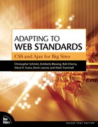
Take a moment to consider the following structure. If XHTML template #1 contains the following CSS link element:
<link href="css/global.css" rel="stylesheet" type="text/css" />
Then, in the global.css file, the file contains no rules, but rather uses the @import CSS command to bring in external CSS files (FIGURE 2.1) for global pages on the site:
@import url(styles.css);
@import url(nav-bar.css);
@import url(content.css);
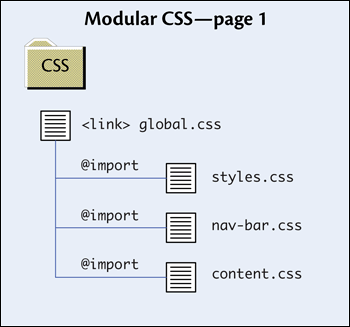
Elsewhere on the site, XHTML template #2, which contains some applications and forms, contains the following:
<link href="css/global-apps.css" rel="stylesheet" type="text/css" />
Then, the global-apps.css file contains import statements for the following:
@import url(styles.css);
@import url(forms-brand.css);
@import url(forms.css);
Note that the link file allows for a modular inclusion of different CSS files based on need (FIGURE 2.2). Both files include styles.css as the core CSS. The styles for forms in forms-brand.css and forms.css are not needed in the global pages, and therefore those CSS files are not included on the global pages; however, they can be linked locally from an application.
This has both advantages and disadvantages. The technique is a powerful approach from a maintenance and distributed-team standpoint, where multiple teams may need to import CSS files that are from a parent brand or some similar scenario. Additionally, from a CMS or template-based site structure, this has the added benefit of being able to add new CSS files without updating the XHTML site templates, because only a change to the CSS link files is required. Also, from a performance standpoint, if the forms rules are large in size, users do not need to download that data before it’s needed.
However, this performance consideration should be carefully considered, because there are also performance downsides. Essentially, for a given page a Web browser and a server are going to have to create and execute lots of HTTP requests. To load a single page with the second example above, four HTTP requests are issued—which puts added burdens on both the client Web browser and the Web server. Multiply that by the full number of users hitting a site at a given moment and the number grows exponentially. This is one demonstration of how the CSS setup alone can impact page load times and site performance. The pros and cons of this type of approach should be carefully considered before being implemented.
Note
Performance and load-time considerations will be examined more thoroughly in Appendix C.
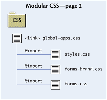
A more conservative approach that scales well over a large Web presence is a well-thought-out, directory-based setup for linking style sheets. A typical large-scale Web site has global presentation-layer needs, and also, quite often, site-section and even page-level needs. From these needs you can create a CSS directory structure that will scale and can be easy to manage. The directory structure could include:
Global CSS folder/files
Site-section or channel CSS folder/files
Page-level CSS folder/files (includes home page)
Media CSS folder/files (print, mobile, etc.)
Internationalization CSS files (folders for en_US/, es_ES/, fr_FR/, etc. Note each of these items consists of a language code followed by an underscore, followed by the region.)
Most Web pages will only require the global and possibly site-section CSS files (FIGURE 2.3). Based on unique needs, authors can link page-specific CSS files, and so forth. The biggest downside is that the site templates will require additional <link> elements in the document’s <head> element depending on what section of the site is being styled.
Using this approach and routine evaluations of page-level files, authors can push the rules up to site sections and then ultimately to the global files. This approach will be examined more thoroughly in the upcoming section.
This structure scales well and is easy for Web teams to manage. There are also fewer questions on the maintenance side as to where to put, as well as where to find, rules. Finally, there will be fewer HTTP requests than with multiple layers of linked CSS files.
Another technique worth consideration is merging multiple CSS files. This can be done during a build, deployment, or publishing process, or even in real time as the files are served to the browser. Merging has the added benefit of allowing multiple files to be managed by different teams, yet reducing the performance drag when a single request is used. This technique has to be carefully planned and executed, keeping all sites that might reference the CSS files in mind.
As a quick example, imagine a site that included these files in the documents’ <head> element:
<link rel="stylesheet" href="main.css" type="text/css" />
<link rel="stylesheet" href="page.css" type="text/css" />
Assume main.css contained the following:
body {font: bold 1.2em Sans-serif;}
.special { color: red; }
#content { font-size: 1em; }
Then, page.css had the following:
.other { color: green; }
#content { font-size: 1.2em; }
#content h1 { font-size: 1.5em; }
Obviously these are simple files for demonstration purposes only. Different teams or team members could easily manage main.css and page.css separately, and it would be easier to locate rules as needed in smaller files. However, before production, a process might create a file called styles.css and link it to the document:
<link rel="stylesheet" href="main.css" type="text/css" />
During deployment or even upon dynamic generation of the CSS, the files would be merged. Keep in mind, if there are rules that depend on the cascade so they should be in a certain order, then they should be merged in order as appropriate.
/* main.css */
body {font: bold 1.2em sans-serif;}
.special { color: red; }
#content { font-size: 1em; }
/* page.css */
.other { color: green; }
#content { font-size: 1.2em; }
#content h1 { font-size: 1.5em; }
Fewer files are downloaded and linked. In this case, the effort would not be worth it; however, with large sets of files for many properties, disparate teams, site sections, or micro-sites, then the benefit can help simplify the code in the actual pages when deployed.
Microsoft Internet Explorer (IE) features some proprietary extensions that can be helpful when dealing with some oddities in its CSS features. In particular, IE’s “conditional comments” are useful when linking CSS files for IE. Check out the following:
<!--[if lte IE 5.5]>
<link rel="stylesheet" href="patches/ie5.css" type="text/css" />
<![endif]-->
Basically, this code is ignored by most browsers because the code wrapping the <link> element looks like a standard XHTML comment. However, the expression in the square brackets [if lte IE 5.5] means “if less than or equal to IE 5.5,” and therefore IE’s parser knows to include this code, but only if the version number of the browser is 5.5 or below. This can be useful when dealing with issues such as the different box model measurements between IE 5.x and 6.x.
There is some controversy around code such as conditional comments, because code is being introduced that is meaningless to anything but Internet Explorer. Ideally, we should avoid targeting a specific browser whenever possible, even IE, since this can lead to problems when new versions come out. Sometimes finding alternative ways to code something might eliminate the need altogether.
Naming rules for CSS files themselves can be just about anything, so long as an organization can agree to a system and keep it consistent. What matters more is that the usage is consistent and makes sense.
Moving deeper into the CSS files’ content, an important aspect worth mentioning is that CSS class names and IDs are case sensitive. Consider the following:
<style type="text/css">
 .myRules { font-size: 1em; }
</style>
<p class=" myrules">
  My text will NOT be 1em because the case is not right.
</p>
Some Web browsers are more forgiving than others, but for cross-browser compatibility it is best at all times to remain true to CSS names being case sensitive.
Class Conventions
Remember that IDs and CSS classes should honor the rules of proper separation of content from presentation; they should describe what an object does or the purpose it serves, not what it looks like. If the presentation attributes ever change, the names might become disconnected or mismatched from the actual attributes—not a pretty sight.
See Chapter 1 for CSS class naming-convention guidelines.
Good news for authors who might be trying to decide what to call a CSS class: There are protocols being established in the industry. A group of Web technologists have begun to collaborate and define best practices for defining, in a consistent way, certain types of information that might be classified in CSS. These nascent protocols for classifying objects and collections of information support application programming interfaces (APIs) and data-mining activities, but also establish simple models for those looking for naming conventions. Some of these protocols have been called microformats.
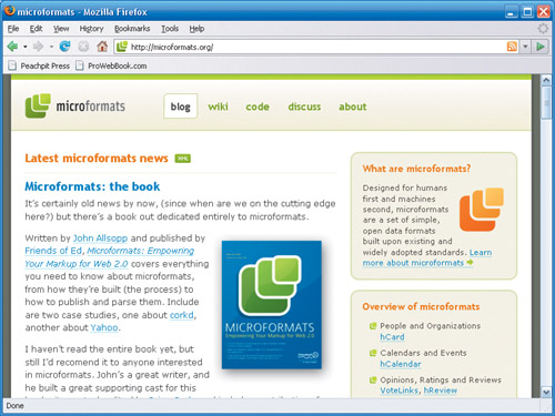
Microformats, on microformats.org (FIGURE 2.4), are defined as:
“Simple conventions for embedding semantic markup ... that normalize existing content usage patterns using brief, descriptive class names often based on existing interoperable standards to enable decentralized development of resources, tools, and services.” | ||
| --www.microformats.org/wiki/what-are-microformats | ||
Most expert Web standards-aware designers and developers today consider microformats to be an excellent protocol to use for coming up with meaningful naming conventions for some types of information on a Web site.
Microformats are built on top of POSH to help deliver real meaning in HTML. So POSH is an integral and critical part of a microformat.
Taking the example from the POSH section in Chapter 1 (see FIGURE 1.12), where the document displayed an article introduction and the information about the author of the article. The code looked like this:
<div class="article">
   <h1>My Online Article Title</h1>
   <h2>May, 2007</h2>
   <p>
      Hey everybody, welcome to my article. Today we're going to
      be talking about:
   </p>
   <ol>
      <li>Web standards-based markup</li>
      <li>Cascading Style Sheets</li>
      <li>XHTML</li>
   </ol>
   <p>Let's get started!</p>
</div>
<div class="credit">
   <h3>About the author:</h3>
   <h4><a href="http://navigationarts.com">Rob Cherny</a><br>
     Lead Developer</h4>
   <p>
      NavigationArts, LLC<br>
      7901 Jones Branch Road<br>
      McLean, VA, 22102 United States of America<br>
      703.584.8920
   </p>
</div>Concentrating on the credit portion, this bit of POSH code can be enhanced with even greater meaning by overlaying a microformat. For instance, one way to assign classes and pieces of information to the credit information might be:
<div id="hcard-Robert-M-Cherny" class="vcard">
   <h3>About the author:</h3>
   <h4><a class="url fn n" href="http://navigationarts.com">
   <span class="given-name">Rob</span>
      <span class="family-name">Cherny</span></a><br>
      <span class="title">Lead Developer</span></h4>
   <p>
      <span class="org">NavigationArts, LLC</span><br>
      <span class="adr">
      <span class="street-address">
      7901 Jones Branch Road</span><br>
      <span class="locality">McLean</span>,
      <span class="region">VA</span>,
      <span class="postal-code">22102</span>
      <span class="country-name">
         United States of America</span><br>
      <span class="tel">703.584.8920</span>
      </span>
   </p>
</div>
This example adopts the hCard microformat defined at microformats.org. The classes defined for vcard, given-name, additional-name, family-name, org, adr, and so forth identify key pieces of information. While on the markup-heavy side, it does, in a very granular way, specify the meaning of each element, which is of potentially great use.
In XML, tags give meaning to each field of information. With microformats, valid class and other attribute information can be added to the POSH code to enable understanding of the granular pieces of information.
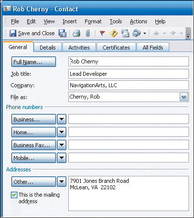
Using the hCard example above and an extension add-on for the Mozilla Firefox browser, it is possible to demonstrate a simple example of how powerful microformats can be. Michael Kaply at IBM has created an excellent extension called Operator, which you can download and install from the Mozilla Add-ons site: https://addons.mozilla.org/en-US/firefox/addon/4106
Once the extension is installed, users have either a new toolbar or a status bar icon that becomes active when visiting a Web page with data embedded in a microformat. The toolbar allows a multitude of ways to interact with a variety of microformats (FIGURE 2.5).

Since this example is an hCard, the Operator extension allows the user to export the embedded contact information to a vCard file, which can be imported into any software package that accepts that format, such as Microsoft Outlook. It is an incredibly easy and powerful way to add information to an address book directly from a Web page, particularly in a business environment (FIGURE 2.6).
For a breakdown of CSS selectors, see Appendix D.
Web standards purists have coined the term classitis, which means putting too many classes in a Web site’s markup and CSS. The term is a funny word for a valid concern. Having dozens and dozens of CSS classes to remember, document, and reference is difficult for Web authors and business users alike.
In the long run, a more practical, graceful, and scalable solution is to use element and descendant CSS selectors. These selectors automatically apply styles to XHTML elements without having to apply classes to every item.
Descendent selectors match any element inside another element having a space between the two elements.
div p {color: red;}In this example, any <p> element that descends from a <div> element will be red. This technique also works with classes and IDs. Using this simple technique, authors can begin to remove the complexity from their CSS code.
Here is an example of classitis at work (FIGURE 2.7). Note that styles are embedded in the document for convenience alone, as this is not necessarily a best practice.
<!DOCTYPE html PUBLIC "-//W3C//DTD XHTML 1.0 Strict//EN"
     "http://www.w3.org/TR/xhtml1/DTD/xhtml1-strict.dtd">


<html xmlns="http://www.w3.org/1999/xhtml" xml:lang="en" lang="en">
<head>

   <title>Classitis Example</title>
   <meta http-equiv="Content-Type"
     content="text/html;charset=utf-8" />
   <style type="text/css">
   /* elements */
   body { font-size: .9em; }
   /* main styles */
   .main { width: 200px; float:left; margin-right: 15px;}
   .main-header { text-decoration: underline; color:
     green; font-size: 1.2em; }
   .content { color: #666; font-size: 1em; }
   .main-list { list-style-type: square; color: #f60; }
   /* related styles */
   .main-related { width: 200px; float: left; }
   .rel-header { border-bottom: 1px dashed #f60; font-size: 1.2em; }
   .rel-content { color: maroon; font-size: .85em; }
   .rel-list { list-style-type: square; color: #666;
      font-size: .85em; }
   </style>
</head>
<body>
   <div class="main">
      <h1 class="main-header">My Header</h1>
      <p><span class="main-content">
        My content goes here.
      </span></p>
      <ul>
         <li class="main-list">Item one</li>
         <li class="main-list">Item two</li>
         <li class="main-list">Item three</li>
      </ul>
   </div>
   <div class="main-related">
      <h1 class="rel-header">My Related Header</h1>
      <p><span class="rel-content">
        My content goes here.
      </span></p>
      <ul>
         <li class="rel-list">Item one</li>
         <li class="rel-list">Item two</li>
         <li class="rel-list">Item three</li>
      </ul>
   </div>
</body>
</html>Examination of the above document reveals a number of areas that could be improved upon. The code references an army of CSS classes that simply do not need to be there. The author of this document has defined classes for each <div>, all the headers, text, and list styles for each column in this simple two-column document. All the classes make the document difficult to read and increase the page weight needlessly. Most experts agree that classes should be reserved for exceptions to the basic rules that are being set up for elements in a document.
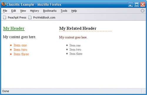
Now look at an alternative example, which provides the same design in a more graceful way (FIGURE 2.8).

<!DOCTYPE html PUBLIC "-//W3C//DTD XHTML 1.0 Strict//EN"
      "http://www.w3.org/TR/xhtml1/DTD/xhtml1-strict.dtd">


<html xmlns="http://www.w3.org/1999/xhtml" xml:lang="en" lang="en">
<head>
   <title>Classitis Example</title>
   <meta http-equiv="Content-Type"
     content="text/html;charset=utf-8" />
   <style type="text/css">
   /* elements */
   body { font-size: .9em; }
   h1 { font-size: 1.2em; }
   ul li { list-style-type: square; }
   div { float: left; }
   /* main styles */
   #main { width: 200px; margin-right: 15px;}
   #main h1 { text-decoration: underline; color: green; }
   #main p { color: #666; font-size: 1em; }
   #main ul li { color: #f60; }
   /* related styles */
   #main-related { width: 200px; }
   #main-related h1 { border-bottom: 1px dashed #f60; }
   #main-related p { color: maroon; font-size: .85em; }
   #main-related ul li { color: #666; font-size: .85em; }
   </style>
</head>
<body>
  <div id="main">
     <h1>My Header</h1>
     <p>My content goes here.</p>
     <ul>
        <li>Item one</li>
        <li>Item two</li>
        <li>Item three</li>
      </ul>
   </div>
   <div id="main-related">
     <h1>My Related Header</h1>
     <p>My content goes here.</p>
     <ul>
        <li>Item one</li>
        <li>Item two</li>
        <li>Item three</li>
      </ul>
   </div>
</body>
</html>
Superficially, this document looks exactly the same as the first. However, there is not a single class used: It has been reduced to a simple POSH document. Descendent selectors allow authors to set styles via context; this can be a powerful tool. This is not to say that classes should never be used; however, simplifying code in complex environments is never a bad thing. A POSH approach with simple selectors will get documents quite far and will be simpler to maintain.
Consider a situation where a designer might not be able to directly impact the markup because of business reasons or software architecture limitations, and this becomes even more powerful. Careful techniques involving hearty selectors and design changes can be pushed down into code that authors can’t even touch!
Another robust technique worth noting is that the rules for markup allow multiple classes to be assigned to any given object. This is another powerful way to avoid using extra classes when they are not necessary (FIGURE 2.9).
Here’s another style sheet example:
.error { color: red; }
.errorExtreme { font-weight: bold; }
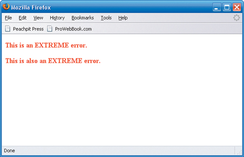
.extaError { font-weight: bold; color: red; }Note there are three classes defined: one making text red, the second making text bold, and the third combining both. Here is one usage of these classes in some XHTML code, where both sets of text are bold and red, but the author added an extra <span> to combine classes, and they also had to create the last selector, which does the same as the other two combined:
=<p class="error"><span class="errorExtreme">
This is an EXTREME error.</span></p>


<p class="extaError">This is also an EXTREME error.</p>
Now, consider the same style sheet without the last selector (which is not actually necessary):
.error { color: red; }
.errorExtreme { font-weight: bold; }
Finally, an author who exploits the features of standards-aware Web browsers can combine the classes using space-delimited lists inside the class attribute of elements, like this:
<p class="error errorExtreme">This is an EXTREME error.</p>
Again, the result is simply less code, and fewer classes. Advanced usage of CSS selectors takes Web standards-based techniques to the next level and can help style sheets scale without too much complexity.
Tip
The W3C CSS recommendations reference all manner of fantastic selectors that can be used to enhance the elegance and maintainability of CSS. While browser support is inconsistent, newer, more modern browsers such as Mozilla Firefox, Safari, Opera, and even Microsoft Internet Explorer 7 (and later) support most of the CSS 2 selectors module and in some cases some items from the CSS 3 module.
The CSS 2 selectors can be found at www.w3.org/TR/REC-CSS2/selector.html.
The CSS 3 selectors can be found at www.w3.org/TR/css3-selectors/.
The Hierarchy of Rules
CSS selectors carry with them the notion of “specificity,” which means how detailed and specific the rules are drives which rule takes precedence when conflicting rules show up. For instance, ID selectors are more specific than elements, and so forth. Specificity and other aspects of the “cascade” in CSS are described in the CSS recommendation at www.w3.org/TR/CSS21/cascade.html.
Some Web authors agonize over the structure of the CSS files’ content. There are no absolute rules.
#singleLine { border: 1px solid red; padding: 12px; display: inline;
}
Some CSS authors prefer single-line rules, while others prefer rules that span multiple lines:
#multiLine {
   border: 1px solid red;
   padding: 12px;
   display: inline;
}
There aren’t a lot of compelling reasons to use one over the other, except possibly for file size considerations where white space might be a factor. Whatever a team does, it’s best to be consistent.
Tip
As part of their publishing procedure, some larger sites will employ a build process that strips out white space to help optimize the CSS files to a smaller size.
A basic guideline for what order or how to group selectors in a CSS file might be
Define rules that are basic elements that don’t depend on context.
Define classes that are reused regardless of context.
Define ID selectors roughly in their order, matching their usage in the markup.
Define children of ID selectors based on rules set via context.
Another technique that is sometimes helpful, but takes the multiple-line setup to another level, is nesting CSS rules based on relationships, much like programming code.
h1 {
   font-weight: bold;
   border-bottom: 1px solid blue;
}
#main {
   width: 600px;
   padding: 8px;
   float: left;
}
   #main h1 {
     font-weight: normal;
     border-bottom: 1px solid maroon;
   }
   #main p {
      margin: 0 0 12px;
  }
     #main p a {
        padding-right: 15px;
        background-image: url("out.gif");
     }
#siteinfo {
   position: absolute;
   bottom: 20px;
}
   #siteinfo p {
     margin: 0;
   }
Note how the indentations help provide context for the rules. This can get complex to manage as the rules get deep, but it can also help the maintenance and readability of the files. Rules that start as contextual might later be moved out and up to where they are more generalized, and it’s important to watch the cascade and the level of specificity.
Consider the rule defined for <h1> elements without the #main ID that is bold, but with a blue bottom solid border, whereas the one in #main above is maroon and not bold. In time, or after a redesign, it might be determined that the <h1> elements should actually be all a normal font weight with a maroon bottom border. Rather than redeclare the rule, a maintenance activity would be to reorganize the style sheet:
h1 {
   font-weight: normal;
   border-bottom: 1px solid maroon;
}
#main {
  width: 600px;
  padding: 8px;
  float: left;
}
  /* note #main h1 is moved up and replaces the other rule */
  #main p {
    margin: 0 0 12px;
   }
One of the wonderful features of CSS is the ability to specify a specific media type for CSS files. Possible options include “all,” “screen,” “print,” and “handheld.”
For instance, a file might be labeled “screen” and the rules in the file are only applied to the document when viewed on a monitor screen:
<link rel="stylesheet" href="screen.css" type="text/css"
media="screen" />
The use of print CSS can be a powerful asset in any organization. It can actually reduce the workload where oftentimes a CMS or other software is employed to create duplicate or simple versions of documents that are easier to render on printed paper. This software may not be necessary if a print CSS file is attached. This is done the same way as the screen file:
<link rel="stylesheet" href="print.css" type="text/css"
media="print" />
In this case, when used with the screen.css file above, there are no styles applied from screen.css when the user clicks to print the file. However, the styles from print.css are applied, allowing authors the chance to apply very special formatting such as hiding menus and unnecessary design elements while giving emphasis to the content.
Tip
A classic article, written by Eric Meyer in the online resource A List Apart, discusses print CSS in particular detail (http://alistapart.com/stories/goingtoprint/).
Many organizations are effectively using print CSS files to create printed versions of their Web pages—which can be very nice, particularly for content articles where a printed version might be of real importance. In these cases, content is the critical factor, and the old paradigm of clicking print and getting something like what is shown on screen is really going by the wayside. What is on screen does not translate well to paper in most cases. An effective approach is to create a letterhead-type style emphasizing the content and hiding unnecessary menus and so forth.
An excellent example of the use of separate CSS style sheets for screen display and for print can be seen at the site for the Web design agency NavigationArts. The company’s site was a collaborative CMS implementation, the front end of which was built using XHTML Strict and CSS by Web developer Michael Raichelson (http://michaelraichelson.com).
The content pages of the site (www.navigationarts.com/insight/web-standards) feature an inverted white logo graphic on an orange background (the company’s signature color), and a basic three-column layout (FIGURE 2.10). Across the top is global navigation; the left side is main navigation; the middle content column features article content, details, and a graphic; and the right side features related tools. Under the hood, the code features both screen- and print-specific style sheets:
<link media="screen" rel="stylesheet" type="text/css"
   href=" /_res/css/main.css" />
<link media="print" rel="stylesheet" type="text/css"
   href=" /_res/css/print.css" />

First and foremost, it is important to recall that since the main.css file is set to screen, none of its rules will apply when the user clicks the Print button. So, the rules in print.css are coded from the ground up off a pure text display. Since the main graphic used on screen is actually inverted white against a background color, there’s some magic going on behind the scenes in a <div> element hidden at the bottom of the document, which is exposed only when the printer CSS is applied:
<div class="ponly" id="print-logo">
   <img alt="" src=" /_res/img/navigation-arts.print.gif" />
</div>
This logo is used only for printed versions, and is grayscale for a good print representation. The screen CSS defines a class ponly which is applied to any object hidden on the screen, and therefore can be applied to many objects if necessary.
.ponly { display:none; }The additional ID, #print-logo, is used to manipulate the position of the object in the print.css file during printing. Since this image is located at the bottom of the document, on-screen rendering or download times are not significantly impacted, as it is the last thing downloaded. Another set of objects radically manipulated when the page is sent to the printer is the footer (which also happens to be an hCard microformat, thank you), which on screen is at the bottom of the page, and when printed is actually moved to the top of the printed page. But how is all of this accomplished?
The print CSS starts by hiding all sorts of objects not required for printing:
#global-nav, #client-login,
#branding, #left-rail,#right-rail,
.geo, .include, .sonly, .honly, .license a,
#x, #x-insert, #x-image, #x-nav,
.readmore, .apply { display:none !important; }
Moving through the whole print.css file, there are even more elements, classes, and IDs that are hidden. This demonstrates how this technique is in fact an exercise in removing as much as possible. The above rules hide the global navigation as well as the branding, white-on-color logo, and the right and left columns. This essentially leaves the middle content and the footer, as well as the logo that is usually hidden at the bottom, at least on screen.
With this technique, there are a few more rules required for the printer CSS than with printing techniques that share the screen and print rules. The reason is that authors will need to set the fonts and colors for all type styles from scratch once again, since not a single rule from the screen.css file is applied to the print version. However, starting with a clean slate these days is typically more reliable for print CSS, since browser support is inconsistent and poorly documented.
Some more rules:
body {
   font-size:12px;
   color:#000;
   background-color:#fff;
   font-family:Arial,Helvetica,sans-serif;
   padding:120px 10px 20px;
   margin:0;
}
div.vcard {
   font-size:11px;
   position:absolute;
   top:25px;
   right:10px;
   text-align:right;
   width:400px;
}
div#print-logo {
   position:absolute;
   top:45px;
   left:10px;
}
The hidden print logo is not hidden in the print version, and both it and the footer are set to absolute and moved to the top of the document to establish a letterhead-like quality (FIGURE 2.11). Notice how the body has a padding-top of 120px, which leaves room for the absolutely positioned letterhead style print logo and hCard data. The result is a well-formatted and easy-to-read printed page that emphasizes the content.

Using similar techniques can save time and effort on the server-side implementation of mixed-media and multiple-device publishing from a CMS or any other tool. CSS support for handhelds gets better ever day, and it will only allow for greater versatility as time goes by, lessening the burden and level of effort required to provide alternative forms of publishing of the same content.
CSS is critical to a Web standards-based approach, since in a standards world—where HTML is virtually plain text—all presentation information is controlled from the CSS. This has numerous advantages, all the more so the larger the site, because all presentation information can be controlled from a manageable set of files.
It is true, however, that the larger and more complex the site, the more of a challenge managing effective CSS becomes, due to sheer volume. Having a clean base of markup and using effective linking strategies, combined with intelligent creation of selectors, will get a Web team halfway there already, providing them with a newfound sense of freedom and flexibility. Each environment will be different, of course, and it is important to make intelligent decisions on how to best manage the volume of design information that CSS needs to handle.
Once a base of markup and design is in place, adding interaction is another critical component to a modern Web site. Front-end markup impacts design, and both of these technologies interact with the scripting layer as well.